Begin
18 pages · ~36 min
Graphic Design Principles
An introductory course on core graphic design principles, covering layout, color, typography, and composition for aspiring designers.
A digital instructor presents all 18 pages. Hold “Ask” at any point and ask out loud — the answer comes from this course. No sign-up needed.
What you’ll learn
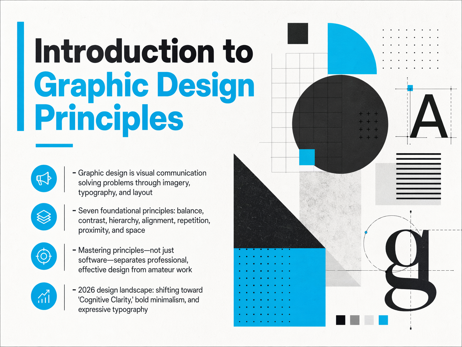
- 01Introduction to Graphic Design PrinciplesWelcome. In this course, we're going to explore the foundational principles of graphic design. Think of this as your visual problem-solving toolkit. Design isn't just about making things look nice; it's about communicating clearly through imagery, typography, and layout. Our goal is to move beyond just knowing the software. We'll focus on mastering the core principles that separate professional, effective work from amateur attempts. We'll dive into seven key ideas: balance, contrast, hierarchy, alignment, repetition, proximity, and the use of space. As we look toward the current design landscape, we're seeing a shift toward what's called 'cognitive clarity,' bold minimalism, and expressive typography. These aren't just trends; they're the practical application of the timeless principles we're about to cover. By the end, you'll have a diagnostic checklist you can use immediately to make your own projects stronger and more intentional. Let's get started by understanding the raw materials we work with in the next slide, 'The Designer's Toolkit: Elements vs. Principles.'superside.comfigma.comuxpin.com+22 min
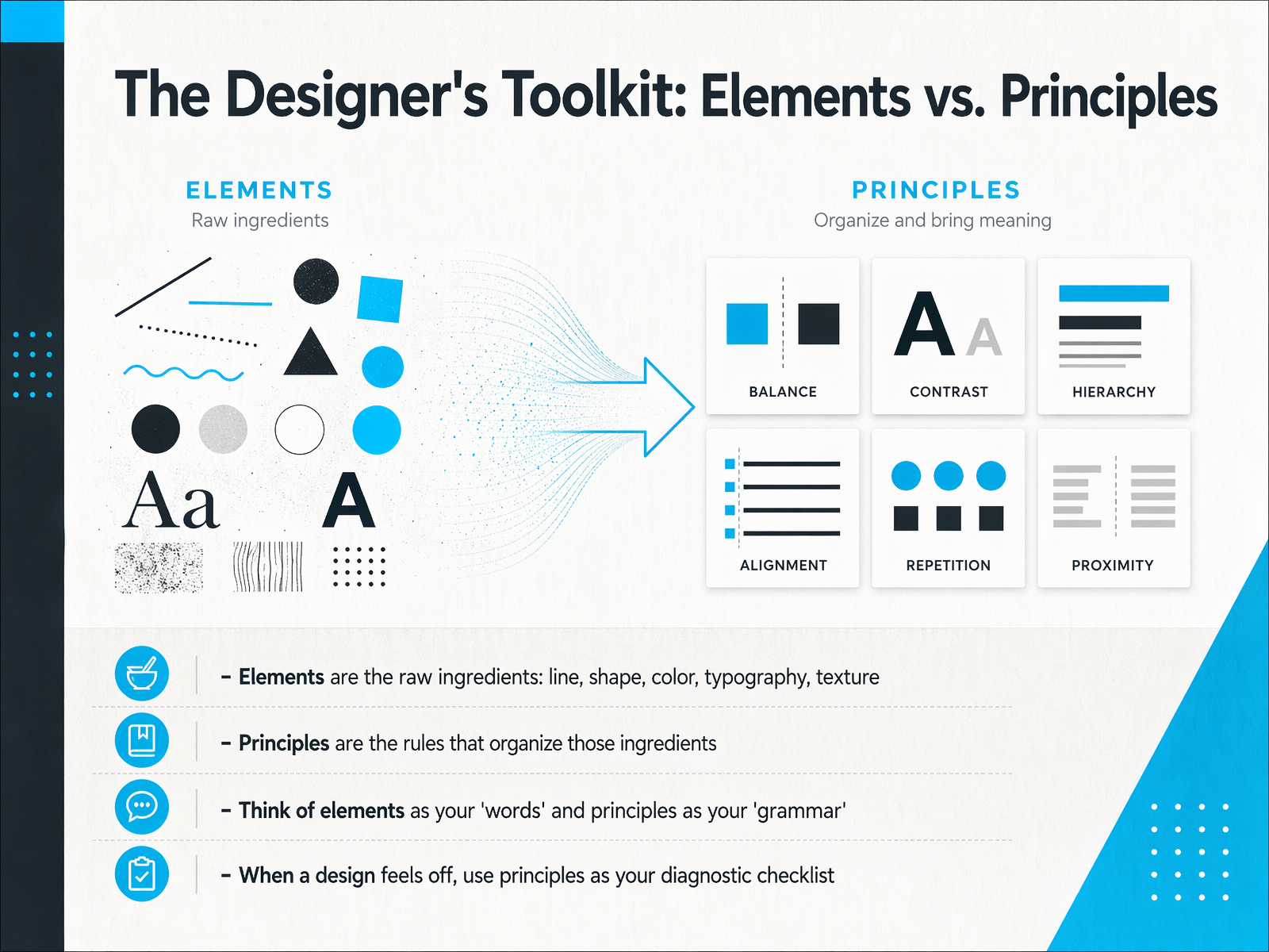
- 02The Designer's Toolkit: Elements vs. PrinciplesNow that we know the difference between the designer's toolkit and the rules for using it, let's dive deeper into how we actually diagnose a design. Think of elements—line, shape, color, typography, and texture—as your raw ingredients. They are the 'what' you are working with. The principles, on the other hand, are the 'how' and the 'why.' They are the rules that organize those ingredients. A helpful way to remember this is to think of elements as your words, and principles as your grammar. You can have all the right words, but without grammar, they don't form a coherent sentence. So, when a design feels off, and you can't quite put your finger on why, use the principles as your diagnostic checklist. Go down the list. Is there enough contrast? Is the alignment intentional? Is the hierarchy clear? This simple mindset shift, from seeing just ingredients to assessing the rules, is what transforms a layout from a collection of parts into a unified, effective visual message. Let's start with the first item on that checklist and explore the principle of balance and visual weight.
 1 min
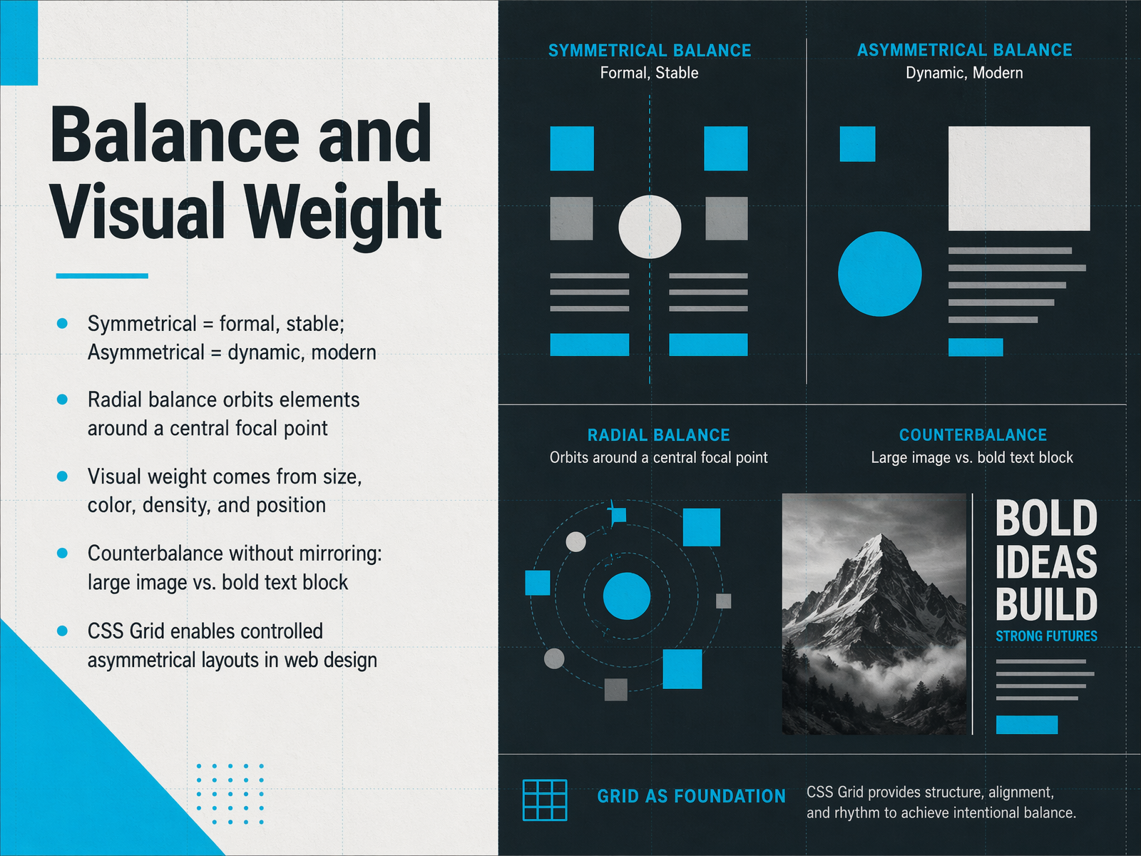
1 min - 03Balance and Visual WeightMoving now to the idea of balance, and specifically, visual weight. When we talk about balance in design, we don't just mean things are centered. Symmetrical balance, where you mirror elements on either side of an axis, feels formal, stable, and even a bit traditional. Asymmetrical balance, on the other hand, is dynamic, modern, and energetic. It creates balance without mirroring. There's also radial balance, where elements orbit around a central focal point, like the spokes of a wheel. The key to all of this is understanding visual weight. You can think of visual weight as the amount of attention an element pulls. This weight comes from several factors: an element's size, its color, its density or texture, and its position on the page. A large, bold image on one side can be counterbalanced by a smaller block of dense, bold text on the other. It's a balancing act, not a mirror image. In web design, this is where CSS Grid really shines. It gives us the tools to build controlled, intentional asymmetrical layouts that are both creative and structurally sound. Now, let's build on this foundation and look at how we can more deliberately guide the viewer's eye with our next principle: Contrast and Emphasis.
 designyourway.netuxpin.comvisme.co+22 min
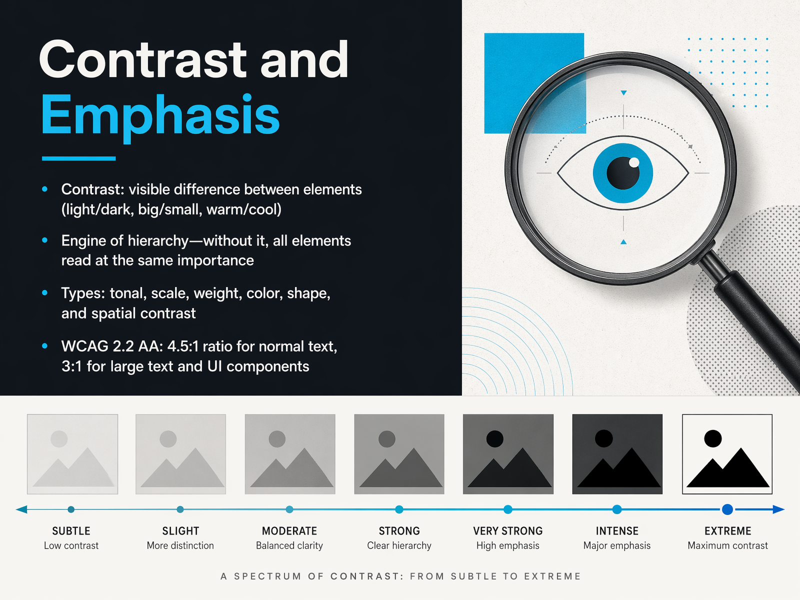
 - 04Contrast and EmphasisNow let's talk about contrast and emphasis. Contrast is simply the visible difference between elements—think light versus dark, big versus small, or warm versus cool colors. Without contrast, all your elements read at the same importance, and your message gets lost. It's the engine of hierarchy. You can create contrast in many ways: tonal contrast plays with lightness and darkness, scale contrast uses size differences, weight contrast uses thin versus bold strokes, and you also have color, shape, and spatial contrast. When it comes to color contrast, there's an important accessibility standard to remember. WCAG 2.2 level AA requires a contrast ratio of at least four point five to one for normal text, and three to one for large text and user interface components. This ensures your content is readable for people with low vision or color deficiencies. So as you design, always ask yourself: where do I want the viewer to look first? Use contrast to make that answer immediately clear. Let's build on this with a look at visual hierarchy and how to guide the eye.
 w3.orgw3.orgw3.org+21 min
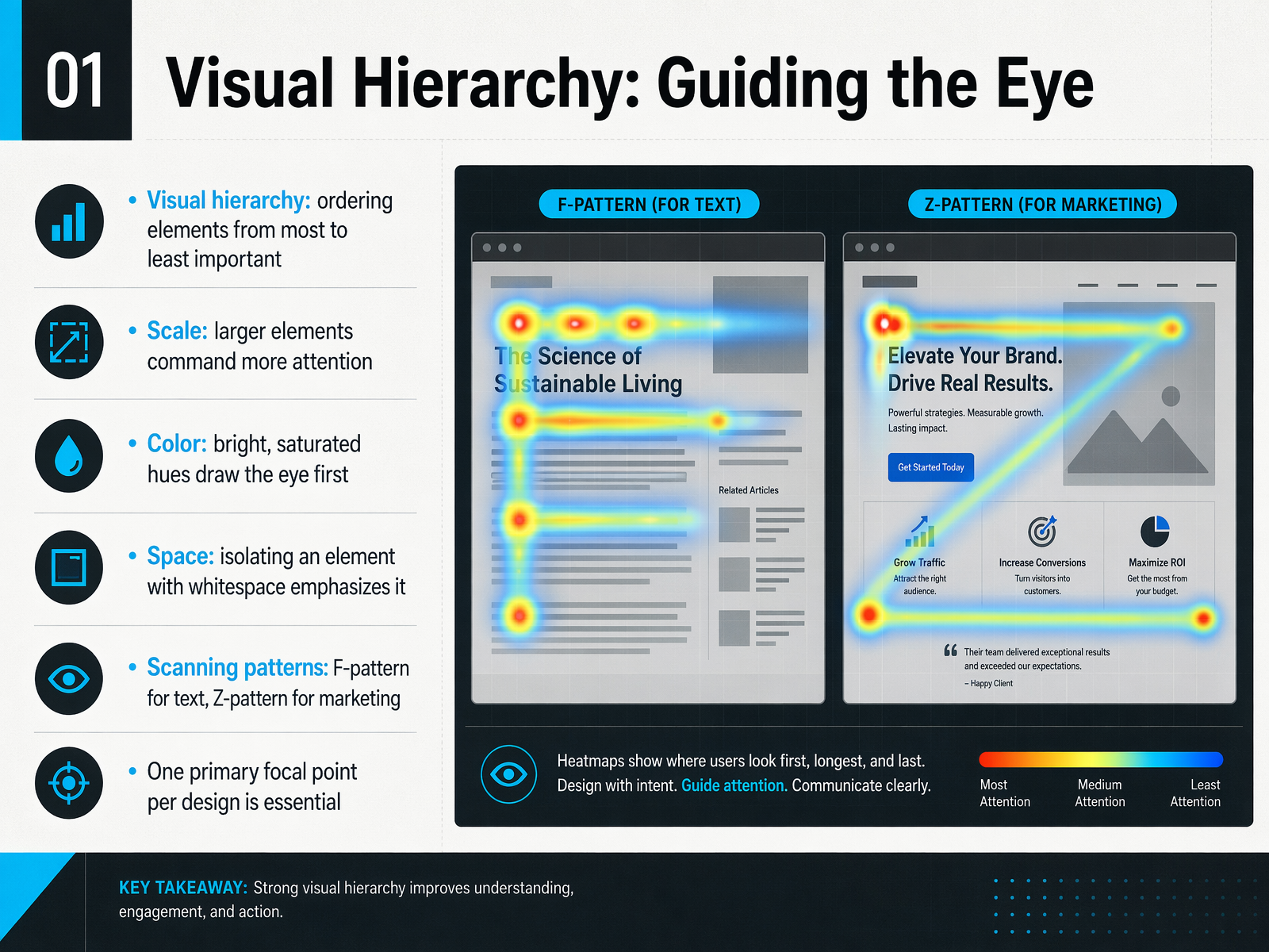
 - 05Visual Hierarchy: Guiding the EyeLet's now explore visual hierarchy, which is simply the art of ordering elements from most to least important. It's how we guide the viewer's eye. One of the most direct tools for this is scale. Larger elements naturally command more attention, so make your headline big and your fine print small. Next, consider color. A bright, saturated hue will always draw the eye first, so use it sparingly on your key call to action. Space is equally powerful. Isolating an element with generous whitespace lets it breathe and gives it major emphasis. It's also helpful to know how people scan. For text-heavy layouts, we often follow an F-pattern, moving left to right and down. For marketing pages, the Z-pattern is more common, where the eye moves from the top left to top right, and then diagonally down. The most critical rule here is to have one primary focal point per design. This ensures clarity and prevents confusion. Next, we'll look at how to create order and cohesion with alignment.
 1 min
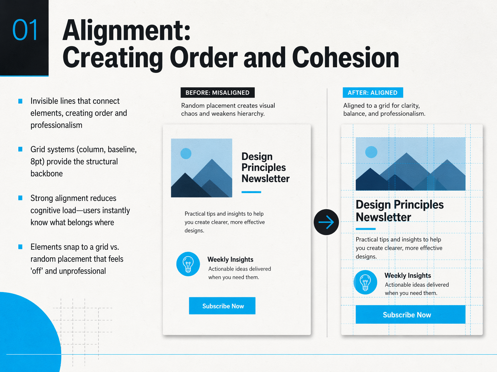
1 min - 06Alignment: Creating Order and CohesionNext, let's talk about alignment, which is all about creating order and cohesion in your designs. Think of alignment as invisible lines that connect elements on your page, giving everything a sense of professionalism and structure. You can achieve this by using grid systems, like a column grid, a baseline grid, or the popular eight-point grid. These grids provide a strong structural backbone, so you're not just placing things randomly. Why does this matter? Because strong alignment significantly reduces what we call cognitive load. It means users instantly and subconsciously know what belongs where, without having to figure it out. When elements snap to a grid, the layout feels intentional and trustworthy. When they're placed randomly, it just feels a bit 'off' and unprofessional. So, using alignment is a simple, powerful way to bring order to your work. Now, let's explore another core principle that works hand-in-hand with alignment: Proximity, or grouping through space.
 nngroup.comglow.teamshopify.com+21 min
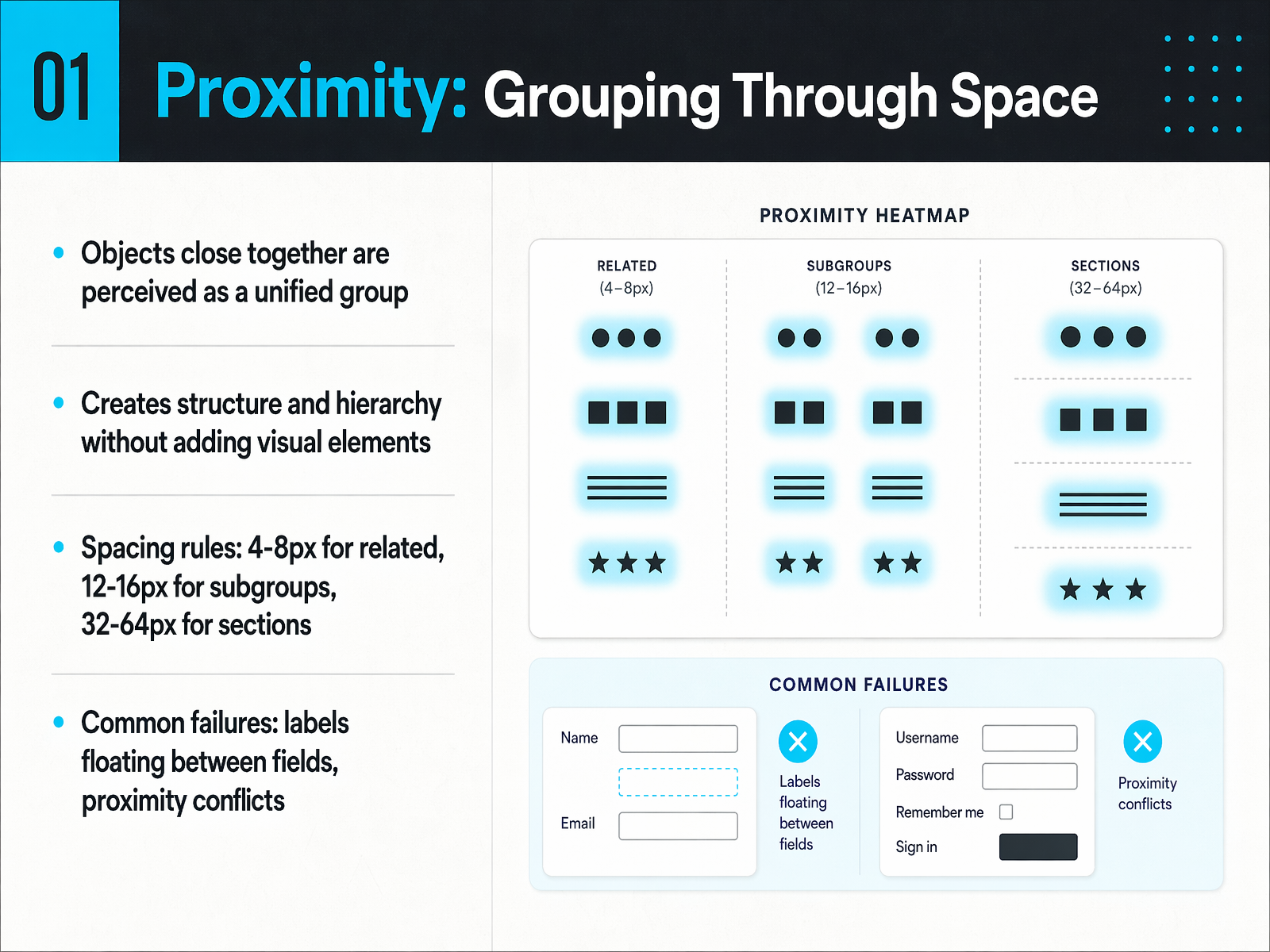
 - 07Proximity: Grouping Through SpaceNow, let's talk about a principle that costs nothing to implement but transforms how people experience your work: the principle of proximity. At its core, proximity is simple. Elements that are close together are perceived as belonging to the same group. Move them apart, and they feel like separate, unrelated items. This isn't just a style preference; it's a hard-wired cognitive response. Your brain groups first and asks questions later. So, when you tighten the space between a headline and its paragraph, you create a single, scannable chunk. When you add generous white space before the next section, you signal a clear separation. The practical spacing rules are your guide here. Keep related elements, like a label and its input field, four to eight pixels apart. Use twelve to sixteen pixels for subgroups within a section. And for major sections, apply thirty-two to sixty-four pixels of separation. The classic failure to avoid is the floating label. If a label sits equidistant between two fields, the grouping collapses. Users won't know which text belongs to which box, leading to errors and frustration. Remember, the label must always be closer to its own field. Master this spacing, and your layouts will instantly feel more organized and trusted. Next, we'll explore how to amplify this clarity with the power of white space.
 nngroup.comglow.teamshopify.com+22 min
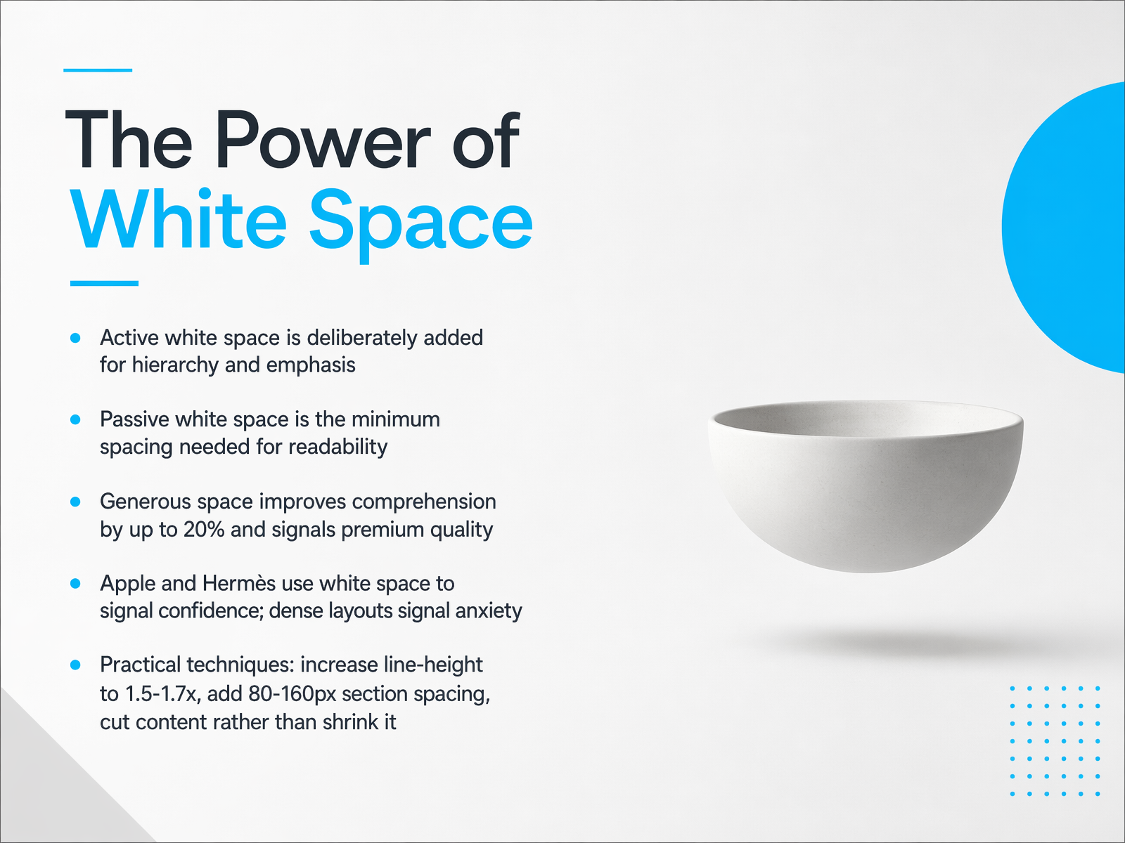
 - 08The Power of White SpaceLet's focus on a tool that often gets overlooked but makes an enormous difference: white space. White space isn't just empty room; it's a deliberate design choice. And it comes in two forms. First, passive white space—this is the minimum spacing needed for readability, like the natural gaps between letters or the standard line height in a paragraph. It's essential, but it's not where the real design power lies. That power belongs to active white space. Active white space is added intentionally to create hierarchy and emphasis. It's the generous margin you place around a hero image, or the deliberate breathing room you give a headline to make it the undisputed focal point. The impact on your audience is measurable. Studies show that generous spacing can improve comprehension by up to 20 percent. It also signals a premium quality. Think about brands like Apple or Hermès. Their layouts use expansive space to project confidence. A dense, crowded layout, on the other hand, can signal anxiety, as if you're afraid the viewer will leave if you don't fill every pixel. So, how can you apply this right now? Here are a few practical techniques. First, increase your body text line height to between 1.5 and 1.7 times the font size. Next, add substantial spacing between page sections—anywhere from 80 to 160 pixels gives each section its own clear identity. And when you feel a page is cramped, resist the urge to shrink everything to fit. Instead, cut content. A page with four strong, spacious sections outperforms one with eight cramped ones. Now, using space effectively provides a perfect foundation for our next principle, which is all about creating a unified and predictable experience through repetition and consistency.
 2 min
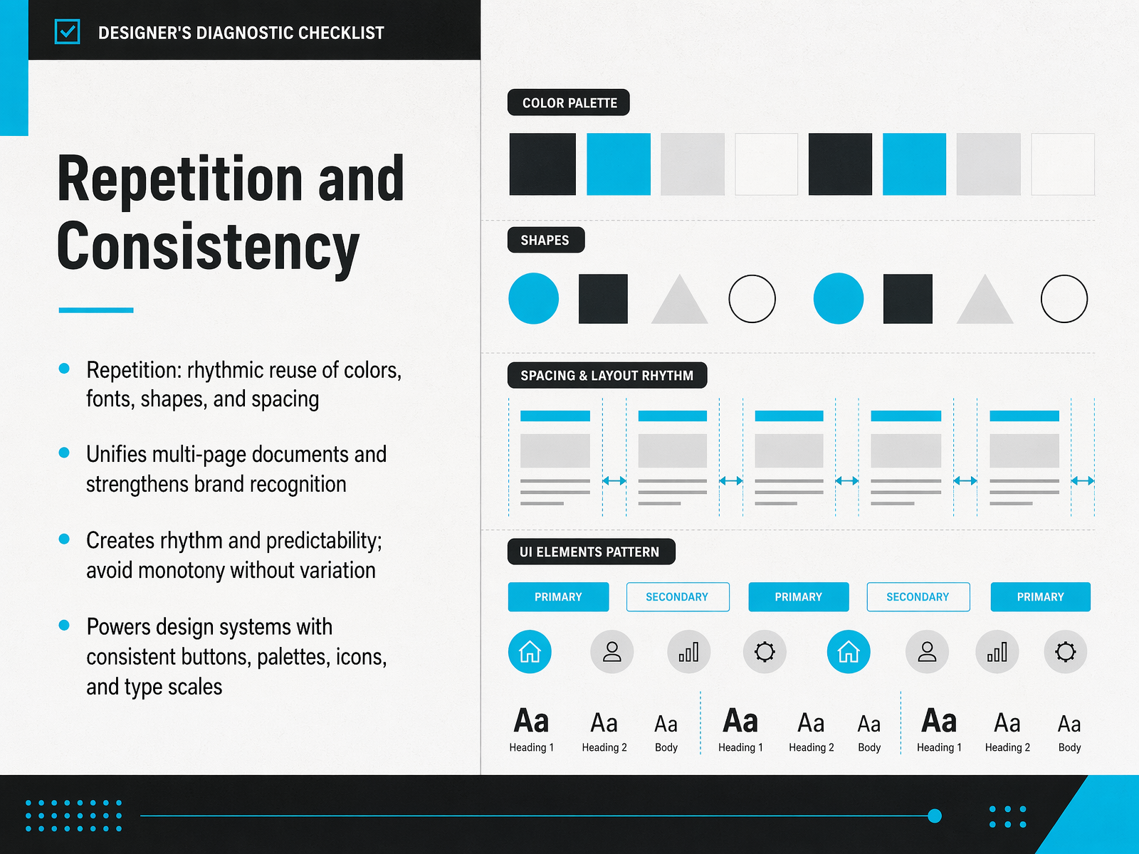
2 min - 09Repetition and ConsistencyNow let’s talk about a principle that quietly holds everything together: repetition and consistency. Think of repetition as the rhythmic reuse of colors, fonts, shapes, and spacing throughout your design. When you carry the same header style, the same button color, or the same margin across multiple pages, you create a sense of unity. That unity is what makes a multi-page document feel like one coherent piece, and it’s also what strengthens brand recognition over time. Repetition builds rhythm and predictability, which helps your audience feel comfortable and oriented. But there’s a fine line here. Without variation, rhythmic can turn into monotonous. So you apply repetition with purpose, and then strategically introduce small, intentional differences to keep the design alive. When you scale this idea, you get what we call design systems. Consistent buttons, a shared color palette, a unified icon set, and a defined type scale all work together because of repetition. It’s the engine behind professional, scalable design. Up next, we’re diving into Typography Fundamentals, where you’ll see how type choices can make or break your message.
 2 min
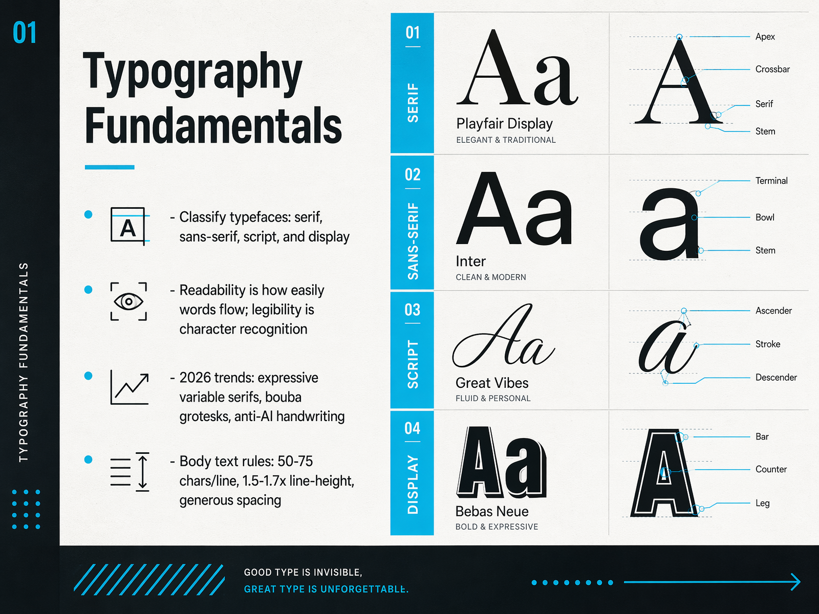
2 min - 10Typography FundamentalsNow, let's get into the fundamentals of typography. Think of typefaces as having distinct personalities. We classify them into four main groups: serif, with those small feet at the ends of strokes; sans-serif, which is clean and without serifs; script, which mimics handwriting; and display, designed for large headlines to grab attention. Next, a critical distinction: readability versus legibility. Readability is about how easily your eyes flow across a block of text, while legibility is about recognizing individual characters, like telling a lowercase L from an uppercase I. Looking ahead to 2026, we're seeing some exciting trends. Expressive variable serifs are making a comeback, and 'bouba grotesks' are adding a soft, friendly feel to sans-serifs. There's also a rise in 'anti-AI handwriting' fonts that feel deliberately human and imperfect. For your body text, remember these three rules: aim for fifty to seventy-five characters per line, set your line-height to about one and a half to one point seven times the font size, and use generous spacing to keep things comfortable. Up next, we'll build on this by exploring practical font pairing strategies.
 1 min
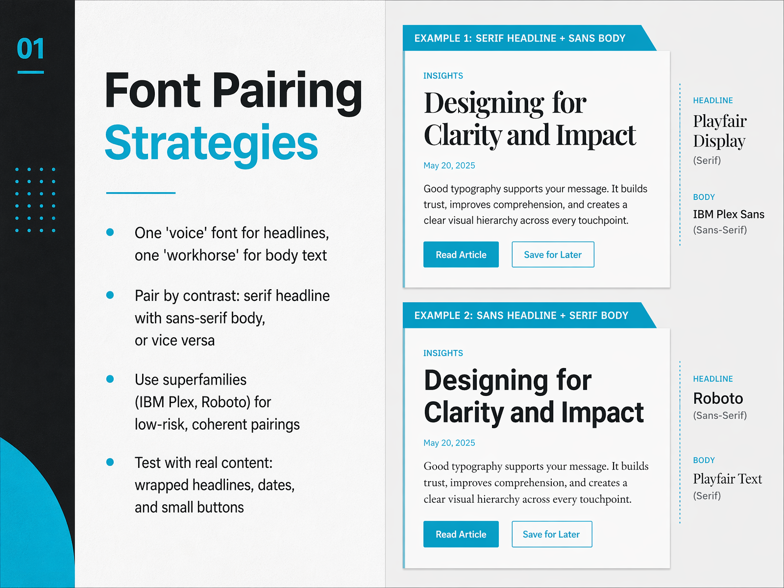
1 min - 11Font Pairing StrategiesNow, let's make these typographic choices work together with font pairing strategies. Think of font pairing like casting roles in a play. You need one voice font for your headlines to grab attention, and one workhorse font for your body text to carry the reading load. The goal is contrast without conflict. A classic, reliable move is pairing a serif headline with a sans-serif body, or the reverse. If you want a low-risk, perfectly coherent look, you can use a superfamily like IBM Plex or Roboto, which includes matching sans, serif, and mono styles designed to work together. But the real secret is to stop browsing and start testing. You must validate your pairings with real content. Look at how a wrapped headline behaves, how dates format, and how labels look in a small button. Often, a pairing that looks beautiful in a large hero section falls apart down in the details. So, test early and test small. Up next, we'll build on this foundation with a look at Color Theory Essentials.
 2 min
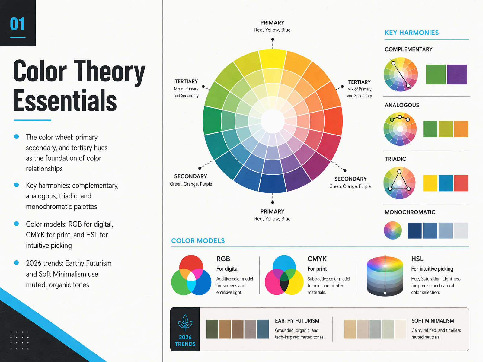
2 min - 12Color Theory EssentialsNow let's bring color theory into focus. It all starts with the color wheel, built on primary, secondary, and tertiary hues. Think of this wheel as a map showing how colors relate to one another. From these relationships, we build color harmonies. Complementary schemes place colors opposite each other for high contrast and energy. Analogous palettes use neighbors on the wheel for a serene, cohesive look. Triadic harmony pulls three evenly spaced colors for a vibrant, balanced feel, while a monochromatic scheme uses a single hue in varying tints and shades for a unified, elegant result. Understanding the technical side is also crucial. RGB is the additive model for digital screens, while CMYK is the subtractive model for print. For a more intuitive way to pick colors, HSL lets you adjust hue, saturation, and lightness directly. Looking ahead, you'll see these principles applied in trends like Earthy Futurism and Soft Minimalism, which favor muted, organic tones to create grounded, sophisticated designs. Up next, we'll apply a critical lens to these choices with a look at Color Accessibility and WCAG Compliance.
 2 min
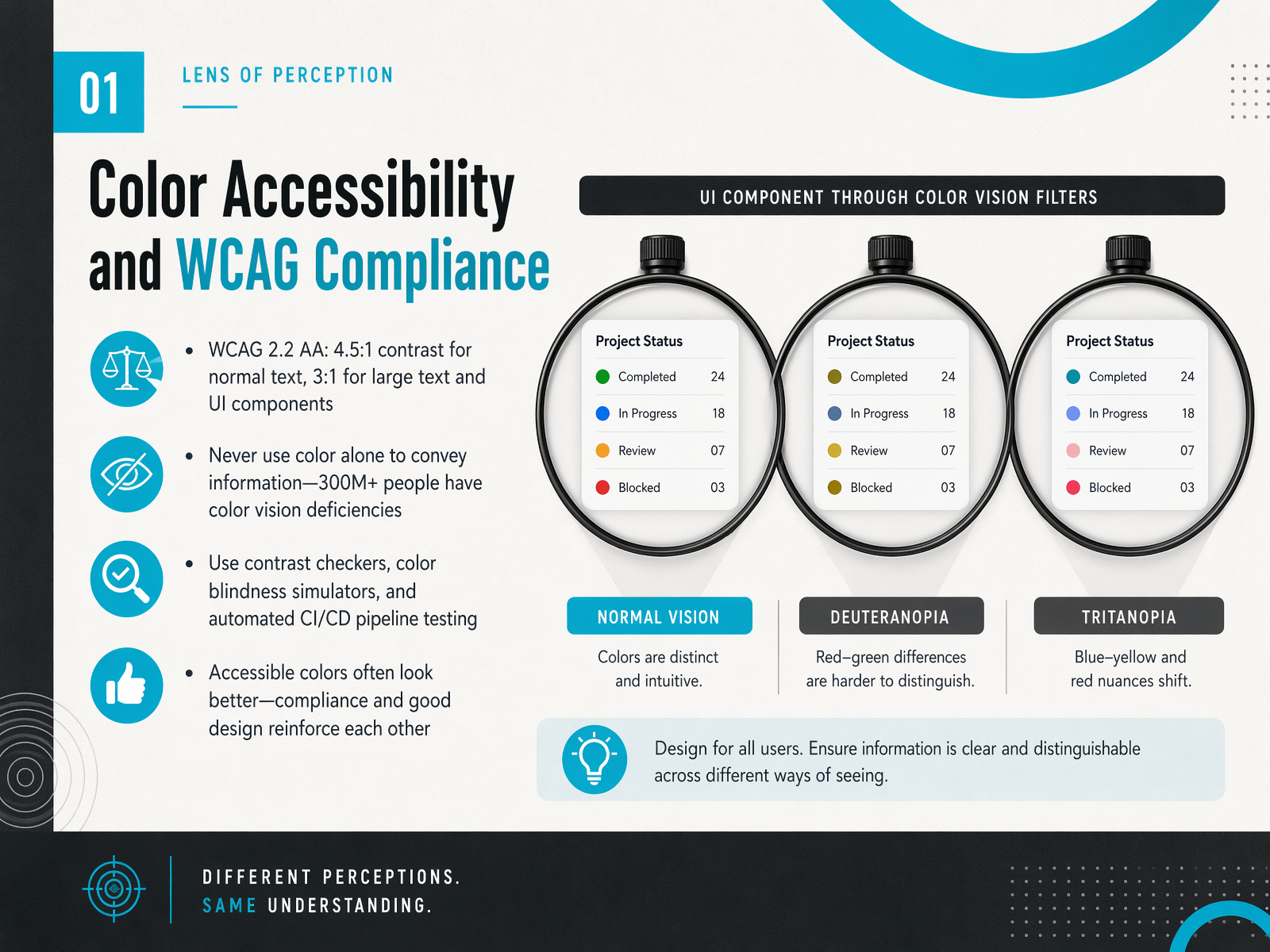
2 min - 13Color Accessibility and WCAG ComplianceNow, let's turn to a topic that's both a technical requirement and a smart design choice: color accessibility and WCAG compliance. This might sound like a checklist, but it's really about making sure your designs work for everyone, including the over 300 million people worldwide with some form of color vision deficiency. The core rule for WCAG 2.2 AA conformance is simple: normal text needs a contrast ratio of at least four point five to one against its background. For large text, think eighteen point or fourteen point bold and above, the minimum is three to one. The same three to one ratio applies to active user interface components, like buttons and form fields. One of the most common mistakes is using color as the only way to communicate information. For example, don't just make an error message field red; add an icon or a text label to ensure everyone can perceive the state. The good news is that accessible colors are often just better design. Strong contrast feels clean and decisive. To make this easy, use tools like contrast checkers and color blindness simulators early in your process. Better yet, integrate automated accessibility testing right into your development pipeline. When you design for compliance, you're reinforcing clarity and usability for all users. Next, we'll pull these ideas together as we explore composition and layout systems.
 w3.orgw3.orgw3.org+22 min
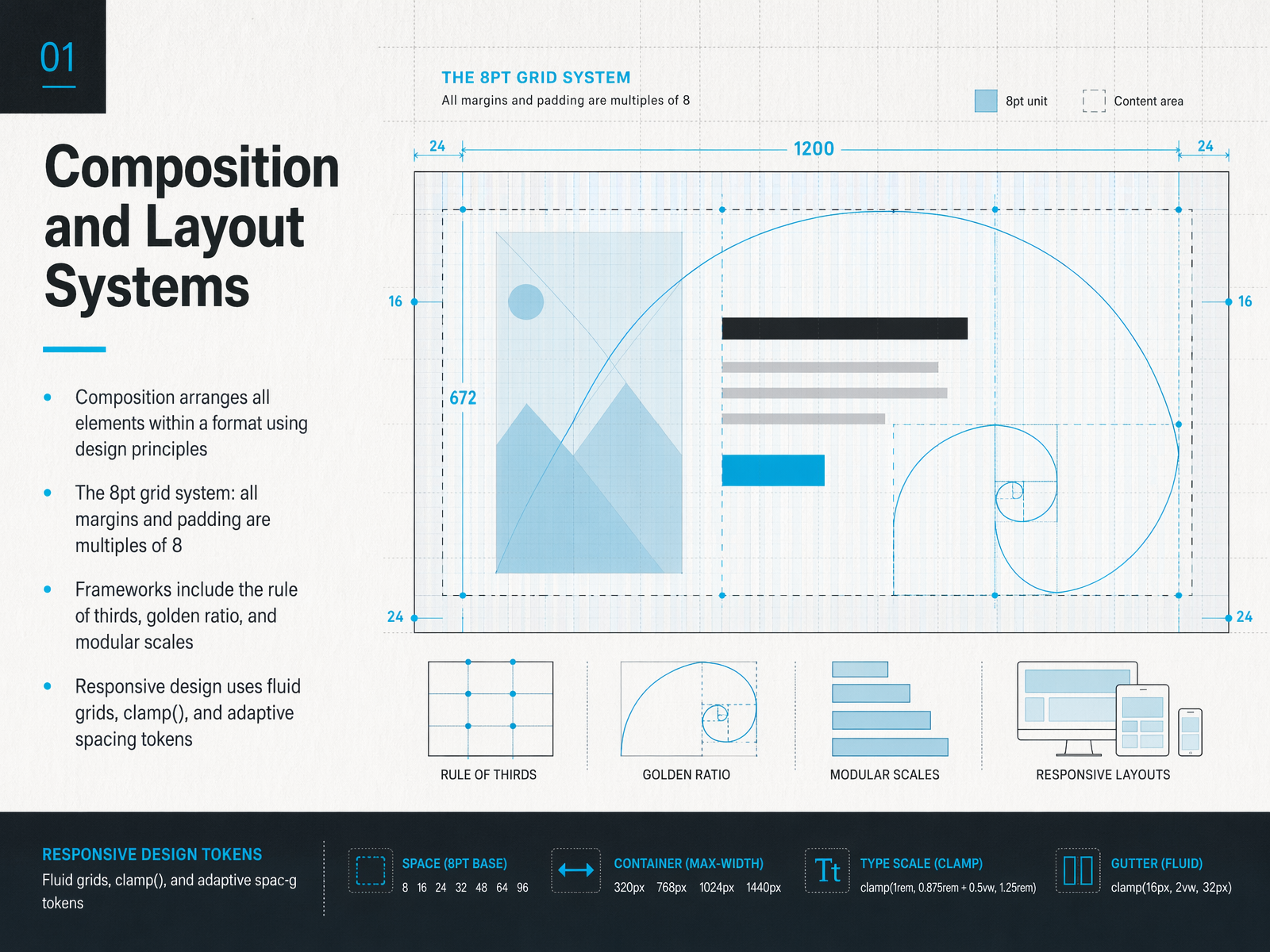
 - 14Composition and Layout SystemsNow, let's bring those principles together into a unified whole. Composition is essentially the art of arranging all elements within your format, using design principles to create a clear, intentional visual path. One practical tool to achieve this is the eight-point grid system. Simply put, all your margins, padding, and spacing should be multiples of eight. This creates a subtle, underlying rhythm that makes your layouts feel cohesive and professional. Beyond the grid, we have classic frameworks like the rule of thirds, the golden ratio, and modular scales—think of these as trusted maps for placing elements and sizing type. And because our work lives on so many different screens, responsive design is no longer optional. This means using fluid grids, modern CSS functions like clamp, and adaptive spacing tokens so your composition breathes and reshapes itself beautifully, from a phone to a large monitor. Next, we'll move from theory to practice and explore designing for real devices and contexts.
 1 min
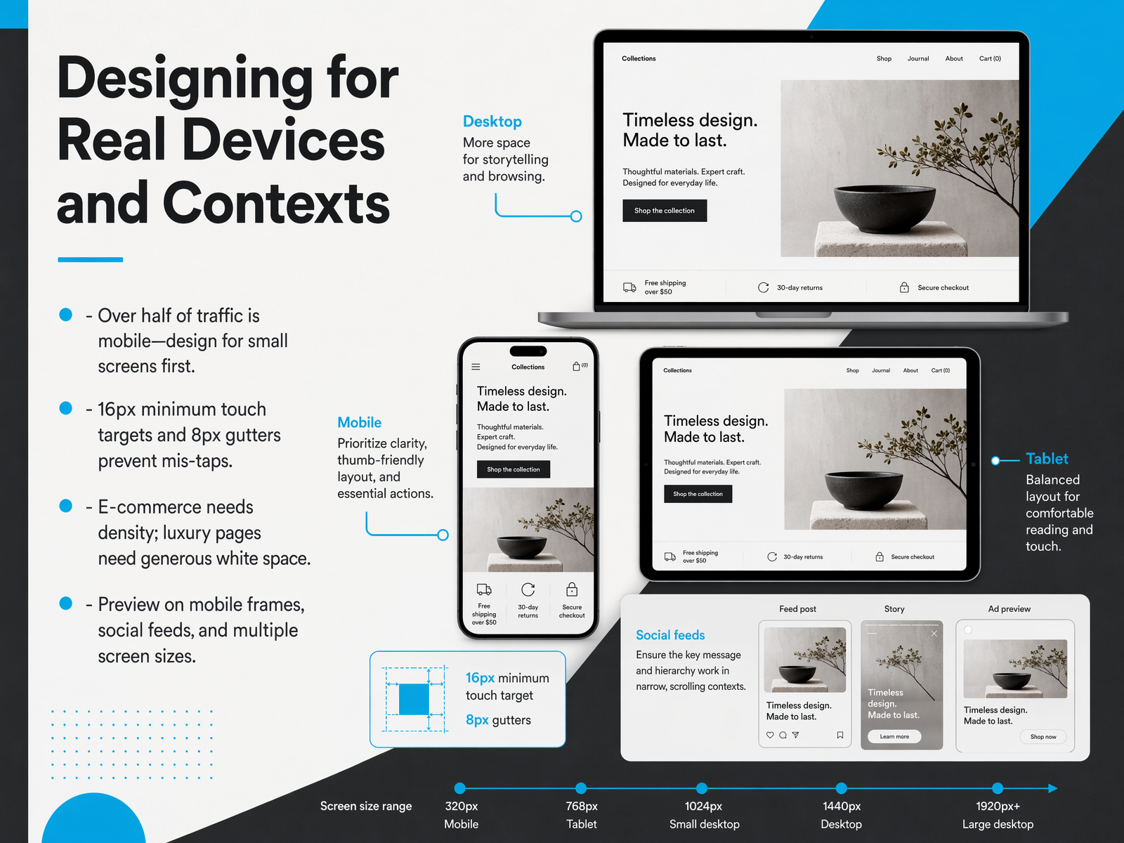
1 min - 15Designing for Real Devices and ContextsNow, let's bring these principles to life on actual screens. Because a beautiful design only works if it's usable where people actually see it. Today, over half of all web traffic comes from mobile devices. So, we need to design for small screens first. This mobile-first approach forces us to prioritize content and make tough, smart choices early. Start with the constraints of a phone, then expand for larger screens. On a practical level, that means respecting the finger. Design your touch targets, like buttons and links, to be at least 16-by-16 pixels, with a minimum of 8 pixels of clear space between them. This simple rule prevents frustrating mis-taps and makes your design feel effortless. Context also dictates density. An e-commerce product grid needs to be dense and information-rich for quick scanning. A luxury brand page, however, needs generous white space to let the product breathe and create a sense of exclusivity. The same design principles apply, but the ratios change. Finally, don't just design in a vacuum. You must preview your work in real contexts. Drop your mockups into a phone frame, see how they look in a social media feed, and test them on multiple screen sizes. What looks perfect on a large desktop monitor might feel cramped or illegible on a phone. Let's now look forward to where these practical skills are taking us, with the trends and movements shaping the design landscape in 2026.
 2 min
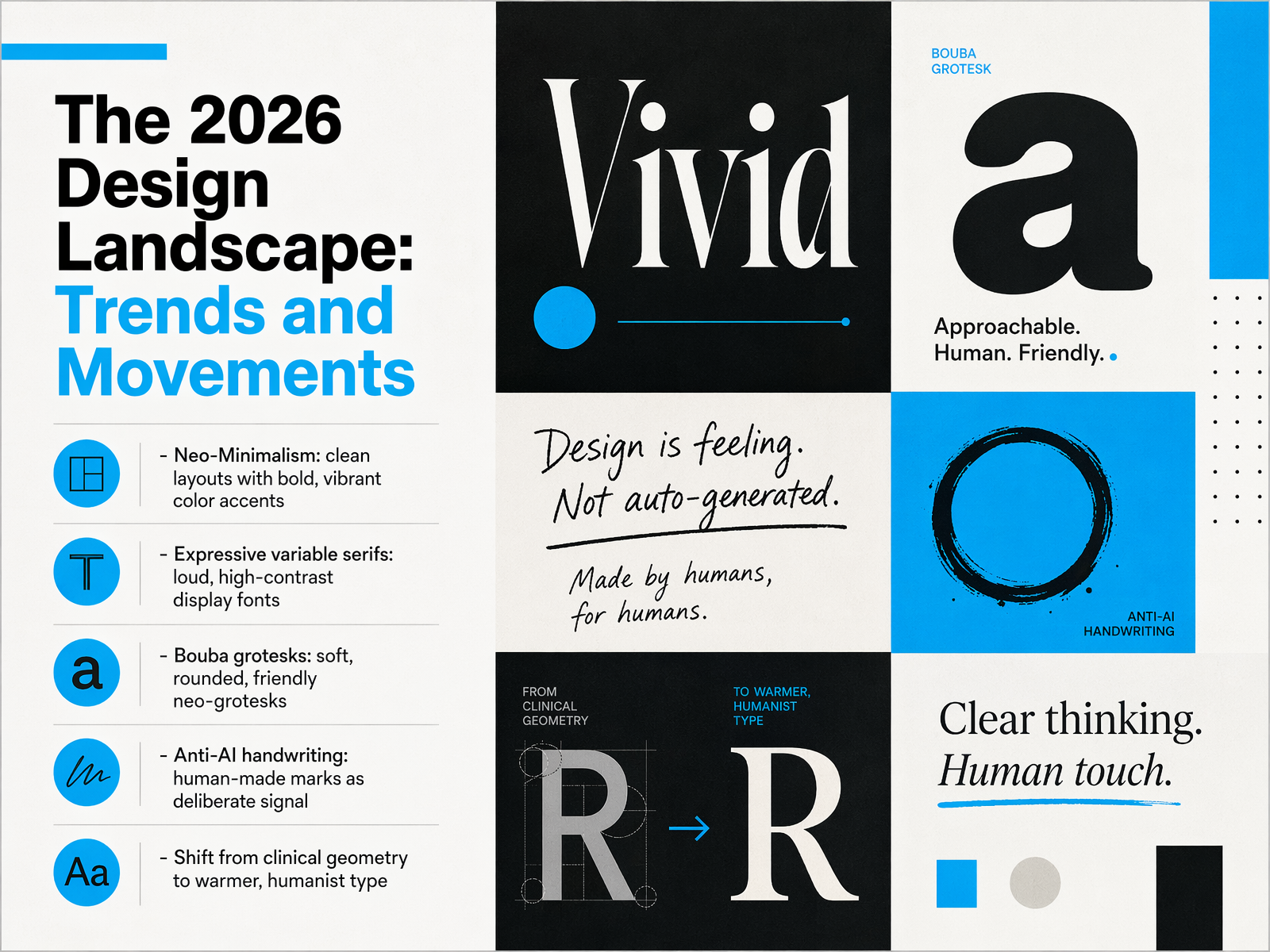
2 min - 16The 2026 Design Landscape: Trends and MovementsNow, let's look ahead at the design landscape taking shape in twenty twenty-six. We are seeing a clear shift away from clinical geometry toward warmer, more humanist expression. One major movement is Neo-Minimalism. This isn't just empty white space; it pairs clean, functional layouts with bold, vibrant color accents to create focus. In typography, expressive variable serifs are making a loud comeback. These high-contrast display fonts command attention. At the same time, we are witnessing the rise of Bouba Grotesks. These are soft, rounded, friendly neo-grotesks that replace cold precision with warmth and approachability. Perhaps the most deliberate trend is Anti-AI handwriting. As synthetic content spreads, a human-made mark becomes a powerful signal of authenticity and craft. Each of these trends is a practical tool for shaping how your audience feels. Next, we will put everything we have learned into practice with a design audit checklist.
 1 min
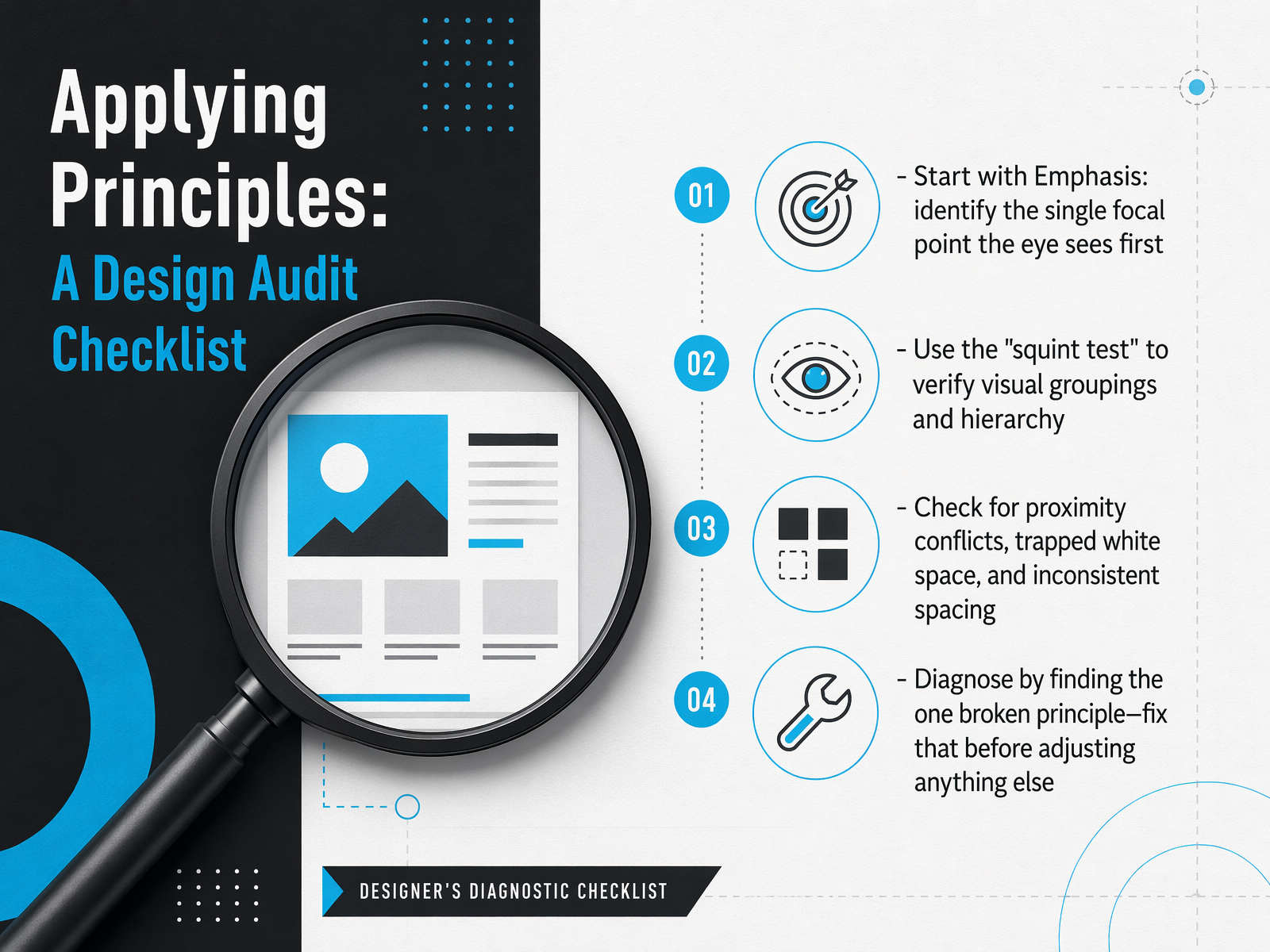
1 min - 17Applying Principles: A Design Audit ChecklistNow let's turn these principles into a practical tool you can use on every project: a design audit checklist. Think of this as a quick diagnostic routine that catches issues before they reach your users. First, start with emphasis. Identify the single focal point your eye sees first when you land on the page. If you can't name it instantly, your hierarchy needs work. Next, use the squint test. Step back and blur your eyes until the details disappear. The clusters that remain reveal your true visual groupings. If related elements don't merge into a clear block, your spacing is not telling the right story. Then, check for proximity conflicts. Look for trapped white space, inconsistent gaps, or labels that float halfway between two fields. Remember, a label must be closer to its own input than to any other element. Finally, diagnose the root cause. Find the one broken principle that is causing the most confusion and fix that first, before adjusting anything else. Often, a single spacing correction will cascade and resolve multiple problems at once. Let's keep this momentum going as we wrap up with our final slide: Next Steps and Resources.
 nngroup.comglow.teamshopify.com+22 min
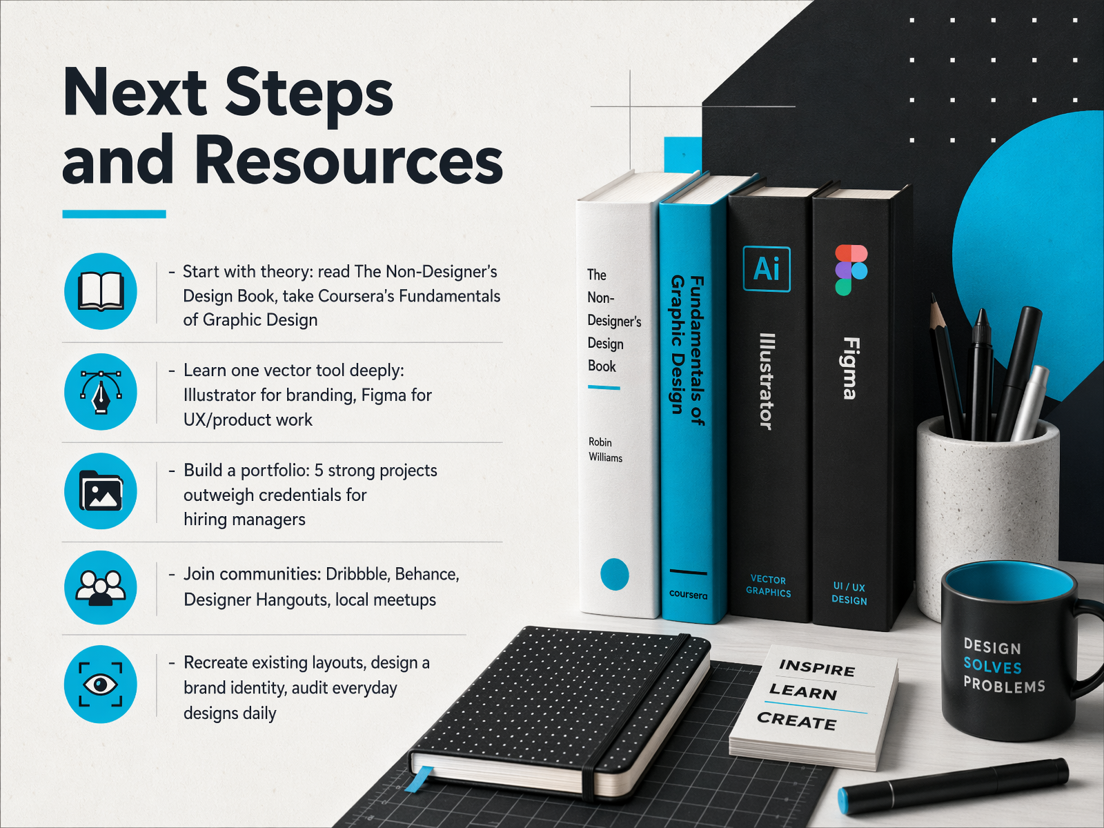
 - 18Next Steps and ResourcesAnd here we are at the final step. But this is really just the beginning of your design practice. Let's talk about how to keep moving forward. First, start with theory. I strongly recommend picking up The Non-Designer's Design Book by Robin Williams. It is a short, powerful read that will transform how you see every layout. Pair that with the Fundamentals of Graphic Design course on Coursera to build a solid conceptual foundation before you even open a piece of software. Next, learn one vector tool deeply. If you are drawn to branding and print, choose Adobe Illustrator. If you are aiming for UX and digital product work, Figma is your best first choice. Don't try to master three tools at once. Build a portfolio of five strong projects. Hiring managers value real work far more than a list of credentials. Join communities like Dribbble, Behance, or local meetups. Share your work, get feedback, and learn from others. Finally, make practice a daily habit. Recreate layouts you admire, design a brand identity from scratch, and audit the design of everyday objects around you. You now have the principles and the path. The only thing left is to start. Thank you for joining me, and I cannot wait to see the incredible work you will create.
 2 min
2 min
Take the deck with you
Download this course as a file — free, no sign-up needed.
- PDF handoutEvery slide page, ready to print or share.19 pages · 4.9 MBDownload
- Narrated PowerPointThe deck that presents itself — every slide carries the digital human's narration video.19 pages · 22.6 MBDownload
- PowerPoint slidesThe full deck as a .pptx — open it in PowerPoint, Keynote, or Google Slides.19 pages · 4.8 MBDownload
Free to use in your own training — please keep the PersonWise credit page at the end.
Have your own deck? Turn it into a course
Sources consulted
Web sources consulted while building this course.
- 13 Principles of Design for 2026, a Visual Guide From Superside — superside.com
- 13 Graphic Design Principles + How To Apply Them | Figma — figma.com
- Basic Design Elements and Principles of Design: A Complete Guide [2026] - by UXPin — uxpin.com
- The 7 Principles of Design Explained (With Real Examples) — 2026 Guide — Digital Polo Blog — digitalpolo.com
- The 12 Principles of Design (With Examples and Infographic) | Toptal® — toptal.com
- What Is Asymmetry in Graphic Design? Explained — designyourway.net
- Symmetry vs. Asymmetry in Design: Types, Examples & How to Choose (2026) | UXPin — uxpin.com
- What is Asymmetrical Balance and How to Use It (+ Examples) — visme.co
- Fragile Pressure by Artemii Lebedev on Muzli — me.muz.li
- Why Asymmetric Two-Column Hero Sections Are Replacing Centered Layouts on B2B Webflow Sites in 2026 | Blog | Pravin Kumar - Webflow Developer — pravinkumar.co
- Understanding Success Criterion 1.4.3: Contrast (Minimum) | WAI | W3C — w3.org
- Web Content Accessibility Guidelines (WCAG) 2.2 — w3.org
- Understanding Success Criterion 1.4.6: Contrast (Enhanced) | WAI | W3C — w3.org
- WCAG 2.2 Color Accessibility: The Complete 2026 Developer & Designer Guide | Chroma Creator | Chroma Creator — chromacreator.com
- WCAG 2026: A Complete Accessibility Compliance Guide for Designers and Developers | Lucky Graphics | Lucky Graphics — lucky.graphics
- Proximity Principle in Visual Design - NN/G — nngroup.com
- Proximity Principle of Design: The Complete Guide (2026) — glow.team
- Law of Proximity in Web Design: Ecommerce Tips + Examples (2026) - Shopify — shopify.com
- The Law of Proximity — ixdf.org
- Laws of Proximity in UX: Gestalt Principle + Practical UI Examples — markbuskbjerg.dk