Begin
16 pages · ~32 min
Accessible Digital Documents
Training on creating accessible digital documents, covering key standards and techniques for inclusive content design.
A digital instructor presents all 16 pages. Hold “Ask” at any point and ask out loud — the answer comes from this course. No sign-up needed.
What you’ll learn
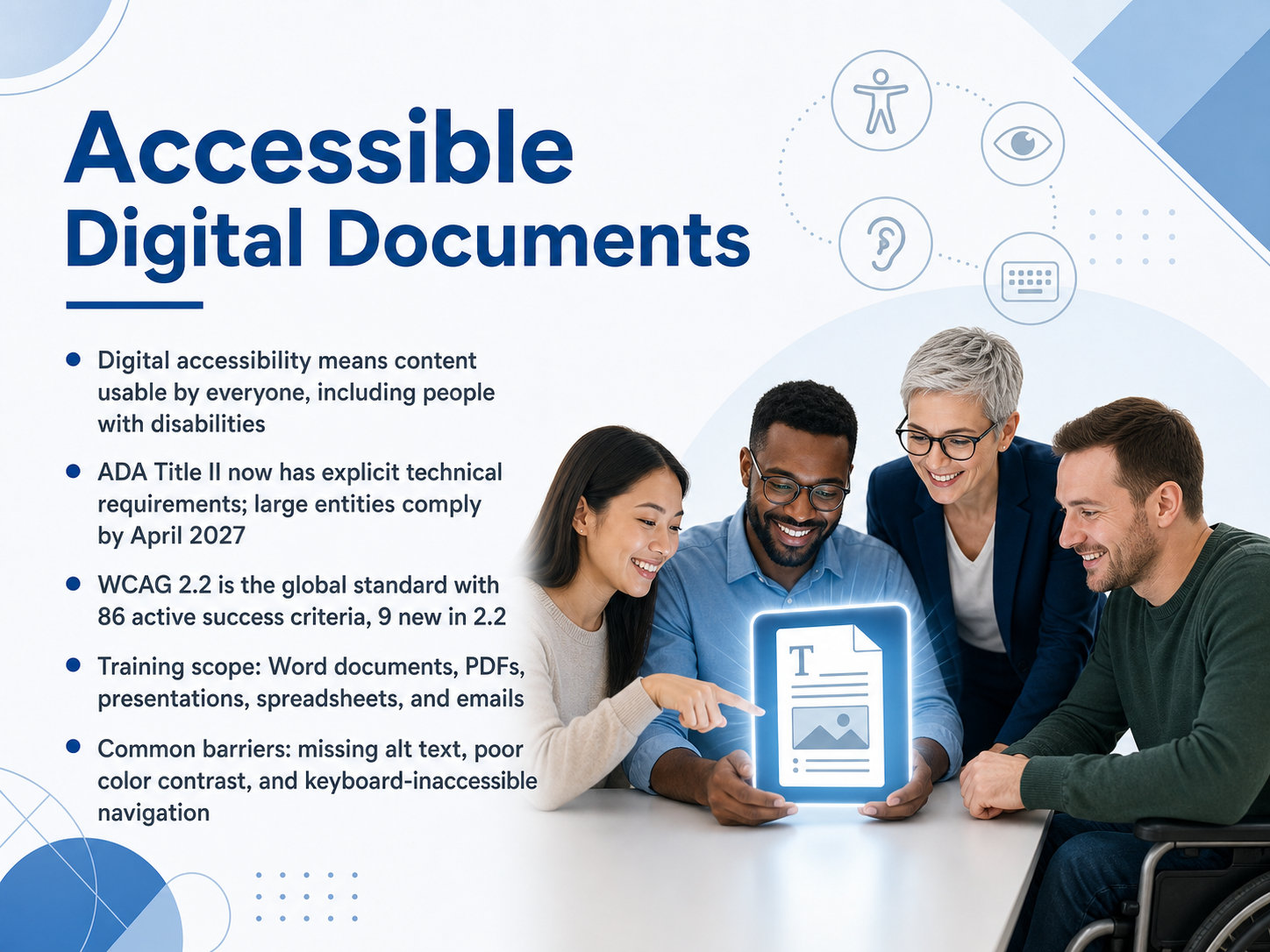
- 01Accessible Digital DocumentsWelcome. I am glad you are here. Today, we are going to focus on accessible digital documents. The goal is straightforward: to help you create content that everyone can use, including people with disabilities. Let us start by framing what digital accessibility really means. It means your documents, your presentations, your spreadsheets, and your emails are designed so that people who are blind, have low vision, or have limited mobility can access them just as effectively as anyone else. This is not just a good practice. Under the Americans with Disabilities Act, Title Two now has explicit technical requirements. Large public entities must comply by April twenty-seventh, twenty twenty-seven. The technical standard that underpins this is the Web Content Accessibility Guidelines, version two point two. It contains eighty-six active success criteria, with nine new ones added in this latest version. Throughout this training, we will cover Word documents, PDFs, presentations, spreadsheets, and emails. We will also address the most common barriers that block users. These include missing alternative text for images, poor color contrast that makes text hard to read, and navigation that cannot be operated with a keyboard. By the end of this course, you will know how to spot these barriers and fix them. Let us begin by looking at the bigger picture. In the next slide, we will explore the business case and the legal landscape.w3.orgw3.orgmeetaandi.com+22 min
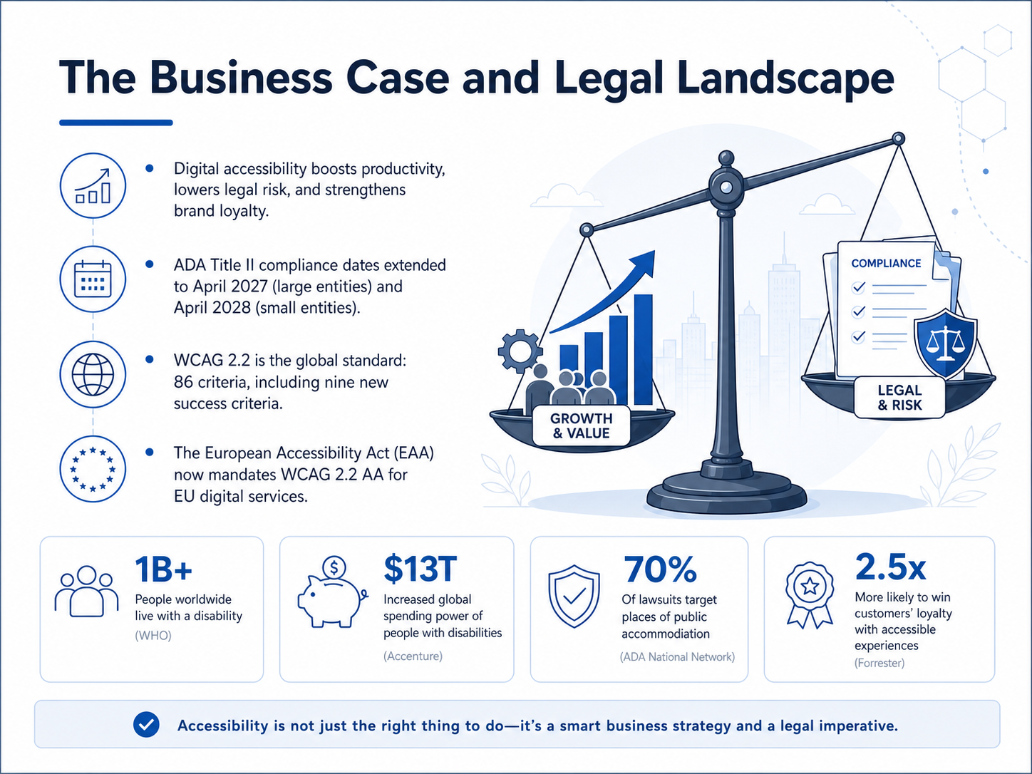
- 02The Business Case and Legal LandscapeLet's look at the business case and the legal landscape driving digital accessibility. First, accessibility isn't just about compliance. It boosts productivity, lowers your legal risk, and strengthens brand loyalty. On the legal side, the Department of Justice has extended the compliance dates for ADA Title Two. Large public entities now have until April twenty-sixth, twenty twenty-seven, while smaller entities and special districts have until April twenty-sixth, twenty twenty-eight. The global standard for accessibility is WCAG, version two point two. It contains eighty-six criteria, including nine new success criteria. And it's not just the U.S. The European Accessibility Act now mandates WCAG two point two Level AA for digital services across the European Union. So whether you're looking at it from a risk, reputation, or regulatory perspective, the case for action is clear. Next, we'll explore who we're designing for, covering disabilities and assistive technologies.
 ada.govada.govada.gov+21 min
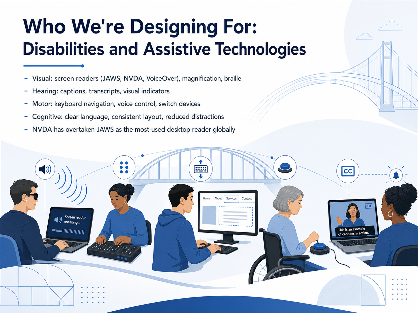
 - 03Who We're Designing For: Disabilities and Assistive TechnologiesNow, let's talk about who we're designing for. Accessibility isn't a single setting; it's a spectrum of tools and needs. For visual disabilities, people often use screen readers like JAWS, NVDA, or VoiceOver, as well as magnification software or braille displays. In fact, NVDA has recently overtaken JAWS as the most-used desktop screen reader globally, though JAWS remains very common in enterprise workplaces. For hearing disabilities, we rely on captions, transcripts, and visual indicators instead of sound. For motor disabilities, users might navigate entirely by keyboard, voice control, or switch devices. And for cognitive disabilities, we focus on clear language, consistent layouts, and reducing distractions. Understanding these tools helps us build documents that truly work for everyone. Next, we'll explore the POUR Principles for Document Design to put these concepts into action.
 doi.orgwebaim.orgblind.msstate.edu+21 min
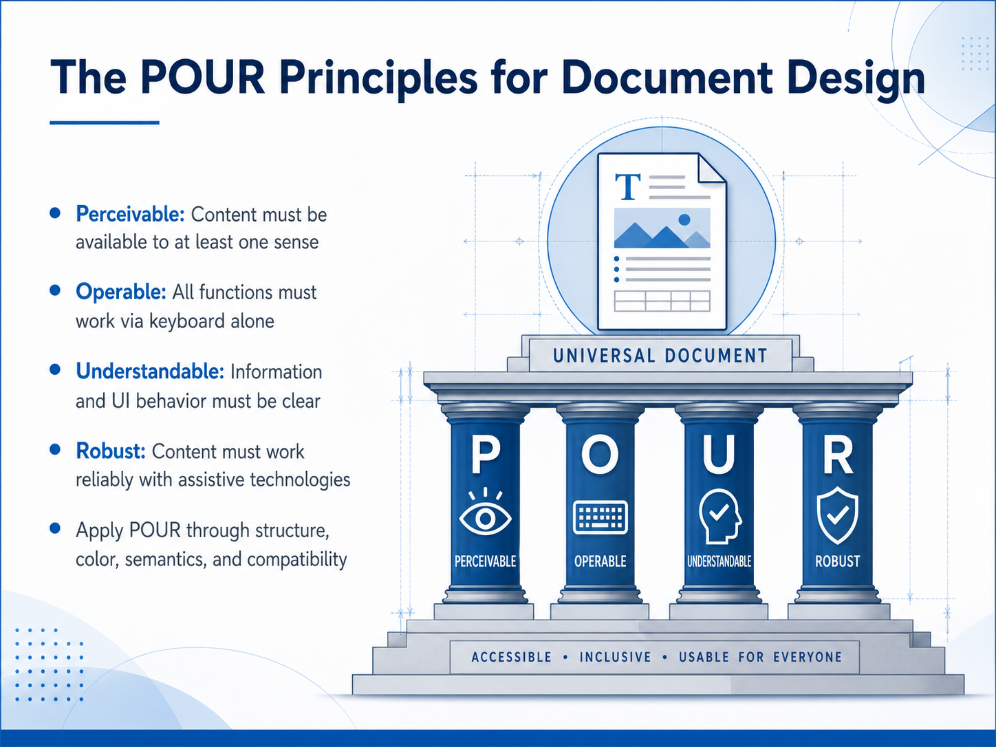
 - 04The POUR Principles for Document DesignNow let's look at the four core principles that guide all accessible document design—the POUR principles. POUR stands for Perceivable, Operable, Understandable, and Robust. Think of them as the foundation you'll build on.
First, Perceivable. Content must be available to at least one sense. That means if someone can't see an image, they need a text alternative they can hear or feel with a braille display.
Second, Operable. Every function must work using only a keyboard. Not everyone can use a mouse, so navigation, links, and form controls must be fully reachable and usable without one.
Third, Understandable. Information and the way the interface behaves must be clear. Use plain language, consistent labels, and predictable layouts so users don't get lost or confused.
Finally, Robust. Your content must work reliably with current and future assistive technologies. That means using proper structure, semantic tags, and following standards so screen readers and other tools can interpret the document correctly.
You apply these POUR principles through four practical areas: structure, color, semantics, and compatibility. When you get these right, you make your documents perceivable, operable, understandable, and robust for everyone.
Next, we'll put these principles into practice by building a solid structure with headings, lists, and tables.
 w3.orgw3.orgmeetaandi.com+22 min
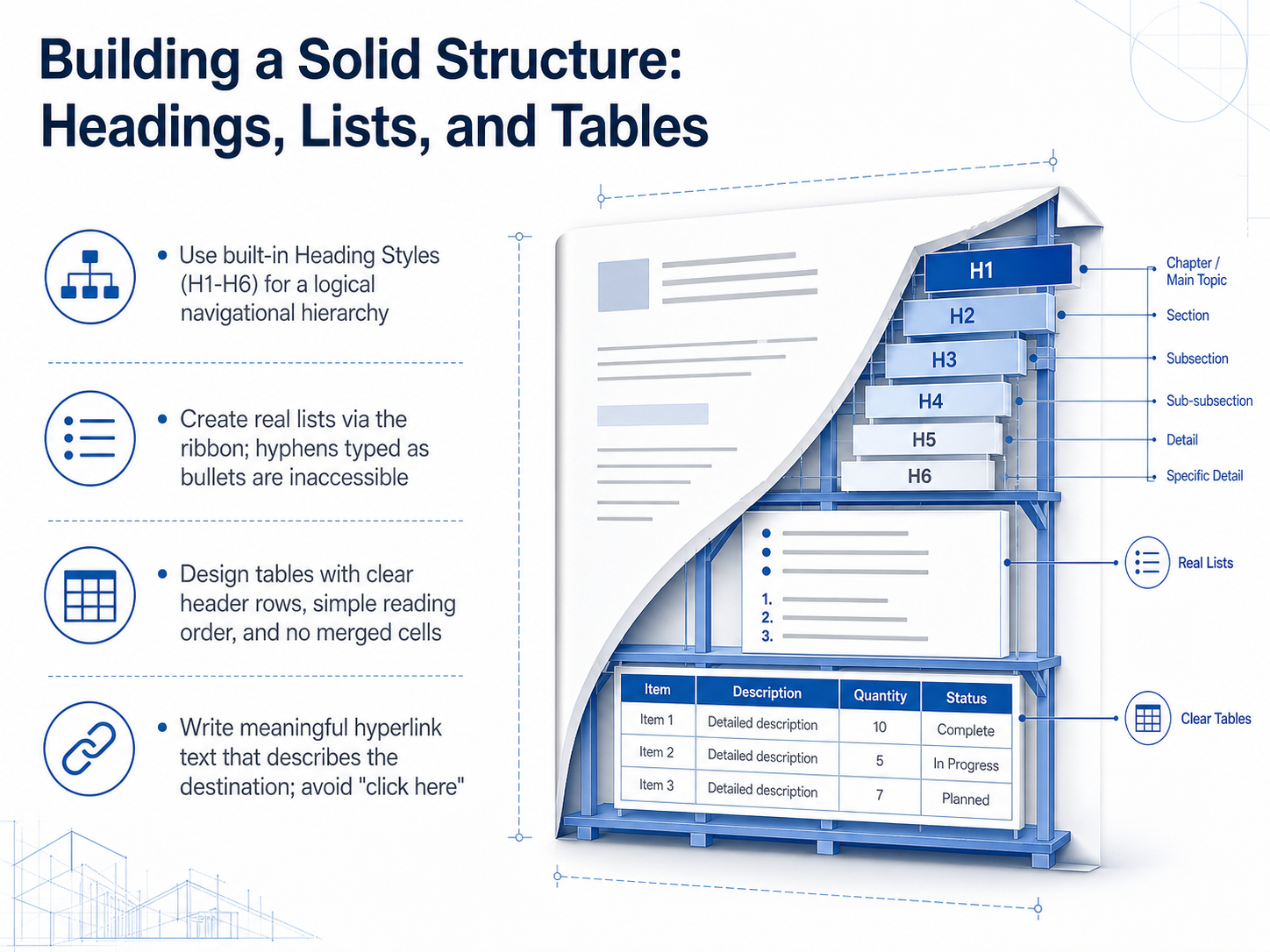
 - 05Building a Solid Structure: Headings, Lists, and TablesNow, let's move from the big picture into building a solid structure. This slide is all about three core elements: headings, lists, and tables. Think of these as the skeleton that gives your document shape and makes it navigable for everyone. First, use the built-in heading styles, from Heading 1 down to Heading 6, found on the Home tab. This creates a logical hierarchy, like a clickable table of contents, that lets screen reader users jump directly to the section they need. Please don't just make text bigger and bolder; the software needs those real styles. Next, for lists, always use the bullet or number buttons on the ribbon. If you type a hyphen and a space, it may look like a bullet point, but a screen reader just hears it as a paragraph with a dash. It's not recognized as a list, and that crucial structure is lost. For tables, keep them simple. Use a clear header row, maintain a left-to-right, top-to-bottom reading order, and avoid merging or splitting cells. Complex layouts can scramble the reading order for assistive technology. Finally, when you add a hyperlink, write meaningful text that describes the destination. Full web addresses and 'click here' are confusing out of context, especially when a screen reader pulls up a list of all the links in your document. Let's apply these structural rules next, and then we'll explore how to use color and sensory characteristics responsibly.
 support.microsoft.com508blueprint.comtheaccessibilityguy.com+22 min
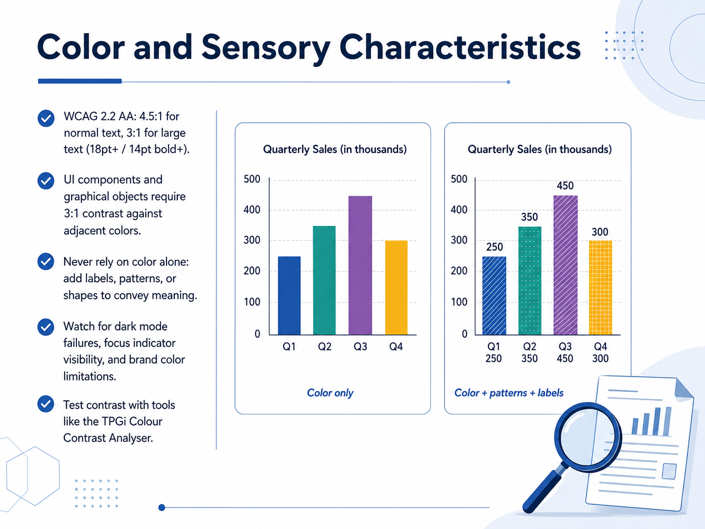
 - 06Color and Sensory CharacteristicsNow let's talk about color and sensory characteristics. This is where we make sure that information is perceivable by everyone, regardless of how they see color. First, contrast ratios. WCAG level AA requires a contrast ratio of at least four point five to one for normal text. For large text, which is eighteen point regular or fourteen point bold and above, the minimum is three to one. User interface components and meaningful graphical objects also need a three to one contrast ratio against adjacent colors. This applies to button borders, form inputs, icons, and chart elements. A critical rule is to never rely on color alone to convey meaning. Always add a secondary cue, like a text label, a pattern, or an icon. Additionally, watch out for dark mode. Your colors might work on a light background but fail on a dark one. Also verify that focus indicators are clearly visible and check whether your brand palette meets these thresholds. A reliable tool for testing is the TPGi Colour Contrast Analyser. It removes the guesswork. Up next, we'll apply these principles to writing effective alternative text for images.
 w3.org2 min
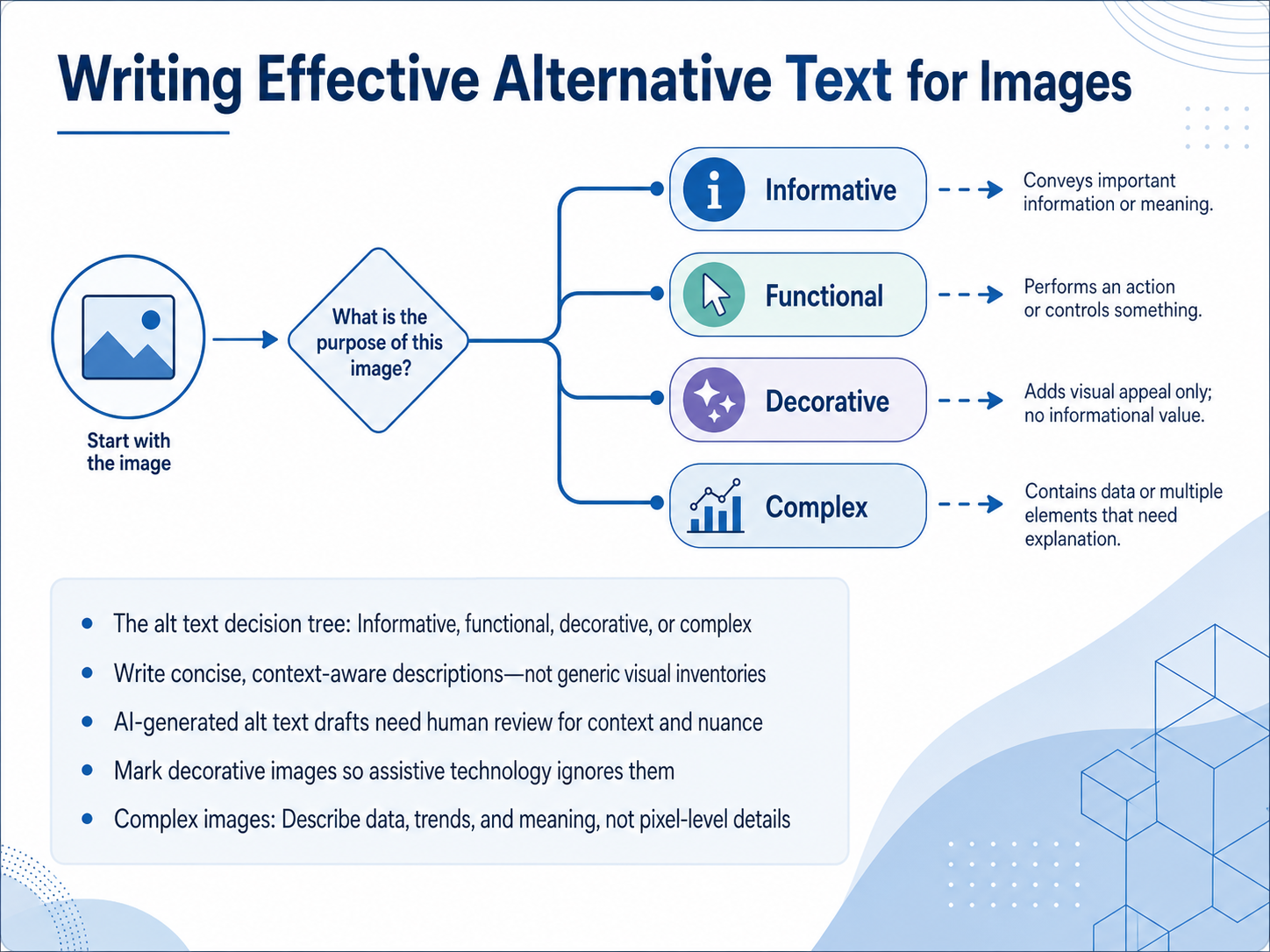
 - 07Writing Effective Alternative Text for ImagesLet's move into one of the most hands-on skills you'll build: writing effective alternative text, or alt text. The first step is to figure out what kind of image you're dealing with. Use a simple decision tree. Is the image informative, like a photo that adds meaning? Is it functional, like a button or link? Is it purely decorative? Or is it complex, like a chart or infographic? That category shapes everything you write next. For informative and functional images, aim for concise, context-aware descriptions. Don't just list what you see; explain the image's purpose on the page. AI tools can now draft alt text for you, and that's a great time-saver. But you must review those drafts. Research in 2026 shows that AI often misses cultural context, invents details, or describes what is visible instead of what the image means. Always verify the output. For decorative images, like a background gradient or a stock photo that adds no real information, mark them properly so screen readers skip them. That silence is golden. It reduces cognitive load for your users. When you face a complex image, like a bar chart or a diagram, do not describe every pixel. Focus on the data, the trends, and the key takeaway. State the meaning, not the visual inventory. Up next, we'll apply these skills directly to everyday documents as we cover creating accessible Microsoft Word documents.
 2 min
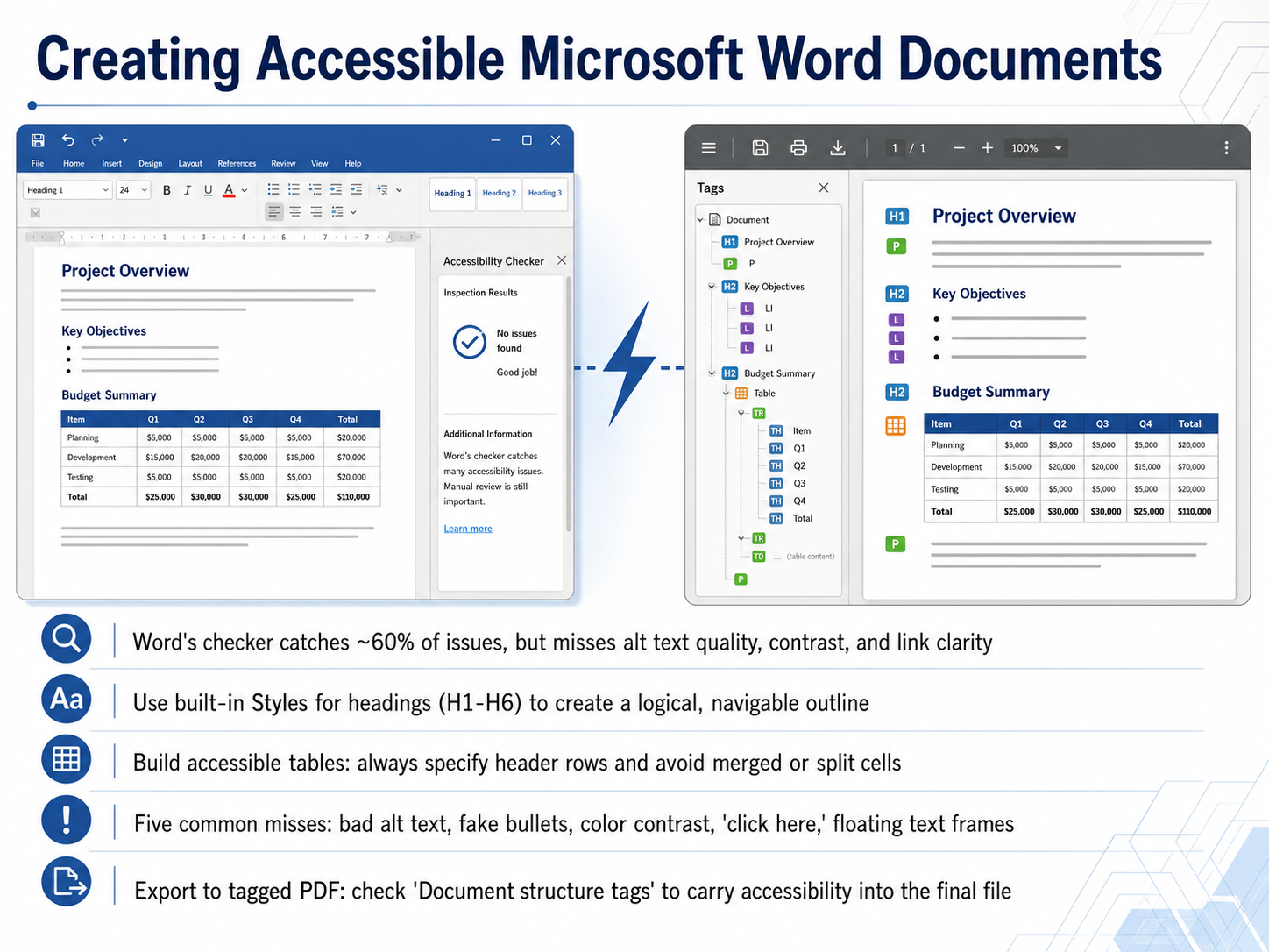
2 min - 08Creating Accessible Microsoft Word DocumentsNow let's turn to creating accessible Microsoft Word documents. Word's built-in checker is a great starting point, but it only catches about 60 percent of issues. It misses things like alt text quality, color contrast, and link clarity. So think of it as your floor, not your ceiling. First, use the built-in Styles to create real headings, from Heading 1 down to Heading 6. This builds a logical, navigable outline for screen readers. For tables, always specify a header row and avoid merging or splitting cells. There are five common misses the checker won't flag: bad auto-generated alt text, fake bullets typed with hyphens, low color contrast, vague 'click here' links, and floating text frames that break reading order. When you're ready to export, save as PDF and check the option for 'Document structure tags.' This carries your accessibility work into the final file. Coming up next, let's explore PDF accessibility and remediation essentials.
 support.microsoft.com508blueprint.comtheaccessibilityguy.com+22 min
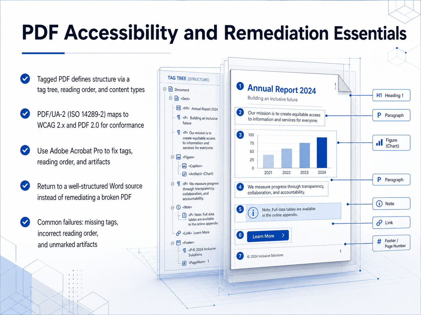
 - 09PDF Accessibility and Remediation EssentialsNow let's focus on the essentials of PDF accessibility and remediation. At the heart of an accessible PDF is what's called a Tagged PDF. This defines the document's structure using a tag tree, which establishes the proper reading order and identifies content types like headings, paragraphs, and lists. The latest standard you need to know is PDF slash U A dash two, also known as ISO 14289 dash two. This standard maps directly to W C A G two point x and is designed for PDF 2.0 files, ensuring your documents meet modern conformance requirements. When you need to fix accessibility issues, Adobe Acrobat Pro is the primary tool for repairing tags, reordering content, and correctly marking decorative elements as artifacts. However, here's a critical best practice: if you receive a poorly constructed PDF, your most efficient path is often to return to a well-structured source document, like Microsoft Word, and re-export a properly tagged PDF. Common failures to watch for include missing tags entirely, an incorrect reading order that confuses screen readers, and unmarked artifacts that clutter the content stream. Remember, fixing the source is almost always faster than extensive remediation of a broken PDF. Next, we'll apply these structural principles to accessible presentations in PowerPoint and Google Slides.
 2 min
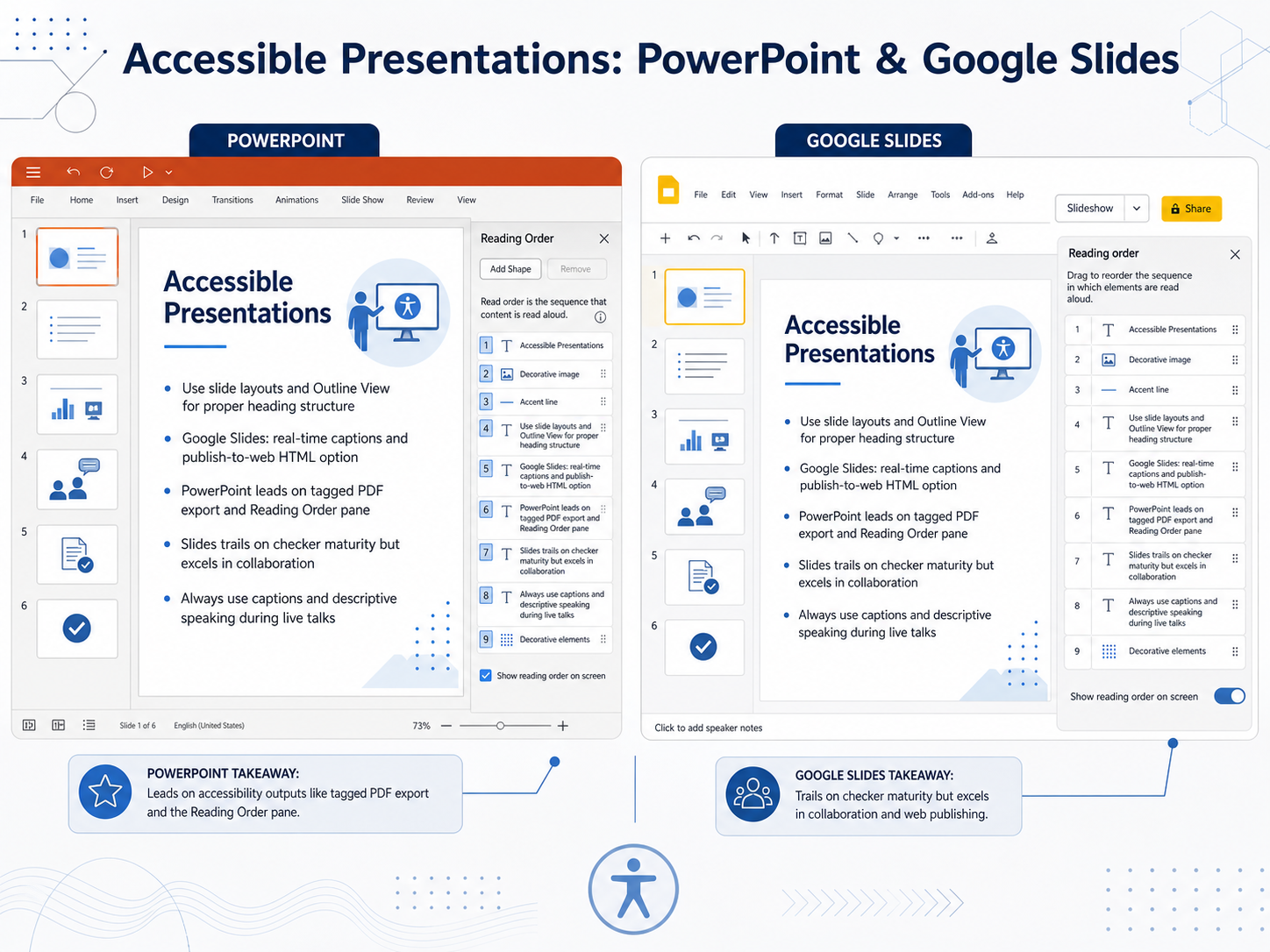
2 min - 10Accessible Presentations: PowerPoint & Google SlidesNow let's compare two of the most popular presentation tools, PowerPoint and Google Slides, and see how to use them accessibly. The most important step in either platform is to always use the built-in slide layouts. This ensures a proper heading structure when you use the Outline View. For live presentations, Google Slides offers excellent real-time captions, and its publish-to-web option creates a clean, single-page HTML version that many screen reader users find easier to navigate. On the other hand, Microsoft PowerPoint is the leader when you need to export a fully tagged PDF. It also provides a dedicated Reading Order Pane, which lets you fix the reading sequence on complex slides—a powerful tool that Google Slides currently lacks. While Google's collaboration features are fantastic, their built-in checker is more basic. Your real secret weapon for accessibility happens during your live talk. Always use captions, and practice descriptive speaking. Instead of saying 'as you can see here,' say 'as you can see in this chart, sales increased by twenty percent.' That's the easiest way to make your live presentation inclusive for everyone. Next, we'll apply these principles to structured data in our session on accessible spreadsheets.
 2 min
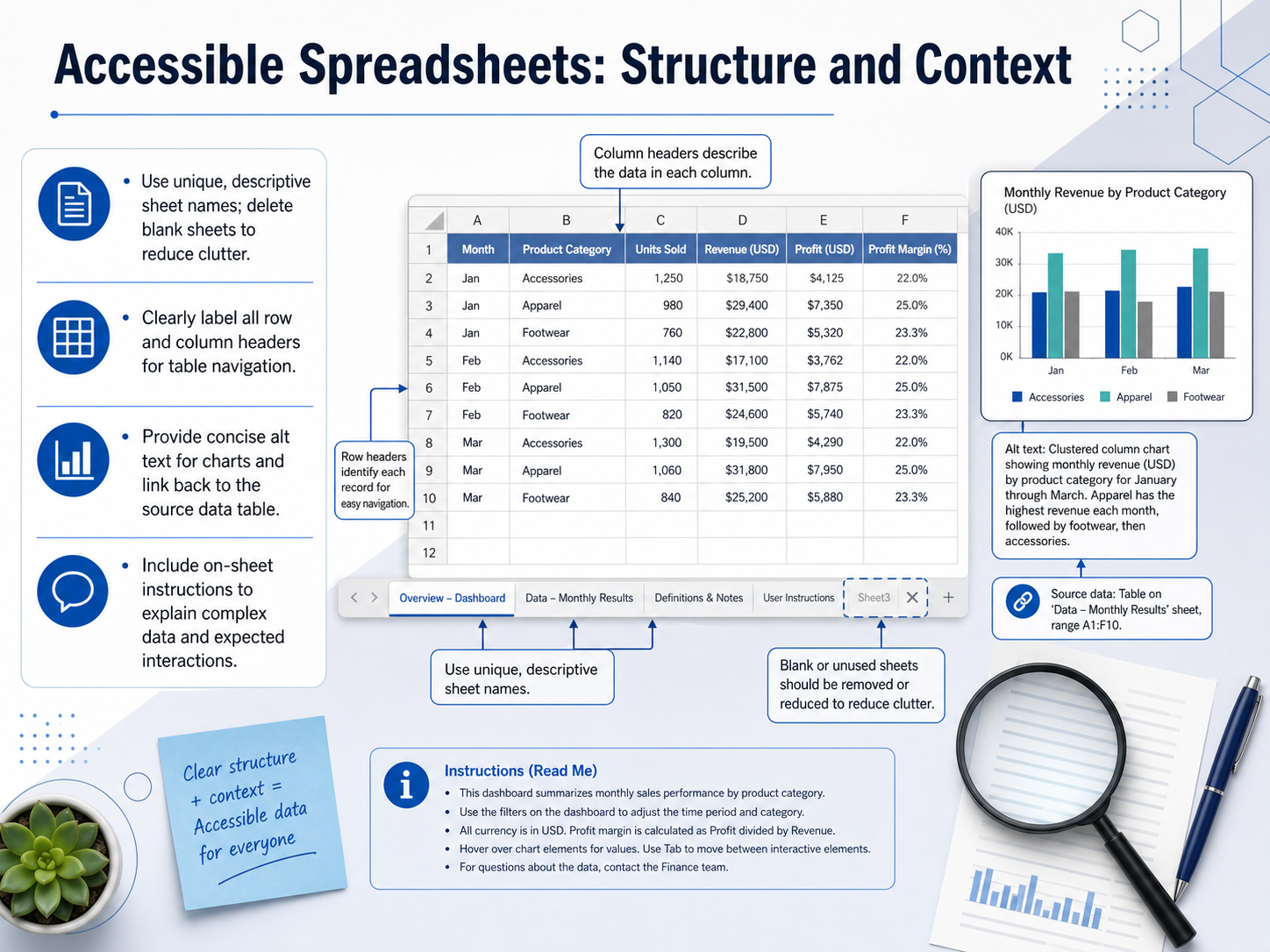
2 min - 11Accessible Spreadsheets: Structure and ContextNow let's talk about building accessible spreadsheets with clear structure and context. First, give every sheet a unique, descriptive name, and delete any blank sheets to keep the workbook clean. Next, clearly label all row and column headers. This helps screen readers announce the structure so users can navigate tables easily. For any charts or graphs, write concise alt text that explains the key takeaway, and include a link back to the source data table so users can explore the numbers directly. Finally, add on-sheet instructions to explain complex data, formulas, or expected interactions. A simple note at the top of the sheet can make a huge difference for everyone. Up next, we'll apply similar principles to accessible email communications.
 support.microsoft.com508blueprint.comtheaccessibilityguy.com+21 min
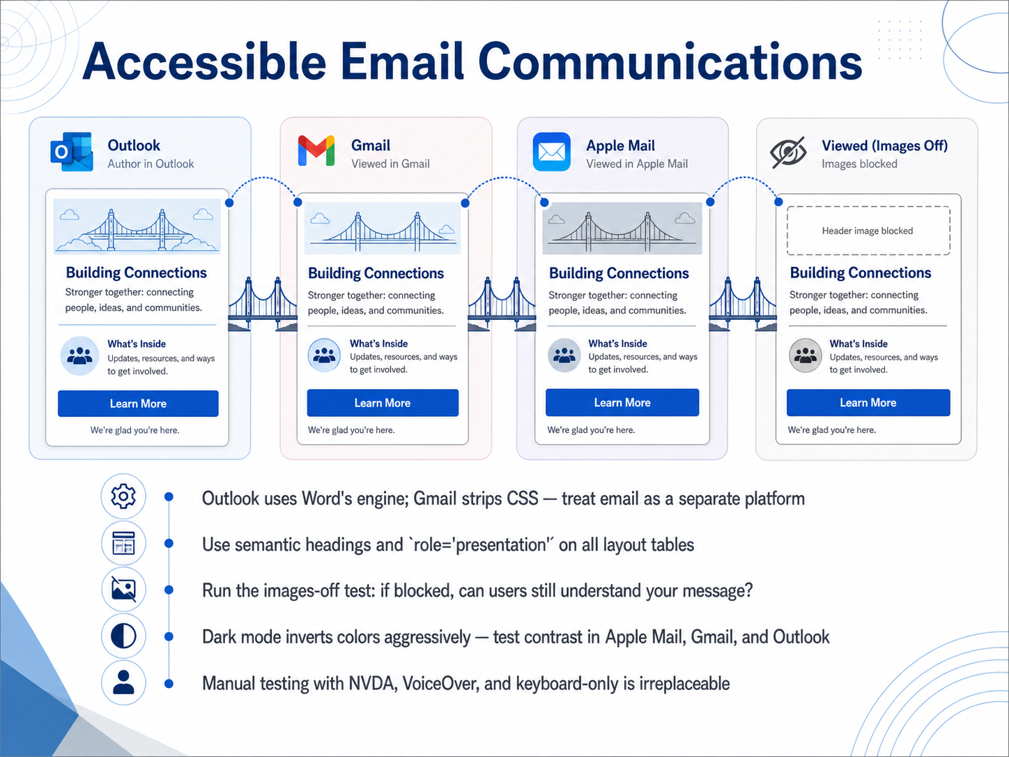
 - 12Accessible Email CommunicationsNow let's shift our focus to a form of communication we use every day: email. When it comes to accessibility, you cannot treat email like a mini web page. The platforms are completely different. Outlook on Windows uses Microsoft Word's rendering engine, which has poor support for modern CSS. Gmail often strips out style blocks and aggressively inverts colors in dark mode. Because of these quirks, you need to build emails as their own platform. Start with a solid semantic structure. Use real heading tags like H one and H two so screen reader users can jump between sections. Just as importantly, apply the role equals presentation attribute to every single layout table. Without it, screen readers will announce the table boundaries, which creates constant audio clutter. Next, run the images-off test. Go to your email client settings and block all images. If the message still makes sense and the user can act on it, you've passed. If all you see are blank rectangles, you need more live text. Finally, we must tackle dark mode. Outlook, Apple Mail, and Gmail can partially or fully invert your colors. A white logo on a transparent background might simply disappear. Always test your contrast in multiple clients and consider using the prefers-color-scheme media query for the apps that support it. But remember, automated tools cannot do this for you. Manual testing with a screen reader like NVDA, VoiceOver, and with your keyboard only—is irreplaceable. You need to hear the experience firsthand. Now, let's build on these manual testing skills and move into our next topic: Testing and Auditing, Beyond the Automated Checker.
 2 min
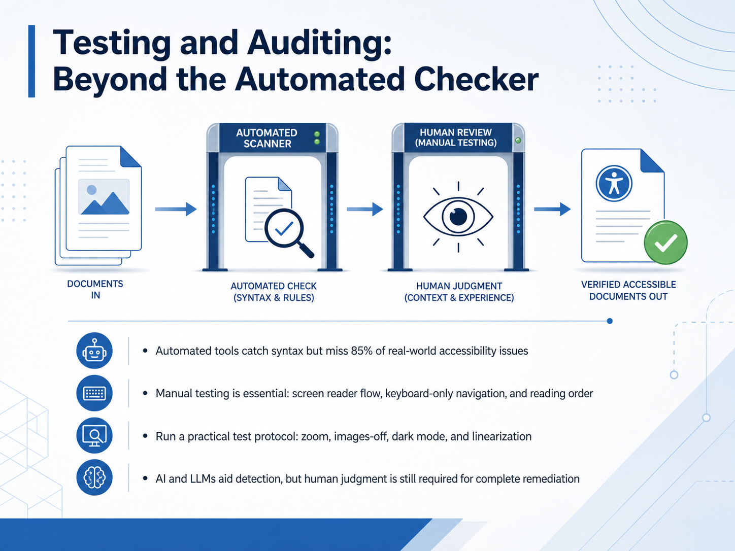
2 min - 13Testing and Auditing: Beyond the Automated CheckerNow let's talk about testing beyond the automated checkers. Accessibility scanning tools are a great starting point, but they only catch about 15 percent of real-world issues. That means you can get a clean report and still have a document that is impossible for many people to use. Manual testing is essential. That means navigating with a screen reader, moving through the entire file using only the keyboard, and checking the reading order. I also recommend a practical protocol: zoom to 200 percent, turn off images, switch to dark mode, and linearize the content. These steps reveal problems that automated tools simply cannot see. AI and large language models are improving detection, especially for semantic issues, but research shows they still require human judgment for complete remediation. So use AI as a copilot, not a replacement. Always verify with your own eyes and assistive technology. Next, we will integrate these practices into your daily workflow.
 2 min
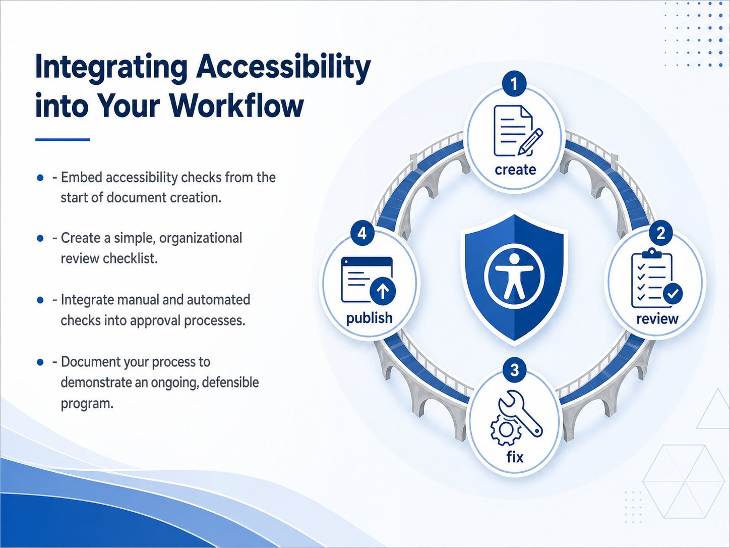
2 min - 14Integrating Accessibility into Your WorkflowNow let's talk about how to weave accessibility directly into your daily workflow. Making your documents accessible shouldn't be a final, separate step. Instead, embed accessibility checks from the very start of document creation. For example, use built-in styles for headings right away, not just before you publish. Next, create a simple, organizational review checklist. This helps your team consistently verify key items like color contrast, alt text, and logical reading order. Then, integrate both manual and automated checks into your approval processes. An automated tool can flag missing headings, but a person still needs to verify the alt text is truly descriptive. Combining these methods creates a stronger safety net. Finally, document your entire process. Keep records of your checklists, audit results, and the steps you take to fix issues. This documentation demonstrates an ongoing, defensible program, which is essential for long-term compliance. Let's look next at how we can build on this foundation to create an accessibility-first culture.
 ada.govada.govada.gov+22 min
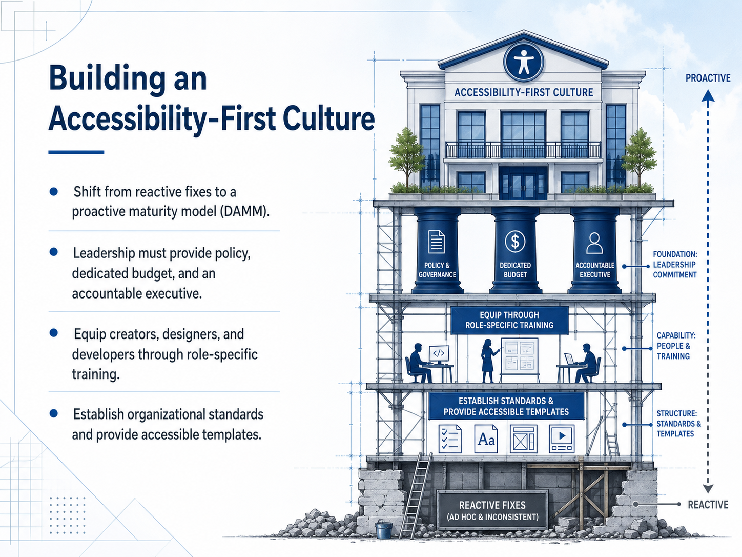
 - 15Building an Accessibility-First CultureNow, let's look at how to turn these practices into a lasting, organization-wide effort. This is about building an accessibility-first culture. The first step is shifting from reactive fixes to a proactive maturity model. Frameworks like the W3C's Accessibility Maturity Model, or Deque's DAMM, help you measure where you are and plan a clear path forward. This shift requires leadership. Executives must provide a clear policy, a dedicated budget, and an accountable person to drive the program. Without this, accessibility efforts often stall. Next, you need to equip your people. Provide role-specific training for creators, designers, and developers. When everyone knows their part, accessibility becomes part of the daily workflow, not a specialist task. Finally, establish organizational standards and give your teams accessible templates. This makes the right choice the easy choice, baking compliance into every document from the start. As you build this culture, the next step is to put these ideas into a concrete plan. Let's move on to our Action Plan and Next Steps.
 2 min
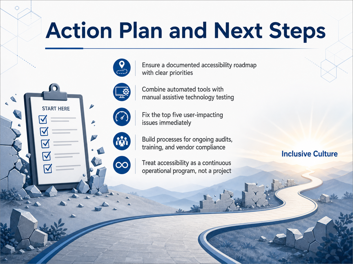
2 min - 16Action Plan and Next StepsLet's bring everything together into a clear action plan. First, make sure you have a documented accessibility roadmap with clear priorities. This isn't just a list of fixes; it's a strategic plan that shows what you're tackling, when, and why. Second, combine automated tools with manual assistive technology testing. Automated scans are fast, but they only catch a fraction of the issues. Real user testing with screen readers and keyboards finds the barriers that truly impact people. Third, fix the top five user-impacting issues immediately. Focus on the problems that block people from completing essential tasks, like applying for benefits or paying a bill. Fourth, build processes for ongoing audits, training, and vendor compliance. Accessibility is not a one-time fix; your digital content changes, and your team needs regular skill-building. Finally, and most importantly, treat accessibility as a continuous operational program, not a project. The deadline extension gives you a realistic window to build sustainable infrastructure, not a reason to delay. Thank you for investing this time to make digital services more inclusive. The work you do today creates a more equitable experience for everyone, and that is a goal worth pursuing every single day.
 ada.govada.govada.gov+22 min
Take the deck with you
Download this course as a file — free, no sign-up needed.
- PDF handoutEvery slide page, ready to print or share.17 pages · 4.3 MBDownload
- Narrated PowerPointThe deck that presents itself — every slide carries the digital human's narration video.17 pages · 19.1 MBDownload
- PowerPoint slidesThe full deck as a .pptx — open it in PowerPoint, Keynote, or Google Slides.17 pages · 4.2 MBDownload
Free to use in your own training — please keep the PersonWise credit page at the end.
Have your own deck? Turn it into a course
Sources consulted
Web sources consulted while building this course.
- What's New in WCAG 2.2 | Web Accessibility Initiative (WAI) - W3C — w3.org
- How to Meet WCAG (Quickref Reference) — w3.org
- WCAG 2.0 vs 2.1 vs 2.2 - How is it different for documents? — meetaandi.com
- Web Content Accessibility Guidelines (WCAG) 2.2 - W3C — w3.org
- WCAG 2.2 Success Criteria | Plain-English Guide — callingallminds.com
- Extension of Compliance Dates for Nondiscrimination on the Basis of Disability; Accessibility of Web Information and Services of State and Local Government Entities — ada.gov
- State and Local Governments: First Steps Toward Complying with the Americans with Disabilities Act Title II Web and Mobile Application Accessibility Rule | ADA.gov — ada.gov
- Accessibility of Web Content and Mobile Apps Provided by State and Local Government Entities: A Small Entity Compliance Guide | ADA.gov — ada.gov
- DOJ Extends Public Entities’ Compliance Deadline for ADA-Related Website Accessibility, But HHS’s May 2026 Deadline Still Looms - Jackson Lewis — jacksonlewis.com
- ADA Title II Compliance Extended to 2027 — blog.usablenet.com
- Is one enough? Screen reader use among employed people who are blind or have low vision in the U.S. — doi.org
- WebAIM: Screen Reader User Survey #10 Results — webaim.org
- Is one enough? Screen reader use among employed people who are blind or have low vision in the U.S. — blind.msstate.edu
- Screen Reader Usage Statistics and Trends — beaccessible.com
- https://tinyurl.com/ydy78zw6 — tinyurl.com
- Rules for the Accessibility Checker | Microsoft Support — support.microsoft.com
- Word Accessibility Checker Misses These 5 Things — 508blueprint.com
- How to Use the Microsoft Word Accessibility Checker — theaccessibilityguy.com
- Word Document Accessibility: 10-Step Section 508 Checklist — 508blueprint.com
- Understanding the Limits of Microsoft’s Accessibility Checker — boia.org