Data Visualization: Encodings & Comparisons
Begin
15 pages · ~30 min
Data Visualization: Encodings & Comparisons
This training teaches new analysts how to create effective data visualizations by focusing on the core principles of asking the right questions, choosing appropriate visual encodings, and making accurate comparisons.
What you’ll learn
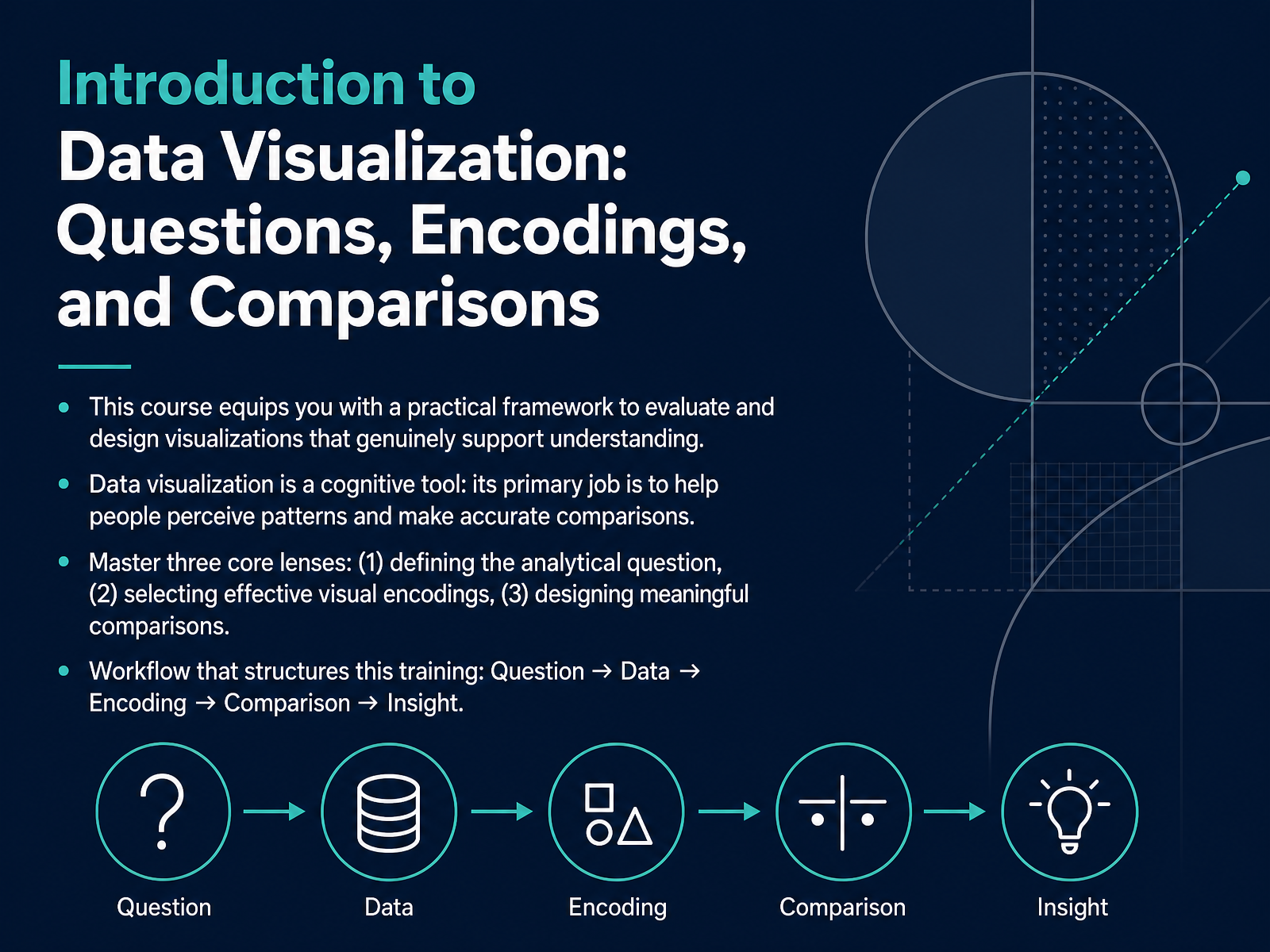
- 01Introduction to Data Visualization: Questions, Encodings, and ComparisonsWelcome. In this course, you will learn a practical framework to evaluate and design visualizations that genuinely support understanding. Think of data visualization as a cognitive tool. Its main job is to help people perceive patterns and make accurate comparisons. To do this well, we focus on three core lenses. First, define the analytical question. Ask yourself: what question is this chart answering? Second, check the visual encodings. See if color, position, or length carries the data. Third, design meaningful comparisons. Always ask: compared to what? This course follows a clear workflow. We start with a question, then we look at the data, choose an encoding, set up a comparison, and finally arrive at an insight. That is your checklist for critical viewing. Up next, we will explore why visualization is a cognitive tool, not just a design exercise.annualreviews.orgdoi.orgfh-wedel.de+22 min
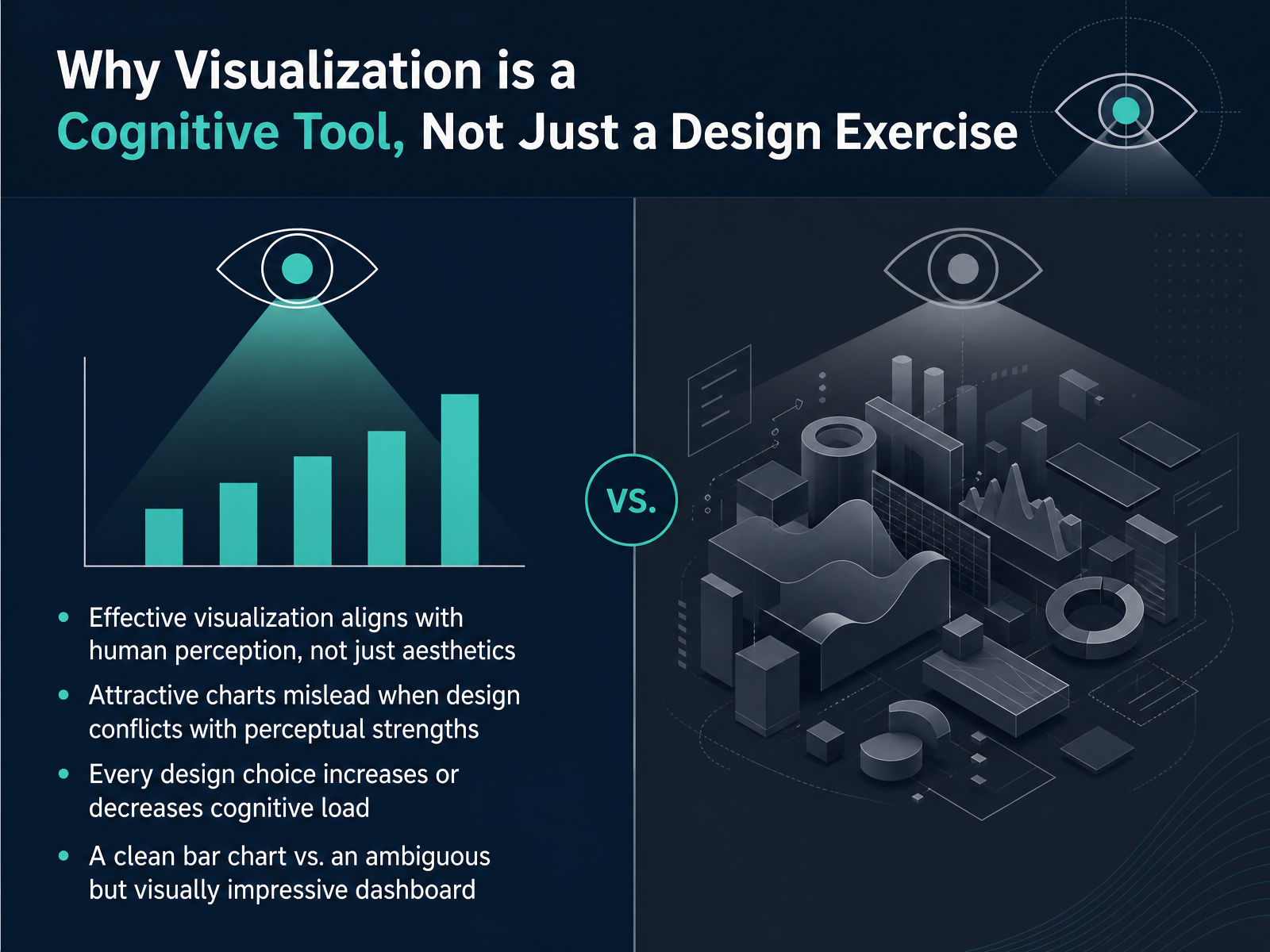
- 02Why Visualization is a Cognitive Tool, Not Just a Design ExerciseNow let's talk about why we approach visualization as a cognitive tool, not simply a design exercise. Effective charts align with how your brain naturally perceives information. That's a very different goal from just choosing colors that look good. An attractive dashboard can actually mislead you if its design choices fight against your perceptual strengths. Think about it this way. Every single design element you add, whether it's a color, a gridline, or an animation, either increases or decreases cognitive load. It either helps you think or gets in the way. The question is never just, does this look impressive? The question is, does this help or hurt your ability to see the data clearly? Picture a clean bar chart next to a flashy dashboard filled with gauges and three-dimensional pie charts. The bar chart is often seen as less exciting, but it usually lets you compare values almost instantly. The complex dashboard might feel more sophisticated, yet it forces your brain to work much harder just to decode what the shapes mean. Your goal as an analyst is to make the design work for cognition, not the other way around. With that foundation, let's move on and put this into practice. We'll start with Lens One: Defining the Analytical Question.
 annualreviews.orgdoi.orgfh-wedel.de+21 min
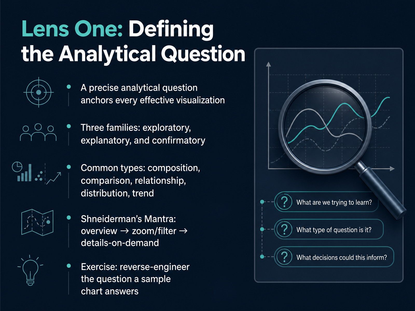
 - 03Lens One: Defining the Analytical QuestionNow, let's look at our first lens for critical viewing: defining the analytical question. A clear question is the anchor for every effective visualization. Without it, a chart is just a collection of marks. So, your first step is always to ask: what is this chart trying to answer? Questions typically fall into three families. It could be exploratory, where you are looking for patterns you didn't expect. It could be explanatory, where the chart communicates a specific finding to you. Or it could be confirmatory, where it tests a specific hypothesis. Within those families, the question usually points to a common type of analysis. Is the chart showing you the composition of a whole? Maybe it is highlighting a comparison between groups, a relationship between variables, a distribution of values, or a trend over time. Identifying this upfront sharpens your focus. A helpful framework to apply here is Shneiderman's Visual Information Seeking Mantra. It outlines a natural sequence for engaging with data: gain an overview first, then zoom and filter to focus on what's relevant, and finally, request details on demand when you need them. For our exercise, I want you to reverse-engineer the question behind a chart. Pick any chart you see today. Look at its title, its axes, and its marks. Don't accept it at face value. Write down a single, precise question you believe the chart is designed to answer. This practice turns you from a passive viewer into an active analyst. Once you have mastered defining the question, we will move to Lens Two: Visual Encodings, where you will learn to map that data directly to visual perception.
 cs.umd.educs.umd.eduinfovis-wiki.net+22 min
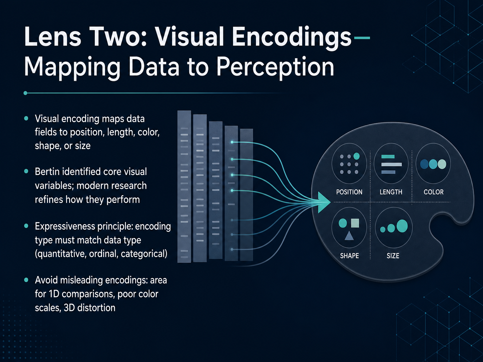
 - 04Lens Two: Visual Encodings—Mapping Data to PerceptionNow let's focus on how data is actually mapped to what you see. This is the world of visual encodings. Think of an encoding as the bridge between a number in a spreadsheet and a visual property you can perceive, like a bar's length, a point's position on an axis, a shape's color, or its size. Researchers, starting with Jacques Bertin and refined by modern studies, have identified how these different visual channels perform. A core rule is the expressiveness principle: your encoding must match your data type. That means using position or length for precise quantitative values, but using color or shape for categorical groups. To spot a misleading chart, check for broken rules. Is the chart using the area of a circle to show a simple one-dimensional comparison? That's inaccurate. Is it applying a rainbow color scale to ordered data? That can hide the true pattern. And always be skeptical of 3D effects that distort angles and make values nearly impossible to read. This lens gives you a concrete checklist to verify if a chart’s visual map is honest. Next, we'll build on this by introducing the perceptual hierarchy, which ranks exactly which encodings work best.
 annualreviews.orgdoi.orgfh-wedel.de+22 min
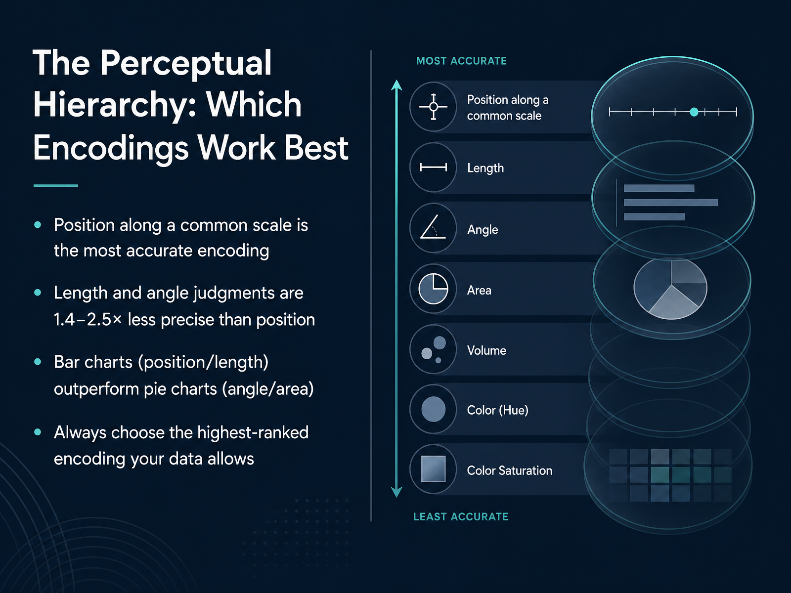
 - 05The Perceptual Hierarchy: Which Encodings Work BestNow you have a clear question in mind. The next step is to check how the data is visually encoded, because not all encodings are equally precise. Cleveland and McGill's research gave us a perceptual hierarchy that ranks these visual tools by accuracy. At the top sits position along a common scale. When you see dots or bars aligned against a shared baseline, your eyes can make very precise comparisons. Length and angle are less reliable. In controlled experiments, position judgments were one point four to two and a half times more accurate than length, and nearly twice as accurate as angle. This explains a classic piece of advice: a bar chart will almost always outperform a pie chart. Bar charts let you judge position and length, while a pie chart forces you to compare angles and areas. So when you look at a chart, ask yourself: which encoding is doing the real work? And always push to use the highest-ranked encoding your data allows. This simple check prevents a lot of confusion before it starts. Next, we will move from individual encodings to the visual shortcuts that grab attention instantly. Let's look at preattentive attributes.
 doi.orgdoi.orgdsciclass.org+22 min
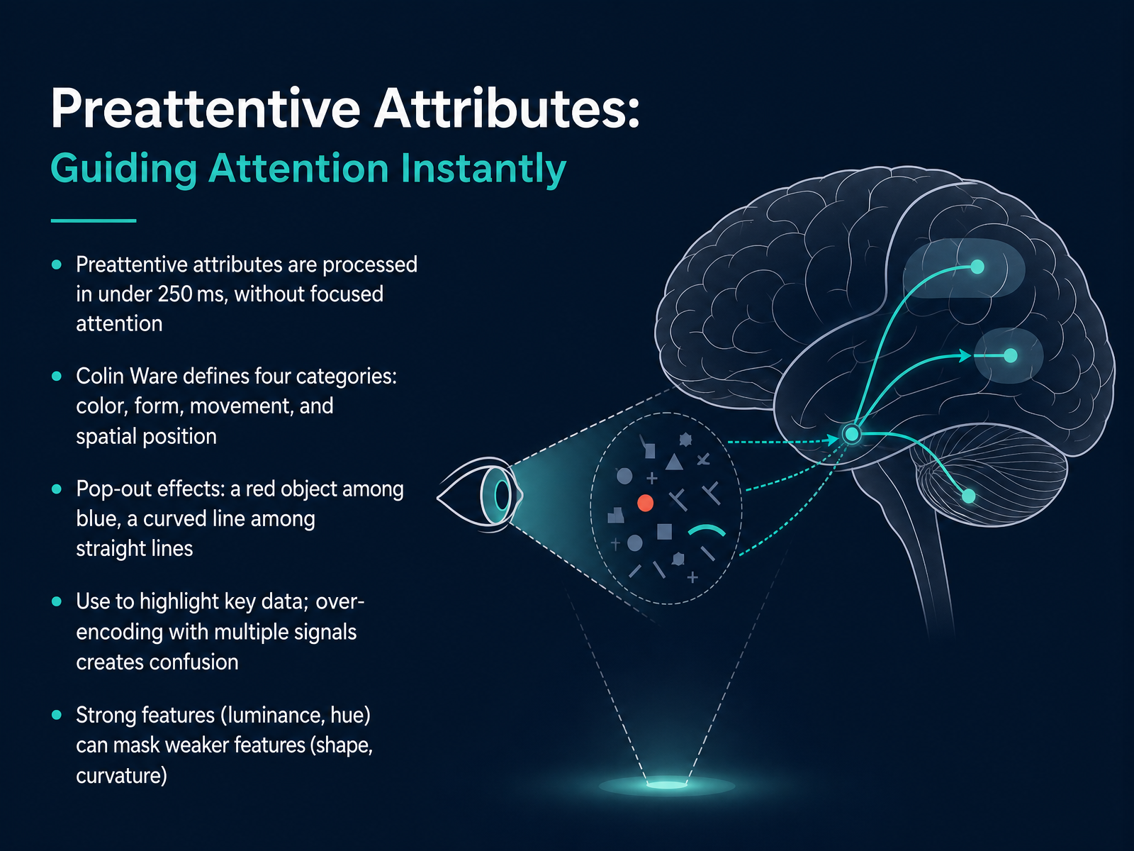
 - 06Preattentive Attributes: Guiding Attention InstantlyNow let's talk about a powerful tool for guiding your viewer's attention: preattentive attributes. These are visual properties our brains process in under a quarter of a second—without any focused effort. Colin Ware organizes them into four categories: color, form, movement, and spatial position. You see this in action with pop-out effects. A single red mark among blue ones, or a curved line in a field of straight lines, grabs your eye instantly. This is how you highlight key data. But be careful. When you layer too many signals at once—say, color, size, and shape all competing—you create confusion, not clarity. The visual system gets overwhelmed. There is also a hierarchy to remember. Strong features like brightness and hue can mask weaker ones like shape or curvature. So assign your most important data to the most salient visual channel. Think of this as a spotlight. Use it deliberately to guide your viewer's eye to what matters most, and keep the rest of the scene quiet by comparison. Up next, we will turn this into a practical checklist in 'Selecting the Right Encoding.'
 csc2.ncsu.eduixdf.orgeducate.elsevier.com+22 min
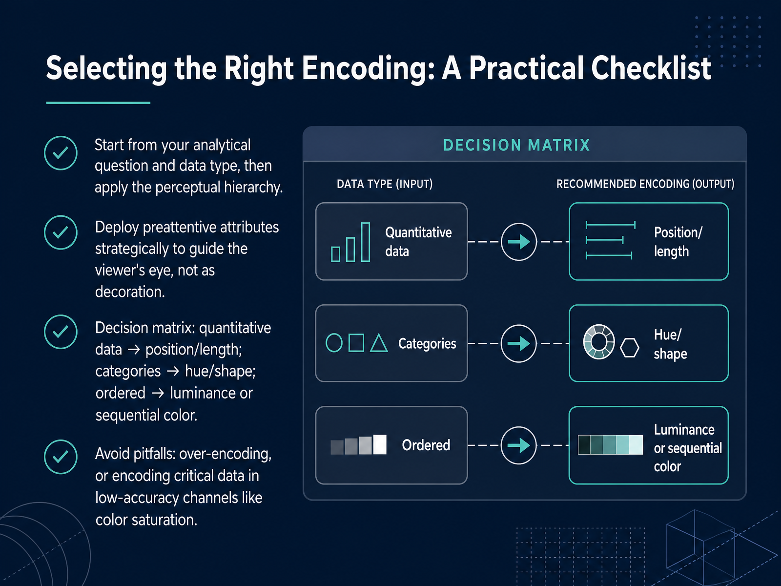
 - 07Selecting the Right Encoding: A Practical ChecklistNow let's translate our framework into a practical checklist for choosing the right visual encoding. Always start with your analytical question and your data type. Once you know those, apply the perceptual hierarchy we discussed. Use position or length for quantitative data because our visual system judges them most accurately. For categories, rely on hue or shape to create clear distinctions. When you have ordered data, like survey responses from low to high, use luminance or a sequential color ramp to signal that natural progression. Now, think about attention. Deploy preattentive attributes like color intensity or size strategically to guide your viewer's eye to the most important numbers, not as decoration. A common mistake is over-encoding: adding bold colors, different shapes, and varied sizes all at once. This creates noise, not clarity. Remember, avoid encoding your most critical data in low-accuracy channels like color saturation alone. Instead, support it with position or length. Use this checklist as your quick sanity check before finalizing any chart. Next, we will explore Lens Three: Designing Comparisons That Work.
 annualreviews.orgdoi.orgfh-wedel.de+22 min
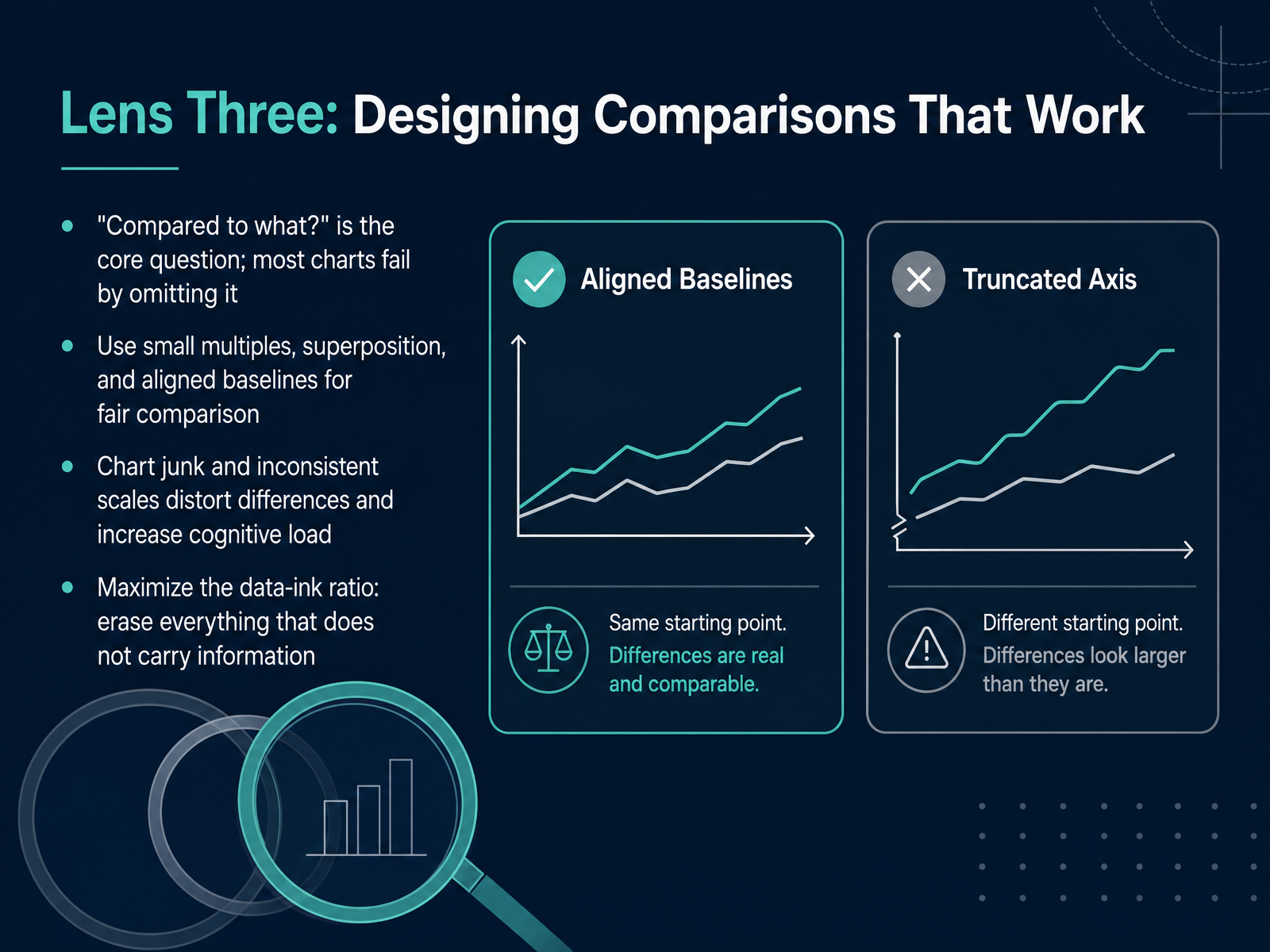
 - 08Lens Three: Designing Comparisons That WorkNow we turn to the third and final lens: designing comparisons that actually work. The question that should always be in your mind when looking at a chart is, "Compared to what?" Most charts that fail are missing a clear baseline or reference point. To build fair comparisons, use techniques like small multiples, where you repeat the same chart structure for different slices of the data. You can also use superposition, carefully layering data series, and always align your baselines. Watch out for chart junk and inconsistent scales. These distortions increase cognitive load and trick the eye into seeing differences that are not real. Your goal is to maximize the data-ink ratio. Erase anything that does not carry information. Gridlines, heavy borders, and decorative elements are often just noise. Every mark on the page should answer the question, "Compared to what?" By stripping away the clutter and sticking to a consistent visual grammar, you let the comparison speak clearly for itself. Next, we will explore the most powerful technique for these repeated, comparable views: small multiples.
 2 min
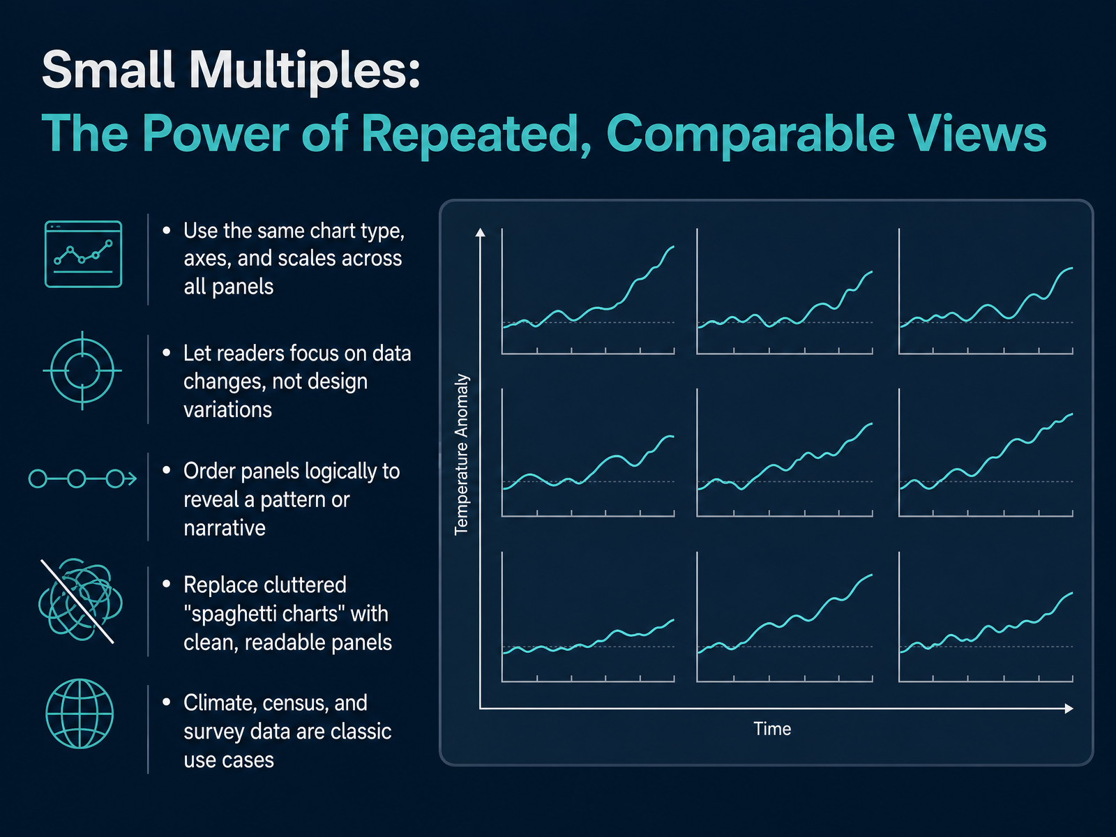
2 min - 09Small Multiples: The Power of Repeated, Comparable ViewsLet's now turn to one of the most powerful techniques for answering that core question: “Compared to what?” It's called small multiples. Think of it as a grid of mini charts. Each panel uses exactly the same chart type, the same axes, and the same scales. The only thing that changes is the data. This consistency is the secret. It lets your reader focus purely on the differences in the data, not on figuring out a new chart design every time. The most famous example is replacing a tangled, unreadable “spaghetti chart” full of overlapping lines with a clean set of individual panels, one for each category. To make it work, the order of your panels matters. Arrange them logically, maybe from the lowest to the highest average value, to reveal a clear pattern or narrative. This technique is a go-to for climate trends over decades, census data across regions, or survey results from different demographic groups. When you see a panel grid, ask yourself: can I directly compare the values across panels because the visual rules are identical? If yes, the designer has set you up for a rapid, accurate understanding.
 2 min
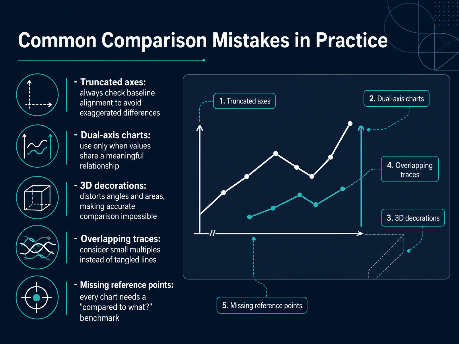
2 min - 10Common Comparison Mistakes in PracticeNow let's walk through a few of the most common comparison mistakes and, more importantly, how to fix them. First, watch out for truncated axes. Cutting off the baseline on a bar chart can make a tiny gap look like a dramatic difference. Always ask yourself: does the axis start at zero? Next, dual-axis charts. These let you overlay two different scales, but they can easily suggest false relationships. Only use them when the two measures share a meaningful, logical connection. Otherwise, stick to individual panels. Third, 3D decorations. Perspective tilts and shadows distort angles and areas, which makes accurate comparison nearly impossible. If the third dimension doesn't encode real data, keep the chart flat. Then there's the spaghetti problem: too many overlapping lines. When the traces tangle, skip the legend and create small multiples instead. Use the same scale across a grid of clean panels so your eye can move easily from one to the next. Finally, every chart needs a reference point. A raw number never speaks for itself. Ask: compared to what? A clear benchmark, target line, or context turns a data point into a story. These five checks will protect you from the most common traps. Next, we'll put everything together into one practical evaluation lens in 'Putting It All Together: A Three-Lens Evaluation Rubric.'
 doi.orgdoi.orgdsciclass.org+22 min
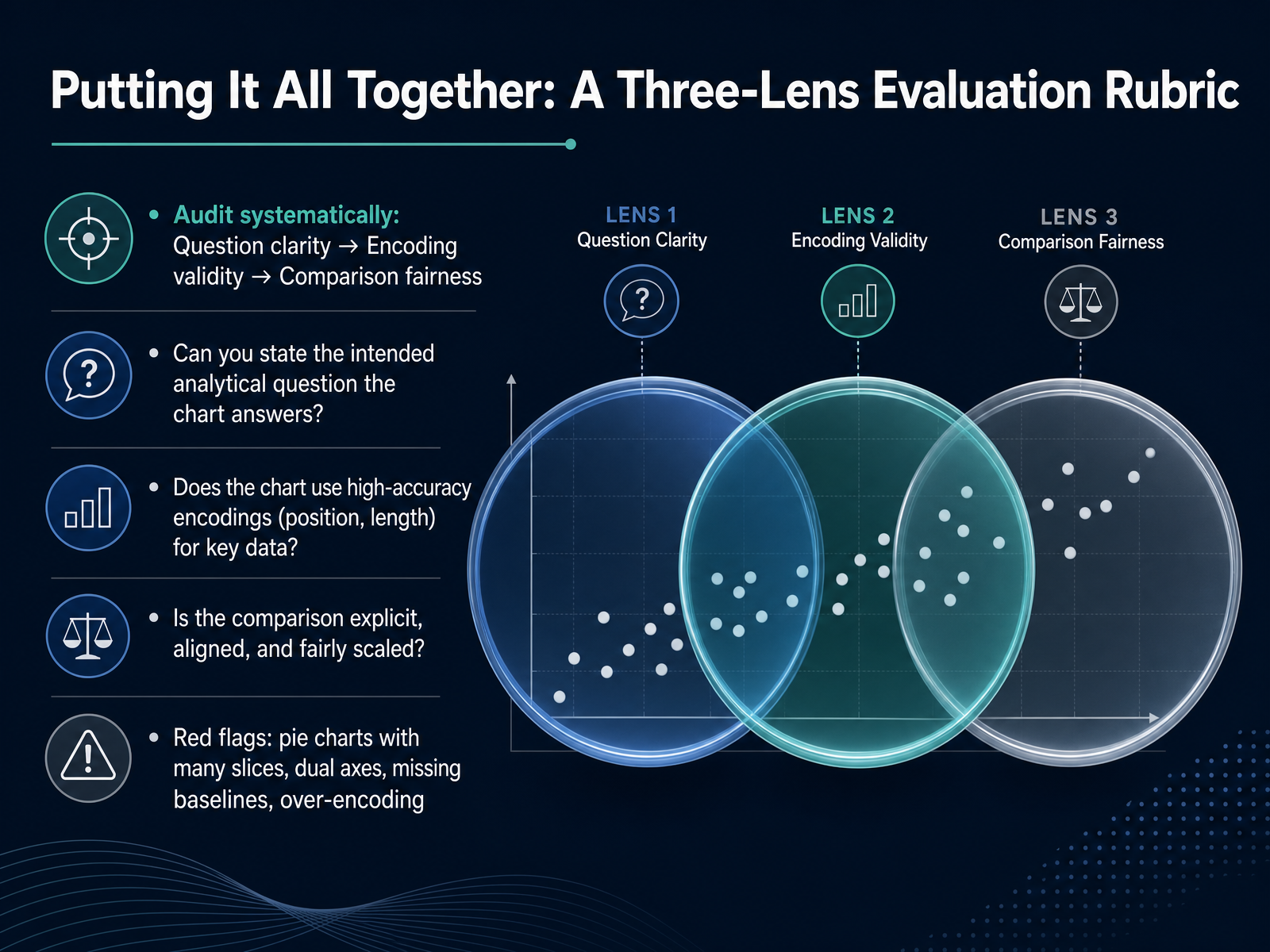
 - 11Putting It All Together: A Three-Lens Evaluation RubricNow we bring everything together into a practical three-lens evaluation rubric. Think of this as your quick audit checklist for any chart. The systematic order is simple: first, question clarity; second, encoding validity; third, comparison fairness. Start by asking, can you state the single analytical question this chart is meant to answer? If the question is unclear, the chart has already failed. Next, check the encodings. Does the chart use high-accuracy channels like position or length for the most important data? Or does it rely on less precise channels like angle or area? Finally, assess the comparison. Is it explicit, aligned, and presented on a fair scale? Watch out for red flags that often distort our perception. These include pie charts with too many slices, dual axes that can mislead, missing baselines that exaggerate differences, and over-encoding where too much visual detail hides the signal. With a little practice, this three-lens audit becomes second nature. Next, we will apply this exact rubric in a group diagnosis, evaluating real-world charts.
 annualreviews.orgdoi.orgfh-wedel.de+22 min
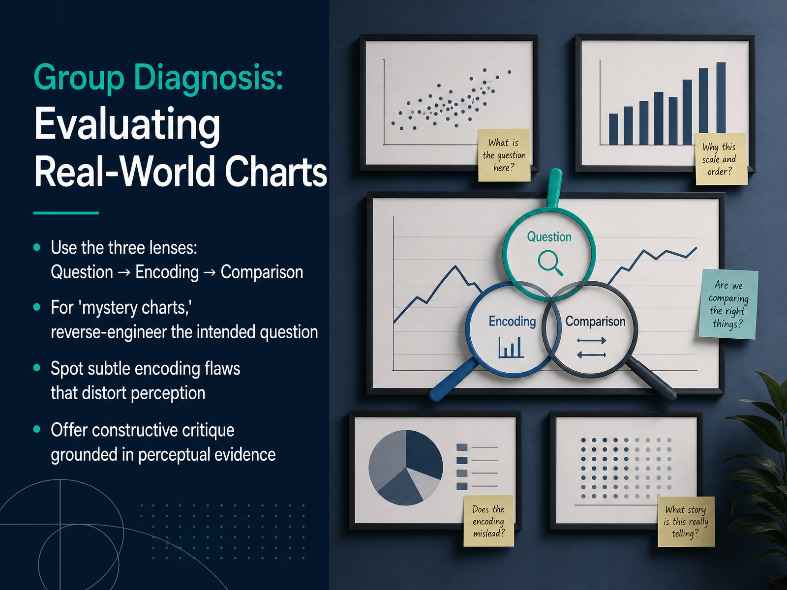
 - 12Group Diagnosis: Evaluating Real-World ChartsNow we shift from theory to practice. Let's take the three lenses of question, encoding, and comparison and apply them to real, messy charts you see every day. When you encounter what I call a mystery chart, your first step is to reverse-engineer the designer's intent. Ask directly: what question is this chart trying to answer? Once you identify the intended question, inspect the encoding. Are they using position on a common scale, or relying on less precise angle and area judgments? Then, define the comparison range. Does the chart allow you to answer compared to what, or does it lock you into a single, isolated number? You also need to spot subtle encoding flaws that distort perception. A bar chart might use a non-zero baseline, exaggerating small differences. A bubble chart encodes values by area, but our eyes struggle to compare circle sizes accurately. Your critique should always be constructive. Don't just say a chart is bad. Say the chart relies on angle judgments, which Cleveland and McGill show are nearly twice as error-prone as position judgments. I recommend switching to a dot chart or a bar chart to make the story instantly clearer. This evidence-based approach turns you from a passive viewer into a skilled diagnostic reviewer. Let's carry this diagnostic mindset forward as we examine cognitive load and the dashboard fallacy.
 doi.orgdoi.orgdsciclass.org+22 min
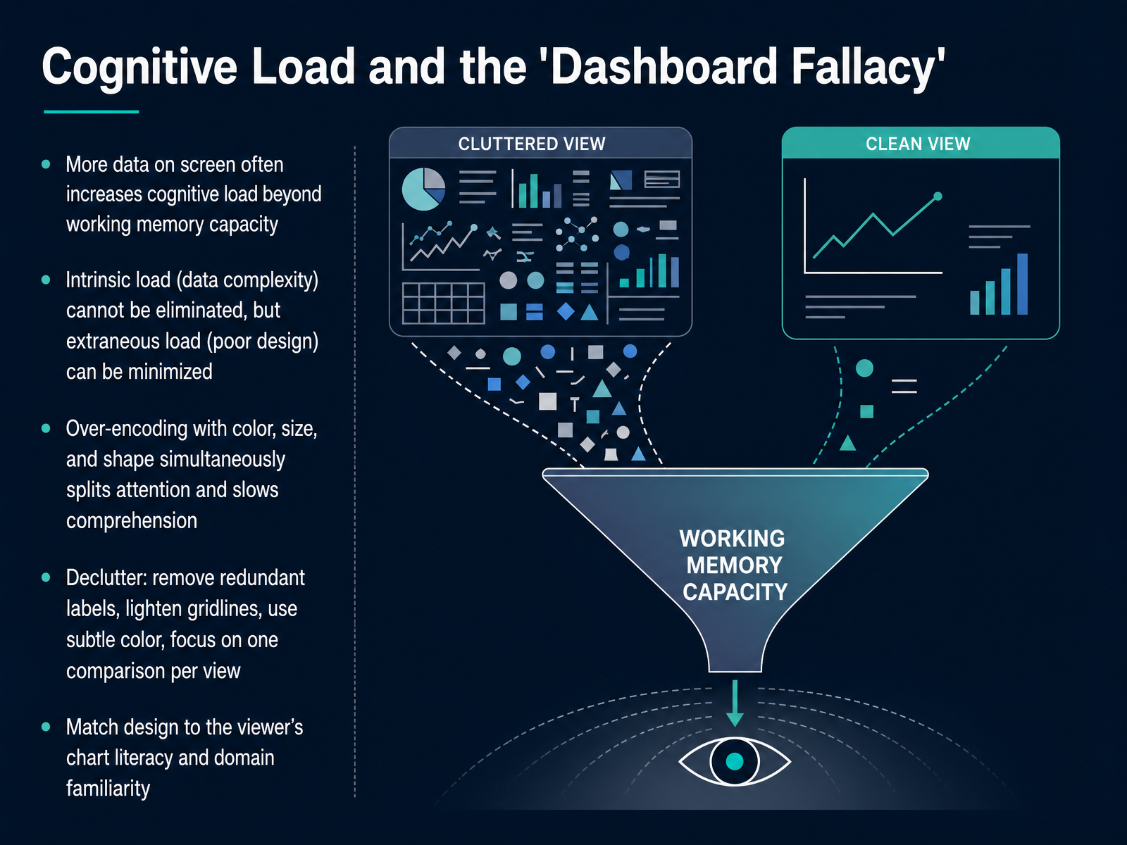
 - 13Cognitive Load and the 'Dashboard Fallacy'Now let's talk about cognitive load, and a common trap every analyst should watch for: the dashboard fallacy. It is the belief that more data on screen is always better. In reality, too much information can exceed a viewer's working memory. Think of cognitive load in three parts. Intrinsic load comes from the data's own complexity. You cannot eliminate it, but you can manage it. Extraneous load comes from poor design, like clutter or competing encodings, and you can minimize this. Using bright color, size, and shape all at once splits attention and slows comprehension. So here is your quick checklist. First, declutter. Remove redundant labels, lighten heavy gridlines, and use subtle, focused color. Second, focus on one comparison per view. Finally, match the design to your viewer's chart literacy and domain familiarity. A room full of domain experts can handle more complexity than a distracted executive checking a mobile dashboard. Good design helps the viewer use their mental energy on the insights, not on decoding the chart. Next, let's move into your toolkit, with principles and tools for continued practice.
 2 min
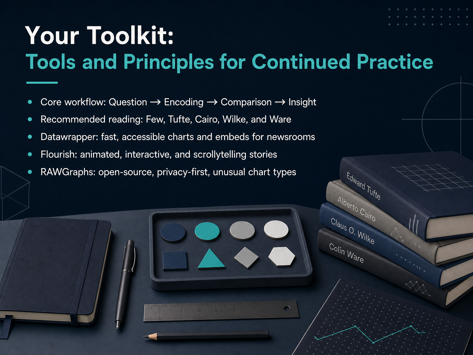
2 min - 14Your Toolkit: Tools and Principles for Continued PracticeLet’s build your ongoing toolkit so you can keep applying the Question, Encoding, and Comparison workflow long after this course. First, remember the core loop: start with a clear question, identify how the data is encoded, check what’s being compared, and then extract the insight. For deeper reading, explore the works of Stephen Few, Edward Tufte, Alberto Cairo, Claus Wilke, and Colin Ware. Now, let’s look at three practical tools. Datawrapper is built for newsrooms. It’s fast, produces accessible charts, and embeds cleanly on any platform. Flourish specializes in animated, interactive, and scrollytelling stories. It’s ideal when the visualization itself is the narrative. RAWGraphs is an open-source, privacy-first tool that runs directly in your browser. It’s perfect for sensitive data and unusual chart types like alluvial diagrams or sunbursts. Pick the tool that matches your question and your audience. Up next, we’ll bring everything together in a final exercise: redesign a flawed chart.
 2 min
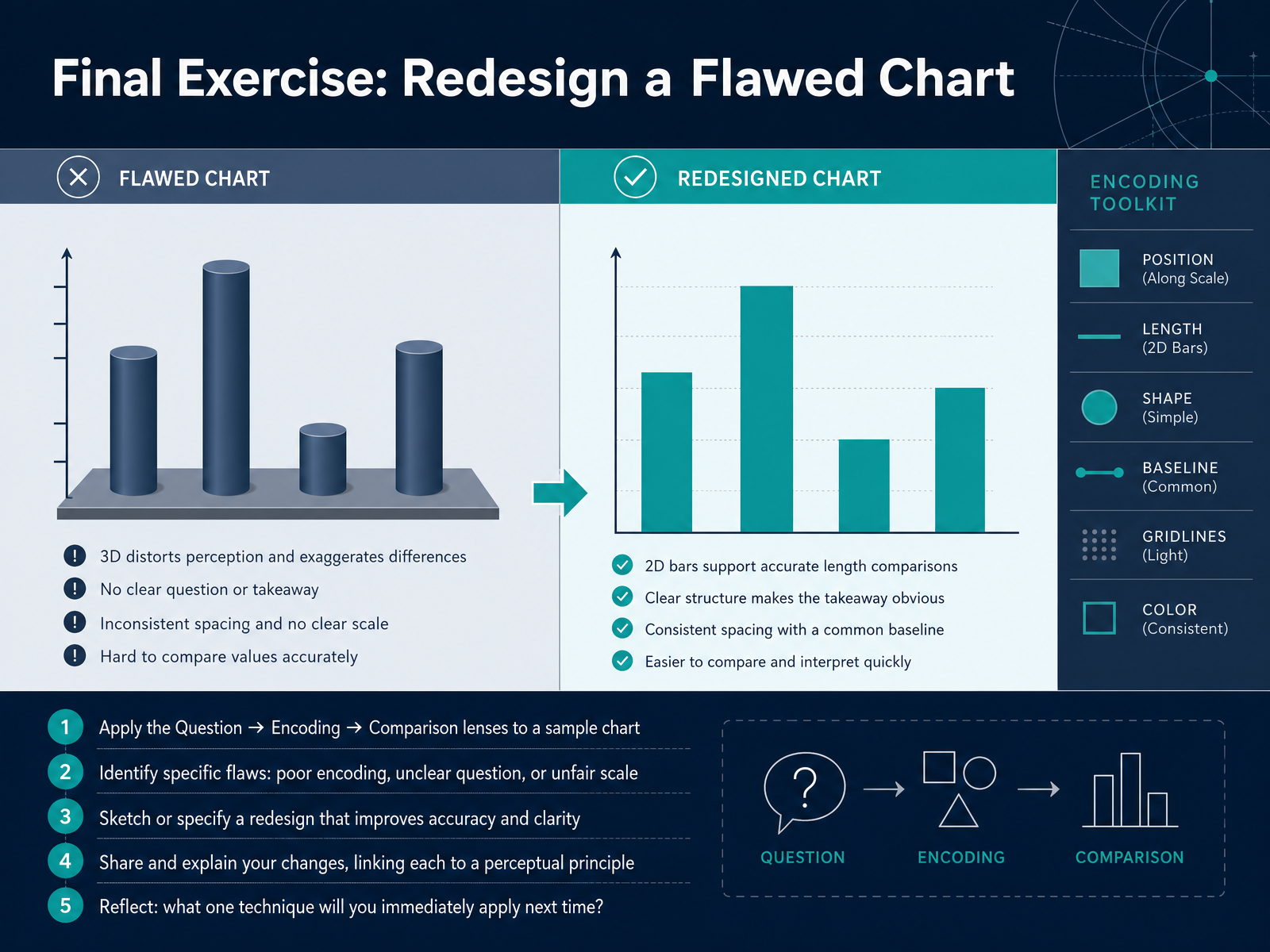
2 min - 15Final Exercise: Redesign a Flawed ChartNow it's your turn to put everything into practice. We have a final hands-on exercise. You'll work with a sample chart that was deliberately designed with problems. Your job is to apply our three lenses: first, ask what question the chart is really trying to answer. Then, check the encoding. Is the data mapped to position, length, or color in a way that makes sense? After that, examine the comparison. Does the scale distort the difference, or is the context missing? Identify the specific flaws you find. Maybe the bars encode the wrong metric, or the axis starts at a misleading number. Next, I want you to sketch your redesign, or just describe it clearly on paper. Fix the encoding, clarify the question, and make the comparison fair. Then, share your new version and explain the changes you made. Link each fix to a principle we have discussed. For example, you might say, "I switched to a dot plot because position is more accurate than angle." Finally, take a moment to reflect. What is the single most useful technique you will apply the very next time you read or build a chart? This is a powerful skill, and you are now equipped to use it. Thank you for learning with me, and I look forward to seeing your sharper charts.
 2 min
2 min
Take the deck with you
Download this course as a file — free, no sign-up needed.
- PDF handoutEvery slide page, ready to print or share.16 pages · 3.5 MBDownload
- Narrated PowerPointThe deck that presents itself — every slide carries the digital human's narration video.16 pages · 15.9 MBDownload
- PowerPoint slidesThe full deck as a .pptx — open it in PowerPoint, Keynote, or Google Slides.16 pages · 3.4 MBDownload
Free to use in your own training — please keep the PersonWise credit page at the end.
Have your own deck? Turn it into a course
Sources consulted
Web sources consulted while building this course.
- Perceptual and Cognitive Foundations of Information Visualization | Annual Reviews — annualreviews.org
- Cognitive Affordances in Visualization: Related Constructs, Design Factors, and Framework — doi.org
- Literature Review on Principles for Effective Data Visualization — fh-wedel.de
- Exploring Emerging Opportunities in Visualization Comprehension Research — sheelaghcarpendale.ca
- A Review and Collation of Graphical Perception Knowledge for Visualization Recommendation — doi.org
- A Task by Data Type Taxonomy for Information Visualizations — cs.umd.edu
- Information Visualization — cs.umd.edu
- Visual Information-Seeking Mantra — infovis-wiki.net
- The Eyes Have It: A Task by Data Type Taxonomy for Information Visualizations - Visual Languages, 1996. Proceedings., IEEE Symposium on — mat.ucsb.edu
- The Eyes Have It: A Task by Data Type Taxonomy for Information Visualizations — hci.stanford.edu
- Graphical Perception: Theory, Experimentation, and Application to the Development of Graphical Methods — doi.org
- Graphical Perception: Theory, Experimentation, and Application to the Development of Graphical Methods — doi.org
- Graphical Perception: Theory, Experimentation, and Application to the Development of Graphical Methods — dsciclass.org
- Graphical Perception: Theory, Experimentation, and Application to the Development of Graphical Methods — statsclass.com
- Graphical Perception and Graphical Methods for Analyzing ... — researchgate.net
- Perception in Visualization — csc2.ncsu.edu
- Preattentive Visual Properties and How to Use Them in Information ... — ixdf.org
- Information Visualization - Edition 3 - By Colin Ware Elsevier Educate — educate.elsevier.com
- Preattentive attributes of visual perception and their application to ... — uxdesign.cc
- Exploring Preattentive Attributes — learnforeverlearn.com