Designing Dialogues & Confirmation Flows
Begin
14 pages · ~28 min
Designing Dialogues & Confirmation Flows
Learn to design effective conversational dialogues and confirmation flows for user interfaces, focusing on clarity, user intent, and error prevention.
What you’ll learn
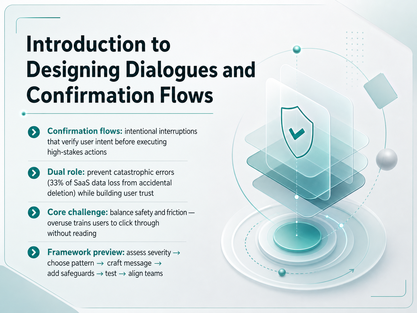
- 01Introduction to Designing Dialogues and Confirmation FlowsWelcome. In this course, we are going to redesign one of the most delicate moments in any product: the confirmation dialog. Think about the last time a piece of software asked you, 'Are you sure?' Did you stop and read, or did you just click 'OK' out of habit? If you are a product designer, that moment is your responsibility. Confirmation flows are not just annoying pop-ups; they are intentional interruptions that verify a user's intent before executing a high-stakes action. They serve a dual role. First, they prevent catastrophic errors—about one-third of software-as-a-service data loss comes from accidental deletion. Second, when designed well, they build user trust. But here is the core challenge: balancing safety and friction. If we overuse dialogs, we train users to click through without reading. By the end of this course, you will have a practical framework to solve this. We will walk through assessing severity, choosing the right pattern, crafting precise messages, adding safeguards, and aligning your team. Let's start building safer, more respectful interactions. Next, we will look at the psychology behind why good dialogs work and bad ones fail.uxplanet.orgmedium.comnngroup.com+22 min
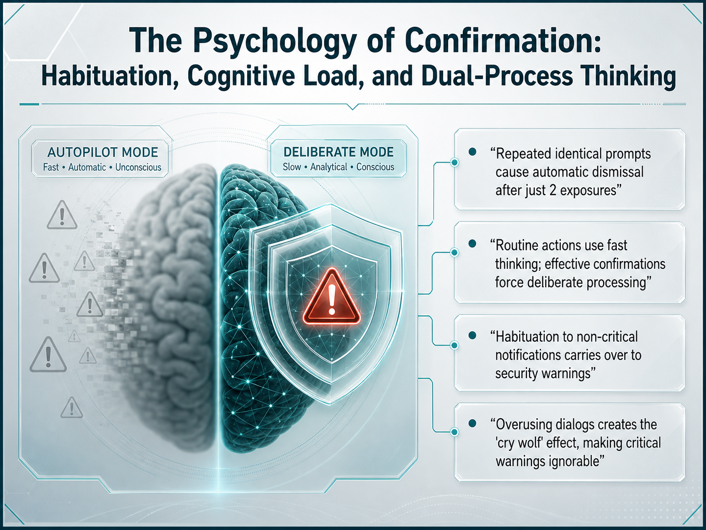
- 02The Psychology of Confirmation: Habituation, Cognitive Load, and Dual-Process ThinkingNow let's unpack the psychology behind confirmation fatigue. Our brains are wired to automate repetitive tasks—this is what lets us type, drive, or navigate apps without thinking about every single step. But this same efficiency creates a problem: habituation. When a user sees the same confirmation prompt just twice, their visual processing centers start to tune out. By the third or fourth exposure, they’re already clicking “OK” on reflex, not on purpose. This is the “cry wolf” effect—overusing dialogs for trivial actions trains people to ignore the ones that actually matter. Even worse, habituation to low-stakes notifications doesn’t stay isolated. It carries over to critical security warnings that look and feel similar. So a user who dismisses twenty routine pop-ups every morning is neurologically primed to dismiss the one warning that could prevent a data breach. The takeaway here is about thinking speed: routine actions rely on fast, automatic thinking. Effective confirmations must force a switch into deliberate, slow thinking—but they can only do that if they’re rare, specific, and visually distinct. Let’s carry this insight forward into the next slide, where we’ll match the weight of a dialogue to the severity of the action.
 uxplanet.orguxpatternsguide.comnngroup.com+22 min
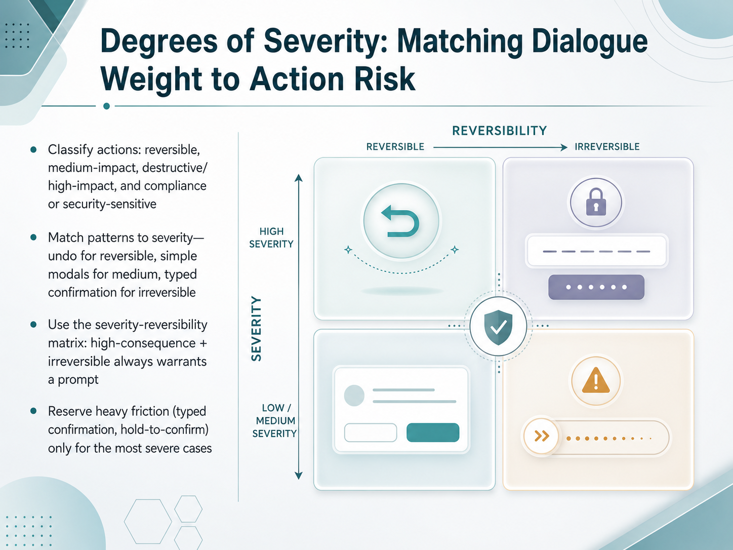
 - 03Degrees of Severity: Matching Dialogue Weight to Action RiskNow let's talk about degrees of severity, and how to match the weight of your dialogue to the real risk of the action. Not every confirmation deserves the same level of friction. Start by classifying the action. Is it easily reversible, like archiving a message? Is it medium impact, like changing a billing threshold? Is it destructive or high impact, such as permanently deleting a project? Or is it compliance or security sensitive, like granting admin access? Match your pattern to that severity. For reversible actions, skip the dialog entirely and use an undo toast instead. For medium impact, a simple modal with specific copy works well. For truly irreversible actions, escalate to a typed confirmation where the user must type the object name before the button enables. Reserve that heavy friction, typed confirmation or hold to confirm, only for the most severe and irreversible cases. Use a simple matrix in your own design work. If the consequence is high and the action cannot be undone, a prompt is always warranted. If it is low and reversible, the prompt is noise. Keeping this spectrum clear protects your users without exhausting their attention. Next, we will build on this foundation and look at crafting the message itself: titles, body copy, and button labels that guide decisions.
 learn.microsoft.comdesignmybit.comnngroup.com+22 min
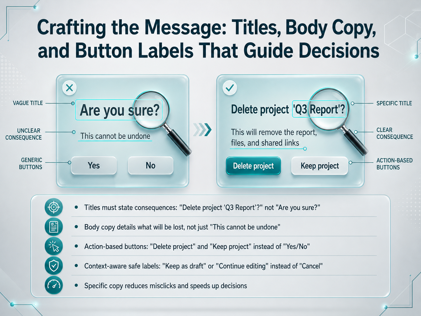
 - 04Crafting the Message: Titles, Body Copy, and Button Labels That Guide DecisionsNow let's get specific about crafting the message itself. Every word in a confirmation dialog matters, starting with the title. Generic questions like "Are you sure?" force users to pause and interpret what they might lose. Instead, a title should state the consequence directly. For example, "Delete project Q three report?" instantly confirms the action and the object, so users can decide faster without second-guessing. Next, the body copy must describe what will actually be lost. Avoid vague warnings like "This cannot be undone." A better approach explains the tangible impact, such as "This will remove all tasks assigned to this project." This helps users understand the scope before they commit. Then look at the buttons. Labels like "Yes" and "No" create friction because people must mentally map them to the action. Replace them with specific, action-based labels. Use "Delete project" and "Keep project," or for a draft, use "Publish now" and "Keep as draft." This clarity reduces misclicks and speeds up confident decisions. To summarize, write titles that name the consequence, body copy that details the loss, and action-based buttons that match user intent. Up next, we will explore how visual design and layout support instant comprehension and accessibility.
 uxplanet.orgmedium.comnngroup.com+22 min
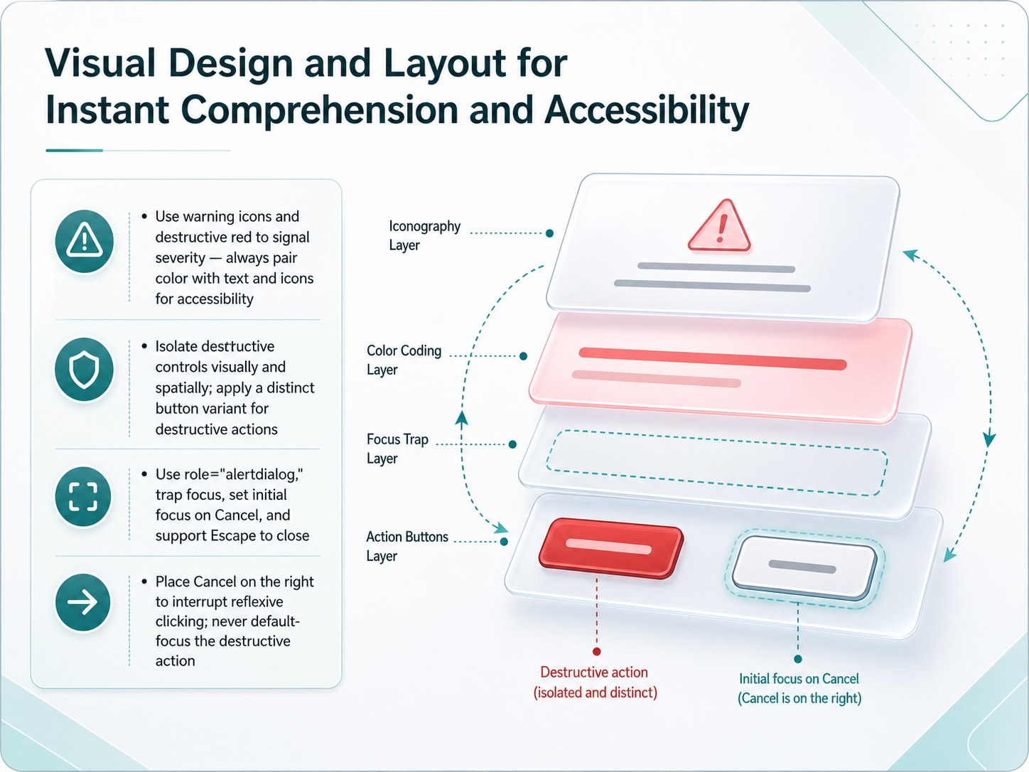
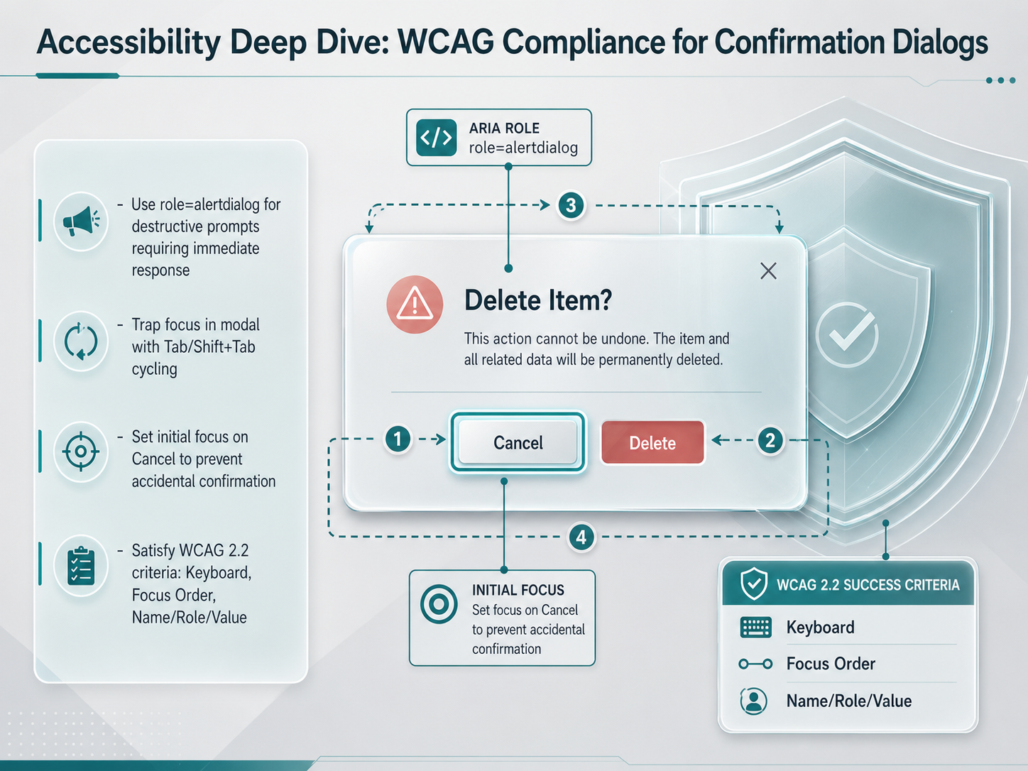
 - 05Visual Design and Layout for Instant Comprehension and AccessibilityNow let's talk about visual design and layout, specifically how to make your confirmation dialogs instantly understandable and accessible. When signaling danger, never rely on color alone. Use warning icons and a destructive red treatment, but always pair the color with clear text labels. This makes the severity obvious for users who are color-blind or using assistive technology. Next, isolate destructive controls both visually and spatially. Give them a distinct button variant, separated from safe actions, so the risk is unmistakable even at a glance. From a code perspective, use the role `alertdialog` to prioritize screen reader announcement. Trap focus within the dialog, and set the initial focus on the Cancel button, not the destructive action. This prevents a reflexive press of the Enter key from causing a disaster. Also, support the Escape key to safely close the dialog. And crucially, consider button placement. Placing the Cancel button on the right side of the dialog can interrupt our tendency for reflexive clicking, which often targets that final position. Never default-focus the destructive action. These visual and spatial strategies work together to build a clear, accessible safety net before a single line of code is executed. Next, we'll dive deeper into guarding against accidental confirmation with a principle called Friction by Design.
 w3.orguxpin.coma11ypath.com+22 min
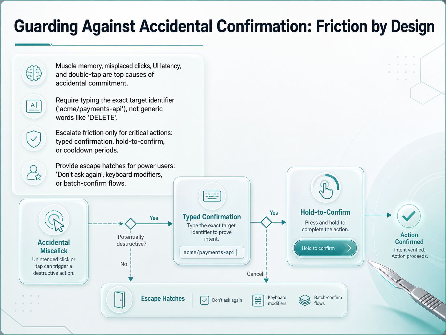
 - 06Guarding Against Accidental Confirmation: Friction by DesignNow, let's look at the top causes of accidental commitment. Muscle memory, misplaced clicks, UI latency, and double taps are the main culprits. When a user performs a familiar gesture, they often act before the interface finishes loading, which leads to irreversible mistakes. To protect against this, we need to design friction into the flow, but only for the most critical actions.
For truly catastrophic operations, generic words like "DELETE" are not enough. Users will type them by habit without checking the specific target. Instead, you should require them to type the exact target identifier, such as the repository path "acme/payments-api". This forces them to recognize the object they are destroying.
We can escalate this friction based on the severity of the damage. You might use a typed confirmation, a hold-to-confirm button, or a brief cooldown period before the button activates. But remember your power users. They need escape hatches to move fast without sacrificing safety. Consider adding a "Don't ask again" checkbox, keyboard modifiers to bypass the dialog, or a batch-confirm flow to handle multiple items at once.
Now that we have applied intentional friction, we also need to know when to remove dialogs entirely. The next section covers alternatives like undo and soft delete.
 uxpatternsguide.comvercel.comprism-design.supernova-docs.io+22 min
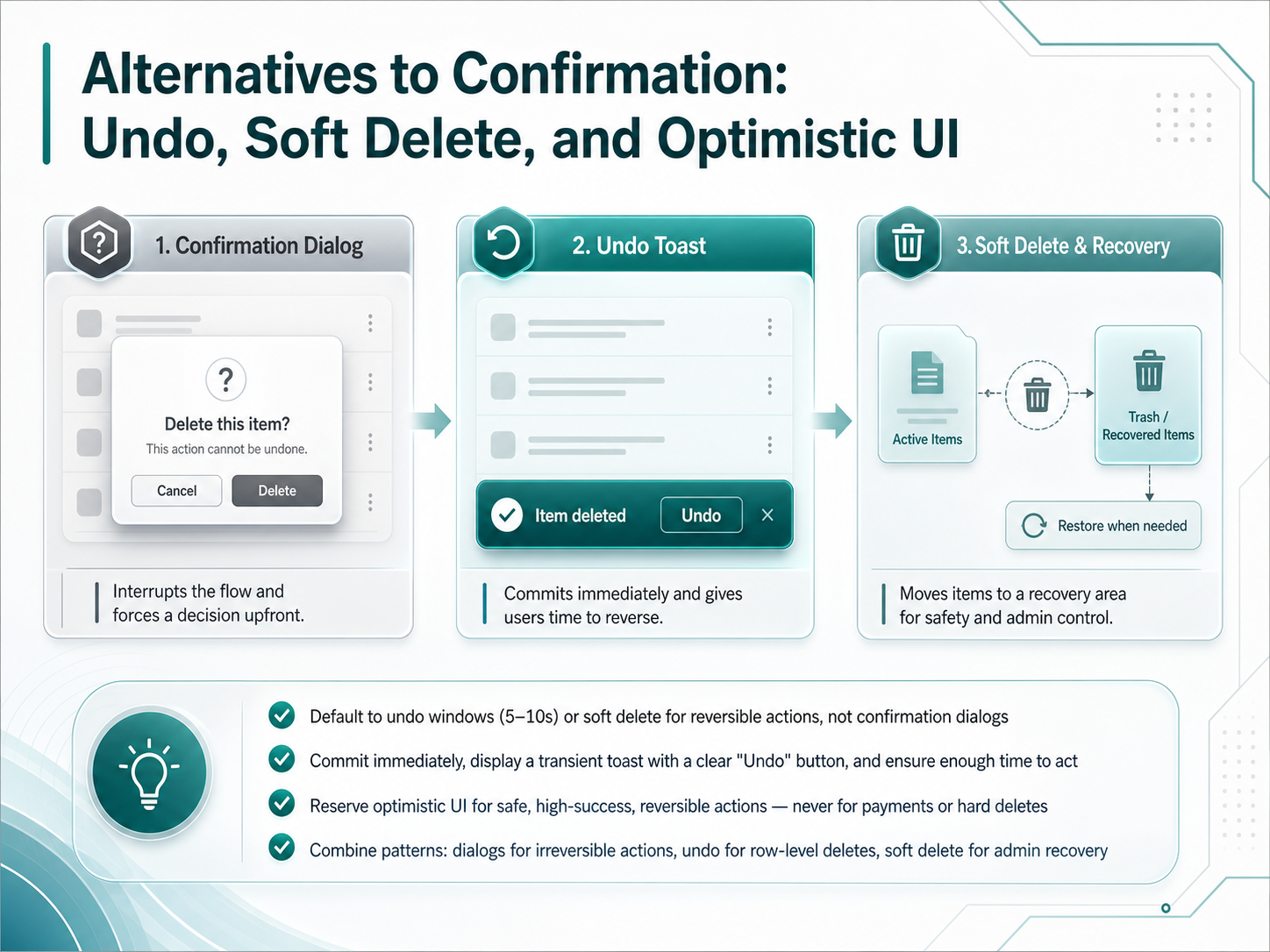
 - 07Alternatives to Confirmation: Undo, Soft Delete, and Optimistic UIWe have established that a confirmation dialog is not your only option, so let's unpack the alternatives. The most powerful one is the Undo window. Instead of interrupting the user, commit the action immediately and show a transient toast with an Undo button for five to ten seconds. This lets the user see the result before deciding, which reduces anxiety and keeps power users moving fast. Another tool is soft delete, which hides an item from the main view but keeps it recoverable in a visible trash bin for a set retention window, like thirty days. Then there is optimistic UI, where the interface updates instantly assuming success, and reconciles quietly with the server. Reserve this strictly for safe, high-success reversible actions, and never use it for payments or hard deletes. The real skill is combining these patterns. Use undo windows for row-level deletes, soft delete for admin recovery, and save confirmation dialogs only for genuinely irreversible actions. This layered approach keeps your interface safe without drowning the user in noise. Next, we will move into designing multi-step and rich confirmation flows.
 uxplanet.orgmedium.comnngroup.com+22 min
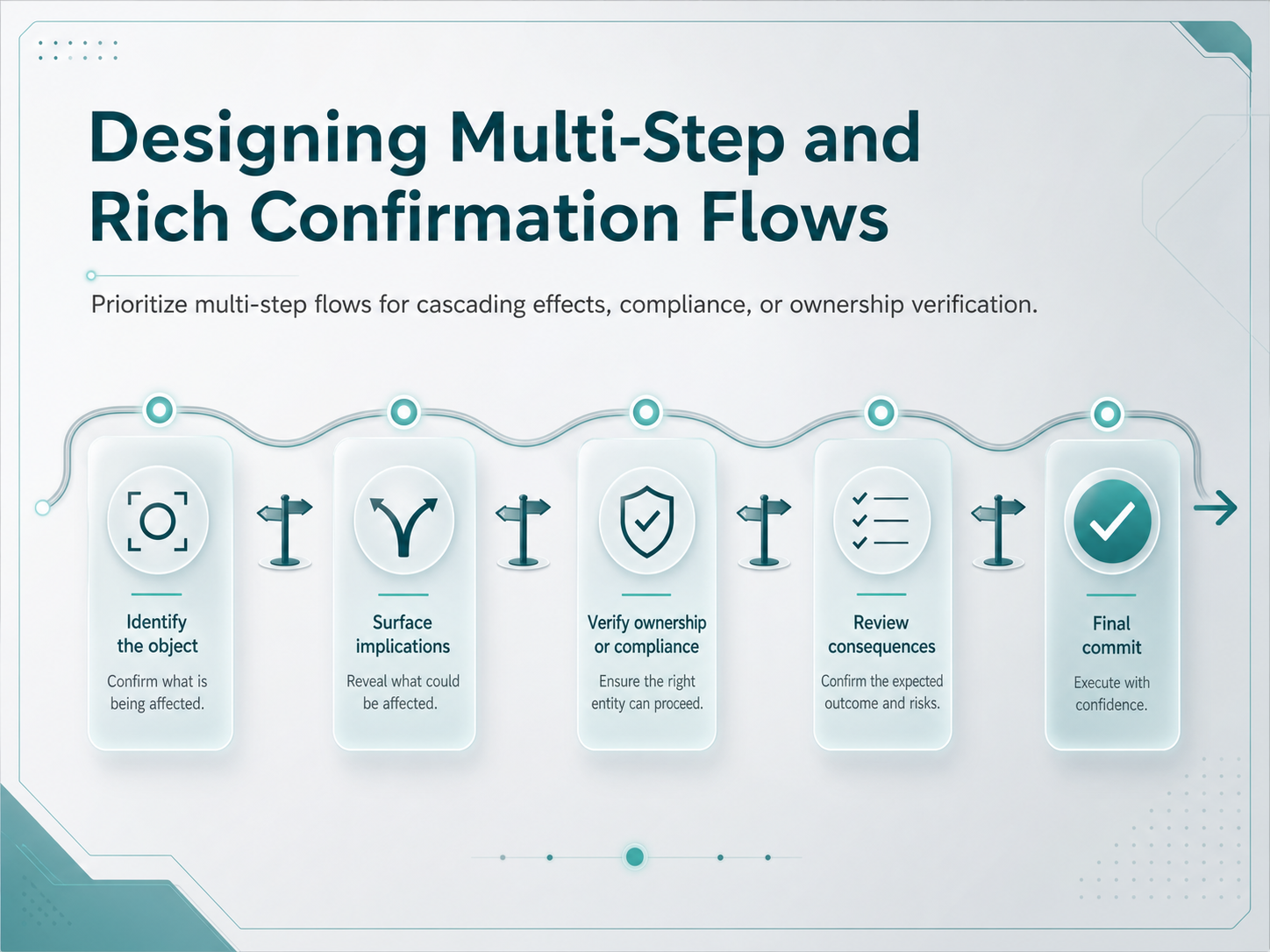
 - 08Designing Multi-Step and Rich Confirmation FlowsNow let's talk about multi-step and rich confirmation flows. These aren't your standard yes-no pop-ups. You reach for a multi-step flow when a single action triggers a cascade of effects, or when compliance or ownership verification is required. Think about deleting an entire team workspace. If the user just clicks one button, they might not realize that all projects, tasks, and reports inside it will disappear too. A multi-step flow lets you surface that scope progressively. First, list what will be lost with specific counts. Then, if the action is truly irreversible, add a typed confirmation gate. This is where you ask the user to type the exact name of the resource to enable the delete button. That pattern proves the user recognized the object, not just the word DELETE. For high-security operations like transferring account ownership, you might also require a second factor, like entering a pin or confirming an email. The goal in each step is to provide just enough information for a deliberate choice without overwhelming the user. Avoid using a multi-step flow for routine, reversible actions, or you'll risk causing confirmation fatigue. Next, we'll explore confirmation timing and context: when to ask and when to skip.
 nngroup.comuxpatternsguide.comuxplanet.org+22 min
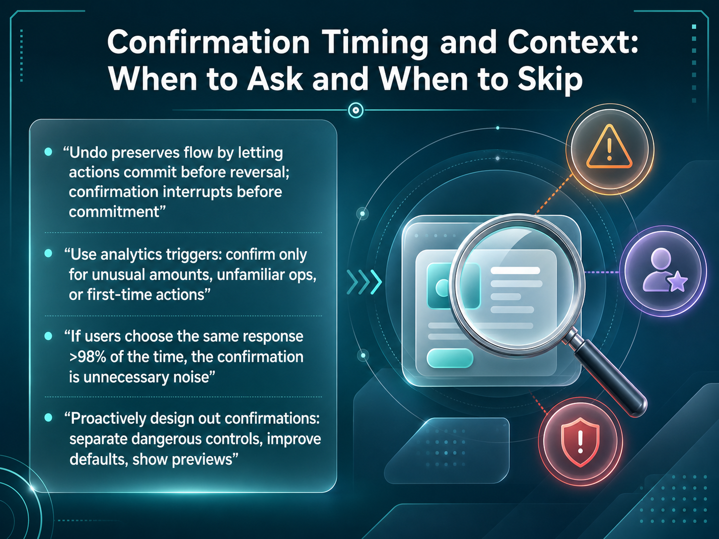
 - 09Confirmation Timing and Context: When to Ask and When to SkipLet's get practical about timing. When do we interrupt, and when do we let the action happen? The core difference is this: confirmation disrupts the user before the commitment, while an undo lets the action commit and preserves the flow. Both have a place, but the default should usually lean toward undo. In fact, before you add a dialog, look at your analytics. Only confirm when something is truly unusual—like a payment amount that's twice the user's average, a first-time action, or an operation the user rarely performs. Here is a useful litmus test: if your telemetry shows users click the same response over ninety-eight percent of the time, that confirmation is just noise. It has lost its protective value. And finally, the best confirmation is the one you don't need. Proactively design out the dialogs. Move dangerous controls away from safe ones, improve your default settings, and show a live preview where possible. If a user can see the consequence before they click, you often don't need to ask. Next, we'll look at how to test if your confirmation flows are actually working—covering metrics, methods, and ethics.
 uxplanet.orgnngroup.comdesignmybit.com+22 min
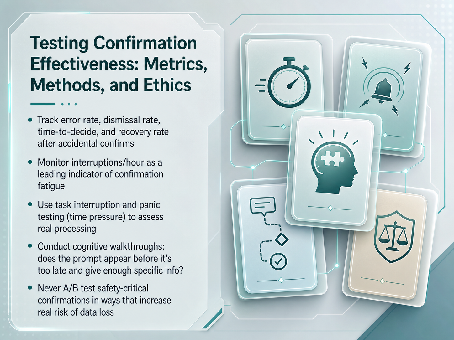
 - 10Testing Confirmation Effectiveness: Metrics, Methods, and EthicsNow, let's talk about how you'll know if your confirmation designs are actually working. We can't just trust our instincts; we need to measure effectiveness. Start by tracking four key quantitative metrics: the error rate after the dialog, the dismissal rate, the time users take to decide, and the recovery rate after accidental confirms. Next, keep an eye on interruptions per hour. If this number is climbing, it's a leading indicator of confirmation fatigue. Your users are starting to tune out. To really understand processing, use task interruption and panic testing. Put users under time pressure to see if your prompts still work when it counts. You should also run cognitive walkthroughs. Ask: does the prompt appear before it's too late? And does it give enough specific information for a real decision? Finally, and this is a hard ethical line, never A B test safety-critical confirmations in a way that increases the real risk of data loss. Now, let's shift our focus to ensuring everyone can use these dialogs, starting with accessibility standards.
 nngroup.comuxplanet.orgmedium.com+22 min
 - 11Accessibility Deep Dive: WCAG Compliance for Confirmation DialogsNow let's translate all of that into real technical compliance with an accessibility deep dive. For a destructive prompt that needs an immediate response, don't just use the standard dialog role — use role equals alert dialog. That ARIA role tells assistive technology this is urgent and interrupts whatever else the screen reader was doing. When the dialog opens, set initial focus on the Cancel button, not on the destructive action. This small choice prevents muscle-memory accidents where a user presses Enter before reading, because the default safe path is the first thing they land on. Next, implement a focus trap. While the modal is open, pressing Tab or Shift plus Tab must cycle only through the dialog controls — never escape into the background page. And finally, all of this rolls up into satisfying key WCAG 2.2 criteria: Keyboard operability, Focus Order so the sequence makes visual and logical sense, and Name, Role, Value so assistive technology correctly announces what this thing is and what it does. Up next, we'll pull everything together into a unified framework for designing confirmation flows.
 w3.orguxpin.coma11ypath.com+22 min
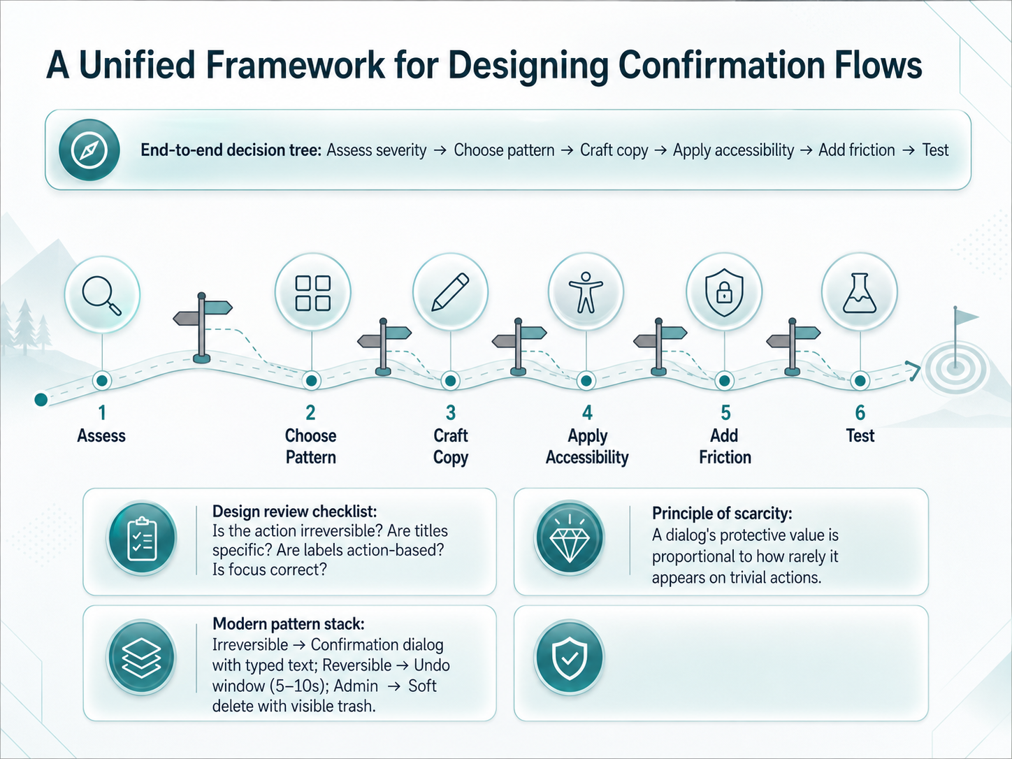
 - 12A Unified Framework for Designing Confirmation FlowsWith all the individual guidelines we have covered, let's bring them together into one unified framework. The goal is not to memorize a list of rules. The goal is to have a decision-making process you can apply to any action in your product. It starts with an end-to-end decision tree. First, assess the severity. Is this irreversible? Next, choose the right pattern. Do you need an undo window, a soft delete, or a full confirmation dialog? Once you choose the pattern, craft the copy with a specific title and action-based labels. After that, apply accessibility by setting logical focus order and using proper ARIA roles. Then, add intentional friction. If it is truly destructive, consider asking the user to type the word 'delete' rather than just clicking a button. Finally, test the flow to ensure it does not slow down power users. We can also use a quick design review checklist to spot issues before shipping. Ask yourself: is the action truly irreversible? Are the dialog titles specific? Are button labels based on the actual action, and is the keyboard focus correct? A key principle that ties all of this together is the principle of scarcity. A confirmation dialog's protective value is directly proportional to how rarely it appears on trivial actions. If you warn users about everything, they stop reading when it really counts. In practice, modern product teams use a layered pattern stack. For an irreversible action, like permanently deleting an account, use a confirmation dialog, often with typed text for extra friction. For a reversible action, like removing a row from a list, skip the modal and use a five to ten second undo window. For admin operations, use a soft delete model with a visible trash for recovery. This stack keeps your interface safe for new users and fast for power users. Next, let's look at common pitfalls and team alignment strategies to maintain this system over time.
 nngroup.comprimer.styledesignsystems.one+22 min
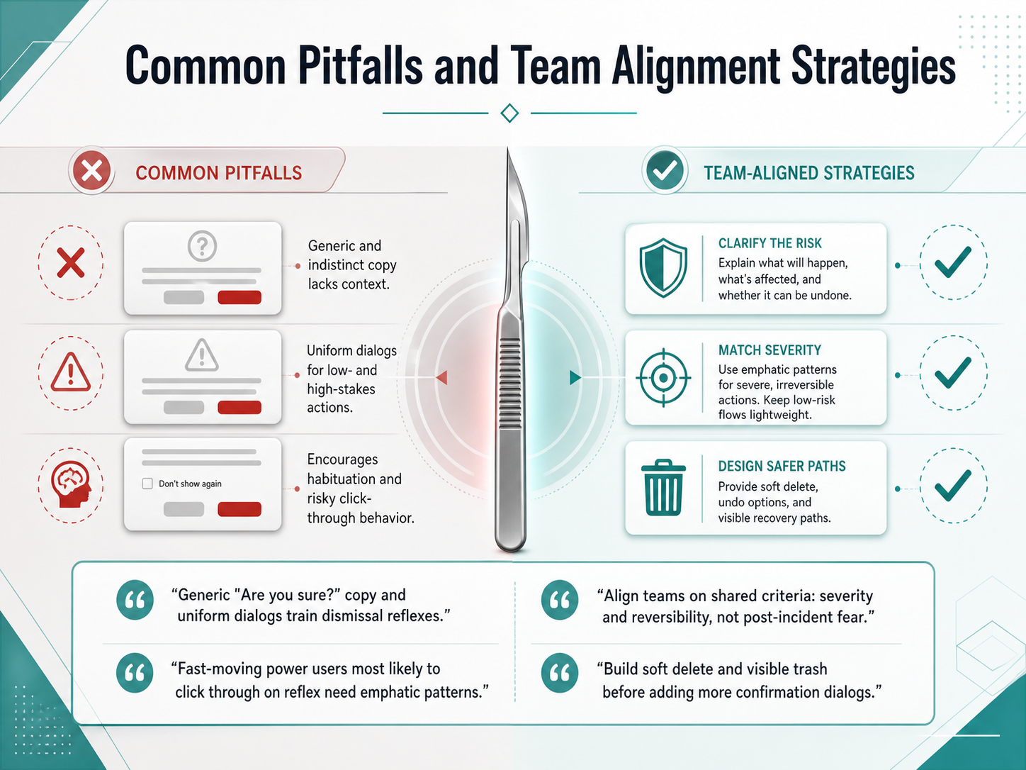
 - 13Common Pitfalls and Team Alignment StrategiesLet's turn now to the most common pitfalls teams fall into, and how to align around better safeguards. The biggest trap is the generic dialog. A uniform 'Are you sure?' on every action trains a single, unconscious reflex: dismiss and move on. That becomes dangerous when a genuinely destructive action pops up in the same wrapper. No one reads it. The dismissal reflex has already taken over. And here's the part that's easy to overlook: your fastest power users, the ones who perform dozens of actions a day, are the most likely to click through on pure muscle memory. They need emphatic, distinct patterns, not louder words in the same box. To align your team, tie your confirmation decisions to two shared criteria: severity of the outcome, and whether the action is reversible. Do not anchor your strategy to the fear of the last post-incident review. That's how dialogs multiply without actually increasing safety. Here's a concrete first step: before you add one more confirmation dialog, build a soft delete and a visible trash. Give users a recovery path that doesn't slow them down. When they know they can restore an item, you can strip out dozens of low-stakes confirmations. The ones that remain will actually be read. Up next, we'll bring all of this together in a final course summary and a clear action plan for your own confirmation flow design.
 nngroup.comprimer.styledesignsystems.one+22 min
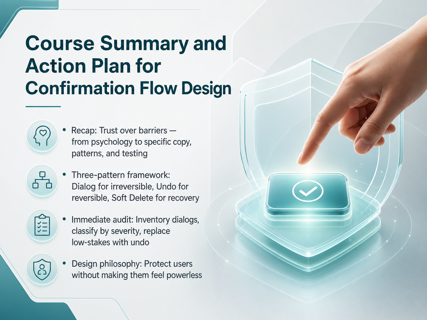
 - 14Course Summary and Action Plan for Confirmation Flow DesignWe have covered a lot of ground together, so let us bring it into focus with a clear summary and an action plan you can start using right away. At the core of this work is a simple principle: we design for trust, not for barriers. Everything flows from that. We moved from understanding the psychology of user error through to writing specific, action-based copy, choosing the right pattern, and testing with real users. Use the three-pattern framework to guide your decisions. For actions that are truly irreversible, use an explicit confirmation dialog. For reversible actions, replace that dialog with a simple undo option. And for anything that might need recovery later, use a soft delete pattern with a visible trash. Your immediate next step is an audit. Go through your product and inventory every confirmation dialog. Classify each action by its actual severity, and immediately replace every low-stakes dialog you find with an undo toast. This one change will dramatically reduce friction for your users. Where a dialog is truly justified, make sure the title names the action and the object, like 'Delete Q3 Sales Report?', and never use 'Are you sure?'. This entire practice rests on a single design philosophy: our job is to protect users without ever making them feel powerless. A well-crafted confirmation is not a wall; it is a thoughtful pause that respects a person's mental model and their time. Thank you for your attention throughout this course. Now, go audit those dialogs and build confidence into every interaction your users have.
 uxplanet.orgmedium.comnngroup.com+22 min
Take the deck with you
Download this course as a file — free, no sign-up needed.
- PDF handoutEvery slide page, ready to print or share.15 pages · 3.4 MBDownload
- Narrated PowerPointThe deck that presents itself — every slide carries the digital human's narration video.15 pages · 15.8 MBDownload
- PowerPoint slidesThe full deck as a .pptx — open it in PowerPoint, Keynote, or Google Slides.15 pages · 3.3 MBDownload
Free to use in your own training — please keep the PersonWise credit page at the end.
Have your own deck? Turn it into a course
Sources consulted
Web sources consulted while building this course.
- Confirmation dialogs: How to design dialogs without irritation — uxplanet.org
- Critical confirmation: The language and logic of destructive modals | by Aleksandra Smith | Bootcamp | Medium — medium.com
- Confirmation Dialogs Can Prevent User Errors (If Not ... — nngroup.com
- Confirmation dialog UX Pattern | UX Patterns Guide — uxpatternsguide.com
- Guidelines - ConfirmationDialog | Primer — primer.style
- Confirmation fatigue UX Anti-pattern | UX Patterns Guide — uxpatternsguide.com
- Replication: Do We Snooze If We Can’t Lose? — teamusec.de
- The Confirmation Nudge: Prompts to Change or Confirm Initial Preferences Steer Consumer Choice — doi.org
- Confirmations - Win32 apps | Microsoft Learn — learn.microsoft.com
- Designing Success (Part 2): Do’s, Don’ts, and Use Cases of Confirmation Patterns - The UX Bit — designmybit.com
- Confirmations & destructive actions — Cross-system pattern reference | DesignSystems.one | DesignSystems.one — designsystems.one
- Modal Dialog Example | APG | WAI — w3.org
- How to Build Accessible Modals with Focus Traps (2026 Guide) | UXPin — uxpin.com
- Accessible Modal Dialog: Native HTML dialog Element — A11yPath — a11ypath.com
- Building Accessible Modals: Native `<dialog>` or a Library? — blog.openreplay.com
- Understanding Success Criterion 2.1.2: No Keyboard Trap — w3.org
- Typed confirmation UX Pattern | UX Patterns Guide — uxpatternsguide.com
- https://vercel.com/geist/destructive-action-modal — vercel.com
- Destructive action confirmation | Prism Design System — prism-design.supernova-docs.io
- How To Manage Dangerous Actions In User Interfaces — smashingmagazine.com