Storytelling with Data Visualization
Begin
14 pages · ~28 min
Storytelling with Data Visualization
Learn to craft compelling data narratives and design clear, impactful visualizations for business audiences. Ideal for professionals seeking to communicate insights effectively.
What you’ll learn
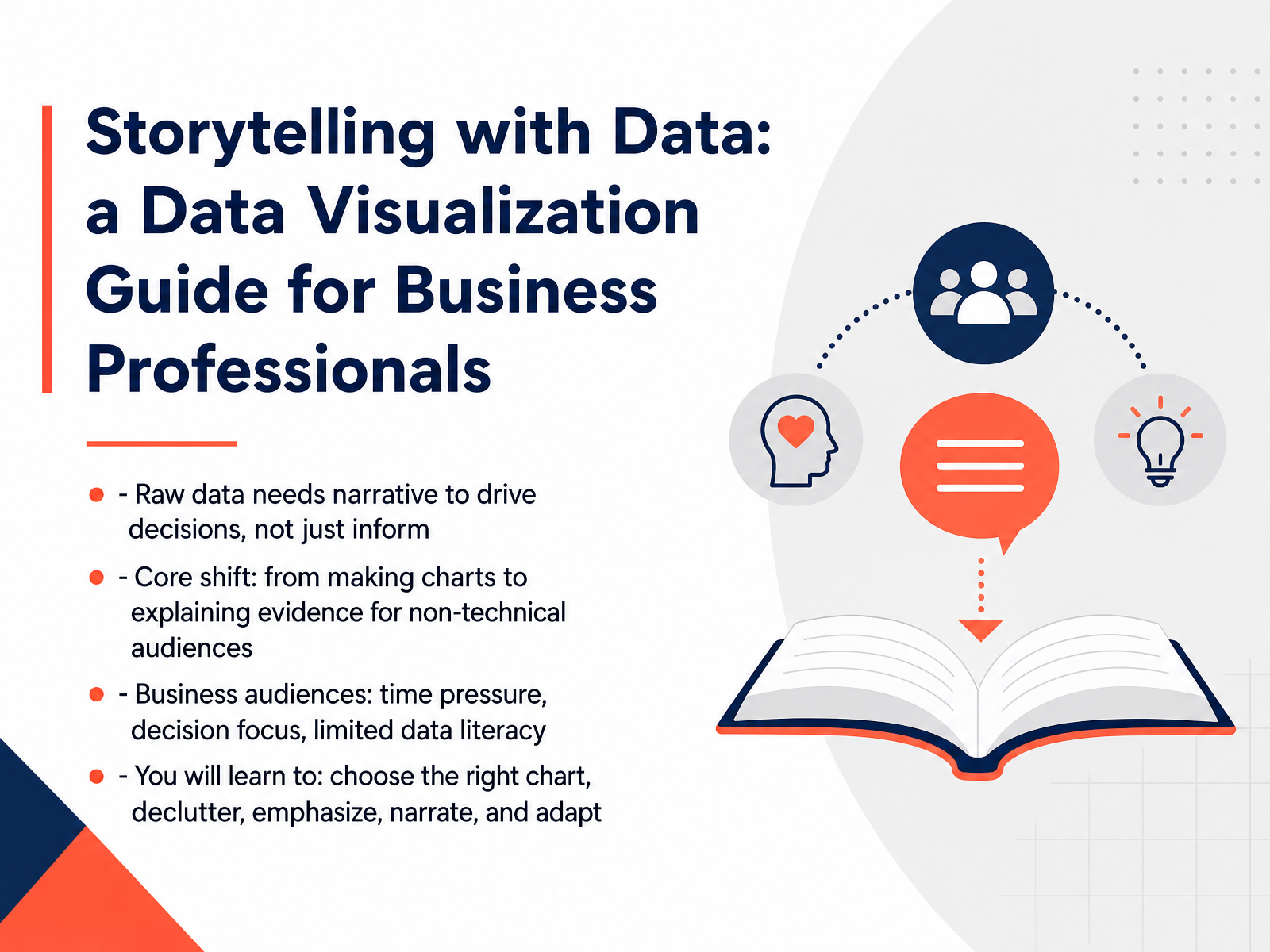
- 01Storytelling with Data: a Data Visualization Guide for Business ProfessionalsWelcome. If you've ever watched a room full of stakeholders stare blankly at a chart, you already know the problem this course solves. Raw data only informs. It doesn't decide. Your job is to build the bridge between numbers and action. That means shifting from just making charts to explaining evidence for people who are short on time, focused on outcomes, and not interested in doing your analysis for you. In this course, you'll learn to choose the right chart for the message, strip away clutter that hides your point, and use emphasis to show people exactly where to look. You'll also learn to structure the story so your audience remembers it, and adapt your approach as the situation demands. Think of your last dashboard or weekly report. Would a quick glance tell your boss what needs to happen next? If not, you're in the right place. Let's start by looking at what poor data communication actually costs in real business terms.storytellingwithdata.comsupersummary.comapp.getstoryshots.com+21 min
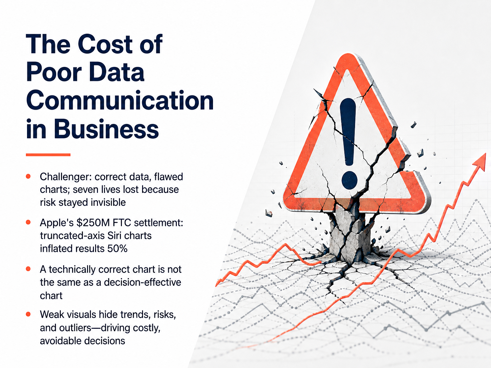
- 02The Cost of Poor Data Communication in BusinessLet's start by looking at what's at stake when we get data communication wrong. Consider the Challenger disaster. The engineers had the right data—O-ring failure rates clearly rose as temperature dropped—but their charts were so poorly designed that the risk stayed invisible. Seven lives were lost as a result. More recently, Apple paid a two hundred fifty million dollar settlement over Siri charts with truncated axes that inflated a five percent accuracy gain to look like fifty percent. Here's the core point: a technically correct chart is not the same as a decision-effective chart. When your audience can't quickly spot the trend or the outlier, they will miss the risk hiding in plain sight. That leads to costly, avoidable decisions. So the stakes are clear. Now let's talk about how your audience actually builds meaning from the charts you create.
 stephen-few.comonlineethics.orgdatafield.dev+21 min
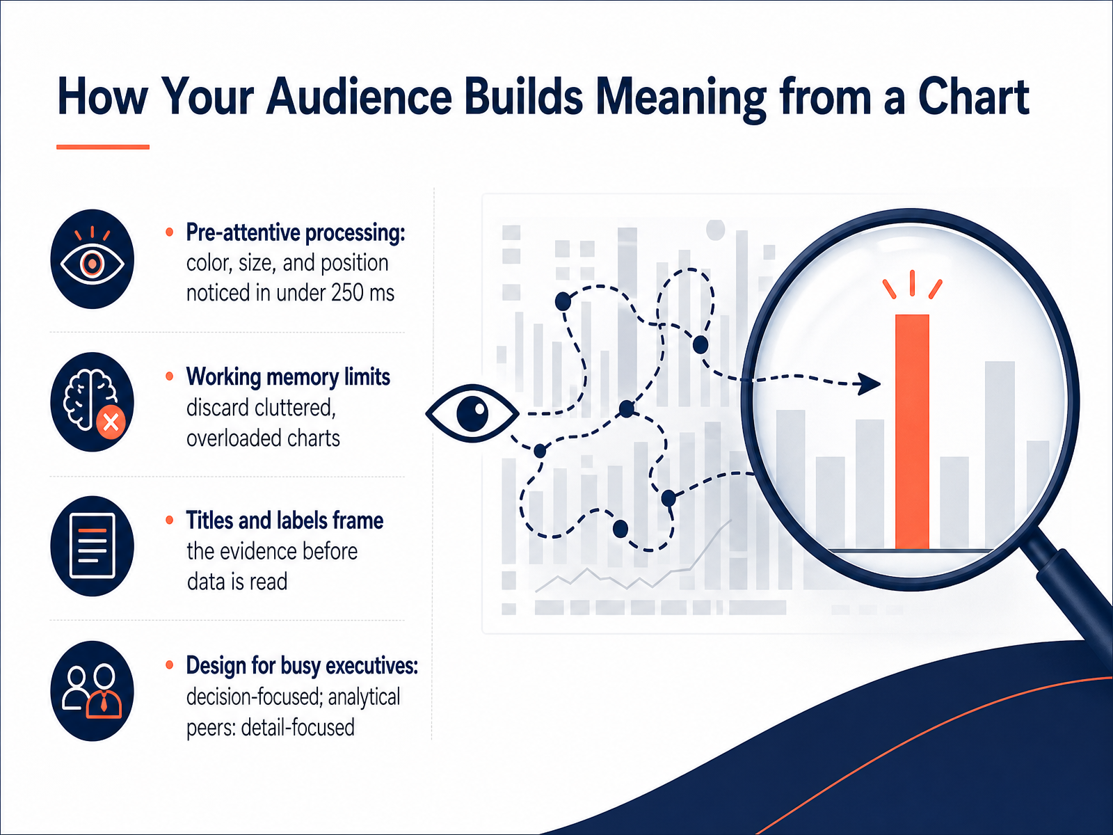
 - 03How Your Audience Builds Meaning from a ChartNow let’s talk about how your audience actually builds meaning from a chart. It starts with something called pre-attentive processing. That’s a fancy term for a simple fact: your brain notices certain visual cues like color, size, and position in under a quarter of a second. No conscious effort required. So when you make one bar bright red and the rest gray, the message lands instantly. The catch is working memory. It can only hold a few chunks at a time, and a cluttered chart overloads it fast. If your audience has to work to find the point, they’ll likely give up. Titles and labels do heavy lifting here. They frame the evidence before anyone reads a single number. So make them count. And remember your audience. Busy executives need decision-focused charts. Analytical peers can handle more detail. When you design for how people see and process, your charts stop being decoration and start being tools that drive action. Up next, we’ll look at how to choose a chart that supports the decision you need to make.
 annualreviews.orgcsc2.ncsu.edugraphicsinterface.org+21 min
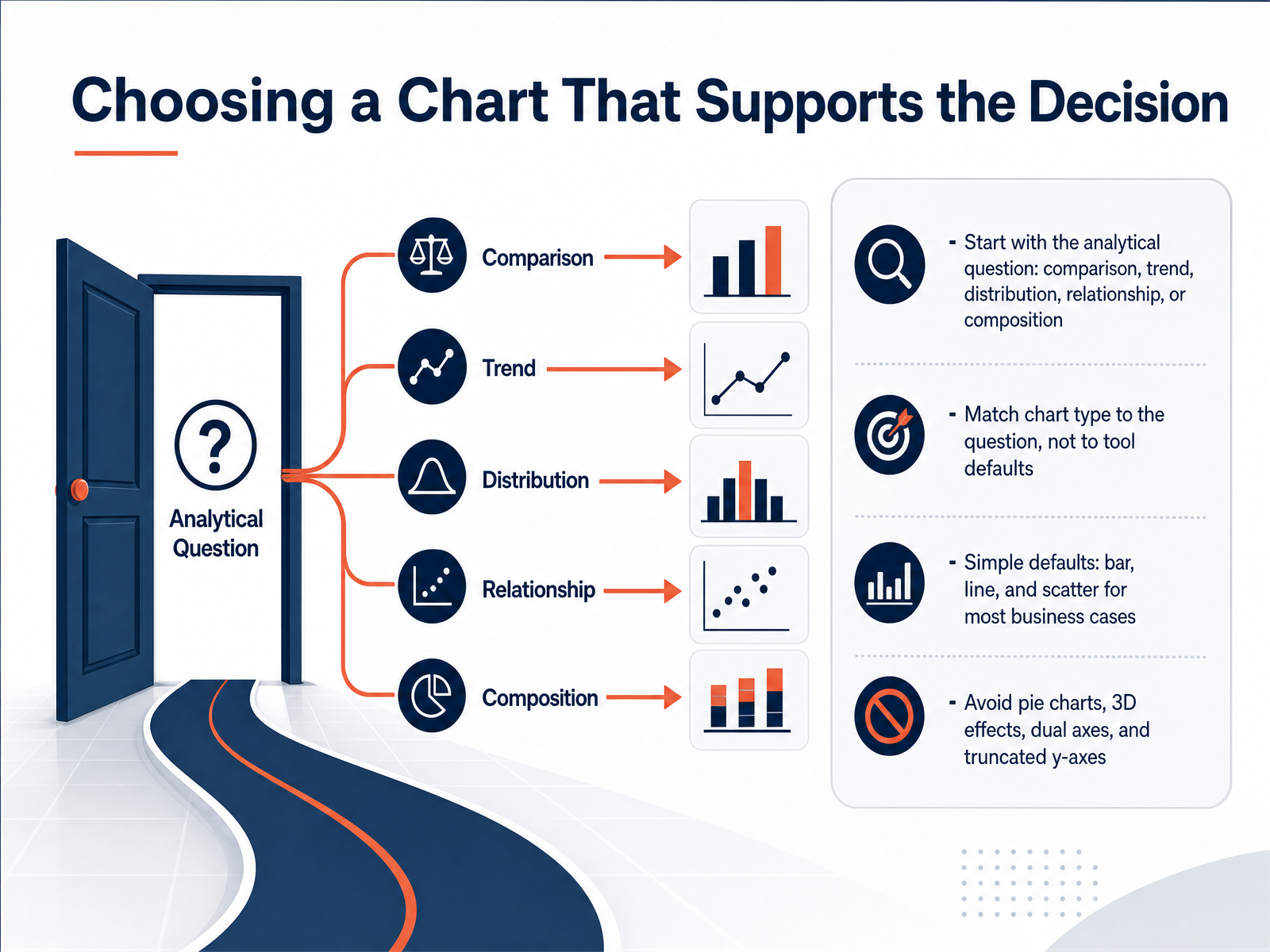
 - 04Choosing a Chart That Supports the DecisionSo how do you pick the right chart? It’s simple: start with the analytical question, not with what your software defaults to. Are you comparing values? Look for differences between categories. Showing a trend? That’s change over time. Maybe you need to show a distribution, or a relationship between two variables. Or perhaps it’s about composition — the parts of a whole. Once you name the question, the chart type almost picks itself. For most business cases, bar charts handle comparisons, line charts handle trends, and scatter plots handle relationships. That covers a huge amount of daily reporting. Now, some rules of thumb. Avoid pie charts unless you have two or three slices. Skip 3D effects — they distort the numbers. Never use dual axes; they mislead the eye. And always start your bar chart axis at zero. A truncated axis makes small differences look dramatic. Match the chart to the decision, and your audience will get the point in seconds instead of squinting. Up next, we’ll look at reducing clutter so your message stands out.
 datafield.devflourish.studiohighcharts.com+22 min
 - 05Reducing Clutter and Emphasizing the SignalLet’s talk about clearing away the noise. The fastest way to improve most charts is to remove things. Edward Tufte called this maximizing your data-ink ratio—the share of pixels that actually carry meaning. Gridlines, borders, redundant labels, drop shadows, 3D effects: if it doesn’t help the viewer understand the data, it’s probably getting in the way. Try this: make gridlines light gray or kill them entirely. Use direct labels instead of a legend. And if numbers are already labeled, axes can go. Now, for emphasis—use one accent color. Just one. Put the rest in neutral gray, and save your strong color for the one bar, line, or point you want people to see. Studies show this actually drives what viewers remember. And finally, write your title as the takeaway—not just the topic. Instead of "Sales by Quarter," try "Q4 sales recovered above pre-pandemic levels." That way, even a quick glance gets the point. So: remove, lighten, and make the message unmistakable. Next, we’ll look at building a three-part narrative around the data—another layer that turns a chart into a story.
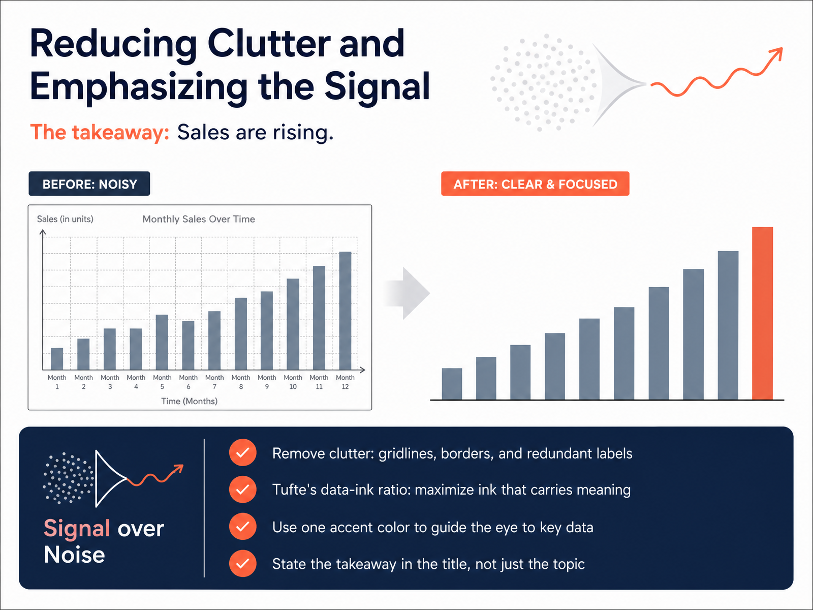 1 min
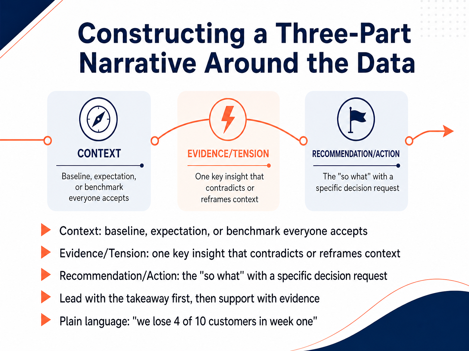
1 min - 06Constructing a Three-Part Narrative Around the DataLet's talk about the backbone of any good data story: a three-part narrative. First, set the context. This is the baseline, the expectation, or the benchmark everyone already accepts. It's the ground you're standing on. Next, introduce the tension: the one key insight that contradicts or reframes that context. This is what grabs attention. Then, deliver the recommendation: the so-what, with a specific request for a decision. Here's the trick: lead with the takeaway first, then back it up. Don't build suspense. Say it plainly. Instead of 'the cohort retention curve shows a decline at day seven,' say 'we lose four of ten customers in their first week.' That's clarity under pressure. A simple chart with a clear takeaway always beats a beautiful chart that leaves the reader guessing. In our next part, we'll look at annotations and captions, the final layer of clarity.
 1 min
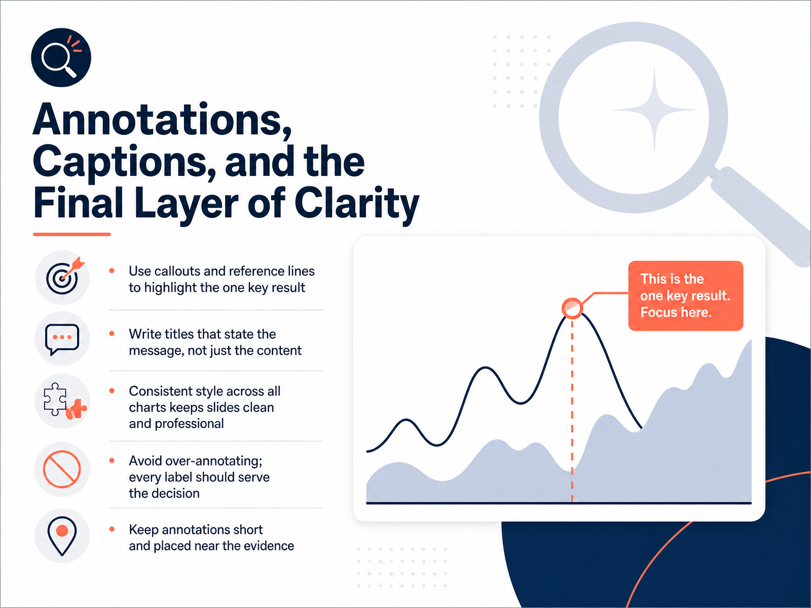
1 min - 07Annotations, Captions, and the Final Layer of ClarityOnce your chart is clean and your message is clear, the final layer is annotation. Think of annotations as your voice on the chart. A simple callout like "Q4 sales surged thirty percent due to the new product launch" turns an interesting chart into a decision-ready insight. First, use callouts and reference lines to highlight the one key result. Don't annotate everything—only what matters for the decision. Second, write titles that state the message, not just the content. Instead of "Revenue by Quarter," use "Revenue grew eighteen percent despite supply chain setbacks." That immediate context orients your audience. Third, keep a consistent style across all charts. Same font, same color, same placement. This keeps your slides clean and professional, so viewers know where to look. Fourth, avoid over-annotating. Every label should serve the decision. If a reader needs more than a few seconds to get the point, you're either under-annotated or over-annotated. Finally, keep annotations short and place them right next to the evidence. An arrow and six words beat a paragraph anywhere else on the slide. Remember, annotation is guided interpretation. It reduces cognitive load and makes the actionable insight impossible to miss. Next, we'll look at how to adapt the same evidence for different audiences.
 1 min
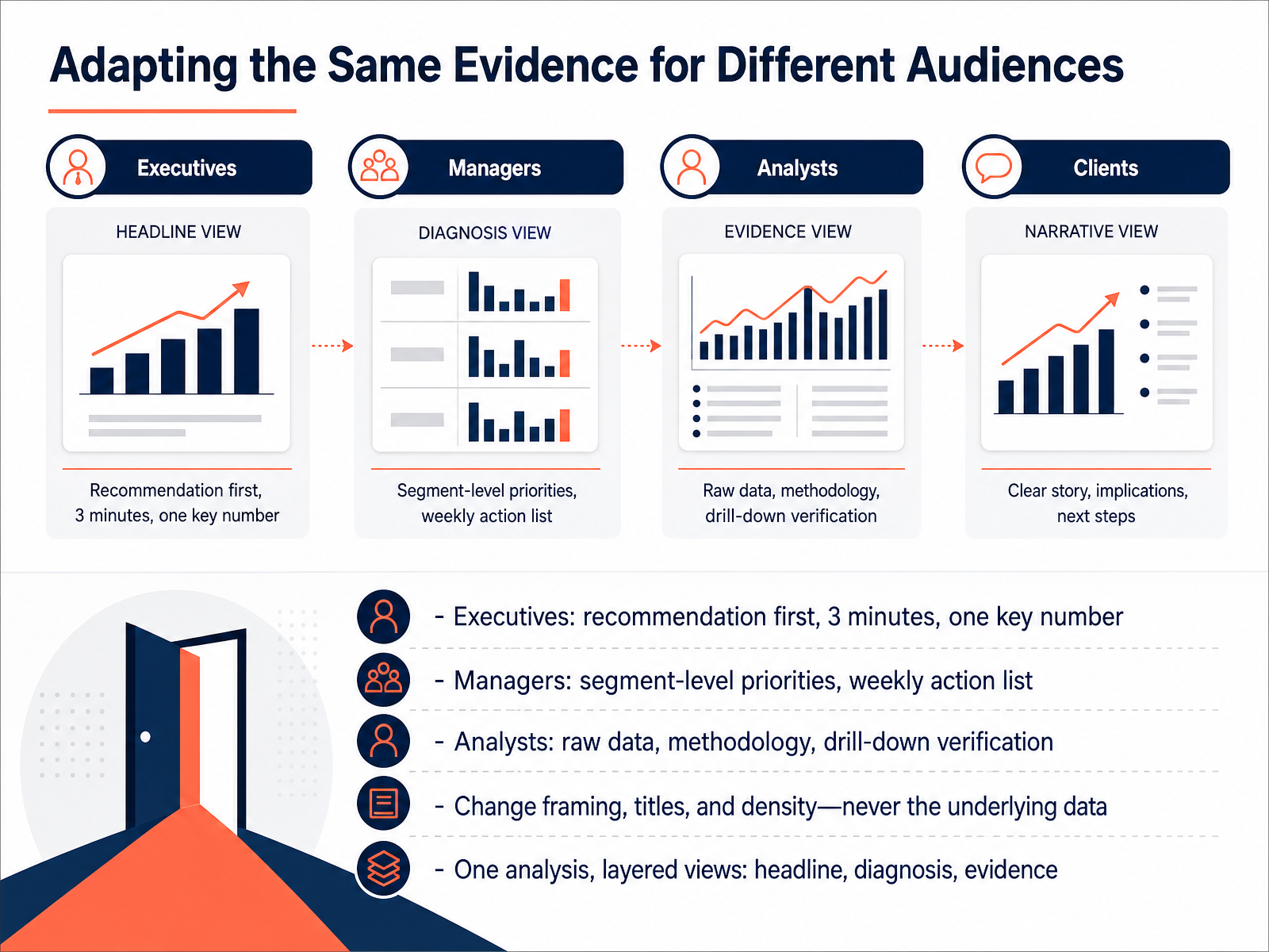
1 min - 08Adapting the Same Evidence for Different AudiencesNow let's talk about adapting the same evidence for different audiences. The data doesn't change, but how you frame it absolutely must. Executives need the recommendation up front and one key number, delivered in about three minutes. Managers need segment-level priorities they can turn into a weekly action list. Analysts need raw data, methodology, and the ability to drill down and verify. The key is to change the framing, the titles, and the density, but never the underlying data itself. Think of it as one analysis with three layered views: the headline for decision-makers, the diagnosis for managers, and the full evidence for analysts. Same truth, different altitude. And this layered approach is what keeps you from falling into common pitfalls, which we'll tackle next.
 1 min
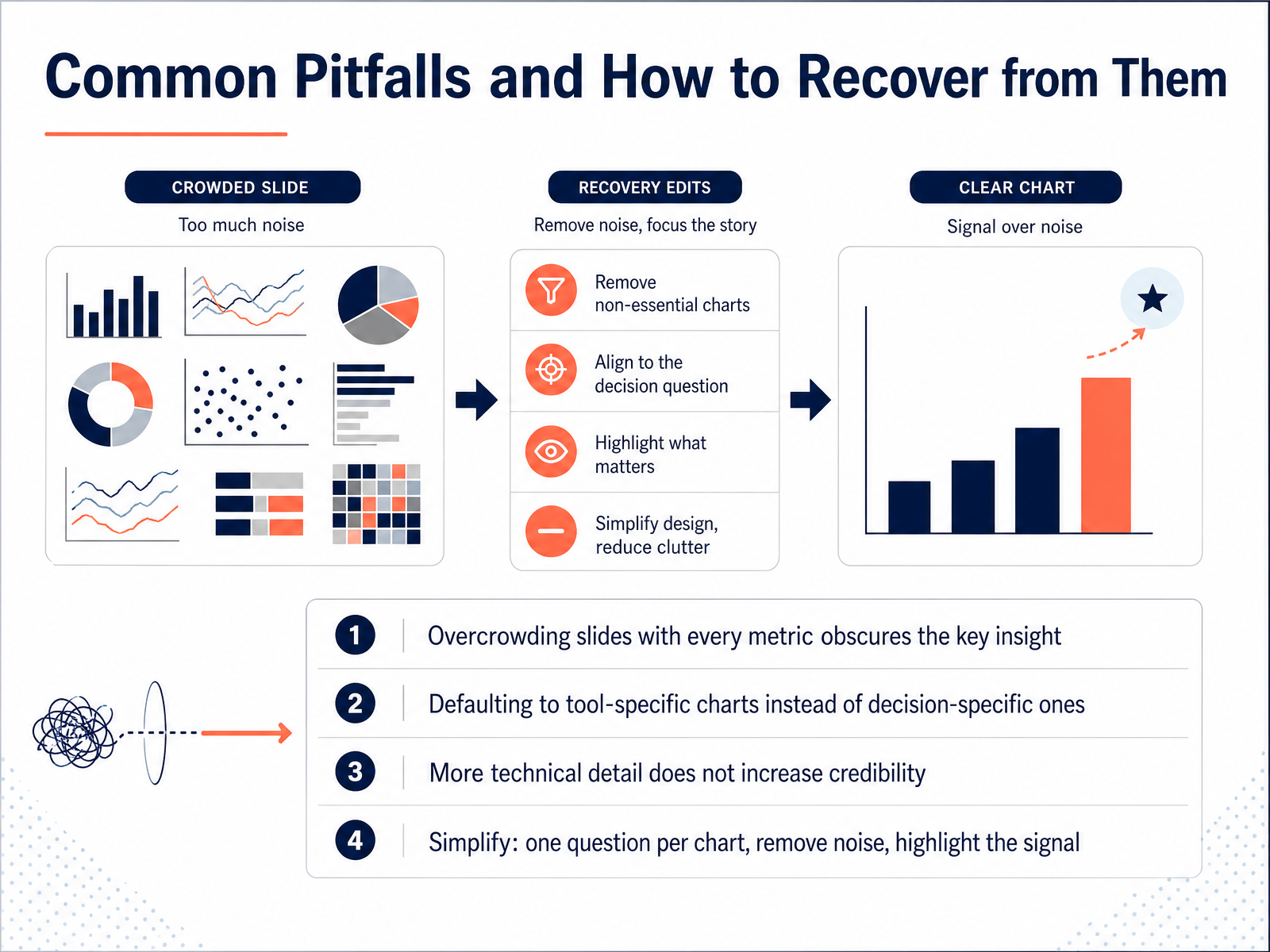
1 min - 09Common Pitfalls and How to Recover from ThemLet's talk about the common pitfalls and how to recover from them. First, overcrowding. When you pack every metric into one slide, you bury the key insight. Your audience can’t find the story, so they tune out. Second, defaulting to whatever chart your tool suggests instead of choosing one that answers the specific decision. A pie chart might look nice, but a simple bar chart often communicates the comparison far better. Third, think that more technical detail boosts your credibility. It doesn’t. It just adds noise and makes people question your judgment. The fix is always the same: simplify. One chart, one question. Remove the gridlines, the legends, the extra colors. Highlight the signal, not the noise. Before you present, ask yourself: if someone sees this for ten seconds, do they get the point? If not, cut it down. Now, let's apply these principles to your next presentation.
 1 min
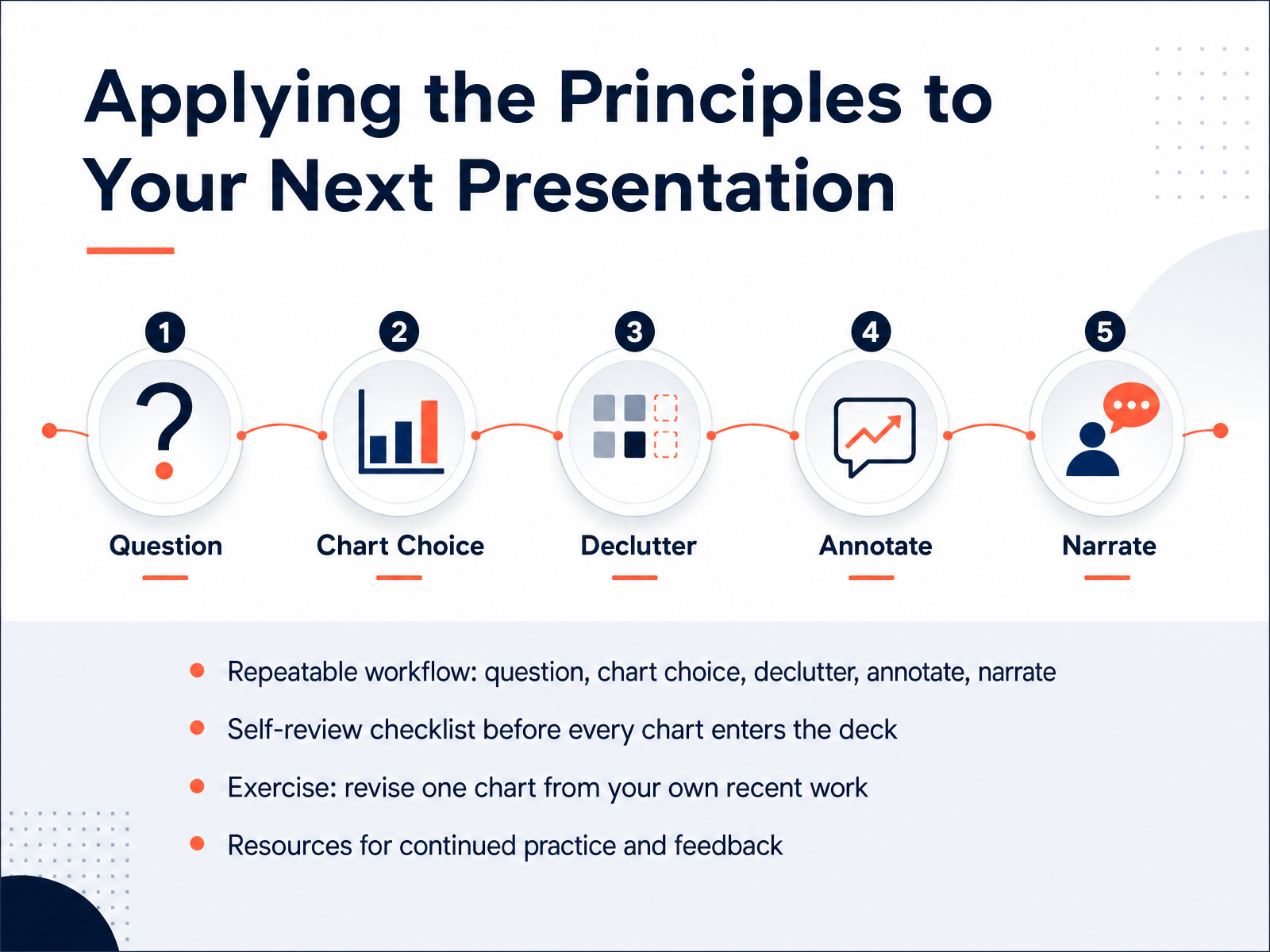
1 min - 10Applying the Principles to Your Next PresentationSo how do you make all of this stick? You need a repeatable workflow. Start with the question you are answering, then pick the chart type, strip out the clutter, annotate the key point, and narrate the takeaway. Before any chart goes into your deck, run it against a quick self-review. Do the numbers match the source? Does the title state the conclusion, not just the topic? Would a skeptic trust the axis and the labels? Now, here is the practical part. Take one chart from your own recent work and revise it using this process. It takes ten minutes, and it will show you exactly where your habits need to shift. Keep the checklist with you, and run it every time. No exceptions. And remember, the goal is not perfect graphics. It is a chart your audience understands in five seconds and acts on confidently. Now let us put this into practice with a real business chart you can revise step by step.
 2 min
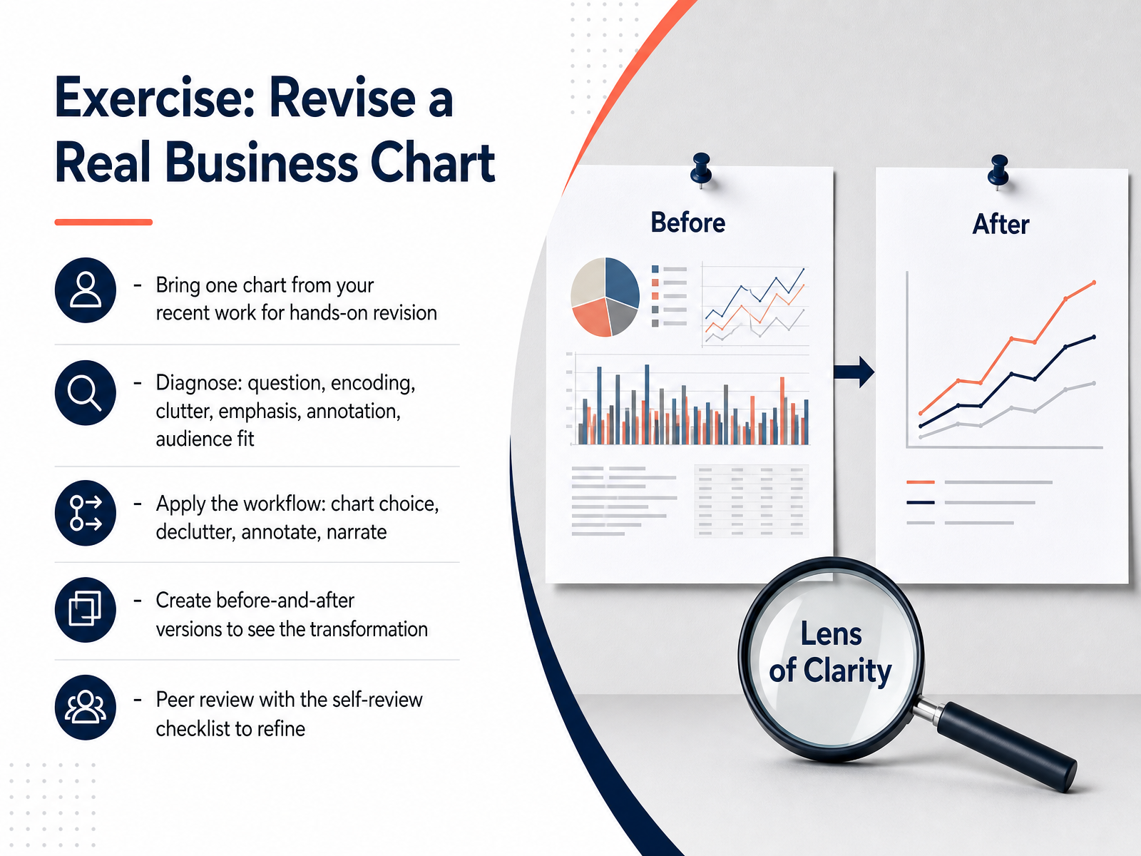
2 min - 11Exercise: Revise a Real Business ChartNow it's time to put all of this into practice, using your own work. Pick one chart from a recent report, dashboard, or stakeholder review. Start with a diagnosis. What question is it answering? Is the encoding clear? Is there clutter? Is the emphasis right? Now apply the workflow. Choose the right chart type, declutter aggressively, annotate the key point, and prepare your narration. Then create two versions: the original and the revised version, side by side. The difference should be striking. Finally, run both through the self-review checklist. Does the headline state the insight? Does the color direct attention? Would a first-time viewer get the message in five seconds? Use a colleague for peer review if you can. Fresh eyes catch what you no longer see. This exercise is where the principles become habit. Once you've revised your chart, we'll look at how to present these decisions through decision-focused storytelling.
 1 min
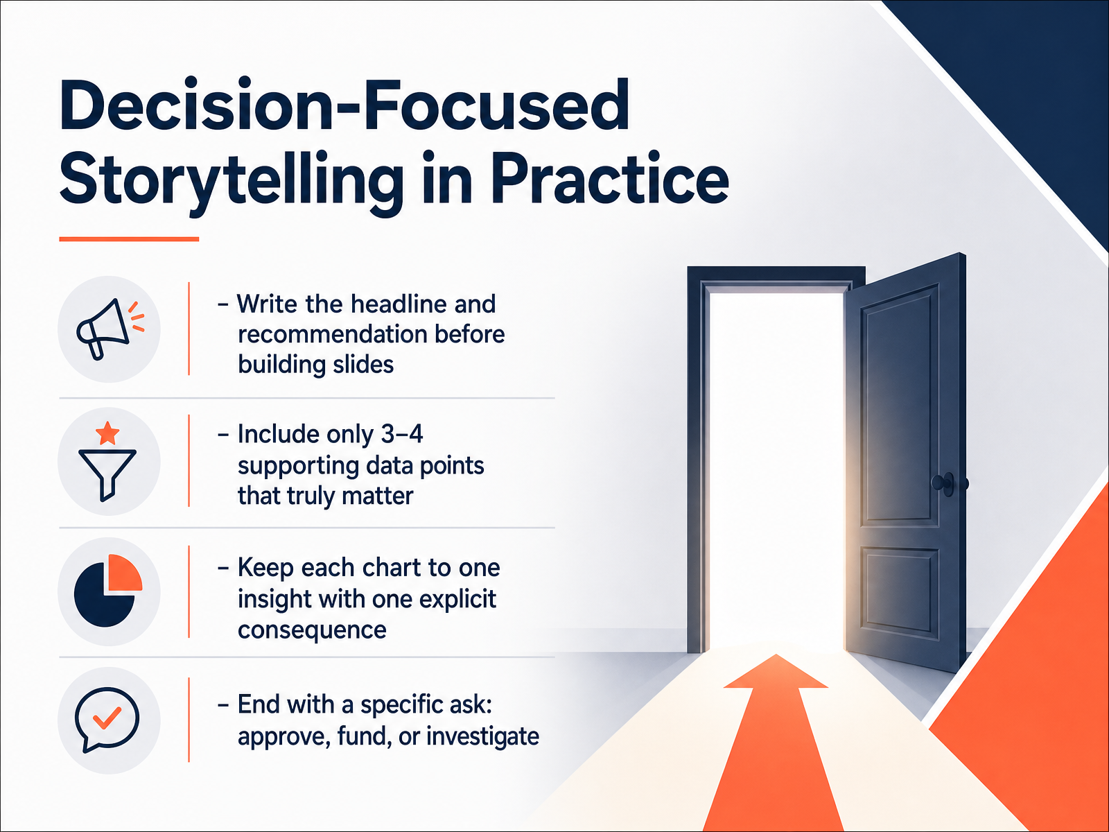
1 min - 12Decision-Focused Storytelling in PracticeHere is where the discipline really pays off. Before you build a single slide, write your headline and your recommendation. If you cannot state the conclusion in one clear sentence, you are not ready to present. This forces you to decide what the story is actually about. Then, pick only three or four supporting data points that truly matter. Not every interesting finding. Just the evidence that directly backs your recommendation. Each chart you show should carry exactly one insight, with one explicit consequence. If a chart needs two takeaways, split it or cut it. And finally, end with a specific ask. Are you asking for approval, funding, or further investigation? Make it concrete. A vague ask gets a vague response. A specific ask gets a decision. Remember, your job is not to display data. Your job is to drive a decision. Next, we will talk about how to keep that story honest, with ethics and trust in data visualization.
 1 min
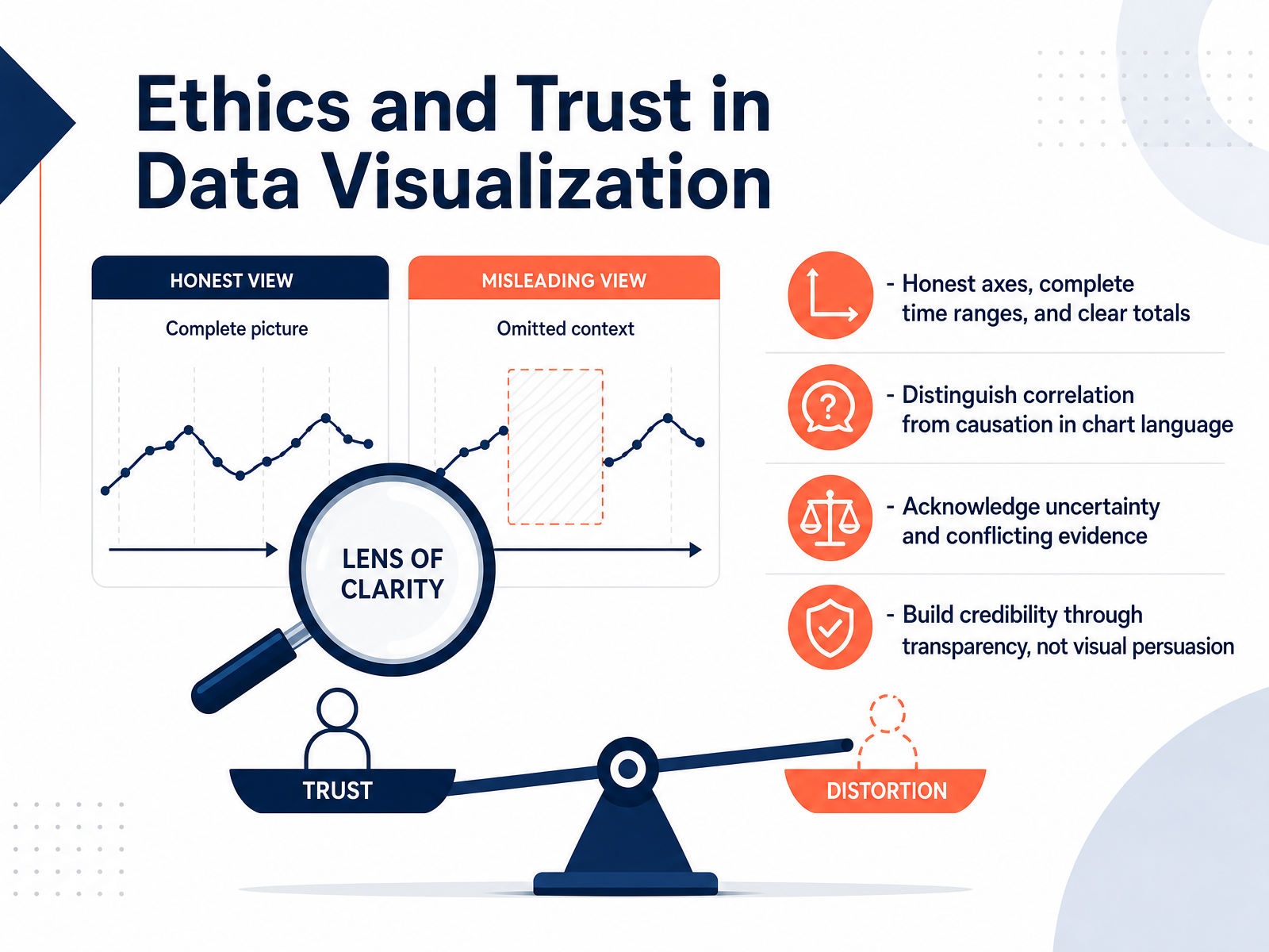
1 min - 13Ethics and Trust in Data VisualizationLet's talk about trust, because every chart you put in front of a stakeholder either builds it or erodes it. The first rule is simple: use honest axes. Start bar charts at zero, show complete time ranges, and give clear totals. When you truncate an axis to make a small difference look dramatic, you're not persuading, you're misleading. Second, watch your language. If your data shows correlation, say 'correlates with,' not 'causes.' That one word change protects your credibility and keeps you from making claims your data can't support. Third, acknowledge uncertainty. Add error bars, show confidence intervals, and don't hide conflicting evidence. Being upfront about what you don't know is a sign of rigor, not weakness. Finally, remember that transparency beats visual persuasion. The goal isn't to make the chart look impressive; it's to make the right decision obvious. When you prioritize clarity over flash, your audience learns to trust your numbers. And that trust is what makes your insights actually matter. Now let's pull these lessons together with a practical action plan.
 stephen-few.comonlineethics.orgdatafield.dev+22 min
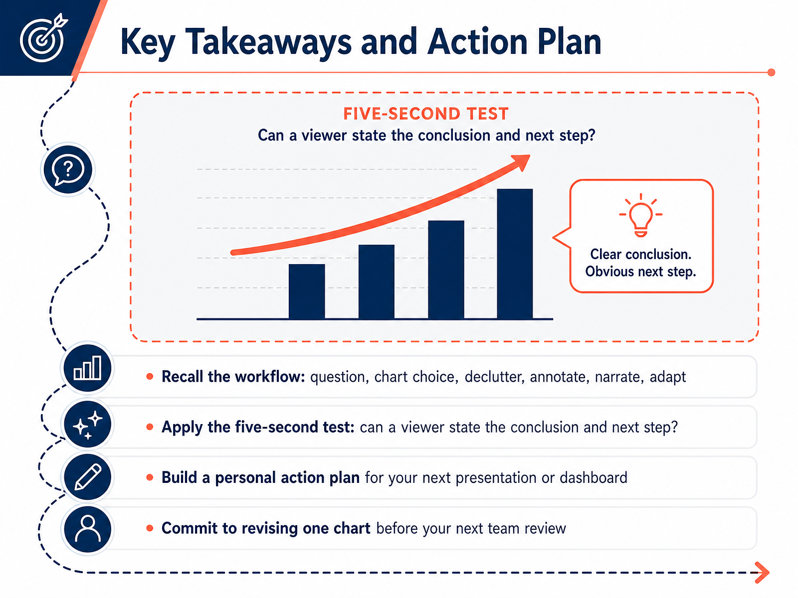
 - 14Key Takeaways and Action PlanSo here we are at the finish line. Let's lock in what matters. First, remember the workflow: start with a clear question, choose the right chart, strip out the clutter, annotate the key points, tell the story, and adapt to your audience. Second, run the five-second test on everything you build. Show it to someone. If they can't state the conclusion and the next step in five seconds, it needs work. Third, make this real. Build a personal action plan for your next presentation or dashboard. Write down which chart you will fix, which title you will sharpen, and which color you will use to direct attention. And commit to the smallest meaningful step: revise one chart before your next team review. Just one. That single act will change how you communicate with data. Thank you for your time today. You now have the tools; go use them and make your data impossible to ignore.
 storytellingwithdata.comsupersummary.comapp.getstoryshots.com+22 min
Take the deck with you
Download this course as a file — free, no sign-up needed.
- PDF handoutEvery slide page, ready to print or share.15 pages · 3.2 MBDownload
- Narrated PowerPointThe deck that presents itself — every slide carries the digital human's narration video.15 pages · 13.4 MBDownload
- PowerPoint slidesThe full deck as a .pptx — open it in PowerPoint, Keynote, or Google Slides.15 pages · 3.1 MBDownload
Free to use in your own training — please keep the PersonWise credit page at the end.
Have your own deck? Turn it into a course
Sources consulted
Web sources consulted while building this course.
- my guiding principles - storytelling with data — storytellingwithdata.com
- Storytelling With Data Overview - SuperSummary — supersummary.com
- Storytelling with Data: A Data Visualization Guide for Business Professionals by Cole Nussbaumer Knaflic | Summary & Audiobook | StoryShots — app.getstoryshots.com
- Key points from the book ‘Storytelling with Data’ by Cole Nussbaumer Knaflic | by Aneesh R | Analytics Vidhya | Medium — medium.com
- Cole Nussbaumer Knaflic's Storytelling With Data (Book ... — shortform.com
- Apple AI Settlement Reaches $250M: Viz Ethics Lessons — stephen-few.com
- Representation and Misrepresentation: Tufte and the Morton Thiokol Engineers on the Challenger — onlineethics.org
- Case Study 1: The Challenger Disaster — How a Chart... | AI & ML for Business | DataField.Dev — datafield.dev
- Case Study 2: The Challenger Disaster and the Chart... | Data Viz with Python | DataField.Dev — datafield.dev
- FYI Visual: The Story of a Product that was Built on a Fault — perceptualedge.com
- Perceptual and Cognitive Foundations of Information Visualization | Annual Reviews — annualreviews.org
- Perception in Visualization — csc2.ncsu.edu
- Harnessing Preattentive Processes for Multivariate Data Visualization — graphicsinterface.org
- Chapter 2: How the Eye Sees — Pre-Attentive Processing and... | Data Viz with Python — datafield.dev
- Systematic Variation of Preattentive Attributes to — iris.polito.it
- Chapter 5: Choosing the Right Chart: A Decision Framework f... | Data Viz with Python — datafield.dev
- How to choose the right chart type for your data - Flourish — flourish.studio
- Chartchooser — highcharts.com
- Choosing the right chart — Data Visualization — datarekha — datarekha.com
- Appendix C: Chart Selection Cheatsheet | Data Viz with Python | DataField.Dev — datafield.dev