Begin
14 pages · ~28 min
UI Design Patterns and Pitfalls
This training helps UI designers and developers evaluate common interface design patterns, identifying their strengths and pitfalls to make better design decisions.
A digital instructor presents all 14 pages. Hold “Ask” at any point and ask out loud — the answer comes from this course. No sign-up needed.
What you’ll learn
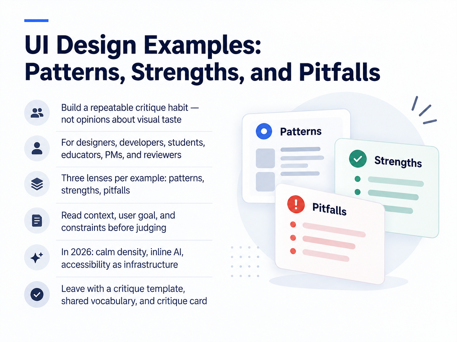
- 01UI Design Examples: Patterns, Strengths, and PitfallsWelcome. Over the next fourteen slides, we're building a repeatable critique habit, not a set of opinions about visual taste. This is for designers, developers, students, educators, product managers, and reviewers. You'll apply three lenses to every example: patterns, strengths, and pitfalls. Before you judge anything, read the context, the user goal, and the constraints. A dense dashboard that fails for a first-time consumer might be exactly right for a power user. In 2026, three currents matter: calm density, inline AI, and accessibility treated as infrastructure. You'll see calm density in products like Linear, where restrained type and muted color let dozens of issues live on one screen. Inline AI replaces chat panels by putting the model at the cursor or selection. And accessibility, from reduced motion to visible focus states, is now built into the wireframe rather than retrofitted after launch. Hold that frame. Ask whether each choice solves a real problem, or just decorates one. Let's start with a working critique framework.elements.envato.comtimgraf.comaydesign.ai+22 min
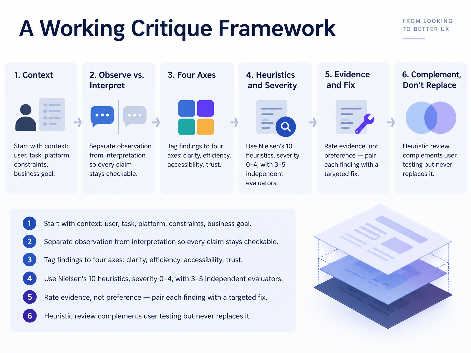
- 02A Working Critique FrameworkSo before we critique any interface, we need a shared method. A working critique framework does five things. First, start with context: who's the user, what task, which platform, what constraints, and what business goal. A pattern that works for a quick mobile check-in may fail in a dense enterprise dashboard.
Second, separate observation from interpretation. "The primary button sits below the fold" is checkable; "the design feels cluttered" is not. Keep every claim tied to something you can point at.
Third, tag findings to four axes: clarity, efficiency, accessibility, and trust. That tag tells you who owns the fix.
Fourth, use Nielsen's ten heuristics, with severity scored zero to four, and run three to five independent evaluators. You'll see this when a single reviewer flags a handful of issues and a group surfaces twice as many.
Fifth, rate evidence, not preference. Pair each finding with a targeted fix. And remember, a heuristic review complements user testing but never replaces it. Let's move on to navigation and information architecture patterns.
 faculty.washington.edusuperbloom.designgithub.com+22 min
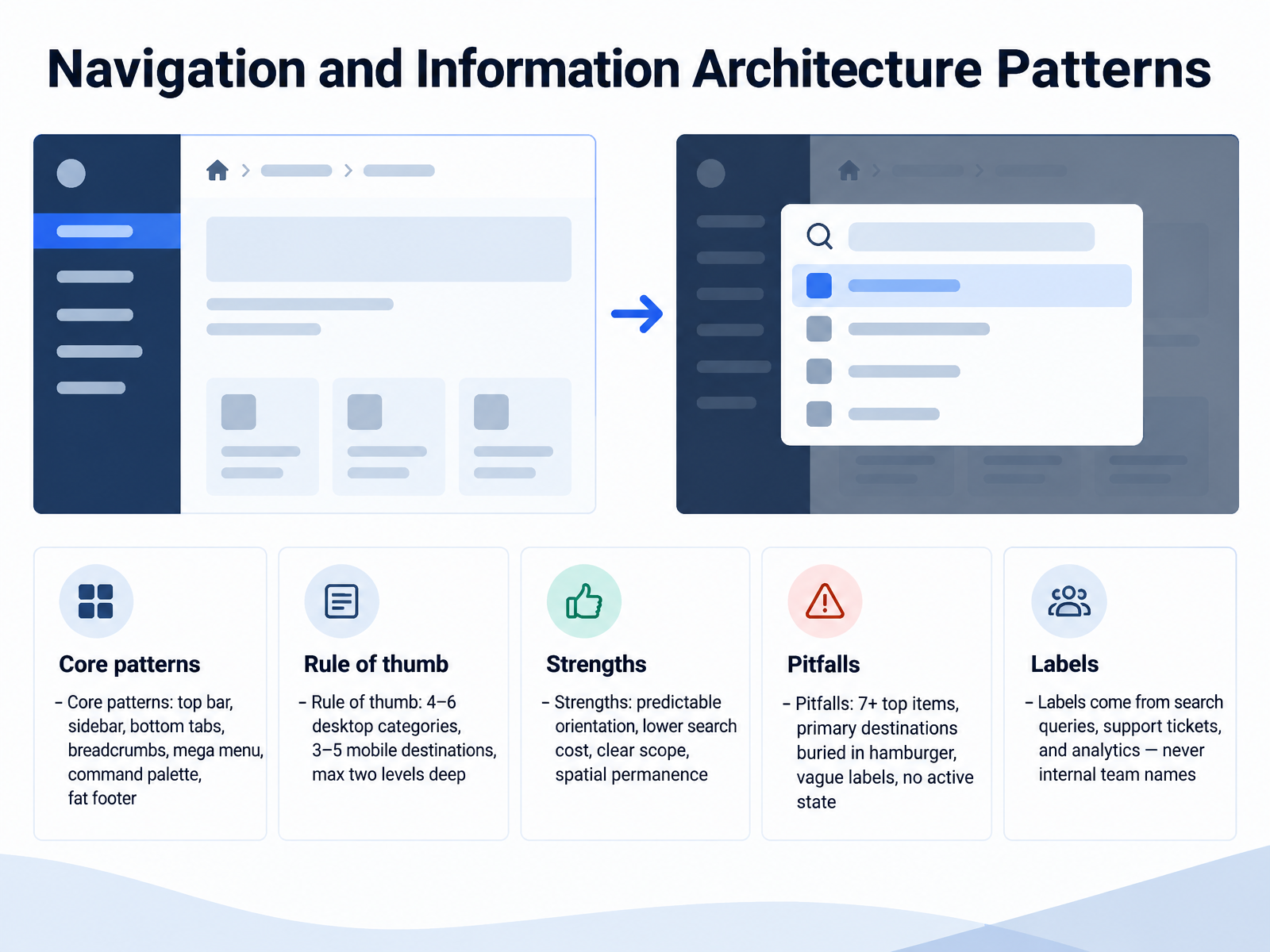
 - 03Navigation and Information Architecture PatternsNow let's look at navigation and information architecture patterns. The core set you'll evaluate includes the top bar, sidebar, bottom tabs, breadcrumbs, mega menu, command palette, and fat footer. As a rule of thumb, keep desktop categories between four and six, mobile destinations between three and five, and hold the hierarchy to a maximum of two levels. The strengths are predictable orientation, lower search cost, clear scope, and spatial permanence. That last term means a menu keeps the same position on every screen, so users build a reliable mental map. The pitfalls are equally concrete. Seven or more top items overloads scanning. Primary destinations buried in a hamburger menu lose discoverability. Vague labels force guessing, and no active state leaves users unsure where they are. You'll see this when a sidebar rearranges per section, which breaks the spatial memory people built. Ask whether your labels match user language, not internal team names. Pull them from search queries, support tickets, and analytics. Next, we move into forms, input, and error prevention.
 layoutscene.comweb.michaelbell.co.uklazarev.agency+21 min
 - 04Forms, Input, and Error PreventionLet's move into forms, input, and error prevention, the place where interface decisions get judged fastest.
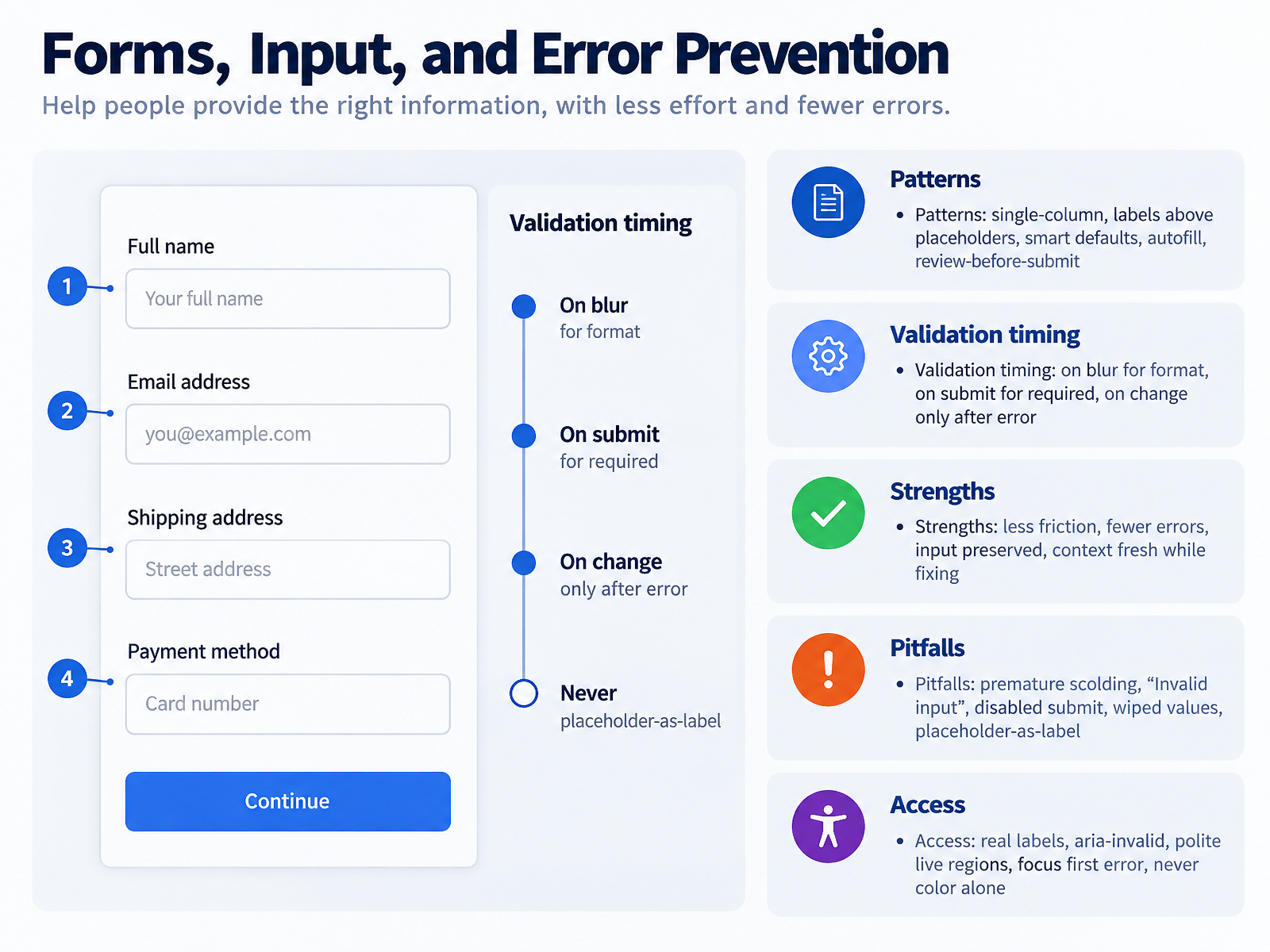
Start with the structural patterns. Single-column layouts with labels above placeholders. Smart defaults and autofill, wired through correct autocomplete attributes, and a review-before-submit step for longer forms. Together these cut friction before validation ever matters.
Then timing, the most-botched decision here. Validate format on blur, once the user has left the field. Validate required fields on submit. Switch to on-change only after a field is already in an error state, so users see live confirmation as they fix it. The strengths follow directly: fewer errors, input preserved, and context still fresh while correcting.
Now the pitfalls. Premature scolding, generic "Invalid input" copy, a disabled submit button that never explains itself, wiped values after a failed submit, and placeholder-as-label, which disappears on focus. You'll see all of these in shipped products.
On access: use real labels tied by for and id, aria-invalid on failing fields, polite live regions for inline errors, and focus on the first error at submit. Never rely on color alone.
Feedback, Status, and System Visibility.
 uxpatterns.devcaduh.comsaasui.design+22 min
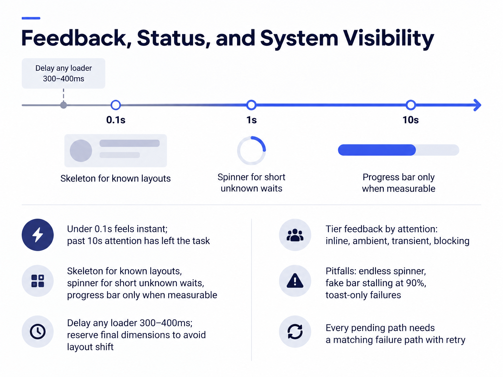
 - 05Feedback, Status, and System VisibilityLet's talk about feedback, status, and system visibility. Timing sets the baseline. Under one tenth of a second feels instant; past ten seconds, attention has left the task. So match the indicator to the wait: a skeleton for known layouts, a spinner for short unknown waits, and a progress bar only when progress is genuinely measurable. Delay any loader by three to four hundred milliseconds, and reserve the final dimensions so content does not shift when it arrives.
Tier feedback by attention. Inline feedback sits on the element that caused it; ambient feedback is persistent and low-weight; transient feedback is a brief toast; blocking interruption is a last resort. You'll see this when a save button shows an inline spinner instead of a full-page takeover.
Then watch the pitfalls: the endless spinner, the fake bar stalling at ninety percent, and toast-only failures that vanish before anyone reads them. Ask whether every pending path has a matching failure path with a retry. Next, we'll look at accessibility as a quality lens.
 2 min
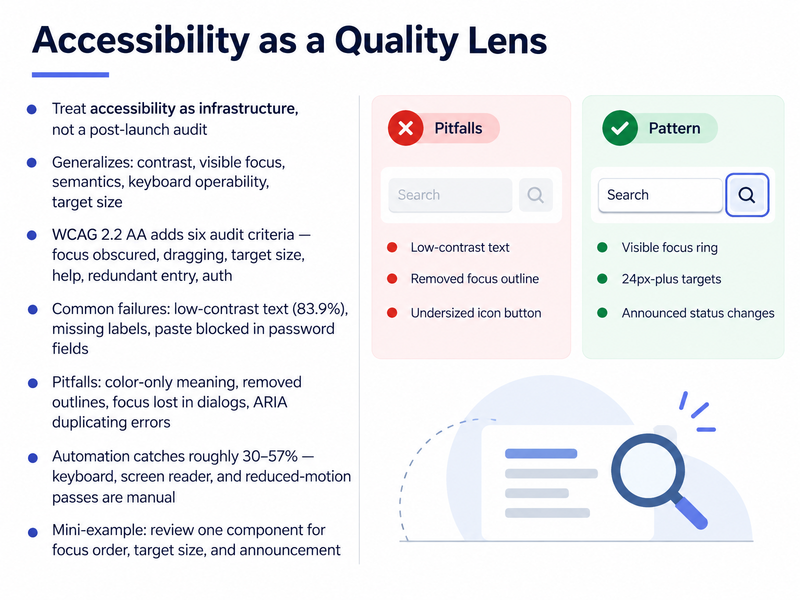
2 min - 06Accessibility as a Quality LensLet's look at accessibility, not as a post-launch audit, but as infrastructure you build in from the start. The same qualities generalize across every screen. You'll see this when you ask whether contrast holds, focus stays visible, semantics are real, keyboard operation works, and targets are big enough. Under WCAG 2.2 AA, six new criteria are in scope: focus not obscured, dragging alternatives, target size, consistent help, redundant entry, and accessible authentication. The common failures are telling. Low-contrast text appears on about eighty-four percent of home pages. Labels go missing. Password fields block paste, which breaks password managers. Then there are the pitfalls you can catch in critique. Color as the only signal, outlines removed with nothing replacing them, focus lost inside a dialog, or ARIA that duplicates an error already announced in text. Here's the key tradeoff. Automation is fast, but it catches roughly thirty to fifty-seven percent of issues by volume. Focus order, screen reader announcements, and reduced motion need a human pass. So use this lens on one component today. Check its focus order, its target size, and what it announces. That small review will sharpen how you critique everything else. Next, we'll look at platform conventions and cross-platform critique.
 faculty.washington.edusuperbloom.designgithub.com+22 min
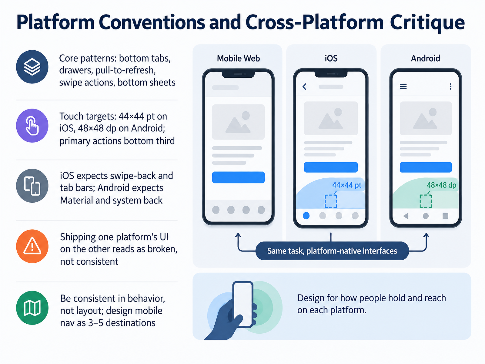
 - 07Platform Conventions and Cross-Platform CritiqueNow let's talk about platform conventions and how to critique them. On mobile, you'll see a familiar set of core patterns: bottom tabs, drawers, pull-to-refresh, swipe actions, and bottom sheets. These work because users already know them. But the details differ by platform. Touch targets should be at least forty-four by forty-four points on iOS and forty-eight by forty-eight density-independent pixels on Android, with primary actions placed in the bottom third for thumb reach. Critically, iOS users expect swipe-back gestures and tab bars, while Android users expect Material patterns and system back. If you ship one platform's UI on the other, it reads as broken, not consistent. So ask whether you're being consistent in behavior rather than layout. Keep mobile navigation to three to five destinations. Next, we'll look at responsive and adaptive layout decisions.
 elements.envato.comtimgraf.comaydesign.ai+21 min
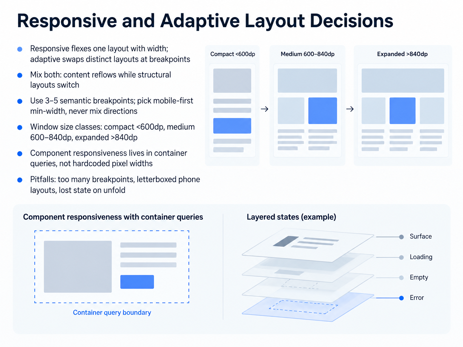
 - 08Responsive and Adaptive Layout DecisionsLet's move into responsive and adaptive layout decisions. Responsive means one layout that flexes continuously with width, while adaptive swaps distinct layouts at breakpoints. In practice, you mix both: content reflows fluidly, and structural layouts switch. That is why a card can be responsive while the page-level shell is adaptive. You'll see this when a list-detail split appears only on wider screens. Use three to five semantic breakpoints, break on meaning rather than specific devices, choose mobile-first min-width, and never mix directions, because overlapping ranges create gaps and unpredictable behavior. Window size classes give you shared vocabulary: compact below six hundred density-independent pixels, medium from six hundred to eight hundred forty, and expanded above eight hundred forty. Component responsiveness belongs in container queries, not hardcoded pixel widths, so a card adapts to its container rather than the viewport. Watch for too many breakpoints, letterboxed phone layouts on tablets, and lost state when a device unfolds. Ask whether each break is semantic, and whether your layout preserves context. Next, we turn to data-dense dashboards and tables.
 2 min
2 min - 09Data-Dense Dashboards and TablesLet's move on to data-dense dashboards and tables, the component that fields more interface traffic than anything else you design. Start with structure. Lead with the identity column, name, ID, or title, keep three to seven default columns so a row reads in one horizontal glance, and right-align numeric columns so figures line up by their trailing digits. Density is a task decision, not a taste decision. Rows of thirty-two to thirty-six pixels suit scanning and comparison; forty-four to fifty-six pixels suit careful inspection of a single row. Avoid the compromise middle, because it optimizes for neither. Then make one table scale: sticky headers, column control, and remembered preferences. Sorting needs a persistent indicator, not just a hover state, and filters need visible chips with one-click clear, because a filtered table that looks unfiltered is how people misread data. Watch three pitfalls: every field as a column, hover-only row actions that vanish for keyboard and touch users, and pagination with no total. Finally, design the true empty, no-results, loading, and error states alongside the table, since no-results and no-data tell very different stories. Next, we'll look at visual hierarchy, density, and prioritization.
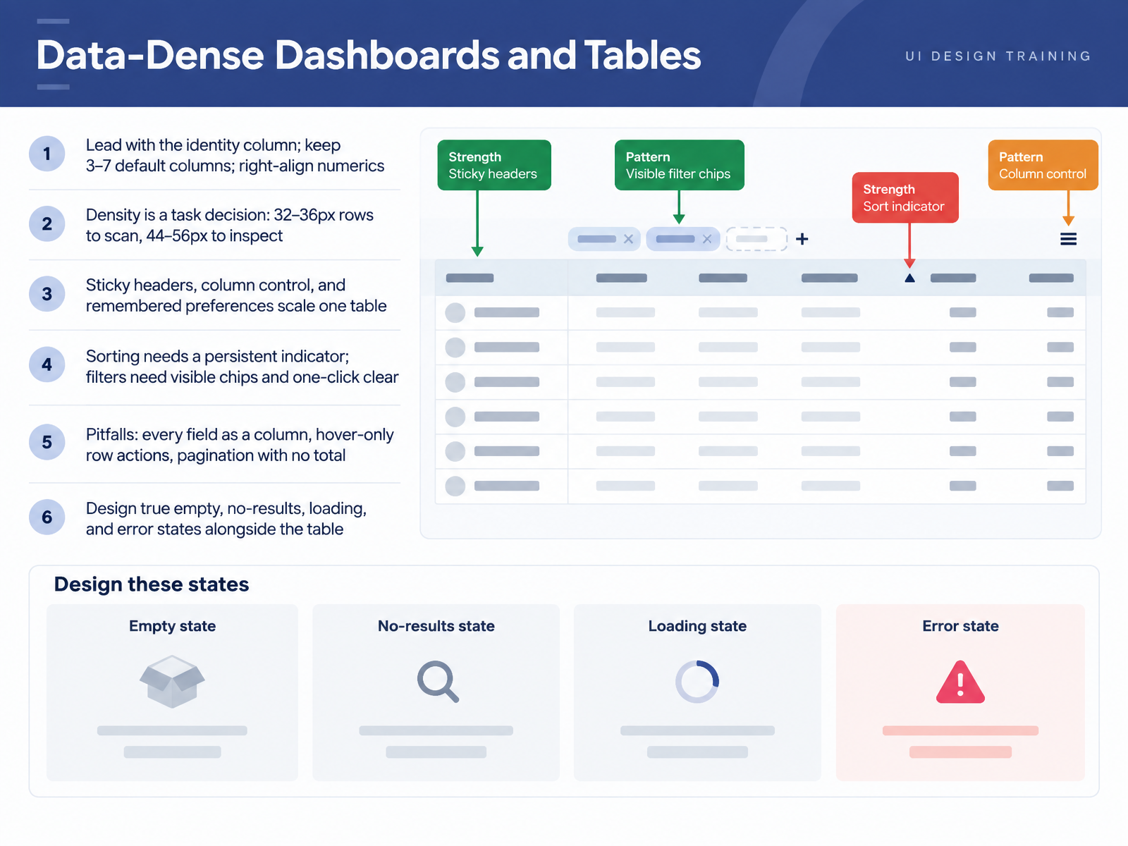 2 min
2 min - 10Visual Hierarchy, Density, and PrioritizationNow let's talk about visual hierarchy, density, and prioritization. Calm density is the 2026 direction: pack more information on screen, but keep the treatment quiet through restrained typography, muted color, and a strong type hierarchy. Linear is the canonical example, putting dozens of issues and metadata on one screen without feeling cluttered. Aim for one primary action per screen, with secondary actions visually subordinate. Hick's and Miller's Laws set ceilings here, so keep navigation at seven items or fewer and chunk forms into roughly five sections. Contrast and visual weight carry priority, so your main call to action should hold the strongest weight in its viewport. Watch for the common pitfalls: gradients used instead of density, ten equal weight metrics that flatten priority, and tiny type faking density. When you evaluate, ask a single question of every element: if it were removed, what user understanding would be lost? That test separates signal from decoration. Next, we move into AI touched and generative interfaces.
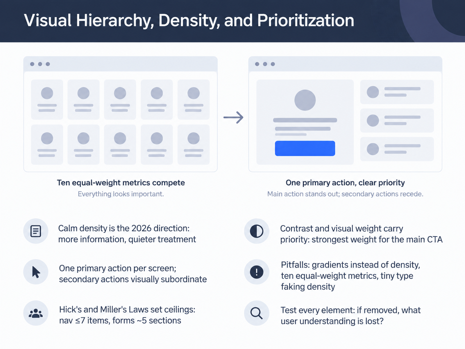 elements.envato.comtimgraf.comaydesign.ai+22 min
 - 11AI-Touched and Generative InterfacesNow let's look at AI-touched and generative interfaces. Start with a transparency baseline: show why a suggestion appeared, how confident the system is, and how a user overrides it. You'll see inline AI has largely displaced the side chat bubble, living directly in the editor, the cell, or the canvas, which removes the context switch of explaining your work to a separate panel. The tradeoff is coherence, so keep predictable envelopes. Navigation, headers, and canonical actions stay fixed while generated content fills the frame. Every generated component needs three things: an edit affordance so users can steer the output, a deterministic fallback such as plain text when the model is unsure, and real error states, because streaming only works if the weakest component handles partial data. Watch three pitfalls: inconsistent sessions that make every visit feel like the first, unpredictable DOM that breaks screen readers and focus order, and AI-generated code that bypasses your component library and quietly forks your design system. So ask whether the affordance clarifies the user's task or simply serves the platform. Up next, Pitfall Clinic: Dark Patterns and Recurring Anti-Patterns.
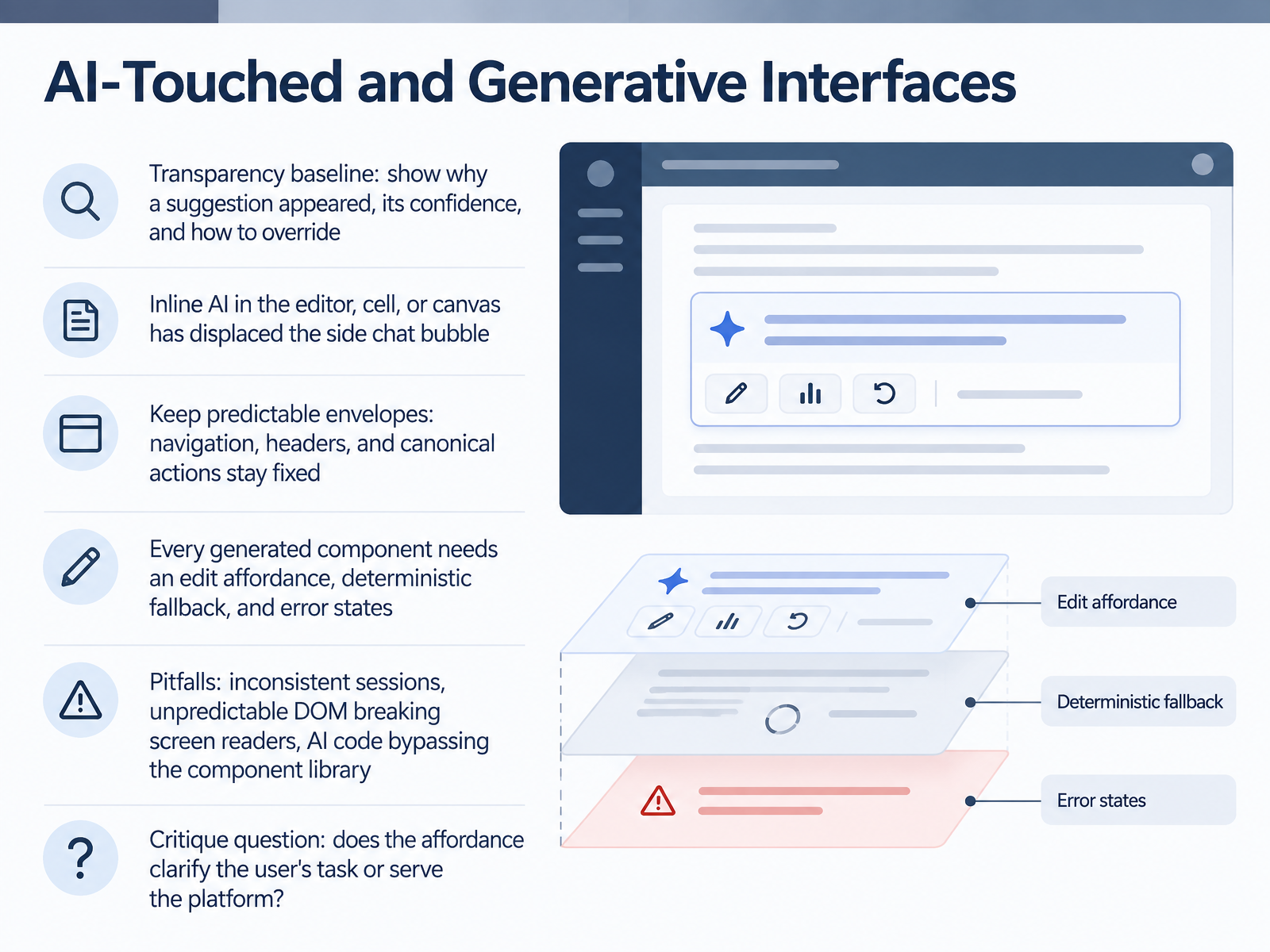 elements.envato.comtimgraf.comaydesign.ai+22 min
 - 12Pitfall Clinic: Dark Patterns and Recurring Anti-PatternsLet's move into the pitfall clinic. First, a distinction worth keeping sharp: dark patterns deceive on purpose, while anti-patterns are usually well-intentioned mistakes. The deceptive set includes obstruction, sneaking, interface interference, forced action, and social engineering. You'll recognize confirmshaming, preselection, hidden costs, and trick wording, and so far, they still work on most users. Cool-down interstitials and dark-pattern education rarely counteract them, so regulation, not user vigilance, is the real fix. Accidental anti-patterns show up too, like hamburger overuse, carousel blindness, icon-only buttons, and modal overload. So before shipping, ask one question: would users still act this way if they were fully informed? Next, we'll put that question to work in critique practice with real examples.
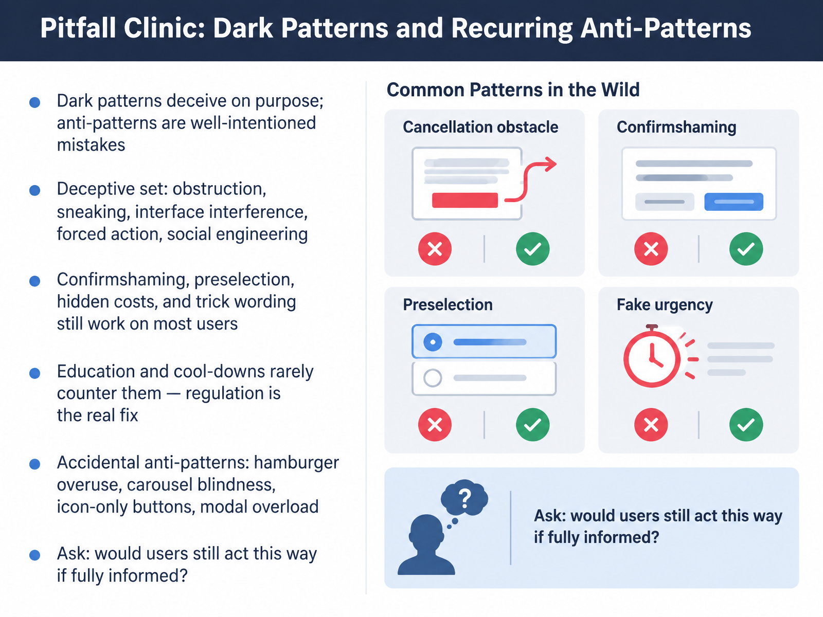 1 min
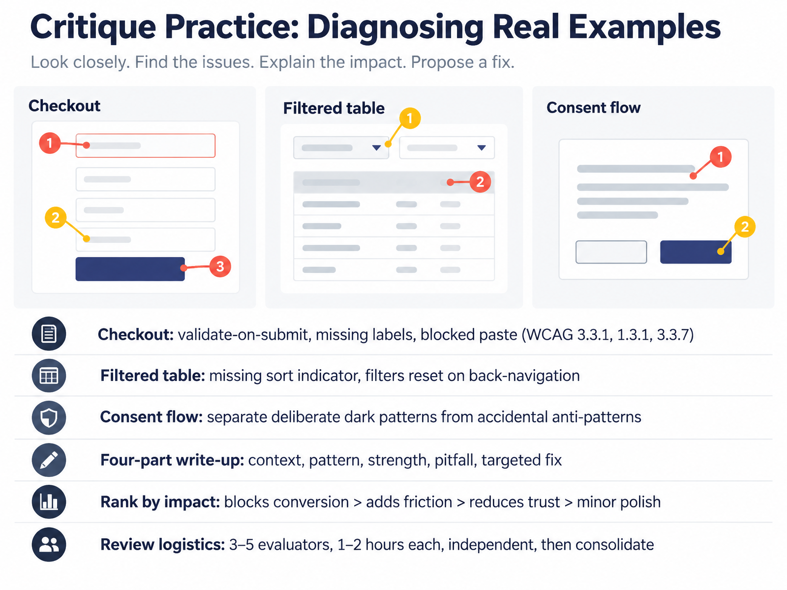
1 min - 13Critique Practice: Diagnosing Real ExamplesNow let's put all of this into practice. You're diagnosing real examples and writing up what you find. Start with a checkout flow. Look for validate-on-submit only, missing field labels, and blocked paste. Those map to WCAG 3.3.1, 1.3.1, and 3.3.7, and they hit real users during your highest-stakes moment. Blocking paste on an order ID or card number forces retyping, which is a conversion problem, not just a compliance checkbox. Next, a filtered table. Ask whether the sort indicator is visible and whether filters reset when you hit back. Losing filter state on navigation is one of the most disruptive failures in enterprise tools. Then a consent flow. Separate deliberate dark patterns, like a preselected marketing checkbox, from accidental anti-patterns, like confusing double-negative wording. Intent matters for the fix. Write each finding in four parts: context, pattern, strength, pitfall, and a targeted fix. Rank by impact: blocks conversion outranks adds friction, which outranks reduces trust, which outranks minor polish. For logistics, run three to five evaluators, one to two hours each, working independently, then consolidate. Building a Critique Portfolio and Review Habit.
 faculty.washington.edusuperbloom.designgithub.com+22 min
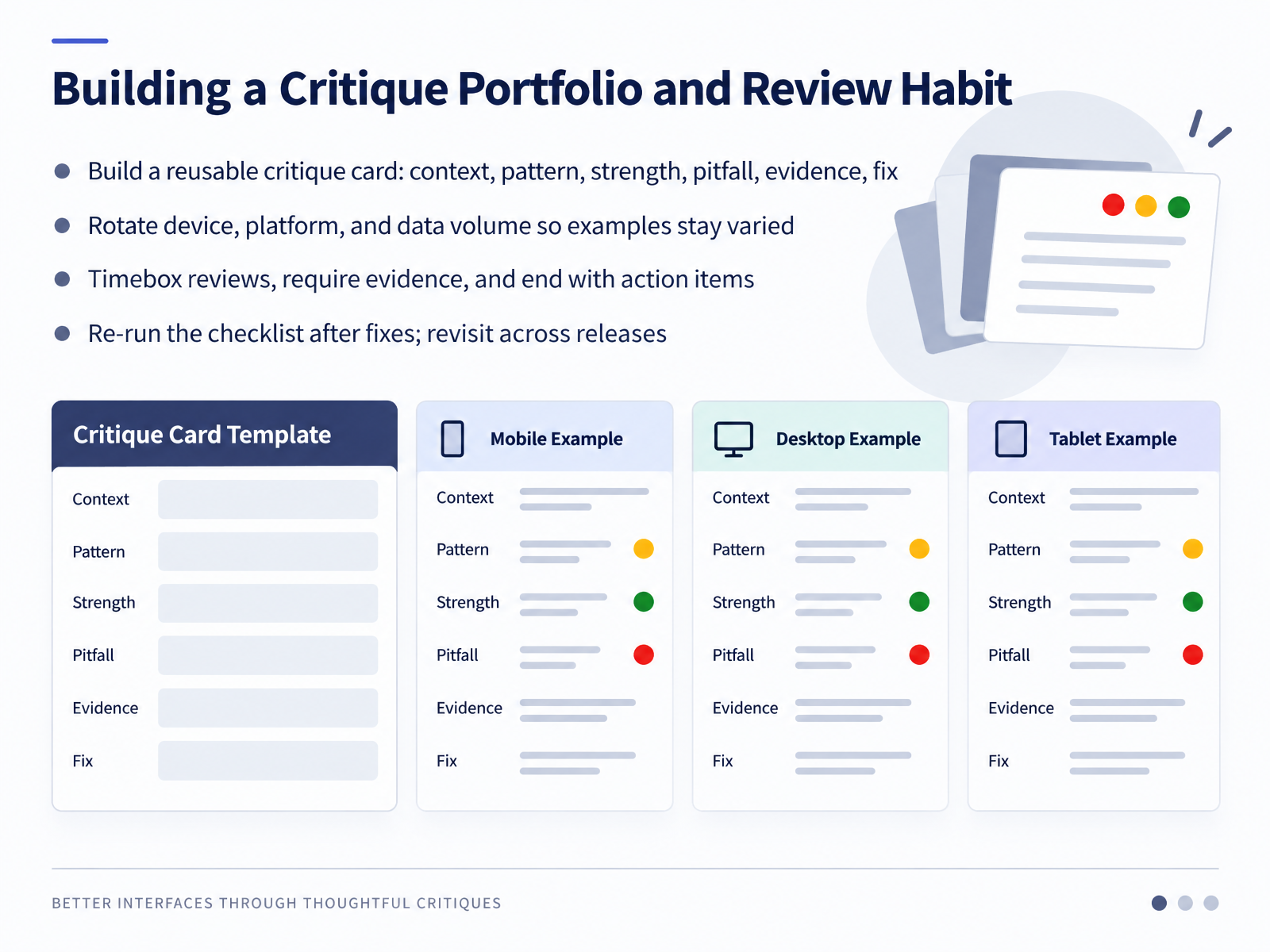
 - 14Building a Critique Portfolio and Review HabitLet's close by turning all of this critique practice into a repeatable habit. First, build a reusable critique card. Each entry holds six fields: context, pattern, strength, pitfall, evidence, and a proposed fix. Six consistent fields make your findings comparable across projects, which is what turns scattered opinions into a body of evidence. Next, rotate what you review. Cycle through mobile and desktop, different platforms, and varying data volumes. A table with three rows hides nothing; the same table with three thousand rows exposes pagination, filtering, and empty-state problems you would otherwise never see. When you run reviews, timebox them, roughly an hour or two per pass, and require evidence for every finding. A screenshot, a DOM inspection, a contrast ratio measured against the four point five to one threshold. End each session with assigned action items, not vague impressions. Then re-run your checklist after the fixes and again across releases. That closes the loop and tells you whether a finding truly resolved or quietly regressed. So keep the habit small and steady: card, rotation, timebox, evidence, action, re-test. Thank you for working through this course. You now have the vocabulary to critique interfaces with precision, so go build that portfolio, one honest review at a time.
 faculty.washington.edusuperbloom.designgithub.com+22 min
Take the deck with you
Download this course as a file — free, no sign-up needed.
- PDF handoutEvery slide page, ready to print or share.15 pages · 3.0 MBDownload
- Narrated PowerPointThe deck that presents itself — every slide carries the digital human's narration video.15 pages · 14.2 MBDownload
- PowerPoint slidesThe full deck as a .pptx — open it in PowerPoint, Keynote, or Google Slides.15 pages · 2.9 MBDownload
Free to use in your own training — please keep the PersonWise credit page at the end.
Have your own deck? Turn it into a course
Sources consulted
Web sources consulted while building this course.
- UX/UI design trends for 2026: calm interfaces, transparent AI and the end of visual theatrics — elements.envato.com
- Evolving Design Patterns: Balancing Familiarity and Innovation in UX/UI for 2026 - Timothy Graf | UX/UI Design Theory & 2026 Strategies — timgraf.com
- SaaS UI design trends to watch in 2026 — aydesign.ai
- Generative UI in 2026: 7 Design Patterns That Work — Mantlr — mantlr.com
- shadcn/ui as Design Monoculture: Why Half the Web Looks Like the Same Component Library in 2026 — Sailop Blog — sailop.com
- Ability Heuristics for Conducting Accessibility Inspections — faculty.washington.edu
- For Publication: Accessibility and Usability Heuristic Review — superbloom.design
- vmarafetti/crit — github.com
- Zendevve/ux-laws-reviewer — github.com
- agents/design-critic.md — github.com
- Navigating the Future: Your Essential Guide to Website and App Navigation Patterns for 2026 - Layout Scene — layoutscene.com
- What is navigation design? a practical 2026 guide — web.michaelbell.co.uk
- UX navigation patterns to lift conversion | Lazarev.agency — lazarev.agency
- Navigation UX design: best practices for clear and intuitive product navigation in 2026 - Full Clarity — fullclarity.co.uk
- How to Design Navigation | UIGuides — uiguides.com
- Form Validation Pattern | UX Patterns for Developers — uxpatterns.dev
- Forms That Don’t Fail Users: Validation UX, Accessibility, and Error Patterns · caduh — caduh.com
- SaaS Form Design UX Patterns & Examples (2026) — saasui.design
- Forms — UI Craft docs — skills.smoothui.dev
- Accessibility & Error UX for Forms | Client-Side Form — client-side-form.com