Content Design for Digital Products
Begin
16 pages · ~32 min
Content Design for Digital Products
A training for content designers on structuring, writing, and managing digital product content to improve user experience.
What you’ll learn
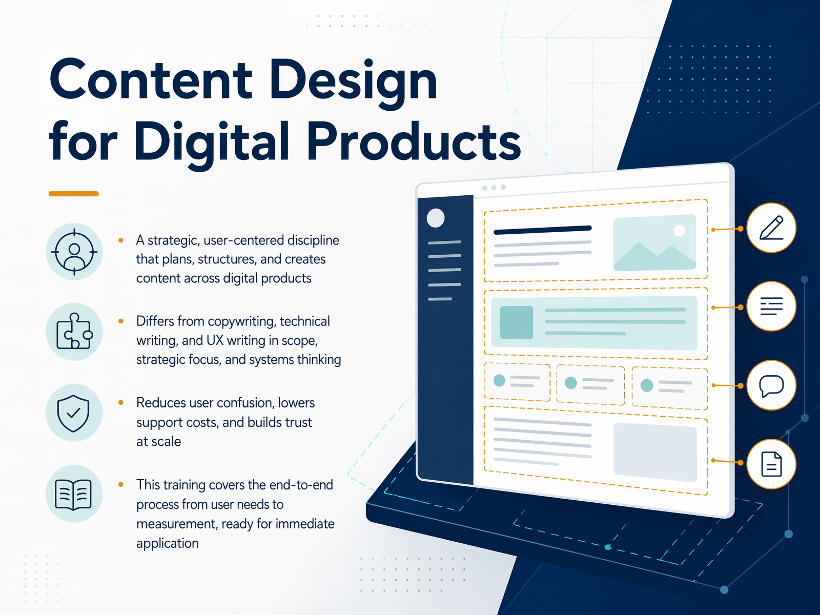
- 01Content Design for Digital ProductsWelcome. If you work on digital products, you know the challenge: turning user needs into something clear, something people can actually use. That's what this training is about. It's called content design. Think of it as a strategic, user-centered discipline. It's not just copywriting, where you make words sound better. It's not just technical writing, or UX writing. Content design asks bigger questions. Like, does this content need to exist at all? And how should it be structured so the right person finds it, understands it, and acts on it? It's systems thinking. Getting this right reduces user confusion. It lowers support costs. And it builds trust, at scale. Over this course, we'll walk through the end-to-end process. From researching user needs, all the way to measuring what works. And you'll leave with techniques you can apply immediately. Let's start by getting our bearings, with the content design mindset.ceros.comuxcontent.comuxcontent.com+21 min
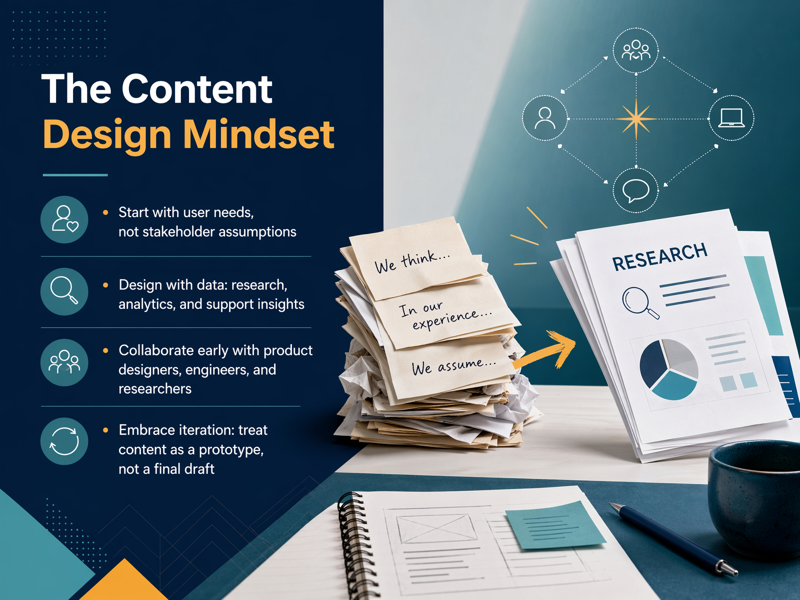
- 02The Content Design MindsetNow, let's talk about the core mindset that makes content design work. It's a shift in how we approach building products. Instead of starting with what a stakeholder assumes the user wants, we begin with actual user needs. What is the person really trying to do? We look for the evidence. That means designing with data: pulling from user research, looking at analytics, and digging into customer support tickets to find the real points of friction. This mindset also means we don't work in a silo. We collaborate early and often with product designers, engineers, and researchers. We're all partners solving the same problem from different angles. And finally, this approach requires us to embrace iteration. We treat our content not as a final draft to be polished and handed off, but as a prototype. We put it out there, test it, learn from it, and make it better. It's about progress, not perfection. In the next slide, we'll go deeper into the first step of this process: understanding user needs for content.
 medium.comalistapart.comdefradigital.blog.gov.uk+22 min
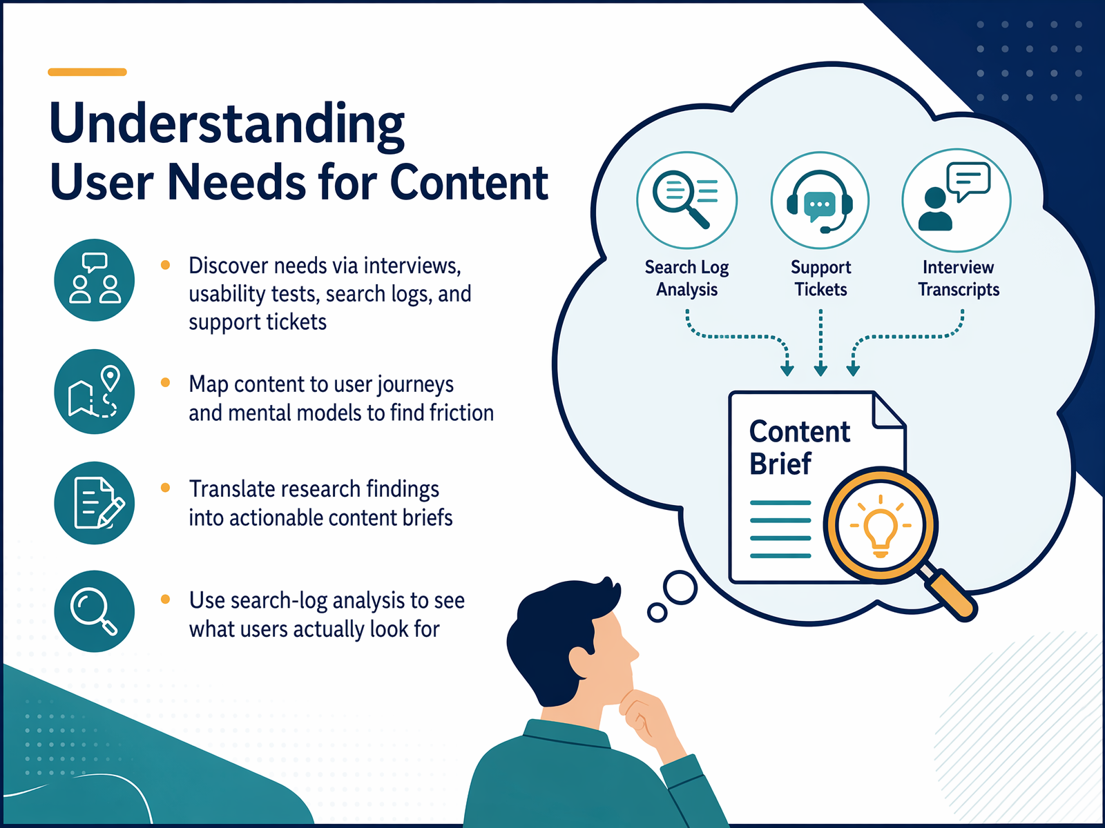
 - 03Understanding User Needs for ContentAlright, so we know why content matters. But how do we actually figure out what users need before we write a single word? Let's talk about the discovery process. First, don't rely on assumptions. Look at your existing data. Search logs are a goldmine here. They show the exact words real people type when they can't find something. They're not telling you what they think you want to hear; they're telling you what they actually want. Combine that with support tickets and usability tests to spot where the friction is. Once you have those insights, we map them. This means taking those user needs and placing them onto a journey map to see the full story. Where do people get stuck? Where do they drop off? Finally, you translate all of this research into a clear, actionable content brief. This brief is your single source of truth that connects the user's actual need to the piece of content you're about to create. Next, we'll build on this by looking at structuring that information for clarity.
 nngroup.comblogs.gov.scotinsidegovuk.blog.gov.uk+21 min
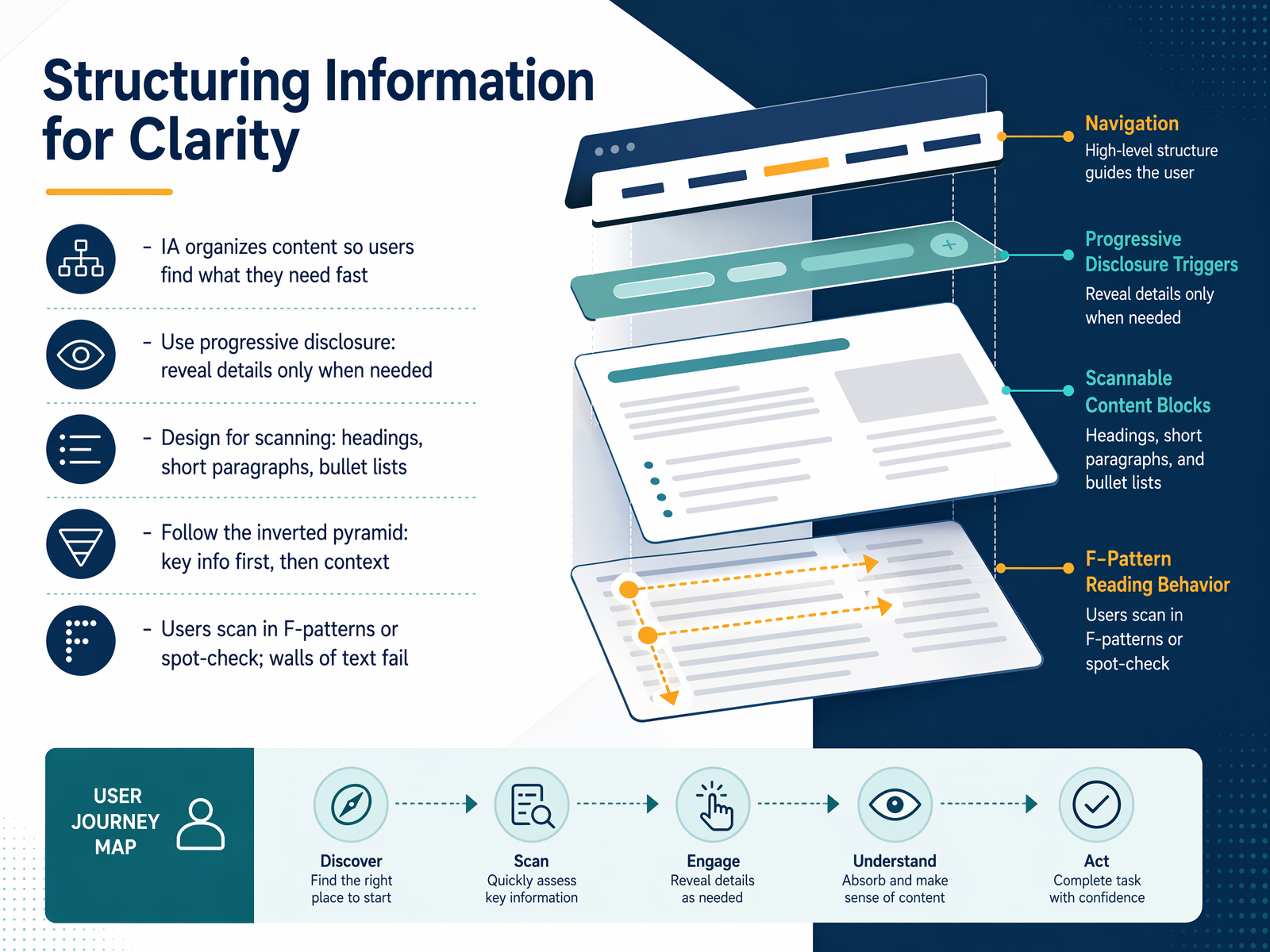
 - 04Structuring Information for ClarityNow let's talk about structuring information so users can find what they need at a glance. This is where information architecture, or IA, earns its keep. A solid IA organizes content logically, helping users get to the answer fast without feeling lost. Our goal is to reduce cognitive load, not add to it. One of the most effective techniques is progressive disclosure. This means revealing details only when they're needed. For example, you might show a summary or a key heading first, and let users click to expand for more. This keeps the page clean and avoids overwhelming people. Next, we need to design for scanning. Research shows users don't read every word; they scan in F-patterns or spot-check for keywords. To support that, use clear headings, short paragraphs, and bullet lists. A wall of text simply fails. Finally, follow the inverted pyramid. Put the most important conclusion or key information right at the top, then follow with supporting context. This way, even if someone only reads the first few lines, they still get the core message. Let's carry this thinking forward and look at how voice, tone, and inclusive language bring your structure to life.
 vrunik.comcopy.aideveloperux.com+22 min
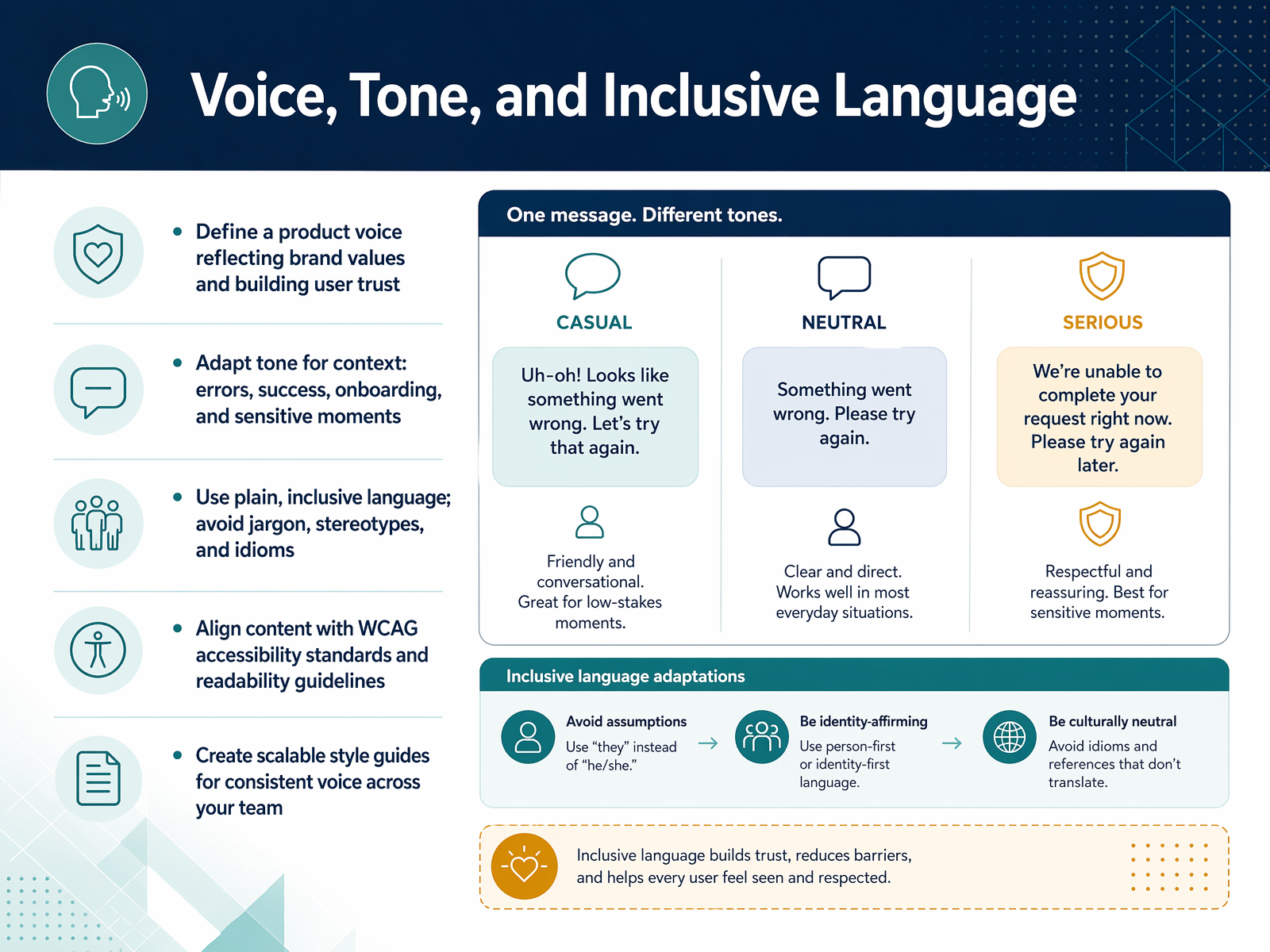
 - 05Voice, Tone, and Inclusive LanguageNow let’s talk about voice, tone, and inclusive language. Think of your product voice as its personality. It should reflect your brand values and build user trust every time someone reads your words. And that voice stays consistent, but your tone shifts based on context. For example, an error message needs a direct, helpful tone. A success moment can be warm and encouraging. During onboarding, you want to be guiding and clear. In sensitive situations, a respectful and supportive tone matters most. Next, make plain, inclusive language your default. Avoid jargon, stereotypes, and idioms that may confuse or exclude people. Refer to people the way they prefer. For instance, use “person with disability” rather than “disabled person,” unless a specific community guidance says otherwise. And align your content with accessibility standards like WCAG. That means clear headings, descriptive link text, and text alternatives for images. To keep all of this consistent across your team, create a scalable style guide. It should define your voice, give tone examples for each context, and provide clear rules for inclusive language. This way, every writer can produce content that feels like one trusted product. Next, we’ll get practical with microcopy: buttons, labels, and forms.
 2 min
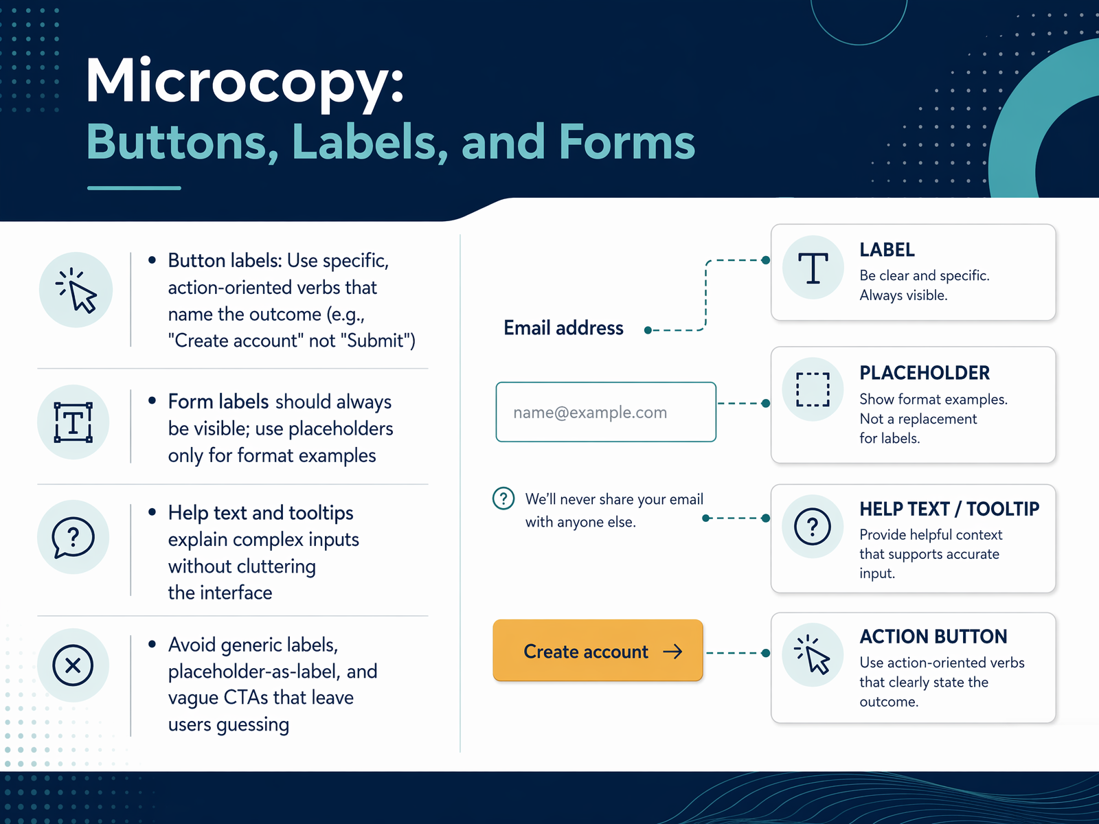
2 min - 06Microcopy: Buttons, Labels, and FormsNext, let's talk about microcopy for buttons, labels, and forms. These small pieces of text do the heavy lifting at decision points. For button labels, use specific, action-oriented verbs that name the outcome. Instead of a generic 'Submit,' say 'Create account' or 'Send message.' This tells users exactly what happens when they click. For forms, always keep labels visible. Use placeholder text only to show format examples, like 'name at example dot com.' Never use placeholders as the only label, because they disappear as soon as someone starts typing. For complex inputs, add help text or tooltips to explain without cluttering the interface. Avoid vague calls to action that leave users guessing. The goal is to make every interaction feel obvious and safe. Up next, we will look at error messages and system feedback.
 1 min
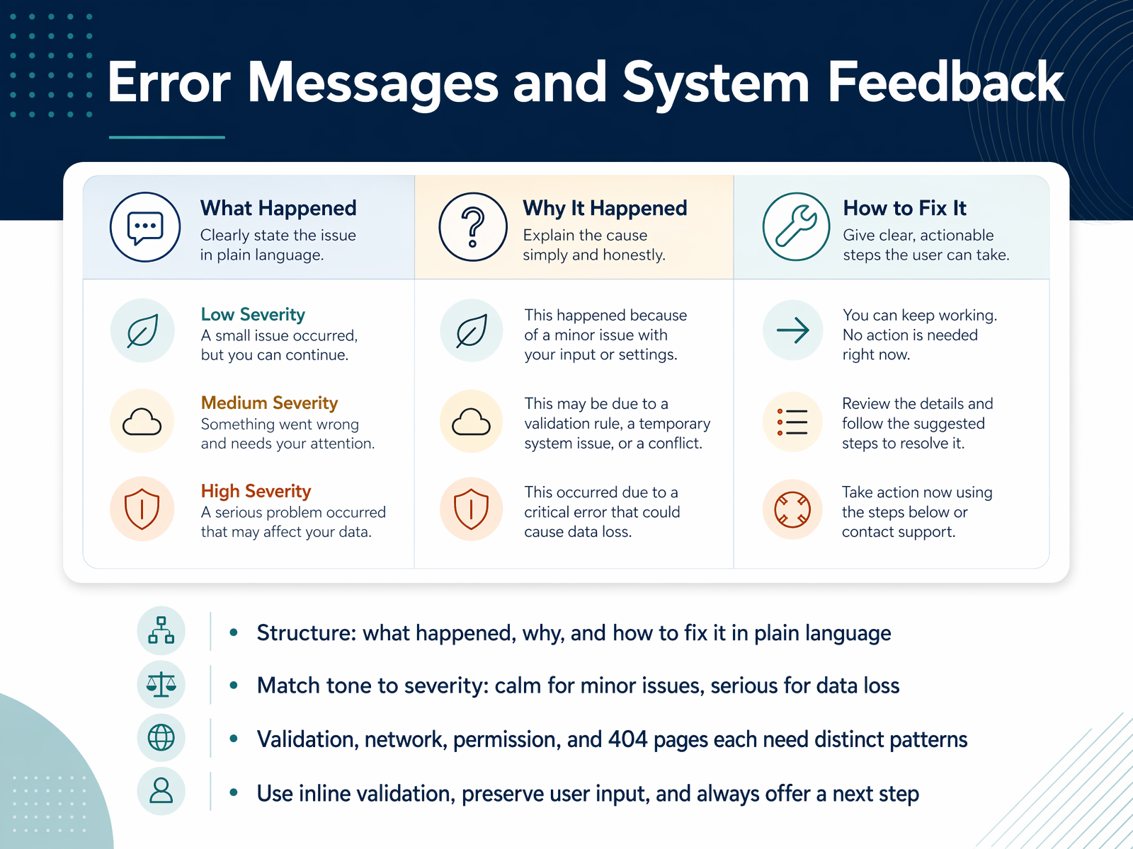
1 min - 07Error Messages and System FeedbackNow let's talk about error messages and system feedback, because that's often where users feel the most friction. The structure is simple but powerful: tell them what happened, why, and how to fix it. Plain language, no jargon. For example, instead of 'Invalid input', try 'Please enter a valid email address, like [email protected].' That's clear and directly helpful. Next, match the tone to the severity of the problem. A calm, neutral tone works for a minor validation issue. But if there's a potential for data loss, your message needs to be serious and direct. Different situations need distinct patterns. Form validation, network errors, permission issues, and 404 pages shouldn't all sound the same. A network error might say, 'Check your connection and try again,' while a 404 page can be a bit more human and guide the user home. And here are three practical rules to always follow. Use inline validation so users get feedback right next to the field they're filling in. Preserve user input so they don't have to retype everything after a mistake. And always offer a clear next step, like a 'Retry' button or a link to support. Next up, we'll apply similar clarity to onboarding, empty states, and notifications.
 2 min
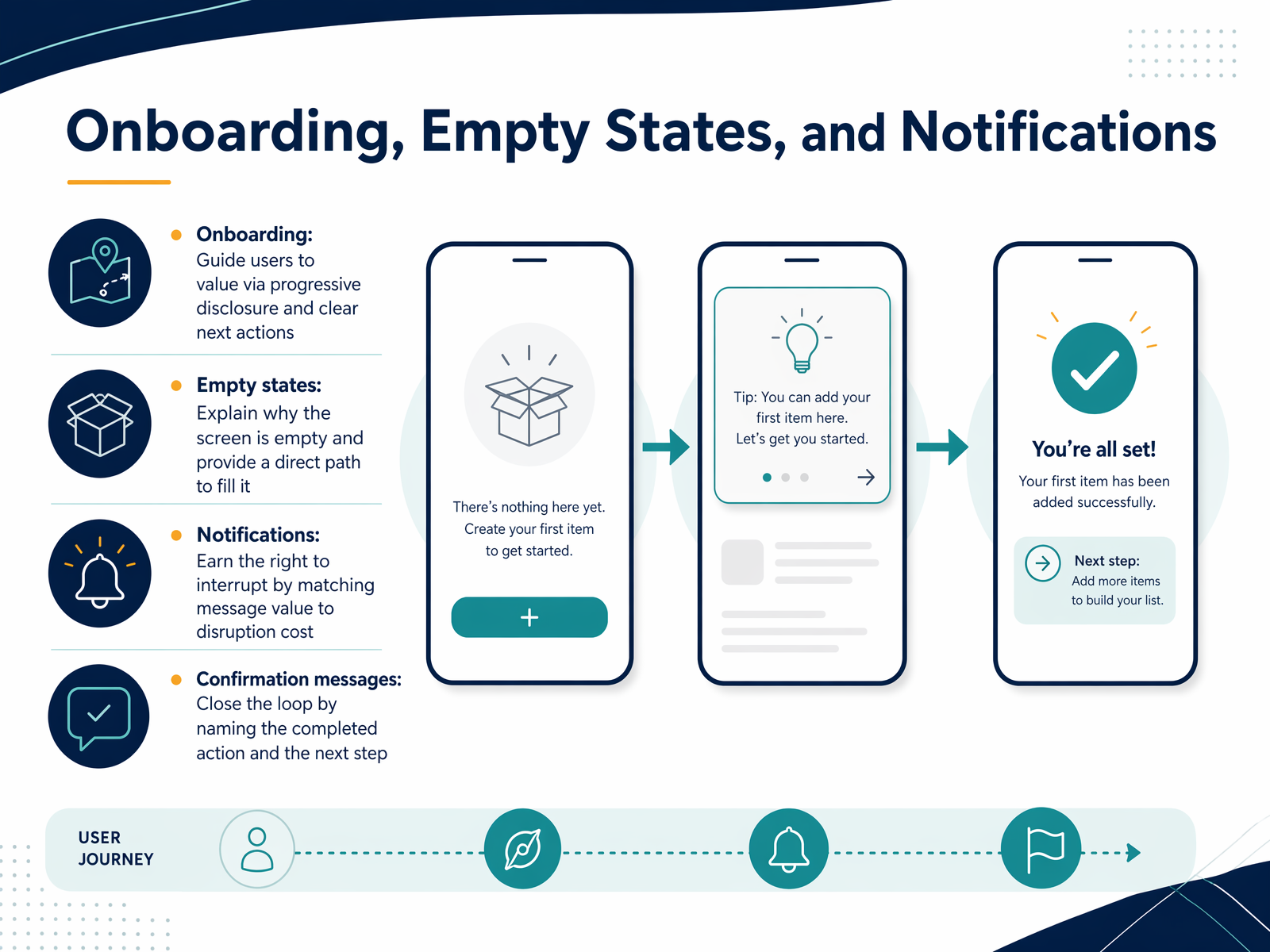
2 min - 08Onboarding, Empty States, and NotificationsNow let's move into the copy that guides users at key decision points. Onboarding, empty states, and notifications. Onboarding is about getting users to value quickly. Use progressive disclosure to reveal one concept at a time, and focus your copy on the outcome, not just the feature. For example, instead of saying 'Set up your profile,' say 'Tell us about yourself so we can personalize your experience.' Empty states are easy to overlook, but they are critical. A blank screen shouldn't be dead air. Explain why it's empty and provide a clear, direct path to fill it. So instead of 'No data,' try 'You don't have any projects yet. Create your first one to get started.' Notifications must earn the right to interrupt. Match the value of the message to the cost of the disruption. If you're asking for attention, the message must be personally relevant and actionable. And confirmation messages close the loop. After a user takes an action, name the specific action that was completed and suggest the logical next step. Don't just say 'Success.' Say 'Your message has been sent. View your conversation.' These small moments of clarity build trust and keep users moving forward. Up next, we'll look at scaling this work with content operations that support consistent, high-quality workflows.
 2 min
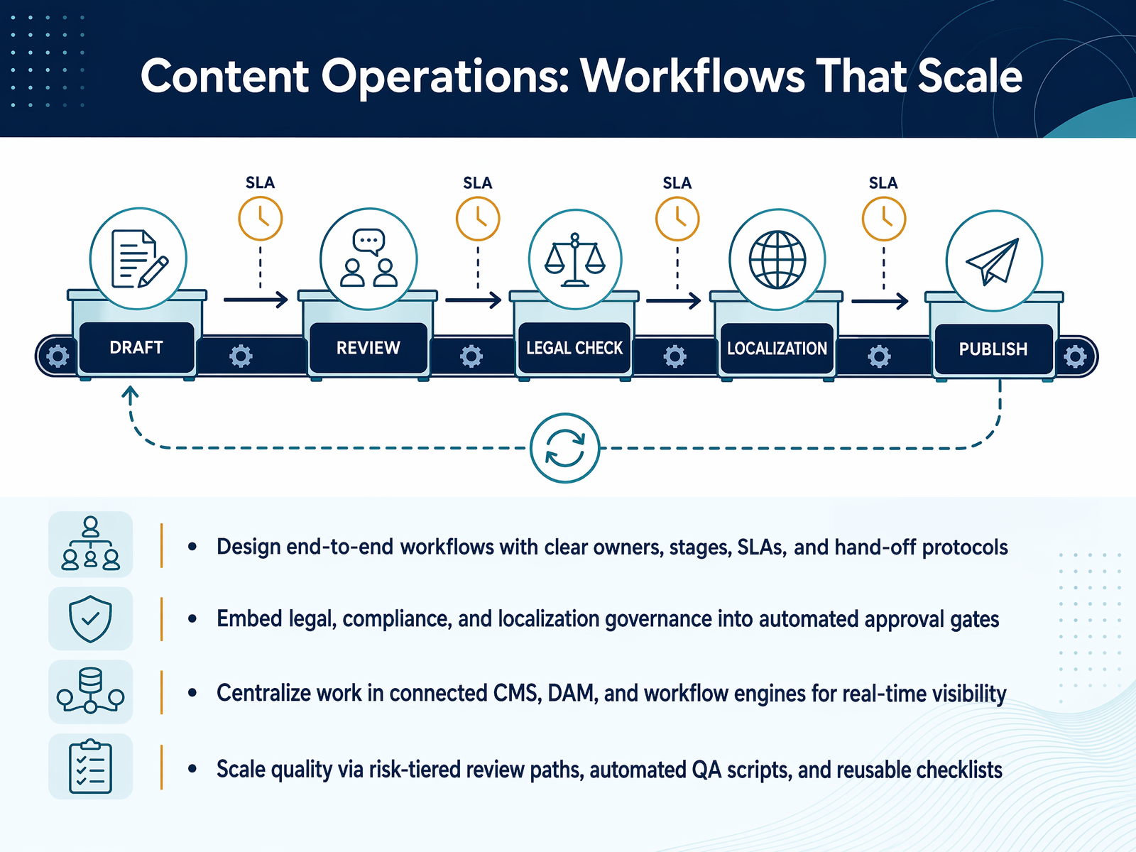
2 min - 09Content Operations: Workflows That ScaleLet's talk about the engine that makes content operations actually work: workflows that scale. This isn't just about moving faster. It's about building repeatable systems that maintain quality as you grow. Start by designing end-to-end workflows with clear owners, defined stages, and service level agreements for every hand-off. Everyone should know exactly who does what, by when. Next, embed your governance directly into the process. Instead of chasing approvals through email, build automated gates for legal, compliance, and localization reviews. The system flags the risk, so reviewers only step in when necessary. Centralization is key. Connect your work in a unified content management system, digital asset manager, and workflow engine. This gives everyone real-time visibility, so you're not guessing where an asset is stuck. Finally, scale quality without scaling effort. Use risk-tiered review paths, automated QA scripts, and reusable checklists. This way, a high-risk regulatory piece gets a deep review, while a standard blog post flows through a lighter, automated check. These four pillars create a system that turns content chaos into a predictable, governed pipeline. Up next, we'll look at how content governance and design systems tie all of this together.
 2 min
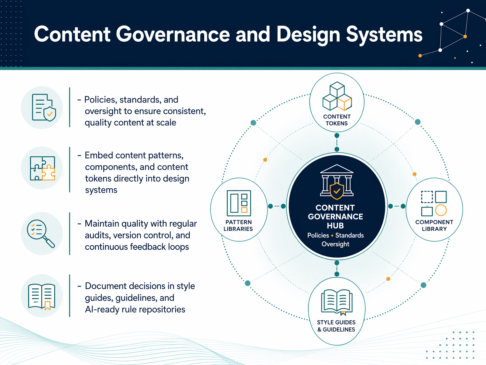
2 min - 10Content Governance and Design SystemsNow, let's talk about how to keep all this great content consistent and healthy at scale. That's where content governance and design systems come in. Think of governance as your rulebook. It's the policies and oversight that make sure every piece of content feels like it comes from the same brand, and meets accessibility and legal standards. You don't just write these rules down and forget them. You embed them directly into your design system. This means building components like call-to-action buttons or notification banners with real, approved copy baked in, not placeholder text. You also use content tokens—think of them as pre-defined, reusable bits of copy, like a standard error message. To keep quality from slipping, you build in regular checkups. We're talking about content audits to spot outdated information, version control so you can track changes, and continuous feedback loops. If a customer support ticket shows a particular error message is confusing, that insight should feed back into your content instantly. And finally, document everything. This isn't just about a Word doc. Your style guide, your voice-and-tone rules, and your accessibility standards should be in an AI-ready rule repository. This sets you up to use AI tools reliably, which is exactly what we'll explore next—AI and the future of content design.
 2 min
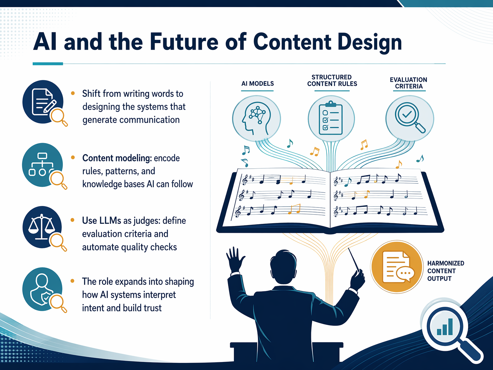
2 min - 11AI and the Future of Content DesignSo where is all of this heading? The role of content design is shifting from writing individual words to designing the systems that generate communication. Think of it as content modeling. Instead of crafting every single message, you encode the rules, patterns, and knowledge bases that AI can follow. This means our jobs expand to shaping how AI systems interpret user intent and build trust. A practical way to do this is by using LLMs as judges. You define the evaluation criteria for quality and then automate the checks, ensuring the AI output is clear, accurate, and on-brand. It's about moving upstream to influence the logic before the words are ever produced. Next, let's look at how we keep all of this accountable by measuring content effectiveness.
 ceros.comuxcontent.comuxcontent.com+21 min
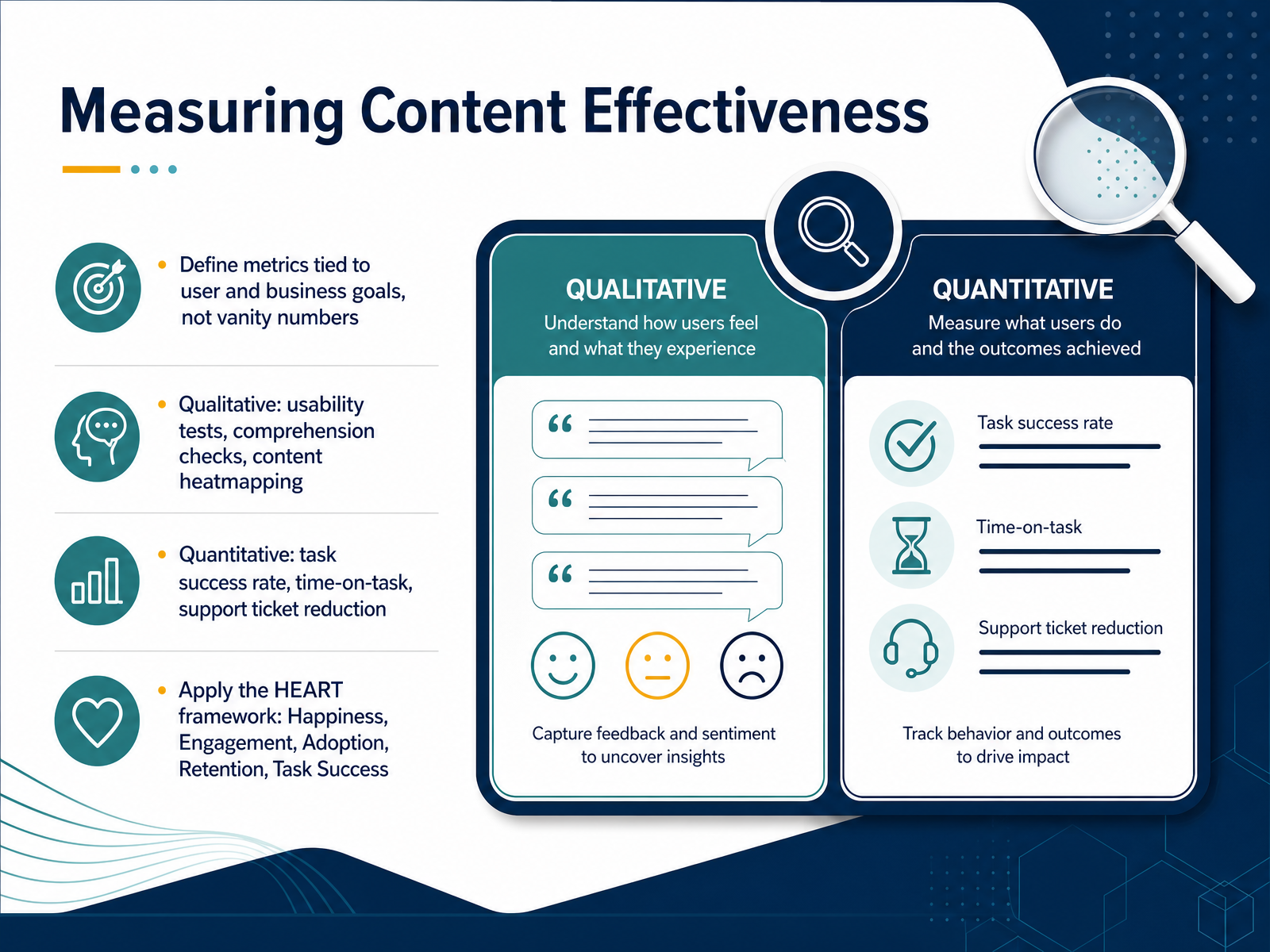
 - 12Measuring Content EffectivenessSo, how do you actually know if your content is working? The answer is measurement, but not just any measurement. You need metrics tied to real user and business goals, not vanity numbers like page views. Let's break it down into two categories. First, qualitative methods. These tell you the 'why' behind the numbers. Run usability tests, ask for comprehension checks, or use a content heatmap where users highlight what's clear and what's confusing. Second, quantitative methods. These are your hard numbers: task success rate, time-on-task, and reduction in support tickets. To bring it all together, apply the HEART framework. It stands for Happiness, Engagement, Adoption, Retention, and Task Success. For each dimension, define your goal, the signal that shows it's working, and a specific metric to track. That way, you're not just collecting data—you're proving the value of your content design. Next, we'll dive into the practical side of 'Testing Content with Users.'
 2 min
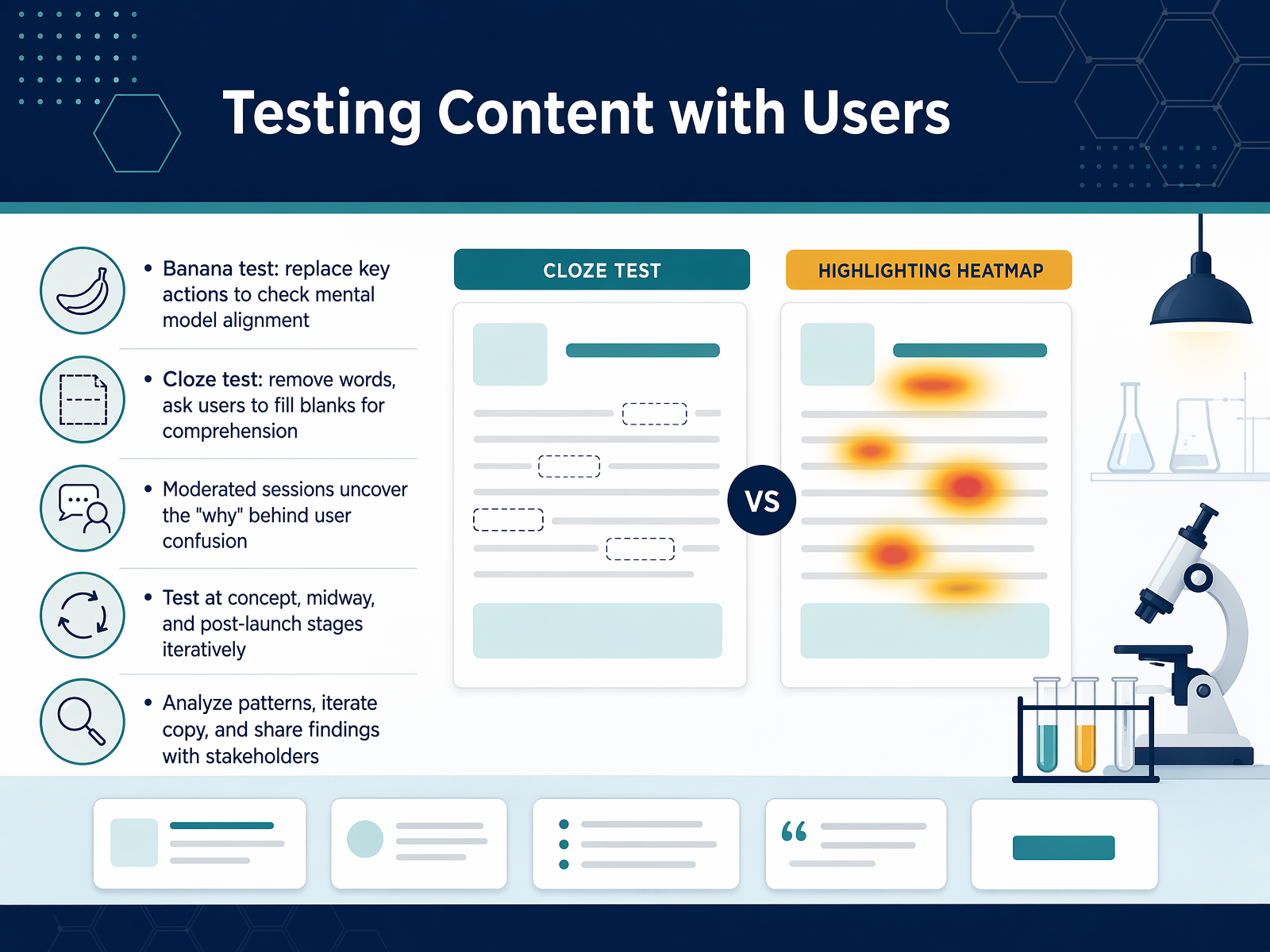
2 min - 13Testing Content with UsersNow, let's get into the methods that tell you if your content actually works. We'll start with two quick, structured tests. The banana test replaces key actions with the word "banana" and asks users what they think will happen. It's a fast way to check if your labels and icons match their mental model. The cloze test removes words from your copy and asks users to fill in the blanks. If they can't, that section probably isn't clear enough. Moderated sessions take you deeper. They uncover the "why" behind user confusion, which is something you rarely get from clicks alone. These tests are most valuable when you run them iteratively. Test during the concept phase, again midway through design, and once more after launch. As you test, don't just fix individual words. Analyze the patterns across users, iterate the core copy, and share those findings with your stakeholders. The goal is to build a shared understanding of what makes your content effective. Next, let's explore what it means to build a content design culture.
 1 min
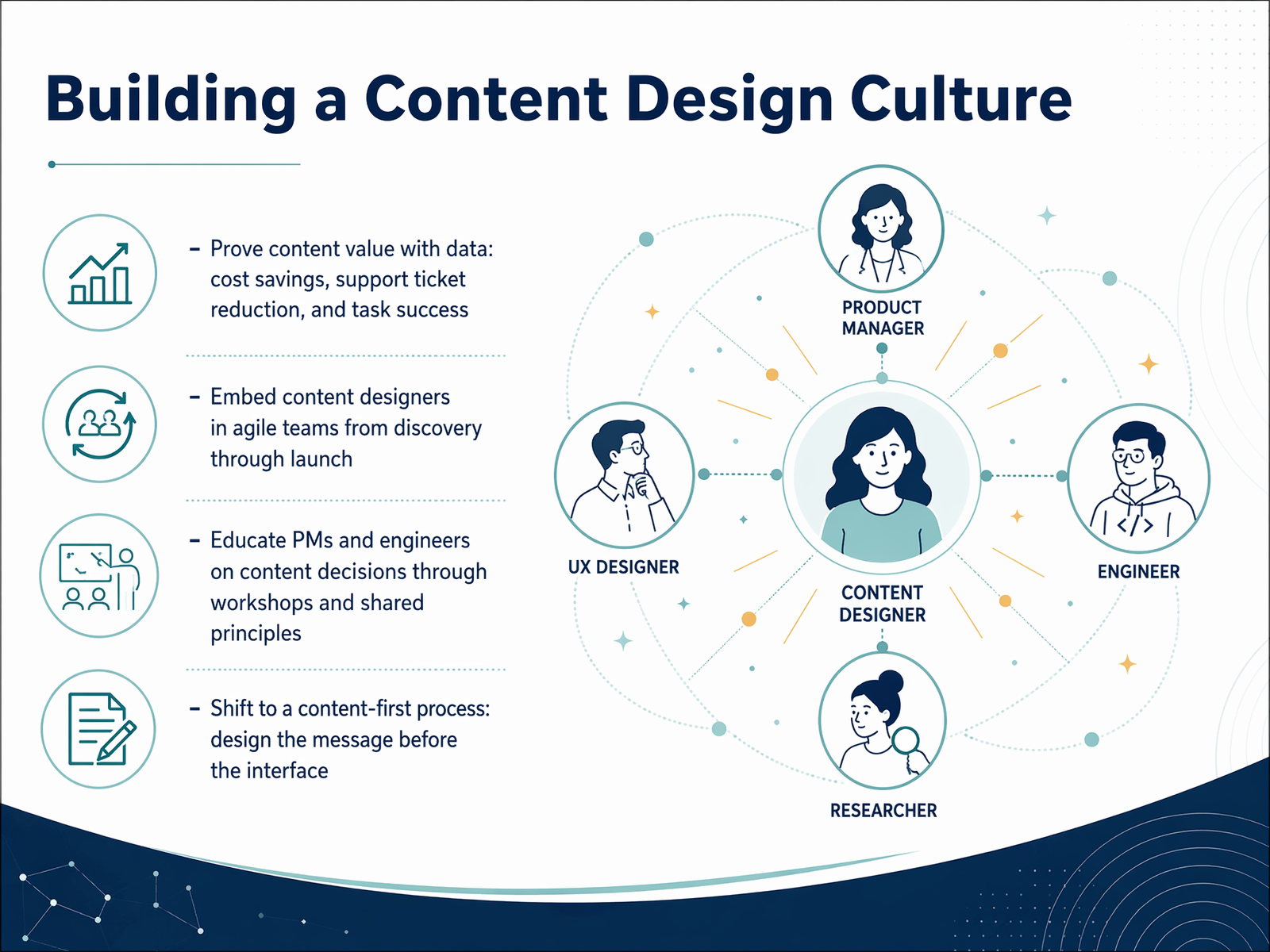
1 min - 14Building a Content Design CultureSo, how do you actually make this shift stick? It starts with getting the right people in the right conversations. Embed your content designers directly into agile teams from discovery all the way through launch. Instead of bringing them in at the end to “put words on it,” involve them early and often. That way, they shape the strategy, not just the surface. Next, use data to prove the value. Track metrics like task success rates, support ticket reduction, or even cost savings. When you can show that clearer content means fewer confused users, you build a strong case for the entire practice. It also helps to educate your partners. Run workshops for product managers and engineers. Share your content principles and walk through the decisions behind the words. When everyone understands the “why,” collaboration becomes much smoother. Finally, shift to a content-first process. Before you touch an interface, design the message. Ask yourself: what does the user need to know, and what do they need to do? If you get that right, the interface becomes a natural home for the content. Next, we’ll put these ideas into practice. Let’s walk through a workshop where we redesign a content flow together.
 medium.comalistapart.comdefradigital.blog.gov.uk+22 min
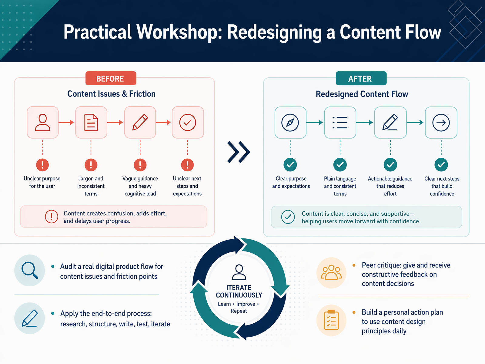
 - 15Practical Workshop: Redesigning a Content FlowNow, let's put all of this into practice. In this workshop, you'll pull apart a real digital product flow and look for content issues and friction points. We'll move through the full end-to-end process together. That means starting with user research, structuring the information, writing the content, testing it with real people, and then iterating based on what you learn. You'll also participate in a peer critique, giving and receiving constructive feedback on content decisions. This is a safe space to learn from each other. Finally, you'll build a personal action plan. This is your practical guide to using content design principles every single day, not just in a workshop. Next up, we'll wrap up with the key takeaways and your next steps.
 nngroup.comblogs.gov.scotinsidegovuk.blog.gov.uk+21 min
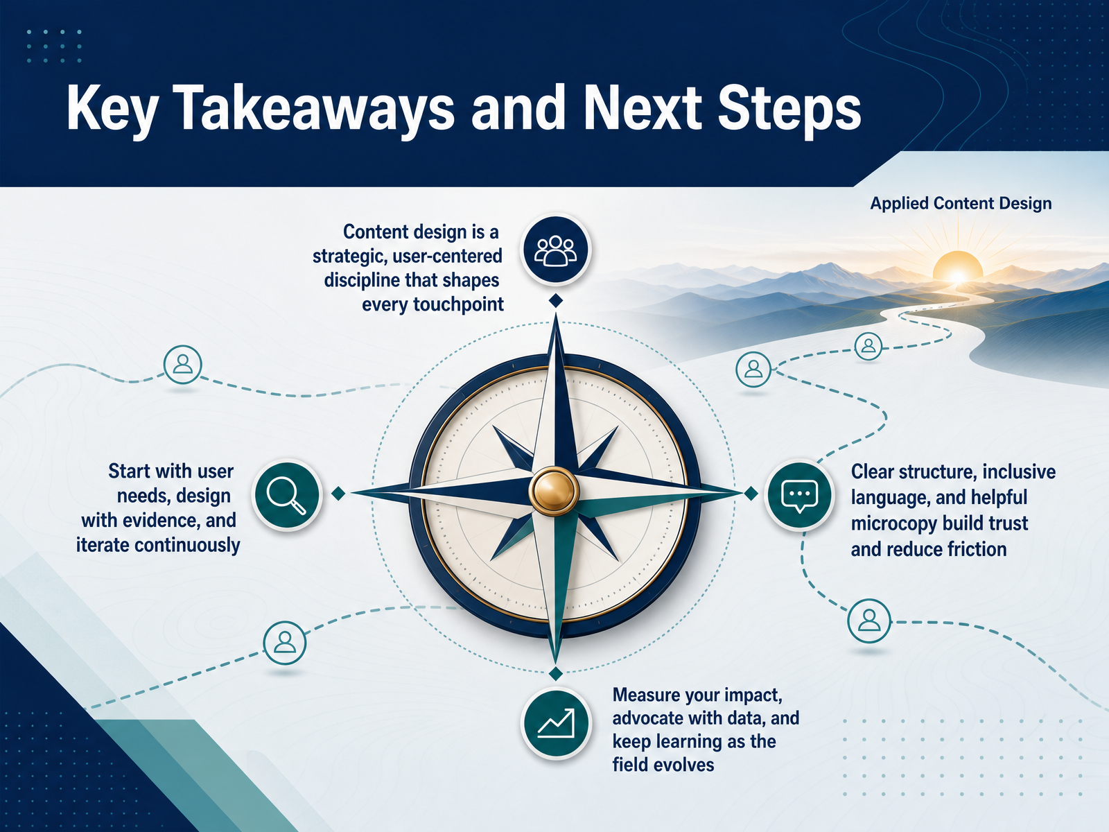
 - 16Key Takeaways and Next StepsLet's tie everything together with the key ideas from this course. Content design is a strategic discipline that shapes the entire user experience, from the first touchpoint to the last. It starts with real user needs and uses evidence, not guesswork, to guide every decision. You build clear structures, choose inclusive language, and craft helpful microcopy that builds trust and reduces friction. But the work doesn't stop once you ship. You measure your impact, advocate for users with data, and keep learning as the field evolves. This is your foundation. Now it's yours to build on. Thank you for joining me, and I can't wait to see what you design next.
 ceros.comuxcontent.comuxcontent.com+21 min
Take the deck with you
Download this course as a file — free, no sign-up needed.
- PDF handoutEvery slide page, ready to print or share.17 pages · 3.8 MBDownload
- Narrated PowerPointThe deck that presents itself — every slide carries the digital human's narration video.17 pages · 14.7 MBDownload
- PowerPoint slidesThe full deck as a .pptx — open it in PowerPoint, Keynote, or Google Slides.17 pages · 3.6 MBDownload
Free to use in your own training — please keep the PersonWise credit page at the end.
Have your own deck? Turn it into a course
Sources consulted
Web sources consulted while building this course.
- What is content design? Definition, process, tools & more [2026] — ceros.com
- What is content design? A complete guide | UX Content Collective — uxcontent.com
- Content design in 2026: what's changing? | UXCC — uxcontent.com
- Medium — kateagena.medium.com
- What is Content Design? | UX writing 101 | Frontitude — frontitude.com
- Write First: The Craft of Content-first Design | by Joscelin | Google Design | Medium — medium.com
- Content-First Design – A List Apart — alistapart.com
- Doing content-first design at Defra – part one – Defra digital, data, technology and security — defradigital.blog.gov.uk
- How To Do Content First Design: A Step-by-Step Framework — uxdesigninstitute.com
- How to apply a content-first design approach to public services | Nava — navapbc.com
- How Practitioners Create Journey Maps: Typical Uses, Roles, and Methods - NN/G — nngroup.com
- Digital Journey mapping as a content design tool - Digital — blogs.gov.scot
- Improving content through journey mapping – Inside GOV.UK — insidegovuk.blog.gov.uk
- How to Conduct Research for Customer Journey Mapping (Video) - NN/G — nngroup.com
- Leverage User Journeys to Identify Content Needs and Gaps — maven.com
- The Ultimate Guide to Information Architecture in UX Design updated 2025 - — vrunik.com
- Content Strategy & Information Architecture Guide | Copy.ai — copy.ai
- 5 Steps to Scalable Information Architecture — developerux.com
- How information architects are helping to build GOV.UK’s future – Inside GOV.UK — insidegovuk.blog.gov.uk
- How to Organize Content with Information Architecture - Branch Boston — branchboston.com