Design Presentation Patterns and Pitfalls
Begin
14 pages · ~28 min
Design Presentation Patterns and Pitfalls
Explore design presentation patterns with examples that highlight strengths and common pitfalls, helping professionals improve how they structure and deliver design work.
What you’ll learn
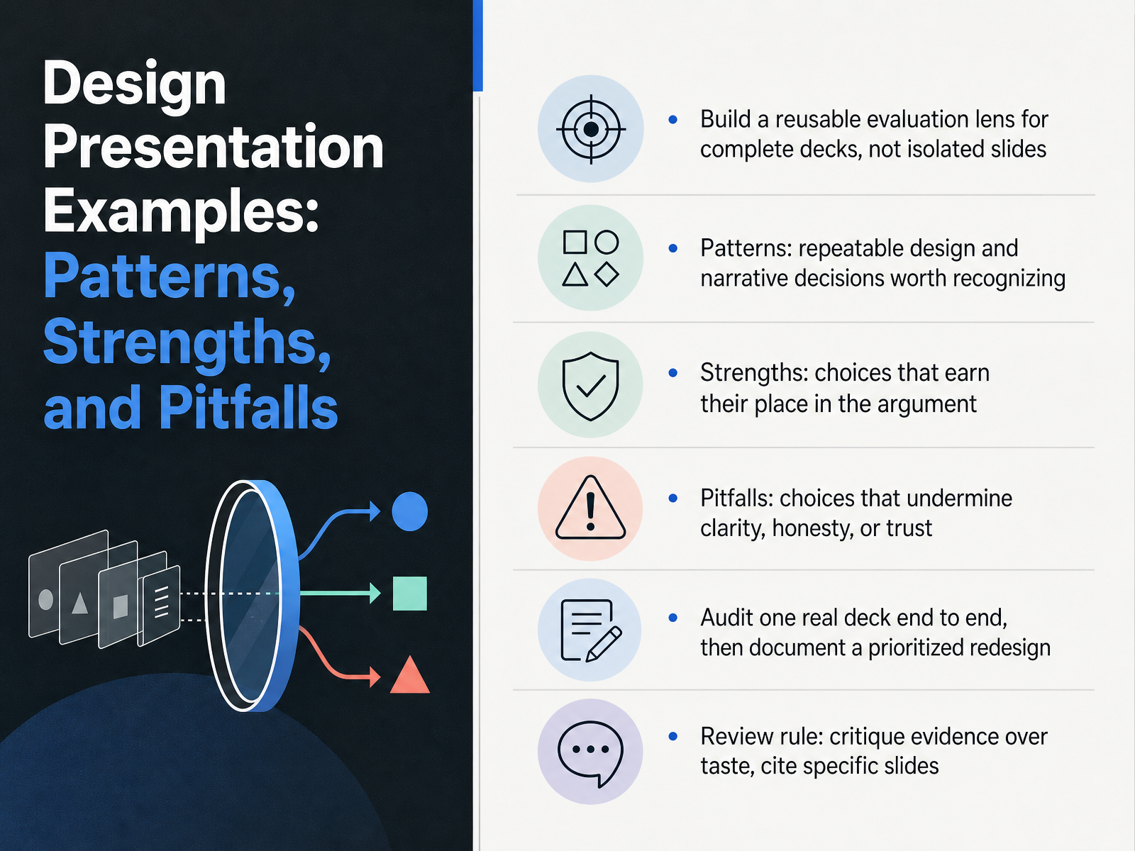
- 01Design Presentation Examples: Patterns, Strengths, and PitfallsWelcome. I'm glad you're here. Today we're going to build a reusable evaluation lens for full presentation decks, not just isolated slides. That shift matters, because a deck rises or falls on how its parts work together. We'll look at three things. First, patterns, the repeatable design and narrative decisions worth recognizing. Second, strengths, the choices that earn their place in the argument. And third, pitfalls, the choices that quietly undermine clarity, honesty, or trust. Here's how we'll practice. You'll audit one real deck end to end, then document a prioritized redesign. So bring a deck you know well, maybe one that got mixed reactions from stakeholders. As we go, keep one review rule in mind. Critique evidence over taste, and cite specific slides. Instead of saying the visuals feel weak, you might point to slide seven, where three charts compete for attention and none supports the headline. That kind of note is actionable. It respects time, mixed audience needs, and the reality of feedback rounds. Next, we'll ask why whole deck review beats slide by slide critique.2 min
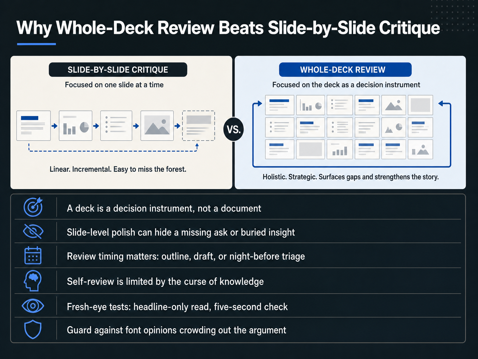
- 02Why Whole-Deck Review Beats Slide-by-Slide CritiqueLet's talk about why whole-deck review beats slide-by-slide critique. A deck is a decision instrument, not a document. Its job is to move someone to a choice, so weak logic can't be rescued by pretty slides. Slide-level polish often hides a missing ask or a buried insight. Fixing each slide in isolation may improve appearance while the argument drifts. Timing matters too. Reviews look different at the outline, the draft, and the night-before triage stage. And self-review is limited by the curse of knowledge. You know too much to see what your audience sees. So run fresh-eye tests. Try a headline-only read, then a five-second check. If the main point doesn't surface, you have a sequencing problem. Also guard against font opinions crowding out the argument. Style debates feel productive, but they can distract from the core decision. Up next, we'll look at reading a deck like a reviewer, focusing on dimensions and sequence.
 1 min
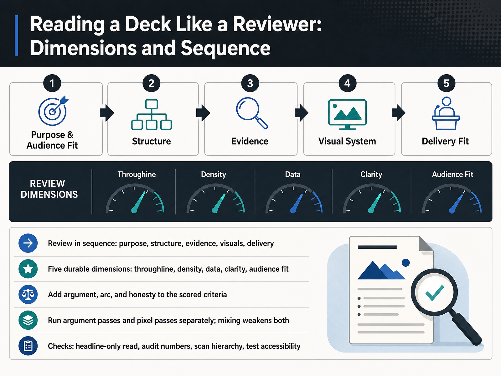
1 min - 03Reading a Deck Like a Reviewer: Dimensions and SequenceNow let's look at how to read a deck like a reviewer. Start with sequence. Check purpose first, then structure, then evidence, then visuals, and finally delivery. Within that, apply five durable dimensions. Throughline, does one clear idea connect the whole deck. Density, is there too much on each slide. Data, are the numbers accurate and well framed. Clarity, can a stranger follow the logic. And audience fit, does it match the room you are presenting to. Add three scored criteria, argument, arc, and honesty. Argument means your claims hold up. Arc means the story builds. Honesty means you do not hide weak evidence. Run argument passes and pixel passes separately. One pass for logic, one for alignment and typography. Mixing them weakens both. For quick checks, try a headline-only read. Audit every number. Scan the hierarchy for what draws the eye first. And test accessibility, including contrast and reading order. Reviewing in passes keeps your feedback specific and fair. Next, we will look at a pattern library of recurring deck structures that work.
 2 min
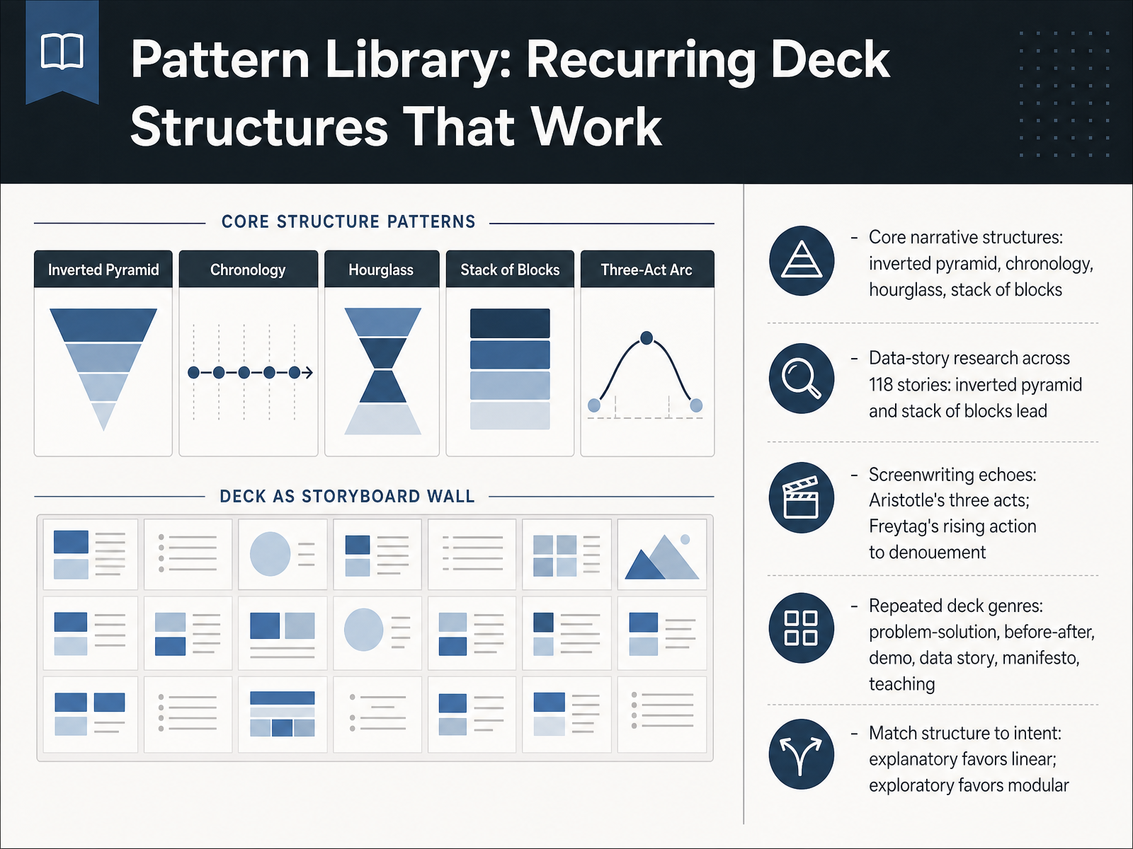
2 min - 04Pattern Library: Recurring Deck Structures That WorkLet's look at the patterns you can reuse. Four core narrative structures keep showing up: the inverted pyramid, chronology, the hourglass, and a stack of blocks. In data-story research across one hundred eighteen stories, the inverted pyramid and the stack of blocks led the pack. That matters because proven structures lower your risk. Screenwriting echoes the same logic. Aristotle gave us three acts, and Freytag traced rising action to a denouement. Your decks inherit those shapes. Now, watch for repeated genres: problem-solution, before-after, demo, data story, manifesto, and teaching. Each one carries its own rhythm. So match structure to intent. If your goal is explanatory, choose linear and guide the audience step by step. If your goal is exploratory, go modular, so people can move where their questions lead. One practical test: can you describe your deck in a single sentence using one of these patterns? If not, your structure may be fighting your message. Next, we'll examine the structural signatures inside them: openers, transitions, and closers.
 2 min
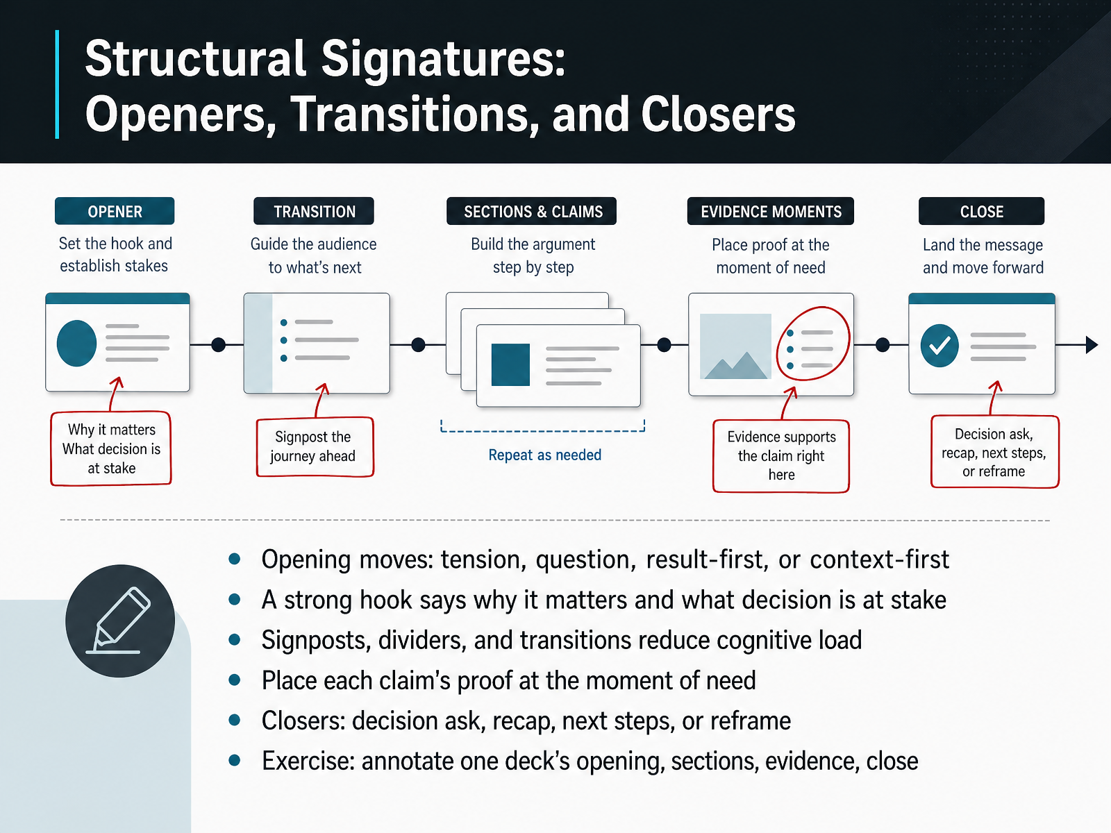
2 min - 05Structural Signatures: Openers, Transitions, and ClosersNow let's look at structure, because every strong deck has a recognizable signature. Openers usually take one of four shapes: tension, a question, result first, or context first. Your hook should say why this matters and what decision is at stake. For example, instead of opening with company history, open with the risk you're asking the room to resolve. Next, use signposts, dividers, and transitions to reduce cognitive load. They tell people where they are and what comes next. Then, place each claim's proof at the moment of need, not buried at the end. If you ask for budget, show the cost and return right there. Closers come in four types: a decision ask, a recap, next steps, or a reframe. Pick one, and make it unmistakable. Here's your exercise. Take one deck and annotate its opening, sections, evidence, and close. Mark what each part is doing. You'll quickly see which parts build momentum and which parts just fill space. Coming up next, visual patterns that carry meaning.
 2 min
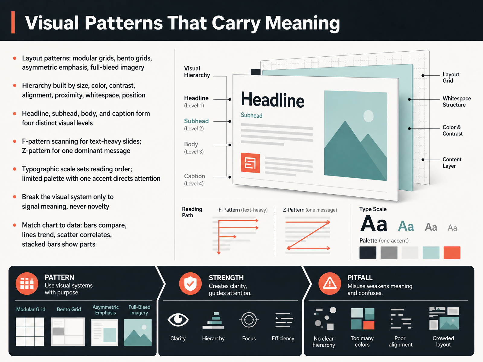
2 min - 06Visual Patterns That Carry MeaningNow let's look at visual patterns that carry meaning. Think of layout first. Modular grids keep dense information tidy, bento grids group related ideas into tiles, asymmetric emphasis pushes one element forward, and full bleed imagery sets a mood. Hierarchy comes next. You build it with size, color, contrast, alignment, proximity, whitespace, and position. On most slides, four levels are enough: headline, subhead, body, and caption. For text heavy slides, readers scan in an F pattern. For one dominant message, use a Z pattern to guide the eye. Your typographic scale sets reading order, and a limited palette with one accent directs attention. Here is the rule that matters. Break the visual system only to signal meaning, never novelty. And match your chart to your data. Bars compare, lines show trends, scatter plots reveal correlation, and stacked bars show parts of a whole. If the chart does not fit the question, the audience will do the work you should have done. So choose patterns deliberately, then keep them consistent. Next, we will examine strengths, what earns its place.
 2 min
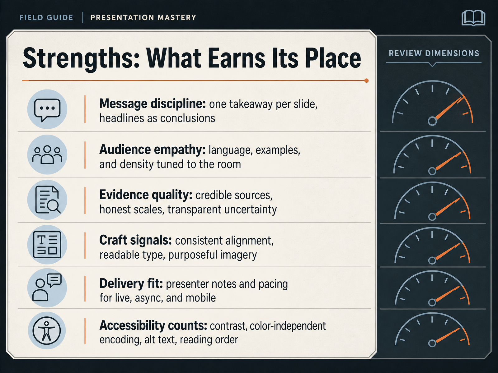
2 min - 07Strengths: What Earns Its PlaceNow let's flip the evaluation around. What earns its place in a strong design? Start with message discipline. One takeaway per slide, and headlines written as conclusions, not labels. Instead of saying quarterly results, say we missed our target by four percent. Next, audience empathy. Tune your language, examples, and density to the room. A board review needs different detail than a team workshop. Then evidence quality. Cite credible sources, keep your scales honest, and be transparent about uncertainty. Craft signals matter too. Consistent alignment, readable type, and purposeful imagery all build trust. Delivery fit is about how the deck lives. Presenter notes and pacing should work live, async, and on mobile. Finally, accessibility counts. Strong contrast, color-independent encoding, alt text, and a logical reading order include everyone. So as you review a deck, ask: does each slide carry one clear message, serve this audience, and hold up under scrutiny? If yes, it has earned its place. Coming up next, we look at the flip side: Pitfalls: Narrative, Visual, and Cognitive Failure Modes.
 2 min
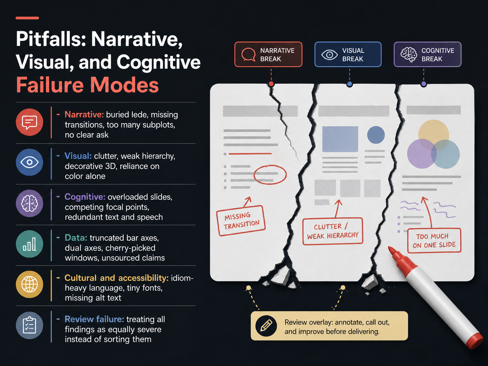
2 min - 08Pitfalls: Narrative, Visual, and Cognitive Failure ModesLet's look at where complete presentation designs commonly break down. The first is narrative failure. That means a buried lede, missing transitions, too many subplots, or no clear ask. Your audience should never wonder what you want from them.
Next is visual failure. Watch for clutter, weak hierarchy, decorative three-dimensional charts, and reliance on color alone to carry meaning.
Cognitive failure is about load. Overloaded slides, competing focal points, and redundant text and speech force your audience to split attention instead of listen.
Then there is data failure. Truncated bar axes, dual axes, cherry-picked date windows, and unsourced claims can all mislead, even when the number itself is correct.
Cultural and accessibility failures matter too. Idiom-heavy language, tiny fonts, and missing alternative text exclude people who need to understand your message.
Finally, review failure. This is treating every finding as equally severe instead of sorting issues by impact and fixing the big ones first.
So when you evaluate a deck, name the failure mode, then prioritize what actually blocks understanding. Next, let's go deeper into data pitfalls in detail, and how charts mislead.
 1 min
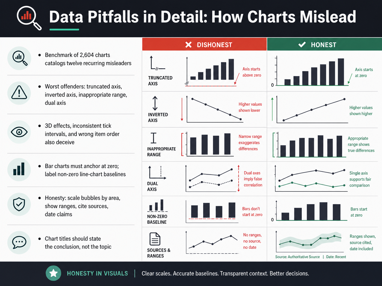
1 min - 09Data Pitfalls in Detail: How Charts MisleadNow let's get specific about data pitfalls, and how charts mislead. A benchmark of two thousand six hundred four charts cataloged twelve recurring misleaders. The worst offenders: a truncated axis, an inverted axis, an inappropriate range, and a dual axis. Three dimensional effects, inconsistent tick intervals, and wrong item order also deceive. Here's the rule that matters most. Bar charts must anchor at zero. If you cut the baseline, small differences look huge. For line charts, label any non-zero baseline clearly. Honesty means scaling bubbles by area, not diameter, showing ranges instead of single points, citing your sources, and dating every claim. One more habit. Chart titles should state the conclusion, not the topic. Say profits fell three quarters in a row, not quarterly profits. So before your next review, check the axis, the baseline, the order, and the title. Small fixes, big credibility. Next, we look at accessibility review basics for full decks.
 2 min
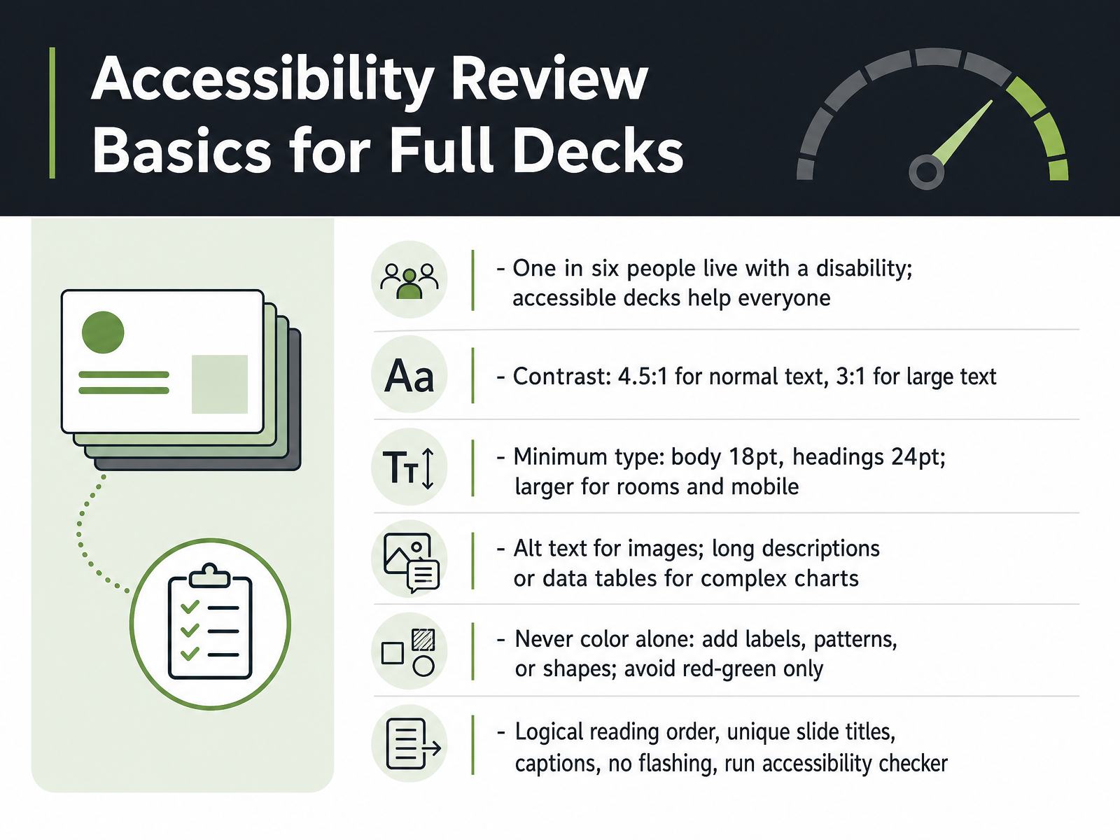
2 min - 10Accessibility Review Basics for Full DecksNext, let's cover accessibility review basics for full decks. Accessibility is not a separate project. One in six people live with a disability, and accessible design helps everyone. So build it into your review. Start with contrast. Normal text needs a contrast ratio of at least four point five to one. Large text needs at least three to one. Then check type size. Body text should be at least eighteen point. Headings should be at least twenty four point. Go larger for big rooms or mobile viewing. For images, add alt text. For complex charts, write a long description or provide a data table. Never use color alone. Add labels, patterns, or shapes. Avoid red and green as your only signal. Finally, confirm logical reading order, unique slide titles, captions, no flashing, and run the accessibility checker. Your takeaway is simple: treat accessibility as a quality check you run on every full deck. Now let's see these criteria in action with Walkthrough One: Business Strategy Deck.
 2 min
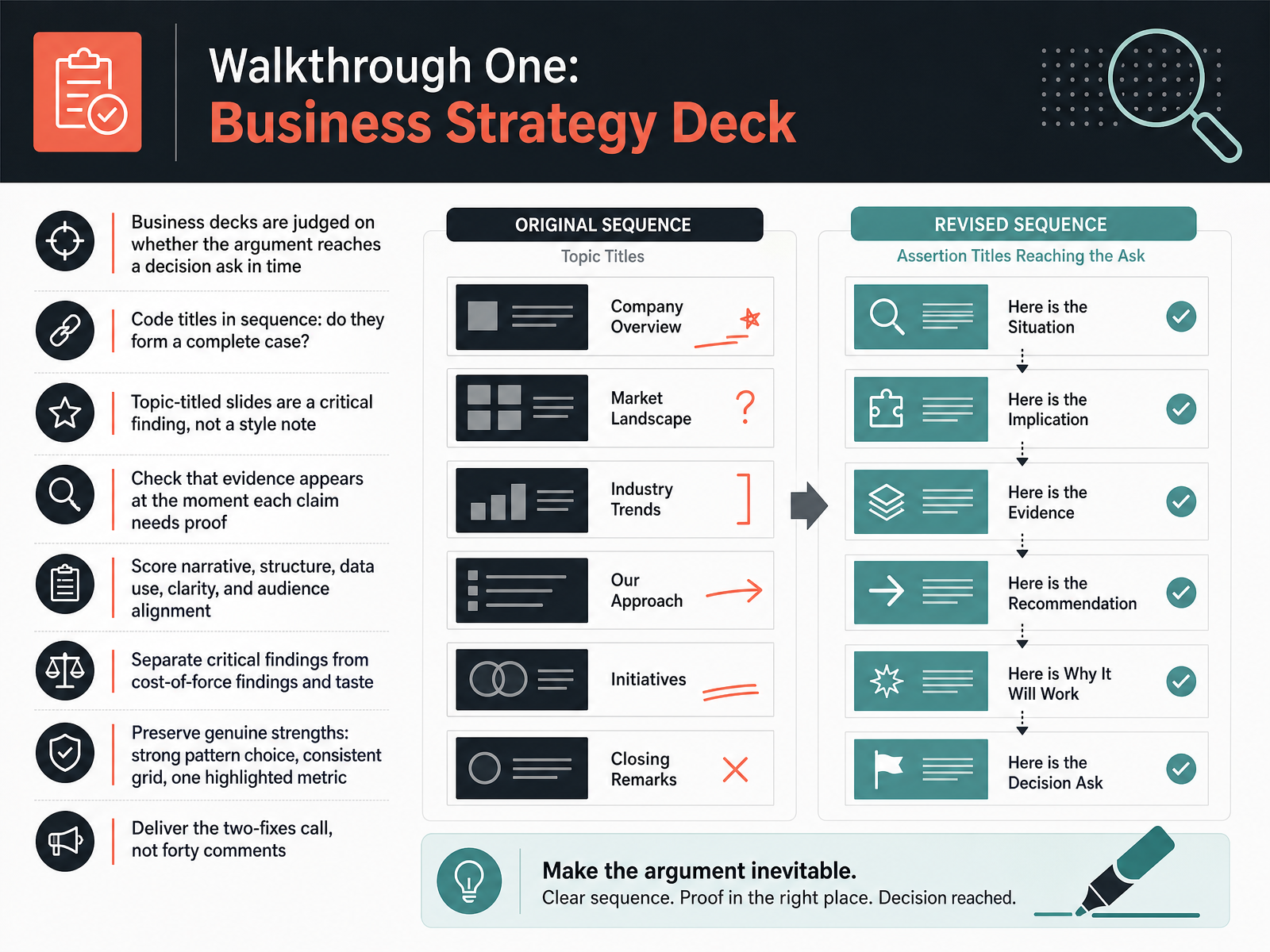
2 min - 11Walkthrough One: Business Strategy DeckLet's walk through a complete business strategy deck. Business decks are judged on one thing: does the argument reach a decision ask in time? Start by reading your slide titles in sequence. Do they form a complete case on their own? If they only name topics, that's not a style note. It's a critical finding, because your titles are the spine of your argument. Next, check your evidence. Does proof appear at the moment each claim needs it, or does it arrive three slides later? Then score the deck on five dimensions: narrative, structure, data use, clarity, and audience alignment. Keep your findings sorted. Separate critical findings from cost-of-force findings and pure taste. And preserve what genuinely works. Strong pattern choice, a consistent grid, one highlighted metric. Your job is to deliver the two-fixes call, not forty comments. Next, we'll move to Walkthrough Two: Educational and Portfolio Decks.
 2 min
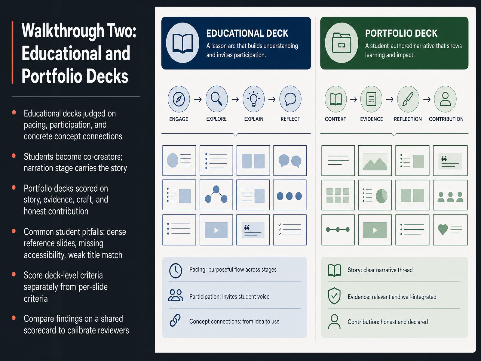
2 min - 12Walkthrough Two: Educational and Portfolio DecksNow let's apply those criteria to educational and portfolio decks. For educational decks, judge three things. Pacing, participation, and concrete concept connections. Ask yourself, does each section build on the last? Do students become co-creators, or just listeners? And does the narration stage carry the story when visuals step back? For portfolio decks, score four areas. Story, evidence, craft, and honest contribution. A clean layout means little if the project story feels vague, or if your role is unclear. Watch for common student pitfalls. Dense reference slides that nobody reads. Missing accessibility, like low contrast or no alt text. And weak title match, where the headline promises something the slide never delivers. One practical habit helps here. Score deck-level criteria separately from per-slide criteria. Then compare findings on a shared scorecard, so reviewers calibrate against each other instead of guessing. That keeps feedback fair, specific, and easy to act on. Next, we move from critique to redesign, prioritizing what matters.
 2 min
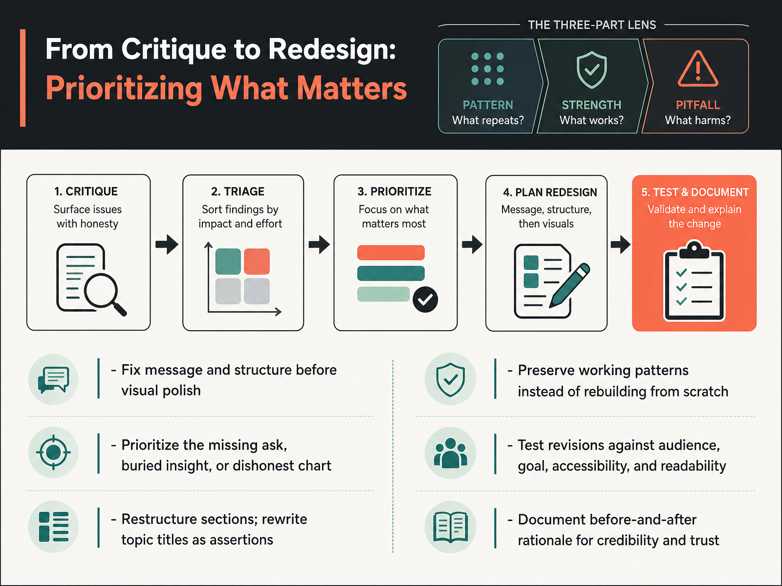
2 min - 13From Critique to Redesign: Prioritizing What MattersNow let's turn critique into a redesign plan. The order matters. Fix message and structure before visual polish. If the logic is broken, nicer fonts will not save it. So prioritize the highest-impact problems first. That could be a missing ask, a buried insight, or a dishonest chart. Ask yourself, what would change the audience's decision? Start there. Then restructure sections, and rewrite topic titles as assertions. Instead of saying quarterly results, say costs rose faster than revenue. Preserve working patterns. Do not rebuild from scratch when a strong opening or clear comparison already works. Next, test every revision against your audience, your goal, accessibility, and readability. For example, check contrast and font size, not just color preference. Finally, document your before-and-after rationale. That builds credibility and trust with stakeholders. Next, the Practice Lab and Take-Home Toolkit.
 1 min
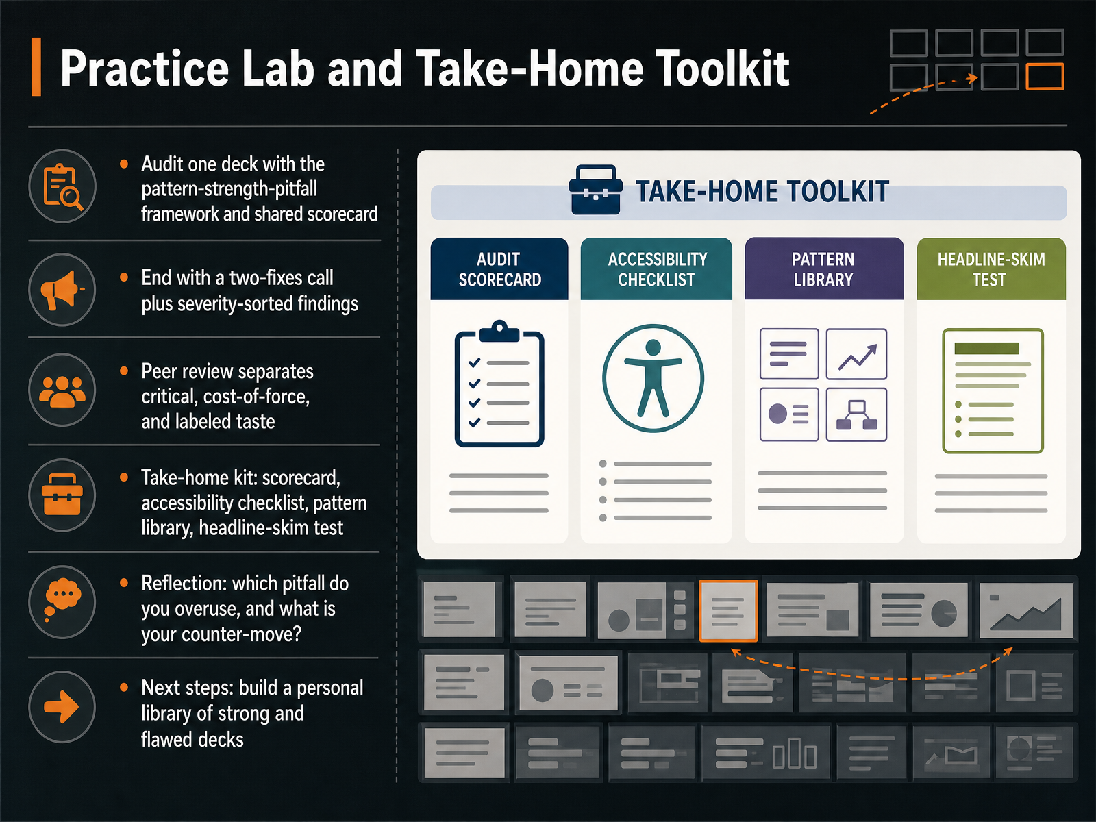
1 min - 14Practice Lab and Take-Home ToolkitNow let's put it all into practice. Your final task is simple: audit one real deck using the pattern-strength-pitfall framework and the shared scorecard. Then close with a two-fixes call. Write your findings in severity order, so the most damaging issue comes first. When you peer review, separate three things: critical fixes, cost-of-force fixes, and labeled taste. For example, unreadable text is critical. Slightly heavy visuals are cost-of-force. A color preference is taste, and you should label it as such. Your take-home kit includes the scorecard, an accessibility checklist, a pattern library, and the headline-skim test. Take a moment for reflection. Which pitfall do you overuse? More importantly, what is your counter-move? Finally, for next steps, build a personal library of strong and flawed decks. Study both. That comparison is how your judgment sharpens. Thank you for your attention and effort. Keep auditing, keep refining, and make every slide earn its place.
 2 min
2 min
Take the deck with you
Download this course as a file — free, no sign-up needed.
- PDF handoutEvery slide page, ready to print or share.15 pages · 3.7 MBDownload
- Narrated PowerPointThe deck that presents itself — every slide carries the digital human's narration video.15 pages · 14.9 MBDownload
- PowerPoint slidesThe full deck as a .pptx — open it in PowerPoint, Keynote, or Google Slides.15 pages · 3.6 MBDownload
Free to use in your own training — please keep the PersonWise credit page at the end.
Have your own deck? Turn it into a course