Data Visualization Chart Types
Begin
14 pages · ~28 min
Data Visualization Chart Types
Learn to select and apply various data visualization chart types for effective data presentation and analysis.
What you’ll learn
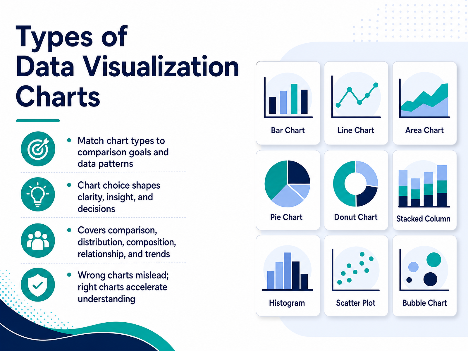
- 01Types of Data Visualization ChartsWelcome. Today we’re going to talk about choosing the right type of data visualization chart. The chart you select shapes how clearly your audience sees the data, and ultimately, how well they understand your insight. A well-chosen chart speeds up decisions. A poorly chosen one can mislead, even when every number is accurate. So our focus is on matching chart types to your comparison goals and the patterns in your data. We’ll cover charts for comparison, distribution, composition, relationships, and trends. By the end, you’ll have a practical framework for picking the chart that makes your message clear. Let’s begin with the core framework for chart selection.highcharts.comchartmekko.comprezlab.com+21 min
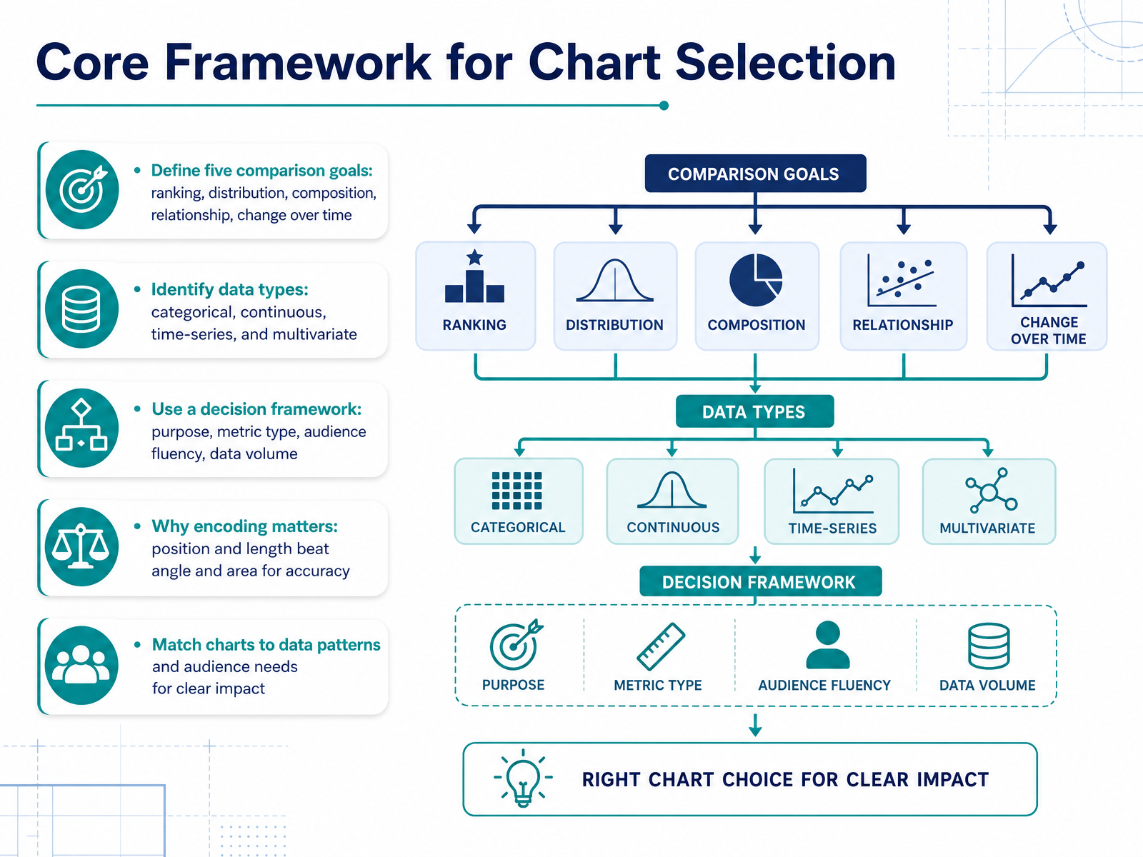
- 02Core Framework for Chart SelectionLet’s build a core framework for choosing charts. Start by naming the comparison goal. Are you ranking items, showing a distribution, breaking down composition, revealing a relationship, or tracking change over time? Each goal points to a different family of charts. Next, identify the data type you are working with: categorical, continuous, time-series, or multivariate. These two steps narrow your options considerably. Then apply a decision framework. Consider your purpose, the metric type, your audience’s data fluency, and the volume of data. A bar chart works well for a handful of categories, but it becomes cluttered with dozens. Also, remember the science of encoding. People judge position and length far more accurately than angle and area. That is why bars and lines outperform pies and bubbles for precise comparisons. Match the chart to the data pattern and to what your audience can read quickly. When your goal is clear, the right chart becomes obvious. Next, we will walk through specific charts for comparing values.
 highcharts.comchartmekko.comprezlab.com+21 min
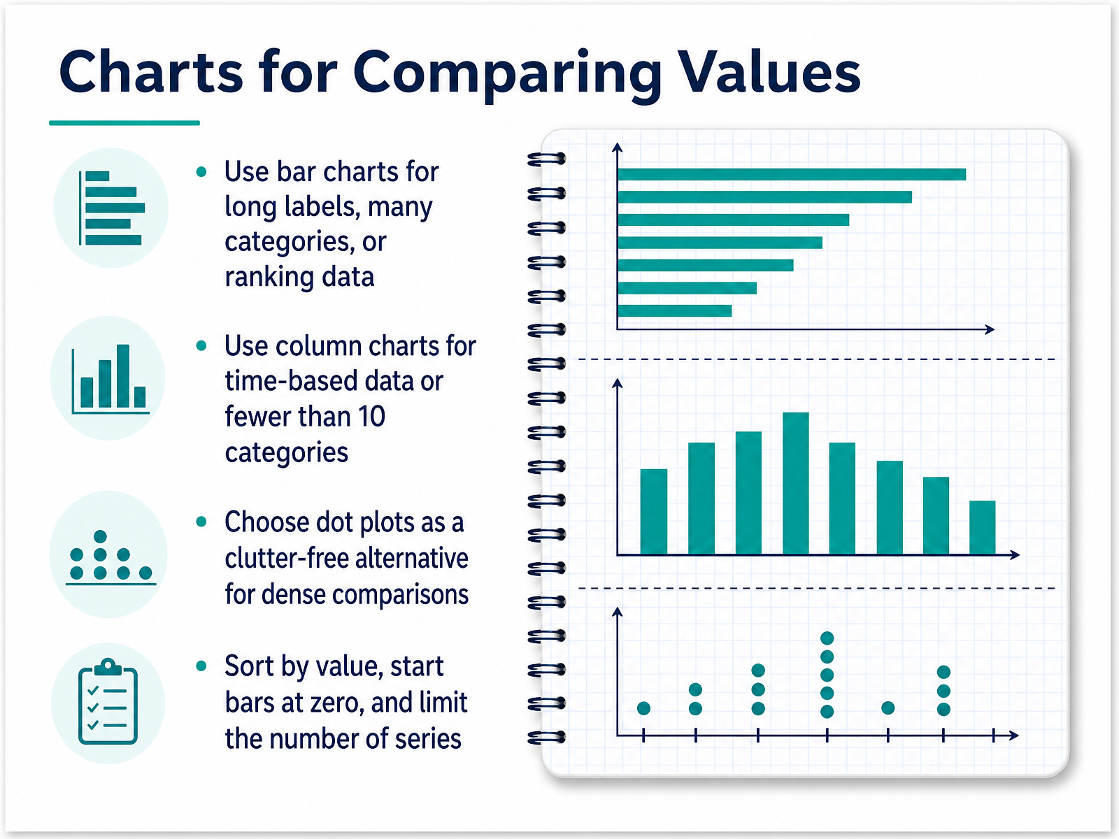
 - 03Charts for Comparing ValuesNow let’s talk about the workhorses of comparison: bar charts, column charts, and dot plots. When your goal is to compare values across categories, the orientation of the chart matters more than you might think. If your labels are long or you have many categories—say more than ten—a bar chart with horizontal bars is the better choice. It gives text room to breathe and makes ranking data easy to scan from top to bottom. On the other hand, if you are showing values over time, like monthly sales, or if you have fewer than ten categories, a column chart works best. Its vertical bars make it natural to read progress from left to right. A useful alternative is the dot plot. It provides a clean, clutter-free way to compare dense sets of values without heavy bars competing for attention. Whichever you choose, apply two simple rules. Sort the data by value so the pattern is obvious, and always start the axis at zero so the differences are not exaggerated. Also, limit the number of series to keep the chart readable. With these choices, you can compare values clearly and honestly. Next, we’ll look at charts that reveal how data is distributed.
 fusioncharts.comexceldemy.comblacklabel.net+22 min
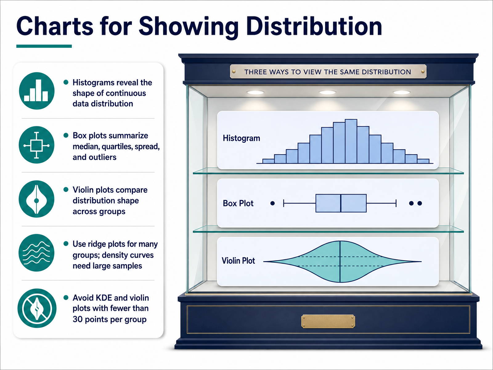
 - 04Charts for Showing DistributionNow let’s look at charts that reveal how your data is spread. When your goal is to understand distribution, the histogram is your starting point. It shows the shape of continuous data, but it can be sensitive to bin choices, so keep that in mind. If you need a quick summary of median, quartiles, spread, and outliers, use a box plot. It works well across multiple groups, though it can hide a bimodal shape. For a deeper view of distribution shape across groups, a violin plot is ideal. It combines a box plot with a density curve. Use it when you have at least thirty observations per group. For many groups, ridge plots keep things readable. And remember, density curves and violin plots become reliable only with larger samples, so avoid them when each group has fewer than thirty points. Choose the chart that matches your sample size and your question.
 datafield.devr-statistics.cobookdown.org+21 min
 - 05Charts for Showing CompositionNow let's talk about charts for showing composition. These answer the question: what share of the total does each category represent? If you have a single whole and five or fewer categories, a pie or donut chart works well for a quick impression. For example, market share for a handful of competitors. But keep in mind, pie charts are not reliable for precise comparisons, especially when slices are similar in size. When your goal is to compare composition across multiple groups, stacked bars are the better choice. A stacked bar shows how the parts change from group to group. And if you only care about proportions, not totals, use 100 percent stacked bars so each bar adds up to the same whole. This makes it much easier to compare percentages across groups. Now, if your data is dense or hierarchical, a treemap is a practical option. It uses nested rectangles to show the breakdown of many categories in a compact space. That said, studies show treemaps can be slower to read than pie charts for simple part-to-whole tasks. So reserve them for when you have many categories. A good rule of thumb: simple data, simple chart. Complex or nested data, consider a treemap. Next, we'll look at charts for showing relationships between variables.
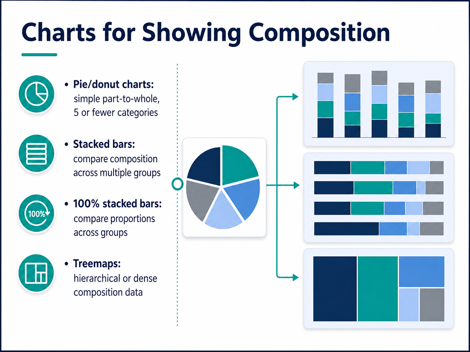 tableau.comlicklider.aihighcharts.com+21 min
 - 06Charts for Showing RelationshipsNow let’s look at charts that reveal relationships between variables. When your goal is to see how two continuous measures move together, a scatter plot is your best starting point. Each dot represents one observation, with its position set by the x and y values. If the dots form a clear upward or downward pattern, you have a correlation. For example, you might plot advertising spend against revenue to see if more spend tends to lead to more sales. To add a third variable, turn the scatter plot into a bubble chart. The size of each bubble represents that additional measure, such as customer count or market size. You can also use color to group data points by category, like region or product line. This lets you compare three or even four dimensions in one view. When you have many variables and want a summary of relationships, a correlation heatmap works well. It uses color intensity to show how strongly each pair of variables is related, so you can scan for patterns quickly. Finally, a connected scatter plot is useful when you want to show a relationship that evolves over time. Lines connect the points in sequence, making the path visible. Just be careful with large datasets—too many overlapping points or lines can hide the insights. In short, choose a scatter plot for two variables, add bubbles for a third, use a heatmap for many, and reach for a connected scatter plot only when time is part of the story. Next, we’ll look at charts designed to show change over time.
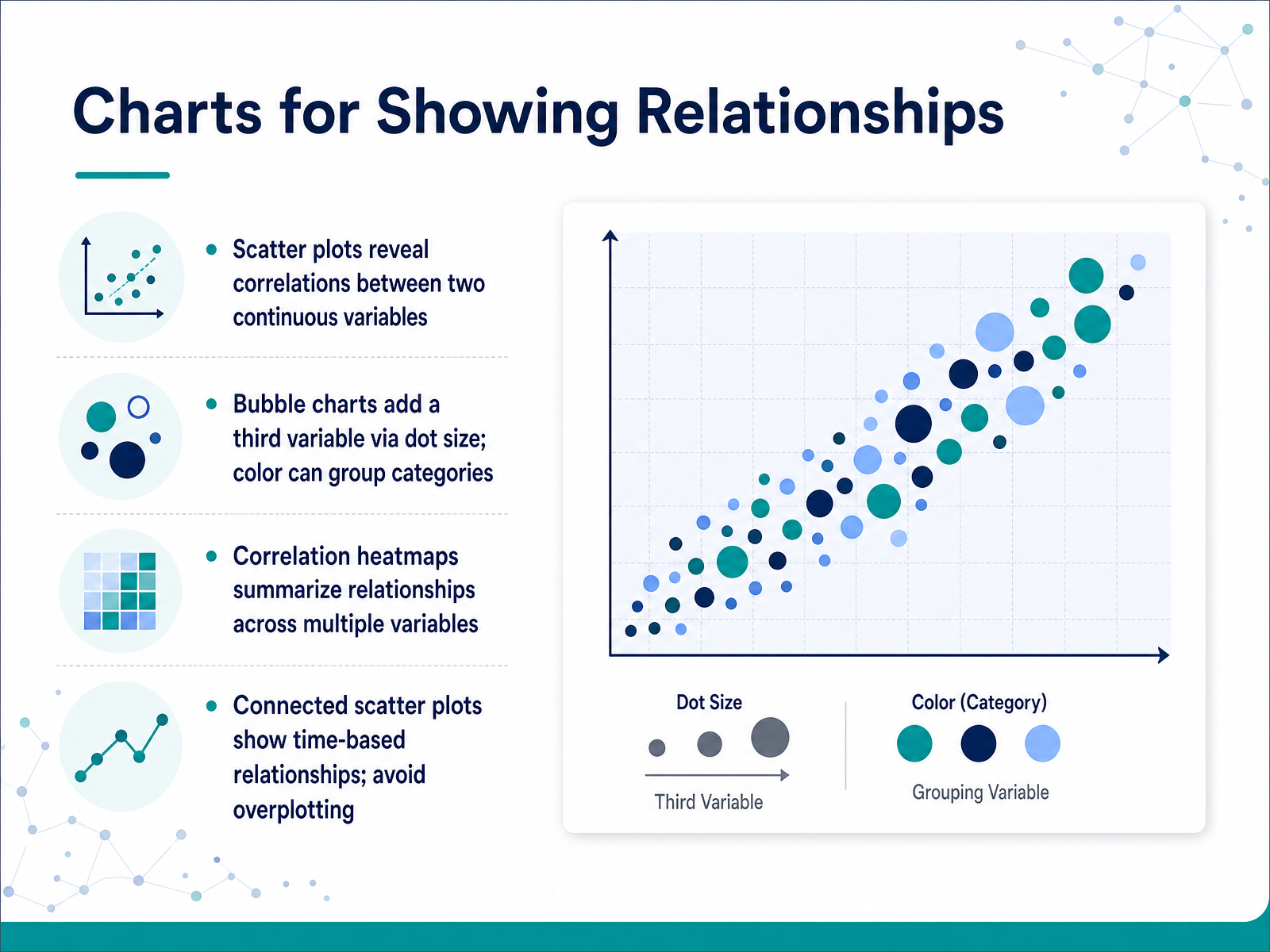 2 min
2 min - 07Charts for Showing Change Over TimeNow let's look at charts that show change over time. For continuous trends with precise comparisons, a line chart is your best choice. It's clean, handles multiple series well, and lets you zoom in on subtle changes without starting the axis at zero. When your goal is to emphasize volume or cumulative totals, switch to an area chart. The shaded region draws attention to magnitude. Just remember to always start the y-axis at zero, otherwise you will distort the visual weight and mislead your audience. For before-and-after comparisons or ranking changes, use a slope graph. It connects just two points in time, stripping away intermediate noise so increases, decreases, and flat lines become instantly visible. If you have many small trends to show in a compact space, sparklines are a great inline option. They act as tiny line charts embedded in text or tables, guiding the eye to the shape of the trend without taking up much room. So the key takeaway is this: lines for precision, areas for volume, slopes for simple change, and sparklines for compactness. In the next section, we will turn these options into practical selection guidelines you can apply directly to your own data.
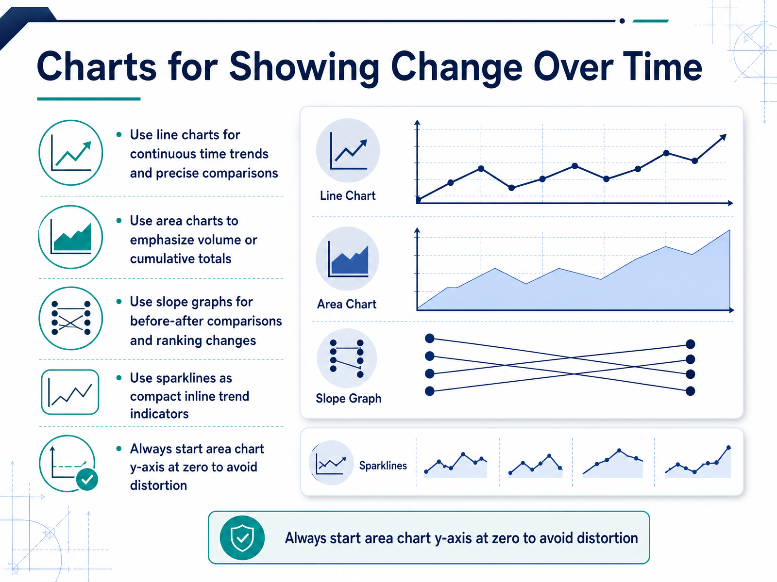 2 min
2 min - 08Practical Selection GuidelinesLet's turn those chart options into a practical selection process. Start by matching the chart type to your comparison goal and the pattern in your data. Ask yourself what you are trying to show. If you need to compare categories, a bar chart works well. If you are showing a trend over time, a line chart is usually the better choice. To stay consistent, work through a simple decision tree. Consider your purpose, the type of metric, your audience's familiarity with data, and the nature of the dataset itself. This structure removes guesswork. Also, be mindful of common pitfalls. Avoid truncated axes, which exaggerate differences. Use pie charts sparingly, only for a few categories. And remove chartjunk, any decoration that does not add meaning. Before you finalize, run a quick checklist. Confirm your goal, select the right chart family, check the encoding, review the design, and test it on a colleague. A thoughtful review catches distortions before your audience does. With this framework in place, let's look at the common mistakes that can undermine an otherwise solid chart.
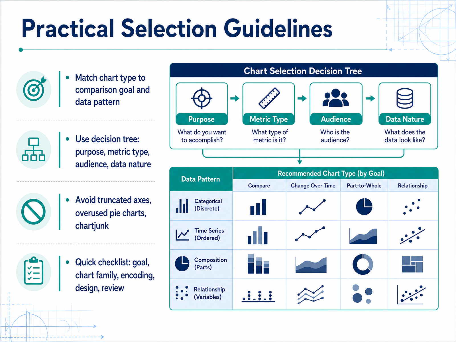 highcharts.comchartmekko.comprezlab.com+22 min
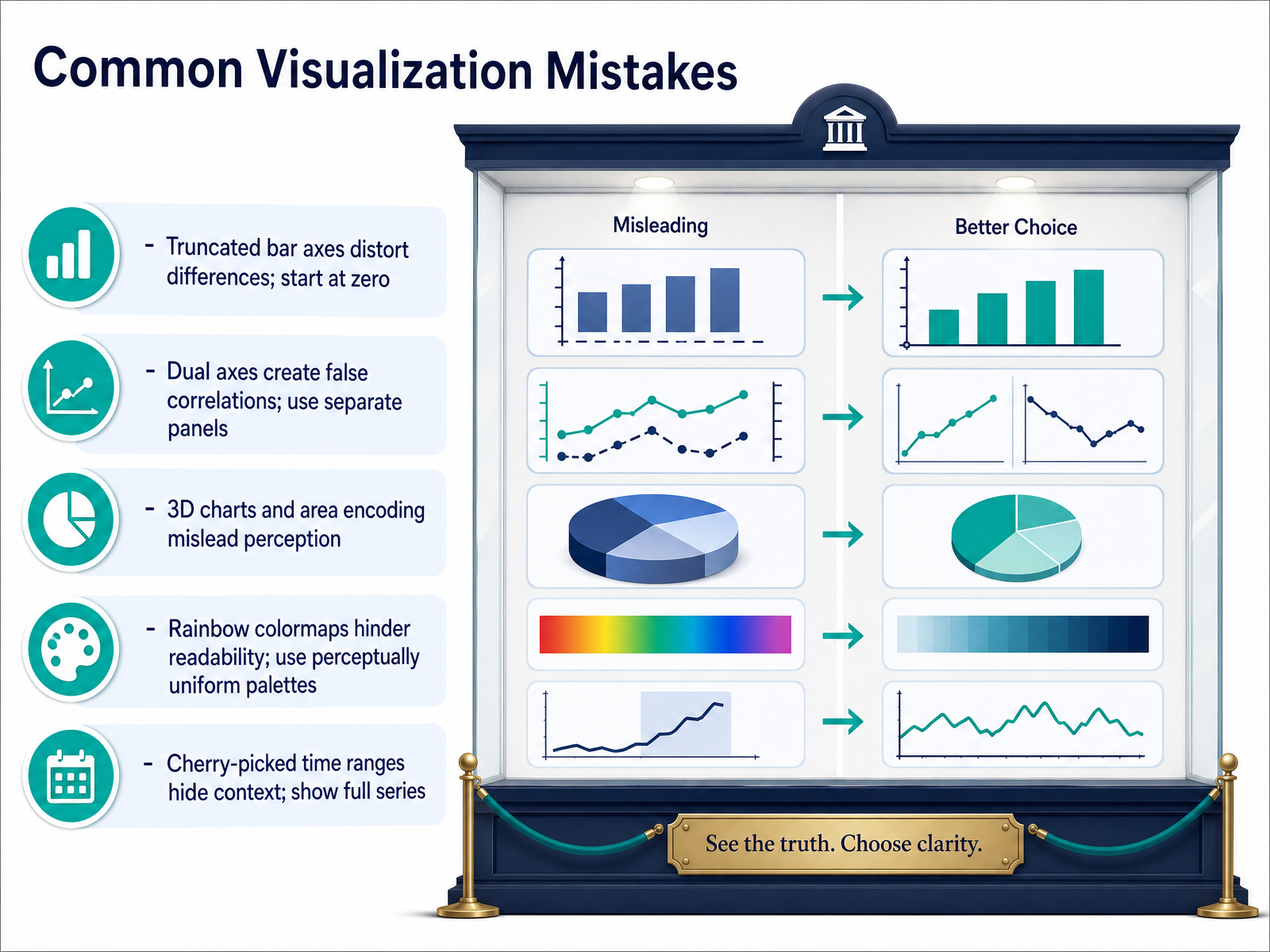
 - 09Common Visualization MistakesNow let's look at the common mistakes that can make a chart misleading. First, truncated bar axes. When your goal is comparing values with bars, always start the axis at zero. Cutting the baseline can make a small difference look massive. If you need to show fine differences, consider a dot plot instead. Next, dual axes. If you need to compare two trends, resist the urge to put them on the same chart with different scales. That can create false correlations. Use separate panels stacked vertically instead. Also, avoid 3D effects and area encoding. They distort perception. A 3D bar or pie looks impressive, but it misleads the eye. When it comes to color, don't use rainbow palettes. They are hard to read and exclude color blind viewers. Use perceptually uniform palettes like viridis. Finally, don't cherry pick your time range. Show the full series so your audience sees the context. The takeaway is simple. Check your baseline, your scales, your colors, and your time window. Now, let's move on to matching charts to your audience and context.
 1 min
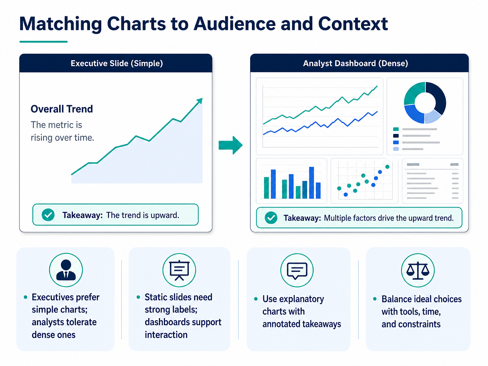
1 min - 10Matching Charts to Audience and ContextNow let's talk about matching your chart to your audience and context. The best chart is not just technically correct; it also respects who will read it and where it will appear. Executives typically prefer simple charts that deliver one clear message quickly, so avoid dense visuals with many layers when presenting upward. Analysts, on the other hand, can handle more complexity, so you have more freedom with technical audiences, but you still need to serve their analytical needs. Consider the medium as well. If you are building a static slide, include strong labels and annotations because there is no interaction to clarify meaning. If you are working on a dashboard, you can rely on tooltips and filters to provide additional detail. For explanatory presentations, you should guide the viewer toward the takeaway by annotating peaks, outliers, or thresholds directly on the chart. Finally, do not forget practical constraints. The ideal chart may require tools or time you do not have, so balance the perfect choice with what is realistic to build and maintain. Your purpose and your audience's data fluency should always carry the most weight in that trade-off. Keep these factors in mind as we move into hands-on practice scenarios.
 highcharts.comchartmekko.comprezlab.com+21 min
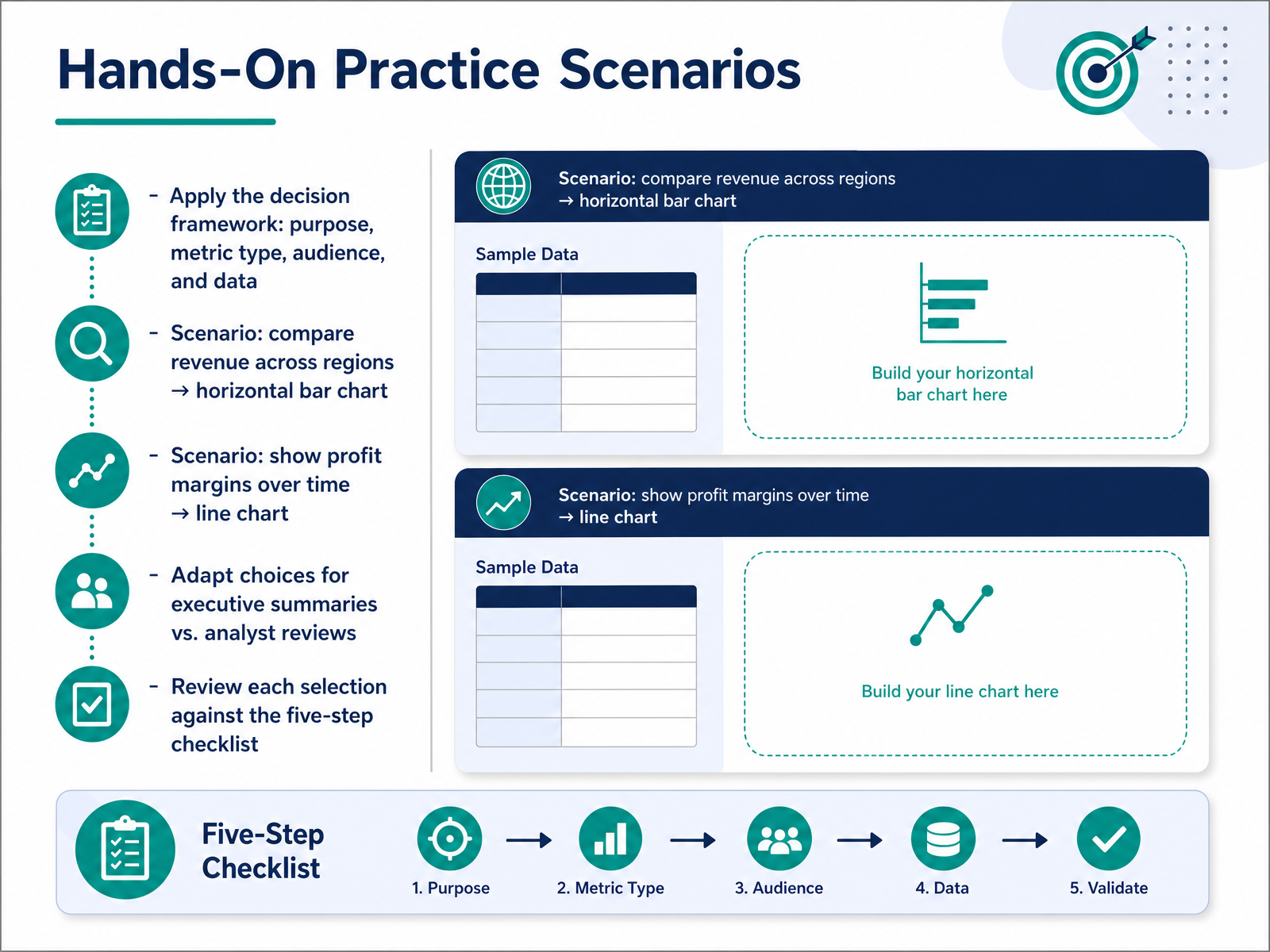
 - 11Hands-On Practice ScenariosNow let's put the framework into practice. Remember, we choose charts based on four things: purpose, metric type, audience, and the nature of your data. Consider two common scenarios. First, if you need to compare revenue across regions, a horizontal bar chart works best. It handles long region names well and makes ranking easy to scan. Second, if you want to show profit margins over time, a line chart is your go-to. It clearly reveals trends and changes across periods. But your choices should adapt to your audience. For an executive summary, keep it simple and highlight the key takeaway. For an analyst review, you can include more detail and complexity. Finally, run each selection through your five-step checklist. Does it match your purpose? Is the metric type correct? Will your audience understand it? Does the data support it? And is the message clear? When you take this structured approach, you'll make consistent, effective chart choices every time. Next, we'll review a quick reference checklist to lock in these decisions.
 highcharts.comchartmekko.comprezlab.com+21 min
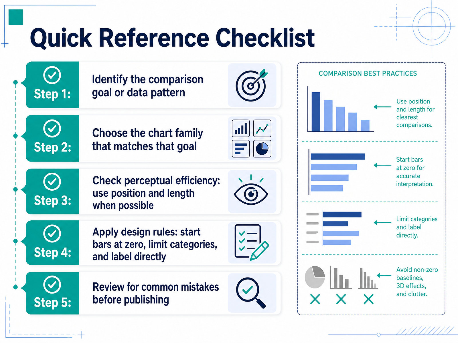
 - 12Quick Reference ChecklistLet's wrap up with a quick reference checklist you can use every time you build a chart. Step one: identify the comparison goal or data pattern. Are you comparing values, showing a trend, or revealing a distribution? Step two: choose the chart family that matches that goal. Bars for comparisons, lines for trends, histograms for distributions. Step three: check perceptual efficiency. Use position and length whenever possible, because people read those most accurately. Avoid relying on angle or area. Step four: apply design rules. Start bars at zero, limit categories to about eight or twelve, and label directly on the chart to reduce legend lookups. Step five: review for common mistakes before publishing. Check for truncated axes, dual axes, 3D effects, and rainbow color palettes. A quick thirty-second audit can catch most misleading visuals. Keep this checklist handy, and your charts will stay clear and honest. Next, we'll summarize the key takeaways from this session.
 highcharts.comchartmekko.comprezlab.com+21 min
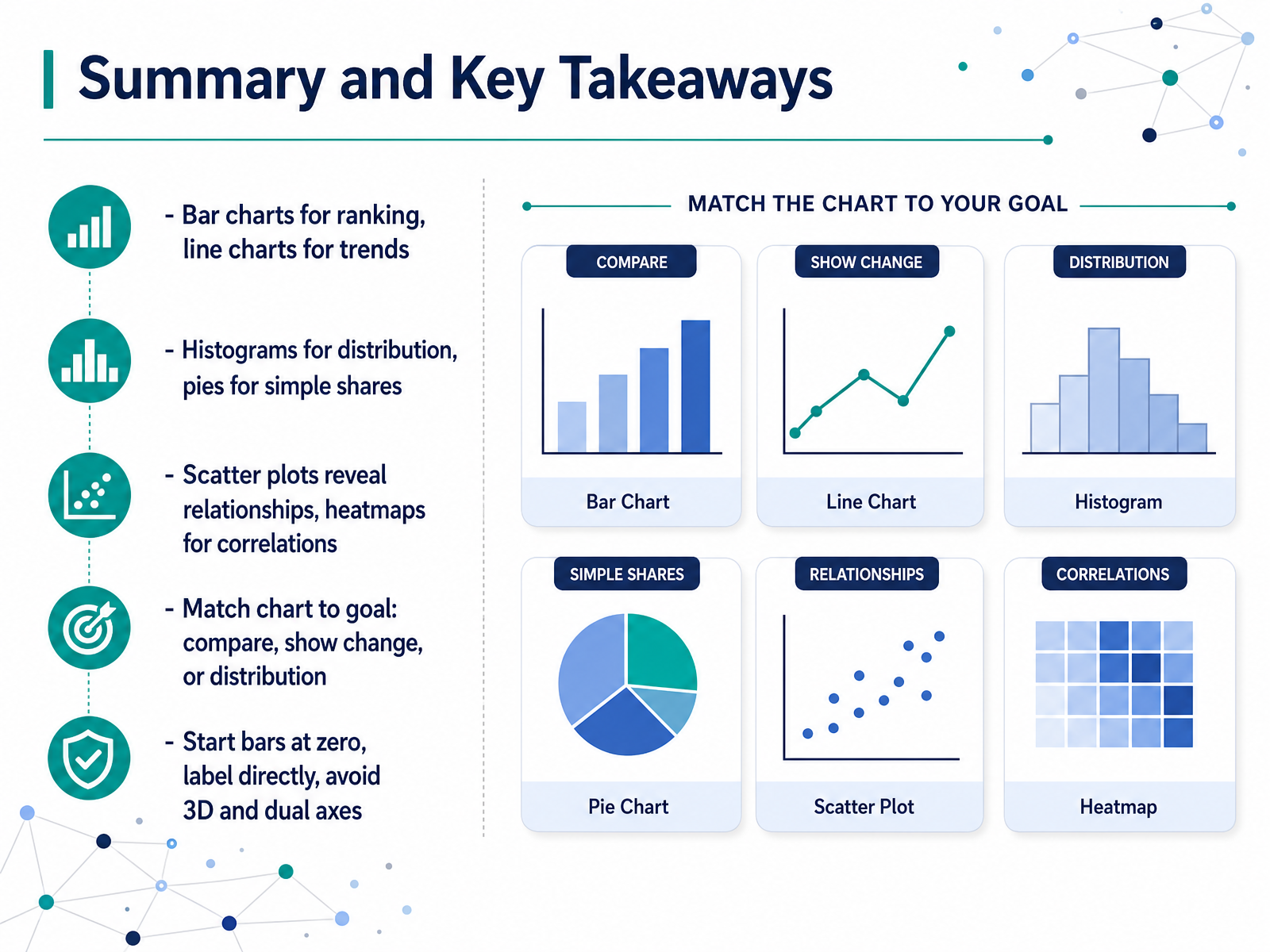
 - 13Summary and Key TakeawaysLet’s pull everything together. When your goal is to compare values across categories, use a bar chart. When you need to show change over time, a line chart is your best choice. For distribution, a histogram reveals the shape of your data. Use a pie chart only for simple shares with just a few parts. Scatter plots help you spot relationships between two variables, and heatmaps are effective for showing correlations across a matrix. The key is to match your chart to your goal. Ask yourself: are you comparing, showing change, or revealing a distribution? That question guides your decision. Finally, follow these practical rules. Start your bar charts at zero so lengths stay honest. Label your data points directly to reduce clutter. Avoid 3D effects and dual axes, as they distort perception and imply false relationships. Keep these principles in mind, and your charts will communicate clearly and honestly. Up next, we’ll cover some practical next steps and resources you can use to continue building your skills.
 highcharts.comchartmekko.comprezlab.com+22 min
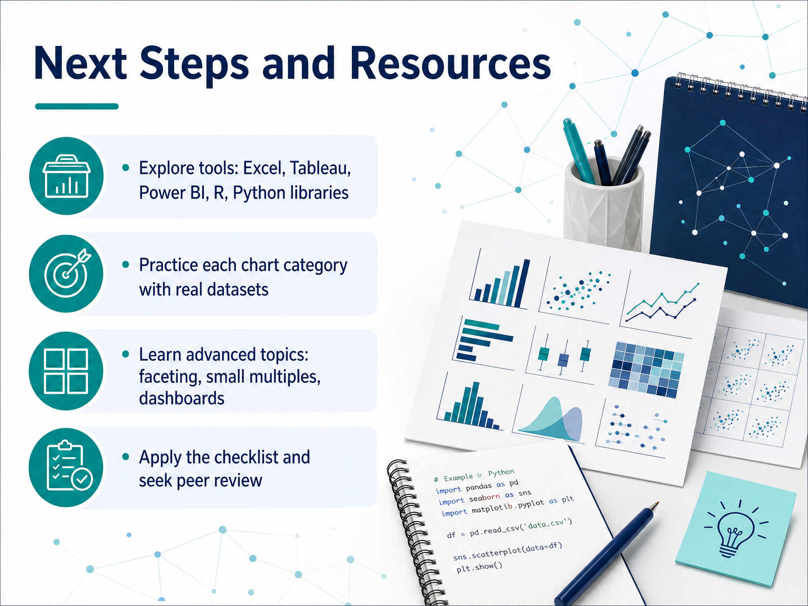
 - 14Next Steps and ResourcesYou've covered the main chart types and the logic behind choosing them. Now it's time to put that knowledge into practice. Start by exploring tools like Excel, Tableau, Power BI, and R or Python libraries. Each has strengths, so pick one that fits your workflow. Next, practice each chart category with real datasets. Don't just read about them—build them. Try comparing sales across regions with a bar chart, then show a trend over time with a line chart, and reveal a distribution with a histogram. As you get comfortable, move to advanced topics like faceting, small multiples, and dashboards. These help you show more context without cluttering a single chart. And finally, apply your own checklist before you finalize: ask if the chart matches your goal, if the audience can read it quickly, and if the data is presented honestly. Then seek peer review. A fresh set of eyes often catches what you miss. Remember, the best chart is the one that makes your insight clear and actionable. You have the framework, so trust it and keep practicing. Thanks for your time, and good luck with your next visualization.
 highcharts.comchartmekko.comprezlab.com+22 min
Take the deck with you
Download this course as a file — free, no sign-up needed.
- PDF handoutEvery slide page, ready to print or share.15 pages · 3.5 MBDownload
- Narrated PowerPointThe deck that presents itself — every slide carries the digital human's narration video.15 pages · 14.8 MBDownload
- PowerPoint slidesThe full deck as a .pptx — open it in PowerPoint, Keynote, or Google Slides.15 pages · 3.4 MBDownload
Free to use in your own training — please keep the PersonWise credit page at the end.
Have your own deck? Turn it into a course
Sources consulted
Web sources consulted while building this course.
- How to Choose the Right Chart: A 3-Part Framework for ... — highcharts.com
- How to Choose the Right Chart: A Practical Guide for Consultants, Marketers, and Product Managers — chartmekko.com
- A Practical Guide To Data Visualization Charts — prezlab.com
- How to Build a Dashboard Visualization Selection Tree — inetsoft.com
- Data Visualization: Chart Choosers — infoguides.gmu.edu
- Bar Chart vs Column Chart: Which One Should You Choose? — fusioncharts.com
- Column Chart vs Bar Chart in Excel (6 Useful Examples) - ExcelDemy — exceldemy.com
- Bar Chart vs Column Chart: Which is best for you? - — blacklabel.net
- Column Graphs vs. Bar Charts – When to choose each one | Think Outside The Slide — thinkoutsidetheslide.com
- How to Make a Bar Chart in Google Sheets | Sheets Bootcamp — sheetsbootcamp.com
- Chapter 17: Distributional Visualization | Data Viz with Python — datafield.dev
- ggplot2 Distribution Charts: Which Plot and When — r-statistics.co
- 3.2 Graphical Measures | A Guide on Data Analysis — bookdown.org
- Box plot vs. violin plot comparison — matplotlib.org
- chapter-10-slides slides — nathancarter.github.io
- The Impact of Distribution and Chart Type on Part-to-Whole Comparisons — tableau.com
- Part to Whole | Licklider — licklider.ai
- What chart to use when your data adds up to 100% — highcharts.com
- The Impact of Distribution and Chart Type on Part-to-Whole Comparisons — diglib.eg.org
- What chart to use when your data adds up to 100% — highcharts.com