Front End Web Development Fundamentals
Begin
14 pages · ~28 min
Front End Web Development Fundamentals
Learn core front-end web development concepts, including purpose and practical examples, ideal for beginners starting their web development journey.
What you’ll learn
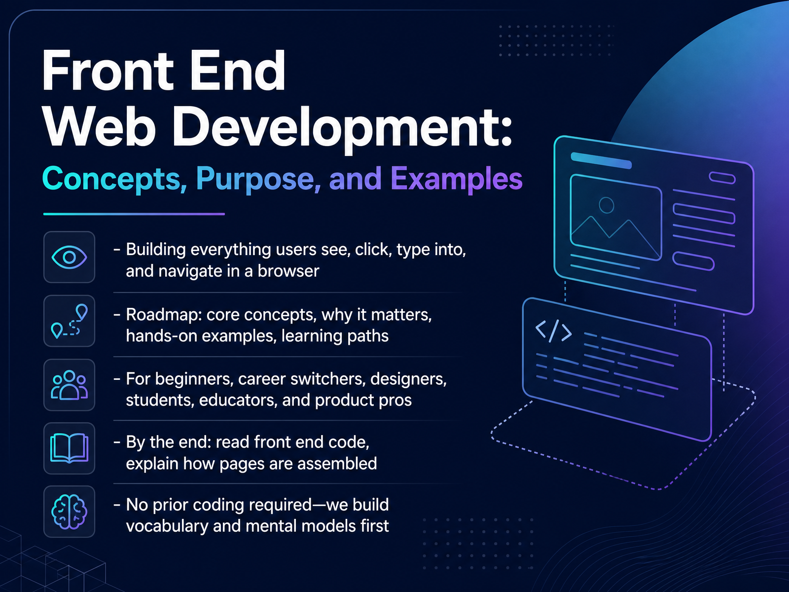
- 01Front End Web Development: Concepts, Purpose, and ExamplesWelcome. I am so glad you are here. Today we are starting at the very beginning of front end web development. This is the work of building everything users see, click, type into, and navigate in a browser. Think about the last website you visited. The buttons, the menus, the form you filled in. All of that is the front end. Here is our roadmap. We will cover core concepts, why they matter, hands on examples, and learning paths. This course is for beginners, career switchers, designers, students, educators, and product professionals. By the end, you will be able to read front end code and explain how a page is assembled. And here is the good news. No prior coding experience is required. We will build vocabulary and mental models first, one small step at a time. Let us start with what front end development actually is.greatfrontend.comwscubetech.comscrimba.com+21 min
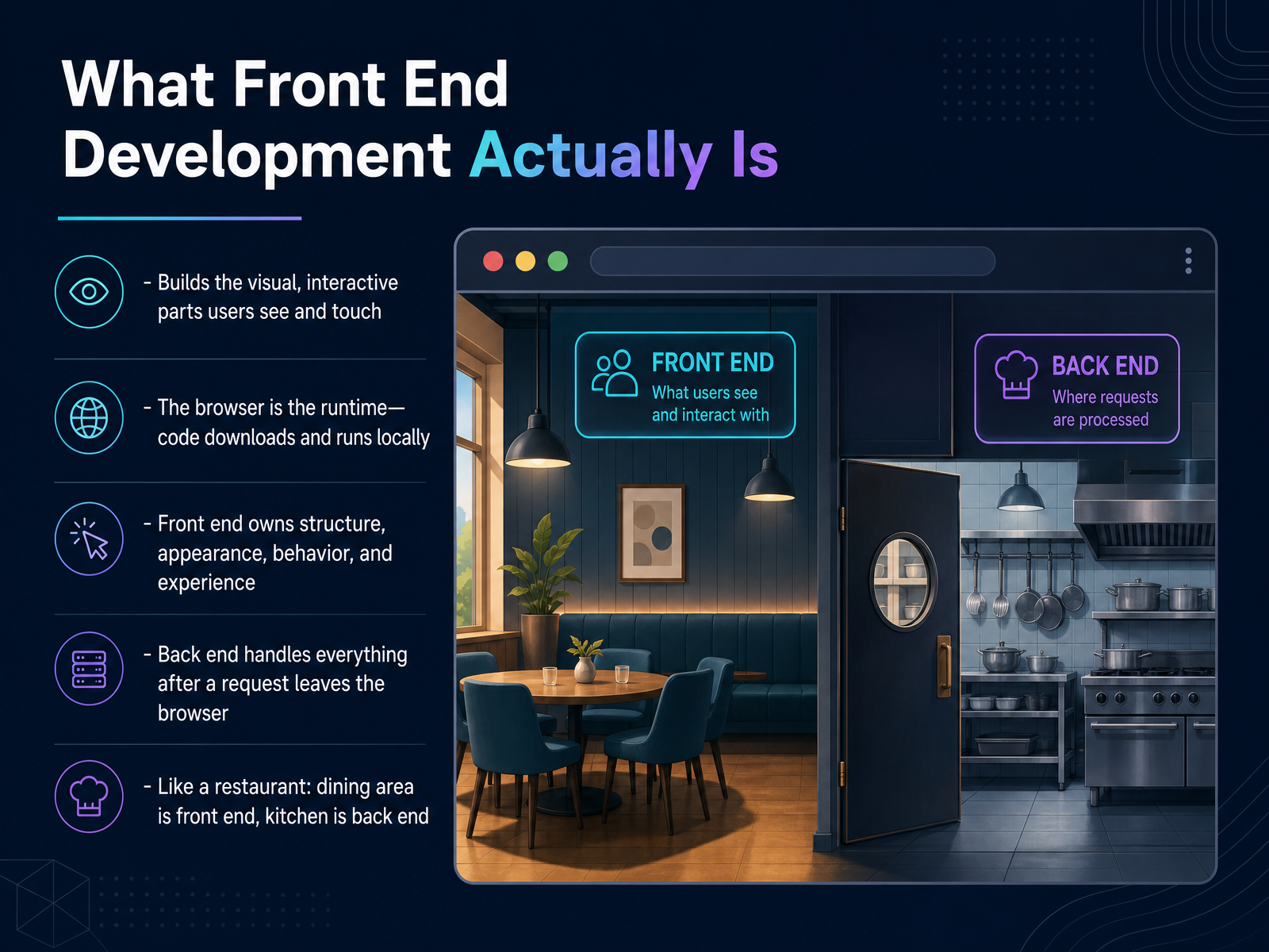
- 02What Front End Development Actually IsLet's make this concrete. What is front end development, really? It's the work of building the visual, interactive parts users see and touch. Every button, layout, form, and animation is front end. And here's the key idea: the browser is the runtime. Your code downloads and runs locally on the user's device, not on a distant server. Front end owns four things: structure, appearance, behavior, and experience. Back end handles everything after a request leaves the browser, like databases and authentication. Think of a restaurant. The dining area, the menu, the lighting, that's front end. The kitchen is back end. You interact with the front, while the back keeps everything running. So front end development sits right where design meets code. Next, let's look at the tools behind it: The Three Building Blocks: HTML, CSS, and JavaScript.
 greatfrontend.comwscubetech.comscrimba.com+22 min
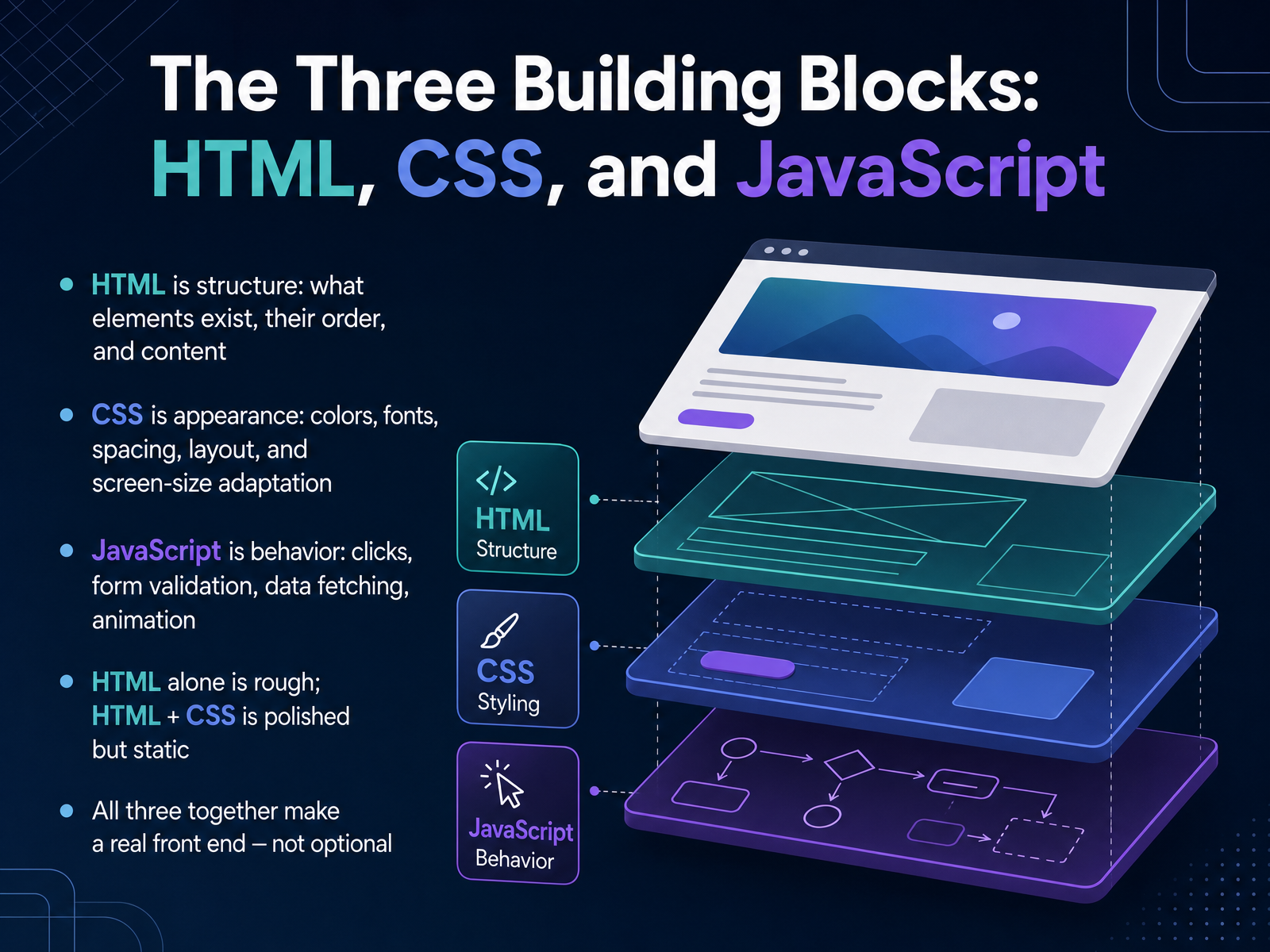
 - 03The Three Building Blocks: HTML, CSS, and JavaScriptNow let's look at the three building blocks of every front end: HTML, CSS, and JavaScript. Each one has a distinct job. HTML is structure. It defines what elements exist, their order, and their content. Think of headings, paragraphs, and buttons. On its own, HTML works, but it looks rough. CSS is appearance. It controls colors, fonts, spacing, layout, and how your page adapts to different screen sizes. Add CSS, and the same page becomes polished, though still static. JavaScript is behavior. It handles clicks, form validation, fetching data, and animation. Notice how each layer changes what the user sees and does. Remove any one, and something breaks. HTML alone is rough. HTML with CSS is polished but lifeless. All three together make a real front end, and none of them are optional. Next, we'll follow a web request from the browser to a visible page. From a Web Request to a Visible Page.
 greatfrontend.comwscubetech.comscrimba.com+22 min
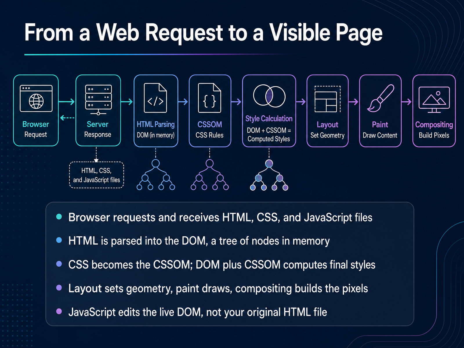
 - 04From a Web Request to a Visible PageLet's follow what actually happens between a click and a visible page. First, the browser requests your HTML, CSS, and JavaScript files, and receives them over the network. As the HTML arrives, the browser parses it into the DOM, a tree of nodes held in memory. Next, your CSS becomes the CSSOM, and the browser combines the DOM with the CSSOM to compute final styles for each element. Then layout sets the geometry, paint draws the visuals, and compositing builds the pixels you see. Here is the key idea. JavaScript edits the live DOM, not your original HTML file. So when a click adds a new list item, the file on disk never changes. The browser just recalculates styles, layout, and paint for the updated tree.
 developer.mozilla.orgmedium.comalexweblab.com+21 min
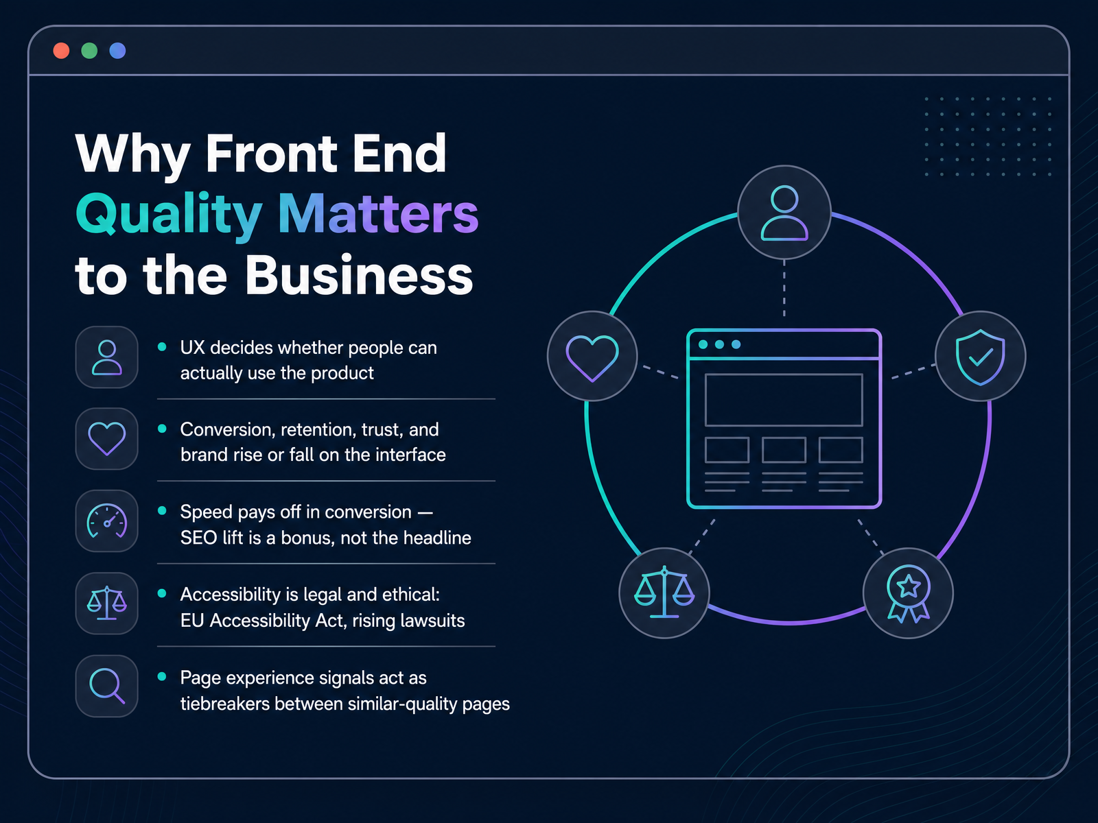
 - 05Why Front End Quality Matters to the BusinessLet's talk about why front end quality matters to the business. The interface is where your product actually meets people. If it's confusing or slow, they can't use it, no matter how good the idea is. Conversion, retention, trust, and brand all rise or fall right there on the screen. Here's something worth remembering. Speed pays off in conversion first. Search visibility is a bonus, not the headline. When pages respond quickly, more visitors stay and complete what they came to do. Accessibility matters too, and not just ethically. Laws like the European Accessibility Act are real, and lawsuits are rising. So building accessibly protects both people and the business. And page experience acts as a tiebreaker. When two pages are similar in quality, the faster, steadier one tends to win. That's why front end quality is a business decision, not just a technical detail. Next, we'll look at the language of performance: L C P, I N P, and C L S.
 developers.google.compagespeedmatters.comtheseocompany.com.au+21 min
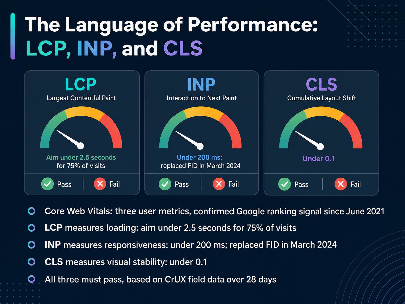
 - 06The Language of Performance: LCP, INP, and CLSNow let's talk about performance, because speed is something your users feel. Google measures it with three numbers called Core Web Vitals. And since June twenty twenty-one, they've been a confirmed ranking signal. First, Largest Contentful Paint, or L C P, measures loading. Aim to have your biggest visible element appear within two point five seconds for seventy-five percent of visits. Second, Interaction to Next Paint, or I N P, measures responsiveness. Keep it under two hundred milliseconds. It replaced the older metric, First Input Delay, in March twenty twenty-four, and it's stricter, because it watches every tap and click, not just the first one. Third, Cumulative Layout Shift, or C L S, measures visual stability. Keep it under zero point one, so content stops jumping around. Here's the key point. All three must pass, based on real field data from Chrome users over twenty-eight days. Notice how this ties directly to what people actually experience. Next, let's move into structuring content with semantic H T M L and the D O M.
 developers.google.compagespeedmatters.comtheseocompany.com.au+22 min
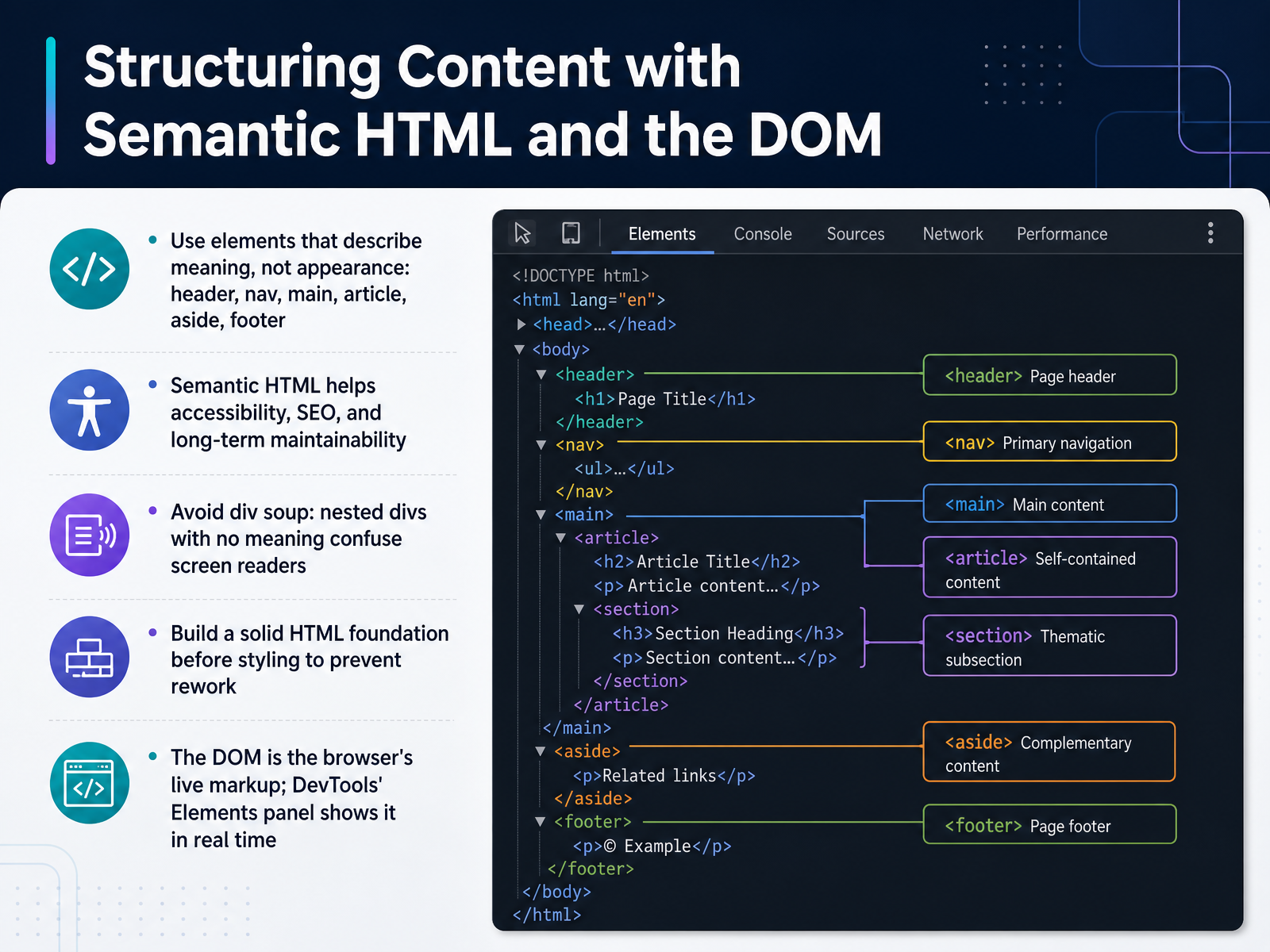
 - 07Structuring Content with Semantic HTML and the DOMLet's talk about structure. Before you touch any styling, your HTML should describe what each piece of content actually is. Use elements that carry meaning: header, nav, main, article, aside, and footer. Instead of a generic container, a navigation bar goes inside nav. A blog post goes inside article. That meaning matters, because screen readers use it to help people jump between regions. Search engines use it to understand your page. And future you will thank you, because semantic markup stays readable as the project grows. Now, avoid what developers call div soup. That's nested divs with no meaning. It looks fine on screen, but it can confuse assistive technology. Here's a practical habit. Build your HTML foundation first, then style. You prevent rework later. Finally, the DOM. That's the browser's live version of your markup after it parses it. Open DevTools, and the Elements panel shows that tree in real time. Now that our structure has meaning, let's bring it to life in Styling and Layout: Box Model, Flexbox, and Grid.
 freecodecamp.orgpyshine.comhtmlgenie.net+22 min
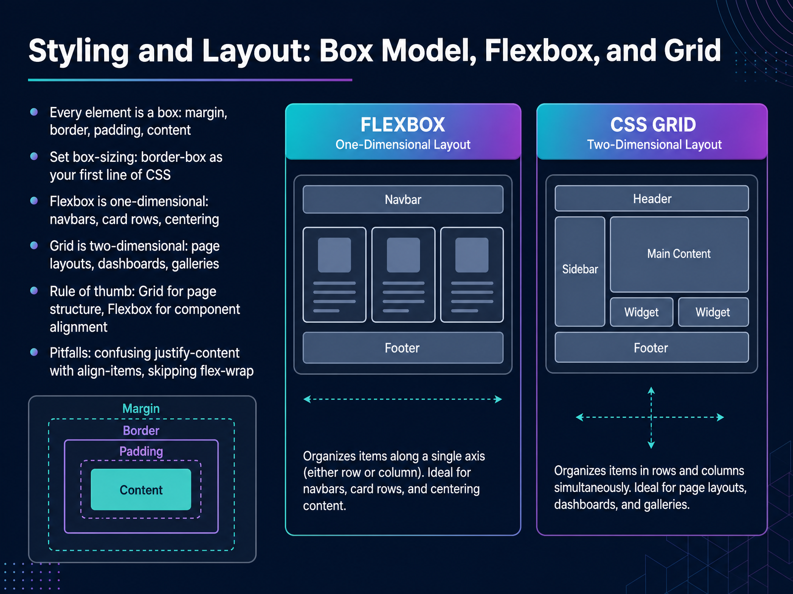
 - 08Styling and Layout: Box Model, Flexbox, and GridNow let's talk about styling and layout, starting with one idea that changes how you see every page. Every element is a box. It has content in the middle, then padding, then a border, then margin around the outside. Here's a practical tip. Set box-sizing to border-box as your first line of CSS. That way, padding and borders count inside the width you set, so your math stops surprising you. Next, two tools. Flexbox is one-dimensional, meaning it handles a single row or a single column, like a navbar, a row of cards, or centering one item. Grid is two-dimensional, with rows and columns together, so it's ideal for page layouts, dashboards, and galleries. A simple rule of thumb: use Grid for page structure, and Flexbox for aligning things inside a component. Watch for two common pitfalls. People mix up justify-content, which aligns along the main axis, with align-items, which aligns on the cross axis. And they forget flex-wrap, so items squash instead of wrapping on smaller screens. Coming up next, Responsive Design: Reaching Every Screen Size.
 freecodecamp.orgpyshine.comhtmlgenie.net+22 min
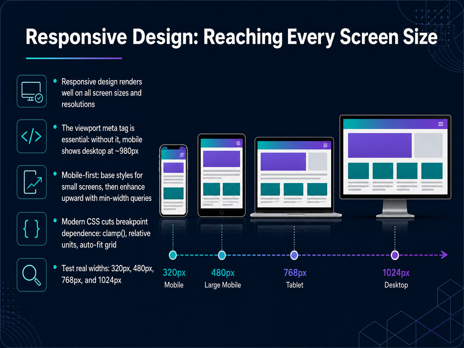
 - 09Responsive Design: Reaching Every Screen SizeNow that you can lay out elements with Grid and Flexbox, let's make those layouts work on every screen. Responsive design means your page renders well on all screen sizes and resolutions. On phones, tablets, and desktops, it should feel like it belongs. There is one essential line in your HTML head, the viewport meta tag. Notice how this changes the page. Without it, mobile browsers render your desktop layout at about nine hundred and eighty pixels wide, then zoom out. Text becomes tiny and hard to use. Add the tag, and the page matches the device width. Next, think mobile first. Write your base styles for small screens, then enhance upward using min width queries. Modern CSS reduces how many breakpoints you need. Functions like clamp, relative units, and auto fit grids let content stretch and wrap smoothly. Finally, test at real widths: three hundred twenty, four hundred eighty, seven hundred sixty eight, and one thousand twenty four pixels. That habit catches problems early. From Static Pages to Interactive Applications.
 freecodecamp.orgpyshine.comhtmlgenie.net+22 min
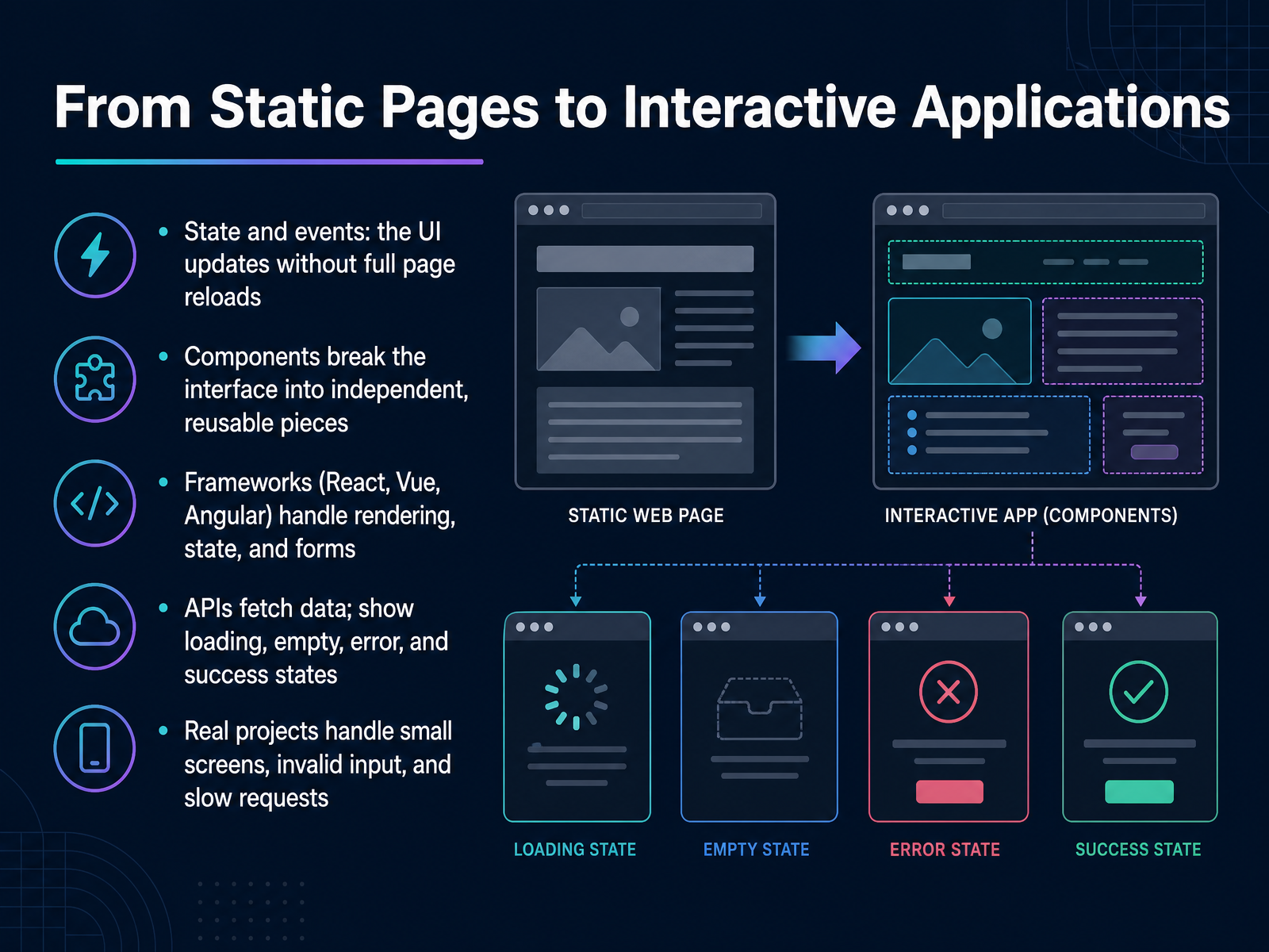
 - 10From Static Pages to Interactive ApplicationsNow let's look at how static pages grow into interactive applications. Think about typing in a search box and watching results appear instantly. That is state and events working together, updating the interface without reloading the whole page. Next, components. Instead of one giant page, we break the interface into independent, reusable pieces. A button, a card, a navigation bar. Frameworks like React, Vue, and Angular handle rendering, state, and forms for you. When your app needs data, APIs fetch it. And here is the important part: always show loading, empty, error, and success states. Notice how that changes the experience. Real projects also handle small screens, invalid input, and slow requests. Those messy conditions are where good frontend work really shows. Up next, we will compare React, Vue, and Angular to help you choose a first framework.
 greatfrontend.comwscubetech.comscrimba.com+21 min
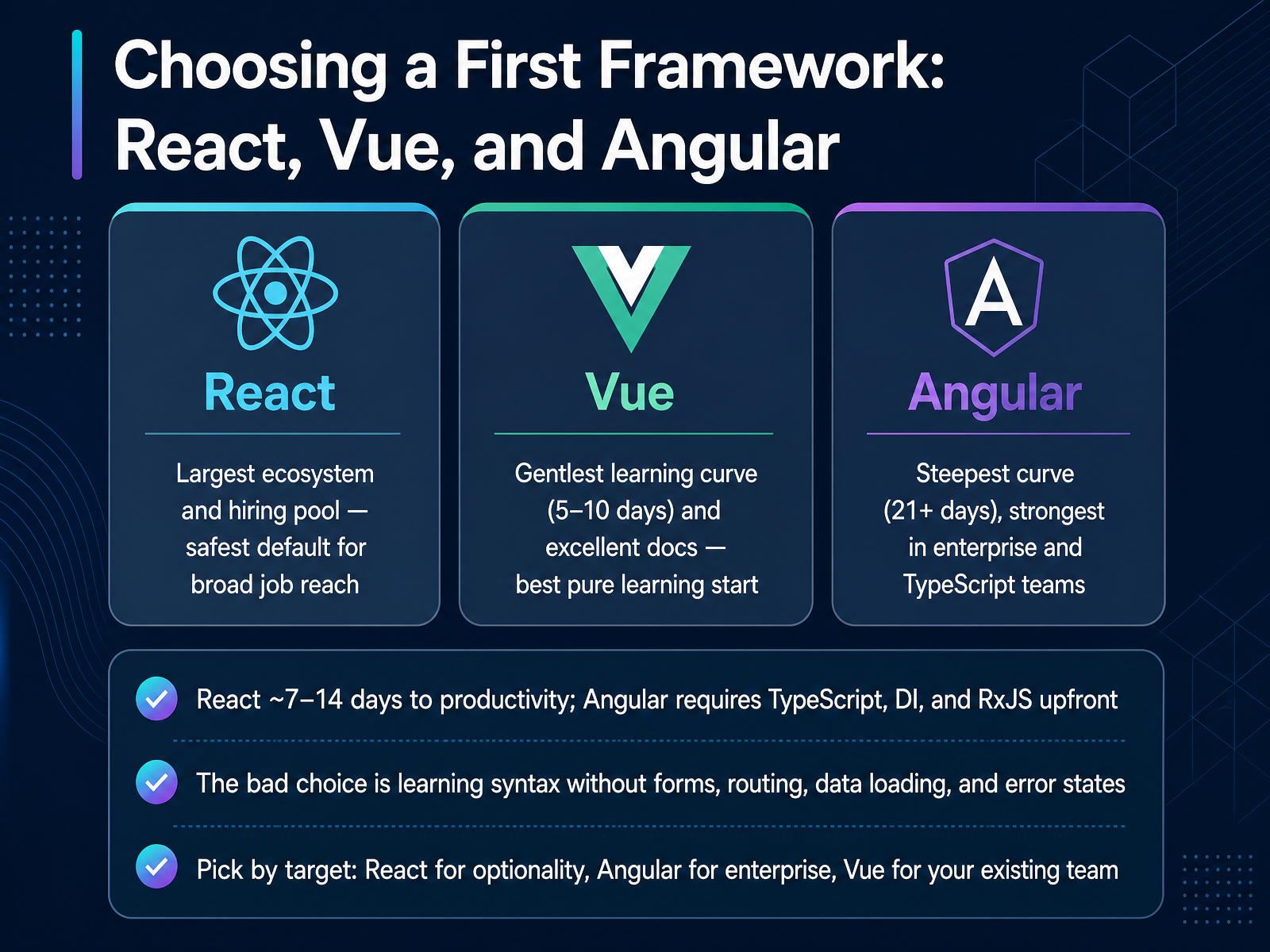
 - 11Choosing a First Framework: React, Vue, and AngularNow let's talk about choosing your first framework. There are three big names: React, Vue, and Angular. React comes from Meta, and it has the largest ecosystem and hiring pool. If you want broad job reach, React is the safest default. React takes roughly seven to fourteen days to reach basic productivity. Vue has the gentlest learning curve, maybe five to ten days, plus excellent documentation. It is the best pure learning start. Angular comes from Google and has the steepest curve, twenty-one days or more, but it is strongest in enterprise and TypeScript teams. Angular requires TypeScript, dependency injection, and RxJS upfront. Here is the key insight. The bad choice is not picking the wrong framework. The bad choice is learning syntax without building forms, routing, data loading, and error states. So pick by your target. Choose React for optionality, Angular for enterprise, and Vue for your existing team. Next, we will look at a practical example: building a simple profile page.
 1 min
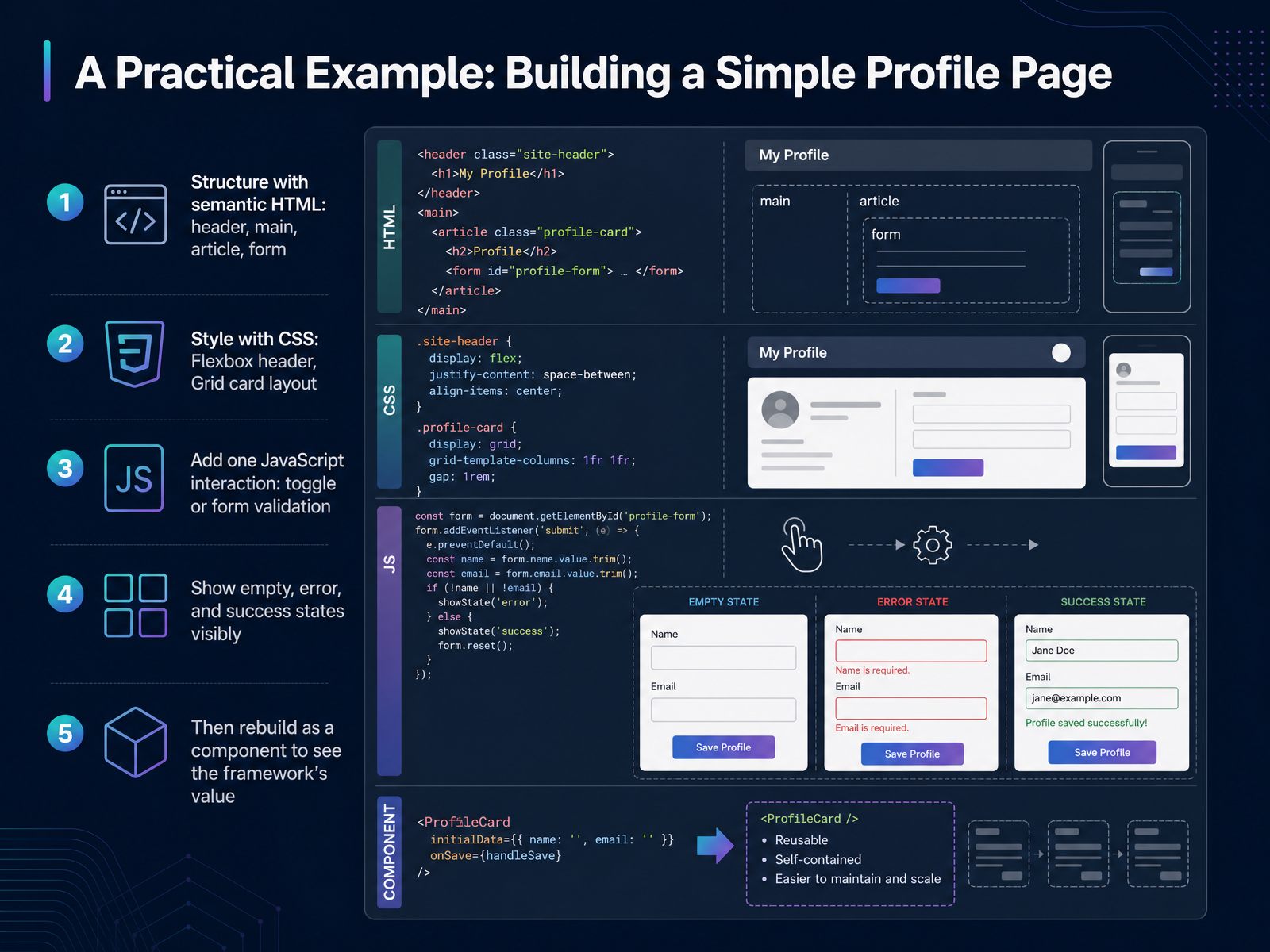
1 min - 12A Practical Example: Building a Simple Profile PageLet's make this concrete by building one small profile page, step by step. Start with semantic HTML: a header for the page title, a main region, an article for the profile details, and a form for editing them. Semantic elements tell the browser what each part means, which also helps screen readers. Next, style it. Use Flexbox on the header to place the name and a button side by side. Use Grid for the card layout, so columns line up neatly and collapse to one column on small screens. Then add a single JavaScript interaction, perhaps a toggle that reveals the edit form, or validation that checks the email field. Notice how this changes the page: empty, error, and success states become visible, so you can see exactly what the user sees. Finally, imagine rebuilding this as a component. Suddenly, the framework's value is obvious. Next, we look at tools, workflow, and the debugging habit.
 freecodecamp.orgpyshine.comhtmlgenie.net+21 min
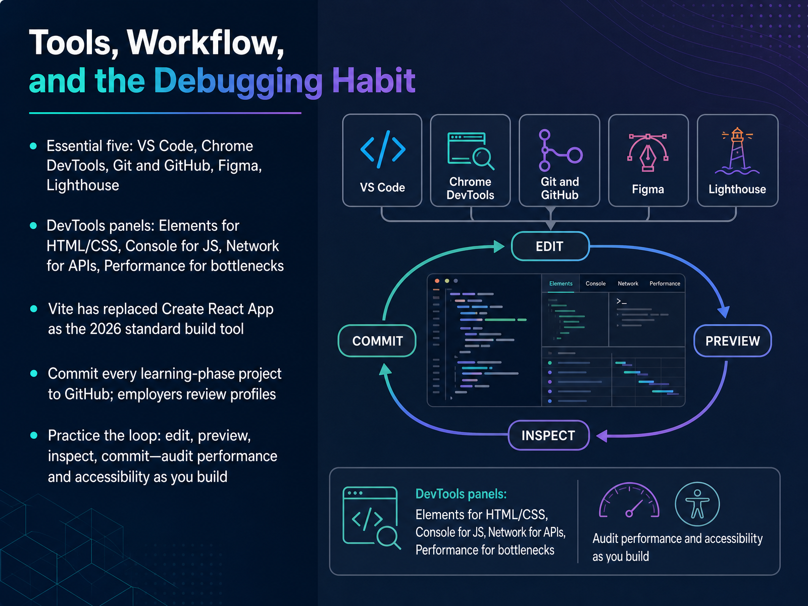
 - 13Tools, Workflow, and the Debugging HabitLet's talk about your daily toolkit. You really only need five things to start: VS Code as your editor, Chrome DevTools for debugging, Git and GitHub for version control and your portfolio, Figma for reading designs, and Lighthouse for performance audits. Here is the habit that matters most. Chrome DevTools has panels, and each one answers a different question. The Elements panel shows your HTML and CSS. The Console shows JavaScript errors. The Network tab shows API calls. The Performance panel shows bottlenecks. Notice the pattern: inspect before you guess. One more shift for 2026. Vite has replaced Create React App as the standard build tool, so if a tutorial still uses Create React App, it is out of date. Then commit every learning project to GitHub, because employers really do review profiles. Practice the loop: edit, preview, inspect, commit. Audit performance and accessibility as you build, not after. That habit separates people who finish projects from people who ship them. Next, let's cover key terms, learning paths, and next steps.
 2 min
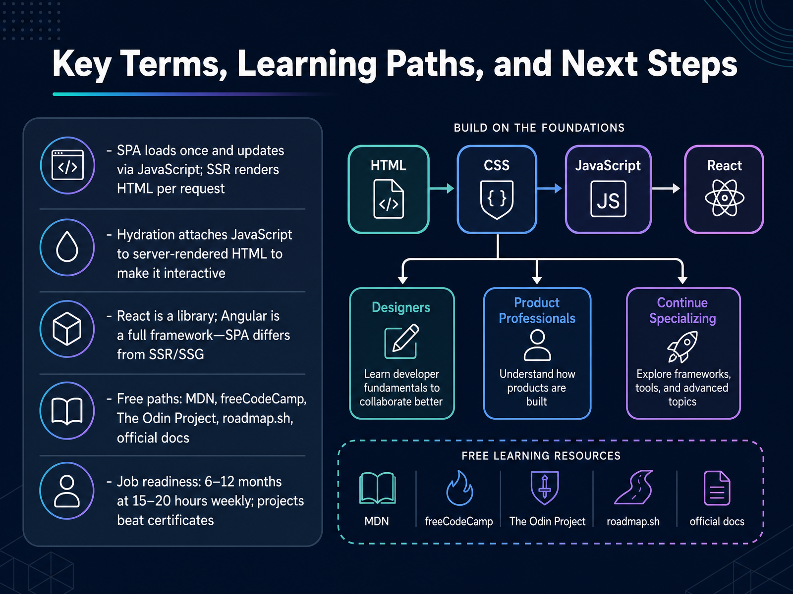
2 min - 14Key Terms, Learning Paths, and Next StepsLet's close with the terms and steps that will carry you forward. A single-page app loads once, then updates with JavaScript. Server-side rendering sends fresh HTML for each request. Hydration attaches JavaScript to that server-rendered HTML so it becomes interactive. And remember, React is a library, while Angular is a full framework. For learning, MDN, freeCodeCamp, The Odin Project, and roadmap dot s h are free and excellent. Realistically, job readiness takes six to twelve months at fifteen to twenty hours a week. Build projects that work. Employers trust shipped work more than certificates. You now have the concepts, the purpose, and real examples. Thank you for learning with me, and keep building. You are closer than you think.
 scrimba.com1 min
Take the deck with you
Download this course as a file — free, no sign-up needed.
- PDF handoutEvery slide page, ready to print or share.15 pages · 3.5 MBDownload
- Narrated PowerPointThe deck that presents itself — every slide carries the digital human's narration video.15 pages · 12.9 MBDownload
- PowerPoint slidesThe full deck as a .pptx — open it in PowerPoint, Keynote, or Google Slides.15 pages · 3.4 MBDownload
Free to use in your own training — please keep the PersonWise credit page at the end.
Have your own deck? Turn it into a course
Sources consulted
Web sources consulted while building this course.
- Frontend Development for Beginners: Where to Start in 2026 | Blog — greatfrontend.com
- What is Front-End Development? Complete Beginner's Guide — wscubetech.com
- How to Become a Frontend Developer in 2026 | Roadmap — scrimba.com
- What Is Frontend Development? Beginner's Guide (2026) — articsledge.com
- What is Frontend Development? — roadmap.sh
- How browsers load websites - Learn web development | MDN — developer.mozilla.org
- How modern browsers work. A very deep-dive into how modern web… | by Addy Osmani | Medium — medium.com
- The Browser Rendering Pipeline (Full Picture) - AlexWebLab | Engineering Manager in Bangkok, Thailand | Hong Kong Permanent Resident 香港 — alexweblab.com
- How Browsers Render Web Pages (HTML, CSS, and JavaScript Explained) — incofyblog.com
- The Browser Rendering Pipeline Explained: From HTML to Pixels | Billy Okeyo — billyokeyo.dev
- Understanding Core Web Vitals and Google search results — developers.google.com
- Does Core Web Vitals Affect SEO? The Ranking Impact (2026) | PageSpeed Matters — pagespeedmatters.com
- Core Web Vitals and Page Experience: The 2026 Playbook | Learn SEO | The SEO Company — theseocompany.com.au
- Core Web Vitals and SEO in 2026: Real Ranking Impact and Optimization Guide | ElevaSEO — elevaseo.com
- Core Web Vitals 2026: What Actually Matters Now · CrawlSense Blog — crawlsense.ai
- CSS Flexbox and Grid Tutorial – How to Build a Responsive ... — freecodecamp.org
- Learn HTML and CSS in a Single Post: A Complete Tutorial From Semantic Markup and the Box Model to Flexbox, Grid, and Responsive Design | PyShine — pyshine.com
- Mastering Modern Web Layout: The Convergence of Semantic HTML, CSS Grid, and Flexbox - HTML Genie | Practical Web Development — htmlgenie.net
- Mastering CSS Flexbox & Grid: The Ultimate Responsive Layout Guide | Samad Shaikh — samadshaikh.dev
- Responsive web design - Learn web development | MDN — developer.mozilla.org