Begin
14 pages · ~28 min
Design System Types
This training introduces the types of design systems and helps designers and developers understand which model fits their product and team.
A digital instructor presents all 14 pages. Hold “Ask” at any point and ask out loud — the answer comes from this course. No sign-up needed.
What you’ll learn
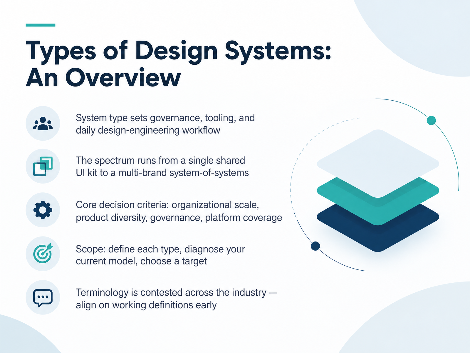
- 01Types of Design Systems: An OverviewWelcome. This course is about the types of design systems, and how picking a type shapes everything downstream. Here is the core idea. Your system type sets governance, tooling, and the daily design-engineering workflow. Get the type wrong, and you inherit mismatched review processes, awkward token pipelines, and slow handoffs. The spectrum is wide. At one end, a single shared UI kit. At the other, a multi-brand system-of-systems spanning platforms and regions. The decision criteria stay consistent. Organizational scale. Product diversity. Governance model. Platform coverage. Across the next slides, we will define each type, help you diagnose your current model, and choose a target. One caution before we start. Terminology is genuinely contested across the industry. What one team calls a pattern library, another calls a component library. So align on working definitions early, and write them down. Watch for that drift, because it quietly erodes the coherence you are trying to build. Next, why type beats maturity as a starting lens.dl.designresearchsociety.orgdesignsystemscollective.comcdn.jsdelivr.net+22 min
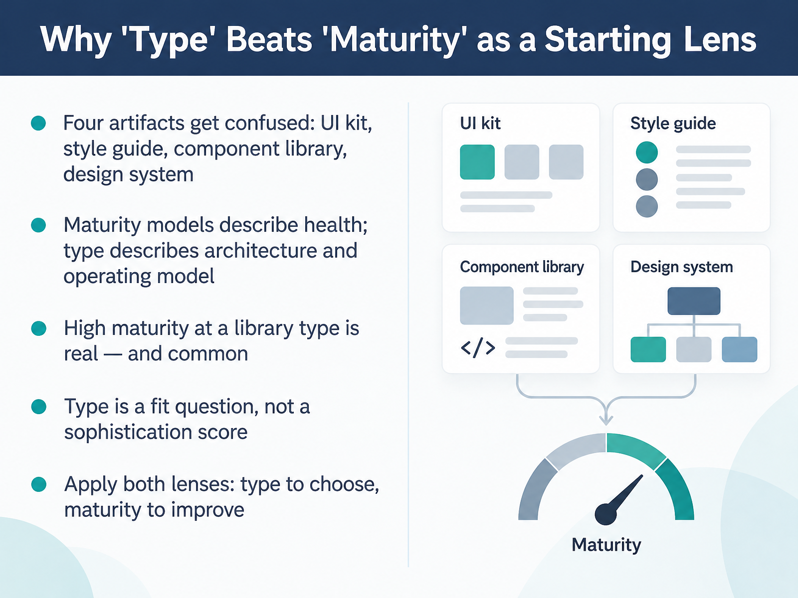
- 02Why 'Type' Beats 'Maturity' as a Starting LensLet's talk about why type beats maturity as a starting lens. Four artifacts get confused constantly: the UI kit, the style guide, the component library, and the design system. They are not the same thing. Maturity models describe health. Type describes architecture and the operating model around it. And here's the part people miss: high maturity at a library type is real, and it's common. A very healthy component library is still a component library. So type is a fit question, not a sophistication score. Choose based on your team's constraints, legacy code, staffing, and adoption costs. Watch for the trap of chasing a maturity score while ignoring the operating model that actually fits you. Apply both lenses. Type to choose. Maturity to improve. Next, we'll look at how we got here, from style guide to design platform, a short history.
 1 min
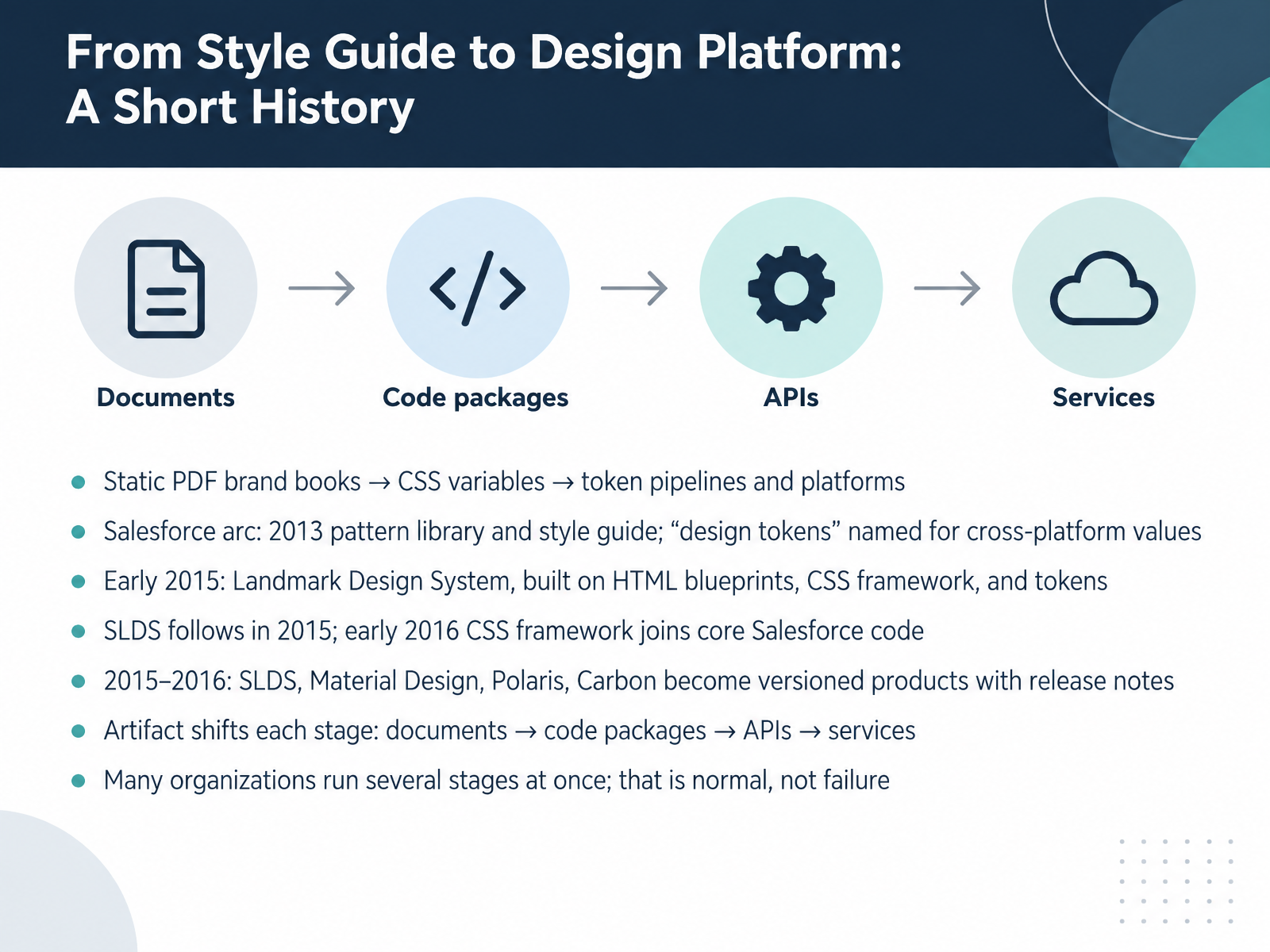
- 03From Style Guide to Design Platform: A Short HistorySo how did we get here? The arc runs from static PDF brand books, to CSS variables, to token pipelines and platforms. Salesforce is the clearest case. In 2013, with Salesforce1, the team documented a pattern library and an initial style guide, and they named design tokens to describe values shared across native and web. Early 2015 brought the Landmark Design System, built on HTML blueprints, an expanded CSS framework, and tokens. SLDS follows in 2015, and in early 2016 the CSS framework joins core Salesforce code. By 2015 and 2016, SLDS, Material Design, Polaris, and Carbon are versioned products with release notes. Watch the artifact shift at each stage. Documents become code packages, then APIs, then services. One thing to expect. Many organizations run several stages at once. Your legacy screens sit on a PDF-era guide while new work pulls from a token pipeline. That is normal, not failure. Choose your next investment based on where your adoption costs actually land. The Type Spectrum at a Glance.
 trailhead.salesforce.combradfrost.comdocusign.com+22 min
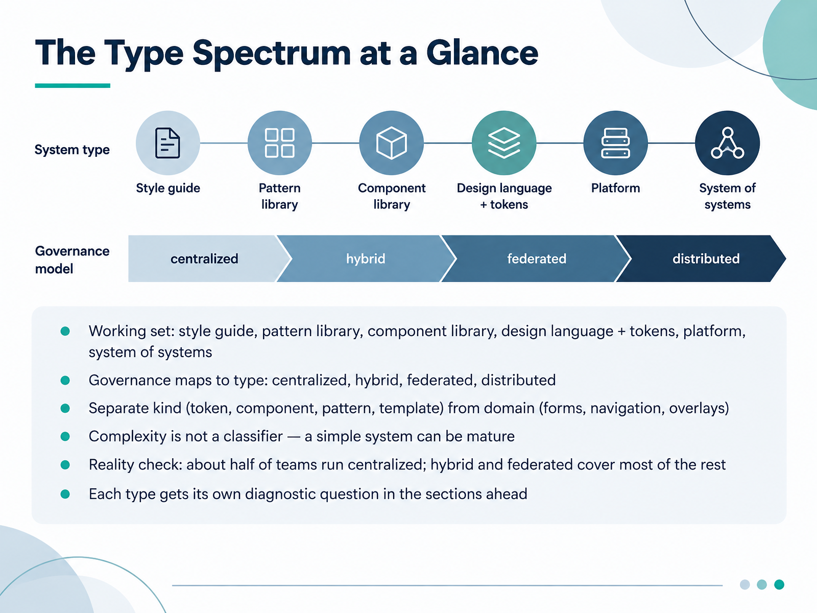
- 04The Type Spectrum at a GlanceHere is the type spectrum at a glance. Think of it as a working set. At one end, a style guide or a pattern library. At the other, a full design language with tokens, then a platform, then a system of systems. Governance maps to type: centralized, hybrid, federated, or distributed. As you classify, separate kind from domain. Kind means token, component, pattern, or template. Domain means forms, navigation, overlays. And watch for this: complexity is not a classifier. A simple system can be mature. In practice, roughly half of teams run centralized. Hybrid and federated cover most of the rest. Your constraints matter here: legacy code, staffing, adoption cost. So choose based on what you can sustain, not on the label. Each type gets its own diagnostic question in the sections ahead. Next, we look at style guides and brand systems.
 2 min
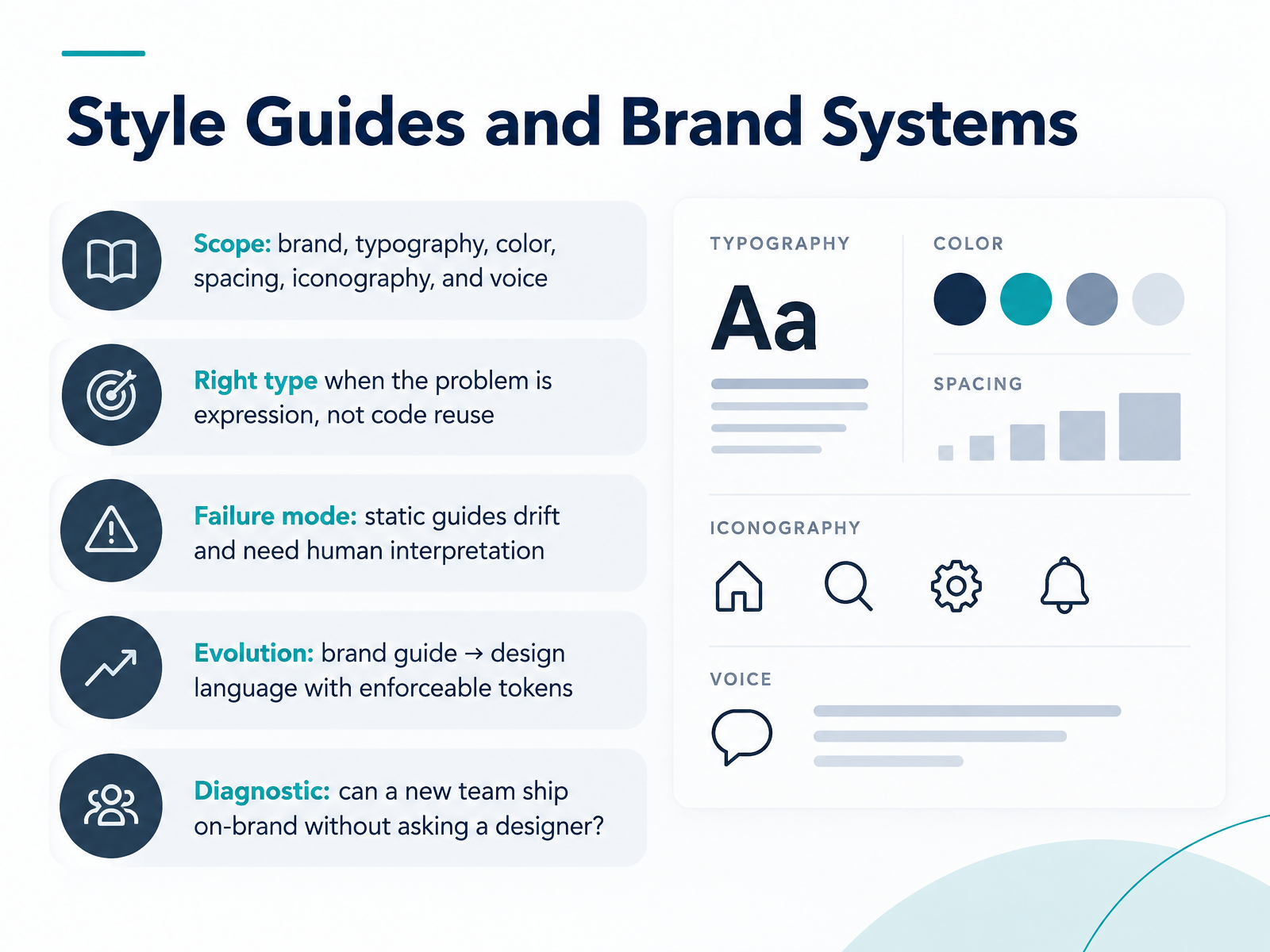
- 05Style Guides and Brand SystemsNow let's look at style guides and brand systems. These cover scope: brand, typography, color, spacing, iconography, and voice. They're the right type when the problem is expression, not code reuse. So if your team needs to communicate a brand consistently across marketing and product, this is a strong fit. But watch the failure mode: static guides drift. They age quickly, and every new scenario needs human interpretation. A designer ends up as the help desk for the PDF. The evolution path is to move from a brand guide to a design language with enforceable tokens. That means codifying decisions so they're machine-readable and versioned. Here's a diagnostic question: can a new team ship on-brand without asking a designer? If not, you still have a static guide. If yes, you've built a system. Keep that question in mind as we contrast pattern libraries and component libraries next.
 1 min
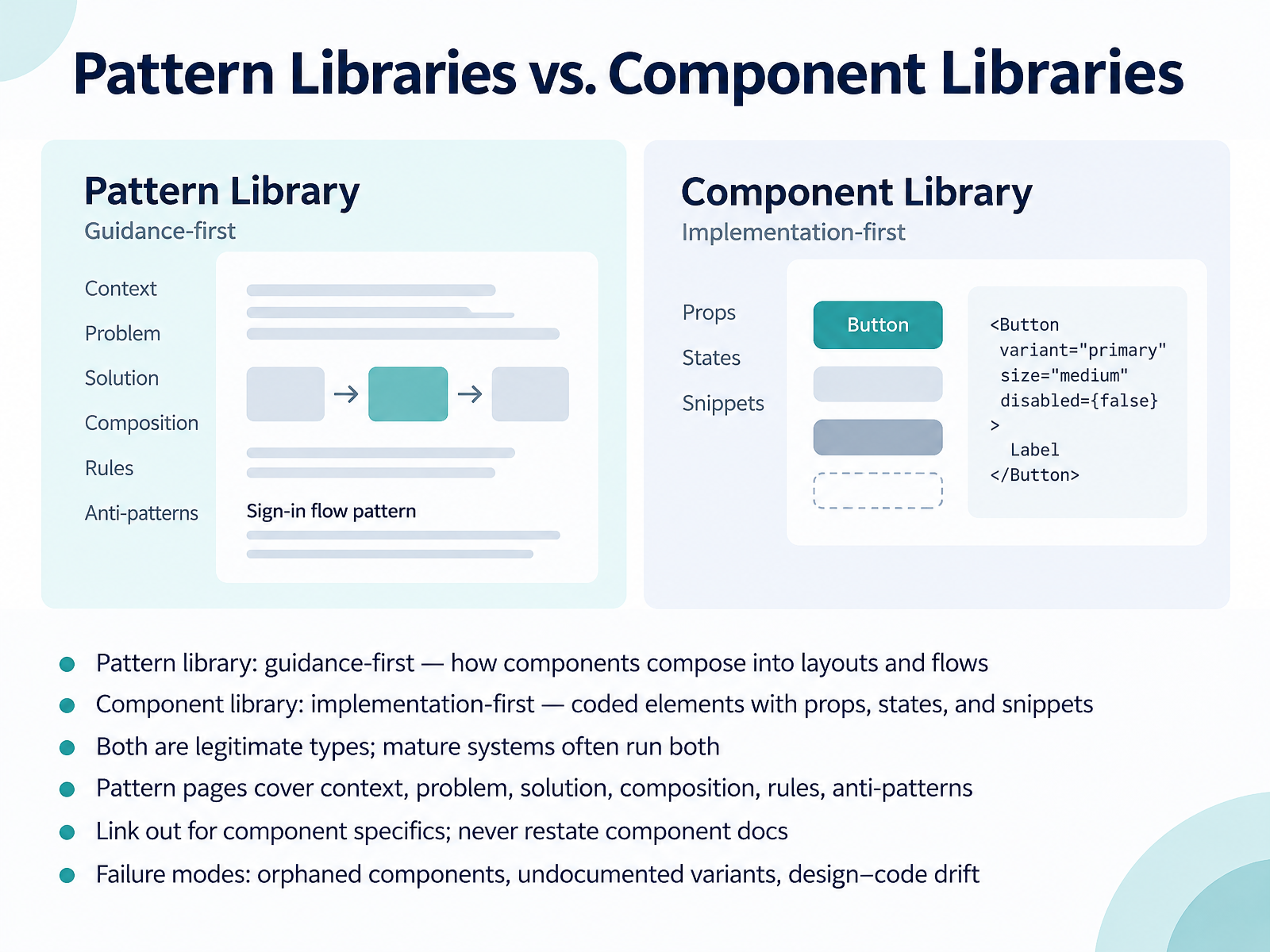
- 06Pattern Libraries vs. Component LibrariesLet's separate two terms teams often blur together: pattern libraries and component libraries. A pattern library is guidance-first. It shows how components compose into layouts and flows, like a sign-in page or an empty dashboard state. A component library is implementation-first. It ships coded elements with props, states, and copyable snippets. Both are legitimate types, so choose based on what your teams actually need. Mature systems often run both. For pattern pages, cover the context, the problem, the solution, composition, rules, and anti-patterns. Then link out for component specifics. Never restate component documentation, because once it's duplicated, it drifts. Watch for the classic failure modes: orphaned components nobody references, undocumented variants, and design-code drift. Now let's turn to what good actually looks like inside a library.
 zeroheight.comeightshapes.comstorybook.js.org+21 min
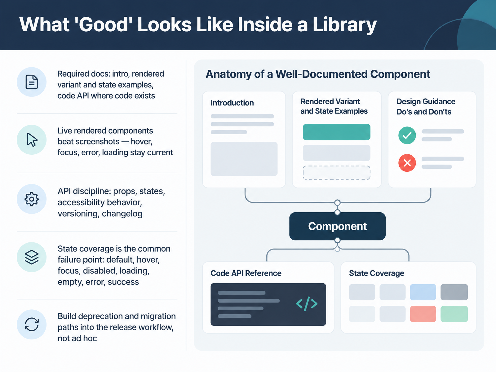
- 07What 'Good' Looks Like Inside a LibraryNext, let's look at what good actually looks like inside a component library. Start with required docs. Every component needs an intro, rendered examples of variants and states, and a code API reference wherever code exists. Live rendered components beat screenshots every time. Hover, focus, error, and loading states stay current only when they run. Then comes API discipline. Document props, states, accessibility behavior, versioning, and a changelog. State coverage is where most libraries fail. Be explicit about default, hover, focus, disabled, loading, empty, error, and success. Watch for teams that document two states and ship seven. Finally, build deprecation and migration paths into your release workflow. Don't handle them ad hoc. Legacy code and limited staffing make migration expensive, so plan it with your product teams rather than around them. That sets you up for the next topic: Design Languages and Multi-Brand Token Architecture.
 1 min
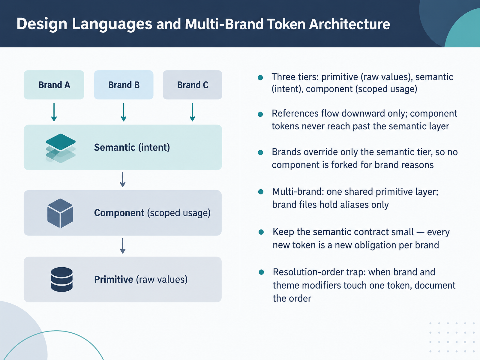
- 08Design Languages and Multi-Brand Token ArchitectureNow let's talk about design languages and the token architecture behind multi-brand theming. Most systems that hold up at scale use three tiers. Primitive tokens hold raw values. Semantic tokens name intent, like action background or text default. Component tokens scope that intent to a specific piece of UI. References flow downward only. A semantic token points to a primitive, and a component token points to a semantic. Component tokens never reach past the semantic layer. That constraint is what keeps the model stable.
So brands override exactly one tier, the semantic tier. Brand A maps action background to violet, brand B to amber. Nothing downstream changes, and no component gets forked for brand reasons. Operationally, one shared primitive layer holds the ramps for every brand, and each brand file holds aliases only. Keep the semantic contract small. Every new semantic token is a new obligation for every brand to fulfil. Watch the resolution order trap too. When a brand modifier and a theme modifier touch the same token, the order of the array decides the value. Pick that order deliberately and write it in the readme.
Next, we look at the platform model, where the design system operates as an internal product.
 figma.comadamarant.cominvariant.design+22 min
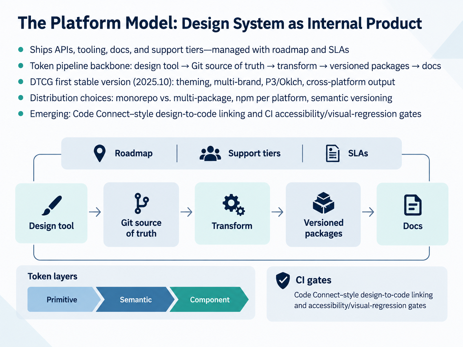
- 09The Platform Model: Design System as Internal ProductNow let's look at the platform model, where the design system itself is run as an internal product. That means you ship APIs, tooling, docs, and support tiers, and you manage all of it with a roadmap and service level agreements. The backbone is the token pipeline: design tool to Git as the source of truth, then transform, then versioned packages, then docs. Watch for the Design Tokens Community Group's first stable spec, version twenty twenty-five point ten. It brings theming and multi-brand support, Display P three and Oklch color, and cross-platform output. For distribution, choose based on your constraints: monorepo versus multi-package, npm per platform, and semantic versioning so consumers upgrade intentionally. Emerging practices worth tracking are Code Connect style design-to-code linking, plus CI gates for accessibility and visual regression. Treat the platform as a product with real users and real service levels.
 figma.com1 min
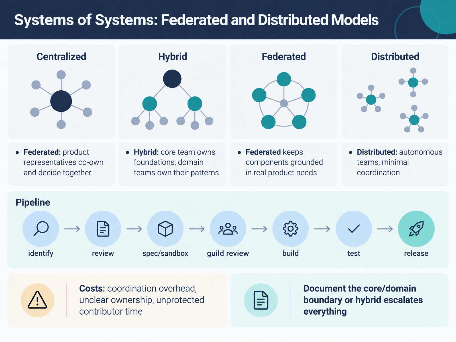
- 10Systems of Systems: Federated and Distributed ModelsNow let's look at the federated and distributed models, where the system becomes a system of systems. In a federated model, product representatives co-own the system and decide together. A hybrid keeps a core team on the foundations, while domain teams own their patterns. Distributed means autonomous teams with minimal coordination. Federation is the model that keeps components grounded in real product needs, because the people closest to the use cases are the ones building them. But watch the costs. Coordination overhead grows with every representative. Ownership can get unclear. And contributor time is often unprotected, because product work wins. So run a pipeline. Identify a need, review it, spec it in a sandbox, take it to guild review, then build, test, and release. And document the core and domain boundary clearly. Otherwise a hybrid quietly escalates every decision back to the core. Next, we'll look at case patterns across system types.
 2 min
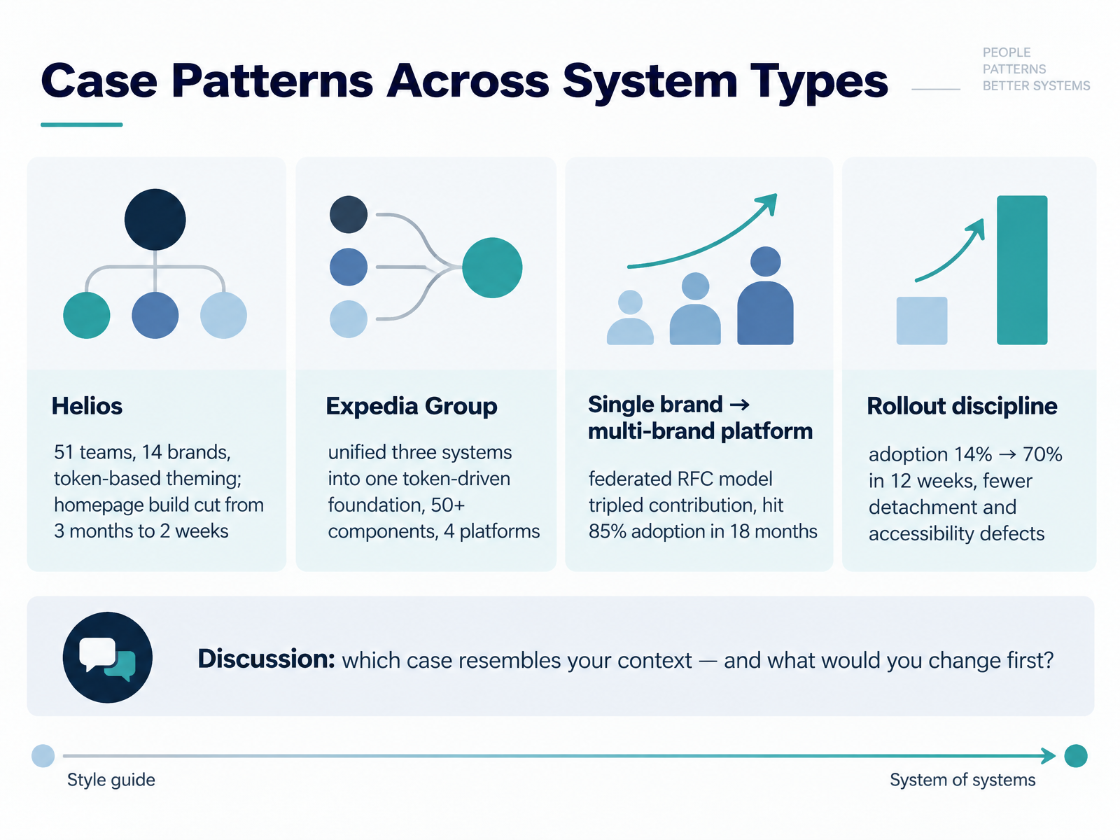
- 11Case Patterns Across System TypesLet's ground these system types in real cases. Helios supports fifty-one teams and fourteen brands through token-based theming. Their homepage build dropped from three months to two weeks. That's the payoff of theming decoupled from component code.
Expedia Group consolidated three systems into one token-driven foundation. Over fifty components, four platforms. Watch what that buys you: one source of truth, less duplication, but a heavier governance burden up front.
One organization moving from single brand to a multi-brand platform adopted a federated RFC model. Contribution tripled, and they reached eighty-five percent adoption in eighteen months. Slower than a mandate, but it held.
Rollout discipline matters too. One team went from fourteen percent to seventy percent adoption in twelve weeks, with fewer detachment and accessibility defects. That's sequencing and support, not just tooling.
So, which case resembles your context, and what would you change first? Keep that answer in mind as we move into Governance, Contribution, and Adoption by Type.
 2 min
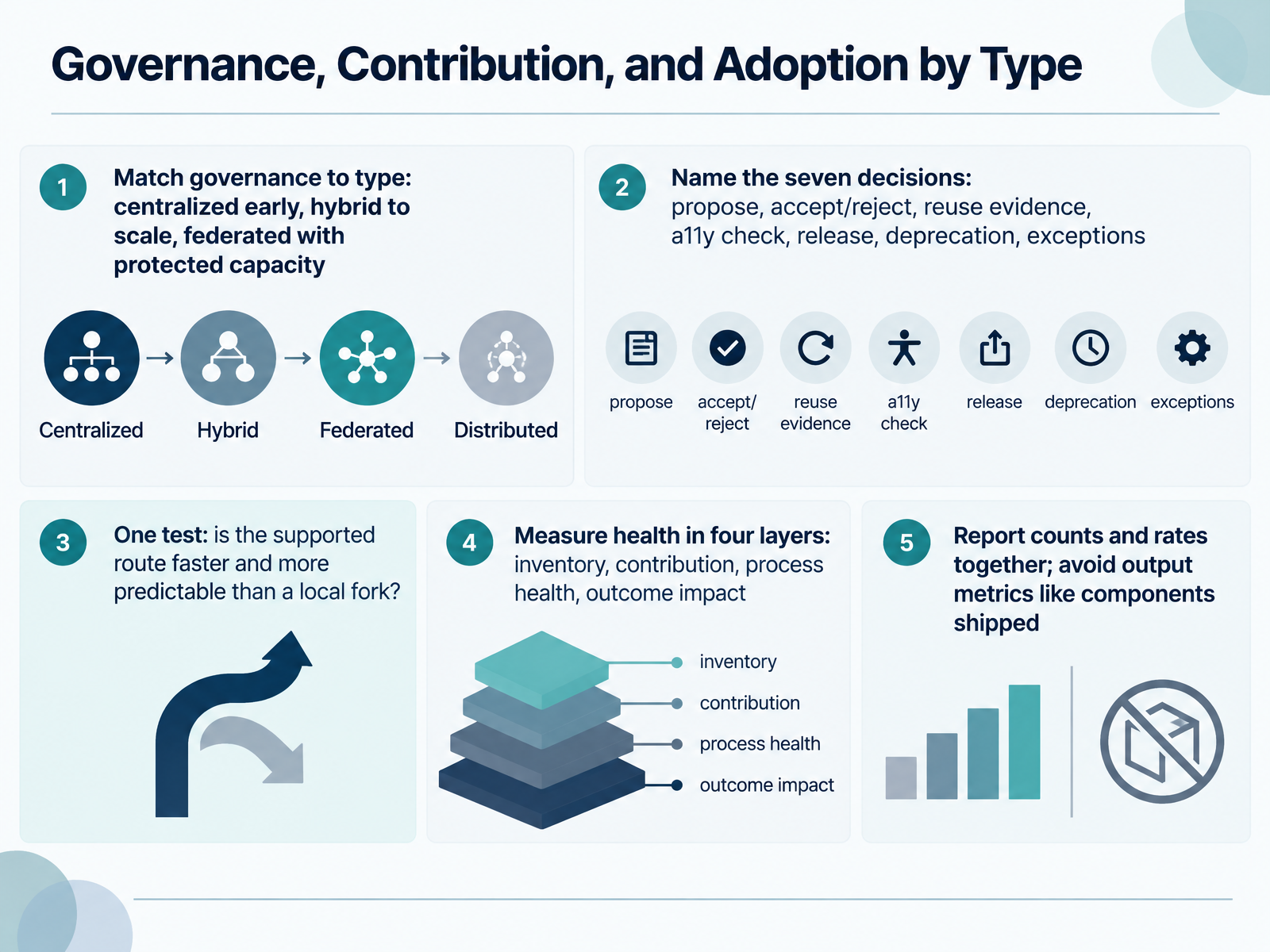
- 12Governance, Contribution, and Adoption by TypeNow let's connect governance to the type you chose. Match the model to your stage. Centralized works early, when one team approves every change. Hybrid carries you to scale, with a core team owning foundations and product teams contributing within guardrails. Federated only works when people have protected capacity, so watch for contributors whose sprint time quietly disappears. Whatever the model, name seven decisions: who proposes, who accepts or rejects, what reuse evidence is required, who runs the accessibility check, who releases, who deprecates, and how exceptions get recorded. Publish response times and outcomes, including keep it local. Then apply one test. Is the supported route faster and more predictable for a product team than a local fork? If not, forking is rational, so fix the route. Measure health in four layers: inventory, contribution, process health, and outcome impact. Report counts and rates together, so forty two of fifty seven components migrated is a rate with context. Avoid output metrics like components shipped. Next, we get practical with choosing the right type, using a decision framework.
 2 min
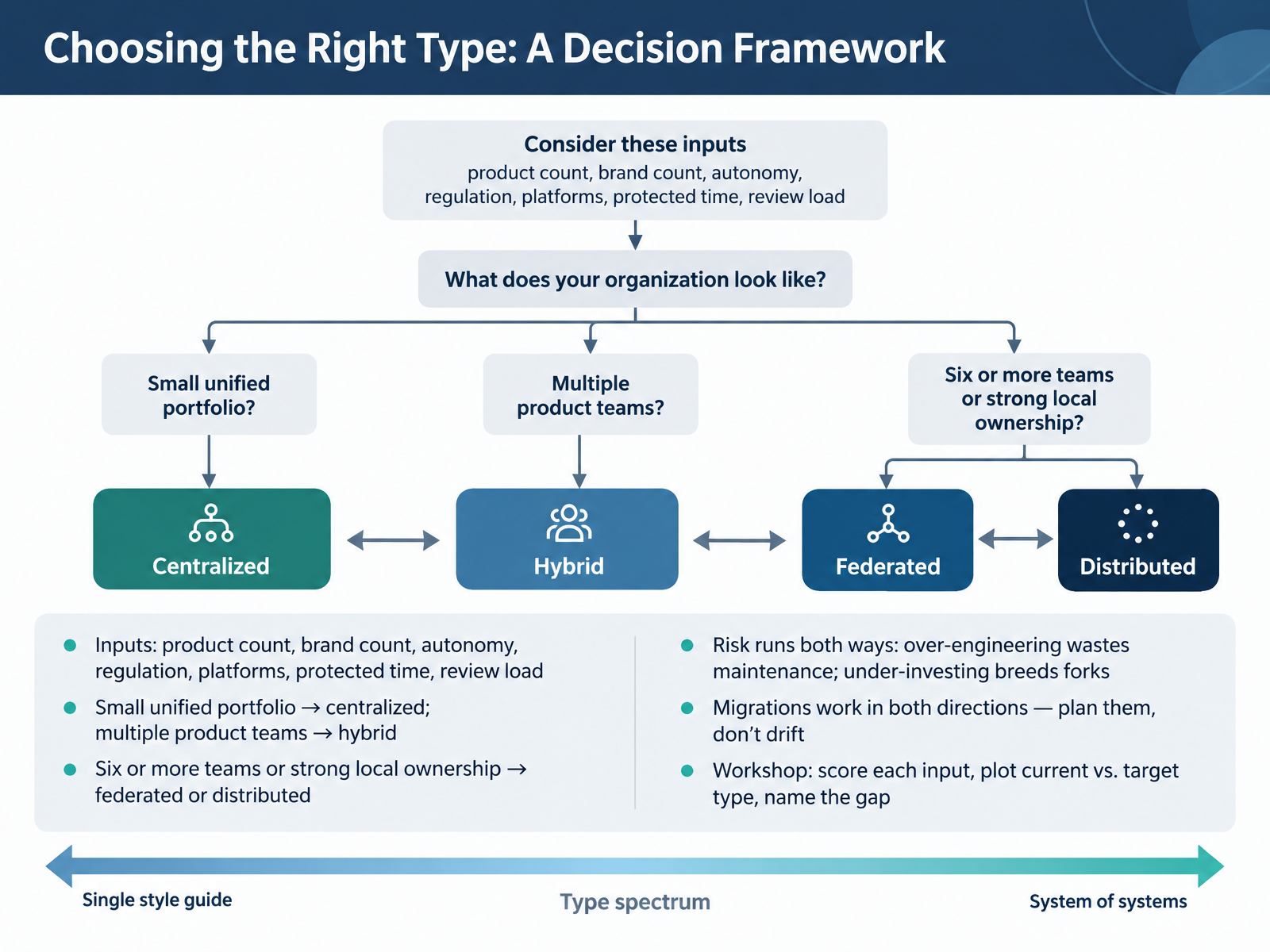
- 13Choosing the Right Type: A Decision FrameworkLet's turn all of that into a decision framework. Start by scoring seven inputs: product count, brand count, team autonomy, regulation, supported platforms, protected maintenance time, and review load. A small, unified portfolio usually points to centralized. Multiple product teams with shared brand needs often point to hybrid. Six or more teams, or strong local ownership, push you toward federated or distributed. Risk runs both ways. Over-engineering wastes maintenance capacity and review time. Under-investing breeds forks, drift, and shadow systems. Watch for both. And remember migrations work in both directions, so plan them explicitly rather than letting the system drift. In the workshop, score each input, plot your current type against your target type, and name the gap. That gap is your roadmap. Next, we move into the action plan for your next ninety days.
 1 min
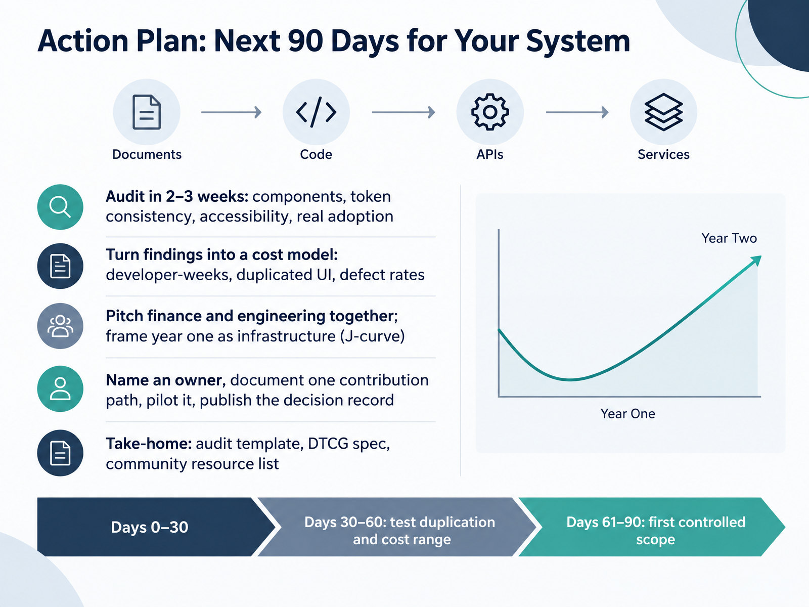
- 14Action Plan: Next 90 Days for Your SystemSo let's land this with a ninety-day plan you can actually run. Start with a fast audit, two to three weeks. Cover components, token consistency, accessibility, and real adoption. Keep it binary, and include the people consuming the system. Stretch that audit to a quarter and the executive attention you needed has moved on. Days thirty to sixty, turn findings into a cost model. Developer-weeks, duplicated UI, defect rates. Test the range with representative data. Then pitch finance and engineering together, and be honest about the J-curve. Year one is infrastructure. Separate pitches breed misaligned expectations. Name an owner, document one contribution path, pilot it, and publish the decision record. Days sixty-one to ninety, ship your first controlled scope. Take-home resources are on the slide: the audit template, the DTCG spec, and a community list. Pick the one next step your team can commit to this week. Thank you for working through this with me. You now have the vocabulary to choose the right system, not just the popular one. Go build it.
 2 min
Take the deck with you
Download this course as a file — free, no sign-up needed.
- PDF handoutEvery slide page, ready to print or share.15 pages · 3.0 MBDownload
- Narrated PowerPointThe deck that presents itself — every slide carries the digital human's narration video.15 pages · 12.9 MBDownload
- PowerPoint slidesThe full deck as a .pptx — open it in PowerPoint, Keynote, or Google Slides.15 pages · 2.9 MBDownload
Free to use in your own training — please keep the PersonWise credit page at the end.
Have your own deck? Turn it into a course
Sources consulted
Web sources consulted while building this course.
- Exploring Current Understandings of ‘Design Systems’: Toward a Conceptual Framework — dl.designresearchsociety.org
- Medium — designsystemscollective.com
- https://cdn.jsdelivr.net/npm/@exxatdesignux/[email protected]/consumer-extras/patterns/design-system-taxonomy.md — cdn.jsdelivr.net
- Design System | Modyo Docs — docs.modyo.com
- Design System Guide: Build, Manage, and Scale in 2026 — figr.design
- SLDS Design System Development Story — trailhead.salesforce.com
- Clarity Conf: Crawl, Walk, Run – the Evolution of a Design System | Brad Frost — bradfrost.com
- Docusign Olive: From style guide to front-end system — docusign.com
- A Brief History of Design Systems. Part 2 - UX Magazine — uxmag.com
- How we went from Style Guides to real Design Systems — designsystems.surf
- Documenting design system patterns - zeroheight — zeroheight.com
- Eightshapes > @components > Documenting Components — eightshapes.com
- How to document your design system: best practices & tools — storybook.js.org
- Design Systems vs Pattern Libraries vs Style Guides — uxpin.com
- Components, styles, and shared library best practices — figma.com
- Design Token Architecture: Structuring for Scale | Figma — figma.com
- Multi-brand design tokens: 6 steps from one primitive layer · Adamarant — adamarant.com
- Token Architecture — 04 — Token System — IDL v1.1 — invariant.design
- Design Token Governance for Multi-Brand Platforms — pathtoproject.com
- Operating Multi‑Brand Design Systems at Enterprise Scale | CoreLine — coreline.agency