Data Storytelling Tool Selection and Workflow
Begin
14 pages · ~28 min
Data Storytelling Tool Selection and Workflow
Learn to select the right data storytelling tools and design effective workflows for impactful data narratives. Ideal for analysts, data scientists, and BI professionals.
What you’ll learn
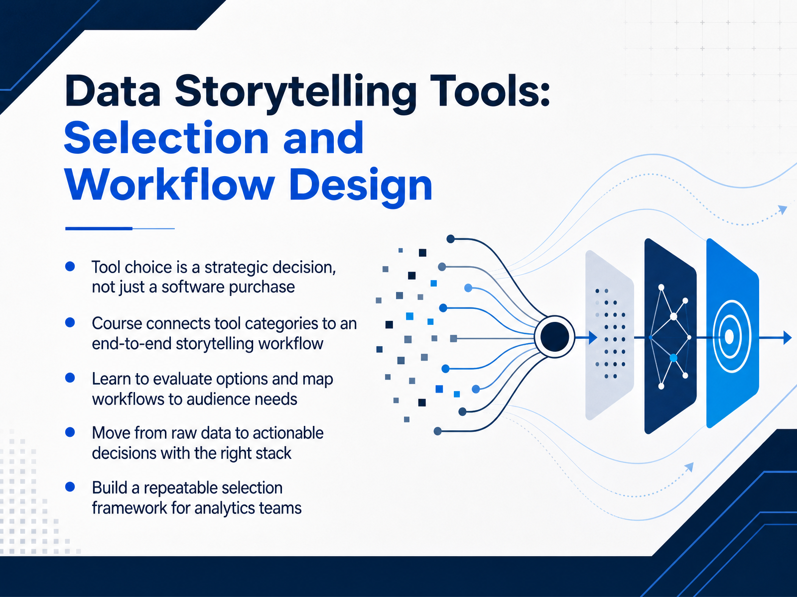
- 01Data Storytelling Tools: Selection and Workflow DesignWelcome. If you are evaluating reporting tools or standardizing a stack for an analytics team, this course is designed for you. Let us start with a core premise. Choosing a data storytelling tool is a strategic decision, not just a software purchase. The tool you select shapes your data pipeline, your dashboard governance, and ultimately, whether insights lead to action. Throughout this course, we will connect tool categories to an end-to-end storytelling workflow. You will learn to evaluate options, map workflows to specific audience needs, and move from raw data to actionable decisions with the right stack. The goal is simple. By the end, you will have a repeatable selection framework that your team can use to make confident, defensible tooling choices. Next, we will diagnose the core problem: the gap between raw data and the decisions your stakeholders need to make.dataprogpy.github.ioobservablehq.comusdsi.org+21 min
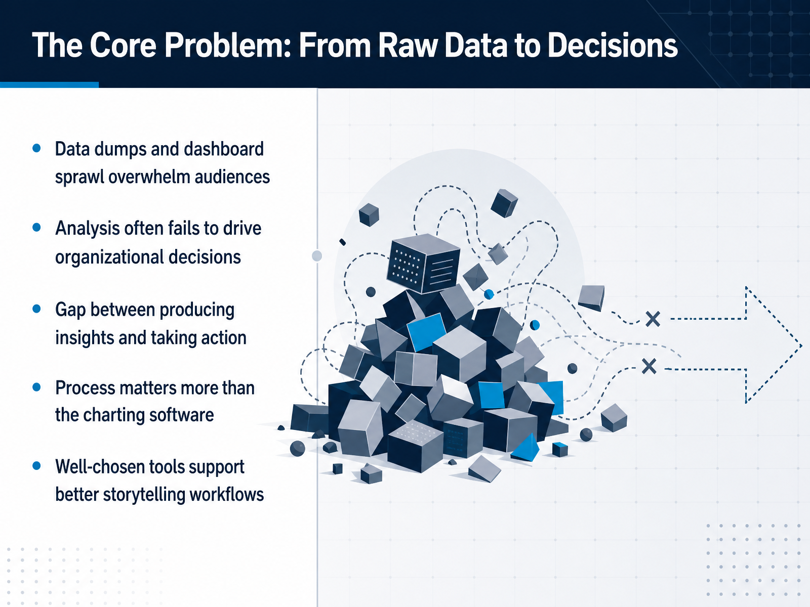
- 02The Core Problem: From Raw Data to DecisionsYou have probably seen it happen. A team builds more dashboards, adds more charts, and the audience still walks away overwhelmed. The real issue is rarely the data itself. It is the gap between producing an insight and getting someone to act on it. When a report turns into a data dump, decision makers stop reading. When every metric gets equal weight, nothing stands out. That is why process matters more than the charting software. A well chosen tool should reinforce your workflow. It should help you define the question, structure the narrative, and control visual hierarchy. It should make the path from analysis to action shorter, not longer. The goal is not just better charts. The goal is better decisions.
 1 min
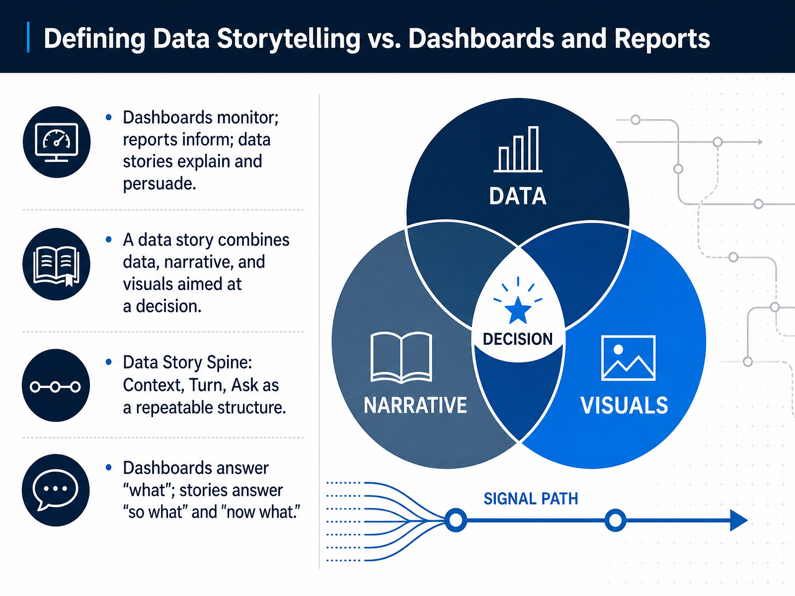
1 min - 03Defining Data Storytelling vs. Dashboards and ReportsLet’s get precise about what we’re comparing, because this distinction drives every tool selection decision you’ll make. A dashboard is an instrument panel. It monitors current state and answers the what. A report shares information, but it’s often passive. The reader does the interpreting. A data story does something different. It combines data, visuals, and narrative to explain the so what and drive a decision. The structure that makes this repeatable is what we call the Data Story Spine. You establish Context, the baseline everyone accepts. You introduce a Turn, the one insight that breaks that baseline. Then you close with the Ask, the decision that insight justifies. If you leave your audience with monitoring questions only, you’ve built a dashboard. If you’ve guided them to a specific next action, you’ve told a story. This separation matters because your tool stack should support both, but not confuse them. Next, we’ll map these modes to specific audiences and use cases.
 databricks.comanalyticalstack.comlumenore.com+21 min
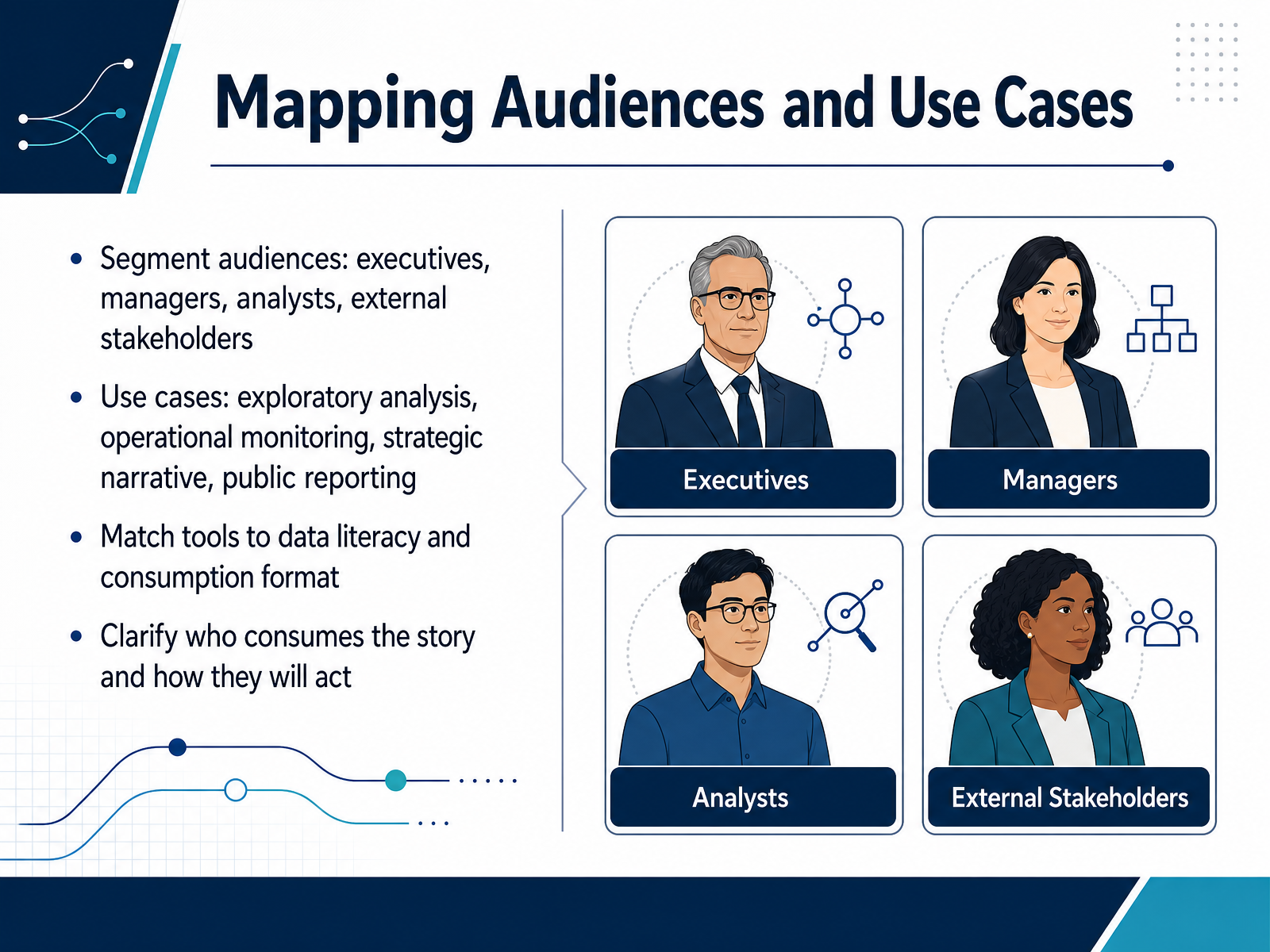
 - 04Mapping Audiences and Use CasesBefore you choose a tool, map who actually consumes the story and how they will act on it. Start by segmenting your audiences. Executives need strategic narrative and clear decisions. Managers want operational context and accountability. Analysts expect flexibility for exploration. External stakeholders often need polished, self-contained reporting. Then align each audience with a use case. Exploratory analysis favors direct data access and speed. Operational monitoring favors governed dashboards with refresh cycles. Strategic narrative favors curated visuals and controlled pacing. Public reporting favors accessibility and brand consistency. Match the tool to data literacy and consumption format. A live query interface may empower analysts but confuse executives. A static PDF may reassure regulators but limit exploration. The key question is simple: who consumes the story, in what format, and what decision follows. That answer should shape your tool selection before any feature comparison. Next, we move into the data storytelling workflow itself.
 2 min
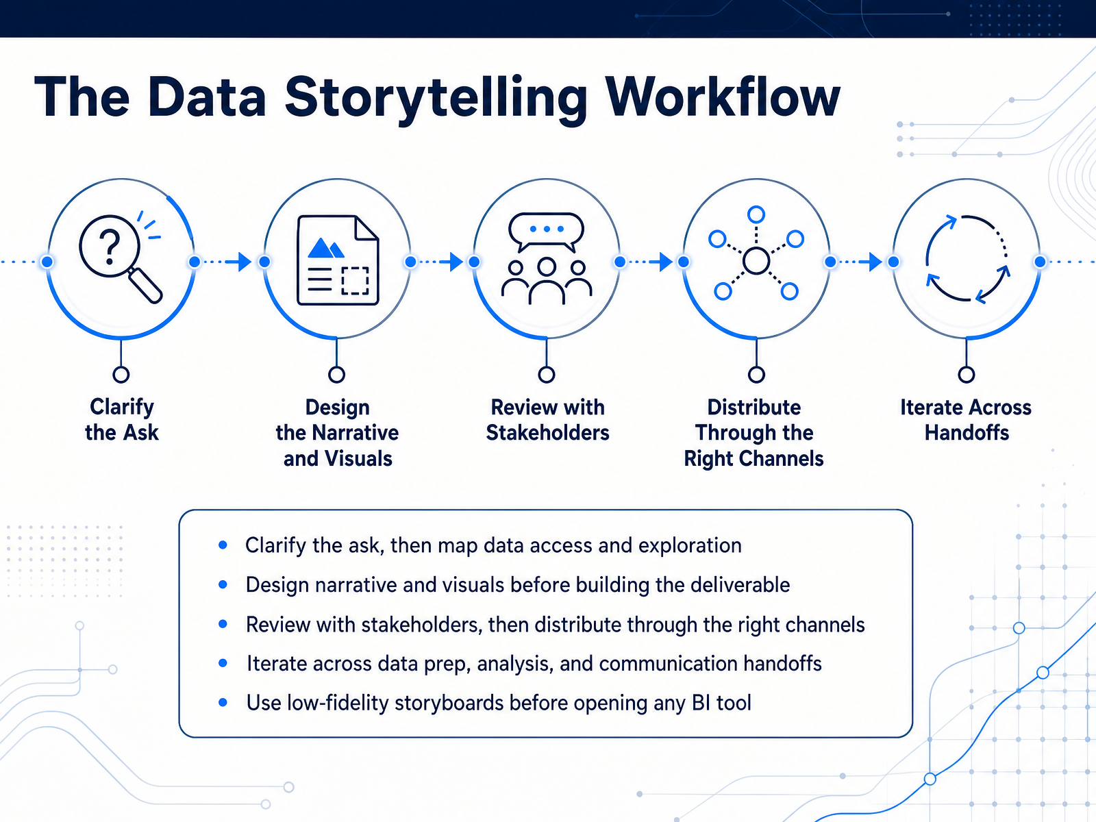
2 min - 05The Data Storytelling WorkflowLet’s look at the workflow itself, because the tool should serve the process, not the other way around. Start by clarifying the actual ask. What decision does the audience need to make? Then map your data access and exploration to that question. Before you open any BI tool, sketch the narrative and rough visuals. A low-fidelity storyboard will expose logic gaps faster than a polished dashboard. It also keeps you from sinking time into charts you won’t use. Once the story is clear, build the deliverable. Then review with stakeholders. Their pushback at this stage is cheaper than a redesign after distribution. Finally, route the output through the right channels. That could be a live dashboard, a static briefing, or a data appendix. And expect to iterate. The handoffs between data prep, analysis, and communication are where most workflow friction lives. Keep those transitions visible so the team can audit where time is being spent. With that workflow in mind, we’re ready to match it to the main tool categories for data storytelling.
 1 min
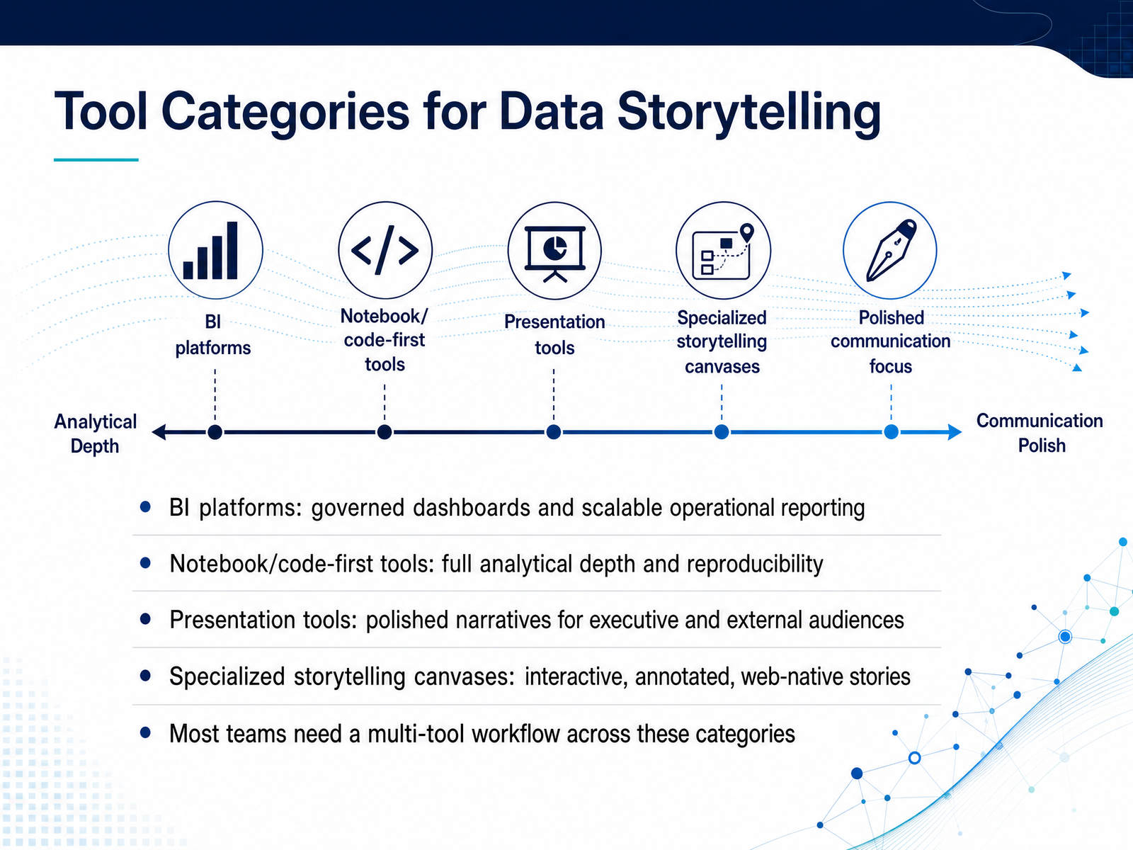
1 min - 06Tool Categories for Data StorytellingThe tools you choose shape the stories you can actually tell. So let's map the landscape. First, BI platforms. These give you governed dashboards and scalable operational reporting. They trade analytical depth for broad adoption and consistency. Second, notebook and code-first tools. Here you get full analytical depth and reproducibility. This is where the real investigation happens. Third, presentation tools. Think polished narratives for executive and external audiences. They excel at clarity and message control. And fourth, specialized storytelling canvases. These create interactive, annotated, web-native stories. They sit between the depth of code and the polish of a slide deck. The key takeaway is this. Most teams do not choose one tool. They need a multi-tool workflow that moves analysis from raw exploration into governed reporting, and then into a sharp narrative. With that frame in mind, let's look at evaluation criteria that matter.
 1 min
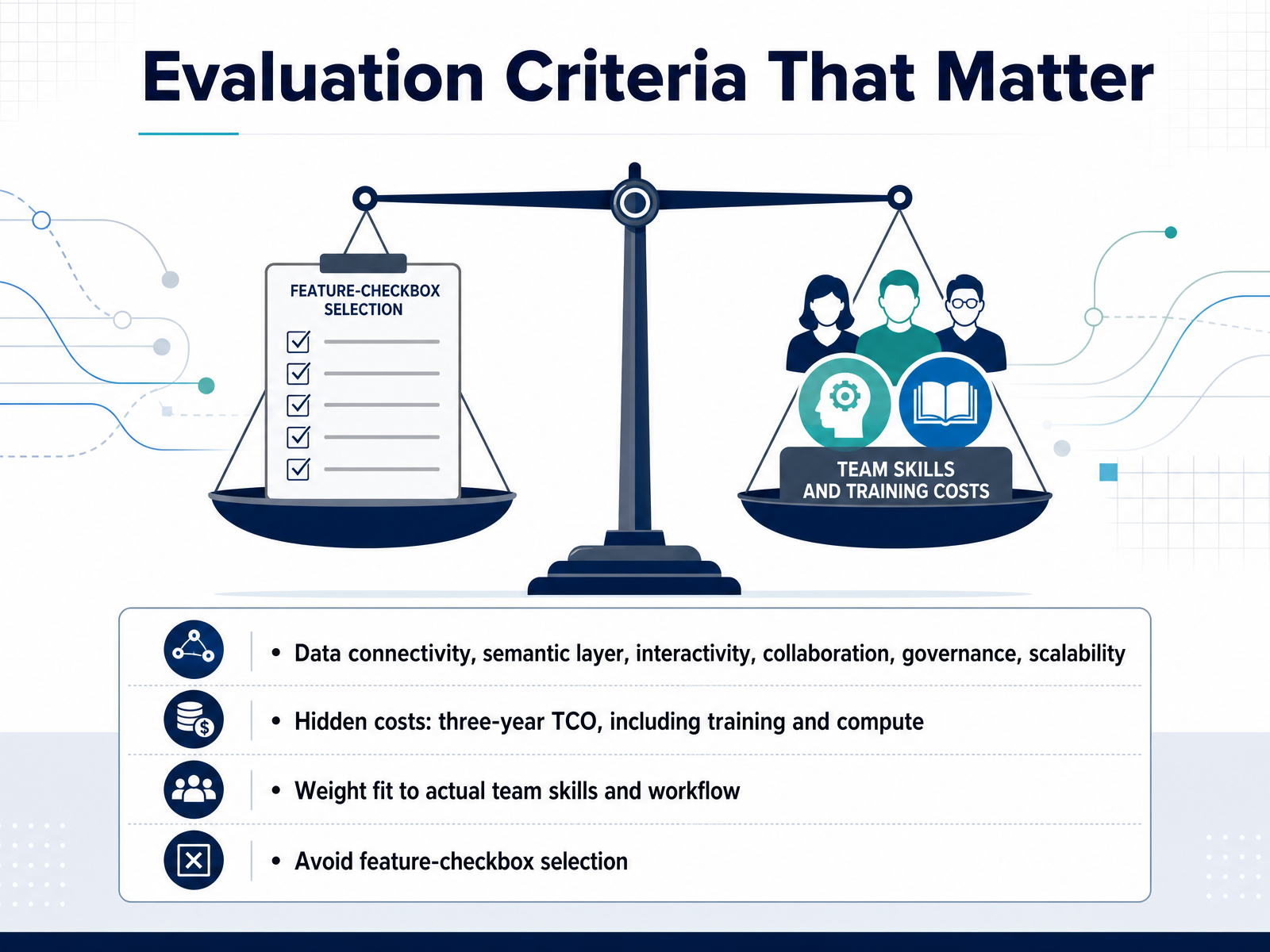
1 min - 07Evaluation Criteria That MatterWhen you're comparing platforms, it's tempting to start with a feature checklist. But the most important evaluation criteria are less about what a tool claims to do, and more about how it actually performs on six fronts. Data connectivity, semantic layer capability, interactivity, collaboration, governance, and scalability. You need to judge each against the reality of your own team. Then, look hard at the hidden costs. A three-year total cost of ownership is far more reliable than a per-seat price. Include training time, administrative overhead, and compute expenses in that calculation. Weight each criterion based on your team's actual skills and daily workflow. A platform that requires a steep learning curve may never get adopted, no matter how powerful it is. So avoid the trap of selecting the tool with the most boxes checked. Choose the one that aligns with how your team actually works. That practical focus will help you narrow the list as we look at a few leading platforms next.
 2 min
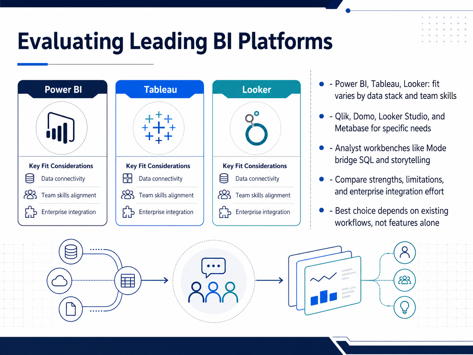
2 min - 08Evaluating Leading BI PlatformsNow let’s look at how the leading platforms stack up in practice. Power BI, Tableau, and Looker each fit differently depending on your data stack and team skills. For example, Power BI tends to integrate cleanly in Microsoft-centric environments, while Looker rewards teams that are comfortable modeling data before visualization. Qlik, Domo, Looker Studio, and Metabase also have their place. They solve more specific needs, from embedded analytics to lightweight self-service reporting. If your analysts already work heavily in SQL, consider analyst workbenches like Mode. They bridge direct query work with narrative outputs, which can speed up storytelling when you need precise control over the data. As you compare tools, factor in strengths, limitations, and the effort required for enterprise integration. The best choice depends on your existing workflows, not simply on which platform has the most features. With that foundation in place, next we’ll explore AI augmented and specialized storytelling tools.
 1 min
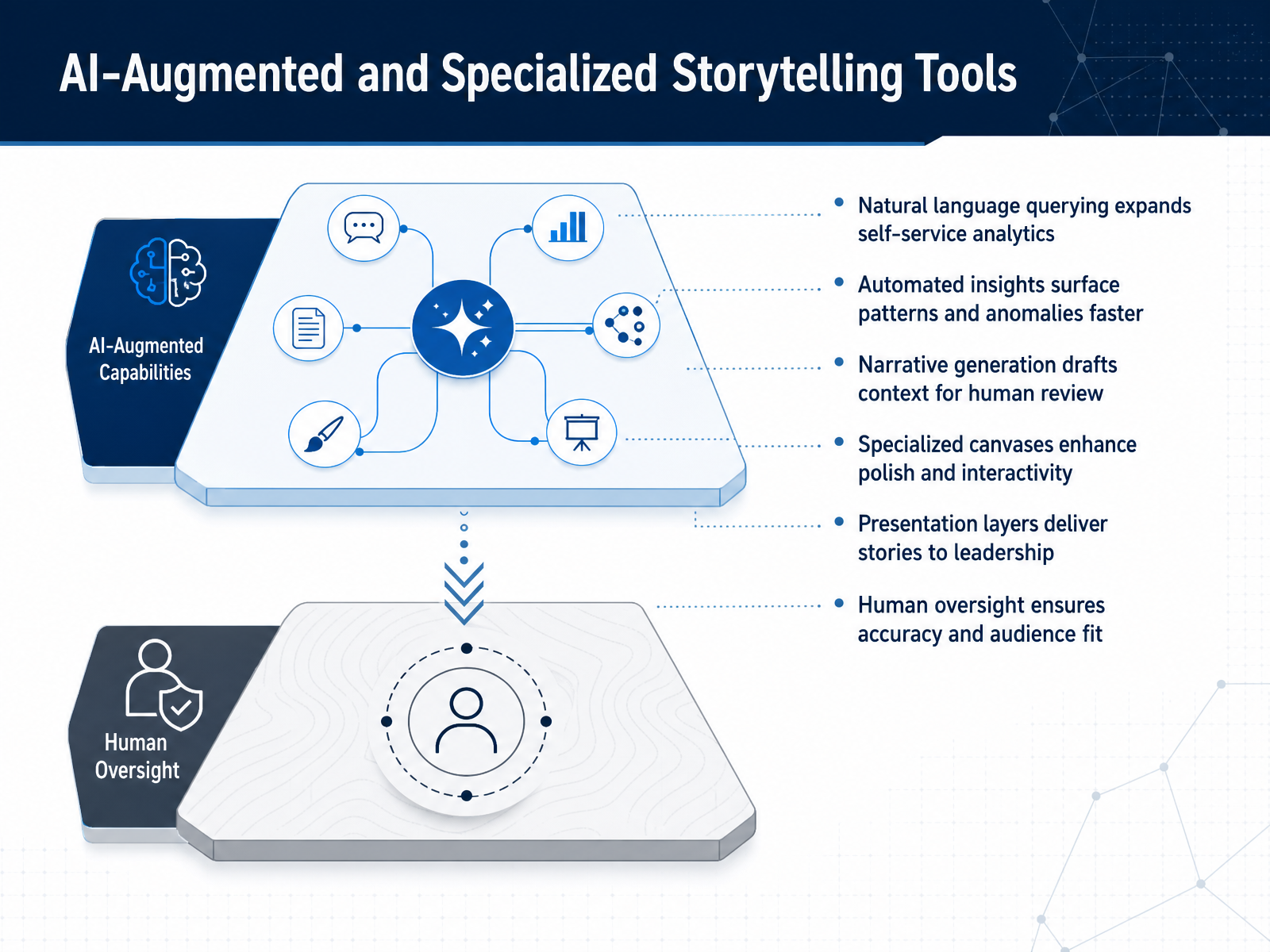
1 min - 09AI-Augmented and Specialized Storytelling ToolsLet’s look at how AI-augmented and specialized tools are changing the storytelling workflow. Natural language querying gives business users a direct path into the data, without waiting on a custom dashboard build. Automated insights flag patterns and anomalies sooner, which helps your team surface what actually needs attention. Some platforms can even draft narrative context for review, turning raw results into a story draft. When you need more polish, specialized canvases support stronger visual hierarchy, custom interactivity, and presentation-ready layers. The tradeoff is oversight. Every generated insight or draft still needs human judgment for accuracy, tone, and audience fit. Treat these tools as accelerators, not replacements for editorial control. Next, we’ll move from capability into operational reality with governance, security, and scalability.
 1 min
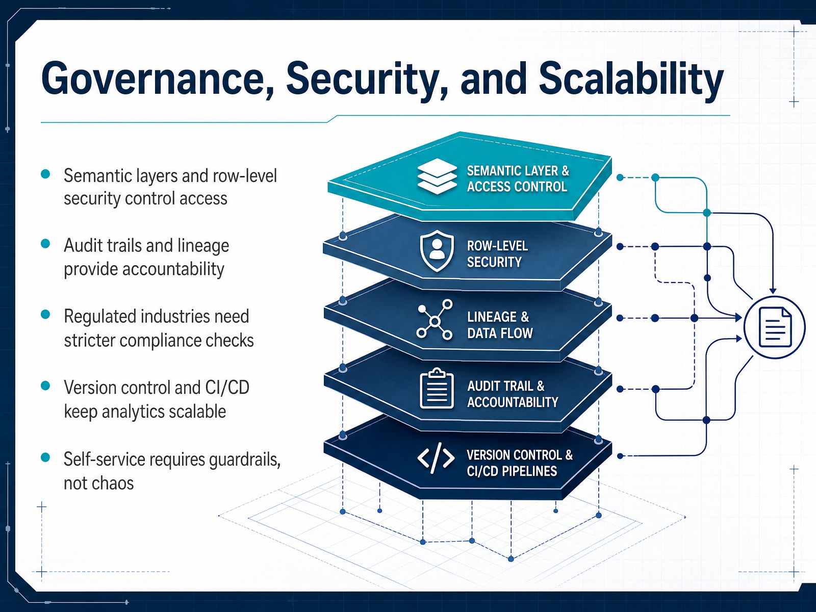
1 min - 10Governance, Security, and ScalabilityNow let's look at how governance, security, and scalability shape your tool decision. A semantic layer is not just a nice-to-have; it defines who can access what, and row-level security enforces those rules at the data level. When your team needs audit trails and lineage, you gain accountability. You can trace a number back to its source and see who changed it, and when. If you operate in a regulated industry, compliance checks become a first-class requirement, not a late-stage add-on. Version control and CI/CD matter more as your analytics scale, because they let you test changes, roll back cleanly, and avoid breaking production dashboards. And here is the key point: self-service only works with guardrails. You want analysts to move fast, but not to create chaos with conflicting definitions or ungoverned data access. So when you evaluate tools, ask what governance comes built in, and what you will have to build yourself. Next, we will move into building a repeatable selection framework.
 2 min
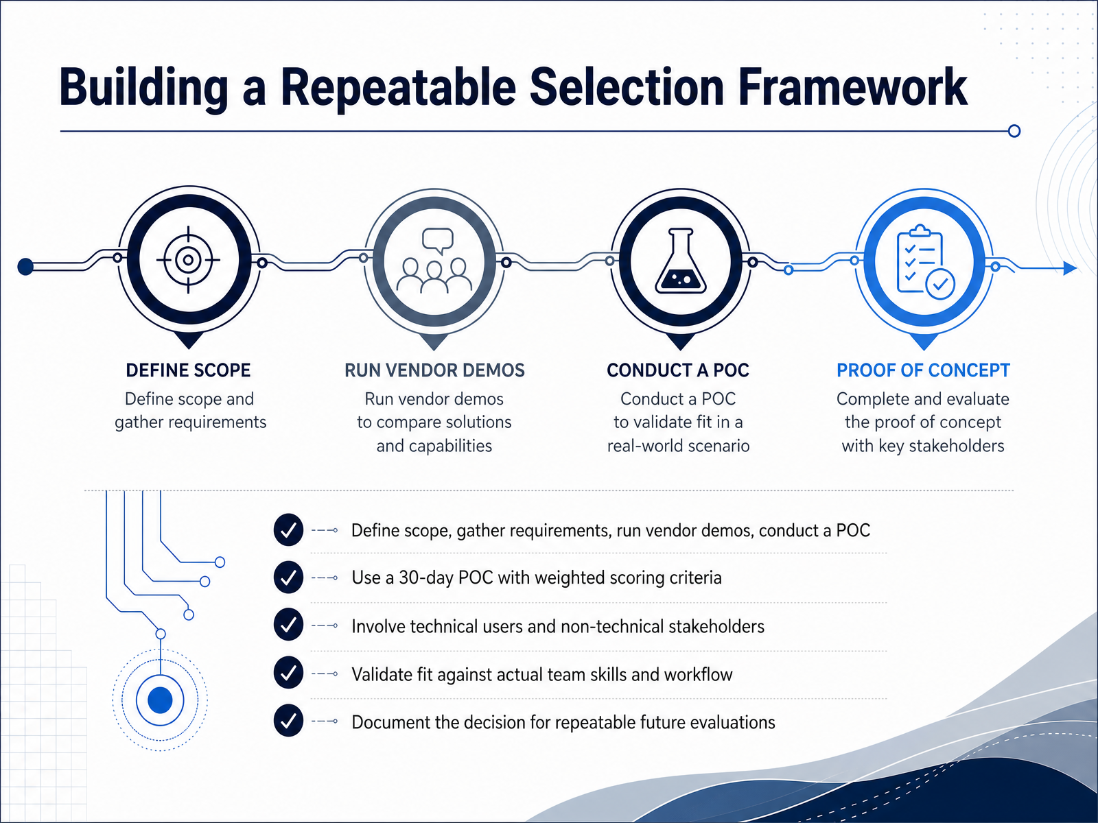
2 min - 11Building a Repeatable Selection FrameworkHere's where you make this process repeatable instead of starting from scratch every time. You first need to define a clear scope. What are you actually trying to solve? Then gather requirements from both technical users and non-technical stakeholders. Run vendor demos early to narrow the field, but let a structured proof of concept drive the real decision. I typically recommend a thirty-day POC with weighted scoring criteria. That means you assign different weights to things like ease of use, governance controls, and integration with your existing data pipeline. Then you evaluate each tool against those priorities. And remember, you are validating fit against your actual team skills and workflow, not just a feature list. A tool with impressive capabilities is still a poor choice if your team will not adopt it. Once you decide, document the rationale. That record makes your next evaluation faster and more consistent. Next, let's look at implementation planning and adoption.
 2 min
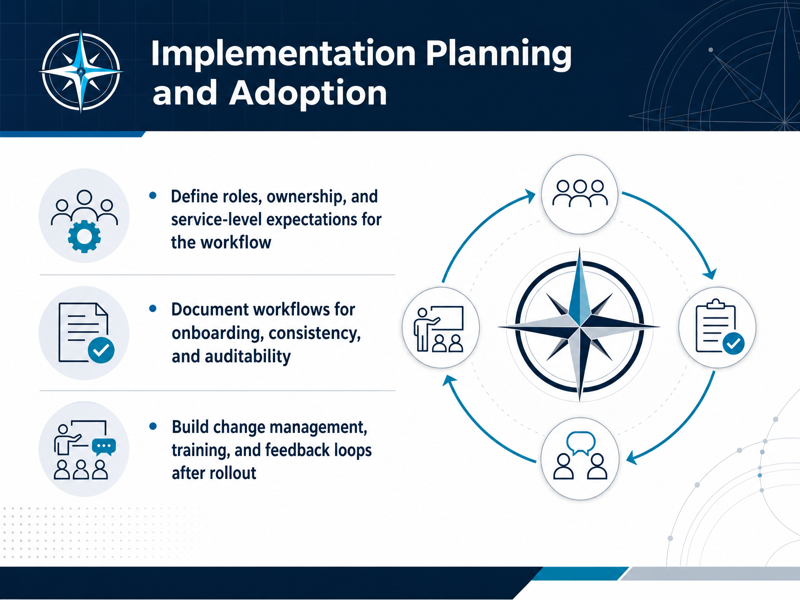
2 min - 12Implementation Planning and AdoptionOnce the tool is selected, the operational work begins. The first step is to define clear roles, ownership, and service-level expectations. Someone needs to own the data pipeline, someone needs to approve visual standards, and someone needs to answer business questions. Without that clarity, dashboards tend to drift. Next, document the workflow. This means capturing how new users get onboarded, how metrics are defined, and how changes are tracked. Documentation is what keeps your reporting consistent and audit-ready, especially when analysts rotate or leadership asks for proof. Finally, plan for adoption from day one. Build a change management strategy, schedule targeted training, and create feedback loops after rollout. Adoption does not happen by accident. It happens when people know where to go, what the numbers mean, and how to flag issues. That operational layer is often the difference between a tool that sits on a shelf and one that shapes decisions. Let's move to a real-world scenario on executive KPI reporting.
 2 min
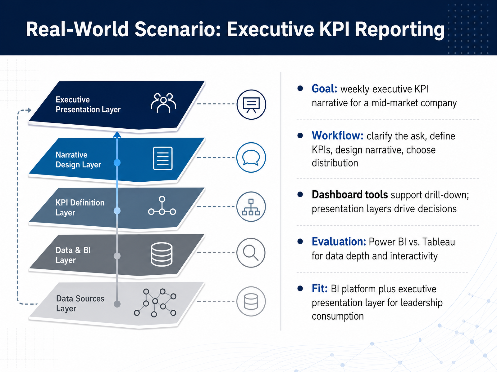
2 min - 13Real-World Scenario: Executive KPI ReportingLet’s ground this in a real situation: you need to deliver a weekly executive KPI narrative for a mid-market leadership team. Your first move should not be opening a tool. Clarify the ask, define the KPIs that matter, design the narrative, and only then choose how to distribute it. Power BI and Tableau both handle data depth and interactivity well, but their strengths sit at the analysis layer, where your team still needs drill-down capability. Leadership consumption is different. Executives usually act on a clear story, not a dashboard they have to explore. So the practical fit is often a BI platform for the underlying data and a presentation layer built specifically for executive review. That combination keeps analysis flexible while keeping leadership focused on decisions. Next, we’ll apply this framework in a hands-on exercise.
 1 min
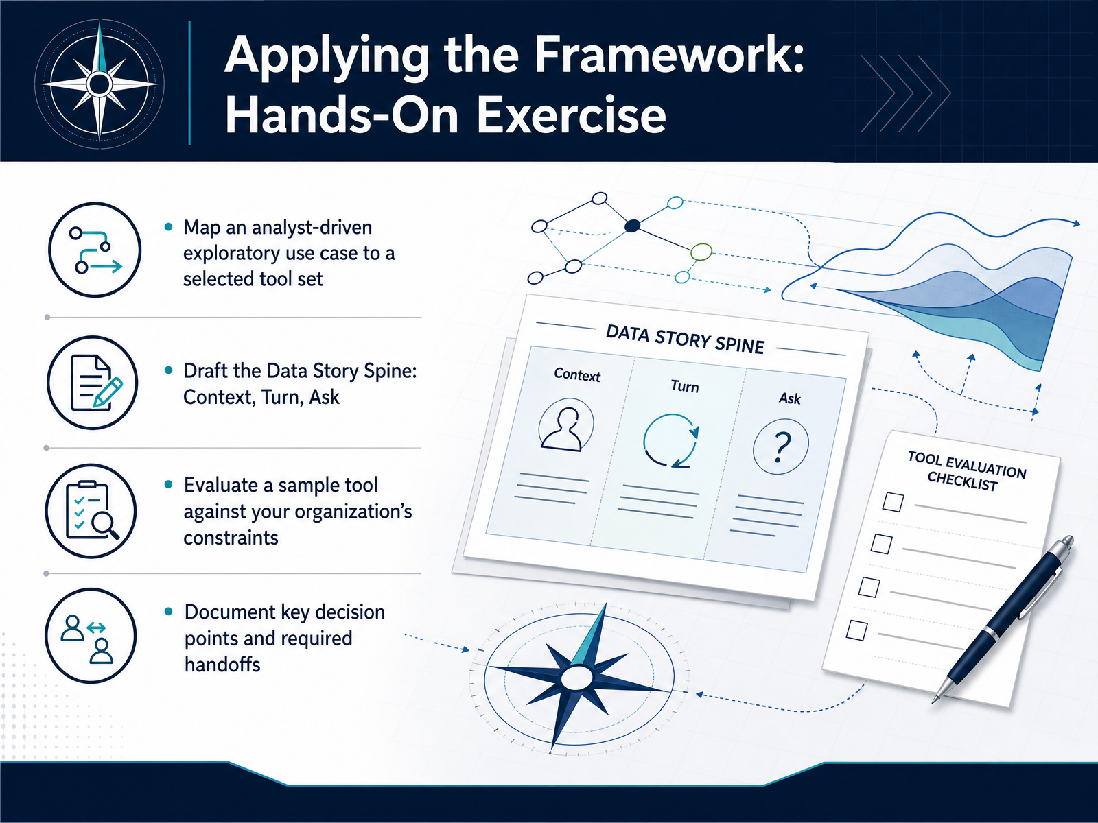
1 min - 14Applying the Framework: Hands-On ExerciseNow let’s put the framework to work. Start with an analyst-driven exploratory use case, and map it to a tool set you’re actually considering. Think about where the data pipeline starts, where exploration happens, and what gets handed to a dashboard or a stakeholder. Then draft the Data Story Spine. Define the context clearly, identify the turn in the data, and state the specific ask you’re making of your audience. That discipline keeps exploration from drifting into a tool demo. Next, evaluate one sample tool against your own constraints. Consider cost, governance, adoption, and visual hierarchy, not just feature lists. Finally, document the key decision points and required handoffs. Which team owns data prep, who validates dashboards, and where does narrative review happen? Those handoffs often decide whether a tool choice actually sticks. You now have a repeatable way to select data storytelling tools and design workflows around clear decisions. Thanks for working through this, and good luck with your next evaluation.
 2 min
2 min
Take the deck with you
Download this course as a file — free, no sign-up needed.
- PDF handoutEvery slide page, ready to print or share.15 pages · 3.4 MBDownload
- Narrated PowerPointThe deck that presents itself — every slide carries the digital human's narration video.15 pages · 13.6 MBDownload
- PowerPoint slidesThe full deck as a .pptx — open it in PowerPoint, Keynote, or Google Slides.15 pages · 3.3 MBDownload
Free to use in your own training — please keep the PersonWise credit page at the end.
Have your own deck? Turn it into a course
Sources consulted
Web sources consulted while building this course.
- Data Storytelling Workflow - Data Programming — dataprogpy.github.io
- From raw data to data storytelling: A framework for structuring any analysis | Observable — observablehq.com
- What Powers Data Storytelling in 2026 — usdsi.org
- What Is Data Storytelling? The Complete Guide (2026) | Storyflow — storyflow.so
- Craft a data story with AI | storyboarding & narrative arc — storytellingwithdata.com
- What is Data Storytelling? | Databricks — databricks.com
- Dashboards vs. Data Storytelling: Which One Actually Drives Decisions? — analyticalstack.com
- What is Data Storytelling – Complete Guide to Turning Data into Decisions — lumenore.com
- Data storytelling: a practical framework | Basedash — basedash.com