Begin
16 pages · ~32 min
Typography for Digital Interfaces
Learn to apply typography principles in digital interfaces to improve readability, hierarchy, and user experience.
A digital instructor presents all 16 pages. Hold “Ask” at any point and ask out loud — the answer comes from this course. No sign-up needed.
What you’ll learn
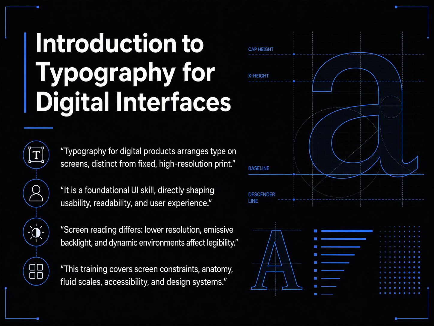
- 01Introduction to Typography for Digital InterfacesWelcome. Today, we're exploring typography for digital interfaces, a foundational skill for anyone designing screens. The goal is to move beyond picking fonts that just look good, and start understanding how type actually works to shape usability, readability, and the overall user experience. Typography on a screen is fundamentally different from print. Print is a fixed, high-resolution medium where ink sits on paper, and you have total control over the final output. On a digital screen, we're arranging type made of light, which has to adapt to different resolutions, screen sizes, and dynamic environments. This means reading itself is a different physical act, affected by a screen's backlight and lower image clarity. In this training, we'll cover the specific constraints of the screen medium, the anatomy of letterforms, how to build fluid type scales, critical accessibility considerations, and how to implement all of this within a design system. Let's start by taking a closer look at the screen as a medium and its unique constraints.whatfontis.comen.wikipedia.orgso05.tci-thaijo.org+22 min
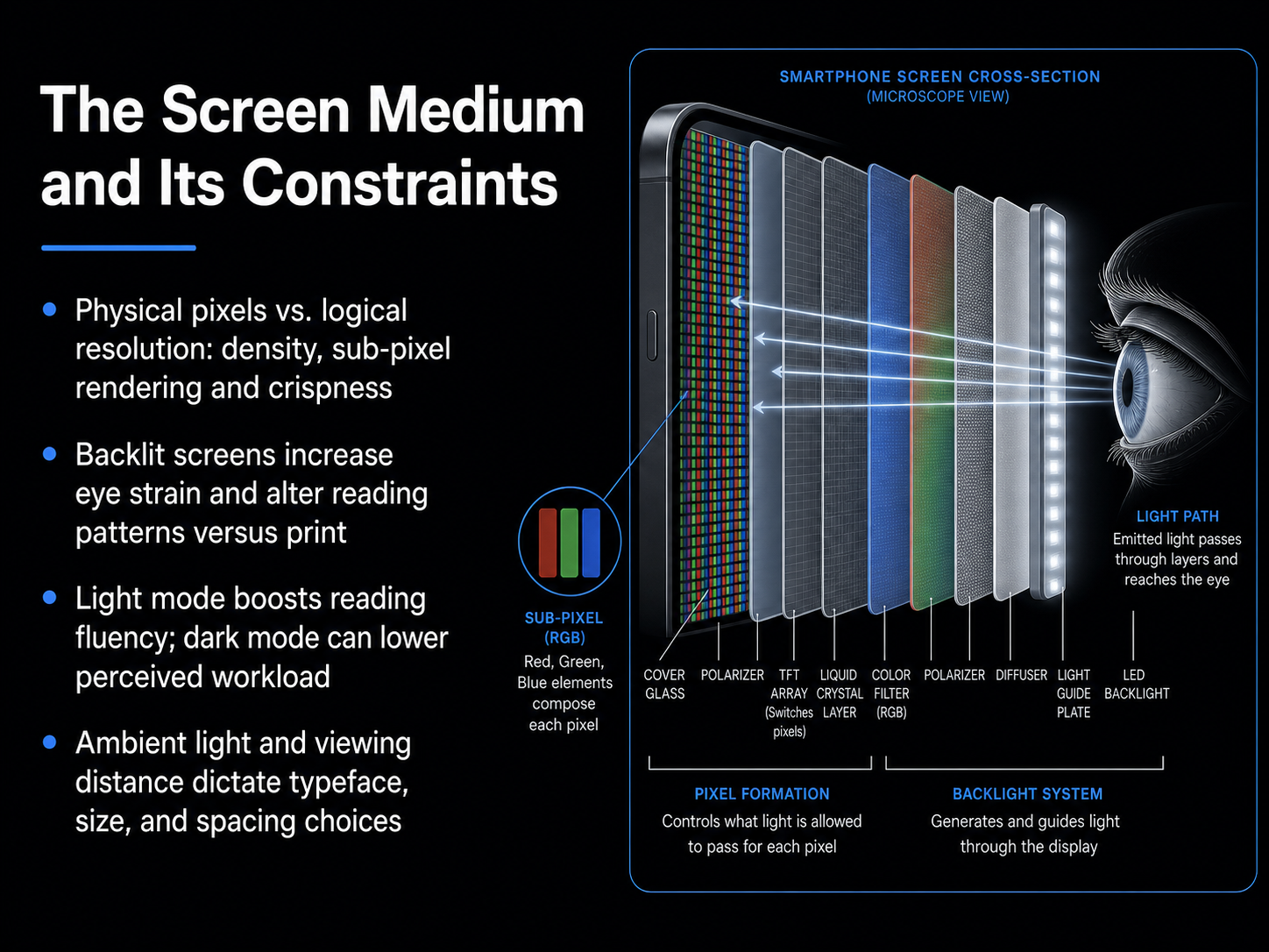
- 02The Screen Medium and Its ConstraintsLet's move into the actual medium we design for: the screen. Unlike print, where ink sits on paper, screens emit light. This fundamental difference creates constraints we need to understand. First, resolution. A digital letterform isn't a smooth shape; it's built from pixels. High pixel density and sub-pixel rendering help us achieve crispness, but logical resolution and physical pixels are always in a dance. Second, backlighting. A backlit screen increases eye strain and alters reading patterns compared to a reflective page. Users scan, they don't always read deeply. Third, the mode debate. Light mode generally boosts reading fluency because the brighter background constricts the pupil, increasing visual acuity. Dark mode, however, can significantly lower perceived mental workload, especially in low-light environments. Neither is universally better; the key is to ensure your design works in both. Finally, context dictates everything. Ambient light and viewing distance directly determine the typeface, the size, and the spacing you must choose. A phone used outdoors demands a very different typographic system than a desktop monitor in a dim office. So, the screen's constraints set the rules. Up next, we'll bring these rules into focus by breaking down the core anatomy of letterforms and how we classify typefaces.
 smashingmagazine.comfontfyi.comagentys.io+22 min
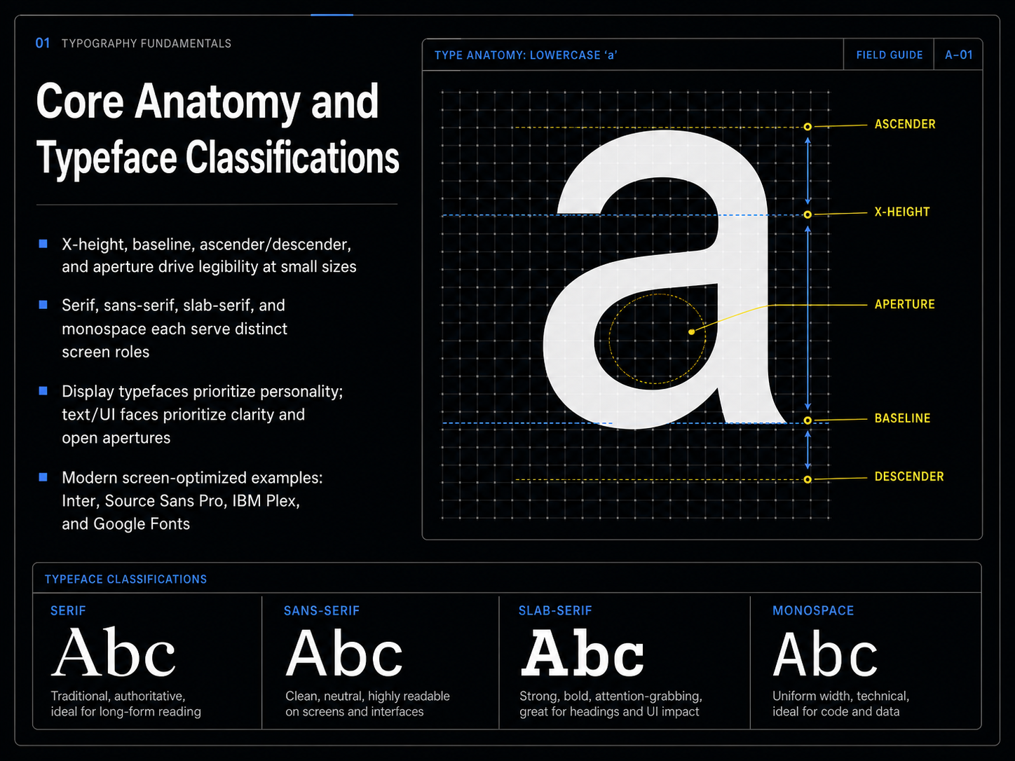
 - 03Core Anatomy and Typeface ClassificationsNow let's get structural and look at the core anatomy of a typeface. Think of the x-height first. That’s the height of the lowercase 'x', and it’s the main driver of legibility at small sizes on screen. A generous x-height opens up the letterforms and keeps them readable. The baseline is our invisible ground line where all the letters sit. Above it, we have ascenders, like the stem on a 'd'. Below it, descenders, like the tail on a 'p'. The aperture is the opening in a letter, like the gap in a lowercase 'e'. On a pixel-based screen, an open aperture is critical. It prevents the shape from closing up and looking like a blob. Next, we have the major classifications. Serif typefaces have those little feet, and they’re great for establishing a formal or editorial tone. Sans-serif faces are clean, without serifs, and they’re the workhorses of user interfaces because of their clarity. Slab-serifs have thick, blocky feet, giving a sturdy, confident feel. Monospace fonts give every character the same width, which is perfect for code and data tables. For pure display and branding, you can choose a typeface with personality. But for text and UI, you must prioritize clarity and open apertures. Some modern screen-optimized families that do this brilliantly are Inter, Source Sans Pro, IBM Plex, and the vast library from Google Fonts. They’re designed from the ground up to render beautifully on today’s displays. Understanding this anatomy helps you make informed, intentional choices. Next, we’ll move from the parts to the whole, exploring how to select and pair typefaces for a complete UI.
 whatfontis.comen.wikipedia.orgso05.tci-thaijo.org+22 min
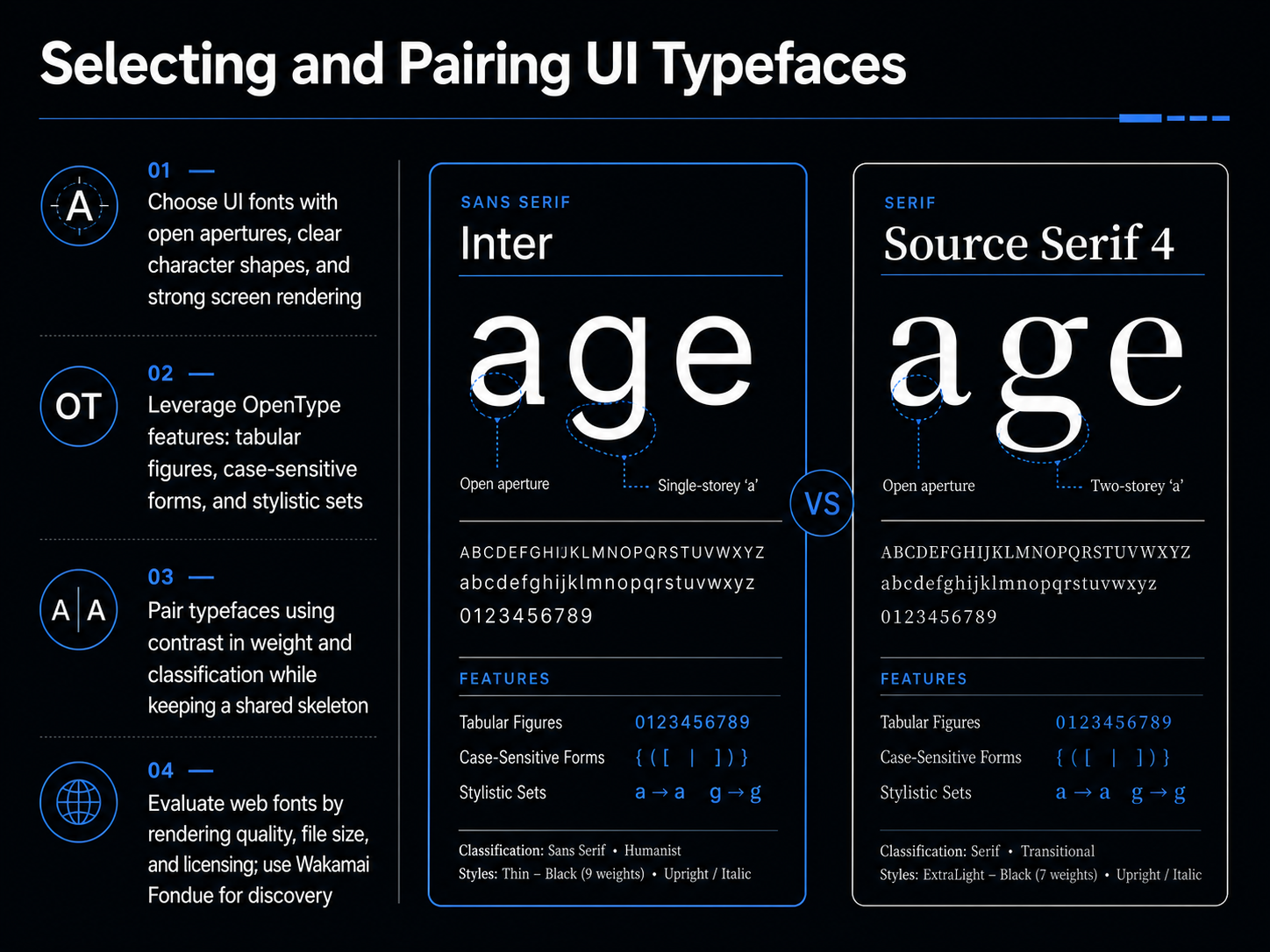
 - 04Selecting and Pairing UI TypefacesChoosing and pairing typefaces for a user interface is a deliberate process. Start with fonts that have open apertures, clear character shapes, and strong screen rendering. These qualities ensure text remains legible, even at small sizes on low-resolution displays. Next, unlock the potential already inside your font files by leveraging OpenType features. Use tabular figures for perfectly aligned columns of data, and case-sensitive punctuation for all-caps labels. Some fonts include stylistic sets, which can subtly shift the entire personality of the typeface without loading another file. When pairing typefaces, the secret is contrast with a shared skeleton. Combine a bold sans-serif with a refined serif, but ensure they share similar proportions and x-heights. This creates hierarchy while keeping the design cohesive. Finally, evaluate web fonts carefully. Check rendering quality, file size, and licensing. A tool like Wakamai Fondue can instantly analyze any font to reveal its hidden features and metrics. Let's now build on this foundation and explore responsive sizing with fluid typographic scales using CSS Clamp.
 developer.mozilla.orgfont-converters.comultimatedesigntools.com+22 min
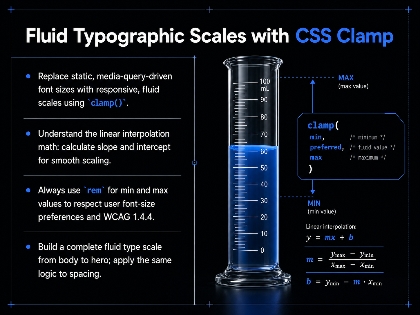
 - 05Fluid Typographic Scales with CSS ClampWith the principles of fluid design in mind, let's get practical. We're going to replace static, media-query-driven font sizes with a single, responsive function: CSS clamp. Clamp takes three values: a minimum, a preferred fluid value, and a maximum. The browser holds the size within your defined floor and ceiling, scaling smoothly in between. The real work is choosing the right preferred value. This is linear interpolation. You pick two points, the minimum font size at a minimum viewport width, and the maximum font size at a maximum viewport width. The formula calculates the slope and intercept to draw a straight line between them. For example, scaling from 16 pixels to 24 pixels between a 320-pixel viewport and a 1280-pixel viewport gives you a slope of 0.833 viewport widths. The final clamp looks like this: clamp with a minimum of 1 rem, a preferred value of 0.833 rem plus 0.833 vw, and a maximum of 1.5 rem. Now, a critical rule: always use rem units for your minimum and maximum values. Pixels ignore user font-size preferences. Rems respect them, which is essential for WCAG accessibility. You can build a complete fluid type scale this way, from body text to hero headings, and the same logic applies to spacing. Use clamp for padding, margins, and gaps to make the entire layout breathe with the viewport. Next, we'll establish the rhythm of that breathing by looking at vertical rhythm and spacing mechanics.
 web.devkitlab.appmoderncsstools.com+22 min
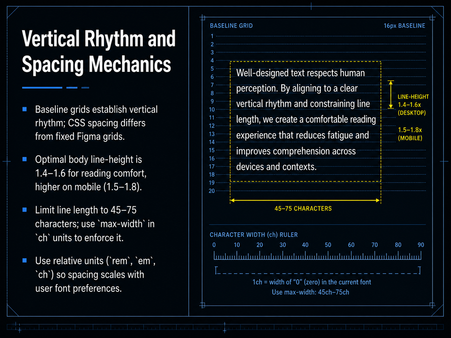
 - 06Vertical Rhythm and Spacing MechanicsNow let's talk about vertical rhythm and the mechanics of spacing. Think of a baseline grid as the invisible skeleton that holds your text. In print, that grid is fixed and absolute, but on the web, CSS spacing is fluid. It has to adapt to different screens and user preferences, so we need more flexible rules. For body text, set your line height between one point four and one point six. That breathing room helps the eye track from the end of one line to the start of the next. On mobile devices, open it up a little more—aim for one point five to one point eight—because smaller screens and distractions make tight text feel claustrophobic. Next, line length. Keep your lines between forty-five and seventy-five characters. Any wider and the reader gets lost. Any narrower and the rhythm breaks. The cleanest way to enforce this is with a max-width property using 'ch' units. That ties the measure directly to the width of your font's characters. Finally, always use relative units like 'rem', 'em', and 'ch' for your spacing. This ensures that if a user increases their default font size, your entire layout scales up gracefully and stays accessible. Next, we'll put these principles into practice as we look at coding text for performance and accessibility.
 smashingmagazine.comfontfyi.comagentys.io+22 min
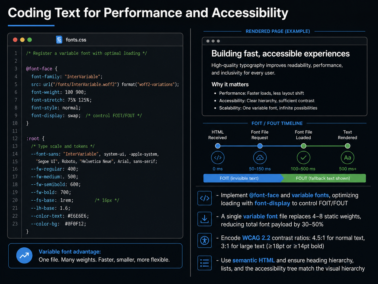
 - 07Coding Text for Performance and AccessibilityNow let's turn to the code that brings typography to life in the browser: performance and accessibility. First, implement font-face and variable fonts. A single variable font file can replace four to eight static weights, cutting your total font payload by thirty to fifty percent. Optimize loading with font-display to control the flash of invisible or unstyled text. Next, encode the WCAG two point two contrast ratios. For normal text, you need a minimum of four point five to one. For large text, defined as eighteen points or fourteen points bold and above, the minimum is three to one. These are measurable, non-negotiable targets. Finally, always use semantic HTML. Match your heading hierarchy, lists, and the accessibility tree to your visual hierarchy. This ensures screen readers interpret the page exactly as you designed it. In the next slide, we'll dive deeper into a WCAG two point two compliance checklist.
 1 min
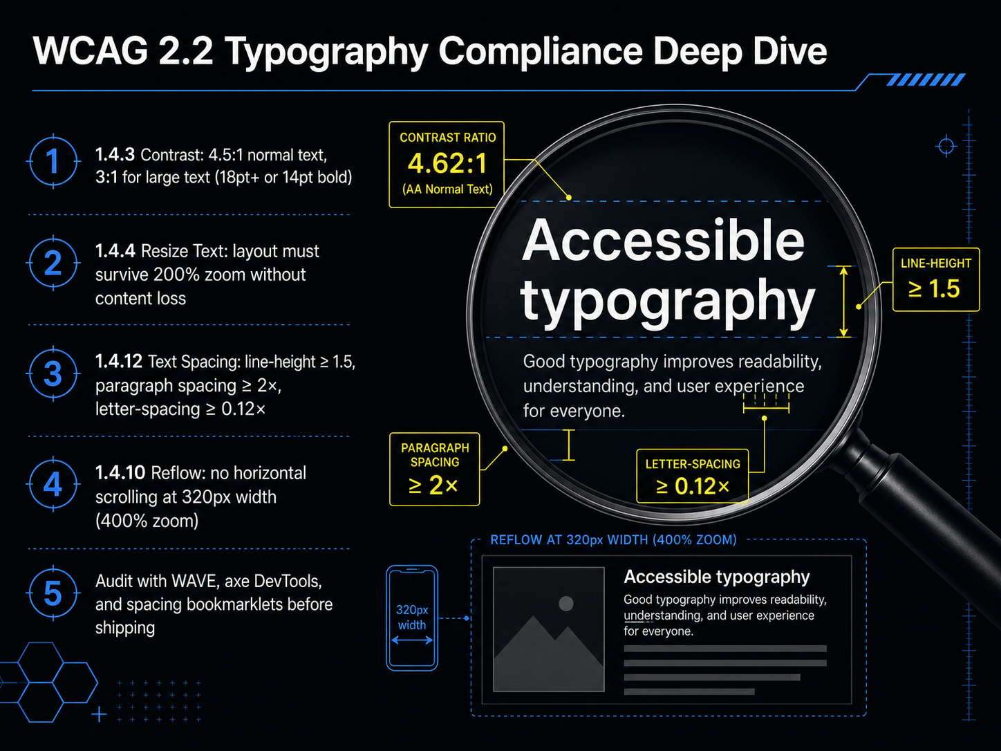
1 min - 08WCAG 2.2 Typography Compliance Deep DiveNow let's turn those guidelines into a proper compliance deep dive for WCAG 2.2 typography. The first and most common failure point is contrast, criterion 1.4.3. For normal text, you need a minimum ratio of 4.5 to 1. For large text, defined as eighteen points or roughly twenty-four pixels, or fourteen points bold, the threshold drops to 3 to 1. Please don't eyeball this. A grey that looks stylish on your monitor can easily fail at 2.5 to 1. Use a tool before you ship. Criterion 1.4.4 then requires that your layout survives a 200 percent zoom without losing content or functionality. This means you should avoid fixed pixel heights on text containers. Next, text spacing, criterion 1.4.12. Your design must not break when a user overrides the spacing. That means line height to at least 1.5 times the font size, paragraph spacing to at least 2 times, and letter spacing to 0.12 times. Finally, reflow, criterion 1.4.10. At a width of 320 CSS pixels, equivalent to a 400 percent zoom, there must be no horizontal scrolling. Before you mark a design as complete, run an audit with WAVE, axe DevTools, and a spacing bookmarklet. These catch the violations you can't see by eye. Next, we'll build on this foundation by exploring visual hierarchy and composition.
 2 min
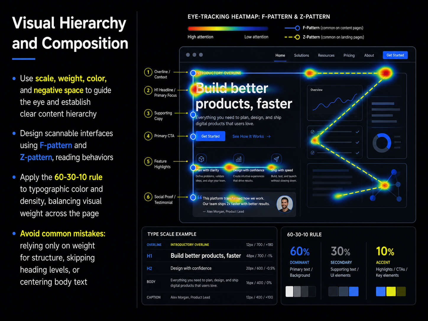
2 min - 09Visual Hierarchy and CompositionNow let's turn to visual hierarchy and composition. Think of hierarchy as the roadmap you give your users. By adjusting scale, weight, color, and negative space, you signal what's most important and guide the eye through the interface. Without that, everything screams for attention and nothing gets read. Strong hierarchy turns a wall of text into a scannable layout. And scanning is exactly how people read on screens. They follow an F-pattern or a Z-pattern, so place your key elements along those natural reading paths. Another tool is the 60-30-10 rule. Use your primary weight or color for about sixty percent of the text, a secondary style for thirty percent, and an accent for the final ten. This balances visual density and keeps the page from feeling chaotic. Before we move on, a few common mistakes to avoid. Don't rely only on font weight to build structure. Use a clear heading scale instead. Never skip a heading level. And please, don't center body text. Centered text is hard to scan and disrupts the reading rhythm. Keep body text left-aligned for readability. Coming up next, we'll push beyond the basics with Accessible Typography: Beyond the Minimum.
 whatfontis.comen.wikipedia.orgso05.tci-thaijo.org+22 min
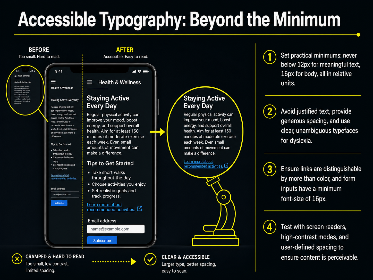
 - 10Accessible Typography: Beyond the MinimumSo far we've talked about best practices, but accessible typography really means going beyond the minimum. Let's start with the hard numbers. Never set meaningful text below twelve pixels. For body copy, sixteen pixels is your practical floor. And always use relative units like rems, so text respects the user's browser settings. Next, think about layout. Avoid justified text. It creates uneven rivers of white space that are especially hard for dyslexic readers. Instead, provide generous line height and use clear typefaces where similar characters are easy to tell apart. We also need to address interactive elements. Make sure links are distinguishable by more than just color. Underline them. And this is a big one for mobile: set a minimum font size of sixteen pixels on all form inputs. Anything smaller triggers an auto-zoom on iOS that can break your layout. Finally, don't just trust your eyes. Test with screen readers, high-contrast modes, and user-defined spacing. Your layout must survive these overrides without losing content. Up next, we'll see how to bake these rules into a scalable system with Typography in Design Systems.
 smashingmagazine.comfontfyi.comagentys.io+22 min
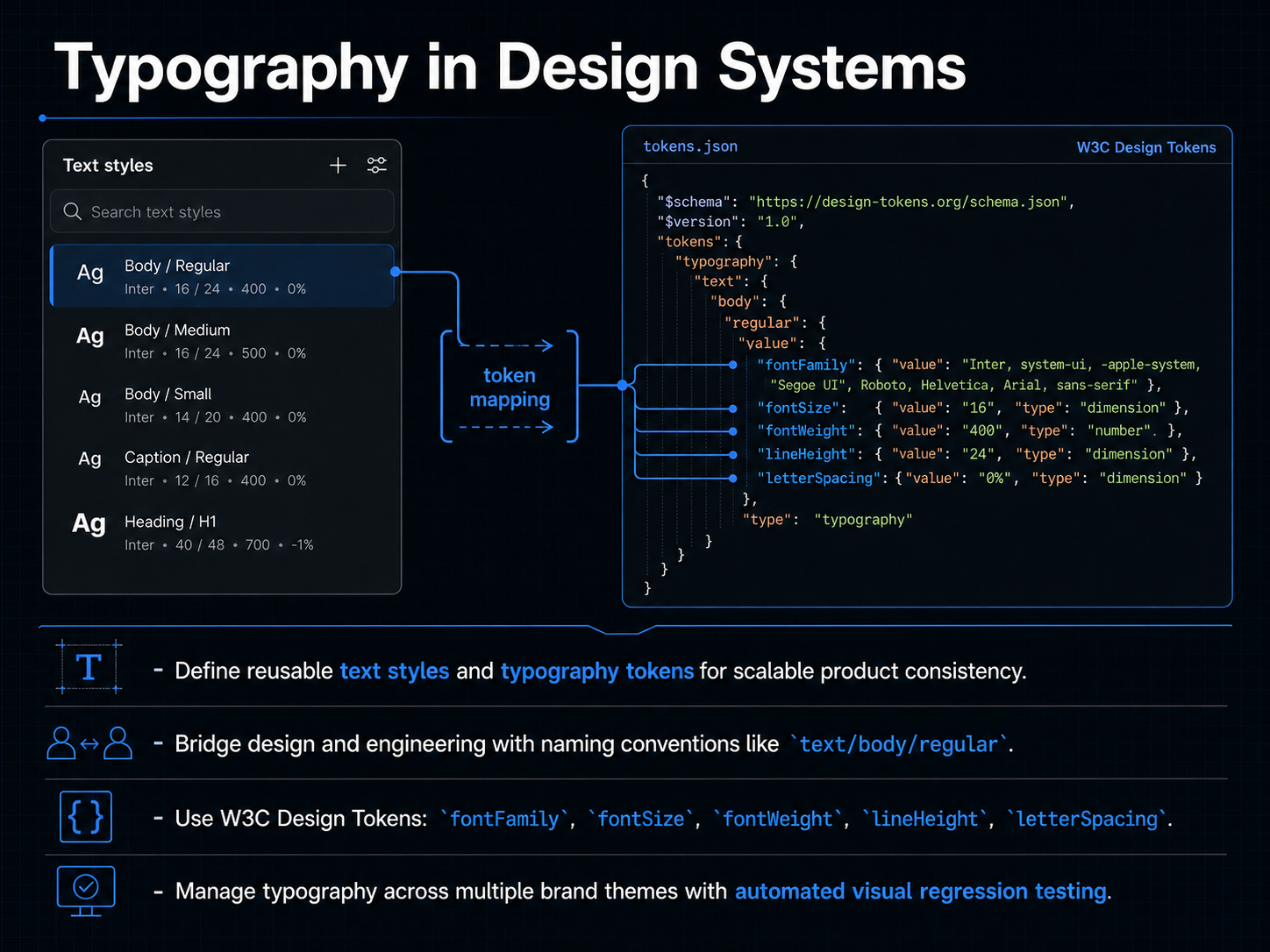
 - 11Typography in Design SystemsNow let's talk about how typography lives inside a design system. The goal here is scalability. You define reusable text styles and typography tokens once, then apply them consistently across every screen in your product. This creates a single source of truth for all your type decisions. To bridge the gap between design and engineering, we use clear naming conventions. A name like text slash body slash regular tells both the designer and the developer exactly what style to apply, with no guesswork. Under the hood, these tokens map to the W C three design token specification. That means standardized properties like font family, font size, font weight, line height, and letter spacing. These tokens are the nuts and bolts that make your styles work across different platforms. When you manage multiple brand themes, typography can get complex. Automated visual regression testing becomes essential. It catches unintended shifts in type rendering before they ship, so you can confidently scale your system across brands. Next, we will explore how variable fonts are driving adoption and changing implementation.
 developer.mozilla.orgfont-converters.comultimatedesigntools.com+21 min
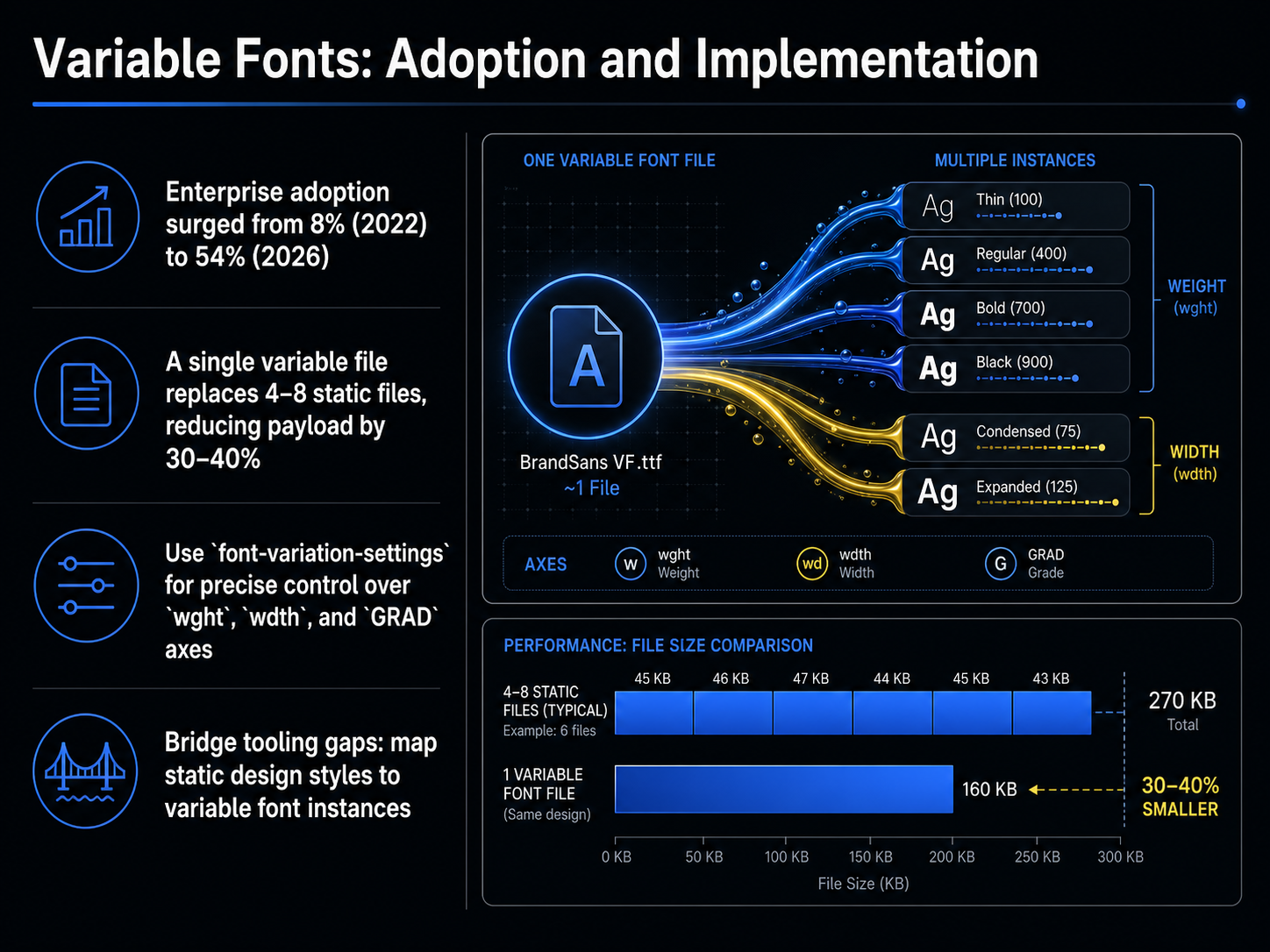
 - 12Variable Fonts: Adoption and ImplementationNow, let's talk about turning the promise of variable fonts into production reality. The adoption numbers tell a powerful story. Enterprise use surged from just eight percent in 2022 to fifty-four percent by 2026. This isn't a gradual trend; it's a rapid shift driven by a clear performance advantage. A single variable font file can replace four to eight static files, slashing the total font payload by thirty to forty percent. That's a direct win for page speed and Core Web Vitals. To implement this, you use the CSS property font-variation-settings. This gives you precise control over axes like weight, width, and the grade axis for fine-tuning density without reflow. But the real challenge is often the bridge between design and engineering. Your design tools may still use static style names like 'Bold' or 'Medium'. The key is to map these static design tokens to specific variable font axis values in your design system. This closes the tooling gap and lets your development team leverage the full performance and flexibility of a single, modern font file. Next, we'll expand this thinking into fluid layouts beyond typography.
 developer.mozilla.orgfont-converters.comultimatedesigntools.com+22 min
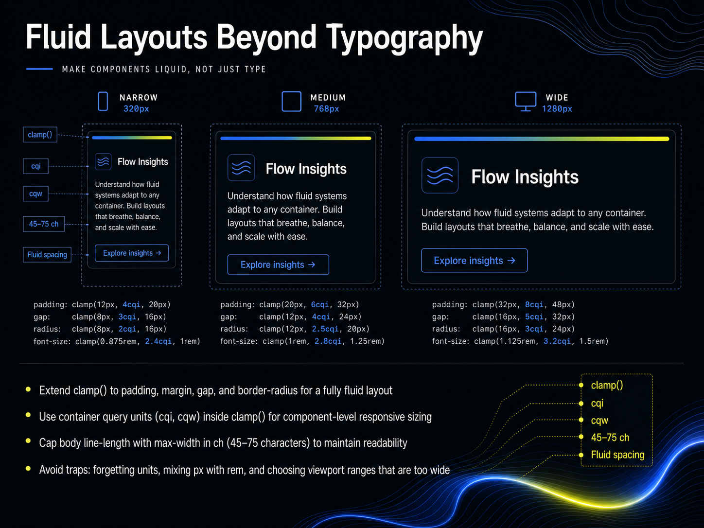
 - 13Fluid Layouts Beyond TypographyNow let's take fluid sizing beyond typography. Everything we've learned about clamp can apply directly to your layout properties. Use clamp for padding, margin, gap, and even border-radius. This creates a fully fluid layout where every element breathes proportionally with the viewport, not just the text. For example, a section's padding could scale from two rem to six rem, preventing cramped mobile spacing or floaty desktop gaps. Now, here's a powerful advancement: combine clamp with container query units like cqi and cqw. This lets you build component-level responsive sizing. A card's internal spacing scales based on its own container width, not the entire viewport, so your components stay perfectly proportional wherever they're placed. For readability, cap your body text line-length with max-width in ch units. Aim for 45 to 75 characters per line. This is the sweet spot that prevents the eye from getting lost on wide screens. Finally, let's bulletproof our work by avoiding the classic traps. Never forget your units inside clamp, avoid mixing px with rem inconsistently, and don't choose viewport ranges that are too wide. A 320 to 4000 pixel range gives a nearly flat slope, making text feel static. Target a 320 to 1280 or 1440 pixel range for the best responsive feel. Next, we'll put all of this into practice with Typographic Testing and QA.
 web.devkitlab.appmoderncsstools.com+22 min
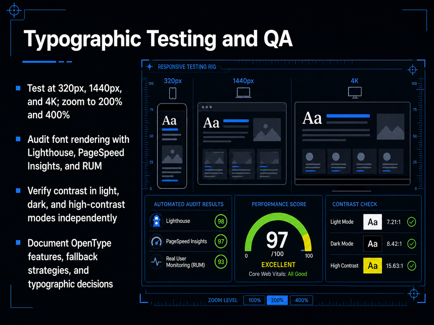
 - 14Typographic Testing and QANow that we have a system, we need to prove it works. Typographic testing and quality assurance is where the numbers meet the screen. Don't just check a single viewport. Test your type at 320 pixels wide, 1440 pixels wide, and at 4K resolution. Then zoom in to 200 and 400 percent. If the layout breaks or text clips, you have a reflow failure against WCAG criterion 1.4.10. Next, audit the rendering. Use Lighthouse, PageSpeed Insights, and real user monitoring data to verify that fonts are loading correctly and that fallback text doesn't cause layout shifts. But a performance audit isn't enough. You must verify contrast independently across light mode, dark mode, and high-contrast mode. A dark background reduces halation, but it can also drop your contrast ratio below the required 4.5 to 1 if you aren't careful. Finally, document everything. Record which OpenType features you rely on, detail your fallback stack, and log your typographic decisions. This prevents silent regressions. Looking ahead, we will explore how these foundations evolve in Future Trends and Emerging Interfaces.
 2 min
2 min - 15Future Trends and Emerging InterfacesLet's look at where typography on interfaces is heading right now. The numbers tell a clear story. Fifty-four percent of enterprise websites already use variable fonts, and browser support is over ninety-six percent. That's no longer an experiment. It's the new baseline. And the performance case is undeniable. A single variable font file typically reduces total font payloads by thirty to fifty percent compared to loading multiple static weights. That's a huge win for Core Web Vitals, with fewer requests and a lighter page. Beyond file size, we're seeing the very definition of a typographic workflow shift. AI-assisted typesetting is starting to handle fine spacing and optical sizing automatically. And in augmented and virtual reality, spatial typography forces us to rethink how type lives in three dimensions, responding to head position and depth. Underpinning all of this is a critical piece of shared infrastructure. The World Wide Web Consortium's Design Tokens specification has reached its first stable version, finally standardizing typography tokens for reliable exchange across design tools and codebases. This means your type scales, font families, and weights can move seamlessly from Figma to Storybook without breaking. These trends point in one direction: typography is becoming more performant, more adaptive, and more systematic. Let's take that thinking into practical action with our final slide.
 whatfontis.comen.wikipedia.orgso05.tci-thaijo.org+22 min
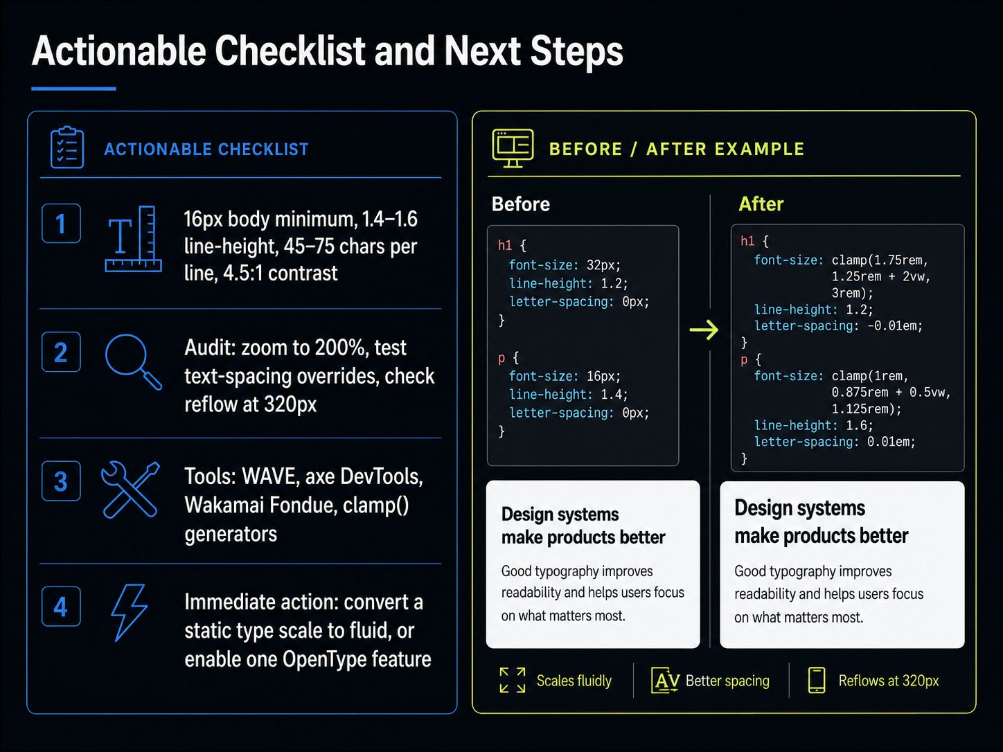
 - 16Actionable Checklist and Next StepsLet's turn knowledge into action. We've covered a lot, so here's your concrete checklist. First, the hard numbers: a minimum 16-pixel body size, a line-height between 1.4 and 1.6, a line length of 45 to 75 characters, and a contrast ratio of at least 4.5 to one. Next, the audit. Zoom your interface to 200 percent. Test text-spacing overrides to ensure the layout doesn't break. And check reflow at a narrow 320 pixels—this simulates the mobile experience. Third, the toolkit. Add WAVE, axe DevTools, and Wakamai Fondue to your browser. A clamp generator is essential for fluid type. Finally, your immediate action. Before you close this course, pick one small task. Convert one static type scale to a fluid clamp function, or enable one OpenType feature—like tabular figures for a data table. Small details make a massive difference. Thank you for joining me. Now go make your interfaces more readable for everyone.
 smashingmagazine.comfontfyi.comagentys.io+22 min
Take the deck with you
Download this course as a file — free, no sign-up needed.
- PDF handoutEvery slide page, ready to print or share.17 pages · 4.3 MBDownload
- Narrated PowerPointThe deck that presents itself — every slide carries the digital human's narration video.17 pages · 17.1 MBDownload
- PowerPoint slidesThe full deck as a .pptx — open it in PowerPoint, Keynote, or Google Slides.17 pages · 4.1 MBDownload
Free to use in your own training — please keep the PersonWise credit page at the end.
Have your own deck? Turn it into a course
Sources consulted
Web sources consulted while building this course.
- Fonts for print versus digital: The key differences every designer should know - WhatFontIs Blog — whatfontis.com
- Typography - Wikipedia — en.wikipedia.org
- Digital Typography: Evolution and Communication in the Technological Age | Journal of Siam Communication Arts Review — so05.tci-thaijo.org
- Digital Type Challenges — visible-language.org
- Typography in Digital vs Print Media: Key Differences and Applications - Dutable — dutable.com
- A Reference Guide For Typography In Mobile Web Design — Smashing Magazine — smashingmagazine.com
- Mobile Typography Accessibility — Minimum Font Sizes — FontFYI — fontfyi.com
- Optimal Font Size and Line Height for Digital Reading (2026) — agentys.io
- Readable Typography | Troubleshooting Guide | Oversearch — oversearch.ai
- Font Size for Mobile App Design: A Complete Guide — align.vn
- OpenType font features - CSS | MDN — developer.mozilla.org
- Complete OpenType Features Guide: Ligatures, Alternates, Stylistic Sets 2025 — font-converters.com
- How to Use OpenType Features in CSS | UDT — ultimatedesigntools.com
- OpenType Features: Ligatures, Small Caps, and Beyond | ChangeThisFile — changethisfile.com
- OpenType Features Guide — Ligatures, Small Caps, Alternates — FontFYI — fontfyi.com
- Responsive and fluid typography with Baseline CSS features | Articles | web.dev — web.dev
- CSS clamp(): the ultimate 2026 guide to fluid typography (with the formula explained) | KitLab — kitlab.app
- Fluid Typography with CSS clamp() - A Complete Guide | Modern CSS Tools — moderncsstools.com
- Responsive typography with CSS clamp: rules that hold up - TYPECLAMP — typeclamp.com
- Reimagining Fluid Typography | OddBird — oddbird.net