Comparison Experience Design
Begin
15 pages · ~30 min
Comparison Experience Design
Learn to design effective comparison experiences, enabling users to evaluate options and make informed decisions.
What you’ll learn
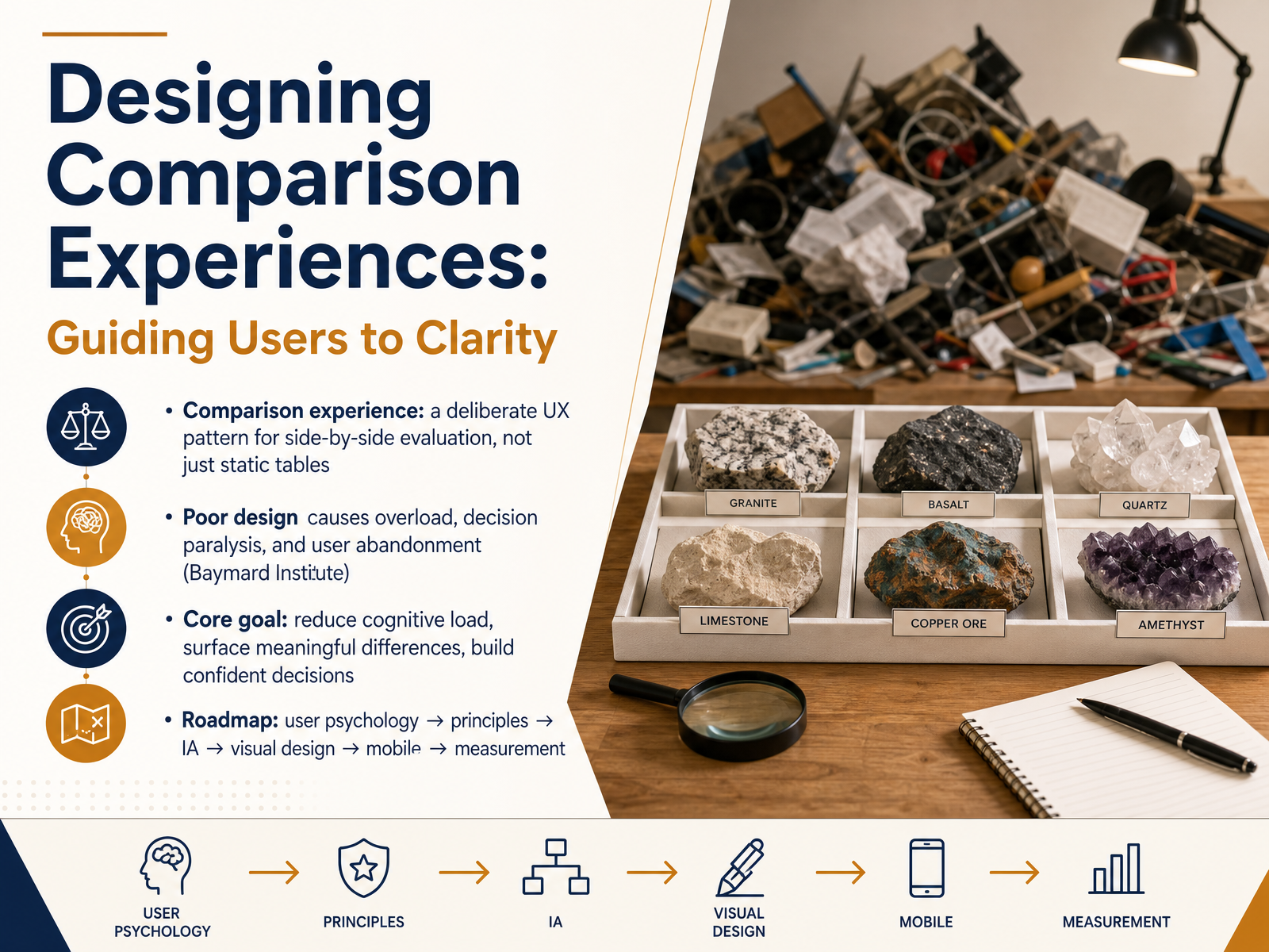
- 01Designing Comparison Experiences: Guiding Users to ClarityWelcome to Designing Comparison Experiences. This course is about helping users evaluate options with clarity and confidence, instead of feeling overwhelmed by too much information. Think of a comparison experience as a deliberate design pattern for side by side evaluation. It goes far beyond a simple, static table. Research from the Baymard Institute shows that poor comparison design leads to cognitive overload, decision paralysis, and ultimately, user abandonment. Our core goal is to reduce that mental load, surface the differences that truly matter, and guide users toward a confident choice. We'll build a practical roadmap, moving from understanding user psychology to applying solid design principles, structuring information, refining the visual design, adapting for mobile, and finally, measuring what works. Let's begin by exploring the psychology of comparison and why users struggle.bestpage.ainngroup.comatticusli.com+22 min
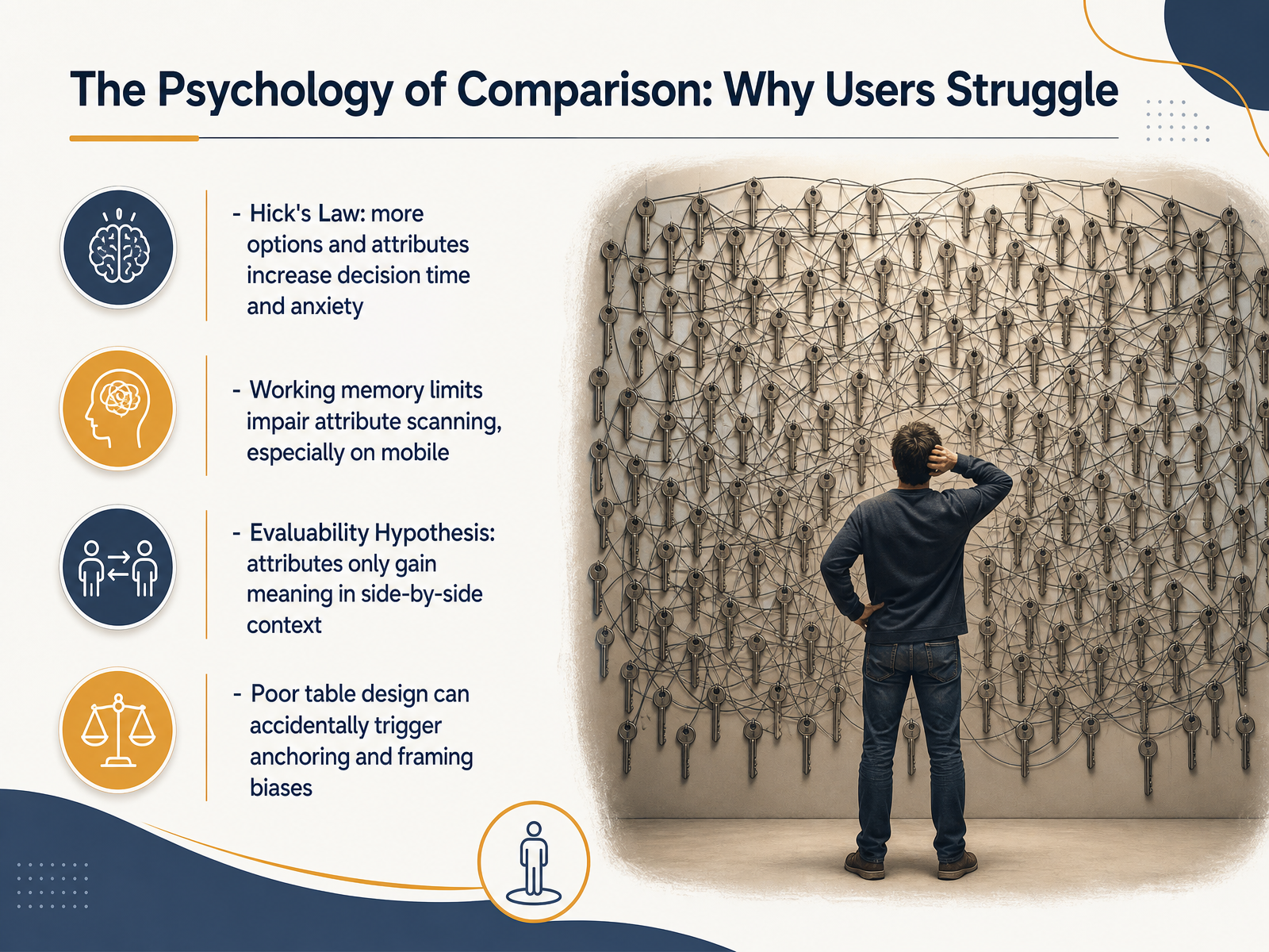
- 02The Psychology of Comparison: Why Users StruggleNow let's look at why comparison can feel so difficult in the first place. There are a few psychological principles at work here. First, Hick's Law tells us that more options and more attributes directly increase decision time and anxiety. Our working memory also has clear limits, especially when scanning detailed information on a mobile screen. Another key idea is the Evaluability Hypothesis. This research shows that some attributes only gain real meaning when you see them side by side. Without that context, a value by itself is hard to judge. Finally, we need to be careful with table design. Poorly structured layouts can accidentally trigger anchoring or framing biases, where the first piece of information or the way data is grouped sways the user's judgment. These are the hidden barriers we'll learn to remove. Next, we'll move into Core Principles: Honest Guidance Over Feature Dumps.
 sciencedirect.compages.ucsd.edupapers.ssrn.com+21 min
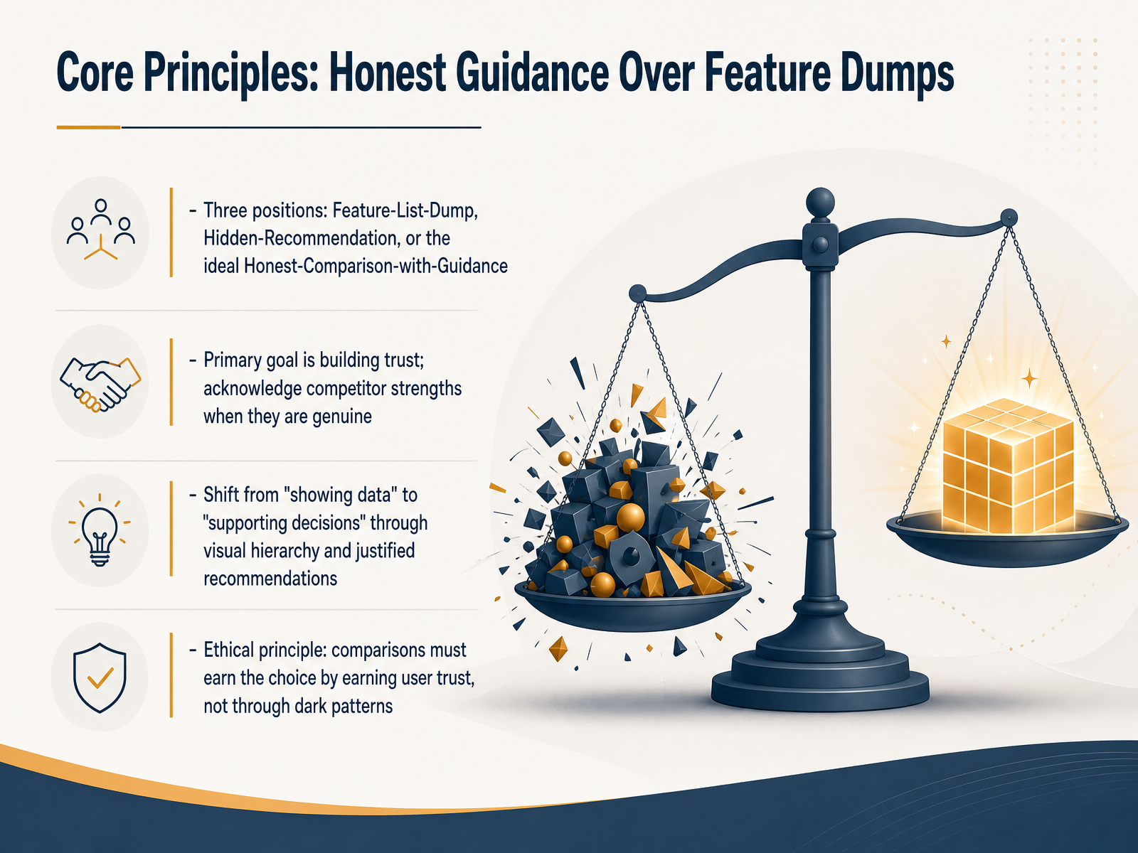
 - 03Core Principles: Honest Guidance Over Feature DumpsLet's talk about the core principles that separate a helpful comparison from a frustrating one. There are three main positions you can take. The first is the Feature-List-Dump. This is where you throw every single specification into a giant grid, leaving the user alone to weigh dozens of cells. Most people just leave. The second is the Hidden-Recommendation, which is really just a sales pitch disguised as a comparison. It erodes trust the moment users notice the bias. The ideal position is what we call Honest-Comparison-with-Guidance. This means a genuine like-for-like analysis, plus an explicit, defensible recommendation. Your primary goal here is to build trust, which means you must acknowledge competitor strengths when they are genuine. We are shifting the goal from simply showing data to actively supporting decisions, using visual hierarchy and justified advice. The ethical principle is that comparisons must earn the user's choice by earning their trust, never through dark patterns. Up next, we will look at Information Architecture: Structuring for Scannability, where we will translate these principles into a clear layout.
 bestpage.ainngroup.comatticusli.com+22 min
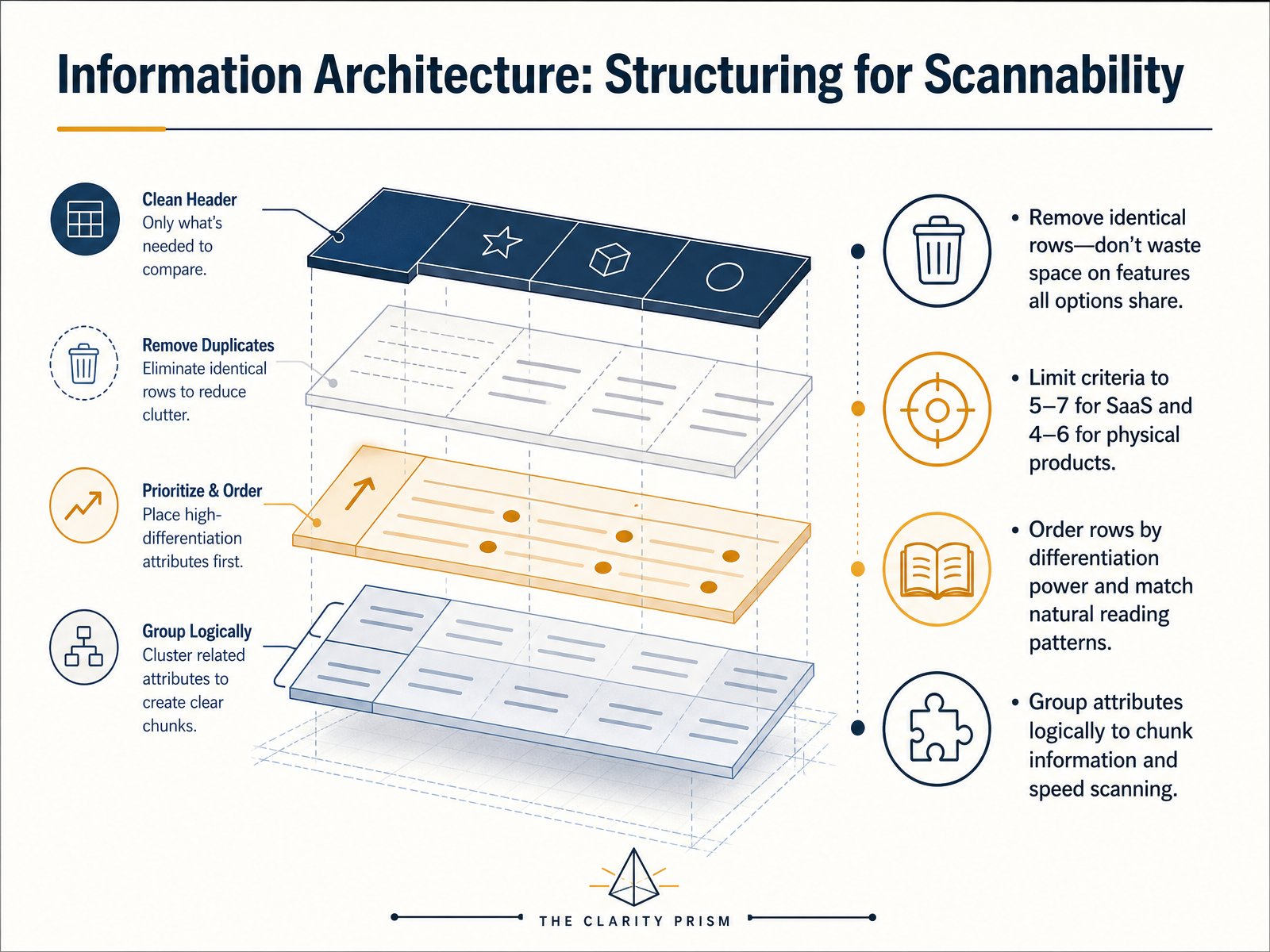
 - 04Information Architecture: Structuring for ScannabilityLet's move into the structure that makes comparison tables truly scannable: information architecture. The first rule is to eliminate redundancy. If every option offers the same feature, remove that row entirely. Identical check marks in every column waste space and create visual noise that slows decision-making. Next, limit your criteria. For SaaS products, aim for five to seven differentiating features. For physical products, keep it to four to six. This prevents cognitive overload and keeps the focus on what actually separates one choice from another. The sequence of rows also matters. Order them by differentiation power, with the most decisive attributes near the top or bottom, where the eye naturally pauses. And group related attributes into logical chunks, such as security, support, or integration. This chunking helps users process information faster and find what they care about without scanning the entire table. By removing identical rows, limiting criteria, ordering strategically, and grouping related data, you create a table that feels effortless to navigate. Coming up next, we'll look at how progressive disclosure and control can further reduce the noise and give users even more command over what they see.
 bestpage.ainngroup.comatticusli.com+22 min
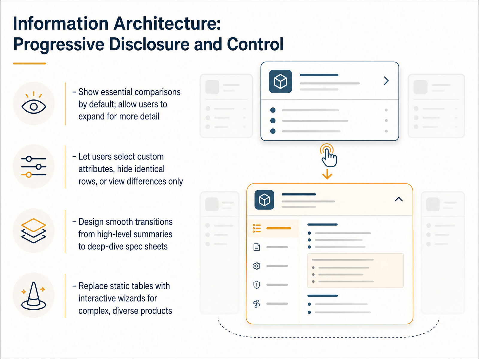
 - 05Information Architecture: Progressive Disclosure and ControlNext, let's look at how to structure the information itself through progressive disclosure. This principle means showing essential comparisons by default, and letting users expand for more detail when they're ready. Instead of overwhelming shoppers with a giant table of every possible specification, we only surface the top eight to twelve decision-driving attributes first. You should also give users control. Let them select custom attributes to add, hide identical rows, or view only the differences between products. This transforms a static table into a flexible tool. Design smooth transitions from high-level summaries to deep-dive spec sheets. For instance, a compact summary card can expand into a full technical breakdown on demand. Finally, for complex and diverse products, consider replacing rigid static tables with interactive wizards. An AI-guided flow can ask a few targeted questions and dynamically build a personalized comparison, just like an in-store expert would. By combining progressive disclosure with user control, you reduce cognitive load and build confidence. Moving on, we will explore the visual side of this with our next topic: Visual Design: Translating Data into Meaning.
 zoovu.comcrobox.comhellorep.ai+22 min
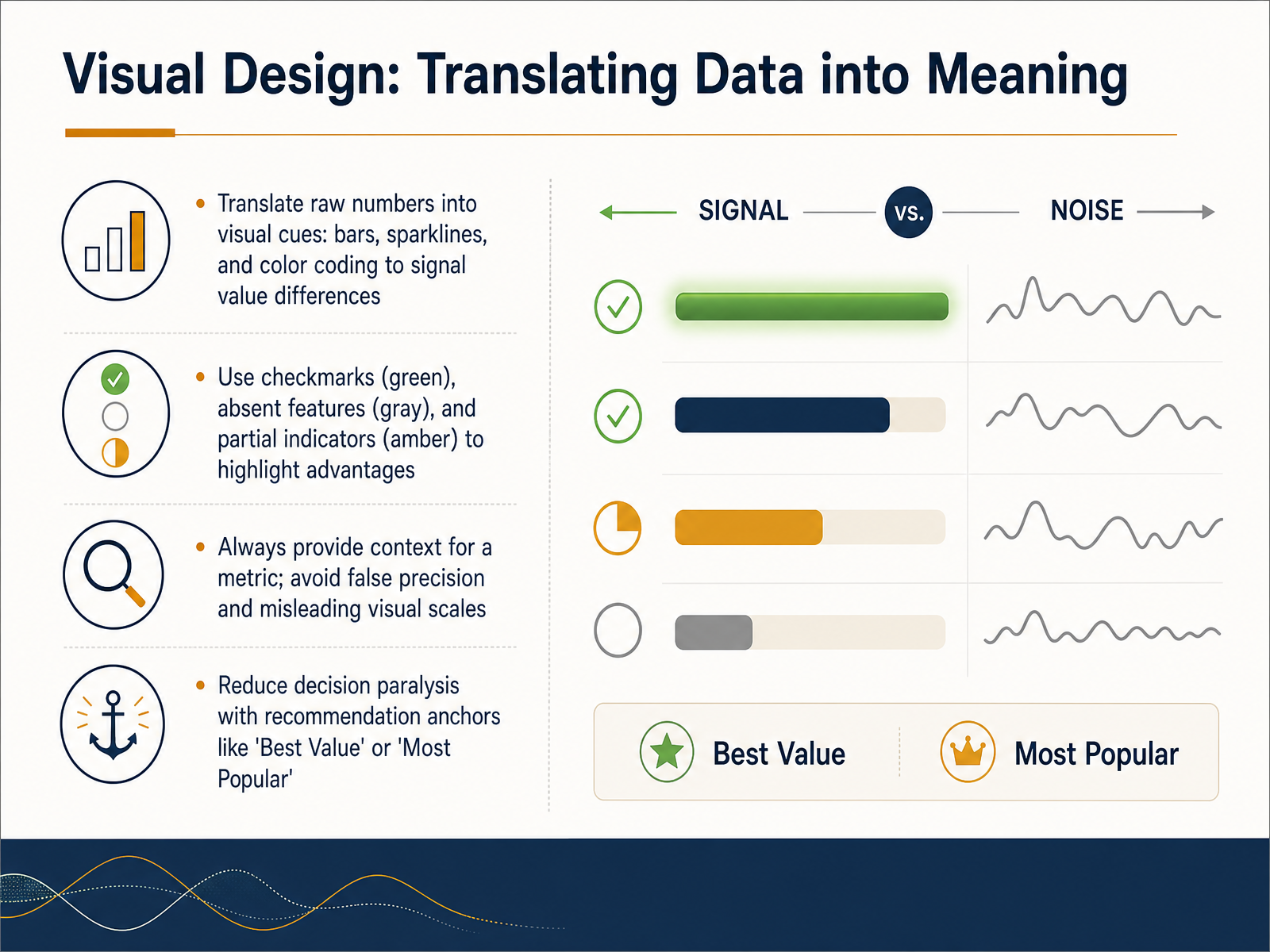
 - 06Visual Design: Translating Data into MeaningLet's move into the visual layer, where raw data becomes meaning. This slide is about translating numbers into visual cues that help users compare without getting lost in the details. When you design a comparison view, replace dense numbers with bars, sparklines, or color coding. These visual signals make value differences immediately clear. For feature availability, use checkmarks in green to highlight advantages, gray text or blank space for absent features, and amber partial indicators where a feature is limited. This approach creates an honest, scannable pattern. Always provide context for any metric you show. If you display a number, explain what good looks like, and avoid false precision or misleading chart scales that distort the truth. To reduce decision paralysis, add recommendation anchors like 'Best Value' or 'Most Popular' badges. These small labels give users a trusted starting point without removing their ability to choose differently. Next, we will apply these visual principles to accessibility and clarity.
 bestpage.ainngroup.comatticusli.com+22 min
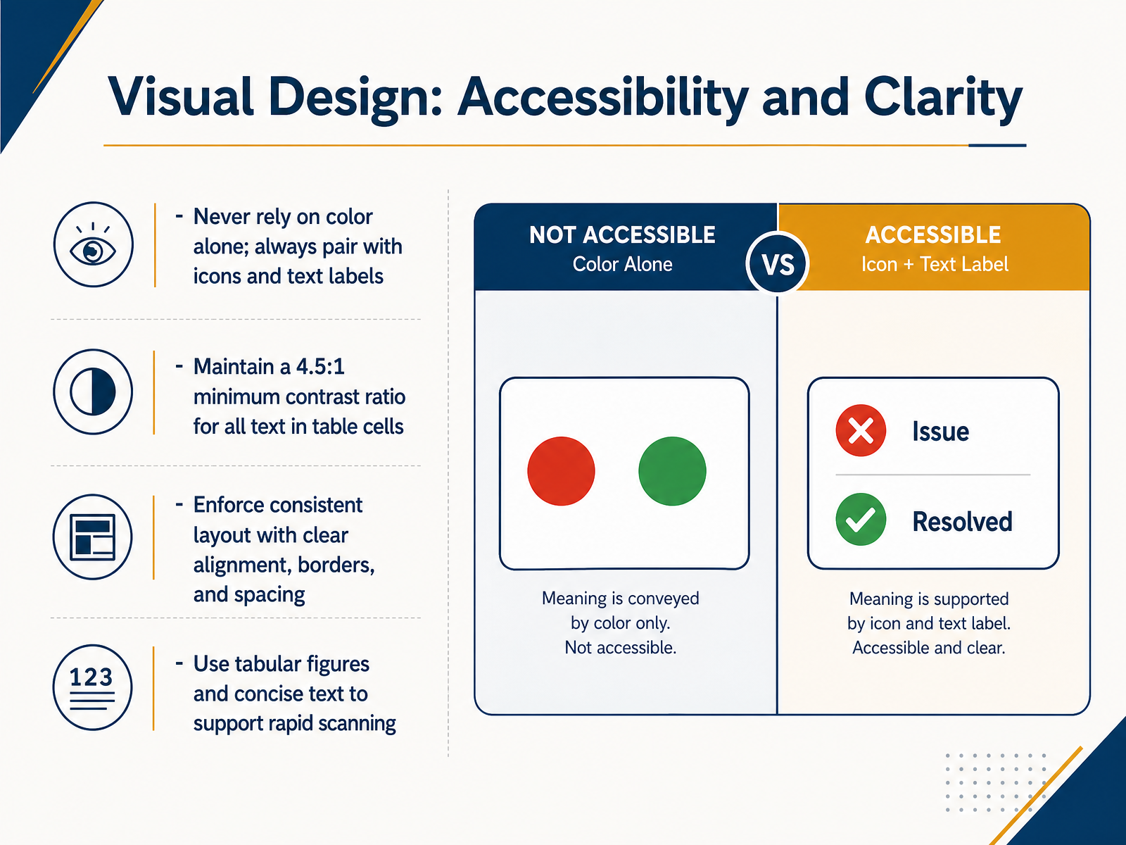
 - 07Visual Design: Accessibility and ClarityNow let's look at visual design: making your comparisons both accessible and crystal clear. First, a critical rule for accessibility: never rely on color alone to communicate meaning. Always pair color with an icon or a text label. For example, a green checkmark should also include the word 'Yes,' and a gray 'X' should say 'No.' This ensures every user can understand the difference, regardless of visual ability. Next, ensure all text inside your table cells meets a minimum contrast ratio of four point five to one against its background. This isn't just a technical spec—it's what makes your content readable at a glance. Third, enforce a consistent layout. Clear alignment, visible borders, and generous spacing guide the eye smoothly across columns and rows without causing fatigue. Finally, use tabular figures and concise text to support rapid scanning. Tabular figures are monospaced numbers, so prices align perfectly, making quantitative comparisons effortless. Keep your text brief—short phrases, not long descriptions. These four practices transform a dense grid into an effortless decision-making tool. Next, we'll build on this by tackling a related challenge: simplifying complex attributes for non-experts.
 bestpage.ainngroup.comatticusli.com+22 min
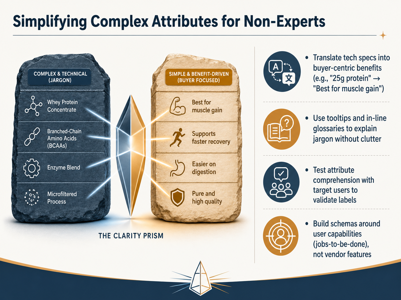
 - 08Simplifying Complex Attributes for Non-ExpertsNow we get into the practical work of simplifying complex attributes for people who aren't technical experts. The core idea is to translate specs into buyer-centric benefits. Instead of listing '25 grams of protein,' a label like 'Best for muscle gain' tells the user what that spec actually does for them. Next, use tooltips or in-line glossaries to explain jargon right where it appears, so the interface stays clean and helpful. It's also essential to test your attribute labels with real target users. What seems clear to you may still confuse the people you're trying to help. Finally, build your comparison schemas around user capabilities, using a jobs-to-be-done framework, rather than organizing everything by vendor features. This shifts the focus from what the product is to what the user can accomplish with it. Up next, we'll look at how to combine these ideas into guided comparison flows and smart recommendations.
 nasa.github.ioiso.orgassets.metrolinx.com+21 min
 - 09Guided Comparison Flows and Smart RecommendationsAlright, let's move beyond static tables. Guided comparison flows use interactive wizards, quizzes, and plan builders to help shoppers make decisions without feeling overwhelmed. Instead of showing every option at once, these tools ask about user priorities and then dynamically filter the choices. This reduces cognitive effort and makes the experience feel like a helpful conversation. We should distinguish between two main approaches. Guided selling tools, like quizzes and AI advisors, lead the customer through a question-based journey. Direct comparison tables, on the other hand, let users see all options side by side and draw their own conclusions. As we design these flows, we can ethically integrate social proof to support decisions. For example, adding a simple note that 'forty-five customers chose this plan' can serve as a helpful decision-support attribute, not just a marketing badge. Now, we need to make sure these comparison experiences work well on any device. Let's explore mobile and responsive comparison design.
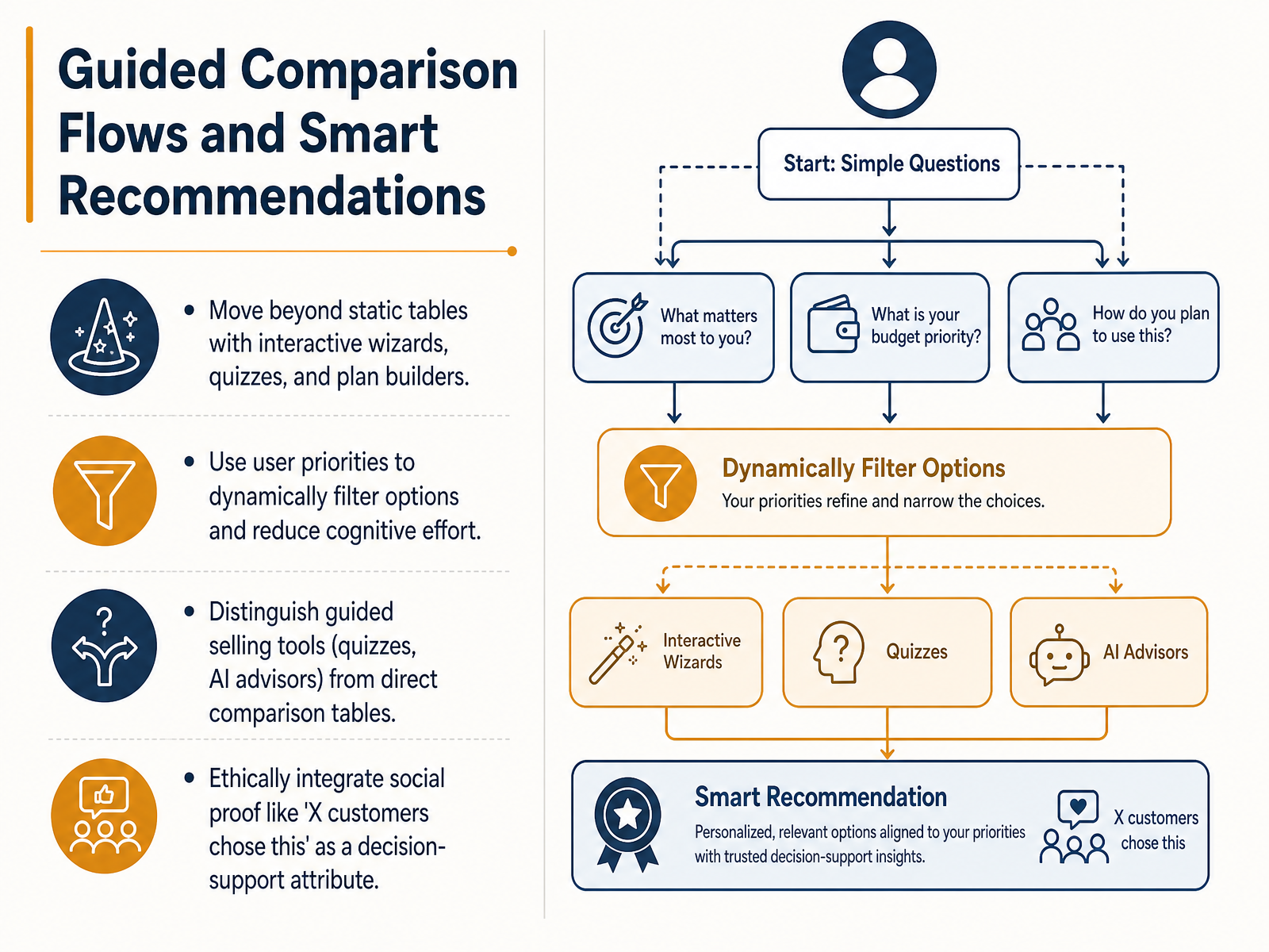 zoovu.comcrobox.comhellorep.ai+22 min
 - 10Mobile and Responsive Comparison DesignNow let's address one of the most common failure points in comparison design: mobile and responsive behavior. Nothing destroys a user's confidence faster than a comparison table that breaks on their phone. The first thing to diagnose is the full-page horizontal scroll. When a wide table forces the entire website to scroll sideways, users lose their place and often abandon the page. Another critical failure is losing the header context, where column labels scroll out of view and leave users guessing which product belongs to which feature. To fix this, we use a sticky column and scroll pattern. We lock the first column, which contains the attribute labels, and allow only the product columns to scroll horizontally. This keeps the row context always visible. For a true mobile-first approach, we transform tables into stacked cards or accordions. Instead of shrinking columns to an unreadable size, each product becomes a vertical card, or each attribute group becomes an expandable section. This maintains clarity and scannability on small screens. Finally, ensure every comparison state has a shareable, unique U R L. Many buying decisions involve asking a colleague or partner for a second opinion. A unique link lets users continue the decision-making process seamlessly across devices without starting over. In our next slide, we'll move into the data layer and explore building a schema for honest comparison.
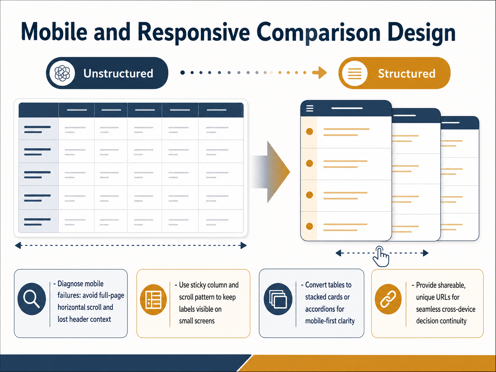 ecomdesignpro.combestpage.ai2 min
 - 11The Data Layer: Building a Schema for Honest ComparisonLet's build the data structure behind an honest comparison. A simple feature checklist, with its basic check marks, breaks down completely when you compare tools that take fundamentally different approaches. It forces a yes or no answer that hides important nuance. Instead, use richer statuses to tell the truth. Designations like Different Model, Partial, or Not Applicable give users a much clearer, fairer picture than a missing check mark ever could. Next, think about pricing. Don't just list a flat monthly fee. Model it as a dynamic system. Show tiers, usage limits, and scaling curves so users can project their actual costs over time. Finally, a non-negotiable rule: every single comparison claim must cite a verified source and a date. This ensures your matrix stays accurate and trustworthy. Next, we'll explore how to measure the success of these experiences with metrics that matter.
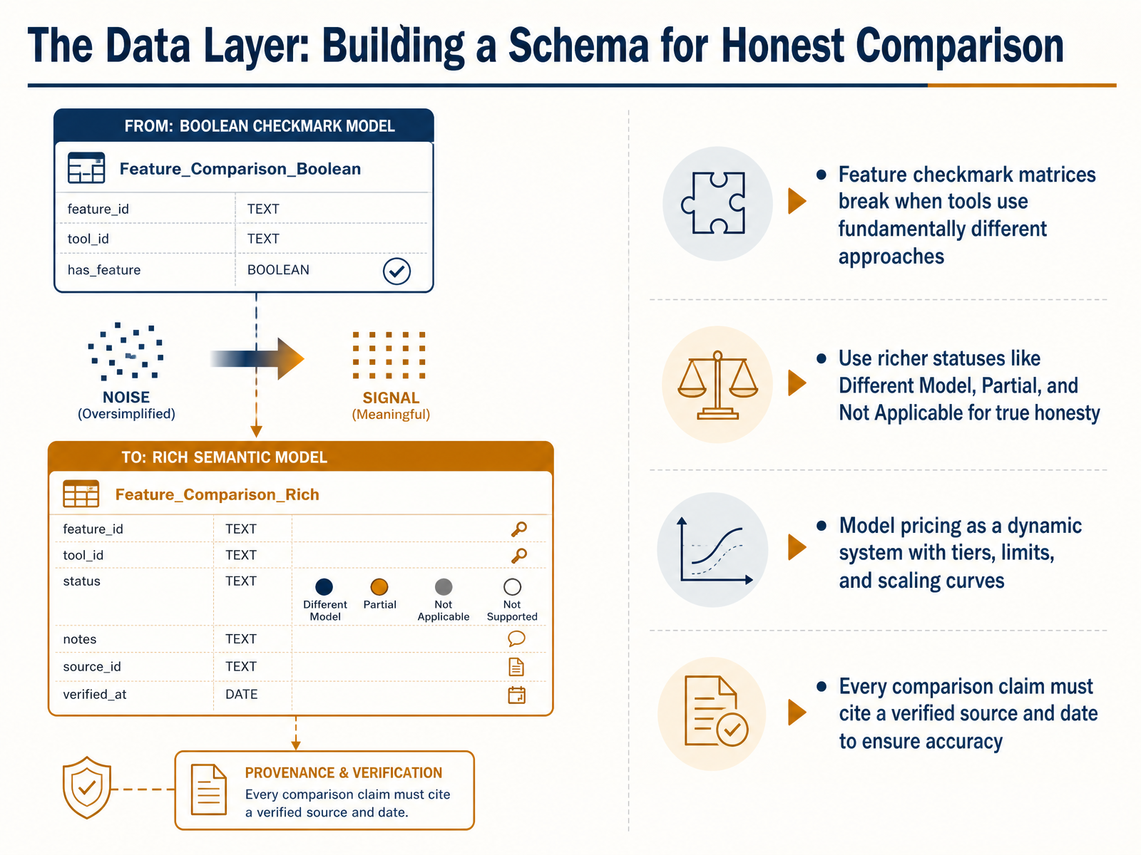 1 min
1 min - 12Measuring Success: Metrics That Matter for Decision UXNow we turn to measuring success, specifically the metrics that matter for your comparison experience. Good design is not just about what looks right. It is about what performs right over time. Start by tracking process quality. Decision velocity tells you how quickly users move from comparison to choice. The stickiness rate, often measured over 90 days, shows whether decisions stay made or get reopened. Together, these reveal if your design builds real confidence. Next, connect experience to business outcomes. Monitor conversion rates and changes in average order value. These are your ultimate indicators that the comparison flow is driving value, not just clicks. To validate your design choices, use A/B testing. Compare a traditional table layout against a guided quiz format, or test how your table performs on mobile versus desktop. This data confirms which pattern truly helps users decide. Finally, analyze the click stream. Look for drop-off points where users abandon the flow. A sudden exit right after a dense row of specs signals cognitive overload. Identifying that moment tells you exactly where to simplify. Next, we will examine common failure modes and how to fix them.
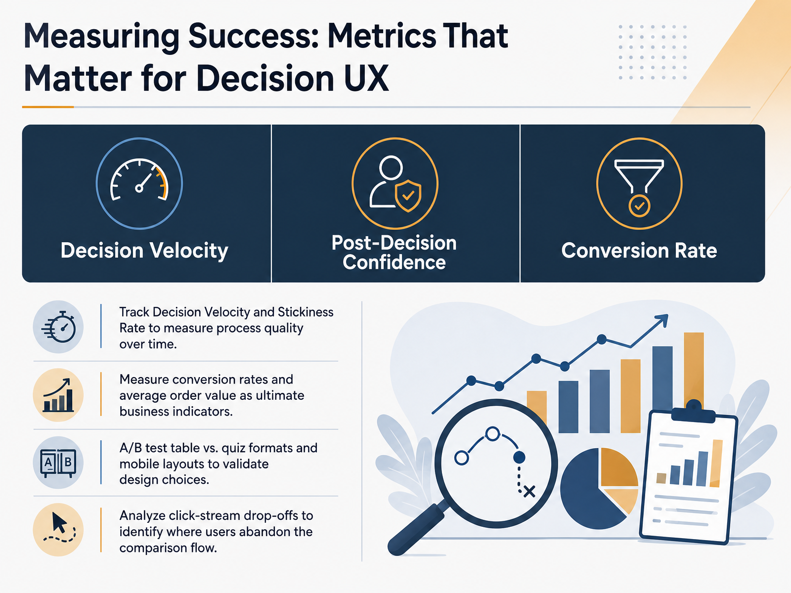 bestpage.ai2 min
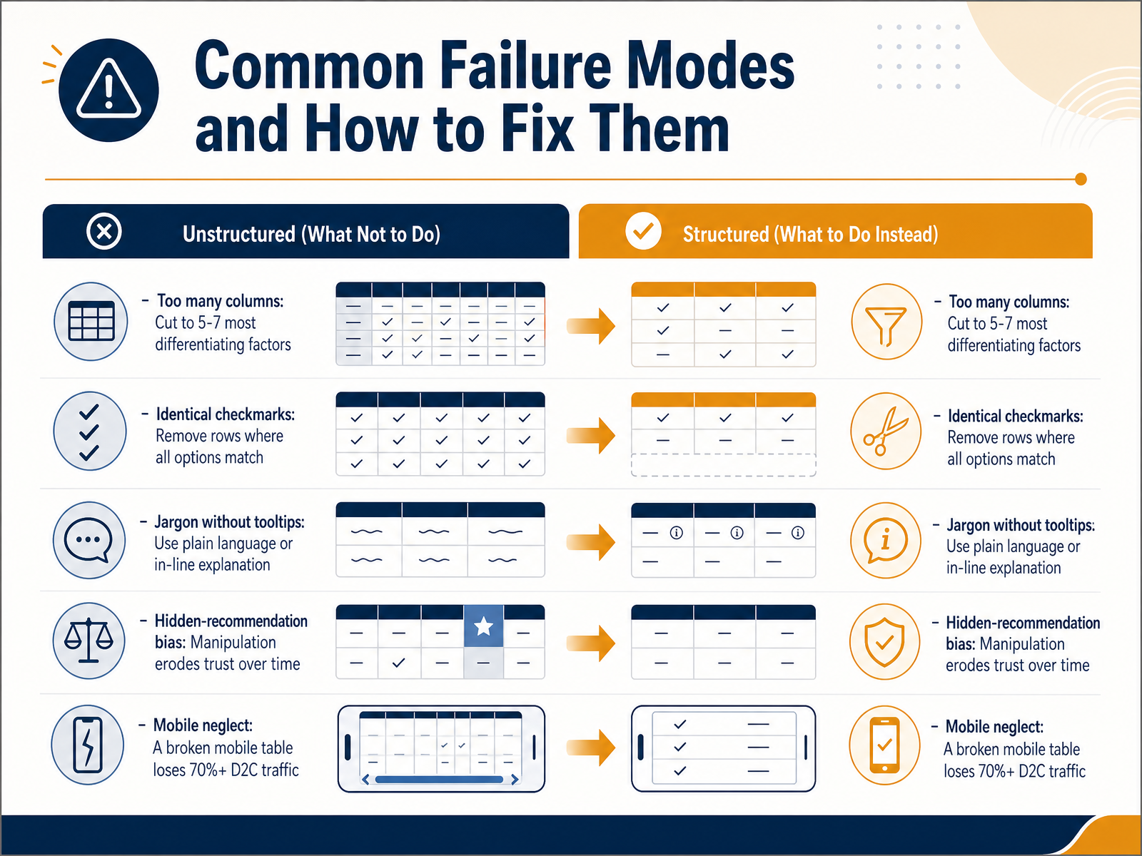
 - 13Common Failure Modes and How to Fix ThemNext, let’s look at common failure modes and how to fix them. First, having too many columns. Limit your table to the five to seven most differentiating factors. Anything beyond that creates noise, not clarity. Second, rows full of identical checkmarks. If every option has the feature, the row isn't helping anyone decide. Remove it. Third, jargon without explanation. Use plain language, or provide simple tooltips that define terms in context. Fourth, hidden recommendation bias. When a comparison secretly steers users toward one option, trust erodes over time. Be transparent about your recommendation and why it fits certain audiences. Finally, mobile neglect. A broken table on a phone can lose over seventy percent of your direct-to-consumer traffic. Always design for thumb scrolling and responsive layouts from the start. Up next, we examine a case study that turned a cluttered spec sheet into a clear decision tool.
 bestpage.ainngroup.comatticusli.com+22 min
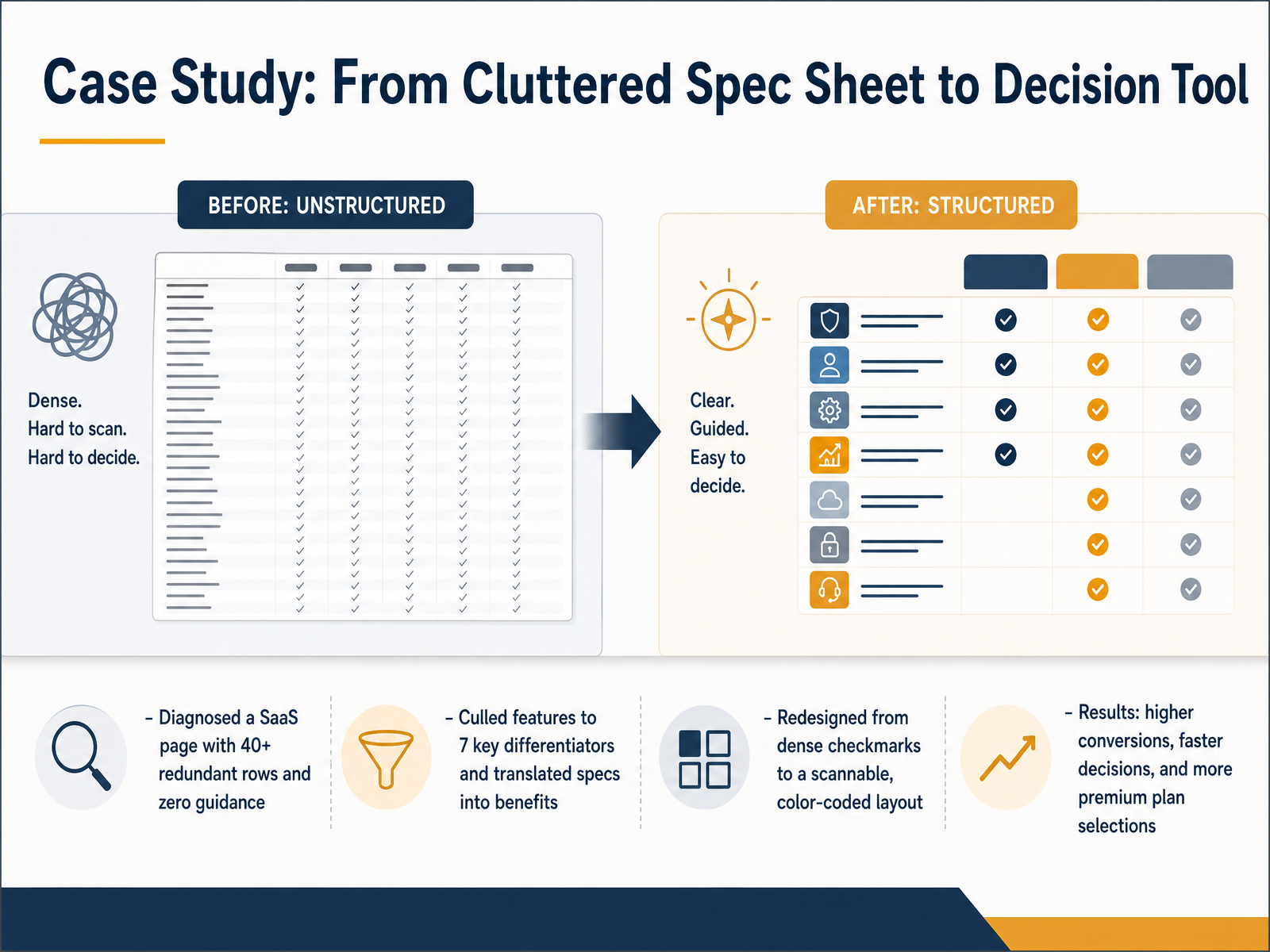
 - 14Case Study: From Cluttered Spec Sheet to Decision ToolNow let's look at a real-world example of what we've been discussing. A SaaS company came to us with a product comparison page that had over 40 feature rows and absolutely no guidance for the buyer. It was essentially a raw spec sheet. We diagnosed the core problem: too much noise, not enough signal. First, we culled the features down to just 7 key differentiators that actually mattered to customers. Then, we translated each technical specification into a clear customer benefit. Instead of listing RAM and storage, we described fast performance and plenty of project space. Finally, we redesigned the visual layout, moving away from a wall of dense checkmarks to a scannable, color-coded design. The results were immediate. The company saw higher overall conversions, much faster decision-making, and a significant shift toward premium plan selections. This case illustrates how a streamlined, benefit-focused comparison doesn't just inform users, it actively guides them toward the best choice for their needs. Next, we'll move into a practical workshop where you'll have the chance to redesign an overloaded comparison yourself.
 2 min
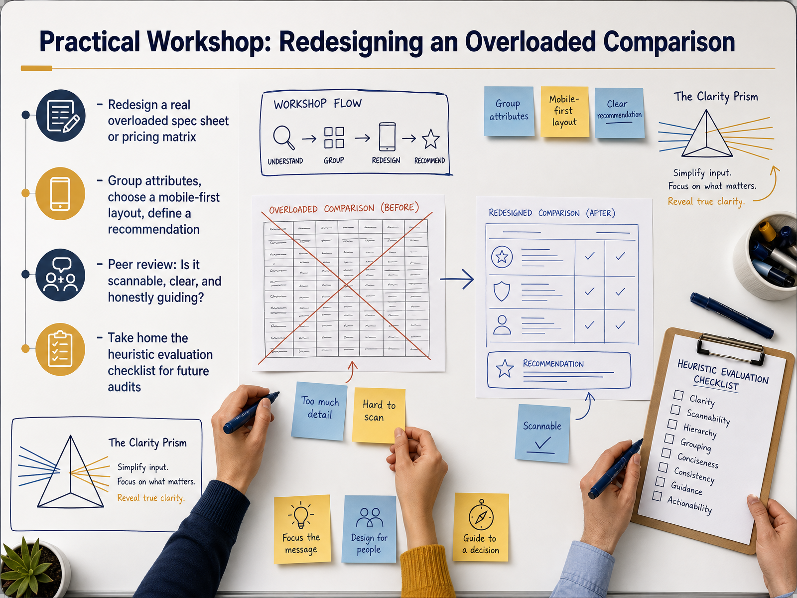
2 min - 15Practical Workshop: Redesigning an Overloaded ComparisonLet's put everything into practice. For our closing workshop, you'll take a real, overloaded specification sheet or pricing matrix and redesign it. Start by grouping related attributes together, then choose a mobile-first layout that lets the information breathe. Based on the data, define a clear recommendation for your user. After that, you'll participate in a peer review. Ask each other three simple questions: Is it scannable? Is it clear? And does it honestly guide someone toward a decision without hiding important trade-offs? Before you go, make sure to take home the heuristic evaluation checklist. It's your practical tool for auditing future comparison experiences with confidence. Thank you for your time and focus today. Trust your structure, and you'll help users decide with clarity.
 2 min
2 min
Take the deck with you
Download this course as a file — free, no sign-up needed.
- PDF handoutEvery slide page, ready to print or share.16 pages · 4.1 MBDownload
- Narrated PowerPointThe deck that presents itself — every slide carries the digital human's narration video.16 pages · 16.1 MBDownload
- PowerPoint slidesThe full deck as a .pptx — open it in PowerPoint, Keynote, or Google Slides.16 pages · 4.0 MBDownload
Free to use in your own training — please keep the PersonWise credit page at the end.
Have your own deck? Turn it into a course
Sources consulted
Web sources consulted while building this course.
- Comparison Table UX: Help Users Decide Faster | BestPage.ai — bestpage.ai
- 3 Rules for Better Comparison Tables (Video) - NN/G — nngroup.com
- Product Comparison Pages: 19 Experiments Reveal What Actually Converts | Atticus Li — atticusli.com
- Product Comparison UX: How to Design “Compare” Tables People Actually Use - Ecom Design Pro – Professional Ecommerce Design Services — ecomdesignpro.com
- Comparison Tool Design: Honest Comparison | RampStack — rampstack.co
- Regular Article The Evaluability Hypothesis: An Explanation for Preference Reversals between Joint and Separate Evaluations of Alternatives ☆ — sciencedirect.com
- An Explanation for Preference Reversals between Joint ... — pages.ucsd.edu
- The Evaluability Hypothesis: An Explanation for Preference ... — papers.ssrn.com
- Preference Reversals Between Joint and Separate ... — cmu.edu
- Beyond preference reversal: Distinguishing justifiability from evaluability in joint versus single evaluations — sciencedirect.com
- 6 Best Guided Selling Software for Ecommerce — zoovu.com
- Top Product Finder Tools: Guided Selling Software Compared — crobox.com
- 7 Best Guided Selling Solutions for Ecommerce in 2026 — hellorep.ai
- The 11 best guided selling software tools for e-commerce in 2026 | Aiden — aiden.cx
- Guided Selling Software in 2026: Best 7 Tools Compared — outfindo.com
- NASA Glenn Content Guide - Technical and interface writing — nasa.github.io
- ISO/IEC 23859:2023 - Information technology — User interfaces — Requirements and recommendations on making written text easy to read and understand — iso.org
- Metrolinx Requirements for Writing Technical Standards and Procurement Specifications — assets.metrolinx.com
- UX writing best practices — patternfly.org
- Plain Language Is for Everyone, Even Experts — nngroup.com