Distributions: Center, Spread, Outliers
Begin
12 pages · ~24 min
Distributions: Center, Spread, Outliers
This training helps learners explore key statistical concepts—center, spread, and outliers—to better understand data distributions.
What you’ll learn
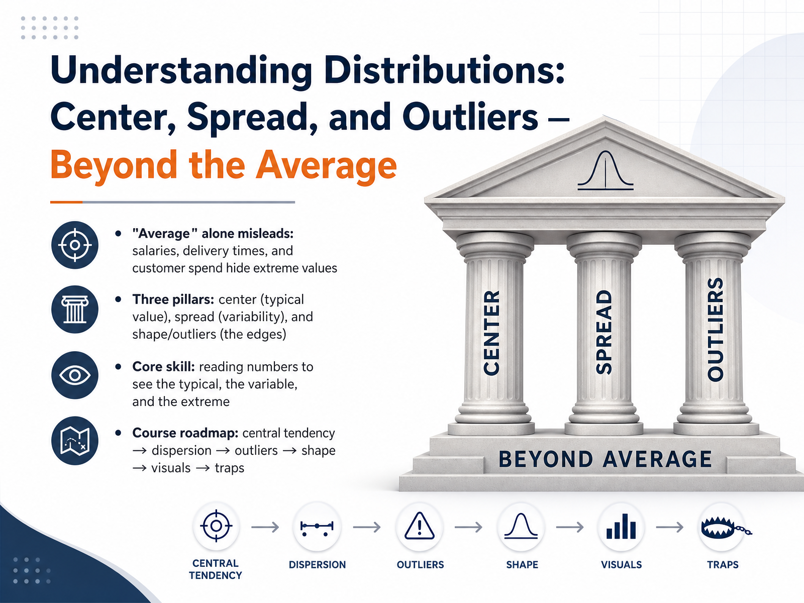
- 01Understanding Distributions: Center, Spread, and Outliers — Beyond the AverageWelcome to Understanding Distributions: Center, Spread, and Outliers. I'm glad you're here. Over the next few minutes, we're going to build a skill that separates surface-level number readers from people who truly understand what data is saying. You've probably seen a headline or a dashboard that leaned entirely on the word 'average.' And maybe something about it didn't feel right. That instinct is exactly what this course validates. Today, we move beyond the average. We'll break data into three pillars: center, the typical value; spread, the variability around it; and the shape and outliers that live at the edges. Our roadmap is clear. We start with central tendency, then move to dispersion, then tackle outliers and distribution shape, visual intuition, and finally, the traps that catch even experienced professionals. The core skill you'll leave with is this: reading a set of numbers and immediately seeing the typical, the variable, and the extreme, without being fooled by any single summary. Let's begin by confronting the number that misleads most often. Next up: Why the Mean Lies, where we'll see exactly when 'average' tells the wrong story.ssa.govdatafield.devstatisticsbyjim.com+22 min
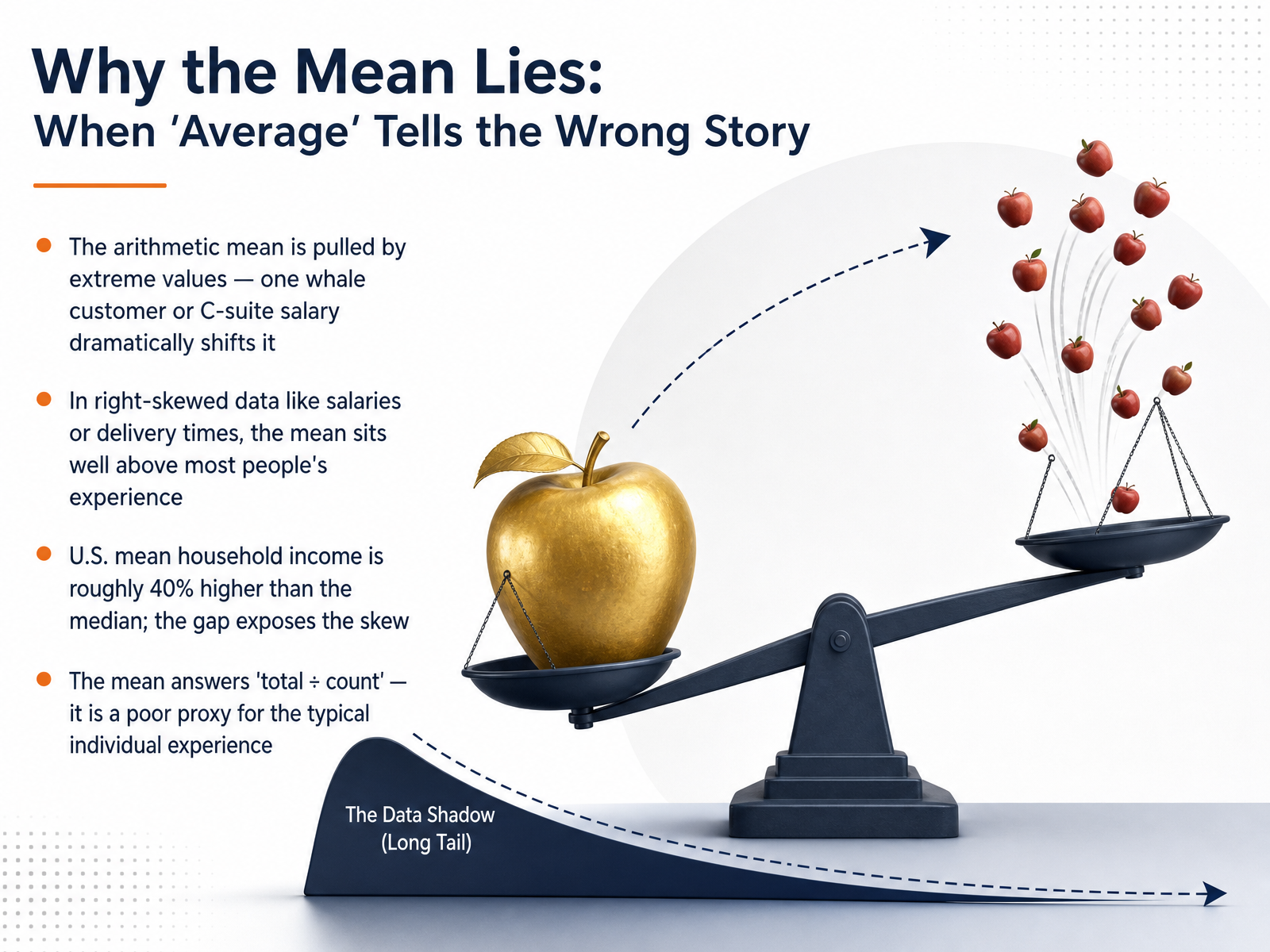
- 02Why the Mean Lies: When 'Average' Tells the Wrong StoryLet's get straight into a central idea that often catches professionals off guard: why the mean can lie to you. The arithmetic mean is pulled hard by extreme values. Think of one whale customer or a single C-suite salary in a company-wide payroll. That one number drags the entire average far to the right. In right-skewed data sets like salaries, housing prices, or delivery times, the mean ends up sitting well above most people's actual experience. For a concrete example, consider the U.S. mean household income. It's roughly forty percent higher than the median household income. That gap is not a rounding error. It's direct mathematical proof of a severely skewed distribution. The mean simply answers 'total dollars divided by headcount.' It is a fantastic tool for calculating a total budget, but a poor proxy for what a typical individual actually sees. A single executive salary averaging across hundreds of entry-level employees creates a number that feels high to everyone but is true for nobody. So, the rule is: when you hear an average, ask whether it's the mean, and whether that might be hiding a long tail. Coming up next, we'll formally compare three core measures: mean, median, and mode, to see exactly how to choose an honest summary.
 ssa.govdatafield.devstatisticsbyjim.com+22 min
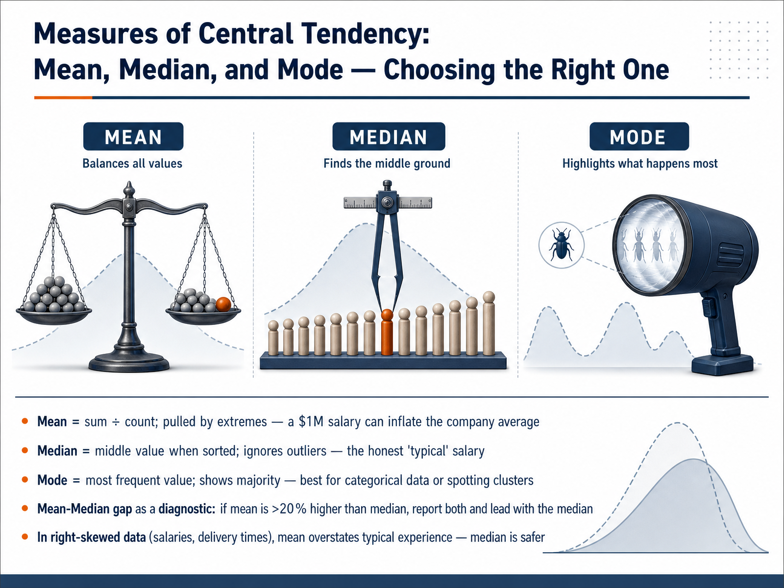
 - 03Measures of Central Tendency: Mean, Median, and Mode — Choosing the Right OneLet's get into the three main measures of center: the mean, the median, and the mode. The mean is the arithmetic average. It takes the sum of all values and divides by the count. But it's sensitive to extremes. A single one-million-dollar salary can inflate a company's average, making it look much richer than the typical employee actually experiences. The median is the middle value when the data is sorted. It ignores those extremes entirely and gives you the honest typical salary. The mode is the most frequent value. It's best for categorical data, or for spotting where the majority clusters. Now, here's a powerful diagnostic: you can use the gap between the mean and the median. If the mean is more than twenty percent higher than the median, report both, but lead with the median. In right-skewed data, like salaries or delivery times, the mean overstates the typical experience. The median is your safer, more honest choice. Next, we'll build on this by exploring spread, looking at range, IQR, variance, and standard deviation.
 ssa.govdatafield.devstatisticsbyjim.com+22 min
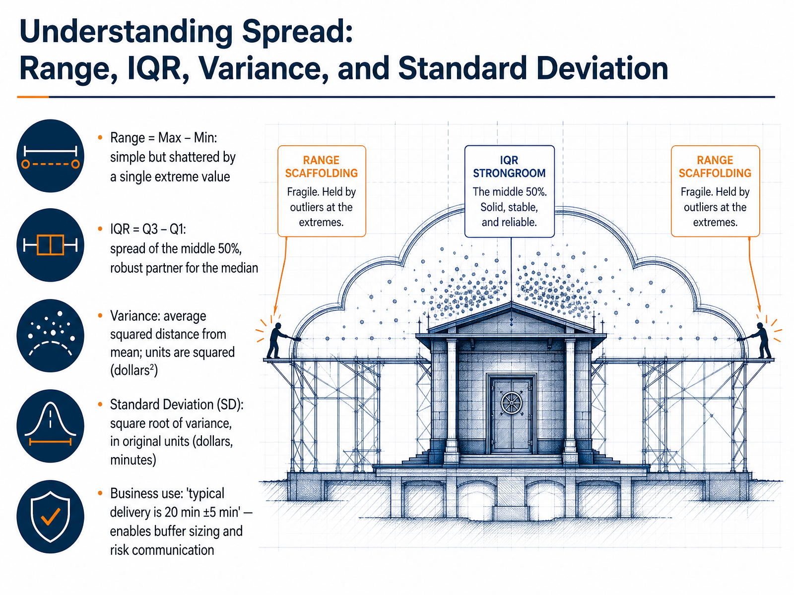
 - 04Understanding Spread: Range, IQR, Variance, and Standard DeviationNow, to really size up a distribution, we need to understand its spread. Let's break down four key measures. First, the Range. It's simply the Max minus the Min. Easy to calculate, but incredibly fragile. A single extreme value smashes the range, making it a risky standalone metric. Next is the Interquartile Range, or IQR. Think of Q3 minus Q1. It captures the spread of the middle fifty percent of your data. The IQR is robust, a perfect partner for the median, ignoring those tail extremes. Then we get to Variance. This is the mathematical foundation, measuring the average squared distance from the mean. But here's the catch: the units are squared. If your data is in dollars, variance is in dollars squared, which doesn't mean much in a business meeting. That's where Standard Deviation comes in. It's simply the square root of the variance, bringing the metric back into the original units, dollars or minutes. This lets you say something like, typical delivery is twenty minutes, plus or minus five. That single phrase lets you size buffers and communicate risk immediately. Building on that, next we'll explore the reporting rules: when do you pair the mean with the standard deviation, and when do you switch to the median and IQR?
 investopedia.comamericanexpress.comtempleton.host+22 min
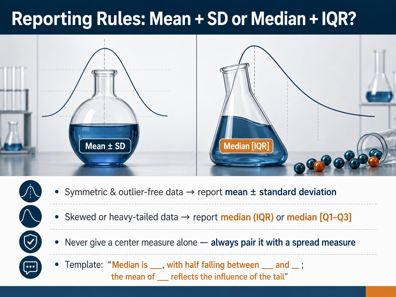
 - 05Reporting Rules: Mean + SD or Median + IQR?Now we get to the practical reporting rules. If your data is roughly symmetric and free of extreme outliers, you report the mean and the standard deviation together. That pair works because the mean is the balance point and the standard deviation tells you the typical distance from that balance point in the original units, like dollars or minutes. But if your data is skewed or has a heavy tail, the mean gets pulled, and the standard deviation inflates. In that case, switch to the median with the interquartile range. You can say the median is a certain value, with the middle half falling between Q one and Q three. This combination is robust because the median and quartiles resist the pull of extreme values. The key rule is this: never give a center measure alone. Always pair it with a spread measure, or you are hiding the story. Use a simple template: the median is blank, with half falling between blank and blank; the mean of blank reflects the influence of the tail. That one sentence keeps your audience from being misled by a single number. Let's carry this thinking into our next topic, detecting and interpreting outliers.
 investopedia.comamericanexpress.comtempleton.host+22 min
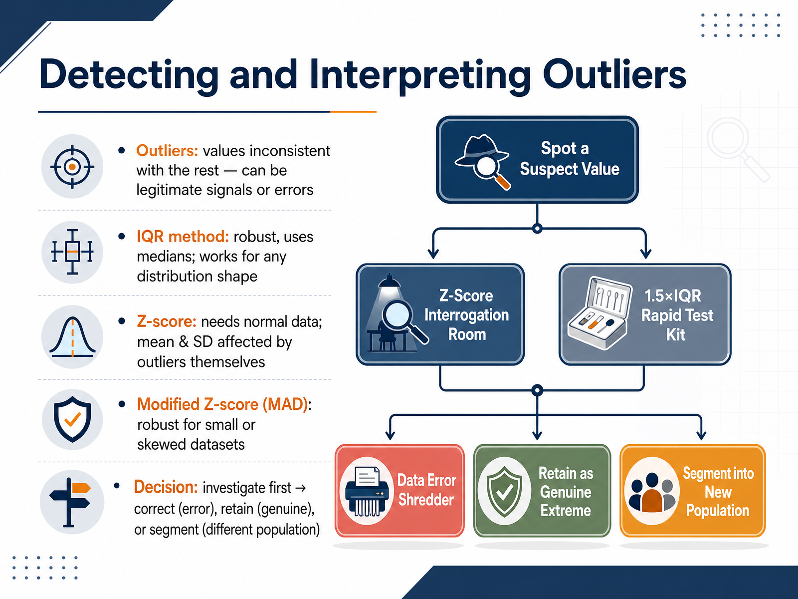
 - 06Detecting and Interpreting OutliersNow let's turn to detecting and interpreting those outliers. Outliers are values that are inconsistent with the rest of your data. But here is the critical distinction: they can be legitimate signals, or they can be errors. Your job is not to delete them blindly. Your job is to investigate. Let's look at three common detection methods and when to use them. The IQR method, or interquartile range method, is the workhorse. It uses the median and quartiles, which are robust. They are not affected by the outliers themselves, so the method works well for nearly any distribution shape, skewed or normal. The Z-score method uses the mean and standard deviation, but there is a catch. The mean and standard deviation are themselves distorted by outliers, which can mask the very points you are trying to find. Use the Z-score only when you are confident your data is approximately normal. A better alternative for small or skewed datasets is the modified Z-score. It swaps the mean and standard deviation for the median and the MAD, the median absolute deviation. This makes it robust and less fooled by extreme values. Regardless of the method you choose, the final step is always the same: decide. Investigate the outlier first. If it is a data entry error, correct it. If it is a genuine extreme event, like a viral sales spike, you should retain it and document it. And if it represents a different population entirely, you might need to segment your analysis. The point is that your decision must be driven by context, not by a formula.
 statsolvepro.complotnerd.comanalyticsvidhya.com+22 min
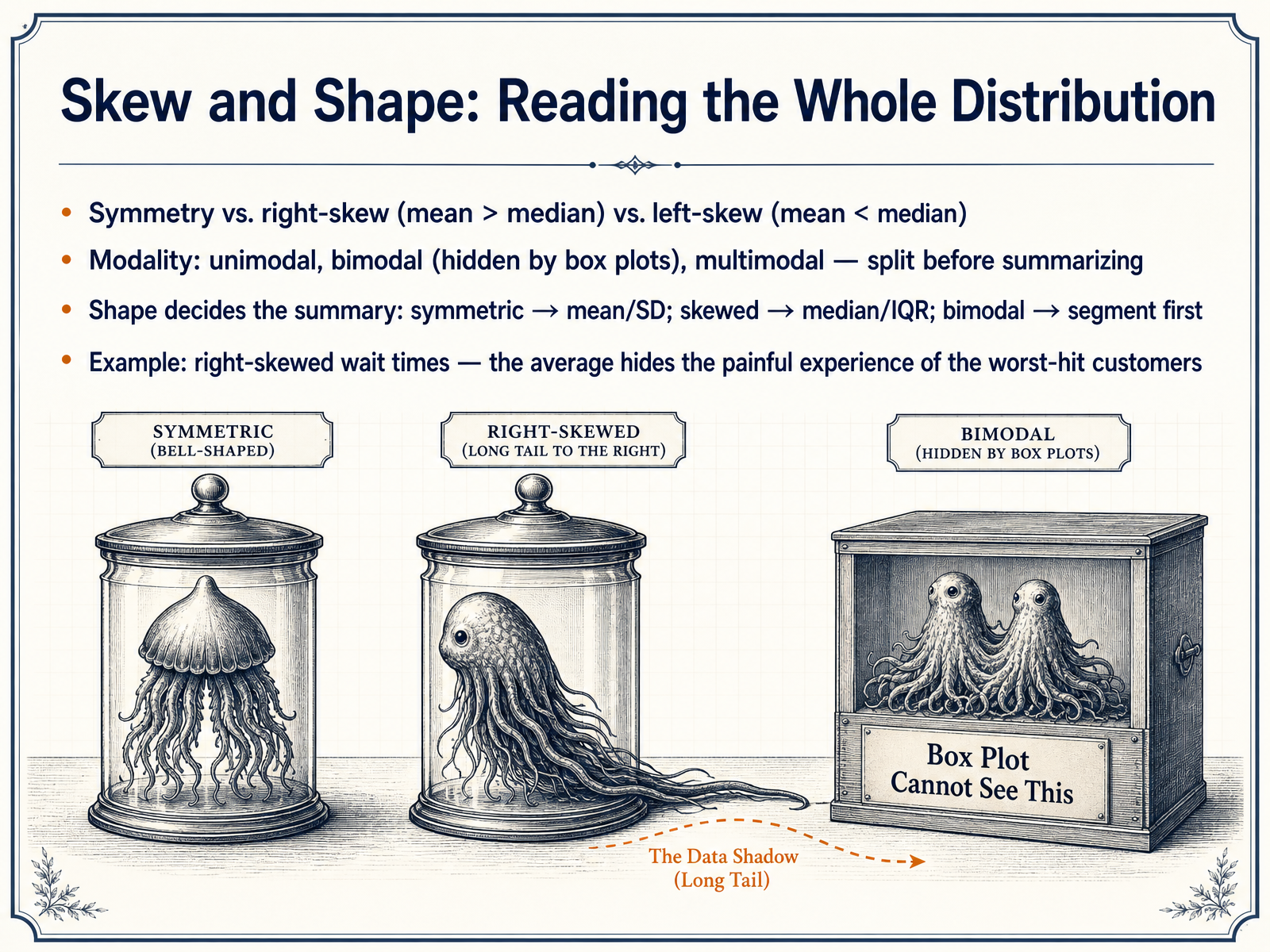
 - 07Skew and Shape: Reading the Whole DistributionNow that we can read the center and spread, let's look at how the entire distribution is shaped. Shape determines which summary numbers to trust. A symmetric distribution has its mean and median near each other. In a right-skewed distribution, the right tail stretches out and pulls the mean above the median. Service wait times are a classic case: a few painfully long waits inflate the average, making a typical customer's experience look better than it actually is. Researchers call this aversion to thick right tails. When you see that gap between the mean and the median, trust the median. Modality matters too. A unimodal distribution has one peak, and a bimodal has two. Box plots completely hide bimodality, so if your data mixes two subgroups, splitting before summarizing is non-negotiable. The practical rule is simple. If symmetric, use the mean and standard deviation. If skewed, use the median and IQR. And if you spot multiple peaks, segment your data first. One button-press summary on raw data can bury the real story. Next, we will explore visual tools for distribution literacy.
 doi.orgpapers.ssrn.comarxiv.org+22 min
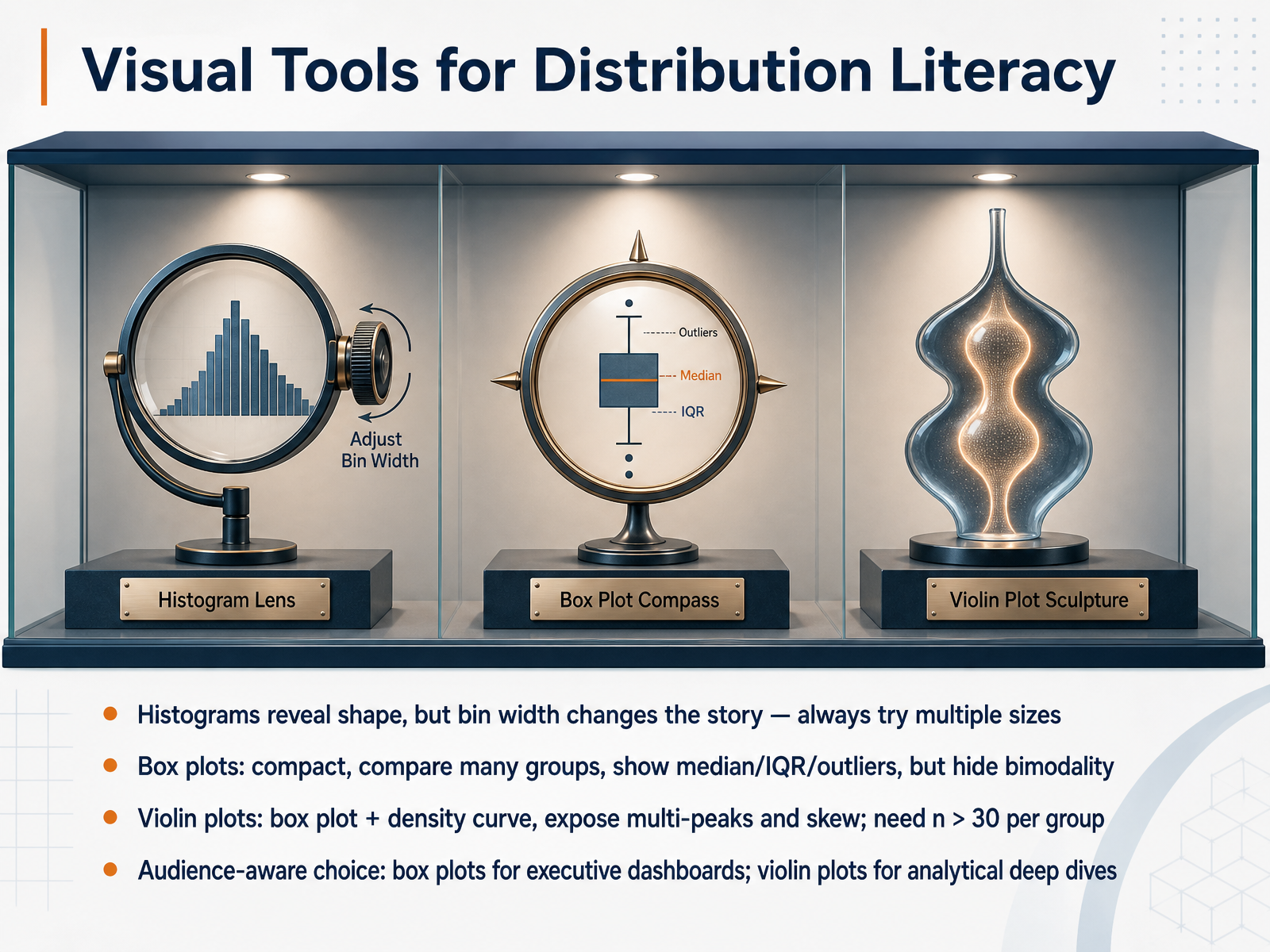
 - 08Visual Tools for Distribution LiteracyNow that we understand the measures, let's look at the visual tools that bring them to life. Histograms reveal shape, but the story changes dramatically with bin width, so always try multiple sizes before settling on a conclusion. Box plots are compact workhorses. They compare many groups side by side, clearly showing the median, IQR, and outliers as individual dots. Their weakness is that they completely hide multimodality. Two completely different distributions can produce identical box plots. Violin plots solve this by adding a mirrored density curve around the box. They expose multiple peaks and skew that box plots miss, but they need at least 30 data points per group for the density estimate to be reliable. The key is audience-aware choice. Use box plots for executive dashboards where quick, familiar comparisons matter. Reserve violin plots for analytical deep dives where distribution shape tells the real story. Let's continue to the common traps when interpreting summary statistics.
 ssa.govdatafield.devstatisticsbyjim.com+22 min
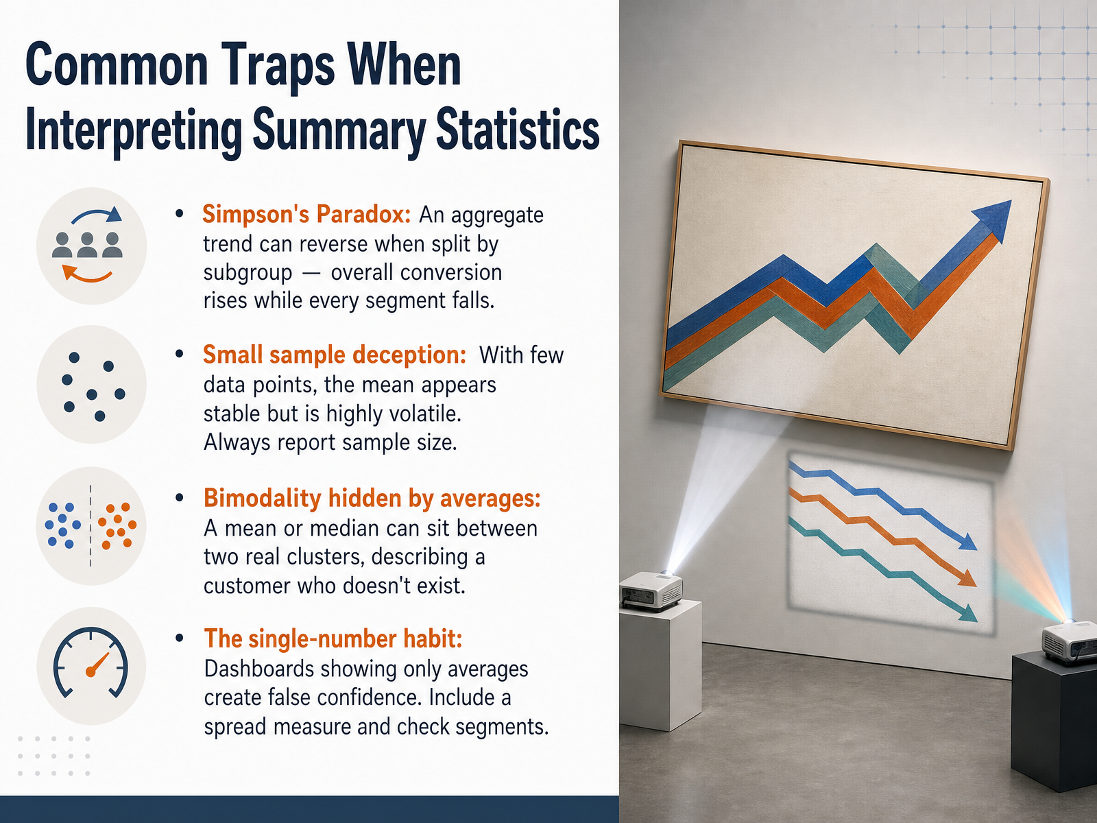
 - 09Common Traps When Interpreting Summary StatisticsNow let's look at the most common traps that even experienced analysts fall into when interpreting summary statistics. First, Simpson's Paradox. This is when an overall trend completely reverses when you split the data into subgroups. For example, your dashboard might show overall conversion rate rising by three percent, making you ready to ship a feature. But when you check by device type, you find it's actually worse on mobile and worse on desktop. The aggregate win came purely from a shift in traffic mix, not a real improvement. Every segment is down, yet the headline number points up. Second, small sample deception. With only a handful of data points, a mean looks stable but is extremely volatile. Always check the sample size before trusting any average. Third, bimodality hidden by averages. A mean or median can land right between two real customer clusters, describing a person who simply does not exist. Finally, the single-number habit. Dashboards that only show averages create false confidence. You must include a measure of spread and always check key segments before making decisions. When you hold yourself to that standard, you stop being fooled by your own data. Next, let's apply this distribution thinking to everyday business decisions.
 datafield.dev2 min
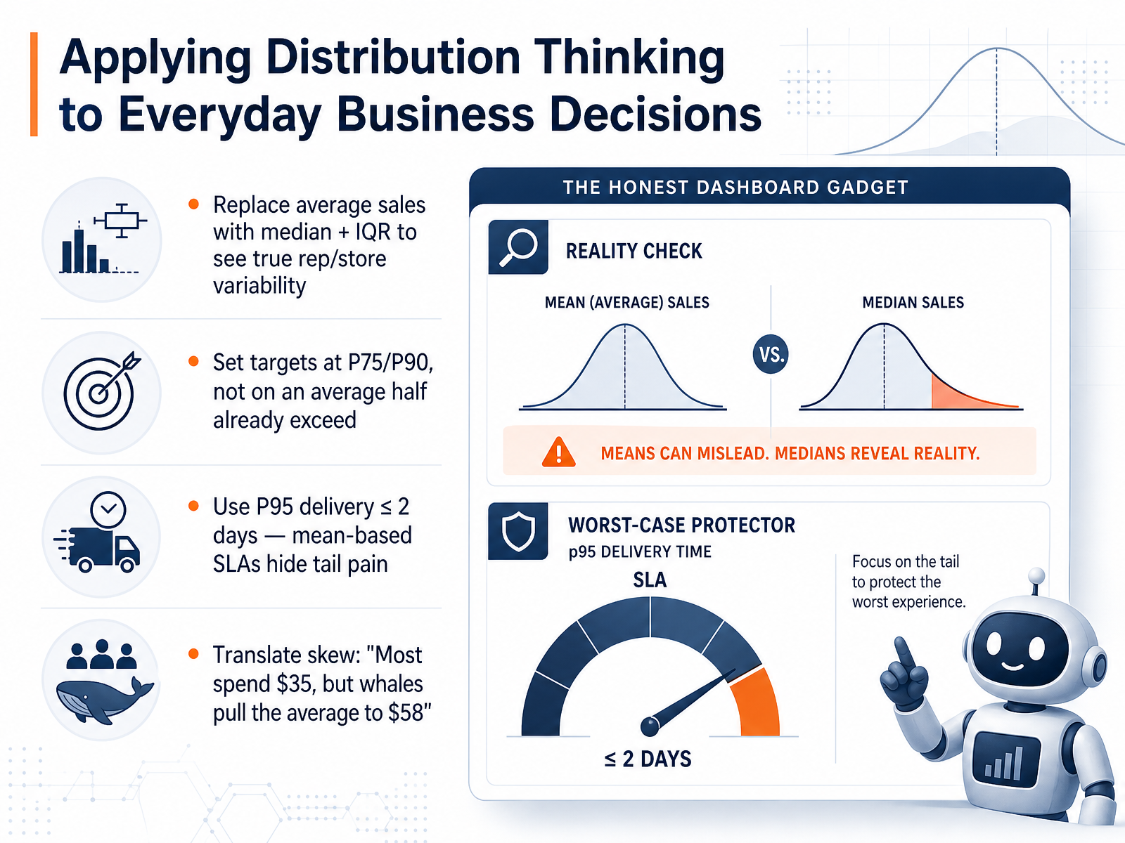
 - 10Applying Distribution Thinking to Everyday Business DecisionsNow let's make this practical. When you face a business decision, don't stop at the average. Let's walk through four shifts that change the story. First, for sales reporting, replace the average store sales with the median and the interquartile range. That immediately surfaces the true spread and flags which stores are struggling or overperforming. Second, set your targets at the 75th or 90th percentile. If you target the average, half your team already exceeds it, so there's no stretch. Third, in your service level agreements, prefer percentile-based targets. For example, require the 95th percentile delivery time to be two days or less. An average masks the tail, and your customers experience the tail. Fourth, translate the skew into business language. Instead of saying the average spend is fifty-eight dollars, say, 'Most customers spend thirty-five dollars, but a few large accounts pull the average up to fifty-eight.' You'll build a sharper plan by acting on the spread, the percentiles, and the tail.
 doi.orgpapers.ssrn.comarxiv.org+22 min
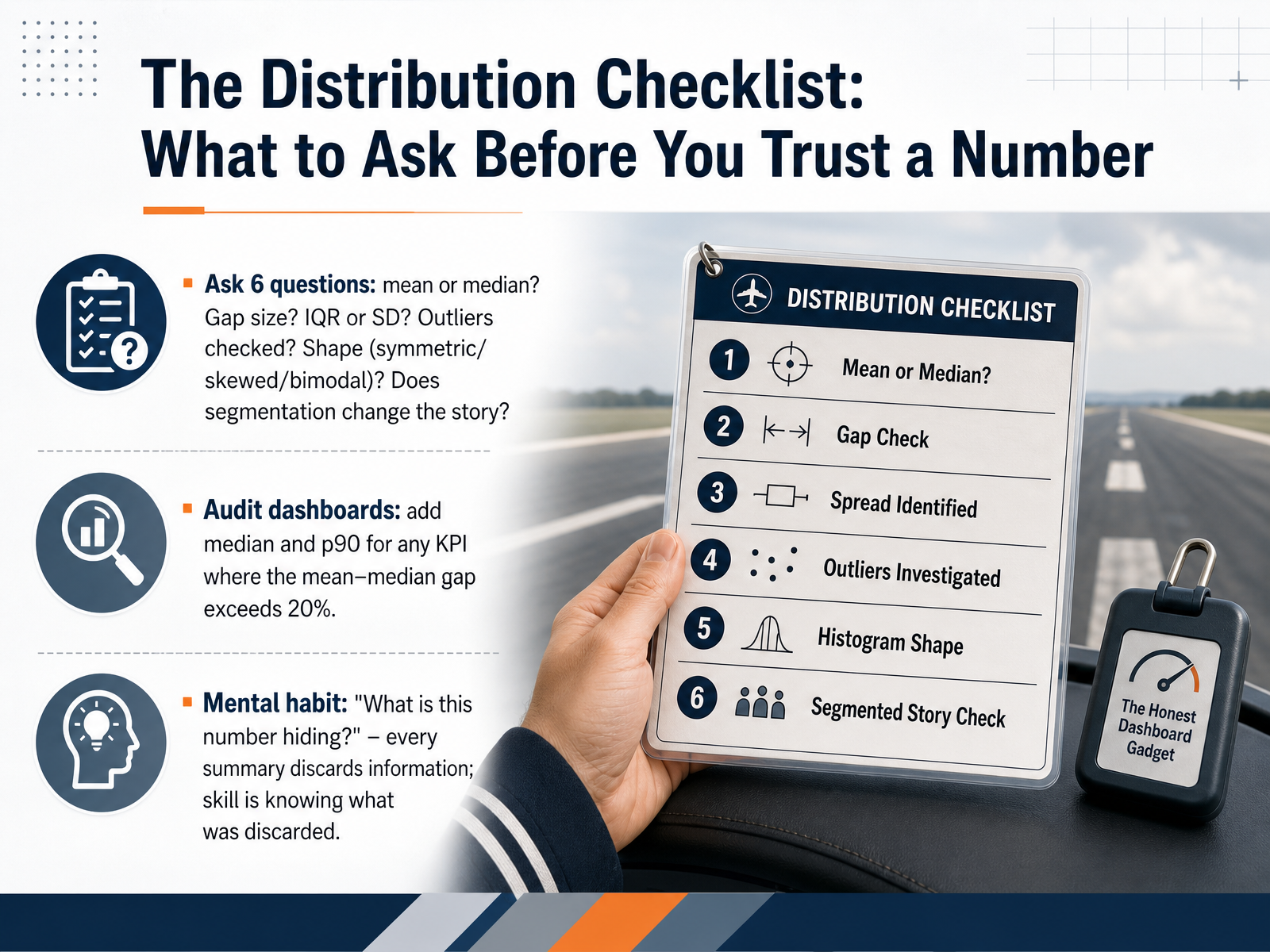
 - 11The Distribution Checklist: What to Ask Before You Trust a NumberLet's turn everything we've covered into a practical, repeatable checklist. Every time you look at a summary number, run it through these six questions. First, is it a mean or a median? Remember, a median often better represents the typical case. Second, how big is the gap between them? If the mean is far from the median, the data is skewed. Third, what's the spread? Ask for the IQR or the standard deviation to understand variability. Fourth, have outliers been checked and explained? A single large value can drag the mean into empty space. Fifth, what's the shape of the distribution? Is it symmetric, skewed, or maybe even bimodal? And sixth, does the story change when you segment the data? A rising average might hide falling performance in every single subgroup. Here's a concrete dashboard audit rule: for any KPI where the mean-median gap exceeds twenty percent, you should automatically add the median and the p90. And finally, build this mental habit: ask yourself, what is this number hiding? Every summary discards information. The skill is knowing what was discarded. Now, let's move from principles to practice with a case study and self-assessment.
 statsolvepro.complotnerd.comanalyticsvidhya.com+22 min
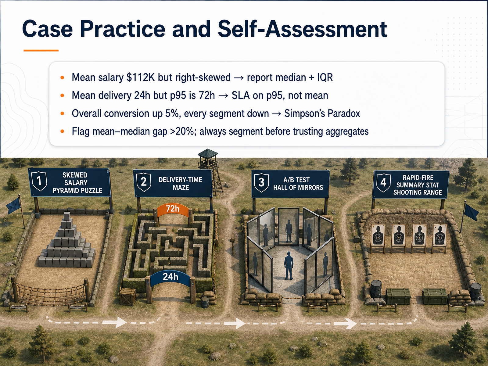
 - 12Case Practice and Self-AssessmentLet's put everything together with four real-world scenarios you can carry into your next business review. First, consider a mean salary of one hundred twelve thousand dollars that is heavily right-skewed. A few C-suite salaries pull that average far above what most employees earn. The honest summary reports the median and the interquartile range, not the mean alone. Second, imagine a delivery promise. Your mean delivery time is twenty-four hours, but the ninety-fifth percentile is seventy-two hours. Building your service-level agreement on the mean guarantees disappointment for nearly one in twenty customers. Design the SLA on the ninety-fifth percentile instead. Third, watch for the conversion trap. Overall conversion is up five percent, but every single segment is down. That is Simpson's Paradox in action. A mix shift toward higher-converting segments can completely reverse the real story. Always segment before you trust an aggregate. Finally, adopt a simple rule of thumb. Whenever the gap between the mean and the median exceeds twenty percent, flag it. That gap signals a skewed distribution where the mean is a misleading single-number summary. Thank you for investing this time in building your distribution-thinking skills. The next time a dashboard shows you a single average, you will know exactly which follow-up questions to ask. Trust the shape of the data, not just the center.
 datafield.dev2 min
Take the deck with you
Download this course as a file — free, no sign-up needed.
- PDF handoutEvery slide page, ready to print or share.13 pages · 3.8 MBDownload
- Narrated PowerPointThe deck that presents itself — every slide carries the digital human's narration video.13 pages · 14.7 MBDownload
- PowerPoint slidesThe full deck as a .pptx — open it in PowerPoint, Keynote, or Google Slides.13 pages · 3.7 MBDownload
Free to use in your own training — please keep the PersonWise credit page at the end.
Have your own deck? Turn it into a course
Sources consulted
Web sources consulted while building this course.
- Average wages, median wages, and wage dispersion — ssa.gov
- Case Study 1: What "Average" Salary Really Means — W... | Intro to Data Science | DataField.Dev — datafield.dev
- Mean vs. Median - Statistics By Jim — statisticsbyjim.com
- Usual Weekly Earnings of Wage and Salary Workers News Release - 2025 Q05 Results — bls.gov
- Chapter 6 — Case Study: Income Inequality — Why the Mean Lies | Introductory Statistics | DataField.Dev — datafield.dev
- Standard Deviation Formula and Uses, vs. Variance — investopedia.com
- Risk Management Experts Break Down Standard Deviation — americanexpress.com
- Standard Deviation | Business Finance | Andrew Templeton | Andrew Templeton — templeton.host
- 7.3: Interpreting Expected Return and Standard Deviation - Business LibreTexts — biz.libretexts.org
- Standard Deviation: Interpretations and Calculations — statisticsbyjim.com
- Outlier Detection Methods — IQR, Z-Score & When to Use — statsolvepro.com
- IQR vs Standard Deviation: Which Outlier Detection Method is Best? | PlotNerd — plotnerd.com
- Outliers Detection Using IQR, Z-score, LOF and DBSCAN - — analyticsvidhya.com
- How to Find Outliers Using IQR and Z-Score Methods | Math Calculator — mathcalculator.org
- Outlier Detection: IQR Method vs Z-Score vs Modified Z-Score (Complete Guide) - VrcAcademy — vrcacademy.com
- Chasing Tails: How Do People Respond to Wait Time Distributions? — doi.org
- How Do Customers Respond to Wait Time Distributions? — papers.ssrn.com
- Chasing Tails: How Do People Respond to Wait Time Distributions? — arxiv.org
- https://www.scielo.br/j/pope/a/TKdYRzzJDsrP5rV4RTKXGYz/?format=pdf&lang=en — scielo.br
- Beyond Averages: How Do Customers Respond to Wait Time Distributions? — doi.org