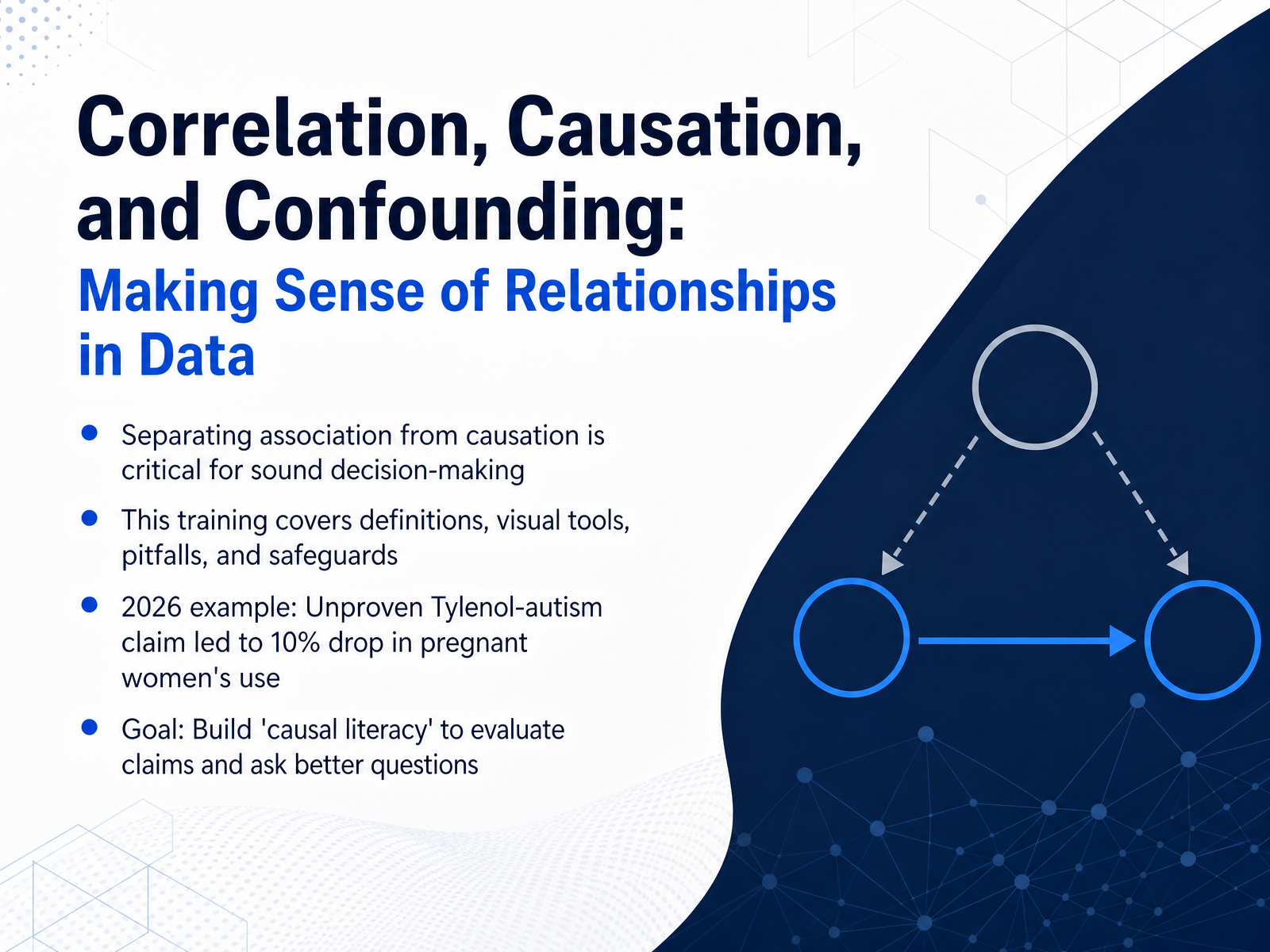
Correlation, Causation, Confounding
Begin
13 pages · ~26 min
Correlation, Causation, Confounding
Learn to distinguish correlation from causation and identify confounding variables in data analysis.
What you’ll learn
- 01Correlation, Causation, and Confounding: Making Sense of Relationships in DataWelcome. Today we are building a skill called causal literacy: the ability to separate genuine cause and effect from simple correlation. This is not just an academic exercise. When we confuse association with causation, real people can make decisions that carry real risk. Think of a claim that might sound familiar. In twenty twenty-five, a public figure stated that Tylenol use during pregnancy was linked to autism, even though the scientific consensus found no proven causal link. Within weeks, Tylenol orders for pregnant women in emergency departments dropped by about ten percent. The data showed a clear association between the announcement and changing behavior. But the underlying claim itself confused correlation with causation. That confusion had consequences that we will explore. Throughout this session, we will define key concepts, look at visual tools, identify common pitfalls, and practice safeguards. Our goal is simple: by the end, you will be better equipped to evaluate claims and ask sharper questions when you see a headline that says one thing is linked to another. Let us begin by examining the high cost of getting it wrong.apnews.comstatnews.comcidrap.umn.edu+22 min
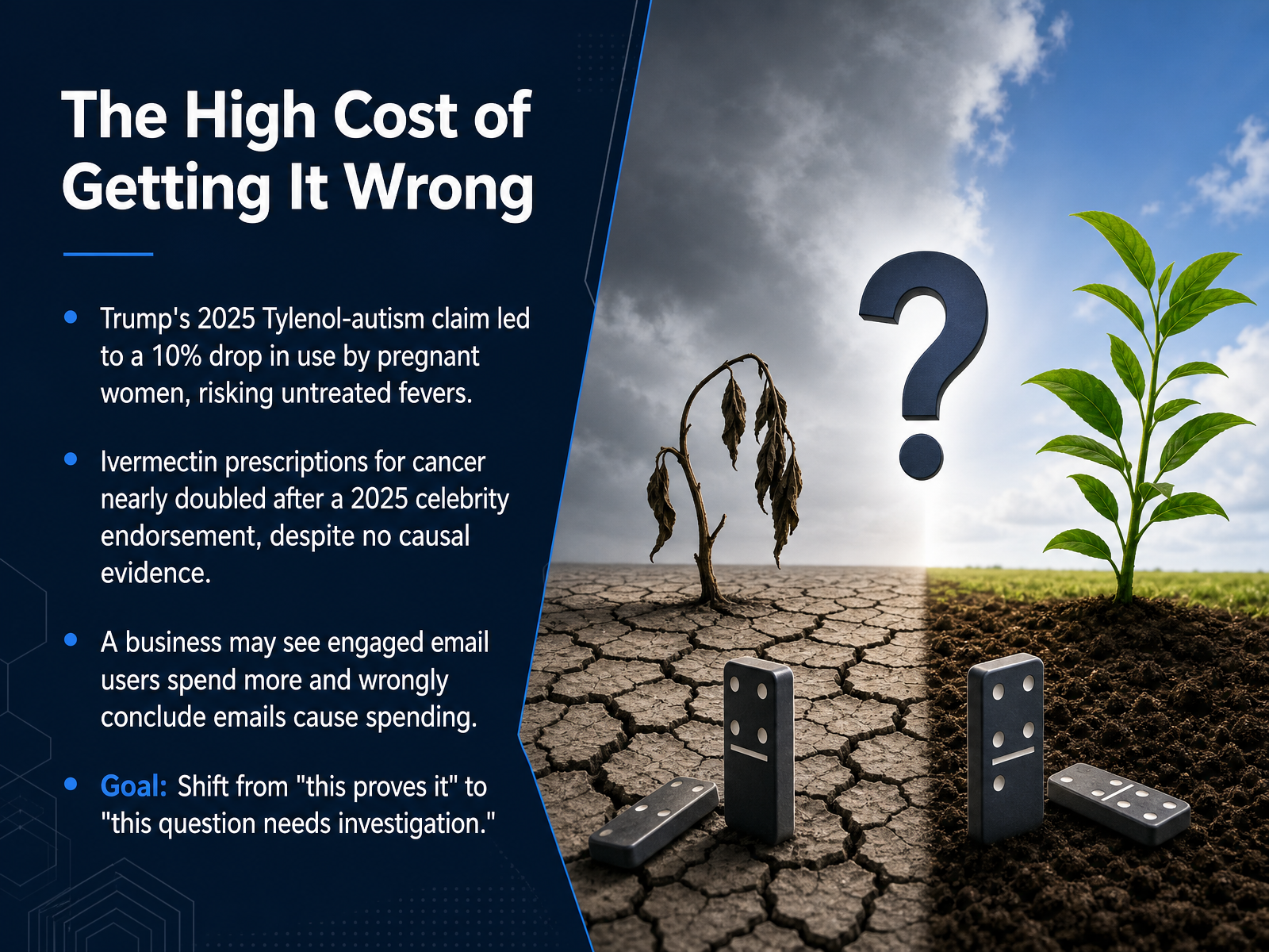
- 02The High Cost of Getting It WrongNow let's look at what happens when we ignore this distinction. The consequences are not just academic—they can be costly and dangerous. Think about a real event from twenty twenty-five. A public figure claimed Tylenol use during pregnancy is linked to autism, despite scientific consensus finding no proven link. After that claim, Tylenol orders for pregnant women in emergency rooms dropped by ten percent. That meant thousands of women went without safe fever and pain relief, risking untreated fevers that can actually harm a developing baby. The same dynamic appeared when a celebrity endorsed ivermectin as a cancer treatment on a major podcast. Prescriptions nearly doubled, especially among cancer patients, even though no causal evidence supports using these drugs for cancer. The real risk is patients delaying proven treatments. In business, you might see engaged email users spend more and wrongly conclude emails cause spending. But highly engaged customers are simply more likely to both open emails and spend more. Our goal is to shift from saying “this proves it” to asking “what further investigation does this question need?” Now let's explore what correlation actually measures.
 apnews.comstatnews.comcidrap.umn.edu+22 min
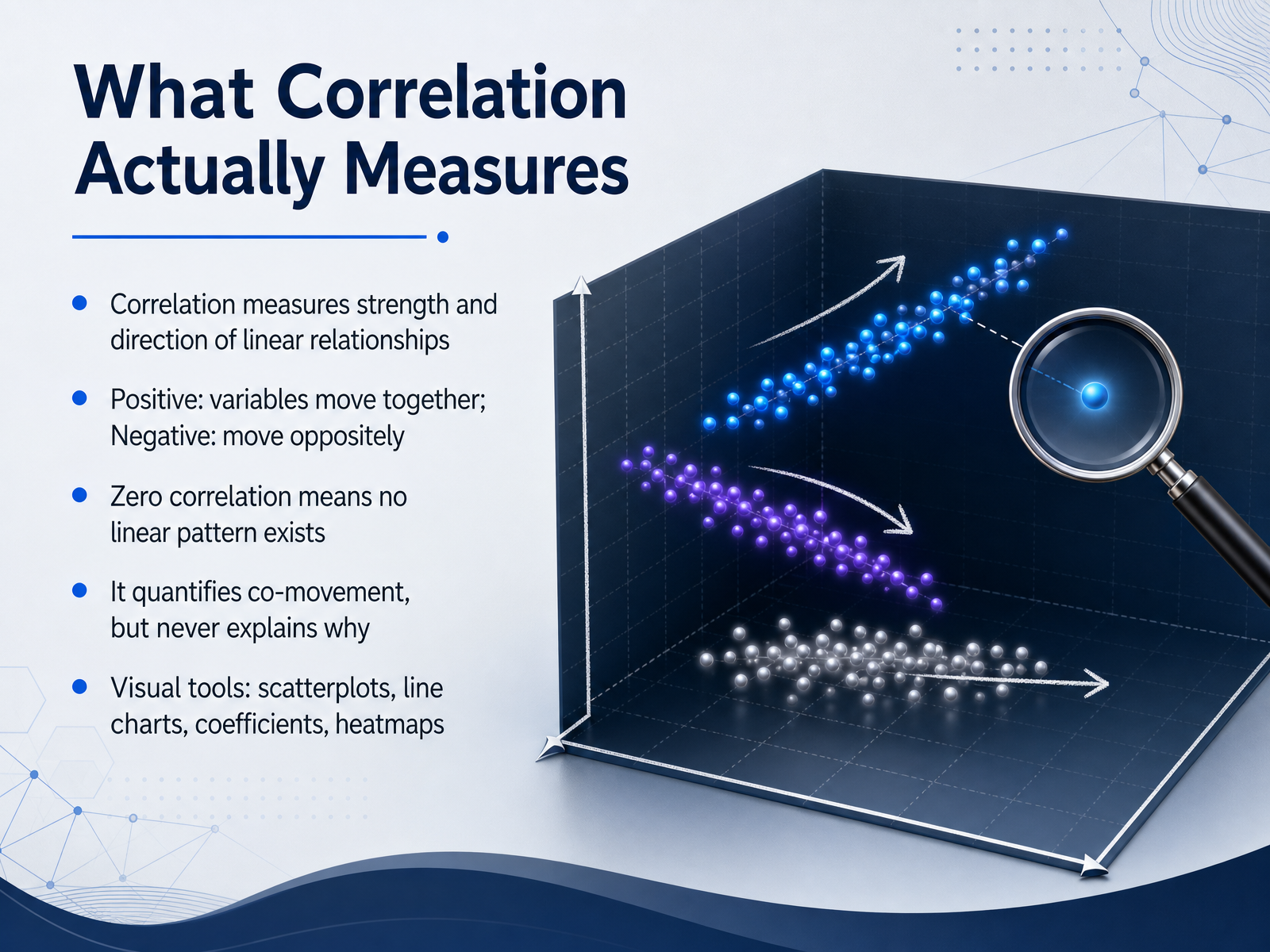
 - 03What Correlation Actually MeasuresLet's pull apart what a correlation actually measures. At its core, correlation captures two things about a linear relationship: the strength of the pattern and its direction. A positive correlation means the variables move together—as one goes up, the other tends to go up. A negative correlation means they move in opposite directions. And a zero correlation simply tells us there is no visible linear pattern in the data. But here comes the crucial guardrail: a correlation coefficient quantifies co-movement only. It is a purely descriptive number. It stays silent on the question of why. You might use a scatterplot to spot the trend visually, or a heatmap to compare many correlations at once, but none of these tools can tell you whether one variable causes another to change. That is a conclusion you bring from outside the numbers. So, when you see a clean scatterplot or a high coefficient, what you are really seeing is synchronized movement—nothing more, nothing less. Next, we are going to decode those correlation coefficients themselves, looking at what different values actually signal.
 2 min
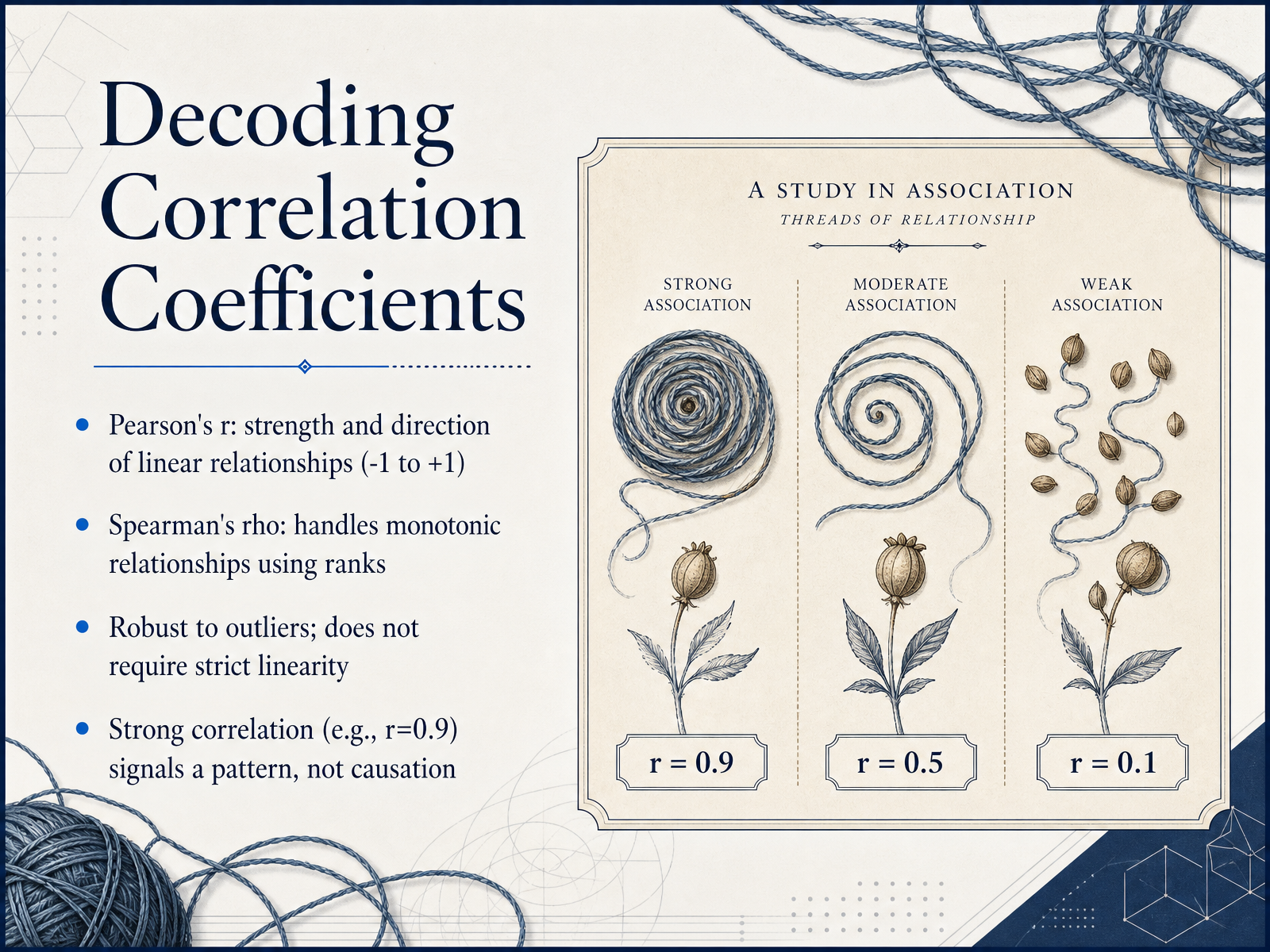
2 min - 04Decoding Correlation CoefficientsNow let's look at what those correlation values actually mean. When you see Pearson's r, you're measuring the strength and direction of a linear relationship. It always falls between negative one and positive one. A value near zero means there's no straight-line pattern, while values close to negative one or positive one signal a strong linear trend. But what if your data follows a curve? That's where Spearman's rho comes in. It works with ranks instead of raw values, so it captures monotonic relationships—patterns that consistently go up, or consistently go down, even if the line curves. Spearman's rho also handles outliers better, because extreme values get converted to their rank position. Here's the crucial guardrail: a strong correlation, like an r of 0.9, tells you there's a pattern worth investigating. It does not tell you that one variable causes the other. The number is just a description, not an explanation. Coming up next, we'll clarify what causation really means.
 2 min
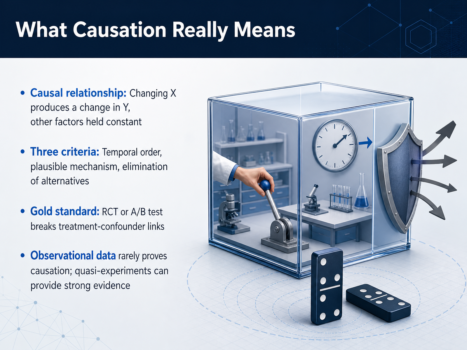
2 min - 05What Causation Really MeansLet's shift from talking about association to talking about true causation. What does it actually mean to say one thing causes another? In a causal relationship, changing the independent variable, X, must produce a change in the outcome, Y, while all other factors are held constant. That last part is the real challenge. To establish causality, our evidence needs to meet three key criteria. First, temporal order: the cause must happen before the effect. Second, a plausible mechanism: there needs to be a logical story connecting the two. And third, elimination of alternatives: we have to rule out other explanations. The gold standard for achieving this is a randomized controlled trial, or an A B test. Randomization breaks the link between the treatment and any confounders, letting us isolate the true effect. Now, observational data, like sales records, almost never proves causation by itself. However, when experiments aren't possible, well-designed quasi-experiments can provide very strong evidence. The secret is to use domain knowledge to draw a map of your assumptions, what we call a directed acyclic graph, or D A G, before you ever run an analysis. This brings us directly to the hidden third variable that can fool us. Let's talk about confounding.
 statstest.comxica.netmedium.com+22 min
 - 06The Hidden Third Variable: Understanding ConfoundingLet's pull back the curtain on one of the trickiest traps in data analysis—the hidden third variable, or confounder. It quietly influences both the cause and the effect, creating a relationship that looks real but is actually an illusion. Think about the classic example of ice cream sales and drownings. When ice cream sales go up, drownings also seem to rise. So, does buying ice cream cause drowning? Of course not. Here, the hot weather is the confounder. It drives people to buy ice cream and it drives them to go swimming, which sadly increases the risk of drowning. We see a similar dynamic in business. Imagine you find a strong link between an employee training program and higher team performance. It’s tempting to credit the training alone, but leadership quality could be the confounder. Effective leaders may be more likely to invest in training and they also directly boost team performance through better management. If you ignore that, you’ll overestimate the training’s true impact. Finally, a critical rule to remember: never control for a collider. This is a special type of variable caused by two other variables you're studying. Adjusting for a collider doesn't remove bias—it actively opens up a false, non-causal link. Always ask yourself if an unseen factor might be pulling the strings on both sides of the relationship you're examining. Now, let's see how these hidden variables play out in real-world scenarios, from health research to HR analytics.
 arxiv.orgdoi.orghelpfulprofessor.com+22 min
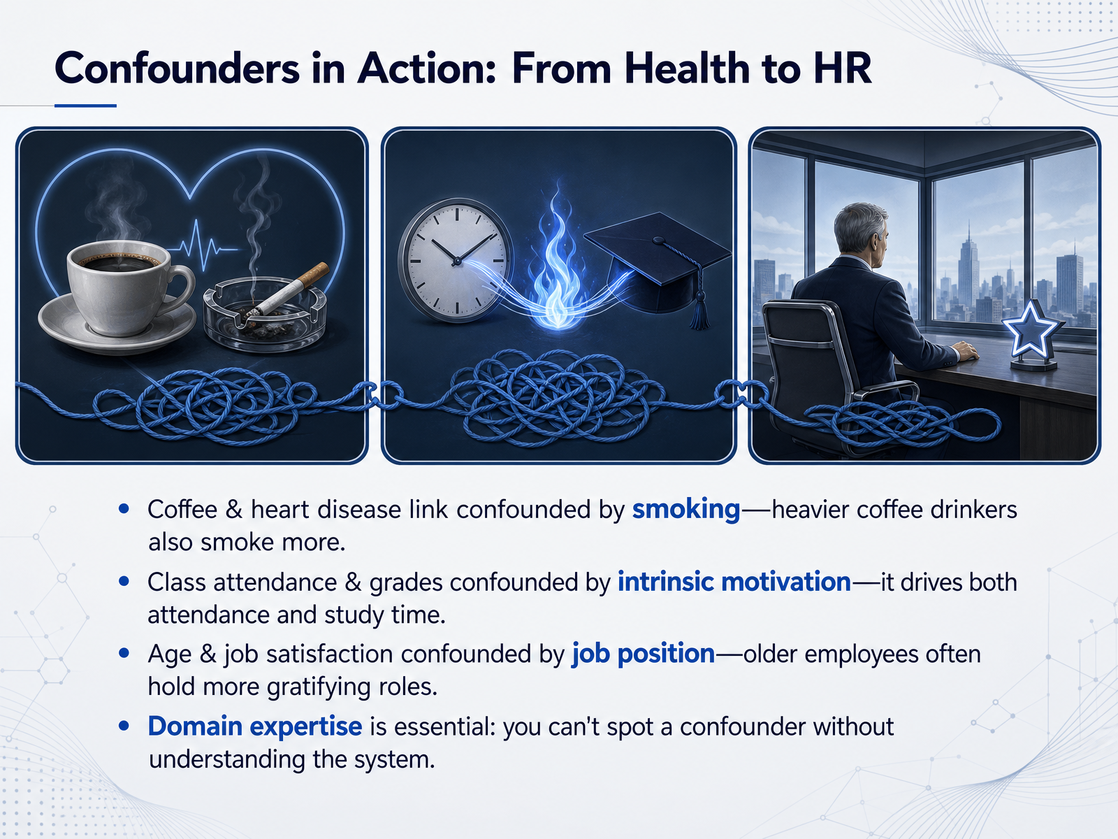
 - 07Confounders in Action: From Health to HRWe have looked at the logic of confounders. Now let's put it into action with a few real-world examples from health and human resources. Consider the link between coffee drinking and heart disease. Studies often find a correlation, but heavy coffee drinkers also tend to smoke more frequently. Here, smoking is the confounder—it drives both coffee consumption and heart disease risk independently. If you ignore it, you might wrongly blame your morning espresso. Next, think about class attendance and grades. It is tempting to say showing up causes higher performance. But intrinsic motivation is a powerful confounder; highly motivated students show up to class and they also study harder outside of class, which directly improves their grades. In the workplace, you might notice that age correlates with job satisfaction. Before concluding that getting older makes you happier at work, consider job position. Older employees often hold more senior, gratifying roles, and that job position is likely the real driver of satisfaction. These examples show a critical truth: you cannot spot a hidden confounder without deep domain expertise. You have to understand the system to ask 'what else is going on here?' Coming up next, we will explore a statistical illusion that makes confounding even more surprising, known as Simpson's Paradox.
 arxiv.orgdoi.orghelpfulprofessor.com+22 min
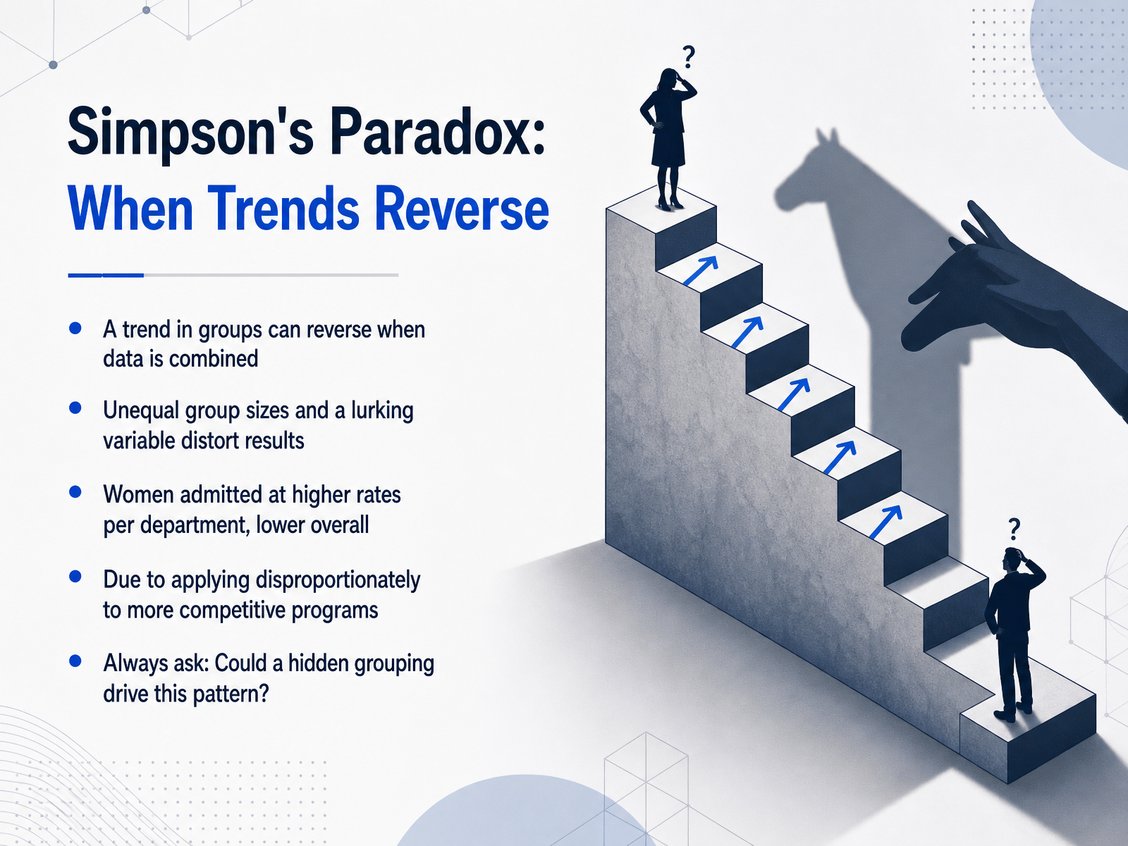
 - 08Simpson's Paradox: When Trends ReverseNow we come to one of the most counterintuitive traps in data analysis: Simpson's Paradox. Imagine you're evaluating university admissions. You look at the numbers and notice that overall, men are admitted at a higher rate than women. Open-and-shut case, right? But then you break the data down by department. And suddenly, in nearly every single department, women are actually admitted at a higher rate than men. How can a trend completely reverse when you combine the groups? The culprit here is a lurking variable -- in this case, the selectivity of each department. The women in this data set applied disproportionately to more competitive programs with lower admission rates. At the same time, men applied in larger numbers to departments with higher admission rates. And these unequal group sizes create a distorted overall picture. So, the very step that feels rigorous -- looking at the big, aggregate number -- actually leads you to a faulty conclusion. This is why you must always ask: could a hidden grouping drive this pattern? Next, we'll turn this mindset into action with a practical checklist for spotting non-causal patterns.
 2 min
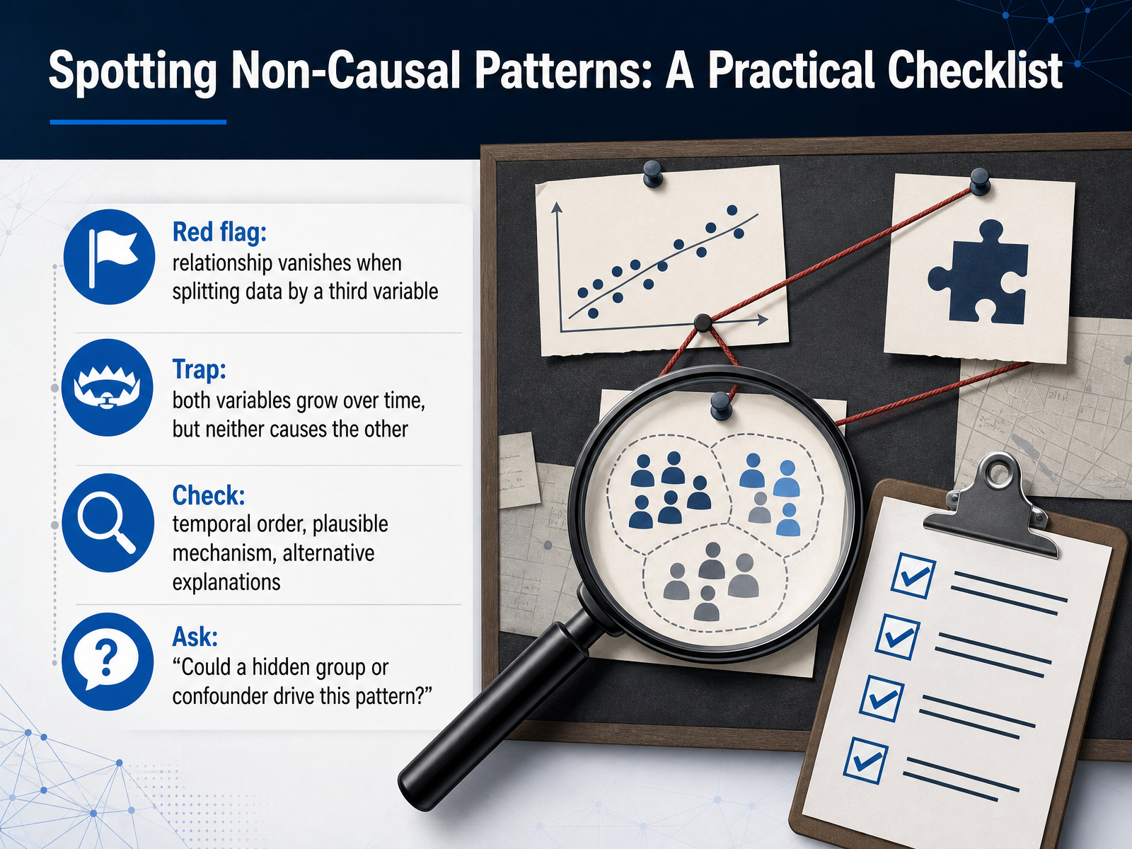
2 min - 09Spotting Non-Causal Patterns: A Practical ChecklistLet's walk through a practical checklist for spotting a non-causal pattern. When you see a relationship that seems strong, your first red flag is this: if the pattern disappears when you split the data by a third variable, you are likely looking at a confounded association. The variable you split on is the hidden driver. A common trap is when both variables simply grow over time, like your ad spend and a competitor's sales. Neither causes the other; they are both pulled along by a broader market trend. Always pause and run three checks. Did the cause happen before the effect? Is there a plausible mechanism, a real story, connecting them? And have you accounted for alternative explanations? The most important question to ask yourself is: could a hidden group or a single confounder be driving this entire pattern? Asking this turns a casual observation into a careful analysis. Now, once you suspect a confounder, you need a way to organize all these variables. That brings us to our next topic: mapping causal assumptions with DAGs.
 statstest.comxica.netmedium.com+22 min
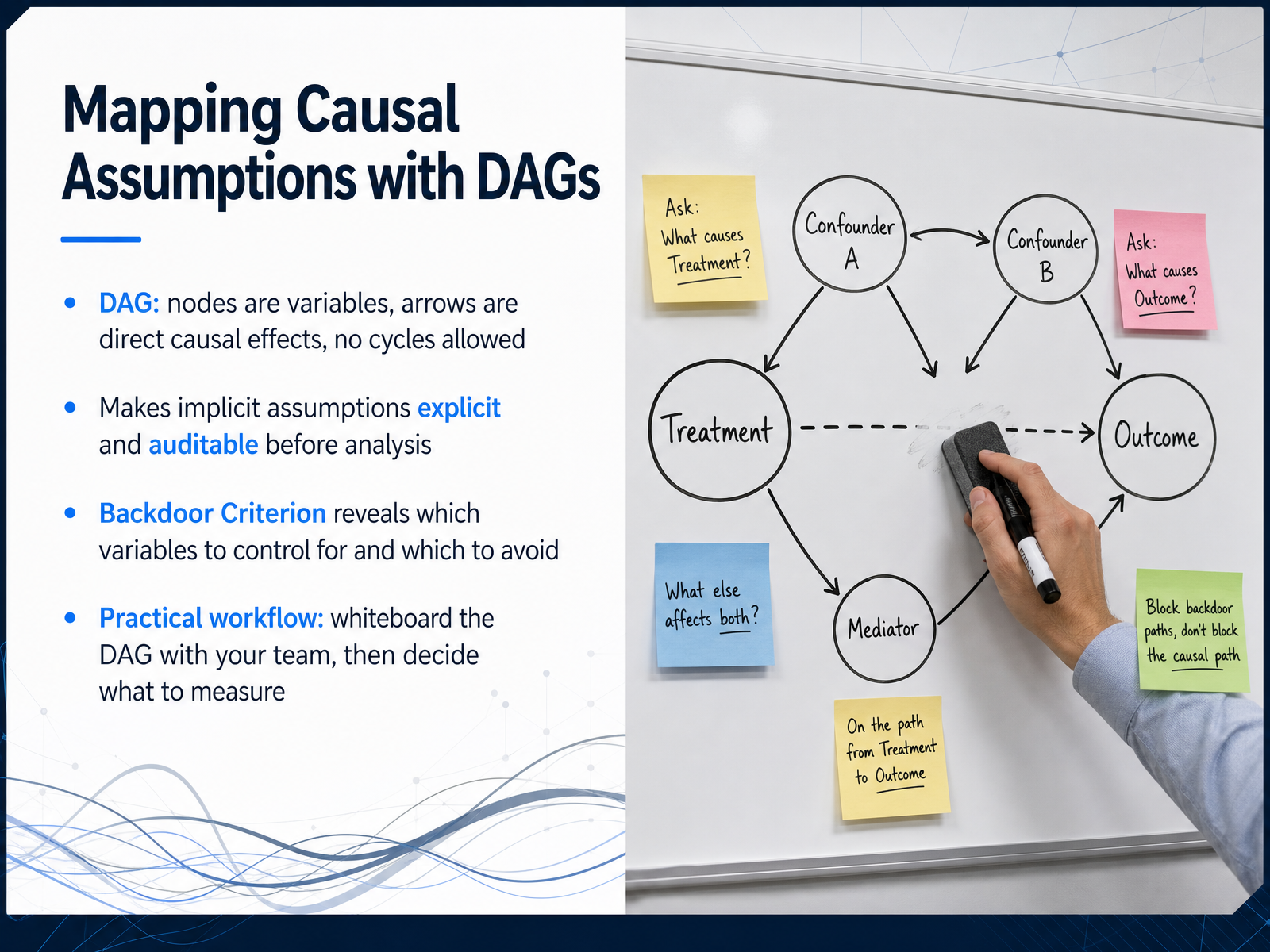
 - 10Mapping Causal Assumptions with DAGsNow let's make our causal assumptions visible. A directed acyclic graph, or DAG, is like a map where circles represent variables and arrows represent direct causal effects. The rule is simple: no cycles are allowed. This forces us to commit to a causal story before we look at the data. The real power comes from the backdoor criterion. It tells you exactly which variables to control for to isolate an effect, and just as importantly, which ones you must leave alone to avoid collider bias. Here is a practical workflow. Get your team around a whiteboard. Sketch the treatment, the outcome, and all plausible confounders, even the ones you cannot measure. That drawing makes your reasoning auditable. Only after you agree on the DAG should you decide what data to collect and what to adjust for. Let's turn this into action next with practical strategies to avoid the correlation trap.
 statstest.comxica.netmedium.com+22 min
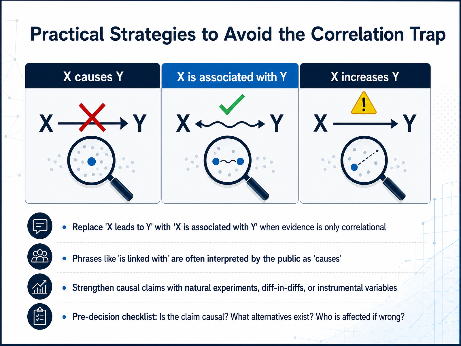
 - 11Practical Strategies to Avoid the Correlation TrapSo how do we protect ourselves from these mistakes? Let's look at some practical strategies you can use right away. First, language matters more than you might think. When the evidence is only correlational, replace 'X leads to Y' with 'X is associated with Y.' A study found that phrases like 'is linked with' are often interpreted by the public as meaning 'causes.' So be precise in your own reporting and be skeptical when you read headlines. Second, to strengthen a causal claim, you need stronger methods. Look for natural experiments, difference-in-differences analysis, or instrumental variables, which is a technique that uses a third factor to isolate causality. Before you finalize any conclusion, run a quick pre-decision checklist. Ask yourself three questions. Is the claim actually causal? What alternative explanations could exist? And who is affected if this claim turns out to be wrong? Asking these questions can stop an assumption from becoming a costly decision. Now let's take this framework and look at applying it directly in your work.
 apnews.comstatnews.comcidrap.umn.edu+22 min
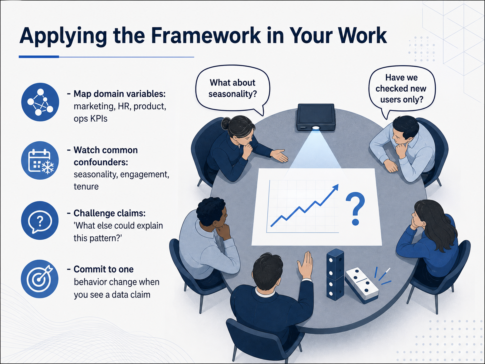
 - 12Applying the Framework in Your WorkLet's take this framework and apply it directly to your work, whatever your domain. Start by mapping out the key variables in your world. In marketing, you might track ad spend, impressions, and sales. In HR, think about training hours, engagement scores, and retention. For product teams, it could be feature usage, NPS, and churn. The principle is the same: draw the picture before you trust the numbers. As you do, watch for the usual suspects—common confounders that create false patterns. Seasonality is a classic. Sales and marketing spend often rise together during the holidays, but the season drives both. Customer engagement and tenure can also distort relationships; long-tenured users are both more engaged and more likely to renew, which can make engagement look like the sole cause. When you hear a claim, ask the one question that saves you from overreaching: 'What else could explain this pattern?' If you can think of a confounder that hasn't been ruled out, you're not ready to call it causal. Now, here's my challenge to you: commit to one behavior change the next time you see a data claim. Maybe you will sketch a quick DAG before running a regression. Or perhaps you will simply ask about confounders in a meeting. Small habits built here prevent big mistakes out there. Next, we'll lock this in with a summary of key takeaways and some resources for extended learning.
 statstest.comxica.netmedium.com+22 min
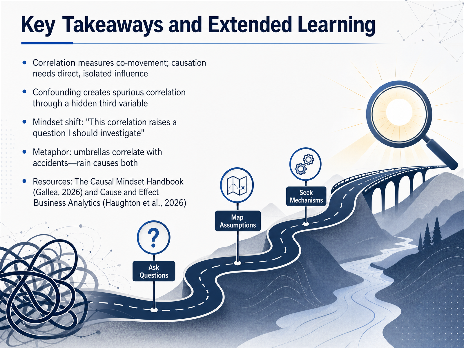
 - 13Key Takeaways and Extended LearningWe have covered a lot of ground, so let’s lock in the essentials. First, correlation measures how two things move together, but causation requires us to isolate a direct influence, not just observe co-movement. Second, confounding is the hidden third variable that creates a spurious correlation. Think of our umbrella example: umbrella sales correlate with traffic accidents, but rain is the confounder driving both. So what is the mindset shift? When you see a correlation, train yourself to say, this raises a question I should investigate, rather than jumping to a cause-and-effect conclusion. If you want to go deeper, two excellent resources are The Causal Mindset Handbook by Quentin Gallea, published in 2026, and Cause and Effect Business Analytics by Haughton, Haughton, and Lo, also 2026. Both will equip you with practical tools to separate signal from noise. Thank you for joining this session. Trust the data, but always question the link. Keep practicing that analytical caution, and you will make much stronger, evidence-based decisions.
 routledge.compenguinrandomhouse.comuk.sagepub.com+22 min
Take the deck with you
Download this course as a file — free, no sign-up needed.
- PDF handoutEvery slide page, ready to print or share.14 pages · 3.8 MBDownload
- Narrated PowerPointThe deck that presents itself — every slide carries the digital human's narration video.14 pages · 15.0 MBDownload
- PowerPoint slidesThe full deck as a .pptx — open it in PowerPoint, Keynote, or Google Slides.14 pages · 3.8 MBDownload
Free to use in your own training — please keep the PersonWise credit page at the end.
Have your own deck? Turn it into a course
Sources consulted
Web sources consulted while building this course.
- Tylenol use drops among some pregnant women after Trump's unproven autism claim | AP News — apnews.com
- Tylenol orders for pregnant people dropped after Trump linked the drug to autism | STAT — statnews.com
- Tylenol use in pregnant women visiting ED dropped after Trump’s unfounded autism claim | CIDRAP — cidrap.umn.edu
- Tylenol use by pregnant women in ERs dropped after Trump autism warning : NPR — npr.org
- Trump Kennedy influence alters Tylenol and leucovorin prescriptions — bostonglobe.com
- DAGs for Analysts: Drawing Your Assumptions Before You Analyze | StatsTest Blog — statstest.com
- Understanding the causal structure of marketing strategies using DAG (Directed Acyclic Graph) — xica.net
- Causal Inference in Decision Intelligence — Part 4: Directed Acyclic Graph | by Eugene Zinoviev | Medium — medium.com
- Causal Inference in Decision Intelligence — Part 5: The Business Case and Running Example | by Eugene Zinoviev | Medium — medium.com
- Drawing the Map: DAGs and the Backdoor Criterion (Part 2) | by Brian James Curry | Medium — medium.com
- The Effects of Flipped Classrooms in Higher Education: A Causal Machine Learning AnalysisFunded by the German Federal Ministry of Education and Research. Grant reference: 16DHL1037. The grant provider was not involved in the design, creation, analysis, evaluation, or submission of this work in any w — arxiv.org
- Competing hypotheses about online versus face-to-face course outcomes: Analysis leveraging the unique circumstances of the COVID-19 pandemic — doi.org
- 25 Confounding Variable Examples (2026) — helpfulprofessor.com
- Confounding Variables: Identification, Definition, Types ... — editage.com
- Solved: Correlation does not imply causation - case in point: though highly correlated, student de [Statistics] — gauthmath.com
- Cause and Effect Business Analytics and Data Science - 1st Edition - D — routledge.com
- Impact Evaluation in Firms and Organizations by Martin Huber: 9780262552929 | PenguinRandomHouse.com: Books — penguinrandomhouse.com
- The Data Analyst’s Guide to Cause and Effect | SAGE Publications Ltd — uk.sagepub.com
- https://thecausalmindset.com/book — thecausalmindset.com
- The Causal Mindset Handbook [Book] — oreilly.com