Video Player Controls Design
Begin
16 pages · ~32 min
Video Player Controls Design
Learn to design intuitive and accessible video player controls, focusing on user interaction patterns and touch-friendly interface elements.
What you’ll learn
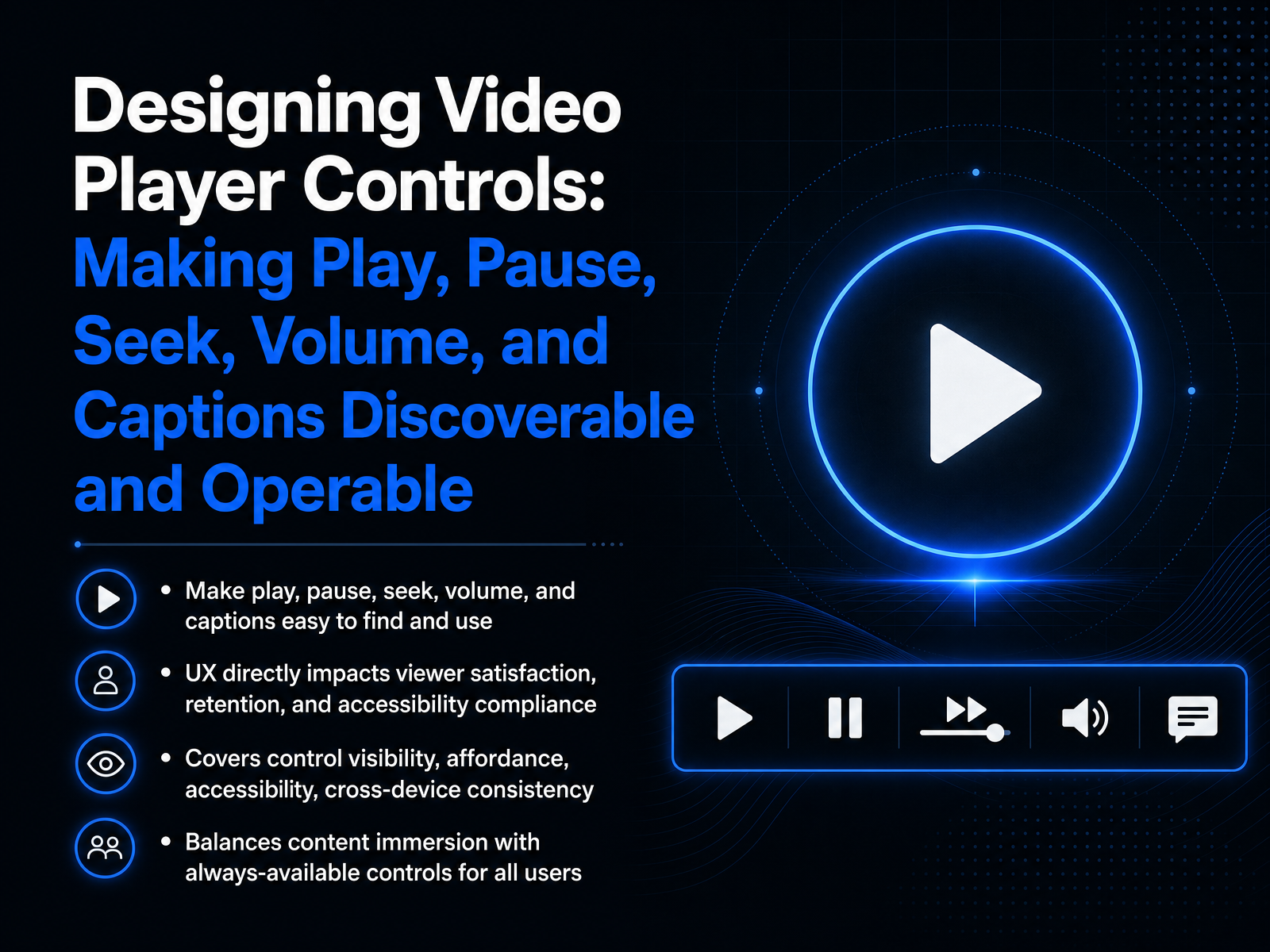
- 01Designing Video Player Controls: Making Play, Pause, Seek, Volume, and Captions Discoverable and OperableWelcome to Designing Video Player Controls. In this session, we'll focus on making core functions like play, pause, seek, volume, and captions easy to find and easy to use. The way you design these controls directly shapes how satisfied viewers feel, how long they stay engaged, and whether your player meets accessibility standards. We'll cover how to make controls visible and obvious, how to design for touch, mouse, and keyboard, and how to keep the experience consistent across devices. You'll also learn to balance a clean, immersive view with controls that are always available when someone needs them. Let's start by exploring why these choices matter so much, looking at usability, engagement, and the real business impact behind player controls.1 min
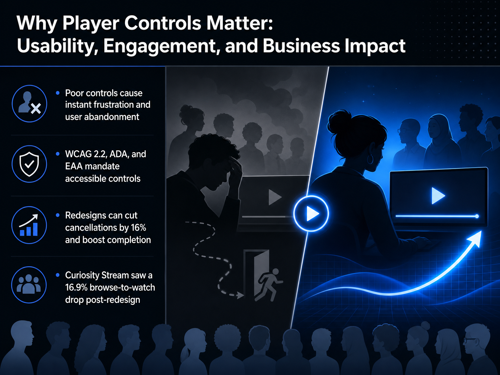
- 02Why Player Controls Matter: Usability, Engagement, and Business ImpactNow let's talk about why video player controls matter so much, from usability to business impact. We can think of controls as the steering wheel of a video experience. When they work well, users hardly notice them. But when they're poorly designed, frustration sets in almost instantly. Users click away, abandon the video, and sometimes leave the platform altogether. That's a direct loss in engagement. Beyond frustration, legal requirements are also in play. Standards like WCAG two point two, the ADA, and the European Accessibility Act all mandate that video controls be accessible to everyone. For example, a screen reader user must be able to operate the play button and adjust the volume without getting stuck. The business case is just as strong. After a player redesign, some services have cut subscription cancellations by sixteen percent and increased completion rates. Curiosity Stream, for instance, saw a nearly seventeen percent drop in the browse-to-watch ratio after rolling out a cleaner, more accessible player. That means users started watching more of what they discovered. Every pixel and every interaction in your control bar has a measurable effect on viewers and on the bottom line. Next, we'll look at the core control inventory: what users actually need and use.
 hci.khu.ac.krdoi.orgpreview-nature.com+22 min
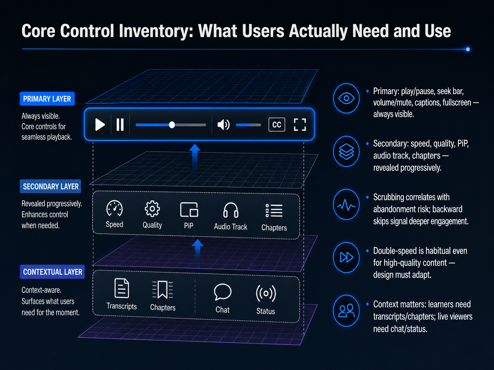
 - 03Core Control Inventory: What Users Actually Need and UseLet's now build your control inventory. Research shows that a handful of controls handle the vast majority of user interactions. Place play and pause, the seek bar, volume and mute, captions, and fullscreen directly in the primary bar. Keep them always visible. Secondary controls, like playback speed, quality, picture in picture, audio tracks, and chapters, are important but used less often. Reveal those progressively, perhaps behind a three-dot menu or on hover. Now, think about the seek bar. Studies confirm that scrubbing, or dragging the thumb quickly forward, often signals a risk of abandonment. But backward skips? Those suggest deeper engagement, like rewatching a tough concept. And here is a critical finding. Users now habitually watch at double speed, even for high-quality content. So your design must make the speed control easy to find and adapt to this behavior without degrading the experience. Context also shapes your inventory. Learners need fast access to transcripts and chapter markers. Live viewers need chat and stream status. Map these controls to your audience's primary goals, not just a feature list. With your core controls defined, we are ready to make them feel intuitive. Up next, we will explore affordance and visual clarity through icons, sizing, contrast, and progressive disclosure.
 hci.khu.ac.krdoi.orgpreview-nature.com+22 min
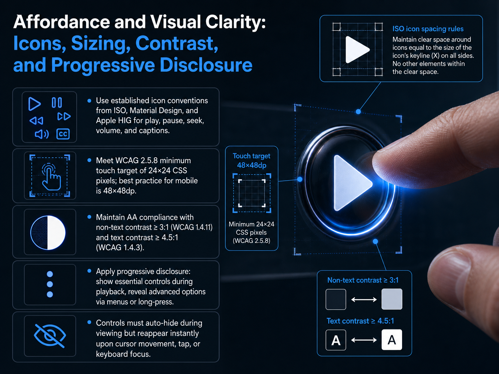
 - 04Affordance and Visual Clarity: Icons, Sizing, Contrast, and Progressive DisclosureNow let's look at how to make controls easy to see, easy to tap, and easy to understand. This is what we call affordance and visual clarity. Start with icon conventions. Don't invent a new symbol for a familiar action. Use the standard play, pause, volume, seek, and captions icons from ISO, Material Design, or Apple H I G. These are the shapes users already know. Next, think about touch targets. The bare minimum is 24 by 24 C S S pixels, which aligns with W C A G Success Criterion 2.5.8. But on phone and tablet screens, a much better target is 48 by 48 density-independent pixels. That extra size gives a finger enough room to tap without missing or hitting the wrong button. Contrast matters just as much. Non-text controls must meet a contrast ratio of at least 3 to 1 against their background. Any visible text label needs a ratio of at least 4.5 to 1. These numbers come directly from W C A G levels 1.4.11 and 1.4.3, and they're non-negotiable for accessibility. Then apply progressive disclosure. During playback, show only the essential controls. Tuck advanced settings like playback speed or quality inside a menu or behind a long-press. This keeps the interface clean and reduces cognitive load. Finally, make the controls auto-hide when the video is playing. They must disappear so users can focus on the content. But they must reappear instantly the moment a user moves the mouse, taps the screen, or brings keyboard focus onto the player. That instant reappearance removes all doubt about how to get controls back. Up next we'll go beyond captions and dive into screen readers, focus management, and keyboard operability.
 researchr.orgdoi.orgeleken.co+22 min
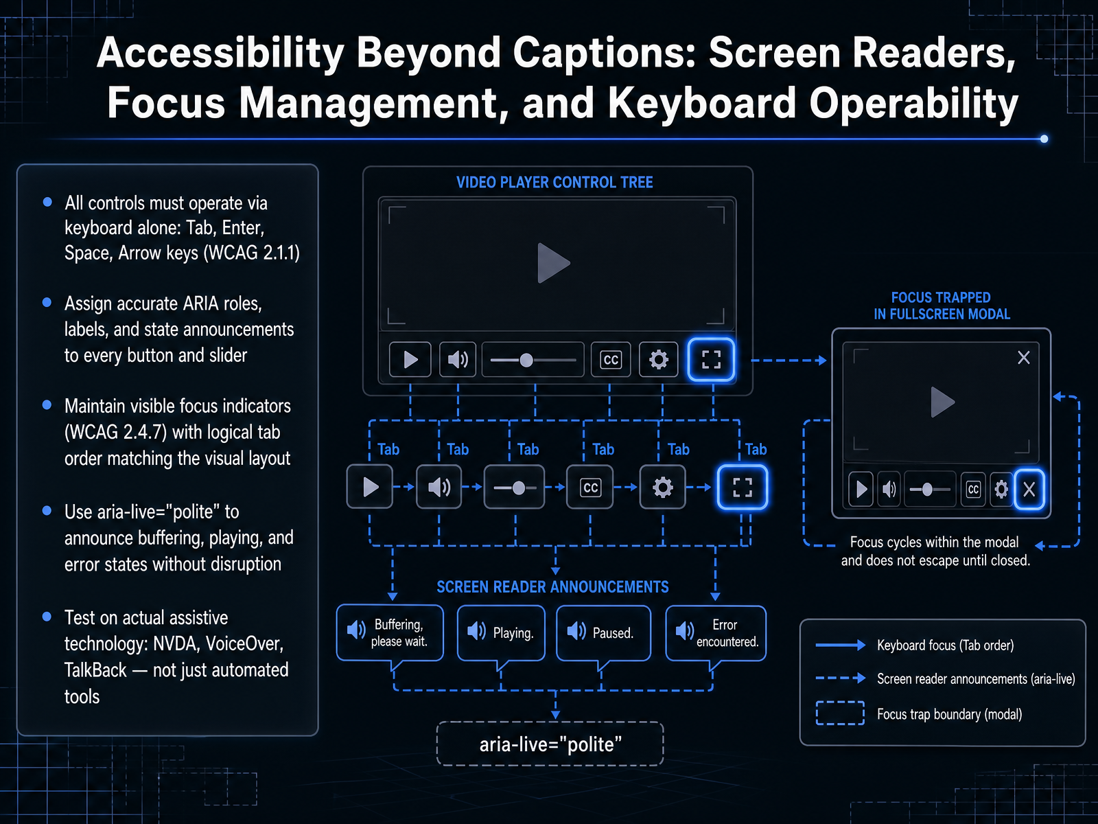
 - 05Accessibility Beyond Captions: Screen Readers, Focus Management, and Keyboard OperabilityLet's move beyond captions and talk about how the player interacts with screen readers and keyboards. First, make sure every control works with the keyboard alone. Users must be able to press Tab, Enter, Space, and the Arrow keys to operate play, pause, volume, and seeking. This meets the WCAG guideline for keyboard operability. Next, assign accurate ARIA roles, labels, and state announcements to every button and slider. When a screen reader lands on the play button, it should announce its name, its role as a button, and whether the video is currently playing or paused. Maintain visible focus indicators that follow a logical tab order matching the visual layout. Everyone should clearly see which control is active. Use aria-live set to polite to announce changes like buffering, playing, or error states without interrupting the user's current task. Finally, test on real assistive technology. Run through your player with NVDA, VoiceOver, and TalkBack, not just automated checkers. Real devices reveal gaps that tools miss. Up next, we'll cover keyboard shortcuts and power-user efficiency.
 w3.orgw3.orgw3.org+22 min
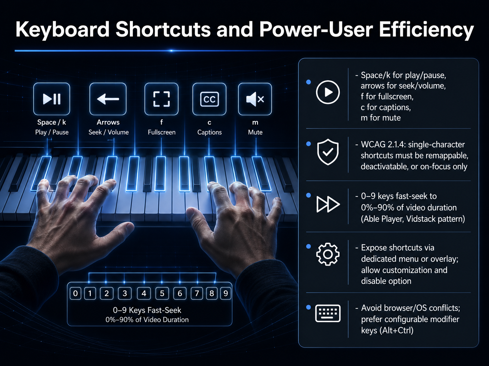
 - 06Keyboard Shortcuts and Power-User EfficiencyNow let's talk about keyboard shortcuts that make your video player feel fast and precise for power users. Start with the essentials. The space bar or the K key toggles play and pause. The left and right arrow keys seek backward and forward. The up and down arrows adjust volume. The F key enters fullscreen, C toggles captions, and M mutes the sound. For long videos, the number keys zero through nine let users jump instantly to zero through ninety percent of the duration. You have seen this pattern in players like Able Player and Vidstack. But there is a critical rule. Success Criterion two dot one dot four requires that any single-character shortcut can be remapped, turned off, or works only when the player has focus. So never trap your users. Always provide a dedicated shortcuts menu or overlay. Let users see every shortcut, customize the keys, and disable them completely if needed. Also watch out for conflicts with the browser or operating system. A good fix is to let users add modifier keys like Alt plus Control to your shortcuts, exactly as Able Player does. This keeps the player powerful without hijacking their keyboard. Up next, we will move from keys to layout and discuss Positioning and Spatial Layout, including control bars, thumb zones, and responsive design.
 vidzflow.comsmashingmagazine.comaccessibility.com+21 min
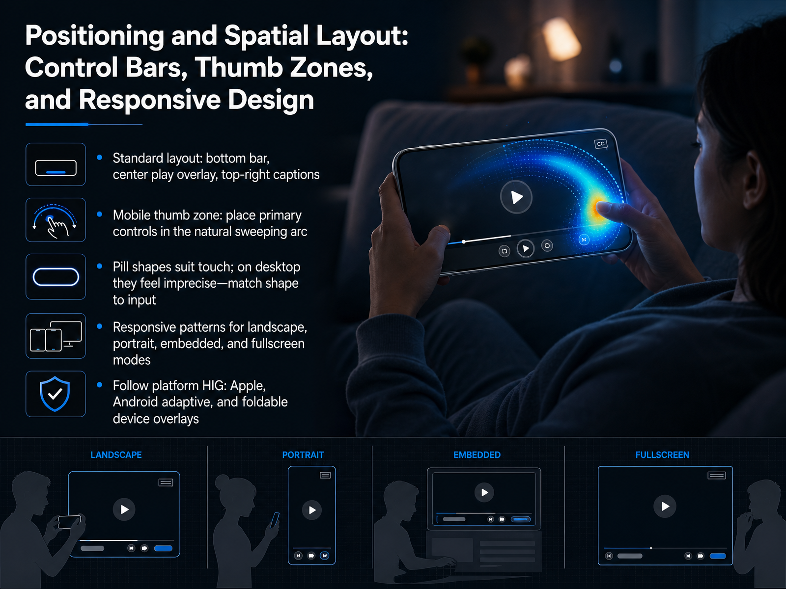
 - 07Positioning and Spatial Layout: Control Bars, Thumb Zones, and Responsive DesignLet's map out exactly where controls sit so they feel natural and effortless. Start with the standard layout: a bottom control bar for the timeline and main actions, a large central play button for the primary tap target, and top-right placement for secondary options like captions. That structure matches what most people already expect. On phones, think about the thumb zone. Place your primary controls—play, pause, seek—within the natural sweeping arc of the thumb, especially when holding the device in landscape. Keep the most-used actions easy to reach without stretching or adjusting grip. A common design trend is pill-shaped buttons. These large, rounded shapes suit touch because they provide generous tap targets. But on desktop, the same oversized pill shapes can feel imprecise with a mouse, so match the button shape to the primary input device—touch versus pointer. Next, design for different contexts. Lay out your controls so they adapt cleanly across landscape, portrait, embedded, and fullscreen modes. Each viewport shape changes how much space you have, so don't force the same layout everywhere. Last, follow the platform's Human Interface Guidelines, whether that is Apple, Android Adaptive, or overlays for foldable devices. These guides ensure your controls feel native and predictable. Here's the core takeaway: position controls where the hand already rests, scale shapes for the input in use, and let the layout change with screen size. In the next slide, we'll zoom into one critical control—the seek bar—and how to design it for precision, feedback, and a comfortable hit area.
 researchr.orgdoi.orgeleken.co+22 min
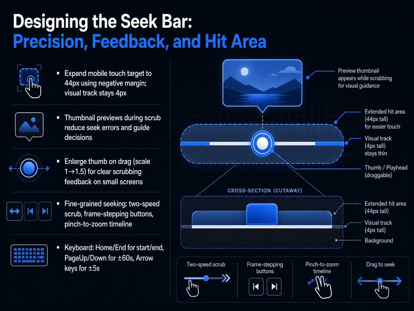
 - 08Designing the Seek Bar: Precision, Feedback, and Hit AreaLet's focus on the seek bar. Designing it well means balancing three things: precision, feedback, and a touch target that's actually easy to grab. First, the hit area. On a phone, your finger is much wider than the thin visual track. A good pattern is to expand the invisible touch target to forty-four pixels using negative margins, while keeping the visible track thin, around four pixels. This prevents accidental taps on other controls while making the bar easy to find and drag. Next, give users real-time feedback. Displaying a thumbnail preview as they scrub helps them see exactly where they're heading, reducing errors. Also, make the thumb visibly larger during an active drag. Scaling it up from one to one point five gives clear confirmation on small screens that the scrub is working. For those who need frame-by-frame precision, provide extra tools. You can add a two-speed scrub, frame-stepping buttons, or even let users pinch to zoom the timeline. And don't forget keyboard users. Arrow keys should jump by five seconds, Page Up and Page Down by sixty, and the Home and End keys should snap to the start or end of the video. These shortcuts turn a rough drag into a precise tool. Next, we'll apply this same kind of responsive thinking to volume controls and audio management.
 researchr.orgdoi.orgeleken.co+22 min
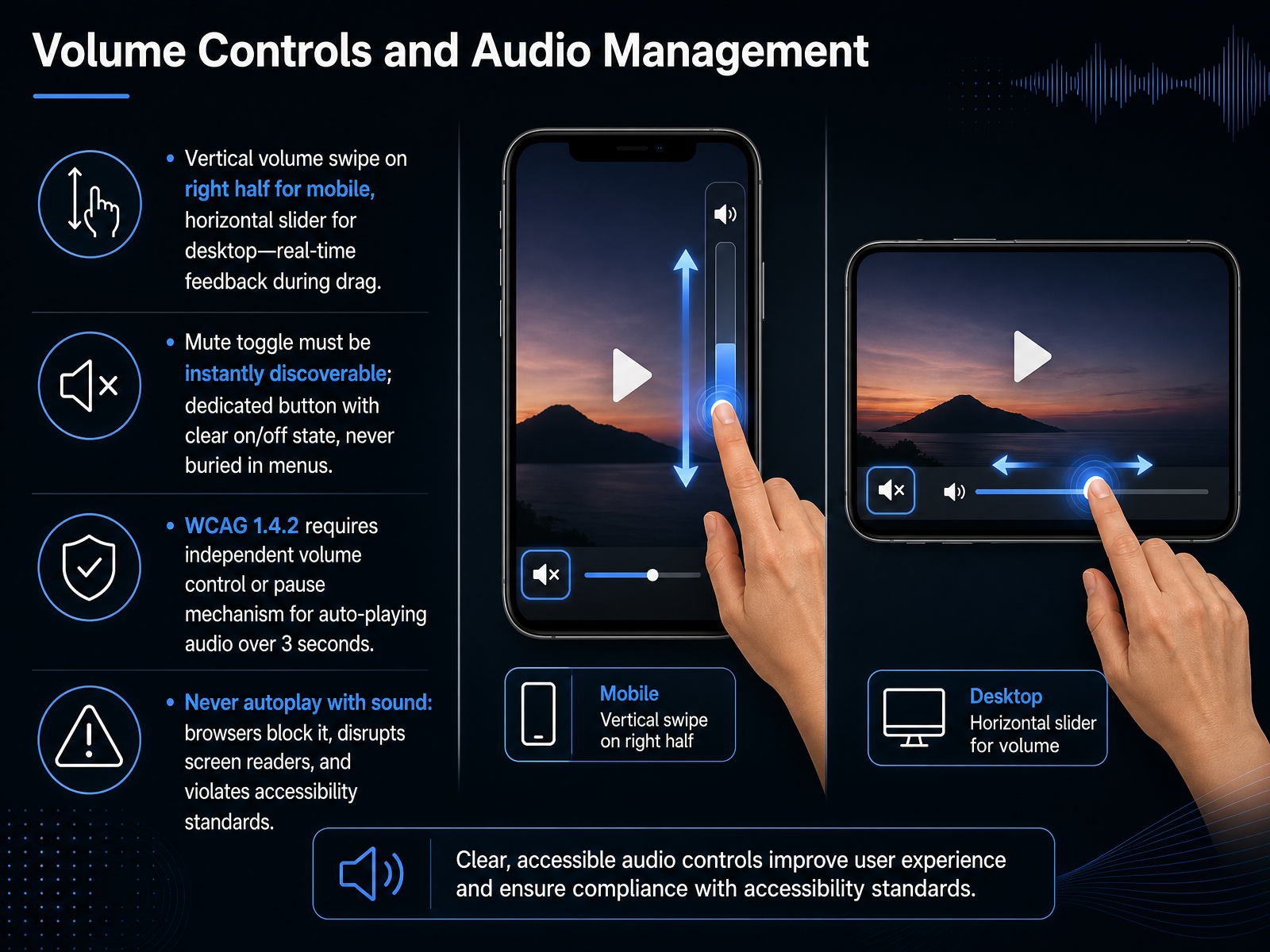
 - 09Volume Controls and Audio ManagementNow let's design the volume controls and audio management for your player. Users expect sound control to feel completely natural, whether they are on a phone or a desktop. On a mobile device, let users swipe vertically up and down on the right half of the screen to adjust volume. As their thumb drags, show the volume change live so they get instant feedback. On a desktop, use a horizontal slider that users click and drag with the mouse. Next, place the mute toggle right on the main control bar, never bury it inside a menu. Use a dedicated button that clearly shows whether sound is on or off at a single glance. Here is a critical rule from WCAG success criterion one dot four dot two: if any audio plays automatically for more than three seconds, you must give users an independent way to pause, stop, or control the volume. But the stronger best practice is even simpler. Never autoplay audio with sound. Browsers often block it anyway, and sudden noise can disrupt screen reader users and break accessibility standards. Always wait for a deliberate tap or click before starting audio. Up next, we will cover captions, subtitles, and language controls.
 w3.orgw3.orgw3.org+22 min
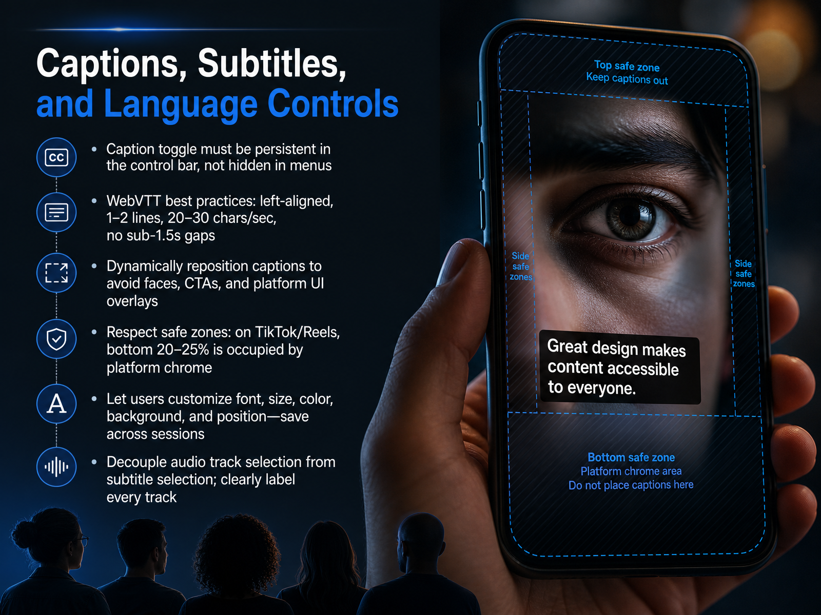
 - 10Captions, Subtitles, and Language ControlsNow let’s focus on captions, subtitles, and language controls. First, make the caption toggle persistent. Always show it directly in the control bar, never hide it inside a settings menu. For the caption file itself, follow WebVTT best practices. Keep text left-aligned, limit it to one or two lines, and aim for twenty to thirty characters per second. Never leave a gap shorter than one and a half seconds between segments, or the text will flicker. As you position captions, think about dynamic repositioning. Move them automatically to avoid covering faces, call-to-action buttons, or platform overlays. For short-form players like TikTok and Reels, the bottom twenty to twenty-five percent of the screen is usually occupied by platform chrome, so keep your captions above that safe zone. Give users real control over how captions look. Let them adjust font, size, color, background, and position, then save those choices across sessions. Finally, decouple the audio track selection from the subtitle track. Label every track clearly so users can mix, for example, a French audio track with English subtitles without any guesswork. Up next, we’ll look at cross-device consistency and adapting inputs for different modalities.
 w3.orgw3.orgw3.org+22 min
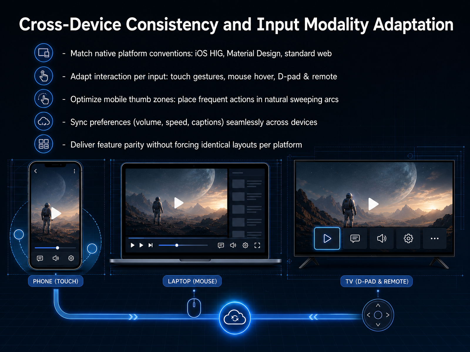
 - 11Cross-Device Consistency and Input Modality AdaptationNow, let's talk about what happens when your video player moves from a phone to a laptop, or from a web browser to a smart TV. Your goal isn't to build one layout and force it everywhere. Instead, aim for feature parity without identical layouts. Users expect the same core abilities—play, pause, seek, volume, captions—on every device, but they don't expect them to look or behave exactly the same way. On a desktop, a user clicks and hovers. On a mobile phone, they tap and swipe. On a TV, they use a D-pad and a remote. Match the platform conventions first. Follow Apple's Human Interface Guidelines on iOS, Material Design on Android, and standard web patterns on the browser. Then, adapt your interactions. For touch screens, place the most frequent actions—like play, pause, and seek—inside the natural sweeping arcs of the thumb zone, so they are easy to reach without stretching. For precision tasks like scrubbing a seek bar, expand the touch target and provide a visual tooltip, because a finger is less precise than a mouse pointer. Finally, sync user preferences seamlessly. If someone sets their volume, playback speed, or caption style on their phone, that choice should follow them to their laptop without any extra steps. This consistency builds trust and reduces frustration. Next, we'll explore how to balance feature visibility with immersion using progressive disclosure and auto-hide behaviors.
 researchr.orgdoi.orgeleken.co+22 min
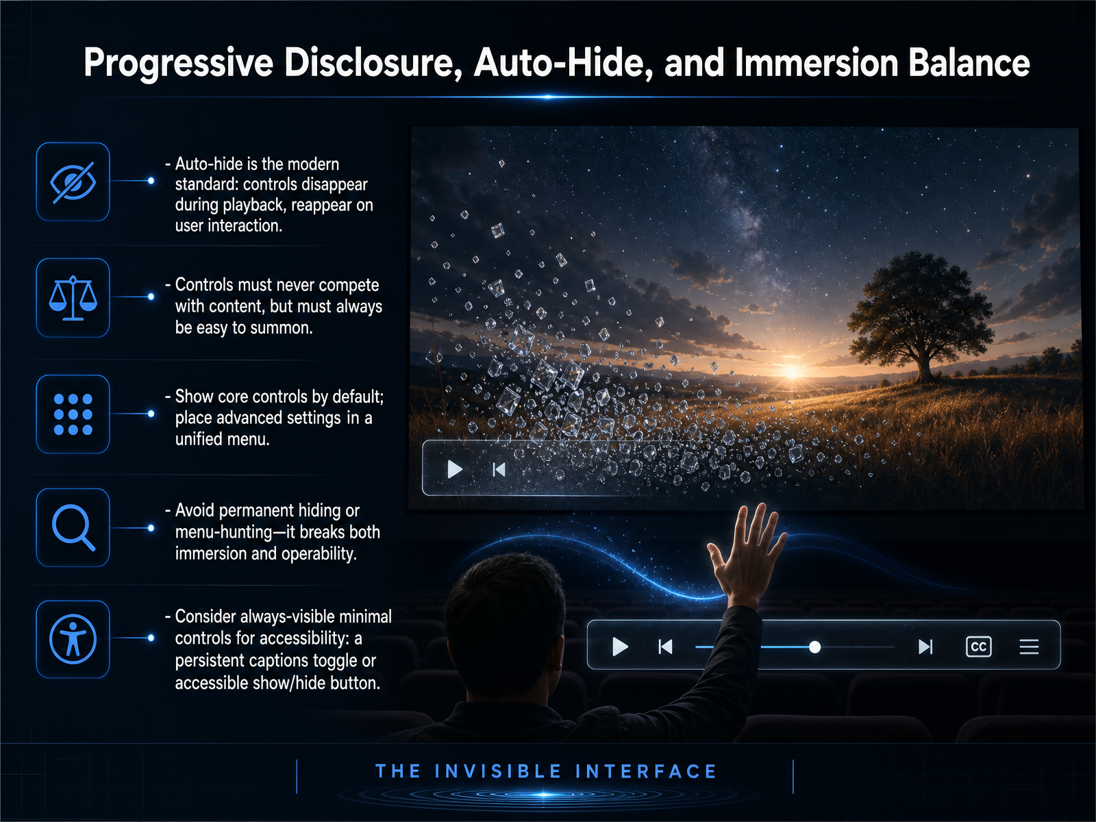
 - 12Progressive Disclosure, Auto-Hide, and Immersion BalanceNext, let's explore how to balance progressive disclosure, auto-hide, and immersion. Auto-hide has become the modern standard. Controls disappear during playback so the viewer stays focused on the content, then reappear instantly on any user interaction. Controls must never compete with your content, but they must always be easy to summon. To avoid overwhelming users, show only core controls by default, like play or pause. Place advanced settings inside a unified menu that slides open with one click. Avoid two extremes. Don't permanently hide controls in a way that forces menu-hunting, which breaks immersion and operability. At the same time, don't lock all controls on screen. To support accessibility, consider always-visible minimal controls. For example, keep a persistent captions toggle or an accessible show and hide button so screen reader and keyboard users always have a reliable waypoint. Now that we've balanced control visibility, our next slide addresses testing discoverability with methods, metrics, and heuristics.
 researchr.orgdoi.orgeleken.co+22 min
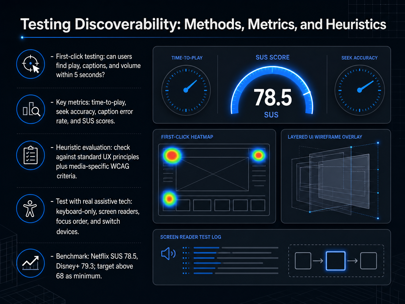
 - 13Testing Discoverability: Methods, Metrics, and HeuristicsNow let's talk about testing whether your controls are truly discoverable. Start with first-click testing. Give a user a simple task and watch if they can locate the play button, captions, and volume slider within five seconds. If they can't, your layout needs adjustment. Track key metrics like time-to-play and seek accuracy. For captions, measure the error rate. Also calculate a System Usability Scale score, or SUS score. This is a standard questionnaire that gives you a single usability number. For context, Netflix scores around seventy-eight point five and Disney Plus around seventy-nine point three. Aim for above sixty-eight as your minimum. Next, run a heuristic evaluation. Compare your player against established UX principles and the media-specific criteria in WCAG, the Web Content Accessibility Guidelines. Finally, test with real assistive technology. Navigate using only a keyboard. Confirm the focus order is logical. Listen with a screen reader to hear if buttons are properly labeled. Try switch devices that scan through controls. These real-world tests reveal barriers that automated tools miss. Up next, we'll examine common anti-patterns and how to avoid them.
 researchr.orgdoi.orgeleken.co+22 min
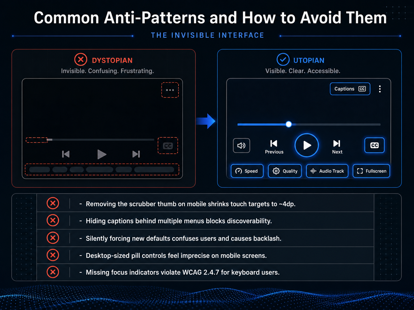
 - 14Common Anti-Patterns and How to Avoid ThemLet's look at five common design missteps in video players, and how to fix them. First, never remove the scrubber thumb on mobile just for a cleaner look. That shrinks the touch target down to about four density-independent pixels, making it nearly impossible to drag accurately with a finger. Second, don't bury captions behind multiple menus. Users should find the captions button directly on the player surface, not hidden in a settings panel they have to hunt for. Third, avoid silently forcing new defaults. When a player suddenly changes volume behavior or gesture controls without warning, users assume it is broken, and that damages trust. Fourth, resist the urge to use oversized, desktop-style pill controls on a phone screen. What feels natural on a large monitor often feels imprecise and clunky under a thumb. Finally, always provide visible focus indicators for keyboard users. Skipping them violates accessibility guideline two point four point seven and locks out anyone who navigates without a mouse. These aren't edge cases; each one is a real barrier that frustrates real people right at the moment they are trying to learn. Now let's move from spotting problems to applying solutions in our practical design workshop, where we will apply these principles to real scenarios.
 researchr.orgdoi.orgeleken.co+22 min
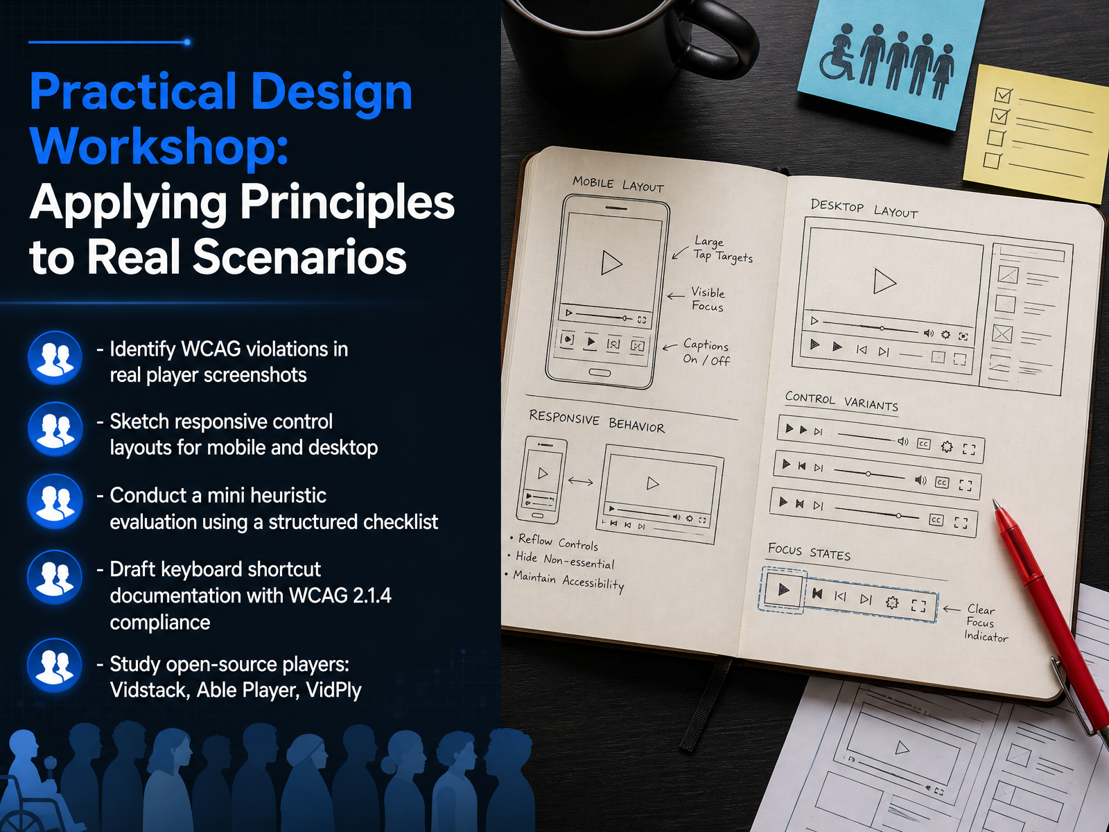
 - 15Practical Design Workshop: Applying Principles to Real ScenariosLet's put everything we have discussed into practice with a hands-on workshop. Start by pulling up screenshots of real video players and identify where they fail the Web Content Accessibility Guidelines. Look for missing focus indicators, unlabeled buttons, or controls you cannot reach with the Tab key. Next, sketch responsive control layouts for both mobile and desktop. Consider how you would reposition the play button, seek bar, and volume slider so they remain easy to tap or click on any screen size. Then conduct a mini heuristic evaluation using a structured checklist. Walk through each control and ask: Is it keyboard accessible? Does a screen reader announce its name and state correctly? After that, draft keyboard shortcut documentation that complies with WCAG criterion 2.1.4. Map every function to a key press and document what happens when the user activates it. Finally, study three open-source players: Vidstack, Able Player, and VidPly. Examine how each one handles focus management, ARIA labeling, and caption support. You will learn practical patterns you can reuse in your own designs. Up next, we will consolidate everything with a design checklist, a reference toolkit, and key takeaways.
 2 min
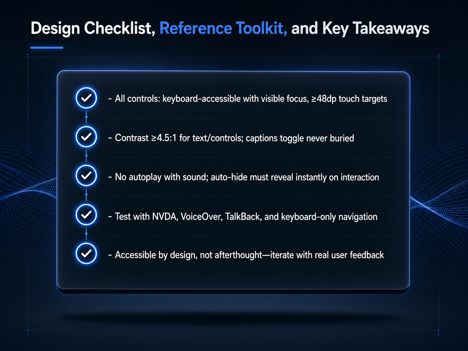
2 min - 16Design Checklist, Reference Toolkit, and Key TakeawaysAnd here we are at our final checkpoint. Let's turn everything we've covered into a checklist you can use on your next project. First, verify every control. Make sure play and pause, volume, captions, and the seek bar are all reachable with the Tab key. Every control needs a visible focus outline, and on touch screens, each tap target should be at least 48 device independent pixels wide and tall. Next, audit your colors. Text and controls must maintain a contrast ratio of at least 4.5 to one. Also, check that the captions toggle is never buried in a deep menu. Now, prevent disruption. Never autoplay video with sound. If your controls auto-hide, confirm they reveal instantly when a user taps a key or moves their mouse. Finally, test with real tools. Run through the player with N V D A, VoiceOver, and TalkBack. Then unplug your mouse and navigate with the keyboard alone. Accessibility is not a patch you add after launch. It is a design requirement you validate with real user feedback, and then you iterate. Thank you for joining me on this walkthrough of accessible video controls. Take these checklists and tools back to your work, start testing early, and build players that truly welcome everyone.
 w3.orgw3.orgw3.org+22 min
Take the deck with you
Download this course as a file — free, no sign-up needed.
- PDF handoutEvery slide page, ready to print or share.17 pages · 4.3 MBDownload
- Narrated PowerPointThe deck that presents itself — every slide carries the digital human's narration video.17 pages · 18.5 MBDownload
- PowerPoint slidesThe full deck as a .pptx — open it in PowerPoint, Keynote, or Google Slides.17 pages · 4.2 MBDownload
Free to use in your own training — please keep the PersonWise credit page at the end.
Have your own deck? Turn it into a course
Sources consulted
Web sources consulted while building this course.
- An Empirical Study of User Playback Interactions and Engagement in Mobile Video Viewing | Interactive TEchnology & Methodology — hci.khu.ac.kr
- Modeling of User Interactions for Adaptive Video Streaming Services on Smartphone Devices — doi.org
- Exploring the use of double-speed video playback in a fast-paced society through structural equation modeling | Scientific Reports — preview-nature.com
- https://pdfs.semanticscholar.org/f817/22ff0d2953538c827ea0d83b23a372e6ee02.pdf — pdfs.semanticscholar.org
- Designed to binge? Exploring user perceptions of interface features on ... — sciencedirect.com
- Does This Button Work? Investigating YouTube's Ineffective User Controls - researchr publication — researchr.org
- Gesture-Based Interaction with Video Players Using MediaPipe: A Case Study — doi.org
- Video Player UI: Best Examples, Patterns & UX Tips — eleken.co
- Designing an Inclusive Video Player | Hilton UX Case Study — aprilwalczak.com
- Contingent Discoverability: Understanding Platform Guidance and User Autonomy on Streaming Services — sage.cnpereading.com
- Understanding Guideline 1.2: Time-based Media | WAI | W3C — w3.org
- Understanding Success Criterion 1.4.2: Audio Control | WAI | W3C — w3.org
- Web Content Accessibility Guidelines (WCAG) 2.2 — w3.org
- Kaltura V7 Player Web VPAT — dyzz9obi78pm5.cloudfront.net
- Understanding Success Criterion 1.2.2: Captions (Prerecorded) | WAI | W3C — w3.org
- Mastering Video Player Controls: UX Best Practices for Engagement — vidzflow.com
- Designing for Accessibility: Best Practices for Closed Captioning and ... — smashingmagazine.com
- Best Practices for Closed Captioning — accessibility.com
- Captioning Best Practices - Electronic Accessibility — ucop.edu
- Module 4.2: Implementing Accessible Video Embedding | Path 4: Video Player and Controls | MediaScribe Academy | MediaScribe — mediascribe.ai