Designing Helpful Tooltips & Contextual Help
Begin
13 pages · ~26 min
Designing Helpful Tooltips & Contextual Help
Learn to design clear, concise tooltips and contextual help that guide users and improve product usability.
What you’ll learn
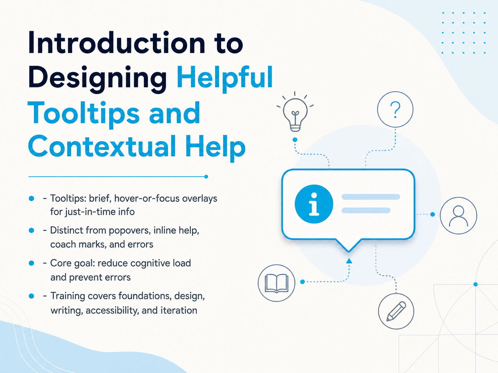
- 01Introduction to Designing Helpful Tooltips and Contextual HelpWelcome. Let's talk about something small that makes a big difference: tooltips and contextual help. You know those tiny labels that appear when you hover over an icon? That's what we're focusing on. We're not talking about big popovers, inline help text, or error messages. Our goal is simple: help people finish tasks without thinking too hard, and catch mistakes before they happen. In this session, we'll walk through the foundations of good tooltips, how to design them, what to write, how to make them accessible, and how to keep improving them. Think of it as a quick guide to giving users just the right nudge at just the right moment. Next, we'll map out a clear decision framework so you can tell a tooltip, a popover, and other helpers apart.1 min
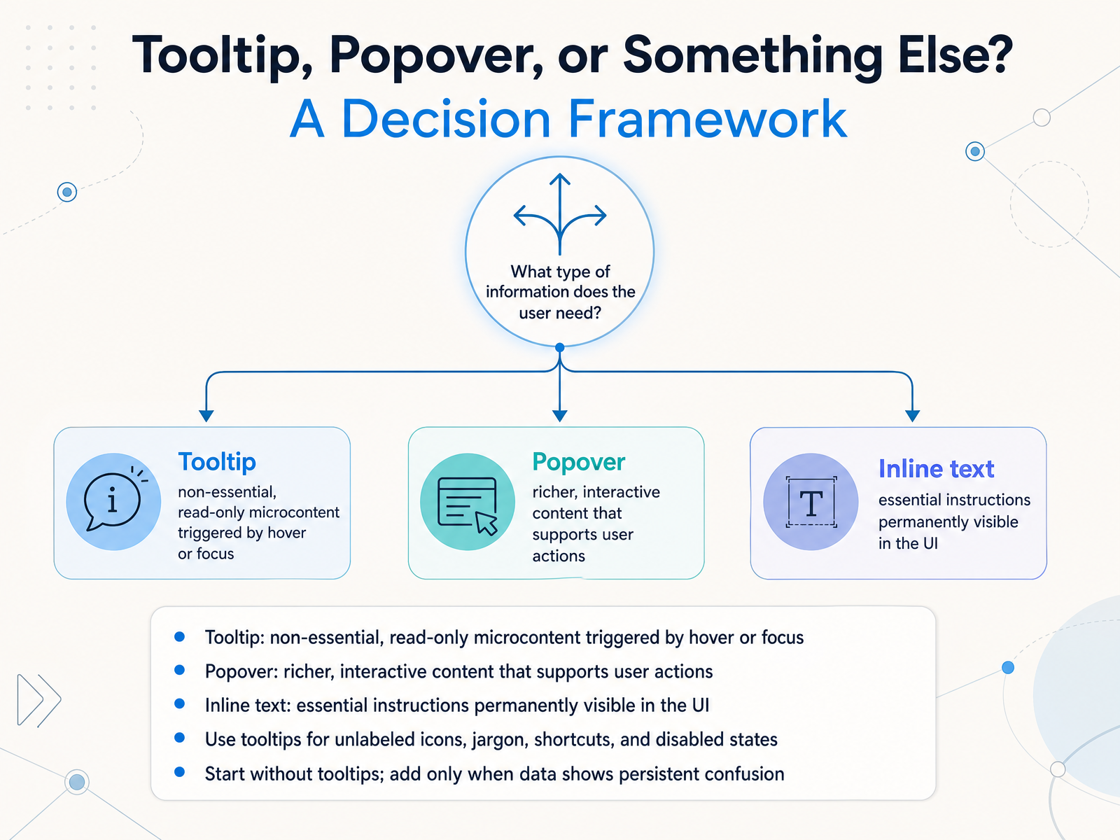
- 02Tooltip, Popover, or Something Else? A Decision FrameworkAlright, let's get the naming right first. When do you use a tooltip, and when do you need something else? A tooltip is for non-essential, read-only microcontent. It appears on hover or focus and disappears. Think of it as a whisper, not a conversation. A popover, on the other hand, is richer. It supports interactive content, maybe a link or a button, and often stays open until the user dismisses it. And then there's inline text. This is for essential instructions that are permanently visible in the UI. Never hide critical information behind a trigger. You'll typically use tooltips for four specific things: unlabeled icons, unexplained jargon, keyboard shortcuts, and disabled states. But here's a ground rule: start without tooltips. Design a clear interface first. Only add a tooltip when your data shows persistent confusion. That's how you know it's actually needed. Now that we have a framework, let's look at the visual anatomy of a tooltip that works.
 2 min
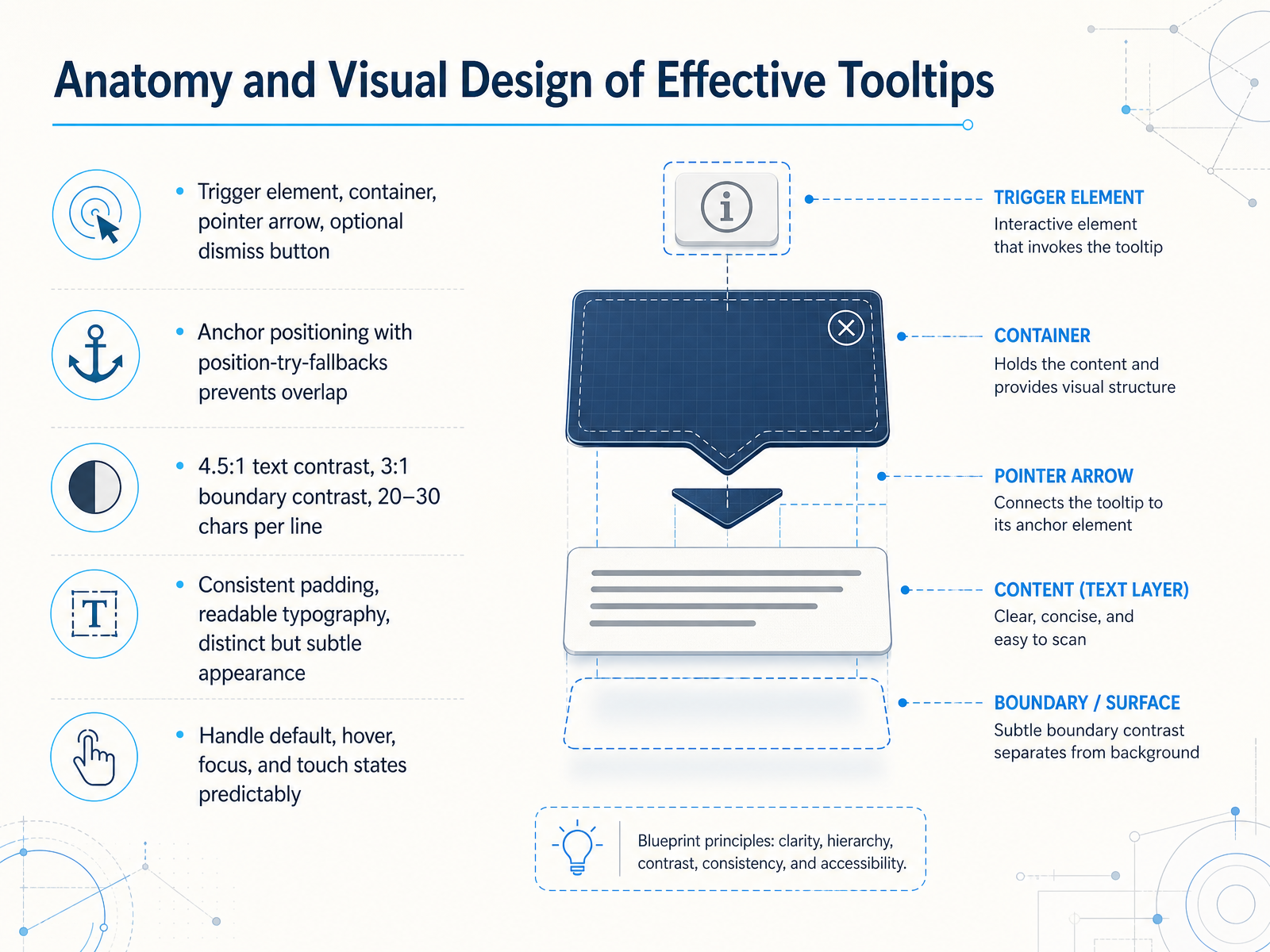
2 min - 03Anatomy and Visual Design of Effective TooltipsLet's pick apart what a tooltip actually looks like, so it feels helpful the moment it appears. You’ve got the trigger element that starts the interaction, a container for the message, and often a small pointer arrow for orientation. An optional dismiss button gives users clear control. Now, where you place it matters hugely. Use anchor positioning with fallbacks, like position-try-fallbacks, so the tip never collides with the edge of the screen or covers critical content. For readability, we aim for the same contrast standards we use everywhere else: four point five to one for text and three to one for the tooltip boundary. Keep lines short, around twenty to thirty characters, so the eye doesn’t have to work hard. Internally, use consistent padding and a readable typeface. The container should feel distinct but never shout, think subtle background and a soft shadow. Finally, don’t forget the interaction states. Does it work predictably on hover? On focus? On touch? Make sure a user’s instinct is always rewarded. That’s the anatomy. Next, let’s talk about what goes inside the bubble: writing clear, scannable microcopy.
 2 min
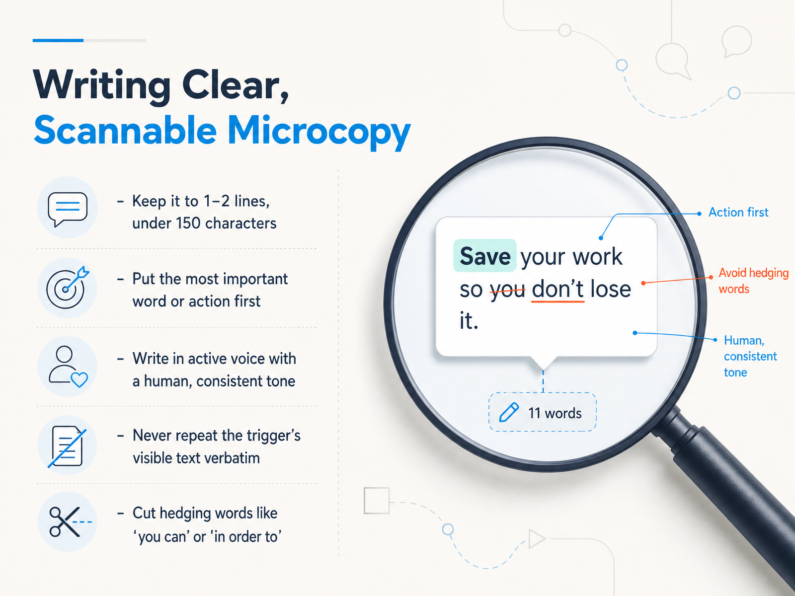
2 min - 04Writing Clear, Scannable MicrocopyLet's get into the craft of the copy itself. Good microcopy feels like a teammate just whispered a helpful hint, not like a manual. The first rule? Keep it brutally short. One to two lines, under 150 characters. If it wraps, it's probably too long. Lead with the most important word or the action the user needs to take. For example, instead of 'You can click here to save,' just say 'Save changes now.' That's active voice. It's direct and human. Also, never repeat the button or label text verbatim. If the button says 'Share,' the tooltip shouldn't just say 'Share.' It should add value, like 'Send a copy to your team.' And finally, cut the hedging. Words like 'you can' or 'in order to' just slow things down. Give the user the essential info, fast. Next up, we'll tackle how to present these tips without driving everyone crazy, in 'Triggers, Timing, and the Hover Tunnel Problem.'
 1 min
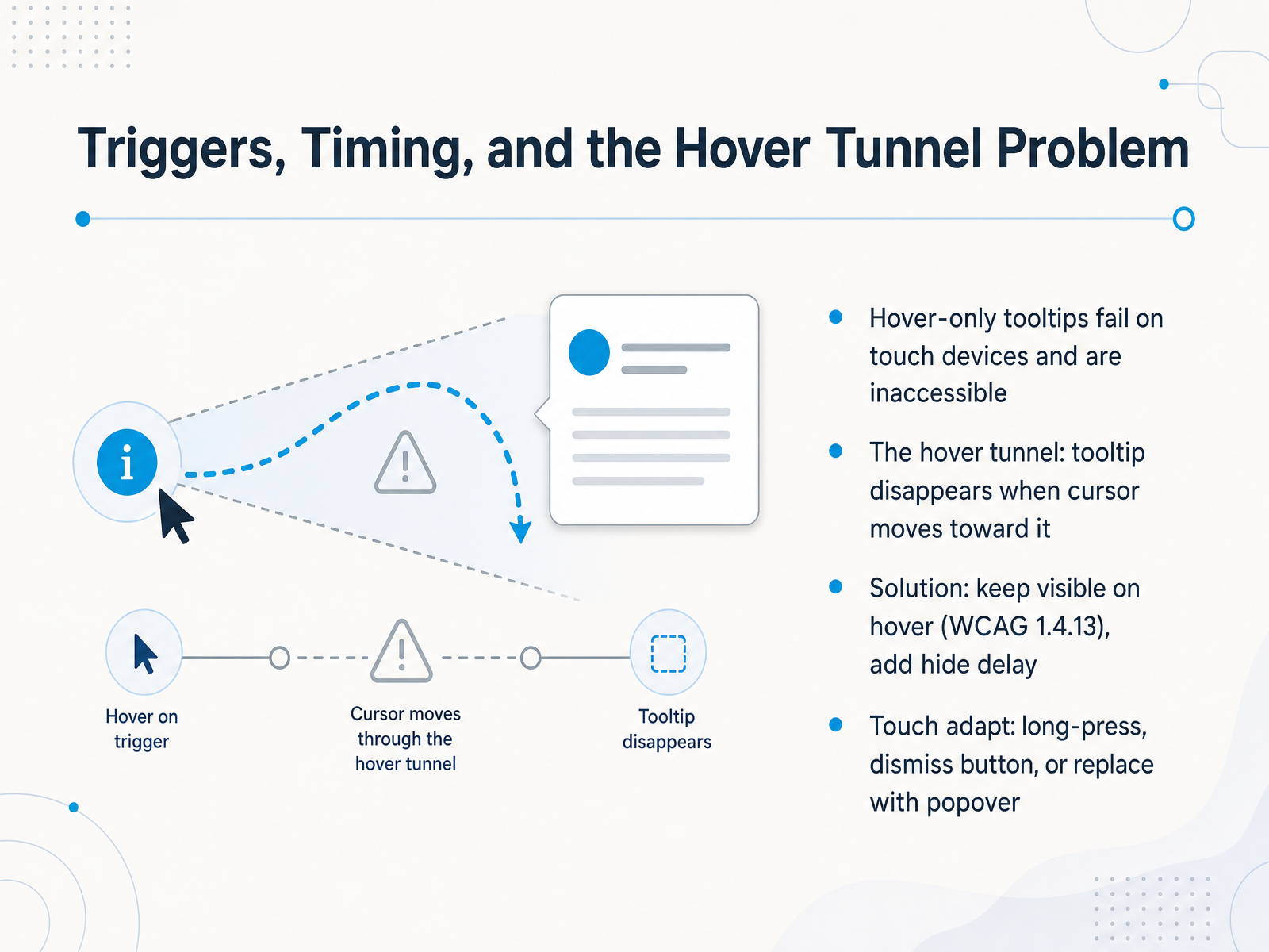
1 min - 05Triggers, Timing, and the Hover Tunnel ProblemSo, let's talk about triggers and timing. We've all built a beautiful tooltip that only appears on hover, right? But here's the thing: hover-only tooltips completely fail on touch devices. And they're inaccessible for anyone navigating with a keyboard. It's a pretty big deal. Then there's the hover tunnel problem. You know this one: the user moves their cursor toward the tooltip to maybe click a link inside, but the moment the cursor leaves the original trigger area, the tooltip disappears. Super frustrating. The fix is straightforward. First, keep the tooltip visible while the user hovers over it, which aligns with WCAG 2.1 success criterion 1.4.13. Next, add a tiny hide delay, around half a second, to make the experience feel forgiving. For touch, we adapt. Long-press to reveal, include a clear dismiss button, or sometimes just swap the tooltip for a proper popover. Next, we'll look at dismissal behavior and user control.
 2 min
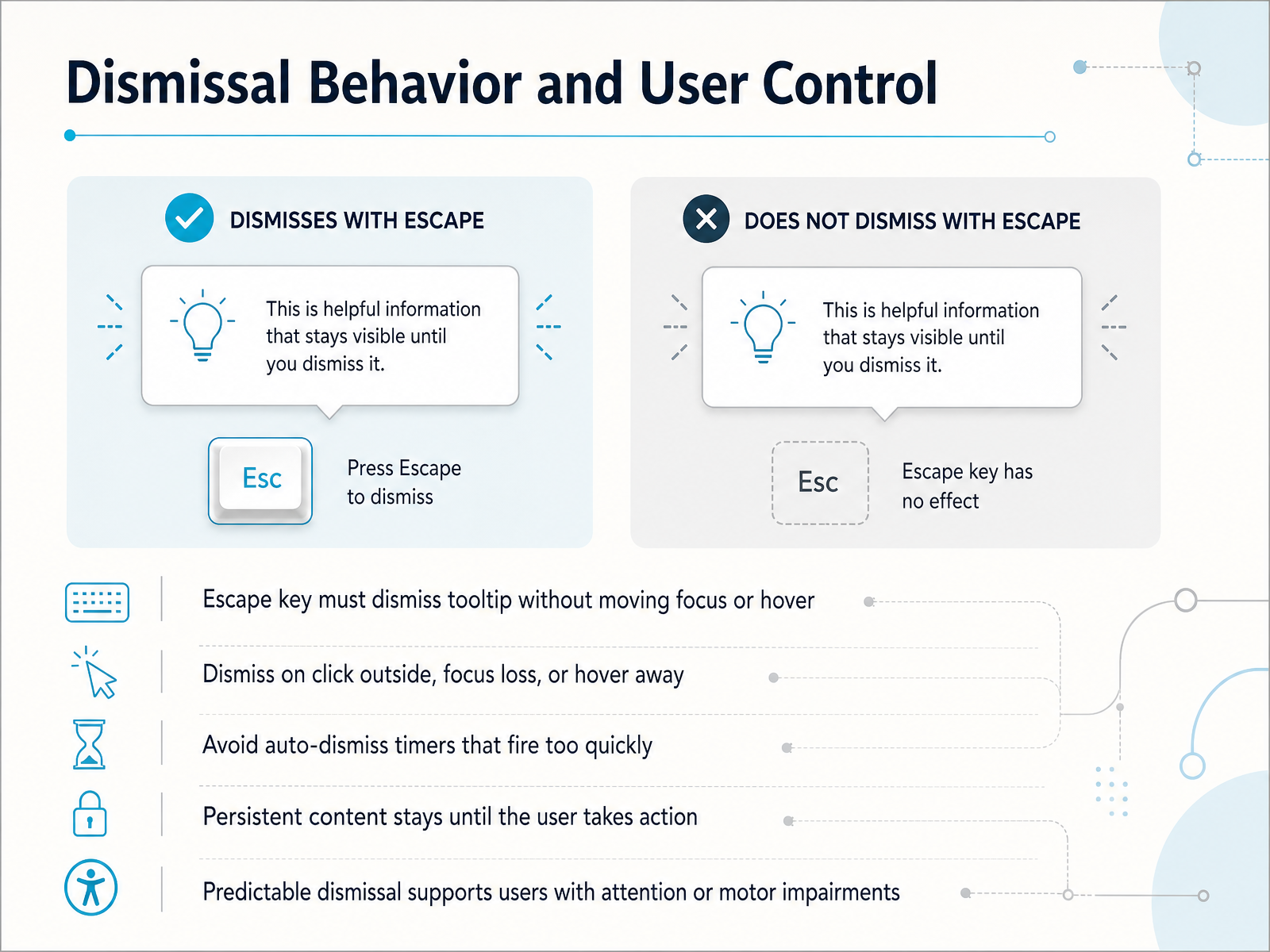
2 min - 06Dismissal Behavior and User ControlSo, once that tooltip is visible, how does it actually go away? Control is everything. The user needs predictable, easy dismissal. First, the Escape key must always close the tooltip, without moving keyboard focus or relying on hover. Next, it should dismiss on a click outside, when focus leaves, or when the mouse moves away. Here’s what to avoid: auto-dismiss timers that fire too quickly. You never want to snatch information away before someone finishes reading. For richer content, make it persistent, staying until the user takes action. This predictable behavior isn’t just good practice; it’s especially helpful for users with attention or motor impairments. They shouldn’t have to chase a disappearing target. Up next, we’ll ground these patterns in the standards that support them, specifically in Accessibility Foundations: WCAG, ARIA, and Screen Readers.
 2 min
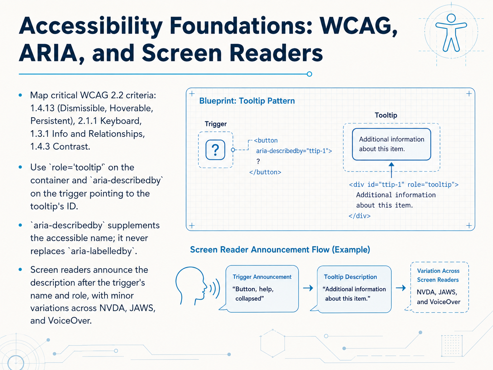
2 min - 07Accessibility Foundations: WCAG, ARIA, and Screen ReadersLet's ground our tooltip work in accessibility. A few key WCAG criteria really matter here. First, 1.4.13: tooltips must be dismissible without moving focus, hoverable without disappearing, and persistent until the user leaves. Next, 2.1.1: everything must work with a keyboard alone. Also, 1.3.1 ensures the tooltip's relationship to the trigger is clear in code, and 1.4.3 covers sufficient color contrast. Now, how do we mark this up? Use role equals tooltip on the container, and aria-describedby on the trigger pointing to the tooltip's ID. Remember, aria-describedby supplements the accessible name; it never replaces aria-labelledby. When a screen reader encounters this, it announces the trigger's name and role first, then the description. The exact timing varies slightly between NVDA, JAWS, and VoiceOver, but the core experience is consistent. Up next, we'll look at inclusive design beyond screen readers.
 1 min
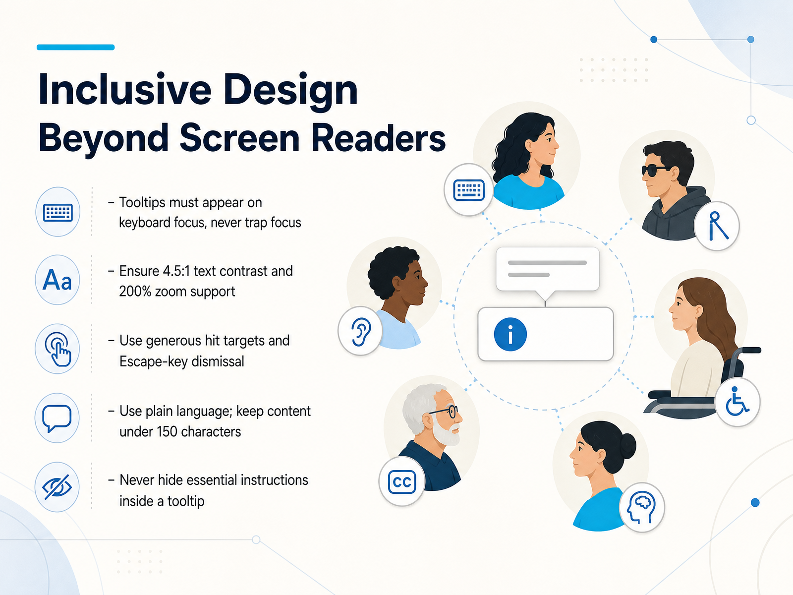
1 min - 08Inclusive Design Beyond Screen ReadersLet's widen our lens beyond screen readers and talk about inclusive design more broadly. It starts with keyboard access. Tooltips must appear on keyboard focus, but they should never trap focus. A user tabs to an icon, sees the tip, then tabs away. Simple. Visual readability is just as critical. Make sure your text meets the four point five to one contrast ratio and that the tooltip still works when someone zooms in to two hundred percent. Interaction design matters too. Use generous hit targets, and always let users dismiss the tooltip with the Escape key. For the content itself, keep it short and in plain language. Aim for under one hundred and fifty characters. And here's a hard rule: never hide essential instructions inside a tooltip. If the user needs to know it to complete a task, put it in the main interface. Now, let's see how to turn these principles into reusable patterns in tooltips and design systems.
 1 min
1 min - 09Tooltips in Design Systems and Component LibrariesNow, let's look at how the big design systems handle tooltips. You'll notice they all make a key distinction. Material Design separates plain tooltips for simple text from rich tooltips that can include buttons or images. Apple's Human Interface Guidelines call them help tags, designed for brief, user-triggered info. Microsoft Fluent splits them into a standard tooltip and a teaching bubble for longer, more instructional moments. And IBM Carbon makes a sharp distinction between a tooltip, for a short label, and a toggletip, for persistent, interactive content. Why does this matter for you? It means your component library should probably define at least two distinct variants, not just one. On the technical side, modern CSS anchor positioning is a game-changer. It lets you declaratively position a tooltip relative to its trigger, replacing heavy JavaScript libraries and solving z-index headaches. For your spec, keep it minimal: a character limit of around sixty to two hundred, clear placement rules, and the correct ARIA attributes. Consistent use of these patterns across your product is what builds user trust and makes help truly discoverable. Next, we'll talk about measuring tooltip effectiveness and user impact.
 2 min
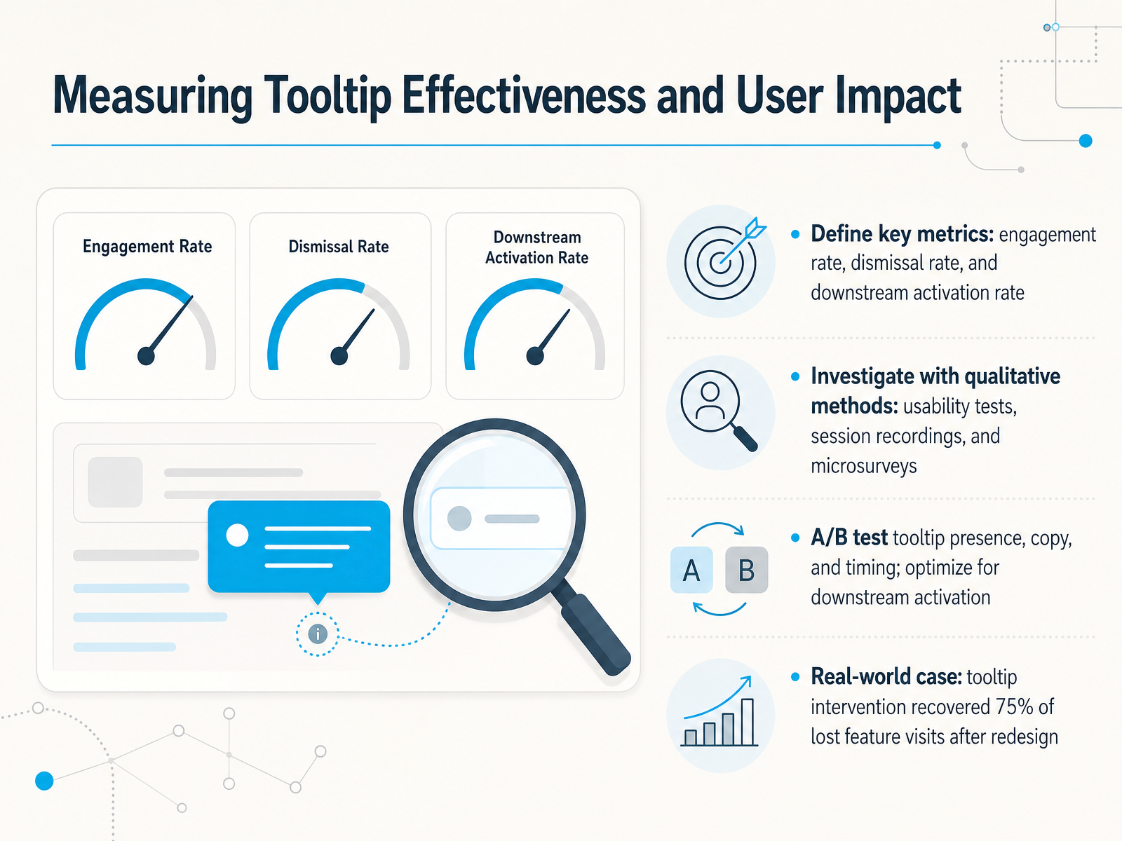
2 min - 10Measuring Tooltip Effectiveness and User ImpactAlright, so you've shipped a tooltip. How do you know it's actually working? Let's talk about measuring real impact beyond just 'someone saw it.'
First, define a few key metrics. You'll want to track the engagement rate, basically, did people hover or click? Then, the dismissal rate. That's a strong signal. A high rate here might mean the tooltip is annoying or not helpful. But the metric that really matters is the downstream activation rate. That's when a user takes the action the tooltip was suggesting.
Now, numbers tell you what happened, but you need qualitative methods to understand why. Run quick usability tests to watch people's reactions. Scan session recordings to see if users pause or ignore the tooltip entirely. Even a one-question microsurvey, like 'Was this helpful?', can give you direct feedback.
To be truly confident, run A B tests. You can test the presence of the tooltip, different copy options, or the timing of when it appears. Always optimize for that downstream activation, not just clicks. I've seen a real case where a single tooltip intervention recovered seventy-five percent of lost feature visits after a redesign. That's huge.
So, measure what users do, not just what they see. Once you have that data, you'll know when a tooltip has done its job. Next, let's talk about when and how to retire a tooltip.
 2 min
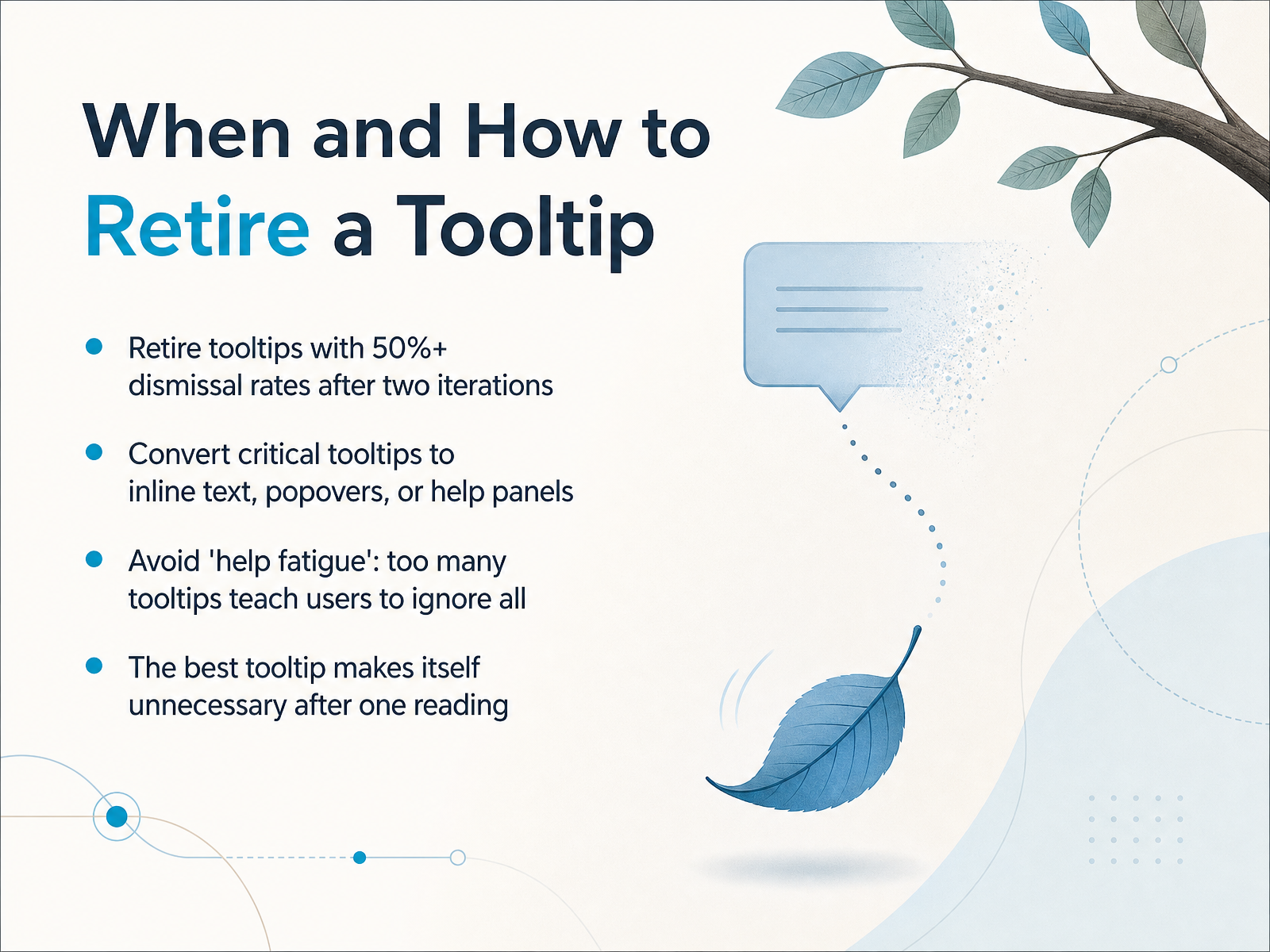
2 min - 11When and How to Retire a TooltipSo, when does a helpful hint overstay its welcome? A good rule of thumb is this: if more than half of users dismiss a tooltip, and you've already tried improving it twice, it's time to retire it. Instead of a tiny pop-up, think about where that information really belongs. Could it become a short line of inline text right next to the field? Or maybe it fits better in a popover that users can open on purpose, or a dedicated help panel. The goal is to avoid 'help fatigue.' When every element on the screen demands attention, users learn to ignore all of them. Remember, the best tooltip is one that teaches just once and then makes itself invisible. You want the user to get it, not to keep coming back for the same hint. Up next, let's put this into practice with a workshop on auditing your existing tooltips.
 1 min
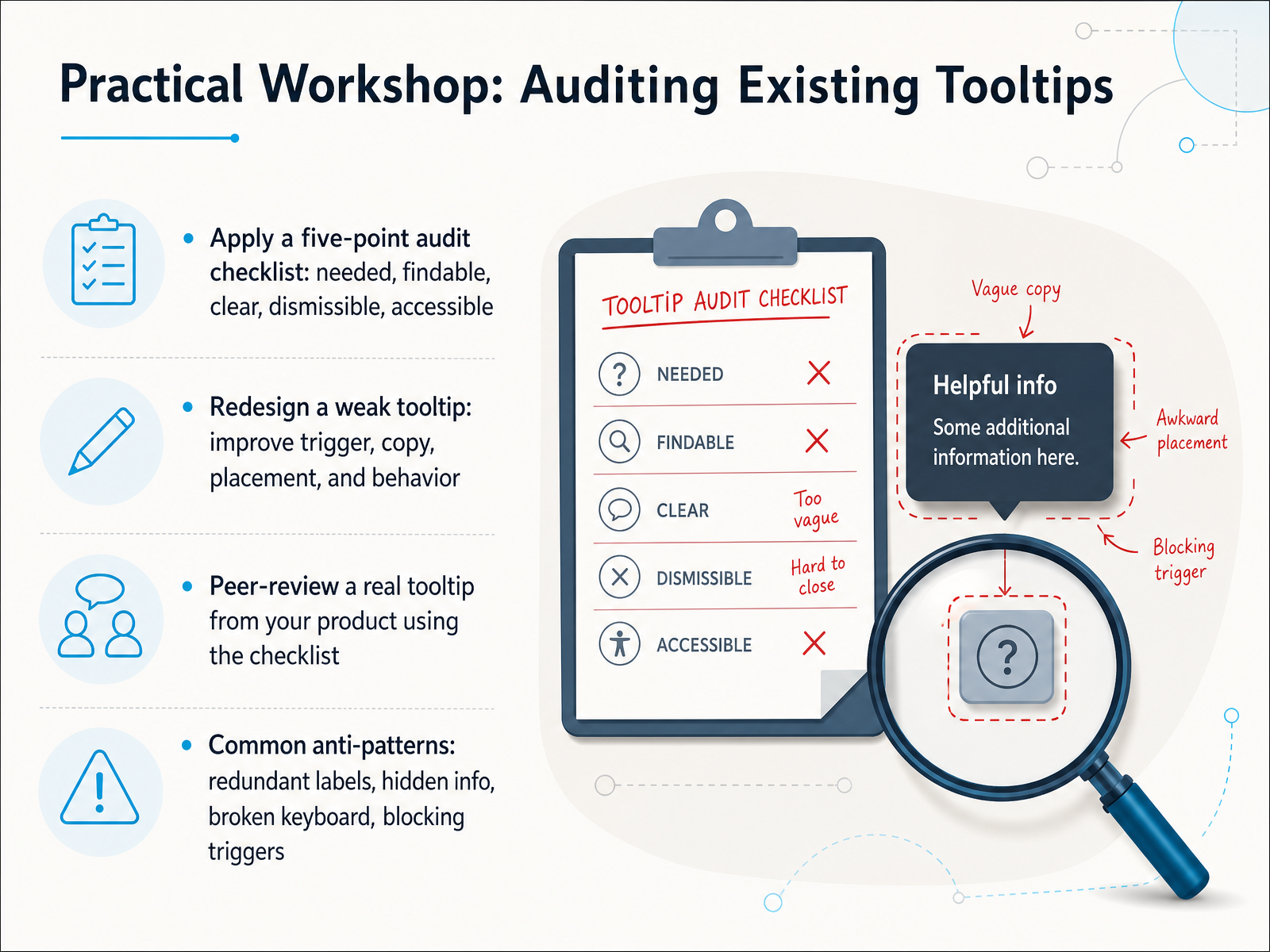
1 min - 12Practical Workshop: Auditing Existing TooltipsAlright, let's apply what we’ve covered by auditing some real tooltips. We’re going to use a simple five-point checklist: Is it needed? Is it findable? Is the copy clear? Can it be dismissed? And is it accessible? Run a tooltip through each of those questions, and the weak spots will surface fast. Next, pick a weak tooltip and redesign it. Improve the trigger, rewrite the copy, adjust the placement, and fix the behavior. Then, grab a real tooltip from your own product and peer-review it using the same checklist. Finally, watch out for common anti-patterns—redundant labels, hidden info, broken keyboard support, and triggers that block the user. These are the quickest wins you can fix. With that, let’s build a reusable design kit and set your next steps.
 1 min
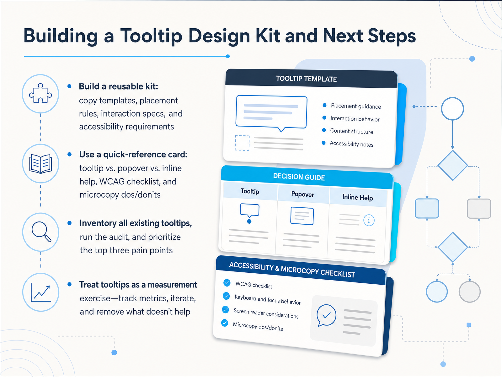
1 min - 13Building a Tooltip Design Kit and Next StepsLet's wrap up with a concrete action plan. First, build a reusable kit. That means copy templates, clear placement rules, interaction specs, and accessibility requirements. Don't start from scratch every time. Next, create a quick-reference card. It should map out when to use a tooltip versus a popover or inline help, include a bite-sized WCAG checklist, and keep a list of microcopy dos and don'ts. Then, get practical. Inventory every existing tooltip in your product, run the audit we talked about, and pick the top three pain points to fix first. Finally, treat tooltips as a measurement exercise. Track metrics, see what's actually helping, iterate, and have the courage to remove anything that doesn't improve the experience. That's the real skill. Thanks for thinking through this with me. Now go build tooltips that truly help, and remember, if it's not useful, it's just noise.
 1 min
1 min
Take the deck with you
Download this course as a file — free, no sign-up needed.
- PDF handoutEvery slide page, ready to print or share.14 pages · 2.8 MBDownload
- Narrated PowerPointThe deck that presents itself — every slide carries the digital human's narration video.14 pages · 22.2 MBDownload
- PowerPoint slidesThe full deck as a .pptx — open it in PowerPoint, Keynote, or Google Slides.14 pages · 2.7 MBDownload
Free to use in your own training — please keep the PersonWise credit page at the end.
Have your own deck? Turn it into a course