Multi-Select and Bulk Actions Design
Begin
13 pages · ~26 min
Multi-Select and Bulk Actions Design
Learn to design efficient multi-select patterns and bulk action interfaces for streamlined data management.
My workspace26 minFree to watch
What you’ll learn
- 01Introduction to Designing Multi-Select and Bulk ActionsWelcome to our session on designing multi-select and bulk actions. In this course, we will explore how to help users safely select multiple items and perform batch operations. We will focus on a few core goals: making the selection scope crystal clear, providing reliable safety mechanisms, and designing clear feedback for every step. This topic is essential for efficiency in enterprise productivity, data management, and admin tools. When handled well, it solves critical pain points—such as repetitive manual work, surprising errors, and even accidental destructive changes. Over the next few minutes, we will break down selection patterns, strategies for scope clarity, and the safety nets that build user confidence. Let's start by looking at the most common way users enter a multi-select flow. That brings us to our next slide, where we will examine selection models and entry points.nngroup.comshadcn.iouianatomy.dev+21 min
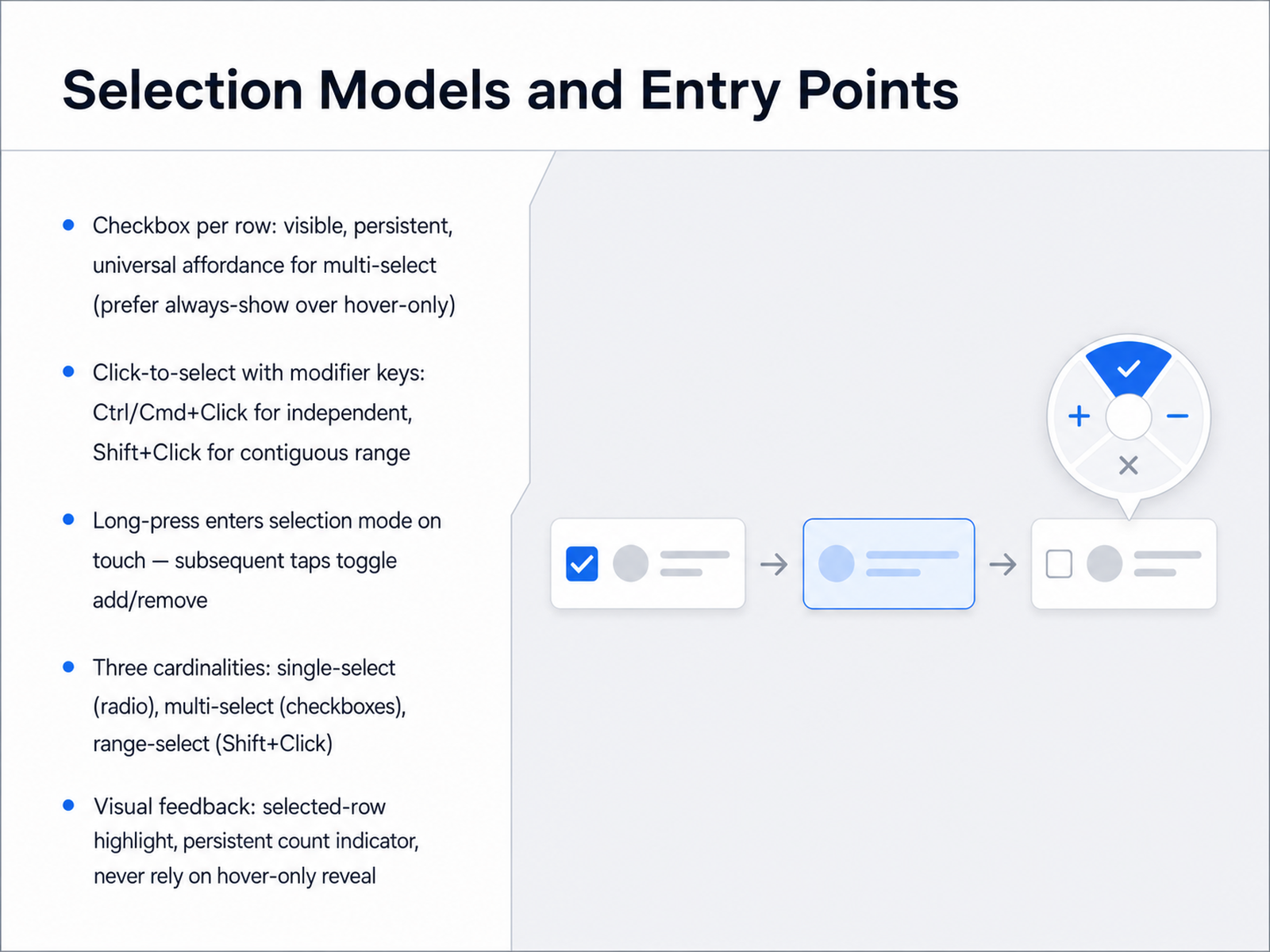
- 02Selection Models and Entry PointsNow let's look at the core mechanics of selecting items. This slide covers selection models and how users actually enter the multi-select flow. The clearest entry point is a checkbox per row. Make it visible and persistent. Avoid showing the checkbox only on hover—that hides the affordance and slows users down. On desktop, you can also support click-to-select with modifier keys. Control-click or Command-click on Mac toggles independent items, and Shift-click selects a contiguous range from the last clicked item. For touch interfaces, the standard pattern is long-press to enter selection mode. After that, a single tap adds or removes the item. Under the hood, there are three basic cardinalities. Single-select uses radio buttons. Multi-select uses checkboxes. And range-select uses Shift-plus-click. For visual feedback, always show a highlighted background on the selected row and a persistent count indicator of how many items are selected. Never rely on hover alone to reveal selection state. Up next, we'll apply these entry points to a common bulk-action control: the Select-All pattern and the indeterminate state.
 nngroup.comshadcn.iouianatomy.dev+22 min
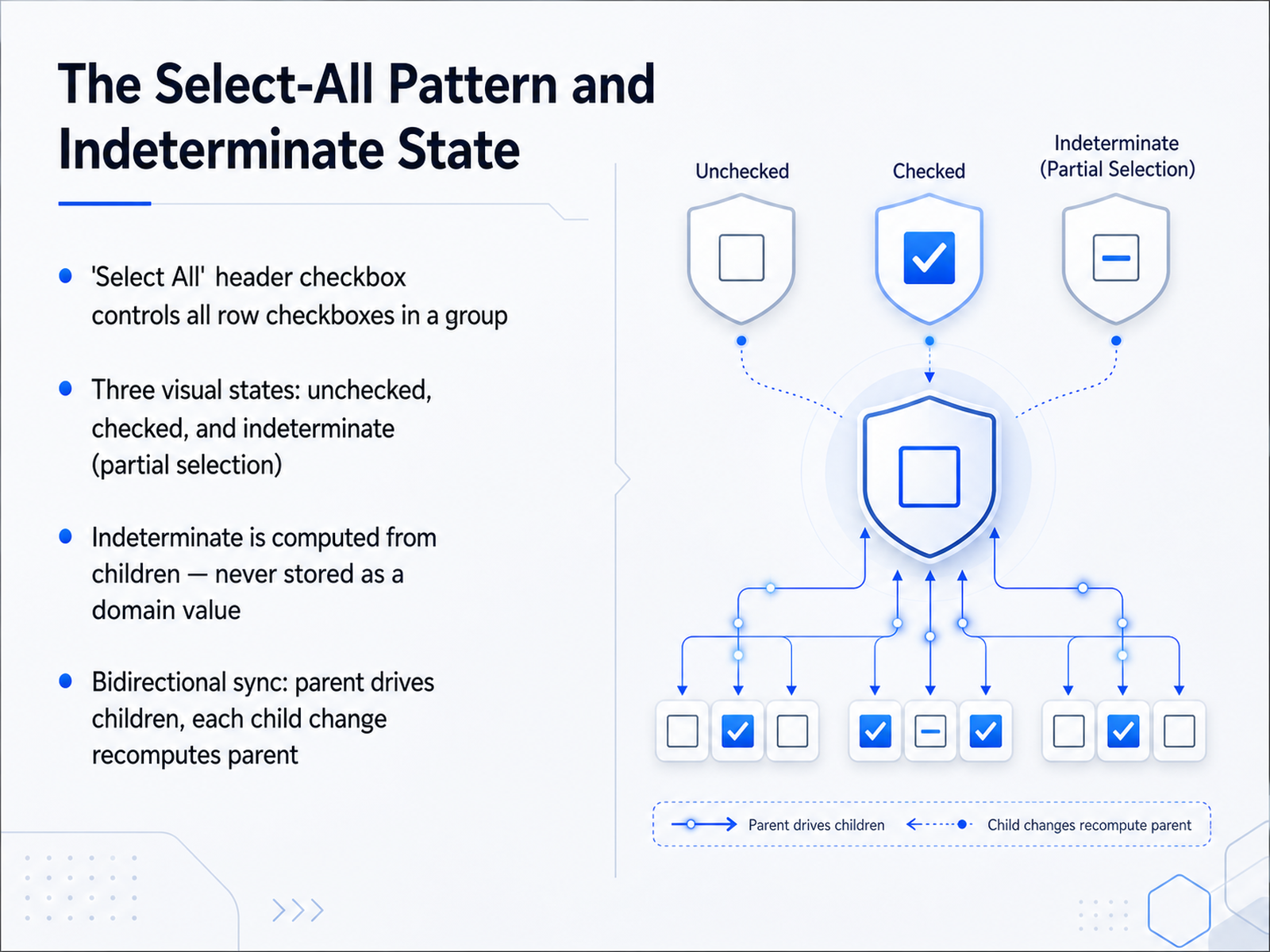
 - 03The Select-All Pattern and Indeterminate StateNext, let's look at the select-all pattern and an essential visual cue called the indeterminate state. When you have a header checkbox at the top of a list, it controls every row checkbox in that group. This header checkbox actually has three visual states you need to communicate. The first two are obvious: unchecked means nothing is selected, and checked means everything is selected. The third state is the indeterminate state. It typically looks like a dash or a horizontal line inside the checkbox. This state appears when some, but not all, of the child rows are selected. Here is the critical rule to remember: you never store the indeterminate state as a piece of your application data. It is computed entirely from the children. If one item is checked and the rest are not, you calculate that the parent should look indeterminate. Finally, this relationship must be bidirectional. When a user clicks the parent checkbox to select all, you correctly set every child to checked. And whenever a single child changes, you must immediately recompute the parent to decide if it should be checked, unchecked, or indeterminate. This keeps the interface honest and the user always knows the true selection scope. Up next, we will define and communicate that selection scope clearly to the user.
 nngroup.comshadcn.iouianatomy.dev+22 min
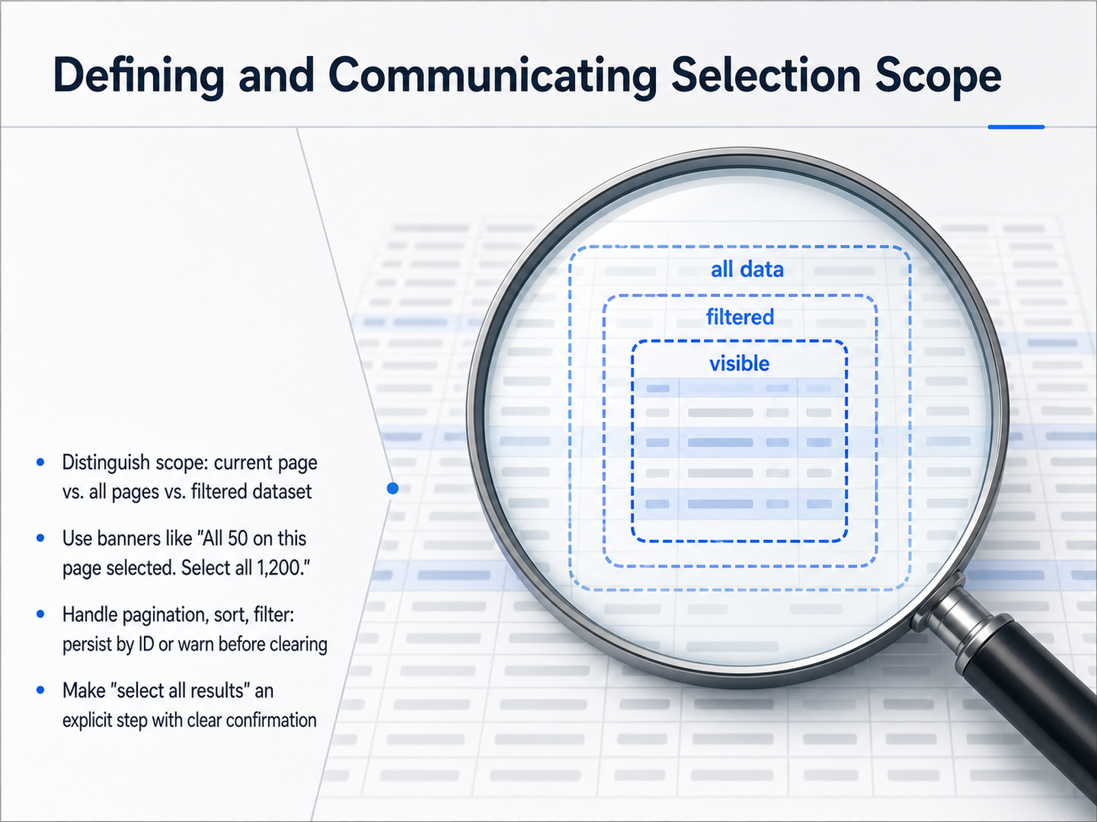
 - 04Defining and Communicating Selection ScopeNow let's talk about one of the trickiest parts of multi-select design: defining and communicating exactly what is selected. We call this the selection scope. The most common mistake users make is confusing what they see on the current page with the entire data set. To prevent this, your interface must clearly distinguish between the current page, all pages, and a filtered dataset. A clear banner message is your best tool here. For example, when a user checks the header checkbox, the interface should say something like, "All 50 on this page selected. Select all 1,200." This transforms a simple checkbox into an explicit choice. Next, you must handle scope persistence. When a user selects items and then sorts, filters, or moves to the next page, you need to decide if the selection persists. If it does, persist by ID. If not, warn the user before their selection is cleared. Finally, making "select all results" an explicit step is a critical safety feature. Never make it a hidden surprise. Always require a clear confirmation click so the user is fully aware of the massive scope. This single step prevents the most damaging bulk-action mistakes. Next up, we'll bring this to life by looking at bulk action discovery and the floating toolbar.
 nngroup.comshadcn.iouianatomy.dev+21 min
 - 05Bulk Action Discovery and the Floating ToolbarNow let's focus on the floating toolbar itself and how users discover it. The most important rule is that this toolbar must never hide behind a hover or a right-click. It appears the moment the selection count goes above zero, and it disappears only when that count returns to zero. This ensures the user always knows what actions are available. Position the bar close to the selected items. A common and reliable approach is to anchor it to the bottom of the viewport or just below the selection area so it feels connected. Limit the primary actions you show inline to a maximum of three or four. Any additional actions should collapse into a clearly labeled More menu. This keeps the interface clean and prevents choice overload. Inside the bar, you must always show two things: a label that clearly states the number of selected items, and a Clear selection button. These give the user a constant awareness of their current scope. As the user scrolls, the toolbar must persist on screen so actions are never out of reach. For mobile views, you can hide secondary text labels to save space, but those primary action buttons must remain visible and tappable. Up next, we will explore safety mechanisms for destructive batch operations.
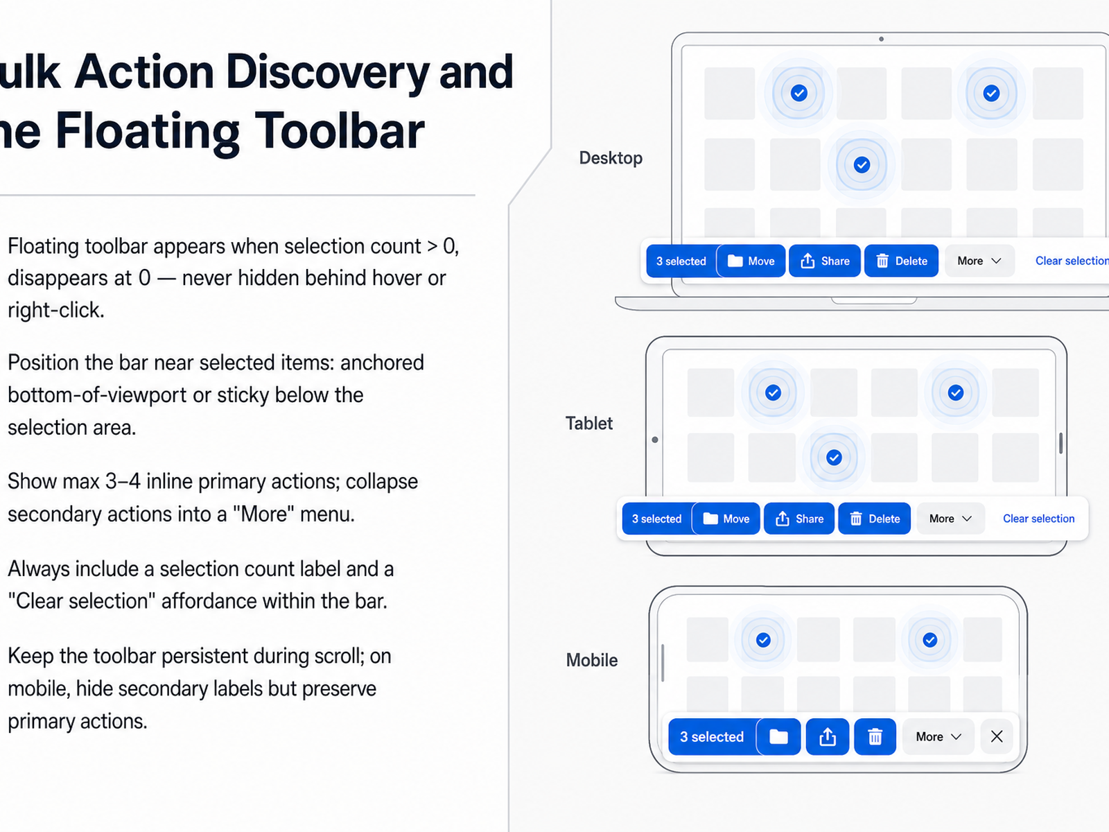 eleken.conngroup.comappmaster.io+22 min
 - 06Safety Mechanisms for Destructive Batch OperationsNow let's look at how to pick the right safety mechanism for destructive batch operations. There is no single best answer. You need to match the mechanism to the risk level. For a truly irreversible action, like sending a mass email or permanently erasing regulated data, you need a specific confirmation dialog. For a reversible action, like changing a status, an undo toast is much faster and keeps the user in flow. For deletes, a soft delete with a trash folder gives the user a longer safety net, often for seven to thirty days. The key is to combine these. The gold standard for most deletes is an undo toast that gives five to ten seconds for an instant reversal, plus a soft delete that keeps the item recoverable in a visible trash view for weeks. When you do use a confirmation dialog, make it effective. State the specific consequence, like "Delete 24 customers." Make the destructive button visually distinct and don't make it the default focus. For the most severe and irreversible cases, add a typed confirmation, where the user must type a word like DELETE to proceed. This prevents muscle-memory clicks from causing disasters. The goal is to design a layered defense that feels fast and safe, not annoying. Next, we'll walk through the confirmation-dialog decision framework to give you a clear process for choosing the right pattern every time.
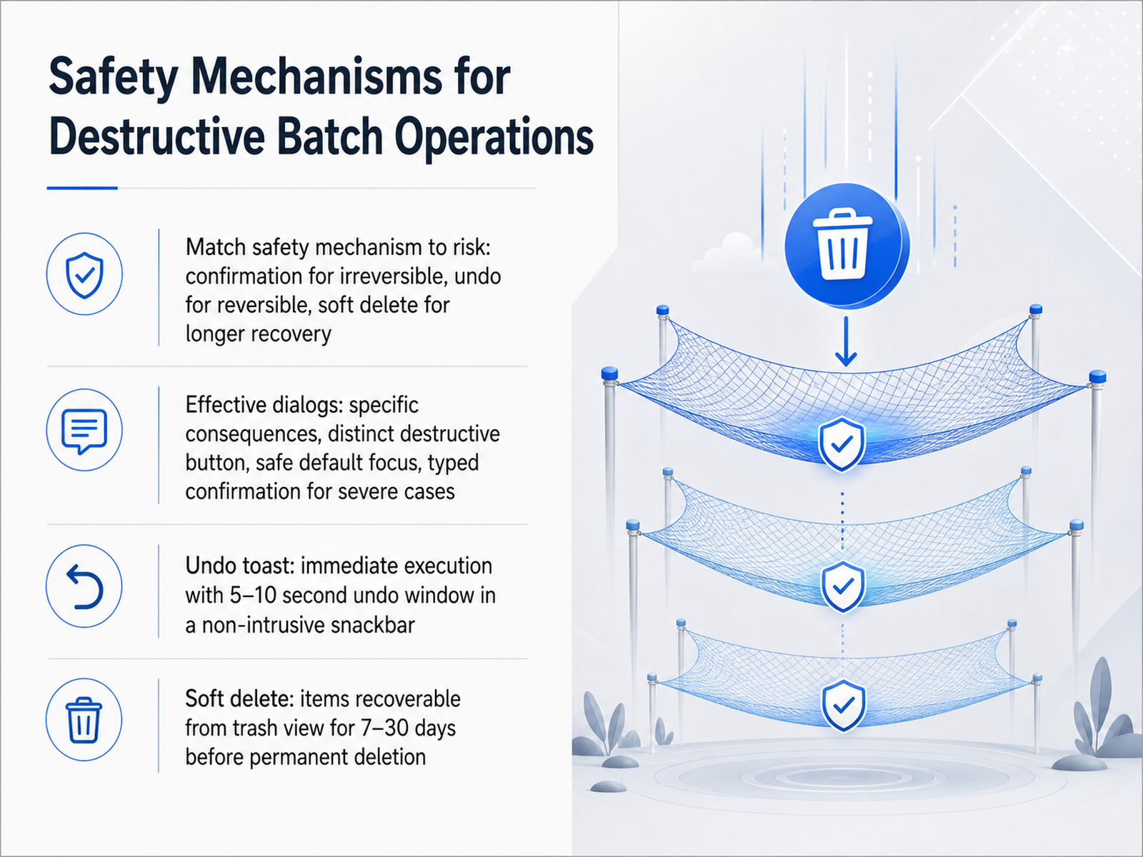 appmaster.ioappmaster.ioeleken.co+22 min
 - 07The Confirmation-Dialog Decision FrameworkNow let's build a simple decision framework for when to use confirmation dialogs versus undo. The rule is straightforward: choose the pattern based on reversibility, not habit. Ask four filter questions before adding any dialog. First, is this action truly irreversible? Think of sending an email blast, capturing a payment, or hard-deleting regulated data. Second, can the user fix the mistake immediately with a single undo click? Third, does the user need a longer recovery window, like a few days or weeks? And fourth, is this a high-frequency task that power users perform dozens of times a day? For reversible actions, undo wins. Commit the change instantly and show a five to ten second toast. The user sees the result and can take it back without breaking flow; no modal interruption needed. Confirmation dialogs are justified only for true irreversibles. When you must use one, make the body text specific: "Send this email to one thousand two hundred forty-seven recipients. This cannot be cancelled once sent." Reserve typed confirmation for the most severe cases. For most deletes, the hybrid default is undo plus soft delete: commit immediately, offer a short undo toast, and keep the item recoverable in a trash view for thirty days. This mix keeps the app fast for experts and safe for everyone. Next, let's look at how to give users clear feedback and show progress during batch execution.
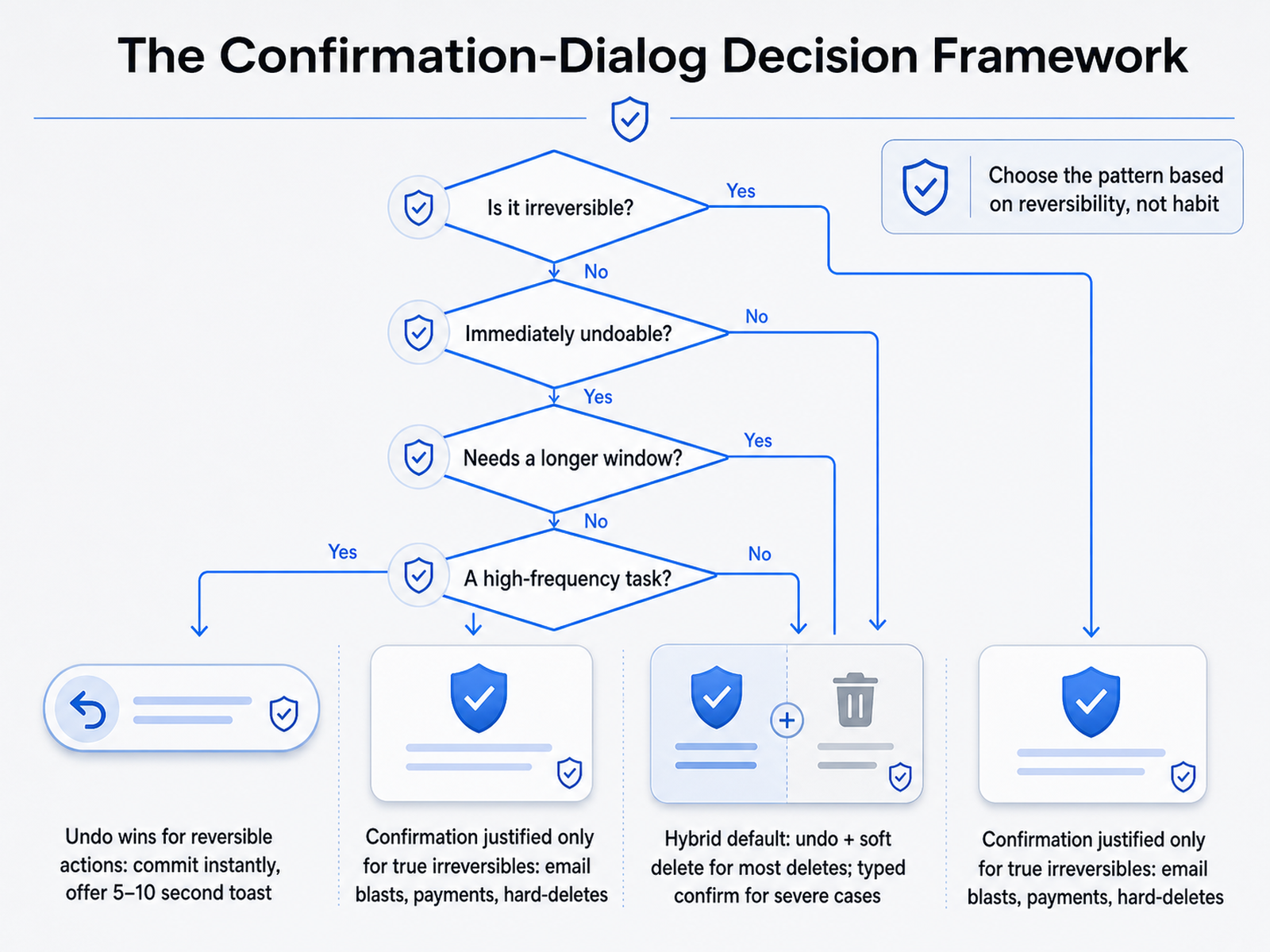 appmaster.ioappmaster.ioeleken.co+22 min
 - 08Feedback and Progress for Batch ExecutionLet's look at what users see the moment they confirm a batch action. The selected rows pulse to show they are in a pending state, the toolbar updates, and a progress indicator appears right away. For larger jobs, we show a determinate progress bar with the number of queued items and an estimated time remaining. This gives users a clear picture of how long they will wait. When the job finishes, do not simply say done if some items failed. Present exact counts of what succeeded, what failed, and what was skipped, along with plain language reasons. For example, some items might be skipped because they lack required permissions, while failures might be due to invalid data. Lengthy operations should run as background jobs so users can continue working. Notify them when the job completes and give them a direct path to retry only the failed items. In the next slide, we will explore partial failure and recovery flows in more detail.
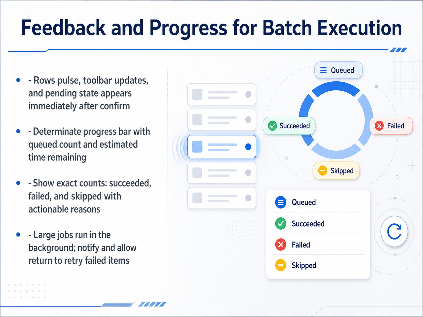 appmaster.ioeleken.cochyshkala.com+21 min
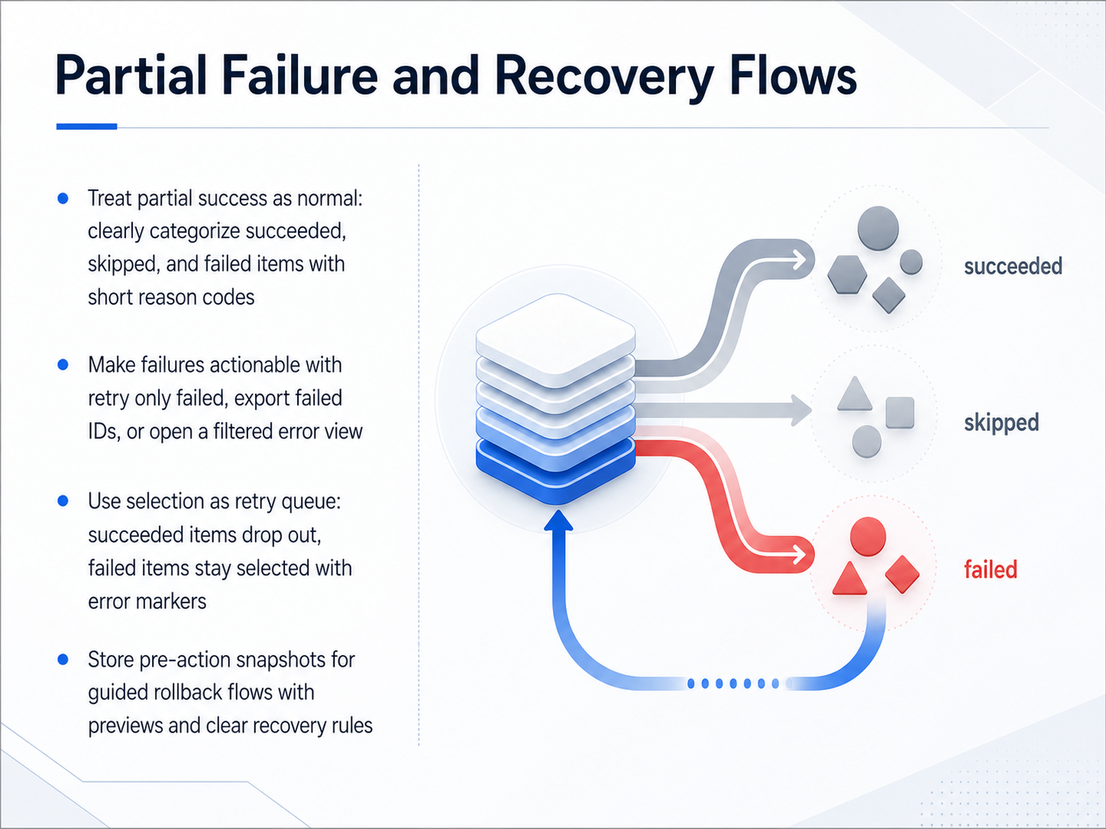
 - 09Partial Failure and Recovery FlowsLet's talk about something that happens all the time in the real world: partial failures. Not everything in a batch will succeed, and that's okay. The important part is how you design the recovery flow. First, treat partial success as the default. Don't just show a generic 'Done' message. Instead, clearly categorize the outcomes. Show how many items succeeded, how many were skipped, and how many failed. Use short, plain-language reason codes like 'Permission denied' or 'Already in target state' so users aren't left guessing. Next, make those failures actionable. Give users direct paths to recover: a 'Retry only failed' button, an option to 'Export failed IDs', or a link to open a filtered error view. You can also reuse the selection itself as a retry queue. After the action runs, remove the successful items from the selection. Only the failed items stay highlighted, marked with an error indicator. This lets the user fix the problem and resubmit just the broken ones without hunting for them. Finally, always store a snapshot of the data before the change runs. This gives you a guided rollback flow with clear previews and recovery rules, so users can confidently undo the entire batch if needed. Up next, we'll look at a topic just as critical: Accessibility Requirements for Multi-Select.
 appmaster.ioeleken.cochyshkala.com+21 min
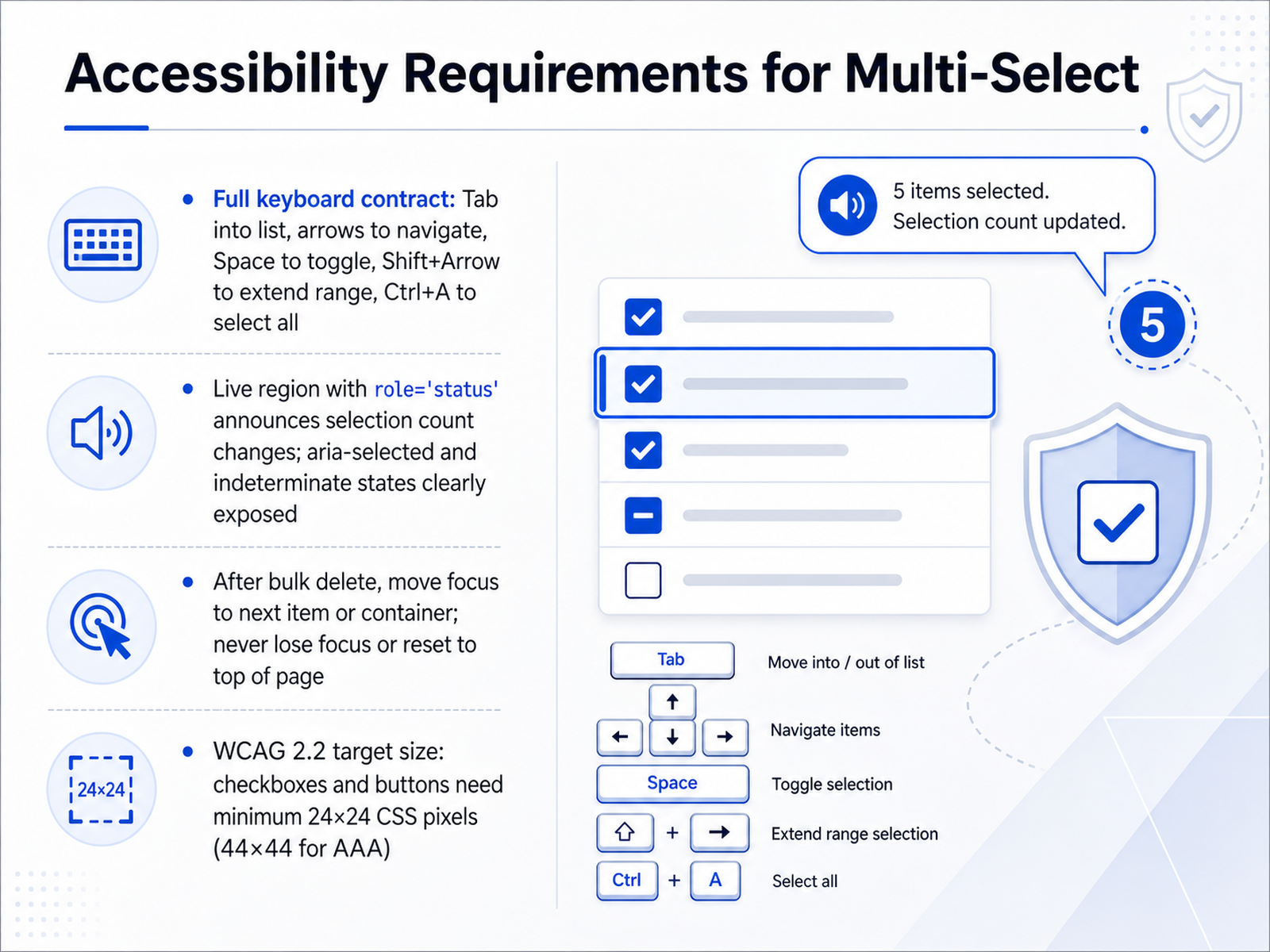
 - 10Accessibility Requirements for Multi-SelectNow, let's talk about making your multi-select experience work for everyone by meeting accessibility requirements. This is non-negotiable for an inclusive product. First, ensure full keyboard control. Users must be able to Tab into the list, navigate with the Arrow keys, toggle selections with the Spacebar, extend a range using Shift plus Arrow, and select everything with Control plus A. These are the standard patterns people expect. Next, assistive technology needs clear feedback. Use a live region with role equals status to announce selection count changes, and make sure aria-selected and indeterminate states are properly exposed. This tells screen reader users exactly what is happening. Focus management is critical after destructive actions. Following a bulk delete, you must move focus to the next logical item or the parent container. Never let focus get lost or reset back to the top of the page, as that is highly disorienting. Finally, respect the WCAG 2.2 target size rules. Hit areas for checkboxes and buttons need a minimum size of 24 by 24 CSS pixels, and ideally 44 by 44 for the triple-A standard, so that people with motor disabilities can accurately tap their targets. Next, we'll dive into the technical side with ARIA Implementation and Screen Reader Support.
 accessibility.buildw3.orgdequeuniversity.com+12 min
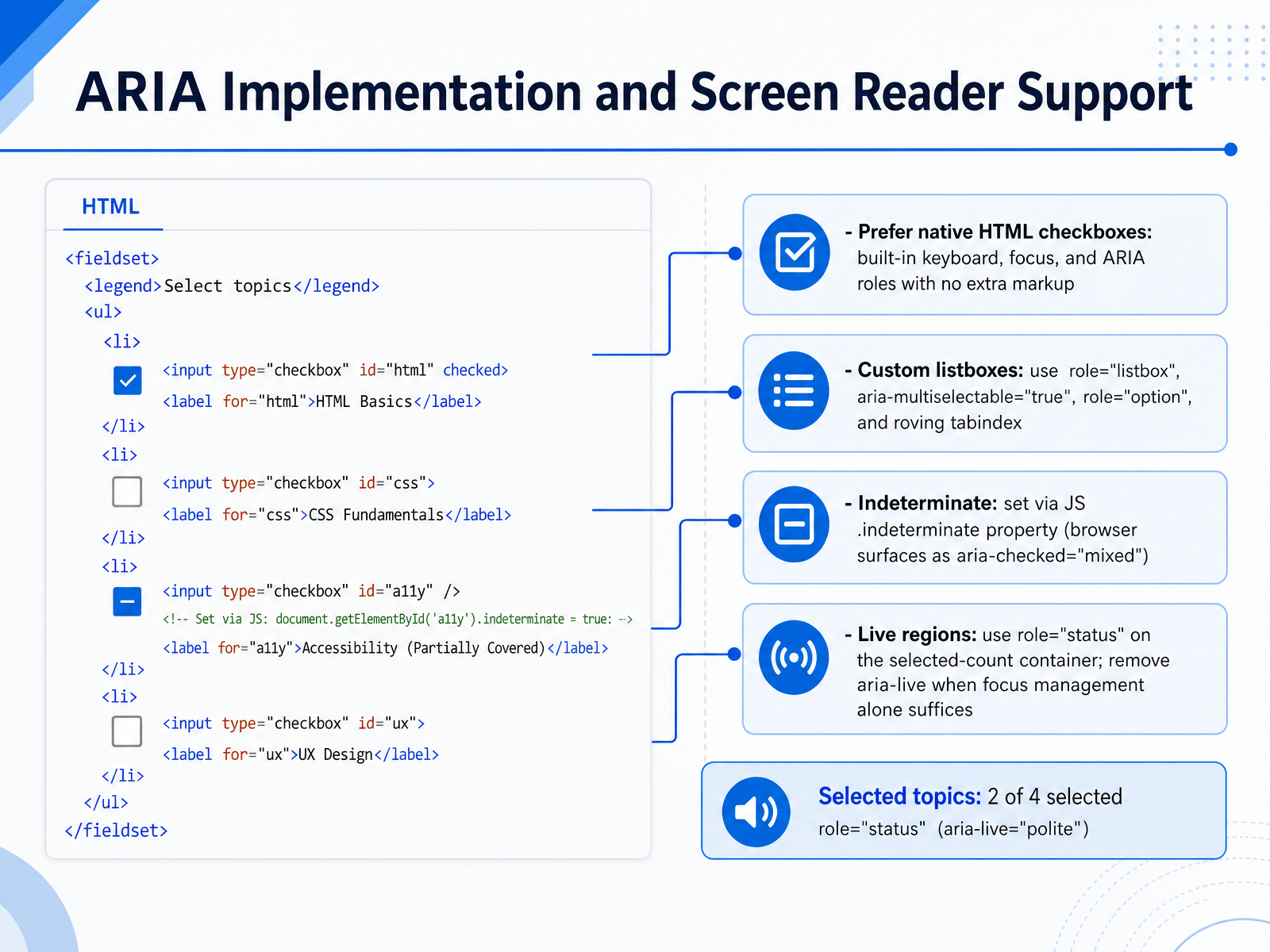
 - 11ARIA Implementation and Screen Reader SupportNow let's look at the underlying code and screen reader support for these selection patterns. First rule: prefer native HTML checkboxes. They give you keyboard focus and ARIA roles with no extra markup. If you must build a custom listbox, use role equals listbox on the container, aria-multiselectable equals true, and role equals option on each item. Manage focus with a roving tabindex pattern. For the indeterminate state, set the dot indeterminate property in JavaScript. This surfaces to screen readers as aria-checked equals mixed. For the selected count, a live region with role equals status works well. But here is an important note: when your focus management alone already tells users what changed, remove aria-live so announcements don't conflict. Up next we will apply these patterns to permissions, eligibility, and mixed-item selections.
 accessibility.buildw3.orgdequeuniversity.com+12 min
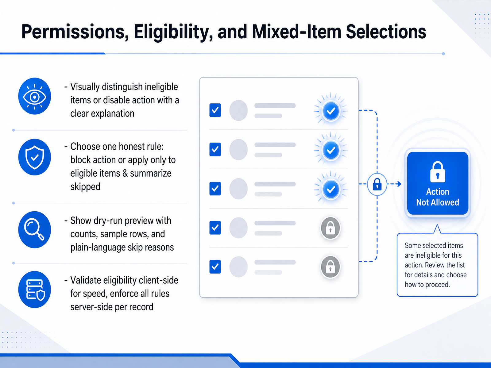
 - 12Permissions, Eligibility, and Mixed-Item SelectionsNow let’s talk about permissions and eligibility — the rules that decide which items your bulk action will actually touch. This is where trust is built or broken. First, make the situation visible before the user clicks apply. If some items in the selection are ineligible, don’t hide that. Either visually distinguish those rows with a muted style and a clear explanation, or disable the action entirely and show a tooltip that says why. Pick one honest rule and stick to it: either block the whole action until only eligible items remain, or apply the change only to eligible items and then summarize exactly what was skipped. Before execution, show a dry-run preview. Include the final count of affected items, a few sample rows so users can spot-check, and plain-language skip reasons — for example, “twelve items skipped because you lack edit permission on those records.” And here’s a critical safety layer: validate eligibility on the client side for speed, but always enforce every rule on the server per record. Client-side checks are a convenience; server-side enforcement keeps your data safe. In our final slide, we’ll cover common pitfalls and design heuristics to bring all of these patterns together.
 eleken.conngroup.comappmaster.io+22 min
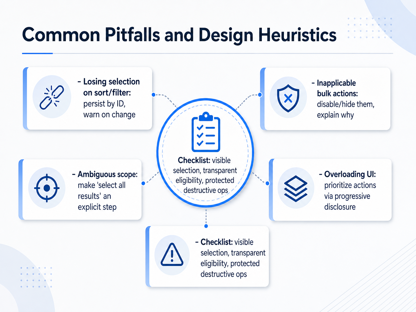
 - 13Common Pitfalls and Design HeuristicsLet's wrap up with the most common pitfalls to avoid when you design bulk actions, and the heuristics to keep you on track. First, losing the user's selection when they sort or filter data. The fix is simple: persist selections by ID, and warn if something changes. Second, showing bulk actions that can't apply. Disable or hide them, and use a tooltip to explain why the action is unavailable. Third, ambiguous scope. Never let users confuse the visible page with the full data set. Make 'select all results' a deliberate, explicit step with a clear count. And fourth, overloading the toolbar. Use progressive disclosure to prioritize the most important actions and move the rest into a 'More' menu. As a final checklist, make sure every design has visible selection state, transparent eligibility rules, and strong protection for destructive operations. Thank you for completing this module. These principles will help your users work safely, quickly, and confidently with large data sets.
 eleken.conngroup.comappmaster.io+22 min
Sources consulted
Web sources consulted while building this course.
- Checkboxes: Design Guidelines — nngroup.com
- Checkbox Indeterminate Parent-Child Form — shadcn.io
- https://uianatomy.dev/components/checkbox — uianatomy.dev
- Indeterminate Checkbox — shadcn.io
- Indeterminate Is Not a Value - DEV Community — dev.to
- Bulk action UX: 8 design guidelines with examples for SaaS — eleken.co
- Bulk Actions: 3 Design Guidelines (Video) - NN/G — nngroup.com
- Bulk actions UI patterns: preview, permissions, and undo | AppMaster — appmaster.io
- Table multi-select | Helios Design System — helios.hashicorp.design
- Data Table Design UX Patterns & Best Practices — pencilandpaper.io
- Safe bulk actions with preview and rollback for admins | AppMaster — appmaster.io
- UX for reversible actions: A decision framework for designing with recovery in mind - LogRocket Blog — blog.logrocket.com
- How to Choose Between Confirmation Dialogs, Undo Windows, and Soft-Delete Patterns - DEV Community — dev.to
- The UI Patterns That Make Background Jobs Feel Reliable | Ihor Chyshkala — chyshkala.com
- UI patterns for async workflows, background jobs, and data pipelines - LogRocket Blog — blog.logrocket.com
- Multi-repo bulk operations | R-That Wiki — wiki.r-that.com
- Accessible Listbox Guide (role=listbox, option & single vs multi-select) | Accessibility.build — accessibility.build
- Understanding Success Criterion 3.2.2: On Input | WAI | W3C — w3.org
- Dynamic Content (JavaScript, AJAX) | Web Accessibility ... — dequeuniversity.com
- jQuery MultiSelect Accessibility Wai-Aria Support - Kendo UI for jQuery — docs.telerik.com