Begin
16 pages · ~32 min
Design Systems Fundamentals
An introductory course on design systems, teaching learners how to create and maintain consistent, scalable UI components for efficient product development.
A digital instructor presents all 16 pages. Hold “Ask” at any point and ask out loud — the answer comes from this course. No sign-up needed.
What you’ll learn
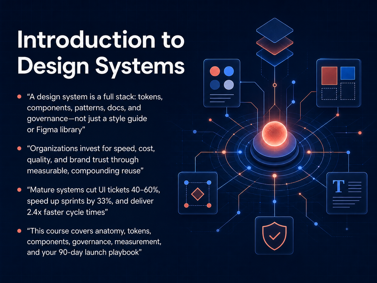
- 01Introduction to Design SystemsWelcome to Introduction to Design Systems. I'm today's digital human instructor. This course will give you a clear, practical understanding of what a design system really is, why organizations invest in them, and how to build one that delivers measurable results. Let's start by defining our terms. A design system is a full stack. It includes design tokens, components, patterns, documentation, and governance. It is not just a style guide or a Figma library. Organizations invest in design systems to gain speed, reduce cost, improve quality, and build brand trust through compounding reuse. The data backs this up. Mature design systems routinely cut UI tickets by 40 to 60 percent, speed up sprints by 33 percent, and deliver 2.4 times faster cycle times. Throughout this course, we'll cover the anatomy of a design system, including tokens, components, governance, and measurement. And you'll finish with a 90-day launch playbook you can put into practice immediately. Next, we'll dive into the business case and explore why design systems matter now more than ever.figr.designfigma.comedana.ch+22 min
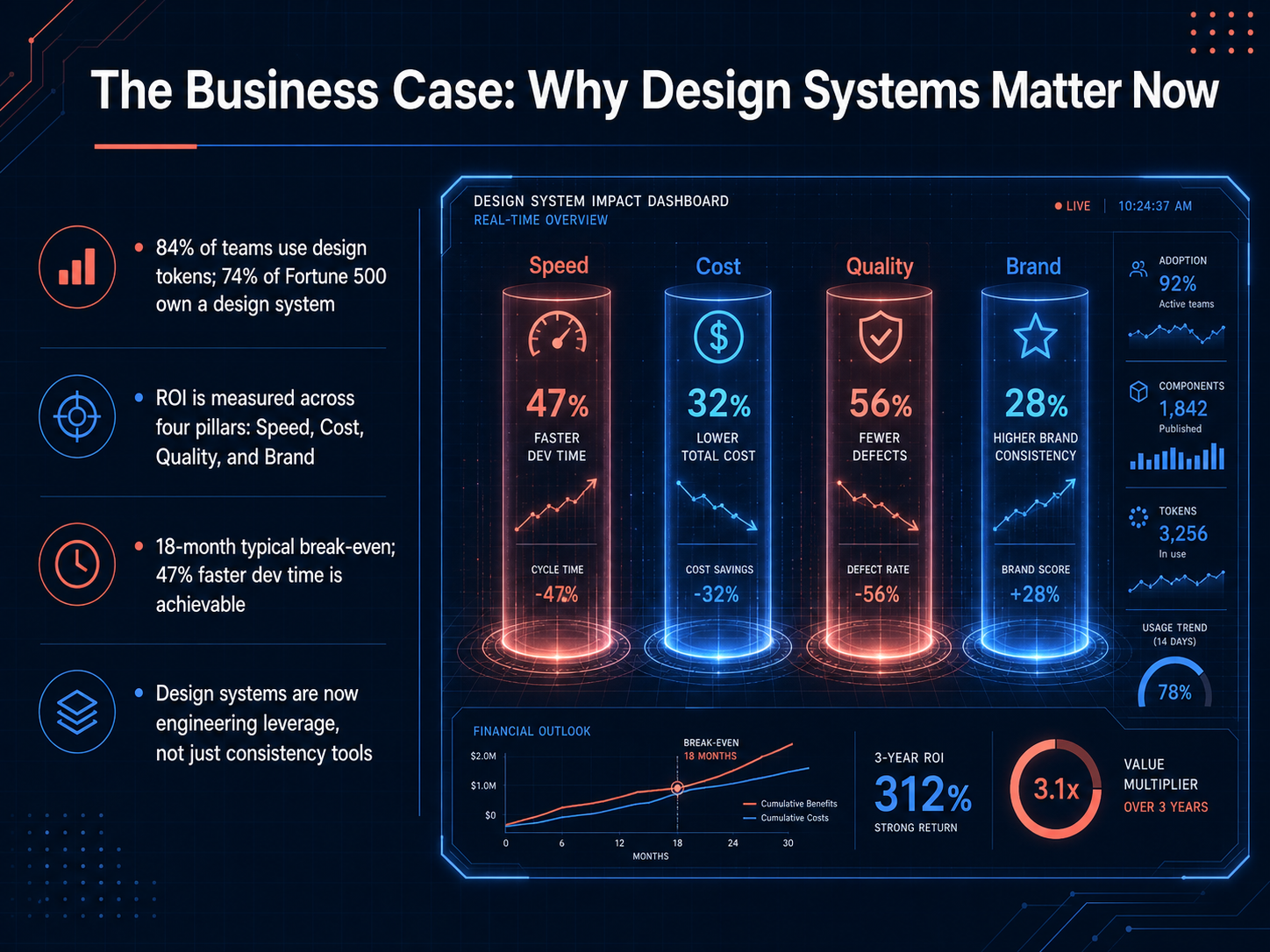
- 02The Business Case: Why Design Systems Matter NowWhy do design systems matter right now? The numbers tell a compelling story. Already, eighty-four percent of teams use design tokens, and seventy-four percent of Fortune 500 companies own a design system. But the real reason they invest is return on investment, measured across four pillars: Speed, Cost, Quality, and Brand. This is the language leadership understands. For example, a typical break-even point is around eighteen months, and studies show a forty-seven percent faster development time is achievable. This is why we now see design systems as engineering leverage, not just a tool for visual consistency. They are a strategic asset that compounds value over time. Next, let's break down the internal structure that makes this possible in 'Core Anatomy: The Layers of a Modern Design System'.
 figr.designfigma.comedana.ch+21 min
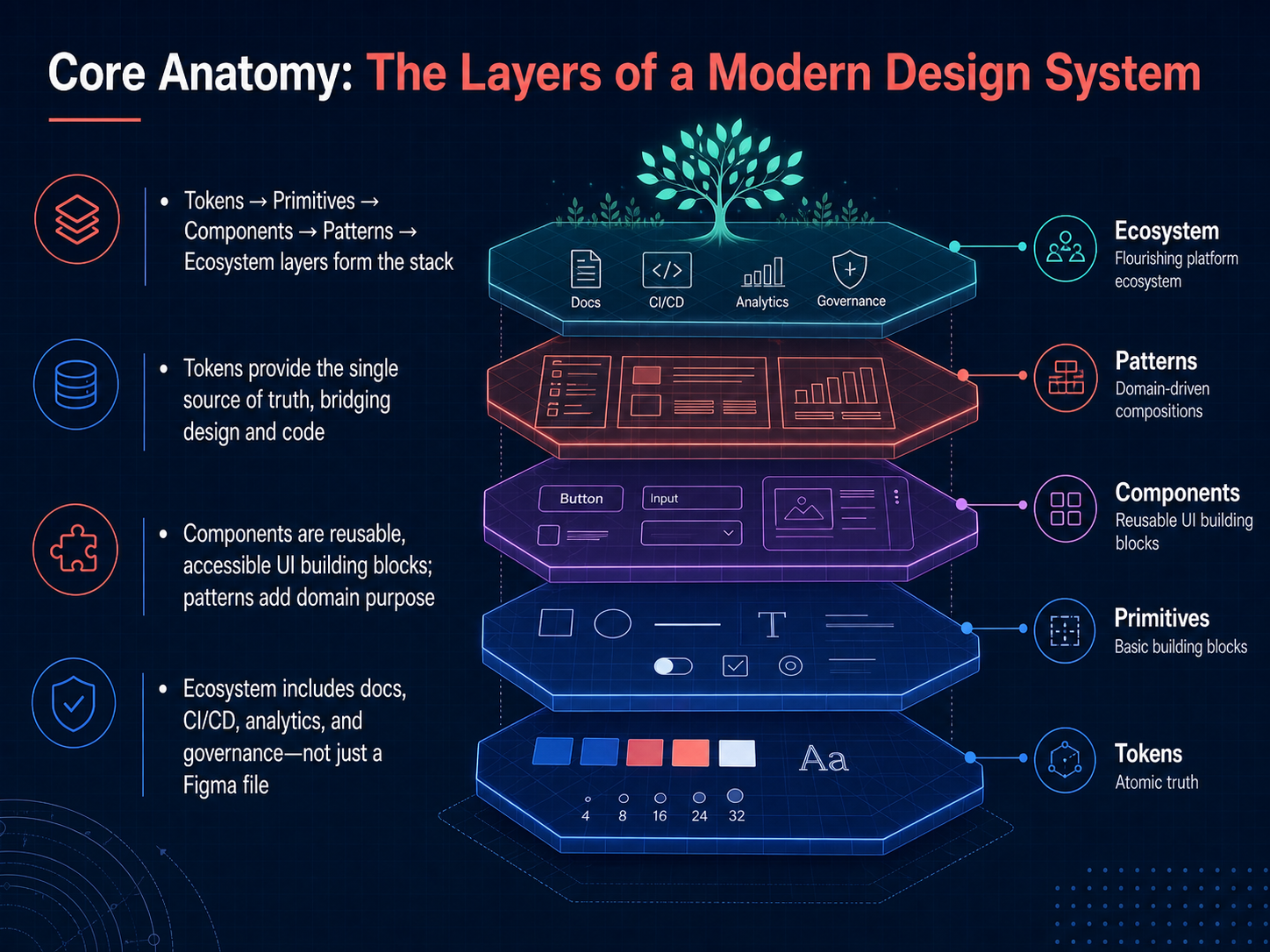
 - 03Core Anatomy: The Layers of a Modern Design SystemCore anatomy of a modern design system. Think of it as a layered stack, starting from the ground up: tokens, primitives, components, patterns, and finally the ecosystem that surrounds everything. At the very base, design tokens are the single source of truth. They are named values for colors, spacing, and typography that bridge the gap between design and code. Moving up, we get to components—reusable, accessible building blocks like buttons and inputs. Patterns then give these components domain purpose, combining them into common flows like navigation or sign-up. And the ecosystem layer is critical. It's not just a Figma file. It includes documentation, automated testing, analytics, and governance to keep the system alive and adopted. So, the system is much more than a component library; it's a complete product infrastructure. Next, we'll dive deeper into the very foundation of this stack: design tokens.
 jakeburdess.comsystem.systemsdcrayons.app+21 min
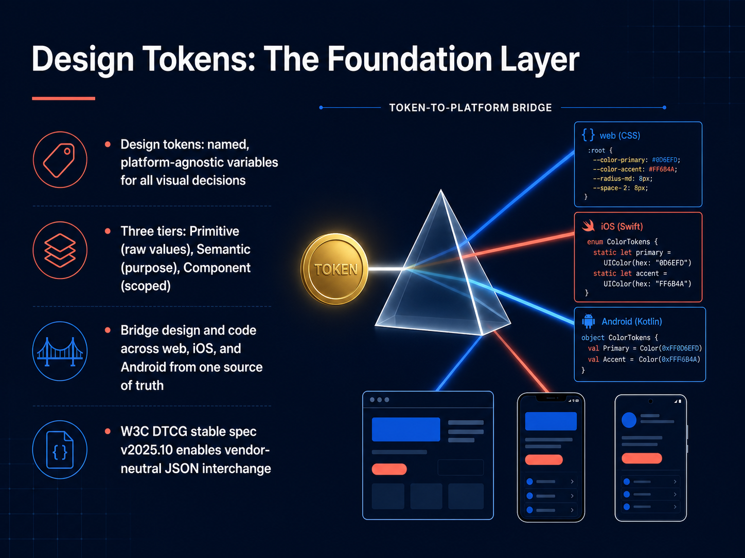
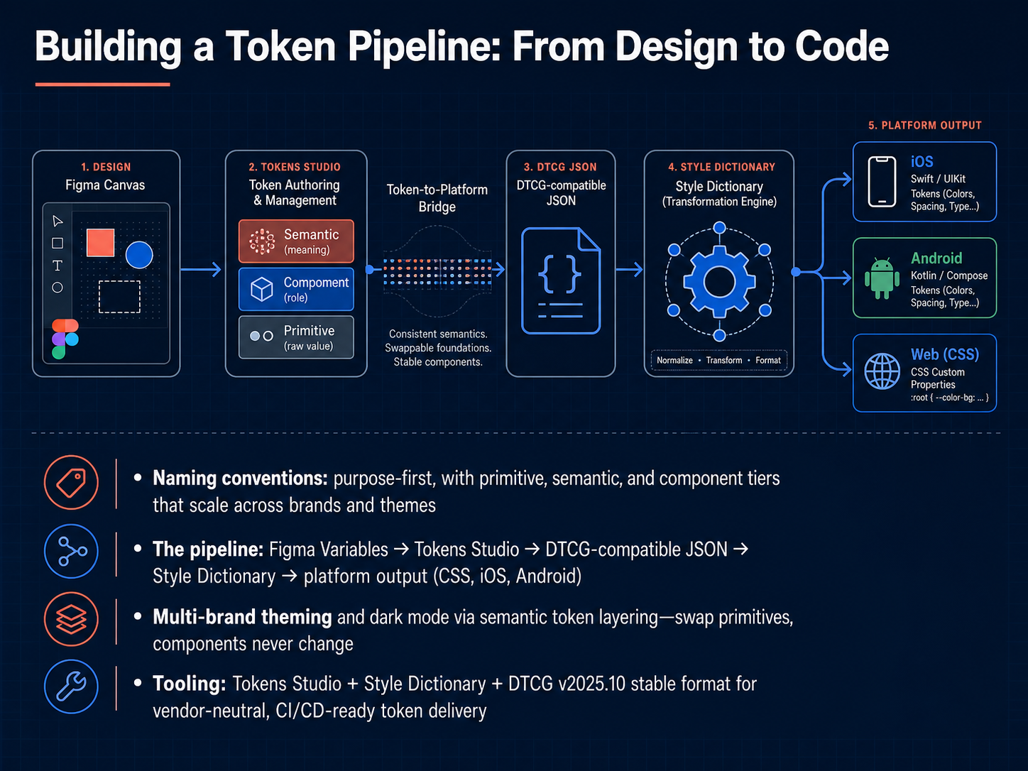
 - 04Design Tokens: The Foundation LayerLet's zoom in on the most atomic layer of any design system: design tokens. Think of them as named, platform-agnostic variables that capture every visual decision. Instead of hard-coding a hex color or a pixel value, you reference a token. This single approach creates a bridge between design and code, so your colors and spacing stay consistent across web, iOS, and Android from one source of truth. To keep things organized, tokens are structured in three tiers. At the bottom, you have primitive tokens. These are raw values, like a specific blue hex code. Next, semantic tokens describe the purpose. They map a primitive to a role, like 'color-text-primary'. Finally, component tokens are scoped specifically to a UI element, like a button's background. This layering means if you change a primitive value, every connected semantic and component token updates automatically. A major milestone for the industry is the W C three Design Tokens Community Group's stable spec, known as version 2025.10. It establishes a vendor-neutral JSON format for interchange, so your tokens aren't locked into a single tool. Now that we have a solid foundation, let's walk through a practical pipeline. Next, we'll explore 'Building a Token Pipeline: From Design to Code'.
 w3.orgw3.orgw3.org+22 min
 - 05Building a Token Pipeline: From Design to CodeToken pipeline, the path your design decisions take from a Figma file all the way to production code. It starts with naming. The industry standard is a purpose-first approach with three tiers: primitive tokens for raw values like a specific hex code, semantic tokens that describe intent, such as "background primary," and component tokens scoped to a single element, like "button primary background." This layering is what makes multi-brand theming and dark mode work. You swap the primitive values, and the semantic and component layers update automatically. The pipeline itself flows from Figma Variables into Tokens Studio, which exports a JSON file compatible with the W3C Design Tokens specification, version twenty twenty-five point ten. This stable, vendor-neutral format ensures your tokens can travel anywhere. From there, Style Dictionary transforms that JSON into platform outputs: CSS custom properties for the web, Swift for iOS, or XML for Android. The entire process runs in CI and CD, so a designer's change in Figma can ship to every platform without a manual handoff.
 w3.orgw3.orgw3.org+22 min
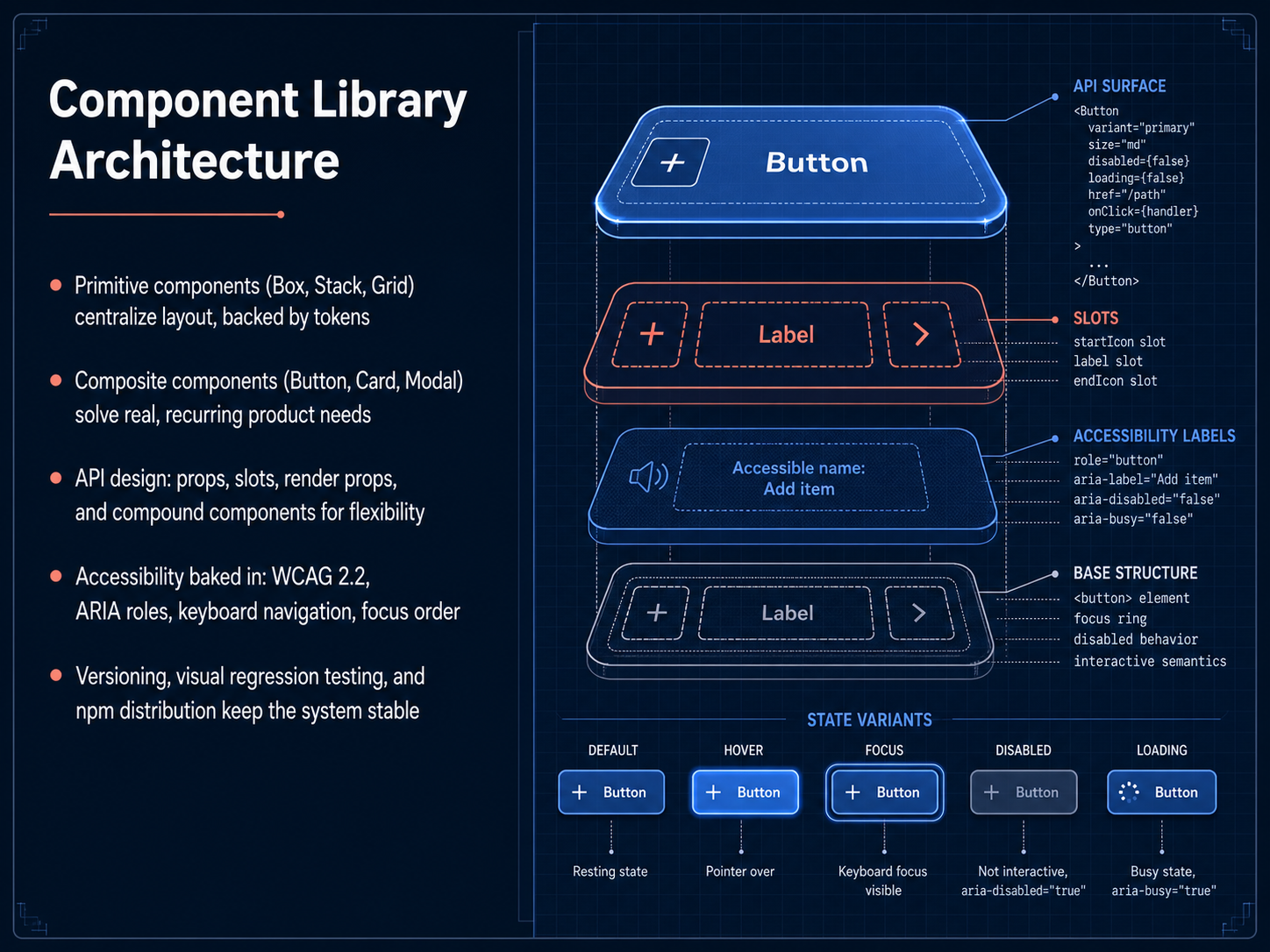
 - 06Component Library ArchitectureNow let's look at how the component library itself is structured. This architecture is what transforms a loose collection of parts into a true, scalable system. We start with primitive components like Box, Stack, and Grid. These are the layout glue, and they are directly backed by design tokens, so spacing and positioning are always consistent. Next, we have composite components, such as Button, Card, and Modal. These are the workhorses that solve real, recurring product needs. The real power comes from a flexible API design, using props, slots, render props, and compound components. This gives teams the control they need without creating a rigid, one-size-fits-all monster. Crucially, accessibility isn't an afterthought here. It's baked directly into the architecture, with WCAG two point two compliance, proper ARIA roles, keyboard navigation, and a logical focus order built in from the start. Finally, a stable system requires solid infrastructure. We use semantic versioning, automated visual regression testing to catch unintended visual changes, and distribution through npm packages to keep the system stable and the updates predictable. Next, let's move on to testing and quality assurance for these components.
 jakeburdess.comsystem.systemsdcrayons.app+22 min
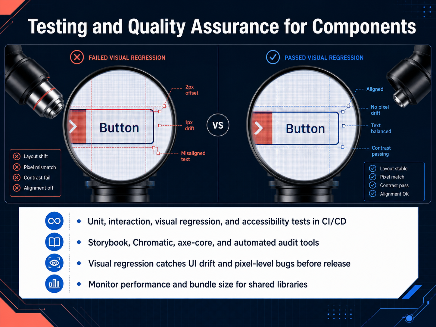
 - 07Testing and Quality Assurance for ComponentsNow, let's talk about testing and quality assurance for components. A design system is only as reliable as the tests you put behind it. We're going to look at four key testing layers that should run in your continuous integration pipeline. First, unit tests verify your component logic. Second, interaction tests confirm that user flows work correctly. Third, visual regression testing catches pixel-level changes before they reach users. And fourth, accessibility tests check for compliance with standards like WCAG. Tools like Storybook and Chromatic make visual regression testing practical, automatically comparing screenshots to spot UI drift. For accessibility, axe-core is the industry standard; it catches over half of common issues automatically. Beyond visuals, you also need to monitor performance and bundle size, especially for shared libraries, because a single component can impact the entire application. When all these tests run automatically on every pull request, your team can ship with confidence. Next, we'll explore documentation that drives adoption.
 designsystemscollective.comchromatic.comgithub.com+22 min
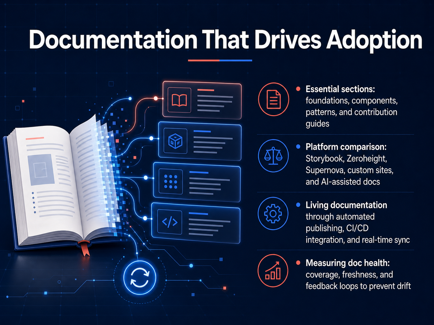
 - 08Documentation That Drives AdoptionNow, let's talk about the documentation itself—the content that actually drives adoption. If your team doesn't use the docs, the system doesn't exist. To make them useful, you need to cover four essential sections. First, foundations: your design tokens for color, spacing, and typography. Second, components, with anatomy diagrams, states, and code snippets. Third, patterns, showing how components combine to solve real problems. And fourth, contribution guides, so anyone can propose a change. When it comes to tools, you have choices. Storybook is great for engineering-heavy teams who need live component playgrounds. Platforms like Zeroheight or Supernova add Figma sync and are built for design ops. For smaller teams, a custom site or an AI-assisted tool like Docsio can get you publishing fast. But the real secret is making this documentation living. You want to automate publishing, connect it to your CI/CD pipeline, and keep specs in real-time sync with your code. Finally, you have to measure its health. Track your coverage, check for freshness, and build feedback loops to prevent what we call 'documentation drift.' If you don't measure it, you can't manage it. Next, we'll look at the governance models and contribution workflows that keep your system healthy over time.
 docsio.co2 min
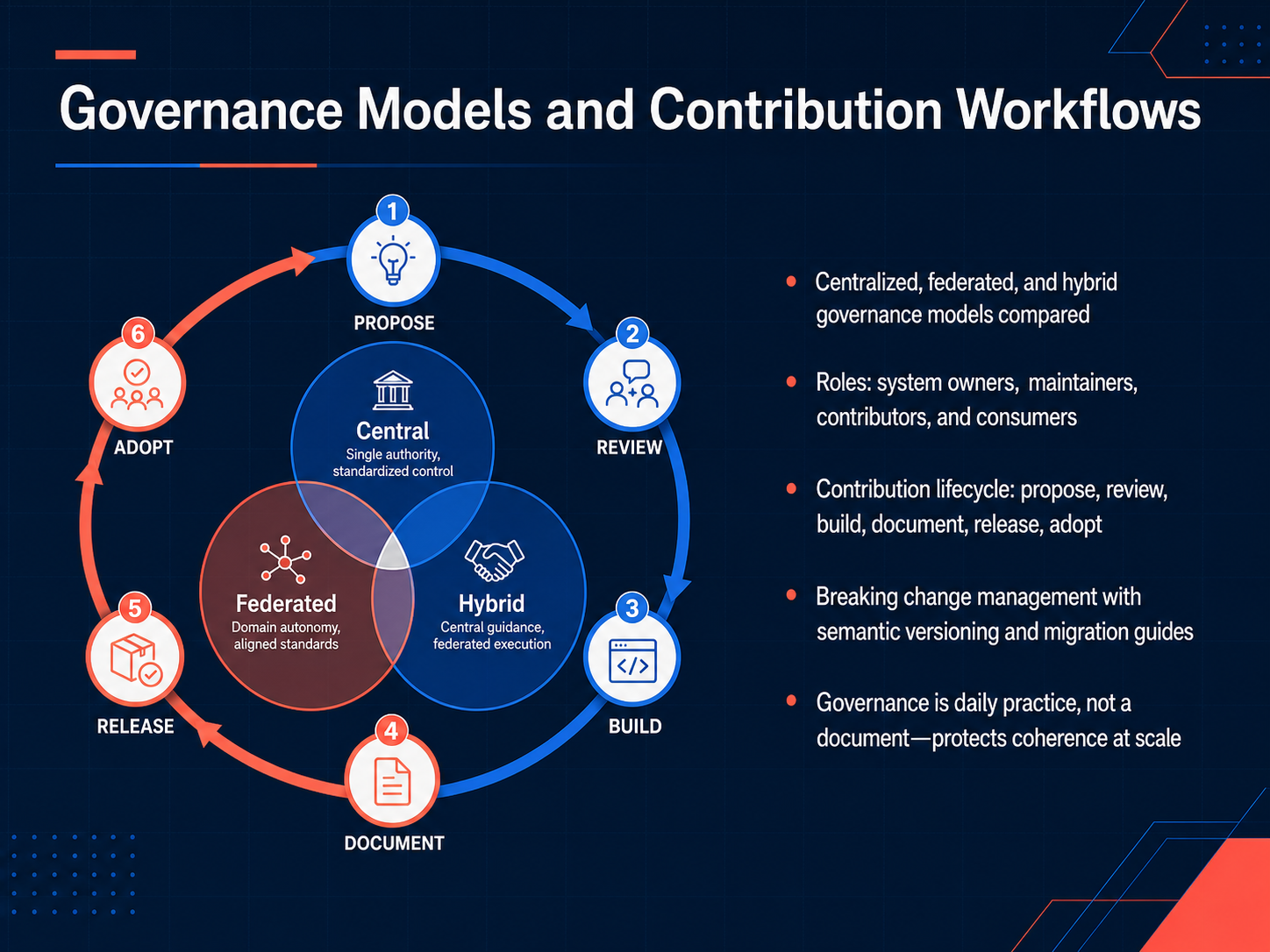
 - 09Governance Models and Contribution WorkflowsNow let's talk about governance, because this is where most design systems either thrive or quietly fall apart. The core insight is this: governance is a daily practice, not a document. It protects the coherence of your system as it scales. Let's compare three common models. Centralized governance has a single core team making all decisions. Federated governance distributes ownership across product teams. The hybrid model is a middle ground, where a core team steers the strategy, and product teams contribute. We also need to define clear roles. System owners set the vision. Maintainers review contributions and manage releases. Contributors propose new components or fixes. And consumers use the system to build products. The contribution lifecycle gives this process a reliable rhythm. It starts with a proposal, then a review, followed by a build phase, documentation, a versioned release, and finally, adoption by the product teams. A critical part of this lifecycle is managing breaking changes. We use semantic versioning to signal the impact of a release, and we provide clear migration guides so teams can upgrade confidently without breaking their products. Remember, governance isn't bureaucracy. It's the mechanism that keeps a system from drifting into chaos. Next, we'll look at measuring design system success.
 jakeburdess.comsystem.systemsdcrayons.app+22 min
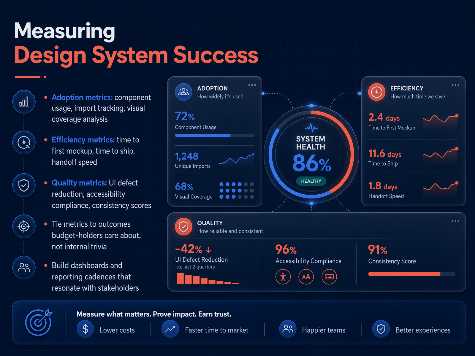
 - 10Measuring Design System SuccessNow let's talk about how to prove your design system is actually working. Measuring success isn't about counting components or tracking internal trivia. It's about connecting your work to outcomes that budget-holders already care about. Start with adoption metrics. Track component usage, imports, and visual coverage. Visual coverage is especially powerful because it measures how much of your live product is truly built with system components, from the user's perspective. Then look at efficiency. How fast can a designer go from opening a file to a clickable mockup? How long does it take to ship a UI feature? Compare surfaces that use the system against those that don't. Quality matters too. Watch for UI defect reduction, accessibility compliance, and consistency scores. These numbers should trend in the right direction as adoption rises. The key is to tie every metric to a real business outcome. Instead of saying 'we saved two hundred hours,' say 'we shipped Feature X forty percent faster than the previous comparable feature.' That second statement moves the budget. Build dashboards and reporting cadences that resonate with stakeholders. A monthly internal dashboard for the team, a quarterly outcome-focused report for leadership, and one concrete shipped-feature example with a time-to-ship comparison. Next, we'll explore common pitfalls and how to avoid them.
 2 min
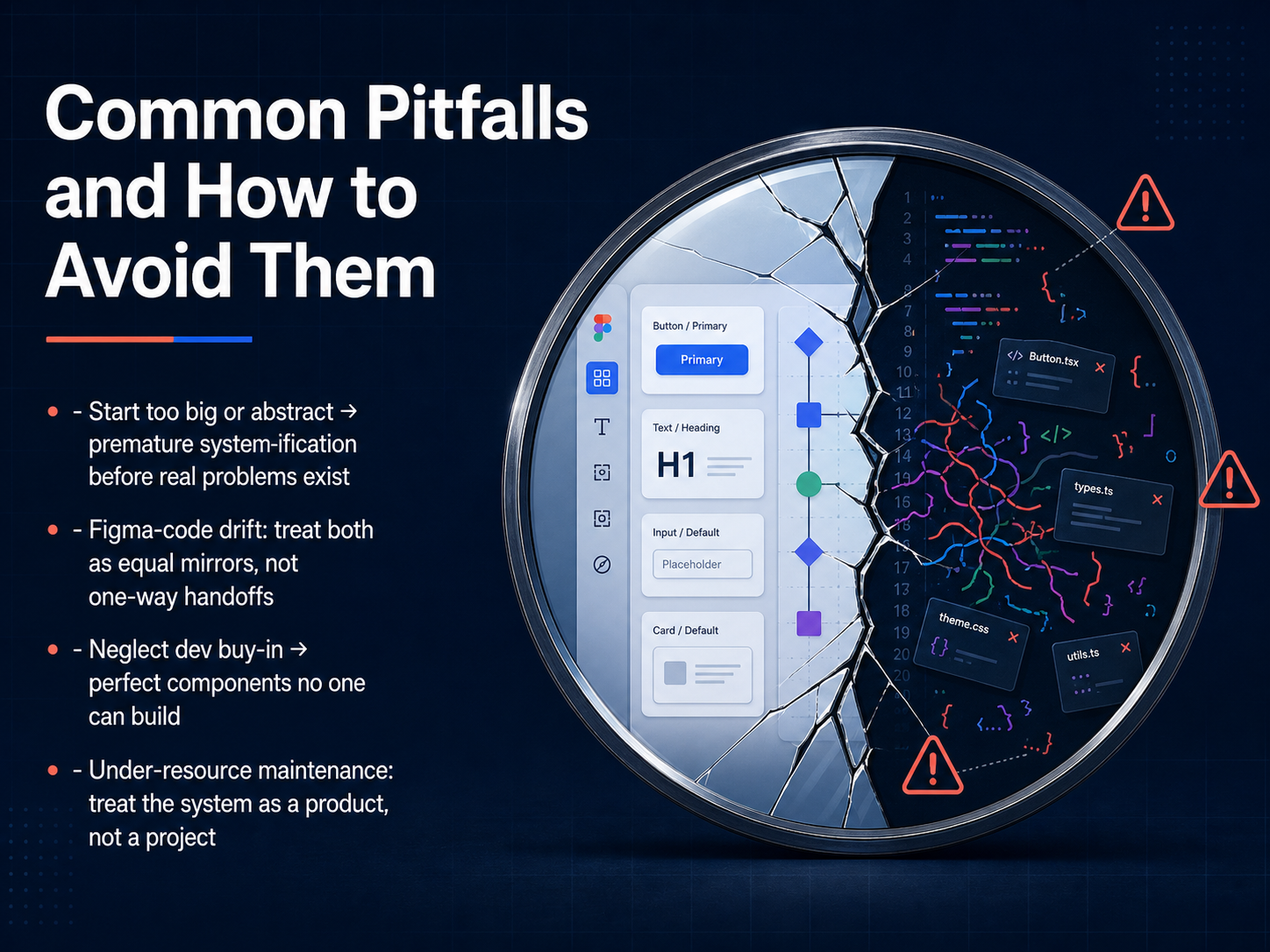
2 min - 11Common Pitfalls and How to Avoid ThemLet's walk through some of the most common pitfalls that can derail a design system, and more importantly, how to steer clear of them. First, starting too big or too abstract. This is what happens when you try to systematize everything before you have real, recurring problems to solve. It's a sign of premature optimization. The fix is to let your system evolve from your actual product, not the other way around. Second, the drift between Figma and code. Think of your design file and your codebase as two mirrors that must reflect each other perfectly. If they aren't treated as equal sources of truth, you get a breakdown in handoff and a system no one trusts. Next, neglecting developer buy-in. You can create the most beautiful component in Figma, but if it's impossible to build with your front-end stack, it's just a picture. Involve engineers early and often. Finally, under-resourcing maintenance. A design system is not a one-time project you finish and forget. It's a living product that needs dedicated care, or it will quickly decay. Treat it like a product, and fund it accordingly. Now, let's pull these ideas together and look at the success triad of people, process, and technology.
 2 min
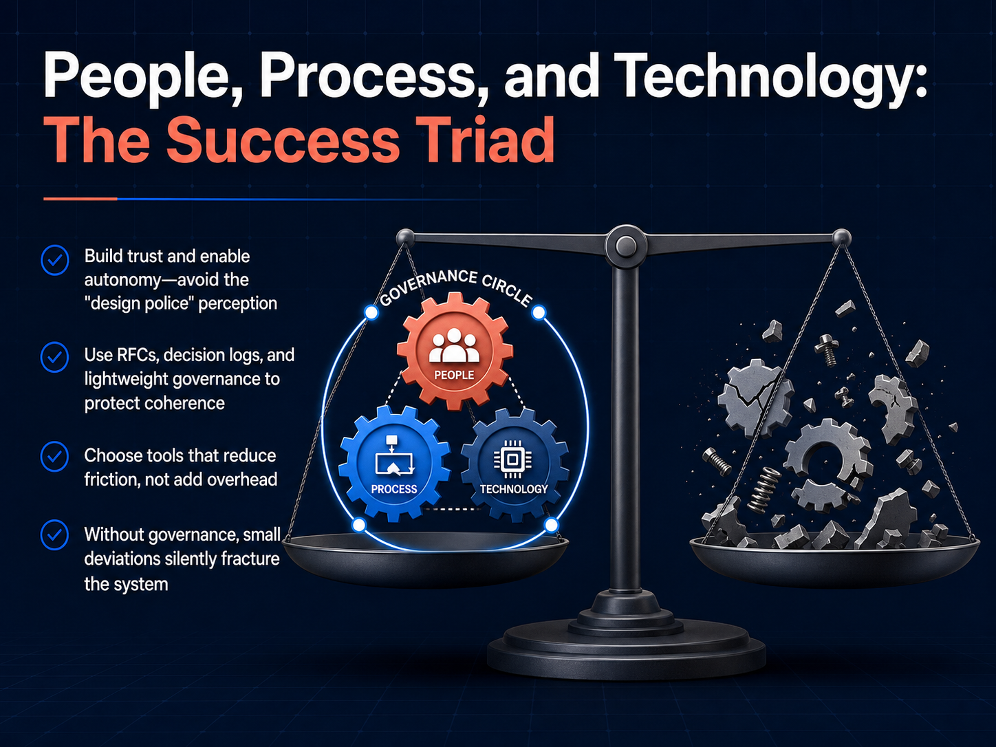
2 min - 12People, Process, and Technology: The Success TriadLet's look at the engine that keeps a design system alive: people, process, and technology. First, people. The fastest way to kill adoption is to become the design police. Instead, build trust and enable autonomy. When a designer needs a custom component, don't just say no. Guide them toward a solution that protects coherence without crushing their creativity. Next, process. Use lightweight governance like RFCs and decision logs. You don't need a heavy bureaucracy. A simple, documented process for contributions protects the system from chaos. As the case studies show, without governance, small deviations silently fracture the system over time. Finally, technology. Choose tools that reduce friction, not add overhead. If a developer has to read source code just to use a button, your tech stack is a blocker. Your tools should make the right thing the easiest thing. This triad of people, process, and technology is what keeps your system from becoming a digital graveyard. Now, let's move from principles to action with our next topic: Getting Started: From Audit to First Release.
 2 min
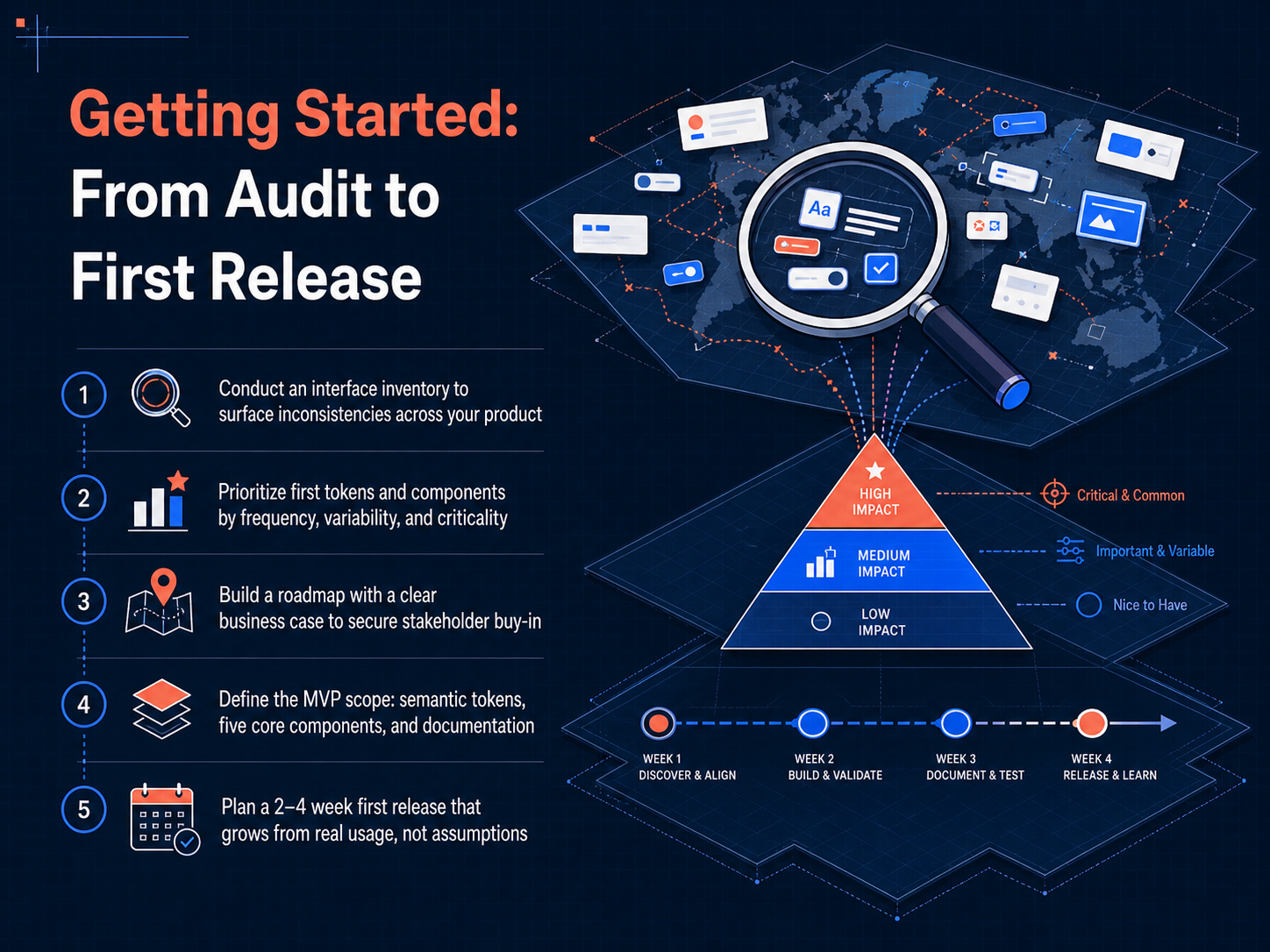
2 min - 13Getting Started: From Audit to First ReleaseLet's map out the practical path from your initial audit to a working first release. The first step is to conduct an interface inventory. This means capturing screenshots of your entire product to surface every inconsistency in colors, spacing, and component patterns. Once you can see the drift, you prioritize. Focus on the tokens and components that are used most frequently, have the highest visual variability, or are critical to your brand's identity. Next, you need a roadmap. To secure stakeholder buy-in, tie every planned element to a clear business case. Show how this work reduces duplicated effort and speeds up feature delivery. For your minimum viable product, or MVP, scope, keep it tight. The goal is a spine you can grow, not a complete library. This means defining your semantic tokens, building your five highest-traffic components, and publishing the documentation that makes them usable. Finally, plan for a two-to-four-week sprint to ship this first release. Let real usage and feedback from your product teams guide what you build next, rather than building from assumptions. This approach turns a big, abstract project into a manageable, concrete launch.
 jakeburdess.comsystem.systemsdcrayons.app+22 min
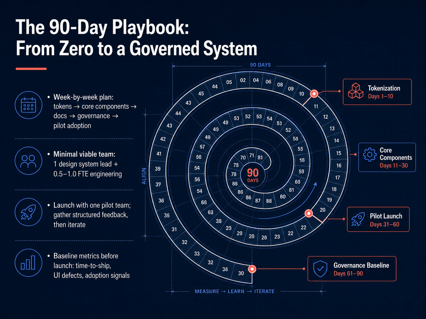
 - 14The 90-Day Playbook: From Zero to a Governed SystemLet's bring this all together with a concrete starting plan — a 90-day playbook to move from zero to a governed system. The sequence matters. Week by week, you'll progress from defining design tokens, to building core components, to writing documentation, establishing governance, and finally piloting adoption with one real product team. You don't need a large dedicated team to begin. A minimal viable setup is one design system lead, plus a half to one full-time engineering resource. Launch with a single pilot team. Gather structured feedback on what works and what breaks, then iterate before you scale. And critically, baseline your metrics before launch. Measure current time-to-ship, UI defect counts, and early adoption signals so you can prove the value you're creating. Next, we'll look at how design systems intersect with AI in the 2026 landscape.
 figr.designfigma.comedana.ch+21 min
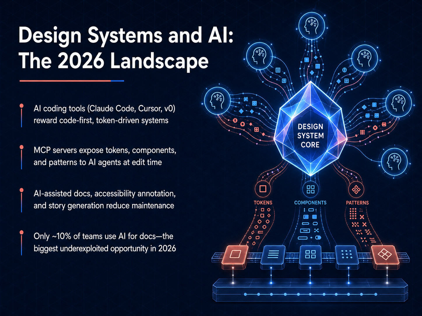
 - 15Design Systems and AI: The 2026 LandscapeNow let's look at the landscape where design systems and AI intersect in 2026. AI coding tools like Claude Code, Cursor, and v0 reward systems that are code-first and token-driven. This means your source of truth needs to live in the repository, not just in a Figma file. A key piece of infrastructure here is the MCP server, which exposes your tokens, components, and patterns directly to AI agents at edit time. On the practical side, AI is also reducing maintenance overhead through auto-generated documentation, accessibility annotations, and even story generation. Yet here is the striking number: only about ten percent of teams are currently using AI for documentation. That gap represents the single biggest underexploited opportunity in the design system space right now. The teams that close it will compound their speed and consistency much faster than those who don't. Next, let's wrap up with the key takeaways and your next steps.
 docsio.codesignsystemscollective.comchromatic.com+21 min
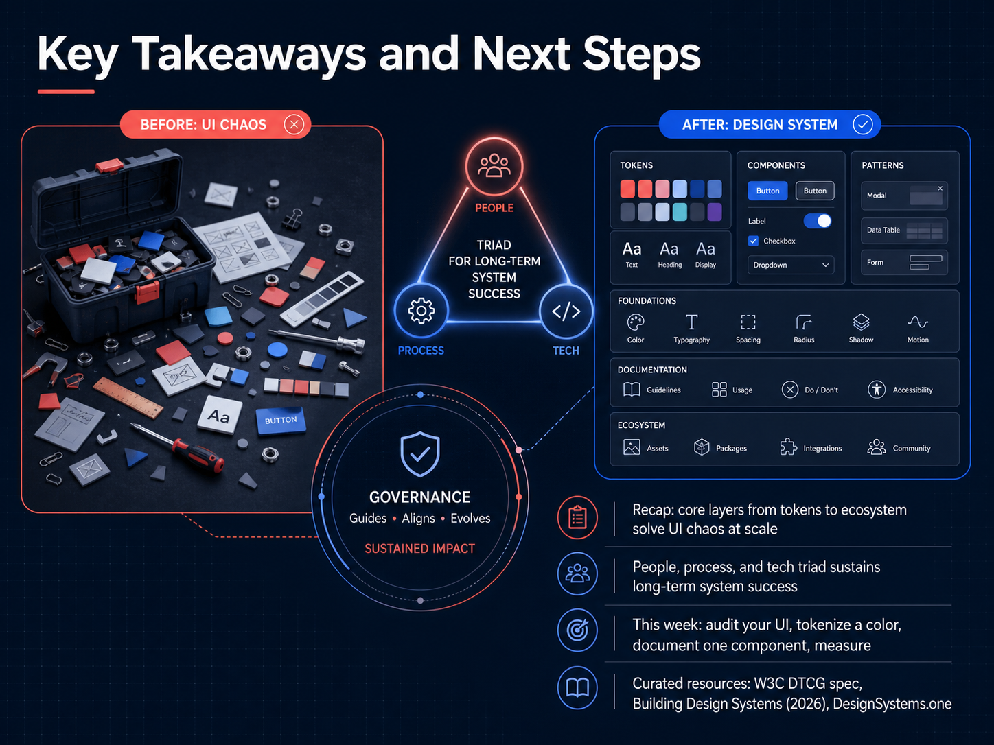
 - 16Key Takeaways and Next StepsWe've covered a lot of ground, so let's bring it all together. The core idea is that a design system's layers, from the smallest token all the way up to the full ecosystem, are what solve UI chaos at scale. We also learned that technology alone isn't enough. The real, long-term success depends on a healthy triad of people, process, and the right tools. So, what's next? This week, I want you to take three concrete actions. First, audit a single screen in your product to spot inconsistencies. Second, pick one color and tokenize it, giving it a clear, semantic name. Third, document just one component, including its states and usage guidelines. Then, measure the difference it makes. To continue your journey, I've curated some essential resources for you. Check out the official W3C DTCG spec for the token standard, the new 'Building Design Systems' book by Sarrah Vesselov for a deep dive, and the website DesignSystems.one for practical tooling advice. You now have the foundation and the next steps. Thank you for taking this course, and I'm excited to see the systems you build.
 docsio.co2 min
Take the deck with you
Download this course as a file — free, no sign-up needed.
- PDF handoutEvery slide page, ready to print or share.17 pages · 4.3 MBDownload
- Narrated PowerPointThe deck that presents itself — every slide carries the digital human's narration video.17 pages · 16.1 MBDownload
- PowerPoint slidesThe full deck as a .pptx — open it in PowerPoint, Keynote, or Google Slides.17 pages · 4.2 MBDownload
Free to use in your own training — please keep the PersonWise credit page at the end.
Have your own deck? Turn it into a course
Sources consulted
Web sources consulted while building this course.
- How to Measure Design System ROI in 2026 — figr.design
- The New Business Case For Design Systems | Figma Blog — figma.com
- Design System ROI: How to Measure the Business Impact — edana.ch
- Enterprise Design Systems ROI: Beyond UI Consistency — nineleaps.com
- The Design System ROI: Evidence from Real Teams | Fordel Studios — fordelstudios.com
- The System Is the Message: Anatomy of a Design System That Doesn’t Die — jakeburdess.com
- The Design System 2025 systems.systems | System.Systems — system.systems
- Enterprise Design System Reference Architecture | Dcrayons | Dcrayons — dcrayons.app
- Design System Architecture in Practice: The Complete Build Path from Design Tokens to Component Libraries — Free online | Tools Ku — toolsku.com
- Design System Documentation: A Practical Guide for 2026 | Docsio — docsio.co
- Design Tokens specification reaches first stable version | Design Tokens Community Group — w3.org
- Design Tokens Format Module 2025.10 — w3.org
- Design Tokens Community Group — w3.org
- FAQ | Design Tokens Community Group — designtokens.org
- Design Tokens Technical Reports 2025.10 — designtokens.org
- Design System Testing: Visual Regression, Accessibility, and Performance in CI/CD | by Roberto Moreno Celta | Design Systems Collective — designsystemscollective.com
- Sneak peek: Accessibility Regression Testing — chromatic.com
- flight505/storybook-assistant — github.com
- @accesslint/storybook-addon — registry.npmjs.org
- React Component Testing: Best Practices for 2025 🧪 - DEV Community — dev.to