Landing Page Copywriting Essentials
Begin
14 pages · ~28 min
Landing Page Copywriting Essentials
Learn to write clear, structured landing pages that guide readers toward a desired action, with tips on next-step tactics.
What you’ll learn
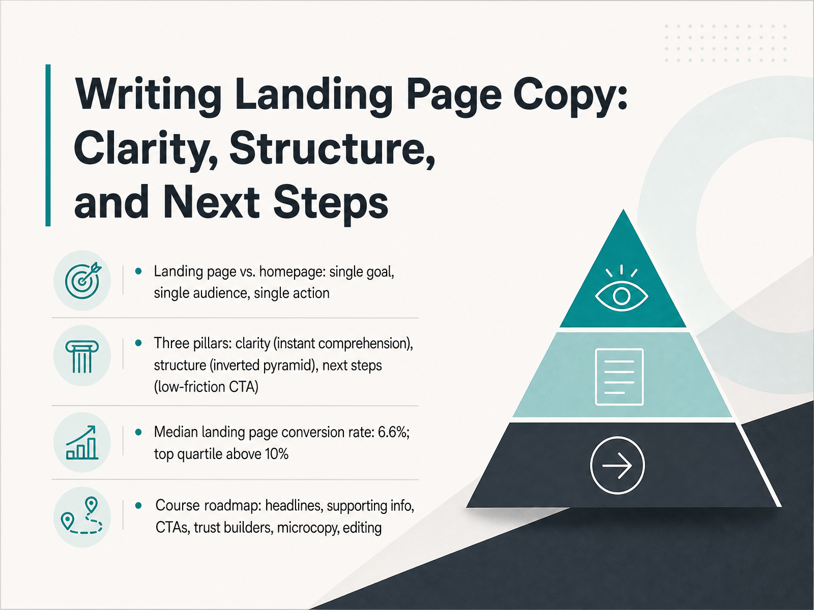
- 01Writing Landing Page Copy: Clarity, Structure, and Next StepsWelcome. This course is about writing landing page copy that gives a reader exactly what they need to act. We will focus on clarity, structure, and a clear next step. Let us start by framing what a landing page actually is. A landing page is not a homepage. A homepage serves many visitors with many goals. A landing page serves a single goal for a single audience and drives a single action. That difference is the foundation. The work rests on three pillars. First, clarity. The reader must understand the offer within seconds. Second, structure. We use an inverted pyramid: the most important information goes at the top. Third, next steps. A low-friction call-to-action tells the reader exactly what to do and what happens after. The numbers show why this matters. The median landing page conversion rate is around six point six percent. The top quartile clears ten percent. Small improvements in copy create that gap. In this course we will move through a practical roadmap. We will cover headlines that name the outcome, supporting information that builds trust, calls to action that reduce friction, trust builders like specific proof, microcopy that removes hesitation, and a repeatable editing process. Each section gives you a tool you can apply immediately. By the end, you will know how to organize a single page so the reader sees what is in it for them, understands why it is credible, and takes the next step with confidence. Let us begin where conversion starts: the core principle of reader-first clarity and the five-second test.roast.pagefoundrycro.comroast.page+22 min
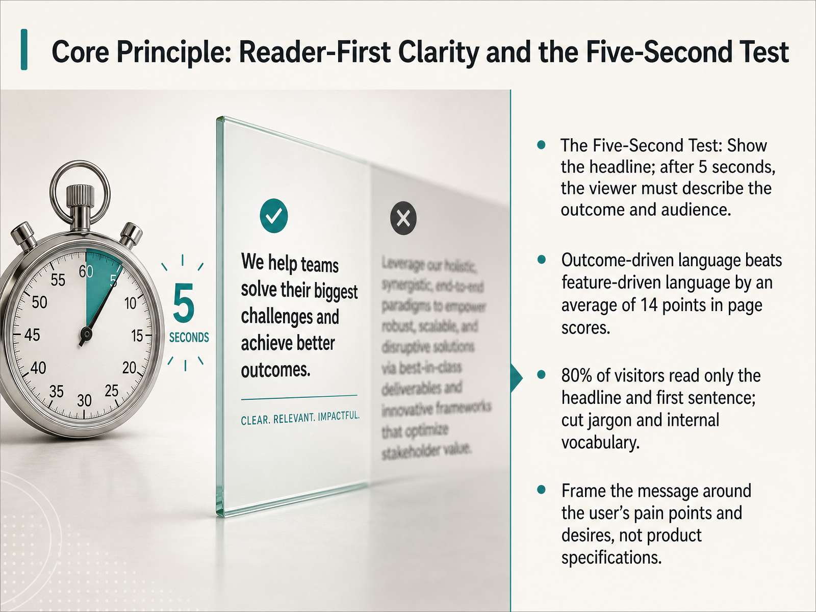
- 02Core Principle: Reader-First Clarity and the Five-Second TestNow, let's ground everything in one core principle: reader-first clarity and the five-second test. The test is simple. Show someone your headline for five seconds. Then take it away. If they can describe the outcome and the intended audience, you pass. If they can't, the headline needs work. This matters because eighty percent of visitors read only the headline and the first sentence. They won't decode jargon or internal vocabulary. They want to know what's in it for them, right now. The data backs this up. Outcome-driven language beats feature-driven language by an average of fourteen points in page scores. Think about the user's pain points and desires. Don't describe what your product is. Frame the message around what the reader achieves next. That's the filter for every line we'll write. Let's apply this filter to a headline's architecture with specific formulas that hook the right reader.
 roast.pagefoundrycro.comroast.page+21 min
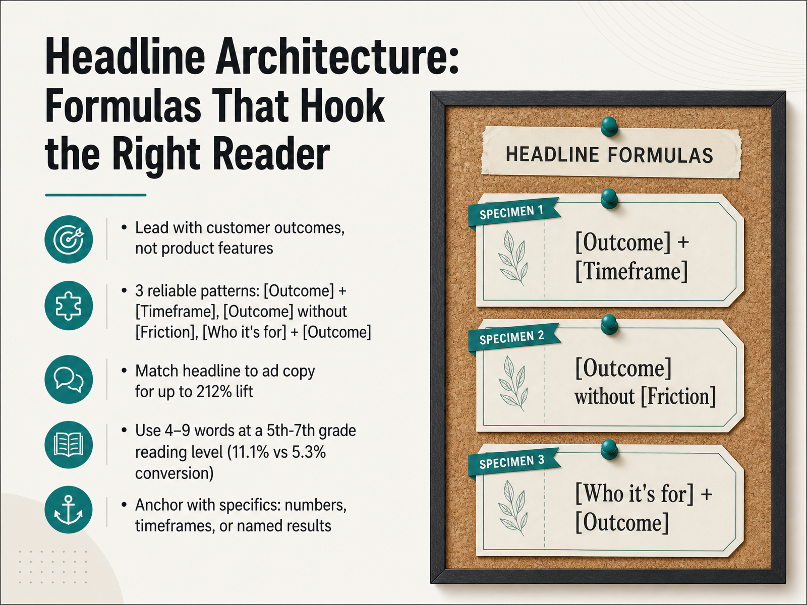
 - 03Headline Architecture: Formulas That Hook the Right ReaderLet's look at the architecture of a headline that actually hooks the right reader. The golden rule is simple: lead with what the customer achieves, not what your product is. For example, "AI-powered analytics platform" describes a feature. "See what's driving revenue this week" names the outcome. The second one wins, often by a significant margin.
Three reliable patterns get you there fast. First, state the outcome plus a timeframe: "Ship a landing page in an afternoon." Second, state the outcome without the friction: "Find leads without cold email." Third, name who it's for plus the outcome: "For solo founders who need to close their first ten customers."
Specificity is your anchor. Use concrete numbers, a clear timeframe, or a named result. Keep the language simple—between a fifth and seventh-grade reading level—to keep your reader moving. And here’s a high-leverage move: match your headline directly to your ad copy. Research shows this can lift conversion by over two hundred percent.
Now that you have the hook, let's look at how to structure the supporting details that keep scanners engaged in the inverted pyramid.
 roast.pagefoundrycro.comroast.page+22 min
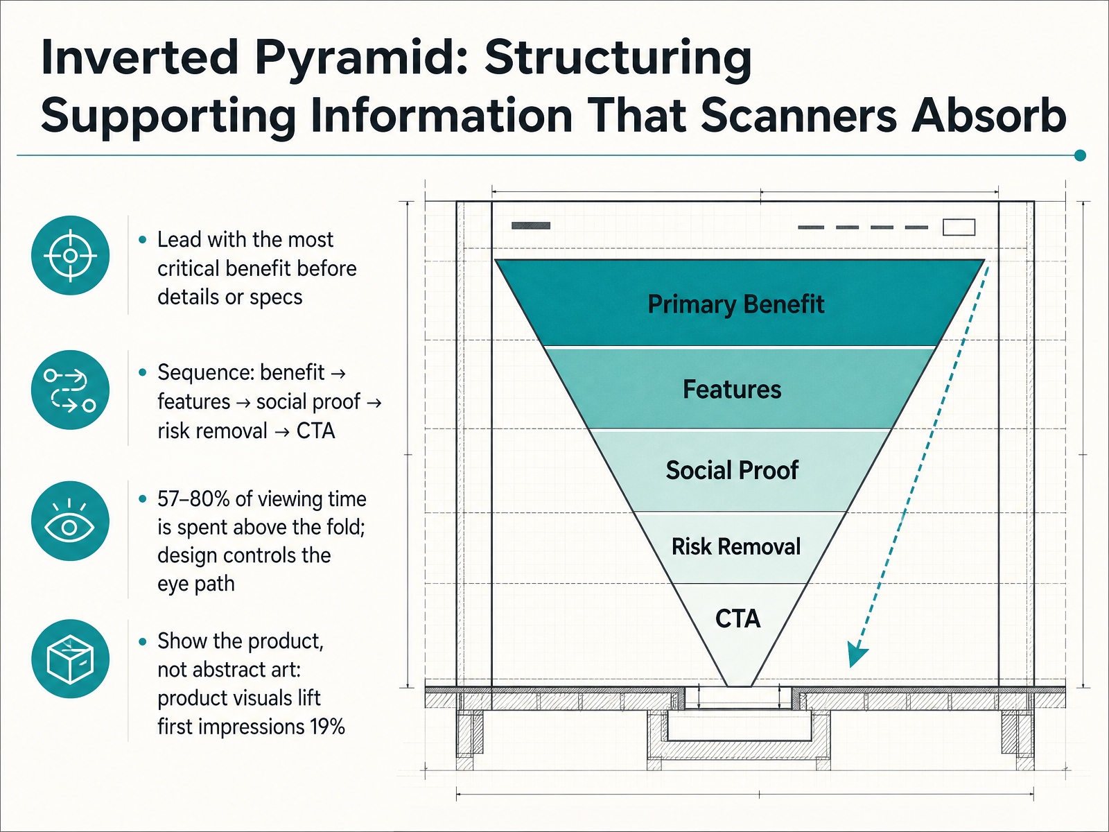
 - 04Inverted Pyramid: Structuring Supporting Information That Scanners AbsorbLet's talk about structuring the information below your headline so a scanning reader actually absorbs it. The most reliable model is the inverted pyramid. You lead with the single most critical benefit. Your reader needs to know what they get, immediately. From there, you sequence outward. The logical flow is benefit first, then features that prove you can deliver it, then social proof that others have succeeded, then risk removal to handle doubt, and finally a specific call to action. This order matters because most visitors never scroll. Research from the State of Landing Pages 2026 report shows that fifty seven to eighty percent of viewing time is spent above the fold. Your visual design needs to control the eye path through that sequence, not fight it. One other finding worth noting. Pages that show the actual product in the hero area score nineteen percent higher on first impressions than pages using abstract illustrations. A screenshot or a short product demo answers the question 'what am I getting' faster than a decorative graphic ever could. Next, we will look at how to layer in social proof at every decision point.
 roast.pagefoundrycro.comroast.page+22 min
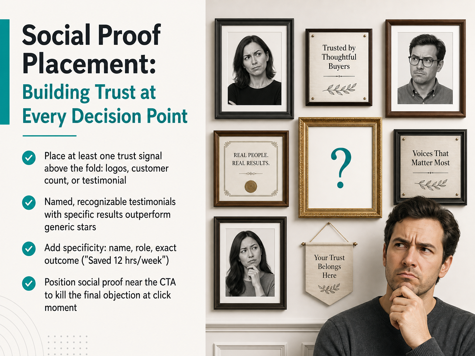
 - 05Social Proof Placement: Building Trust at Every Decision PointNow, let's talk about where trust signals live on the page. Placing social proof isn't just about having it; it's about putting it at the exact moment a reader hesitates. First rule: place at least one trust signal above the fold. This could be a recognizable logo, a customer count, or a short testimonial. It validates the page before the visitor scrolls. Second, quality beats quantity. Named, recognizable testimonials with specific results outperform generic star ratings every time. Add specificity—include the person's name, their role, and the exact outcome they achieved, like 'Saved twelve hours per week.' Finally, position social proof right next to your call to action. When a reader is about to click, a well-placed testimonial kills that final objection at the decision point. They need to see the proof when their hand is on the button. Next, we'll apply this to the element itself in 'Designing the Primary CTA: Copy That Converts.'
 sitegrade.iowordstream.comautomateed.com+22 min
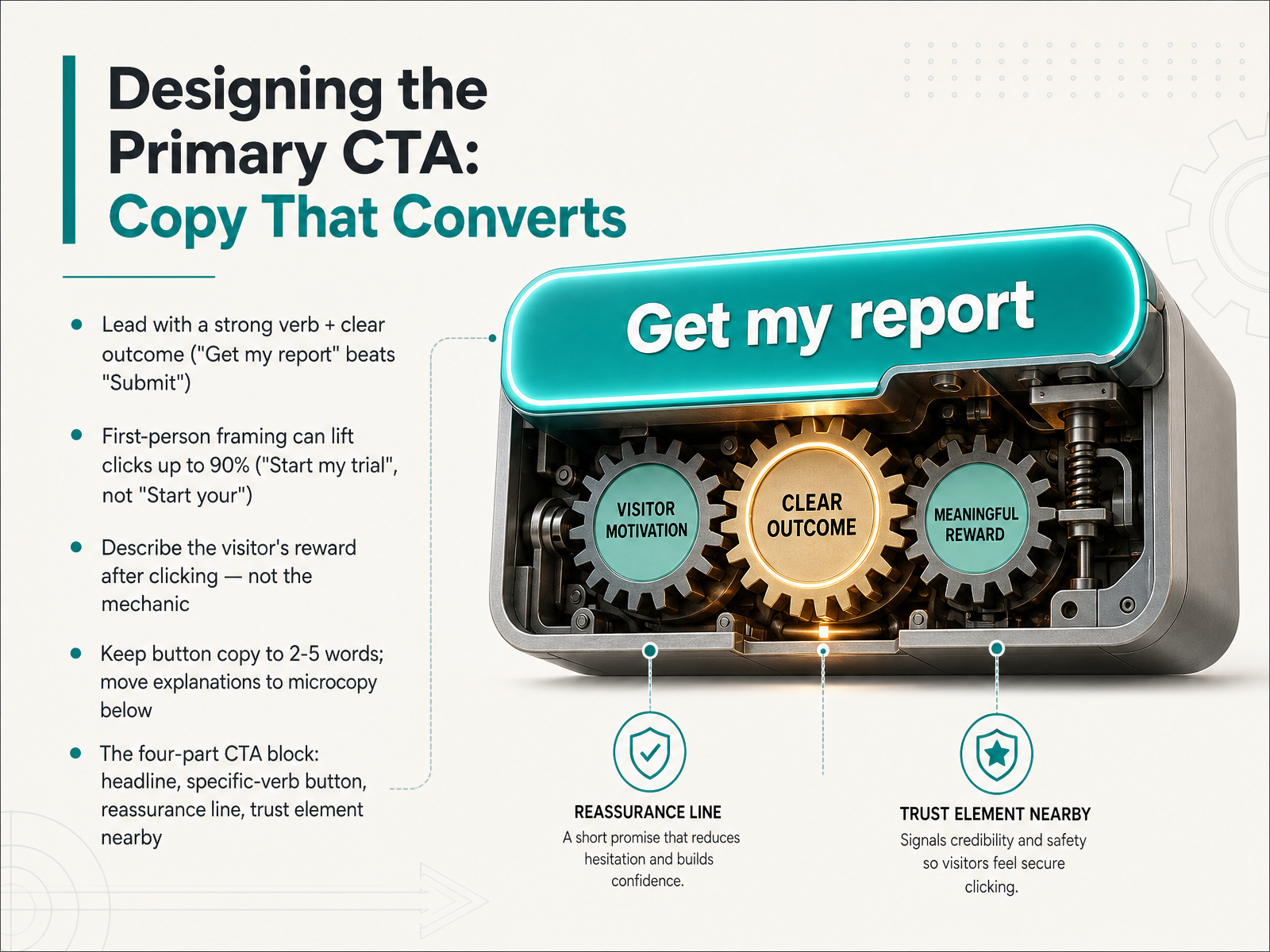
 - 06Designing the Primary CTA: Copy That ConvertsLet's move into the words on the button itself, because this is where small changes create big results. Start every call-to-action with a strong verb that names a clear outcome. "Get my report" tells the visitor exactly what they will receive. "Submit" tells them nothing worth clicking for. Lead with the reward, not the mechanic. Tests consistently show that first-person framing can lift clicks dramatically. "Start my free trial" has outperformed "Start your free trial" by as much as 90 percent. The phrase reads as the visitor speaking to themselves, not a brand giving a command. Keep button copy tight, between two and five words. Any longer and the button stops looking like a button. Move the extra explanation into microcopy just beneath. That short line is where you address the single biggest objection right at the decision point. A phrase like "No credit card required" or "Takes 90 seconds" quietly removes friction. Think of the full CTA block as four parts working together: a specific headline, a verb-driven first-person button, a reassurance line, and a nearby trust element like a rating or customer count. When all four align, the visitor sees a clear next step with nothing left to fear. Next, we will look at where that block should live on the page and how visual design makes action unmissable.
 sitegrade.iowordstream.comautomateed.com+22 min
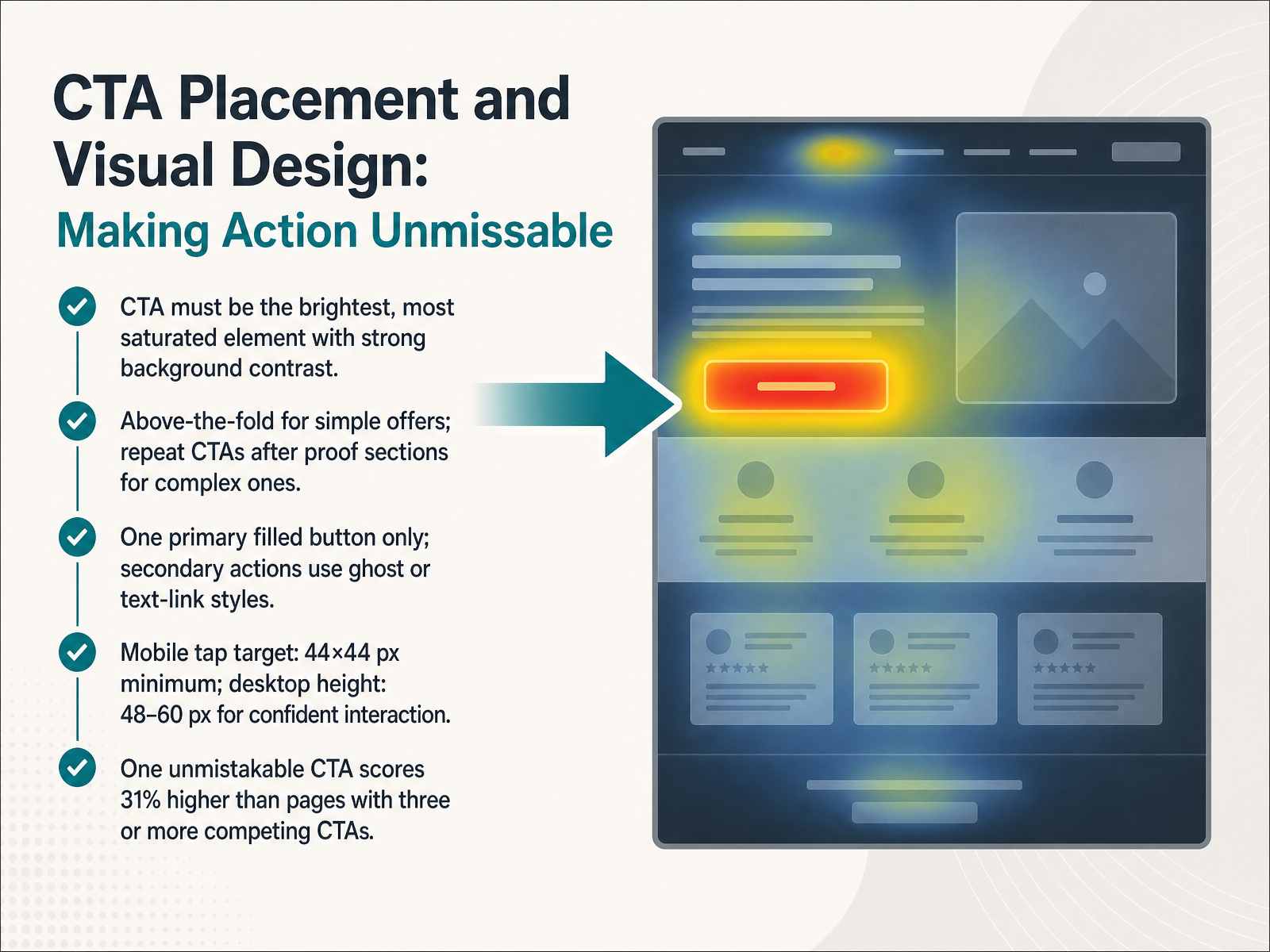
 - 07CTA Placement and Visual Design: Making Action UnmissableNow let's focus on placement and visual design—making the action unmissable. The rule is simple: your call-to-action must be the brightest, most saturated element on the screen, with strong contrast against the background. If you squint at the page, your eye should go straight to the button. For simple offers, keep the CTA above the fold. For complex decisions, repeat it after every section that builds proof. Stick to one primary filled button per viewport. Secondary actions, like "See pricing" or "Watch demo," should use ghost or text-link styles so the hierarchy is unmistakable. On mobile, give buttons a minimum tap target of 44 by 44 pixels. On desktop, aim for a height between 48 and 60 pixels, which invites confident clicking. The payoff is clear: pages with one unmistakable CTA score 31 percent higher than pages with three or more competing calls-to-action. Next, we'll strengthen that button by adding reassurance microcopy—killing objections right at the point of decision.
 sitegrade.iowordstream.comautomateed.com+21 min
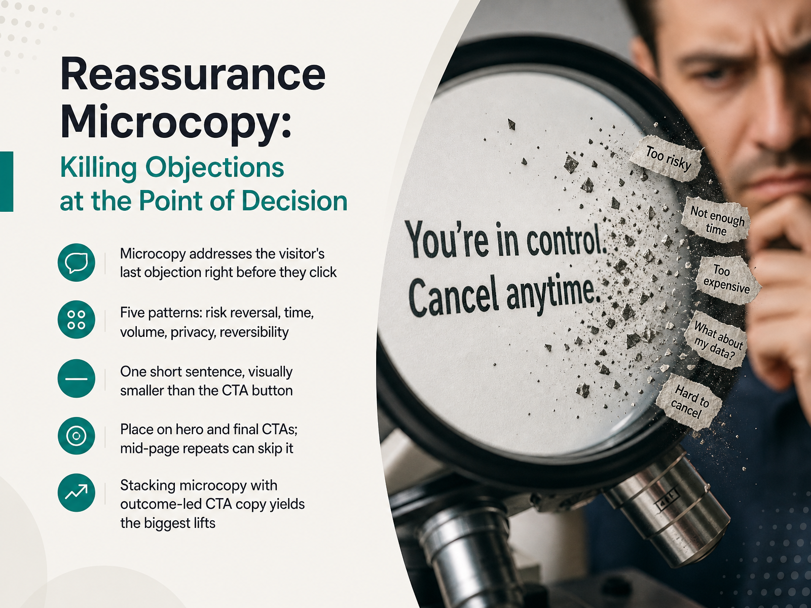
 - 08Reassurance Microcopy: Killing Objections at the Point of DecisionThat reassurance line directly under the button, the small text visitors barely notice consciously, does real work. It's called reassurance microcopy, and its job is to kill the last objection right at the point of decision. When someone is about to click, a quiet doubt often appears. Will this lock me into a contract? Do I need a credit card? How long will this take? The microcopy line answers that single hesitation with one short sentence. It should appear visually subordinate, smaller than the CTA button itself. There are five reliable patterns. Risk reversal says, 'No credit card required.' Time framing says, 'Takes two minutes.' Volume adds social proof like, 'Used by twelve thousand teams.' Privacy says, 'We never sell your email.' And reversibility says, 'Cancel anytime.' Place this microcopy on the hero CTA and the final CTA. Mid-page repeats can usually skip it. The real power comes from stacking. Combine an outcome-led CTA like 'Get my free report' with a clear reassurance line, and you'll see the biggest conversion lifts. Next, we'll look at friction-reducing microcopy for forms, pricing, and error messages.
 sitegrade.iowordstream.comautomateed.com+22 min
 - 09Friction-Reducing Microcopy: Forms, Pricing, and Error MessagesNow let’s focus on microcopy: the small lines of text around forms, pricing, and errors. These words do a lot of work to reduce friction. Start with forms. Explain why each field is needed, and remove anything non-essential. For error messages, don’t just say something went wrong. State the problem and how to fix it. For example, write ‘Enter a valid email address’ rather than ‘Invalid input.’ When you address pricing or signup, surface commitment fears upfront. A short line like ‘No credit card required’ or ‘Takes 90 seconds’ calms hesitation better than clever copy ever will. Choose clarity over being clever, and keep your brand voice helpful and consistent. In the next slide, we’ll step back to the larger hero section and craft the supporting subheadline.
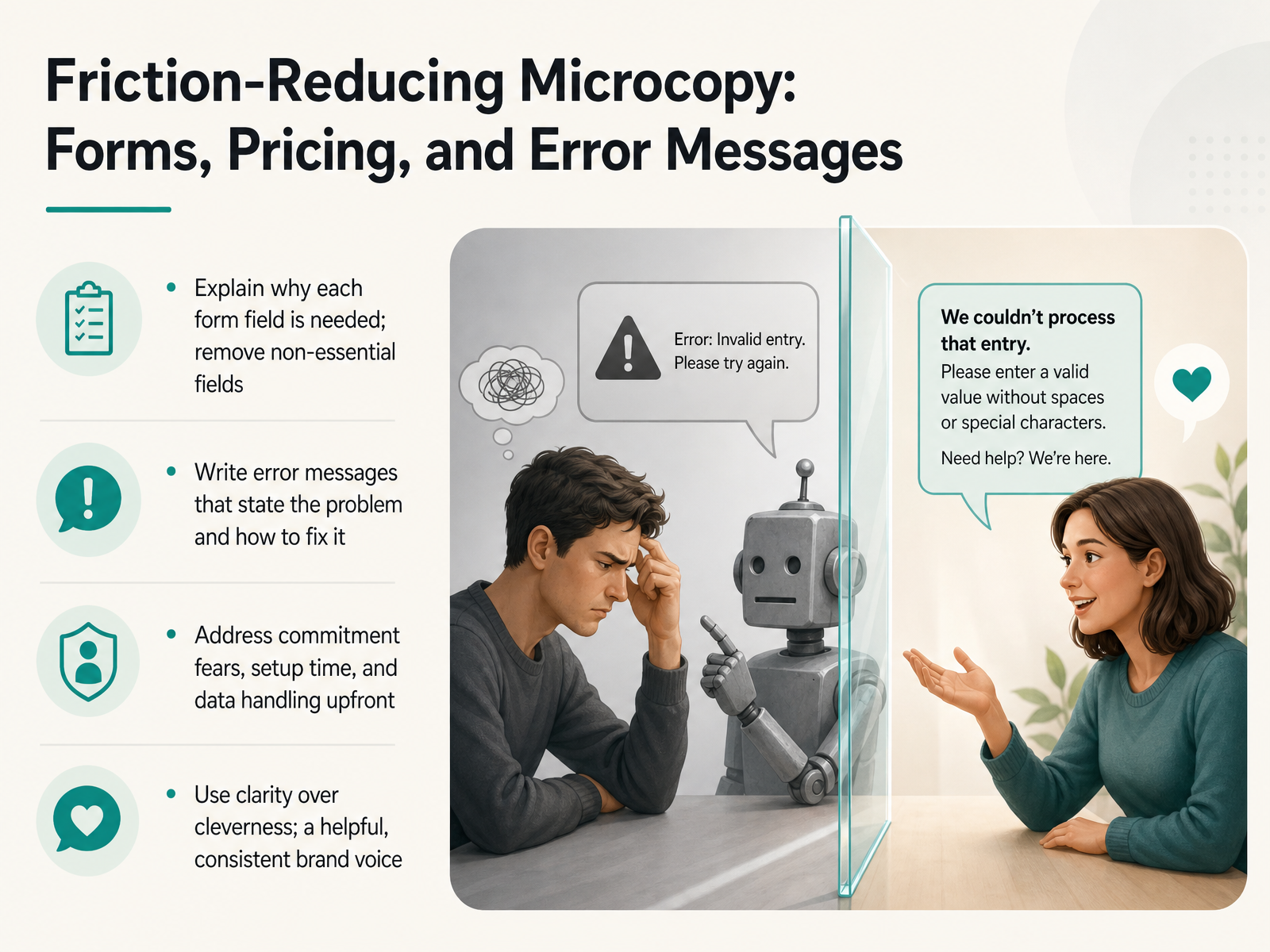 sitegrade.iowordstream.comautomateed.com+21 min
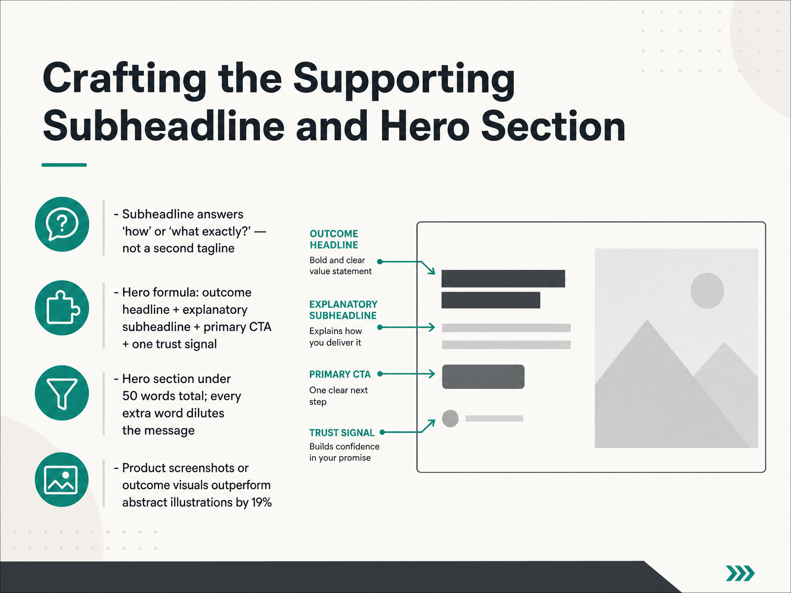
 - 10Crafting the Supporting Subheadline and Hero SectionNow let's move from the headline to the supporting subheadline and the full hero section. The subheadline has one job: it answers 'how' or 'what exactly.' For example, if your headline promises 'Ship dependable AI agents,' the subheadline might say, 'Train, test, and deploy in your own cloud, in under an hour.' It's not a second tagline. It clarifies the mechanism. Keep the entire hero section under fifty words total. A headline, an explanatory subheadline, a primary call to action, and one trust signal. Every extra word dilutes the message, and the data bears this out. Pages with outcome-driven headlines score fourteen points higher than feature-driven ones, and a single clear call to action lifts conversion by up to thirty-one percent. For the visual, choose a product screenshot or an outcome image over abstract illustrations. Product visuals alone lift first impressions by nineteen percent. The formula is simple: outcome headline, explanatory subheadline, primary CTA, and one trust signal, all under fifty words. In the next slide, we'll build on this structure by looking at the sequence and scan flow that turns a single-page argument into a complete reading experience.
 roast.pagefoundrycro.comroast.page+22 min
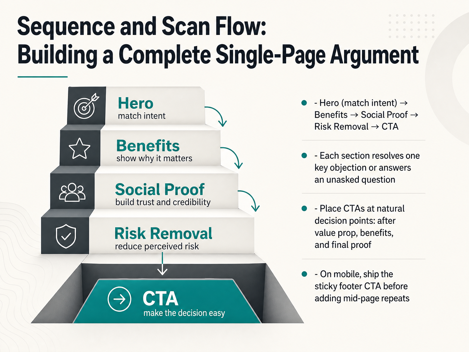
 - 11Sequence and Scan Flow: Building a Complete Single-Page ArgumentLet's assemble the full flow. A single-page argument follows a natural questioning rhythm. Start with a hero section that matches visitor intent precisely. The headline names the outcome, and the CTA offers a clear next step. Next, show the concrete benefits, not just features. Then add social proof, like a short testimonial or a relevant stat. Follow that with risk removal, such as a no-credit-card-required line or a time guarantee. Each section resolves one key objection or answers one unasked question. Place your CTAs at natural decision points: after the value prop, after the benefits, and after that final proof. On mobile, work top-down. Ship the sticky footer CTA first. A mid-page repeat can help, but a constant footer button prevents lost momentum. In the next slide, we'll align CTA strength with visitor intent and funnel stage.
 sitegrade.iowordstream.comautomateed.com+21 min
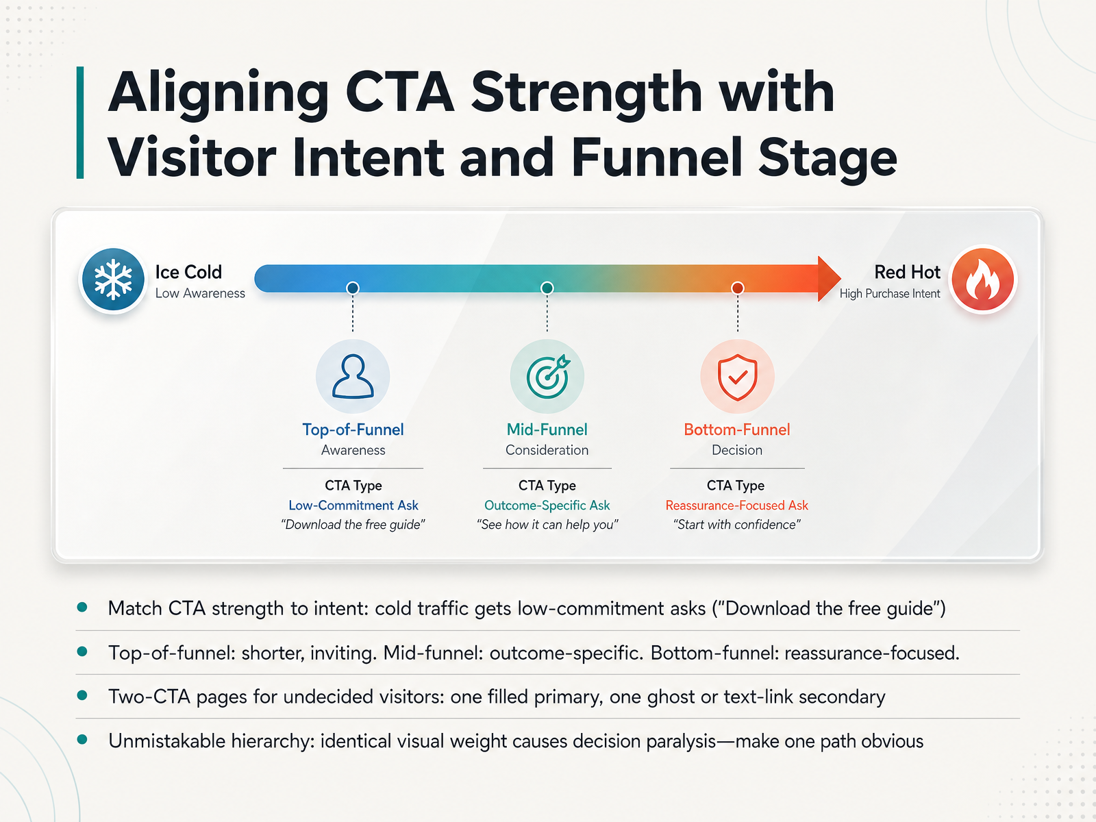
 - 12Aligning CTA Strength with Visitor Intent and Funnel StageThe right call to action, or CTA, depends on where your visitor is mentally. Cold traffic isn't ready to buy. Give them a low-commitment ask—something like, 'Download the free guide.' As they move through the funnel, your language should shift. At the top, keep it short and inviting. In the middle, anchor the button to a specific outcome, like 'See my plan.' At the bottom, where hesitation spikes, add reassurance: 'Secure my order, no card required.' Sometimes a visitor hasn't decided yet. That's where a two-CTA page helps. Offer a filled primary button for the main goal and a quieter ghost button or text link for the secondary path. But watch the visual weight. If both buttons look identical, the reader freezes. Make one path obvious, and the decision becomes easy. Now let's apply these principles. In the next lesson, we'll move into a practical editing and review framework for landing page copy.
 sitegrade.iowordstream.comautomateed.com+21 min
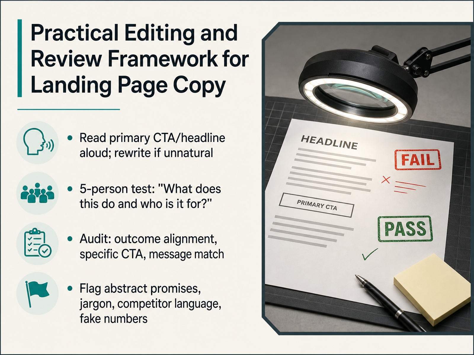
 - 13Practical Editing and Review Framework for Landing Page CopyLet's move from writing first drafts to editing with a practical framework. This is how you catch the small issues that quietly hurt conversion before a page ever goes live. First, read the hero headline and the primary call-to-action button aloud. Your ear will catch clunky phrasing that your eyes skip over. If it feels unnatural to say, rewrite it until it sounds like a human conversation. Next, run the five-person test. Show the headline to someone unfamiliar with the product and ask two questions: 'What does this do, and who is it for?' If five people cannot answer both clearly, the headline needs sharper focus. Then audit three specific areas. Check that every line aligns with the outcome the customer wants, not just a feature list. Confirm the main call-to-action uses a strong verb that names the result, like 'Get my report' instead of 'Submit.' And verify message match: the headline must echo the specific promise from the ad or link the visitor clicked. Finally, flag abstract promises, internal jargon, copied competitor language, and fake-sounding numbers. Replace 'transform your workflow' with a concrete anchor like 'cut reporting time by 12 hours a week.' Use this framework, and your page will speak directly to the right reader. Up next, we wrap everything up and map your next steps.
 roast.pagefoundrycro.comroast.page+22 min
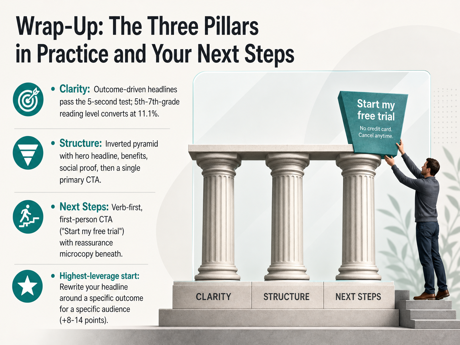
 - 14Wrap-Up: The Three Pillars in Practice and Your Next StepsLet's pull together the three pillars: clarity, structure, and next steps. Clarity means an outcome-driven headline that passes the five-second test and aims for a fifth to seventh-grade reading level. Data shows that readability sweet spot converts at roughly eleven percent. Structure follows the inverted pyramid: a hero headline, the key benefits, social proof, and then a single primary call-to-action. For next steps, write a verb-first, first-person CTA like "Start my free trial" and place a reassurance line right beneath it. The highest-leverage place to start is rewriting your headline around a specific outcome for a specific audience. That single change can add eight to fourteen points. Thank you for walking through this with me. You now have a reliable method for writing landing page copy that moves people forward. Go rewrite that headline first, and watch what happens.
 sitegrade.iowordstream.comautomateed.com+21 min
Take the deck with you
Download this course as a file — free, no sign-up needed.
- PDF handoutEvery slide page, ready to print or share.15 pages · 3.7 MBDownload
- Narrated PowerPointThe deck that presents itself — every slide carries the digital human's narration video.15 pages · 14.4 MBDownload
- PowerPoint slidesThe full deck as a .pptx — open it in PowerPoint, Keynote, or Google Slides.15 pages · 3.6 MBDownload
Free to use in your own training — please keep the PersonWise credit page at the end.
Have your own deck? Turn it into a course
Sources consulted
Web sources consulted while building this course.
- Why Landing Page Headlines Fail — A 1,200-Page Study | roast.page Research | roast.page — roast.page
- Landing Page Headline Benchmarks 2026 + Free Scorer — foundrycro.com
- State of Landing Pages 2026 — Data from 1,000+ AI-Scored Pages | roast.page — roast.page
- How to Write a Landing Page Headline That Actually Converts | Land & Convert Blog — landandconvert.com
- Landing Page Headline Formulas for Conversion — growthlimit.com
- CTA Buttons That Convert in 2026 | SiteGrade — sitegrade.io
- 31 Call to Action Examples + How to Write Your Own | WordStream — wordstream.com
- Writing Compelling Button Copy: Top Tips for 2026 CTA Success — automateed.com
- How to Write a CTA That Actually Converts (With 30+ Examples) | CROgrader — crograder.com
- CTA Button Design and Copy: Color, Size, and Words That Convert | Woobox — woobox.com