
Begin
17 pages · ~34 min
Designing Accessible Digital Products
Learn to design digital products that are inclusive and accessible to all users, including those with disabilities.
A digital instructor presents all 17 pages. Hold “Ask” at any point and ask out loud — the answer comes from this course. No sign-up needed.
What you’ll learn
- 01Designing Accessible Digital ProductsWelcome, everyone. I'm glad you're here. This course is about something we all want as designers and product creators—making interfaces that truly work for more people. Over the next few sessions, you and your team will learn how to weave accessibility into your design process, not as a last-minute checklist, but as a practical, everyday skill. We'll start by grounding ourselves in the key drivers: reaching a wider audience, boosting revenue, managing legal risk, and, most importantly, building products that include everyone. From there, we'll walk through the core POUR principles—Perceivable, Operable, Understandable, and Robust—and map them to concrete UI patterns. We'll also look at the current landscape. With the European Accessibility Act now in force and ADA litigation on the rise, the WCAG 2.2 AA standard is the benchmark your work needs to meet. By the end of this course, you'll have a clear roadmap for integrating these standards into your design systems confidently. Let's start by exploring the business case for accessibility.w3.orga11ypath.commediamato.com+22 min
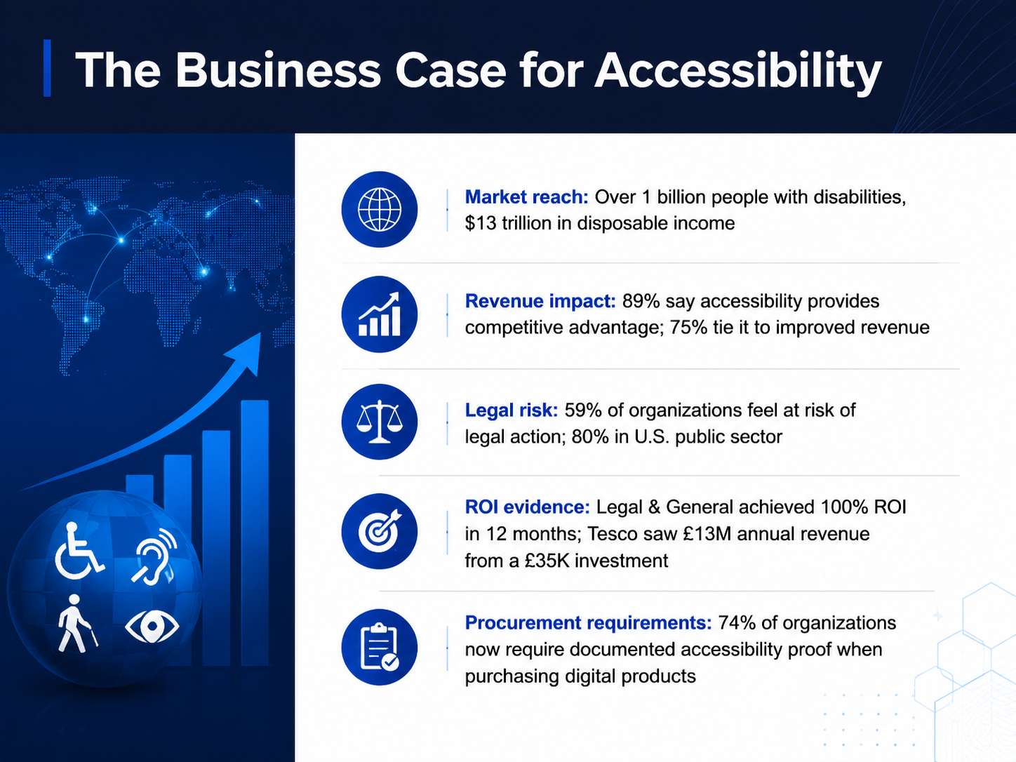
- 02The Business Case for AccessibilityLet's talk about why accessibility matters to your team's bottom line. We're looking at a market of more than one billion people with disabilities, representing thirteen trillion dollars in annual disposable income. That's a huge segment of users you simply can't reach with inaccessible designs. And the business impact is clear: eighty-nine percent of professionals say accessibility provides a competitive advantage, and seventy-five percent tie it directly to improved revenue. Beyond the opportunity, there's also growing risk. Fifty-nine percent of organizations feel they're at risk of legal action, and that number jumps to eighty percent in the U.S. public sector. But the return on investment is real and measurable. Legal and General achieved a one hundred percent ROI within twelve months. Tesco saw thirteen million pounds in annual revenue from a thirty-five-thousand-pound investment. Perhaps most importantly, seventy-four percent of organizations now require documented proof of accessibility when purchasing digital products. So making your work inclusive isn't just good practice—it's fast becoming a requirement for doing business. Next, we'll look at the legal and standards landscape that's driving this shift.
 levelaccess.comaudioeye.comlevelaccess.com+22 min
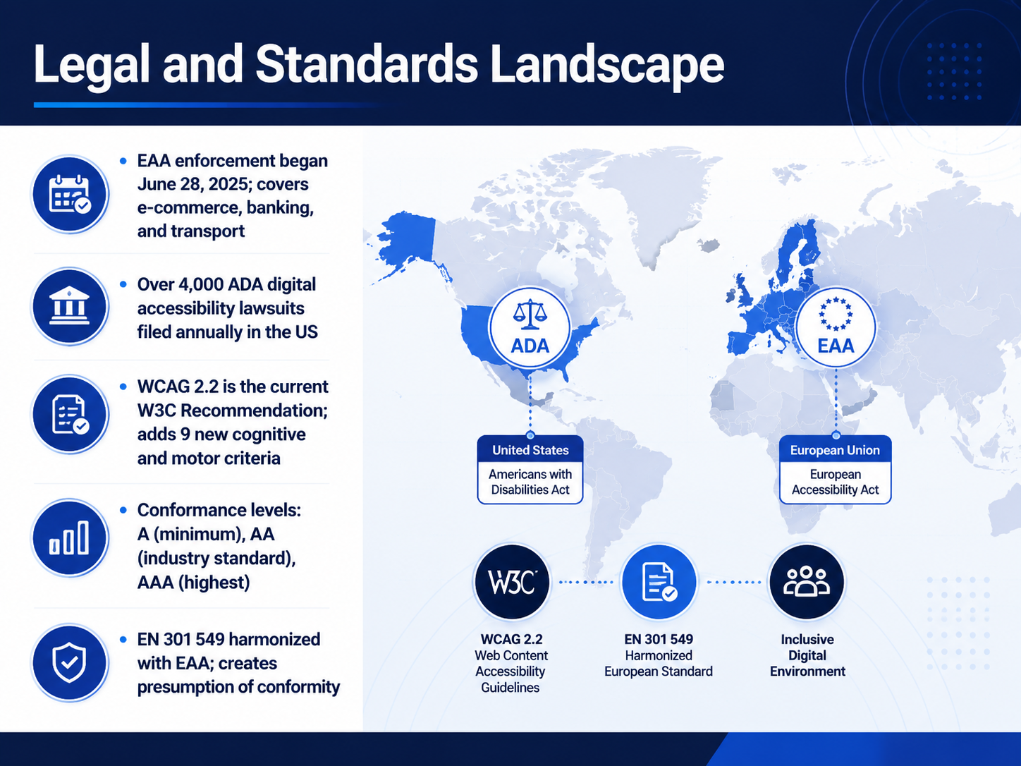
 - 03Legal and Standards LandscapeLet's ground ourselves in the legal and standards landscape, because knowing the rules helps your team make confident design decisions. Enforcement of the European Accessibility Act, or EAA, started on June 28, 2025. It covers e-commerce, banking, and transport, so if your products serve the EU, this directly applies to you. Meanwhile, in the US, over four thousand digital accessibility lawsuits are filed annually under the ADA. The current technical standard is WCAG version 2.2, which added nine new success criteria focused on cognitive and motor disabilities. Think of conformance levels as a ladder: Level A is the minimum, Double-A is the global industry standard, and Triple-A is the highest but often aspirational. The European standard EN 301 549 is harmonized with the EAA, which means following it creates a legal presumption of conformity. So in practice, building to WCAG 2.2 Double-A puts you on solid ground in both major markets. Next, let's unpack the core principles of inclusive design.
 w3.orga11ypath.commediamato.com+22 min
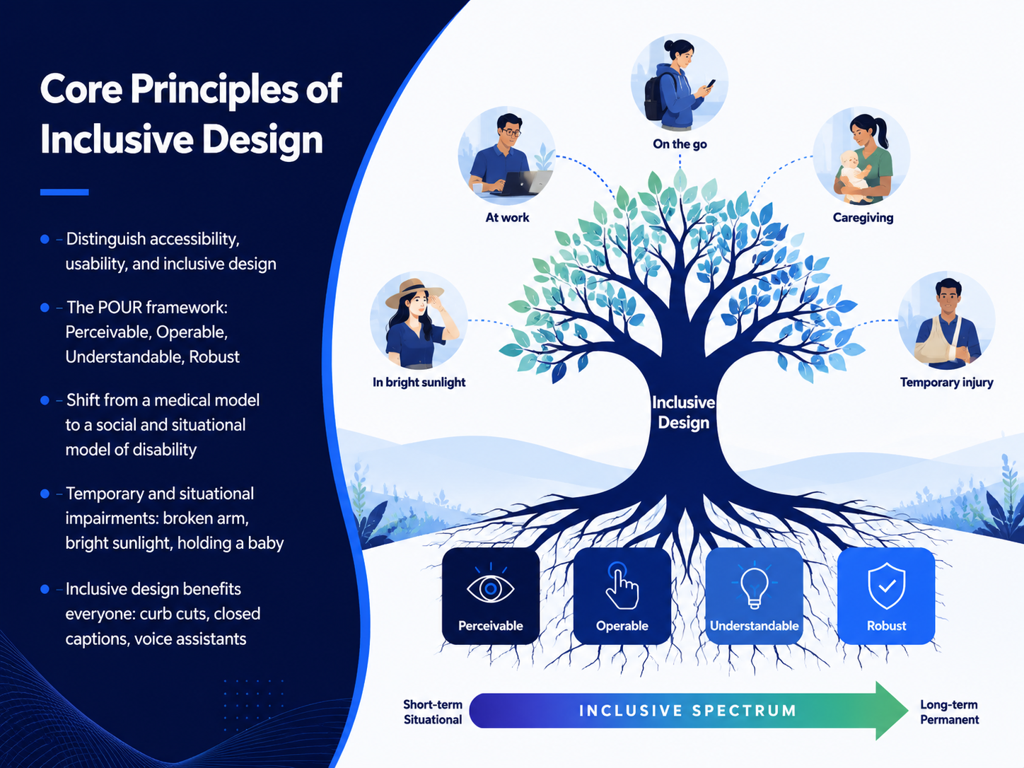
 - 04Core Principles of Inclusive DesignLet's build a shared vocabulary for inclusive design. You’ll often hear three terms used interchangeably, but they solve different problems. Accessibility is about whether people with disabilities can use a product at all. Usability is about how effective and satisfying that experience is for everyone once they’re in the door. Inclusive design goes a step further—it’s a design methodology that actively seeks to understand and include the full range of human diversity from the start. To operationalize accessibility, we use the POUR framework: Perceivable, Operable, Understandable, and Robust. These four principles form the backbone of the WCAG standard and give your team a clear, testable structure. This framework also signals a critical shift in perspective. We’re moving away from the medical model, which sees disability as a personal deficit, toward the social model and the situational model. The social model recognizes that disability is created by barriers in the environment, not by the person. The situational model shows that we all experience impairments at times—like holding a baby in one arm, trying to read a screen under bright sunlight, or navigating with a broken arm. When you design for these situational constraints, or for permanent needs like the curb cuts in sidewalks and closed captions on videos, you improve the product for everyone. Think about voice assistants—they were originally built for accessibility, and now they’re mainstream. That’s the real promise of inclusive design. Next, we’ll move from principles to practice and explore the POUR framework in action.
 w3.orga11ypath.commediamato.com+22 min
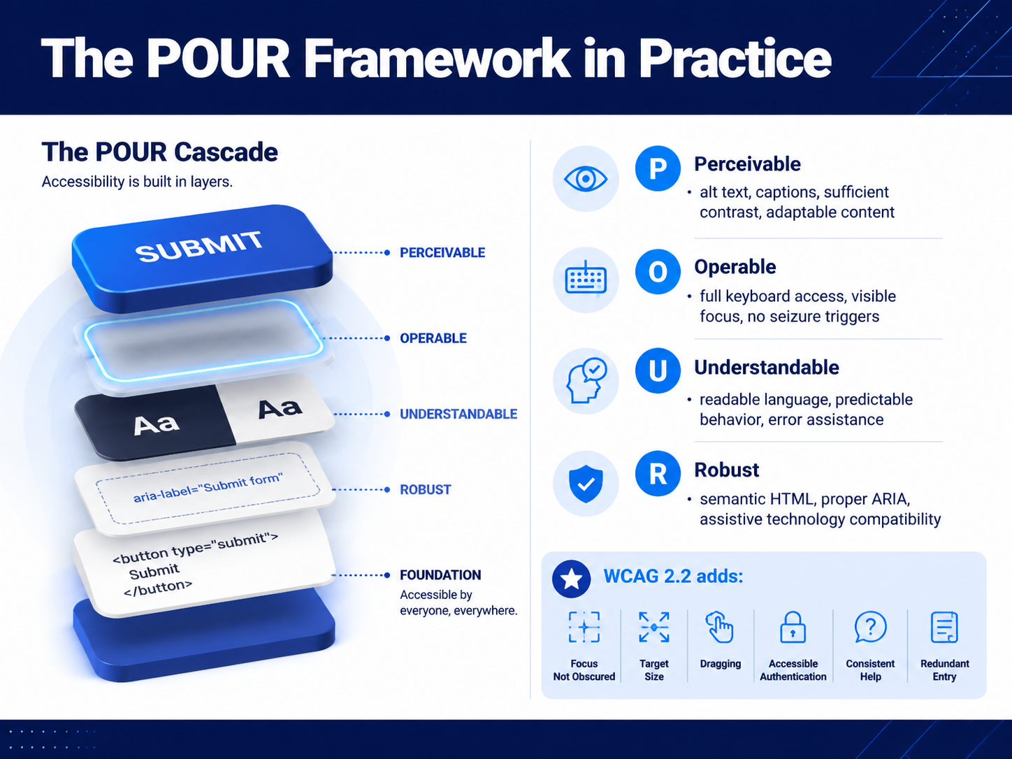
 - 05The POUR Framework in PracticeNow let's make these four principles tangible with the POUR framework in practice. Think of POUR as a lens you can use during design reviews—Perceivable, Operable, Understandable, and Robust. For Perceivable, this is where alt text, captions, and sufficient color contrast live. If an image conveys meaning, it needs a descriptive alt attribute. If it's decorative, use an empty alt tag so screen readers skip it. Operable means every function works from a keyboard, with a visible focus indicator that never gets hidden behind a sticky header. Understandable covers readable language and predictable behavior. That means clear error messages that actually explain how to fix a mistake, not just saying 'invalid input.' Robust is about the foundation: semantic HTML and proper ARIA that works reliably with assistive technology. WCAG 2.2 also added practical criteria like focus not obscured, a minimum target size of 24 by 24 pixels, and accessible authentication that doesn't rely solely on memorizing a password. Next, we'll apply these ideas directly to a core workflow: designing for screen reader users.
 w3.orga11ypath.commediamato.com+22 min
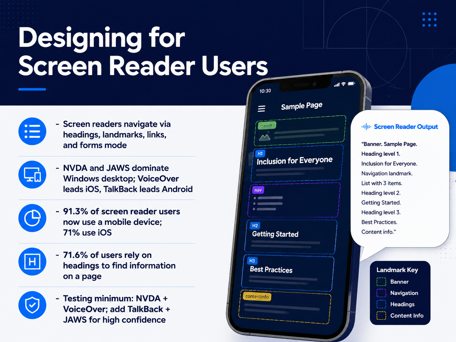
 - 06Designing for Screen Reader UsersLet's shift our focus to designing for screen reader users. Understanding how these tools work helps your team build interfaces that are genuinely navigable. Screen readers don't just read everything on the page; they navigate via headings, landmarks, links, and forms mode. This means your semantic structure is the user's map. For instance, when 71.6 percent of users rely on headings to find information, a well-organized heading hierarchy isn't just good practice; it's a critical navigation tool. On desktop, NVDA and JAWS dominate Windows, while VoiceOver leads on iOS and TalkBack on Android. A key reality check for your team is that 91.3 percent of screen reader users now use a mobile device, with 71 percent on iOS. So, your testing strategy must reflect this mobile-first reality. For a minimum viable confidence level, your team should test with NVDA and VoiceOver. To ship with high confidence, add TalkBack and JAWS to your testing matrix. This practical approach covers the vast majority of your users. Now, let's build on this by tackling another critical piece of the interaction model: keyboard accessibility and focus management.
 webaim.orgwebaim.orgwebaim.org+22 min
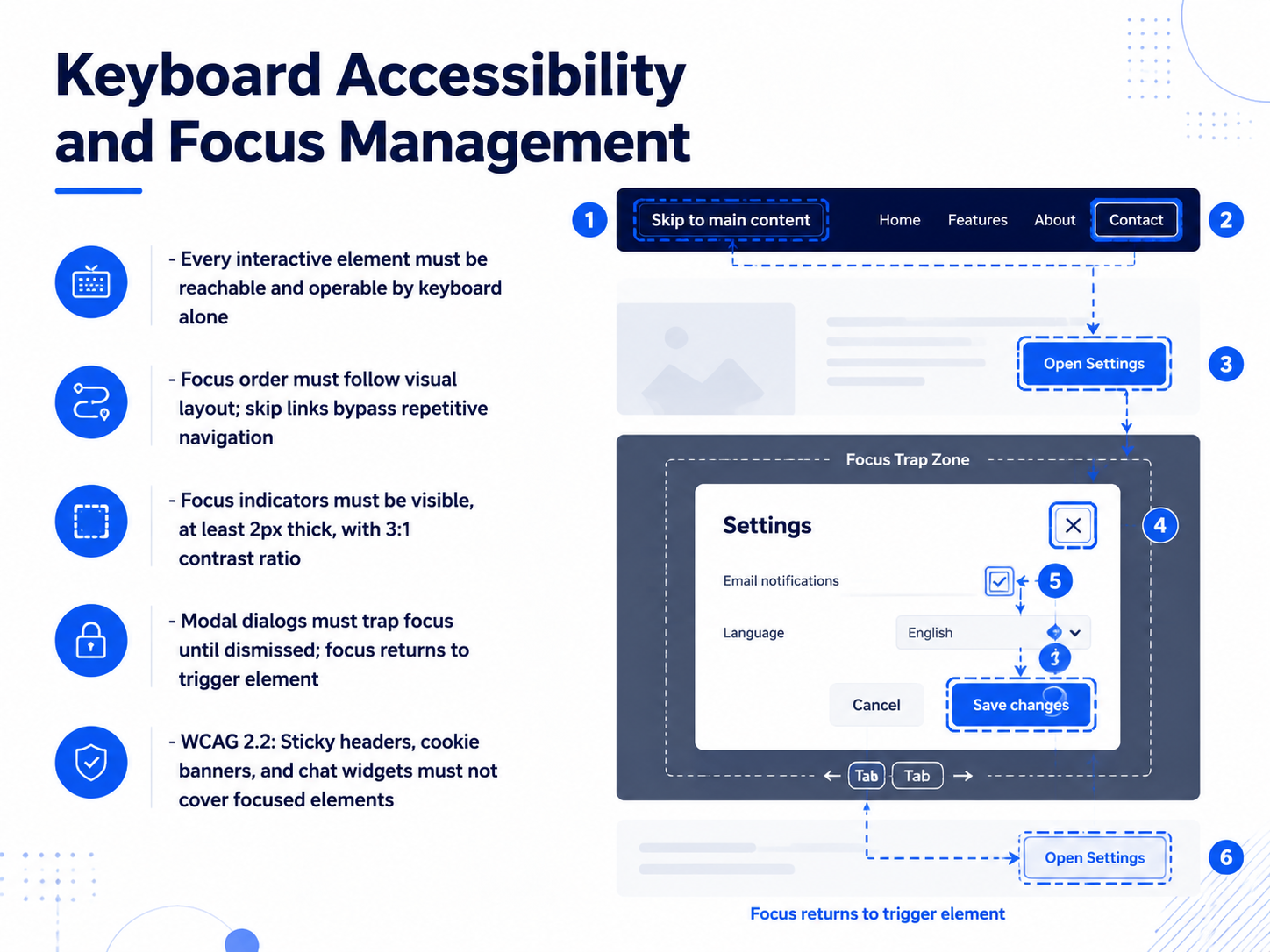
 - 07Keyboard Accessibility and Focus ManagementNext, let's look at keyboard accessibility and focus management. This is about making sure every interactive element on your screen can be reached and operated using only a keyboard, with no mouse required. The focus order must follow the visual layout, so pressing Tab moves predictably from the top of the page, down through the content. A simple but powerful tool here is a skip link. It's a hidden link that appears on the first Tab press, letting users jump directly to the main content and bypass repetitive navigation menus. Focus indicators also need to be visible. They should be at least two pixels thick and maintain a three-to-one contrast ratio against the background. Modal dialogs require special attention. When a dialog opens, keyboard focus must move inside it and be trapped there until the user dismisses it. When it closes, focus must return to the original button that triggered it. Finally, with WCAG two point two, watch out for sticky headers, cookie banners, and chat widgets. They must never fully cover the element that has keyboard focus. Now, let's transition to the visual side of accessibility with our next topic: Visual Design, Color, Contrast, and Typography.
 w3.orga11ypath.commediamato.com+22 min
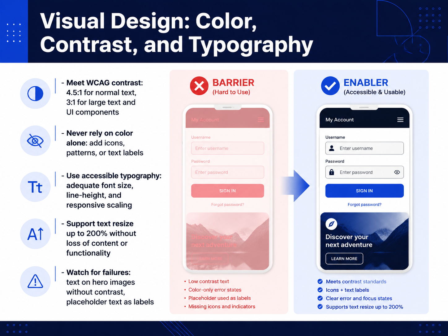
 - 08Visual Design: Color, Contrast, and TypographyNow let's get practical with visual design. The three levers we'll look at are color, contrast, and typography. First, contrast. For normal text, you need a ratio of at least 4.5 to 1 against the background. For large text and UI components, 3 to 1 is the minimum. That's the WCAG standard, and it's what makes text readable for people with low vision. Next, never rely on color alone to communicate information. If you use red to show an error, add an icon or a text label too. A common fix is to pair a warning icon with the red text. For typography, pick a readable font size, set a comfortable line height, and make sure your text scales up. When someone zooms to 200 percent, all content and functionality must still be there. A failure we see often is white text on a busy hero image without enough contrast. A dark overlay behind the text solves that instantly. Another is using placeholder text as a label. Placeholders disappear, leaving users without guidance. Always use a persistent label above or beside the field. These small, deliberate choices make your interface usable by more people. Up next, we'll explore how to extend that same care into your content and microcopy.
 w3.orga11ypath.commediamato.com+22 min
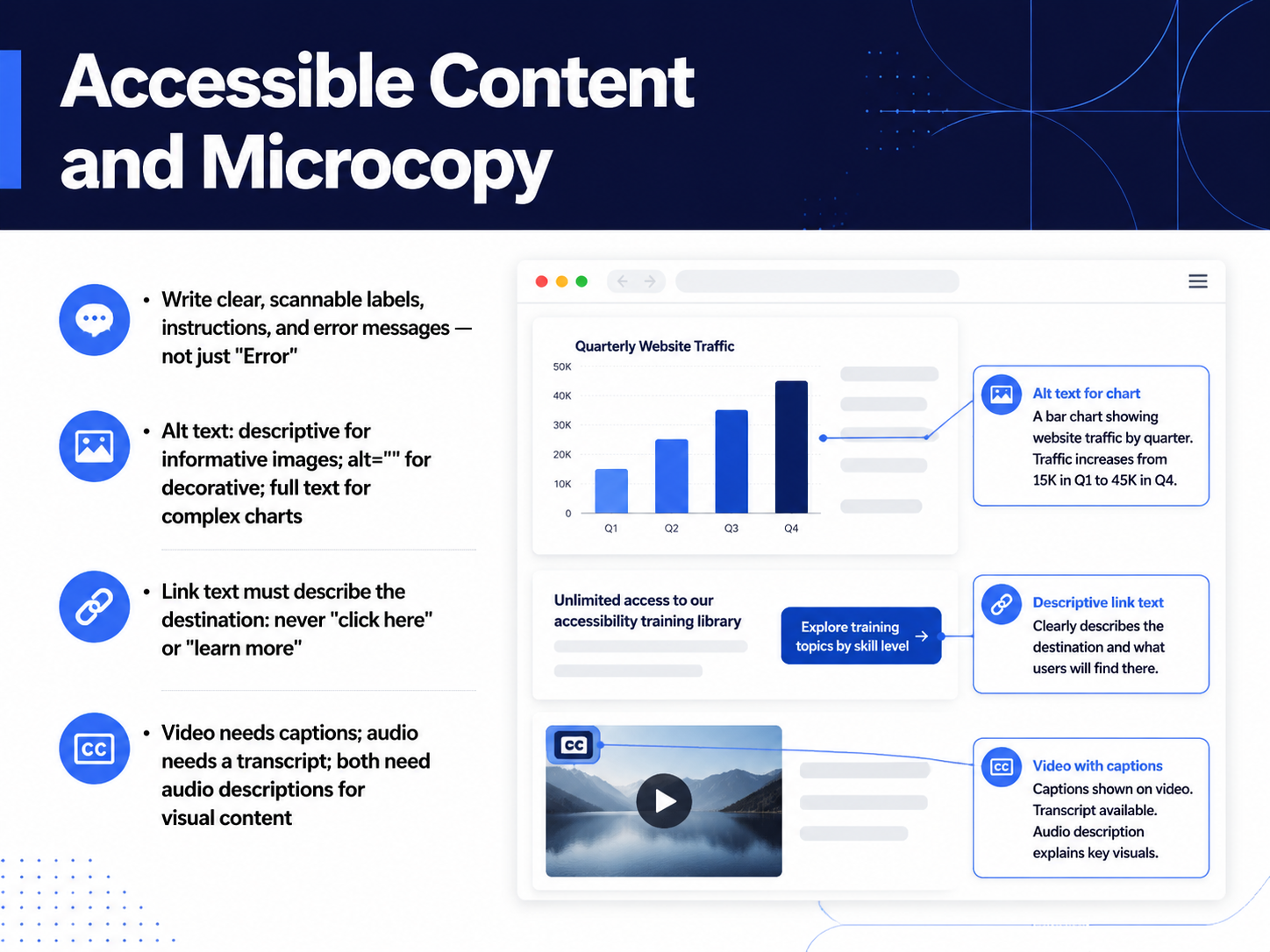
 - 09Accessible Content and MicrocopyLet's talk about the words on the screen—your labels, instructions, and error messages. These small pieces of text have a huge impact on usability. Instead of a generic error message like "Error," be specific: "Please enter a valid email address." This helps users actually fix the problem. For images, alt text is essential. If an image conveys information, describe it clearly—like "Bar chart showing revenue up 18 percent." If it's purely decorative, use an empty alt attribute so screen readers skip it. For complex charts, provide a full text summary nearby. Link text must describe the destination. Never use "click here" or "learn more." Instead, try "View our accessibility guide." For video, always include captions. For audio, provide a transcript. And both need audio descriptions for visual content. Up next, we'll apply these principles as we walk through designing accessible forms.
 w3.orga11ypath.commediamato.com+21 min
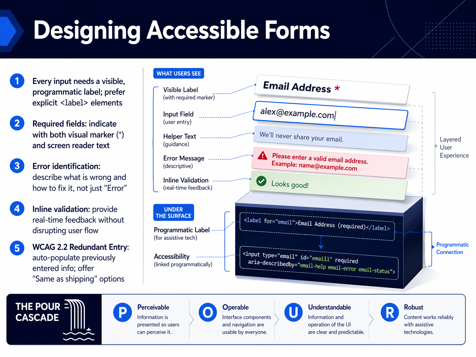
 - 10Designing Accessible FormsNow let's turn to one of the highest-impact areas for your team: designing accessible forms. Forms are where users take action, and even small barriers here can stop someone from completing a task. The first rule is that every input needs a visible, programmatic label. Use an explicit label element. A placeholder alone is not enough; it disappears as soon as someone starts typing, leaving screen reader users without context. For required fields, don't rely on color alone. Use a visual asterisk and make sure the screen reader announces it, for example by adding aria-required equals true. When an error occurs, tell the user what is wrong and how to fix it. Instead of just saying Error, write something like Please enter a valid email address, such as name at domain dot com. Inline validation helps, but it should provide real-time feedback without shifting focus or disrupting the user's flow. Finally, a powerful new requirement in WCAG 2.2 is Redundant Entry. If your user already typed their shipping address, don't ask them to retype it for billing. Auto-populate it or offer a Same as shipping checkbox. This reduces cognitive load and speeds up the process for everyone. Next, we'll build on this by looking at how to design for neurodiversity and cognitive load.
 w3.orga11ypath.commediamato.com+22 min
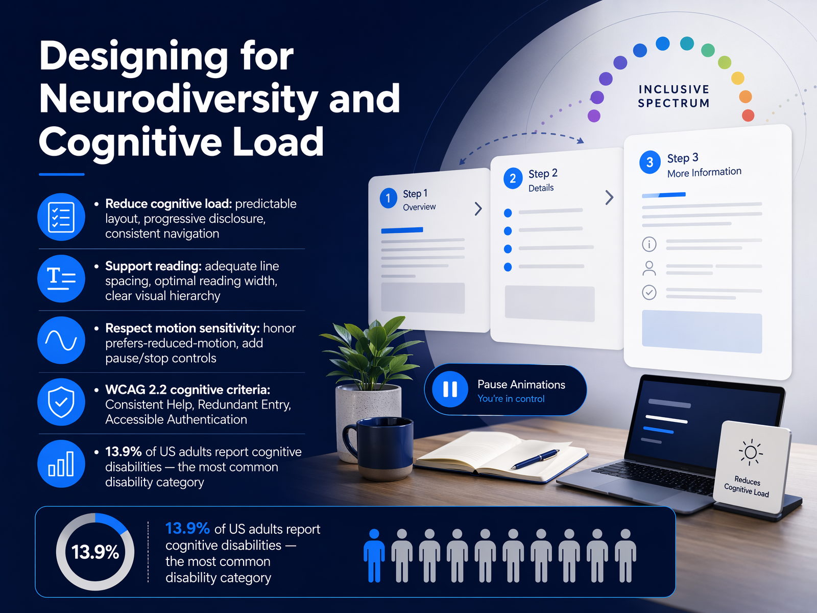
 - 11Designing for Neurodiversity and Cognitive LoadNow, let's talk about designing for the brain. This is about neurodiversity and managing cognitive load. Cognitive disabilities are actually the most common category; around 13.9 percent of U.S. adults report difficulties with concentration, memory, or decision-making. So, your first priority is to reduce cognitive load. Stick to predictable layouts, use progressive disclosure so you don't overwhelm users with too much information at once, and keep your navigation consistent. For reading, provide adequate line spacing, cap your text at an optimal reading width, and maintain a clear visual hierarchy. Remember to respect motion sensitivity. Honor the 'prefers-reduced-motion' media query, and always add pause and stop controls for any moving content. WCAG 2.2 also introduces specific cognitive criteria. 'Consistent Help' means your chat widget or FAQ link must stay in the same spot across pages. 'Redundant Entry' requires you to auto-populate fields like billing addresses in a checkout flow. And 'Accessible Authentication' is crucial; this means you must support password managers and never block paste, so users aren't forced to memorize or transcribe codes. Think of these not as a checklist, but as removing friction for everyone's working memory. Next, let's tie this physical interaction with the next slide on Touch Targets and Input Modalities.
 w3.orgdev.tosujeet.pro+22 min
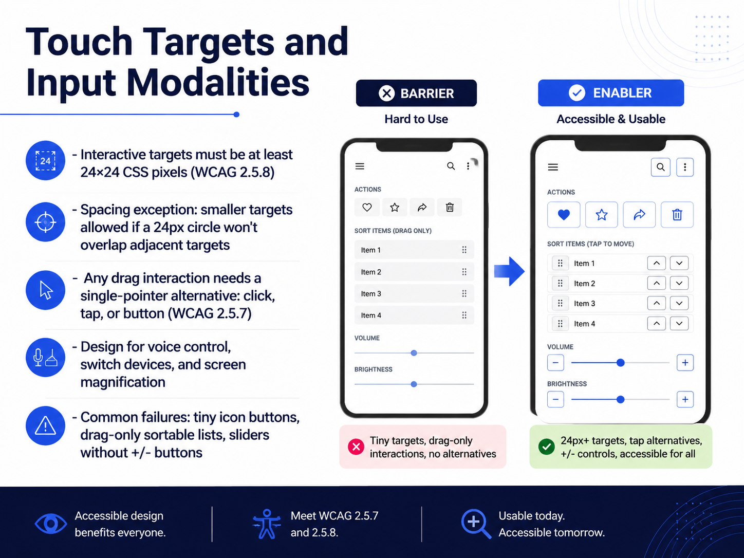
 - 12Touch Targets and Input ModalitiesNow let's talk about touch targets and input modalities. This is where the Operable principle really comes to life for people who use touch devices, pointers, or switch controls. The rule in WCAG 2.5.8 is straightforward: interactive targets must be at least 24 by 24 CSS pixels. Think of a small close button on a modal that's only 16 pixels square. It's frustrating for anyone, but it's a blocker for someone with tremors. The fix is often just adding generous padding to the clickable area, even if the icon itself stays visually small. There is a spacing exception. If your tiny targets are spaced far enough apart that a 24 pixel circle won't overlap adjacent targets, you're still compliant. But a safer default is simply making targets large from the start. Next, any drag interaction needs a single-pointer alternative. This is WCAG 2.5.7. A sortable list that works only by drag-and-drop fails for a switch device user. The solution is to add simple up and down buttons next to each item. That way, drag remains an enhancement, not a requirement. The same thinking applies to sliders. Always pair them with plus and minus buttons. And as you're designing, remember that your interface must work with voice control, switch devices, and screen magnification. The common failures to watch for are tiny icon-only buttons, drag-only sortable lists, and sliders that lack increment controls. Catch these early, and you'll save your team expensive rework. Up next, let's apply that same practical lens to Accessible Authentication.
 w3.orga11ypath.commediamato.com+22 min
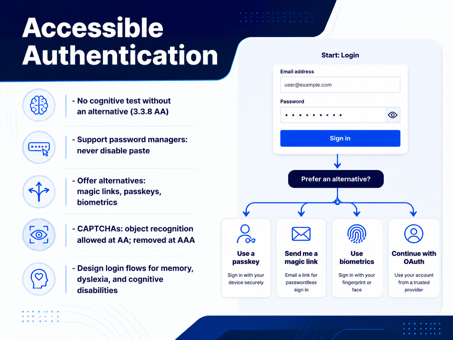
 - 13Accessible AuthenticationNow let's talk about one of the most critical, and often overlooked, parts of the user experience: authentication. This is the gatekeeper to your entire product, and WCAG 2.2's new criterion, 3.3.8, ensures it's a gate that opens for everyone. The core principle is simple: a login flow cannot rely solely on a cognitive function test. This means you can't require users to memorize a complex password, transcribe a one-time code, or solve a puzzle, without providing an accessible alternative. The practical fix is equally straightforward. First, and this is a big one, never disable paste in your password fields. Blocking paste breaks password managers, which are the primary assistive technology for memory. Support password managers fully by using the correct autocomplete attributes. Then, offer alternatives. Magic links sent to email, passkeys, or biometrics like a fingerprint are all excellent, secure ways to bypass a memory test. When it comes to CAPTCHAs, know the levels: object recognition, like 'click all the buses,' is allowed at AA but must be removed for AAA conformance. The goal is to design authentication for memory, dyslexia, and cognitive disabilities from the start, not just bolt on an alternative later. Your team can make logging in a non-event for everyone, and that's a huge win for user experience. Next, let's build on these principles and look at embedding accessibility directly into your design system.
 w3.orgdev.tosujeet.pro+22 min
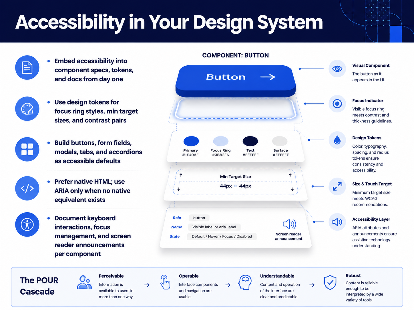
 - 14Accessibility in Your Design SystemSo let’s talk about what it actually looks like to embed accessibility into your design system. And the short answer is this: treat it like a core layer, not a set of exceptions. From day one, your component specs, design tokens, and documentation should all include accessibility requirements. For example, don’t just define a color palette. Use tokens to lock in focus ring styles, minimum touch target sizes of at least twenty-four by twenty-four CSS pixels, and approved contrast pairs for text and controls. When you build default components like buttons, form fields, modals, tabs, and accordions, make the accessible version the only version. That means choosing native HTML elements first. A real button element is always better than a div with a role added. Use ARIA only when no native equivalent exists, and even then, follow the authoring practices guide closely. And don’t forget to document what you’ve built. For each component, write down the expected keyboard interactions, how focus is managed, and what a screen reader should announce. When your team’s defaults are accessible, you stop fixing the same issues over and over, and you start shipping inclusive experiences much faster. Next, let’s look at how annotation toolkits help you communicate all of this in your design files, in the slide: Annotating Designs for Accessibility.
 w3.orga11ypath.commediamato.com+22 min
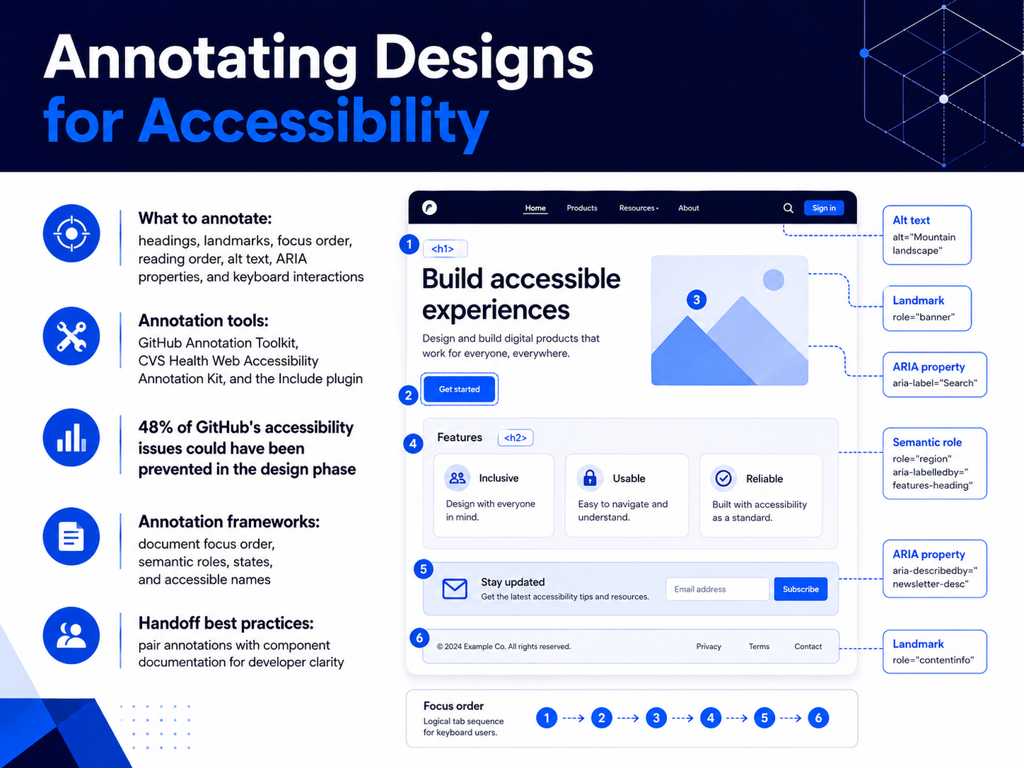
 - 15Annotating Designs for AccessibilityLet's explore how to annotate designs for accessibility. These annotations communicate the intent that visual design alone can't convey. When you hand off designs, your team needs to know heading levels, landmark regions, the focus order for keyboard navigation, the reading order for screen readers, meaningful alt text, ARIA properties, and keyboard interactions. Fortunately, you don't have to start from scratch. The GitHub Annotation Toolkit, recently open-sourced, is a robust Figma library built from real-world data. In fact, GitHub found that forty-eight percent of their accessibility issues could have been prevented right in the design phase. The CVS Health Web Accessibility Annotation Kit is another excellent option, already used to make over one hundred fifty thousand annotations. For a plugin-based workflow, check out Include. It guides you step by step through landmarks, headings, focus grouping, and touch targets. Whichever tool you choose, your annotation framework should document focus order, semantic roles, states, and accessible names. A best practice for handoff is to pair your annotations with your component documentation. This gives developers the full picture, so they don't have to guess your intent. Up next, let's look at design QA and testing tools.
 figma.com2 min
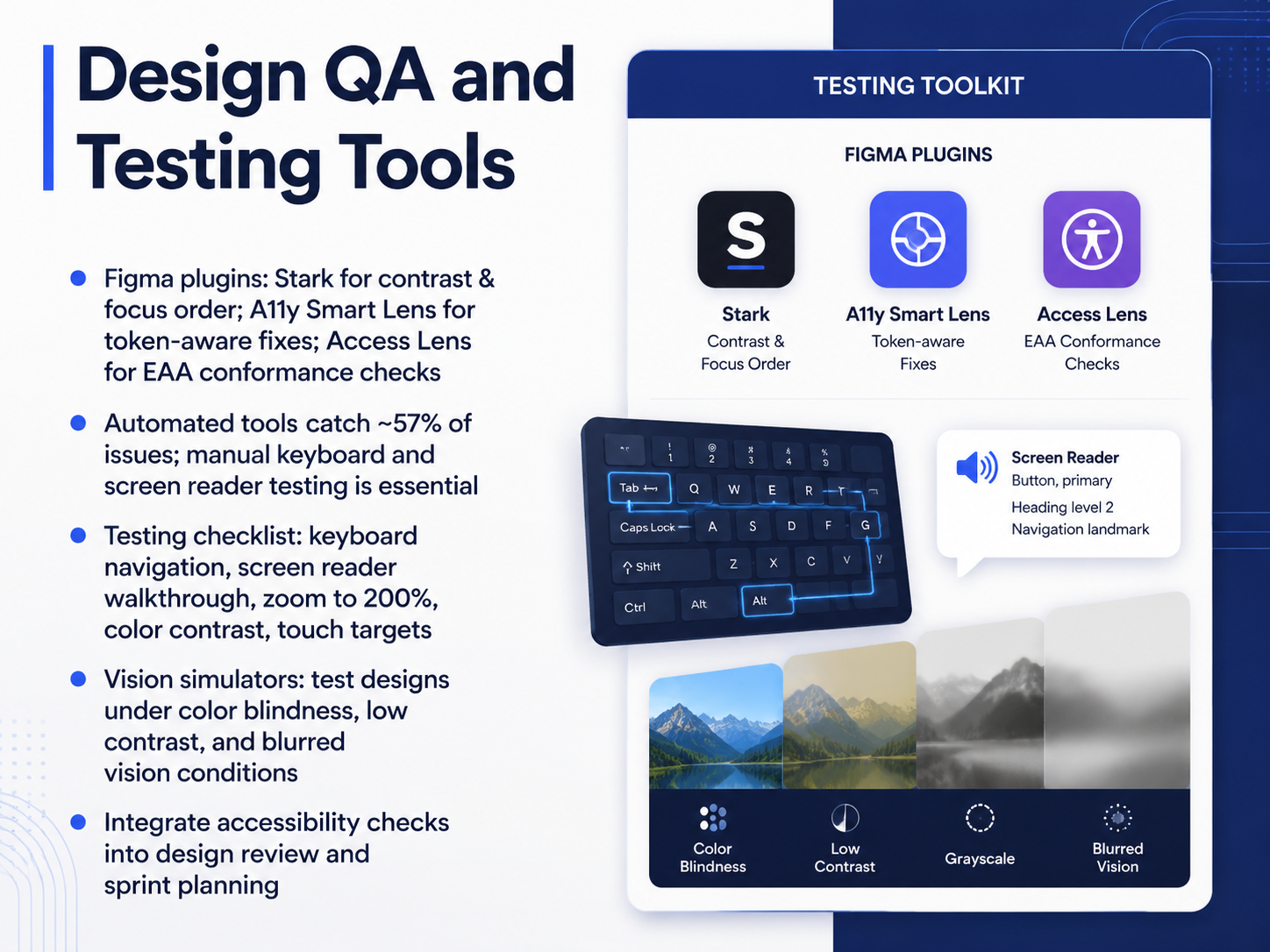
 - 16Design QA and Testing ToolsNow, let's talk about the tools and processes that can catch issues right in your design file. The Figma plugin ecosystem has really matured, and three plugins stand out for different needs. Stark is your comprehensive suite, covering contrast, focus order, and vision simulation. A11y Smart Lens is the go-to for token-aware fixes; it will try to swap your colors with accessible variables from your design system instead of just a raw hex code. And for teams working toward European Accessibility Act conformance, Access Lens maps every finding directly to the relevant legal criteria.
Remember, though, automated tools catch only about fifty-seven percent of issues. They are a fantastic first pass, but they cannot replace manual testing. You need to run a keyboard navigation test, do a screen reader walkthrough, zoom your screen to two hundred percent, and manually check touch targets. Vision simulators are also great for building empathy, letting you test designs under color blindness, low contrast, and blurred vision conditions. The key is to make these checks routine. Integrate them into your design review and sprint planning so accessibility is not a last-minute scramble, but a standard part of your team's workflow.
Next, let's pull all of this together and look at building a testing and prioritization strategy.
 w3.orgdev.tosujeet.pro+22 min
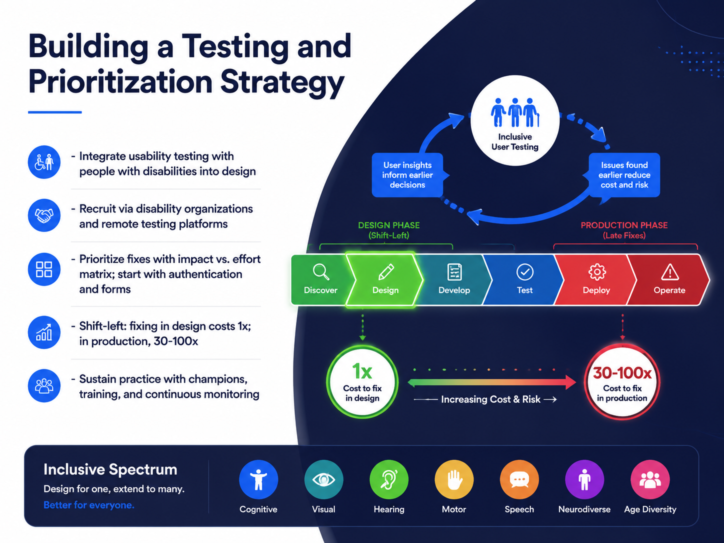
 - 17Building a Testing and Prioritization StrategyLet's tie everything together with a strategy for testing and prioritizing your accessibility work. The most effective way to find real barriers is to include people with disabilities in your usability testing. You can recruit through disability organizations and remote testing platforms to make this practical for your team. Once you have findings, how do you decide what to fix first? Use an impact-versus-effort matrix. High-impact, low-effort fixes are your quick wins. Start with critical flows like authentication and forms, because if users can't log in or check out, nothing else matters. And here's a crucial principle: shift accessibility left. Fixing an issue in design costs about one times the effort. Finding that same issue in production costs thirty to one hundred times more. This is exactly why so many teams are embedding checks early. Finally, sustain your practice with champions who advocate for inclusion, ongoing training, and continuous monitoring. Accessibility isn't a one-time project. It's a core part of how you build great products. Thank you for joining this journey. Your work makes digital experiences better for everyone, one thoughtful decision at a time.
 levelaccess.comaudioeye.comlevelaccess.com+22 min
Take the deck with you
Download this course as a file — free, no sign-up needed.
- PDF handoutEvery slide page, ready to print or share.18 pages · 4.3 MBDownload
- Narrated PowerPointThe deck that presents itself — every slide carries the digital human's narration video.18 pages · 21.5 MBDownload
- PowerPoint slidesThe full deck as a .pptx — open it in PowerPoint, Keynote, or Google Slides.18 pages · 4.2 MBDownload
Free to use in your own training — please keep the PersonWise credit page at the end.
Have your own deck? Turn it into a course
Sources consulted
Web sources consulted while building this course.
- Web Content Accessibility Guidelines (WCAG) 2.2 — w3.org
- WCAG 2.2 Overview: A Developer's Starter Guide — A11yPath — a11ypath.com
- WCAG Four Principles of Accessibility POUR Framework Explained — mediamato.com
- Advanced Accessibility Design: WCAG 2.2 Techniques for Complex UI — sanjaydey.com
- WCAG 2.2 Guidelines: A Practical Guide for Designers | CorsoUX | EULE Institute — euleinstitute.com
- Seventh Annual State of Digital Accessibility Report | 2025-2026 — levelaccess.com
- Web Accessibility Statistics (2026): Research & Data from AudioEye — audioeye.com
- Accessibility ROI: How to Build a Data-Driven Business Case — levelaccess.com
- State of Accessibility Report 2025-2026 | Key Data — levelaccess.com
- The Business Case for Digital Accessibility | Web Accessibility Initiative (WAI) | W3C — w3.org
- WebAIM: Screen Reader User Survey #10 Results — webaim.org
- WebAIM: Screen Reader User Survey #11 — webaim.org
- WebAIM: Screen Reader User Survey #10 Results — webaim.org
- Screen Reader Usage Statistics and Trends — beaccessible.com
- Screen Reader Roadmap 2026: JAWS, NVDA, VoiceOver — disabilityworld.org
- What's New in WCAG 2.2 | Web Accessibility Initiative (WAI) — w3.org
- WCAG 2.2: The 9 New Success Criteria Explained (With Real Examples) - DEV Community — dev.to
- WCAG 2.2: A Practical Guide for Senior Engineers — Sujeet Jaiswal - Principal Software Engineer — sujeet.pro
- WCAG 2.2: What Changed, Why It Matters, and How to Implement It – IDE — ide.com
- GitHub Annotation Toolkit | Figma — figma.com