Begin
14 pages · ~28 min
Creating Design Systems: Practical Workflow
Learn a practical workflow for creating design systems, from planning and component design to documentation and implementation, ideal for designers and developers building consistent interfaces.
A digital instructor presents all 14 pages. Hold “Ask” at any point and ask out loud — the answer comes from this course. No sign-up needed.
What you’ll learn
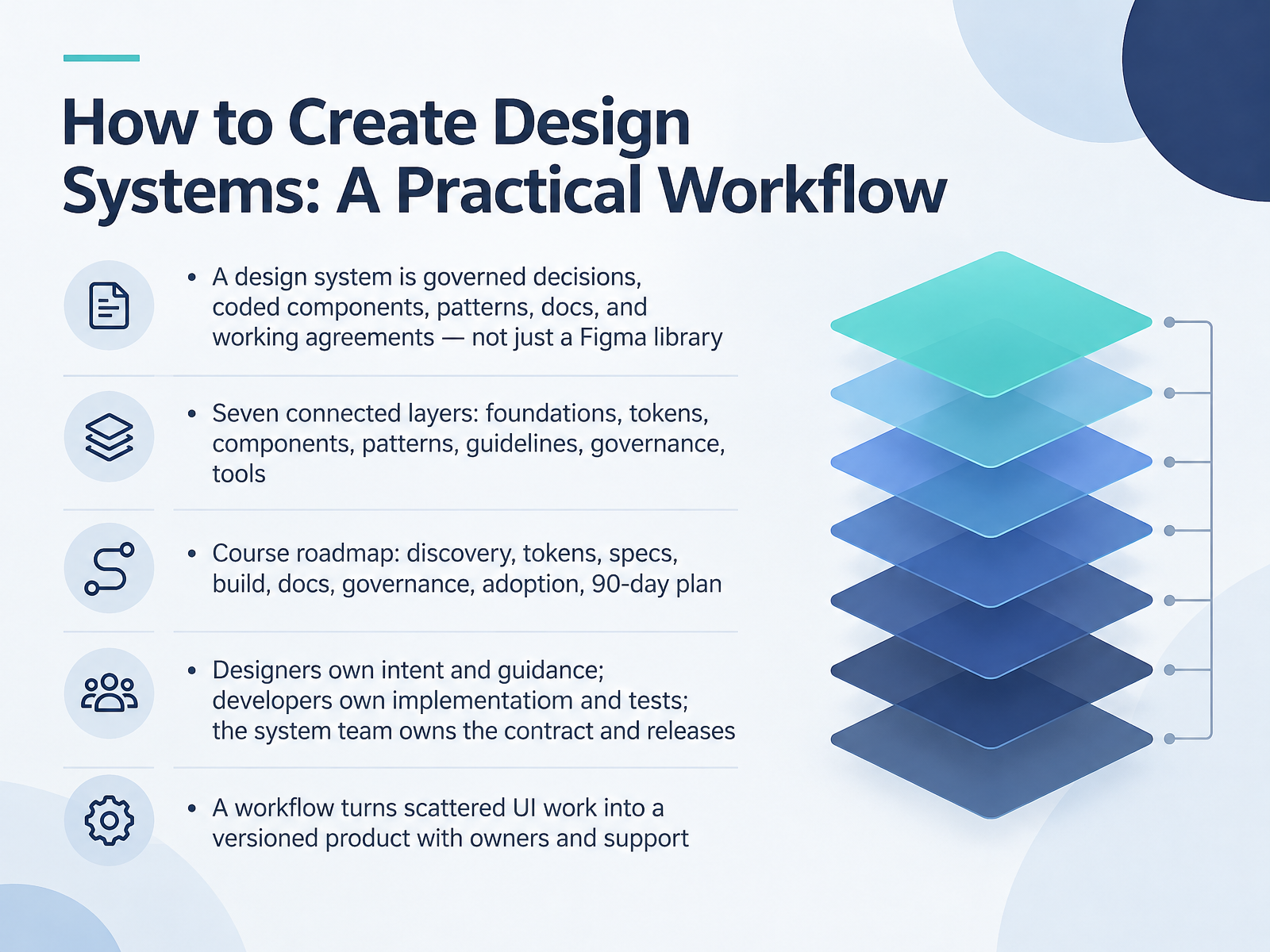
- 01How to Create Design Systems: A Practical WorkflowWelcome. Over the next fourteen slides, we're going to build a design system workflow you can actually run, not just present. Here's the framing. A design system is governed decisions, coded components, patterns, documentation, and working agreements. A polished Figma library alone is not a system, and you already know why. The code drifts, states don't match, and nobody knows who can approve a change. So we'll work through seven connected layers: foundations, tokens, components, patterns, guidelines, governance, and tools. Then we'll follow a practical roadmap: discovery, tokens, specs, build, docs, governance, adoption, and a ninety-day plan. Ownership stays clean and simple. Designers own intent and guidance. Developers own implementation and tests. The system team owns the contract and releases. That's the shift we're after: turning scattered UI work into a versioned product with owners and real support. Next, let's look at where teams actually get stuck, starting with evidence and failure modes.figr.designsoftware-engineering-guide.github.iomiro.com+22 min
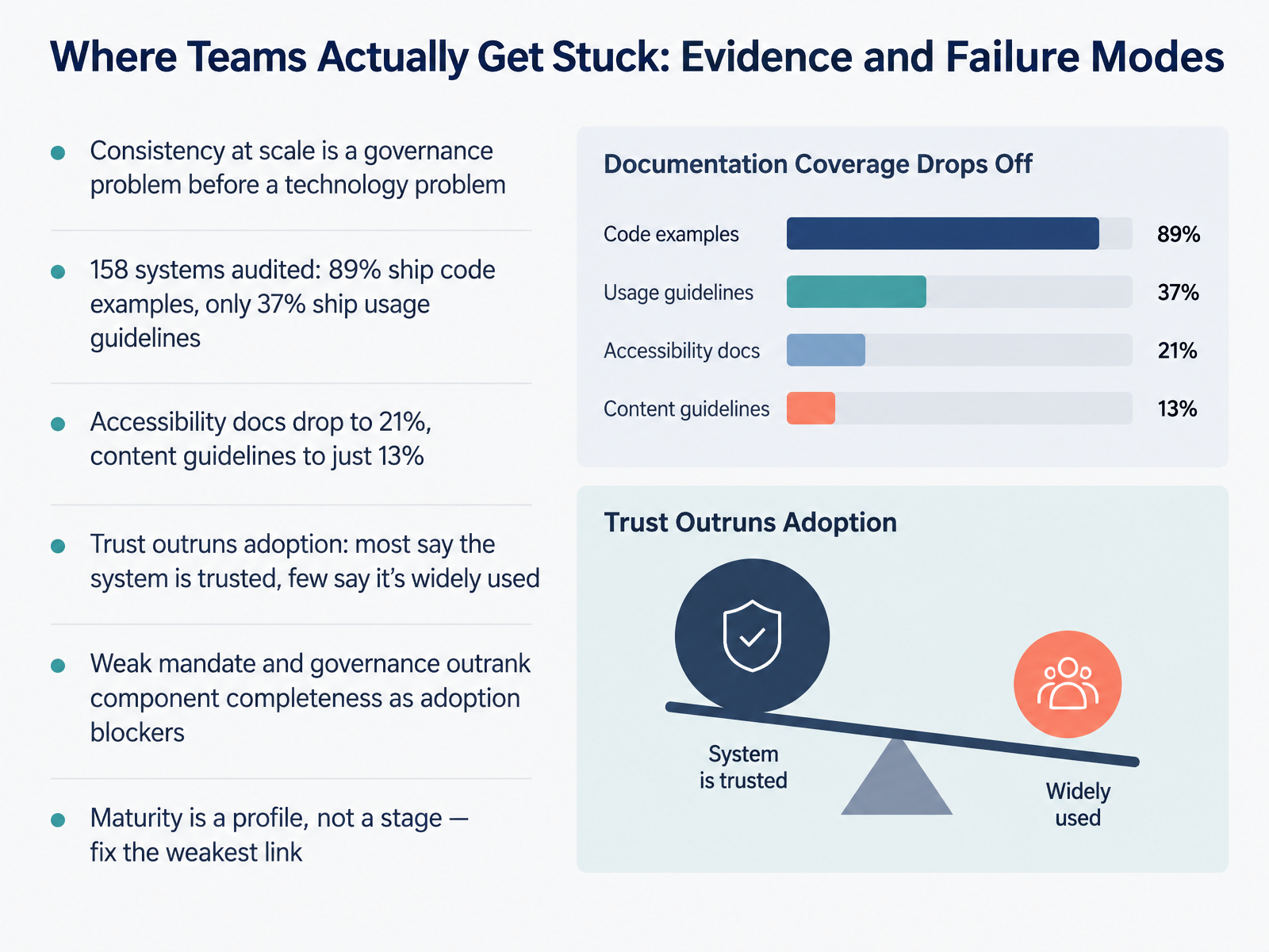
- 02Where Teams Actually Get Stuck: Evidence and Failure ModesLet's talk about where teams actually get stuck. Here's the core finding: consistency at scale is a governance problem before it's a technology problem. The evidence backs that up. Across 158 systems audited, 89 percent ship code examples, but only 37 percent ship usage guidelines. Accessibility docs drop to 21 percent, and content guidelines to just 13 percent. You probably recognize that pattern in your own library. Trust outruns adoption too. Most respondents say their system is trusted, yet few say it's widely used. And when asked what blocks adoption, weak mandate and governance outrank component completeness. So treat maturity as a profile, not a stage. Score each area, then fix the weakest link between a shared decision and the shipped product. Next, we'll look at discovery, and how to bound the audit, then prioritize.
 report.zeroheight.comuxpin.comsparkbox.com+21 min
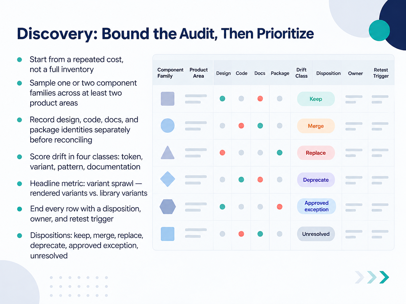
- 03Discovery: Bound the Audit, Then PrioritizeSo let's talk about keeping discovery bounded. Skip the full inventory. Start from a repeated cost, like a component family that keeps getting rebuilt or argued over in review. Sample one or two families across at least two product areas, so you can tell whether a finding recurs. Record design, code, docs, and package identities separately before you reconcile them. Then score drift in four classes: token, variant, pattern, and documentation. Your headline metric is variant sprawl, the rendered variants divided by the library variants. Know the trap: a mismatched border radius and a missing permission state both look like inconsistencies on a slide. So end every row with a disposition, an owner, and a retest trigger. The dispositions are keep, merge, replace, deprecate, approved exception, or unresolved. A row without an owner is just an observation. Next, we'll scope the first slice and align stakeholders.
 netguru.comadamarant.comtcules.com+22 min
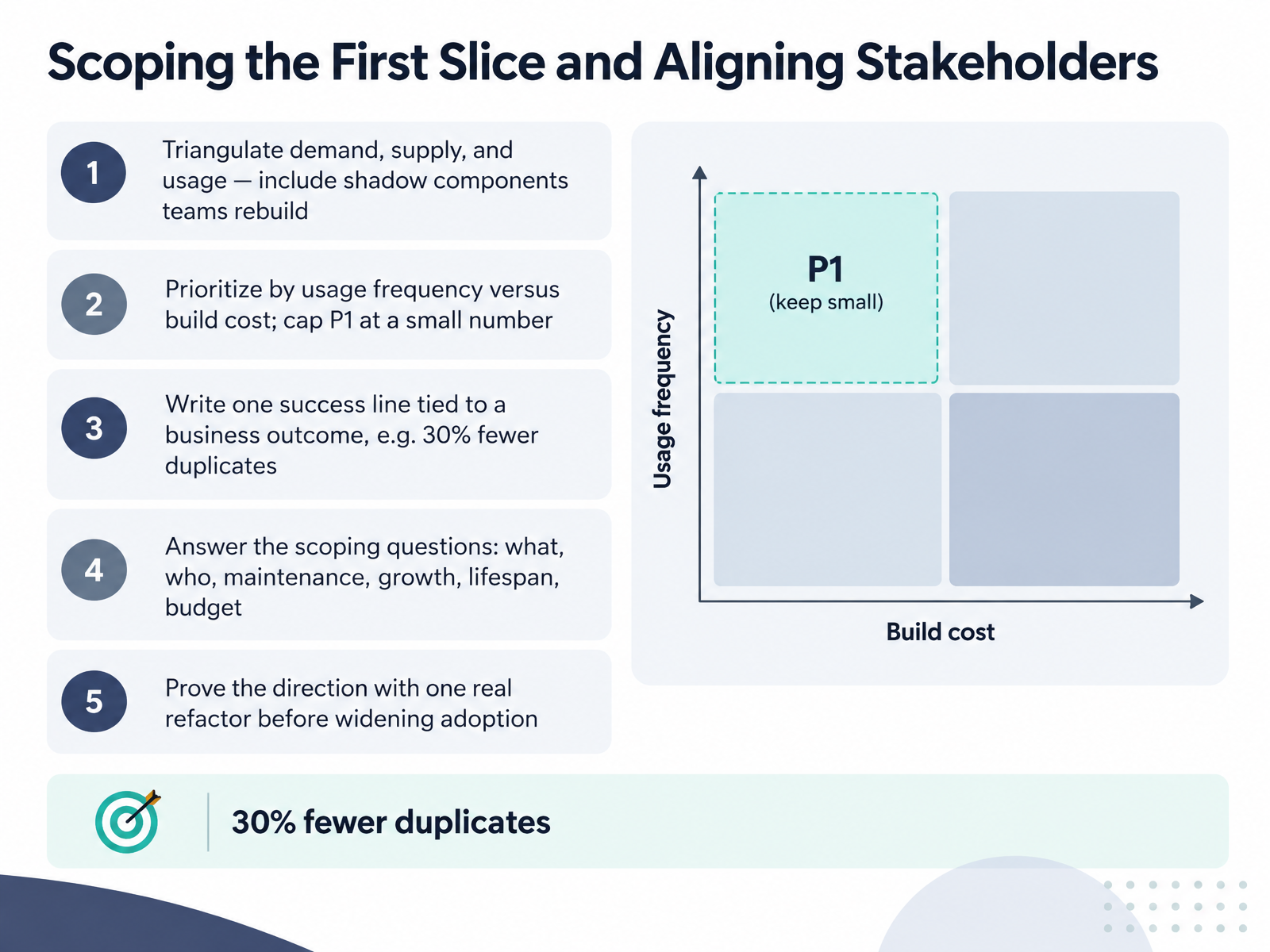
- 04Scoping the First Slice and Aligning StakeholdersNow let's scope the first slice and get stakeholders aligned. Start by triangulating three signals: demand from filed issues, supply from what already exists, and real usage, including the shadow components teams rebuild by hand. Weight your ranking toward what teams actually do. Next, prioritize by usage frequency versus build cost, and cap your first priority tier at a small number. Everyone wants everything in P1, so dot vote if you have to. Write one success line tied to a business outcome, like thirty percent fewer duplicate components. Then answer the scoping questions: what, who, maintenance, growth, lifespan, and budget. And prove the direction with one real refactor before widening adoption. Small slice, clear win, then scale.
 alexlvrs.comgithub.comidentityforge.io+21 min
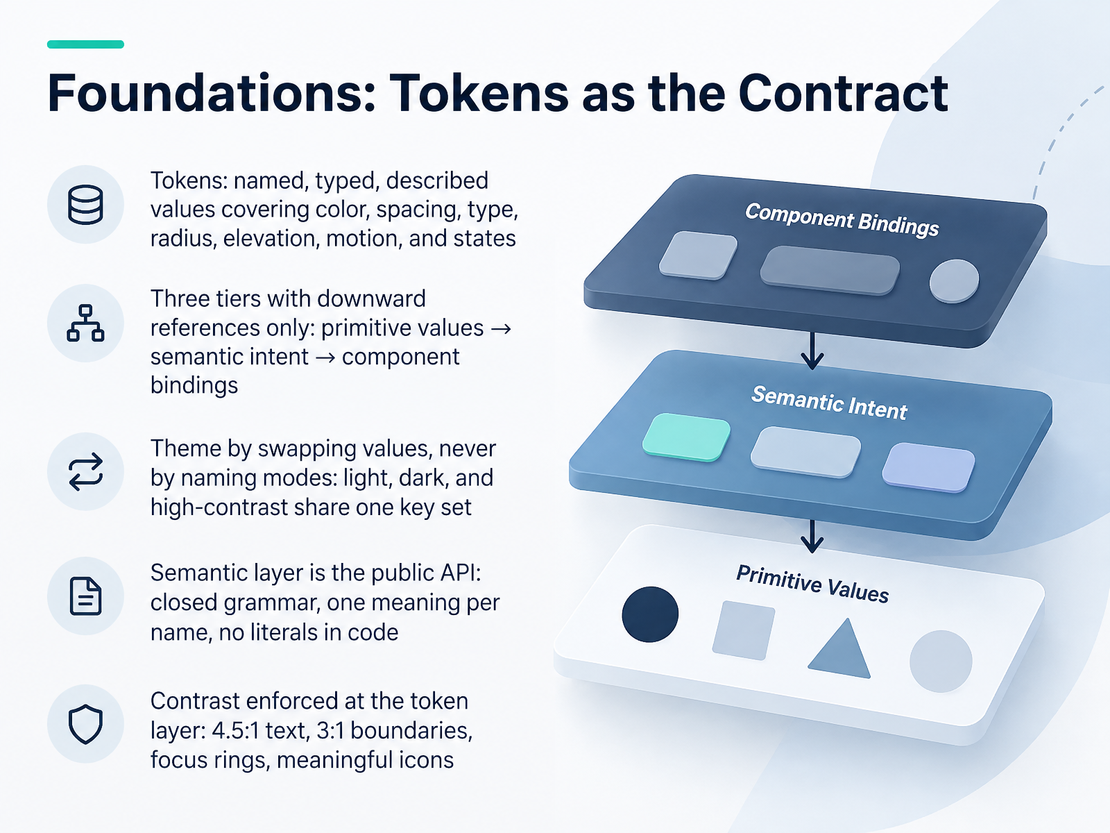
- 05Foundations: Tokens as the ContractNext, we lock down the contract that everything else depends on: tokens. A token is a named, typed, described value covering color, spacing, type, radius, elevation, motion, and states. Build them in three tiers, with references flowing downward only. Primitive values hold raw hexes and numbers. Semantic tokens assign intent, like text primary or action brand. Component bindings scope that intent to one component. Two rules save you real pain. First, theme by swapping values, never by naming modes. Light, dark, and high-contrast share one key set. So no token called dark something. Second, treat the semantic layer as your public API. Closed grammar, one meaning per name, and no literals in component code. Then enforce contrast at the token layer: four point five to one for text, three to one for boundaries, focus rings, and meaningful icons. Catch it there and it never becomes a review comment. Let's look at how those names stay portable across tools.
 figr.designsoftware-engineering-guide.github.iomiro.com+21 min
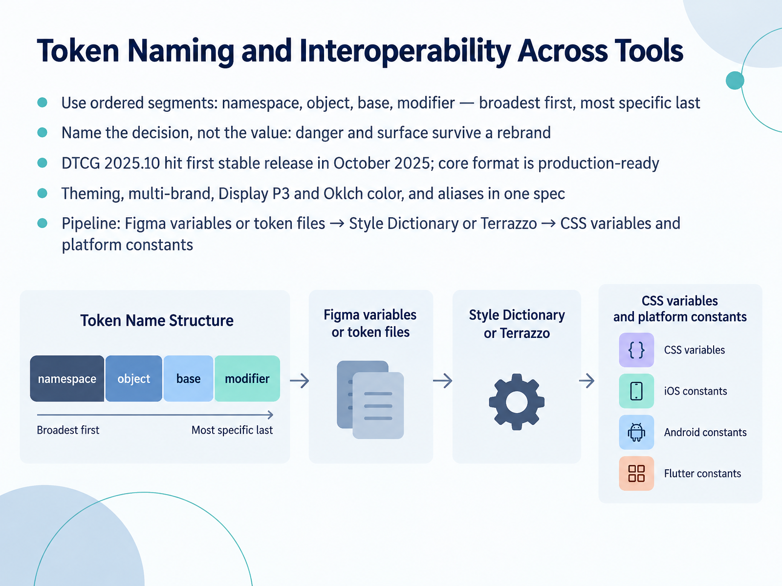
- 06Token Naming and Interoperability Across ToolsNext up, token naming and how your tokens travel between tools. Start with ordered segments: namespace, object, base, modifier. Broadest first, most specific last. So a name reads like the Singapore design system's form padding y, and you can scan it left to right without guessing. Then name the decision, not the value. Call it danger and surface, not purple seven hundred. Those names survive a rebrand, a dark mode, and a second brand without a single component edit. The vocabulary is your contract, so keep it closed and consistent. On interoperability, the D T C G spec hit its first stable release, version twenty twenty-five point ten, in October twenty twenty-five. The core format is production-ready, and it covers theming, multi-brand, Display P three and Oklch color, plus aliases, all in one spec. That means your pipeline can stay simple. Export Figma variables or token files, transform them with Style Dictionary or Terrazzo, then ship CSS variables and platform constants. One source, no drift. Settle the grammar early. Renaming later costs more than building it right. Now let's design an actual component, from anatomy to API.
 2 min
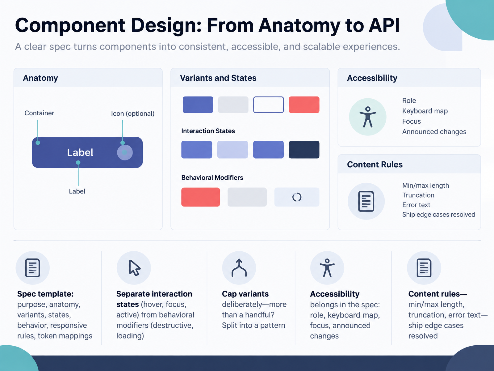
- 07Component Design: From Anatomy to APINow let's move from anatomy to API. Every component gets a spec template covering purpose, anatomy, variants, states, behavior, responsive rules, and token mappings. Fill it in as you design, not months later. Two distinctions save you real pain. First, keep interaction states like hover, focus, and active separate from behavioral modifiers like destructive or loading. A destructive primary button is still a primary button. Second, cap your variants deliberately. More than a handful? Split that into a separate pattern instead. Then put accessibility in the spec itself: the role, the keyboard map, focus behavior, and what gets announced when state changes. Don't leave it to the ticket. Finally, content rules. Minimum and maximum length, truncation behavior, error text. Ship those edge cases resolved in the spec, so developers aren't guessing at handoff. Building and Distributing the Component Library.
 2 min
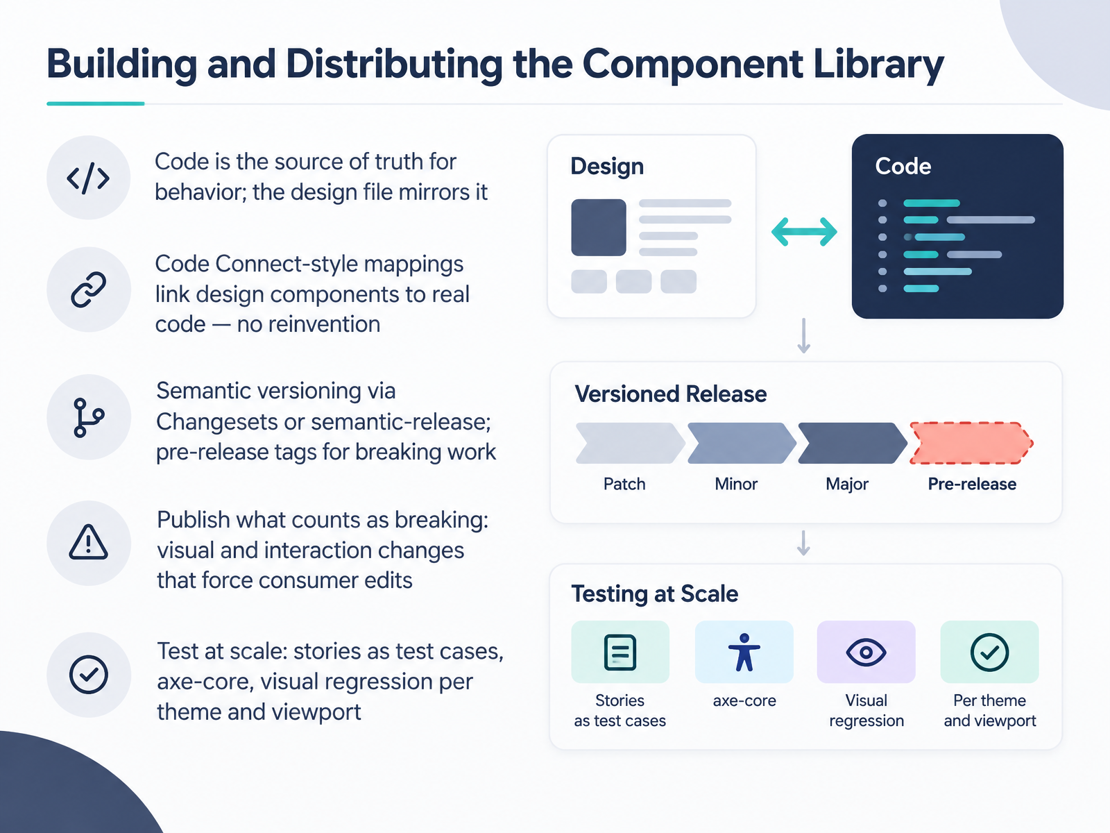
- 08Building and Distributing the Component LibraryNow let's talk about building and distributing the component library. The first rule: code is the source of truth for behavior. The design file mirrors it, not the other way around. Use Code Connect-style mappings to link each design component to its real code, so nobody reinvents a button that already exists.
For releases, version semantically through Changesets or semantic-release. Route risky work through pre-release tags first. And publish your definition of breaking. Ours is simple: any visual or interaction change that forces consumer edits. Write it down and share it.
Finally, test at scale. Treat your stories as test cases. Run axe-core for accessibility, and capture visual regression per theme and per viewport. One broken component multiplies across every product that imports it, so make that gate count.
Next, we look at documentation that people actually use.
 2 min
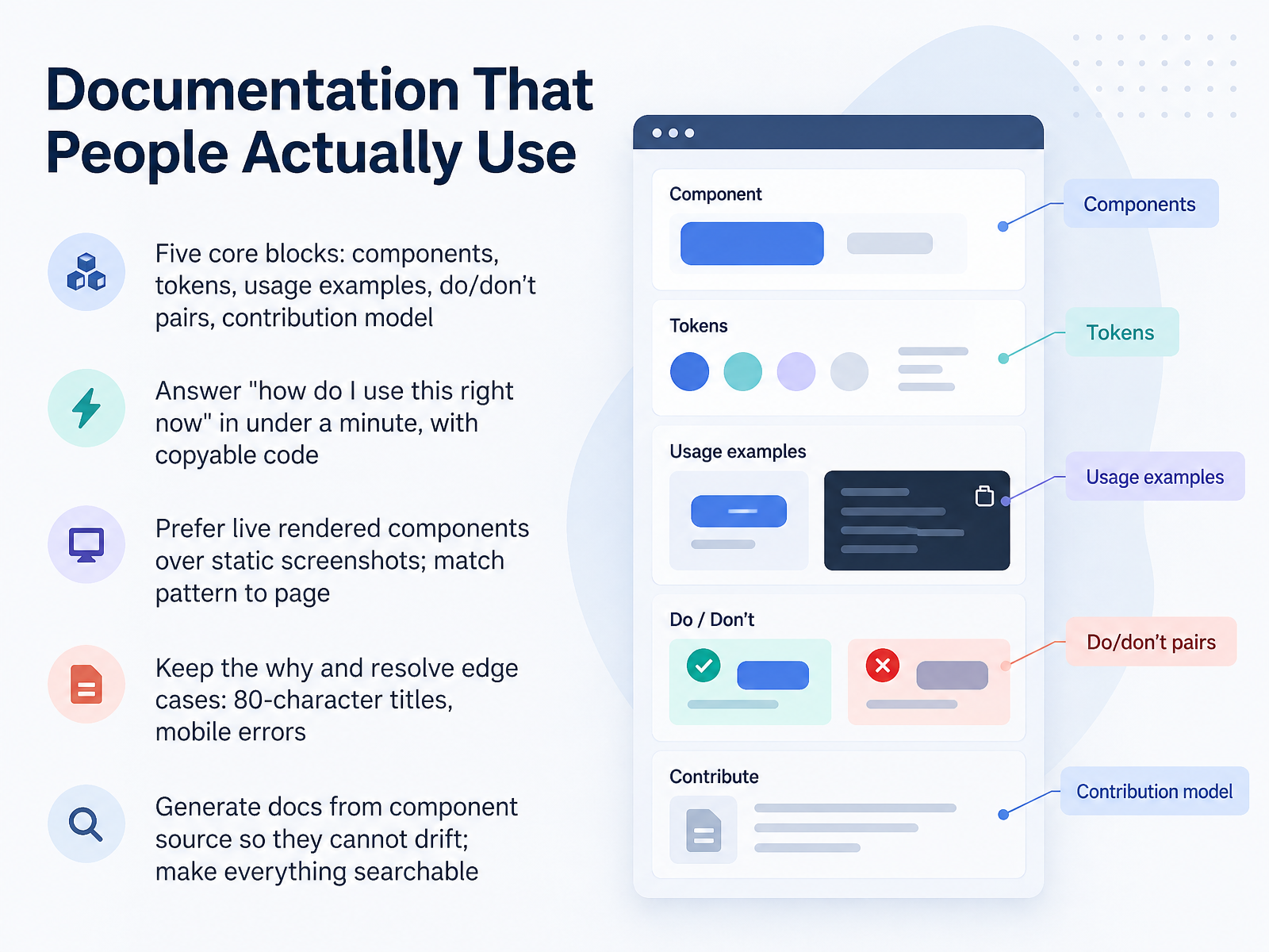
- 09Documentation That People Actually UseLet's talk about documentation people actually use. Every component page needs five core blocks: the component itself, its tokens, usage examples, do and don't pairs, and your contribution model. The test is simple. Can a developer answer "how do I use this right now" in under a minute, with copyable code? That means live, rendered components, not screenshots. Pick the right pattern per page: a full sandbox for complex cases, a static preview for simple ones. Then keep the why, and resolve the edge cases that cause drift, like an eighty-character title or the error state on mobile. Finally, generate docs from component source so they cannot drift, and make everything searchable. Next, Governance, Contribution, and Decision Rights.
 storybook.js.orgfigr.designsoftware-engineering-guide.github.io+22 min
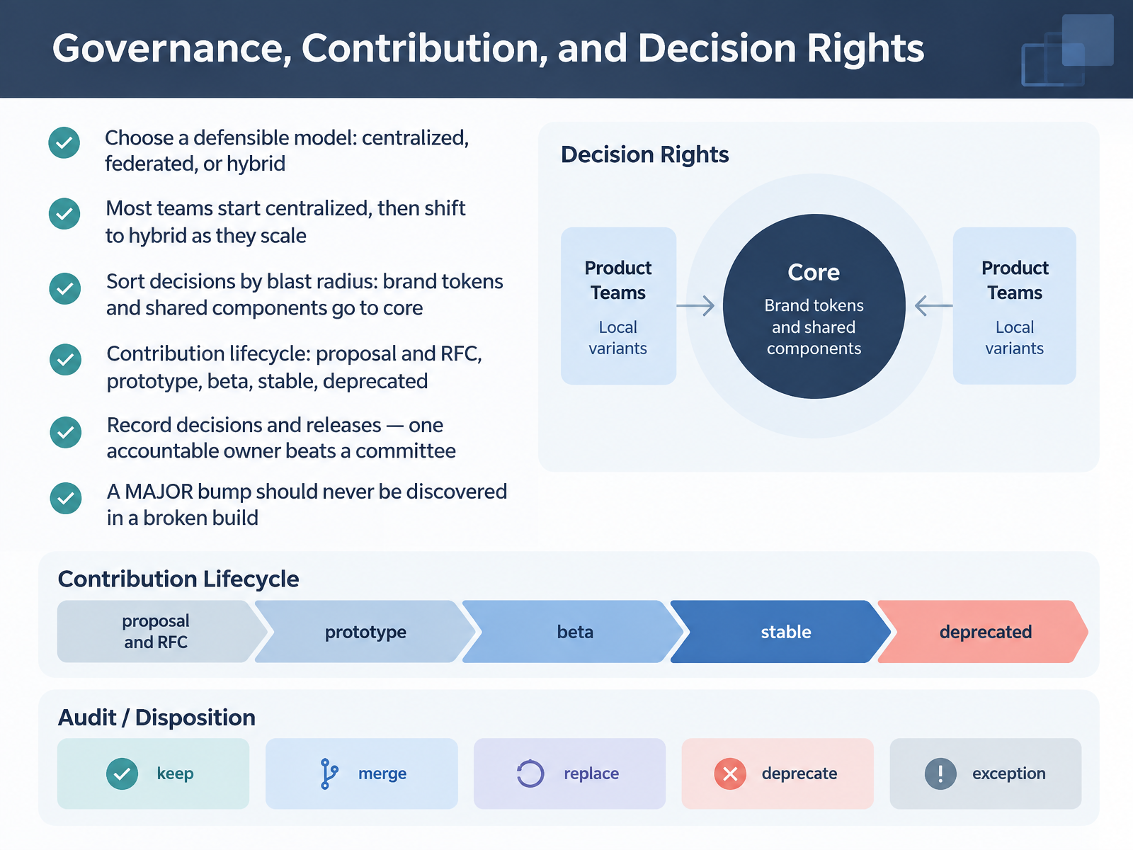
- 10Governance, Contribution, and Decision RightsLet's look at governance, contribution, and decision rights. Start by choosing a defensible model: centralized, federated, or hybrid. Most teams begin centralized, then shift to hybrid as they scale. Next, sort decisions by blast radius. Brand tokens and shared components go to the core team, every time. Everything narrower belongs to the product team. For contributions, run one lifecycle: proposal and RFC, prototype, beta, stable, then deprecated. Record decisions and releases in writing. One accountable owner beats a committee every time. And make major bumps explicit in your release notes. A major version bump should never be discovered in a broken build. Write the model down in your contributing guide, where people will actually find it. Next, we'll cover deprecation and communicating breaking changes.
 figma.comfigr.designsoftware-engineering-guide.github.io+22 min
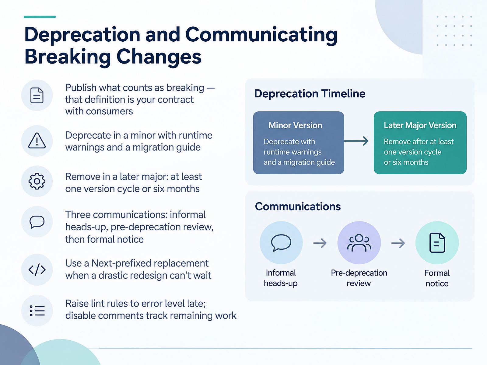
- 11Deprecation and Communicating Breaking ChangesNow let's talk about deprecation and how to communicate breaking changes. First, publish what counts as breaking. That definition is your contract with consumers, so stick to it. Deprecate in a minor release, with runtime warnings and a migration guide attached. Then remove in a later major, after at least one version cycle or six months, whichever is longer. You get three communications: an informal heads-up, a pre-deprecation review, then the formal notice with the guide. The review is where consuming teams flag dependencies and confirm the timeline is realistic. When a drastic redesign can't wait, ship a Next-prefixed replacement and keep the old one working. And raise lint rules to error level late, so disable comments become your inventory of remaining work. The takeaway is simple: no surprises, and a clear path off the old component. Next, we'll look at adoption: metrics, migration, and enablement.
 report.zeroheight.com1 min
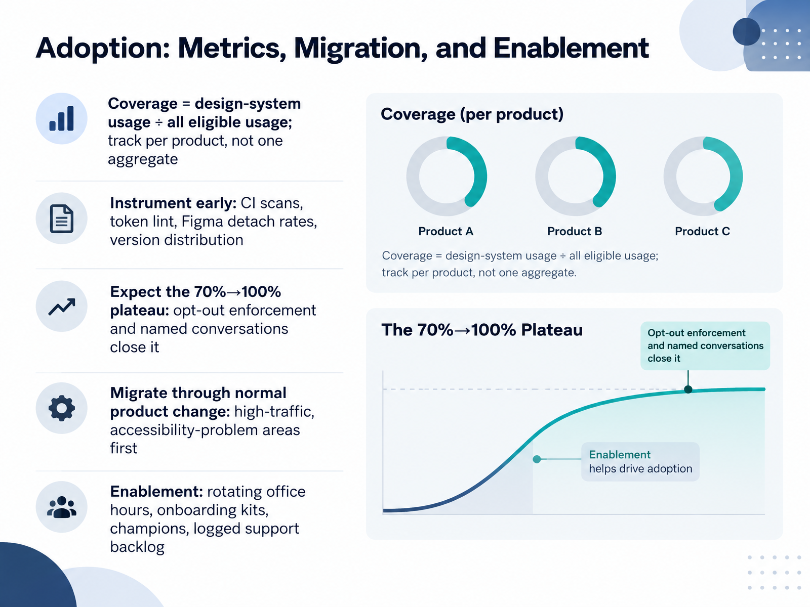
- 12Adoption: Metrics, Migration, and EnablementSo now let's talk adoption, and how you actually measure and finish it. Start with coverage. That's design-system usage divided by all eligible usage. Report it per product, not as one aggregate number. The aggregate hides your laggards, and the per-product breakdown forces specific conversations. Instrument early. Set up CI scans, token lint, Figma detach rates, and version distribution. You want the data before you need it. Expect the plateau. Migrations naturally stall around seventy percent. Closing that last stretch takes opt-out enforcement, like error-level lint on new code, plus a named conversation with each team still holding out. Migrate through normal product change. Start with high-traffic and accessibility-problem areas, because that's where the payoff is. And enable people. Run rotating office hours, hand out onboarding kits, recruit champions, and log your support backlog so recurring blockers shape the roadmap. Next, we'll look at tooling and AI-assisted workflows in 2026.
 report.zeroheight.com2 min
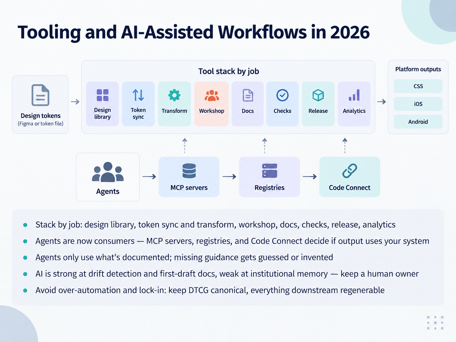
- 13Tooling and AI-Assisted Workflows in 2026Let's talk tooling. Pick tools by job, not by vendor loyalty. Design library, token sync and transform, component workshop, docs, checks, release, analytics. Keep the stack small and keep each slot filled.
The big shift is that agents are now consumers of your system. MCP servers, registries, and Code Connect decide whether generated output actually uses your components. And here's the catch: agents only use what's documented. Missing guidance gets guessed or invented. So if your Figma file, Storybook, and docs disagree, the agent inherits the disagreement.
AI earns its keep on drift detection and first-draft docs. It's weak at institutional memory, so keep a named human owner on every AI-assisted decision.
And resist over-automation. Keep the DTCG token format canonical, and treat everything downstream as regenerable. That keeps you free to swap tools every few months without a rewrite.
Next, let's turn all of this into a plan: Putting It Together, a 90-Day Action Plan.
 1 min
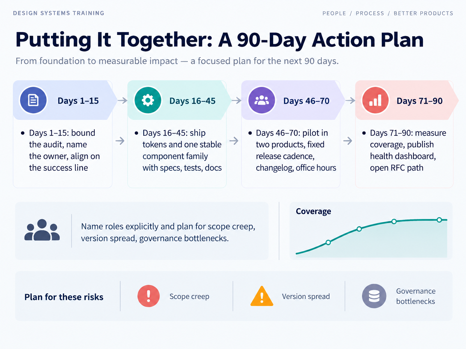
- 14Putting It Together: A 90-Day Action PlanLet's close with a plan you can actually run. Days one through fifteen, bound the audit, name one owner, and agree on the success line. Keep the audit narrow or it swallows the quarter. Days sixteen through forty five, ship tokens and one stable component family with specs, tests, and docs. One family, fully done, beats five half-finished ones. Days forty six through seventy, pilot in two products on a fixed release cadence, with a changelog and office hours. Days seventy one through ninety, measure coverage, publish a health dashboard, and open an RFC path for contributions. And here's the part teams skip. Name roles explicitly, and plan for scope creep, version spread, and governance bottlenecks before they hit. You've got the workflow. Pick your owner this week and start the audit.
 figma.comreport.zeroheight.com1 min
Take the deck with you
Download this course as a file — free, no sign-up needed.
- PDF handoutEvery slide page, ready to print or share.15 pages · 3.0 MBDownload
- Narrated PowerPointThe deck that presents itself — every slide carries the digital human's narration video.15 pages · 12.8 MBDownload
- PowerPoint slidesThe full deck as a .pptx — open it in PowerPoint, Keynote, or Google Slides.15 pages · 2.9 MBDownload
Free to use in your own training — please keep the PersonWise credit page at the end.
Have your own deck? Turn it into a course
Sources consulted
Web sources consulted while building this course.
- Design System Guide: Build, Manage, and Scale in 2026 — figr.design
- 5.2 UI design and design systems - Software Engineering Guide — software-engineering-guide.github.io
- Design System Governance: How to Keep Design and Code in Sync | Miro — miro.com
- Design System Governance: Structuring Ownership | Figma — figma.com
- How to document your design system: best practices & tools — storybook.js.org
- Design Systems Report 2026 - brought to you by zeroheight — report.zeroheight.com
- Design Systems & DesignOps in the Enterprise | UXPin — uxpin.com
- Design Systems Maturity Model — sparkbox.com
- State of Design Systems 2026: Tokens, Components, and the New Frontier | The Stack Stories — thestackstories.com
- Design System Evolution: How Design Systems Grow from Humble Beginnings to Well-Functioning Products — aaltodoc.aalto.fi
- How to Run a Design System Audit: A Step-by-Step Guide for UX Teams — netguru.com
- How to run a design system audit in 5 days: a checklist — adamarant.com
- How to Audit a Design System, with a Checklist | Tcules — tcules.com
- Design system audit: 5 moves + governance | Lazarev.agency — lazarev.agency
- Design System Audit: Systematically Assessing the State — Componiq Knowledge — componiq.com
- Component Audit & Prioritization Framework | Alex Louviers — alexlvrs.com
- skills/component-audit/SKILL.md — github.com
- Design system component inventory template: map design, code, usage, and decisions | Identity Forge — identityforge.io
- How to audit a design system | Obvious University — university.obvious.in
- Collaborative Design System Prioritization That Actually Works (with a Free Downloadable Resource) — systemsandsignals.co