Statistics Workflow for Data Science Projects
Begin
14 pages · ~28 min
Statistics Workflow for Data Science Projects
Learn a practical workflow for applying statistics in data science projects, from data exploration to model validation. Ideal for aspiring data scientists seeking to build reliable, data-driven insights.
What you’ll learn
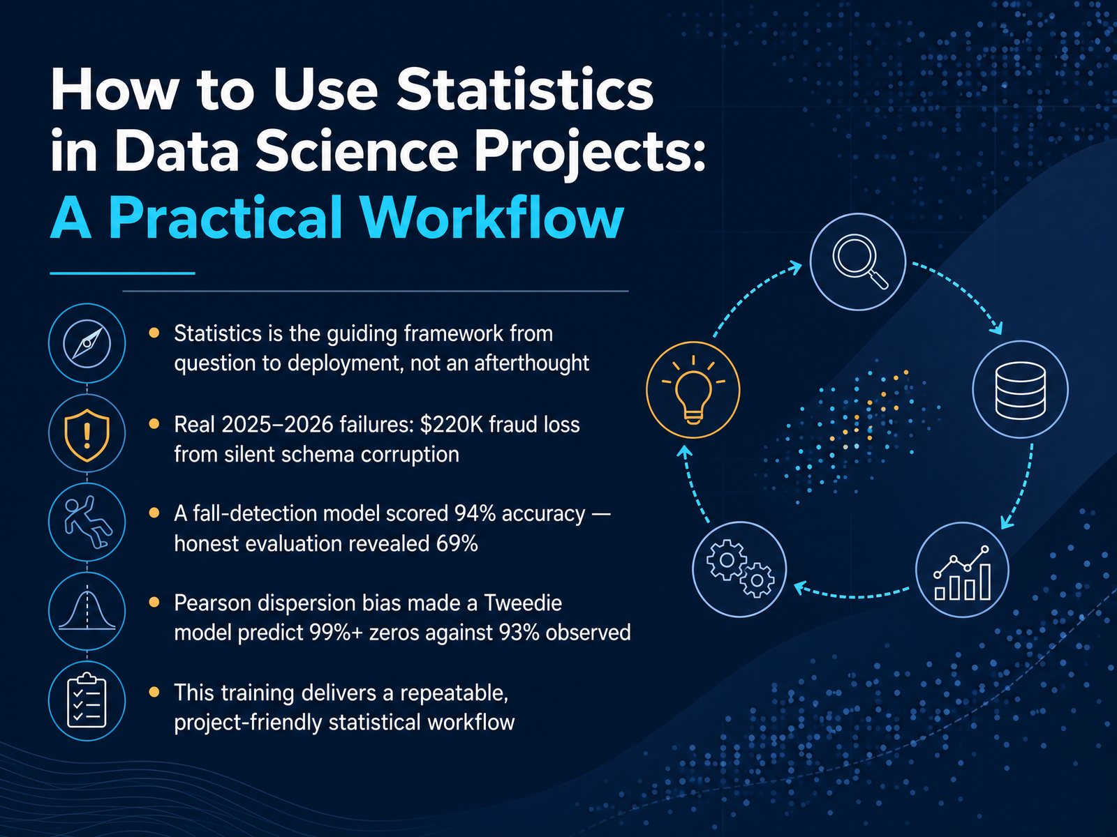
- 01How to Use Statistics in Data Science Projects: A Practical WorkflowWelcome. Today, I want to walk you through something that sits at the core of every successful data science project, something far deeper than just running a few tests. We're talking about statistics as a practical, guiding framework—a workflow that carries you from the initial question all the way through to deployment. It's not an afterthought you paste on at the end. I've seen firsthand, especially looking at recent project failures from 2025 and 2026, what happens when this is ignored. One team lost two hundred and twenty thousand dollars to fraud because a silent schema corruption bypassed their model validation. Another watched a fall-detection model that reported a beautiful ninety-four percent accuracy drop to an honest sixty-nine percent under robust evaluation. And in insurance modeling, a single statistical bias—the Pearson dispersion estimator—caused a Tweedie model to predict over ninety-nine percent zeros, completely missing the true ninety-three percent rate. These aren't rare edge cases; they are predictable failures when rigor is missing. Today, we're going to build a repeatable, project-friendly statistical workflow to make sure you never ship a model with these kinds of hidden flaws. Next, we'll dive right into why statistical rigor determines your project's success or failure.williambdean.github.iotowardsdatascience.commachinelearningatscale.substack.com+22 min
- 02Why Statistical Rigor Determines Project Success or FailureLet's start with a hard truth about data science work. Predictive metrics on their own can be dangerously misleading without sound statistical foundations. I want to share a handful of real project failures where numbers looked great but the models were quietly failing. In one case, a twelve-terabyte fraud pipeline showed an accuracy of zero point eight two. That sounded decent, until we discovered it was masking two hundred twenty thousand dollars in annual losses due to silent schema corruption. Another team built a fall-detection model reporting ninety-four percent accuracy. The true performance was only sixty-nine percent. Frame-level data leakage had inflated the results. We've also seen a Tweedie model predicting over ninety-nine percent zeros against an observed ninety-three percent, which is a classic case of catastrophic Pearson dispersion bias. The takeaway here is simple. If you don't rigorously check your assumptions, you can easily ship a model that looks successful on a dashboard but fails completely in the real world. Next, we'll talk about how to prevent these disasters by framing your business question as a testable hypothesis.
 2 min
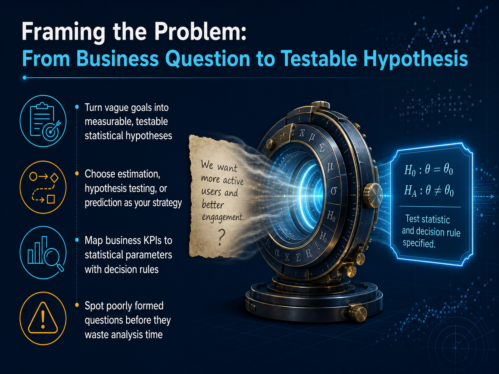
2 min - 03Framing the Problem: From Business Question to Testable HypothesisEvery strong analysis starts with a clear, testable question. A vague goal like 'understand customer churn' needs to become something measurable, such as 'does the average monthly usage differ between customers who churn and those who stay?' This step forces you to pick your strategy. Are you estimating an unknown parameter, testing a specific hypothesis about group differences, or building a prediction model? Your choice changes the entire workflow. Next, connect the business KPI to a statistical parameter. For example, a business target of 'improve conversion rate by five percent' maps to the population proportion you will estimate or test, paired with a clear decision rule like 'deploy the new page if the lower bound of the confidence interval exceeds the current baseline.' One of the most valuable skills here is spotting poorly formed questions early. If a stakeholder asks 'what drives sales,' you know that question is too broad to test directly. Pause, refine it with them, and save hours of unfocused exploration. Up next, we will look at how to design the sampling and data collection plan that gives your hypothesis a reliable foundation.
 2 min
2 min - 04Sampling and Data Collection Design for Reliable InferenceNow let's talk about sampling and data collection design, because how you gather your data determines everything you can say later. The first decision is whether you're using probability sampling or non-probability sampling. Probability sampling means every unit has a known chance of being selected, and that's what allows you to make formal statistical inferences to a broader population. Non-probability samples, like convenience samples, can still be useful for exploration, but they don't support the same kind of generalization. Know the difference before you collect a single data point. Next, let's look at power analysis. This is where you balance four things: sample size, effect size, your alpha level, and statistical power. If you skip this step, you risk running an underpowered study that can't detect the effect you care about, which is a waste of everyone's time. A common target is eighty percent power at an alpha of zero point zero five, with a small to medium effect size based on prior research. You should also identify three threats at the design stage: selection bias, measurement error, and confounding. For example, if you only survey people who click a link, selection bias means you're not hearing from the rest of your target group. If your survey question is vague, measurement error creeps in. And confounding happens when an unmeasured variable, like user experience level, drives both your predictor and your outcome. Catching these early is far cheaper than fixing them later. The good news is we have great tools now. You can use browser-based calculators like the ones on power and sample size dot com, Python simulations, or R libraries like S power. These make power analysis fast and reproducible without requiring advanced programming. With a solid sampling and power plan, you're ready for the next step: exploratory data analysis with a statistical lens.
 powerandsamplesize.comgithub.comncss.com+22 min
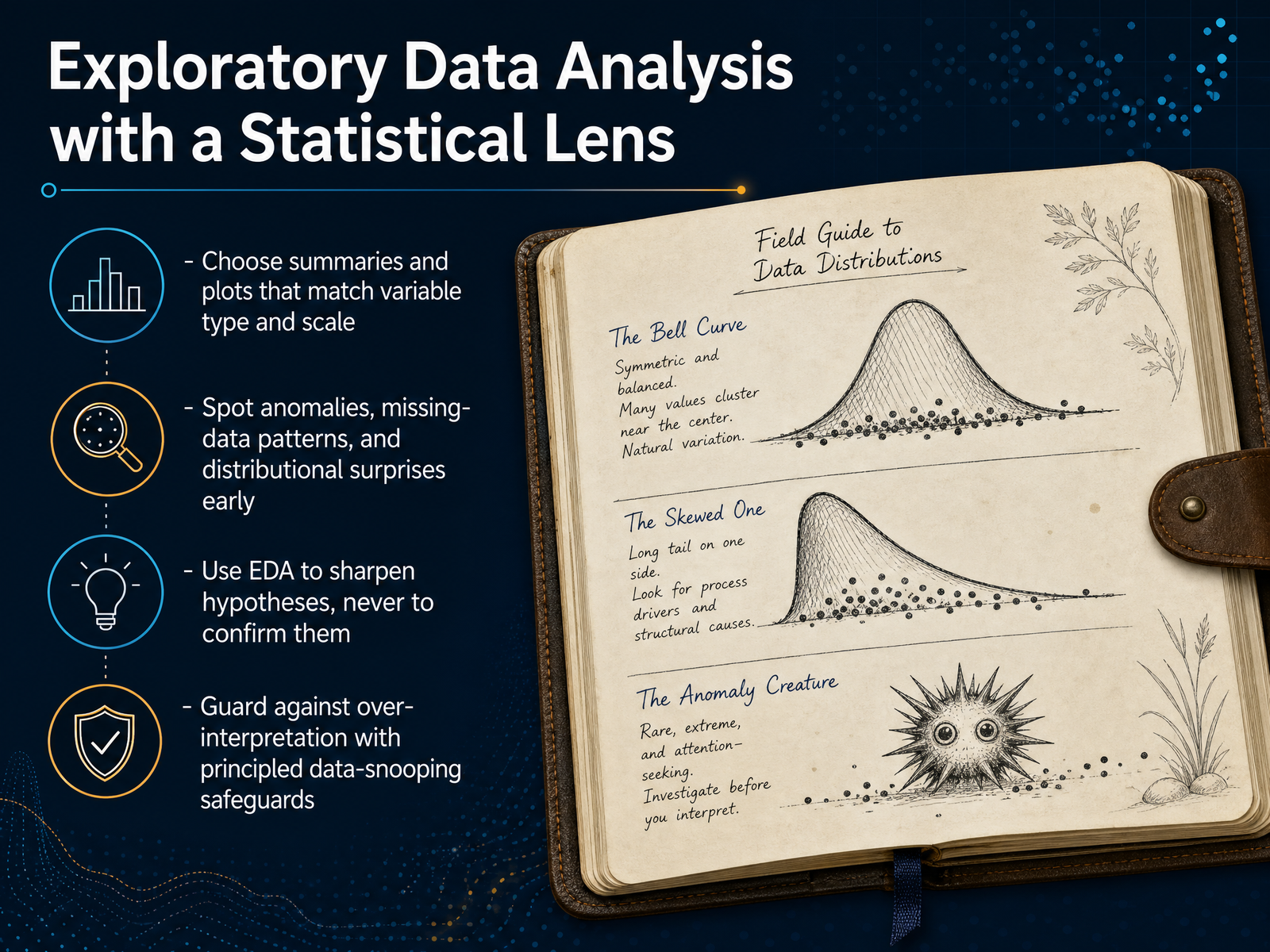
 - 05Exploratory Data Analysis with a Statistical LensLet's look at exploratory data analysis through a statistical lens. The first rule is to match your summaries and plots to the variable type and scale. A bar chart for a categorical variable makes sense. A histogram for a continuous variable makes sense. Don't just run the default command. Think about what the data actually measures before you visualize it. Second, use this step to spot anomalies early. Look for missing data patterns, like an entire column blank for a specific month, or a numeric field that shows a string of zeros when it shouldn't. Look for distributional surprises, like a variable that should be normally distributed but is actually strongly skewed. Catching these now prevents model failures later. Third, and this is critical, use EDA only to sharpen your hypotheses. It is a tool for question generation, not confirmation. If you see an interesting pattern in the plot, you can form a new hypothesis from it, but you cannot test that same hypothesis on this same data. That leads directly to our final point. Guard against over-interpretation by setting principled safeguards before you look. The simplest safeguard is to hold out a separate data slice for confirmation. If a pattern looks promising in exploration, you must validate it against a fresh subset you haven't touched yet. So let's make this concrete. When we move to the next stage, we are going to need a formal model. Those early patterns we just spotted should directly inform our choice of model family and model specification.
 2 min
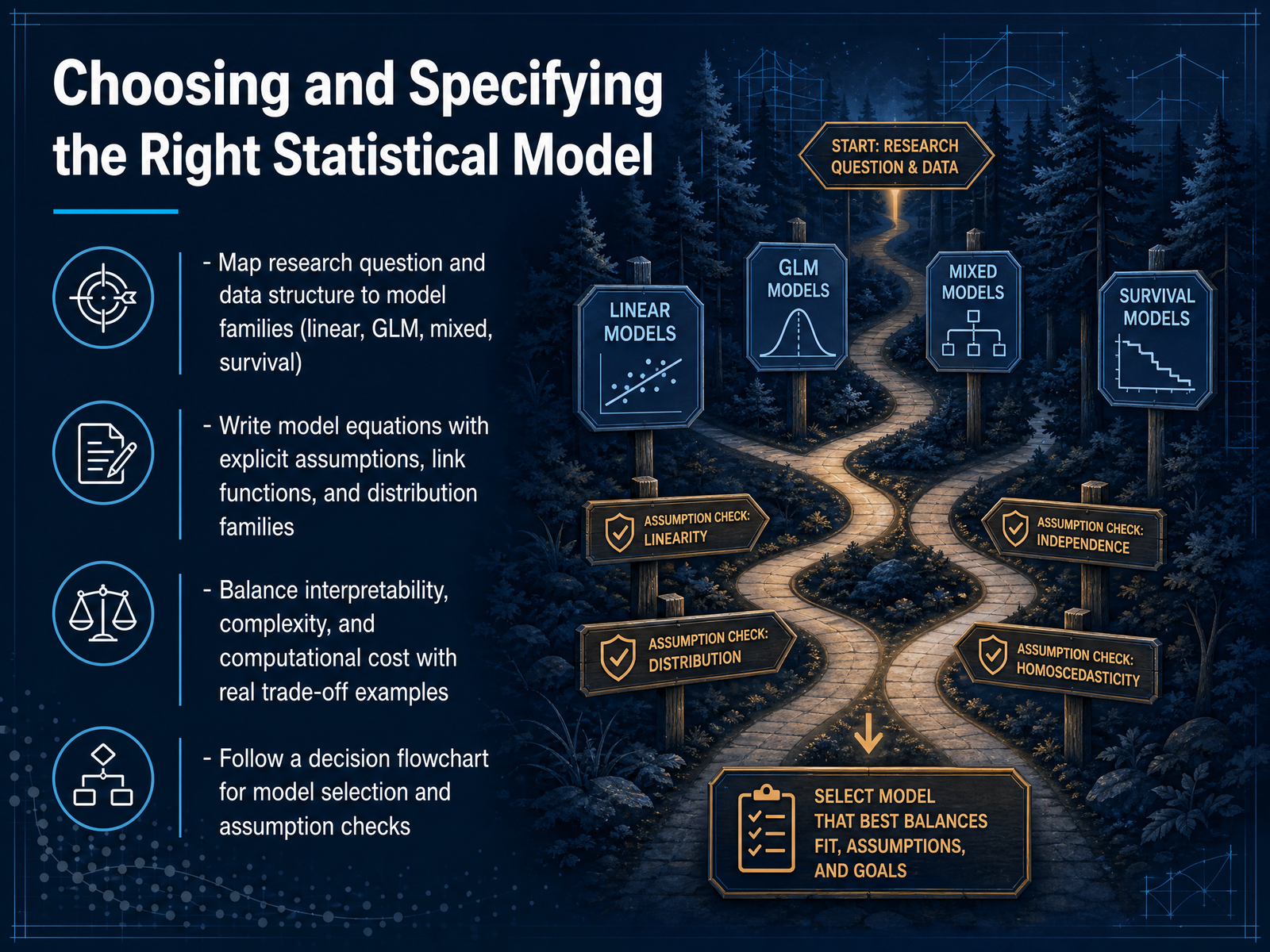
2 min - 06Choosing and Specifying the Right Statistical ModelOnce you have a clean, well-explored dataset, the next big decision is choosing and specifying the right statistical model. This step is all about mapping your research question to the structure of your data. Start by identifying the model family. If your outcome is continuous and roughly normal, think linear regression. For binary outcomes or counts, you move into the generalized linear model family with link functions like logit or log. When you have grouped or repeated measures, mixed models let you account for within-cluster correlation. And for time-to-event data, survival models handle censoring properly. Next, write out your model equation explicitly. Don't just click buttons. State the distribution family, the link function, and your fixed effects. This surfaces your assumptions and makes debugging much easier. Now, balance interpretability, complexity, and computational cost. A simpler linear model with clear coefficients might serve a business team better than a black-box ensemble, even if the ensemble squeezes out slightly lower error. Use a decision flowchart as your guide. Start with the outcome type, check independence assumptions, consider random effects, and then pick the candidate model. Always follow selection with diagnostic plots: residuals versus fitted values, Q-Q plots, and influence measures. That leads us perfectly into our next topic: validating models and quantifying uncertainty.
 2 min
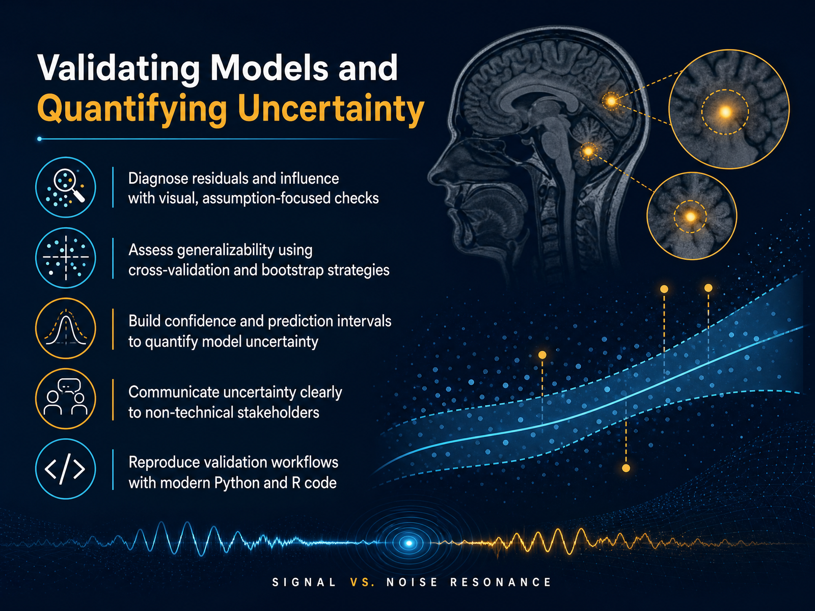
2 min - 07Validating Models and Quantifying UncertaintyNow that we have a working model, we need to understand how much we can trust it. Start by diagnosing your residuals. Look at a residuals versus fitted values plot. You are checking for constant variance and no obvious patterns. A Q-Q plot helps assess normality. These visual checks tell you whether your model's core assumptions hold. Next, move beyond the training data. Use cross-validation to estimate how well your model generalizes. For time series, try a rolling-window approach. For independent observations, five-fold or ten-fold cross-validation works well. The bootstrap is another powerful tool. Resample your data thousands of times to build confidence intervals around your coefficients or predictions. A prediction interval is wider; it captures the range where a single new observation might fall. When you talk to stakeholders, translate these intervals into simple business language. Say, 'We expect next quarter's sales to land between eighty-five thousand and one hundred ten thousand dollars, with ninety-five percent confidence.' To make all of this reproducible, wrap your diagnostics, cross-validation, and bootstrapping into a single function in Python or R. Soon you will move from validating models to taking real action. Next we will cover how to interpret and report these results clearly.
 2 min
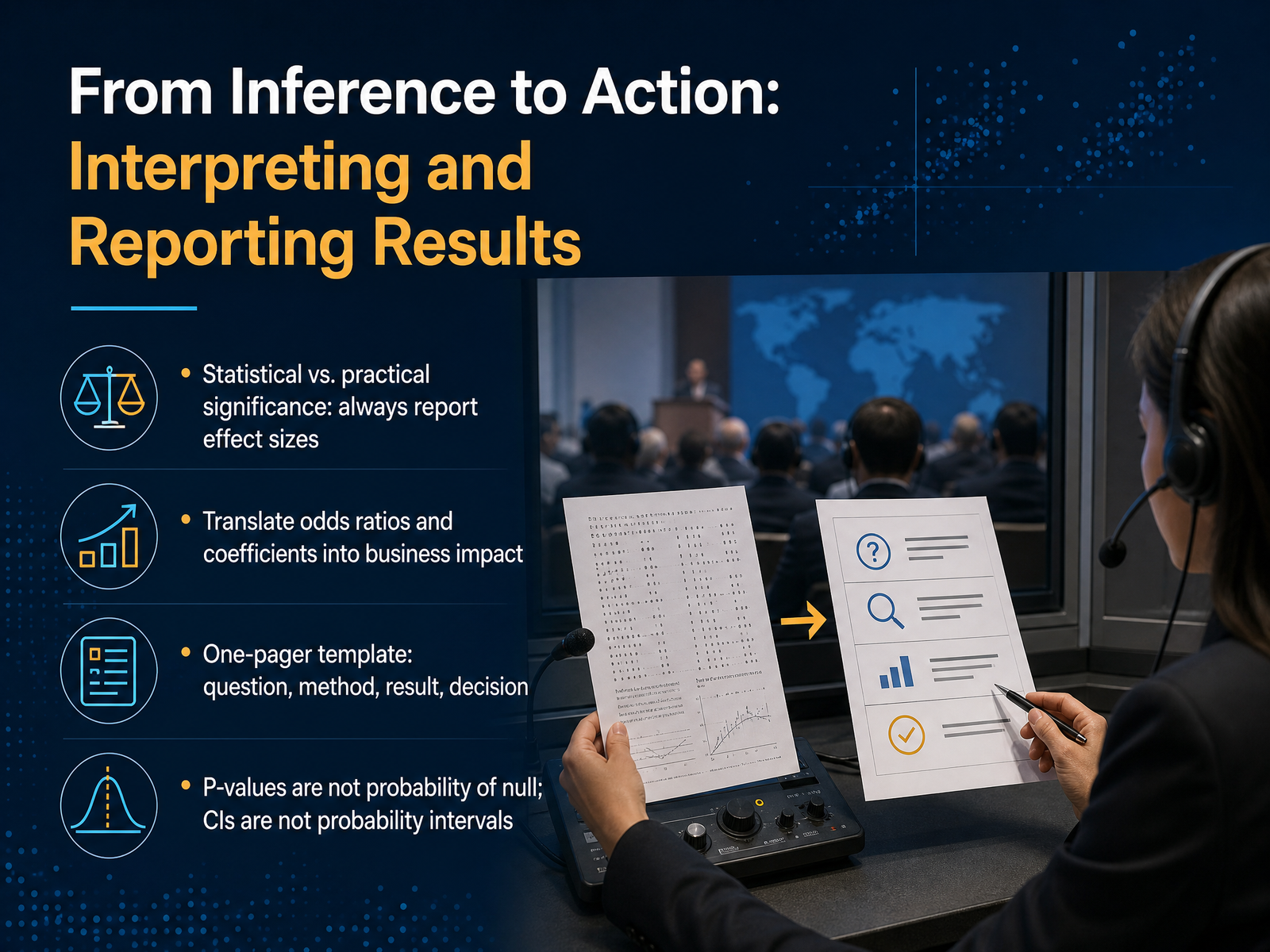
2 min - 08From Inference to Action: Interpreting and Reporting ResultsSo you have run your test and you have a p-value. But a small p-value does not automatically mean the finding matters in the real world. That is the gap between statistical significance and practical significance. Always report an effect size. Think of it this way: the p-value tells you whether an effect exists, but the effect size tells you how big that effect is and whether anyone should care. For instance, an odds ratio of one point zero five might be statistically significant in a huge sample, but it translates to nearly no change in risk for a customer. On the flip side, an odds ratio of two point five means the odds more than double. That is a business impact worth discussing. When you write up your results, don't just paste output tables. Use a simple one-pager template. Start with the business question, state the statistical method you chose, give the main result including the effect size and confidence interval, and end with a clear recommended decision. Also, a couple of quick clarifications. A p-value is not the probability that the null hypothesis is true. And a ninety-five percent confidence interval does not mean there is a ninety-five percent probability that the true value lies inside that specific interval. Keeping these distinctions sharp builds trust and prevents overpromising. Next, we will explore common statistical traps and how to avoid them.
 2 min
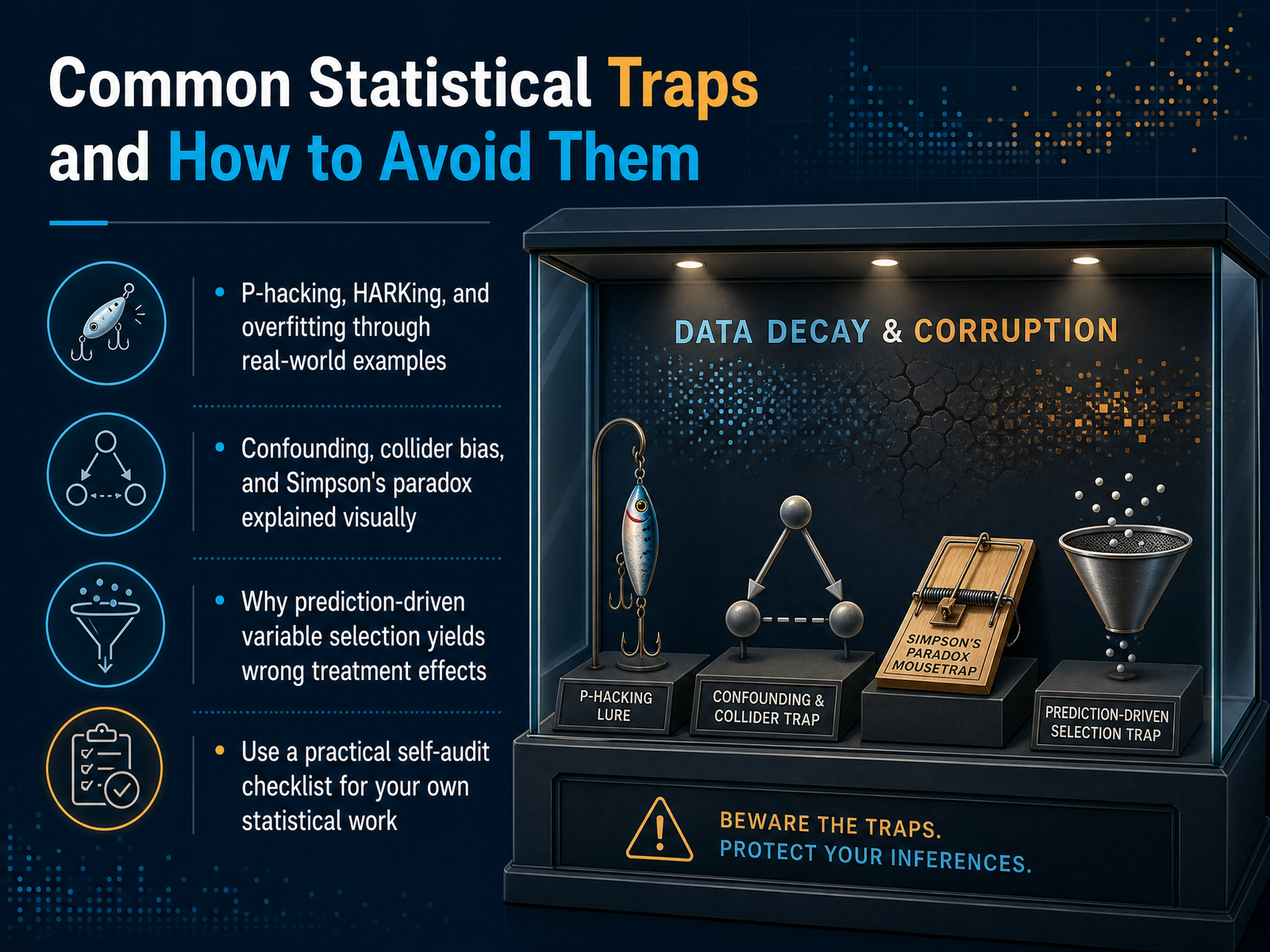
2 min - 09Common Statistical Traps and How to Avoid ThemLet's talk about the traps that even experienced analysts fall into. I want you to recognize these, not so you get paranoid, but so you build a healthy skepticism for your own results. First, p-hacking. Imagine you run twenty different model specifications until you finally get a p-value below 0.05. You've essentially tortured the data until it confessed. The fix is to pre-register your hypotheses or, at minimum, track every test you perform. Closely related is HARKing—hypothesizing after the results are known. You see a correlation, then craft a story around it. That story might be compelling, but it wasn't actually tested. And overfitting means your model memorized noise instead of learning signal. If it works perfectly on training data but fails on new data, you've overfit. Now, let's visually think about bias. Confounding is when an unmeasured variable drives both your cause and effect. Simpson's paradox is trickier: a trend appears in several groups of data but disappears or reverses when you combine them. A classic example is a medical treatment that looks harmful in the aggregate, yet is beneficial when you split data by disease severity. And collider bias happens when you control for a common effect, which artificially induces correlation. Imagine studying only successful startups to find what makes them succeed. By conditioning on success, you create spurious correlations in your data. Finally, a quick warning about prediction-driven variable selection. If you run a LASSO regression to select control variables for a causal estimate, you can severely bias your treatment effect. Use a self-audit checklist after every analysis. Ask: Did I specify my hypothesis first? Did I plot my data in subgroups? And does my model generalize out-of-sample? Now let's apply this to a real mess. Next, we'll work through a case study on debugging a broken causal pipeline.
 2 min
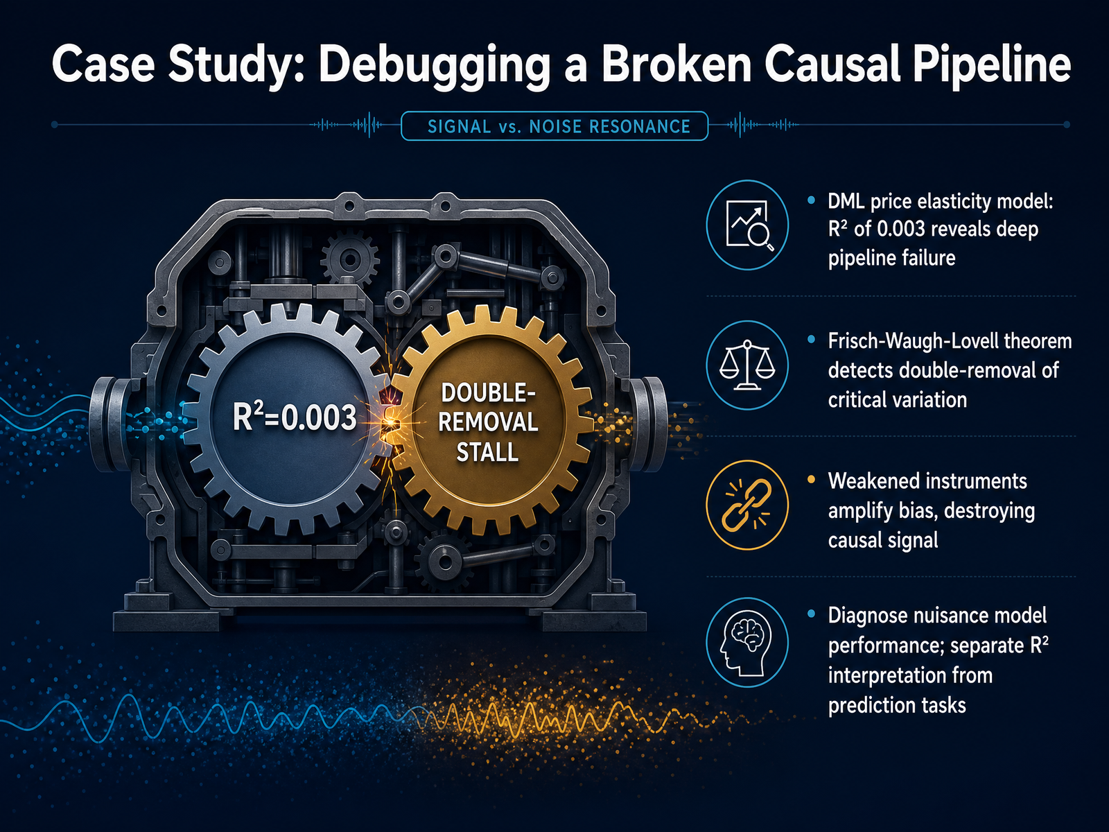
2 min - 10Case Study: Debugging a Broken Causal PipelineLet's walk through a real debugging case where a causal pipeline completely broke down. A team built a double machine learning model to estimate price elasticity, and the R-squared came back at zero point zero zero three. That is effectively zero. Something went badly wrong. Tracing through the Frisch-Waugh-Lovell theorem helped us find the culprit. The theorem states that residualizing twice on the same variables strips out the exact variation needed for identification. Basically, they removed the signal twice. On top of that, the instruments got weakened, which amplifies bias and destroys any hope of recovering the causal effect. The key lesson here is to diagnose your nuisance model performance separately. In D M L, a low R-squared does not mean your prediction is useless. It often means you have an identification problem, not a predictive failure. When you see numbers like this, don't tweak hyperparameters. First, go back to your partialling-out steps and check what variation was removed. Up next, we'll look at how to automate and reproduce this entire statistical workflow.
 2 min
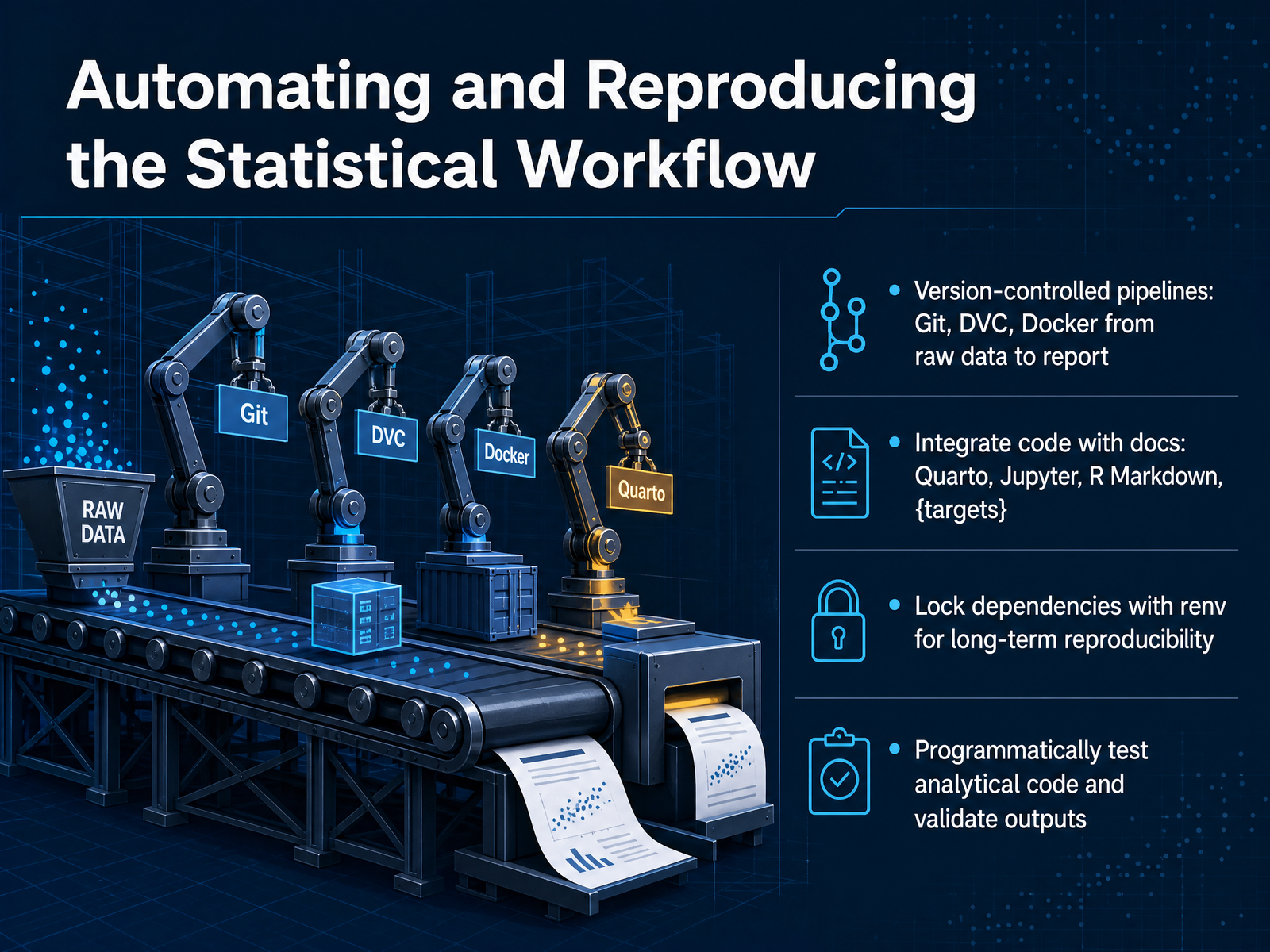
2 min - 11Automating and Reproducing the Statistical WorkflowNow let's move from running one-off analyses to making your entire statistical workflow automated and reproducible. The goal here is simple: anyone on your team should be able to re-run your full pipeline, from raw data all the way to the final report, with a single command. We typically achieve this with version-controlled pipelines, using tools like Git for code, DVC for data versioning, and Docker to package the whole computational environment. Next, integrate your code directly with your documentation. Tools like Quarto, Jupyter, or R Markdown let you weave narrative and executable code into the same document. For more complex dependency chains, the targets package in R is excellent. It only re-runs parts of the pipeline whose upstream dependencies have changed, saving you enormous time. For long-term reproducibility, lock your package versions with renv. This captures the exact library snapshot your project relied on, so a colleague three years from now won't face breaking changes. Finally, don't just trust that your code ran. Programmatically test your functions and validate statistical outputs as part of the pipeline. Check that your columns have expected types, that p-values are within valid ranges, or that group counts match your study design. These automated checks act as a safety net, catching errors the moment they appear. Next, we will look at building fully reproducible research projects using Quarto and the targets package.
 2 min
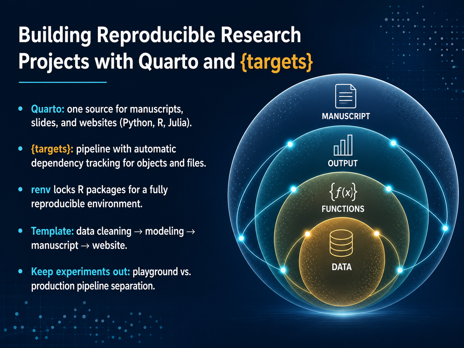
2 min - 12Building Reproducible Research Projects with Quarto and {targets}Now, let's talk about how it all fits together in a reproducible workflow. When you're working on a data science project, you don't want your results to live only on your machine. You want a system where anyone can re-run your analysis and get the same results. We achieve this with three core tools: Quarto, the targets package, and renv. Quarto acts as your single source of truth. You can write one document and render it as a manuscript, a presentation, or even a website, all while embedding code in Python, R, or Julia. Next, the targets package manages your analysis pipeline. Think of it as a smart factory manager that automatically tracks which data objects and files have changed, and only re-runs the necessary steps. It saves enormous time. To seal the environment, renv locks down the exact versions of the R packages you used. This guarantees that the code works the same way, months or years from now, on someone else's laptop. A typical project template flows from a data cleaning script, to a modeling script, to a Quarto manuscript, and finally to a Quarto website. One critical piece of advice: keep your exploration work, your playground, completely separate from this production pipeline. The production pipeline should run end-to-end without manual intervention. Let's put all these pieces together and see a live walkthrough of this end-to-end statistical workflow.
 2 min
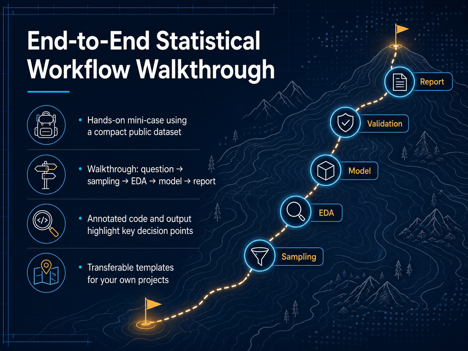
2 min - 13End-to-End Statistical Workflow WalkthroughLet's put everything together in a hands-on walkthrough. We'll use a compact public dataset to go from raw question to final report. Imagine we're analyzing customer churn for a subscription service. Our framework starts with a clear question: what factors predict churn? Then we check our data sources and sampling strategy to ensure we can actually answer that question. Next comes exploratory data analysis, where we visualize distributions and look for patterns. From there, we choose the right statistical model, maybe a logistic regression for binary outcomes, and run the analysis. Finally, we package the findings into a concise, decision-focused report. The annotated code you see here calls out exactly these decision points, so you can reuse the template and swap in your own data next week. Coming up, we'll wrap up with the key takeaways and your immediate next steps.
 1 min
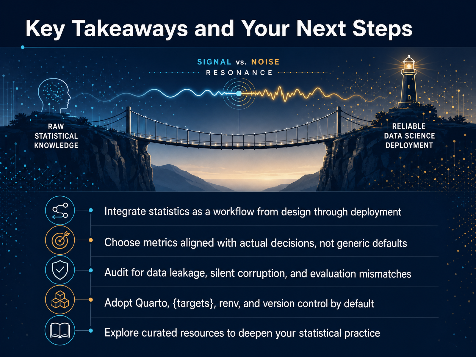
1 min - 14Key Takeaways and Your Next StepsWe have covered a lot of ground together, so let me leave you with a few core habits that will change how you work. First, treat statistics not as a single calculation step, but as a continuous workflow thread running from project design all the way through deployment. Second, choose your evaluation metrics based on the actual business or research decision at stake, not the library default. Always audit for silent dangers like data leakage, corrupted joins, and mismatched evaluation windows. These are the problems that quietly invalidate real projects. On the tooling side, make Quarto, the targets package, renv, and version control your default starting point for every new project. They turn brittle, manual processes into reproducible pipelines you can trust. I have included a short list of curated books and papers in the resources. Pick one deep read and finish it. Thank you for investing this time with me. Now go build something rigorous, and make your next statistical analysis truly decision-ready.
 2 min
2 min
Take the deck with you
Download this course as a file — free, no sign-up needed.
- PDF handoutEvery slide page, ready to print or share.15 pages · 4.6 MBDownload
- Narrated PowerPointThe deck that presents itself — every slide carries the digital human's narration video.15 pages · 17.6 MBDownload
- PowerPoint slidesThe full deck as a .pptx — open it in PowerPoint, Keynote, or Google Slides.15 pages · 4.6 MBDownload
Free to use in your own training — please keep the PersonWise credit page at the end.
Have your own deck? Turn it into a course
Sources consulted
Web sources consulted while building this course.
- Why Pearson φ Fails for Tweedie Pure Premiums (and How Bayesian PPC Fixes It) - Will Dean — williambdean.github.io
- My Fall-Detection Model Scored 94%, and It Was Lying to Me | Towards Data Science — towardsdatascience.com
- $220K Lost to a Fraud Model That Passed a 0.82 Accuracy Check [Edition #5] — machinelearningatscale.substack.com
- Reproducibility Crisis in Cardiovascular Machine Learning: Identification and Correction of Systematic Data Pipeline Errors in Angina Pectoris Recognition | Foundations and Trends in Research — ojs.scipub.de
- My First ML Model Hit 99% Accuracy. Then It Hit Production. — kxdevelopers.com
- Power Analysis Calculators Online | PowerAndSampleSize — powerandsamplesize.com
- SOCR/socr-spa — github.com
- Sample Size Software | Power Analysis Software | PASS - NCSS — ncss.com
- ChrisOldmeadow/DesignPower — github.com
- Power Analysis Tool — biostatpower.com