E-Learning UI Design Templates
Begin
14 pages · ~28 min
E-Learning UI Design Templates
This training teaches UI designers how to create effective e-learning templates, covering layout, navigation, and visual hierarchy to build engaging digital course interfaces.
What you’ll learn
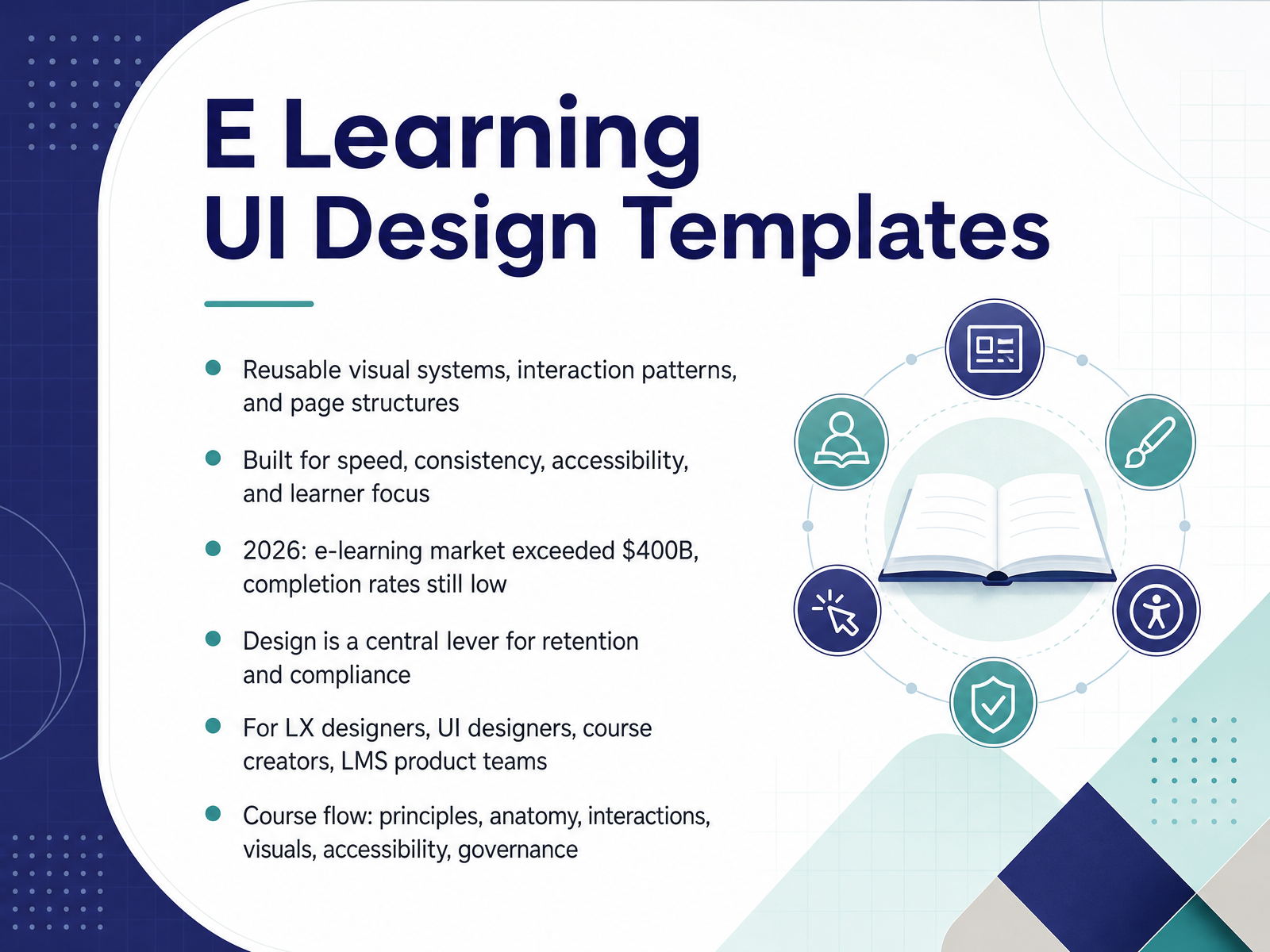
- 01E Learning UI Design TemplatesWelcome. You already know the fundamentals of UI and learning platforms, so we will focus on decisions. Today we are talking about e-learning UI design templates. Think of them as reusable visual systems, interaction patterns, and page structures. They are built for speed, consistency, accessibility, and learner focus. The stakes are high. In 2026, the e-learning market exceeded four hundred billion dollars, yet MOOC completion still hovers between five and fifteen percent. Design is a central lever for retention and compliance. As LX designers, UI designers, course creators, or platform teams, you own that lever. The tension is real: strict brand systems versus template flexibility. My recommendation is to treat templates as constrained systems with defined tokens, not fixed screens. That preserves brand consistency while letting teams adapt to context, with less maintenance effort. Here is your takeaway: before your next course build, audit your current templates for reusable patterns and cognitive load. Our course flow moves through principles, anatomy, interactions, visuals, accessibility, and governance. Next, why templates are a strategic asset.gitnexa.comcraftuxd.comframcreative.com+22 min
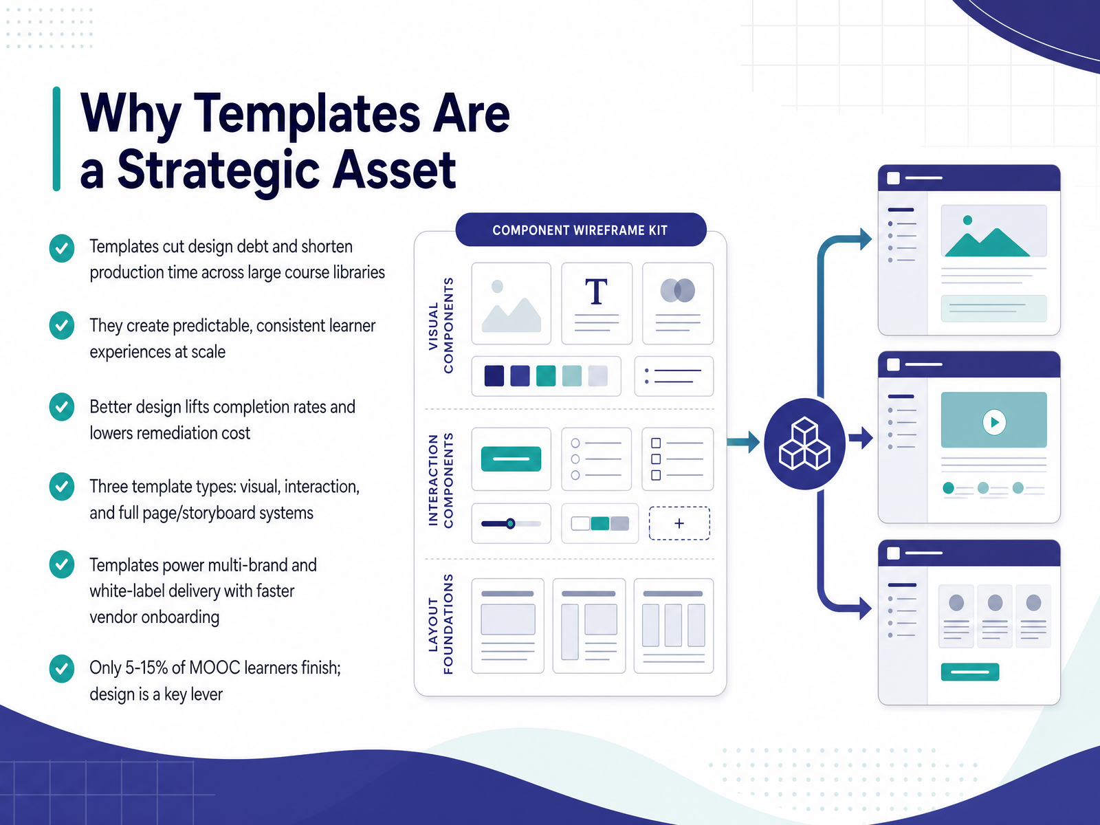
- 02Why Templates Are a Strategic AssetLet's talk about why templates are a strategic asset, not just a shortcut. Across large course libraries, templates cut design debt and shorten production time. They also create predictable, consistent learner experiences at scale. Better design lifts completion rates and lowers remediation cost. Remember, only five to fifteen percent of MOOC learners finish. Design is a key lever here. You have three template types: visual, interaction, and full page or storyboard systems. When brand consistency fights template flexibility, lock the atoms, free the layouts. Templates also power multi-brand and white-label delivery, speeding vendor onboarding. Your takeaway: treat templates as infrastructure. Next, we'll cover core principles for learning-centered interfaces.
 gitnexa.comcraftuxd.comframcreative.com+22 min
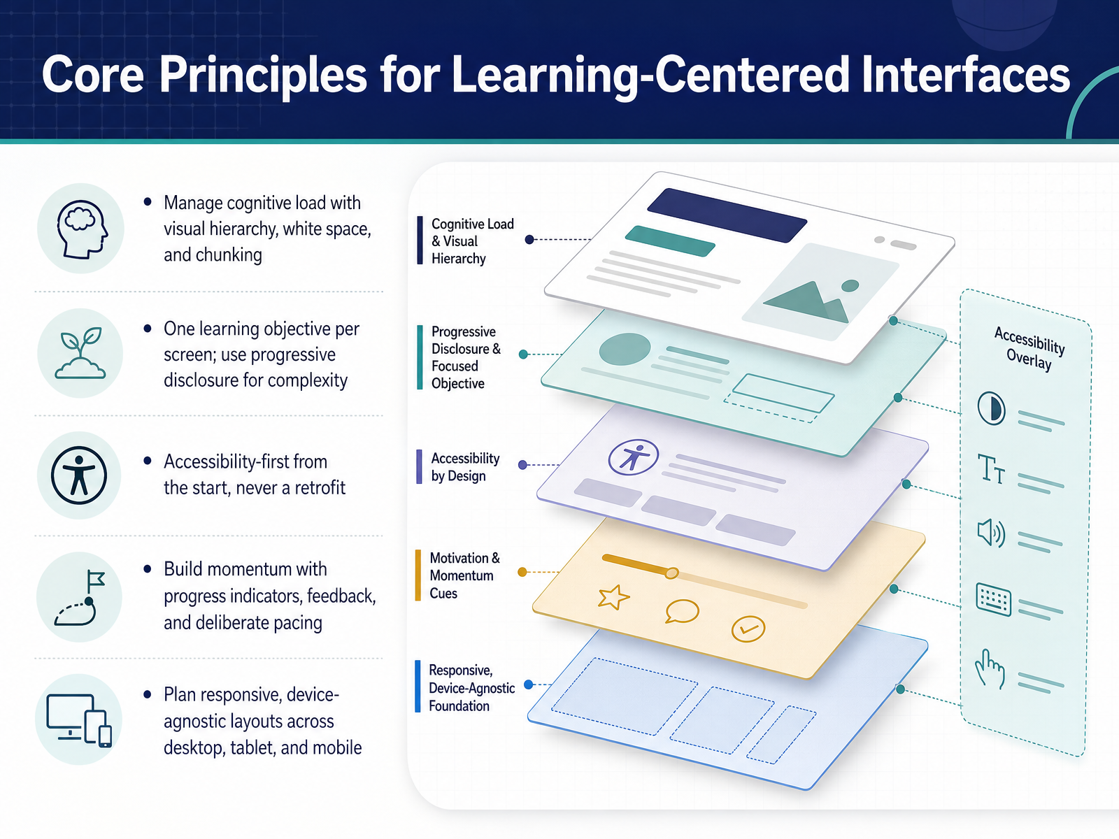
 - 03Core Principles for Learning-Centered InterfacesLet's move into the core principles for learning-centered interfaces. Your job is to protect attention, not decorate it. Manage cognitive load with clear visual hierarchy, generous white space, and deliberate chunking. Too many competing elements on one screen, and comprehension quietly drops. Keep one learning objective per screen, then use progressive disclosure to reveal complexity only when needed. Accessibility belongs at the start, never as a retrofit. Retrofitting costs more and usually delivers less. Build momentum with progress indicators, timely feedback, and intentional pacing. Responsive, device-agnostic layouts should hold across desktop, tablet, and mobile from the first breakpoint. So before your next course build, test each screen against these five principles. Next, we'll look at template anatomy and common screen types.
 gitnexa.comcraftuxd.comframcreative.com+21 min
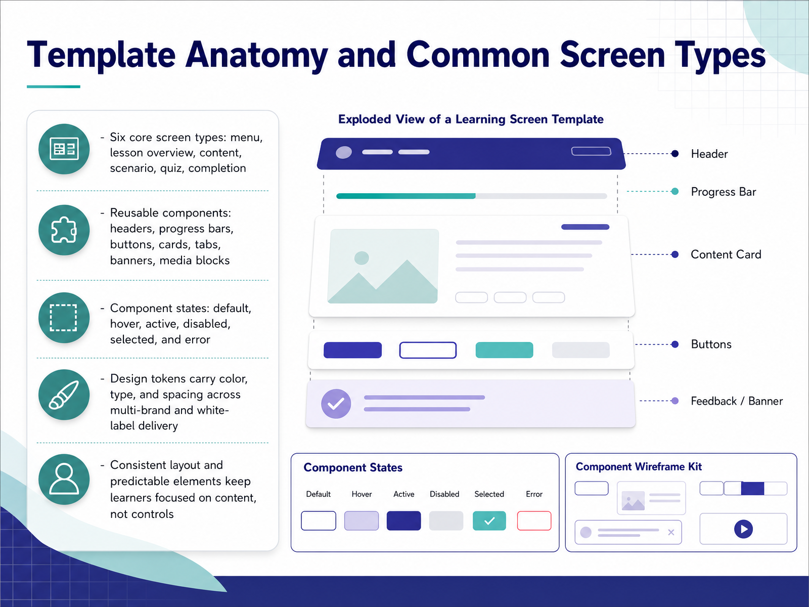
 - 04Template Anatomy and Common Screen TypesNow let's break down template anatomy and the screens you'll reuse most. Think in six core types: menu, lesson overview, content, scenario, quiz, and completion. Each one carries a distinct learner intent, so design them separately rather than stretching one layout. Underneath, you build reusable components: headers, progress bars, buttons, cards, tabs, banners, and media blocks. Every component needs defined states. Default, hover, active, disabled, selected, and error. Skip error states and you create silent failures that erode learner trust. Design tokens carry color, type, and spacing across multi-brand delivery. That resolves the tension between brand consistency and template flexibility. One token set, many skins, no duplicated maintenance. Keep layout predictable so learners focus on content, not controls. Your takeaway: audit your six screen types, then confirm every component ships with all six states. That single check protects attention and cuts rework. Next, we look at interaction patterns that support learning.
 gitnexa.comcraftuxd.comframcreative.com+22 min
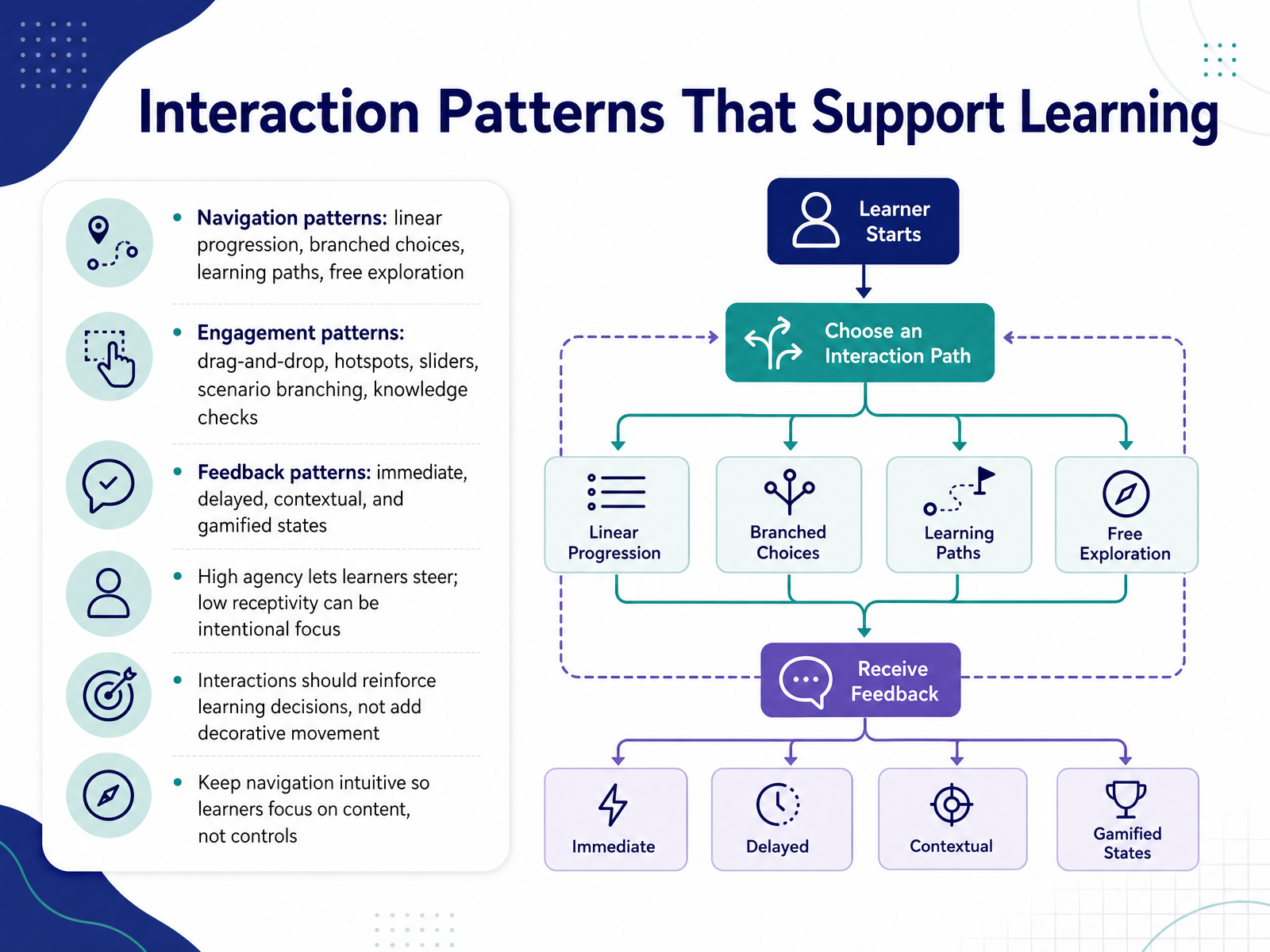
 - 05Interaction Patterns That Support LearningLet's look at interaction patterns that actually support learning. Navigation comes first. Linear progression, branched choices, learning paths, and free exploration each suit different objectives. Match the pattern to the cognitive task, not to visual variety. For engagement, drag-and-drop, hotspots, sliders, scenario branching, and knowledge checks all earn their place only when they reinforce a learning decision. Research on interaction design is clear here. High agency lets learners steer their own pace and path. Low receptivity, like locking progression until a prerequisite is complete, can be an intentional choice to focus attention. That is not a shortcoming. It is pedagogy. Feedback patterns follow the same logic. Immediate feedback confirms actions. Delayed feedback encourages retrieval. Contextual feedback explains why. Gamified states motivate, but overuse distracts from content. So keep navigation intuitive. If learners spend effort decoding controls, they have less capacity for the material itself. Your takeaway for this build: audit every interaction and ask what learning decision it reinforces. Then remove the rest. Next, we move into visual design systems for learning content.
 gitnexa.comcraftuxd.comframcreative.com+22 min
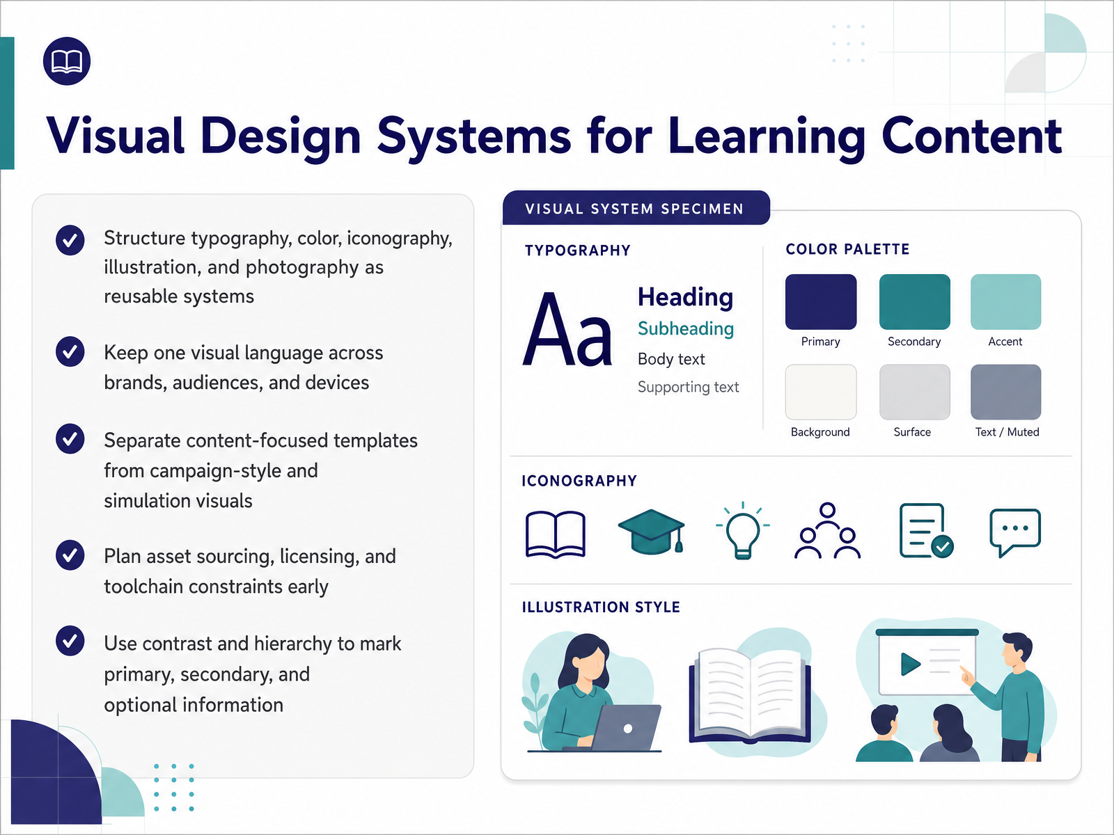
 - 06Visual Design Systems for Learning ContentNow let's talk about visual design systems for learning content. Treat typography, color, iconography, illustration, and photography as reusable systems, not one-off choices. Keep one visual language across brands, audiences, and devices so learners build familiarity fast. Separate content-focused templates from campaign-style and simulation visuals, because they serve different attention goals. Plan asset sourcing, licensing, and toolchain constraints early, or maintenance costs will compound. Use contrast and hierarchy to mark primary, secondary, and optional information clearly. The tension is real: brand consistency versus template flexibility. Resolve it by locking core tokens and letting layout variants flex. Your takeaway: build the system once, then let templates inherit it. Next, we move into accessibility-first template design.
 gitnexa.comcraftuxd.comframcreative.com+21 min
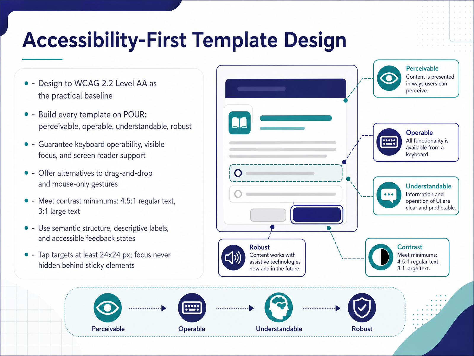
 - 07Accessibility-First Template DesignLet's talk about accessibility-first template design. Treat WCAG 2.2 Level AA as your practical baseline, and build every template on POUR: perceivable, operable, understandable, robust. In practice, that means keyboard operability, visible focus, and real screen reader support. So always offer alternatives to drag and drop. Simple move up and down buttons let students reorder items without a mouse. Meet contrast minimums: four point five to one for regular text, three to one for large text. Use semantic structure, descriptive labels, and accessible feedback states. Keep tap targets at least twenty four by twenty four pixels, and never let focus hide behind sticky headers. That last one is a common audit failure. Bake these rules into your base templates, not individual lessons. Then every course you build starts compliant, and remediation stays small. Next, we move into responsive and mobile-first template behavior.
 continualengine.comelearningsolutionslab.comw3.org+22 min
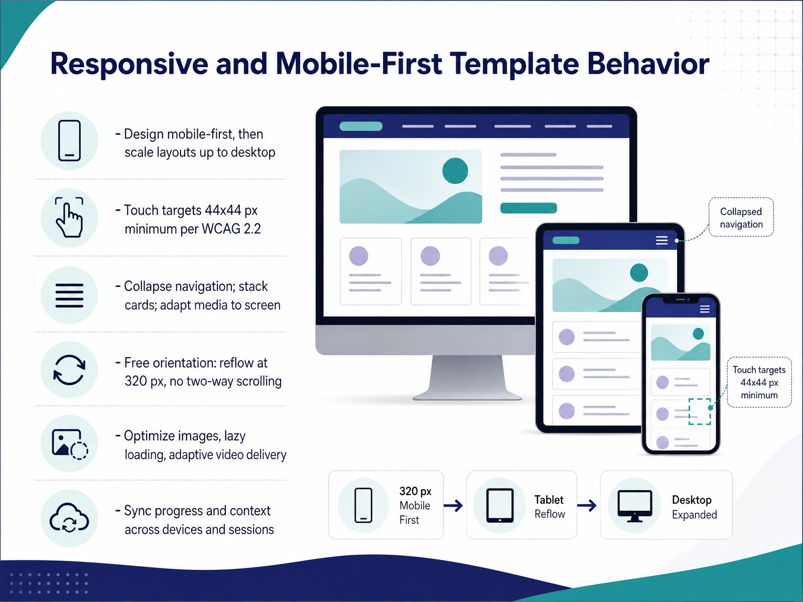
 - 08Responsive and Mobile-First Template BehaviorLet's talk about how your templates should behave across devices. Design mobile-first, then scale layouts upward to desktop. Start with the hardest constraints, then let desktop become the easy, larger case. Keep touch targets at forty-four by forty-four pixels minimum, following WCAG 2.2. Small, crowded controls cause misfires and abandon sessions fast. Collapse navigation on phones, stack your cards into one column, and let media adapt to each viewport. Allow free orientation, reflow cleanly at three hundred twenty pixels, and never force two-way scrolling. That single reflow rule protects learners using fixed-orientation devices. Then optimize your images, add lazy loading, and deliver adaptive video through HLS or DASH. These choices directly reduce load time and dropout. Finally, sync progress and context across devices and sessions, so a learner resumes exactly where they stopped. Offline progress should queue locally and sync on reconnect. Your concrete takeaway: build the phone layout first, and let every breakpoint expand from it. Next, we move into course creator workflow and safe customization.
 academia.eduxiameng.orgtestriq.com+22 min
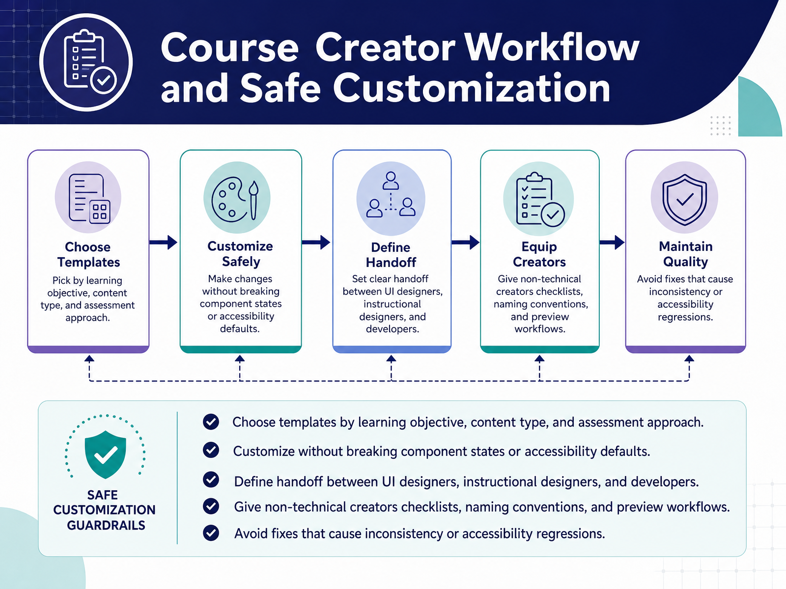
 - 09Course Creator Workflow and Safe CustomizationNow let's talk about how templates move through your team without breaking things. Choose templates by learning objective, content type, and assessment approach, not by visual preference alone. This keeps learner attention on the content. When you customize, protect component states and accessibility defaults. That usually means editing tokens, not detaching components. Define a clear handoff between UI designers, instructional designers, and developers. Ambiguity here is where inconsistency and rework quietly begin. For non-technical creators, give them checklists, naming conventions, and a preview workflow. These small guardrails prevent accessibility regressions before publishing. The tension you'll feel is brand consistency versus template flexibility. Resolve it by letting brands control tokens, and letting creators control layout within approved patterns. Avoid one-off fixes, because they fracture the system and raise maintenance effort. So your takeaway: treat templates as governed systems, not starting files. Next, we'll move into accessibility testing and compliance in practice.
 gitnexa.comcraftuxd.comframcreative.com+22 min
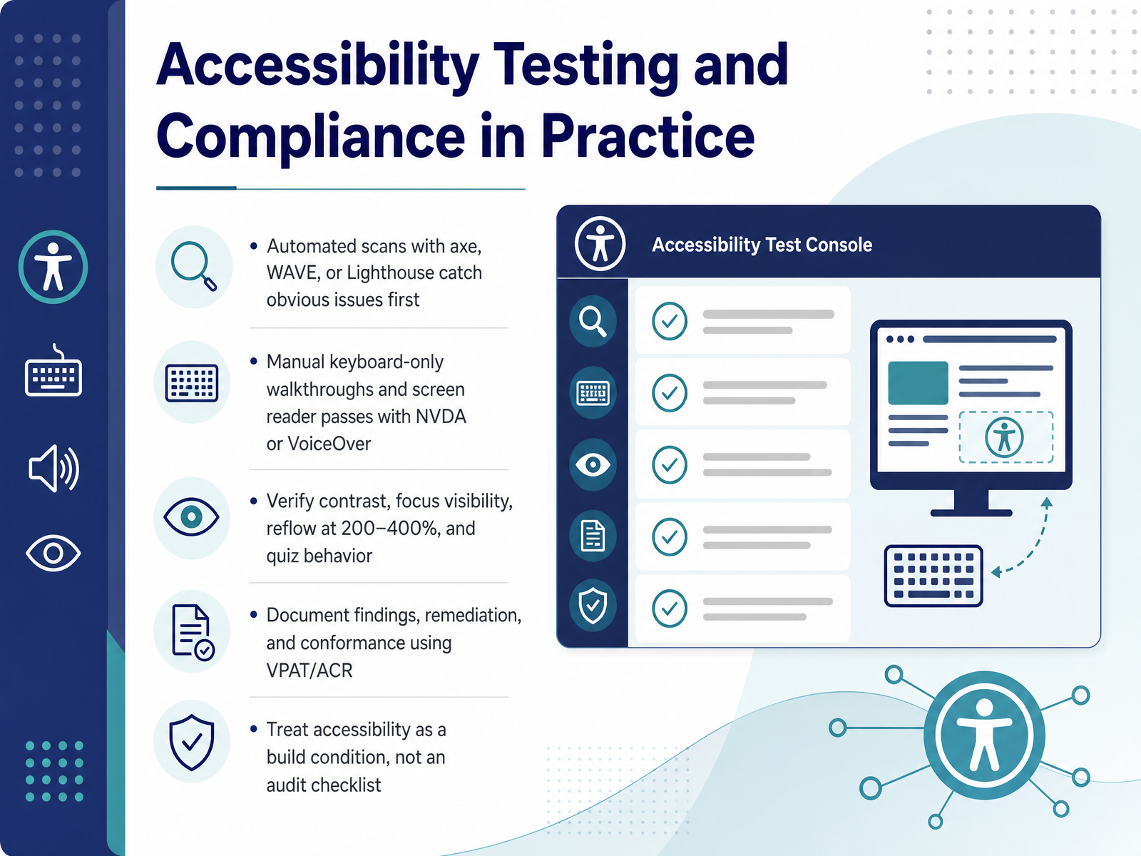
 - 10Accessibility Testing and Compliance in PracticeLet's move into accessibility testing and compliance in practice. Start with automated scans using axe, WAVE, or Lighthouse. They catch obvious issues first, so fix those before manual testing. Then unplug your mouse and walk the whole course keyboard-only. Follow with a screen reader pass in NVDA or VoiceOver. Verify contrast, focus visibility, reflow at two hundred to four hundred percent, and quiz behavior. Document findings, remediation, and conformance in a VPAT or ACR. Treat accessibility as a build condition, not an audit checklist. Takeaway: bake these checks into every build, and remediation stays small. Next, we'll look at template governance and content operations.
 continualengine.comelearningsolutionslab.comw3.org+21 min
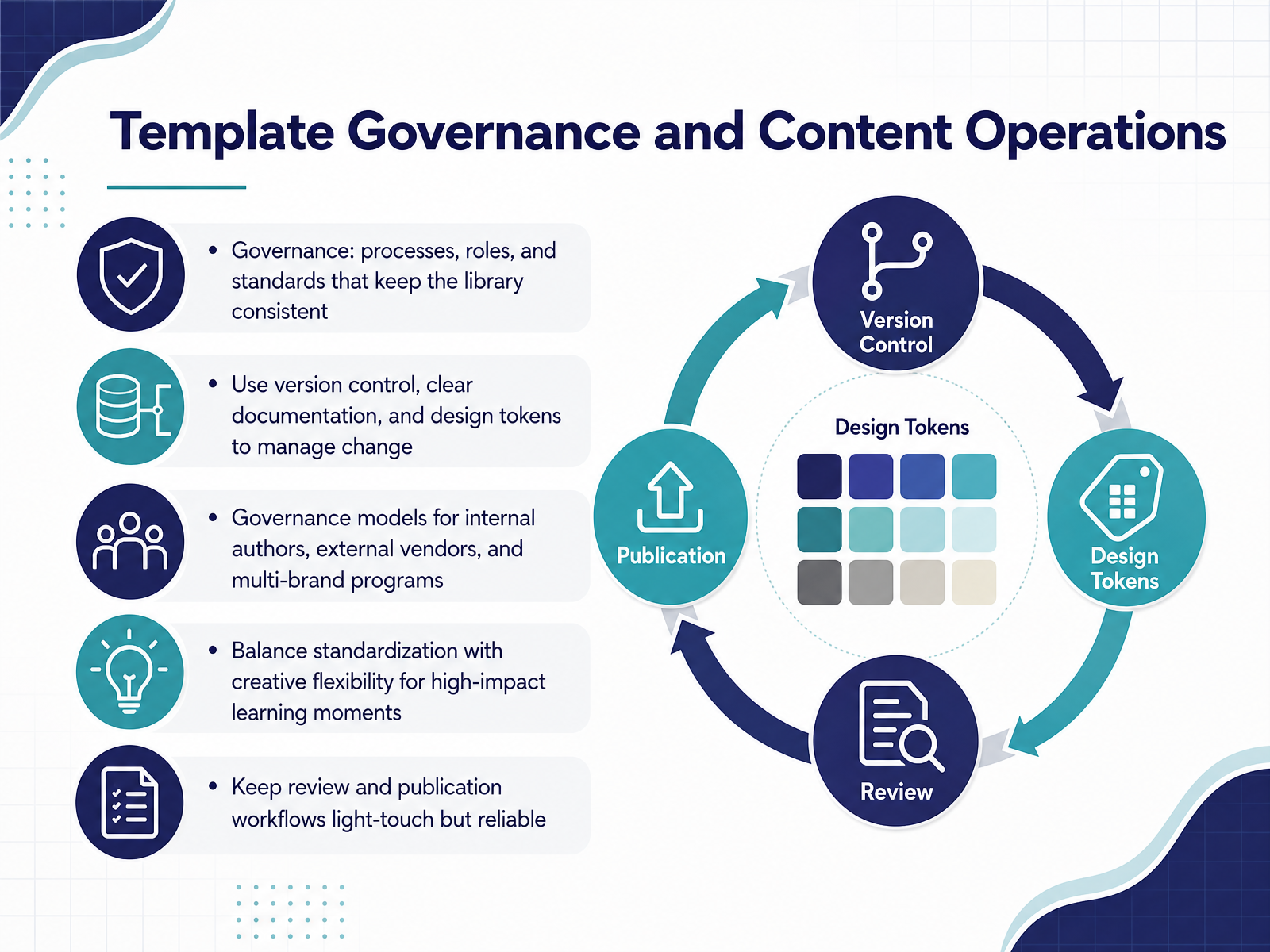
 - 11Template Governance and Content OperationsLet's talk about template governance and content operations. Governance is the set of processes, roles, and standards that keep your template library consistent. A well-built design system without governance will still drift over time. To manage change, use version control, clear documentation, and design tokens. Design tokens bridge design and engineering, so one update propagates everywhere. This saves enormous maintenance effort. Now consider your governance model. Internal authors need autonomy with light guardrails. External vendors need tighter review gates and clear documentation. Multi-brand programs need tokens and naming conventions that scale across brands. That is where consistency and flexibility collide. Balance standardization with creative flexibility for high-impact learning moments. Let authors break the template deliberately when it serves the learner. Keep review and publication workflows light-touch but reliable. Use checklists and basic LMS checks, not lengthy approval chains. A quick conversation often resolves issues faster than formal tickets. Here is your takeaway. Define roles and version control this week. Then document the single path from draft to published. Next, we look at quality assurance and usability evaluation.
 easygenerator.commiro.combradfrost.com+22 min
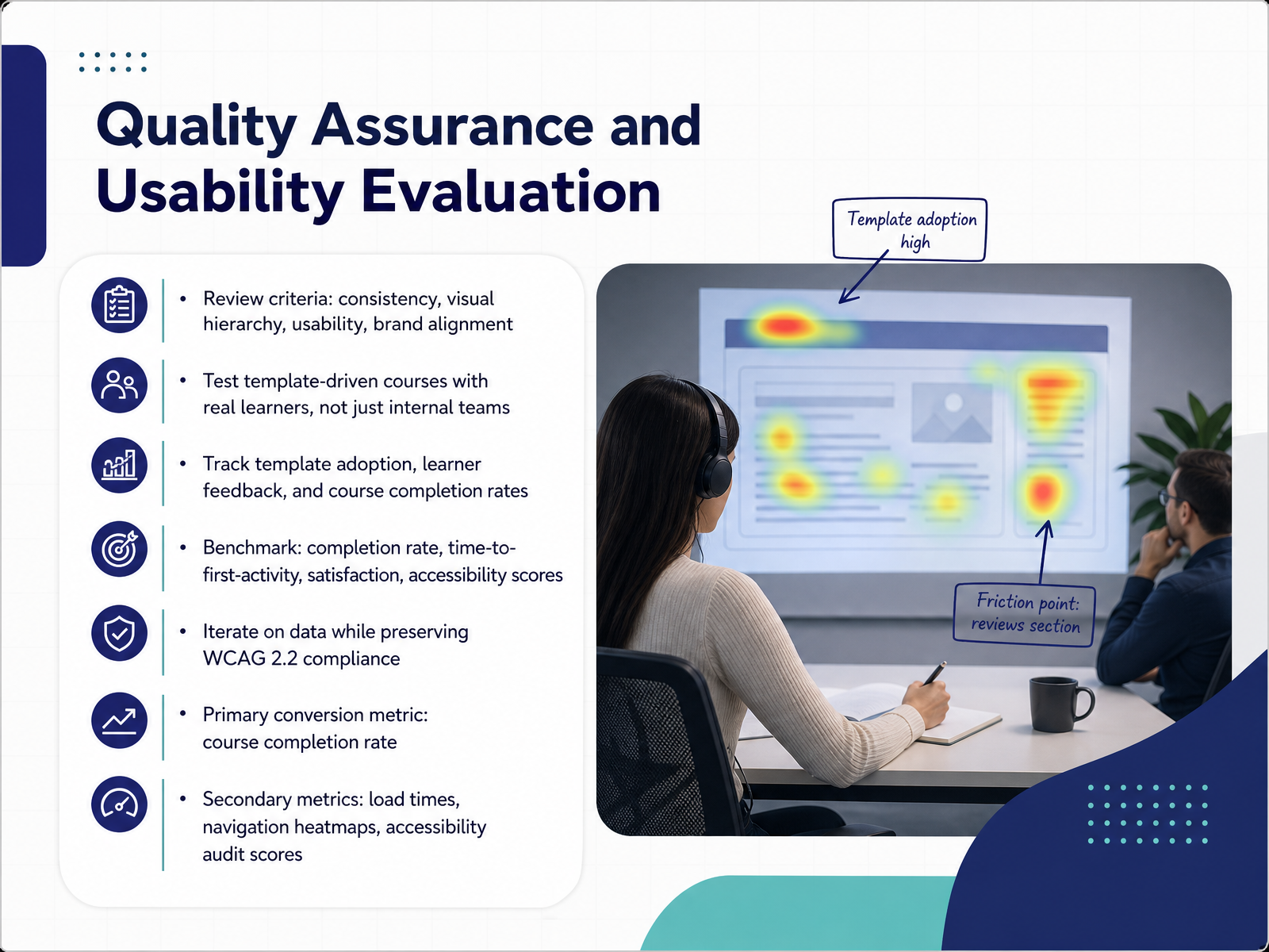
 - 12Quality Assurance and Usability EvaluationNow let us talk about quality assurance and usability evaluation. Review templates against four criteria: consistency, visual hierarchy, usability, and brand alignment. Test template-driven courses with real learners, not just your internal team. Track template adoption, learner feedback, and completion rates together. As the primary conversion metric, course completion rate should anchor every iteration decision. Secondary metrics include load times, navigation heatmaps, and accessibility audit scores. Accessible content still matters here, so preserve WCAG 2.2 compliance as you iterate on data. A single data point rarely tells the full story. Compare these benchmarks before and after each template change. That comparison shows whether your design decisions actually moved learner behavior. Start small, and run one usability test this month. Next, we look at change management and team adoption.
 gitnexa.comcraftuxd.comframcreative.com+21 min
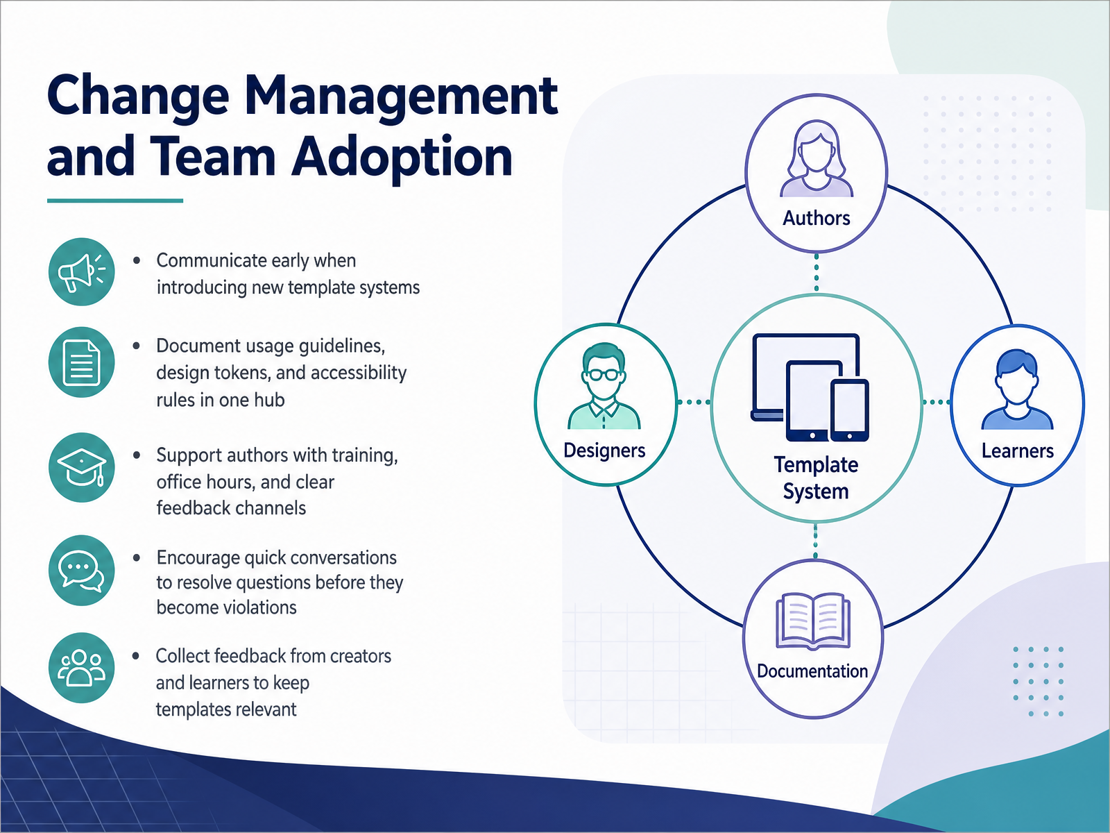
 - 13Change Management and Team AdoptionLet's talk about change management and team adoption. Template systems fail on culture, not components. Communicate early, before rollout, so authors never feel surprised. Document usage guidelines, design tokens, and accessibility rules in one hub. Scattered PDFs slow everyone down and cause drift. Support authors with training, office hours, and a clear feedback channel. Encourage quick conversations to resolve questions before they harden into violations. A five-minute chat often saves a week of rework. Then collect feedback from creators and learners, and review it regularly. That keeps templates relevant, not shelfware. Your takeaway: treat adoption as an ongoing service, not a launch event. Next, we'll cover practical strategies and next steps.
 easygenerator.commiro.combradfrost.com+21 min
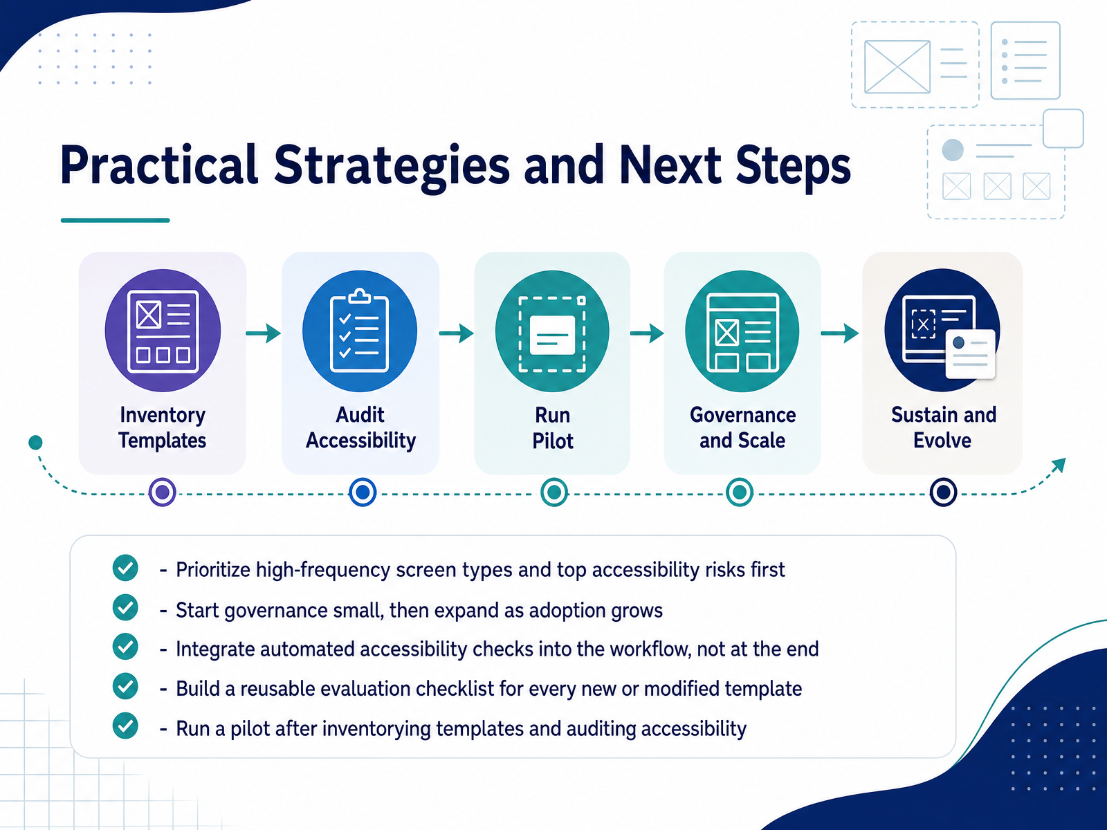
 - 14Practical Strategies and Next StepsLet's close with the next steps you can actually take. Start by prioritizing high-frequency screen types and your top accessibility risks. Then build a reusable evaluation checklist that runs against every new or modified template. Integrate automated accessibility checks early in the workflow, not at the end. That habit catches most issues before they reach learners. Implementation in three phases: inventory your existing templates and audit them for accessibility gaps; start small with lightweight governance, then expand adoption as your pilot stabilizes; run a pilot after inventorying, and automate checks to cut maintenance costs. This protects learner attention, reduces remediation effort, and keeps completion steady. Thank you for building courses that work for everyone. Keep shipping accessible templates.
 gitnexa.comcraftuxd.comframcreative.com+22 min
Take the deck with you
Download this course as a file — free, no sign-up needed.
- PDF handoutEvery slide page, ready to print or share.15 pages · 3.4 MBDownload
- Narrated PowerPointThe deck that presents itself — every slide carries the digital human's narration video.15 pages · 12.9 MBDownload
- PowerPoint slidesThe full deck as a .pptx — open it in PowerPoint, Keynote, or Google Slides.15 pages · 3.3 MBDownload
Free to use in your own training — please keep the PersonWise credit page at the end.
Have your own deck? Turn it into a course
Sources consulted
Web sources consulted while building this course.
- Education UI/UX Design Guide for 2026 | GitNexa | GitNexa Blog | GitNexa — gitnexa.com
- Modern eLearning UI/UX: Practical Design Strategies That Improve Learning — craftuxd.com
- Latest Trends and Best Practices in UI/UX Design for E-Learning — framcreative.com
- E-learning platform design guide - Justinmind — justinmind.com
- Designing for Learning: The Magic of UX/UI in Elearning Courses — enterpriseelearninghub.com
- WCAG 2.2 for EdTech: Key Updates for Course Accessibility — continualengine.com
- Accessible eLearning: WCAG 2.2 Guide for Course Creators — elearningsolutionslab.com
- W3C Accessibility Guidelines (WCAG) 3.0 — w3.org
- EN 301 549 - V4.1.0 - Accessibility requirements for ICT products and services — etsi.org
- D2L Accessibility Conformance Report — d2l.com
- An E-learning Framework based on Responsive Web Design for ... — academia.edu
- Mobile-Friendly Content Design for MOOCs: Challenges, Requirements, and Design Opportunities — xiameng.org
- Mobile Learning Optimization for E-Learning Platforms 2025 — testriq.com
- Responsive Design in LMS: Building Mobile-First, Learner-Centric Learning Platforms - eLeaP® — eleapsoftware.com
- Mobile-First Learning Video: The Phone-First Build — forasoft.com
- Governance in Employee-generated Learning: top strategies from L&D ... — easygenerator.com
- Design System Governance: How to Keep Design and Code in Sync | Miro — miro.com
- Master design system governance with this one weird trick - Brad Frost — bradfrost.com
- Mastering Content Governance for Business | MadCap Software — madcapsoftware.com
- Content Standards in Design Systems - NN/G — nngroup.com