In-Page Navigation Design
Begin
15 pages · ~30 min
In-Page Navigation Design
Learn to create intuitive in-page navigation for web designs, improving user experience and content accessibility.
What you’ll learn
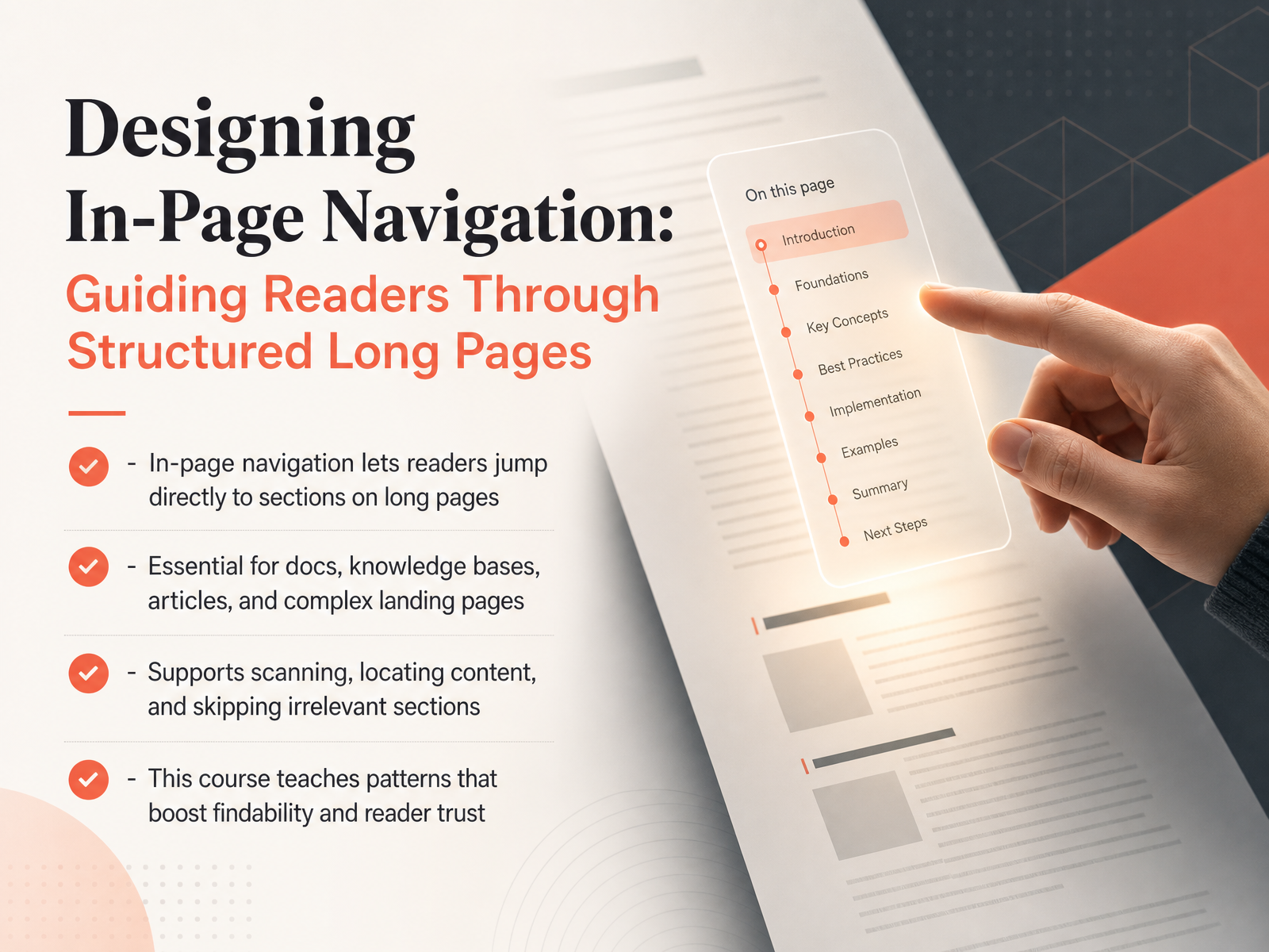
- 01Designing In-Page Navigation: Guiding Readers Through Structured Long PagesWelcome to this course on designing in-page navigation. If you have ever opened a long help article, a knowledge base, or a detailed product page and needed to jump straight to the right section, you already know why this skill matters. In-page navigation gives your readers a clear, clickable path directly to the content they need, right inside a single long page. It is essential for documentation, FAQs, tutorials, and any structured page where scanning and skipping are normal reader behaviors. This course will show you practical patterns that make content more findable and help build reader trust. Let us get started and turn those long pages into easy-to-use resources. Next, we will look at the real user and business case behind good in-page navigation.1 min
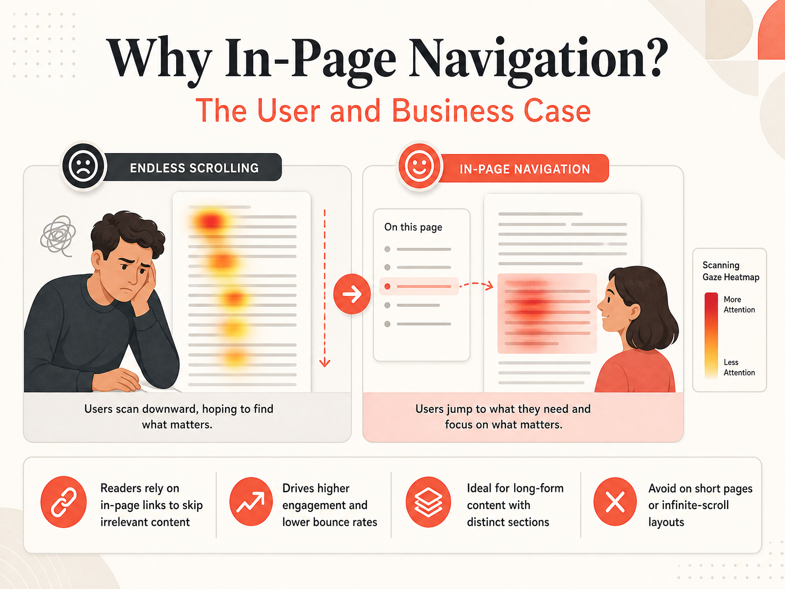
- 02Why In-Page Navigation? The User and Business CaseSo why do we even invest time in designing in-page navigation? It comes down to two main reasons: one for the user, and one for the business. For your reader, long structured pages can be overwhelming. In-page links let them skip right to the section they need, instantly bypassing irrelevant content. This direct access dramatically boosts engagement. Readers stay on the page longer and interact more deeply with the material. From a business perspective, that deeper engagement directly lowers bounce rates. When people find what they need quickly, they don't leave. This pattern works perfectly for any long-form content with clearly distinct sections, like help centers, documentation, or detailed guides. Just remember, this approach is not a universal fix. It falls flat on short pages where navigation is unnecessary, or in infinite-scroll layouts where sections aren't anchored to specific page positions. Keeping these contexts in mind sets the stage for our next topic: understanding your reader's mental models and behavioral goals.
 1 min
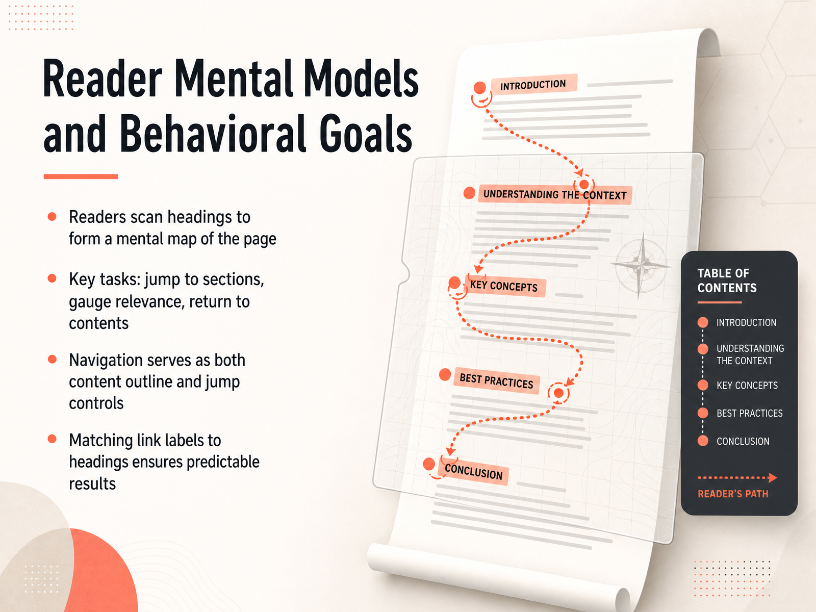
1 min - 03Reader Mental Models and Behavioral GoalsNow let's step into your reader's mind and see what they're actually doing when they arrive on a long page. Most readers scan headings first. They skim those titles and subheadings to build a quick mental map of how the page is organized and what it contains. They aren't reading every word yet. They want to jump to the section that matches their current need, figure out if the rest of the page is even relevant, and have a clear way to return to the main contents if they decide to explore further. That's where in-page navigation steps in. It works like both a content outline and a set of jump controls in one. The trick is making those navigation links match the actual headings on the page precisely. When the link label reads exactly like the heading it points to, the reader knows for sure what they'll get. No guesswork, no surprises, just a fast predictable trip to the right content. Up next we'll look at how your page's content structure becomes the solid foundation for this kind of effective navigation.
 2 min
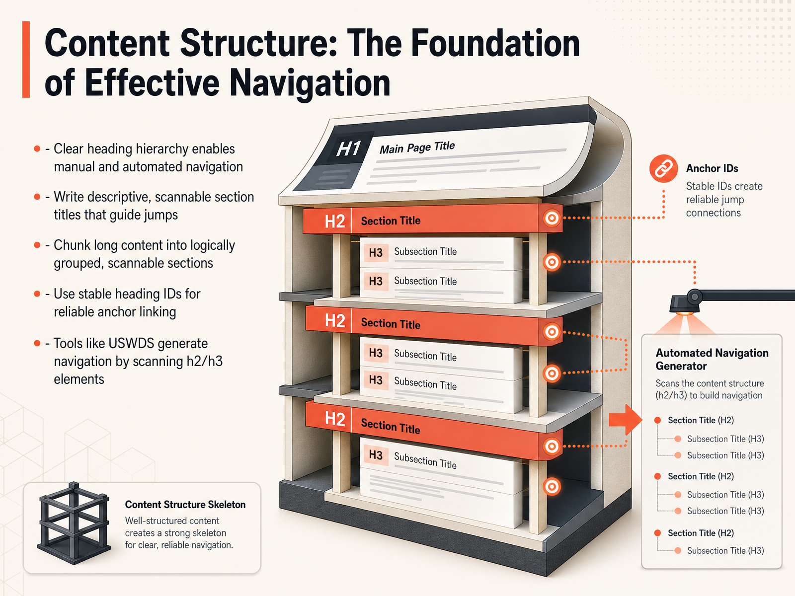
2 min - 04Content Structure: The Foundation of Effective NavigationNow let's dig into the foundation that makes all of this possible: your content structure. Think of it as the blueprint for your navigation. A clear heading hierarchy is essential because it enables both manual scanning by the user and automated navigation tools. Your section titles are the signposts—write them to be descriptive enough that a reader instantly knows what's inside just by scanning the page. Next, remember to chunk your long content. Break dense information into logically grouped, scannable sections. This prevents cognitive overload and makes the page feel more manageable. On the technical side, always use stable heading IDs for your anchors. These ensure your links remain reliable even if the text of a heading is slightly edited later. And here’s a practical tip: design systems like USWDS can automatically generate a table of contents for you just by scanning your h2 and h3 elements. Getting your structure right up front makes the rest of the design process much smoother. Coming up next, we’ll translate this structure into action by exploring core UI patterns and choosing the right navigation mechanism.
 2 min
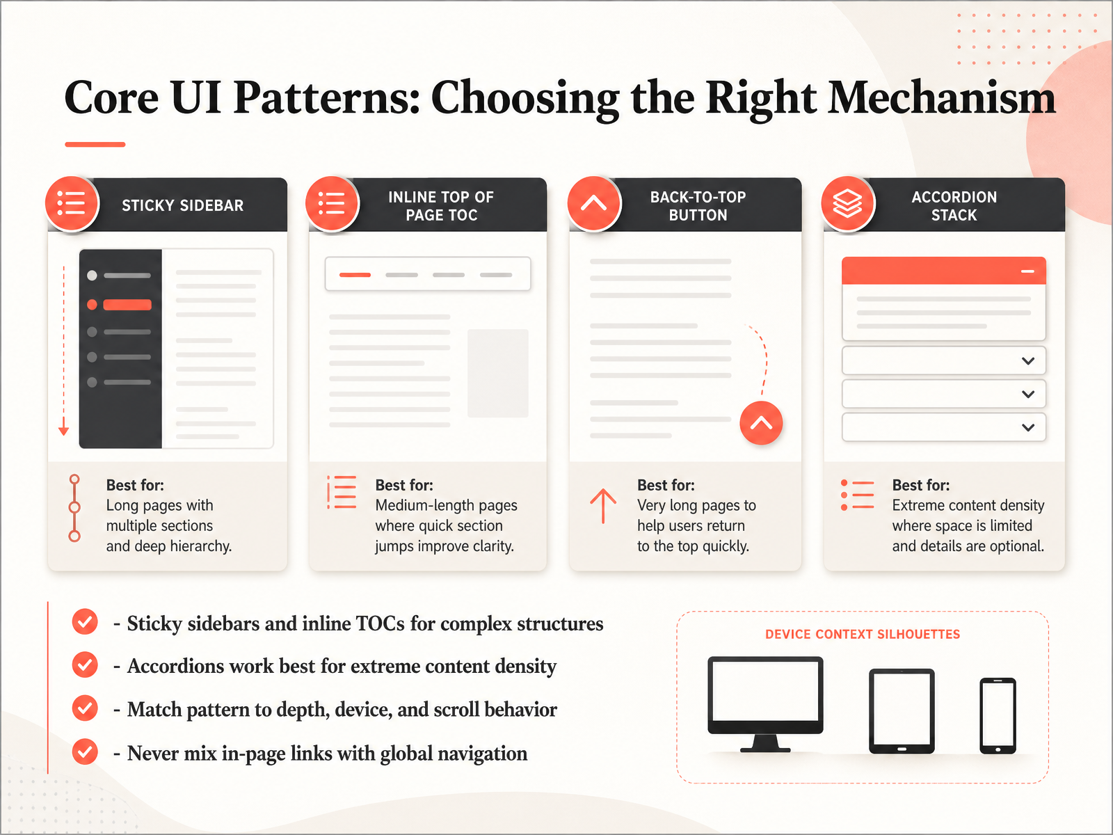
2 min - 05Core UI Patterns: Choosing the Right MechanismNow let's look at the core patterns that make in-page navigation feel natural. Choosing the right mechanism depends entirely on your content structure and how people move through it. First, if you're working with complex, long-form documentation or multi-chapter layouts, sticky sidebars and inline tables of contents are your best friends. They keep the full structure visible without forcing users to scroll back up. For pages with extreme content density, like detailed FAQs or technical specs, accordion components really shine because they collapse secondary information, letting readers expand only what they need. The key is to match the pattern to your content's depth, the device your users are on, and their typical scroll behavior. One rule you should always follow: never mix in-page links with global navigation items. That confuses users about where they are and where they're going. So, keep those separate. Up next, we'll dig into the technical mechanics, specifically how anchors, smooth scrolling, and the URL all work together to make these patterns function smoothly.
 2 min
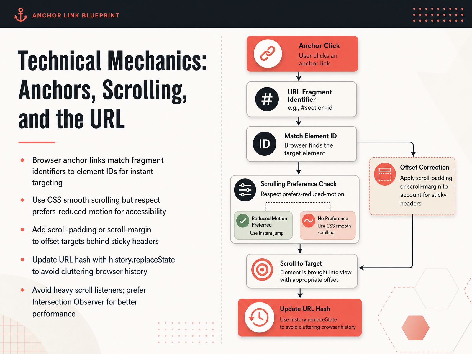
2 min - 06Technical Mechanics: Anchors, Scrolling, and the URLNow let's look under the hood at the mechanics that make in-page navigation feel instant and reliable. It all starts with the browser matching a URL fragment to an element's ID attribute. When someone clicks a link pointing to an ID, the browser immediately targets that spot on the page. To make the movement feel polished, use CSS scroll behavior set to smooth. Just be sure to wrap it in a prefers-reduced-motion media query so you respect users who need instant jumps instead. A common issue is that the target section lands underneath a sticky header. You can fix that with scroll padding on the scrolling container, or scroll margin on the target element itself, giving each section the right breathing room. When a user scrolls freely, you will want the URL to reflect the active section, but you do not want to flood their browser history. Use the history replace state method to quietly update the hash without creating extra back-button steps. For detecting which section is currently in view, stay away from heavy scroll event listeners. Instead, lean on the Intersection Observer API. It watches elements enter and leave the viewport efficiently, keeping interactions fast and battery-friendly. Up next, we will connect these mechanics to visual cues as we explore active states and scroll spy navigation.
 2 min
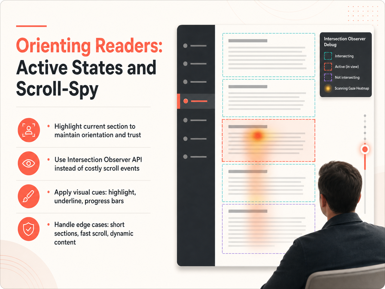
2 min - 07Orienting Readers: Active States and Scroll-SpyLet’s look at how we keep readers oriented once they start scrolling. When a reader jumps to a section, they need a clear signal confirming I am here, this is what you selected. That’s where active states come in, and the combination known as scroll-spy. We recommend highlighting the current section in your navigation as the reader moves through the page. This small visual anchor builds trust and prevents disorientation. Technically, you can achieve this efficiently with the Intersection Observer API rather than attaching costly scroll events. Observers are lighter and more accurate, especially on longer pages. For the visual cues, you can use a highlighted background, a bold underline, or even a small progress bar inside the navigation link. These signals should be immediate and unmistakable. We also need to handle a few real-world edge cases. Very short sections might get skipped during fast scrolling, so you may need fallback logic to keep the closest link active. Likewise, when content loads dynamically after you set up observers, remember to re-observe those new containers. Getting these details right ensures your navigation always feels responsive, never broken. Up next, we’ll apply these same ideas to responsive and mobile-first navigation design.
 2 min
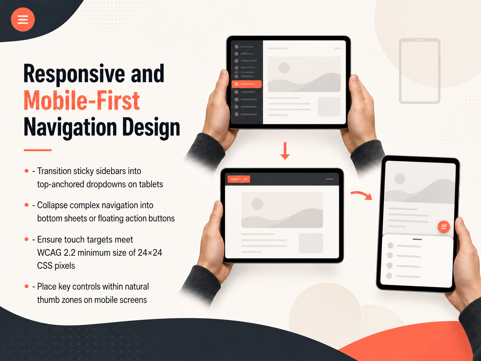
2 min - 08Responsive and Mobile-First Navigation DesignNow, let's talk about making that smart navigation work beautifully on phones and tablets. When we get to smaller screens, we can't just shrink things down. We have to rethink the layout. For example, that sticky sidebar we used on desktop. On a tablet, it's often better to move it into a collapsible menu anchored at the top of the screen. A simple dropdown that stays out of the way but is still easy to reach. And for really complex menus on a phone, consider tucking them into a bottom sheet that slides up, or even a floating action button. The goal is to keep the screen clean. Just as important is making sure everything is easy to tap. A link or a button can be frustrating if it's too small. Always design touch targets to be at least 24 by 24 CSS pixels, as recommended by WCAG 2.2. Finally, think about how people actually hold their phones. Place your most important controls, like section toggles or a 'back to top' button, within the natural, comfortable arc of the thumb zone. It makes the whole experience feel effortless. Next, we'll tackle an essential topic: Keyboard Accessibility, including focus order, traps, and visibility.
 1 min
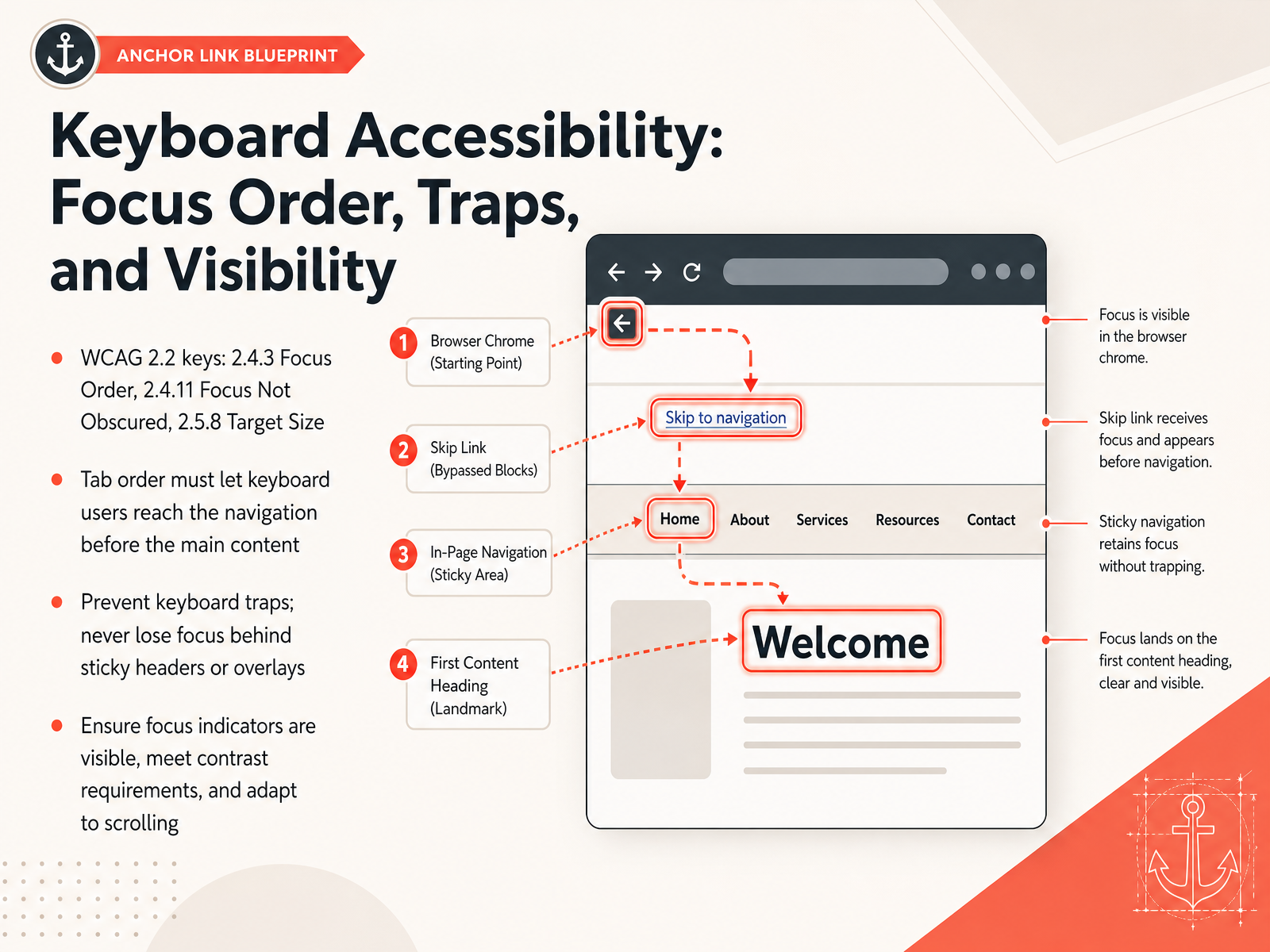
1 min - 09Keyboard Accessibility: Focus Order, Traps, and VisibilityNow let's translate our navigation patterns into a keyboard interface that actually works. There are three WCAG two point two criteria that shape this: Focus Order, Focus Not Obscured, and Target Size. First, tab order. When a keyboard user enters your page, they need to reach the in-page navigation before the main content, otherwise they're stuck scrolling past everything to find the menu. Make sure the DOM order supports that sequence. Second, we have to prevent keyboard traps. Focus can easily disappear behind sticky headers or slide-out overlays. If a user can't tab out of an element, that's a failure. Use CSS scroll-padding to offset for fixed headers so the focused element remains visible. Last, the focus indicator itself must be thick enough to see, meet a three-to-one contrast ratio against adjacent colors, and stay visible even when the page scrolls. In short: meaningful tab order, no traps, and a focus ring you can actually see. Next, we'll look at screen reader and assistive technology support to complete the accessible navigation picture.
 accessible-data-interfaces.comw3.orgw3.org+21 min
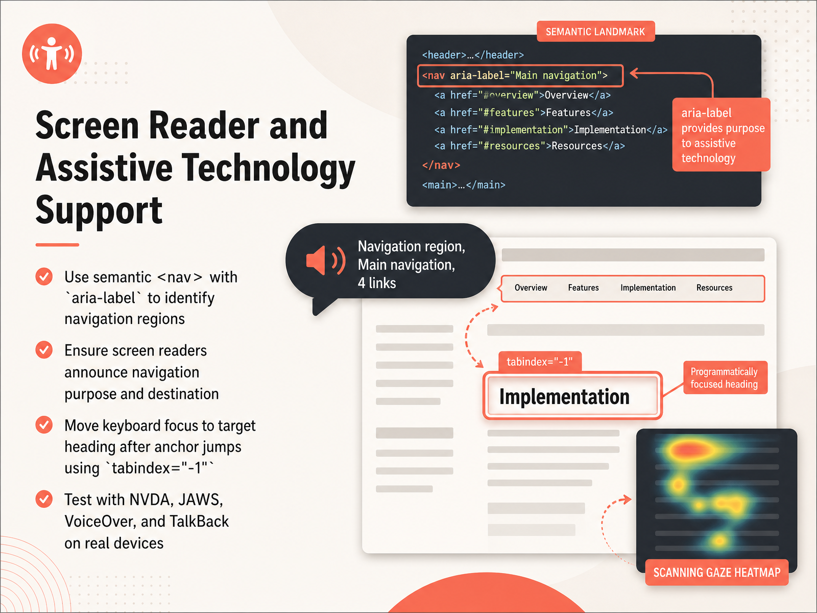
 - 10Screen Reader and Assistive Technology SupportNow let's talk about making this navigation work for screen readers and other assistive technology. This is where we ensure everyone can use the in-page links we've designed. First, always use a semantic nav element and give it an aria-label, like "Table of Contents" or "On this page." This identifies the navigation region clearly. Next, screen readers must announce the purpose of the link and where it will take the user. After a user activates a link, we need to manage focus. Simply jumping to a heading isn't enough—we must move keyboard focus to that target heading. To do this, add tabindex equals negative one to the heading before calling the focus method in JavaScript. This makes a non-interactive element programmatically focusable without adding it to the tab order. Finally, test this on real devices using NVDA, JAWS, VoiceOver, and TalkBack. Desktop and mobile screen readers handle focus differently, so real-world testing is the only way to confirm the experience feels seamless. Coming up next, we'll explore designing the focus experience after the jump.
 accessible-data-interfaces.comw3.orgw3.org+22 min
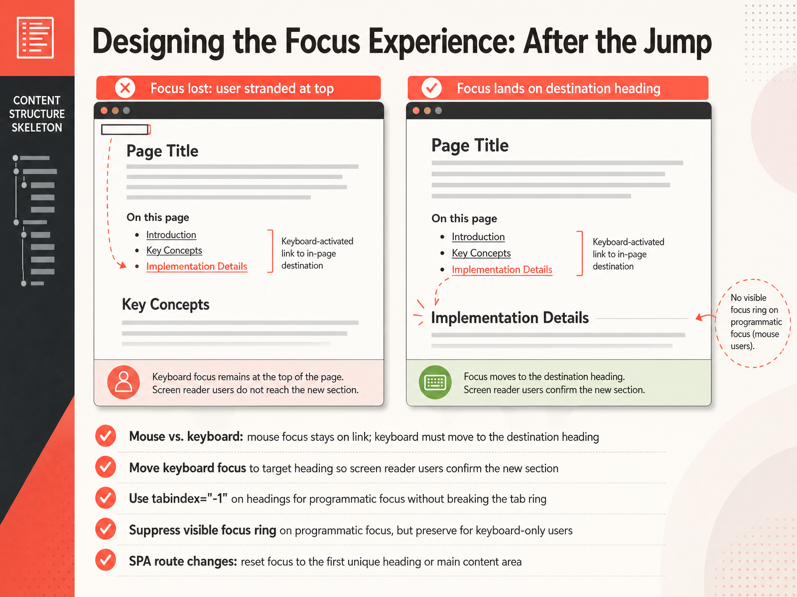
 - 11Designing the Focus Experience: After the JumpNow, let's talk about what happens the moment after a user clicks that jump link. It's not just about the scroll; it's about the focus. For mouse users, the focus usually stays on the original link. But for keyboard-only and screen reader users, the experience must be different. If the focus remains behind, they are stranded at the link list. We need to actively move the keyboard focus to the destination heading. This confirms to the screen reader that they have successfully jumped to a new section. To do this programmatically, we use tabindex equals negative one on the heading elements. This trick lets our script place the focus there without adding the heading permanently to the tab ring. Here is a subtle but crucial design detail: when we move the focus this way, we must suppress any visible focus ring, like the default blue outline, so sighted keyboard users are not confused by a static heading appearing interactive. But we still preserve that visible ring when a user tabs through the interface manually. Finally, this logic applies to single-page applications too. On an SPA route change, reset the focus to the first unique heading or the main content area. This recreates the native page-load behavior and keeps the navigation experience seamless for everyone. Next, we will connect these interaction patterns to the broader structural rules of the page with Skip Links, Landmarks, and Bypass Blocks.
 nngroup.comdesignsystem.digital.govcaptainrandom.co.uk+22 min
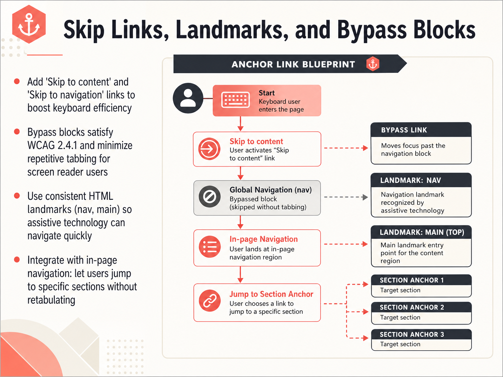
 - 12Skip Links, Landmarks, and Bypass BlocksNow let's talk about skip links, landmarks, and bypass blocks. On a long page, it can take many Tab presses to reach the main content. That's tiring for keyboard-only users. A 'Skip to content' link is an invisible link that appears first in the focus order. Pressing it jumps the focus past the header and navigation straight to the main section. You can also add a 'Skip to navigation' link to make jumping back just as easy. These bypass blocks satisfy WCAG criterion 2.4.1 and cut down on repetitive tabbing, especially for screen reader users. To support even faster navigation, use consistent HTML landmarks like nav for your menus and main for your primary content. Assistive technology can then jump between regions with a single keystroke. Integrate these techniques with your in-page navigation. That lets users jump to a specific section without ever re-tabbing through the entire page. Up next, we'll measure success with analytics, user behavior, and iteration.
 w3.orgw3.orgw3.org+21 min
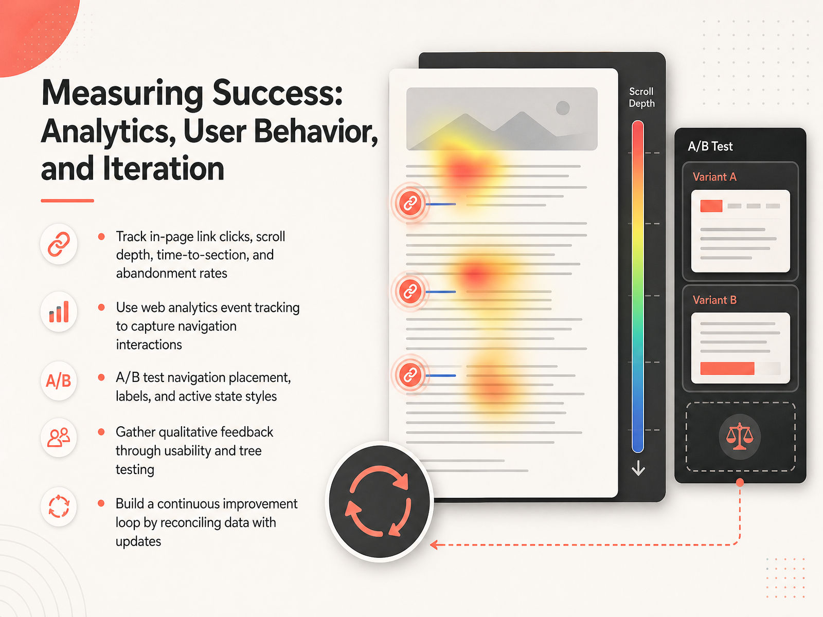
 - 13Measuring Success: Analytics, User Behavior, and IterationNow let's talk about how to know if your navigation design is actually working. This comes down to measuring the right things, and then using that data to improve. First, focus on behavioral metrics. Track clicks on your in-page links, but also look at how far people scroll, how long it takes them to reach a section, and where they give up and leave the page. These signals tell you if the content is reachable. To get this data, set up event tracking in your analytics tool specifically for navigation interactions, like clicks on the sticky menu or a skip link. Next, use A B testing. Experiment with the placement of your navigation, the wording of your labels, and even the visual style of the active state. You might be surprised how a small change like stronger highlighting for the current section improves engagement. Don't rely on numbers alone. Run usability tests or tree tests to hear directly from users about where they expect to find things. Finally, tie it all together into a continuous loop. Compare your data against real user feedback, make informed updates, and then measure again. This cycle is what turns a good navigation structure into a great one. Coming up, we will cover common pitfalls to avoid, so you can sidestep the most frequent mistakes right from the start.
 2 min
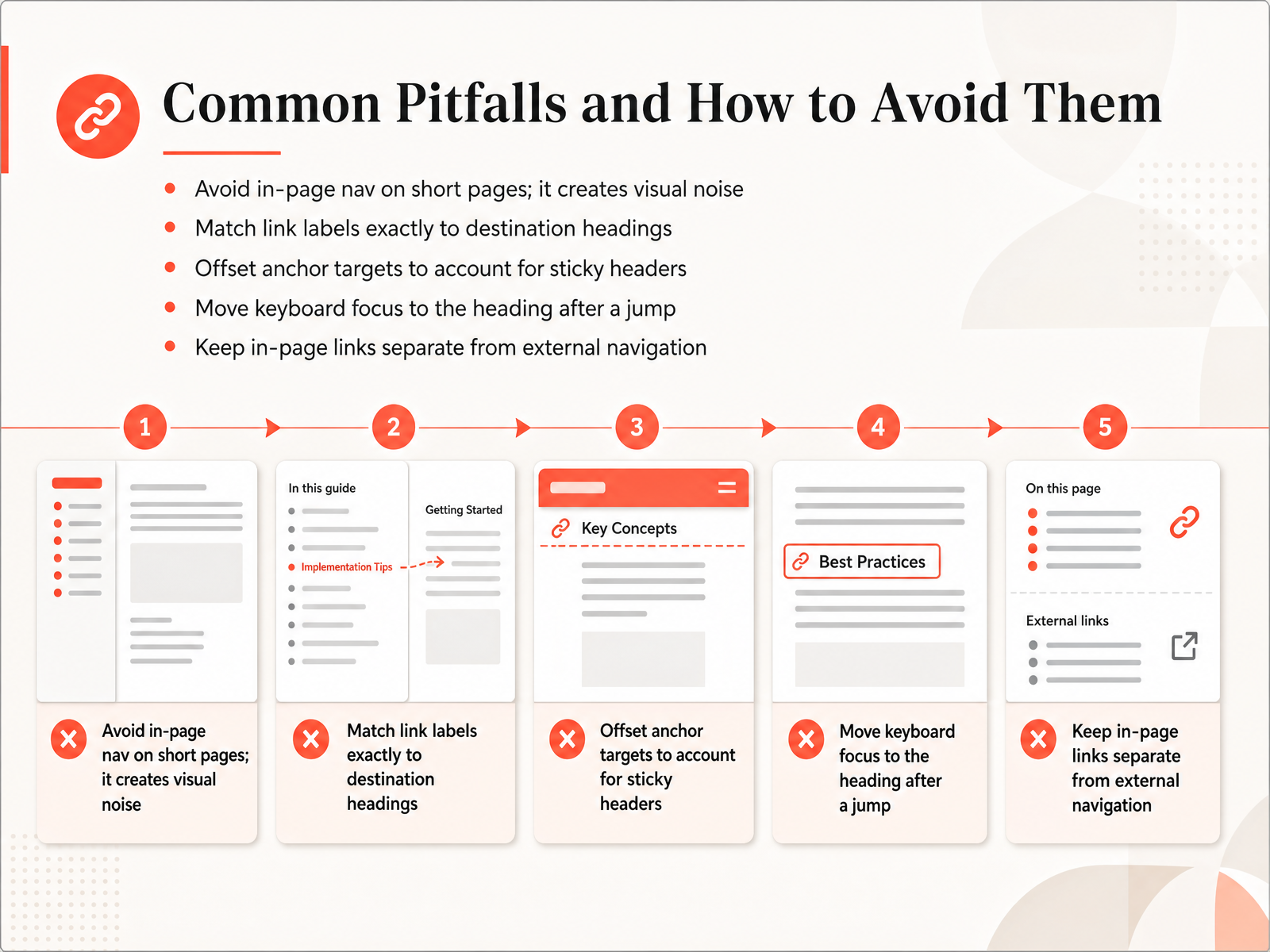
2 min - 14Common Pitfalls and How to Avoid ThemNow, even the best designs can stumble into a few common traps, so let's look at how to steer clear of them. First, don't add in-page navigation to a very short page. If all the content is already visible, extra links just become visual noise and can confuse people. Second, make sure your link labels match the destination headings exactly. If a link says 'Pricing,' the heading at the destination must also say 'Pricing'; otherwise, the user will feel lost. Third, remember to offset your anchor targets. When you have a sticky header at the top of the page, a standard anchor jump will hide the heading behind it. You need to adjust the target position so the heading sits visibly below the header. After a jump, another best practice is to move keyboard focus to the destination heading. This lets screen reader users and keyboard navigators continue from the right place without tabbing through the entire page again. Finally, keep your in-page links visually and structurally separate from links that navigate away to other pages. This clarity helps users build the right mental model for moving around your site. With these pitfalls in mind, you're ready to streamline your whole process. Let's move on to putting it all together and building a smooth design workflow for in-page navigation.
 2 min
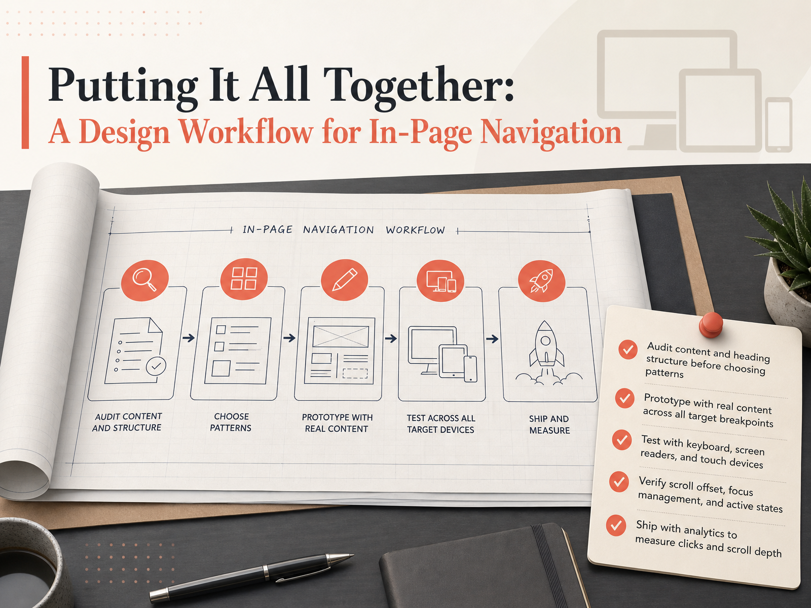
2 min - 15Putting It All Together: A Design Workflow for In-Page NavigationWe have covered a lot of ground. Let us wrap up with a clear, repeatable workflow you can bring straight into your next project. First, before you pick any pattern, audit your content and heading structure. A thoughtful outline makes the navigation practically build itself. Next, always prototype with real content across every breakpoint. That is how you catch a collapsed menu that feels cluttered on a phone, or a table of contents that pushes too far down on a tablet. Then, test thoroughly. Use a keyboard, a screen reader, and a touch device. And do not skip the small details: verify your scroll offset, your focus management, and that the active states update correctly. Finally, ship with analytics. Tag those links and measure which sections get clicked, and how far people actually scroll. That data tells you if your design is truly serving your readers. Thank you for staying with me through the entire course. You now have a solid foundation for designing in-page navigation. Go put it into practice, and build pages that your readers can move through confidently.
 2 min
2 min
Take the deck with you
Download this course as a file — free, no sign-up needed.
- PDF handoutEvery slide page, ready to print or share.16 pages · 3.7 MBDownload
- Narrated PowerPointThe deck that presents itself — every slide carries the digital human's narration video.16 pages · 15.7 MBDownload
- PowerPoint slidesThe full deck as a .pptx — open it in PowerPoint, Keynote, or Google Slides.16 pages · 3.5 MBDownload
Free to use in your own training — please keep the PersonWise credit page at the end.
Have your own deck? Turn it into a course
Sources consulted
Web sources consulted while building this course.
- Focus Management in Single-Page Apps — Accessible Data Interfaces — accessible-data-interfaces.com
- Understanding Success Criterion 2.4.3: Focus Order | WAI — w3.org
- Navigation Treeview Example | APG | WAI | W3C — w3.org
- Making dynamic websites accessible using focus management — visionaustralia.org
- SPA Accessibility: Single Page Apps Done Right — A11yPath — a11ypath.com
- In-Page Links for Content Navigation - NN/G — nngroup.com
- In-page navigation | U.S. Web Design System (USWDS) — designsystem.digital.gov
- Prerequisite chips, scroll-spy TOC, and Pagefind: the trio that closed the learning hub nav spec — captainrandom.co.uk
- In-page anchor navigation UX Pattern | UX Patterns Guide — uxpatternsguide.com
- UX navigation patterns, elements, and fixes to lift conversion | Lazarev.agency — lazarev.agency
- Web Content Accessibility Guidelines (WCAG) 2.2 — w3.org
- Developing a Keyboard Interface | APG | WAI | W3C — w3.org
- Understanding Success Criterion 2.4.11: Focus Not Obscured (Minimum) | WAI | W3C — w3.org
- Focus management — design.va.gov
- What's New in WCAG 2.2 | Web Accessibility Initiative (WAI) | W3C — w3.org