Data Transformations: Scale & Units
Begin
13 pages · ~26 min
Data Transformations: Scale & Units
This training explains how transforming data scales and units can affect the interpretation of results, helping analysts and data professionals make accurate conclusions.
What you’ll learn
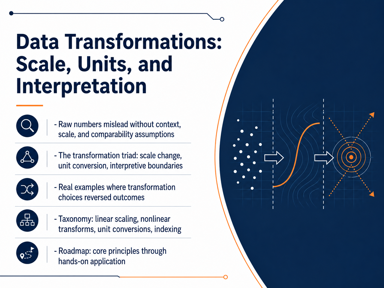
- 01Data Transformations: Scale, Units, and InterpretationWelcome to Data Transformations: Scale, Units, and Interpretation. In this course, we focus on a core analytical truth: raw numbers can mislead when they lack context, a consistent scale, and clear comparability assumptions. Our goal is to give you a practical framework for deciding when and how to transform data so your interpretations are sound. We will work through what we call the transformation triad: scale change, unit conversion, and the interpretive boundaries that each choice creates. You will see real examples where the direction of a finding reversed solely because of a transformation decision. We will build a taxonomy that covers linear scaling, nonlinear transforms, unit conversions, and indexing. And we will move from core principles directly into hands‑on application. Let's begin by examining why we transform data in the first place: the goals, the principles, and the decision to intervene.1 min
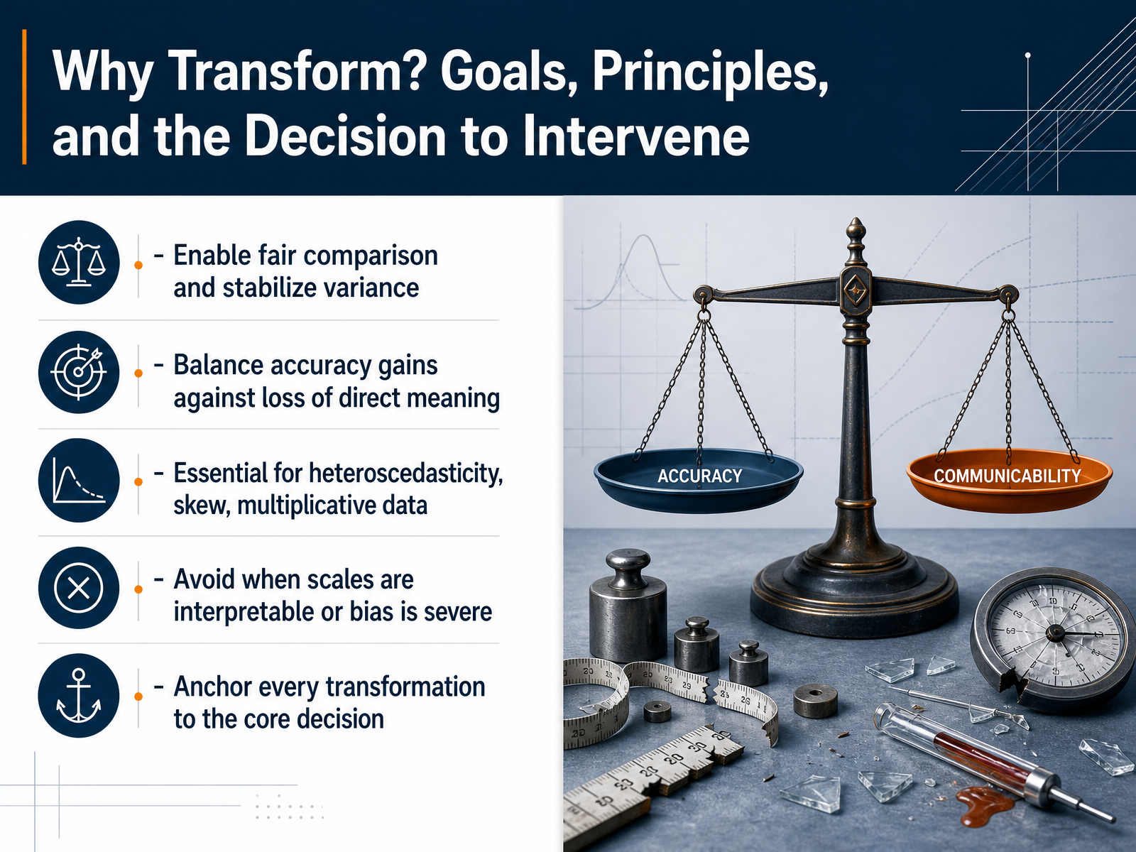
- 02Why Transform? Goals, Principles, and the Decision to InterveneLet's move directly into why we transform data. This slide addresses the core decision to intervene before modeling. Our first goal is to enable fair comparison and stabilize variance. When groups differ sharply in spread, transformations like the logarithm help meet the assumption of equal variance, making tests and models more reliable. The second goal involves a trade-off: we balance gains in accuracy against the loss of direct meaning. A log-transformed salary may improve model fit, but the coefficient is no longer in dollars, which complicates interpretation. We typically intervene when data show heteroscedasticity, strong skew, or multiplicative relationships. For example, compound growth or biological dilution series often require a log scale to become linear and well-behaved. However, we should avoid transformation when the original scales are already clearly interpretable, or when the induced bias would be severe—such as distorting a carefully calibrated clinical score. Above all, anchor every transformation to the core decision. Ask whether the change serves the analysis or obscures it. Next, we will examine how units of measurement silently frame every number, in our upcoming slide: Units of Measurement: The Hidden Framing of Every Number.
 2 min
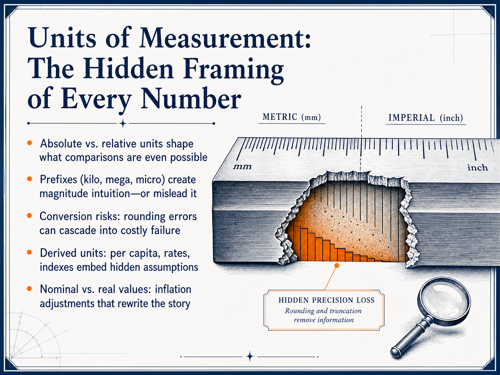
2 min - 03Units of Measurement: The Hidden Framing of Every NumberNow let us consider the unit itself. Every number you work with comes wrapped in a unit of measurement, and that choice is never neutral. Absolute values, like total revenue in dollars, answer one set of questions. Relative values, like market share in percent, answer a completely different set. The frame you pick determines which comparisons are even possible. Scale prefixes, such as kilo, mega, or micro, create immediate magnitude intuition. But they can also mislead when we skip across orders of magnitude without pausing to reset our mental benchmark. Conversion between units introduces real risk. A rounding error at the third decimal place, compounded across a large dataset, can cascade into a costly failure. Derived units embed hidden assumptions. Think of per capita figures, annualized rates, or composite indexes. Each one layers a new transformation on top of the raw data, and each layer carries its own interpretive boundary. Perhaps the most subtle shift comes from nominal versus real values. An inflation adjustment rewrites the growth story entirely, turning an apparent gain into a real loss. In every case, the unit frames the meaning before you run a single analysis. Next, we move from these principles to concrete experience in unit disasters and everyday lessons, where we will examine real case studies.
 2 min
2 min - 04Unit Disasters and Everyday Lessons: Case StudiesLet's look at some concrete consequences of scale and unit mismatches. The Mars Climate Orbiter mission failed because one engineering team used pound-force seconds while another used newton-seconds. That single unit mismatch resulted in a three hundred twenty-seven point six million dollar loss. The Gimli Glider incident occurred when ground crew loaded fuel using pounds instead of kilograms. The aircraft ran out of fuel mid-flight and had to make an emergency landing. A quieter type of failure appeared in a twenty twenty-six lab error, where a suppressed alarm code caused a hundred-fold reporting mistake with no obvious warning. These cases share a common thread. Silent defaults, dropped metadata, and meaning lost during hand-offs are not rare exceptions. They are the everyday risks of working with transformed data. In modern practice, the same pattern shows up when systems confuse milliseconds with seconds, gigabytes with gibibytes, or when risk scales are mismatched between reporting tools. The lesson is practical. Every time you apply a transformation, you must explicitly preserve the unit, the scale, and the interpretation boundary. Next, we will examine linear transformations, specifically centering, scaling, and normalization.
 2 min
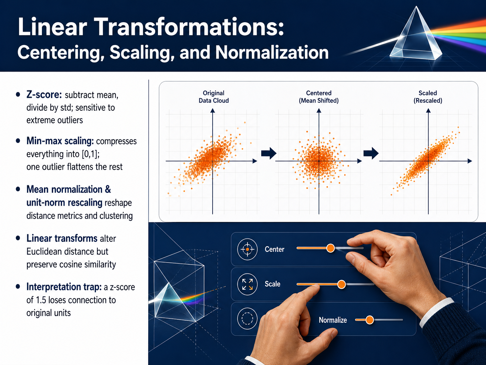
2 min - 05Linear Transformations: Centering, Scaling, and NormalizationNow, let's examine linear transformations and the practical decisions they force us to make. First, the Z-score. You subtract the mean, then divide by the standard deviation. This centers your data at zero and expresses each point in standard deviation units. The direct consequence is that Z-scores are highly sensitive to extreme outliers, because those outliers pull the mean and inflate the standard deviation. Next, min-max scaling. This compresses every value into the range zero to one. The decision to use it carries a clear trade-off. A single outlier can consume most of that range, flattening the rest of your data into a narrow band where differences become invisible. Mean normalization and unit-norm rescaling work differently. They reshape distance metrics and clustering results by changing how we measure proximity. A critical interpretation rule to remember is that all linear transforms alter Euclidean distance. However, they perfectly preserve cosine similarity, because cosine cares only about angle, not magnitude. This leads to a concrete trap. A Z-score of one point five loses all connection to the original units. You no longer know if that value represents dollars, kilograms, or clicks, and that disconnection limits how you can explain the result to a non-technical stakeholder. Let's connect this to what happens when relationships themselves are not linear, which we will cover next with nonlinear transformations.
 2 min
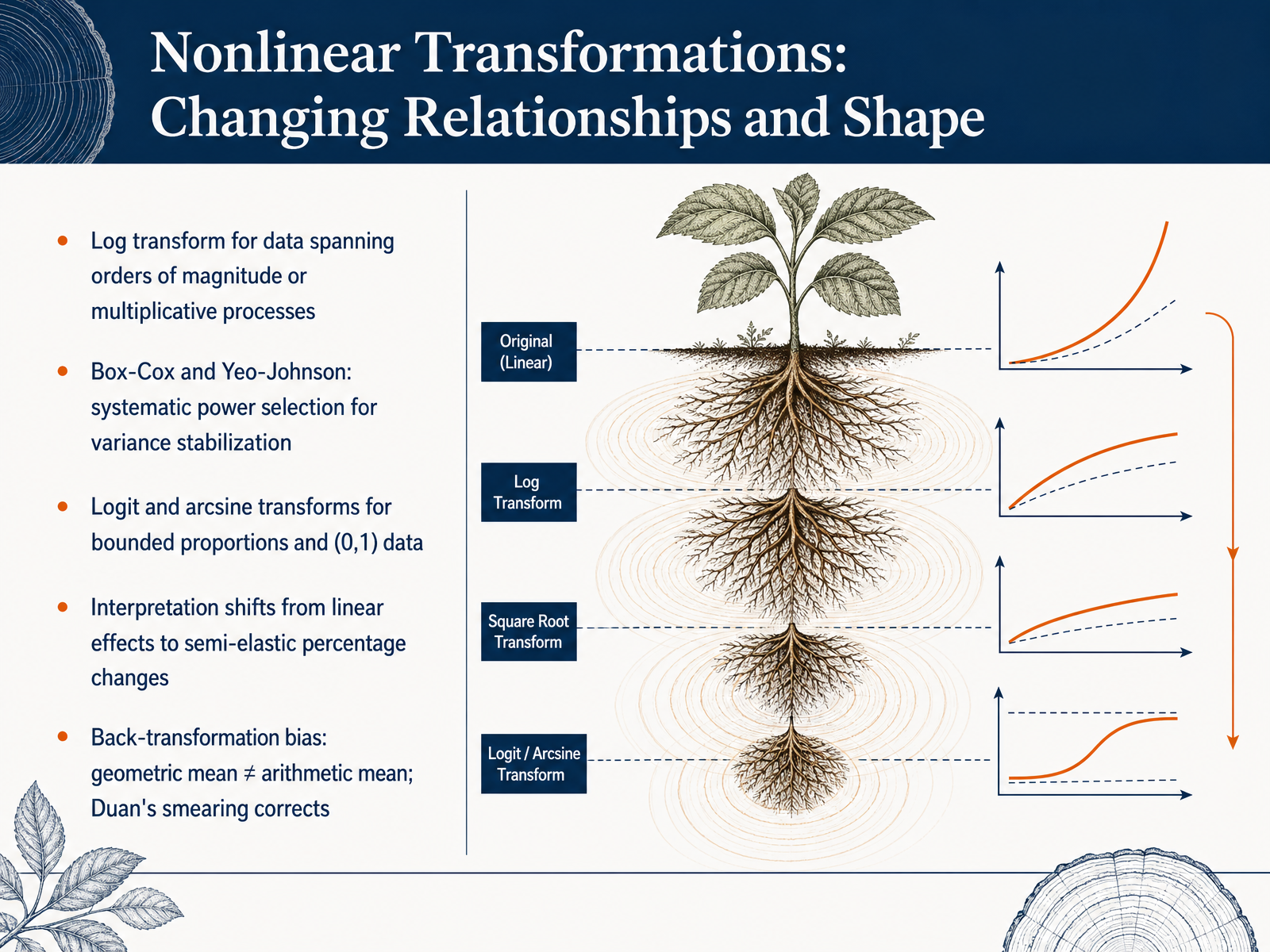
2 min - 06Nonlinear Transformations: Changing Relationships and ShapeNow we shift focus to nonlinear transformations and how they fundamentally change the shape of our data and the interpretation of effects. Let's start with the log transform. It is essential when your variable spans several orders of magnitude or is the product of a multiplicative process. Next, consider Box-Cox and Yeo-Johnson transformations. These provide a systematic way to select the optimal power parameter for variance stabilization, with Yeo-Johnson extending the approach to handle zero and negative values. For bounded proportions and data strictly between zero and one, the logit and arcsine transforms map the values onto the full real line, stabilizing variance near the boundaries. A critical shift occurs in interpretation. When you apply a log transform to a target variable, regression coefficients no longer describe simple linear effects. Instead, they represent semi-elasticities, or approximate percentage changes. Finally, you must avoid a common pitfall: back-transformation bias. After fitting a model on a log scale, the simple exponentiated mean of the log predictions equals the geometric mean, not the arithmetic mean of the original scale. This bias can be corrected using Duan's smearing estimator, which adjusts the retransformed predictions to recover the correct expected value. Next, we will explore a specific case: The Logarithmic Scale: Powerful, Misunderstood, and Easy to Weaponize.
 2 min
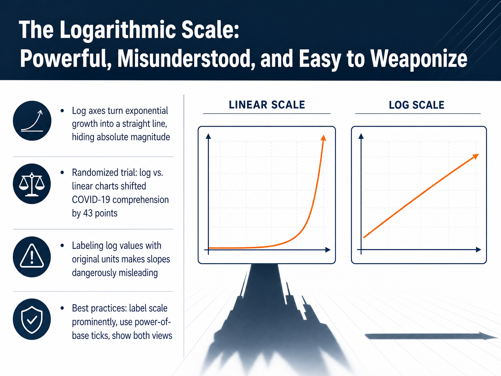
2 min - 07The Logarithmic Scale: Powerful, Misunderstood, and Easy to WeaponizeNow let's turn to a scale that is powerful, often misunderstood, and surprisingly easy to weaponize: the logarithmic scale. A log axis converts exponential growth into a straight line. This makes the rate of change easy to compare, but it completely hides the absolute magnitude. For example, a jump from ten to one hundred looks identical to a jump from one hundred thousand to one million. In one randomized trial, switching between log and linear charts shifted comprehension of COVID-19 data by forty-three points. That is not a small misunderstanding; it is the difference between alarm and complacency. A particularly dangerous practice is labeling log axes with the original units, because the slope of a line then becomes dangerously misleading. Best practices are clear. Always label the scale prominently. Use power-of-base tick marks, like ten, one hundred, one thousand, to restore the sense of magnitude. And whenever possible, show both the log and the linear view side by side. Next, we will examine indexing and rebasing, and how those choices create and question relative narratives.
 2 min
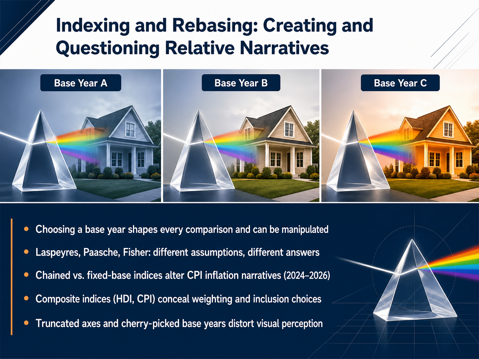
2 min - 08Indexing and Rebasing: Creating and Questioning Relative NarrativesNow we turn to indexing and rebasing. The choice of a base year is a modeling decision, not a neutral one. It shapes every comparison that follows and can be adjusted to tell very different stories. Different index formulas produce different results. A Laspeyres index holds weights constant at the base period. A Paasche index uses current-period weights. A Fisher index combines them geometrically. Each assumption changes the answer. This matters concretely in inflation measurement. Between 2024 and 2026, chained indices and fixed-base indices will produce diverging CPI narratives. The method you select determines whether inflation appears higher, lower, or more volatile. Composite indices such as the Human Development Index and the Corruption Perceptions Index conceal weighting and inclusion choices. Their aggregation rules are not self-evident, yet they drive international rankings and policy decisions. Visual presentation introduces additional risk. Truncated axes and cherry-picked base years can distort perception even when the underlying data is correct. Always verify what the index hides before treating it as fact. Next, we examine scale types and what you are allowed to do with them.
 2 min
2 min - 09Scale Types and What You Are Allowed to Do With ThemLet's examine scale types and what you're allowed to do with them. Nominal, ordinal, interval, and ratio scales each permit different mathematical operations, and respecting those limits keeps your analysis valid. Computing ratios requires a true zero, so only ratio scales let you say that ten dollars is twice five dollars. This is why the long-standing debate over averaging Likert items matters. Treating a five-point agreement scale as interval data produces a mean that can be difficult to interpret. Scale type also constrains your visualization and algorithm choices. A nominal category can be mapped to color hue, but using a continuous color ramp on ordinal data can mislead. Downgrading a ratio scale to ordinal loses precision, and upgrading an ordinal scale to interval adds assumptions the data may not support. Next, we move into diagnostics where we detect when a transformation is actually needed.
 1 min
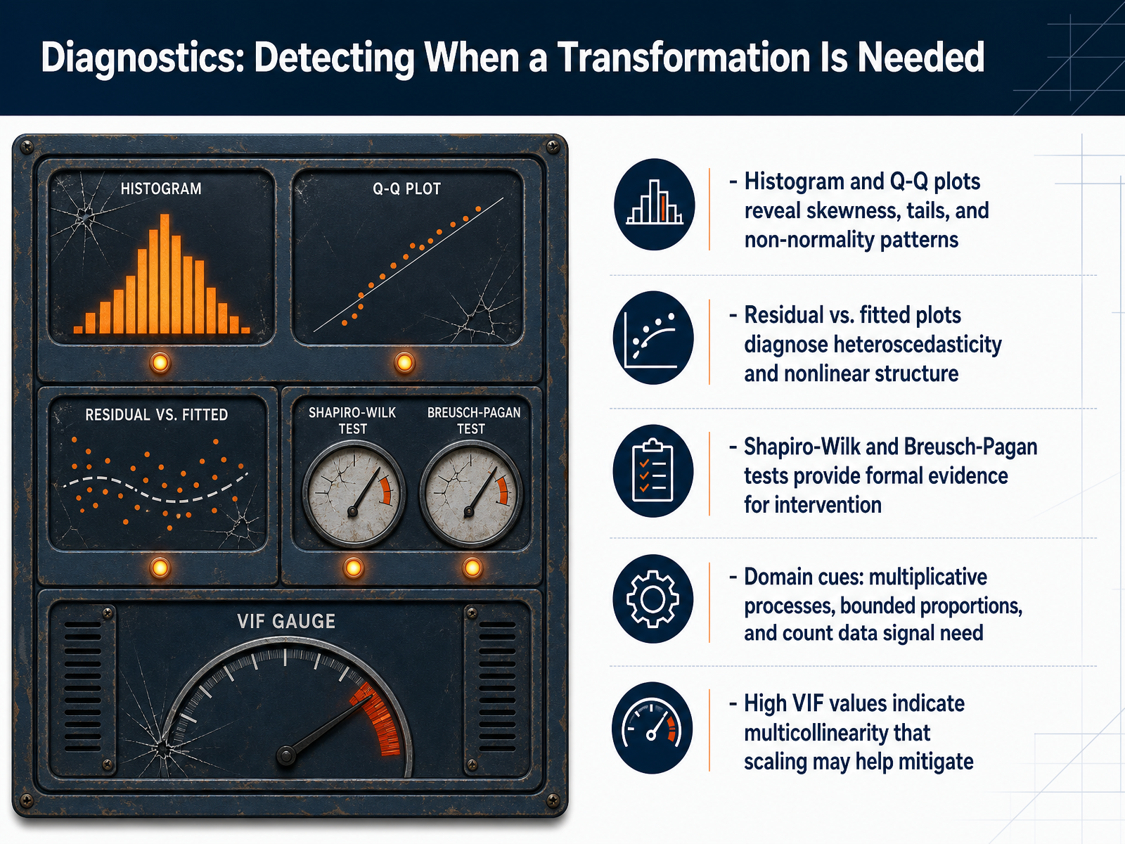
1 min - 10Diagnostics: Detecting When a Transformation Is NeededLet's look at the diagnostics that signal a transformation is needed. Start with visual checks. Histograms and Q-Q plots reveal skewness, heavy tails, or clear departures from normality. Residual versus fitted plots help you diagnose heteroscedasticity, where the spread of residuals changes with the fitted value, as well as nonlinear structure that a straight-line model misses. For formal evidence, use statistical tests: the Shapiro-Wilk test flags non-normality, and the Breusch-Pagan test confirms whether heteroscedasticity is statistically significant. Also, pay attention to domain cues. Multiplicative processes, bounded proportions like percentages, and count data all point toward expected distribution shapes that often require a transformation. Finally, high variance inflation factor values indicate multicollinearity. While centering and scaling do not eliminate the underlying correlation, they can improve numerical stability and make coefficient interpretation more reliable. These diagnostics turn guesswork into a structured decision process. In the next slide, we will discuss how to communicate transformed data to stakeholders.
 2 min
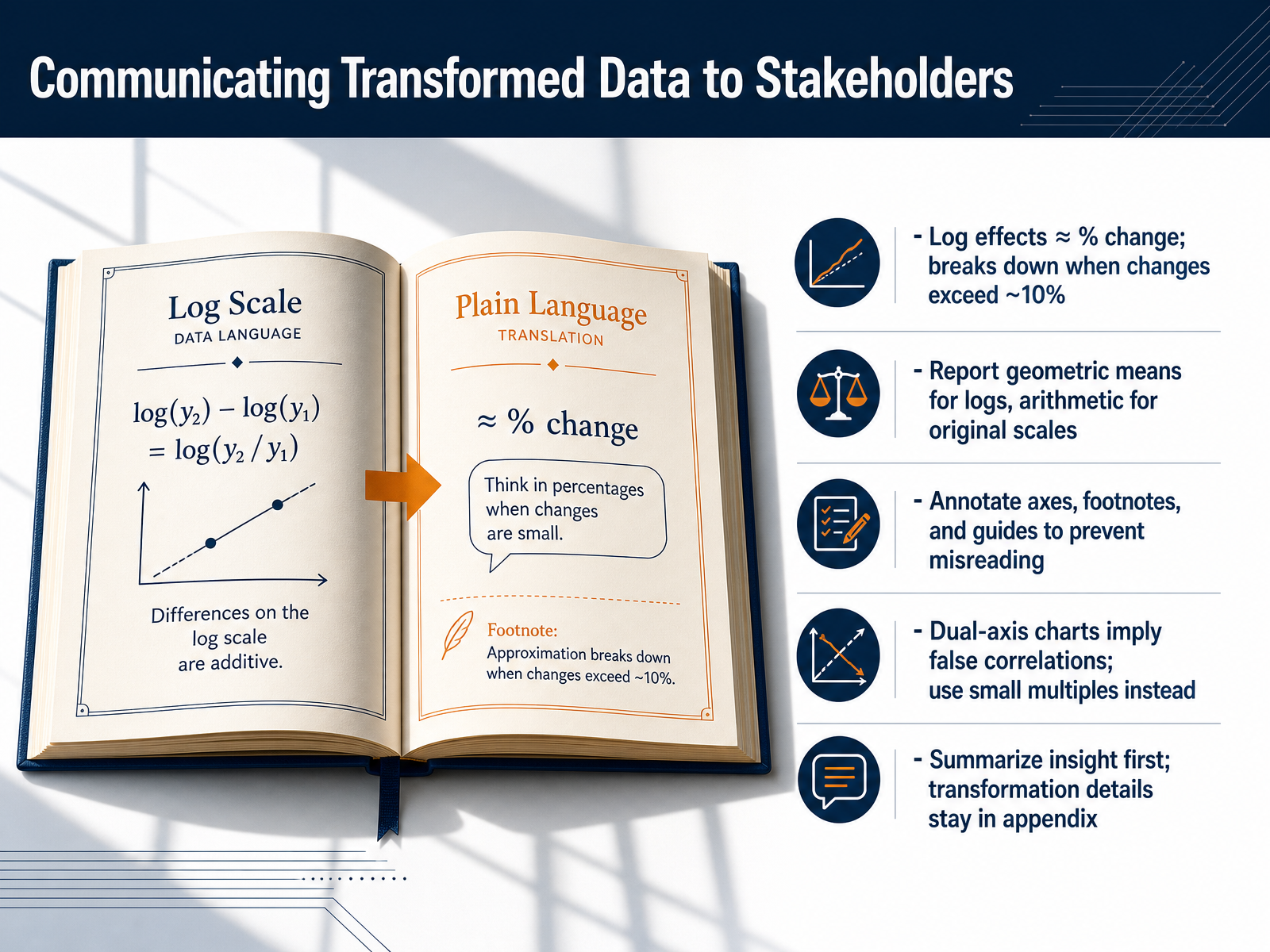
2 min - 11Communicating Transformed Data to StakeholdersNow let's talk about how to communicate transformed data clearly. When you use a log transformation to model percent change, remember that the approximation only holds well for small changes. Once the effect exceeds about ten percent, the match between log differences and true percent change breaks down. When you summarize log-transformed data, report the geometric mean, not the arithmetic mean. On the original scale, return to the arithmetic mean. Always annotate your axes and include footnotes that explain the transformation you applied. Simple guides on the chart prevent misreading. Avoid dual-axis charts. They often suggest false correlations. Use small multiples instead, placing individual series in separate aligned panels so the reader can compare trends honestly. When you present your findings, lead with the insight in plain language. Keep the log specifications and transformation details in an appendix. Next, we will explore 'When Visualizations Mislead: Patterns, Pitfalls, and Fixes.'
 1 min
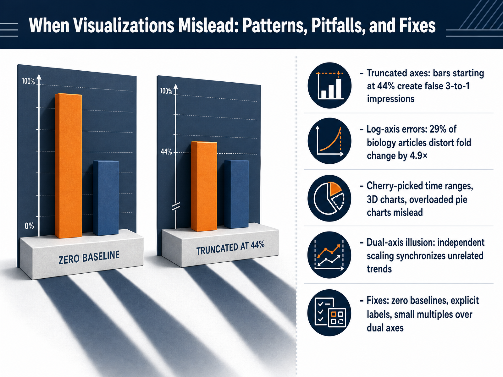
1 min - 12When Visualizations Mislead: Patterns, Pitfalls, and FixesNext, we examine how data transformations create visual patterns that can mislead. Consider truncated axes. When a bar chart starts at forty-four percent instead of zero, a small two-percentage-point difference visually appears as a three-to-one ratio, distorting the real magnitude. Log-axis errors are another common pitfall. In one analysis, twenty-nine percent of biology articles using log scales misrepresented fold changes by a factor of four point nine on average. Additional traps include cherry-picked time ranges that hide long-term trends, three-dimensional charts that skew perception of proportions, and overloaded pie charts that become impossible to read. The dual-axis illusion is particularly insidious. When two variables share a chart but use independently scaled vertical axes, unrelated trends can appear synchronized simply through scale manipulation. The fixes are direct. Always start bar charts at a zero baseline. Label axes explicitly so the unit and scale are unambiguous. When faced with dual-axis temptation, use small multiples instead, plotting each variable with its own consistent scale in separate, aligned panels. In the next slide, we apply these concepts in an integration exercise where you will choose, apply, and defend a transformation.
 2 min
2 min - 13Integration Exercise: Choose, Apply, and Defend a TransformationLet's bring everything together in a hands-on integration exercise. You will be given a raw dataset and a specific business question. Your task is to choose a transformation, apply it, and then defend your choice. You will document your entire pipeline, justifying each step in terms of how it improves comparability, interpretability, and communicability for the stakeholder. Next, you will participate in a peer critique. You will identify alternative transformations your peers chose and articulate the trade-offs they introduced. This practice is critical because we must also navigate ambiguity. We will discuss edge cases where no single transformation is clearly best, and you will need to reason through the least-worst option. Finally, we will summarize the key takeaways, review common mistakes, and I will share a curated set of resources for your continued learning. These skills are now yours to practice. The goal is not just to scale data, but to scale understanding. Thank you for your focus, and I look forward to seeing your applied work.
 2 min
2 min
Take the deck with you
Download this course as a file — free, no sign-up needed.
- PDF handoutEvery slide page, ready to print or share.14 pages · 4.2 MBDownload
- Narrated PowerPointThe deck that presents itself — every slide carries the digital human's narration video.14 pages · 14.5 MBDownload
- PowerPoint slidesThe full deck as a .pptx — open it in PowerPoint, Keynote, or Google Slides.14 pages · 4.1 MBDownload
Free to use in your own training — please keep the PersonWise credit page at the end.
Have your own deck? Turn it into a course