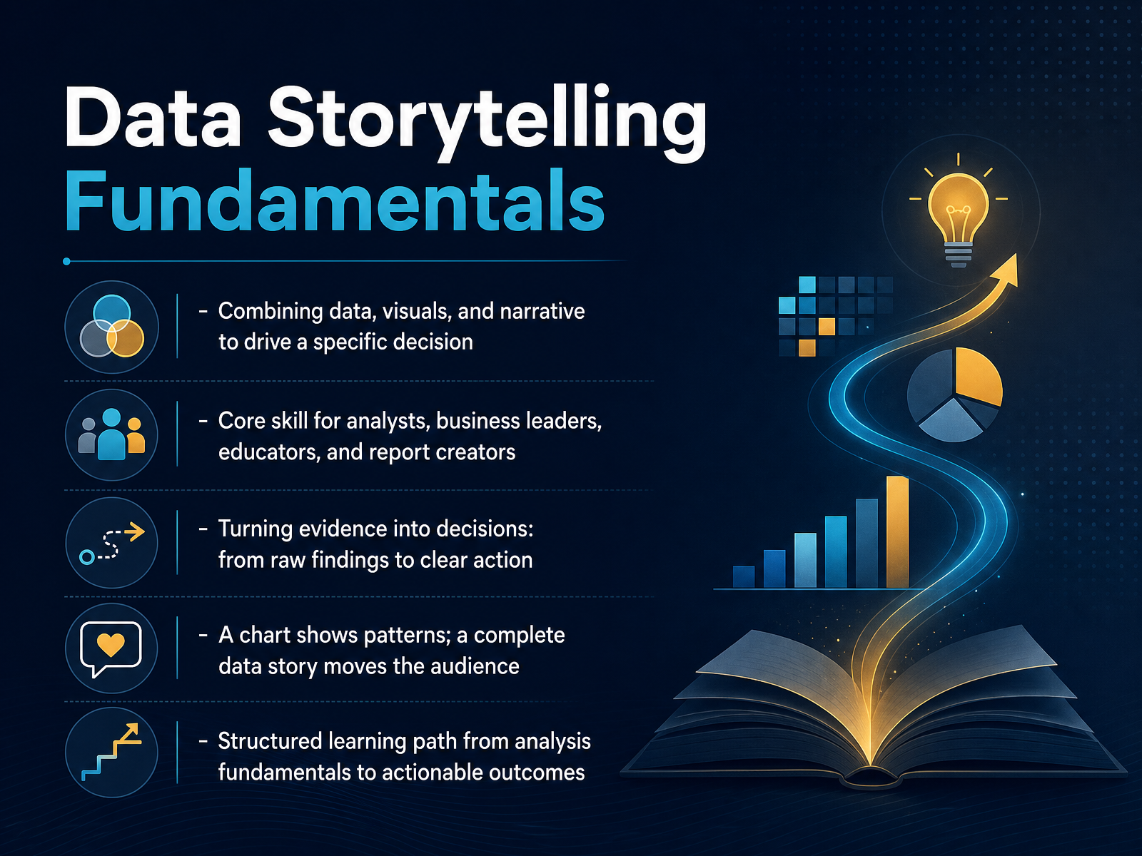
Data Storytelling Fundamentals
Begin
13 pages · ~26 min
Data Storytelling Fundamentals
Master data storytelling fundamentals to craft compelling narratives from data, enabling you to engage audiences and drive informed decision-making.
What you’ll learn
- 01Data Storytelling FundamentalsWelcome. If you work with data in any capacity, you already know the frustration of having a clear insight in your head and watching it fail to land with your audience. That gap between a solid analysis and an actual decision is exactly what we are going to close in this course. Data storytelling is the skill of combining three things: data, visuals, and narrative, to drive a specific decision. It is not about making prettier charts. A chart shows a pattern, but a complete data story argues what that pattern means and what to do about it. This is a core skill for analysts, business leaders, educators, and anyone who creates reports. The goal is to move from raw findings to clear action. We will follow a structured path from analysis fundamentals all the way to actionable outcomes, and along the way, we will practice the same techniques together. Before we build that skill, we need to be honest about a common problem. Let us look at why data alone is not enough.storyflow.sojuiceanalytics.comdatabricks.com+21 min
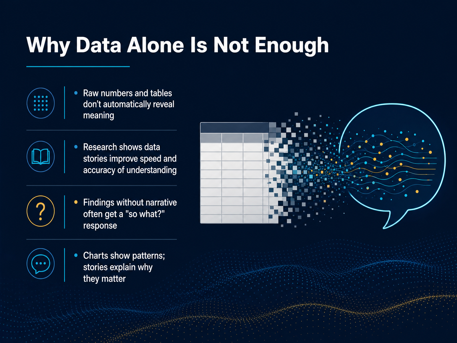
- 02Why Data Alone Is Not EnoughLet's start with a simple truth: data alone is rarely enough. We've all seen it. A table full of numbers, a dashboard with twenty charts. All the information is there, but the meaning is missing. Research backs this up. Studies show that when we combine data with narrative, people understand findings faster and more accurately. That's not surprising. A chart shows us a pattern, like a dip in sales. But it doesn't tell us why that dip happened or what to do about it. Without that story, our audience is left asking, so what? That's the problem we're solving. Data storytelling is about closing the gap between seeing a pattern and understanding why it matters. It turns findings into decisions. Now, if that's clear, let's define exactly what data storytelling is.
 dl.acm.orgideas.repec.orgutupub.fi+21 min
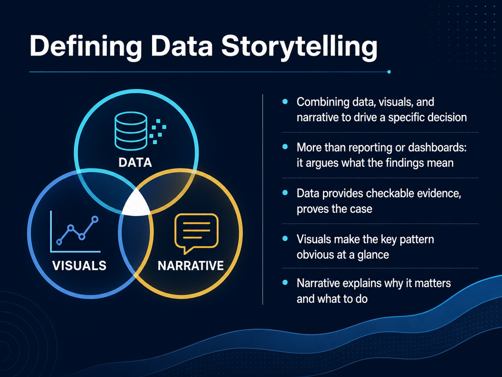
 - 03Defining Data StorytellingLet's get specific about what we mean by data storytelling. At its core, it combines three elements: data, visuals, and narrative, all aimed at driving a specific decision. It's more than reporting or a dashboard. A report shows what is happening. A data story argues what the findings mean and what we should do about them. Each ingredient has a distinct job. Data provides checkable evidence to prove the case. Visuals make the key pattern obvious at a glance. And narrative explains why it matters and what action to take. Remove any one of these, and it stops being a data story. Without the narrative, you basically have a dashboard. Without the data, you have an opinion. Next, we'll explore those core building blocks one by one.
 storyflow.sojuiceanalytics.comdatabricks.com+21 min
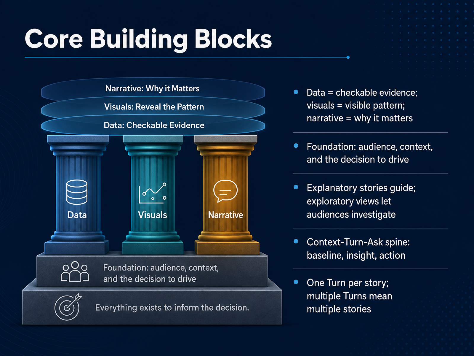
 - 04Core Building BlocksLet's move to the core building blocks that make a data story hold together. At the most basic level, we have three ingredients working in partnership. Data gives us checkable evidence, the visual makes the pattern visible at a glance, and the narrative explains why that pattern should matter to us. Remove any one of these, and the communication weakens. But before we arrange those ingredients, we need a foundation. That foundation is built from three questions: who is our audience, what context do they already carry, and which specific decision are we trying to drive. The answer to those questions changes how we shape everything else. We also need to distinguish between two modes. An explanatory story guides the audience toward one clear conclusion. An exploratory view, like a well-designed dashboard, lets people investigate the data on their own terms. Both have value, but they serve different purposes, so we should be deliberate about which one we are creating. Now, the spine that holds all of this together is a simple three-part structure: Context, Turn, and Ask. Context establishes the accepted baseline. The Turn introduces the single insight that disrupts that baseline. And the Ask converts that disruption into a clear action. Crucially, each story should carry only one Turn. If we find ourselves with three strong turning points, we are actually holding three separate stories. Coming up next, we will look at how to put the audience and our core message first, before we invest in any design or chart choices.
 storyflow.sojuiceanalytics.comdatabricks.com+21 min
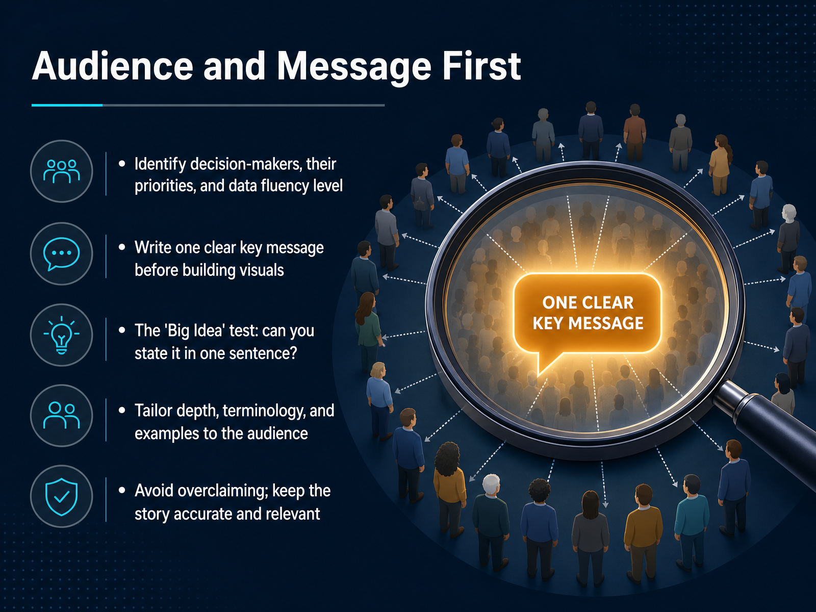
 - 05Audience and Message FirstNow, before we even think about charts or dashboards, we need to start with the audience and the message. This is the step that often gets skipped when we are in a hurry, but it is what separates a story from a simple data dump. First, let's identify who we are actually talking to. We need to understand their priorities and, crucially, their level of data fluency. A CFO needs outcomes, while an analyst peer may want the methodology. Once we know that, we should write one clear key message before building a single visual. If we cannot state the big idea in one sentence, we are probably not ready. We also need to tailor our depth and terminology to fit the room. Overclaiming is where we lose trust, so we will keep the story accurate. When we do this right, the result is a message that lands immediately. Next, we will look at how to choose the right visuals to support that message.
 naccho.orgnaccho.orgdatafield.dev+21 min
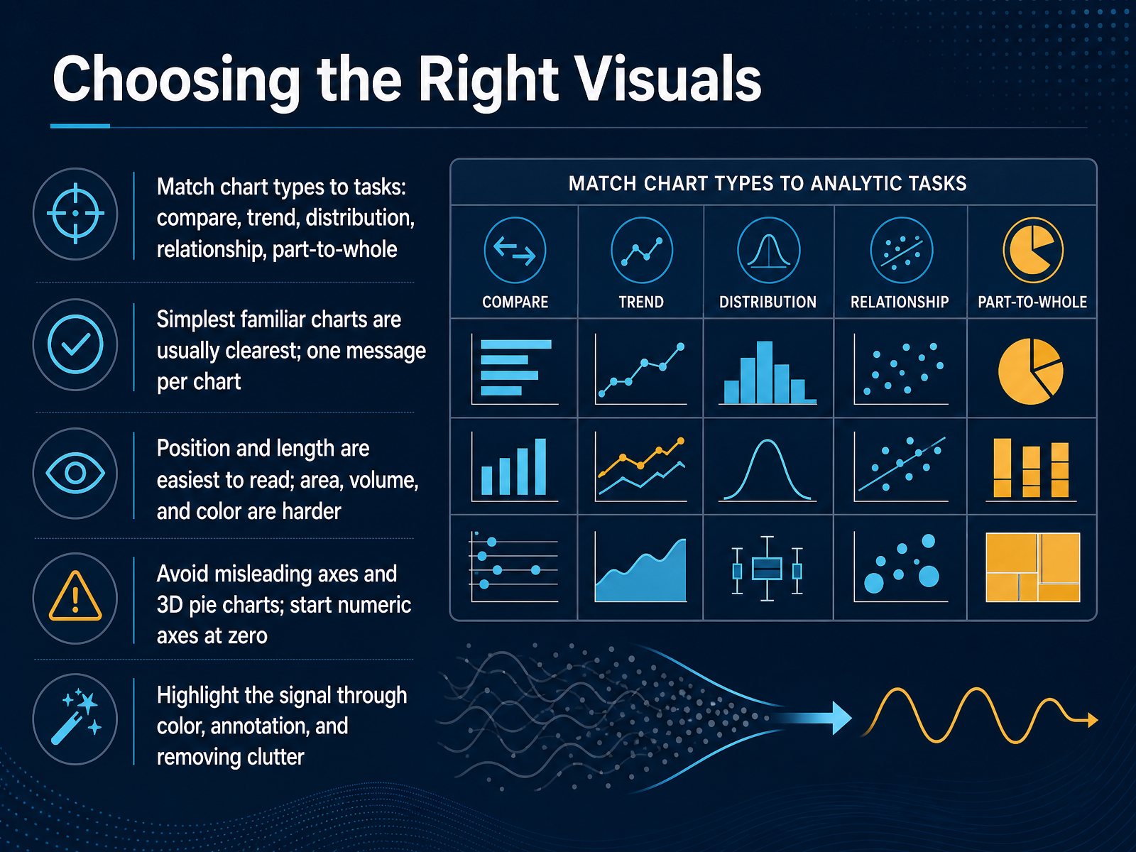
 - 06Choosing the Right VisualsSo let's talk about choosing the right visual. The basic rule is simple. Match the chart to the question you're actually asking. Are we comparing categories? That usually means a bar chart. Showing change over time? A line chart works best. Looking at relationships between two variables? Try a scatterplot. And if we're showing how parts make up a whole, a simple pie chart can work, but only with a few categories. One message per chart is the discipline. When we try to pack three stories into one visual, we lose all three. Also think about how our eyes actually read charts. Position and length are easiest to interpret. Area, volume, and color intensity are much harder. That means a bubble chart, for example, is harder to read precisely than a well-made bar chart. A few integrity rules matter too. Always start numeric axes at zero. Avoid three dimensional pie charts. And use color as a spotlight, not decoration. Highlight the one data point that matters, annotate it directly, and remove the gridlines and legends that don't carry the message. If a chart needs a lot of explanation, it's usually the wrong chart. Up next, we'll bring these visual choices together by structuring the narrative.
 guides.lib.berkeley.eduservice-manual.ons.gov.uklibguides.library.gatech.edu+22 min
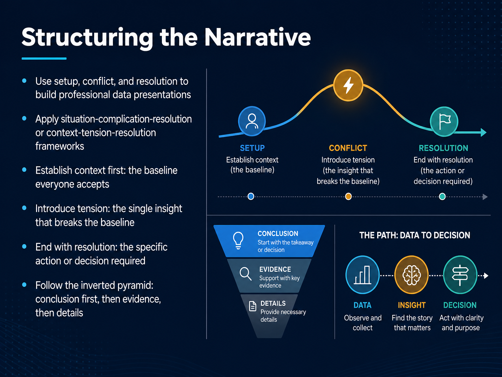
 - 07Structuring the NarrativeNow let's talk about structure, because a strong insight can still lose momentum if the story around it is disorganized. We're going to follow a familiar three-part shape: setup, conflict, and resolution. Think of it as situation, complication, resolution. You start by establishing the baseline, the context everyone already accepts. This is your setup. Then, you introduce a single tension point, the insight that breaks that baseline. That is the moment the story actually starts. Finally, you end with a resolution, the specific action or decision the insight now makes necessary. And here's a practical tip for professionals: use the inverted pyramid. Lead with your conclusion first, then offer the supporting evidence, and leave the background details for last. That way, even a busy stakeholder gets the key message immediately. Up next, we'll look at how to build credible stories.
 naccho.orgnaccho.orgdatafield.dev+22 min
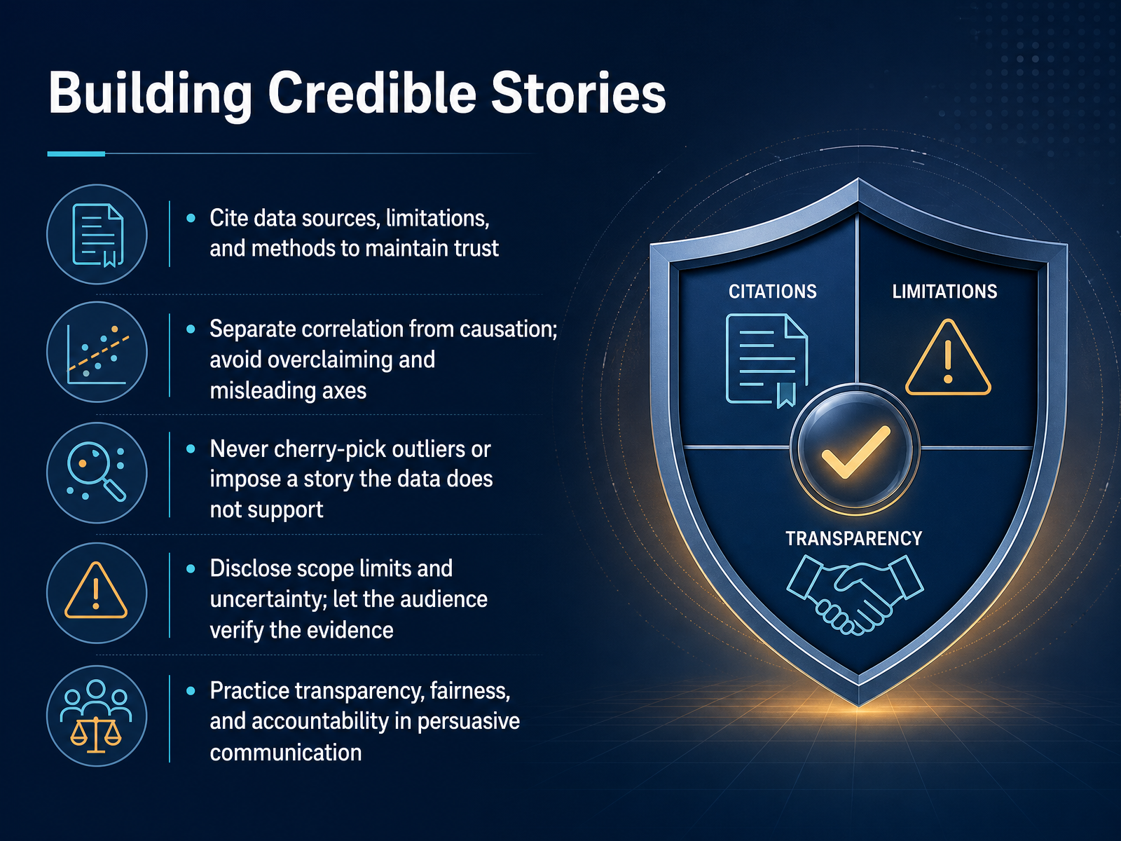
 - 08Building Credible StoriesSo let’s talk about what makes a data story credible. Credibility isn’t just about having accurate numbers. It’s about showing your audience the receipts, so they trust the evidence and the conclusion. Start by citing your data sources, clearly stating the limitations, and explaining your methods. If you only measured part of the market, say so. That kind of transparency builds trust. Next, separate correlation from causation. Just because two trends move together doesn’t mean one causes the other, and claiming otherwise can undo an otherwise great story. Also, watch your visuals. Avoid misleading axes or cherry-picking outliers that distort the picture. If the data doesn’t support a narrative, don’t force it. A strong analysis should survive scrutiny. Finally, treat transparency, fairness, and accountability as habits. When your audience can verify the evidence and understand its limits, you empower them to confidently act on your recommendation. Up next, we’ll cover some common mistakes to avoid.
 storyflow.sojuiceanalytics.comdatabricks.com+21 min
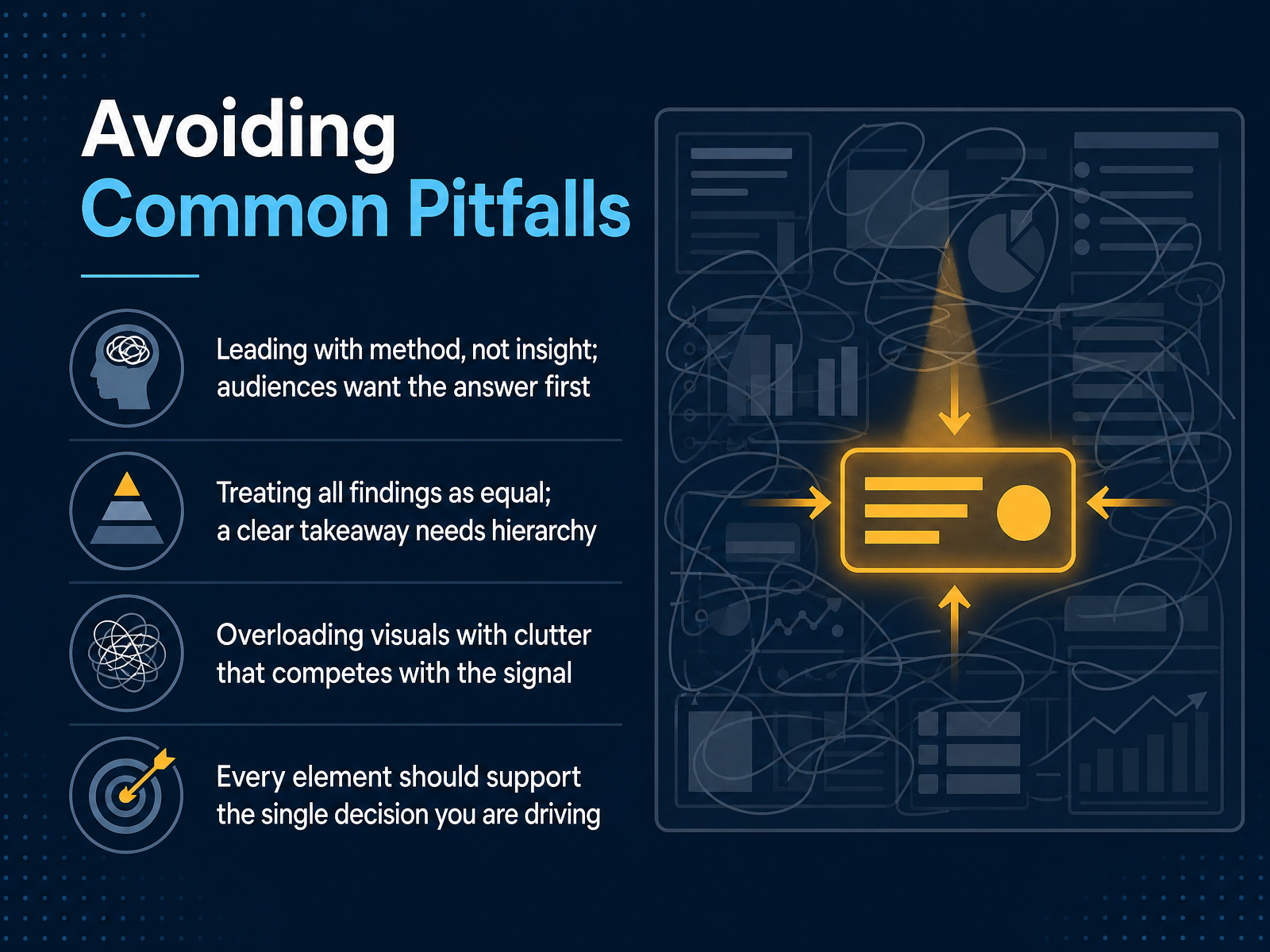
 - 09Avoiding Common PitfallsNow let's talk about the traps that can quietly derail a data story. The first one is leading with your method instead of your insight. Your audience wants the answer first, not a tour of your analysis. So open with the finding, and keep the methodology in your back pocket for questions. The second pitfall is treating every finding as equally important. If everything is emphasized, nothing stands out. You need a clear hierarchy, one primary takeaway supported by maybe two or three secondary points. The third trap is visual clutter. Every label, gridline, or color that isn't helping the message is competing with it. Ask yourself if each element supports the single decision you're driving. If it doesn't, cut it. Let's move on to how we put this into a practical storytelling workflow.
 storyflow.sojuiceanalytics.comdatabricks.com+21 min
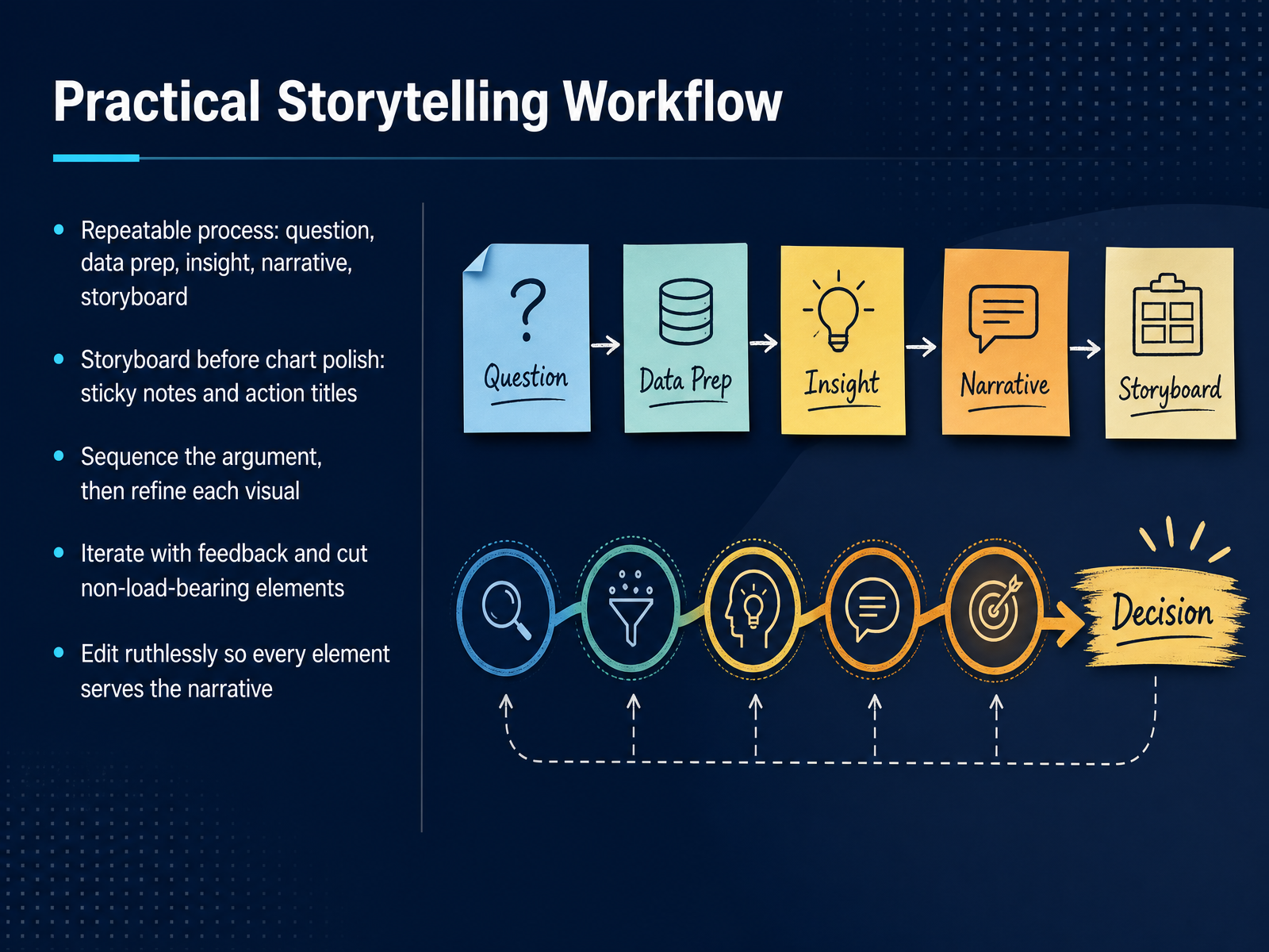
 - 10Practical Storytelling WorkflowNow that we understand the core principles, let's turn that theory into a repeatable workflow. Think of storytelling as a process, not a single event. You start with a clear question, move through data preparation, then uncover the insight that actually matters. From there, you shape the narrative and build your storyboard. A key point here is to storyboard before you polish any charts. Use sticky notes with action titles on each one. This lets you sequence your argument and find structural problems while changes are still cheap. Once the sequence is solid, you refine each visual to support that specific point. Then, iterate. Share drafts, gather feedback, and cut anything that is not load-bearing. Every element on the page should serve the narrative. If it does not move the story forward, remove it. This discipline of cutting ruthlessly is what separates a clear story from a data dump. Up next, we'll explore the tools that can support this storytelling process.
 naccho.orgnaccho.orgdatafield.dev+22 min
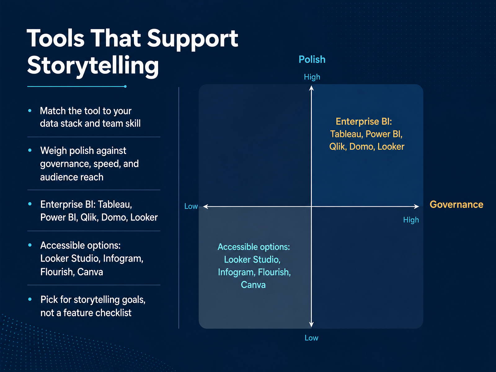
 - 11Tools That Support StorytellingNow let us talk about the tools that support all of this. The biggest mistake we see is picking software based on a feature checklist, then forcing a story to fit the tool. Instead, start with your storytelling goal and work backward. First, match the tool to your data stack and your team's actual skill level. If your analysts already live in Excel and Microsoft 365, Power BI often makes sense. If you need deep visual control, Tableau is a strong fit. Second, weigh polish against governance, speed, and reach. Enterprise platforms like Qlik, Domo, and Looker give you security and consistency, but they demand setup and skills. On the other hand, accessible options like Looker Studio, Infogram, Flourish, and Canva get you to a shareable story quickly, with less overhead. The key is to choose for the story you are trying to tell, not the one the vendor wants to demo. Up next, we will turn all of this into practice and next steps.
 storyflow.sojuiceanalytics.comdatabricks.com+22 min
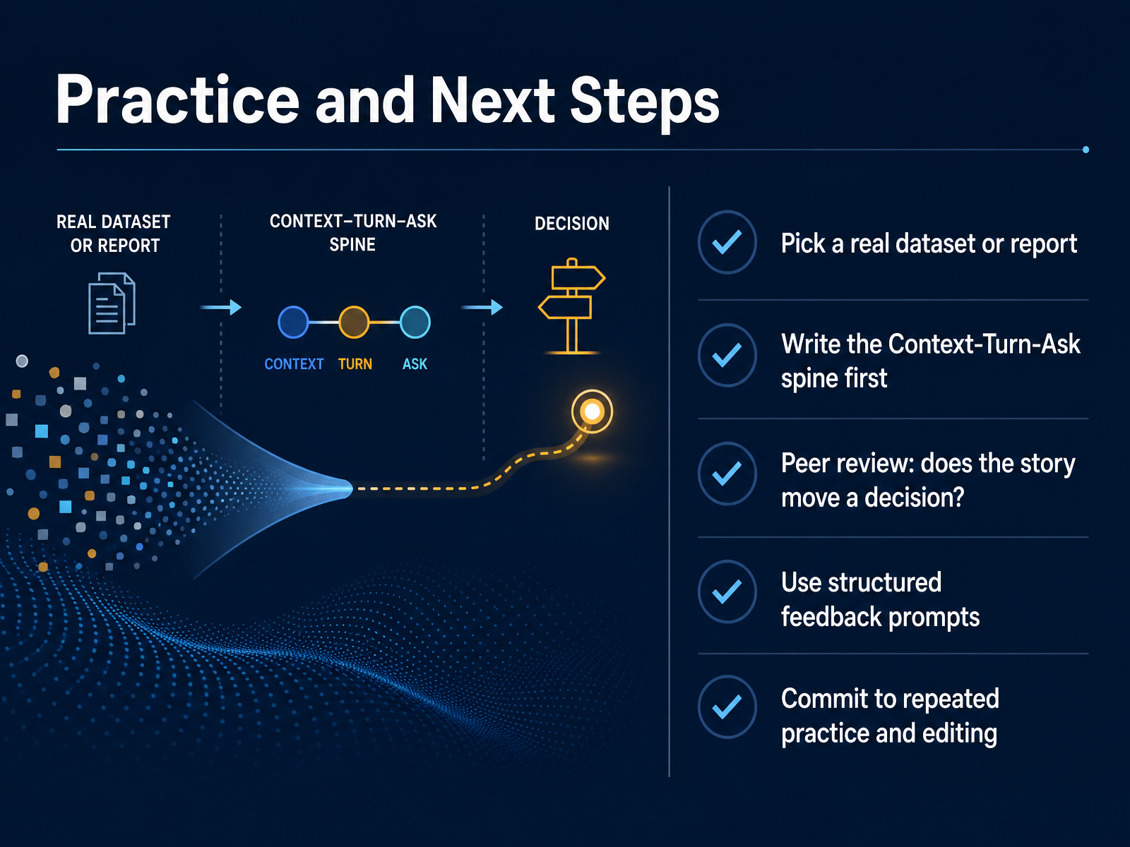
 - 12Practice and Next StepsThe real work starts now, and the best way to build this skill is to apply it right away. Pick a real dataset or report you're already working with. Don't hunt for a perfect one, just something current. Before you touch a chart or a slide, write out the spine. What's the context everyone accepts? What's the one turn that breaks it? And what ask does that turn justify? Keep it to three plain sentences. Then, put your story in front of a peer and ask one pointed question: does this move a decision? That's the test. A chart that only informs is fine, but a story should push someone to act. When you gather feedback, don't just ask what people think. Use structured prompts like, what felt like the turn, and what action would you take after hearing this? That kind of question reveals whether your structure is holding. Finally, don't expect your first pass to land. This is a craft. Write the spine, present it, get the feedback, and edit. Repeat that loop a few times and the discipline becomes automatic. Next, we'll wrap up with the key takeaways and an action checklist.
 storyflow.sojuiceanalytics.comdatabricks.com+22 min
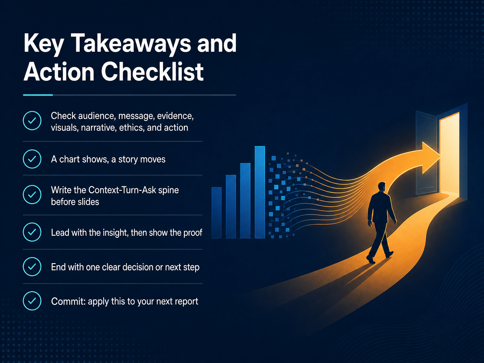
 - 13Key Takeaways and Action ChecklistLet's bring everything together with a simple checklist you can put to work today. Before you present, run through the essentials. Check your audience, your core message, the evidence, the visuals, the narrative, the ethics, and the action. A chart shows the pattern. A story moves people to do something with it. Before you touch a slide template, write your Context, Turn, and Ask spine in three plain sentences. Lead with the insight, then show the proof. And always end with one clear decision or next step. That single moment of clarity is what turns a well-formatted report into a decision. So here's the commitment. Apply this to your very next report. Start small. Write the three-sentence spine, lead with the turn, and finish with a concrete ask. You now have the full framework, and the best way to make it stick is to use it immediately. Thank you for joining me, and here's to telling data stories that truly move people.
 storyflow.sojuiceanalytics.comdatabricks.com+21 min
Take the deck with you
Download this course as a file — free, no sign-up needed.
- PDF handoutEvery slide page, ready to print or share.14 pages · 3.1 MBDownload
- Narrated PowerPointThe deck that presents itself — every slide carries the digital human's narration video.14 pages · 11.8 MBDownload
- PowerPoint slidesThe full deck as a .pptx — open it in PowerPoint, Keynote, or Google Slides.14 pages · 3.0 MBDownload
Free to use in your own training — please keep the PersonWise credit page at the end.
Have your own deck? Turn it into a course
Sources consulted
Web sources consulted while building this course.
- What Is Data Storytelling? The Complete Guide (2026) | Storyflow — storyflow.so
- 12 Rules for Better Data Storytelling (2026 Edition) — juiceanalytics.com
- What is Data Storytelling? | Databricks — databricks.com
- What Is Data Storytelling? Definition, Importance, Examples — sap.com
- What is data storytelling? Benefits, framework & takeaways | CACI - Do amazing things with data — caci.co.uk
- Data Storytelling in Data Visualisation: Does it Enhance the Efficiency and Effectiveness of Information Retrieval and Insights Comprehension? — dl.acm.org
- The power of clarity: Understanding how the effective use of data storytelling can improve the decision-making process — ideas.repec.org
- Telling business tales with data: A systematic literature review on data storytelling in business analytics — utupub.fi
- Data storytelling: What it is and how it can be used to effectively communicate analysis results — ideas.repec.org
- The Influence of Data Storytelling on the Ability to Recall Information — pure.itu.dk
- Data Storytelling Guidance - NACCHO — naccho.org
- Data storytelling guidance — naccho.org
- Key Takeaways — Chapter 9: Storytelling with Data | Data Viz with Python | DataField.Dev — datafield.dev
- shape your story — storytellingwithdata.com
- Data Storytelling: How to Turn Numbers into Narrative | Deckary — deckary.com
- Data Visualization: Choosing a Chart Type - UC Berkeley Library guide — guides.lib.berkeley.edu
- Overall considerations: Choosing a chart type – Data visualisation – Service manual – Office for National Statistics — service-manual.ons.gov.uk
- Choosing the Right Chart - Data Visualization - Resource Guides at Georgia Tech Library — libguides.library.gatech.edu
- Choosing visualisations – Government Analysis Function — analysisfunction.civilservice.gov.uk
- Health Infobase Design Manual - Canada.ca — health-infobase.canada.ca