Designing Effective Forms
Begin
16 pages · ~32 min
Designing Effective Forms
A training for designers and developers on creating user-friendly forms that improve data collection and user experience.
What you’ll learn
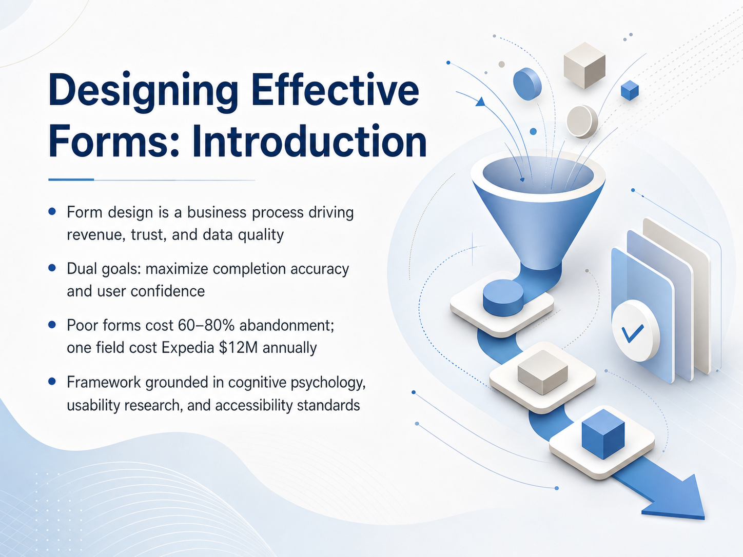
- 01Designing Effective Forms: IntroductionWelcome to Designing Effective Forms. If you build products or experiences that ask someone to complete a digital task, you already know the problem: most people who start a form never finish it. Across industries, sixty to eighty percent of users abandon forms before hitting submit. That is not a minor annoyance. It is a silent, relentless revenue killer. One famous example: a single confusing optional field in Expedia's booking flow was costing them twelve million dollars a year in lost profit. They deleted the field, and the profit came back. So our goal in this course is not just to make forms look nicer. We are here to accomplish two concrete things: maximize task-completion accuracy, and build user confidence. The framework we will use is grounded in cognitive psychology, real usability data, and accessibility standards. We will treat form design as a design problem we can solve with the right evidence and the right decisions. Let's start by getting inside the user's head. Up next: The Psychology of Form Filling, and how users actually think and process what you put in front of them.closetrace.comscalify.aiblog.pdffiller.com+22 min
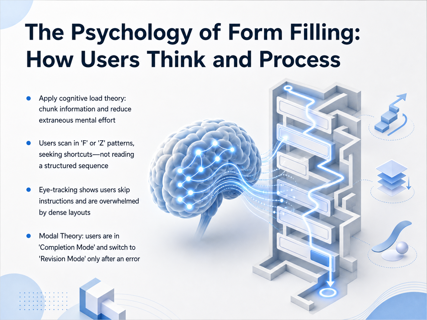
- 02The Psychology of Form Filling: How Users Think and ProcessAlright, let's get into the psychology of how people actually process forms. If we understand that, we can design around real human behavior, not just what looks tidy. First, think about cognitive load. Users have limited mental bandwidth. Our job is to chunk information into small, logical groups and strip away anything that creates extra mental effort. Don't make them think about the layout; make them think about the answer. Next, eye-tracking studies show us something crucial. Users don't read forms in a smooth, structured sequence. They scan in an F or Z pattern, hunting for shortcuts. They're looking for the next input slot, not reading your carefully crafted introductory text. And those dense layouts we sometimes create? The eye-tracking data is clear. Users skip instructions entirely and get overwhelmed by visual clutter. They fixate on the fields, not the helper text. This leads to a powerful concept known as Modal Theory. Users are in 'Completion Mode' when they fill out a form. Their goal is to get through it. They only switch to 'Revision Mode' after they hit an error. If you show an error message while they're still in Completion Mode, they will often ignore it. So, design for the scan, respect the mode, and reduce the noise. Now, let's apply this to how we structure the information itself. Coming up next, we'll look at Information Architecture, specifically how structure, sequencing, and trust guide a user through to completion.
 doi.orgdoi.orgdoi.org+22 min
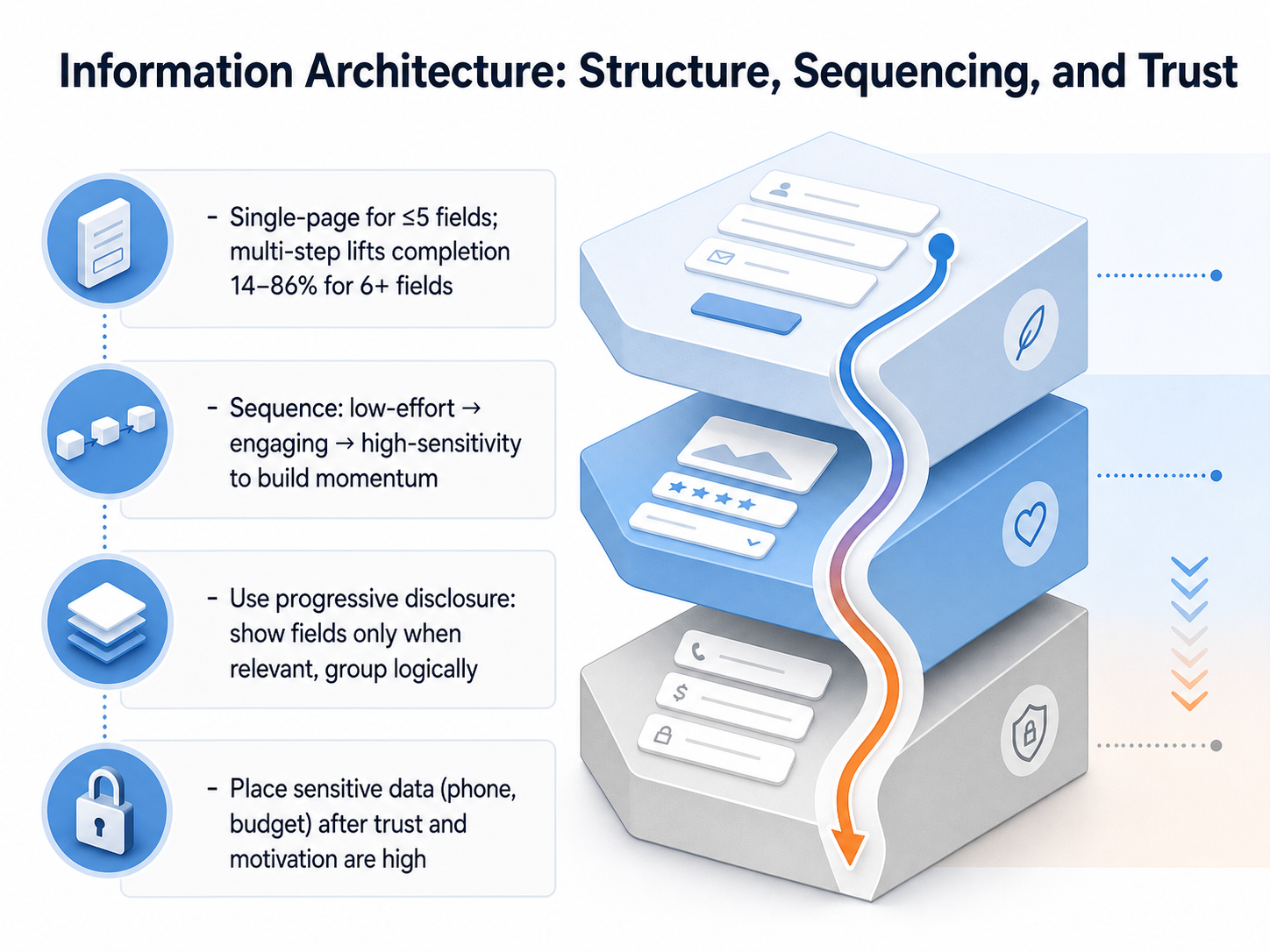
 - 03Information Architecture: Structure, Sequencing, and TrustNow let's talk about how you structure your form. The number of fields you have is the real decision point. If you have five fields or fewer, keep it on a single page. The transparency builds trust, and extra steps add unnecessary friction. But when you hit six or more fields, the data is clear: multi-step forms can lift completion rates dramatically—anywhere from fourteen to eighty-six percent, depending on the study. So think of it this way: single-page for short, simple asks. Multi-step for anything longer or more complex. Now, the order of your questions is just as important as the structure. You want to sequence from low-effort to engaging to high-sensitivity. Start with easy, intent-confirming fields that build momentum. Save sensitive data like phone numbers or budget ranges for the end, after the user has invested some effort and trusts you more. This follows the commitment curve—once someone has typed their name and described their challenge, they're more likely to share the harder stuff. Also, use progressive disclosure. Show fields only when they become relevant. Group related questions logically so each chunk feels like a manageable sub-task. This reduces cognitive load and keeps people moving forward. In short, match the structure to the number of fields, sequence to build trust, and reveal complexity only when it's needed.
 zuko.ioivyforms.comformcreatorai.com+22 min
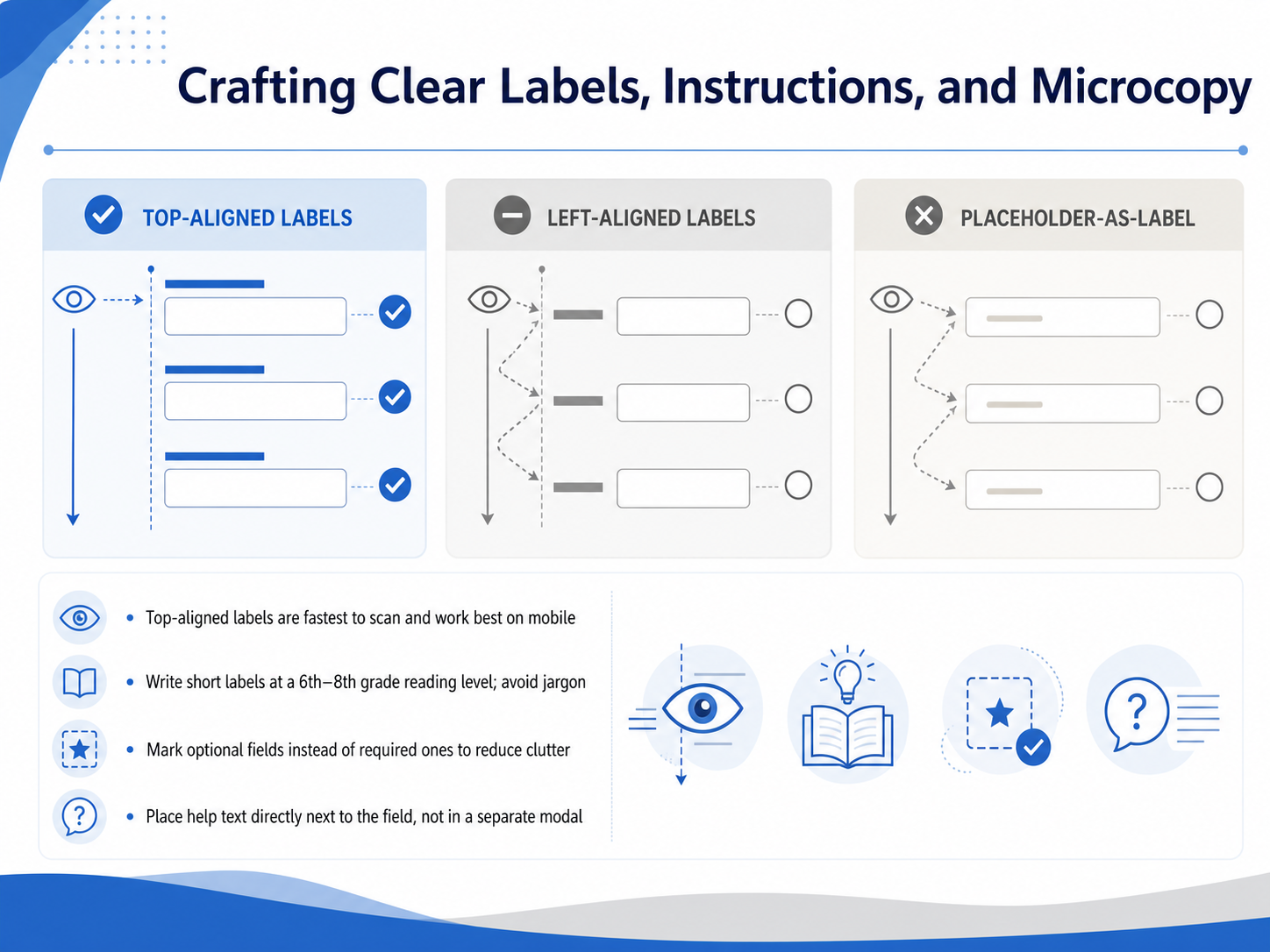
 - 04Crafting Clear Labels, Instructions, and MicrocopyCrafting clear labels, instructions, and microcopy that guide users through every step. These small pieces of text carry a lot of weight. Get them right, and the form feels effortless. Get them wrong, and even a simple task becomes a puzzle. So, where do you place the label? Research consistently shows that top-aligned labels are fastest to process. Placing the label right above the input lets users capture both elements in a single eye movement. This is especially important on mobile, where horizontal space is tight. Avoid the common pitfall of using the label as placeholder text inside the field. It disappears as soon as someone starts typing, which forces them to rely on memory. Instead, keep the label persistent outside the field. For the language itself, aim for a sixth to eighth grade reading level. Use plain, everyday words. If a field needs a specific format, show a concrete example right there, like MM slash DD slash YYYY. When you have optional fields, mark them clearly. This reduces visual clutter and lets users see at a glance what they can skip. Finally, place any help text directly next to the field it describes. Hiding it in a modal or tooltip adds unnecessary friction. Keep the guidance visible and close to the action. Next, let's turn our attention to choosing the right input controls.
 doi.orguxmatters.comdoi.org+22 min
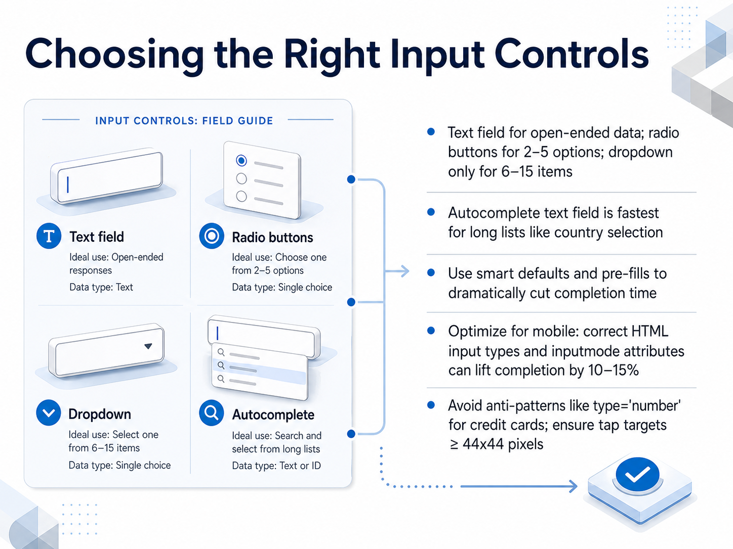
 - 05Choosing the Right Input ControlsChoosing the right input controls. The core rule is simple: match the control to the data. Use a text field when the answer is open-ended. When you have just two to five mutually exclusive options, lay them out as radio buttons so users can see everything at a glance. Dropdowns seem tempting, but reserve them only for six to fifteen items. For really long lists, like a country selector, an autocomplete text field is the fastest path. Users just type the first few letters and select. Next, cut completion time dramatically with smart defaults and pre-fills. Use the correct HTML input types and the inputmode attribute to trigger the right mobile keyboard. For example, show a number pad for a numeric field. But avoid using type equals number for credit cards or ZIP codes, because it can strip leading zeros and add unwanted spinner arrows. Also, make sure every tap target is at least forty-four by forty-four pixels so fingers don't miss. We'll build on this foundation next with error handling and validation that builds confidence.
 doi.org2 min
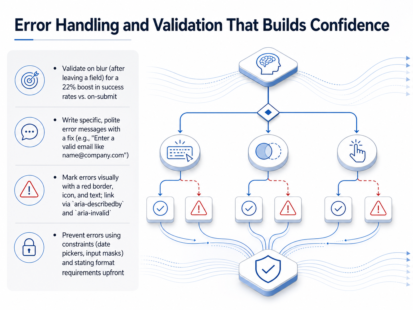
 - 06Error Handling and Validation That Builds ConfidenceError handling that builds confidence instead of frustration. When you validate on blur, after the user leaves a field, you can boost success rates by 22 percent compared to waiting until they hit submit. That early signal lets people fix mistakes right away. Now, when you write the error message, be specific and polite. Instead of saying 'invalid email,' say 'Enter a valid email like name at company dot com.' Pair that message with a clear visual marker: a red border, a small icon, and the text itself. Then link it all programmatically using aria-describedby and aria-invalid equals true. That way, assistive technologies announce the error immediately. Finally, prevent errors before they happen. Use constraints like date pickers and input masks, and state format requirements right up front. In short, validate early, write kind and specific messages, and use both visual and programmatic cues to guide users back on track. Next, we'll explore how transparency and social proof influence trust.
 2 min
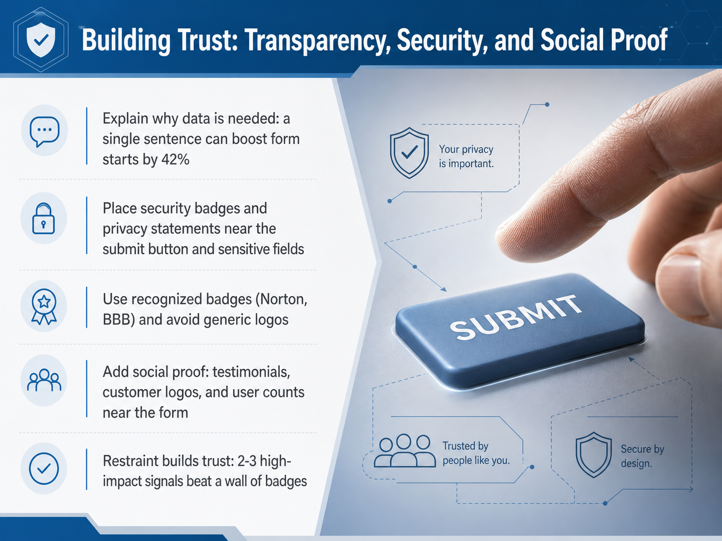
2 min - 07Building Trust: Transparency, Security, and Social ProofBuilding trust directly on the form itself. This is where transparency, security, and social proof come together. A single sentence explaining why you collect sensitive data can lift form starts by forty-two percent. Place that sentence right above the fields, where the hesitation lives. Position security badges, privacy indicators, and data-usage summaries near the submit button, not buried in the footer. That is the moment doubt peaks, so that is where reassurance needs to be. Use recognized badges like Norton or the Better Business Bureau, and avoid stacking generic or unfamiliar icons. Too many badges can look desperate and hurt credibility. Add social proof like testimonials, customer logos, or user counts nearby. And for OAuth flows, state clearly what data will be shared and let users review before they submit. Next, we'll connect these principles to Accessibility and Inclusive Form Design: Core Principles.
 2 min
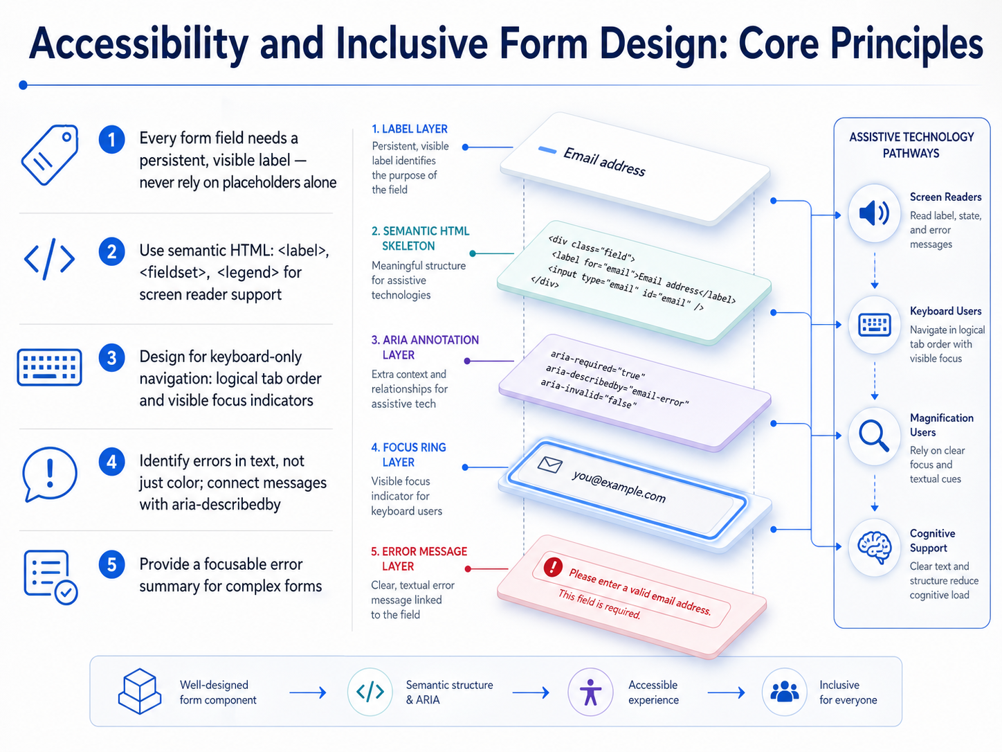
2 min - 08Accessibility and Inclusive Form Design: Core PrinciplesLet's ground our design decisions in the core principles of accessibility. These aren't abstract rules; they are the practical foundation that makes a form work for everyone. First, every form control needs a persistent, visible label. The WCAG success criterion 3.3.2 is clear: placeholder text inside a field is not a label. It disappears the moment a user starts typing, which fails people with cognitive disabilities and anyone who needs a constant reference. Use a real label element that stays on screen. Second, build a robust structure with semantic HTML. Use the label, fieldset, and legend elements to group related controls. For complex components, wire in ARIA attributes like aria-describedby to connect hint text, or aria-required to mark mandatory fields. This gives assistive technology the map it needs to describe your form. Third, design for the keyboard. Maintain a logical tab order that follows the visual flow. Ensure every interactive element has a visible focus indicator so a keyboard-only user never loses their place. And avoid creating keyboard traps where a user can get stuck in a loop. Finally, when errors happen, identify them clearly in text. Use the aria-invalid attribute to mark the field, and aria-describedby to link the field to a specific error message. A red border is a good visual cue, but on its own it's invisible to a screen reader. Consider adding a focusable error summary at the top of the form that lists every problem and links to the field. This combination of visible labels, semantic code, keyboard access, and text-based errors builds a form that is not just compliant, but genuinely usable. Now, let's expand this to support people with cognitive and motor diversity.
 2 min
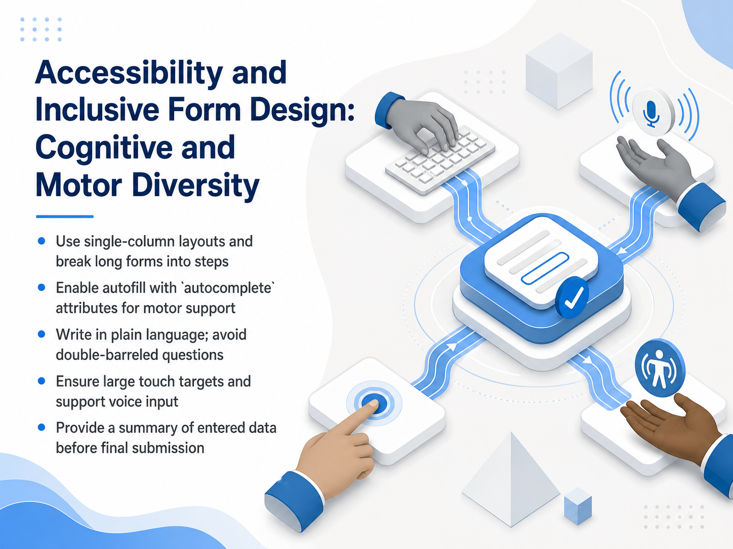
2 min - 09Accessibility and Inclusive Form Design: Cognitive and Motor DiversityAccessibility and cognitive diversity in form design. A single-column layout does more than look clean. It gives the eye a predictable path, which directly lowers cognitive load. When you break a long form into steps, you use progressive disclosure to show only what's needed right now. That keeps the user from feeling overwhelmed before they even start. Support motor diversity with practical choices. Place large touch targets, at least forty-four by forty-four pixels, so tapping is easy. Enable autofill and voice input to reduce the physical effort of typing. For the language itself, write in plain, conversational English. Avoid double-barreled questions that ask about two things at once. Also avoid negative phrasing that forces users to mentally reverse a statement. Before the final submit button, always show a summary of the entered data. This gives everyone a chance to review and correct mistakes without hunting back through the form. Next, we'll look at measuring form performance through analytics and key metrics.
 1 min
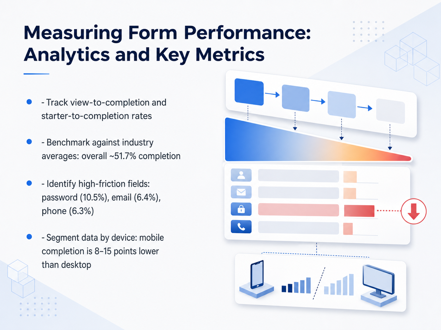
1 min - 10Measuring Form Performance: Analytics and Key MetricsMeasuring form performance. You need to track four core metrics: starter-to-completion rate, field-level abandonment, error rate, and time-to-complete. Across industries, the average starter-to-completion rate hovers around fifty-one point seven percent. But here's the critical gap, desktop users finish forms roughly eight to fifteen percentage points more often than mobile users. That difference is a design problem, not a user problem. To find the friction, use tools like Hotjar or Zuko. These pinpoint which specific fields cause the most drop-offs. Look closely at password, email, and phone fields, they are the usual suspects. Finally, don't trust a single overall number. Segment your data by device, browser, and traffic source. You might find mobile users on a specific browser abandoning at twice the rate of desktop users. That hidden gap is where your next big win lives. Next, we'll look at A B testing and iterative optimization to turn these insights into measurable improvements.
 blog.pdffiller.comclosetrace.comscalify.ai+22 min
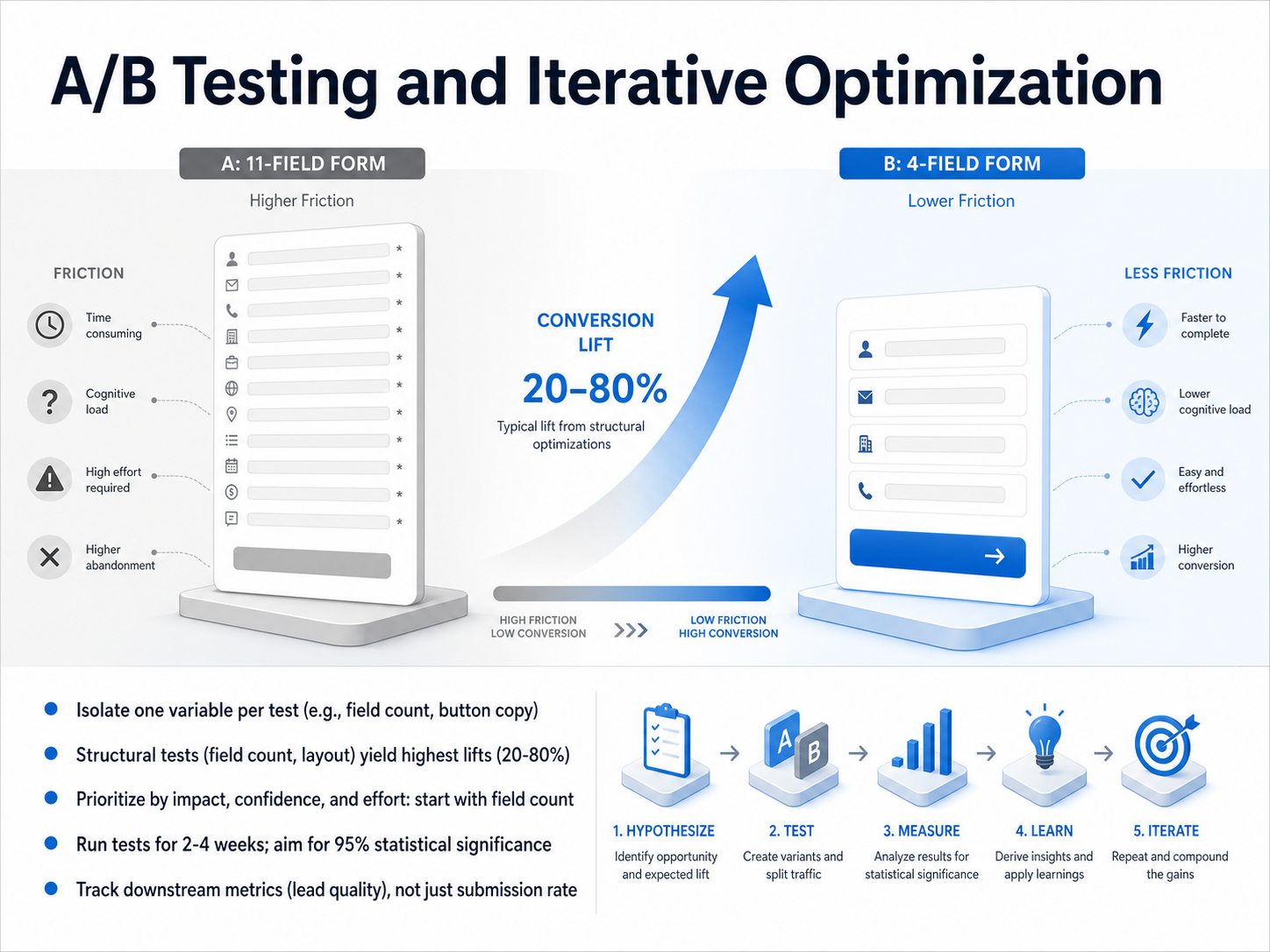
 - 11A/B Testing and Iterative OptimizationNow let's talk about A/B testing and how to approach it with real discipline. Prioritize your tests with a simple formula: Impact times Probability, divided by Effort. That points you to the big wins first. Structural changes—like cutting field count or switching to a multi-step layout—often deliver twenty to eighty percent conversion lifts. So start there. Reduce fields first. When you run a test, isolate one variable per test. Plan for two to four weeks minimum, pre-calculate your sample size, and don't call a winner until you reach ninety-five percent statistical significance. But never optimize for submissions alone. Always track downstream metrics like lead quality, sales-qualified lead rate, or return rate. A variant that boosts volume but hurts lead quality isn't a real win. And document every result, whether it wins or loses. Losing tests teach you where not to invest future effort. Next, we'll look at form design systems and how to scale quality and consistency.
 2 min
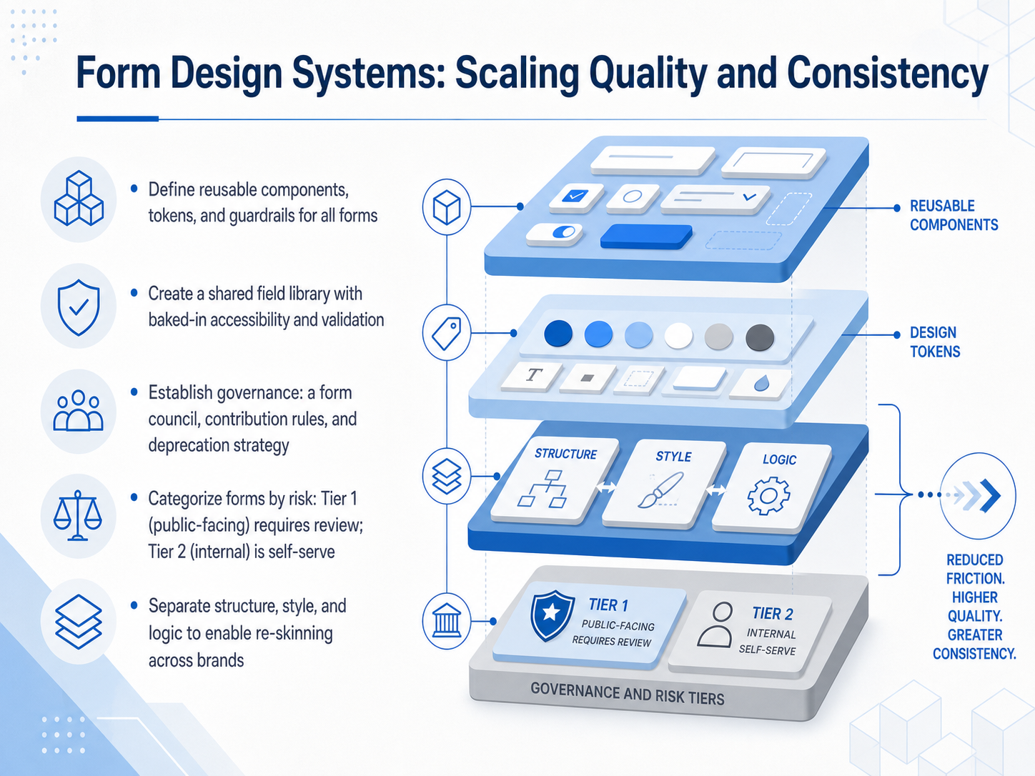
2 min - 12Form Design Systems: Scaling Quality and ConsistencySo how do you take all these patterns and scale them across your team without losing quality? You build a form design system. Start by defining a component library built on shared tokens. Think of tokens as named values for colors, spacing, and typography. They keep every form visually cohesive without anyone reaching for hex codes. Then package those tokens into reusable primitives. Build standardized field types that bake in accessibility and validation by default. One canonical email field, one phone field, one address block. Fix a bug once, and it rolls out everywhere. Use governance tiers to keep this practical. Tier one covers public-facing, mission-critical forms. These need a design review. Tier two covers internal or low-risk forms. Teams can self-serve, as long as they use approved components and themes. Finally, separate structure, style, and logic. Pull apart what you ask, how it looks, and how it behaves. This lets you reuse the same structure across different brands, or swap themes without rebuilding logic. Next, we’ll see how all this applies to mobile-first form design and closing the conversion gap.
 2 min
2 min - 13Mobile-First Form Design: Closing the Conversion GapLet's address the biggest gap in form performance: mobile completion. Data shows mobile form completion runs roughly 35 to 40 percent lower than desktop. The two main culprits are small tap targets and keyboards that don't match the input. To close this gap, start with a single-column layout and top-aligned labels. Place a sticky submit button that stays visible above the keyboard so users can finish without scrolling. Next, set the correct attributes on every field. Use the type attribute, like email or tel, to trigger the optimized keyboard. Add the inputmode attribute for numeric fields like postal codes, and always include the autocomplete attribute so the browser can fill in stored data. A quick win: replace type equals number with type equals text and inputmode equals numeric for credit cards and zip codes. This prevents the browser from stripping leading zeros or adding unwanted spinner arrows. Enforce a minimum tap target of 44 by 44 pixels. Finally, test on real devices, not just emulators. Only a physical device reveals keyboard overlap, scrolling friction, and awkward autofill behavior. These small fixes directly recover the mobile conversion gap. Up next, we'll explore practical strategies for reducing form abandonment.
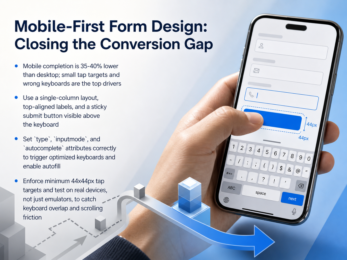 closetrace.comscalify.aiblog.pdffiller.com+22 min
 - 14Practical Strategies for Reducing Form AbandonmentLet's move from theory to the specific moves that recover lost completions. First, and most powerful, ruthlessly cut fields. The data is clear. Each field you remove lifts conversion by seven to eleven percent. Audit your form. If you don't absolutely need a field right now, delete it. Second, make the phone number optional. It's a single field that drives up to thirty-seven percent of all abandonment. Only require it if your follow-up process physically cannot work without it. Third, enable autofill everywhere. This is a low-effort HTML attribute with massive impact. Completion speeds up roughly thirty-five percent, and abandonment can drop by seventy-five percent. It's one of the highest-leverage technical fixes available. Fourth, place a clear privacy statement near the submit button. Twenty-nine percent of users abandon over security concerns. A simple line like 'We never share your data' directly addresses that fear at the moment of commitment. These four strategies remove friction, address anxiety, and fundamentally respect the user's time and cognitive load. Now, let's see how these principles play out in practice with real-world examples and case studies.
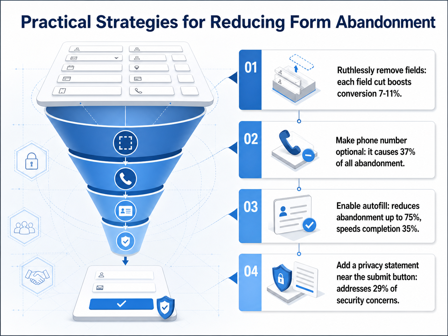 closetrace.comscalify.aiblog.pdffiller.com+22 min
 - 15Real-World Examples and Case StudiesLet's ground these principles with some real numbers. At Expedia, a single confusing field labeled "Company" was causing users to type their bank's name instead of their home address. This triggered credit card mismatches, and the field was silently costing them twelve million dollars in annual profit. Deleting it solved the problem overnight. In another case, a travel insurance form re-sequenced its questions. Moving engaging trip-planning fields above legal disclaimers lifted completed applications by sixteen percent. When we look at validation, switching from on-submit errors to inline validation on blur produced a twenty-two percent higher success rate and a forty-two percent faster completion time. And for sensitive fields like phone or budget, moving them to the end of the form reduces early abandonment before trust is built. These aren't theories. They are recoverable revenue that was hiding in plain sight. Next, we'll move from these case studies to a concrete action plan: a fourteen-day form optimization sprint you can run with your own team.
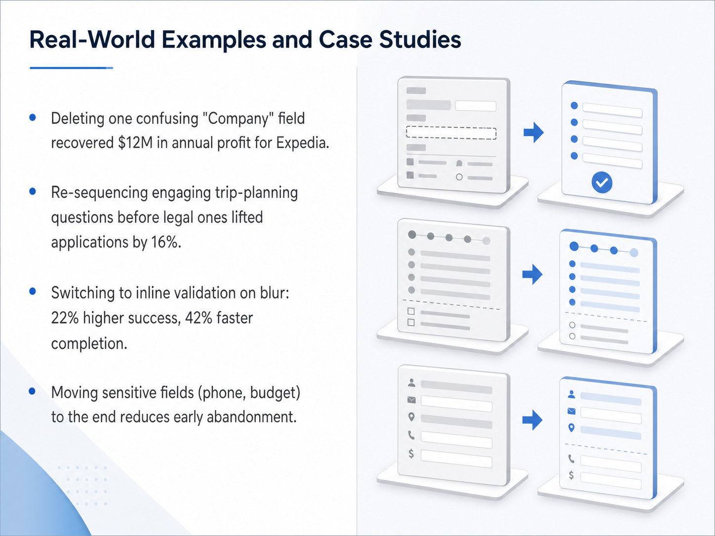 2 min
2 min - 16From Theory to Action: A 14-Day Form Optimization SprintYou’ve got the theory. Now let’s turn it into action. Here’s a 14-day sprint to transform your form.
Days one through three: instrument. Get Microsoft Clarity for session replays, and a tool like Zuko or Hotjar for field-level analytics. Let the data run until you have two hundred to five hundred sessions. That’s your baseline.
Days four through six: diagnose. Find the top three fields causing abandonment, high error rates, or long time-to-complete. Watch the replays. The biggest leak usually becomes obvious fast.
Days seven through nine: quick wins. Cut two or three fields you can defend removing. Add autocomplete attributes on every remaining field. Switch validation from submit to blur, and rewrite error messages to describe the fix. These changes alone can deliver a five to fifteen percent lift.
Days ten through twelve: A B test. Pick your highest-impact hypothesis, usually field count or single-page versus multi-step. Ship the variant and run it for at least one full business cycle before calling a winner.
Days thirteen and fourteen: mobile audit. Test the entire form on a real phone, one-handed. Check tap targets, keyboard switching, and whether the submit button stays visible above the keyboard. Fix the obvious mobile-specific issues.
Forms that follow this sprint typically see a fifteen to thirty-five percent completion lift in two weeks. The biggest gains come from cutting fields and switching to blur validation. Mobile fixes usually add another five to twelve percent on top.
You now have a repeatable, evidence-based framework for designing forms that work. Thank you for taking this course. Now, pick your highest-traffic form and start sprinting.
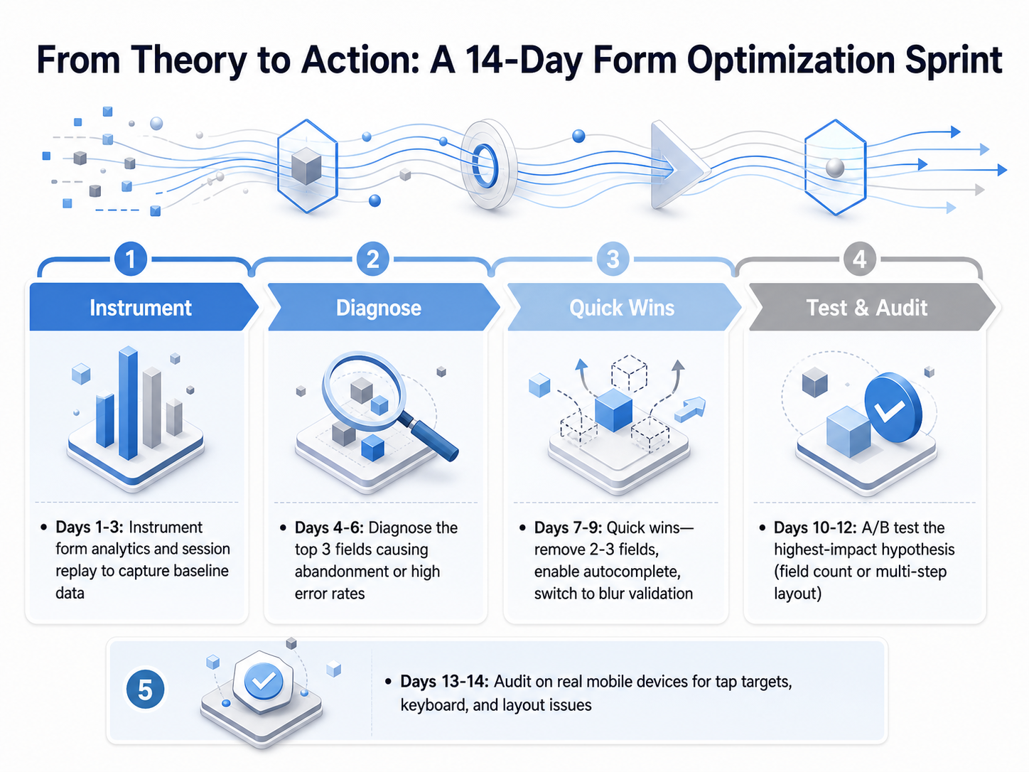 2 min
2 min
Take the deck with you
Download this course as a file — free, no sign-up needed.
- PDF handoutEvery slide page, ready to print or share.17 pages · 3.7 MBDownload
- Narrated PowerPointThe deck that presents itself — every slide carries the digital human's narration video.17 pages · 18.9 MBDownload
- PowerPoint slidesThe full deck as a .pptx — open it in PowerPoint, Keynote, or Google Slides.17 pages · 3.6 MBDownload
Free to use in your own training — please keep the PersonWise credit page at the end.
Have your own deck? Turn it into a course
Sources consulted
Web sources consulted while building this course.
- Form abandonment rate benchmarks (2026 edition) | CloseTrace — closetrace.com
- Form Abandonment Statistics and How to Fix It (2026 Data) — scalify.ai
- Online form statistics in 2026: Insights on usage - pdfFiller Blog — blog.pdffiller.com
- Form Abandonment in 2026: Why Multi-Step Forms Leak and What to Use Instead | Blog | Perspective AI — getperspective.ai
- Form Abandonment Statistics 2026 — 25+ Data Points on Why Visitors Quit Forms | roast.page — roast.page
- Designing usable web forms — doi.org
- Automatic detection of good and bad usability in web forms using eye-tracking-data — doi.org
- Online Forms: An Eye Tracking Exploration into Fixation across Three Label Alignments — doi.org
- Evaluation Approach for Web Form Usability — doi.org
- Designing usable web forms | Proceedings of the SIGCHI Conference on Human Factors in Computing Systems — dl.acm.org
- Is a Single Page Form or Multi Step Form Better for Conversion? | Zuko Blog — zuko.io
- Multi-Step vs Single-Step Forms: Which Converts Better ... — ivyforms.com
- Multi‑Step vs Single‑Page Forms: When to Use Each (with Data) — formcreatorai.com
- Multi-Step Forms Convert 300% Better (Here's When They Don't) | bionicforms — bionicforms.com
- Multi-Step Forms vs Single-Page Forms | Atticus Li — atticusli.com
- Label Placement in Forms — uxmatters.com
- Using eye-tracking to evaluate label alignment in online forms — doi.org
- Why Infield Top-Aligned Labels Beat Floating Labels — uxmovement.com
- Pattern #5: Top Aligned Labels | GoodUI — goodui.org
- Country Selection on Web Forms: A Comparison of Dropdown Menus, Radio Buttons and Text Field with Autocomplete — doi.org