Begin
16 pages · ~32 min
Interface Component Design
Learn to create dynamic interfaces using components and states to build scalable, consistent designs efficiently.
A digital instructor presents all 16 pages. Hold “Ask” at any point and ask out loud — the answer comes from this course. No sign-up needed.
What you’ll learn
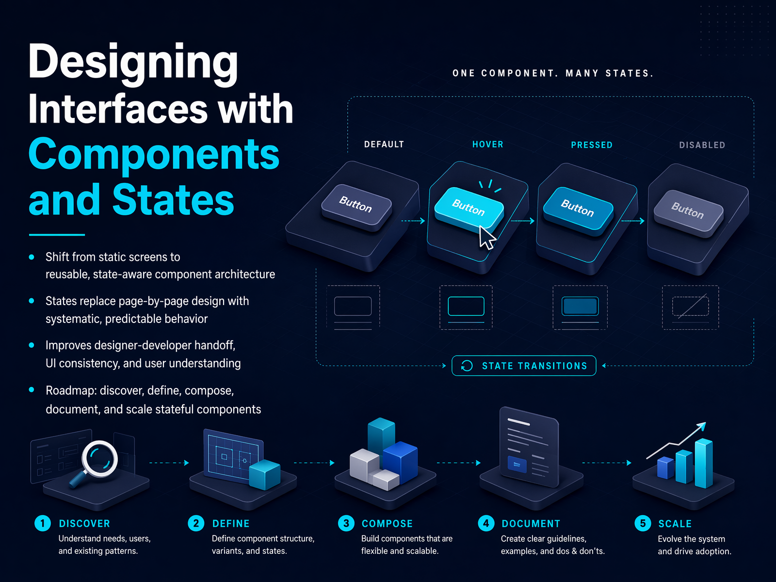
- 01Designing Interfaces with Components and StatesWelcome. Today we're moving from static screens to reusable, state-aware component architecture, and I want you to think of this as a design critique, not a lecture. We'll focus on why components and states matter for consistency, for smoother handoff, and for the user's mental model. When we treat a component as a mini state machine, we eliminate impossible-state bugs before they ship. You'll also see how this approach improves scalability, maintainability, and developer experience across teams. Our roadmap starts with discovering states, then defining them clearly, composing them into robust components, documenting the API, and scaling the system across features. Let's begin by unpacking the mental model that makes all of this work.aivoid.devqcode.inuxpin.com+21 min
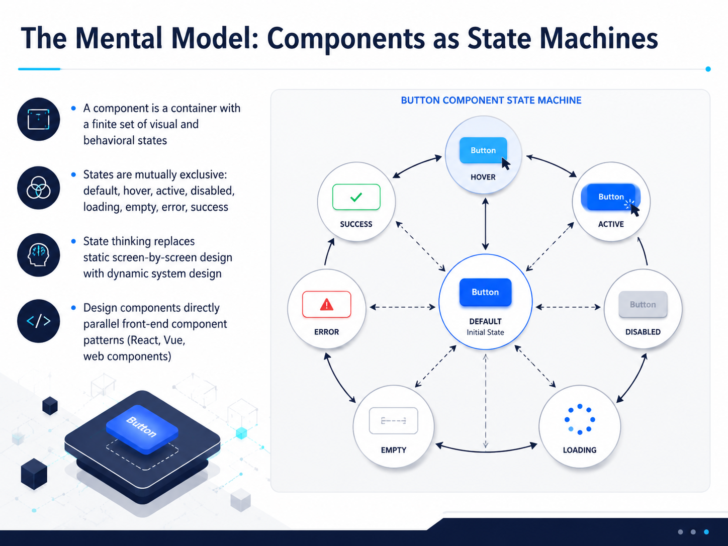
- 02The Mental Model: Components as State MachinesNow, let's lock in the mental model that makes all of this work: a component is a state machine. Think of a component as a container that holds a finite set of visual and behavioral conditions. These states are mutually exclusive. A button isn't hovering and disabled at the same time in the same way; it moves through a clear, defined list like default, hover, active, disabled, loading, empty, error, and success. When you adopt state thinking, you stop designing static screens one by one. You start designing dynamic system logic, where the interaction flow defines the visuals. Crucially, this mirrors how production front-end frameworks like React, Vue, and web components actually work. They render based on state. When your design files use the same mental model, the handoff to code becomes a direct translation, not a guessing game. That tight design-code alignment is where consistency and speed really come from. Next, we'll break down the five core interactive states you absolutely cannot skip.
 designx.coopensource.adobe.comtyrs.studio+21 min
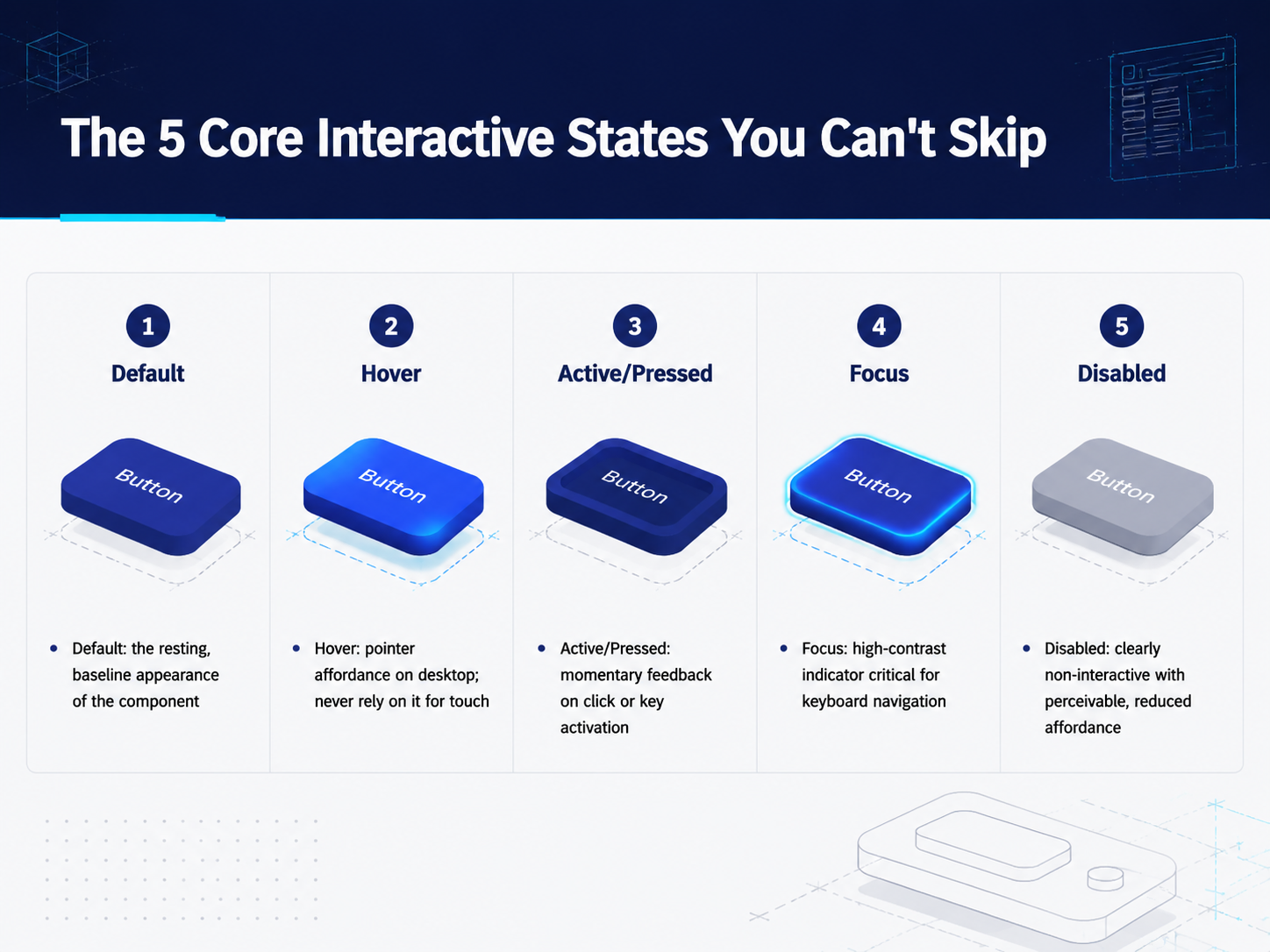
 - 03The 5 Core Interactive States You Can't SkipSo, we've established that components are dynamic. The real question is: what are the specific states we need to define, every single time? There are five core interactive states that are non-negotiable. These aren't just visual polish; they are the fundamental contract of the interface. First, we have the Default state. This is the component's resting, baseline appearance. Everything else is a departure from this. Next is Hover. This provides a pointer affordance on desktop, signaling that an element is interactive. But here's a critical rule: never rely on hover for touch interfaces. It simply doesn't exist there. Third is the Active or Pressed state. This is the momentary feedback that confirms a user's activation, like a button changing shade right when you click it. Then we have Focus, which is absolutely critical for accessibility. It's a high-contrast indicator, usually a ring or outline, that tells keyboard users exactly where they are on the page. It must be distinct from hover. Finally, Disabled is the state that clearly communicates a component is non-interactive. It typically uses lowered opacity and, crucially, provides no pointer feedback. Designing these five states upfront is what turns a static mockup into a real, usable component. Now, these are the foundational interactions, but a component's life gets more complex. Let's move on to the next slide and talk about data-driven and feedback states.
 designx.coopensource.adobe.comtyrs.studio+22 min
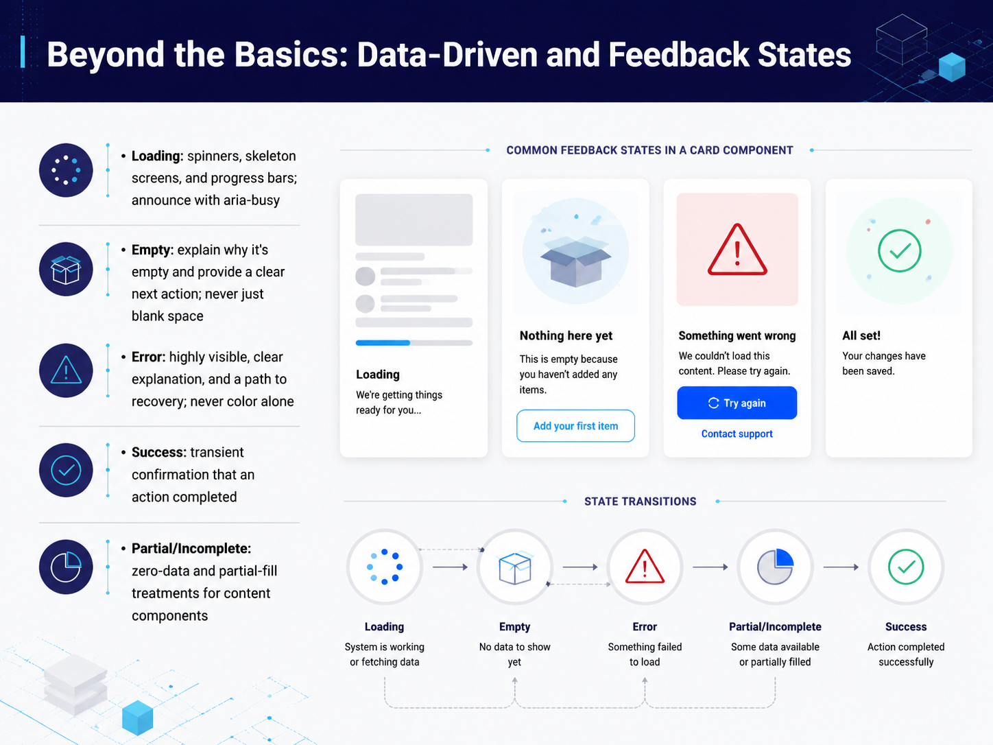
 - 04Beyond the Basics: Data-Driven and Feedback StatesSo far, we've talked about interactive states like hover and focus. Now let's go beyond the basics to cover the states driven by data and feedback. These are the moments where interfaces either build trust or break it. First, loading states. Something is happening, and your component needs to prove it. Use a spinner, skeleton screen, or progress bar, and always announce it with aria-busy for assistive technology. Next, empty states. Blank space is never acceptable. Explain why there's nothing to show, and give the user a clear next action to take. Error states are just as critical. They must be highly visible, never communicated by color alone. Provide a clear explanation and a recovery path. Success states are the opposite: a brief, transient confirmation that an action completed. They should appear, then fade away. Finally, partial or incomplete states show up in content components with zero data or partial fills. Design these treatments deliberately, so the component doesn't look broken. Each of these states is a promise to the user that the interface understands what's happening. Now, let's map those states directly to variants. Up next: The State Matrix: Crossing States with Variants.
 designx.coopensource.adobe.comtyrs.studio+22 min
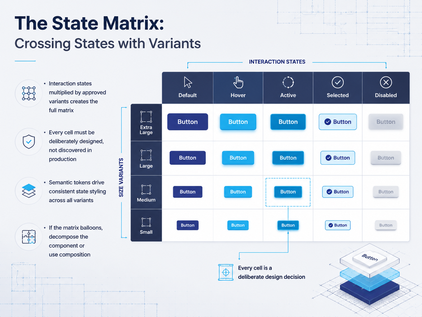
 - 05The State Matrix: Crossing States with VariantsImagine a grid. Down the left side, you list every interaction state: default, hover, focus, active, disabled. Across the top, every approved variant: primary, secondary, ghost, small, medium, large. The full matrix is the cross product of these two axes. Every single cell in that grid must be deliberately designed. It cannot be discovered in production. That means the ghost-small button doesn't just get a hover state because someone guesses—it gets a hover state because a semantic token like "color-bg-hover" resolves it systematically. When you drive the matrix with tokens, one change updates every variant consistently. But the matrix also tells you when your component is doing too much. If you find yourself staring at eighty or a hundred cells, that is a signal. It is time to decompose the component into smaller primitives, or to use composition instead of adding more props. The matrix is both a design tool and a governance checkpoint. Now, let's look at the other side of that governance signal: discovering component boundaries.
 designx.coopensource.adobe.comtyrs.studio+21 min
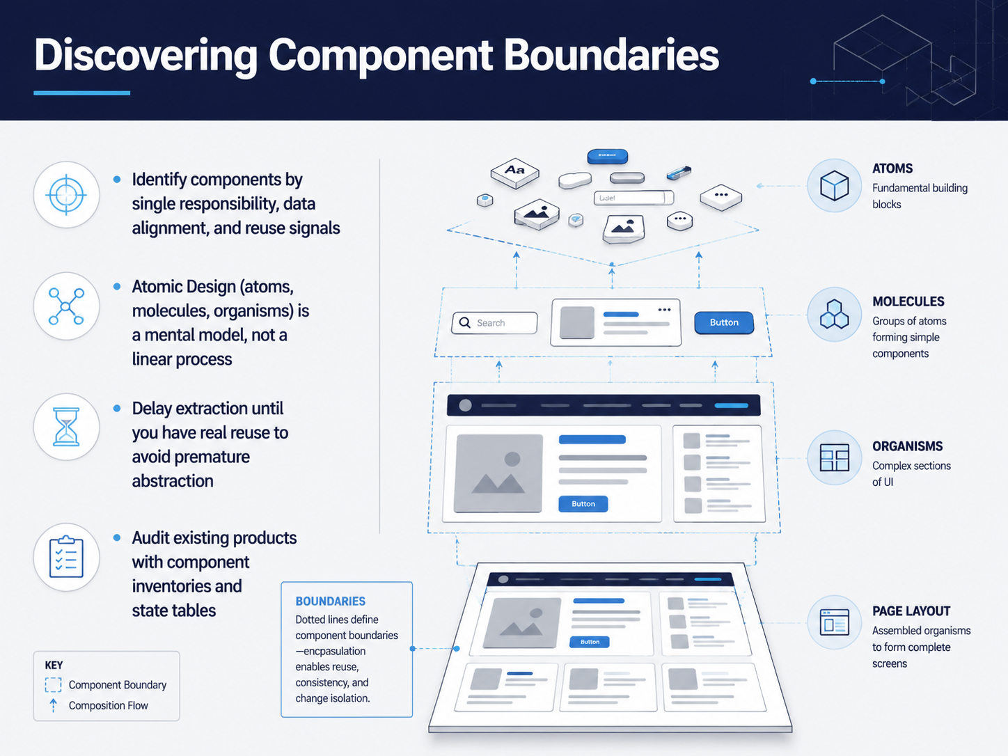
 - 06Discovering Component BoundariesDeciding where to draw component boundaries is one of the hardest parts of interface design, so let's walk through a few repeatable heuristics. First, single responsibility. If you need the word "and" to describe what a component does, split it. Second, data alignment. Your component tree should mirror the shape of your data. When your API returns a product with images and pricing, your components should map to Product, ProductImages, and ProductPricing. Third, reuse signals. When you are copying the same UI block between designs, that is a component trying to be born. But here is the critical caveat: delay extraction until you have at least two or three real instances. Premature abstraction creates indirection that fits nothing well. Fourth, complexity isolation. When a piece of UI has tangled internal state, extracting it protects the rest of the system. Atomic Design helps here, but remember it is a mental model, not a linear process. You work at all levels simultaneously, switching between detailed component work and the broader composition. Finally, a practical move: audit your existing products. Build a component inventory to find duplication and hidden patterns. The system you need is often already half-built, just not yet named. Next, we will apply this thinking to mapping states for a single component.
 docs.synapsestudios.comfeature-sliced.designvercel.com+22 min
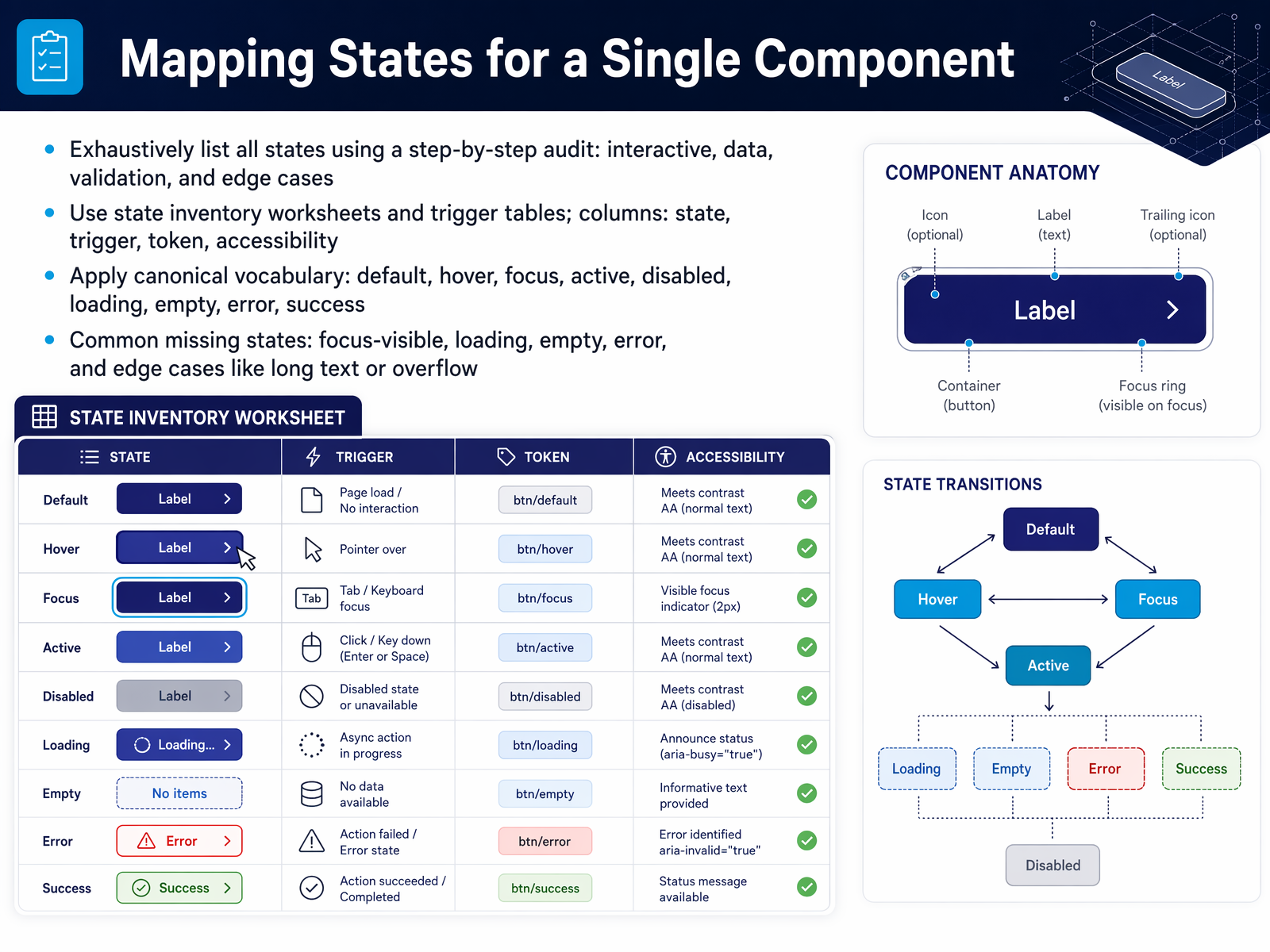
 - 07Mapping States for a Single ComponentMapping every state for a single component is where we turn a static mockup into a real interface. Start by exhaustively listing states: default, hover, focus, active, disabled, loading, empty, error, and success. Don't stop at the happy path. The states most commonly missed are focus-visible, loading, empty, and error, and these are the ones that cause the most production bugs. Use a state inventory worksheet. Pair each state with its trigger event. For example, hover is triggered by a pointer entering the component. Focus is triggered by keyboard navigation. Loading is triggered by an async action. This pairing makes the behavior explicit and testable. Adopt a canonical vocabulary. When design and engineering both call the disabled state "disabled," the handoff is seamless. The word "inactive" or "grayed out" means different things to different people. Standard names prevent that drift. The payoff is a component that behaves predictably in every context. Up next, let's look at how those states connect through transitions and lifecycles.
 designx.coopensource.adobe.comtyrs.studio+21 min
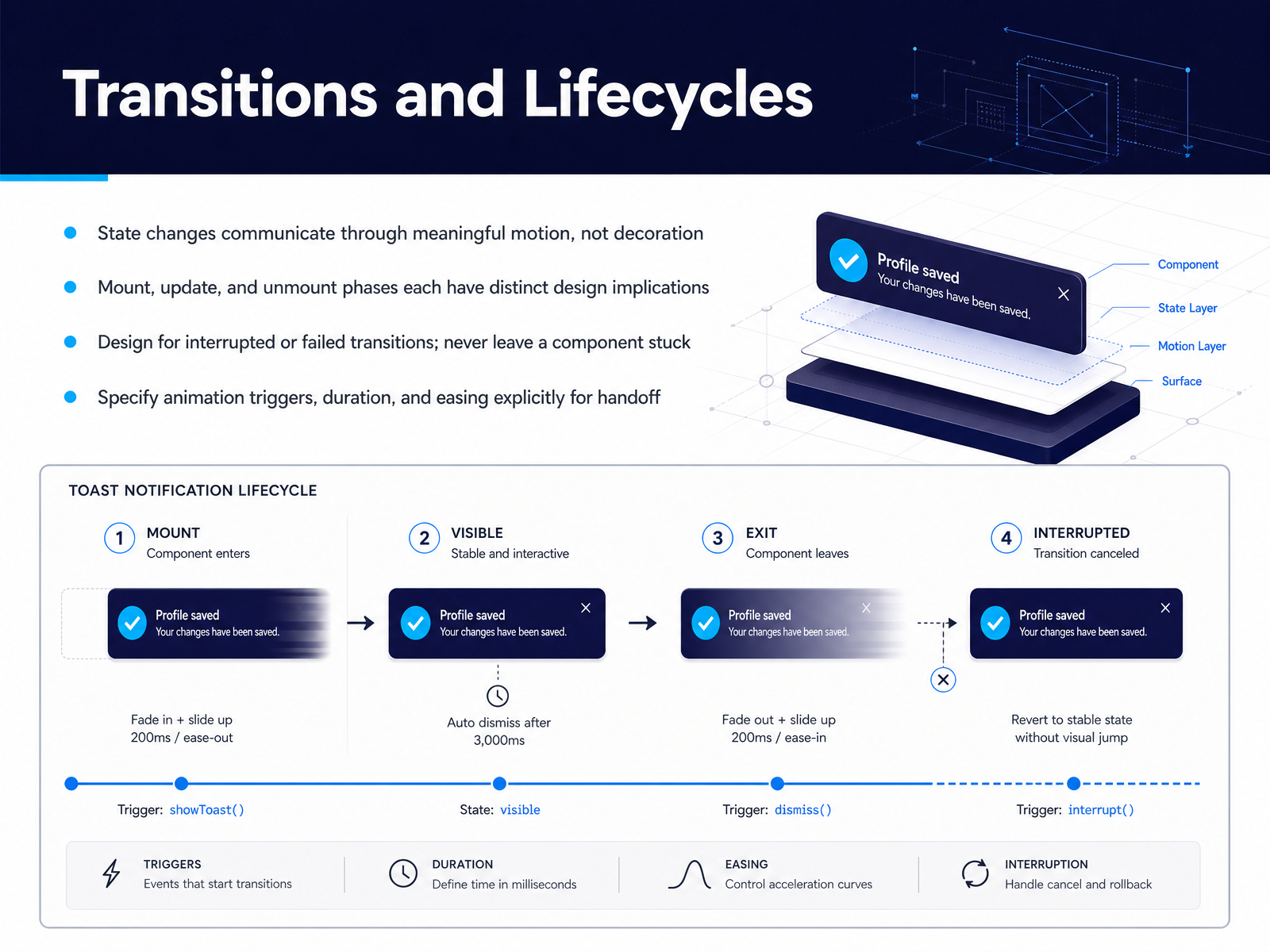
 - 08Transitions and LifecyclesLet's talk about motion and the moment a component arrives or leaves. State changes need meaningful motion, not decorative animation. A menu opening should feel like it unfolds from the trigger, not just appear. That motion tells the user where the menu came from and where to find it again. Think about the component lifecycle. When a component mounts, it might fade in. When it updates, a value might subtly pulse. When it unmounts, it slides away. Each phase carries a design implication. Now, what happens if a user clicks a button, a transition starts, and then they click again before it finishes? Design for interrupted or failed transitions explicitly. If a dismiss animation gets cut off, does the UI reset cleanly? Define that behavior. To make all of this buildable, specify your animation triggers, duration, and easing in your handoff notes. Instead of writing 'add a smooth open,' write 'triggered by click, opacity 0 to 1, duration 200 milliseconds, ease-out.' This precision puts you and your engineer on the same side of the spec, not guessing. Next, let's explore composing these components into full interfaces.
 uxguides.comfigma.comdocsio.co+22 min
 - 09Composing Components into InterfacesNow let's talk about how these components actually work together to form whole interfaces. Components don't sit in isolation—they nest and communicate through parent-child boundaries. The key principle here is to design for composition over configuration. Instead of one monolithic component with thirty props, you create slots, use the children pattern, and build compound components that share state through context. This directly avoids two big problems: prop explosion, where every new use case forces another boolean onto the API, and state duplication, where the same logic gets copied across specs. Think of compound components like a set of cooperating parts—a parent owns the state, and children tap into it implicitly. The consumer gets full control over structure without ever wiring up the shared behavior manually. That explicit, composable structure is what keeps interfaces flexible as they scale. Next, we'll look at slot-based design and composition patterns in practice.
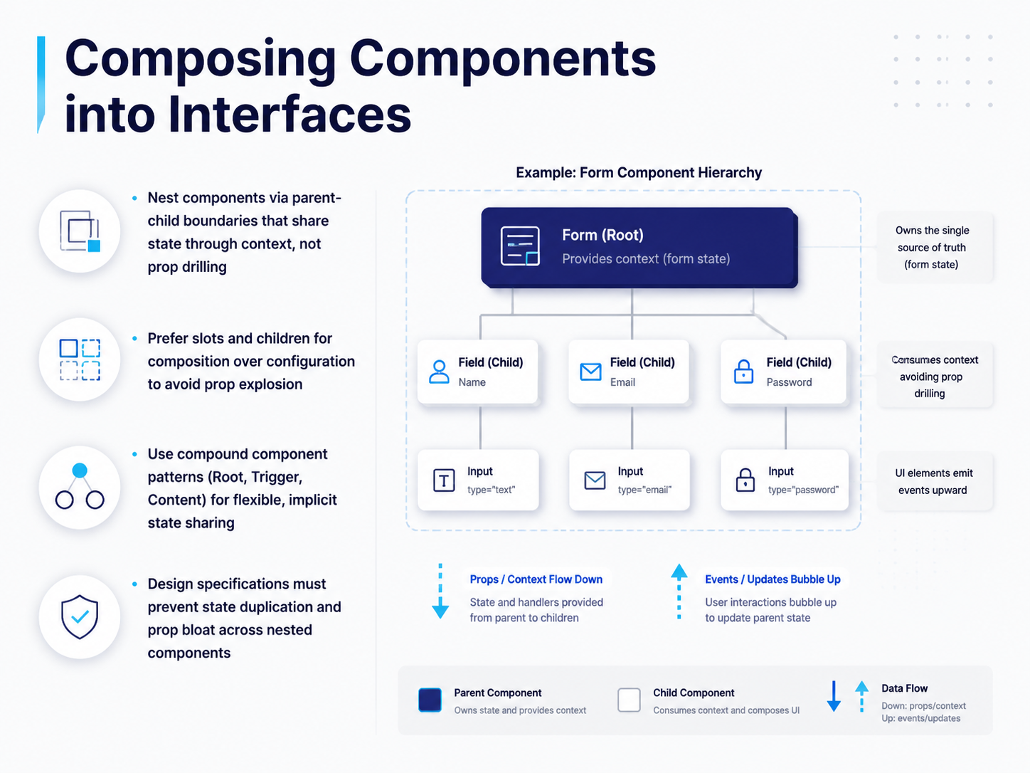 sujeet.provercel.comdocs.synapsestudios.com+21 min
 - 10Slot-Based Design and Composition PatternsNow let's talk about slot-based design and composition patterns. Think of this as the difference between giving someone a fully assembled product versus giving them a set of building blocks they can arrange themselves. Slot-based APIs give consumers full control over what goes inside a component, while the component itself handles layout, spacing, and accessibility. Prop-based APIs work well for simple variants, like a button with primary or secondary styling. But when you need complex, nested customizations, slot-based patterns win. Consider a dialog: you might need a custom header, a scrollable body, and a footer with multiple action buttons. A slot-based approach lets consumers compose those pieces freely. Another powerful pattern is headless components, which separate logic from presentation entirely. The component manages state, keyboard navigation, and ARIA attributes, but you supply the visual appearance. Finally, consistent naming conventions make these patterns predictable. Use names like Root, Trigger, Content, Header, Footer, Title, and Description. These conventions create a shared vocabulary across your design system. Next, we'll explore how to document components and states for smooth handoff to developers.
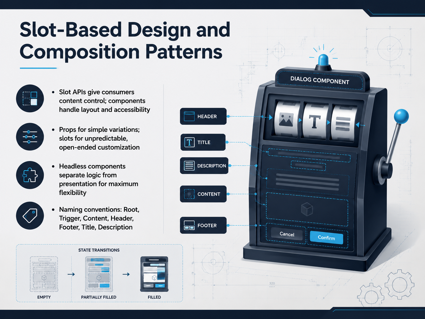 sujeet.provercel.comdocs.synapsestudios.com+22 min
 - 11Documenting Components and States for HandoffSo how do we actually package all this state thinking and component logic for the people who build it? It starts with a structured handoff. Developers don't just need a pretty picture. They need every state, the component mapping, interaction details, responsive behavior, and data requirements. Miss one of those, and you get questions mid-sprint that slow everything down. Structure your documentation with a clear purpose, an anatomy diagram, props, states, variants, clear dos and don'ts, and accessibility notes. Think of Figma annotations as your design specs—perfect for showing spacing, layout, and edge case behavior. Storybook is the developer's live code playground where they can see the component in isolation and toggle its props. And if your team is large enough that people keep asking the same questions, Zeroheight acts as the bridge, pulling Figma frames and Storybook stories into a single shared site. Before you mark that file as ready, run a quick checklist. Are all states complete? Is focus visible? Are edge cases annotated? And did you do one final contextual review on a real screen, not just the isolated component? That last pass is where you catch the surprises. Now, let's look at how we align design and development to close that gap.
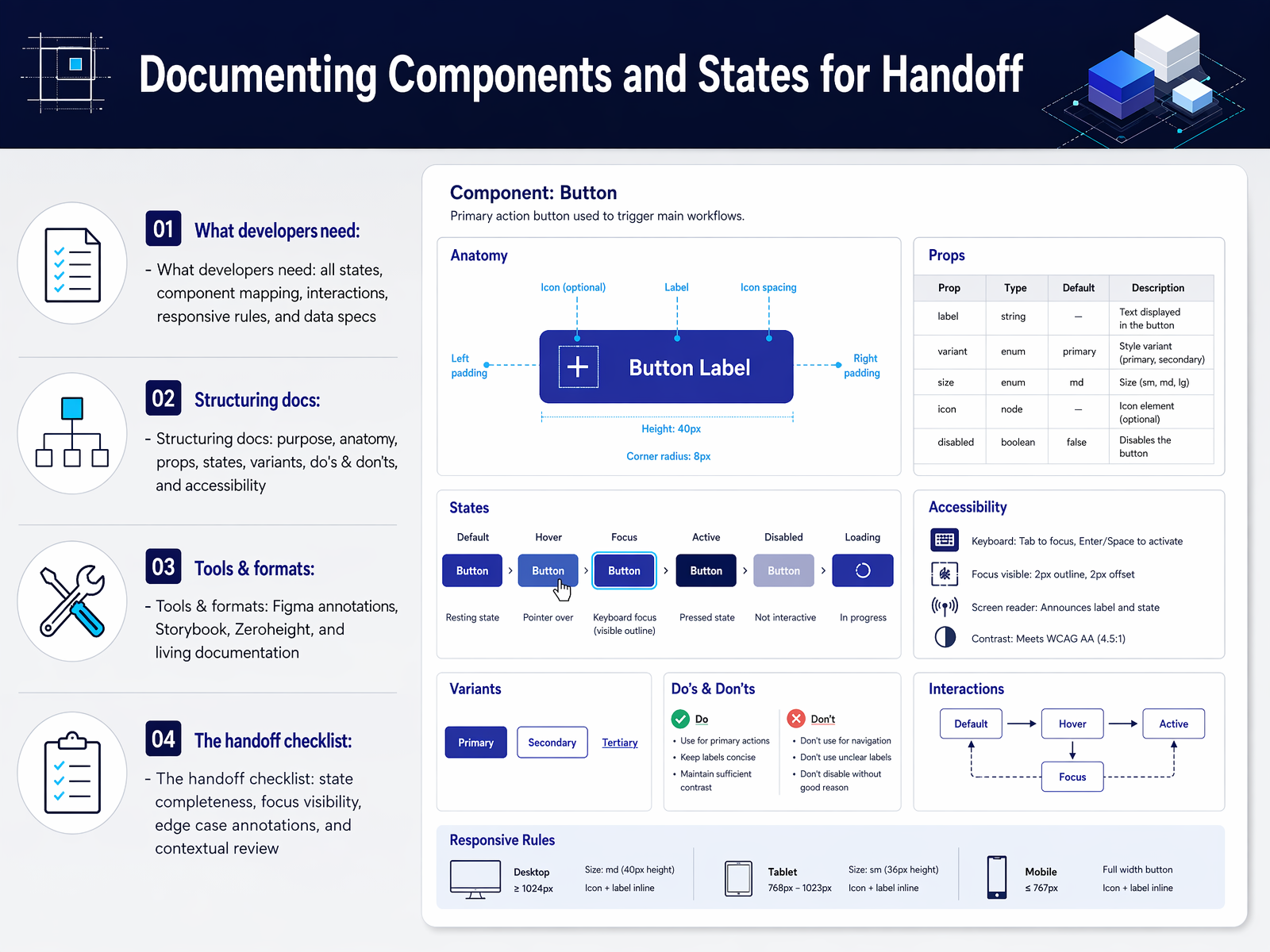 uxguides.comfigma.comdocsio.co+21 min
 - 12Figma to Code: Aligning Design and DevelopmentAlignment between Figma and code is what turns a beautiful component into a buildable one. The goal is to make the logic inspectable, so nothing gets lost in translation. Start with Figma Dev Mode, but use it deliberately. Expose variables so developers see token names, not raw hex values. Structure variants and properties so that state logic is visible, not hidden. If a developer has to reverse-engineer your component's behavior, the handoff has already failed. Next, annotate with intention. Focus on what the pixels don't show—focus order, interaction precedence, overflow rules, and edge cases. Don't waste time narrating the obvious. Finally, link Figma components directly to Storybook stories. This creates a single source of truth, where design and code reflect the same component. When that one-to-one relationship exists, the developer knows exactly what to reach for. Now, let's look at how to verify that behavior actually works by testing components.
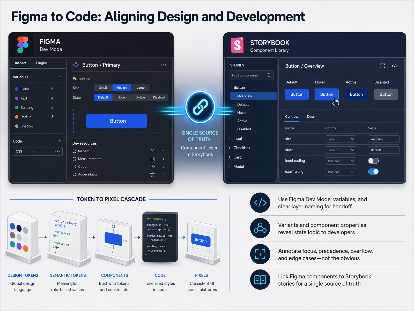 uxguides.comfigma.comdocsio.co+21 min
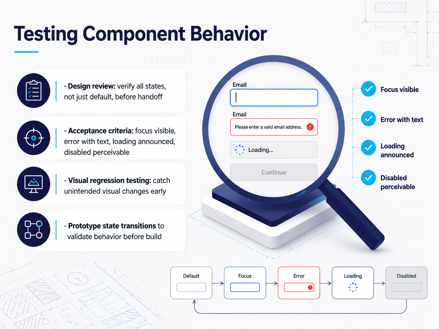
 - 13Testing Component BehaviorNow we shift to testing component behavior. Testing is not a handoff checkbox, it is where we prove that every state we designed actually works. Start with design review. Before you hand a component to engineering, walk through the state set together. Does focus have a visible treatment? Is the error state paired with real text, not just a red border? Is loading announced to screen readers, and is the disabled state still perceivable? These are your acceptance criteria, and they should be explicit before a single line of code is written. Beyond the review, visual regression testing catches unintended visual changes across releases, so a padding fix on a card doesn't silently break a button. And prototypes are your fastest validation layer. Use them to stress-test state transitions and edge cases before the build starts. A quick prototype run can surface focus-logic problems or loading-sequence gaps that cost far more to fix later. A quick thought on the next topic: testing proves the component works, but accessibility requirements define what working really means.
 uxguides.comfigma.comdocsio.co+22 min
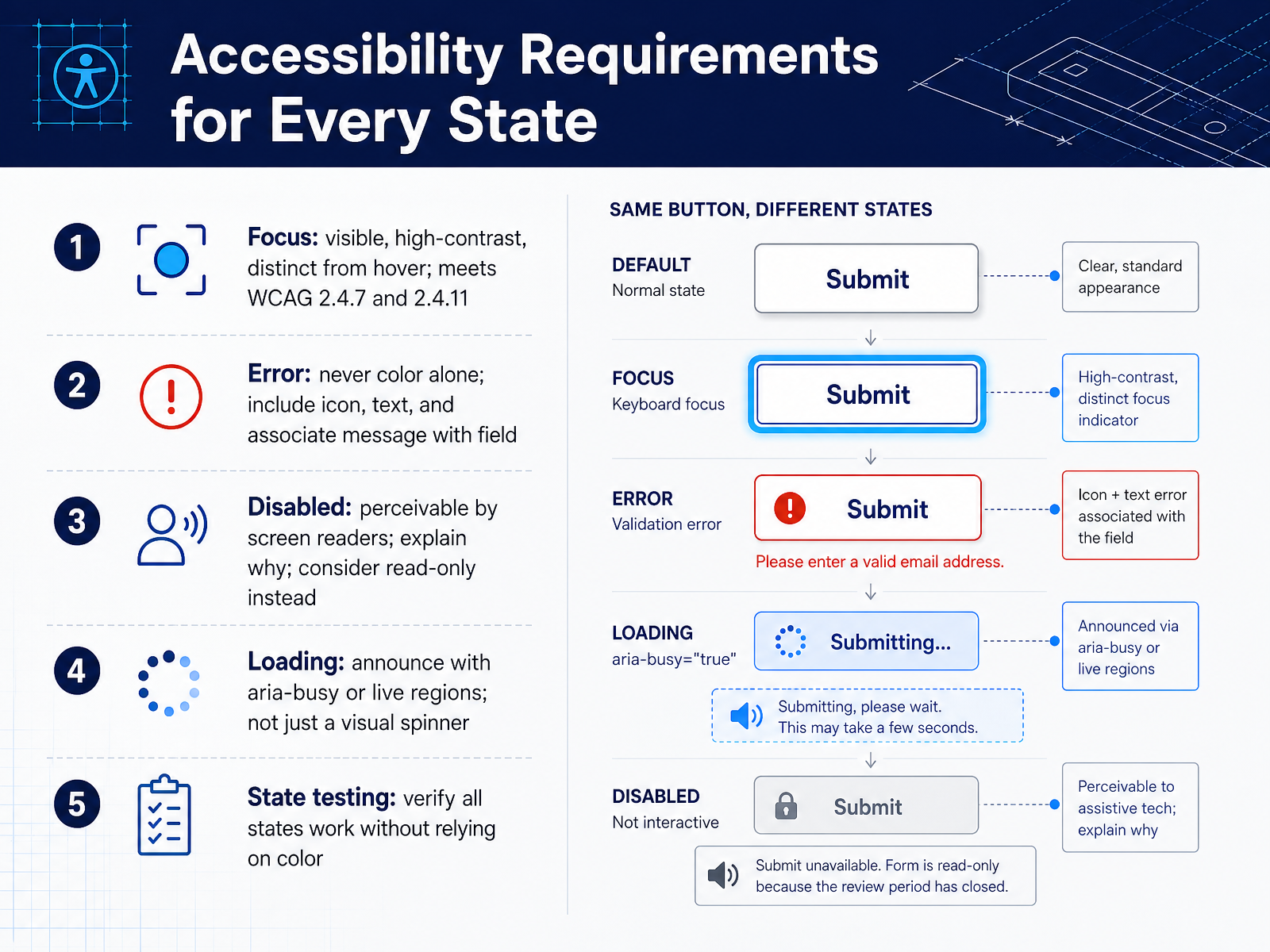
 - 14Accessibility Requirements for Every StateLet's ground every state we've discussed in specific accessibility requirements. First, focus. Every interactive component needs a visible focus indicator with at least a three-to-one contrast ratio against adjacent colors. It must be distinct from hover. This is not optional. It is WCAG two point four point seven and two point four point eleven. Next, error states. Never communicate an error with color alone. Always pair the visual treatment with an icon, a clear text message, and a programmatic link from the message to the field. For disabled states, the component must remain perceivable to screen readers. Explain why the control is disabled, and whenever possible, prefer a read-only state that keeps the content accessible. For loading states, a visual spinner is not enough. Announce the busy state using aria-busy or a live region so assistive technology knows work is in progress. Finally, test every state without relying on color perception. Verify that focus, error, disabled, and loading are all understandable when viewed in grayscale or through a screen reader. That moves us into the final piece: scaling these practices to design systems.
 designx.coopensource.adobe.comtyrs.studio+22 min
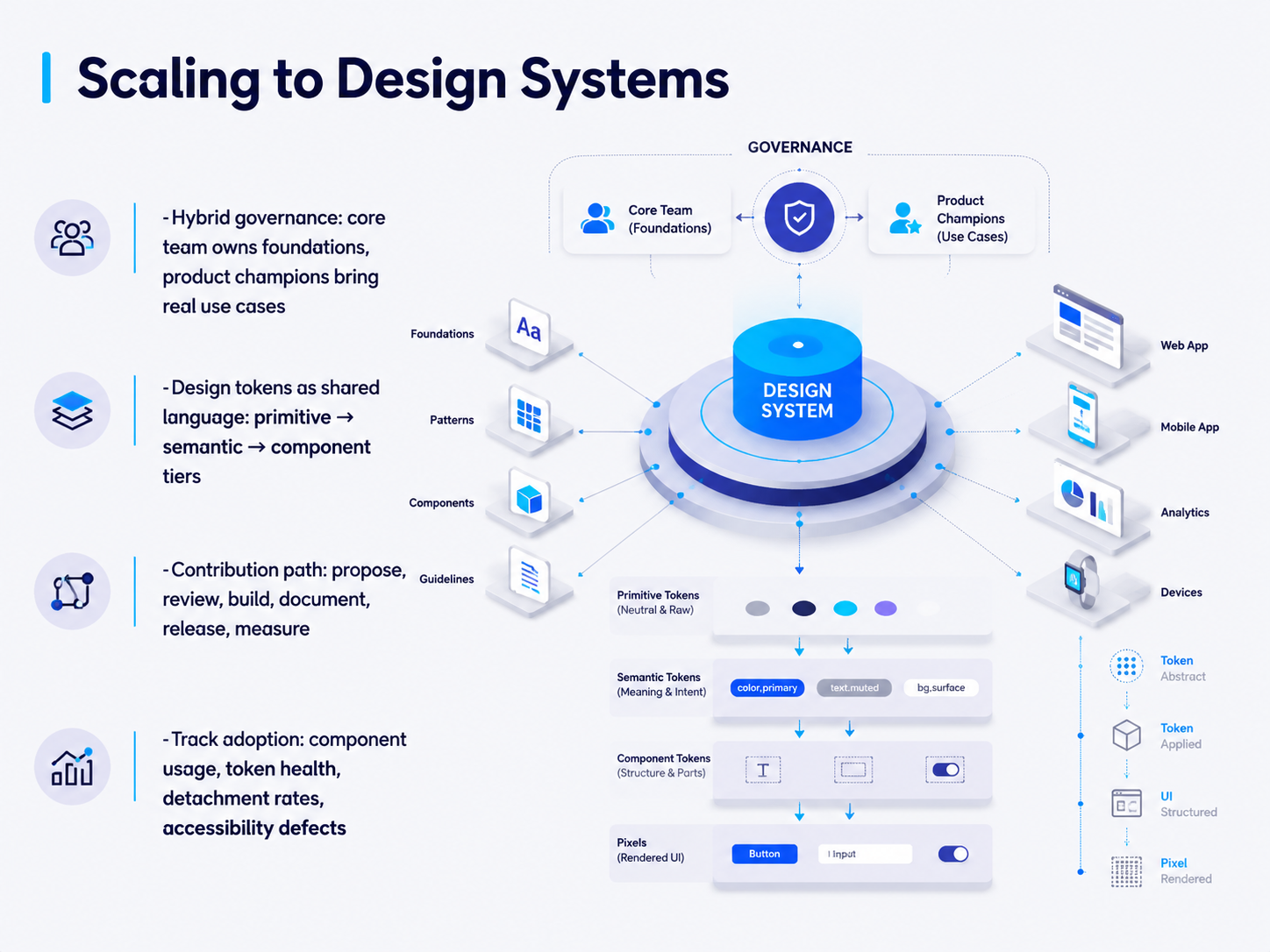
 - 15Scaling to Design SystemsSo far we've focused on designing individual components with clear states. Now let's talk about what happens when you scale that thinking across an entire design system. The same component-and-state discipline doesn't just apply to a single button or input. It extends to every component in your library, and the system itself needs governance to stay coherent. You need a shared language for design decisions, and that's where design tokens come in. They work in three tiers: primitive tokens like raw color values, semantic tokens that describe intent, and component tokens that map directly to the parts of your interface. This gives everyone a single source of truth. Next, you need to define who owns what. Governance means deciding who approves new components, who can change a token, and how exceptions get handled. An exception without an owner and an expiry date is just future technical debt. Finally, you measure what matters. Track adoption rates, component usage, how often teams detach from the system, and accessibility defects. If you can't measure it, you can't improve it. On the next slide, we'll walk through a practical workflow to take these ideas from concept to implementation.
 designx.coopensource.adobe.comtyrs.studio+22 min
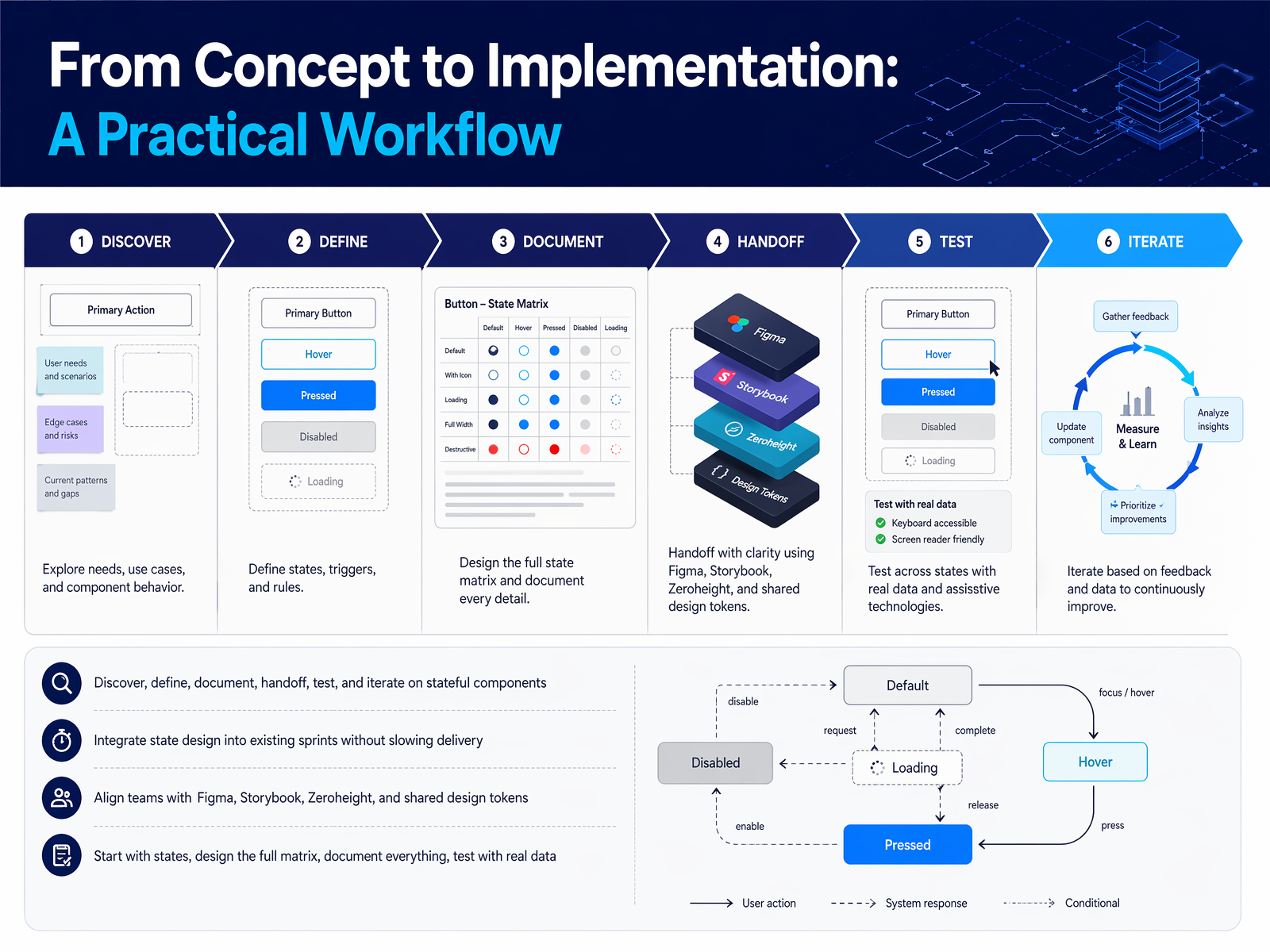
 - 16From Concept to Implementation: A Practical WorkflowLet's pull everything together into a workflow you can start using tomorrow. The rhythm is simple: discover your components, define every state they can be in, then document, handoff, test, and iterate. Don't treat state design as a separate phase. Weave it into your existing process so it adds clarity without slowing the team down. Align your tools to create a single source of truth. Figma for design specs, Storybook for the live code playground, and Zeroheight to bridge them with usage guidelines. When they all point to the same component, developers stop guessing. The practical sequence goes like this: start with states before visual polish, design the full state matrix so nothing ships incomplete, document the when-to-use and when-not-to-use, test with real data and edge cases, and scale through governance. Give every component an owner, a contribution path, and a release cadence. That's how a component library becomes a platform teams trust. Thank you for spending this time together. Go build components that handle every state gracefully.
 uxguides.comfigma.comdocsio.co+22 min
Take the deck with you
Download this course as a file — free, no sign-up needed.
- PDF handoutEvery slide page, ready to print or share.17 pages · 3.7 MBDownload
- Narrated PowerPointThe deck that presents itself — every slide carries the digital human's narration video.17 pages · 17.6 MBDownload
- PowerPoint slidesThe full deck as a .pptx — open it in PowerPoint, Keynote, or Google Slides.17 pages · 3.6 MBDownload
Free to use in your own training — please keep the PersonWise credit page at the end.
Have your own deck? Turn it into a course
Sources consulted
Web sources consulted while building this course.
- Chapter 4: Component Architecture: Composition, Patterns, and Best Practices · AI VOID — aivoid.dev
- React System Design & Architecture: The Complete 2026 Guide – QCode — qcode.in
- Component-Based Design: Complete Implementation Guide | UXPin — uxpin.com
- React Design Patterns: Complete Guide (2026) | TurboDocx — turbodocx.com
- React Component Design Patterns Explained (With Simple Analogies) — Depender Sethi — sethi.io
- Design System Governance Enterprise Guide - DesignX — designx.co
- State model | Spectrum Design Data — opensource.adobe.com
- Component States and Variants — UX Wiki — tyrs.studio
- The State Problem: How to Design (and Build) Components That Change | by Roberto Moreno Celta | Design Systems Collective — designsystemscollective.com
- Design System Governance: A Guide to Prevent Drift | UXPin — uxpin.com
- Compositional UI | Synapse Studios Standards — docs.synapsestudios.com
- Secrets of a Scalable Component Architecture | Feature-Sliced Design — feature-sliced.design
- https://vercel.com/academy/shadcn-ui/compound-components-and-advanced-composition — vercel.com
- Component Library Architecture and Governance — Sujeet Jaiswal - Principal Software Engineer — sujeet.pro
- Designing with Layers | Component Standards — darianrosebrook.com
- How to Document UI Components: A Practical Guide | UIGuides — uxguides.com
- Guide to developer handoff in Figma — figma.com
- Design System Documentation: A Practical Guide for 2026 | Docsio — docsio.co
- How to Hand Off Designs to Developers | UIGuides — uxguides.com
- Developer Handoff: Tools, Templates, Playbook | Figr — figr.design