Begin
10 pages · ~20 min
UI Design Core Skills
This training builds core UI design skills for designers and developers, covering essential principles and hands-on practice to create effective user interfaces.
A digital instructor presents all 10 pages. Hold “Ask” at any point and ask out loud — the answer comes from this course. No sign-up needed.
What you’ll learn
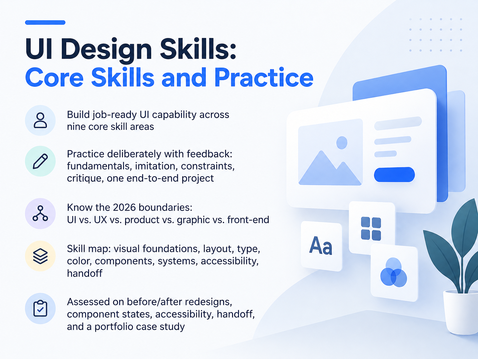
- 01UI Design Skills: Core Skills and PracticeWelcome. I'm glad you're here. This course builds job-ready UI design capability across nine core skill areas. Here's the goal: you leave with work you can defend in a portfolio review, not just pretty screens. First, know the 2026 boundaries. UI is the interface itself: layout, type, color, states. UX covers research, flows, and validation. Product design adds strategy and outcomes. Graphic design leans on brand and print. Front-end turns designs into code. Next, the skill map. Visual foundations. Layout. Typography. Color. Components. Design systems. Accessibility. Handoff. You practice deliberately with feedback: fundamentals, imitation, constraints, critique, then one end-to-end project. This will feel slow at first. That's normal. Employers screen for process, not polish. At this point, look at how you'll be assessed: before-and-after redesigns, component states, accessibility checks, handoff documentation, and one portfolio case study. Start by downloading the skill map and picking your weakest column. Be honest. Then we'll look at how the field has shifted in 2026. How UI Practice Has Changed by 2026.webflow-lp.coursecareers.comwebflow-lp.coursecareers.comcoursecareers.com+22 min
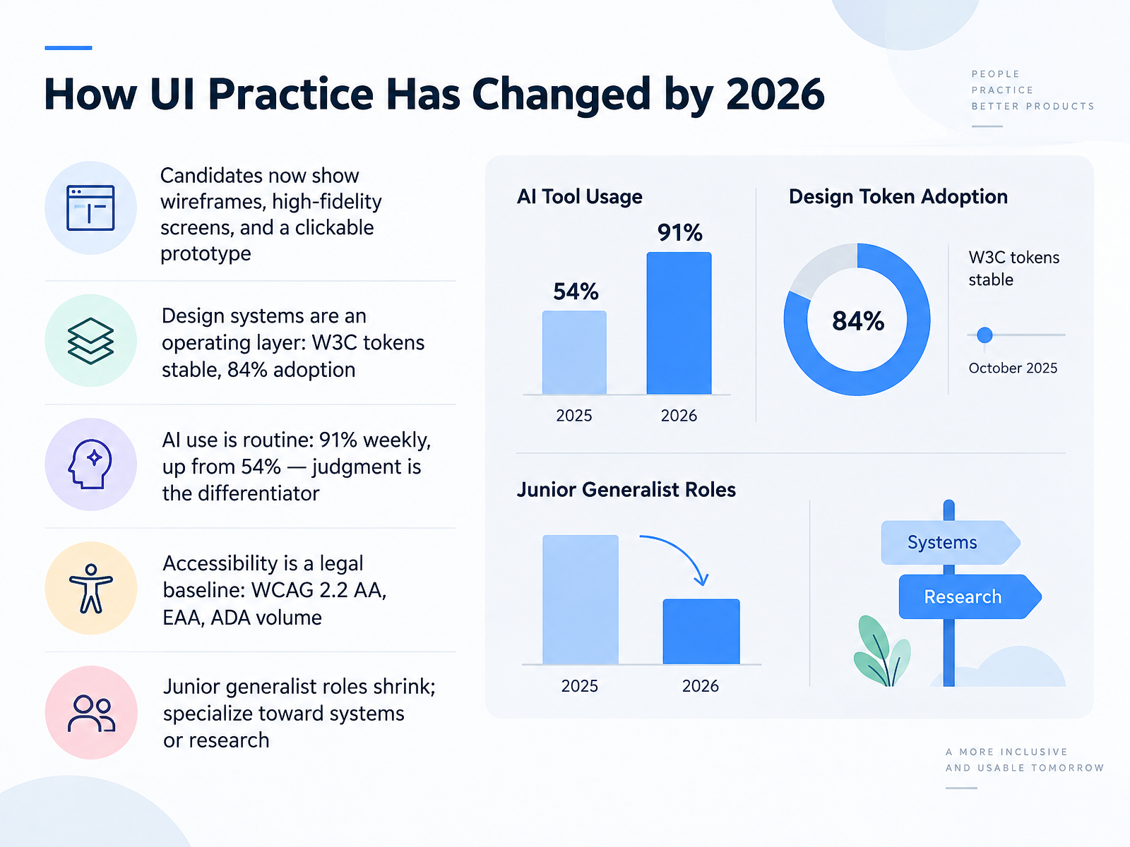
- 02How UI Practice Has Changed by 2026Let's look at how UI practice has actually shifted by twenty twenty-six. First, what you show in a portfolio has changed. Candidates now present wireframes, high-fidelity screens, and a working clickable prototype. Second, design systems moved from nice-to-have to operating layer. The W3C token spec is stable, and adoption hit eighty-four percent. Third, AI is routine. Ninety-one percent of designers use it weekly, up from fifty-four percent. The differentiator is no longer whether you use it, but how you judge and correct its output. Fourth, accessibility is a legal baseline. Think WCAG two point two double A, the European Accessibility Act, and rising ADA case volume. Fifth, junior generalist roles are shrinking. Growth sits in systems and research, so pick a lane and go deep. Next, we get concrete with visual foundations: hierarchy, layout, and spacing.
 webflow-lp.coursecareers.comwebflow-lp.coursecareers.comcoursecareers.com+22 min
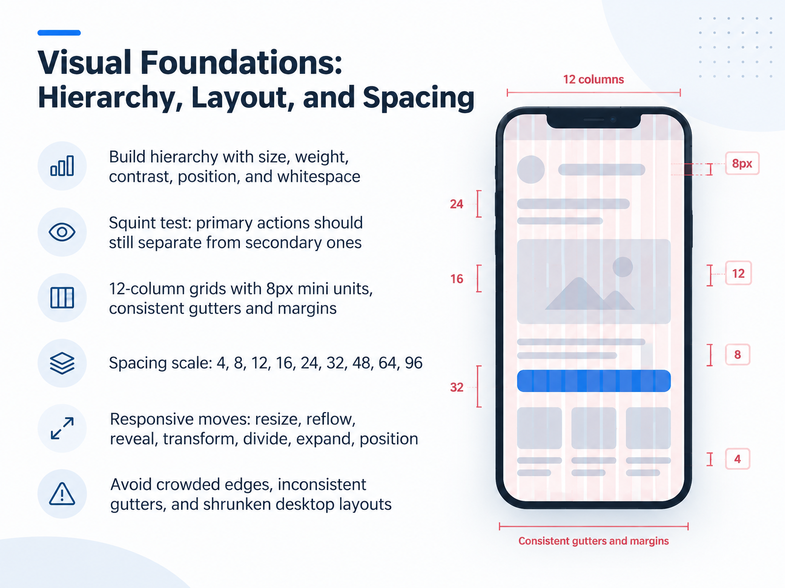
 - 03Visual Foundations: Hierarchy, Layout, and SpacingNow let's talk visual foundations: hierarchy, layout, and spacing. Start by building hierarchy with size, weight, contrast, position, and whitespace. Next, run the squint test. Blur your eyes. Primary actions should still separate clearly from secondary ones. If they blend together, increase the contrast. At this point, set up your grid. Use twelve columns with eight-pixel mini units, and keep gutters and margins consistent. Then reach for a spacing scale: four, eight, twelve, sixteen, twenty-four, thirty-two, forty-eight, sixty-four, ninety-six. This will feel slow at first, but it removes guesswork during handoff. When screens resize, apply responsive moves: resize, reflow, reveal, transform, divide, expand, and reposition. Finally, watch for common failures: crowded edges, inconsistent gutters, and shrunken desktop layouts. Fix those three and your work will survive review. Next, we move into typography and color in interface contexts.
 fluent2.microsoft.designdesignsystems.comdeveloper.android.com+22 min
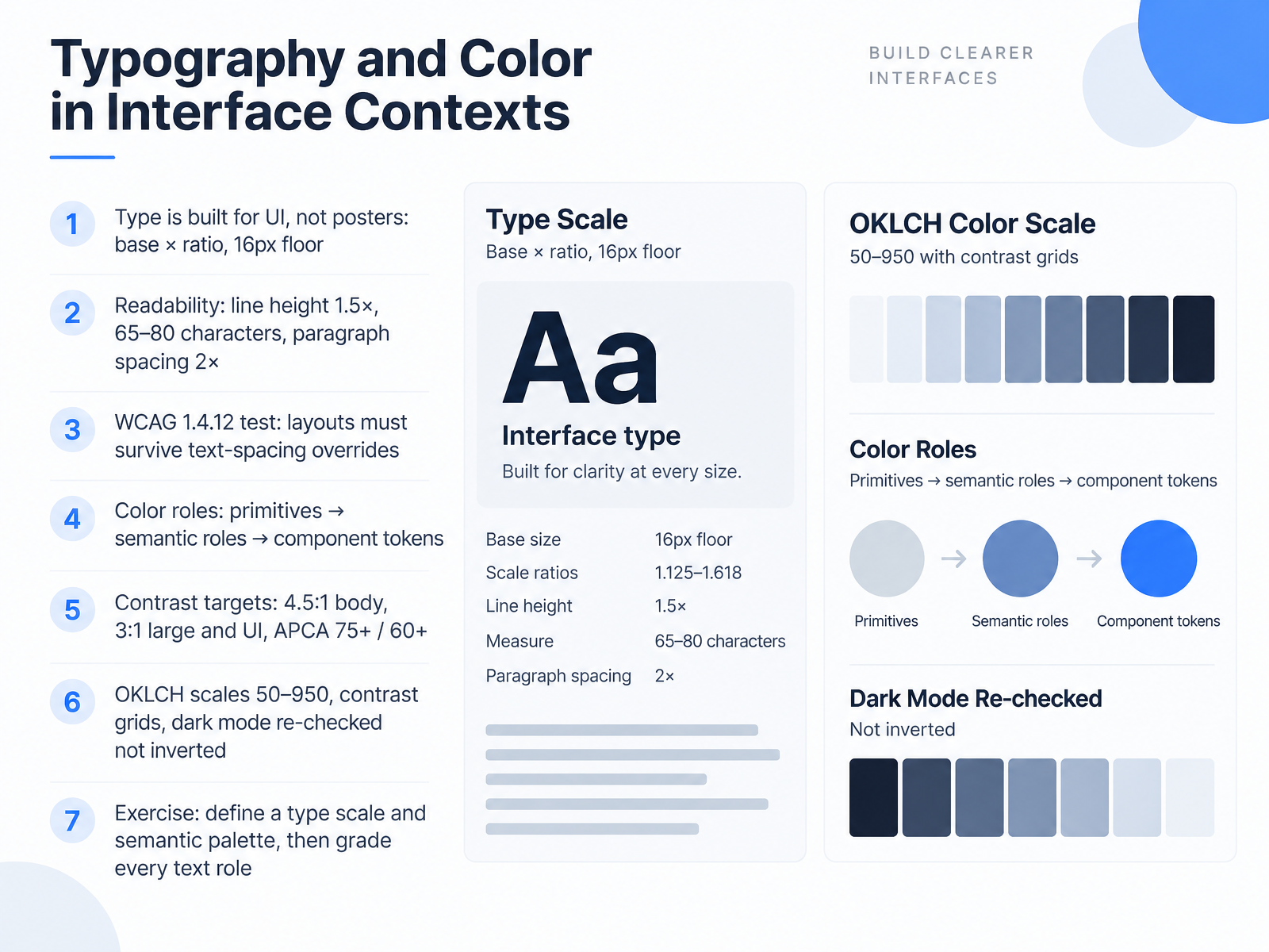
 - 04Typography and Color in Interface ContextsNext, we're moving into typography and color in interface contexts. Here's the core idea. Type is built for the UI, not for posters. Start with a base size and a ratio, say sixteen pixels times one point two five. That gives you every step in the scale. Keep sixteen pixels as your floor for body text. For readability, set line height at one point five times the font size. Keep line length between sixty five and eighty characters, and make paragraph spacing twice the font size. Now test this. WCAG 1.4.12 says your layout must survive text spacing overrides. If you're using Figma, toggle those values on and watch for clipped or overlapping text. Then move to color. Build roles in three layers. Primitives first, then semantic roles, then component tokens. Never hard code raw hex in a component. For contrast, target four point five to one for body text and three to one for large text and UI elements. APCA is the newer model. Aim for seventy five or higher on body text and sixty or more on large text. Build your scales in OKLCH from fifty to nine fifty. Use a contrast grid to check every pairing at once. And for dark mode, re-check every pairing. Do not just invert the light theme. That almost always breaks contrast. Your exercise for this section, define a type scale and a semantic palette, then grade every text role against its background. This will feel slow at first, but it catches the failures before review does. Let's move on to components, states, and interaction design.
 accessibility.buildzepixo.comaccessibility.build+22 min
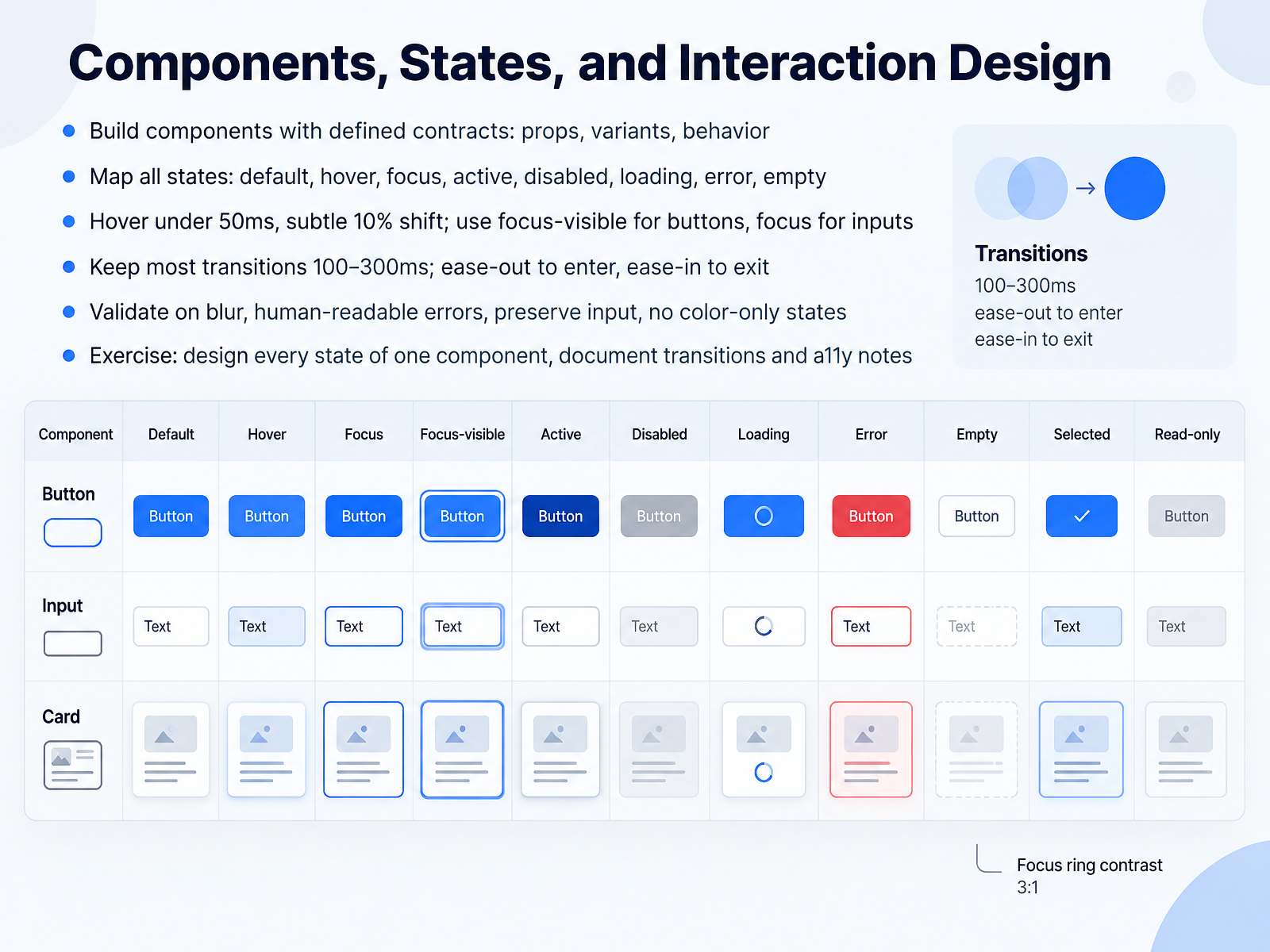
 - 05Components, States, and Interaction DesignNow let's talk about components, states, and interaction design. Start by giving each component a clear contract. Define its props, its variants, and how it behaves. If the contract is vague, your handoff will be vague too. Next, map every state. Default, hover, focus, active, disabled, loading, error, and empty. Skip one, and someone downstream will invent it badly. For timing, keep hover feedback under fifty milliseconds with a subtle ten percent shift. Use focus-visible for buttons, but plain focus for inputs. Keep most transitions between one hundred and three hundred milliseconds. Ease-out to enter, ease-in to exit. On validation, check on blur, write human-readable errors, and always preserve what the user typed. Never signal state with color alone. Your exercise: take one component and design every state. Document the transitions and the accessibility notes. That documentation is what survives review. Next, we'll look at design systems, tokens, and scalable consistency.
 delldesignsystem.compresetai.devgithub.com+22 min
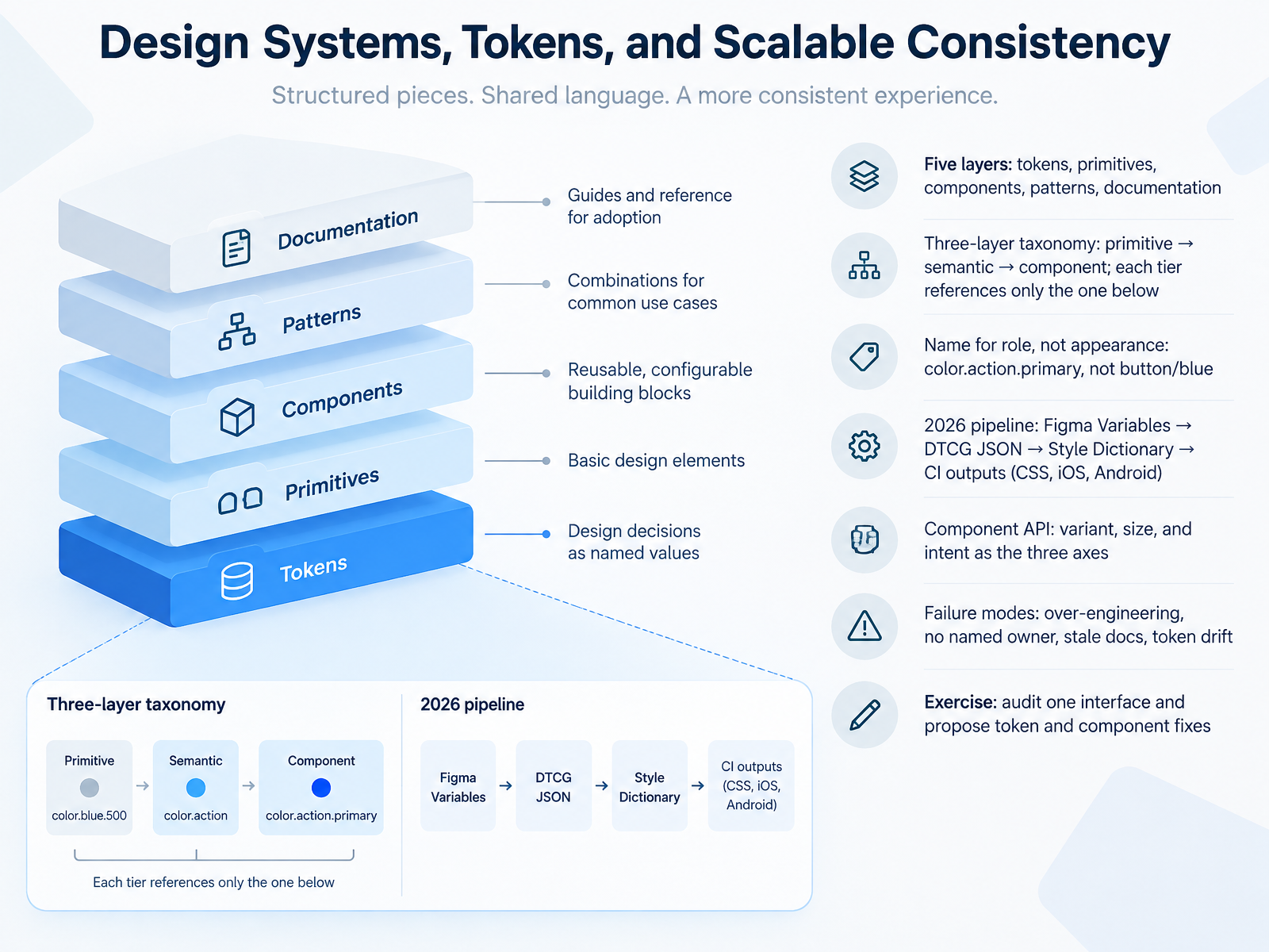
 - 06Design Systems, Tokens, and Scalable ConsistencyLet's talk about design systems, tokens, and scalable consistency. A mature system has five layers: tokens, primitives, components, patterns, and documentation. Tokens follow a strict three-layer taxonomy: primitive, then semantic, then component. Each tier references only the layer below it. So blue five hundred points to color dot action dot primary, which points to button background primary. Name for role, not appearance. Color dot action dot primary, not button slash blue. That one habit makes rebrands a one-line change. The 2026 pipeline is settled. Figma Variables export DTCG JSON, Style Dictionary transforms it, and CI emits CSS, iOS, and Android. For component APIs, use three axes: variant, size, and intent. Watch four failure modes: over-engineering, no named owner, stale docs, and token drift. Now open one real interface, audit its hardcoded values, and propose token and component fixes. Next, we move into accessibility and inclusive UI practice as standard work.
 2 min
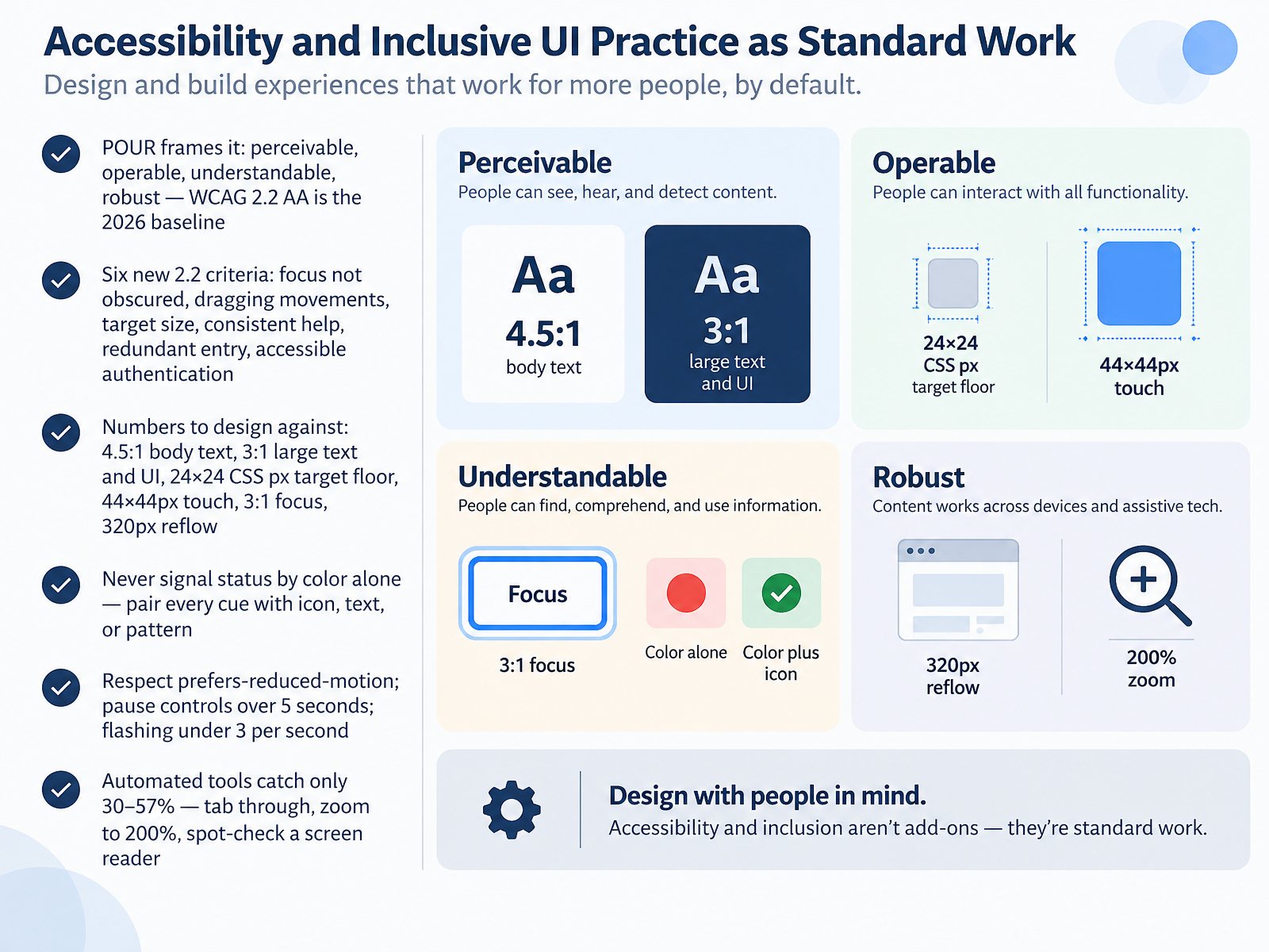
2 min - 07Accessibility and Inclusive UI Practice as Standard WorkLet's make accessibility standard work, not a final pass. POUR frames it: perceivable, operable, understandable, robust. Target WCAG 2.2 AA, the 2026 baseline. Six new criteria matter here: focus not obscured, dragging movements, target size, consistent help, redundant entry, and accessible authentication. Now the numbers to design against. Body text needs four point five to one contrast. Large text and UI need three to one. Target floor is twenty four by twenty four CSS pixels, with forty four by forty four for touch. Focus gets three to one, and layout must reflow at three hundred twenty pixels. Never signal status by color alone. Pair red errors with an icon and message. Respect reduced motion, add pause controls over five seconds, and keep flashing under three per second. Tools catch only thirty to fifty seven percent. So tab through, zoom to two hundred percent, and spot check a screen reader. Next, tooling and design to development handoff.
 2 min
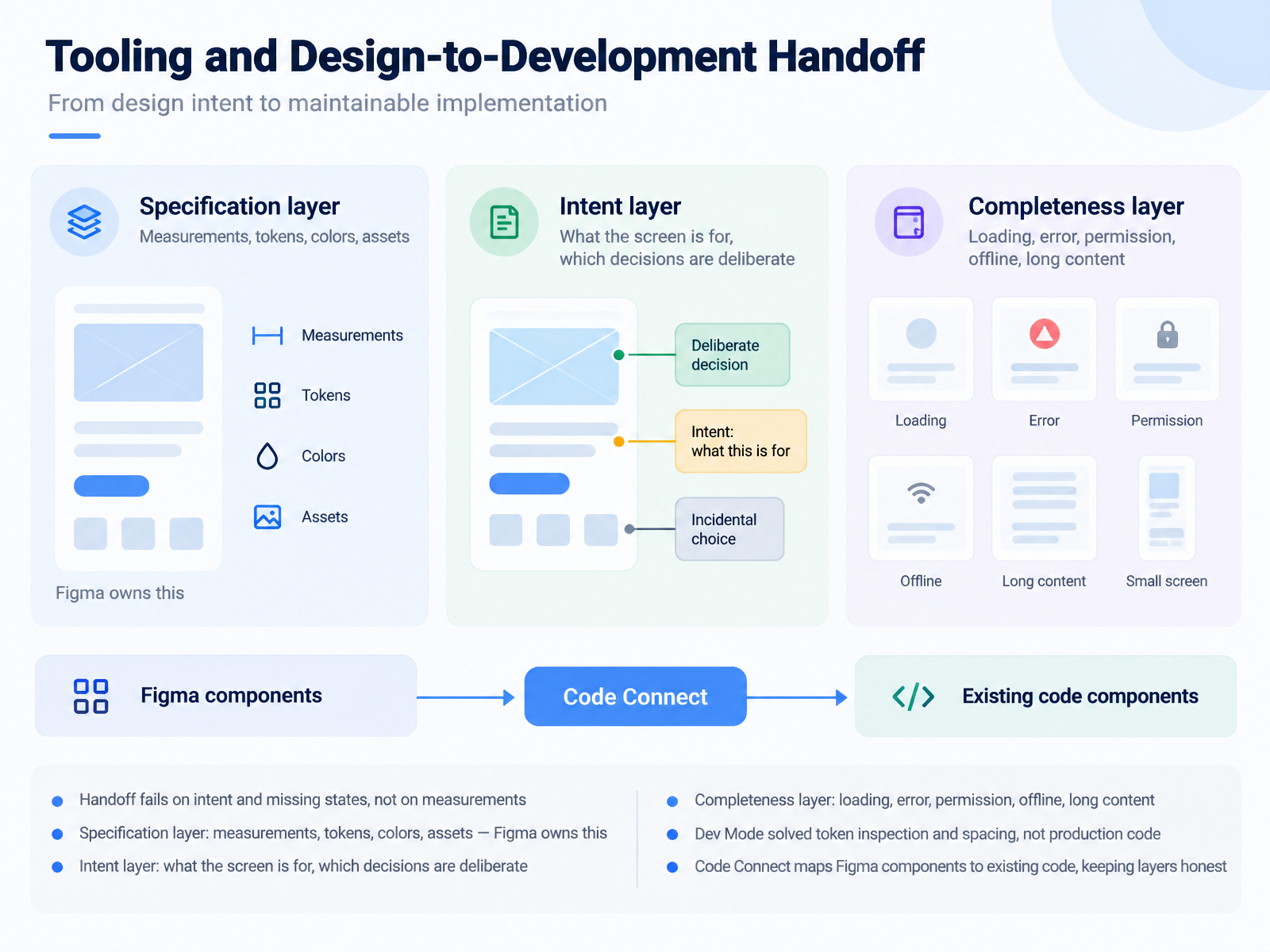
2 min - 08Tooling and Design-to-Development HandoffNext, let's talk about tooling and handoff. Here's the hard truth. Handoff rarely fails on measurements. It fails on intent, and missing states. So split the work into three layers. The specification layer is measurements, tokens, colors, and assets. Figma owns that completely, so do not duplicate it elsewhere. The intent layer is what the file cannot hold. What is this screen for, and which decisions are deliberate versus incidental? Write that down, or developers will guess. Reasonably, and wrongly. The completeness layer is everything the happy path leaves out. Loading, empty, error, permission, offline, and long content. Lay the states out side by side, so a missing one is visibly missing. On tooling, Figma Dev Mode solved token inspection and spacing. It did not solve production code. Treat generated output as reference, not shipping code. And Code Connect maps Figma components to your existing code components. That mapping keeps both layers honest. When the code changes, you update the map. Next up, we'll look at critique, testing, and iteration.
 2 min
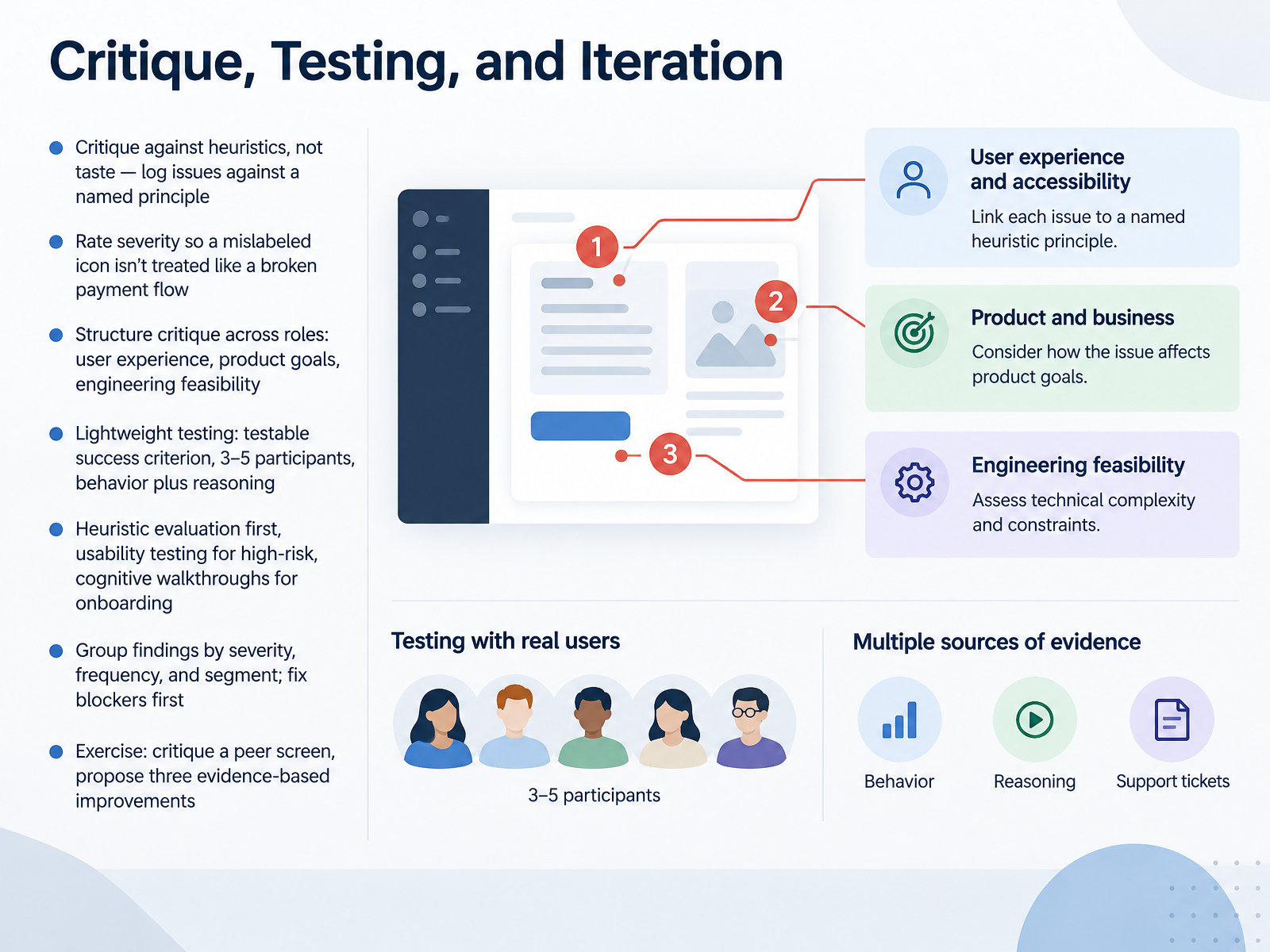
2 min - 09Critique, Testing, and IterationNow let's talk about how you actually evaluate your work. Start with critique against heuristics, not taste. Log every issue against a named principle, so feedback is concrete and easy to defend. Next, rate severity. A mislabeled icon and a broken payment flow should never sit in the same bucket. Then structure critique across roles: user experience, product goals, and engineering feasibility. When recommendations conflict, surface the trade-off instead of picking a winner. For lightweight testing, write one testable success criterion, recruit three to five participants, and capture behavior plus reasoning. At this point, choose your method. Heuristic evaluation first for fast coverage. Usability testing for your highest-risk flows. Cognitive walkthroughs for onboarding and first-use. Then group findings by severity, frequency, and segment, and fix blockers before polish. Your exercise: critique a peer screen and propose three evidence-based improvements. Next, we'll turn this into a practice plan and portfolio readiness.
 2 min
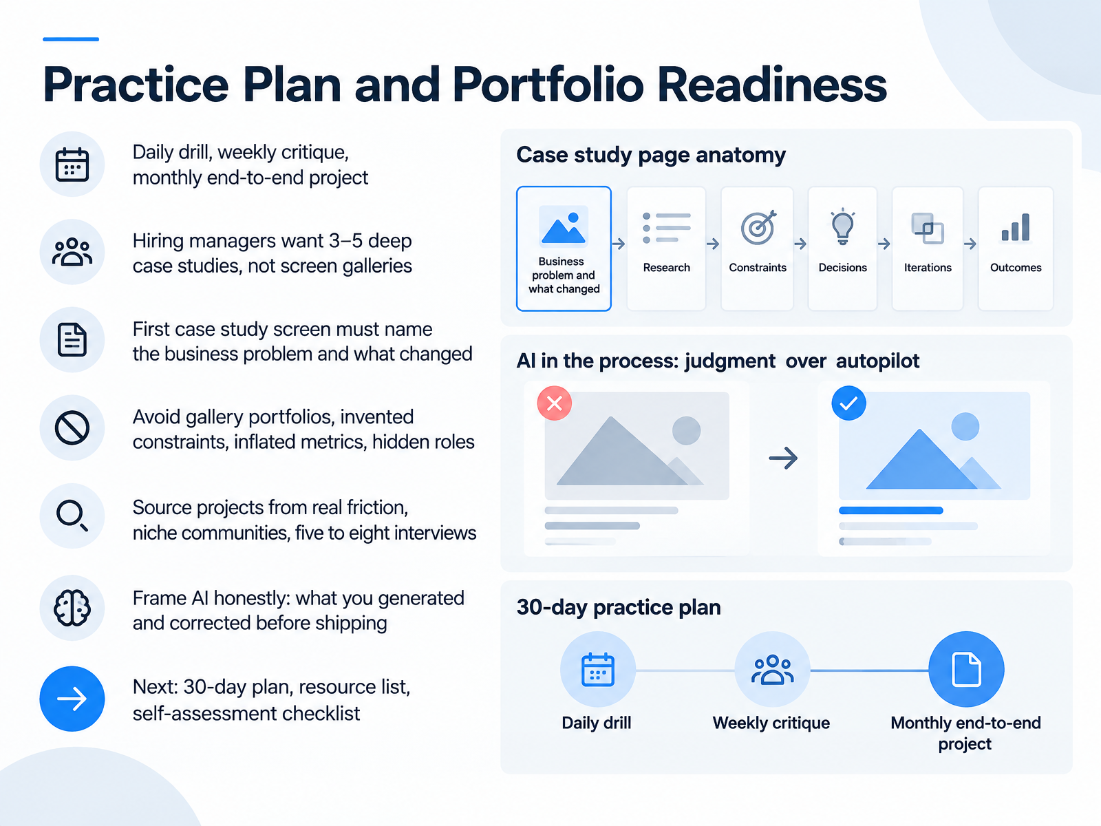
2 min - 10Practice Plan and Portfolio ReadinessLet's close with your practice plan and portfolio readiness. Start with a rhythm: a daily drill, a weekly critique, and one monthly end-to-end project. Hiring managers want three to five deep case studies, not a screen gallery. Your first case study screen must name the business problem and what changed. Skip gallery portfolios, invented constraints, inflated metrics, and hidden roles. Source projects from real friction, niche communities, and five to eight interviews. Frame AI honestly: say what you generated, and what you corrected before shipping. Next, use your 30-day plan, resource list, and self-assessment checklist. Thank you for working through this with me. Keep shipping real work. You've got this.
 webflow-lp.coursecareers.comwebflow-lp.coursecareers.commirrorcv.com+21 min
Take the deck with you
Download this course as a file — free, no sign-up needed.
- PDF handoutEvery slide page, ready to print or share.11 pages · 2.3 MBDownload
- Narrated PowerPointThe deck that presents itself — every slide carries the digital human's narration video.11 pages · 10.7 MBDownload
- PowerPoint slidesThe full deck as a .pptx — open it in PowerPoint, Keynote, or Google Slides.11 pages · 2.3 MBDownload
Free to use in your own training — please keep the PersonWise credit page at the end.
Have your own deck? Turn it into a course
Sources consulted
Web sources consulted while building this course.
- Core Skills Every Junior UI/UX Designer Needs to Get Hired — webflow-lp.coursecareers.com
- What It Takes to Get Hired as a Junior UI/UX Designer — webflow-lp.coursecareers.com
- 3 UI/UX Job Titles for Beginners — coursecareers.com
- 9 UI Designer Skills Every Employer Wants in 2026 — interviewkickstart.com
- UX/UI Designer Resume Guide 2026: Portfolio, Skills & Examples | MirrorCV — mirrorcv.com
- Layout - Fluent 2 Design System — fluent2.microsoft.design
- Spacing, grids, and layouts — designsystems.com
- Grids and units | Mobile | Android Developers — developer.android.com
- Responsive UI - Layout - Material Design — m1.material.io
- skills/modern-web-guidance/guides/css-layout/css-layout.md at main · GoogleChrome/modern-web-guidance — github.com
- Accessible Typography Guide | WCAG 2.2 + 3 Modular Type Scale | Accessibility.build — accessibility.build
- How to Build an Accessible Color System · Zepixo — zepixo.com
- Accessible Typography Studio | WCAG + APCA — accessibility.build
- Building Accessible Forms with Design Tokens: A Complete Guide | Tekton Blog | framingui — framingui.com
- andiaz/chroma-type-studio — github.com
- Microinteraction - Dell Design System — delldesignsystem.com
- Interaction states · preset AI Docs — presetai.dev
- src/schemas/interaction.ts — github.com
- microinteractions/references/feedback-patterns.md at HEAD · wondelai/skills — github.com
- Micro-Interactions: Timing, CSS, and INP — Social Animal — socialanimal.dev