Business Intelligence Dashboard Selection and Workflow
Begin
14 pages · ~28 min
Business Intelligence Dashboard Selection and Workflow
This training guides professionals in selecting BI dashboard software, defining requirements, and implementing effective workflows to deliver data-driven insights.
What you’ll learn
- 01Business Intelligence Dashboard Software: Selection, Requirements, and WorkflowWelcome. Today we are working through a practical path for business intelligence dashboards: choosing the right software, defining real requirements, and building a workflow your team can run repeatedly. This session is designed for analytics leads, BI analysts, operations managers, and planning teams who need to move past one-off reports. Most dashboard problems are not really technology problems. They come from unclear requirements, weak governance, and broken workflows. So we will cover the market and what is changing, the criteria that actually matter, how to capture requirements, how to run a reliable dashboard workflow, governance, vendor evaluation, and the full lifecycle. By the end, you should be able to lead a selection and rollout without losing momentum halfway through. Next, we will ground the conversation in the mid-2026 dashboard and BI landscape.giiresearch.comgiiresearch.comtechtarget.com+21 min
- 02The Mid-2026 Dashboard and BI LandscapeLet's ground this in the current market reality, because it shapes how you should think about buying. The dashboard software space is projected to reach over thirteen billion dollars by twenty thirty, growing at just over fourteen percent annually. The broader BI market isn't far behind, at around eleven and a half percent. That growth is being driven by three clear shifts. First, cloud-first deployment is now the default. Second, mobile-optimized dashboards are a requirement, not a nice to have. And third, embedded analytics is becoming standard inside the applications your teams already use. At the same time, AI-assisted and conversational interfaces are quickly becoming table stakes. That means the real selection question is no longer just about features. It is about workflow fit, governance controls, and how well the tool matches your existing data architecture. Next, we will look at dashboard categories and the current vendor landscape to give you a practical way to narrow the field.
 1 min
1 min - 03Dashboard Categories and the Current Vendor LandscapeNow let's get oriented in the current vendor landscape, because the platform names alone don't tell you much. It's more useful to think about four categories. There's self-service, enterprise governed, embedded, and operational. Each one solves a different reporting bottleneck. On the platform side, Power BI is the practical default for Microsoft-centric teams. Tableau remains the pick when visualization depth and executive presentation quality matter most. Looker fits teams that need governed modeling and one consistent source of truth. Qlik is strong for associative exploration, where users need to follow unexpected paths through connected data. Domo can be a good all in one option for mid sized operations. And Metabase works well as a lightweight open source starting point. One thing that's now table stakes across the board is the AI-native interface. Copilot, Pulse, and Sage are all examples of natural language access. So the real selection question is not which tool looks best in a demo. It's which category and ecosystem match the way your teams actually consume decisions. Keep that in mind as we move into the selection criteria that match how your team works.
 taqtics.comtechvendorindex.comlearn.g2.com+22 min
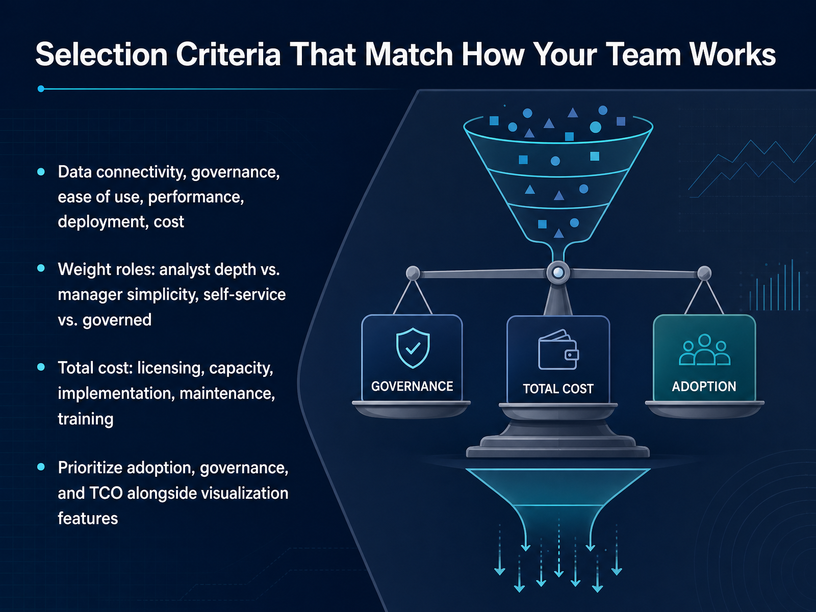
 - 04Selection Criteria That Match How Your Team WorksNow let’s turn to the selection criteria that actually match how your team works. When you compare dashboard platforms, six areas consistently drive long-term success. Data connectivity, governance, ease of use, performance, deployment, and total cost. But these won’t all carry the same weight for every team. Think about the balance you need. Your analysts may want more depth and flexibility, while your managers need simple, repeatable views. At the same time, you have to decide where self-service stops and governed content begins. That balance usually looks different in a small analytics team than in a larger operations group. Also, look beyond the license price. Total cost includes capacity, implementation effort, ongoing maintenance, and training. A cheaper tool can become expensive if it demands heavy support or low adoption. So as you build your shortlist, prioritize adoption, governance, and total cost of ownership right alongside visualization features. Those fundamentals usually matter more in daily use than a long feature list. With that lens in place, let’s move into a practical requirements framework for dashboard projects.
 1 min
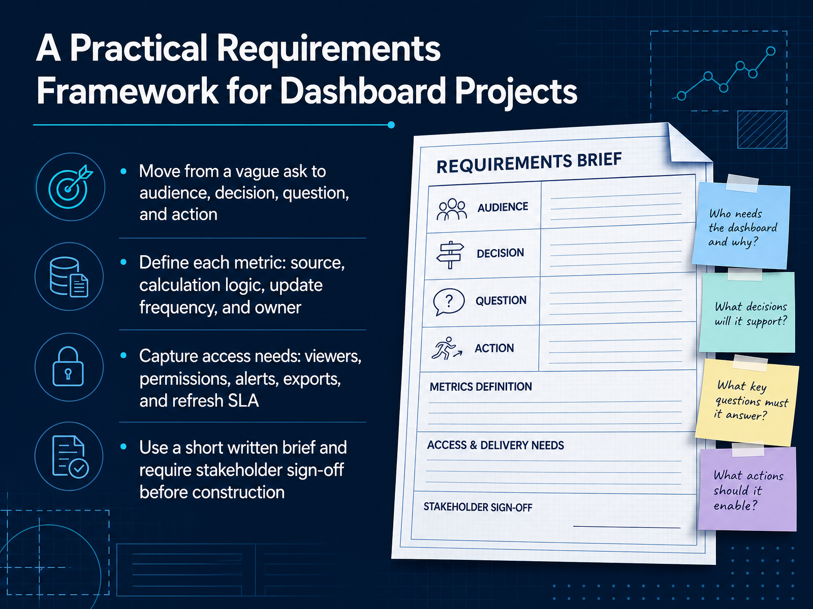
1 min - 05A Practical Requirements Framework for Dashboard ProjectsLet's turn now to a practical requirements framework. The goal here is to avoid building the wrong dashboard. Start by moving away from a vague request and instead define four things: the audience, the decision, the question, and the action. If a dashboard doesn't help someone make a call or take a step, it's just decoration. Next, define every metric with precision. That means its source system, how it is calculated, how often it updates, and who owns it. This prevents the classic problem where finance and operations both report the same number but with different logic. Also capture access needs early. Who views the dashboard, what permissions they need, whether alerts and exports are required, and what refresh latency is acceptable. Finally, put all of this into a short written brief and require stakeholder sign-off before construction begins. This creates a shared agreement and protects the team from scope drift. That written brief is your bridge into the next phase: turning questions into dashboard specifications.
 capitalbuildcon.comd8a.academydatabox.com+22 min
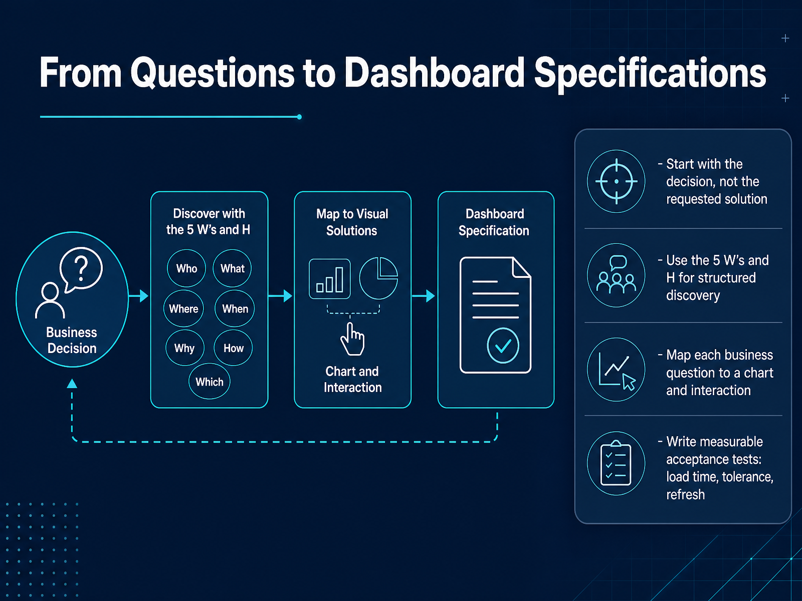
 - 06From Questions to Dashboard SpecificationsNow, let's move from a list of desired features to actual specifications your team can build against. The most important step is to start with the decision the dashboard needs to support, not the chart someone asked for. That keeps the project focused on business impact. Use the five Ws and one H as a discovery guide: who is making the call, what action they will take, when they need the data, where the decision happens, why the current report falls short, and how the result will be measured. This structured questioning turns vague requests into clear requirements. Then, map every business question directly to a chart, filter, or interaction. If a visual does not connect to a question, it likely does not belong in the first version. Finally, write acceptance tests that are concrete, such as a dashboard loading in under three seconds, refresh completing within thirty minutes of source updates, and filters responding without timeout for standard user roles. These tests give your team a shared definition of done. With the specifications clear, we can now build the workflow from request to operating decision.
 2 min
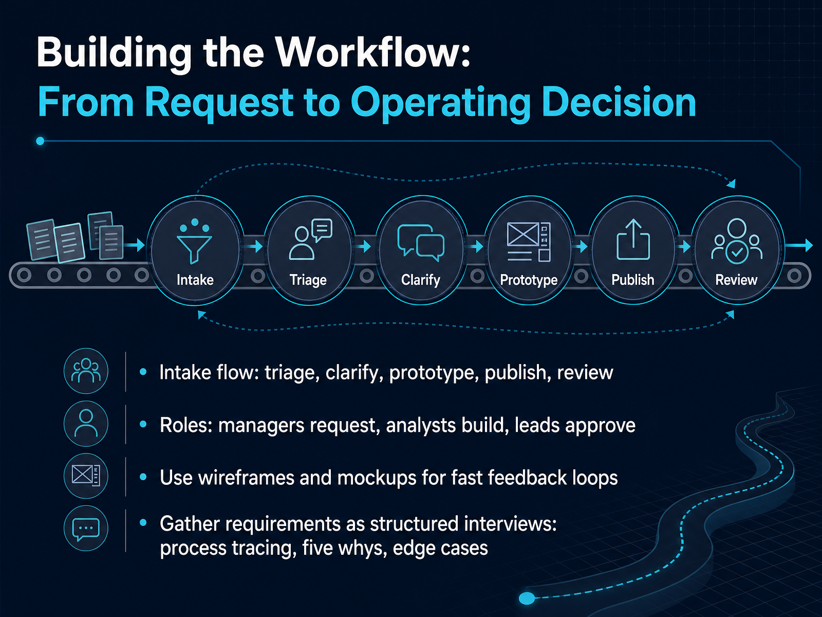
2 min - 07Building the Workflow: From Request to Operating DecisionLet's map the workflow that turns a request into an operating decision. The process should move through five clear stages: triage, clarify, prototype, publish, and review. At intake, managers define the business question. Analysts clarify scope and then build a lightweight prototype. Leads approve the direction before anything is published, so you avoid building the wrong dashboard in detail. Use wireframes or simple mockups early. They let stakeholders react to layout and metrics while changes are still cheap, and that fast feedback loop is what keeps the project on target. For requirements, replace vague conversations with structured interviews. Walk through the current process step by step, ask the five whys to reach the underlying need, and probe edge cases like missing data or unusual time periods. This surfaces real decisions, not just chart requests. The goal is a short written brief that everyone confirms before development picks up speed. Now let's turn to the design and usability standards that drive adoption.
 capitalbuildcon.comd8a.academydatabox.com+21 min
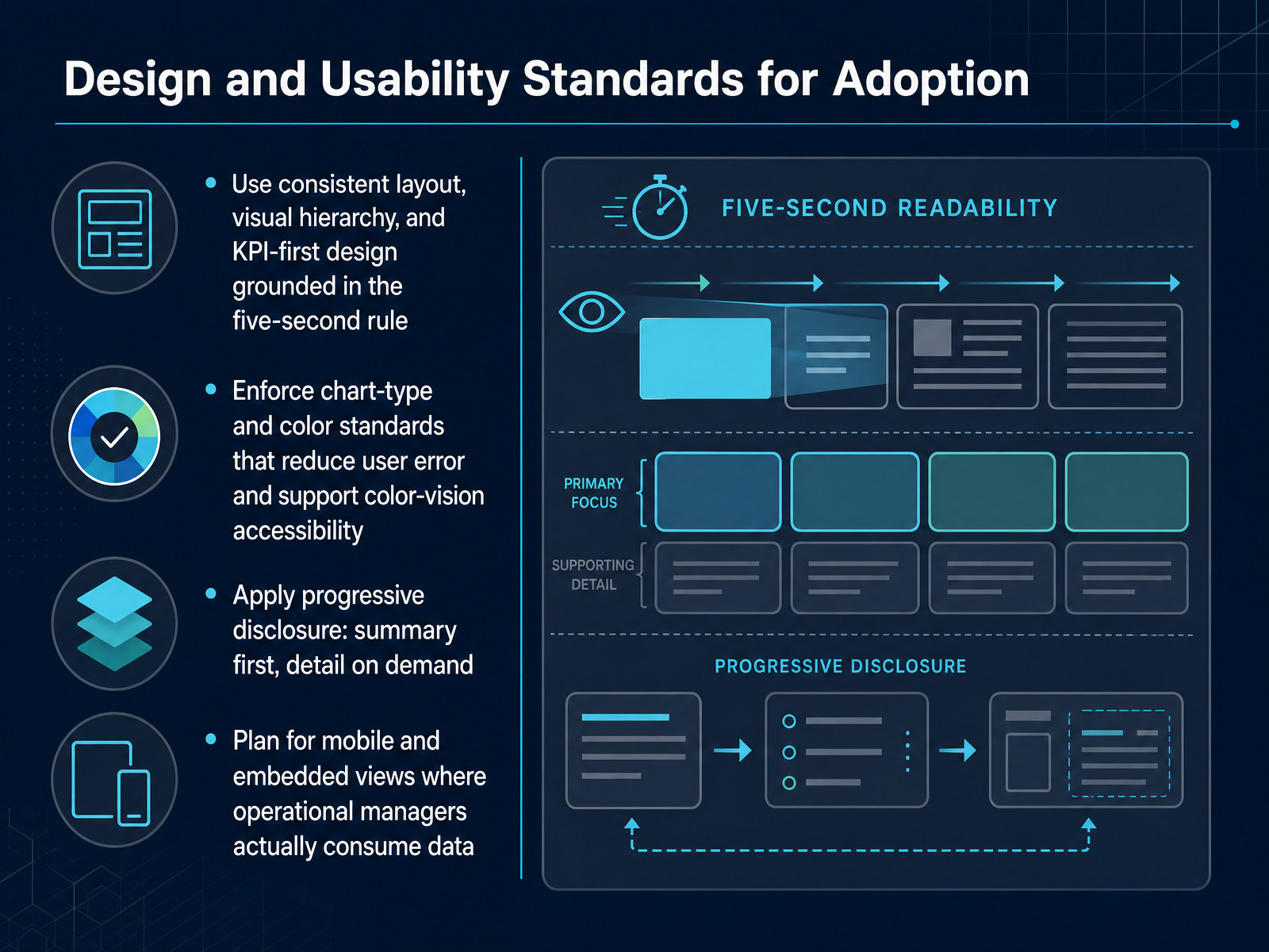
 - 08Design and Usability Standards for AdoptionNext, let us talk about design and usability, because these are the standards that decide whether your dashboards get opened every day or quietly ignored. Start with consistency. Use the same layout, the same visual hierarchy, and put the most important KPI first. A simple test is the five-second rule. If someone cannot name the main takeaway within five seconds, the design is working against them. Next, set standards for chart types and color. Pick the right chart for the question, and do not rely on color alone to carry meaning. That keeps the dashboard clearer and supports people with color-vision accessibility needs. Then apply progressive disclosure. Show the summary and the headline metric first, and let users click or drill down when they want more detail. Do not overload one screen with everything at once. Finally, plan for mobile and embedded views, because many operational managers will check these numbers on a phone or inside another tool, not on a large desktop screen. The dashboard needs to stay usable where the work actually happens. These standards reduce confusion and build trust. Next, we will look at data quality, refresh, and governance.
 domo.comsetproduct.comdesignpixil.com+22 min
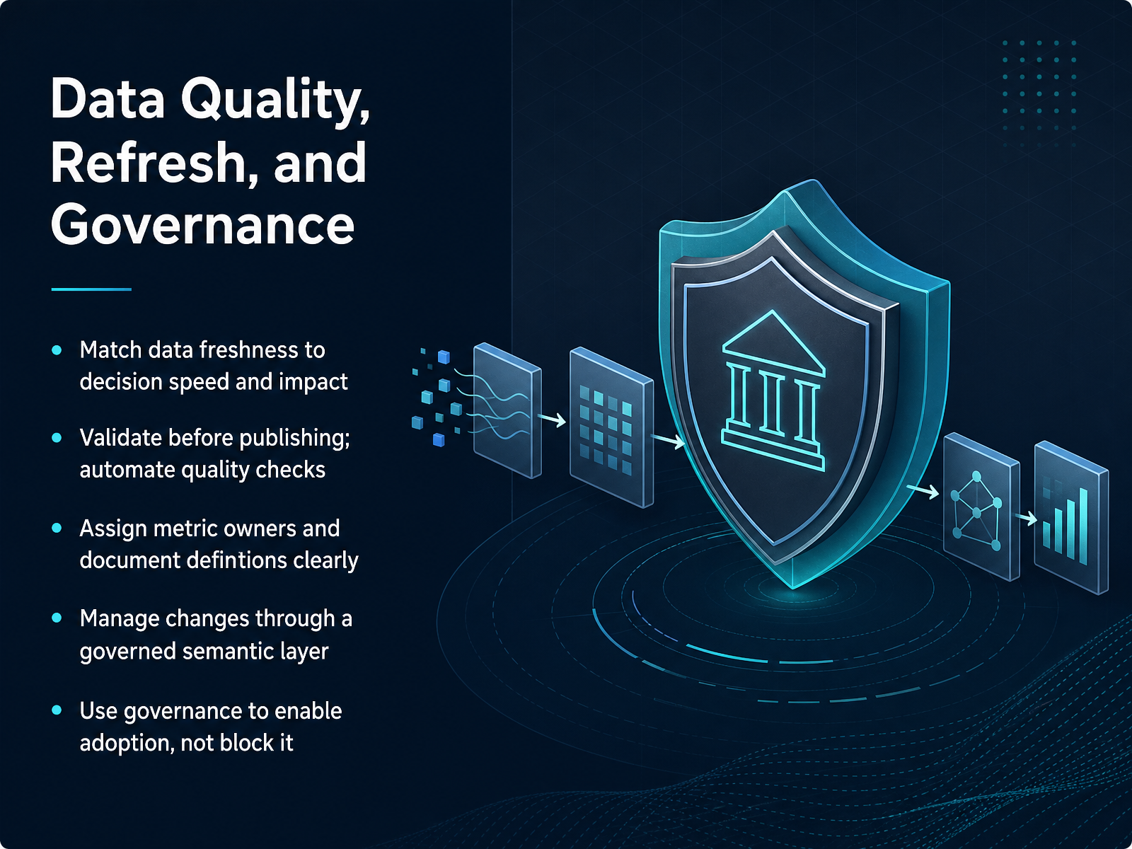
 - 09Data Quality, Refresh, and GovernanceNow let’s talk about the operational side: data quality, refresh, and governance. First, match data freshness to decision speed and impact. An executive dashboard may need daily updates, while an operations view might need near real-time refresh. Confirm the tool can support both without manual work. Second, validate before publishing. Automate quality checks so a broken join or missing field does not reach your stakeholders. Third, assign a metric owner for every key number and document the definition clearly. If revenue means something different to finance and sales, the dashboard will create confusion. Fourth, manage changes through a governed semantic layer. That keeps calculations consistent across reports and prevents duplicate definitions from drifting apart. Finally, use governance to enable adoption, not block it. Set clear standards, but keep the path to publishing fast and transparent for the teams that need it. Next, we will move into evaluating and proofing dashboard software with a hands-on selection approach.
 2 min
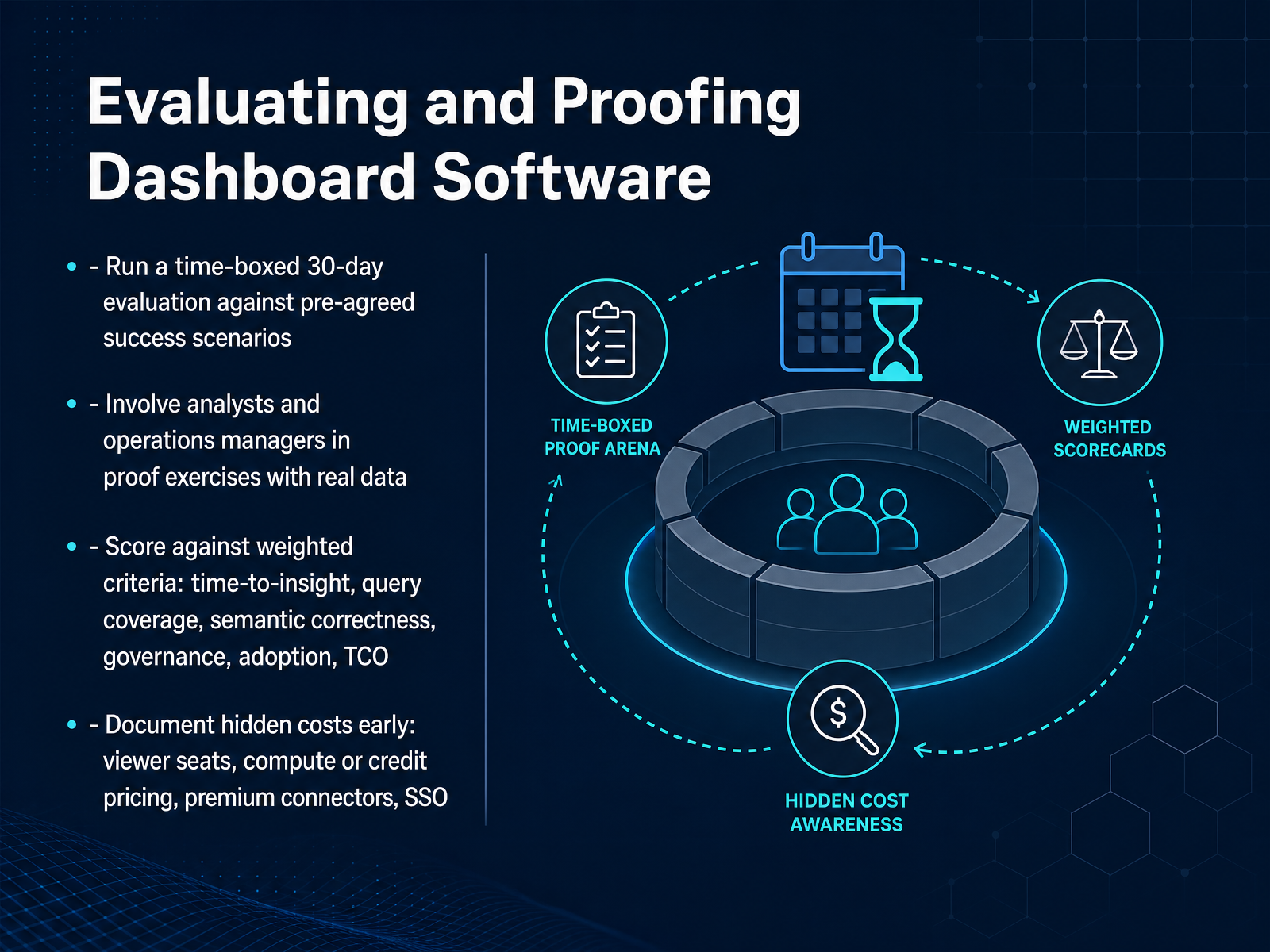
2 min - 10Evaluating and Proofing Dashboard SoftwareA vendor demo proves the tool works on the vendor's best day. Your evaluation needs to prove it works on your worst day. So run a time-boxed, thirty day evaluation against pre-agreed success scenarios built from real questions. Assign two named testers. One should be an analyst, and one should be an operations manager, because adoption is tested by the person who does not live in the data every day. Have both build against real data and document where the tool stalls or silently changes a metric definition. Score each candidate against weighted criteria, not just a feature list. Prioritize time to insight, query coverage, semantic correctness, governance, adoption, and total cost of ownership. A beautiful dashboard that no one trusts is a failed proof. Finally, uncover hidden costs before you sign. Ask specifically about viewer seats, compute or credit pricing, premium connectors, and whether single sign on is included or an upsell. This discipline turns a fuzzy trial into a defensible go or no go decision. Up next, we will look at what happens after the software is selected, including how to operate, maintain, and retire dashboards responsibly.
 1 min
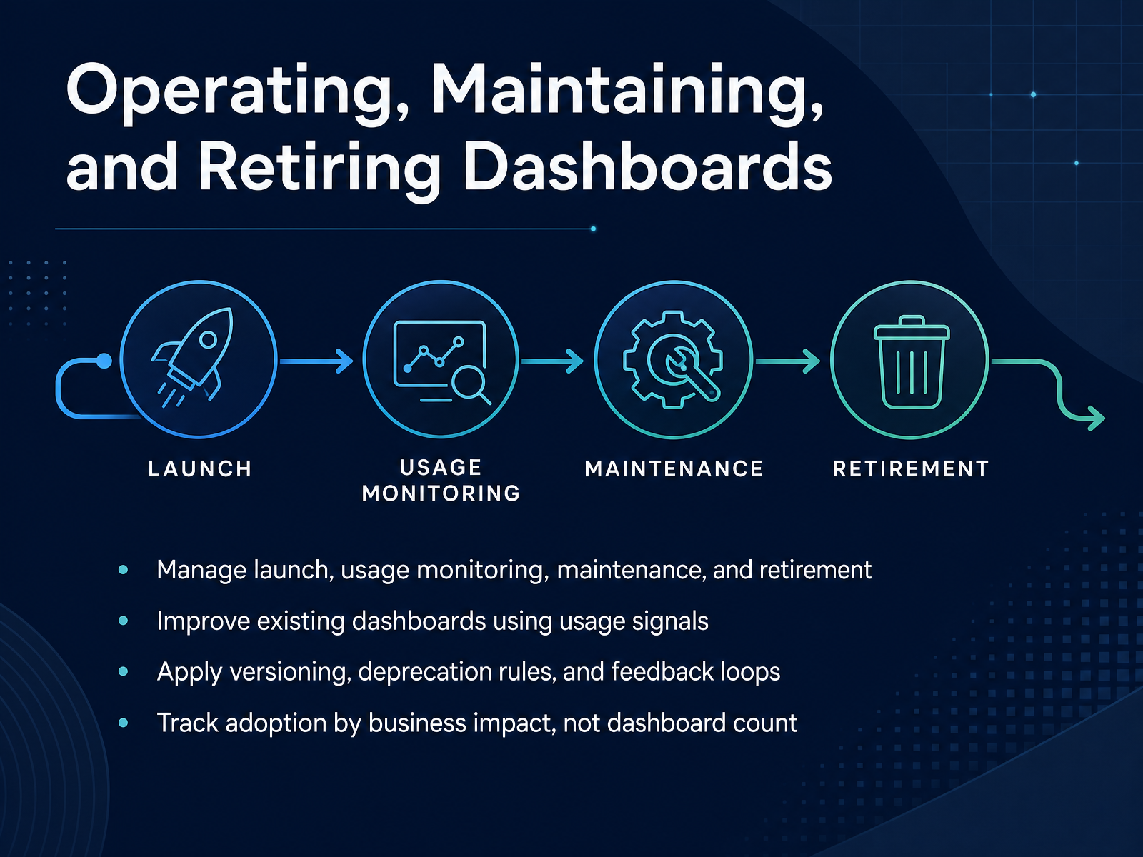
1 min - 11Operating, Maintaining, and Retiring DashboardsOnce a dashboard goes live, the real work begins. Treat launch as the starting point, not the finish line. Set up a simple operating rhythm. Monitor who is using the dashboard, how often, and where they drop off. Use those usage signals to improve the existing dashboards instead of immediately building new ones. For example, if a filter is rarely touched but a certain date range is used constantly, adjust the default view to match the team's actual workflow. Apply clear versioning and deprecation rules. When a dashboard is replaced, retire the old version cleanly and point users to the new one. Create a lightweight feedback loop so analysts and operations managers can flag confusing metrics or missing context. Most importantly, measure adoption by business impact, not by the number of dashboards created. A few well-maintained dashboards that support real decisions will outperform a large library of unused reports every time. In the next slide, we'll bring the full process together, from selection criteria through a working workflow.
 2 min
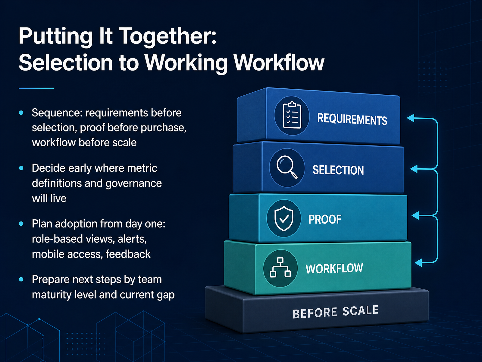
2 min - 12Putting It Together: Selection to Working WorkflowAt this stage, the right sequence protects you from the most common failure pattern. Put requirements before selection, so you have a documented reason for every feature you evaluate. Push for a proof of concept before purchase, using your own data and a real end user, not just an analyst. And design the workflow before you scale, because a dashboard that no one uses is not a small problem. Spend time early deciding where metric definitions and governance will live. If finance and operations use different formulas for revenue, no dashboard tool will fix that mismatch. Plan adoption from day one with role based views, alerts, mobile access, and a clear feedback channel for users to flag confusion or missing context. Finally, set next steps by team maturity and the largest current gap. A team with messy definitions tackles governance first. A team with low adoption pilots one role based view before expanding. Next, we move into a workshop on drafting your first dashboard requirement.
 giiresearch.comgiiresearch.comtechtarget.com+21 min
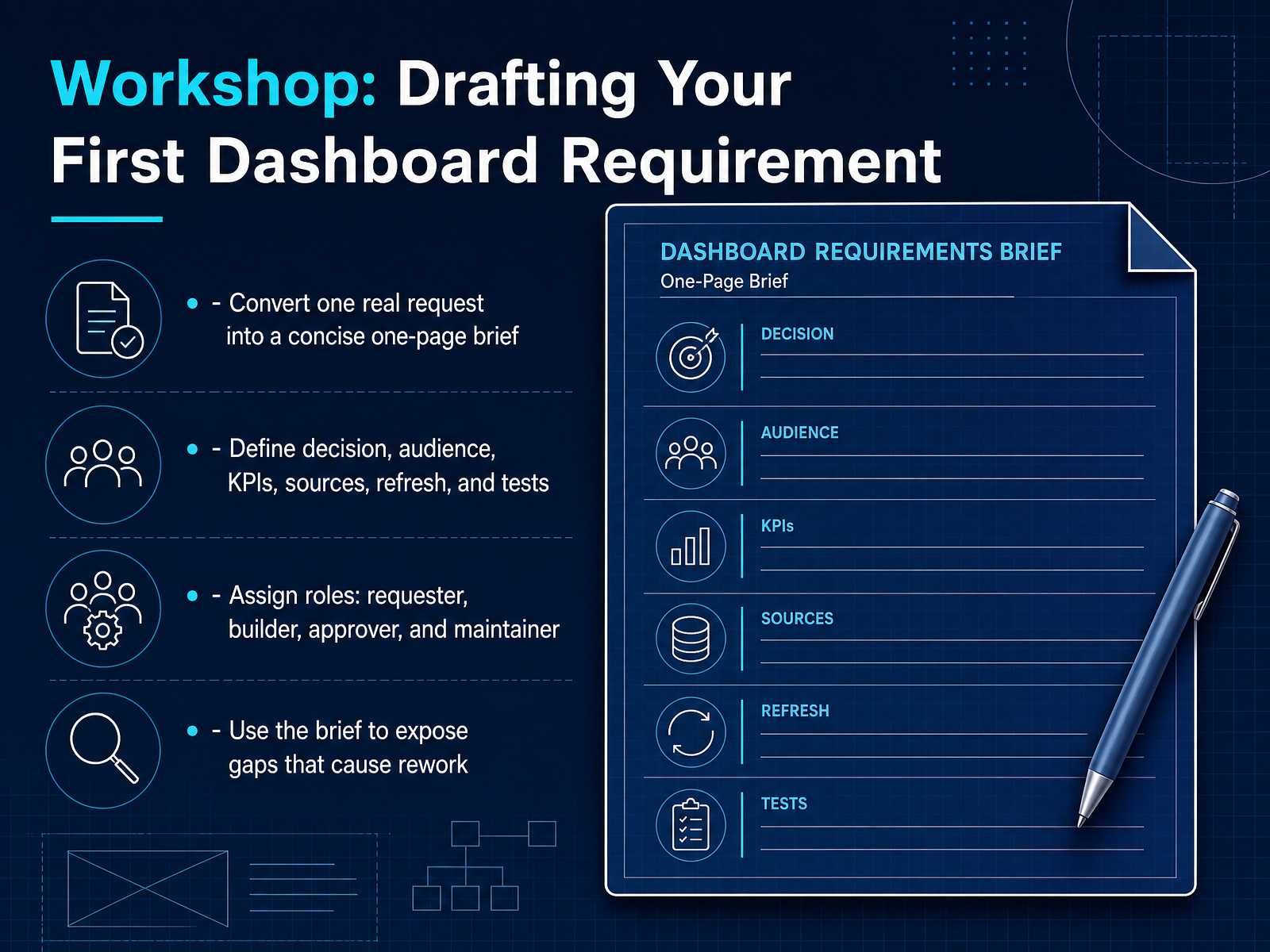
 - 13Workshop: Drafting Your First Dashboard RequirementLet's put this into practice with a focused workshop exercise. The goal here is not to build a dashboard, but to take one real reporting request and turn it into a concise, one-page brief. Start by defining the decision this dashboard should support, the audience who will use it, the key performance indicators they need, the source systems, the refresh schedule, and the acceptance tests that define success. Then assign clear roles from the start: one requester, one builder, one approver, and one maintainer. This prevents orphaned dashboards and last-minute confusion about who owns the result. As you work through the brief, pay close attention to the gaps that surface. An unclear metric definition, a missing source owner, or a vague refresh expectation are exactly the issues that normally cause rework later. The brief is your chance to expose those problems while they are still cheap to fix. A useful discipline is to keep the full brief to one page. That forces everyone to be specific about what the dashboard will answer and what it will deliberately leave out. When you complete this exercise on a real request, you will have a scoped, agreed starting point instead of another vague analytics task. Next, we will close with the action plan and key takeaways you can bring back to your own team.
 capitalbuildcon.comd8a.academydatabox.com+22 min
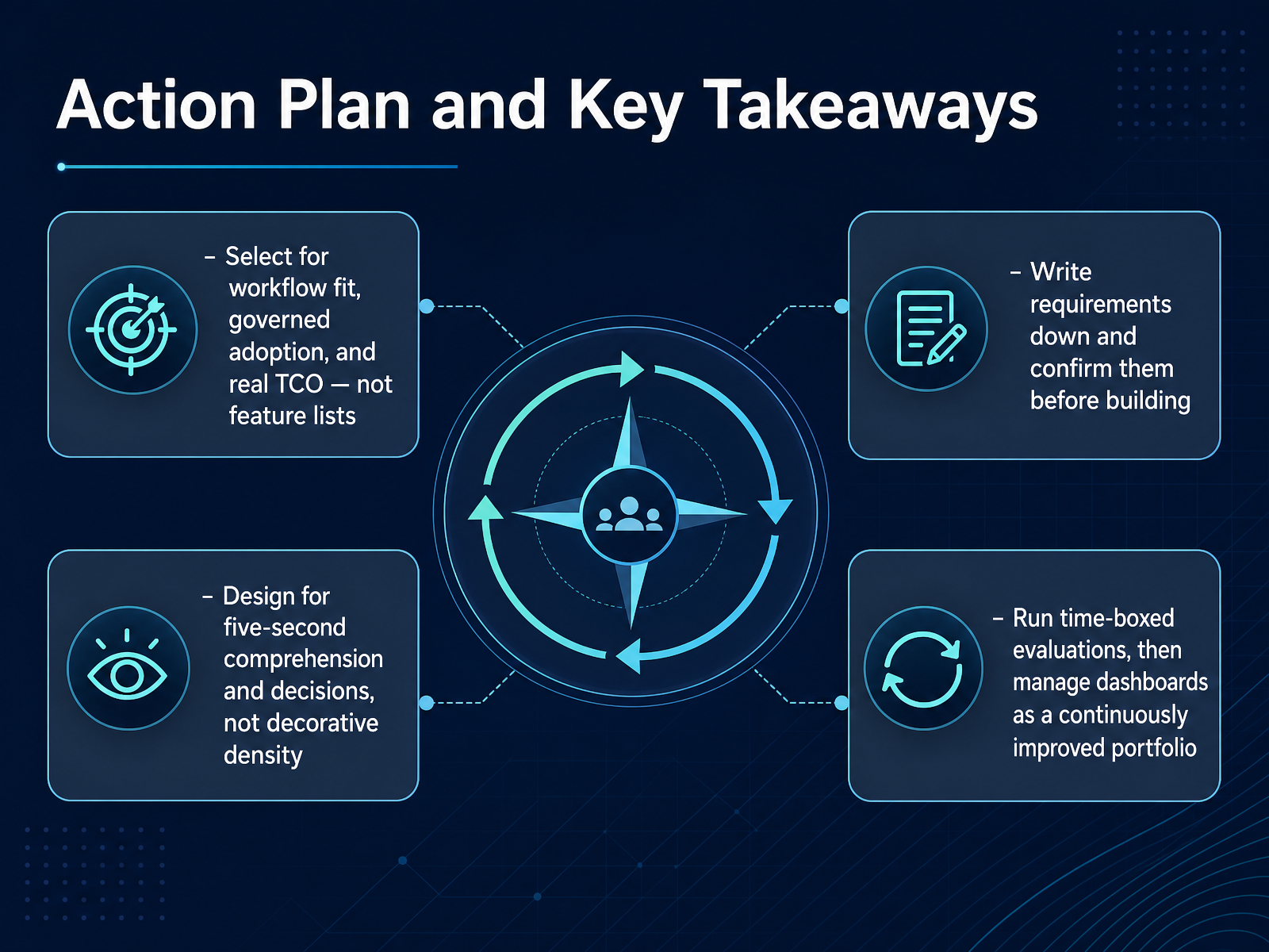
 - 14Action Plan and Key TakeawaysLet's land this with a clear action plan. First, choose your dashboard tool for workflow fit, governed adoption, and real three year total cost. Do not let a long feature list make the decision for you. Second, write your requirements down and confirm them before anyone builds. A shared, written spec prevents scope drift and late surprises. Third, design for five second comprehension. If someone cannot find the answer and make a call within five seconds, the dashboard needs simplification, not more charts. Fourth, run time boxed evaluations. A focused proof of concept with real users and real data tells you more than months of demos. And once you go live, manage dashboards as a continuously improved portfolio. Retire what is unused, refine what matters, and treat each dashboard as a decision tool, not a decoration. That is the operating discipline. Thank you for working through this with me. You now have a repeatable path from selection to adoption. Use it, and your dashboards will earn their place in daily decisions.
 domo.comsetproduct.comdesignpixil.com+22 min
Take the deck with you
Download this course as a file — free, no sign-up needed.
- PDF handoutEvery slide page, ready to print or share.15 pages · 3.5 MBDownload
- Narrated PowerPointThe deck that presents itself — every slide carries the digital human's narration video.15 pages · 14.7 MBDownload
- PowerPoint slidesThe full deck as a .pptx — open it in PowerPoint, Keynote, or Google Slides.15 pages · 3.4 MBDownload
Free to use in your own training — please keep the PersonWise credit page at the end.
Have your own deck? Turn it into a course
Sources consulted
Web sources consulted while building this course.
- Dashboard Software Global Market Report 2026 — giiresearch.com
- Business Intelligence (BI) Global Market Report 2026 — giiresearch.com
- The Future of Business Intelligence: 10 Top Trends in 2026 | TechTarget — techtarget.com
- Dashboard Software Market Report 2026 - Research and Markets — researchandmarkets.com
- Trend Monitor 2026 - Top 20 Trends in Detail — barc.com
- Business Intelligence Platforms Compared (2026) | Taqtics — taqtics.com
- Best Business Intelligence 2026 — TechVendorIndex — techvendorindex.com
- I Evaluated 6 Best Analytics Platforms on G2 for 2026 — learn.g2.com
- Best Business Intelligence Platforms in 2026 | 13 Compared - Tellius — tellius.com
- 12 Best Business Intelligence (BI) Tools in 2026 - Domo — domo.com
- Dashboard Requirements Brief Template: Free Download — capitalbuildcon.com
- A data requirements gathering template (with examples) · D8A Academy — d8a.academy
- Gathering and Understanding Dashboard Requirements — databox.com
- Business Intelligence Requirements Gathering - Dundas BI — dundas.com
- Requirements Gathering for Data Analytics Projects | Blog — calligo.io
- Dashboard Design Best Practices: Layouts & Examples — domo.com
- Dashboard UI design: From KPIs to layouts that convert | Setproduct Blog — setproduct.com
- SaaS Dashboard Design: 9 Best Practices That Reduce Churn — designpixil.com
- Dashboard Design Principles: The Definitive Guide (2026) — uxpin.com
- 15 SaaS Dashboard UX Requirements Every Team Needs 2026 — alphonsolabs.com