Begin
16 pages · ~32 min
Introduction to UX Design
This training introduces the fundamentals of UX design, teaching learners how to create user-centered digital experiences.
A digital instructor presents all 16 pages. Hold “Ask” at any point and ask out loud — the answer comes from this course. No sign-up needed.
What you’ll learn
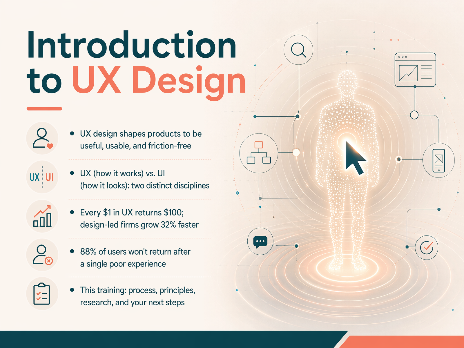
- 01Introduction to UX DesignWelcome to Introduction to UX Design. I'm glad you're here. Think about your favorite app, maybe the one you used this morning to check the weather or order coffee. UX design is what made that experience feel smooth, useful, and almost invisible. That's our goal: to shape products so they're useful, usable, and free of friction. Now, you'll often hear UX and UI mentioned together, but they're two distinct disciplines. UX is how a product works, the structure and flow. UI is how it looks, the colors and typography. Both matter, but they serve different roles. The business impact is real, by the way. Research from Forrester shows that every dollar invested in UX returns one hundred dollars. McKinsey found that design-led companies grow thirty-two percent faster. And here's a number that might surprise you: eighty-eight percent of users won't return after a single poor experience. So getting this right isn't just nice to have, it's essential. In this training, we'll walk through the UX process, core principles, user research, and your practical next steps. Let's get started. Next, we'll dive into The Business Case for User Experience.uxcrush.comsearchlab.nlmaze.co+22 min
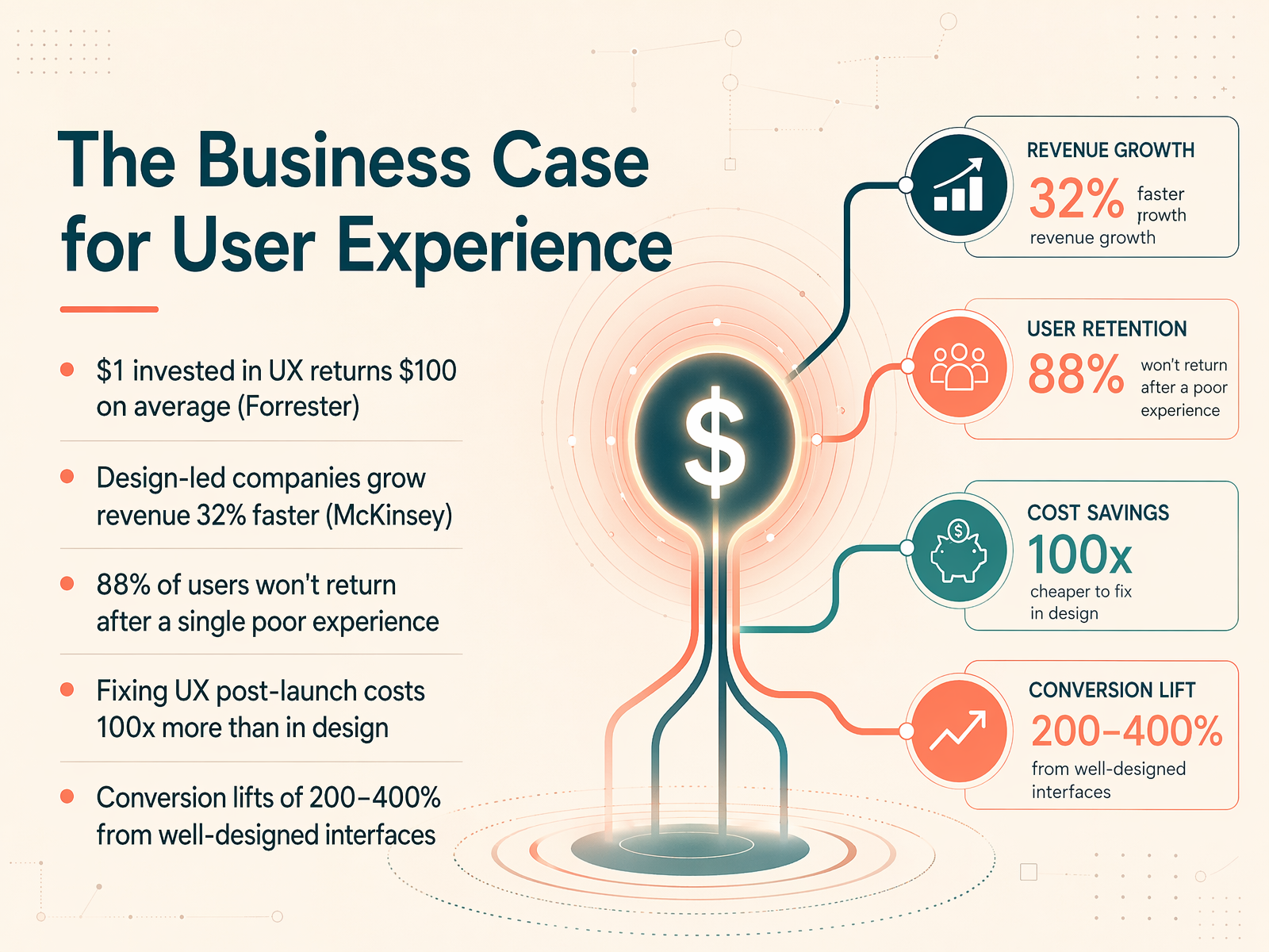
- 02The Business Case for User ExperienceNow, let's get to the heart of why we're here. You might be wondering, does this design work actually move the needle for a business? The answer is a clear yes, and the numbers are truly compelling. Forrester research shows that every dollar invested in UX returns a hundred dollars on average. That's a 9,900 percent ROI. McKinsey tracked 300 companies and found that the top design performers grew their revenue 32 percent faster than their peers. But it's not just about the upside. Think about the cost of getting it wrong. 88 percent of users won't return to a site after a single poor experience. And fixing a usability problem after launch can cost a hundred times more than catching it during the design phase. The immediate impact is often seen in conversion. Well-designed interfaces can lift conversion rates by 200 to 400 percent. This turns UX from a cost center into a revenue engine. Next, we'll break down the difference between the look and the feel by exploring UX vs. UI: Two Sides of the Same Coin.
 toptal.comuxcrush.comideoz.ai+21 min
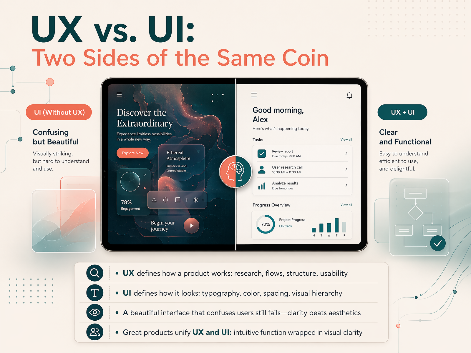
 - 03UX vs. UI: Two Sides of the Same CoinLet’s clear up one of the biggest misconceptions in design: the difference between UX and UI. Think of them as two sides of the same coin. UX, or user experience, defines how a product works. It covers the research, the logical flow, the structure, and overall usability. It’s the invisible architecture that makes an app feel easy and intuitive. UI, or user interface, defines how a product looks. This is the visual layer: typography, color, spacing, and visual hierarchy. It’s what makes the interface visually appealing. A beautiful interface that confuses users still fails. Clarity always beats aesthetics. Great products unify both sides. They combine intuitive function with visual clarity. For example, a checkout flow might look stunning, but if the button is hard to find, the sale is lost. When UX and UI work together, you get a product that feels effortless and looks trustworthy. Up next, we’ll build on this foundation with the core principles of UX design.
 uxcrush.comsearchlab.nlmaze.co+22 min
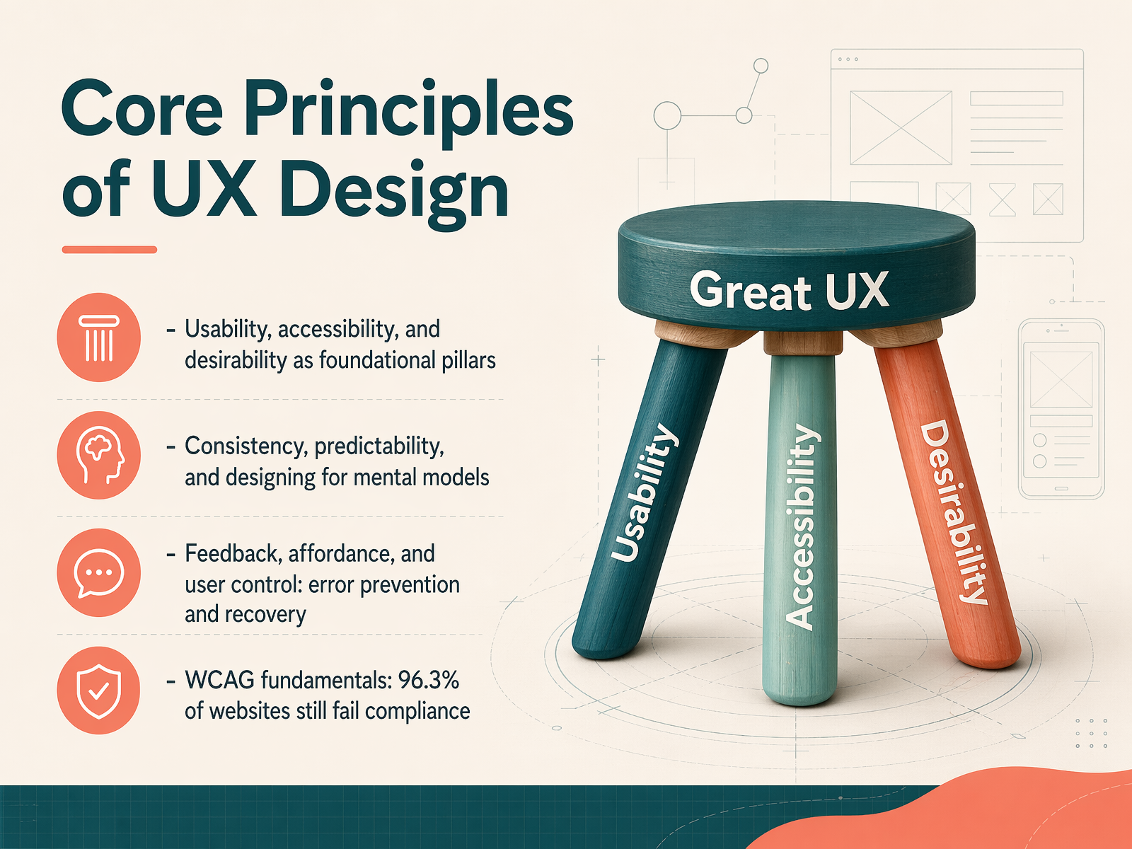
 - 04Core Principles of UX DesignNow let's look at the core principles that hold great UX together. Think of usability, accessibility, and desirability as three foundation pillars. Usability means a product is easy to use. Accessibility means people of all abilities can interact with it. And desirability brings an emotional appeal that makes people want to use it. We also rely on consistency and predictability. When a design matches a user's mental model, like a shopping cart icon always leading to the checkout, they feel more confident. Good feedback and clear affordances are also key. A button should look clickable, and a success message should appear after a payment goes through, preventing errors and helping users recover when things go wrong. A critical part of accessibility is the Web Content Accessibility Guidelines, or WCAG. The data is stark: ninety-six point three percent of website homepages still fail compliance. That's a huge gap, and it's also a major opportunity. We'll build on these principles next as we explore the UX design process and design thinking.
 uxcrush.comsearchlab.nlmaze.co+22 min
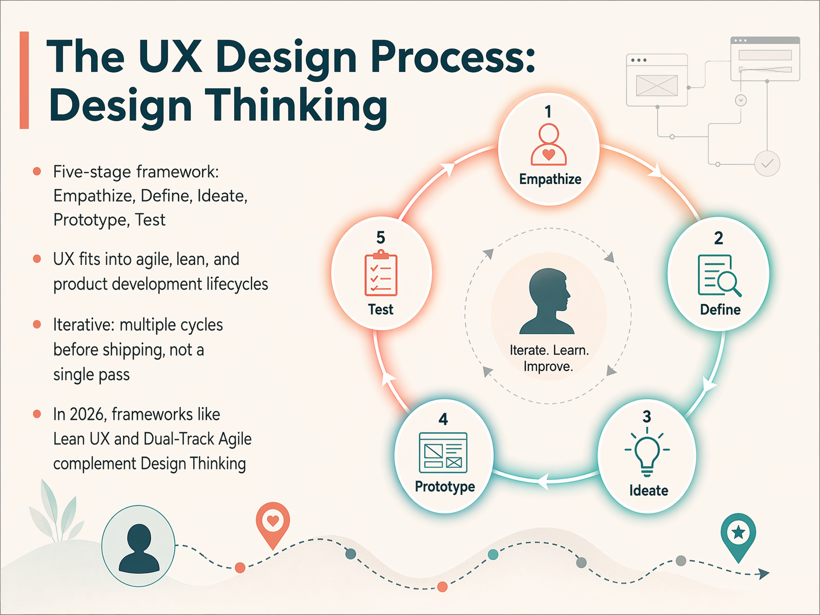
 - 05The UX Design Process: Design ThinkingNow let's explore the framework that structures most UX work today: Design Thinking. Think of it as a five-stage compass: Empathize, Define, Ideate, Prototype, and Test. You start by understanding the user, then you clearly define the problem, brainstorm ideas, build a quick prototype, and test it with real people. A key thing to remember is that this process is iterative. You don't just run through these steps once and ship the product. You cycle through them multiple times, learning and refining with each loop. In 2026, you'll often see Design Thinking working alongside modern approaches like Lean UX and Dual-Track Agile, which help teams move faster without losing sight of the user. This flexible structure is why UX fits so well into agile, lean, and broader product development lifecycles. Up next, we'll dive into the very first stage of this process: User Research Fundamentals.
 uxcrush.comsearchlab.nlmaze.co+21 min
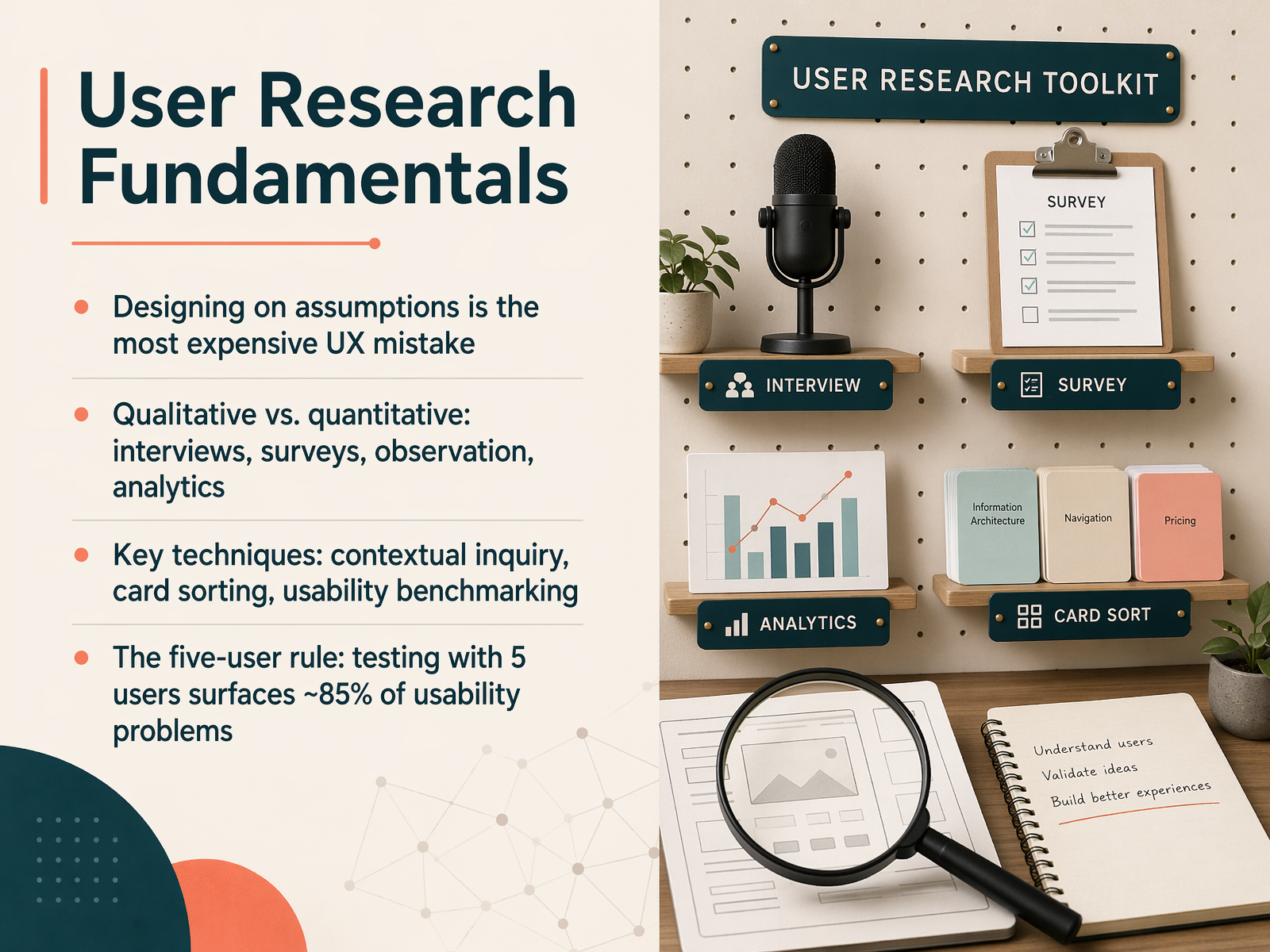
 - 06User Research FundamentalsNow let's talk about user research, which is really the foundation of good UX. Designing on assumptions is the most expensive mistake you can make in this field. Without research, you're guessing, and that guesswork leads to products that fail. To avoid that, we use two main research styles: qualitative and quantitative. Qualitative research, like interviews and observation, tells you why users behave a certain way. Quantitative research, like surveys and analytics, tells you what is happening, backed by hard numbers. Some key techniques you'll learn include contextual inquiry, where you watch users in their own environment, and card sorting, which helps you organize information the way users think. We also use usability benchmarking to measure how easy a product is to use. A powerful rule to remember is the five-user rule. Research shows that testing with just five users can surface about 85 percent of the usability problems. You don't need a huge budget to start getting real insights. Up next, we'll dive into how to start understanding your users directly.
 uxcrush.comsearchlab.nlmaze.co+22 min
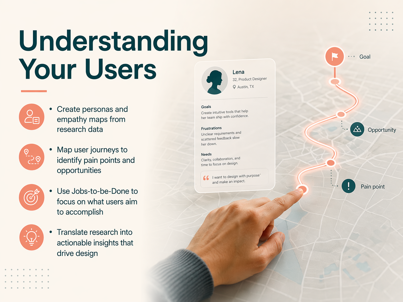
 - 07Understanding Your UsersNow that we have research data, let's talk about making sense of it all. Understanding your users is about moving from raw facts to real empathy. We start by creating personas and empathy maps. Think of a persona as a representative profile, like a busy parent ordering groceries on a phone. An empathy map helps us imagine what they are thinking, feeling, and doing during that process. Next, we map their user journey to find pain points and opportunities, like spotting where someone abandons a shopping cart. A powerful tool here is Jobs-to-be-Done. Instead of just listing features, we focus on the core goal. For example, the job isn't 'use a search bar,' it's 'find a gift quickly for a birthday party tomorrow.' This shift in thinking turns our research into actionable insights that directly drive design decisions. Soon, we will use these insights to structure our content. Let's look at how that works in information architecture and content strategy.
 1 min
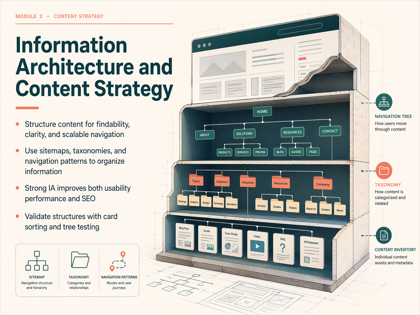
1 min - 08Information Architecture and Content StrategyLet's move into how we organize all the content we've been learning about. This is called information architecture, or IA for short. Think of it as the blueprint for your product. Your goal here is to structure content so it's easy to find, simple to understand, and can grow without becoming a mess. You'll use tools like sitemaps to map out the entire app, and taxonomies to group related things together. Strong information architecture doesn't just help users. It also helps search engines crawl your site, which boosts your SEO. Before you commit to a structure, you can validate it with simple exercises like card sorting. That's where you ask people to group topics in a way that makes sense to them. You can also run a tree test to see if users can find key items in your menu structure. Up next, we'll start sketching these ideas out as we dive into wireframing, moving from concept to structure.
 1 min
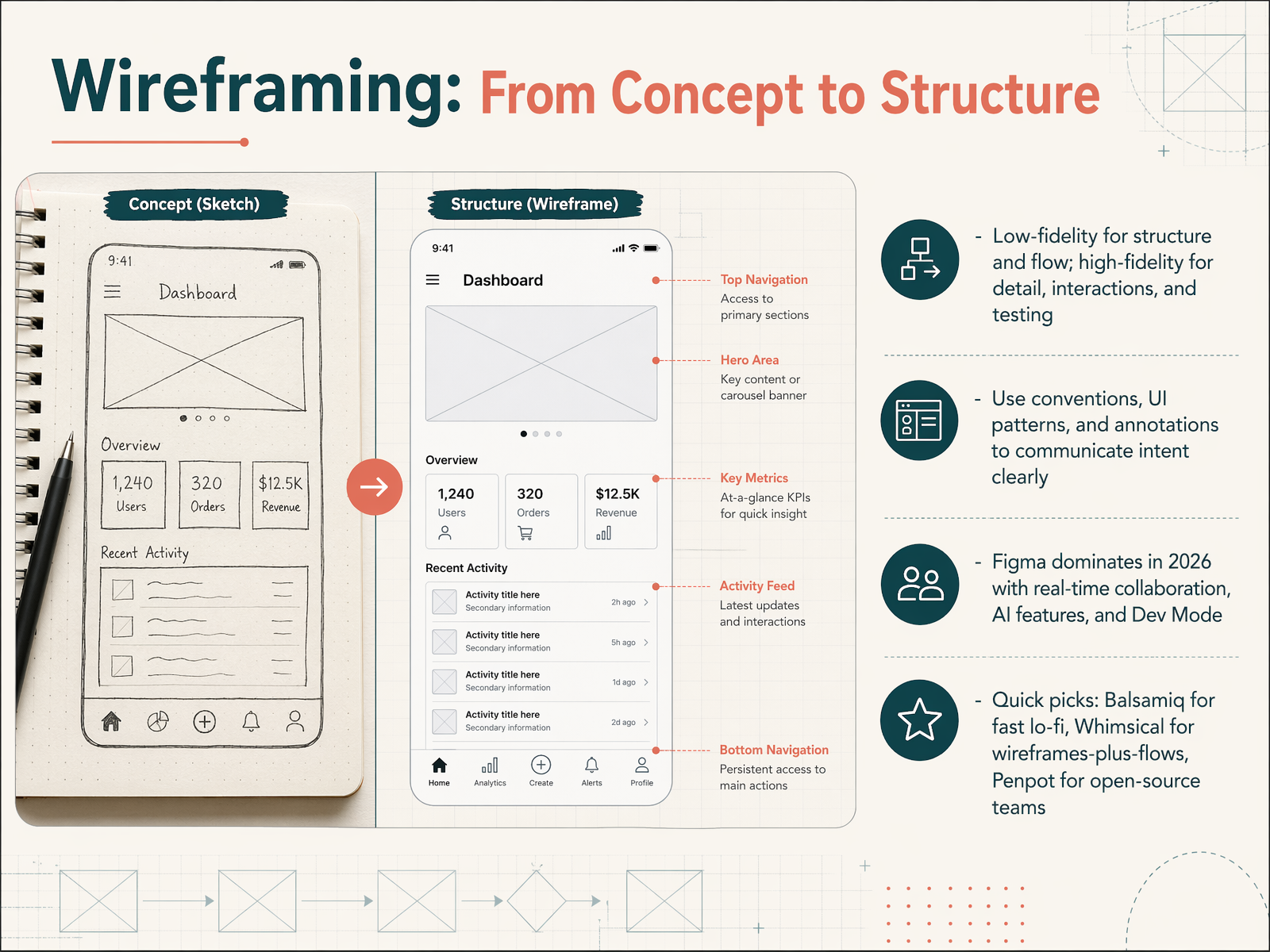
1 min - 09Wireframing: From Concept to StructureLet's move from the big picture to the actual structure of your design. This slide is all about wireframing, which is how we turn a concept into a visible blueprint. Think of it as the architectural plan for your app or website. We start with low-fidelity wireframes. These are rough, simple sketches that focus purely on structure and user flow. They help you decide where buttons, text, and images go without getting distracted by colors or fonts. Once the layout is solid, you can build a high-fidelity wireframe. This version adds detail, realistic content, and even some basic interactions, which is perfect for testing with real users. To communicate your ideas clearly, use common design conventions and UI patterns, because people already know how these work. This makes your design intuitive. You can also add annotations, which are just short notes explaining your logic. In terms of tools, Figma is the industry leader in 2026. It offers real-time collaboration, powerful AI features, and a special Dev Mode that makes handing off to engineers seamless. For quick, low-fidelity work, Balsamiq is a fantastic choice that keeps the focus on structure. If you need to combine wireframes with flowcharts, Whimsical is excellent. And for open-source teams, Penpot provides a free, Figma-like experience with no user limits. Choosing the right tool depends on your project's fidelity needs and team setup. Next, we'll take these wireframes and bring them to life as we explore prototyping.
 zapier.comalphonsolabs.comstoryflow.so+22 min
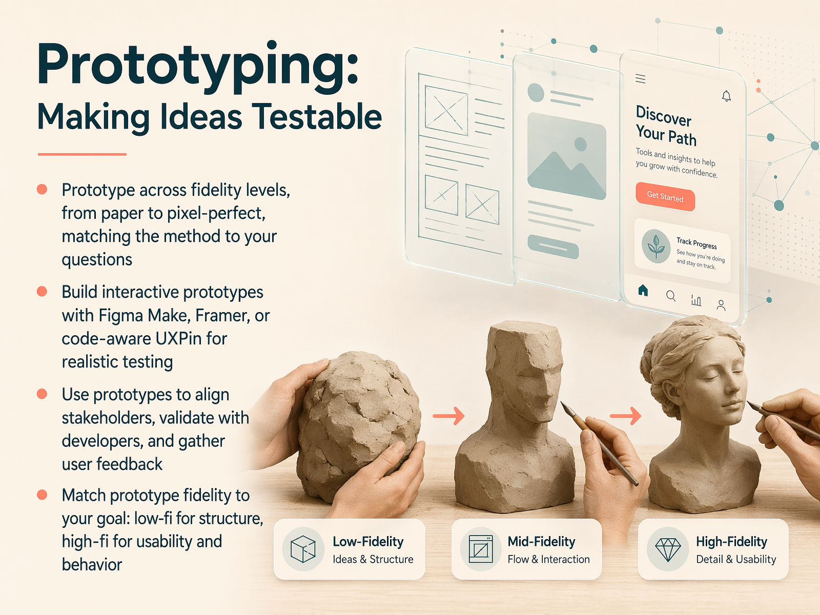
 - 10Prototyping: Making Ideas TestableAlright, let's move into prototyping, where we make our ideas testable. Think of a prototype as a draft version of your product. It doesn't have to be perfect, it just has to be real enough to learn from. The key rule here is to match the fidelity of your prototype to the questions you're asking. If you're just exploring the overall structure and navigation, a quick sketch on paper or a low-fidelity wireframe in Balsamiq is perfect. It keeps the conversation focused on the bones, not the colors. But if you need to test a detailed interaction, like a checkout flow, you'll need a higher-fidelity, interactive prototype. Tools like Figma Make or Framer let you build clickable experiences that feel like the real app. For even more realistic behavior, UXPin lets you build with code-level logic, which is great for validating complex ideas with developers. Using these prototypes helps align your team, gets real feedback from users, and confirms technical feasibility before you write a single line of code. Up next, we'll put those prototypes to work in usability testing, learning directly from real users.
 zapier.comalphonsolabs.comstoryflow.so+22 min
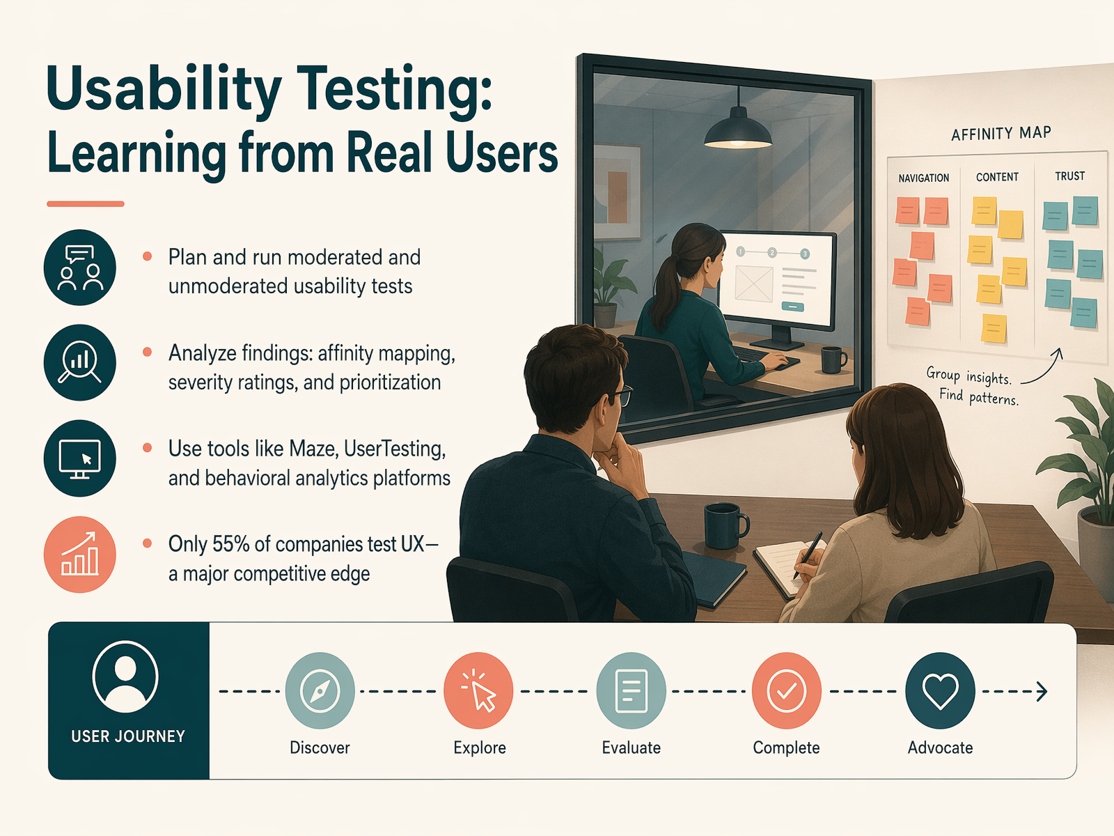
 - 11Usability Testing: Learning from Real UsersLet's talk about usability testing, one of the highest-return activities in UX. It's the practice of watching real people try to use your product so you can learn directly from them. You can plan and run moderated tests, where you guide the participant, or unmoderated tests, where they complete tasks on their own. After the sessions, you'll need to analyze the findings. Techniques like affinity mapping help you group observations into themes, while severity ratings and prioritization let you focus on the issues that matter most for your users. You can use tools like Maze, UserTesting, or behavioral analytics platforms to run these tests and gather insights. And here's a powerful statistic: only 55 percent of companies actually test their UX. Making this a consistent part of your process is a major competitive edge. Now, let's move on to visual design essentials for UX.
 uxcrush.comsearchlab.nlmaze.co+21 min
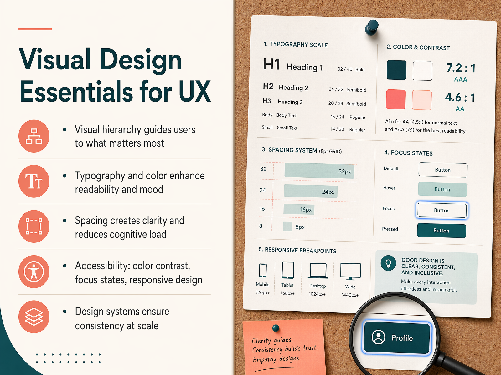
 - 12Visual Design Essentials for UXNow let's talk about the visual side of UX. Visual design isn't just about making things look nice. It directly supports how people use and understand a product. The first essential is visual hierarchy. This simply means arranging elements to guide the user's eye to what matters most, like a key headline or a primary button. Next, we have typography and color. The right font choices improve readability, while color can set the mood and draw attention. Good spacing is also critical. It creates breathing room and reduces cognitive load, making the interface feel clear and less overwhelming. We must always design for accessibility. This includes ensuring sufficient color contrast, providing visible focus states for keyboard navigation, and building responsive layouts that work on any screen size. Finally, to keep all these elements consistent across a large product, teams use design systems. These are shared libraries of styles and components that ensure a cohesive experience at scale. Up next, we'll explore how to measure the success of these designs in 'Measuring UX: Metrics That Matter.'
 2 min
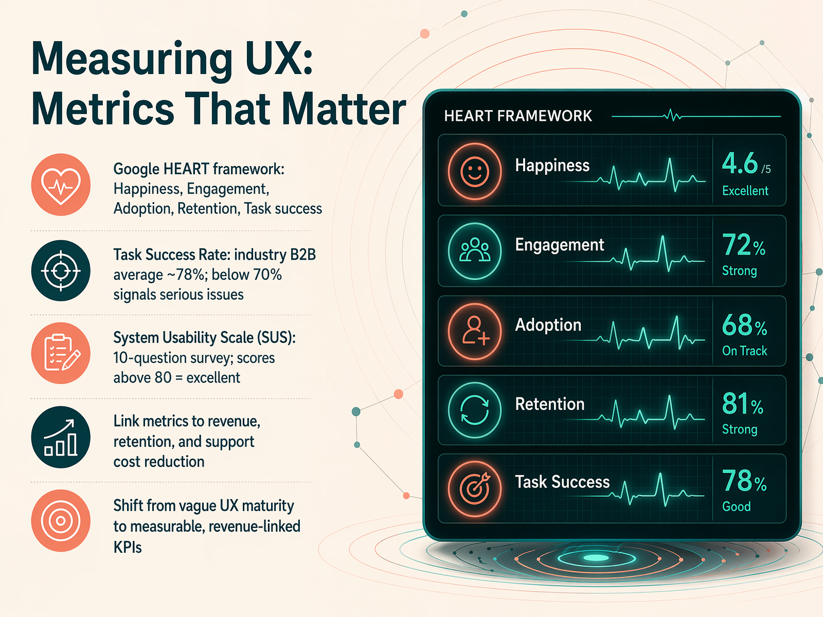
2 min - 13Measuring UX: Metrics That MatterNow that we have a handle on the design process, let's talk about how to prove it's working. This slide is about measuring UX with metrics that matter. We're moving beyond vague feelings and into hard business numbers. First, let's frame it with a well-known structure: the Google HEART framework. HEART stands for Happiness, Engagement, Adoption, Retention, and Task success. It helps you map user attitudes and behaviors directly to your product goals. For a concrete number, look at Task Success Rate. This is simply the percentage of users who can complete a core task without running into trouble. The industry average for B2B software is around 78 percent. If your score dips below 70 percent, that is a serious red flag signaling major usability issues. Another powerful tool is the System Usability Scale, or SUS. It's a quick ten-question survey that gives you a score from zero to 100. A score above 80 is considered excellent. The real magic happens when you link these metrics to business outcomes like revenue, retention, and support cost reduction. For example, good UX can cut support costs by about 33 percent by solving confusing interactions before users need to call for help. This shift from vague UX maturity to measurable, revenue-linked KPIs is what gets design teams a seat at the executive table. Coming up next, we'll explore where all this is heading in our final deep dive: UX in 2026: Trends and the AI Revolution.
 uxcrush.comsearchlab.nlmaze.co+22 min
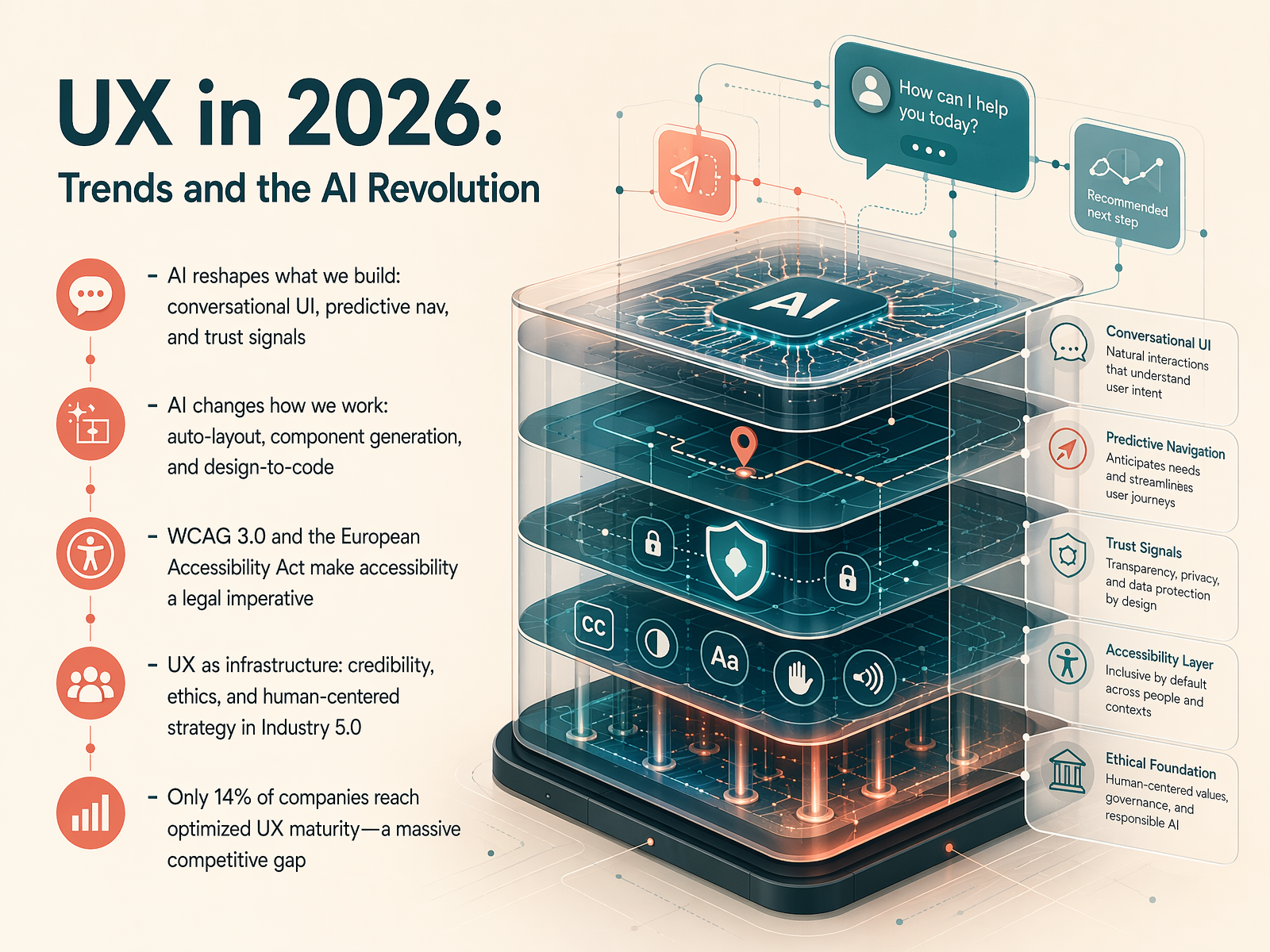
 - 14UX in 2026: Trends and the AI RevolutionLet's look at how UX is evolving in 2026. AI is reshaping what we build and how we work. You now see conversational interfaces, predictive navigation, and subtle trust signals that guide users without them even noticing. Tools like Figma are adding auto-layout, component generation, and even design-to-code features, which means we spend less time on repetitive tasks and more time on strategy. But with this speed comes responsibility. Accessibility is no longer a nice-to-have. WCAG 3.0 and the European Accessibility Act are making it a legal requirement, so inclusive design is now a core part of the job. UX is also becoming strategic infrastructure. It is the credibility engine behind Industry 5.0, where ethics and human-centered strategy really matter. And here is the biggest opportunity: only 14 percent of companies have reached optimized UX maturity. That is a massive competitive gap. For those who invest in mature, responsible UX, the business advantage is huge. Next, we will explore the career paths and roles that make this work possible.
 uxcrush.comsearchlab.nlmaze.co+22 min
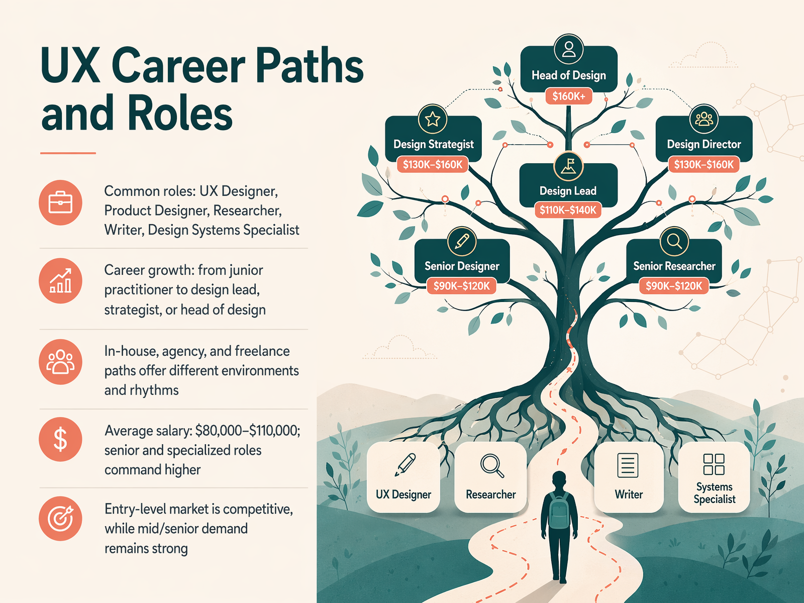
 - 15UX Career Paths and RolesNow, let's talk about where a career in UX design can actually take you. There are many different paths you can follow, and your role isn't just one fixed title. You might start as a UX Designer, focusing on hands-on research and prototyping, or you could specialize from the beginning. Common roles include Product Designer, User Researcher, UX Writer, or even a Design Systems Specialist. As you grow, you can move from a junior practitioner to a design lead, a strategist, or eventually a Head of Design. Your work environment shapes your rhythm, too. You can work in-house, diving deep into a single product over time, join an agency to work with many different clients on a fast-paced schedule, or go freelance, which gives you the flexibility to choose your own projects. In terms of salary, the average range is typically between eighty thousand and one hundred ten thousand dollars per year. Senior and specialized roles command even higher pay. While the entry-level market is competitive right now, demand for mid-level and senior designers remains very strong. So, there is a clear runway for a long-term, rewarding career. Next, we'll wrap up with your next steps into UX design.
 smashingmagazine.comuxdesigninstitute.comcoursera.org+22 min
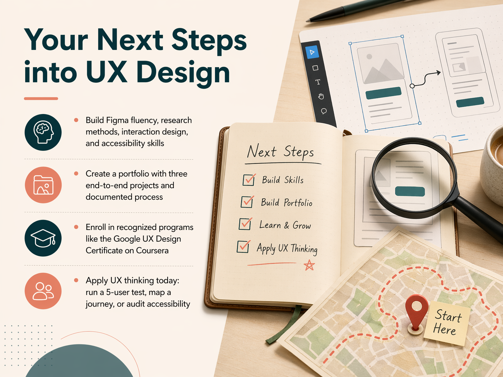
 - 16Your Next Steps into UX DesignWelcome to the final step of our introduction. Now that you have a solid foundation, let's talk about where you go from here. The key is to build a practical skill set. Start by getting truly comfortable with Figma, understanding user research methods, and learning the fundamentals of interaction design and accessibility. Next, you'll want to build a portfolio that tells a story. Aim for three end-to-end case studies that show your process, not just the final polished screens. Employers want to see how you solve problems. To guide your learning, consider enrolling in a recognized program like the Google UX Design Certificate on Coursera. It provides a structured path and a credential that hiring managers know. But don't wait to start applying what you've learned. You can run a simple usability test with five people, map out a user journey for an app you use, or audit a website for accessibility. These small actions build real skills today. Thank you for taking this first step into UX design with me. The field needs thoughtful, curious problem-solvers, and I'm excited for you to join it. Keep learning, keep practicing, and remember to always start with the user.
 smashingmagazine.comuxdesigninstitute.comcoursera.org+22 min
Take the deck with you
Download this course as a file — free, no sign-up needed.
- PDF handoutEvery slide page, ready to print or share.17 pages · 4.4 MBDownload
- Narrated PowerPointThe deck that presents itself — every slide carries the digital human's narration video.17 pages · 16.1 MBDownload
- PowerPoint slidesThe full deck as a .pptx — open it in PowerPoint, Keynote, or Google Slides.17 pages · 4.2 MBDownload
Free to use in your own training — please keep the PersonWise credit page at the end.
Have your own deck? Turn it into a course
Sources consulted
Web sources consulted while building this course.
- UX Design: The Complete Guide for 2026 — uxcrush.com
- UX & UI Design Statistics 2026 | 50+ Data Points & Insights | Searchlab — searchlab.nl
- 40+ Key UX Stats for 2026 — maze.co
- UX Statistics 2026: Key Metrics, Benchmarks & Business Impact Insights — designrush.com
- State of UX in 2026 - NN/G — nngroup.com
- The True ROI of UX: B2B Redesign Case Studies | Toptal® — toptal.com
- 42 UX ROI Statistics for Designers and Product Teams — uxcrush.com
- The ROI of Good UX Research: Real Numbers & Case Studies — ideoz.ai
- How to Prove the ROI of UX Research in 2026 — akraya.com
- The 6 best wireframe tools in 2026 | Zapier — zapier.com
- 10 Best Wireframing Tools in 2026 (Side-by-Side) — alphonsolabs.com
- 12 Best Wireframing Tools in 2026 (Tested by a Builder) | Storyflow — storyflow.so
- 10 Best Wireframing Tools in 2026 (Free + Paid) For UI & UX Projects — rocket.new
- Best Wireframing Tools 2026: Free, Paid & Prototyping — avidclan.com
- UX And Product Designer’s Career Paths In 2026 — Smashing Magazine — smashingmagazine.com
- The UX Job Market in 2026: The Most In-Demand Skills & Roles — uxdesigninstitute.com
- UX Designer Career Path: 5 Ways to Step Up Your Design Career | Coursera — coursera.org
- UX designer salary in 2026: Job description, skills and career path — roberthalf.com
- UX Design Learning Roadmap: Skills, Tools, Certifications | Coursera — coursera.org