Begin
14 pages · ~28 min
Graphic Design Types
This training introduces the main types of graphic design, helping aspiring designers and creative professionals identify core specializations and choose a career focus.
A digital instructor presents all 14 pages. Hold “Ask” at any point and ask out loud — the answer comes from this course. No sign-up needed.
What you’ll learn
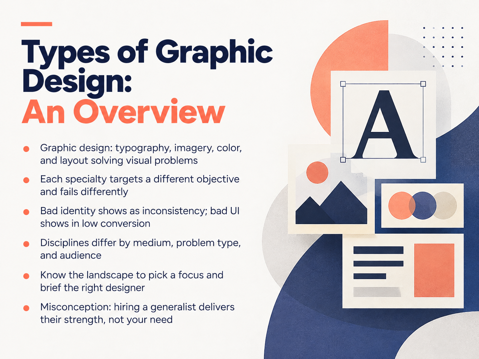
- 01Types of Graphic Design: An OverviewWelcome. In this course, we're going to map out the types of graphic design, so you can see the whole field clearly and know where you want to work. First, a working definition. Graphic design uses typography, imagery, color, and layout to solve visual problems. That covers a lot of ground, but each specialty targets a different objective. And each one fails in its own way. A weak identity shows up as inconsistency across touchpoints. A weak interface shows up as low conversion or confused users. Disciplines differ by medium, by problem type, and by audience. So knowing the landscape helps you choose a focus, and helps you brief the right designer when you're hiring. Here's a common misconception to avoid. Hiring a generalist delivers their strength, not necessarily your need. If your problem is interface usability, a brilliant brand designer may not be the right fit. So as we go, ask yourself: which problems do I want to solve, and for whom? Up next, we'll walk through the Design Disciplines Map.2 min
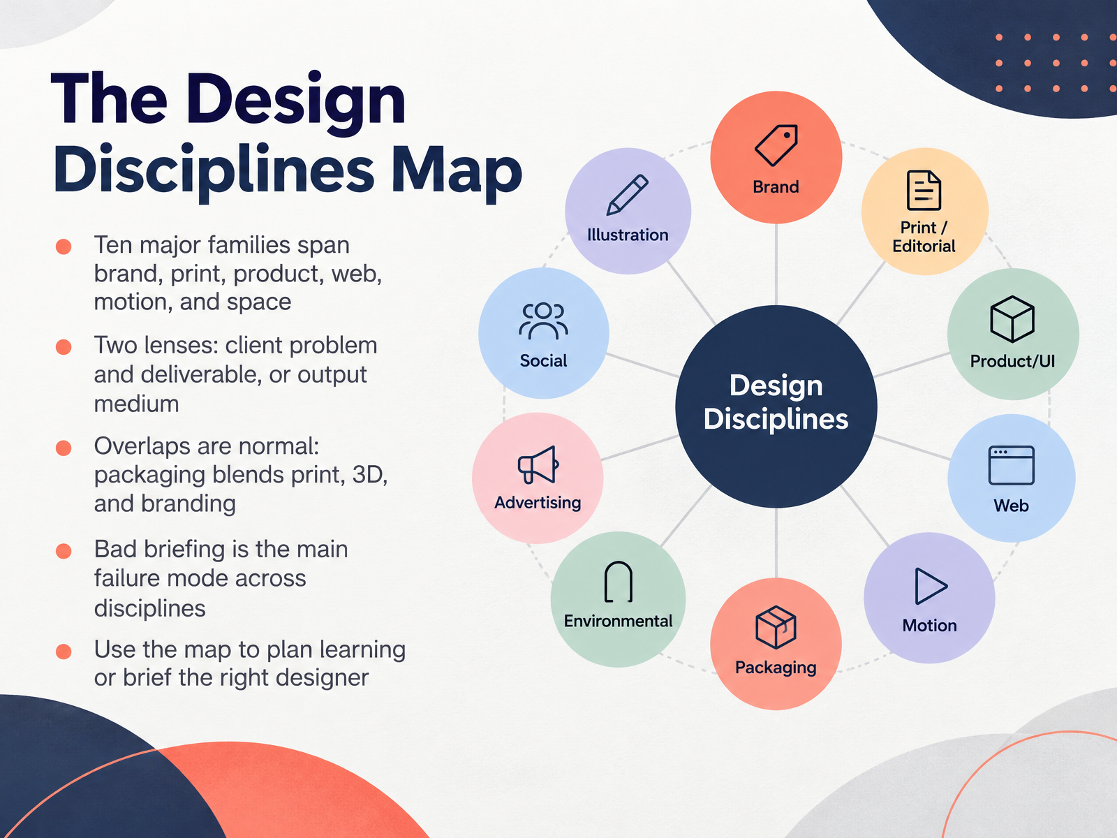
- 02The Design Disciplines MapNow let's look at the design disciplines map. This is the big picture of the field. You'll find ten major families here, spanning brand, print, product, web, motion, and space. That sounds like a lot, so let's simplify it with two lenses. The first lens is the client problem and the deliverable. What is the client trying to solve, and what are you handing over? The second lens is the output medium, like print, screen, or physical space. Expect overlaps. They are normal. Packaging, for example, blends print, 3D, and branding. One thing to watch for: a bad briefing is the main failure mode across every discipline. If the problem and the audience aren't clear, even strong craft misses the mark. So use this map two ways. To plan your learning, and to brief the right designer. Next, we'll zoom into the first family: Brand Identity and Logo Design.
 1 min
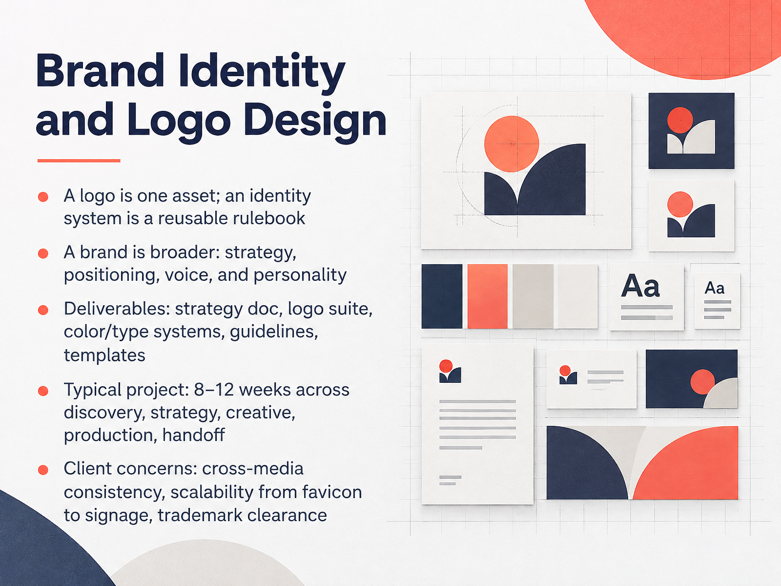
- 03Brand Identity and Logo DesignNext, let's look at brand identity and logo design. Start with a distinction that matters. A logo is one asset. An identity system is a reusable rulebook that tells you how to use that logo, color, and type consistently. A brand is broader still. It includes strategy, positioning, voice, and personality. So identity design turns brand thinking into a practical system. Typical deliverables include a strategy document, a logo suite, color and type systems, guidelines, and templates. Expect a full project to take about eight to twelve weeks, across discovery, strategy, creative, production, and handoff. Clients will care about cross-media consistency, scalability from a favicon to signage, and trademark clearance. So define how the system flexes early, and check legal requirements before finalizing the mark. That's how a logo becomes a durable identity. Coming up next, we'll move into print, editorial, and publication design.
 2 min
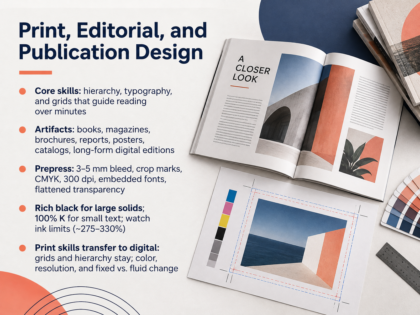
- 04Print, Editorial, and Publication DesignNext, we look at print, editorial, and publication design. Your core skills here are hierarchy, typography, and grids that guide a reader over minutes, not seconds. Think of a magazine feature, a report, or a catalog. You use grids and type to make long reading feel effortless. The work ships as books, magazines, brochures, reports, posters, and long-form digital editions. Before it goes to press, you handle prepress. That means three to five millimeters of bleed, crop marks, CMYK color, images at three hundred dots per inch, embedded fonts, and flattened transparency. Watch your black. Use a rich black for large solids, but one hundred percent black ink for small text. Keep total ink coverage around two hundred seventy-five to three hundred thirty percent. Here is the practical part. Print skills transfer to digital. Grids and hierarchy stay. Color, resolution, and fixed versus fluid layout change. Next, we turn to digital product and user interface design.
 2 min
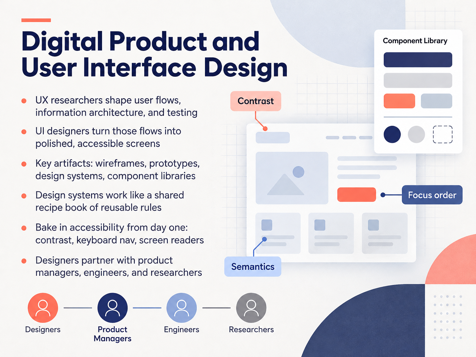
- 05Digital Product and User Interface DesignNext, let's look at digital product and user interface design. This is the work behind apps, websites, and software. It usually involves two close roles. U X researchers shape user flows, information architecture, and testing. U I designers then turn those flows into polished, accessible screens. The key artifacts you'll build are wireframes, prototypes, design systems, and component libraries. Think of a design system as a shared recipe book of reusable rules. It keeps buttons, forms, and spacing consistent across a product, so your team doesn't reinvent them on every screen. And accessibility isn't a final cleanup step. Bake it in from day one. Check color contrast, keyboard navigation, and screen reader support as you design. In practice, designers partner with product managers, engineers, and researchers. So when you build a portfolio project, show your process, not just the final screen. That proves you can work inside a real product team. Coming up next, we move into web and social media design.
 2 min
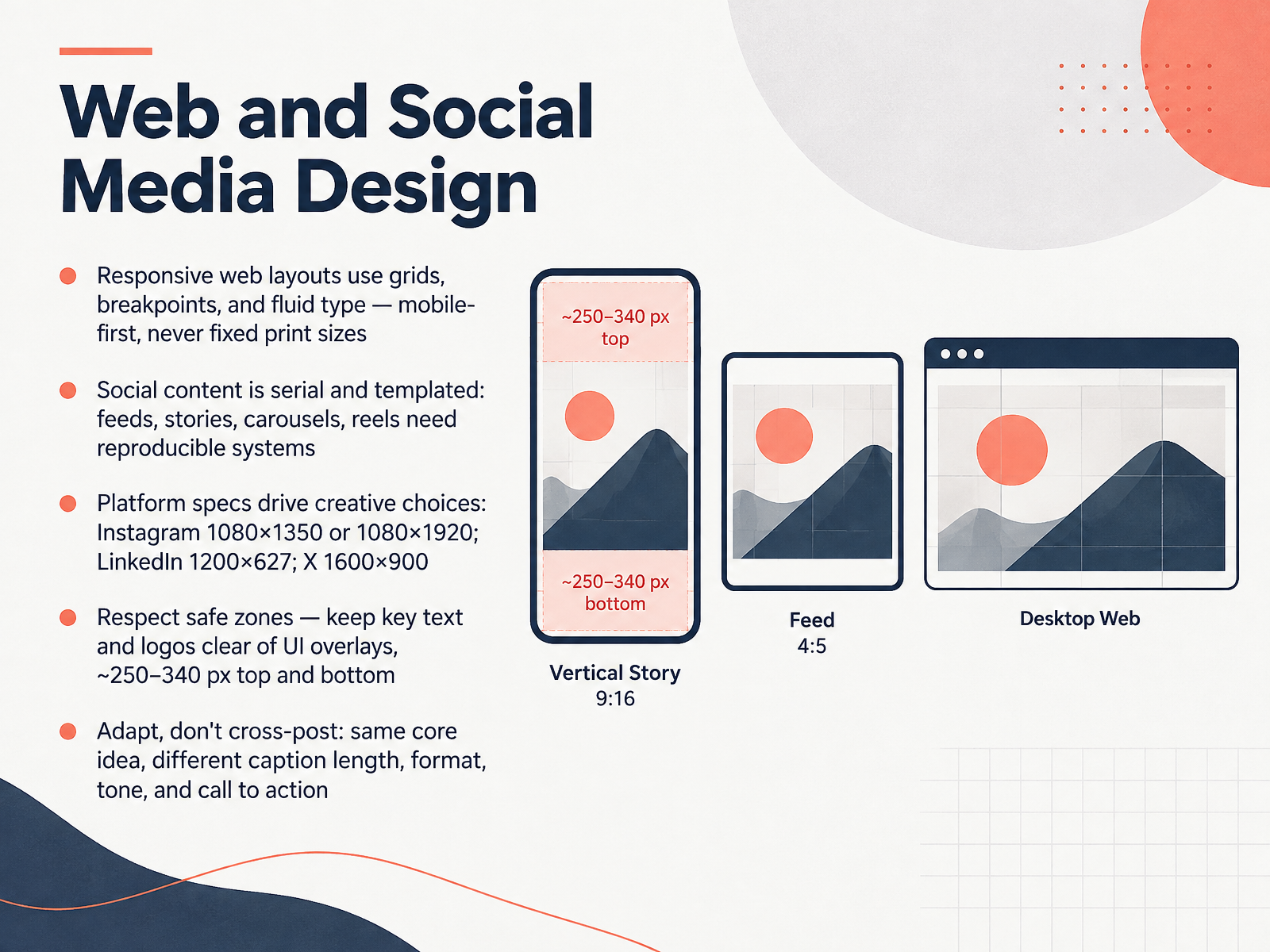
- 06Web and Social Media DesignNow let's turn to web and social media design. These are the formats your audience actually uses every day. For the web, you build responsive layouts. That means grids, defined breakpoints, and fluid type. Start mobile-first, and never treat screen sizes like fixed print dimensions. Social content is different. It's serial and templated. Feeds, stories, carousels, and reels all need reproducible systems, so you can publish consistently without redesigning from scratch each time. Platform specs also drive your creative choices. On Instagram, common sizes are 1080 by 1350 for portrait posts, or 1080 by 1920 for stories and reels. On LinkedIn, 1200 by 627. On X, 1600 by 900. Then respect safe zones. Keep key text and logos clear of interface overlays, roughly 250 to 340 pixels from the top and bottom. And adapt, don't just cross-post. Keep the same core idea, but adjust caption length, format, tone, and call to action for each platform. Up next, motion, video, and 3D design.
 2 min
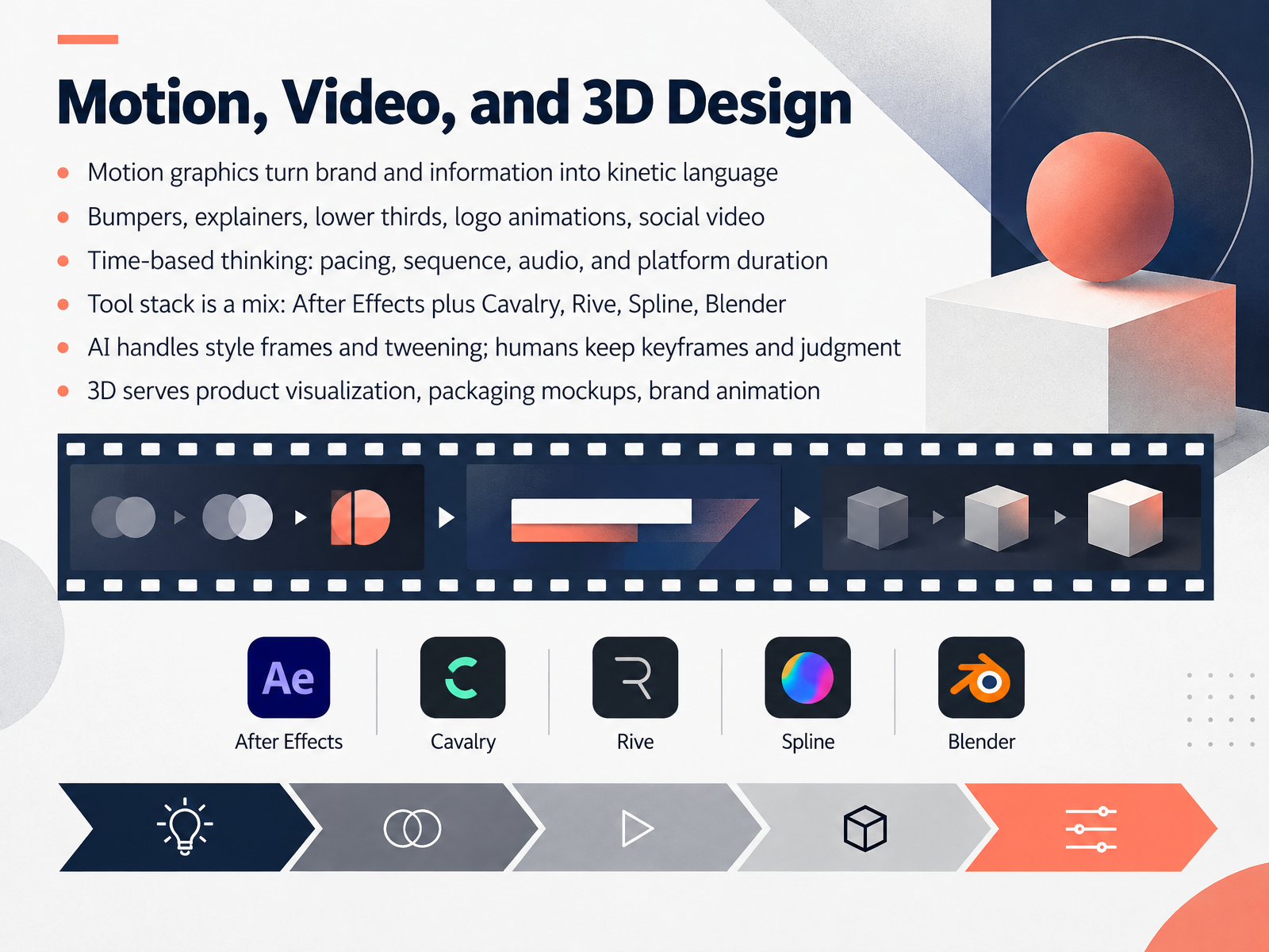
- 07Motion, Video, and 3D DesignNow let's look at motion, video, and 3D design. Motion graphics turn brand and information into kinetic language. That includes bumpers, explainers, lower thirds, logo animations, and social video. The core skill here is time-based thinking: pacing, sequence, audio, and platform duration. A bumper for a streaming service is not the same as a six-second social ad, and the timing has to match the format. Your tool stack is a mix: After Effects plus Cavalry, Rive, Spline, or Blender, depending on the task. AI can help with style frames and tweening, but humans keep the keyframes and the judgment. That judgment is what makes motion feel intentional. 3D design serves product visualization, packaging mockups, and brand animation, where lighting and camera angle shape the story. If you want to build a motion portfolio, choose one tool, finish one short piece, and show your process. Next, we move into packaging and environmental design.
 1 min
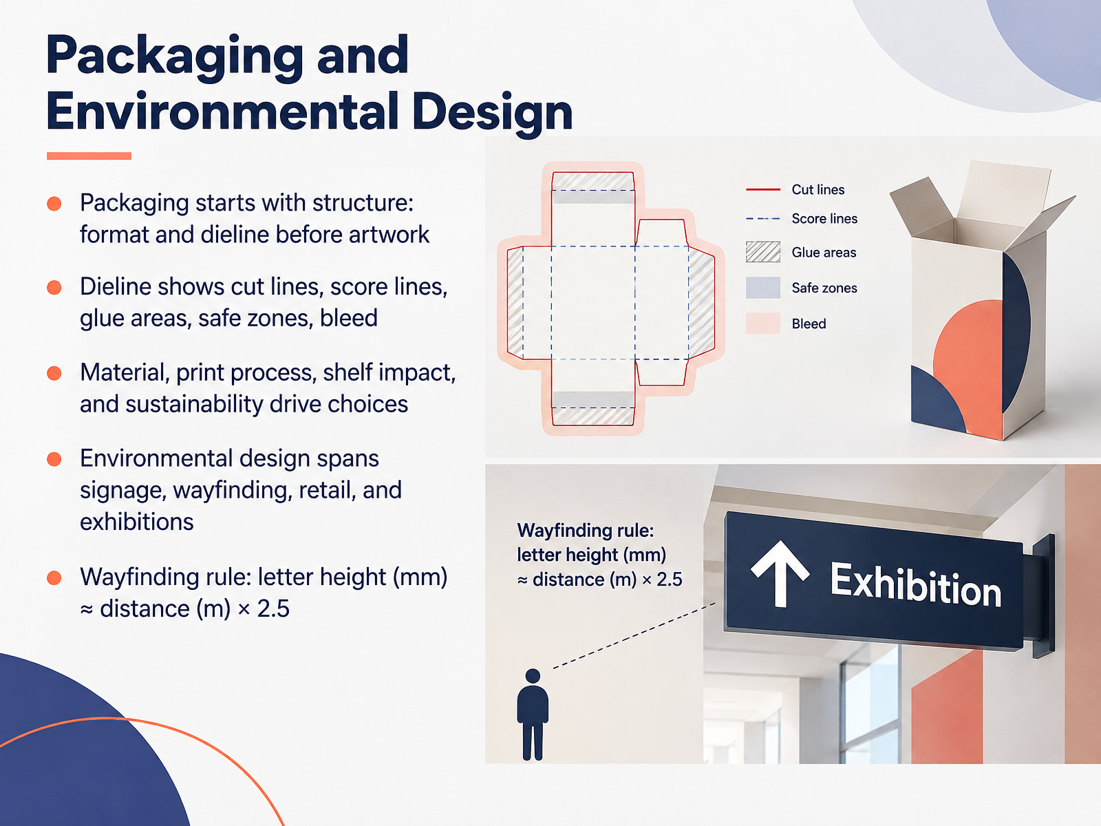
- 08Packaging and Environmental DesignNext, let's look at packaging and environmental design. In packaging, structure comes first. You choose the format and build the dieline before you touch the artwork. The dieline is your technical blueprint. It shows cut lines, score lines, glue areas, safe zones, and bleed. Get that wrong, and no amount of beautiful design will save the print run. Material, print process, shelf impact, and sustainability then drive your choices. For example, a recyclable board may limit certain finishes, and shelf visibility may push you toward bolder contrast. Environmental design is broader. It spans signage, wayfinding, retail spaces, and exhibitions. One practical rule for wayfinding: letter height in millimeters is approximately the viewing distance in meters times two point five. So a sign read from ten meters needs letters around twenty five millimeters tall. Keep structure first, then materials, then visual impact. That order saves time and money. Now let's move into illustration and advertising, two specialized paths.
 2 min
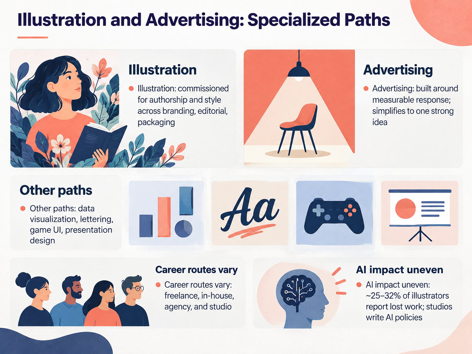
- 09Illustration and Advertising: Specialized PathsNow let's look at two specialized paths, illustration and advertising. Illustration is commissioned for authorship and style. A client hires a particular voice, whether that's branding, editorial, or packaging. Think of a magazine cover or a beer label where the drawing itself carries the identity. Advertising is built around measurable response. It simplifies to one strong idea, because the goal is a reaction you can count, like a click, a call, or a sale. Beyond these, other paths include data visualization, lettering, game UI, and presentation design. Career routes vary too. You might freelance, work in-house, join an agency, or find a studio. And AI impact is uneven. Roughly twenty five to thirty two percent of illustrators report lost work, while many studios now write AI policies. So ask about that in interviews. Next, we'll look at choosing and positioning your design path.
 2 min
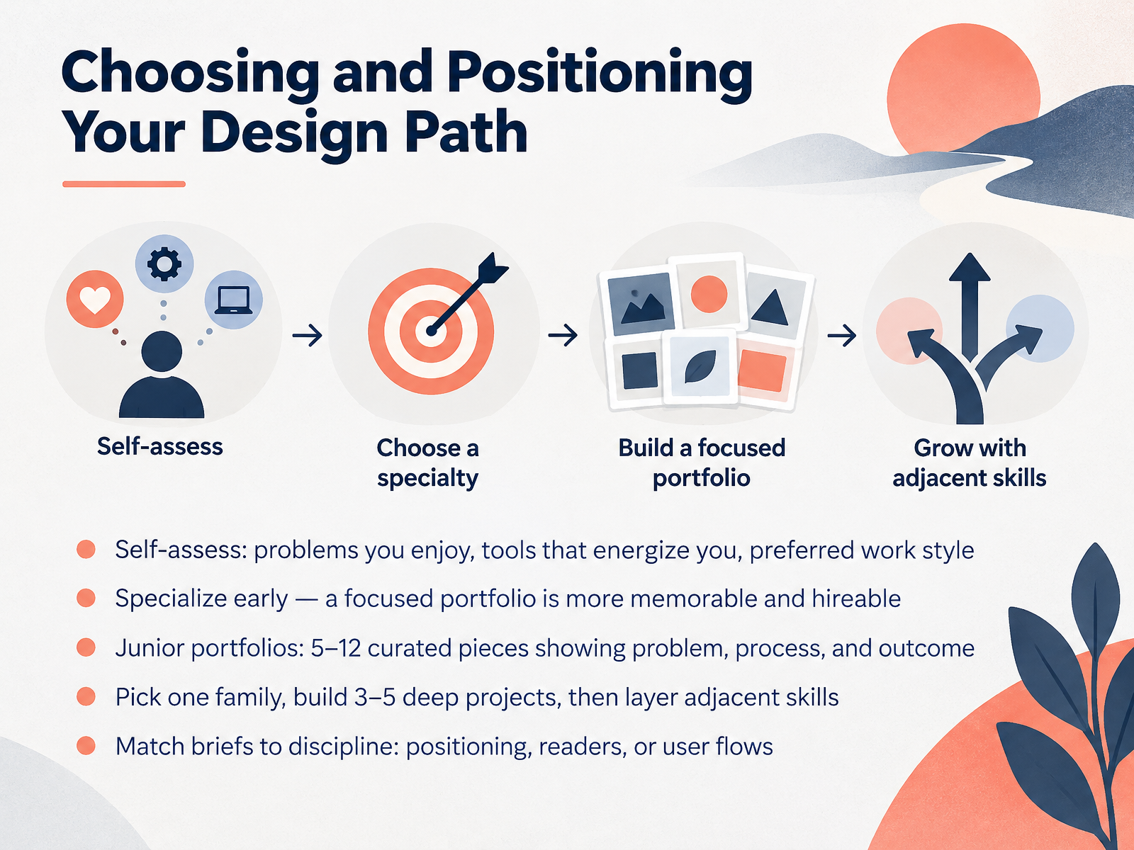
- 10Choosing and Positioning Your Design PathNow let's talk about choosing and positioning your design path. Start with self-assessment. Notice which problems you enjoy solving, which tools energize you, and how you prefer to work, whether solo, in teams, or with tight client contact. Then specialize early. A focused portfolio is more memorable and more hireable than a scattered one. For junior portfolios, aim for five to twelve curated pieces. Each piece should show the problem, your process, and the outcome. Pick one design family, build three to five deep projects, then layer in adjacent skills. And match briefs to the discipline. A visual identity brief needs positioning. An editorial brief needs readers. A product brief needs user flows. Keep these decisions intentional, and your path will become clearer. Next, How to Brief a Designer by Discipline.
 1 min
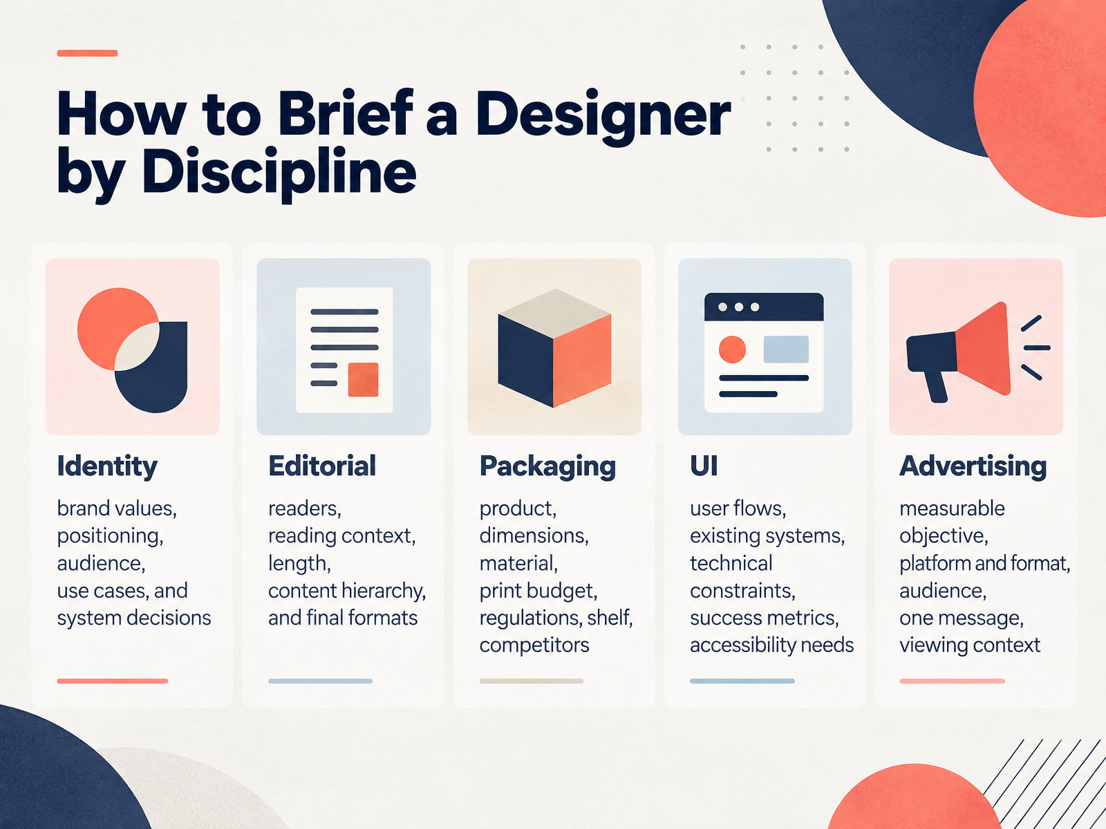
- 11How to Brief a Designer by DisciplineNow let's look at how to brief a designer differently depending on the discipline. A strong brief changes shape by specialty, because each one solves a different problem. For identity, cover brand values, positioning, audience, use cases, and system decisions. That means asking how the logo, color, and type will work across a website, a sign, and a presentation. For editorial, focus on readers, reading context, length, content hierarchy, and final formats. A print magazine brief is not the same as a long-form web article. For packaging, include the product, dimensions, material, print budget, regulations, shelf context, and competitors. That detail prevents expensive reprints later. For UI, clarify user flows, existing systems, technical constraints, success metrics, and accessibility needs. For advertising, name a measurable objective, the platform and format, the audience, one clear message, and the viewing context. Same principle across all five: brief the decisions, not just the deliverable. Next, we'll look at working with AI across design specialties.
 2 min
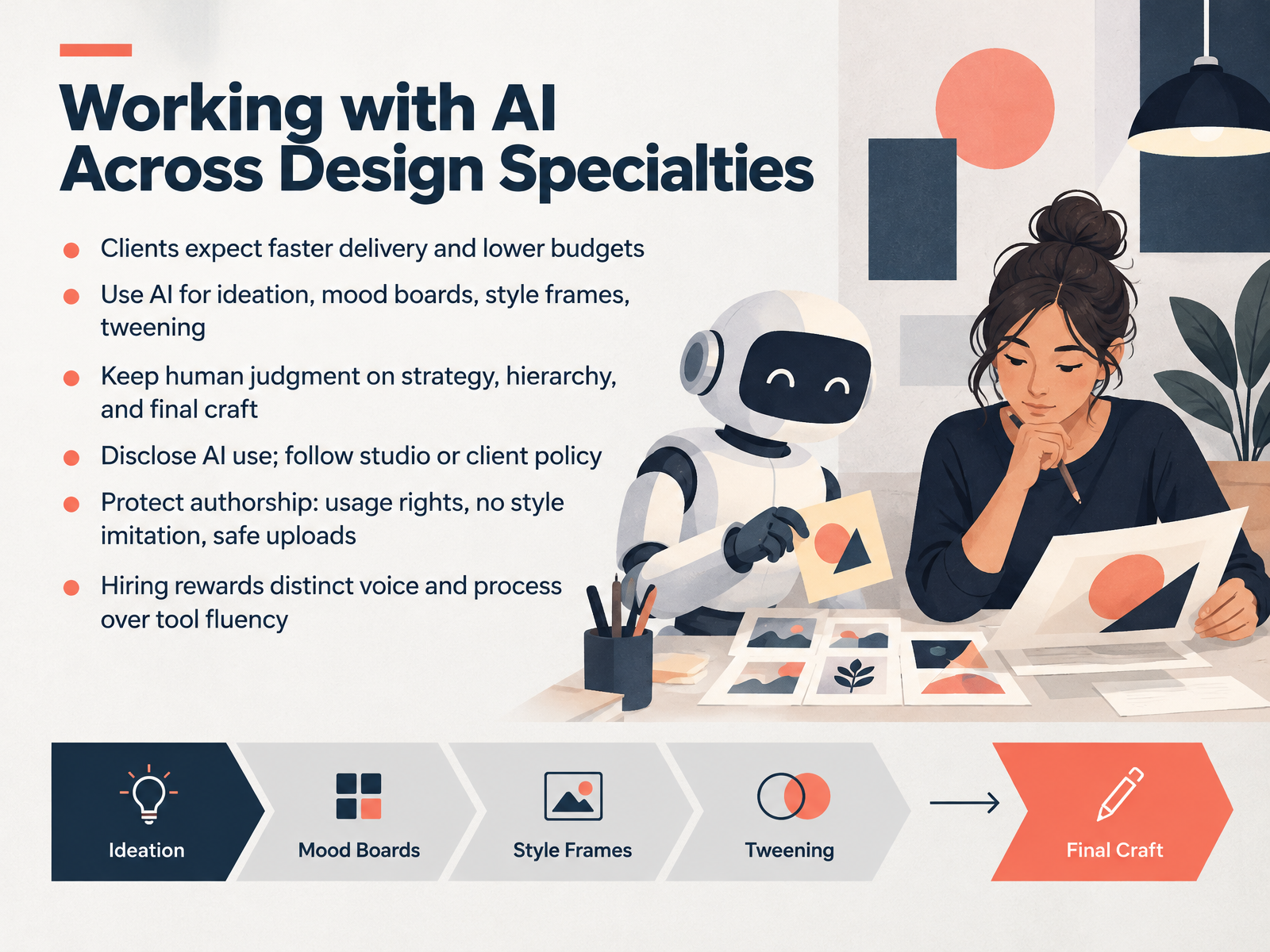
- 12Working with AI Across Design SpecialtiesNow let's look at how AI fits into each design specialty. Your clients will expect faster delivery and lower budgets, so it helps to know where AI genuinely saves time. Use it for ideation, mood boards, style frames, and tweening in motion work. But keep human judgment on strategy, visual hierarchy, and final craft. That is where your value lives. Be transparent about AI use, and follow studio or client policy. Protect authorship too: check usage rights, avoid imitating a living artist's style, and keep uploads safe by removing client data from public tools. Here is the key point. Hiring rewards a distinct voice and a clear process more than tool fluency. So show your thinking, not just your prompts. Next, we look at overlaps, hybrid roles, and where specialties meet.
 1 min
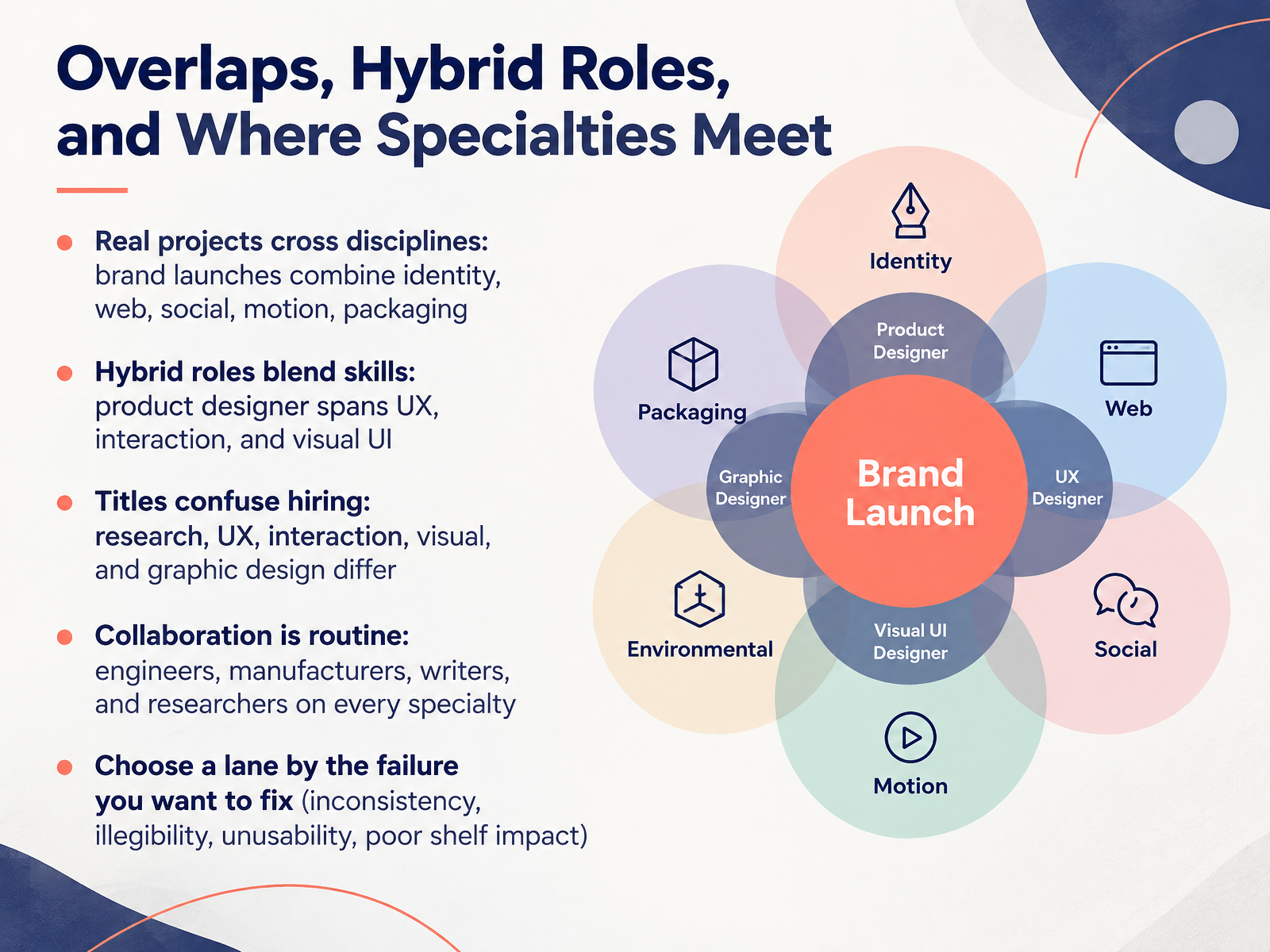
- 13Overlaps, Hybrid Roles, and Where Specialties MeetLet's talk about where specialties overlap. In real projects, disciplines cross all the time. A brand launch might combine identity, web, social, motion, and packaging, all in one campaign. That is normal, not an exception. Hybrid roles blend skills too. A product designer, for example, may span user experience, interaction, and visual interface work. Titles can confuse hiring. Research, user experience, interaction, visual, and graphic design mean different things, even when job posts use them loosely. Collaboration is routine. Engineers, manufacturers, writers, and researchers sit on almost every specialty. So how do you choose a lane? Pick the failure you want to fix. Inconsistency points to identity and systems. Illegibility points to typography and layout. Unusability points to user experience. Poor shelf impact points to packaging and brand design. Choose the lane that matches the problem you care about solving. Next, we'll look at Next Steps: First Projects and Resources.
 2 min
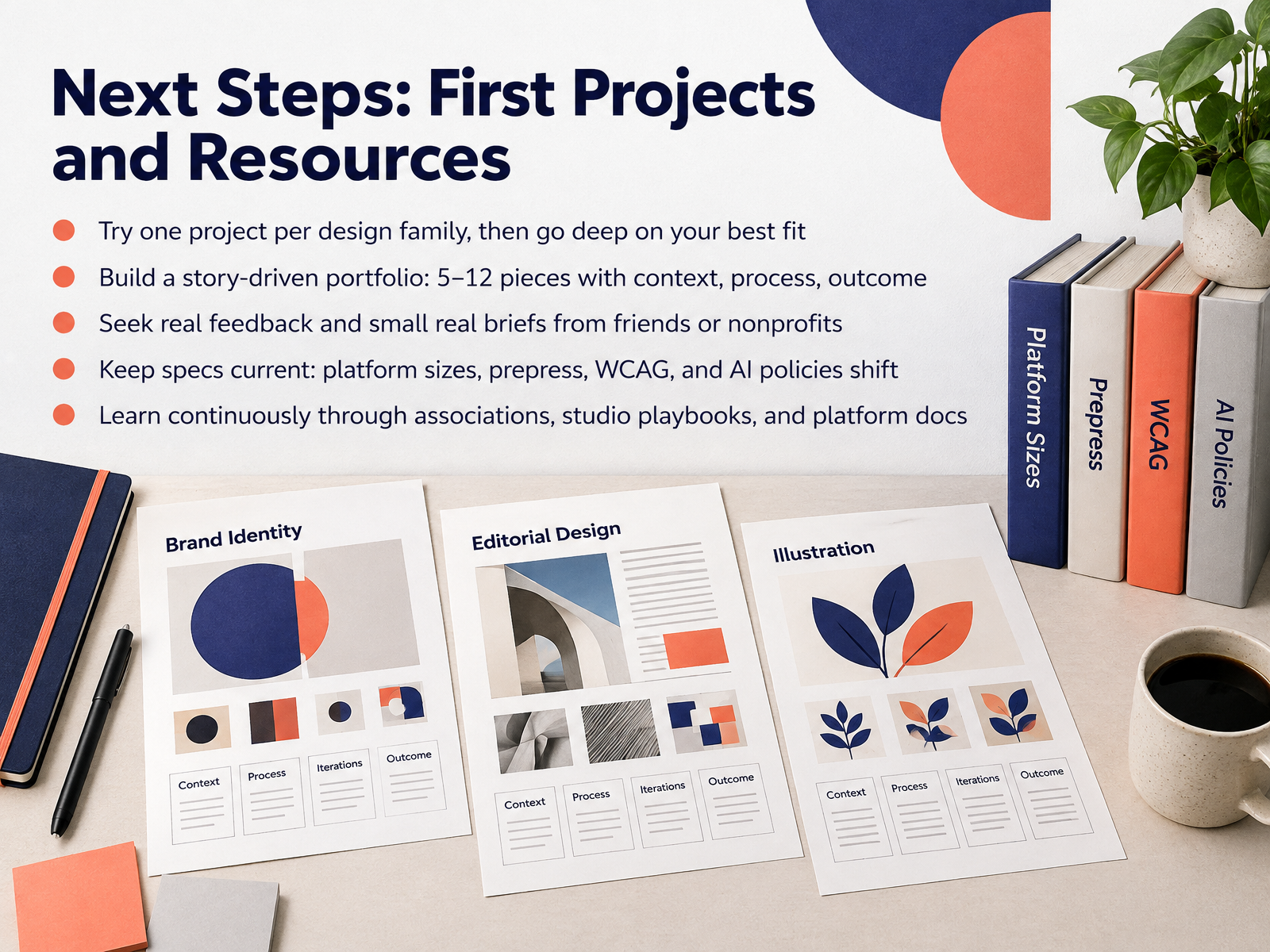
- 14Next Steps: First Projects and ResourcesLet's bring this all together into a practical plan. Start by trying one small project from each design family, like a logo, a landing page, and a social campaign. Then go deep on the one that fits you best. Build a story-driven portfolio of five to twelve pieces, and show the context, your process, and the outcome for each one. Ask for real feedback, and find small real briefs from friends or nonprofits. Keep your specs current, because platform sizes, prepress rules, accessibility standards, and AI policies keep changing. Learn continuously through associations, studio playbooks, and platform documentation. Thank you for joining me. Pick one first project this week, and keep going. You have a strong foundation, now go make the work.
 1 min
Take the deck with you
Download this course as a file — free, no sign-up needed.
- PDF handoutEvery slide page, ready to print or share.15 pages · 3.8 MBDownload
- Narrated PowerPointThe deck that presents itself — every slide carries the digital human's narration video.15 pages · 13.4 MBDownload
- PowerPoint slidesThe full deck as a .pptx — open it in PowerPoint, Keynote, or Google Slides.15 pages · 3.8 MBDownload
Free to use in your own training — please keep the PersonWise credit page at the end.
Have your own deck? Turn it into a course