Begin
14 pages · ~28 min
UI Design Basics: Practical Workflow
Learn UI design basics through a practical workflow covering core principles, tools, and hands-on techniques for creating effective user interfaces.
A digital instructor presents all 14 pages. Hold “Ask” at any point and ask out loud — the answer comes from this course. No sign-up needed.
What you’ll learn
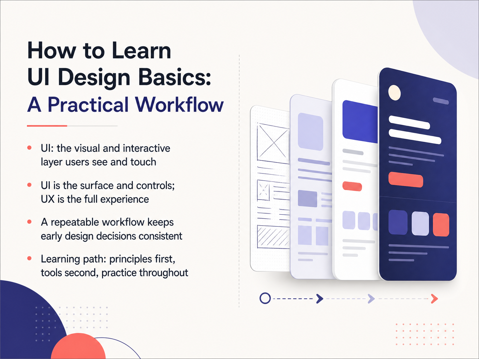
- 01How to Learn UI Design Basics: A Practical WorkflowWelcome! If you are curious about interface design, or you are thinking about making a career change, you are in the right place. This course is a practical workflow for learning the basics of UI design. So what is UI? Simply put, it is the visual and interactive layer users see and touch. That means buttons, menus, text, images, and how they are all laid out on the screen. Many people confuse UI with UX. Think of it this way. UI is the surface and the controls. UX is the full experience of using the product from start to finish. UI is one important part of that bigger experience. When you start designing, it is easy to feel overwhelmed. The fix is to use a repeatable workflow. A consistent process keeps your early design decisions steady, even when the project gets messy. Here is the path we will follow. We will learn design principles first. Then we will pick up the tools. And we will practice all the way through. You do not need any prior experience. Just bring your curiosity and be ready to make mistakes, because that is a normal part of learning. Let's get started. Next, we will explore what UI design really means.uxpin.comuiguides.commiro.com+21 min
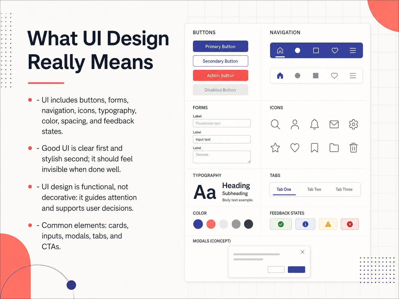
- 02What UI Design Really MeansNow let's look at what UI design really means. When people talk about UI, they mean the user interface. That is every part of a screen you see and touch. Buttons, forms, menus, icons, text, colors, and the space between them all count. Even the small messages that tell you an action worked are part of the UI. Good UI is clear first and stylish second. Think of it like a good road sign. It gets you where you need to go without making you stop and think. When a UI works well, you barely notice it. You just finish your task. UI design is functional, not decorative. It guides your attention and supports your decisions. As you go, you will meet common building blocks. Cards group related content. Inputs let people type information. Modals focus attention on one task. Tabs organize sections. And CTAs, or calls to action, are the buttons that ask people to take the next step. Think of these as your reusable toolkit. Now let's move to the core UI principles you need first.
 uxpin.comuiguides.commiro.com+22 min
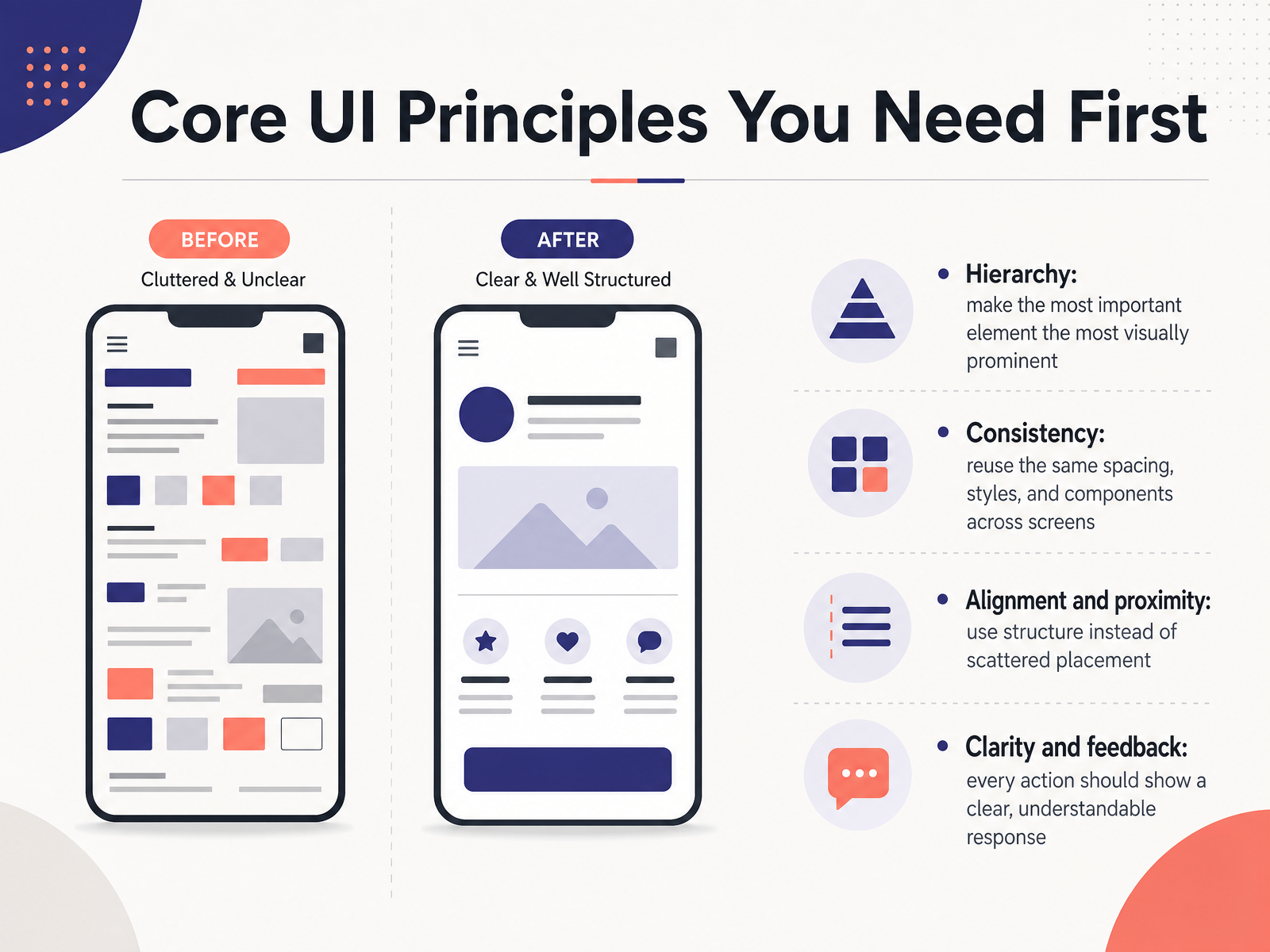
 - 03Core UI Principles You Need FirstBefore we start designing screens, let's lock in four core principles. They work like guardrails for every layout you make. First is hierarchy. Make the most important element stand out the most. That could be a larger heading, a stronger color, or a button placed where the eye lands first. Think of it as telling the user where to look. Second is consistency. Reuse the same spacing, styles, and components across your screens. When a button looks and works the same way everywhere, people stop thinking about the interface and just use it. Third is alignment and proximity. Keep related items close together and line them up with a clear structure. This creates order and makes a screen feel calm instead of scattered. Fourth is clarity and feedback. Every tap or click should show a clear response. A button press, a success message, or a loading state all tell the user the system heard them. If you master these four, your first project will feel more polished. Now let's move to a pocket glossary for reading tutorials.
 figma.commockplus.comcareerfoundry.com+22 min
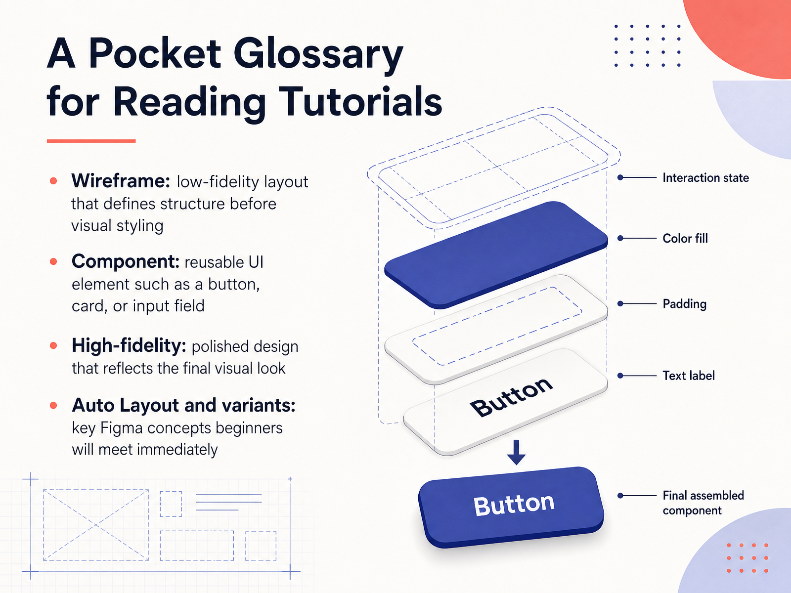
 - 04A Pocket Glossary for Reading TutorialsLet's take a moment to demystify some words you will likely see in tutorials. Think of these as a small pocket dictionary that can make reading lessons feel much less overwhelming. First is a wireframe. This is a low fidelity layout, meaning a simple sketch that defines the structure of a page before you add visual styling. It is like a blueprint. Next is a component. This is a reusable UI element, such as a button, a card, or an input field. You build it once and then use it across your project to save time and stay consistent. You will also hear the term high fidelity. This is a polished design that reflects the final visual look, with real colors and typography. And finally, in Figma you will meet auto layout and variants. These are key concepts that help your components adapt and stay organized. Auto layout controls spacing and alignment, while variants let you manage different states of a component, like a default button versus a hovered one. Try this next: when you read a tutorial, keep this list handy. You will get the hang of it quickly. Now let's move to the practical workflow: structure before style.
 figma.commockplus.comcareerfoundry.com+21 min
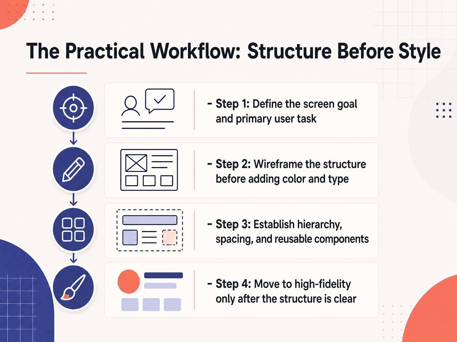
 - 05The Practical Workflow: Structure Before StyleNow let's move to the workflow itself. The most important habit to build early is this: structure before style. Many beginners want to pick colors and fonts right away, but a screen usually fails because the layout is unclear, not because the palette is off. So here is a practical four step path. Step one, define the screen goal and the primary user task. Ask one simple question: what should the person do on this screen? If a screen tries to do too much, it usually performs badly. Step two, wireframe the structure before adding color and type. A wireframe is a simple visual plan, just boxes, lines, and placeholder text. It lets you test the layout cheaply, before you invest in polish. Step three, establish hierarchy, spacing, and reusable components. Decide what deserves the most attention, like the headline or the main button. Then keep buttons, inputs, and spacing consistent everywhere. Step four, move to high fidelity only after the structure is clear. High fidelity means the detailed, polished version. It is much easier to change a wireframe than a finished screen. So get the bones right first. Next, we will see that same idea in action: from idea to finished screen.
 mockflow.comuxdesigninstitute.comnettantra.com+22 min
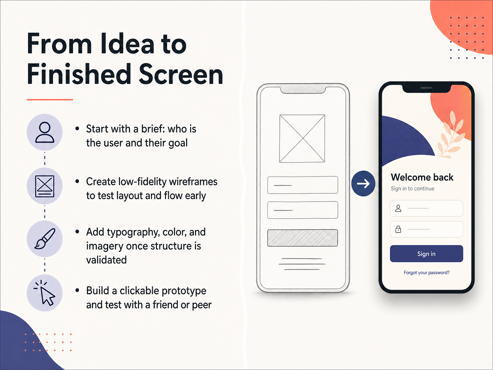
 - 06From Idea to Finished ScreenNow let’s move to the big picture: turning your idea into a finished screen. Try this as a simple four-step loop. First, start with a brief. Write down who your user is and the one main goal they are trying to reach. Keep it to a sentence or two, and you will avoid a lot of redesign later. Second, create low-fidelity wireframes. These are rough boxes and lines that show layout and flow, not colors or fonts. Test this structure early, because changing a wireframe costs almost nothing. Third, once the structure feels solid, add typography, color, and imagery. Think of this as dressing the skeleton, not building it. Fourth, build a clickable prototype and test it with a friend or peer. Watch where they pause or tap the wrong thing. That moment is not a failure; it is your best learning data. So the workflow is brief, wireframe, visual design, and test. You will get the hang of it with one small project. Next, let’s look at the essential tools for learning UI.
 mockflow.comuxdesigninstitute.comnettantra.com+22 min
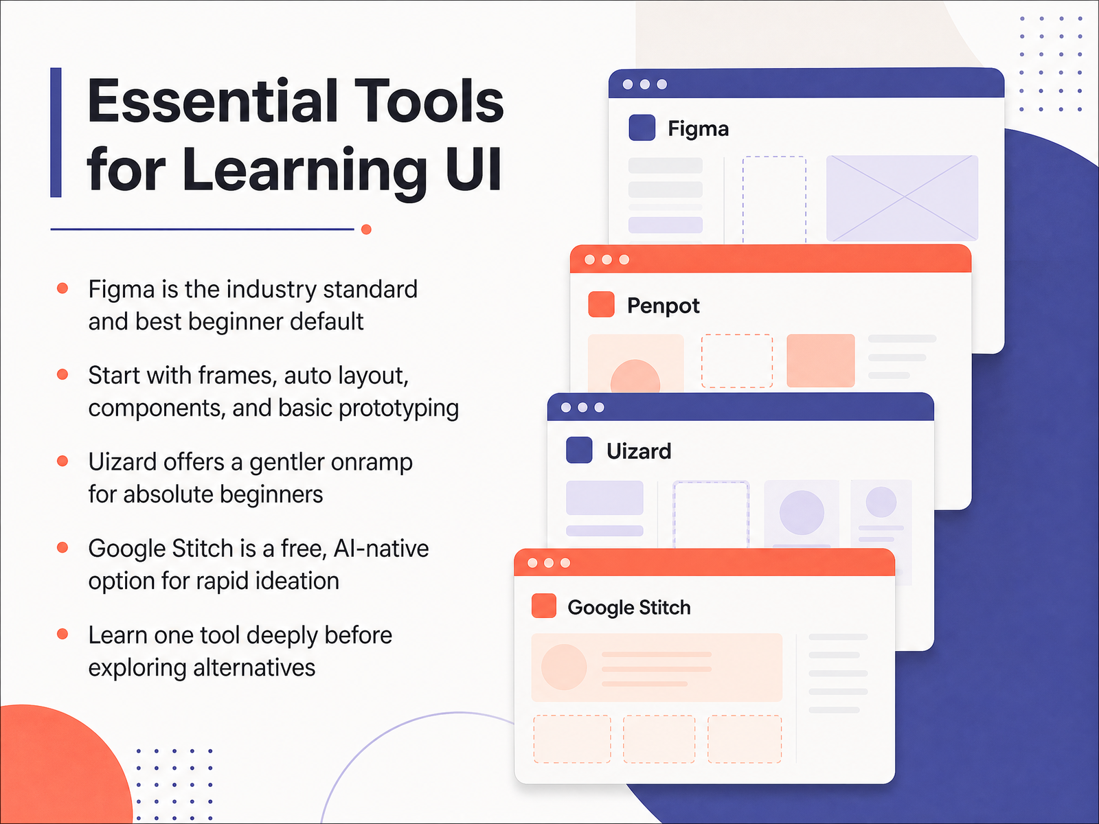
 - 07Essential Tools for Learning UINow let's talk about your toolkit. It's easy to feel overwhelmed by all the software options out there, so let's keep this simple. Figma is the industry standard, and it should probably be your default choice. It has a free plan, and most design jobs will expect you to know it. Start with the basics like frames, auto layout, and components, and get comfortable with simple prototyping. Don't worry about mastering everything right away. If you are an absolute beginner and Figma feels too heavy, you could try Uizard. It has a very gentle onramp and lets you generate screens from simple text descriptions. There is also Google Stitch, which is a free, AI-powered option from Google Labs. It is really useful for rapid brainstorming and turning a rough idea into a clickable prototype in minutes. The most important rule is this: learn one tool deeply before jumping to alternatives. It is better to have solid skills in one app than to be a beginner in five. Stick with your choice for at least two weeks. Once you are comfortable, you can explore others. Now that you have your tools ready, let's move to how to use AI without skipping the craft.
 derekjensen.iocomputertech.cofigma.com+22 min
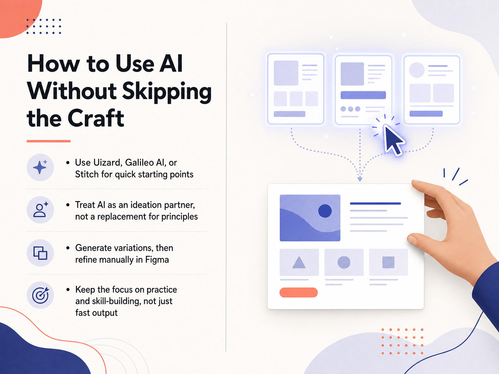
 - 08How to Use AI Without Skipping the CraftNow let's look at a practical question. AI tools can generate screens in seconds, so how do you use them without losing the chance to actually learn design? First, think of tools like Uizard, Stitch, and Galileo AI as quick starting points, not finished work. Uizard is especially gentle for beginners because you can describe an idea in plain words or even scan a hand drawn sketch. Stitch is another useful option because it is free and can turn a rough prompt into several connected screens fast. Try this next. Ask the tool for three variations of one simple screen, then open them in Figma and manually adjust sizes, spacing, and labels to match your own decisions. That manual step is where the crafting happens. The AI gives you raw material, but you provide the judgment. If a result feels wrong, name one specific problem and fix it by hand. You will get the hang of it. The goal is reps and understanding, not fast output. Now let's move to learning by copying with smart practice projects.
 derekjensen.iocomputertech.cofigma.com+22 min
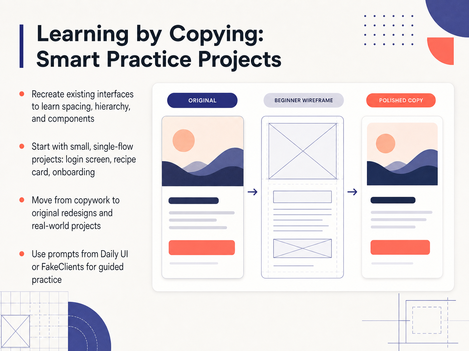
 - 09Learning by Copying: Smart Practice ProjectsNow let's move to one of the most effective ways to learn interface design: smart practice projects. You may have heard that copying is a great way to learn. In design, recreating an interface you already know is a powerful exercise. Pick an app you use daily, and try to rebuild one screen from scratch. Pay attention to how much space sits between sections, how text is sized and arranged, and how components like buttons repeat across screens. This is called copywork, and it trains your eye for detail. Start with something small and focused. A login screen is perfect because it teaches input states and visual hierarchy. A recipe card is another good choice because it helps you master layout and image placement. A simple three-step onboarding flow adds a bit of motion and progression. These single-flow projects feel manageable, and you will build confidence quickly. Once you feel comfortable with copywork, try a small original redesign. Maybe change the layout or the color system, and explain why your version works better. Then move toward a small real-world style project. To keep your practice steady, you can use prompt generators like Daily UI or FakeClients. These tools give you short, clear briefs with a difficulty level and a category. They turn open-ended practice into a focused exercise, and many of them are free to start. That is a great way to build a portfolio piece by piece. When you are ready, the next slide is important because it covers the common beginner mistakes to watch out for, and how to avoid them.
 2 min
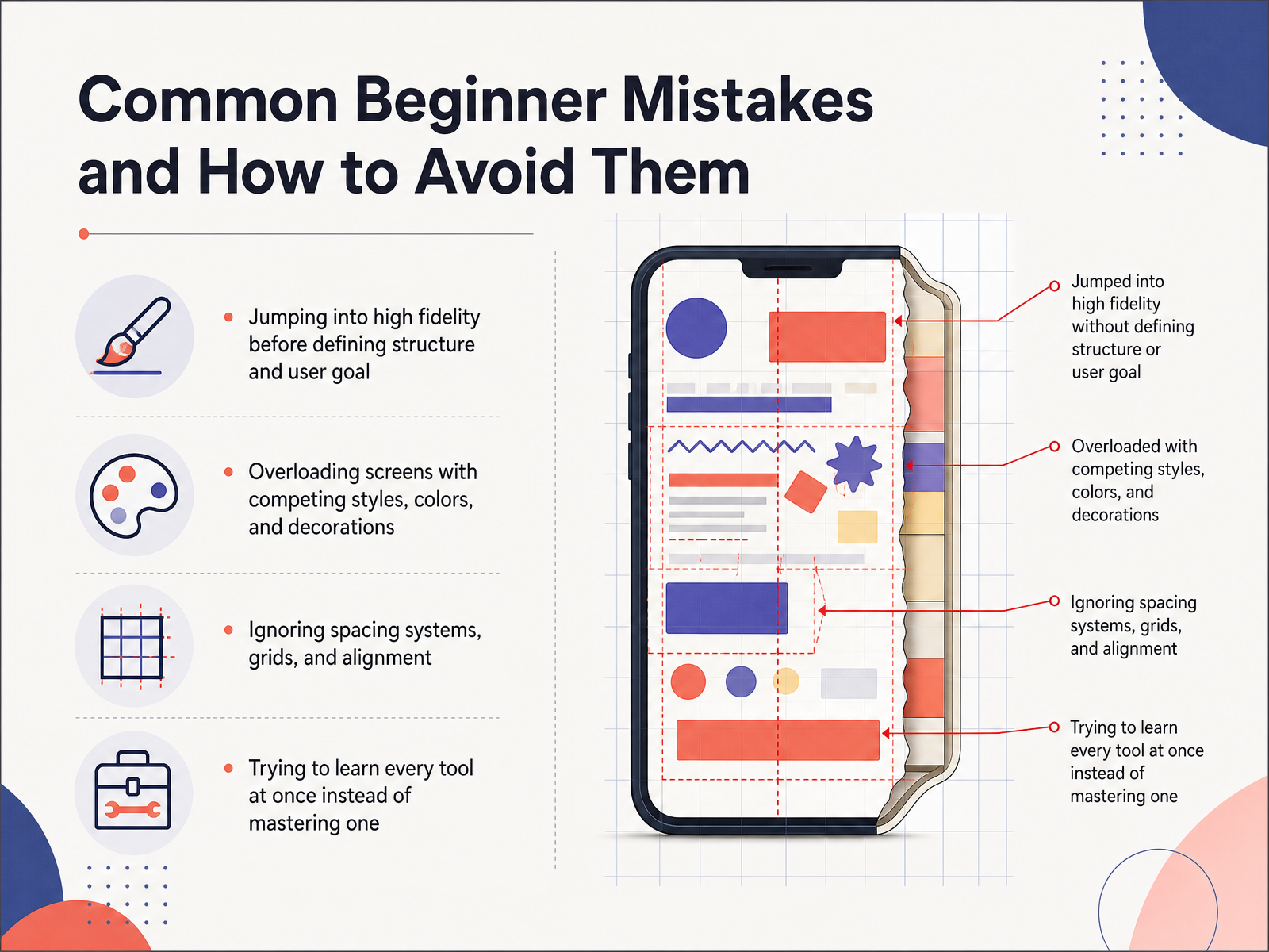
2 min - 10Common Beginner Mistakes and How to Avoid ThemNow let's look at a few mistakes almost every beginner makes, so you can catch them early. The first one is jumping straight into polished, high-fidelity design before you define the structure and the user goal. When you skip that step, you often end up making pretty screens that don't actually solve the problem. Try this next. Start with a simple wireframe and write down the one main goal your user should complete. The second mistake is overloading screens with competing styles, colors, and decorations. Too many visual elements fight for attention and make the interface feel chaotic. Keep your choices limited. Pick one or two fonts, a small color palette, and simple buttons. The third mistake is ignoring spacing systems, grids, and alignment. When elements are not aligned, the layout feels messy even if each part looks fine on its own. Use a basic grid and keep spacing consistent across similar elements. The fourth mistake is trying to learn every tool at once. That usually leads to knowing a little about many tools and not being confident in any. Instead, choose one main design tool and practice until it feels comfortable. You'll get the hang of it. These mistakes are normal parts of the learning curve. When you notice one in your work, treat it as a cue to slow down and apply the right habit. Next, we'll move into building your first portfolio project.
 1 min
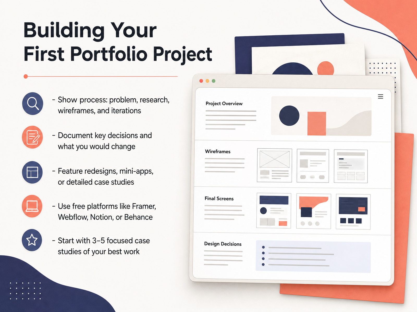
1 min - 11Building Your First Portfolio ProjectLet’s talk about putting together your first portfolio project. It may feel early, but this is where all your practice starts to become visible to other people. A strong beginner project is not about having a perfect final screen. It is about showing how you think. That means showing your process. Start with the problem you noticed. Then show a little research, even if it is just a few simple notes. Include your early wireframes. Then include the changes you made along the way. You do not need to hide the rough drafts. Show at least one iteration. And write down one key decision you made, plus one thing you would change if you had more time. This honesty is a strength. It shows you are learning. You can feature an unsolicited redesign, a small concept app, or a detailed case study from a course. For the tools, try using free platforms like Framer, Webflow, Notion, or Behance. Keep it simple at first. Most beginner portfolios work best with three to five focused case studies. Choose quality over quantity. Pick your best work, not all of it. Now let’s move to a realistic twelve week learning plan.
 1 min
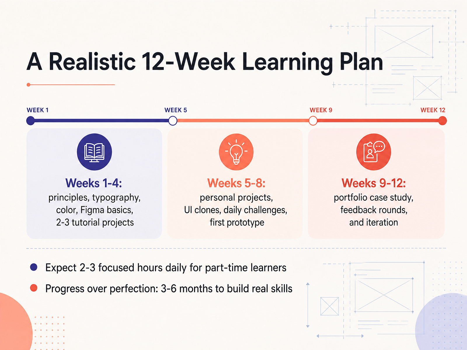
1 min - 12A Realistic 12-Week Learning PlanLet's make this feel real with a simple twelve week plan. In the first month, focus on the basics. Learn design principles, typography, and color. Get comfortable with Figma by completing two or three small tutorial projects. Just follow along and build. In the next month, shift to your own work. Start a personal project, or try recreating a screen from an app you use. Add a daily challenge to build the habit. By the end of this phase, aim to finish your first clickable prototype. It won't be perfect. That's fine. In the final month, pick one project and turn it into a portfolio case study. Show what problem you solved and how you made decisions. Then ask for feedback, and revise based on what you hear. For part-time learners, expect to spend two to three focused hours each day. Progress matters more than perfection. Real skills take three to six months to build. So give yourself that time. Now let's move to where to learn more and get feedback.
 uiguides.comfigma.com1 min
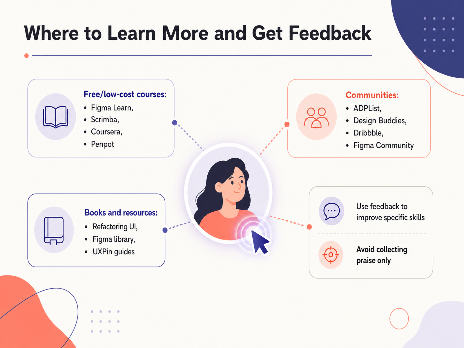
 - 13Where to Learn More and Get FeedbackNow let's look at where you can keep learning and get useful feedback. There are several good places to start. Figma Learn and Penpot offer free hands on courses right inside the tools. Scrimba and Coursera have structured classes if you prefer a guided path. For feedback, join communities like ADPList, Design Buddies, or Dribbble. You can share your work and ask questions. Figma Community is also great for seeing how other designers build files. When you read something like Refactoring UI, try one tip at a time in your own project. Keep a small list so you do not get overwhelmed. And remember to ask for specific feedback. For example, ask if your spacing feels consistent, not just if the design looks good. That helps you improve a real skill instead of collecting praise. Your next step is to apply the workflow we covered this week.
 1 min
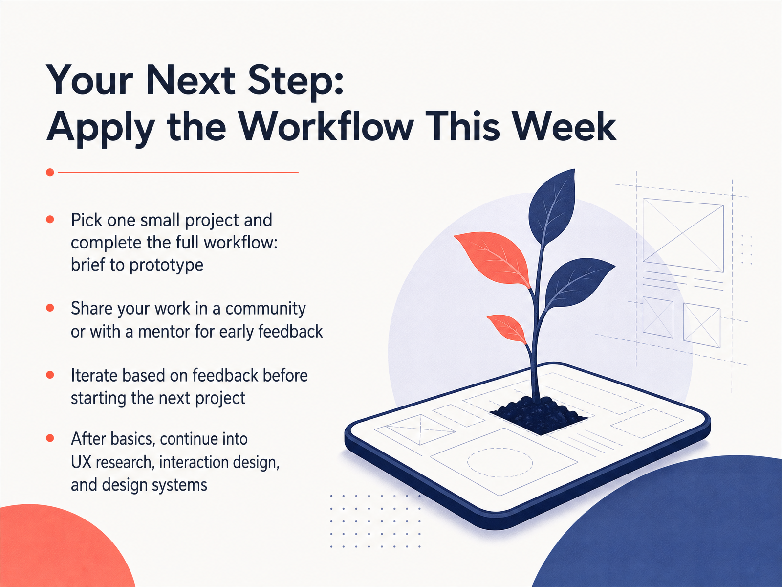
1 min - 14Your Next Step: Apply the Workflow This WeekWe've covered a lot together, so let's bring it all home. Your next step is simple: pick one small project and take it all the way from a brief to a prototype. Don't aim for a big app. A single signup flow or a simple settings screen is perfect. Work through each stage we discussed, one at a time. Once you have something to show, share it with a community or a mentor. Early feedback is a gift. It will point out what you can't see yourself. Then, take that feedback and make one or two improvements. That's iteration, and it's how real design gets better. After you feel comfortable with the basics, you can explore new areas like user research, interaction design, or design systems. There's a whole world to learn, but you don't need to learn it all today. For now, just commit to applying the workflow this week. You have everything you need to begin. Thank you for learning with me, and keep designing.
 uiguides.comfigma.com1 min
Take the deck with you
Download this course as a file — free, no sign-up needed.
- PDF handoutEvery slide page, ready to print or share.15 pages · 2.9 MBDownload
- Narrated PowerPointThe deck that presents itself — every slide carries the digital human's narration video.15 pages · 14.3 MBDownload
- PowerPoint slidesThe full deck as a .pptx — open it in PowerPoint, Keynote, or Google Slides.15 pages · 2.7 MBDownload
Free to use in your own training — please keep the PersonWise credit page at the end.
Have your own deck? Turn it into a course
Sources consulted
Web sources consulted while building this course.
- What Is a User Interface (UI)? Definition, Types & Design Best Practices (2026) | UXPin — uxpin.com
- How to Learn UI Design: A Realistic Learning Path | UIGuides — uiguides.com
- What Is UI Design? | Miro — miro.com
- What Is User Interface Design? A Complete 2026 Guide — shaheermalik.com
- What Is UI Design? A Beginner's Guide — elegantthemes.com
- 7 Key UI Design Principles + How To Use Them - Figma — figma.com
- 15 Key UI Design Principles for Beginners to Make A Real Difference — mockplus.com
- The Top 5 UI Design Principles You Need to Know — careerfoundry.com
- 9 UI Design Principles to Improve Interface Usability — mockflow.com
- Dribbble - Discover the World’s Top Designers & Creative Professionals — dribbble.com
- UI Design Process Explained: Learn to Wireframe and Build UI — mockflow.com
- A Complete Guide to the UI Design Process in 2026 — uxdesigninstitute.com
- UI Design Process Explained: A Step-by-Step Guide for Beginners - NetTantra Technologies — nettantra.com
- The 10 UI Design Process Steps You Need in 2026 — aufaitux.com
- From Brief to High-Fidelity: A Realistic UI Design Workflow | Moonchild AI — moonchild.ai
- UI UX Design with AI: The Complete Beginner's Guide (2026) | Derek Jensen — derekjensen.io
- Google Stitch 2.0 Review 2026: Google Labs' Free AI UI Builder That Turns Sketches Into Prototypes - ComputerTech — computertech.co
- Top AI Tools for UX Designers in 2026 — figma.com
- UI Design Tool | UI Design Software | Uizard — uizard.io
- Top UX and UI Design Tools for 2026 — ixdf.org