Statistical Methods for Data Science
Begin
14 pages · ~28 min
Statistical Methods for Data Science
This training introduces essential statistical methods for data science, equipping beginners with foundational concepts and techniques to analyze data effectively in practical applications.
What you’ll learn
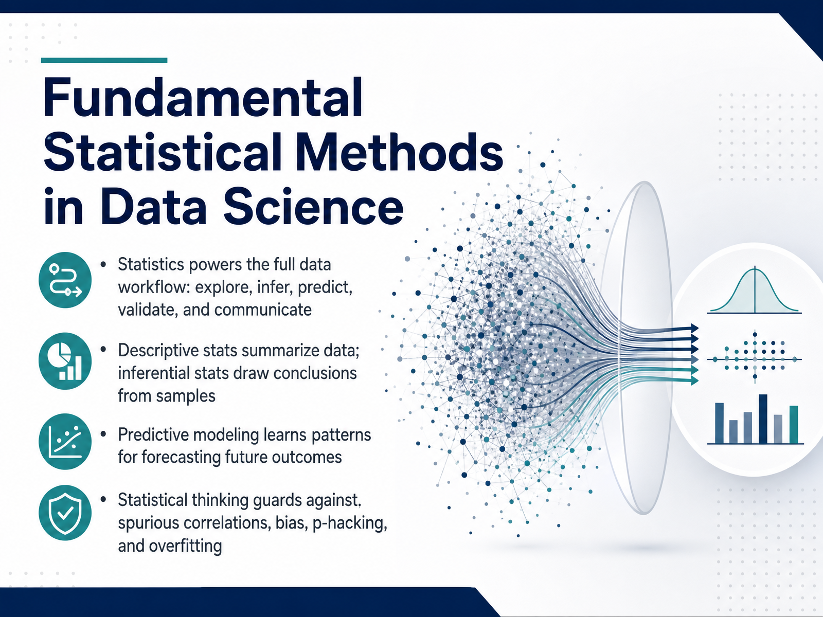
- 01Fundamental Statistical Methods in Data ScienceWelcome. This course is about building your statistical toolkit for data science. We are not going to drown in theory. Instead, think of statistics as a practical set of steps you can apply immediately, whether you are exploring a messy dataset, designing an experiment, or validating a model before it ships. Today we start with the big picture. Statistics powers the full data workflow. You use it to explore raw data, summarize what you see, draw reliable conclusions from samples, build models that predict future outcomes, and then communicate those results clearly to decision-makers. Along the way, statistical thinking is what protects you from chasing noise. It helps you spot spurious correlations, avoid hidden bias, resist the temptation to p-hack, and keep your models from overfitting the training data. By the end of this course, these methods will feel less like abstract rules and more like guardrails that make your analysis stronger and your recommendations more trustworthy. Let's get started by looking at exactly where statistics fits into a real data science workflow.kore1.combls.govanalysisfunction.civilservice.gov.uk+21 min
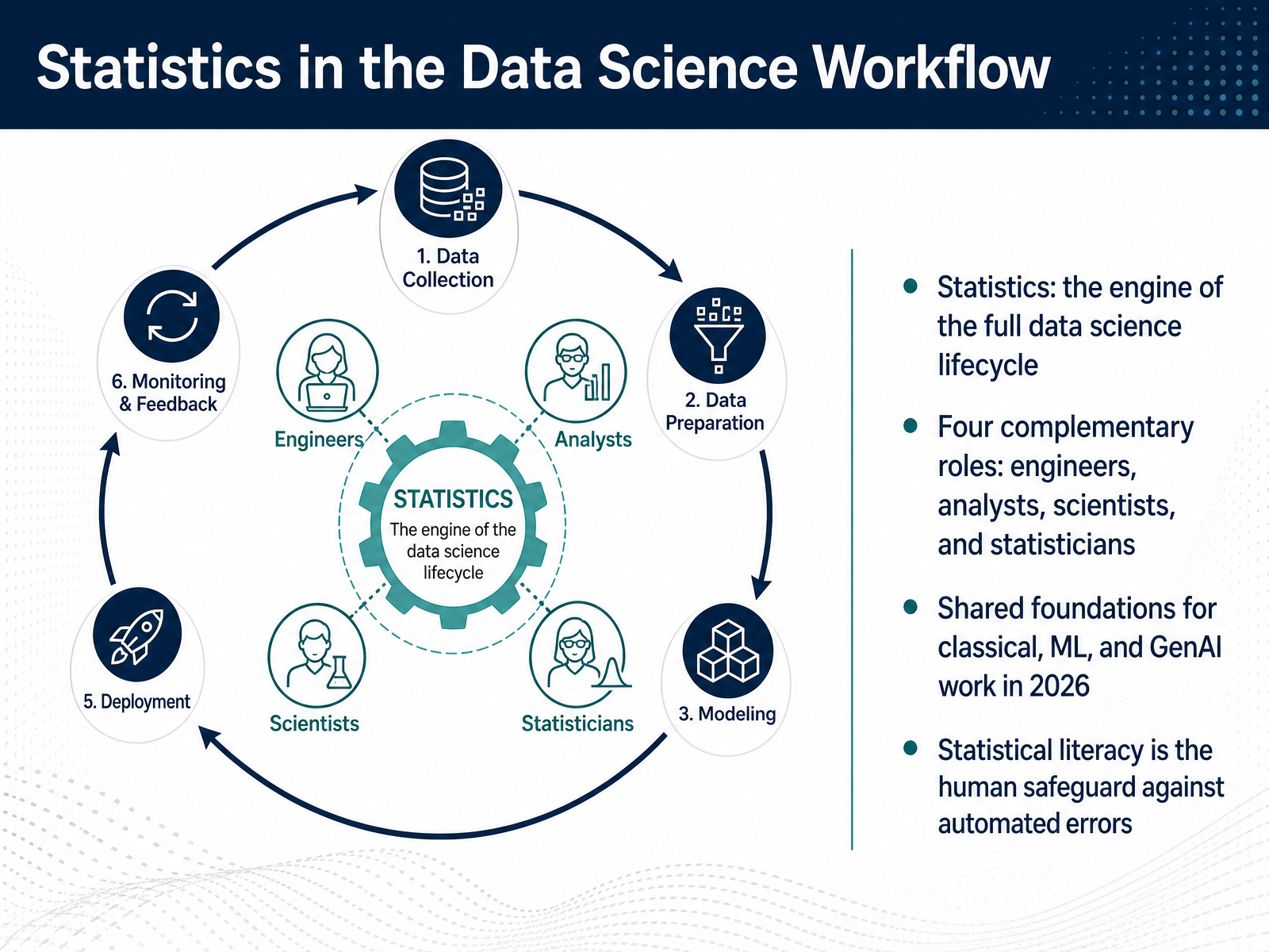
- 02Statistics in the Data Science WorkflowNow let's zoom out and see where statistics fits into the bigger data science picture. Think of statistics as the engine that powers the entire data lifecycle. From framing a business question to collecting data, building models, and evaluating results, statistical thinking is what turns raw information into decisions you can trust. In a modern data team, you'll typically see four roles that share these foundations: data engineers who build the pipelines, analysts who explore and report, data scientists who model and experiment, and statisticians who safeguard the integrity of the conclusions. These roles blur together more than ever in 2026, and the shared language among them is statistics. Whether you're working on a classical A/B test, tuning a gradient-boosted model, or evaluating a GenAI feature for hallucination rates, the core ideas are the same. And here's the thing to remember: as automation takes over more coding and boilerplate work, statistical literacy becomes your human safeguard. It's what lets you catch when a model is confidently wrong or when an AI-generated insight just doesn't add up. So keep that in mind as we move into our next topic: Descriptive Statistics—Central Tendency, Dispersion, and Shape.
 kore1.combls.govanalysisfunction.civilservice.gov.uk+22 min
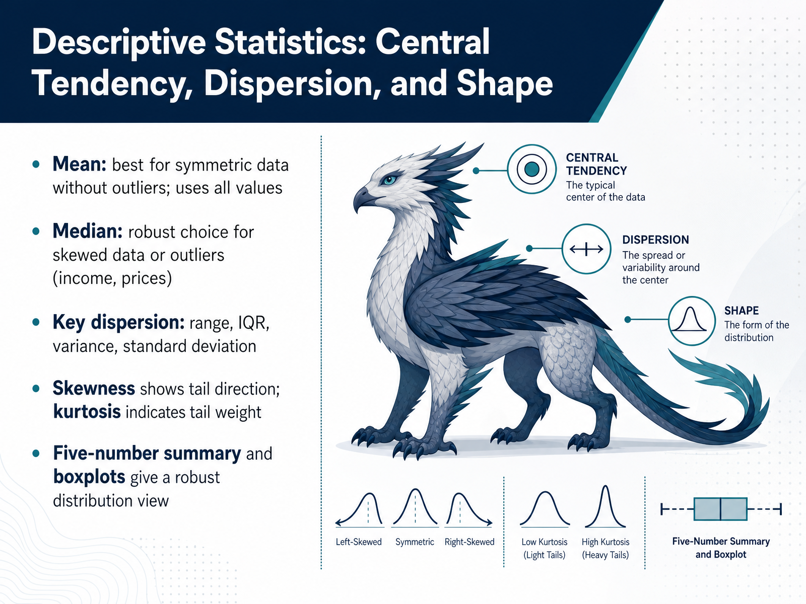
 - 03Descriptive Statistics: Central Tendency, Dispersion, and ShapeNow we turn to descriptive statistics—the tools that summarize the center, spread, and shape of your data. Let’s start with central tendency. If your data is symmetric and free of outliers, the mean is your best friend. It uses every single value and forms the foundation for many advanced methods. But if you’re working with skewed data, like household income or real estate prices, the median is far more reliable. It pinpoints the middle value and won’t be thrown off by those extreme numbers. We describe spread with the range, the interquartile range, the variance, and the standard deviation. Shape comes next. Skewness tells you which way the tail is pointing—left or right—while kurtosis indicates how heavy those tails are compared to a normal distribution. A practical tool I want you to use is the five-number summary together with the boxplot. This gives you a robust snapshot of the distribution—minimum, first quartile, median, third quartile, and maximum—all in one compact view. It’s a powerful way to spot outliers and understand spread before you dive into deeper modeling. In the next slide, we move from summarizing a single variable to visualizing distributions and relationships, so you can see patterns that numbers alone might hide.
 jse.amstat.orgopen.maricopa.edustats.stackexchange.com+22 min
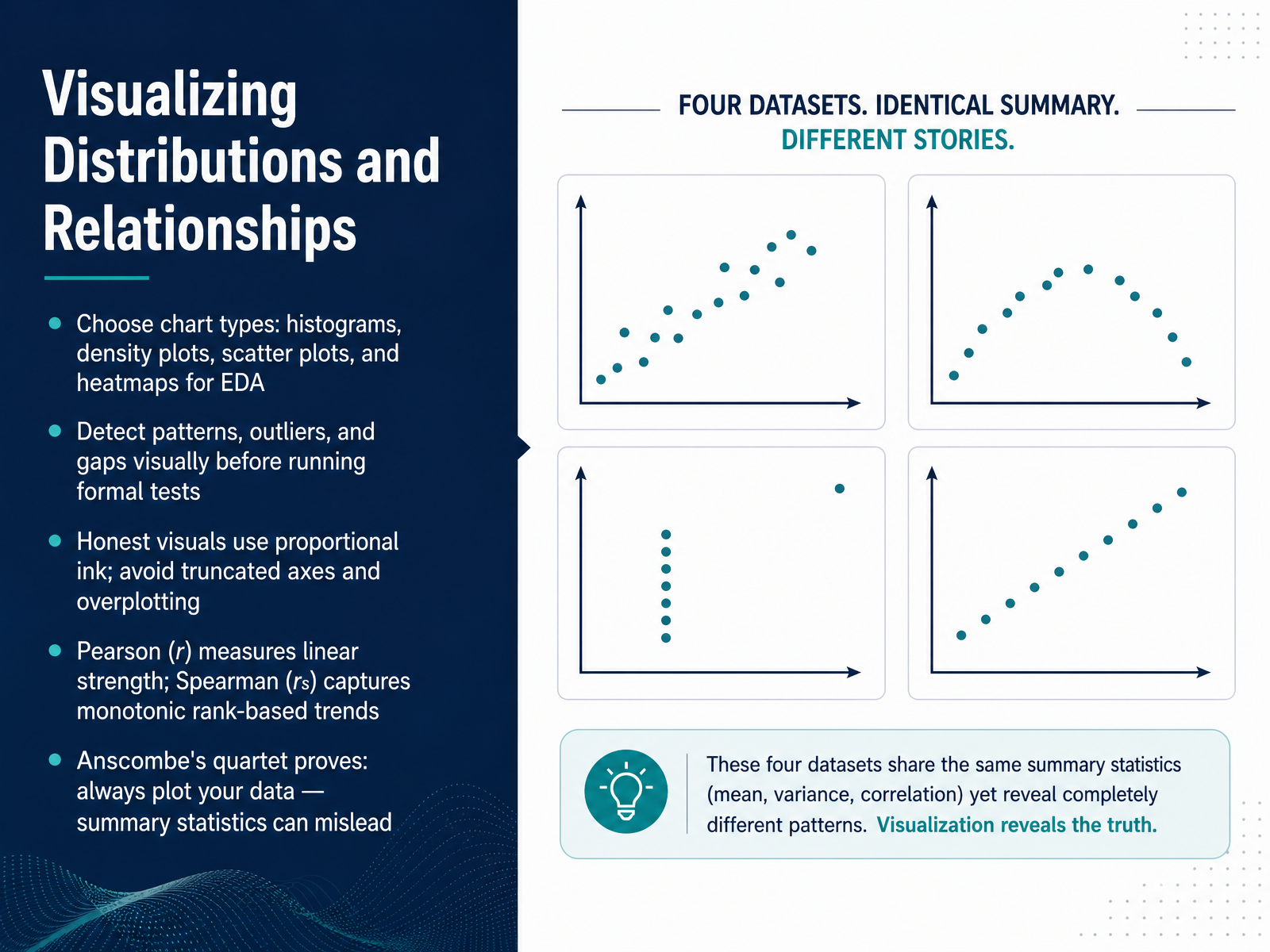
 - 04Visualizing Distributions and RelationshipsNow, let's talk about how we actually see what our data is telling us before we run any formal tests. This step is called exploratory data analysis, and it starts with choosing the right visual. For a single variable, use a histogram or a density plot to see its shape. For two continuous variables, a scatter plot shows relationships at a glance. And when you have a grid of numbers, a heatmap of a correlation matrix can instantly highlight the strongest links. The goal here is to detect patterns, outliers, and gaps. As a rule of thumb, keep your visuals honest: use proportional ink, and avoid truncated axes or overplotting that can hide the real story. Once we see a potential relationship, we quantify it with correlation. Pearson's r measures linear strength, meaning how well the points line up along a straight line. Spearman's rho captures monotonic trends, where variables move together but not necessarily at a constant rate, and it is much less sensitive to outliers. A famous cautionary tale is Anscombe's quartet: four datasets with nearly identical summary statistics but radically different shapes. That is why our golden rule is always plot your data first. Next, we'll build on this intuition with Probability Foundations for Data Analysis.
 statmate.orgthelinuxcode.comgironi.it+22 min
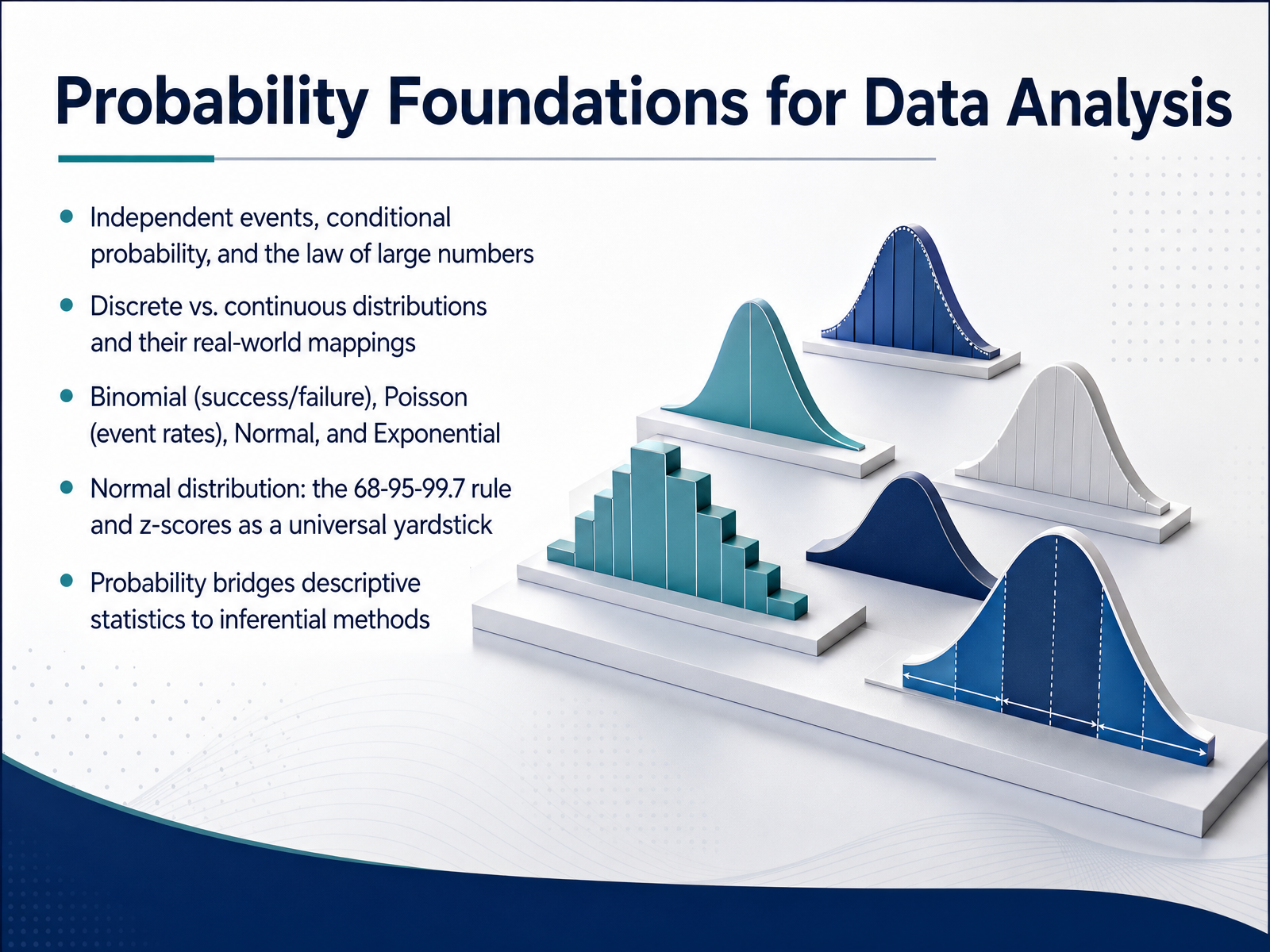
 - 05Probability Foundations for Data AnalysisNow let's bring probability into the picture, because it's the real engine underneath inferential statistics. We'll start with a few foundational ideas. Think about independent events, like flipping a coin twice. The first flip doesn't influence the second. Conditional probability is different, it's the chance of something happening, given that something else has already occurred. And the law of large numbers is what tells us that if we flip that coin enough times, the observed proportion of heads will settle down close to the true fifty percent probability. Next, we map real-world data to distributions. Discrete distributions count distinct outcomes, like the number of customer complaints per day, which often follows a Poisson distribution. Continuous distributions measure things on a scale, like call handling times, often modeled by an Exponential distribution. The Normal distribution is our anchor here. It's that classic bell curve. Remember the sixty-eight, ninety-five, ninety-nine point seven rule. About sixty-eight percent of your data falls within one standard deviation of the mean, ninety-five percent within two, and almost all within three. And z-scores are your universal yardstick, they tell you exactly how many standard deviations a single data point is from the average, letting you compare apples and oranges across completely different datasets. Probability is the bridge that takes us from simply describing our sample data to making inferences about the larger world. Up next, we'll look at how we actually collect that sample data, and we'll introduce the engine that makes it all work, the Central Limit Theorem.
 2 min
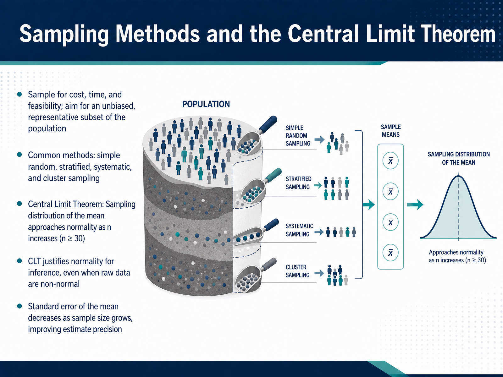
2 min - 06Sampling Methods and the Central Limit TheoremNow let's get practical about how we actually collect data. We almost never have the resources to measure an entire population, so we take a sample. The goal is to select a subset that is truly representative and free of bias. Common methods include simple random sampling, where every member has the same chance, as well as stratified, systematic, and cluster sampling. Whichever approach you use, the sampling method shapes everything that follows.
Once you start working with samples, the Central Limit Theorem becomes your most powerful tool. Here's what it means. If you repeatedly draw independent random samples of size n, and calculate the mean for each sample, the distribution of those sample means will approach a normal bell-shaped curve as n increases. A typical rule of thumb is n greater than or equal to 30.
This is incredibly useful, because the original population data might be skewed, uniform, or even bimodal. The Central Limit Theorem tells us we can still apply normal-based inference. In practice, the standard error of the mean shrinks as your sample size grows, which means your estimate gets tighter around the true population value.
Next, we will build on this foundation by exploring confidence intervals and how to measure the uncertainty in our estimates.
 tidystat.comstevenhirsch.cacantorsparadise.com+22 min
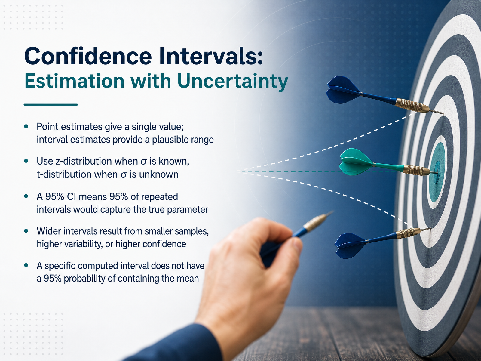
 - 07Confidence Intervals: Estimation with UncertaintyNow let's shift from a single best-guess point estimate to a more honest approach: the confidence interval. A point estimate is like saying the average customer spend is exactly fifty-two dollars. But a confidence interval gives a plausible range, maybe forty-seven to fifty-seven dollars, acknowledging that our sample is just one of many we could have drawn. When we know the true population standard deviation, we use the z-distribution to build that range. In practice, we rarely know that, so we rely on the sample standard deviation and the t-distribution instead. A 95 percent confidence interval doesn't mean we are 95 percent sure this specific range contains the true mean. Instead, it means that if we repeated our sampling process many times, 95 percent of all the intervals we'd build would capture the true parameter. Keep in mind, wider intervals come from smaller samples, higher variability in the data, or when you demand higher confidence, like 99 percent. This understanding of uncertainty sets us up perfectly for our next topic: hypothesis testing, where we'll explore concepts, errors, and the meaning of p-values.
 2 min
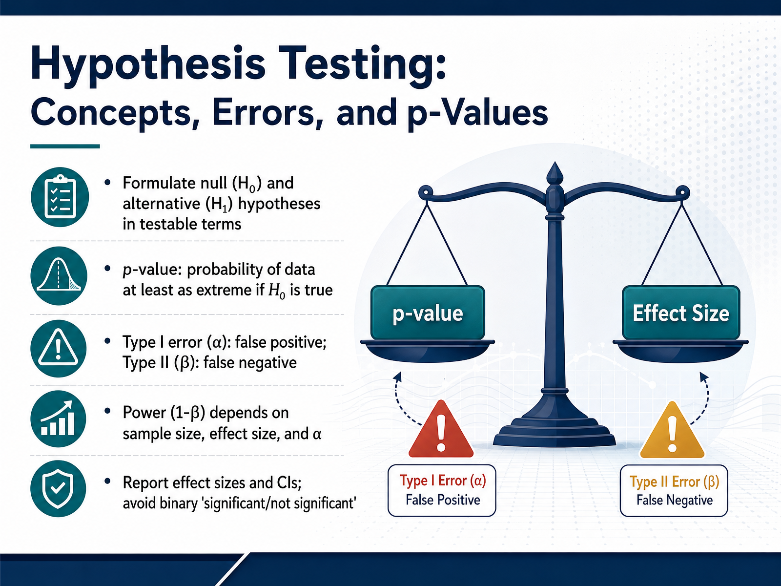
2 min - 08Hypothesis Testing: Concepts, Errors, and p-ValuesNow let's unpack the framework that makes inference possible: hypothesis testing, errors, and the p-value. We start by framing a null hypothesis, H₀, which usually states there is no effect or no difference. The alternative hypothesis, H₁, captures what we suspect might be true. For example, H₀ could be that a new webpage layout has zero impact on conversion rate, while H₁ says it does change the rate. The p-value then answers one specific question. Assuming H₀ is true, how probable are data at least as extreme as what we observed? It is not the chance that H₀ is false, and a tiny p-value does not guarantee an important result. When we make decisions, we face two kinds of errors. A Type I error, or false positive, happens when we reject a true null. That risk is set by alpha, often point zero five. A Type II error, or false negative, happens when we fail to reject a false null; its rate is beta. Power, which is one minus beta, improves with bigger samples, larger true effects, and a higher alpha. Because a single p-value hides all of this context, current best practice is to move beyond a simple significant or not significant call. Report the effect size, such as the actual difference in conversion rate, along with its confidence interval. That tells you both the magnitude and the precision you can count on. Coming up next, we will apply these ideas by choosing the right statistical test for your data.
 2 min
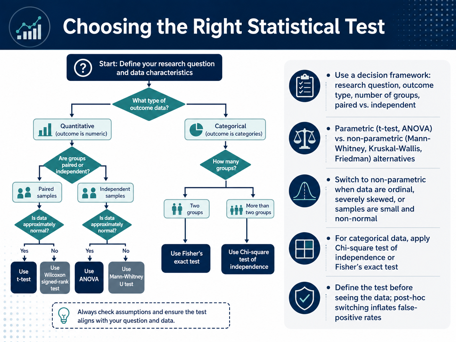
2 min - 09Choosing the Right Statistical TestLet's talk about a practical framework for choosing the right statistical test, because this is where the real decision-making happens. Think of this as a step-by-step checklist. Start with your research question, then identify your outcome type, the number of groups you're comparing, and whether those groups are paired or independent. This structure alone will point you toward the correct family of tests. Now, the next big fork in the road is deciding between parametric tests, like the t-test or ANOVA, and non-parametric alternatives, like the Mann-Whitney or Kruskal-Wallis tests. Switch to a non-parametric test when your data are ordinal, severely skewed, or when you have a very small sample that clearly isn't normal. For categorical data, you'll apply the chi-square test of independence, or Fisher's exact test for smaller samples. And here is a rule that will save you from a lot of trouble: define your test before you see the data. Switching tests after looking at the results, what we call post-hoc switching, seriously inflates your false-positive rate and undermines your conclusions. Coming up next, we'll explore correlation versus causation and how to properly analyze associations.
 2 min
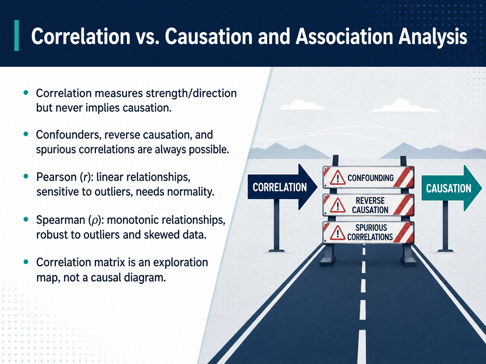
2 min - 10Correlation vs. Causation and Association AnalysisLet's talk about what correlation actually tells us, and what it definitely does not. A strong correlation means two variables move together in a predictable way, but it never proves that one causes the other. Confounders, reverse causation, and even what we call spurious correlations are always possible. For example, an increase in ice cream sales correlates with an increase in drowning incidents. The hidden confounder here is the weather, not a causal link between the two. In practice, you will generally choose between two main tools. Pearson's r measures linear relationships. It is great for continuous data, but it is sensitive to extreme outliers and assumes your data follows a normal distribution. Spearman's rho, on the other hand, works on the ranks of your data rather than the raw values. This makes it robust to outliers and perfect for monotonic relationships, even curved ones, or for ordinal data like survey rankings. Think of your correlation matrix as an exploration map. It highlights which variables are worth investigating deeply, but it is not a causal diagram. A high value in that matrix is the start of a conversation, not the final conclusion. Next, we will move from measuring association to modeling it directly with Simple Linear Regression.
 statmate.orgthelinuxcode.comgironi.it+22 min
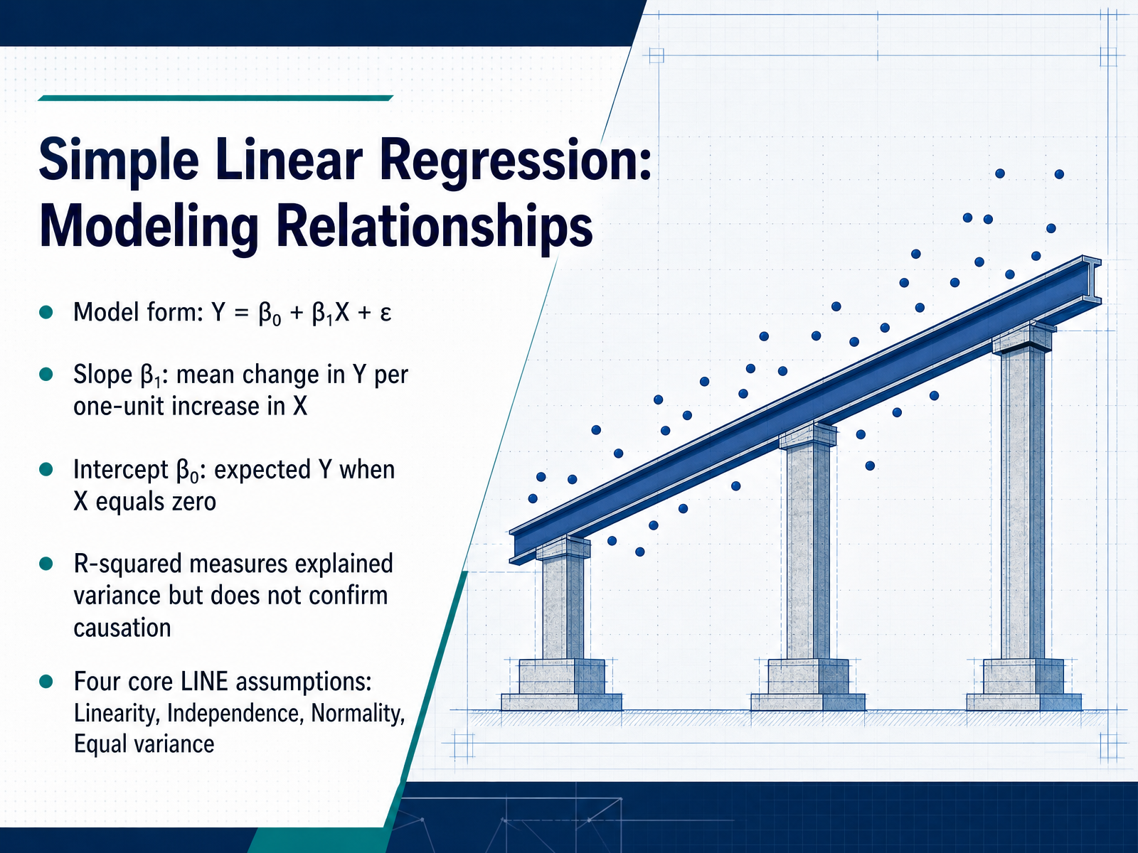
 - 11Simple Linear Regression: Modeling RelationshipsNow let’s translate the idea of relationships into a workable formula: simple linear regression. The model takes the familiar form Y equals beta-zero plus beta-one X plus epsilon. Here, Y is what you’re predicting, X is your predictor, and epsilon represents the random error we can’t explain. Think of beta-one, the slope, as the average change in Y for every one-unit increase in X. Beta-zero, the intercept, is the expected Y when X equals zero. That number may not always be meaningful in practice, but it anchors the line. R-squared tells you how much variance the model explains, but it’s crucial to remember that a high R-squared does not prove causation. Before you trust any of these numbers, you must check the four core L I N E assumptions: Linearity, Independence, Normality, and Equal variance. These assumptions live in the residuals, the gaps between what you observe and what the line predicts. If the residuals show a curve, a funnel shape, or extreme points, your coefficients and p-values become unreliable. Up next, we’ll walk through regression diagnostics so you know exactly how to spot and fix those problems.
 2 min
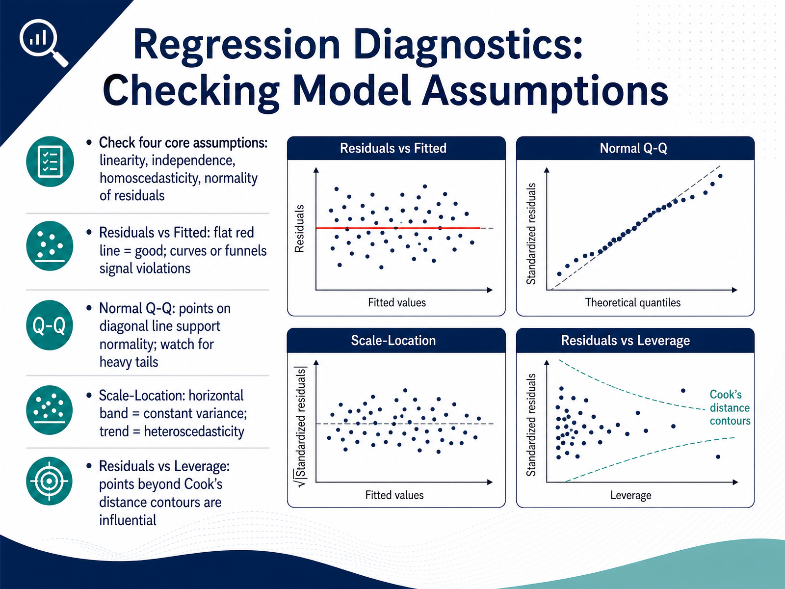
2 min - 12Regression Diagnostics: Checking Model AssumptionsNow we turn to a step many analysts rush past: checking whether your model actually follows the rules. Every linear regression rests on four core assumptions, and diagnostic plots help you verify them. The first is linearity. Look at the Residuals vs Fitted plot. A flat, horizontal red line is what you want. If you see a curve, your straight-line model is missing something. Second, independence of observations. This usually comes down to study design, not a plot, so keep your data collection in mind. Third is homoscedasticity, or constant variance. The Scale-Location plot should show a horizontal band with no obvious trend. A funnel shape warns of heteroscedasticity, which messes up your standard errors. Fourth is normality of residuals. On the Normal Q-Q plot, points hugging the diagonal line support normality. Heavy tails or strong curves are a concern, especially with small samples. There is one more practical check: influential points. The Residuals vs Leverage plot shows whether any single observation can pull your regression line around. Points landing outside the Cook's distance contours need investigation. They could be data entry errors or interesting extreme cases worth keeping. Before applying any fix, run these plots. A model you have not checked is a model you cannot fully trust. Next, let’s put everything together with a structured statistical analysis framework.
 2 min
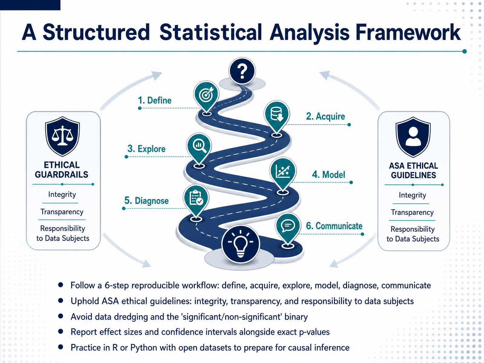
2 min - 13A Structured Statistical Analysis FrameworkNow let's bring everything together into a repeatable, ethical workflow. Think of this as your analysis checklist, a six-step framework you can use on any project. It starts with clearly defining your question. Next, you acquire your data, then explore it to uncover patterns and spot quality issues. From there, you model the relationships, diagnose how well that model performs, and finally, communicate your results transparently. Throughout this entire process, you uphold the ASA Ethical Guidelines, with a focus on integrity, transparency, and your responsibility to the people behind the data. This means you never go fishing for results, a practice known as data dredging. You also avoid treating the world as a simple binary of 'significant' or 'non-significant'. Instead, report exact p-values alongside effect sizes and confidence intervals to give a complete picture. The best way to build these habits is through practice. Start working with open datasets in R or Python, which prepares you to confidently tackle even advanced topics like causal inference. Let's move on to our final session, 'Key Takeaways and Continuing Your Learning Journey'.
 2 min
2 min - 14Key Takeaways and Continuing Your Learning JourneyHere we are at the final slide, and I want to leave you with a few key takeaways. First, always question your data sources, visualize before you model, and always communicate the uncertainty in your findings. Second, the core foundations you built here—descriptive statistics, probability, the central limit theorem, confidence intervals, hypothesis tests, and regression—are the practical toolkit you will reach for every single day. As you continue your journey, I encourage you to explore the next logical steps: causal inference methods, predictive modeling, and even Bayesian approaches, which open up a whole new way of thinking about probability. Finally, stay current. Engage with professional communities like the American Statistical Association. Keep an eye on the fast-moving debates around AI evaluation, and most importantly, keep practicing on real datasets. You now have a solid foundation. Be confident, stay curious, and go apply these skills. Thank you for joining me.
 kore1.combls.govanalysisfunction.civilservice.gov.uk+22 min
Take the deck with you
Download this course as a file — free, no sign-up needed.
- PDF handoutEvery slide page, ready to print or share.15 pages · 3.9 MBDownload
- Narrated PowerPointThe deck that presents itself — every slide carries the digital human's narration video.15 pages · 16.0 MBDownload
- PowerPoint slidesThe full deck as a .pptx — open it in PowerPoint, Keynote, or Google Slides.15 pages · 3.8 MBDownload
Free to use in your own training — please keep the PersonWise credit page at the end.
Have your own deck? Turn it into a course
Sources consulted
Web sources consulted while building this course.
- Data Scientist Job Description Template 2026 | KORE1 — kore1.com
- Data Scientists : Occupational Outlook Handbook: : U.S. Bureau of Labor Statistics — bls.gov
- Role profile: statistician – Government Analysis Function — analysisfunction.civilservice.gov.uk
- The Future Statistician: consultation summary — rss.org.uk
- Data job role personas — apsc.gov.au
- Journal of Statistics Education, v17n3: Melinda Miller Holt and Stephen M. Scariano — jse.amstat.org
- 3.4 – Choosing a Measure of Center – Introduction to Statistics and Statistical Thinking — open.maricopa.edu
- Should the mean be used when data are skewed? — stats.stackexchange.com
- 2.2.4.1 - Skewness & Central Tendency | STAT 200 — online.stat.psu.edu
- 1.3.5.1. Measures of Location — itl.nist.gov
- How to Run Correlation Analysis: Step-by-Step Guide (Pearson & Spearman) | StatMate — statmate.org
- Pearson vs Spearman Correlation Coefficient: A Practical 2026 Guide for Real Data Work – TheLinuxCode — thelinuxcode.com
- Correlation: Pearson, Spearman and Kendall Explained with Examples — gironi.it
- A comparison of the Pearson and Spearman correlation methods - Minitab — support.minitab.com
- Correlation: Pearson, Spearman, and Kendall's tau | UVA Library — library.virginia.edu
- Central Limit Theorem: Examples and Explanations — tidystat.com
- What is the central limit theorem? A non-technical, visual introduction with implications for research and practice — stevenhirsch.ca
- The Central Limit Theorem — Why Is It So? | by Russell Lim — cantorsparadise.com
- Understand Central Limit Theorem | Towards Data Science — towardsdatascience.com
- 8 Sampling Models and the Central Limit Theorem – Introduction to Data Science — rafalab.dfci.harvard.edu