Notification Design Essentials
Begin
13 pages · ~26 min
Notification Design Essentials
Learn to design effective notifications by mastering timing, priority, and user control for better engagement.
What you’ll learn
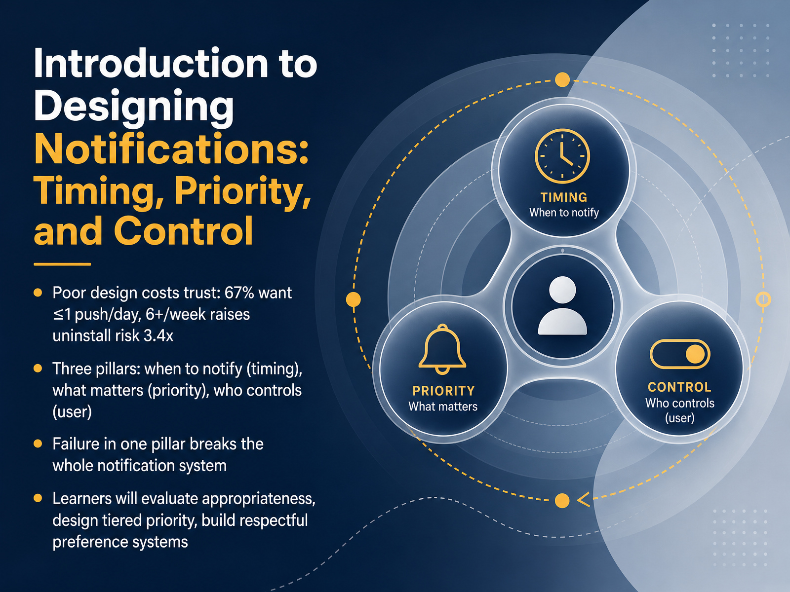
- 01Introduction to Designing Notifications: Timing, Priority, and ControlWelcome. In this module, we're going to tackle one of the most persistent challenges in product design: notification strategy. Specifically, we'll focus on how to design for the right timing, clear priority, and genuine user control. The reason this matters is simple: poor notification design destroys trust. Research shows that sixty-seven percent of users prefer one push notification per day or fewer. And sending more than six per week can increase the risk of an app uninstall by over three times. To avoid that, we'll anchor our work in three pillars. First, timing: knowing when to notify, not just what to say. Second, priority: helping the system distinguish what truly matters from what can wait. And third, control: building preference systems that let users define respectful boundaries, not just toggle everything off. A failure in any one of these pillars breaks the entire notification system. By the end of this course, you'll be equipped to evaluate the appropriateness of different alerts, design a tiered priority framework, and build respectful preference systems that users actually trust. Let's start by exploring the science behind why notifications feel so disruptive.airship.comgrowth.airship.compushwoosh.com+22 min
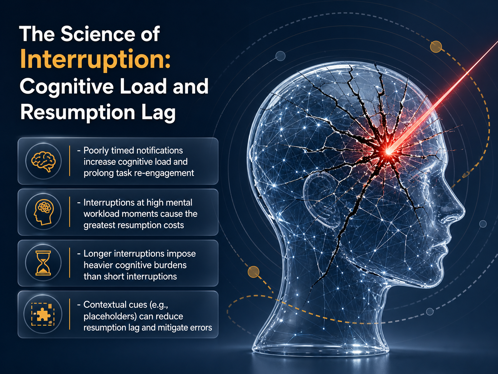
- 02The Science of Interruption: Cognitive Load and Resumption LagLet's look at the science behind why poorly timed notifications feel so disruptive. It comes down to two core concepts: cognitive load and something researchers call resumption lag. Resumption lag is simply the time your brain needs to fully re-engage with a task after you’ve been pulled away. Research shows that interruptions hitting you at moments of high mental workload, like right in the middle of a complex sequence of steps, cause the longest resumption costs. Your brain is working hardest right then, so the recovery is slowest. Longer interruptions naturally impose heavier burdens than short glances, because more context fades from your working memory. The good news is that contextual cues can help. Something as simple as a visual placeholder or a brief summary of your last action before the interruption can reduce resumption lag and help prevent errors. Essentially, you’re giving the user’s brain a clear on-ramp back to where they were. Next, we’ll ground these principles in a person’s actual daily rhythm. Let’s move into aligning delivery with the user’s day: Circadian Rhythms and Context Sensing.
 frontiersin.orgpreview-nature.comfrontiersin.org+22 min
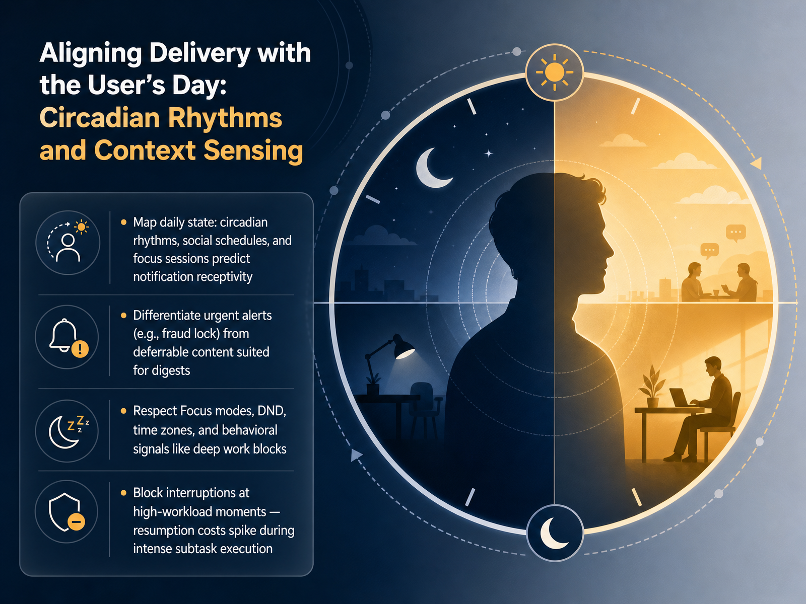
 - 03Aligning Delivery with the User’s Day: Circadian Rhythms and Context SensingNow let's align notification delivery with the user's actual day, using circadian rhythms and context sensing. Think about a person's daily state. Early morning deep work, afternoon social schedules, evening wind-down. These rhythms predict when someone is receptive to interruption and when they are not. Your system should map these patterns and learn when to surface information. Next, differentiate urgent alerts. A fraud lock on a bank account demands immediate attention. But a new comment on a shared document can wait, it belongs in a digest. The key is to match the interruption level to the true priority. This also means respecting system signals like Focus modes, Do Not Disturb, and time zone shifts. If a user sets their status to a deep work block, a non-critical alert creates what researchers call resumption lag. Recent studies show that interruptions during intense sub-task execution cause the highest resumption costs, the mental price of switching context and then switching back. Blocking interruptions at these high-workload moments is not just polite. It protects cognitive performance. Bottom line: sense context, read behavioral signals, and deliver information when the user is truly ready. Next, we will look at timing mechanisms, from send-time optimization to silent windows.
 frontiersin.orgpreview-nature.comfrontiersin.org+22 min
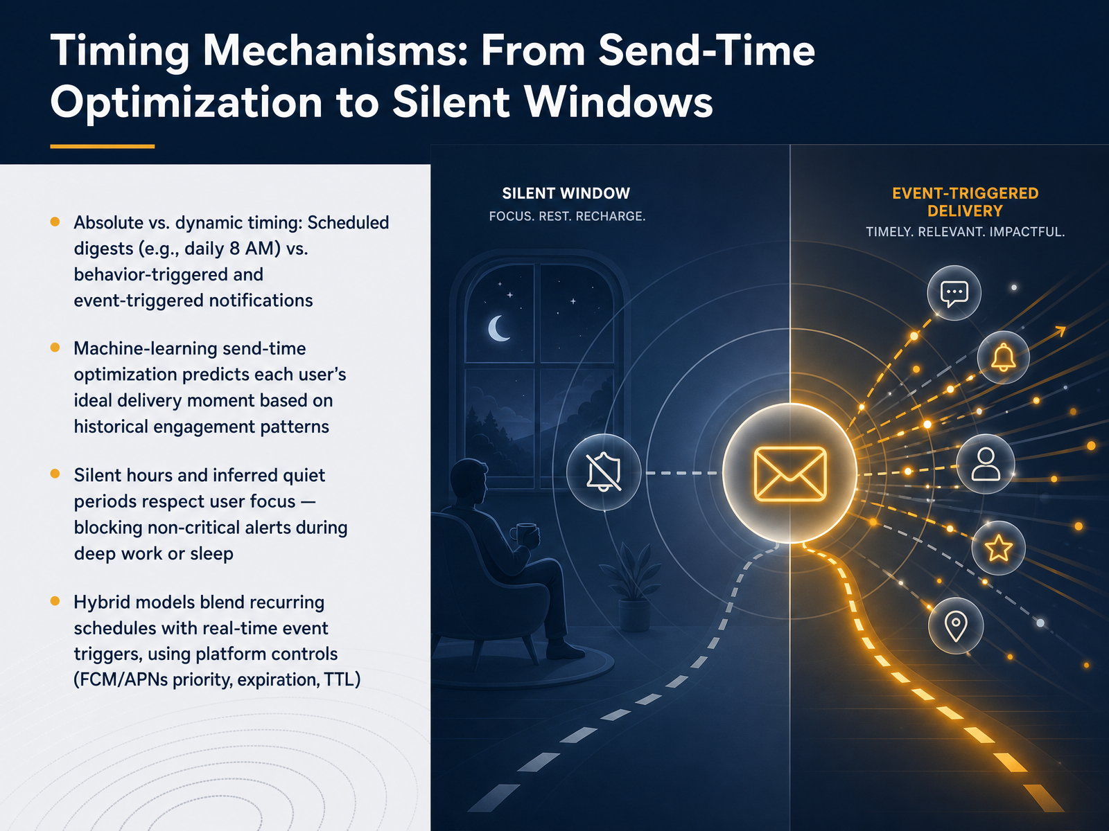
 - 04Timing Mechanisms: From Send-Time Optimization to Silent WindowsNow let's get concrete about the timing mechanics that make or break a notification's respect for the user. We need to think beyond just hitting send. The first distinction is absolute versus dynamic timing. A scheduled digest, like a daily summary at 8 AM, is absolute. It's predictable. But behavior-triggered notifications, like a confirmation after a purchase, are dynamic. They respond to real-time user actions. Machine-learning send-time optimization takes this further. It learns each user's historical engagement patterns, then predicts the ideal moment for delivery to maximize the chance they'll actually see and act on it, rather than dismiss it. Next, we must respect silent hours and inferred quiet periods. This means blocking non-critical alerts during deep work or sleep. It's about protecting focus, and it's non-negotiable for long-term trust. Finally, we have hybrid models. These blend recurring schedules with real-time event triggers, using platform controls like FCM and APNs priority, expiration, and TTL. This is how you ensure a flash-sale alert arrives immediately with a short lifespan, while a weekly digest waits for a power-friendly delivery window. The mechanism must match the message's true time sensitivity. Let's take that sense of urgency and build a concrete priority model next, using a triage matrix and channel mapping.
 foundey.comsetproduct.comuxpatternsguide.com+22 min
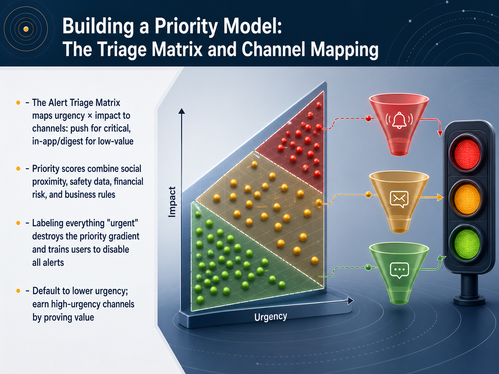
 - 05Building a Priority Model: The Triage Matrix and Channel MappingLet's move into the practical tool for making these decisions: the triage matrix and channel mapping. Here’s a common pitfall: a team labels everything as urgent and blasts it everywhere. The immediate result is that users train themselves to disable all alerts. So how do we fix this? We build a priority model that maps urgency against impact. Think of it as a grid. On one axis, you have how quickly someone needs to act; on the other, the consequence of not acting. A true critical event, like a payment failure that blocks the user, earns an intrusive channel like a push notification or even a full-screen dialog. But an informational event, like a new comment, gets a dot badge or a quiet spot in the in-app feed. A high-priority score isn't just a guess either. It combines factors like social proximity, safety data, financial risk, and specific business rules. The golden rule here is to default to a lower urgency channel and earn the right to escalate. Next, we’ll see exactly how these priority semantics are translated from design into software, with a look at priority in F C M and A P Ns.
 foundey.comsetproduct.comuxpatternsguide.com+22 min
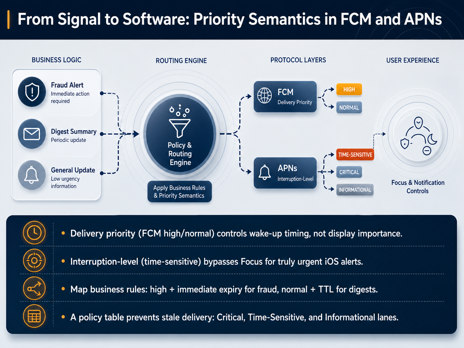
 - 06From Signal to Software: Priority Semantics in FCM and APNsLet's translate the timing concepts we just discussed into the actual message structure for FCM and Apple's APNs. A common pitfall is confusing delivery priority with display importance. In FCM, high priority controls when the device wakes up to receive the message, not how the banner looks on screen. Normal priority, on the other hand, is perfectly fine for digests or sync tasks that can wait until the user opens the app. For iOS, the truly urgent lane is the time-sensitive interruption level. This bypasses Focus modes and Do Not Disturb, so it should be reserved for alerts like a fraud lock or a security code. To prevent stale deliveries, map your business rules into a simple policy table. For example, a fraud alert demands immediate high priority and a short sixty-second expiry, while a content digest can use normal priority with a much longer time-to-live. This keeps your Critical, Time-Sensitive, and Informational lanes clean and prevents a late notification from hurting trust. Now, with priority mapped out, let's shift to the other side of the coin: how we hand that control to the user with granular preferences and transparency.
 firebase.google.comstackoverflow.comfirebase.google.com+22 min
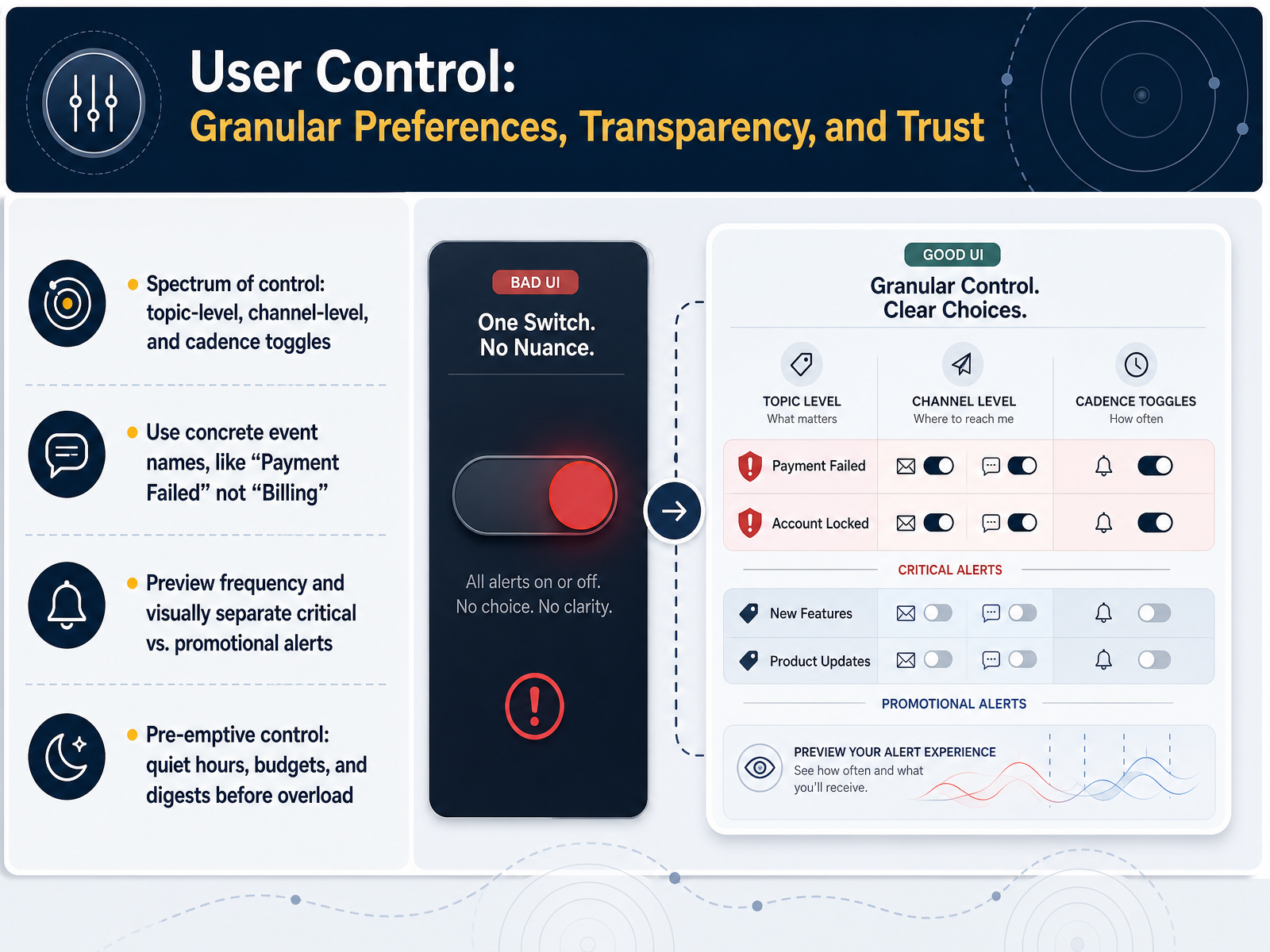
 - 07User Control: Granular Preferences, Transparency, and TrustNow let’s focus on user control—the part of notification design that builds trust through granular preferences and transparency. Control isn’t just a long list of toggles. It sits on a spectrum: topic-level settings, channel-level delivery choices, and cadence toggles for timing and frequency. A common pitfall is using vague labels like “Billing” or “Updates.” Instead, name events concretely. “Payment failed” tells a user exactly what happened; “Billing” forces them to guess. This specificity immediately reduces anxiety and support tickets. Visual separation also matters. Critical alerts like security and payment failures should look different from promotional updates. When users can preview the frequency and severity of each alert type, they are far more likely to trust the system. Beyond toggles, think about pre-emptive control. Offer quiet hours so users define when they don’t want interruptions. Add budget-based alerts if your product deals with spending, and provide digests to batch low-priority updates before a user feels overloaded. These pre-emptive measures respect attention and prevent notification fatigue before it sets in. Up next, we’ll build on this with Preference Architecture, covering modes, digests, and safe defaults.
 2 min
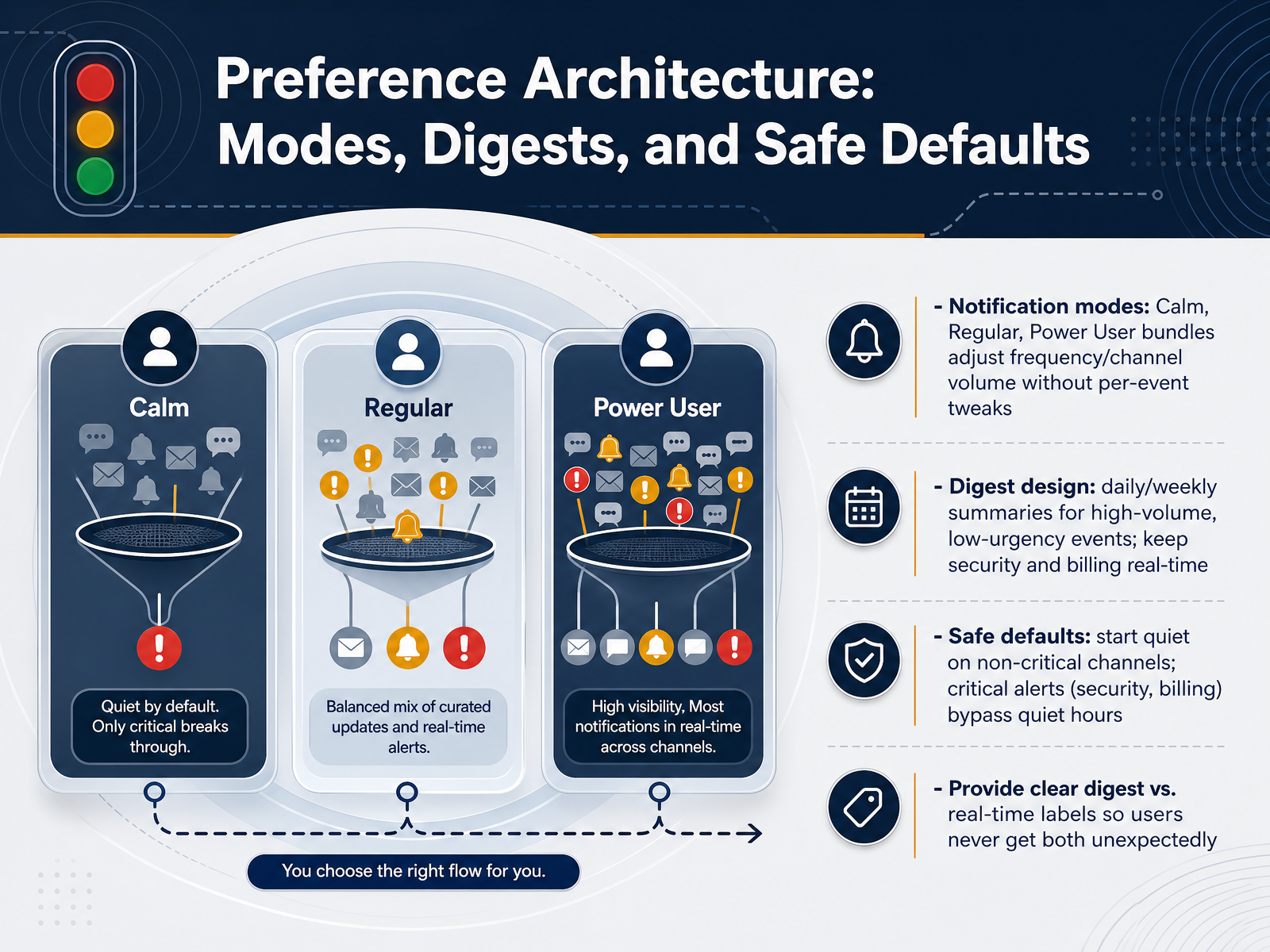
2 min - 08Preference Architecture: Modes, Digests, and Safe DefaultsNow let’s talk about building a preference architecture that users actually trust, using modes, digests, and safe defaults. Think of this as moving from a long wall of toggles to a small, predictable system. Start with notification modes like calm, regular, or power user. These bundles adjust frequency and channel volume without forcing people to tweak every single event. A calm mode might send only mentions and critical alerts, while power user mode keeps the fire hose on. Next, use digests for high-volume, low-urgency updates. Daily or weekly summaries work well for reactions, routine activity, or background stats. But keep security and billing events real time. Never batch a payment failure or a password change. Safe defaults matter just as much. Begin quiet on non-critical channels and let users opt in when they are ready. Critical alerts, like security and billing, must bypass quiet hours so nothing dangerous gets buried. Finally, label every event clearly as real-time or digest. Users should never receive the same message both ways unexpectedly. A digest is a promise not to interrupt. Real-time means it cannot wait. These patterns turn a tangled settings page into something your users can scan, adjust, and walk away from feeling respected. Up next, we will explore designing feedback loops that learn without friction.
 2 min
2 min - 09Designing Feedback Loops That Learn Without FrictionOn this slide, we're tackling how to design feedback loops that actually learn, without creating friction for the user. First, let's talk about implicit signals. A user won't always tell you a notification is bad, but they'll show you. We can detect negative sentiment by analyzing dismissals, how long they mute us, or even the velocity of a swipe-away. Those are honest, low-effort signals. Second, we need to capture frustration in the moment. Simple inline controls like a thumbs-down or a 'see less like this' button give users direct agency, and they also hand us high-quality labeled data right at the point of pain. Now, the real power move is closing the loop fast. We should be re-programming our priority and timing engines in near real-time using this streaming feedback data. This isn't a weekly batch job; it's a continuous flow. Ultimately, this whole loop has one goal: prevent cascading fatigue. By connecting user signals directly back to our delivery models, we stop the system from sending the tenth annoying message in a row. It makes the experience feel adaptive, not aggressive. Now, all of this design work raises a practical question: how do we know it's actually working? That leads us perfectly into our next slide, Metrics That Matter: Measuring Notification Health, Not Just Opens.
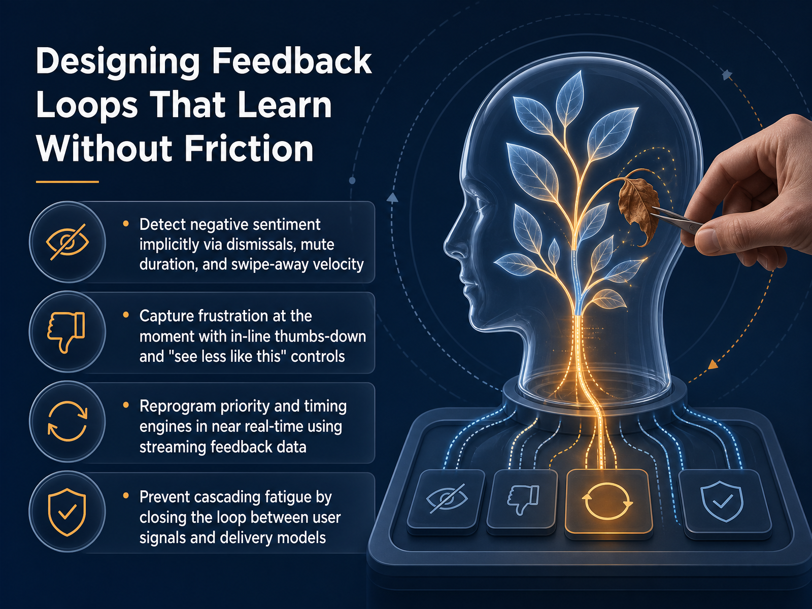 2 min
2 min - 10Metrics That Matter: Measuring Notification Health, Not Just OpensNow let's talk about the metrics that actually measure notification health, because opens alone won't tell you if you're building a sustainable channel or slowly burning trust. Here's the shift I want you to make: use conversion rate and incremental sessions as your primary outcome metrics, not just click-through rate. A high open rate with zero downstream action means the notification promised something it didn't deliver. Next, set up guardrails. Watch your opt-out rate, mute rate, and any signal of uninstall risk. These numbers are your early warning system for trust erosion. A rising mute rate after a campaign is often a stronger signal than a flat open rate. I also recommend introducing a Notification Load Score. This caps how many non-transactional messages any single user receives in a week, so you never overwhelm their attention, no matter how many campaigns are queued. Finally, don't just look at day-seven lifts. Use long-term holdouts and staggered rollouts to detect fatigue early. A pattern I've seen too often is a lift in daily active users in week one, followed by a slow climb in disable rate by week four. Catching that early is how you protect long-term retention. Next up, we'll apply this trust-first mindset to Accessibility and Inclusivity in Notification Design.
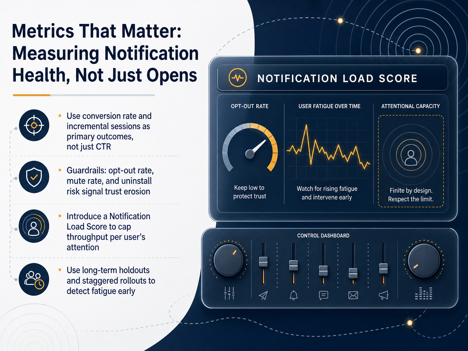 2 min
2 min - 11Accessibility and Inclusivity in Notification DesignNow let's talk about something that separates good notifications from truly inclusive ones: designing beyond the visual. Not everyone perceives alerts the same way. For many users, relying solely on a pop-up or a badge isn't enough. Think about haptics, LED indicators, and audio cues. For example, a bed shaker combined with a flashing light is far more effective for waking a deaf or hard-of-hearing user than a text alert alone. Standardize these patterns: one consistent vibration for errors, another for successes. This builds immediate trust. And we must respect sensory comfort. Too many badges or unnecessary motion can trigger anxiety or even physical discomfort. Always honor the prefers-reduced-motion setting, and avoid motion-triggered parallax effects that can cause vestibular issues. On the technical side, remember that critical safety alerts must be designed for resilience. Format them as simple text that can break through on a 2G or 3G network, or on a low-spec device. Finally, for any rich-media notification, always provide a text alternative and captions. This closes the loop on inclusivity. Next, we're going to put all of this into practice in our workshop: Auditing and Rebuilding a Notification System.
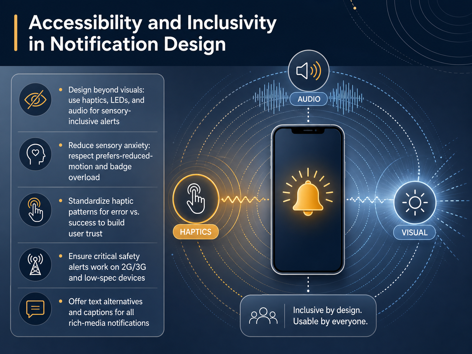 2 min
2 min - 12Practical Workshop: Auditing and Rebuilding a Notification SystemLet's put the principles into practice with a hands-on workshop. This is where we audit and rebuild a notification system the right way. Step one is the audit. Inventory every event your product sends. Tag each one by urgency and impact. Then, calculate the mute rates and list your top ten noise candidates. These are the notifications that are training users to ignore you. Step two is alignment. Take each event and score it in a cost versus benefit matrix. Ask yourself: does this build trust, or does it erode it? From there, route each event to its proper place. Must-send urgent items go to push or a modal. Medium-value updates get batched into a daily digest. And low-value noise gets suppressed entirely. Step three is specification. Pick one single feature. For that feature, define the complete plan: its priority tier, the exact timing window, the delivery channel, the feedback mechanism, and a fallback if the user doesn't respond. This structured approach turns a chaotic feed into a respectful system. Next, let's wrap up with our course summary and action plan.
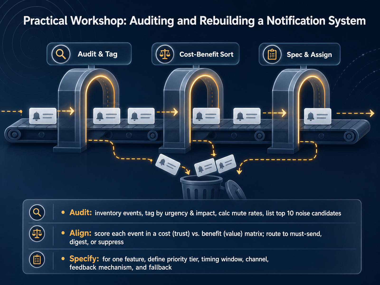 foundey.comsetproduct.comuxpatternsguide.com+22 min
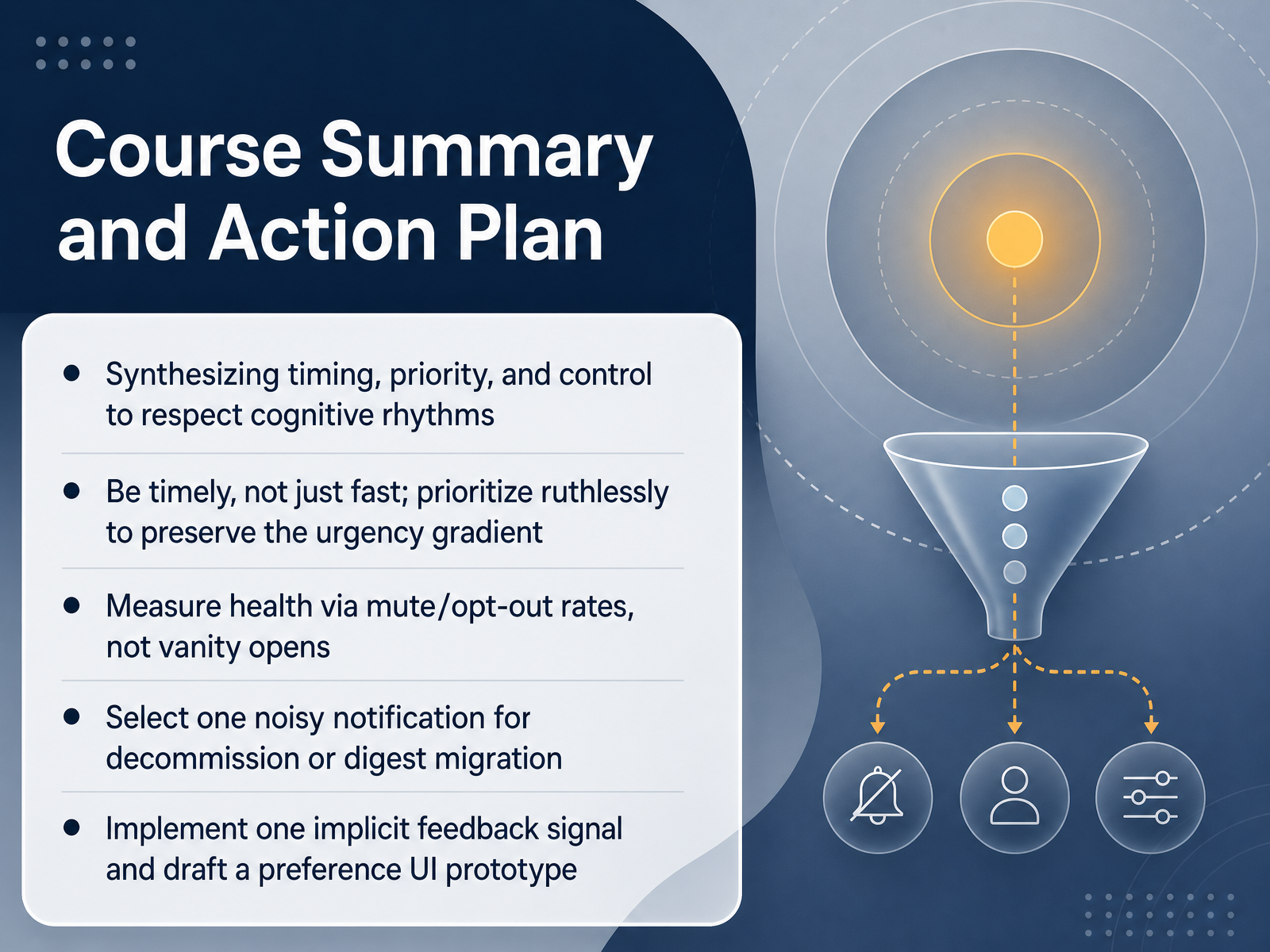
 - 13Course Summary and Action PlanAnd here we are at the final step: your action plan. We covered a lot about timing, priority, and control, so let's turn that into concrete next moves. First, synthesize these three to respect people's cognitive rhythms. Be timely, not just fast, and prioritize ruthlessly to preserve what some call the urgency gradient. If everything screams urgent, nothing is. Next, measure success with honest signals. Track mute and opt-out rates rather than chasing vanity opens. A spike in mutes is a clear sign you are overspending trust. Now for the hands-on part. Pick one noisy notification in your product right now and decommission it, or migrate it into a digest. Small cut, big relief. Then implement one implicit feedback signal, like a user pausing during deep work, and draft a simple preference UI prototype. Even a rough sketch of per-category toggles communicates respect for user control. Thank you for sticking with this session. You now have a solid framework to design notifications that truly serve your users. Start small, ship one improvement this week, and watch the trust metrics move.
 foundey.comsetproduct.comuxpatternsguide.com+22 min
Take the deck with you
Download this course as a file — free, no sign-up needed.
- PDF handoutEvery slide page, ready to print or share.14 pages · 3.6 MBDownload
- Narrated PowerPointThe deck that presents itself — every slide carries the digital human's narration video.14 pages · 14.8 MBDownload
- PowerPoint slidesThe full deck as a .pptx — open it in PowerPoint, Keynote, or Google Slides.14 pages · 3.6 MBDownload
Free to use in your own training — please keep the PersonWise credit page at the end.
Have your own deck? Turn it into a course
Sources consulted
Web sources consulted while building this course.
- Mobile App Push Notification Benchmarks 2026 — airship.com
- Mobile App Push Notification Benchmarks for 2025 — growth.airship.com
- Push notification benchmarks 2025 — pushwoosh.com
- Push Notifications Statistics (2026) — businessofapps.com
- Batch | EXCLUSIVE: The Great Push Notifications Benchmark 2025 ! — batch.com
- examining the cognitive mechanisms underlying interruption-timing effects — frontiersin.org
- The effects of cues on task interruption recovery in a concurrent multitasking environment | Scientific Reports — preview-nature.com
- Frontiers | Individual differences in visuo-spatial working memory capacity and prior knowledge during interrupted reading — frontiersin.org
- EEG Correlates of Cognitive Dynamics in Task Resumption After Interruptions: The Impact of Available Time and Flexibility - PMC — pmc.ncbi.nlm.nih.gov
- Augmented Reality Cues Facilitate Task Resumption after Interruptions in Computer-Based and Physical Tasks — dl.acm.org
- https://foundey.com/blog/notification-ux — foundey.com
- Notifications UI design: Why most apps annoy users instead — setproduct.com
- Notification center UX Pattern | UX Patterns Guide — uxpatternsguide.com
- A Comprehensive Guide to Notification Design — toptal.com
- How to define/classify messages and notifications in web applications — ux.stackexchange.com
- Set the priority of a message | Firebase Cloud Messaging - Google — firebase.google.com
- How to achieve time-sensitive flag in APNS JSON output via FCM? — stackoverflow.com
- REST Resource: projects.messages | Firebase Cloud Messaging REST API — firebase.google.com
- Sending notification requests to APNs — Apple Developer Docs — apple-docs.everest.mt
- Local and Remote Notification Programming Guide: Creating the Remote Notification Payload — developer.apple.com