Begin
14 pages · ~28 min
Customer Success Metrics Mastery
This training equips customer success professionals with the skills to measure, analyze, and interpret key success metrics to drive retention and growth.
A digital instructor presents all 14 pages. Hold “Ask” at any point and ask out loud — the answer comes from this course. No sign-up needed.
What you’ll learn
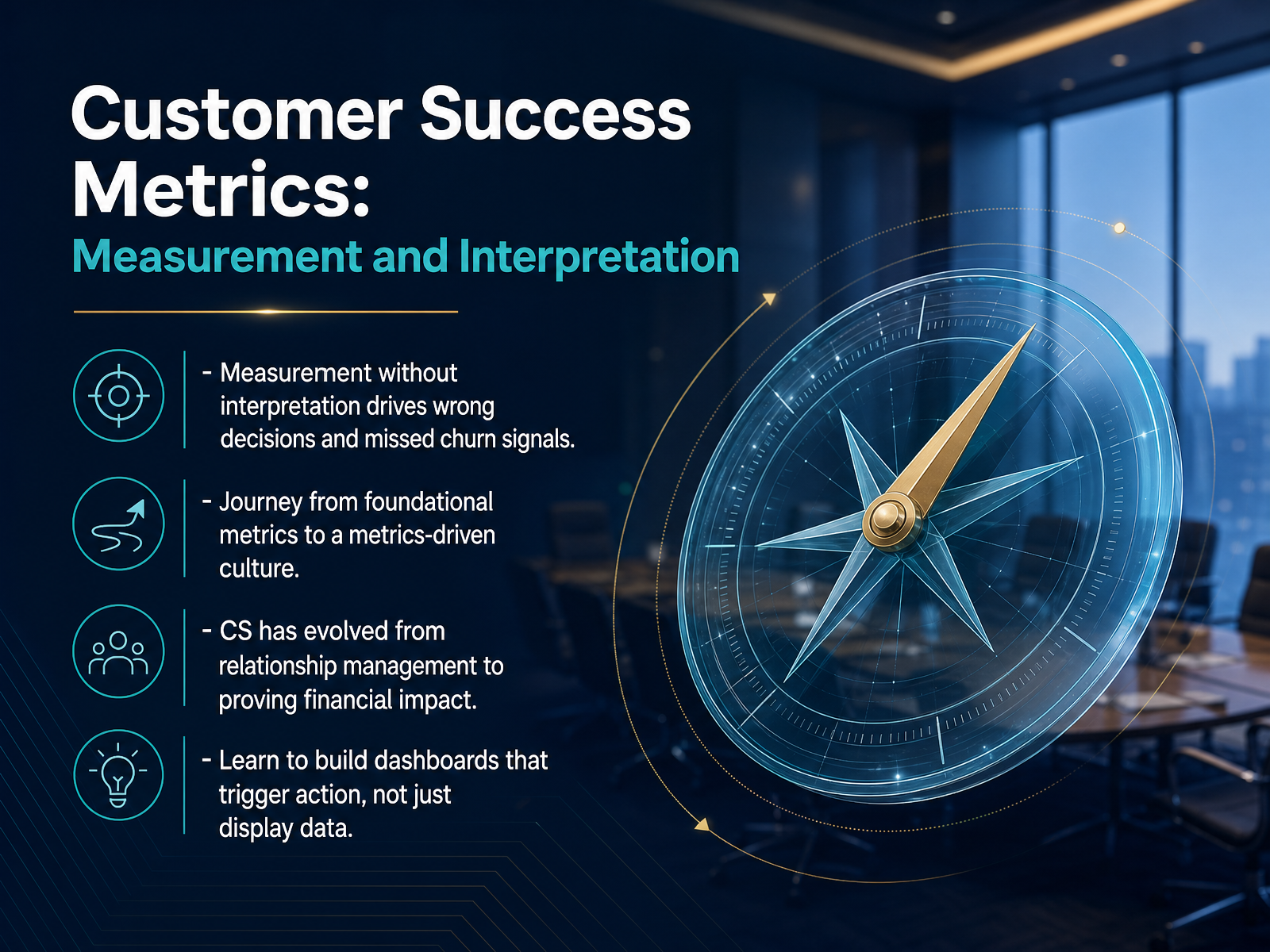
- 01Customer Success Metrics: Measurement and InterpretationWelcome. Over the next few minutes, I want to help you move from tracking numbers to actually interpreting them—because measurement without interpretation leads to wrong decisions and missed churn signals. We'll start with foundational metrics and build toward a true metrics-driven culture. The reality is that customer success has evolved. We're no longer just relationship managers; we're expected to prove financial impact through retention and growth. In this course, you'll learn how to build dashboards that trigger action on a Tuesday morning, not just display data. That journey begins by understanding why so many scorecards fall short, which is exactly where we're headed next.1 min
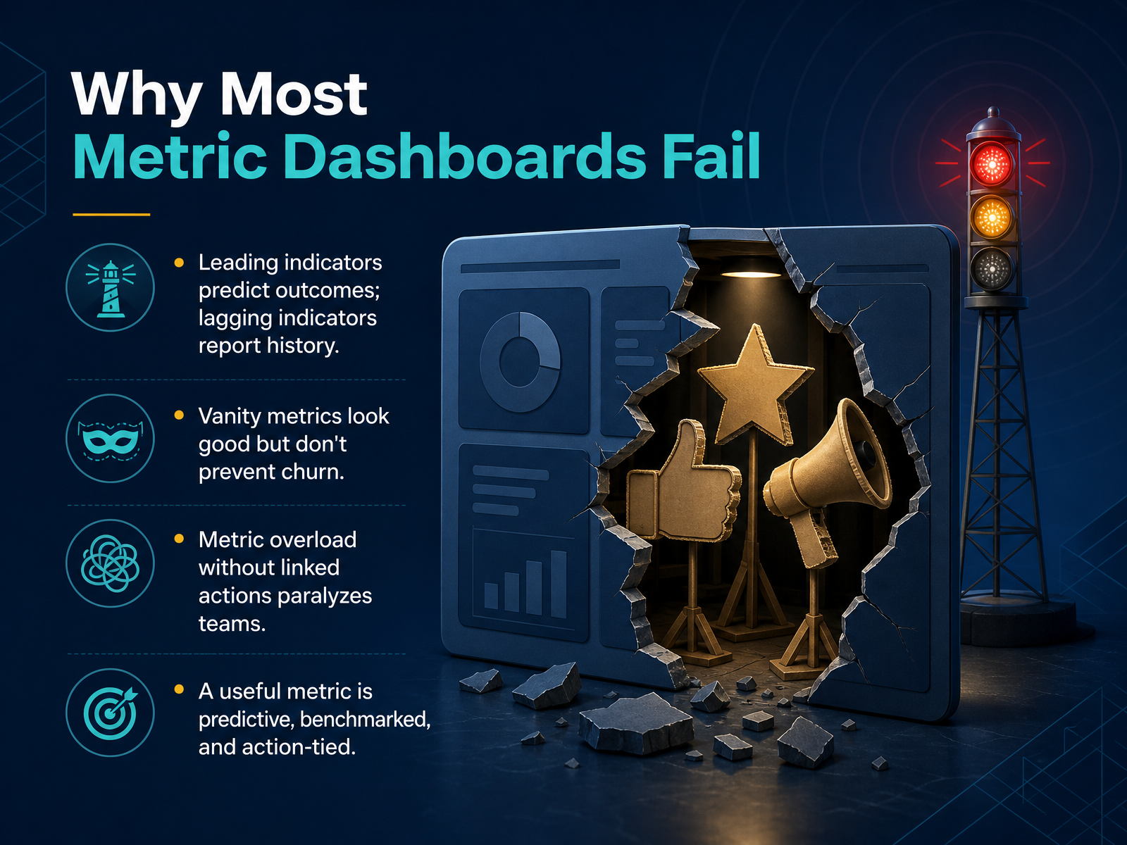
- 02Why Most Metric Dashboards FailLet's talk about why so many dashboards fall short, because understanding this upfront saves you from building a control panel that nobody trusts. The core problem is a mix-up between leading and lagging indicators. Lagging indicators, like last quarter's churn rate, tell you what already happened. Leading indicators, like a drop in user logins, tell you what might happen next. If your dashboard only shows the history book, you're always reacting instead of preventing churn. Another trap is the vanity metric. Think of total free sign-ups. That number might look great in a board meeting, but if the onboarding completion rate is low, those sign-ups won't become paying customers. A high number here gives a false sense of security. Then there's metric overload. When a dashboard shows thirty charts without context, a team doesn't know where to focus. They freeze. They return to guesswork. A useful metric must do three things. It must be predictive, so you can act early. It must be benchmarked, so you know if a number is good or bad. And it must be action-tied, so you know exactly what to do next. That's the framework we'll use moving forward. Now, let's apply this filter to the core metric categories every customer success manager needs.
 2 min
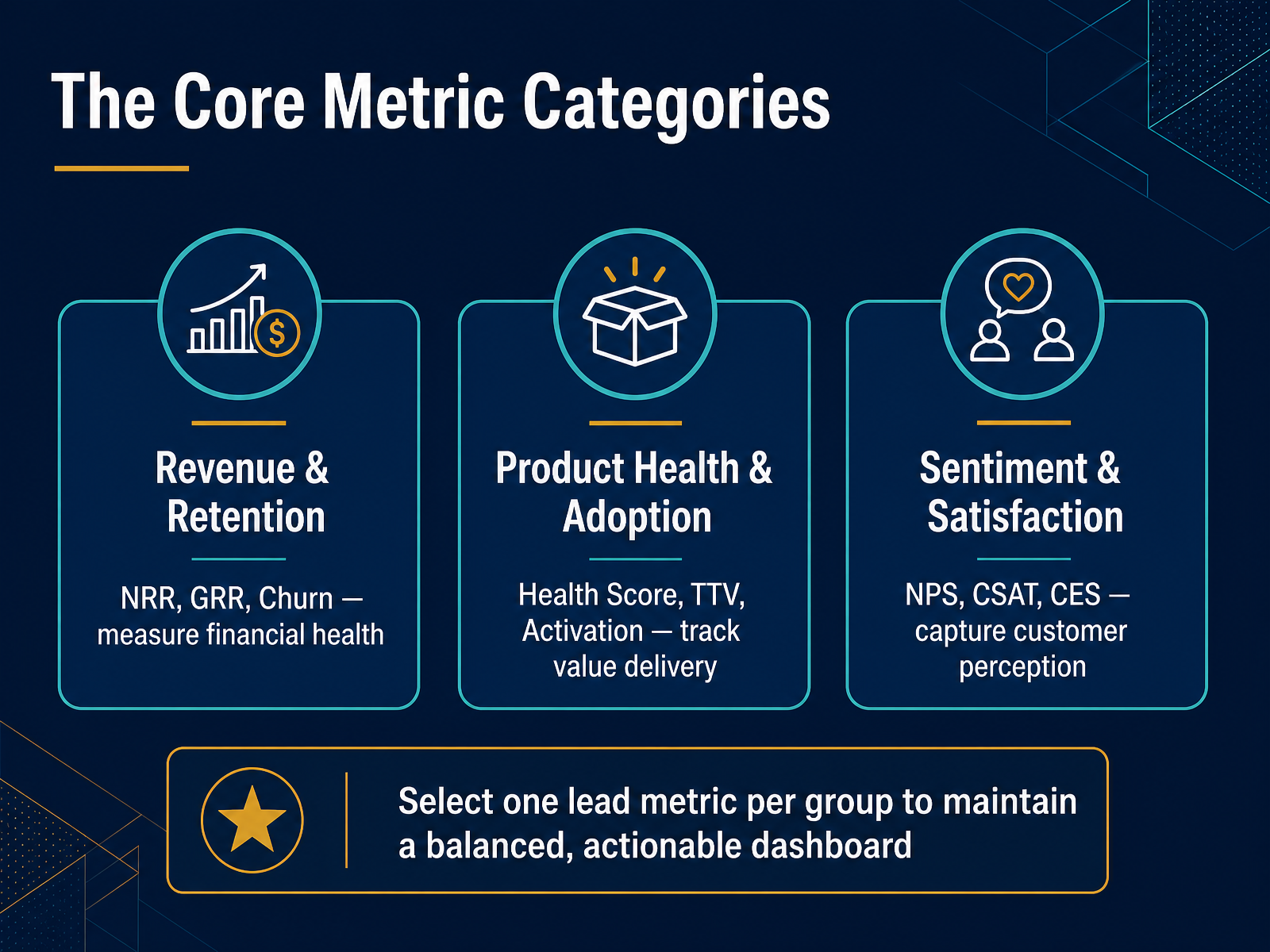
2 min - 03The Core Metric CategoriesNow let's organize the metrics that matter most into three practical groups, because a random list of numbers won't help you make decisions on a Tuesday morning. The first group is Revenue and Retention. Here you're tracking Net Revenue Retention, Gross Revenue Retention, and Churn. Think of these as your financial vital signs. They tell you if the business is growing or slowly leaking value. The second group is Product Health and Adoption. This is where Health Score, Time-to-Value, and Activation live. These metrics measure whether customers are actually extracting value from what they bought, which is the engine of renewal. The third group is Sentiment and Satisfaction. Here you capture customer perception through NPS, CSAT, and Customer Effort Score. One critical piece of advice: don't try to watch everything at once. Select one lead metric from each group to keep your dashboard balanced and truly actionable. Next, we'll do a deep dive into Net Revenue Retention and Gross Revenue Retention.
 2 min
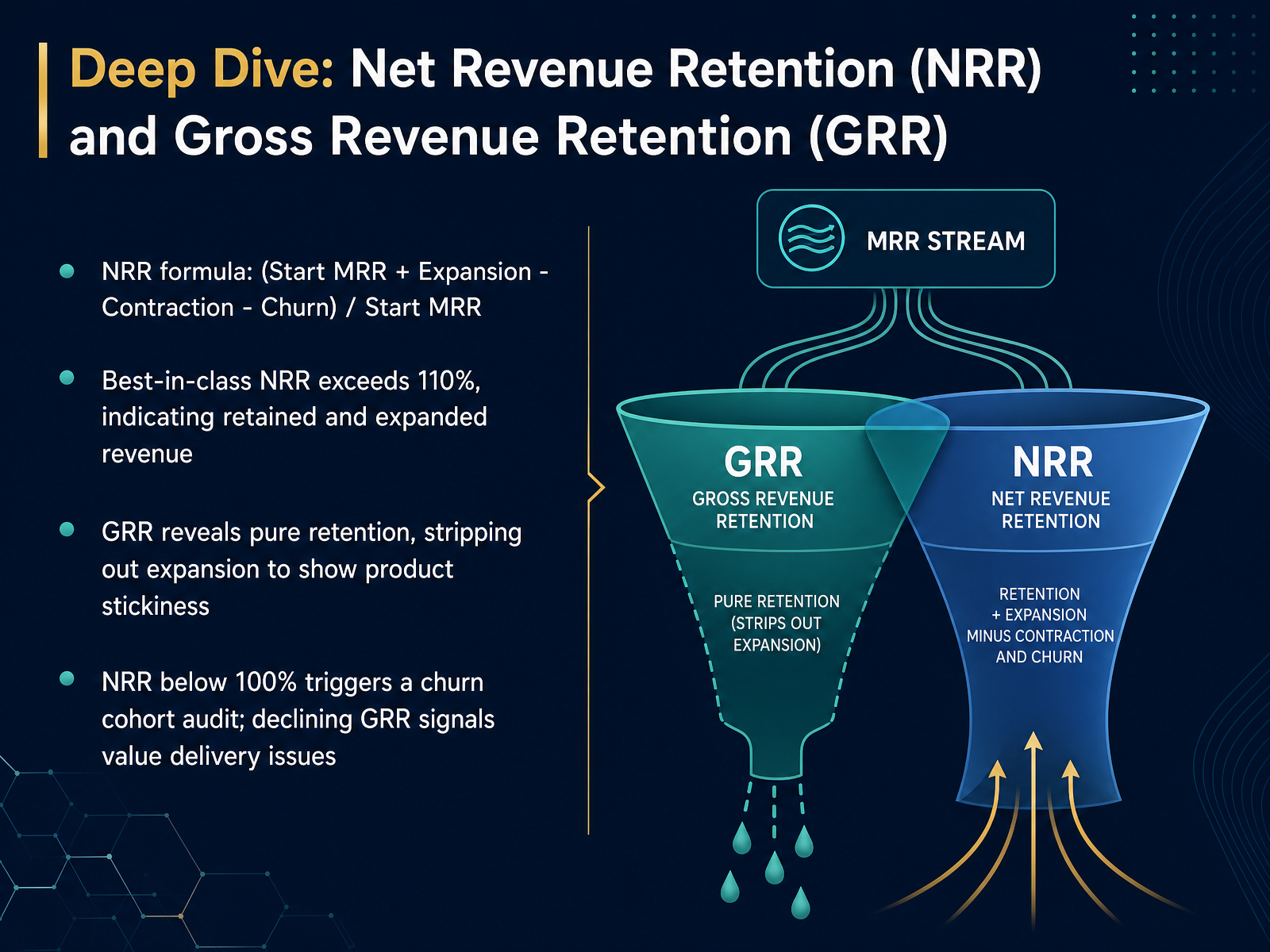
2 min - 04Deep Dive: Net Revenue Retention (NRR) and Gross Revenue Retention (GRR)Let’s unpack two metrics that look similar but tell very different stories: Net Revenue Retention and Gross Revenue Retention. NRR calculates the percentage of recurring revenue you keep from your existing customer base, including expansions. The formula is starting monthly recurring revenue plus expansion revenue, minus contraction and churn, all divided by starting MRR. Best-in-class companies push NRR above one hundred ten percent, which means they’re not just keeping revenue, they’re growing it even before adding a single new logo. GRR, on the other hand, strips out expansion entirely. It isolates pure retention, so you can see whether your product is truly sticky. When NRR dips below one hundred percent, I’d pull a churn cohort audit immediately. If GRR starts declining, that’s your signal that basic value delivery is breaking down. Think of NRR as your growth engine and GRR as your early warning system. Next, we’ll use these signals and more to build a predictive customer health score.
 2 min
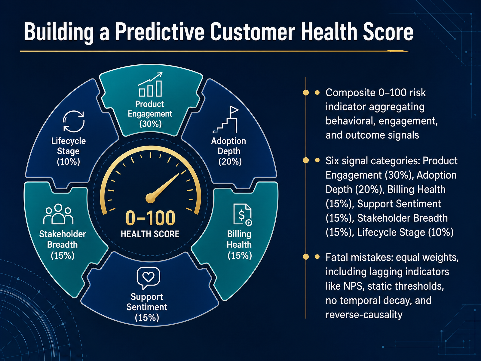
2 min - 05Building a Predictive Customer Health ScoreLet’s turn those individual signals into something you can actually act on—a predictive customer health score. Think of it as a zero-to-one-hundred risk indicator that combines behavioral, engagement, and outcome data into a single, forward-looking number. We want to see trouble coming, not just confirm it after the customer churns. To do that, we blend six categories. Product engagement carries the most weight at thirty percent. Then adoption depth at twenty percent. Billing health, support sentiment, and stakeholder breadth each get fifteen percent. Lifecycle stage rounds it out at ten percent. These aren’t arbitrary; they reflect what typically cracks before a renewal is at risk. Now, here’s what most teams get wrong. Equal weights across every signal dilute the ones that actually predict churn. Including lagging indicators like NPS tells you how they felt three months ago, not what they’ll do tomorrow. Static thresholds ignore seasonal usage patterns, and forgetting to apply temporal decay means a spike of activity from six months ago still props up the score. And watch out for reverse causality—treating a spike in support tickets as positive engagement when it’s really a sign of frustration. So what would you do with this on a Tuesday morning? You’d sort your book of business by health score, and you’d know exactly which ten accounts need a proactive call before the end of the week. With the model built, next we’ll walk through how to calibrate and validate that score so you’re not flying blind.
 2 min
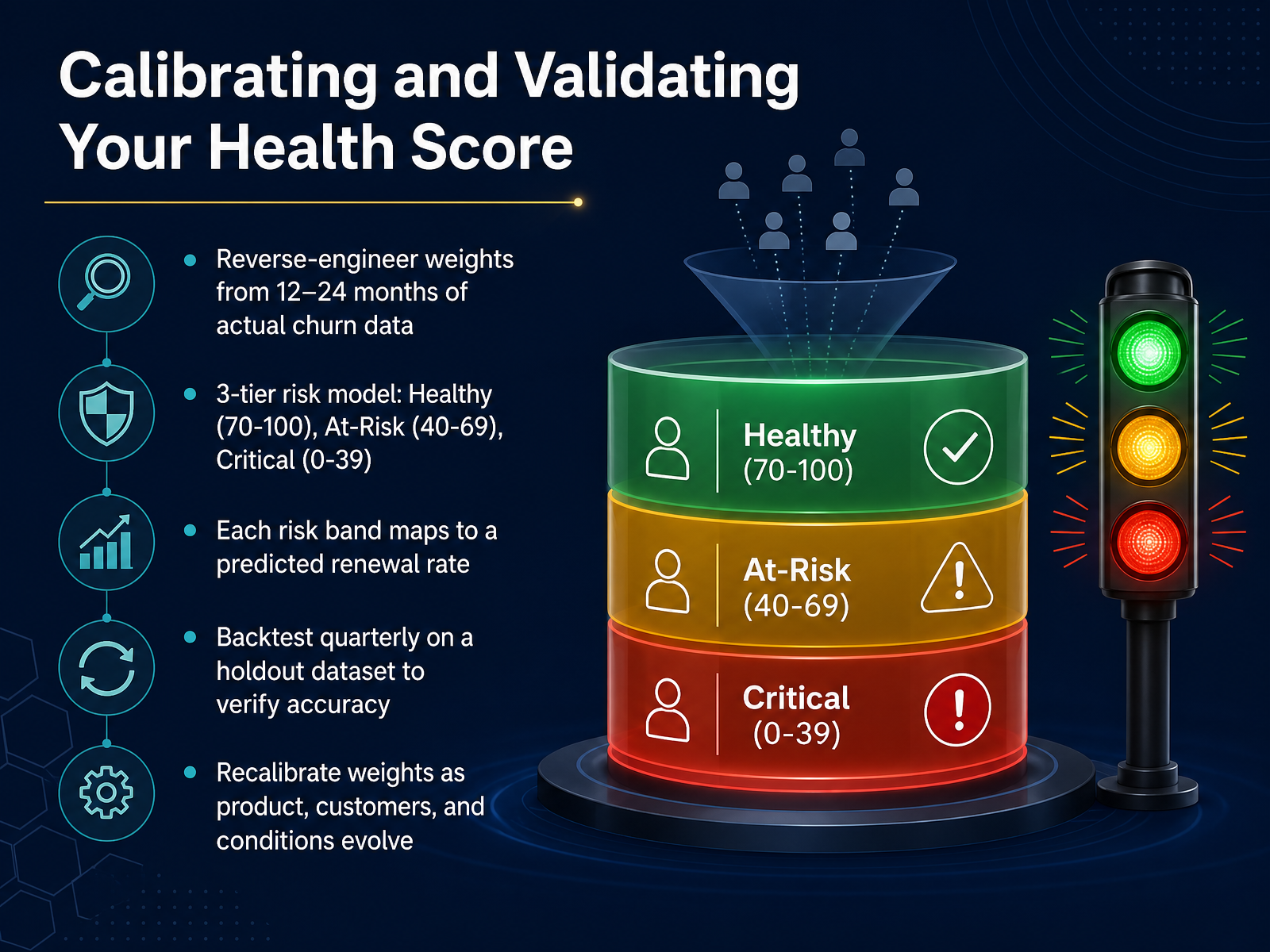
2 min - 06Calibrating and Validating Your Health ScoreLet's move from designing a health score to making sure it actually works. A score is only useful if it predicts real outcomes. To calibrate your model, reverse-engineer the weights from twelve to twenty-four months of your own churn data. Basically, let the data tell you which signals matter most. From there, define a simple three-tier risk model. Healthy accounts score between seventy and one hundred. At-risk sits in the forty to sixty-nine range. Critical is anything below forty. Now, map each band to a predicted renewal rate so you can quantify the risk. For example, a critical account might have a predicted renewal rate of just twenty percent. Next, backtest your model quarterly on a holdout dataset to verify accuracy before using it for live decisions. And remember, your product and customer base evolve, so recalibrate these weights regularly. Once your health scores are validated, the real work begins. Next, we'll move from numbers to narrative and master interpretation.
 1 min
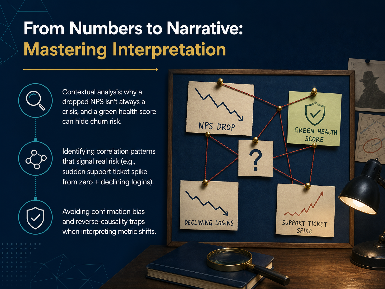
1 min - 07From Numbers to Narrative: Mastering InterpretationAll right, let's move from tracking numbers to telling the story behind them. This is where we separate signal from noise. A dropped Net Promoter Score isn't always a crisis. Maybe you just surveyed a batch of new users who haven't seen the value yet. Conversely, a green health score doesn't mean a renewal is safe. A silent, happy user who stops logging in is often your biggest hidden churn risk. So, what patterns should you actually look for? I always watch for a sudden spike in support tickets from zero, combined with a sharp decline in logins. That tandem movement isn't a coincidence; it's an early indicator of active frustration and disengagement. As you interpret these shifts, watch out for two common traps. First, confirmation bias, where you only see data that supports your existing opinion about an account. Second, reverse causality, where you mistake the symptom for the cause. For example, a drop in usage didn't cause the dissatisfaction—it's the other way around. Always pressure-test the story by asking, 'What else could explain this?' Now that you can read the narrative in your metrics, let's design the dashboards that surface these stories at a glance.
 2 min
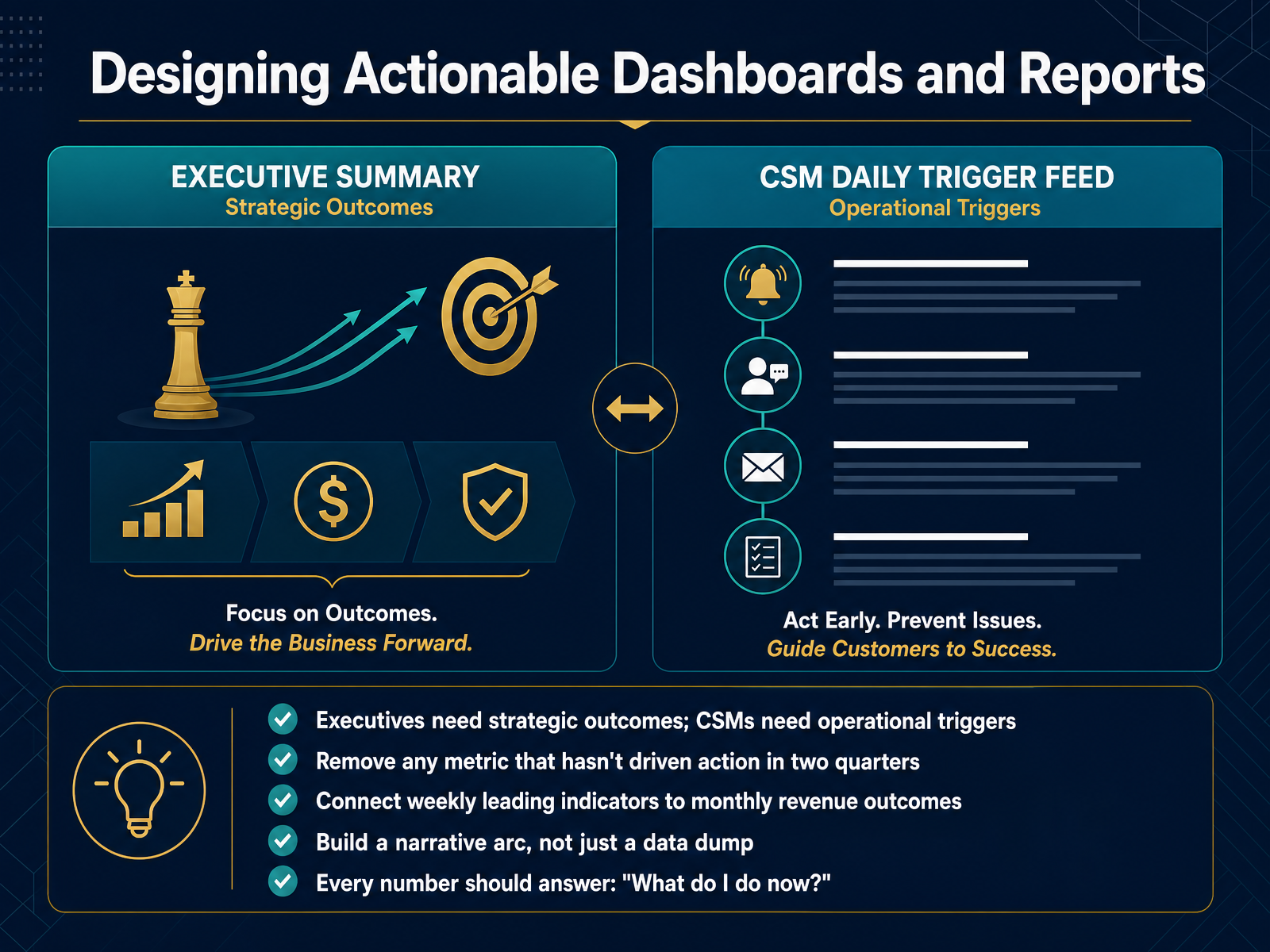
2 min - 08Designing Actionable Dashboards and ReportsNow, let's get practical and design dashboards that people actually use. The first rule is simple: you need two different views. Executives need to see strategic outcomes, like net revenue retention and logo retention trends. Your CSMs, on the other hand, need operational triggers, like which accounts didn't log in this week or whose health score just dropped. One size does not fit all. And here's a tough rule I follow: if a metric hasn't driven a concrete action in two full quarters, remove it from the dashboard. It's visual noise. The real power comes when you connect weekly leading indicators, like adoption depth, directly to your monthly revenue outcomes. That shows whether today's behavior predicts tomorrow's renewal. Most importantly, don't just dump data on a slide. Build a narrative arc that forces a decision. Every single number on that screen should answer one question: What do I actually do now? Next, we'll wire those metrics directly into your playbooks.
 1 min
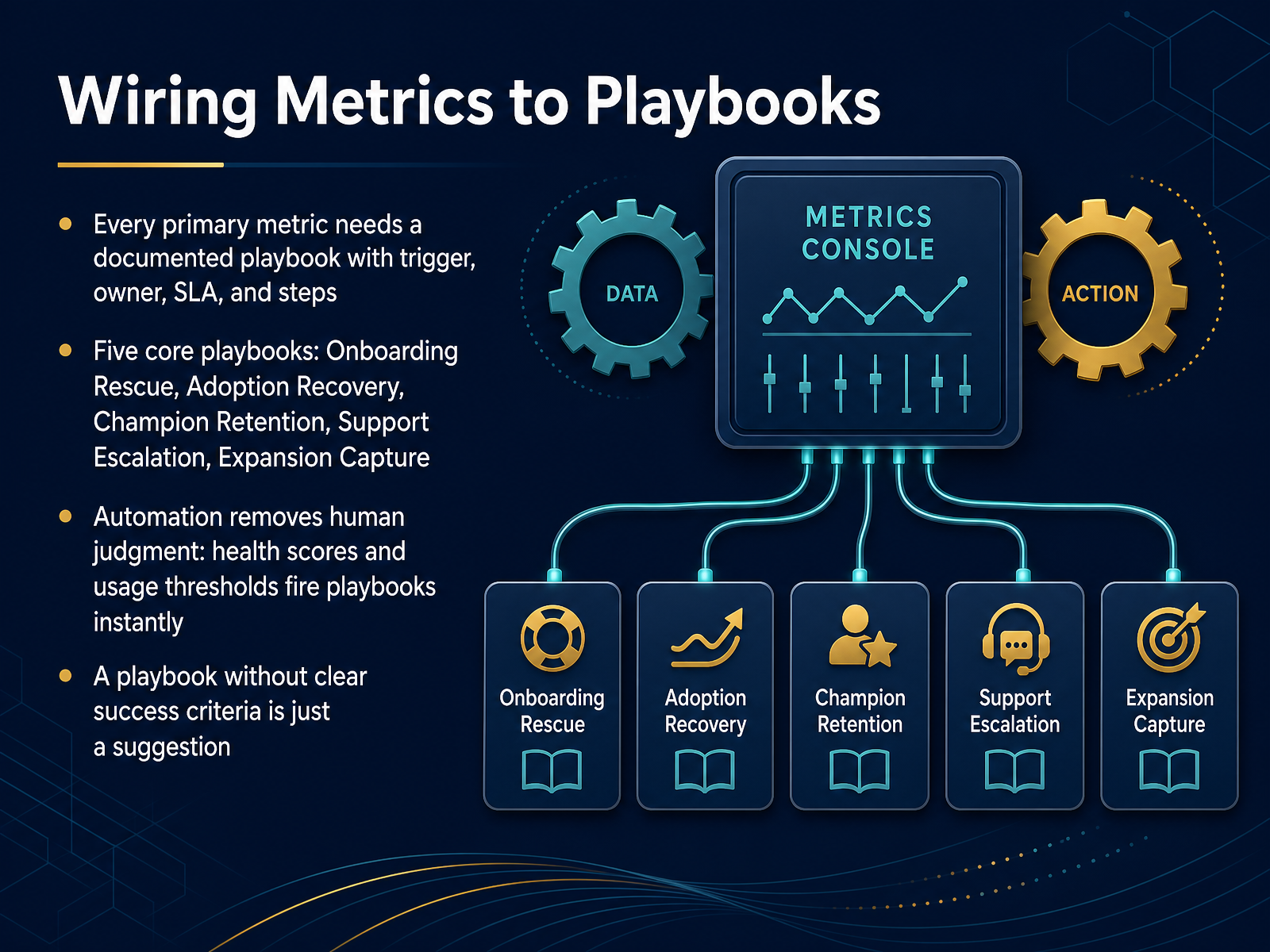
1 min - 09Wiring Metrics to PlaybooksSo we know our key metrics. But a number on a dashboard doesn't change anything by itself. What turns insight into action is a playbook. Here's the rule: every primary metric needs a documented playbook with a clear trigger, an owner, a service-level agreement, and specific steps. Think about onboarding time-to-value. If that metric dips below a threshold, who gets alerted? What exactly do they do, and how fast? Without a playbook, that red number just causes anxiety. We focus on five core playbooks that cover the customer lifecycle: Onboarding Rescue, Adoption Recovery, Champion Retention, Support Escalation, and Expansion Capture. And here's where it gets powerful. Automation removes the need for human judgment in the trigger. When your health score drops or usage falls below a defined threshold, the playbook fires instantly, creating a task or starting a workflow. No one has to remember to check a report. Just remember this: a playbook without clear success criteria is just a suggestion. You need to define what 'resolved' looks like, so you know if the playbook actually worked. Next, we'll put this into practice with a Playbook Workshop focused on Churn Prevention and Expansion.
 2 min
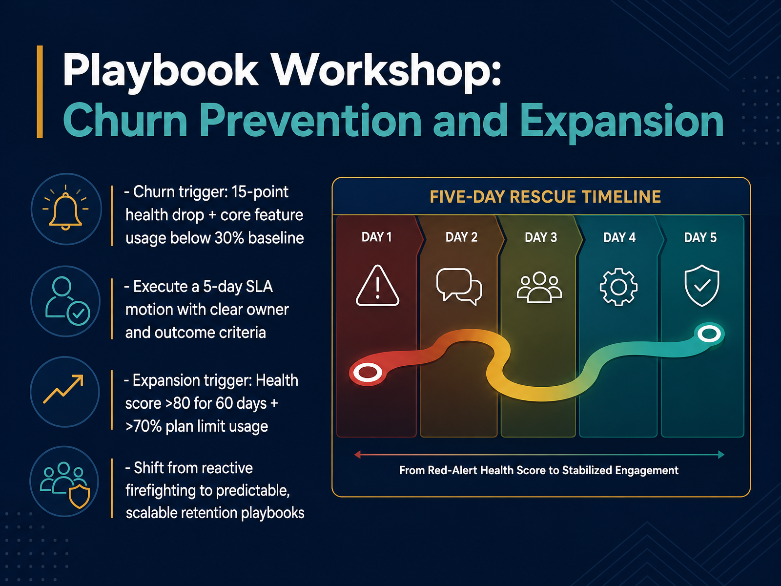
2 min - 10Playbook Workshop: Churn Prevention and ExpansionNow let's make this operational. We're going to build a simple, repeatable playbook. First, churn prevention. Your trigger is a combined signal: a fifteen-point health score drop and core feature usage falling below thirty percent of the baseline. When that fires, you don't just make a note. You execute a five-day service-level agreement with a clear owner and specific outcome criteria. Think of it as a focused sprint to re-engage, not a panicked scramble. On the expansion side, the signal is different. You're looking for a health score above eighty, sustained for sixty days, and over seventy percent plan limit usage. That's not a coincidence; it's a buying signal. When you see it, you shift from a reactive support stance to a proactive growth conversation. The goal here is to move your team from reactive firefighting into predictable, scalable retention motions that any team member can run. Next, let's translate these playbooks into a language the CFO will always appreciate, as we look at quantifying the return on investment of customer success.
 2 min
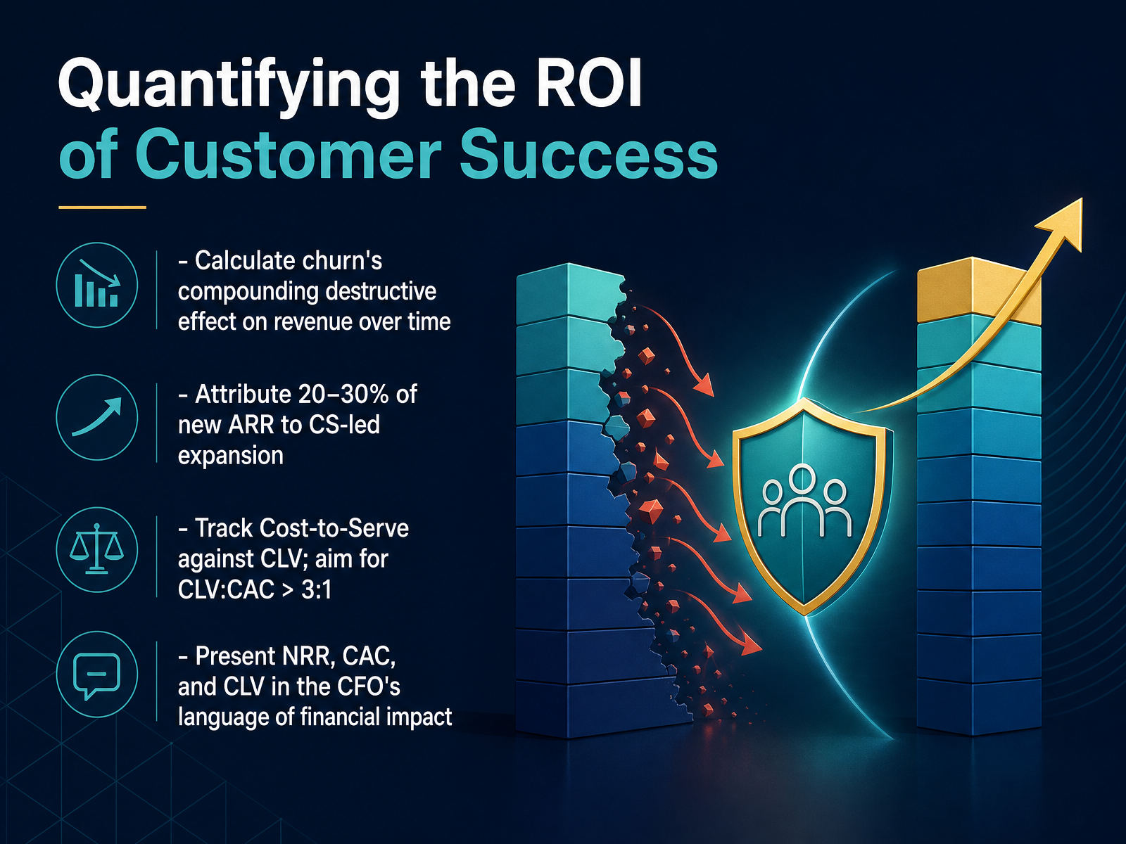
2 min - 11Quantifying the ROI of Customer SuccessNow we get to the part that secures your seat at the executive table: quantifying the return on investment. First, let's talk about the destructive power of churn. It's not just about today's lost revenue. Because of compounding, a five percent monthly churn rate can erode nearly half of your annual recurring revenue over a year. You need to model that forward-looking hole, not just report a rearview metric. Next, connect your work directly to growth. A healthy customer success motion should be generating twenty to thirty percent of new annual recurring revenue through expansions and cross-sells. If that attribution isn't clear, you're leaving your biggest strategic argument on the table. You'll also want to track cost-to-serve against customer lifetime value. A simple benchmark to aim for is a lifetime value to customer acquisition cost ratio of at least three to one. This ratio proves you're acquiring customers profitably and nurturing them efficiently. Finally, frame everything in the language of financial impact. Translate your renewal rate into net revenue retention, tie your engagement data to customer acquisition cost payback periods, and connect health scores directly to lifetime value. These are the numbers your CFO uses to measure company health. Speaking of financial narratives, many teams still get this wrong. Let's move into common mistakes and how to fix them.
 2 min
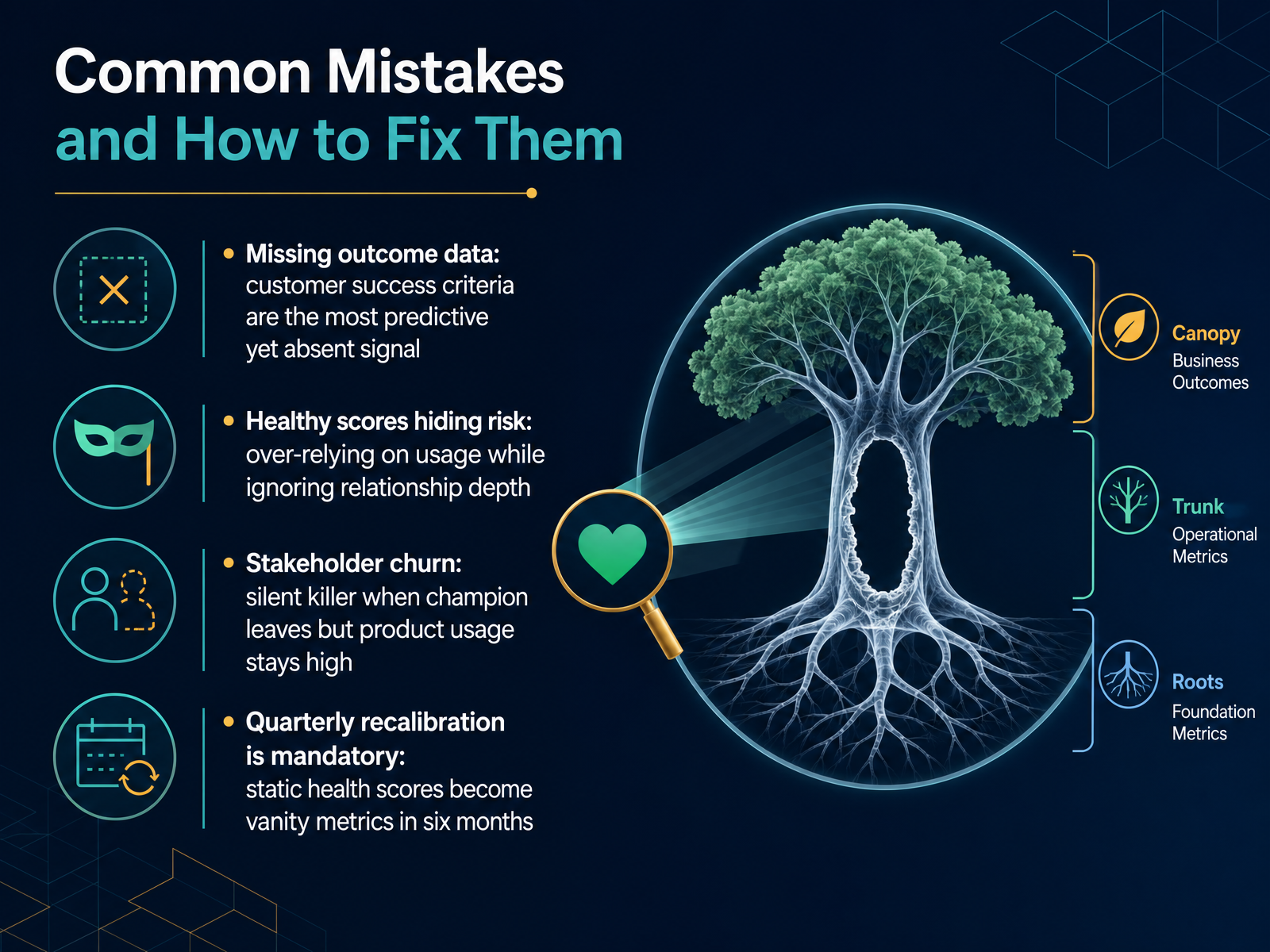
2 min - 12Common Mistakes and How to Fix ThemLet's talk about the mistakes that even experienced customer success teams make, and more importantly, how to fix them. First, missing outcome data. We track support tickets and logins, but the number one predictor of renewal is whether the customer achieved the business goal they signed up for. If that data point is blank, your health score is guessing. Second, healthy scores hiding risk. A customer using your product every day looks perfect on a usage dashboard, but if you haven't spoken to a decision maker in six months, you might be one ignored invoice away from churn. Third, stakeholder churn. This is the silent killer. A champion leaves, product usage stays high because their team hasn't changed habits yet, and you don't find out until the renewal is blocked by someone who has never heard of you. And finally, quarterly recalibration is mandatory. A health score model that isn't adjusted as your product and market evolve becomes a vanity metric in about six months. It feels accurate, but it's measuring the past. Coming up next, we'll move from fixing mistakes to building a metrics-driven culture across your entire organization.
 2 min
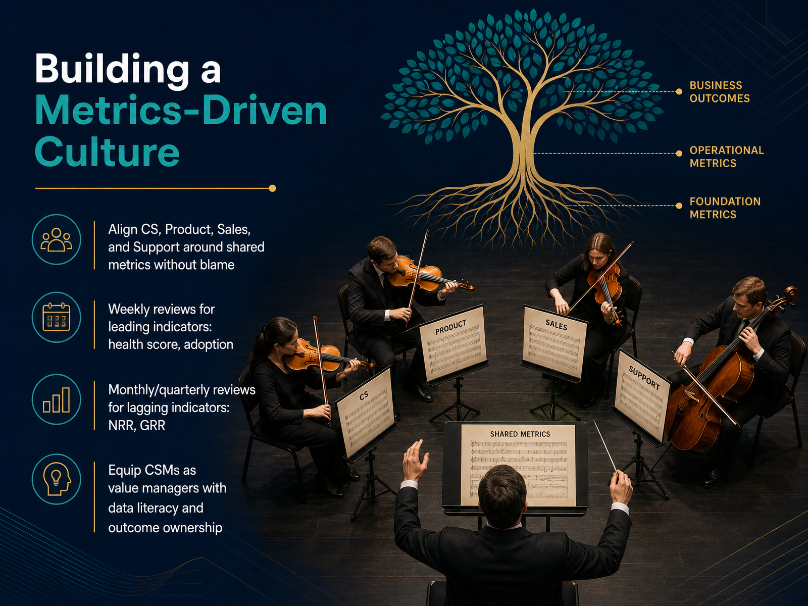
2 min - 13Building a Metrics-Driven CultureSo, how do we actually make these metrics part of the team’s DNA instead of a once-a-quarter panic? It starts with alignment. You need a shared language across Customer Success, Product, Sales, and Support—a set of metrics everyone owns, without pointing fingers. If churn spikes, we ask 'what happened in the customer journey,' not 'whose fault was it.' Next, change the meeting cadence. Weekly reviews should focus on leading indicators like health scores and feature adoption. Are we seeing the behaviors that prevent churn? Save the lagging indicators—your Net Revenue Retention and Gross Revenue Retention—for monthly and quarterly business reviews, where you can connect them to strategic decisions. Finally, you have to equip your CSMs. They aren't just reactive supports; they're value managers. Invest in their data literacy so they can confidently connect their daily actions to a customer’s business outcome. When they see the line from a feature-adoption session to a renewal, they own that number. Let's take these principles and apply them directly to real customer situations.
 2 min
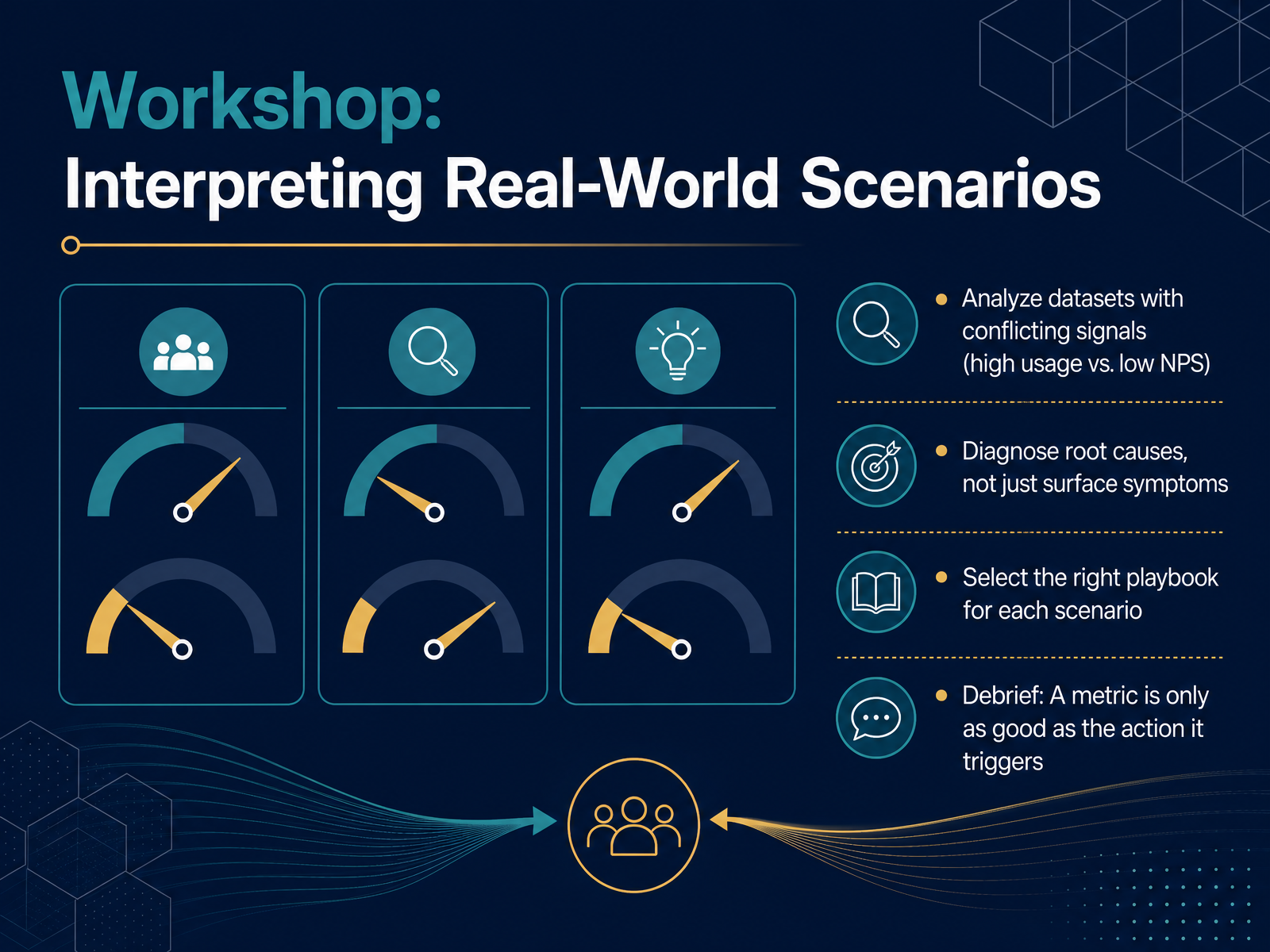
2 min - 14Workshop: Interpreting Real-World ScenariosNow it's your turn to put these concepts into practice. We'll analyze real-world datasets where the numbers don't always agree. Imagine a customer with soaring product usage, yet their Net Promoter Score is plummeting. What's really happening there? Your job isn't to stop at the surface symptom. You need to diagnose the root cause. Is the heavy usage actually a sign of confusion? Are they struggling and not finding value? From there, you'll select the right engagement playbook for that specific scenario. The core lesson of this entire workshop is simple but powerful. A metric, any metric, is only as good as the concrete action it triggers. Thank you for working through these scenarios with me. You now have a sharper lens for interpreting the story behind the data, and the confidence to act on it decisively.
 2 min
2 min
Take the deck with you
Download this course as a file — free, no sign-up needed.
- PDF handoutEvery slide page, ready to print or share.15 pages · 3.8 MBDownload
- Narrated PowerPointThe deck that presents itself — every slide carries the digital human's narration video.15 pages · 16.5 MBDownload
- PowerPoint slidesThe full deck as a .pptx — open it in PowerPoint, Keynote, or Google Slides.15 pages · 3.7 MBDownload
Free to use in your own training — please keep the PersonWise credit page at the end.
Have your own deck? Turn it into a course