
Pagination Design Fundamentals
Begin
15 pages · ~30 min
Pagination Design Fundamentals
A training on designing effective pagination interfaces for web applications, targeting product managers and developers.
What you’ll learn
- 01Introduction to Designing PaginationWelcome to Designing Pagination. This training is about a pattern that touches nearly every digital product: how to move through large sets of content without losing the user. By the end, you will have a clear framework for choosing the right navigation pattern and designing it with confidence.
Let us start with the basics. Pagination breaks a large dataset into numbered, separate pages. That gives people a manageable chunk at a time. For the pattern to work, users need to understand three things: the total size of the collection, their current position within it, and which pages they can reach next.
Now, pagination is not the only way to handle long lists. Two common alternatives are infinite scroll and the load-more button. Each fits a different mental model. Pagination works best when the user's goal is finding, comparing, or returning to a specific spot. Think of search results or data tables. Infinite scroll is built for browsing and casual discovery, like a social feed. Load-more sits in the middle, offering controlled exploration. Choose the pattern that matches the task.
In the upcoming sections, we will unpack the core mental model, walk through the control patterns, discuss implementation trade-offs, and address accessibility. By the end, you will know exactly when to reach for pagination and how to make it feel invisible.
Let us begin with the mental model behind the page concept.shaheermalik.comsubux.proeleken.co+22 min
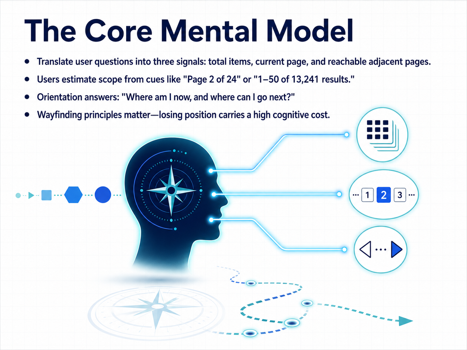
- 02The Core Mental ModelNow that we have introduced the challenges of long lists, let's build the core mental model users bring to pagination. Think of it as translating three internal questions into three visual signals: the total number of items, the current page, and the reachable adjacent pages. Users estimate scope from familiar cues like 'Page 2 of 24' or '1 to 50 of over 13 thousand results.' These cues answer two key orientation questions: 'Where am I now, and where can I go next?' If the answer gets lost, the cognitive cost of reorientation is high. In practice, this means good pagination is really about wayfinding. A user scanning a list of search results is not just moving items; they are building a mental map of the data. When you clearly label the current page and keep the next and previous buttons visually stable, you protect their sense of position. That stability, in turn, makes the broader choice of content-loading pattern much clearer. We will explore that choice next.
 shaheermalik.comsubux.proeleken.co+21 min
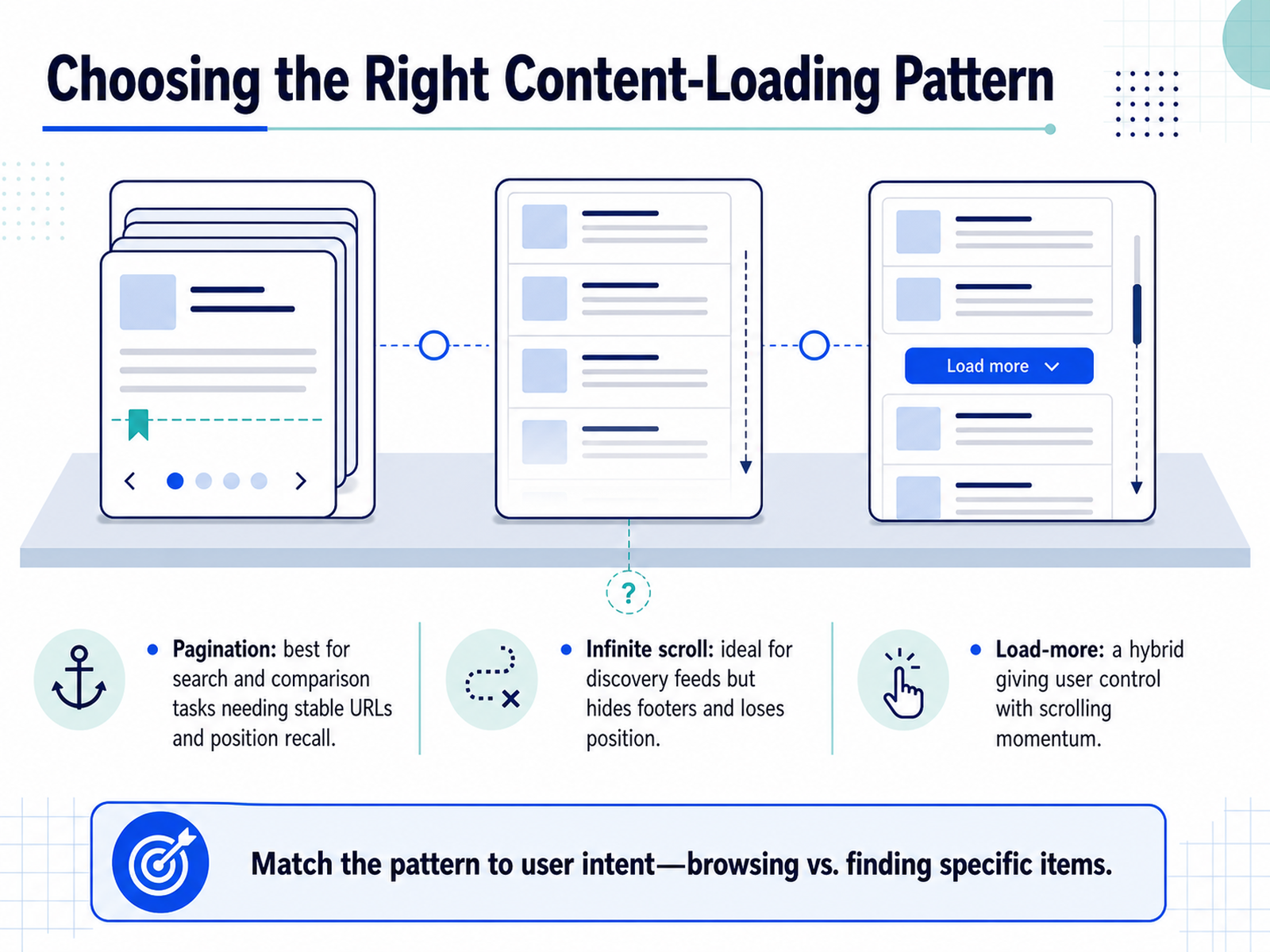
 - 03Choosing the Right Content-Loading PatternNow let's look at the three main content-loading patterns. First, pagination. It divides content into separate pages with a clear current-page indicator. This is your best choice for search results and comparison tasks. Why? Because users need stable URLs and the ability to recall exactly where they were. Second, infinite scroll. It loads new items automatically as you scroll. It is ideal for discovery feeds, but it has a real cost: it hides footers and makes it nearly impossible to return to a previous spot. Third, the load-more button. Think of it as a hybrid. It keeps the user in control. They scroll, they reach the bottom, they choose to load more. It preserves that scrolling momentum without trapping important links behind an endless stream. The core rule is simple: match the pattern to user intent. Browsing and exploring works well with scrolling patterns. Finding a specific item demands the structure of pagination. Up next, we will examine the actual control patterns that make pagination usable.
 shaheermalik.comsubux.proeleken.co+22 min
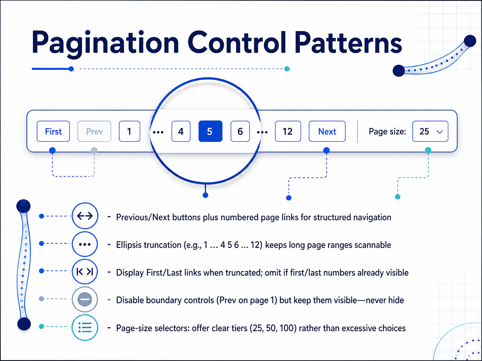
 - 04Pagination Control PatternsNow let's look at the core control patterns that make pagination work. The fundamental building blocks are previous and next buttons paired with numbered page links. This gives users both step-by-step movement and direct jumps. When you have many pages, showing every number becomes overwhelming. Use ellipsis truncation to keep the range scannable—for example, one, ellipsis, four, five, six, ellipsis, twelve. This pattern signals that there are hidden pages without cluttering the interface. If you use truncation, consider adding first and last links to help users jump to the boundaries. However, you can omit those extra links when the first and last page numbers are already visible in the truncated set. A critical rule: always disable boundary controls rather than hiding them. The previous button on page one should appear grayed out but remain visible. Hiding controls creates confusion; keeping them in place teaches users the navigation limits. Finally, page-size selectors give users control over how much data they see at once. Offer clear, meaningful tiers like twenty-five, fifty, and one hundred items. Avoid long menus of choices that only add cognitive load. Good pagination controls give clear feedback about current position and reachable destinations. Next, we'll shift our focus to URL structure and shareable state.
 shaheermalik.comsubux.proeleken.co+22 min
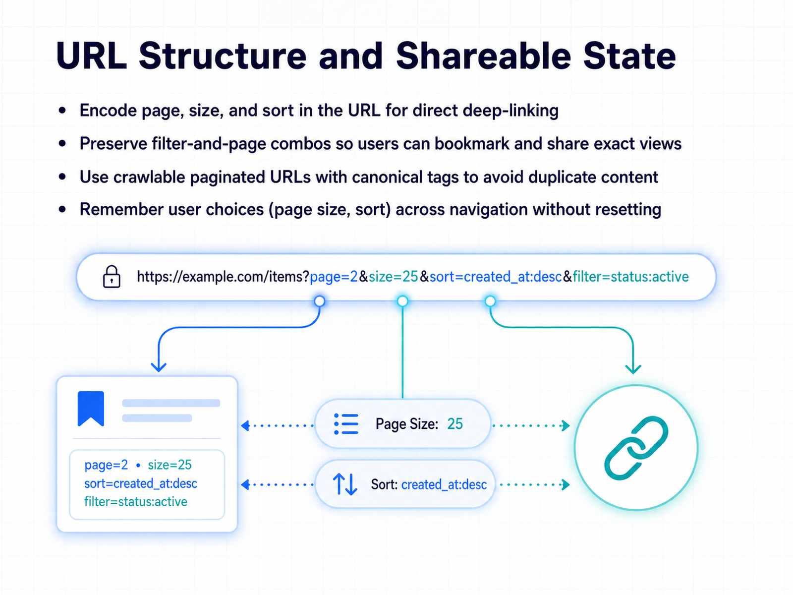
 - 05URL Structure and Shareable StateNow let's move beyond the visible controls and look at what makes pagination truly powerful: the URL. When we design pagination, we're not just building page numbers. We're building direct, shareable addresses. Each unique view—defined by the current page, the number of items per page, and any active sort order—should be encoded directly in the URL. This technique, called deep-linking, lets users bookmark an exact view or send it to a colleague. They don't land on page one and lose their place. They land on page three, sorted by price, with the same filters applied. For public-facing content, this has an important search engine benefit as well. Using crawlable paginated URLs with proper canonical tags ensures search engines index your distinct pages without flagging them as duplicate content. Equally important is respecting user preferences during navigation. If a user chooses to see fifty items per page, that choice should stick as they click through to the next page. The entire query context—filters, page size, and sort order—must be preserved and reflected in the URL, never resetting without the user's intent. This persistence is what turns a series of pages into a single, cohesive workspace. Next, we'll apply these concepts directly to offset pagination in practice.
 shaheermalik.comsubux.proeleken.co+22 min
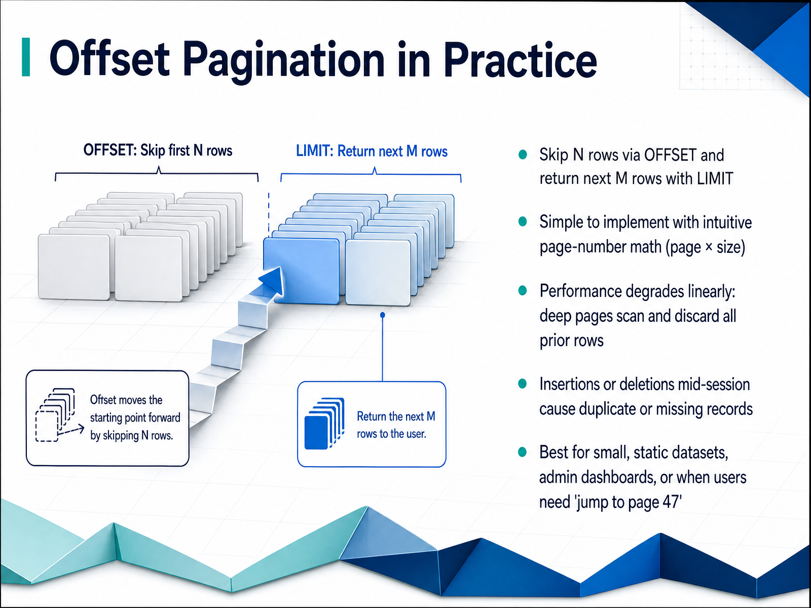
 - 06Offset Pagination in PracticeNow let's see offset pagination in practice. The database command is straightforward: you skip a number of rows using OFFSET, and then return the next batch with LIMIT. The page number math is intuitive. Multiply the page number by the page size, and you have your offset. That simplicity is its main appeal. But the performance cost is not so simple. As you go deeper, the database must scan and discard all the rows it skipped. Page one is cheap, but page two hundred does two hundred times the work. There is also a hidden consistency problem. If new rows are inserted or old ones are deleted mid-session, the row positions shift. This can cause duplicate records to appear across pages, or records that vanish silently without any warning. So offset pagination works best with small, static datasets. Think admin dashboards, a product catalog that rarely changes, or cases where users genuinely need a page-number input to jump directly to page forty-seven. In our next slide, we will shift to cursor-based pagination, the strategy designed for real-time data.
 sitepoint.comdev.tobubble.ro+22 min
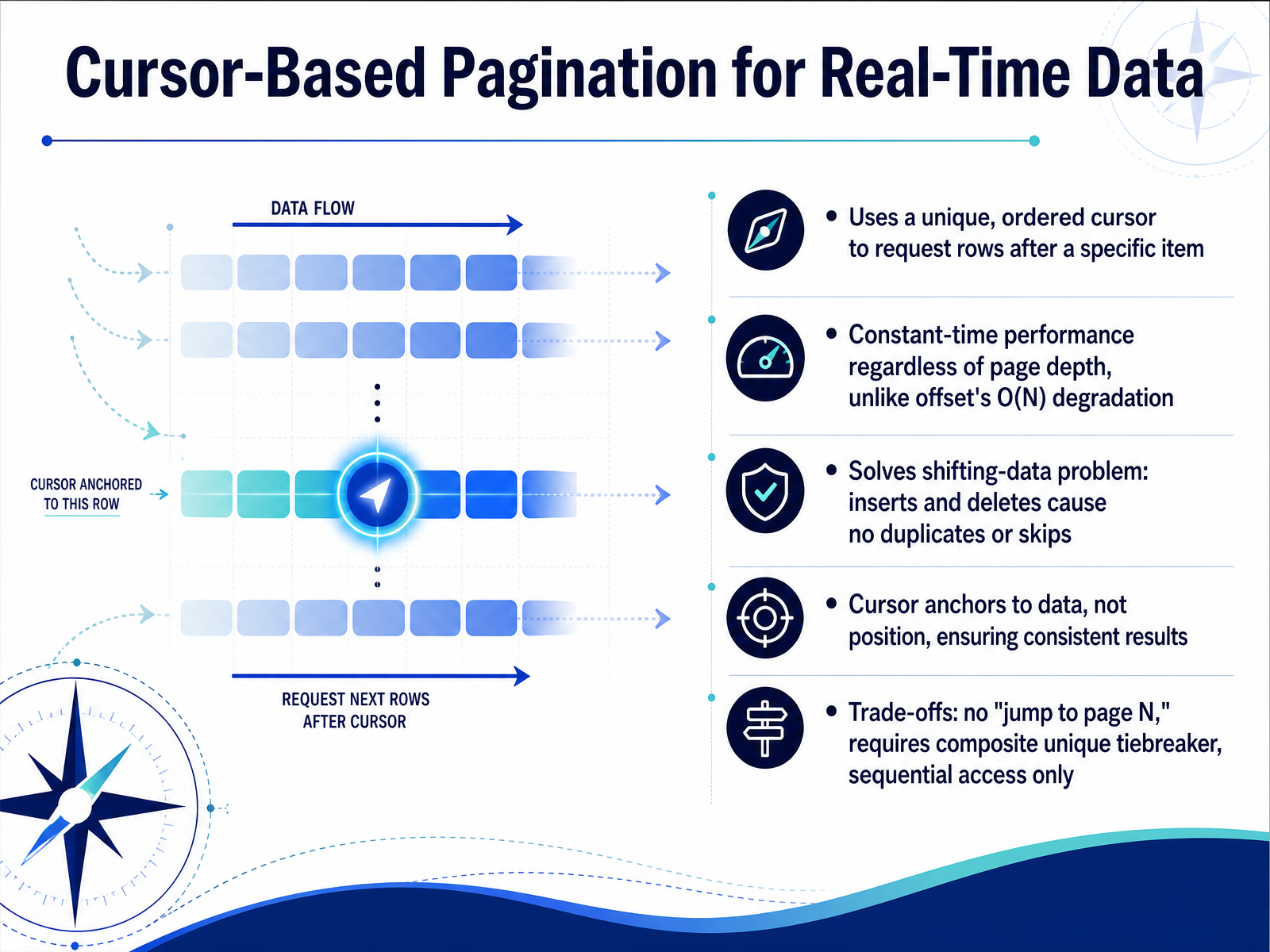
 - 07Cursor-Based Pagination for Real-Time DataNow, let's look at cursor-based pagination and why it's the right tool for real-time data. The core idea is simple: instead of skipping a fixed number of rows, the query uses a unique, ordered cursor to request rows after a specific item. This anchor to data, not position, delivers constant-time performance. Whether you are on page one or page one thousand, the query cost stays the same. Offset pagination suffers from O of N degradation as you go deeper, but a cursor seek avoids that entirely. More importantly, it solves the shifting-data problem. Under offset, inserts or deletes can cause duplicates or skipped items. With a cursor, new rows arriving at the top do not shift your place. The cursor stays locked to the data it points to, ensuring consistent results. There are trade-offs to consider. Cursor pagination does not support jumping to an arbitrary page number. You need a composite unique tiebreaker, like a timestamp paired with a primary key, to handle ties deterministically. Navigation is sequential, moving forward or backward through the set. These constraints make it ideal for infinite scroll, activity feeds, and any live stream where accuracy under continuous writes really matters. Next, we'll put both approaches side by side in 'Choosing Between Offset and Cursor Pagination.'
 sitepoint.comdev.tobubble.ro+22 min
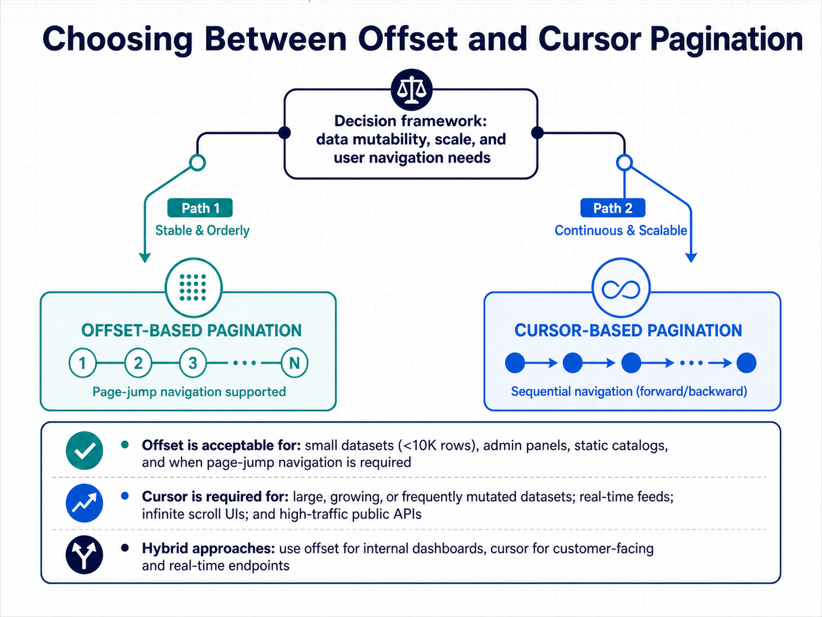
 - 08Choosing Between Offset and Cursor PaginationSo how do you decide which approach fits your project? The answer lies in three factors: how much your data mutates, how large it scales, and how users need to navigate through it. Let's walk through the decision framework. Offset pagination is perfectly acceptable for small datasets, generally under about ten thousand rows. Think admin panels, static product catalogs, or internal tools where data rarely changes between requests. It is also the right call when users genuinely need to jump directly to page forty-seven, because offset gives you that page-number math instantly. Cursor pagination, on the other hand, becomes almost necessary for large, growing, or frequently mutated datasets. Real-time feeds, infinite scroll UIs, and high-traffic public APIs all benefit from the stable, constant-time performance that cursors provide. You avoid the drifting-window problem entirely. Some teams even combine both. Use offset for internal dashboards where data is stable and developers need quick random access. Use cursor-based pagination for customer-facing endpoints and any real-time stream where missing even one record matters. The choice is not always absolute. It is about matching the strategy to the specific access pattern. Next, let's look at managing changing collections.
 sitepoint.comdev.tobubble.ro+21 min
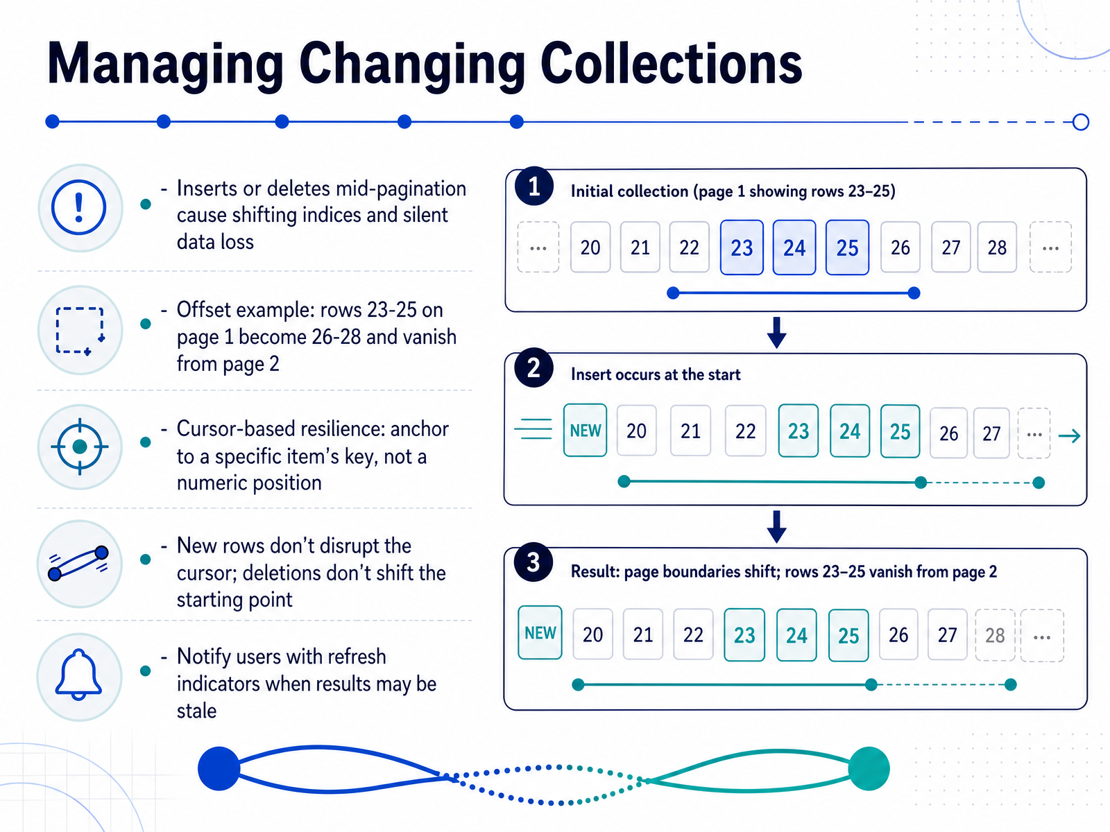
 - 09Managing Changing CollectionsNow let's look at what happens when the collection itself changes while a user is paging through it. With offset-based pagination, inserts or deletes in the middle of the dataset shift everything. Think about what we saw earlier: rows twenty-three through twenty-five appear on page one. A few new records arrive at the top, and those same rows suddenly get pushed to positions twenty-six through twenty-eight. They silently vanish from the user's view on page two. There is no error, no warning. The pagination simply skips them. Cursor-based pagination handles this differently. Instead of anchoring to a numeric position, it anchors to a specific item's key, like a unique identifier. New rows inserted elsewhere do not disrupt the cursor, and deletions do not shift the starting point. The cursor always refers to the same record, so the next page resumes predictably. One practical note: even with a stable cursor, the data set can become stale while the user browses. Use refresh indicators to let them know when newer results are available. Up next, we'll apply this thinking to loading states and perceived performance.
 sitepoint.comdev.tobubble.ro+22 min
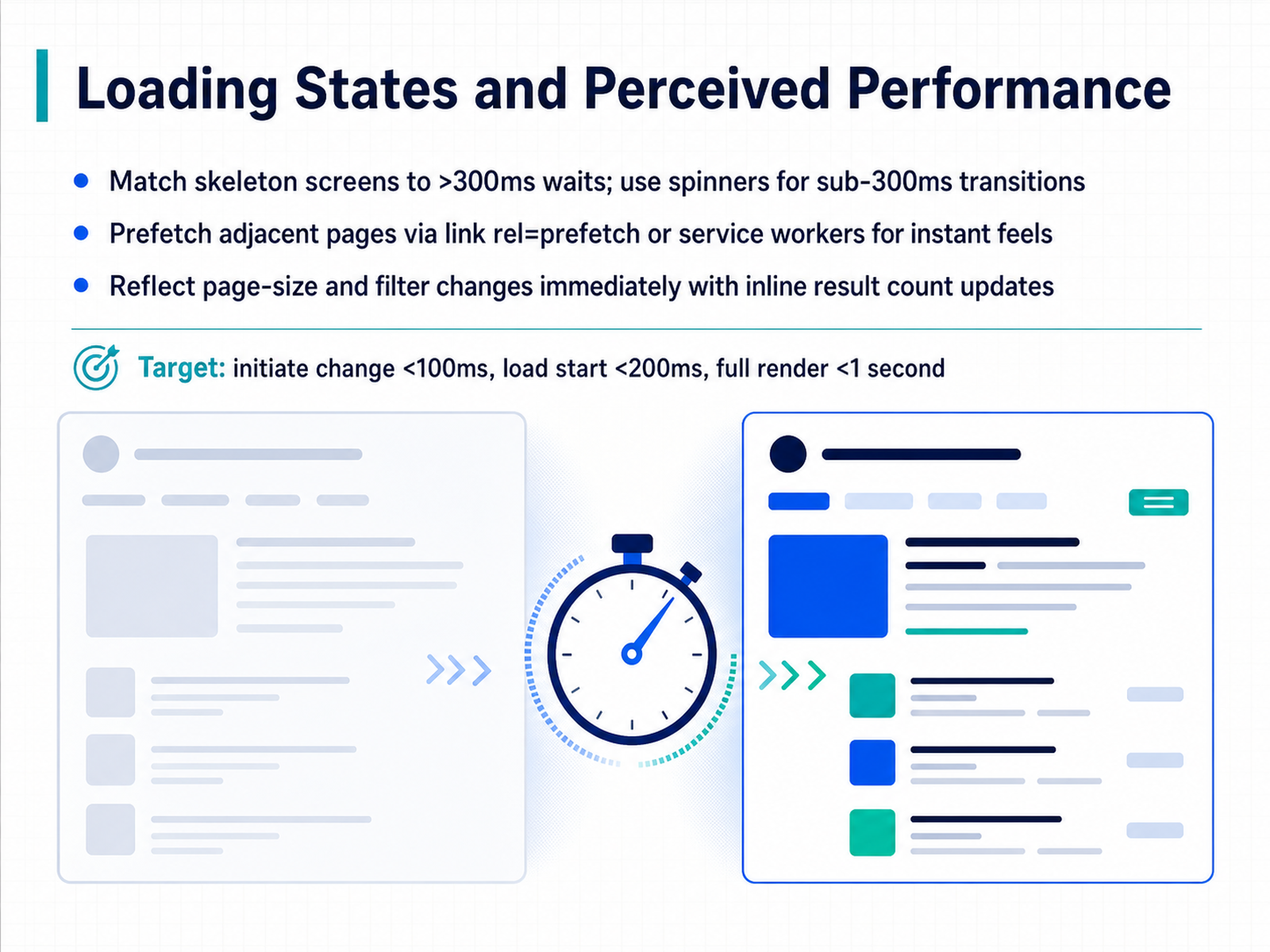
 - 10Loading States and Perceived PerformanceLet's shift from structure to speed. Perceived performance is what the user feels, not what a stopwatch shows. When a wait is unavoidable, use skeleton screens for any delay over three hundred milliseconds. They outline the coming content and reduce uncertainty. For shorter transitions under three hundred milliseconds, a simple spinner is cleaner and less distracting. To make navigation feel instant, prefetch the next page. Use a link-rel-prefetch hint or a service worker to load it behind the scenes. When the user clicks 'next,' the page is already there. Also, update the result count inline the moment a filter or page-size change is triggered. The user sees the total items adjust immediately, even before the new data loads. Your performance targets should be: initiate the change within one hundred milliseconds, start loading within two hundred milliseconds, and fully render the new state in under one second. Up next, we'll apply these principles to accessibility for pagination controls.
 2 min
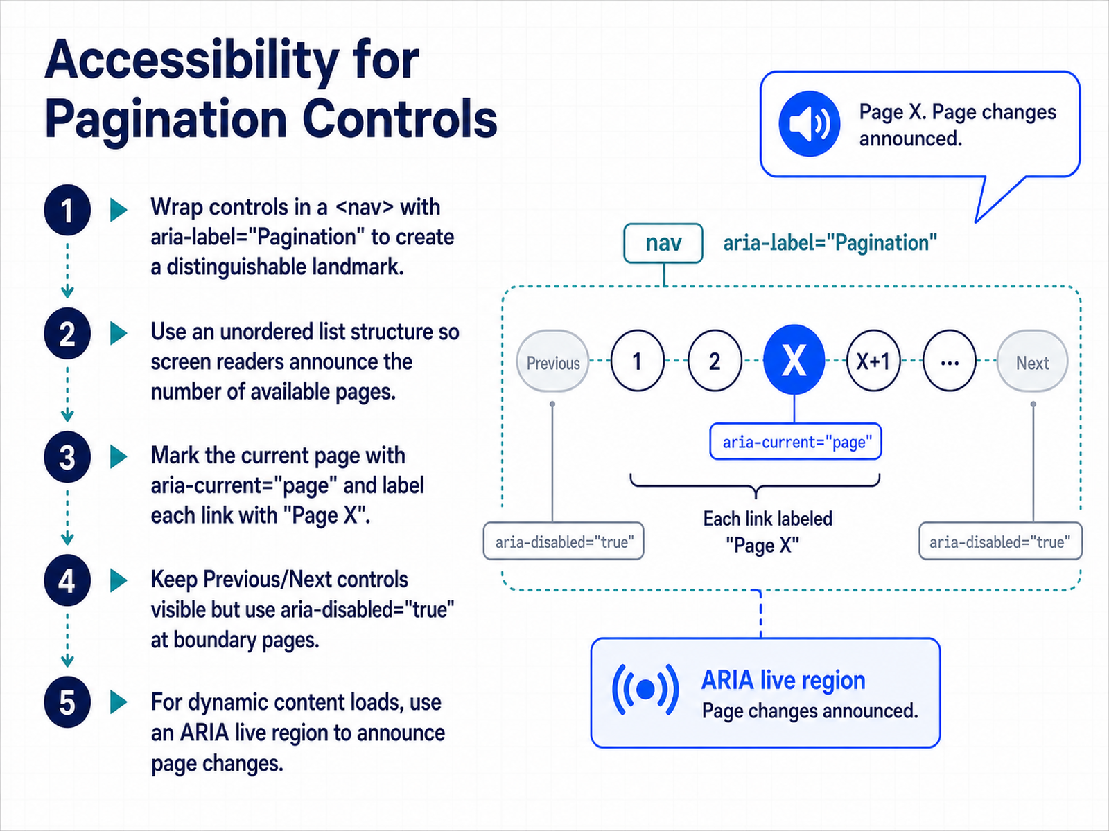
2 min - 11Accessibility for Pagination ControlsNow let's ensure the pagination controls you've designed are accessible to all users. Start by wrapping the entire set of controls in a nav element with the aria-label "Pagination." This creates a distinguishable landmark that screen reader users can jump to directly. Inside the nav, use an unordered list structure. This lets assistive technology announce the number of available pages up front, so the user knows the scope immediately. For the current page, mark its link with aria-current equals "page." Each link also needs a descriptive aria-label, such as "Page 3." This way, a screen reader announces "Page 3, current page, link" instead of just a meaningless number. Keep the Previous and Next controls always visible. When you're on the first page, set aria-disabled to "true" on the Previous control. Do the same for Next on the last page. This keeps the control discoverable but clearly indicates it is unavailable. Finally, if your design loads new content dynamically without a full page reload, use an ARIA live region to announce the page change. This confirms to screen reader users that new results have loaded. In the next slide, we'll pull all these rules together into a concrete structure and review the best practices for building robust, accessible pagination.
 designsystem.digital.gova11ypath.comw3.org+22 min
 - 12Accessible Pagination: Structure and Best PracticesLet's move into the structure that makes pagination understandable for everyone. First, wrap all your page links in an unordered list. This lets screen readers announce the total number of items upfront, so users know the size of the set immediately. On the active link, apply aria-current equals page. This programmatically announces the current page, and it also gives you a clean CSS hook for visual styling. Label each numbered link clearly, for example using aria-label equals page three. When a control is unavailable, like Previous on page one, do not remove it. Instead, use aria-disabled equals true and set tabindex to negative one. This keeps the element discoverable but removes it from the tab order. For the ellipsis that indicates a gap in page numbers, mark it with aria-hidden equals true. It is a visual clue only, and announcing it would add unnecessary noise. These patterns are not just theory. They are tested in production design systems like the U S Web Design System, the Vanilla framework, and the C M S Design System. Next, we will look at the most frequent mistakes designers make and how to prevent them.
 designsystem.digital.gova11ypath.comw3.org+21 min
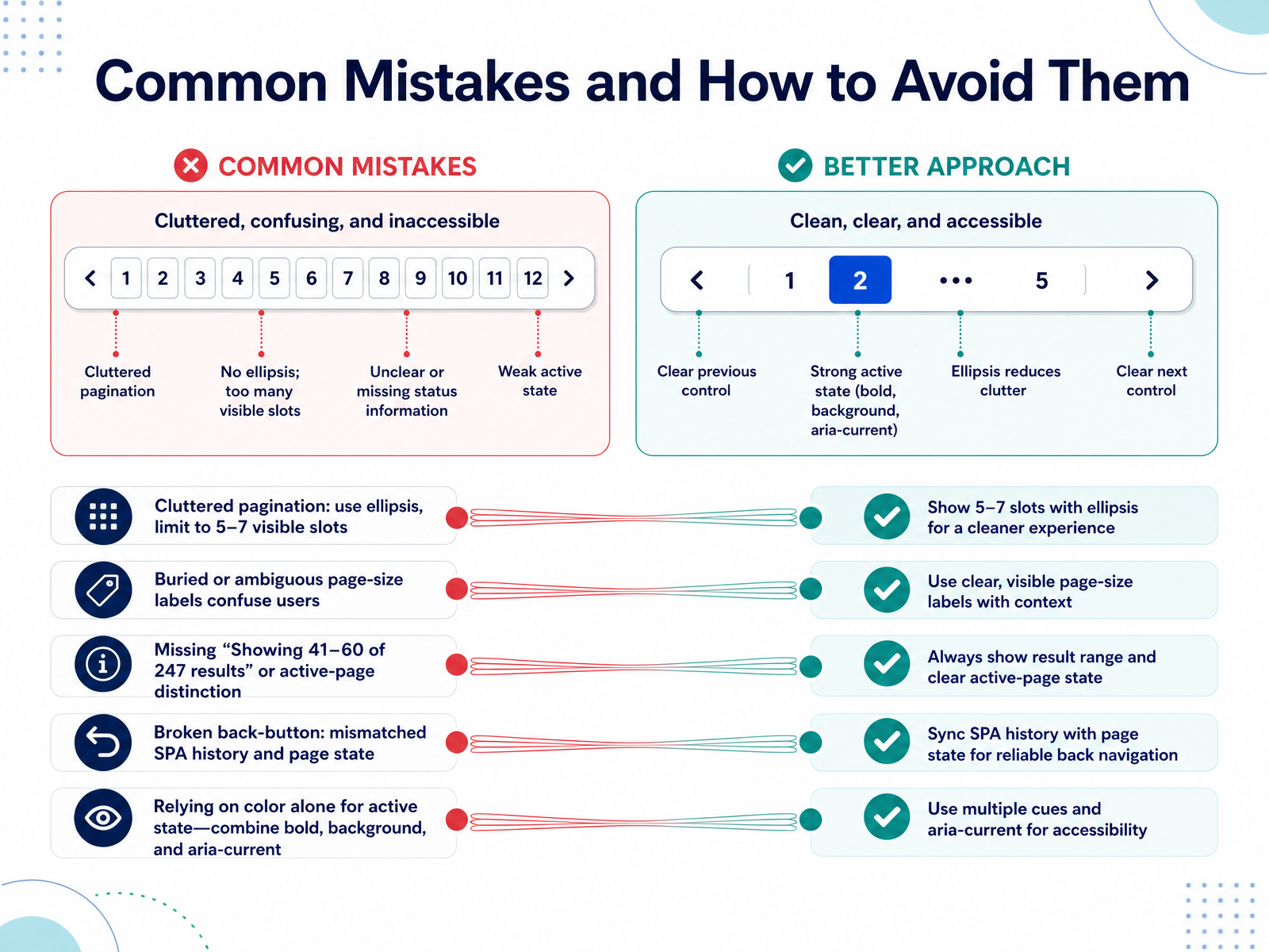
 - 13Common Mistakes and How to Avoid ThemNow let's look at some common mistakes that hurt usability, and how to avoid them. First, cluttered pagination. When there are dozens of page numbers visible, the control becomes overwhelming. Always limit the visible slots to around five to seven, and use an ellipsis to represent the skipped range. Second, ambiguous labels. A dropdown that just says 'page size' without context leaves users guessing. Pair it with the result count, like 'Showing 41 through 60 of 247 results.' Third, a missing active-page distinction. If users cannot instantly spot the current page, they lose their place. Combine bold text, a distinct background shape, and the aria-current tag to make it obvious to everyone, including screen reader users. Another serious mistake is breaking the back button. In single-page applications, make sure the browser history and the page state stay in sync, so users return to exactly where they left off. Finally, never rely on color alone to show the active state. Colorblind users or those in bright light need additional cues like bold weight or a background change. These five fixes will keep your pagination predictable and accessible. Up next, we'll move from mistakes to a practical design checklist for pagination.
 shaheermalik.comsubux.proeleken.co+22 min
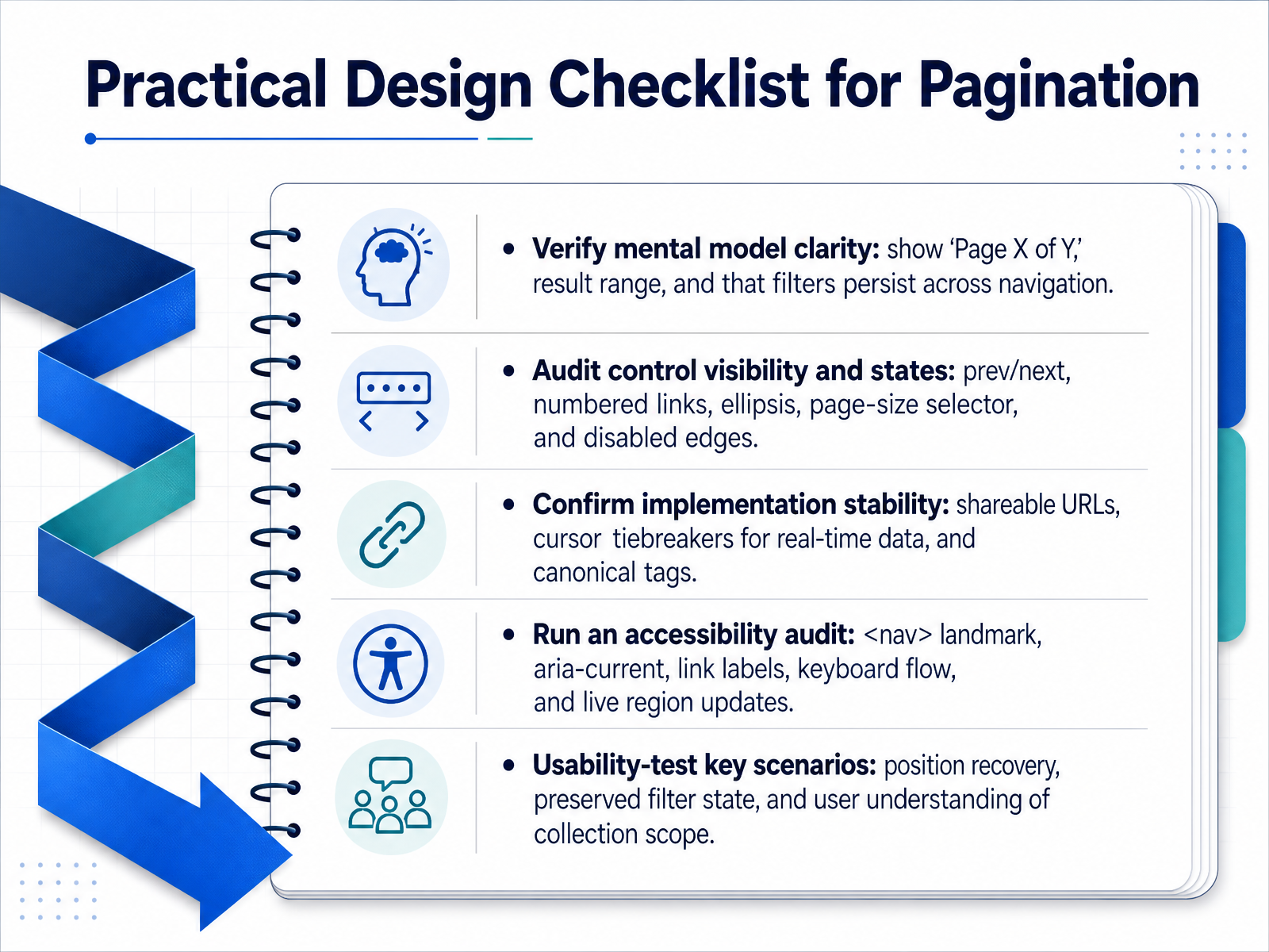
 - 14Practical Design Checklist for PaginationLet's turn theory into practice with a focused checklist. First, verify the mental model. Your user should instantly see where they are. Show the current page, total pages, and the range of items they are viewing. For example, 'Showing forty-one to sixty of two hundred and forty-seven results.' And always confirm that any active filters persist as they navigate. Second, audit the visibility and states of your controls. This means checking the previous and next buttons, numbered links, any ellipsis for skipped ranges, and especially the disabled states at the first and last pages. A page-size selector needs to be obvious too. Next, confirm the technical stability. Every page should have a unique, shareable URL. For real-time, fast-changing data, ensure you have a cursor or tiebreaker so items don't shift between pages. Use canonical tags to prevent duplicate content issues for search engines. Then, run a thorough accessibility audit. Wrap everything in a nav element with a clear ARIA label. Use 'aria-current equals page' to mark the active position, give every link a descriptive label, and test the full keyboard navigation flow. Don't forget to announce page changes with a live region. Finally, usability-test your key scenarios. Can a user return to the same page after clicking back? Does their filter state survive a page jump? And most importantly, do they actually understand the full scope of the collection they are searching through? These five checkpoints will keep your pagination logic solid and user-centered, not just functional.
 shaheermalik.comsubux.proeleken.co+22 min
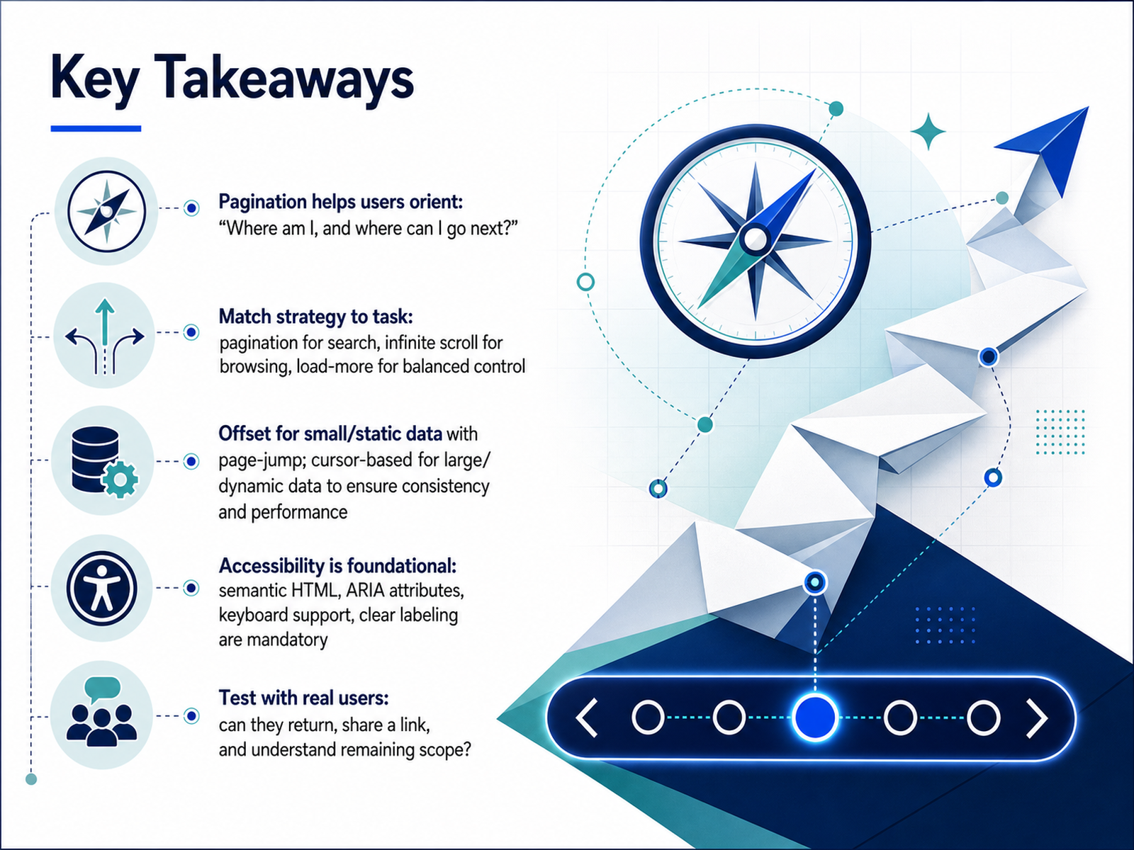
 - 15Key TakeawaysWe have covered a lot of ground. Let's touch on the key takeaways. First, always remember the user's core question. Pagination is how we answer, 'Where am I, and where can I go next?' It provides essential orientation. Next, match your strategy to the task. Pagination works best for goal-oriented search. Infinite scroll suits browsing and discovery. A Load More button offers a nice balance of control and performance. For the technical foundation, choose wisely. Offset-based pagination is straightforward for small, static data sets where jumping to a specific page number is necessary. Use cursor-based pagination for large or real-time data to ensure rock-solid performance and consistency. Accessibility is not a nice-to-have. It is foundational. Semantic HTML, proper ARIA attributes, full keyboard support, and clear labeling are mandatory requirements, not afterthoughts. Finally, test what you build with real users. Observe if they can easily return to a result, share a specific link, and clearly understand the total scope of what remains. Thank you for your time. Apply these patterns thoughtfully, and you will build navigation that feels clear, fast, and invisible.
 sitepoint.comdev.tobubble.ro+22 min
Take the deck with you
Download this course as a file — free, no sign-up needed.
- PDF handoutEvery slide page, ready to print or share.16 pages · 3.7 MBDownload
- Narrated PowerPointThe deck that presents itself — every slide carries the digital human's narration video.16 pages · 17.6 MBDownload
- PowerPoint slidesThe full deck as a .pptx — open it in PowerPoint, Keynote, or Google Slides.16 pages · 3.6 MBDownload
Free to use in your own training — please keep the PersonWise credit page at the end.
Have your own deck? Turn it into a course
Sources consulted
Web sources consulted while building this course.
- Pagination Design Best Practices (2026) - Shaheer Malik — shaheermalik.com
- Pagination vs infinite scroll vs load more – UX Best Practices and Guidelines | SubUX — subux.pro
- Pagination UI: Best Practices and Real Examples — eleken.co
- https://www.andrewcoyle.com/blog/design-better-pagination — andrewcoyle.com
- Pagination Pattern | UX Patterns for Developers — uxpatterns.dev
- Paginating Real-Time Data with Cursor Based Pagination — sitepoint.com
- What Actually Happens When You Paginate a Live, Growing Table - DEV Community — dev.to
- Cursor Pagination: Why OFFSET Quietly Falls Apart at Scale – Bubble — bubble.ro
- Page Numbers Lie: Offset vs Cursor Pagination - DEV Community — dev.to
- Beyond OFFSET: Why Cursor-Based Pagination is the Only Way to Scale APIs - ITNotes — itnotes.dev
- Pagination | U.S. Web Design System (USWDS) — designsystem.digital.gov
- Accessible Pagination: nav landmark + aria-current — A11yPath — a11ypath.com
- ARIA26: Using aria-current to identify the current item in a set | WAI | W3C — w3.org
- Pagination - CMS Design System — design.cms.gov
- Pagination | Components | Vanilla documentation — vanillaframework.io