Tableau Visual Analytics Fundamentals
Begin
14 pages · ~28 min
Tableau Visual Analytics Fundamentals
Learn to create impactful data visualizations in Tableau, including charts, dashboards, and interactive storytelling for business insights.
What you’ll learn
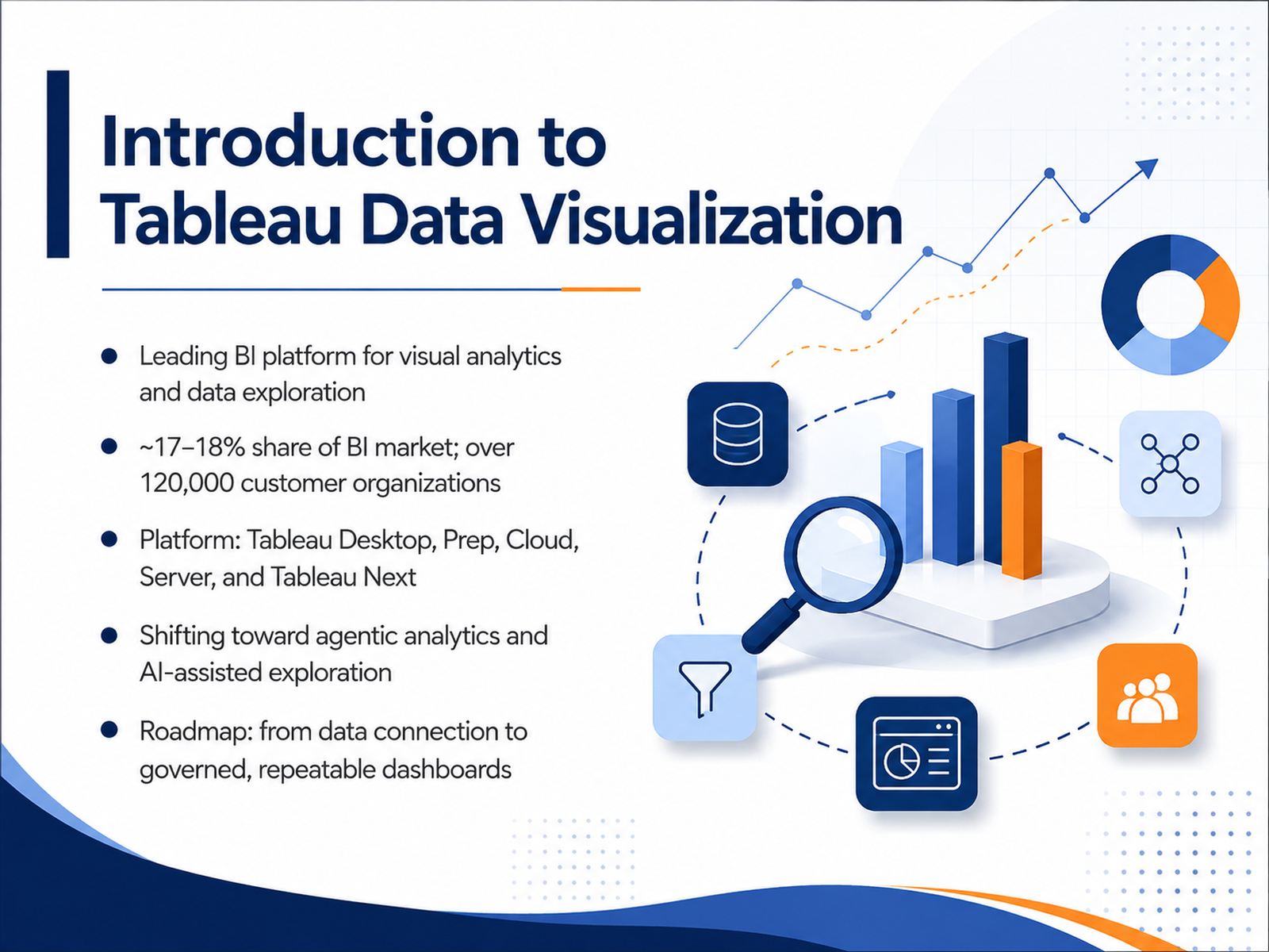
- 01Introduction to Tableau Data VisualizationWelcome to this course on Tableau data visualization. If you work with data pipelines, key performance indicators, or dashboard workflows, this training is built for you. We will focus on practical decisions that improve your reporting and analytics. Let us start with context. Tableau is a leading business intelligence platform, ranking among the top two vendors in the market. It serves over one hundred twenty thousand customer organizations worldwide. The product family includes Tableau Desktop, Prep, Cloud, Server, and the newer Tableau Next. What matters most is the strategic direction. Tableau is moving toward agentic analytics, where AI assists in data exploration and insight generation. The roadmap you will rely on runs from raw data connection through to governed, repeatable dashboards. As an analyst, you are not just building charts. You are creating a scalable, trustworthy flow from data to decisions. Keep that full journey in mind. Next, we will look at where Tableau fits inside a typical analyst workflow.ramp.comramp.comblog.9cv9.com+21 min
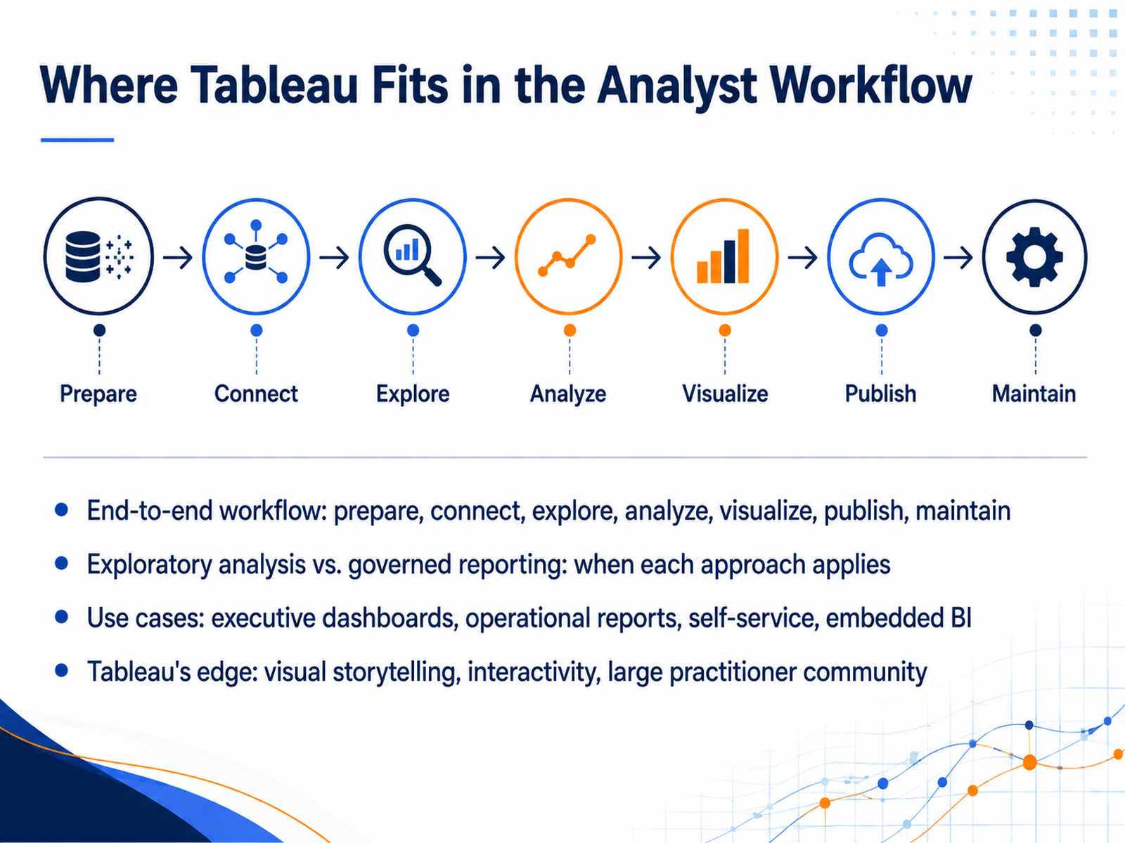
- 02Where Tableau Fits in the Analyst WorkflowNow let's position Tableau within the broader analyst workflow. Think of it as the visual analytics layer that sits between raw data and business decisions. The end-to-end flow typically includes preparing data, connecting to sources, exploring, analyzing, visualizing, publishing, and then maintaining the content. Tableau excels in the exploration and visualization stages, but it also supports governed reporting when you publish certified dashboards to Tableau Cloud or Server. So when do you use exploratory analysis versus governed reporting? If you're investigating a new question or testing a hypothesis, you want the freedom to drag fields, create ad-hoc views, and iterate quickly. Tableau's drag-and-drop interface is built for this. But when you're delivering a KPI dashboard to executives, you need governed reporting: certified data sources, row-level security, and a controlled publishing process. Tableau supports both, and knowing which mode you're in will guide your choices. Use cases vary by audience. Executive dashboards need high-level trends and clear visual hierarchy. Operational reports focus on daily metrics and alerts. Self-service analytics empowers business users to ask their own questions, and embedded BI puts visualizations inside other applications like Salesforce. Tableau has a strong edge here: visual storytelling, cross-filter interactivity, and a large practitioner community that shares best practices and accelerates onboarding. So as you move through this course, keep the full workflow in mind. Next, we'll cover connecting to data and choosing your connection type.
 ramp.comramp.comblog.9cv9.com+22 min
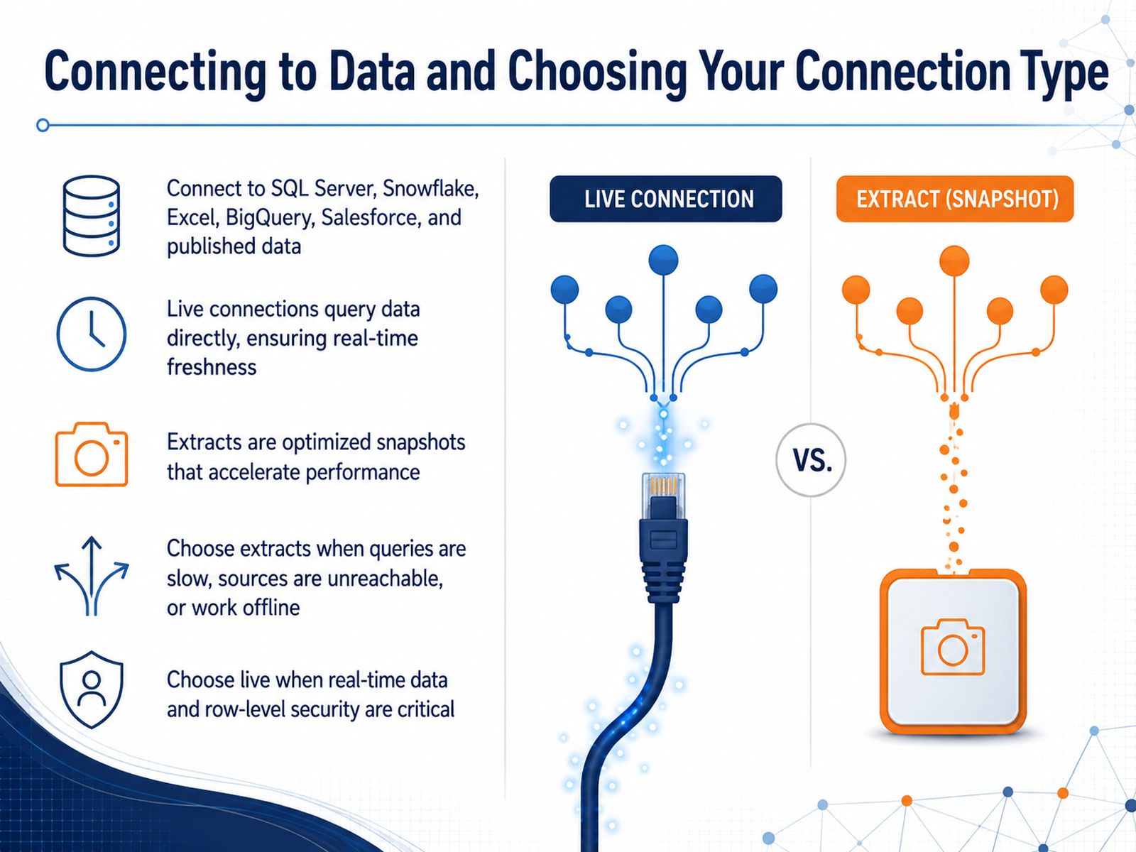
 - 03Connecting to Data and Choosing Your Connection TypeNow let's talk about how you get data into Tableau, and the first real decision you will make: live connection or extract. Tableau connects directly to sources like SQL Server, Snowflake, BigQuery, and Excel, as well as published data sources on your server. A live connection queries the database in real time. Every time you interact with a view, it sends a query to that source. This is the right choice when data freshness is critical, or when your database enforces row-level security that must be respected. But live connections are only as fast as your database and your network. When queries are slow, or your source is heavily loaded, an extract is often the better move. An extract is a compressed, optimized snapshot of your data, stored locally and built for fast analytic queries. It is ideal for large text files, for offline work, or when your source is unreachable from your server environment. The trade-off is that extracts are not real time. You need a refresh schedule. For most analysts, the practical approach is to test both. If your live connection is responsive and your database can handle the load, stay live. If you see slow dashboard loads, or you are pulling from a transactional system, build an extract and filter it to only what you need. A quick rule of thumb: file-based data should almost always be extracted, while enterprise databases that are well tuned can often stay live. Next, we will look at how to structure the data model itself. Clean tables and clear relationships make every subsequent chart faster and simpler to build.
 help.tableau.comhelp.tableau.comhelp.tableau.com+22 min
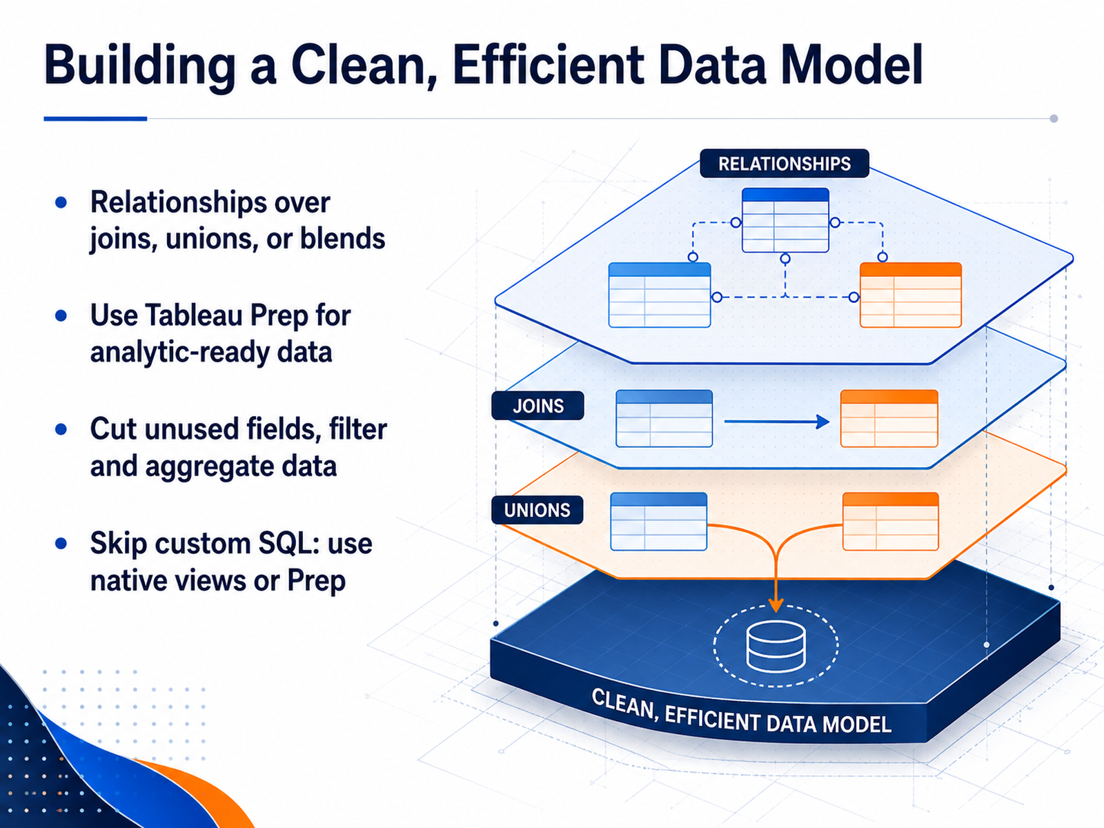
 - 04Building a Clean, Efficient Data ModelNow let's talk about the foundation of any efficient dashboard: the data model. Start by building relationships between tables. They preserve granularity and work well with multiple fact tables. If you have joined tables already, consider refactoring them into relationships or unions where possible. For heavier transformation work, use Tableau Prep to shape and clean your data into an analytic-ready state. Once your model is set, cut unused fields, apply filters, and aggregate to the grain you actually need. This reduces the data footprint and speeds up every subsequent query. As for custom SQL, skip it where you can. Native views or Prep workflows let Tableau optimize the queries and keep performance predictable. Also, if you're connecting to large file-based data like Excel or CSV, use an extract rather than a live connection. It performs significantly faster and unlocks more functionality. These early decisions save you from slow workbooks and frustrating debugging sessions later. Next, we'll look at choosing the right chart for the question you're asking.
 help.tableau.comhelp.tableau.comhelp.tableau.com+22 min
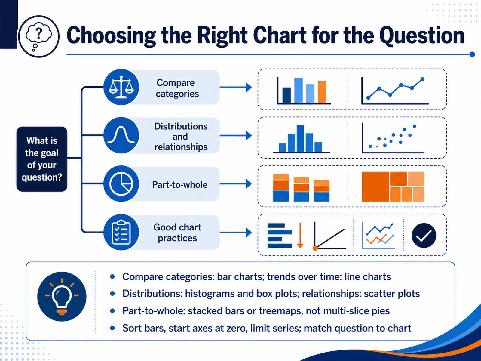
 - 05Choosing the Right Chart for the QuestionNow let's talk about choosing the right chart for the question you're asking. This is a decision you'll make daily, so it's worth building a mental map. If you're comparing categories, like sales across regions, a bar chart is your clearest option. For trends over time, such as monthly revenue or website traffic, line charts show direction and slope better than any other format. When you need to understand how values are spread, use histograms or box plots. They reveal clusters, skew, and outliers. For relationships between two measures, like ad spend and lead volume, scatter plots are the go-to, and adding a trend line can make weak but meaningful correlations visible. For part-to-whole questions, like budget allocation, stacked bars or treemaps are usually better than pie charts with many slices. Human eyes struggle to compare angles. And before you build, remember the basics: sort your bars, start axes at zero, and limit the number of series. Match the chart to the question, not to habit. Next, we'll look at making your visualizations clear and readable.
 help.tableau.comtableau.comhelp.tableau.com+21 min
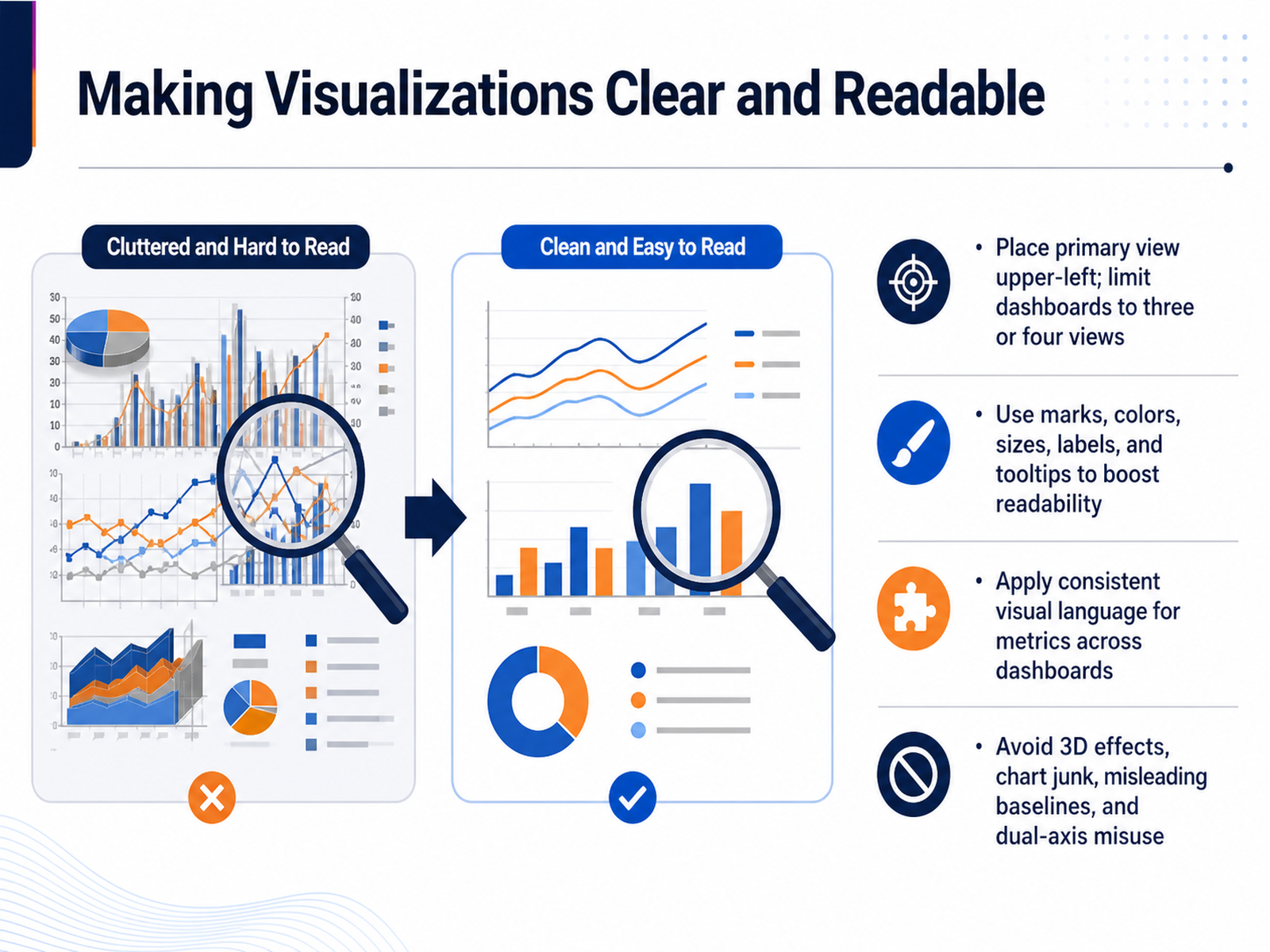
 - 06Making Visualizations Clear and ReadableNow let’s talk about making your visualizations clear and readable. Start by placing the primary view in the upper left, and keep dashboards to three or four views. Too many views will bury the insight. Use marks, colors, sizes, labels, and tooltips to guide attention — for example, color-code your top performers and add a tooltip with the exact variance. Keep a consistent visual language across dashboards: the same metric should always use the same chart type and color, so your audience doesn’t have to relearn the interface each time. Finally, avoid the common traps: no 3D effects, no chart junk, always start bar charts at zero, and be very cautious with dual axes. If you need to compare two measures, consider separate charts or index both to a baseline instead of forcing a misleading overlay. Remember, clarity beats decoration. A simple, well-structured view will always communicate faster than a cluttered one. Up next, we’ll cover calculations — row-level, aggregate, and LOD expressions.
 help.tableau.comtableau.comhelp.tableau.com+21 min
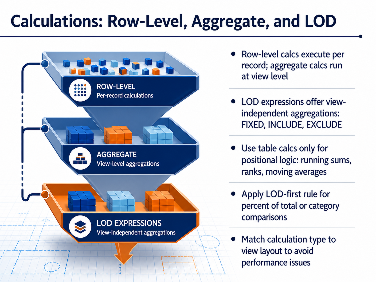
 - 07Calculations: Row-Level, Aggregate, and LODNow let’s talk about calculations in Tableau, because the type you choose determines how reliable and performant your dashboard will be. Start with the fundamental split: row-level calculations run on every record in your data source, and aggregate calculations run at the level of detail in your view. If your view changes, an aggregate calc can change with it. Next, understand Level of Detail expressions, or LODs. FIXED, INCLUDE, and EXCLUDE give you view-independent aggregations. Use FIXED when you need a value that ignores the view's filters, like total sales per customer on a region-level chart. LODs run before dimension filters, so they are immune to the sort-order and layout bugs that plague other approaches. Reserve table calculations for actual positional logic: running sums, ranks, moving averages. These need order-awareness, so they are the right tool there. And here is the LOD-first rule: for percent of total or category comparisons, reach for an LOD expression first. It will give you the same result with zero sensitivity to sorting or layout. Match your calculation type to the view layout to keep performance predictable. Simple aggregates and row-level calcs can push down to the data source. Table calcs run as a second pass on the aggregated result set, so they are fast on small views but brittle if the layout changes. A practical takeaway: before you build a table calculation, ask if the result is inherently sequential. If it's not, an LOD expression is likely your safer, more stable choice. Next, we’ll dig into mastering table calculations in detail.
 varsitytutors.comhelp.tableau.comvarsitytutors.com+22 min
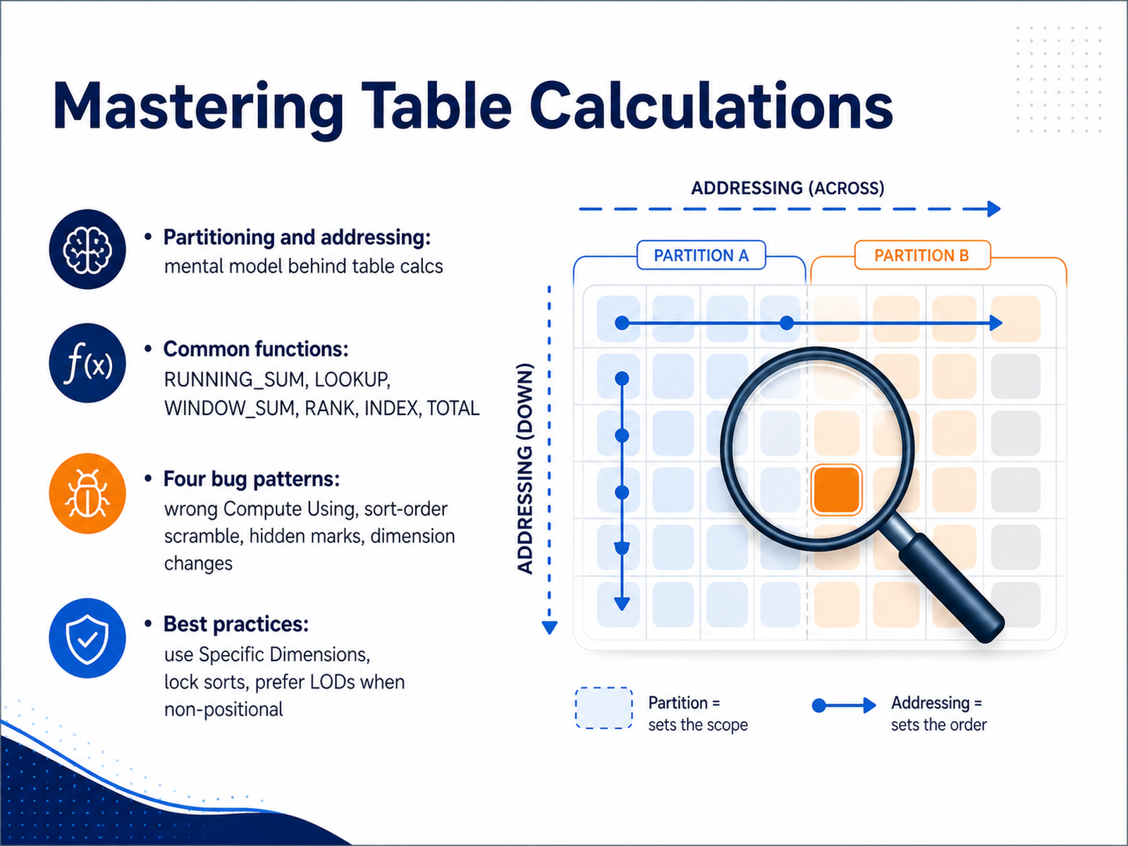
 - 08Mastering Table CalculationsNow let's turn to table calculations. These are powerful, but they are also view dependent, meaning they compute on the visual result set, not the raw data. The best mental model is partitioning and addressing. Partitioning defines separate scopes where the calculation restarts, and addressing defines the direction it moves within each scope. Think of SQL: partition by and order by. You'll often use running sum, lookup, window sum, rank, index, and total. But watch for the four classic bug patterns. One: the wrong compute using direction, where values repeat instead of accumulating. Two: a sort order scramble, where clicking a header silently breaks your rank. Three: hidden marks, where a table calc filter hides values but still includes them in the sum. Four: adding a dimension, which can quietly change the partition. Here is the discipline that prevents these. First, always use Specific Dimensions for addressing, not the quick presets. This makes the calc robust to layout changes. Second, lock your sorts explicitly. Third, if the result is not positional, and you do not need a running total or a rank, prefer a Level of Detail expression instead. It is immune to sort order and view structure. Master this and your calculations become predictable. Next, we will add interactivity with parameters and analytics.
 varsitytutors.comhelp.tableau.comvarsitytutors.com+22 min
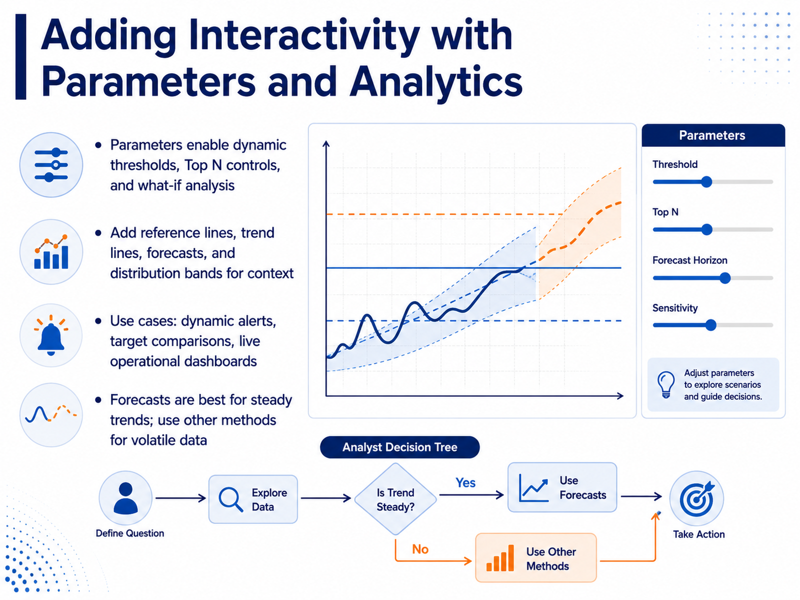
 - 09Adding Interactivity with Parameters and AnalyticsNow let's add interactivity and analytical depth. Parameters are your go-to for dynamic thresholds, Top N controls, and what-if analysis. For example, let users choose their own Top N or adjust a target value without rewriting calculations. Add reference lines for target comparison, trend lines to reveal direction, or distribution bands for context. Use these to power dynamic alerts, benchmark against KPIs, or enrich live operational dashboards. But exercise judgment with forecasts. They work well for steady trends, not volatile data. When patterns are erratic, stick to moving averages or simpler summaries to avoid misleading insights. Next, we'll look at how to bring this together into interactive dashboards that support reporting workflows.
 varsitytutors.comhelp.tableau.comvarsitytutors.com+21 min
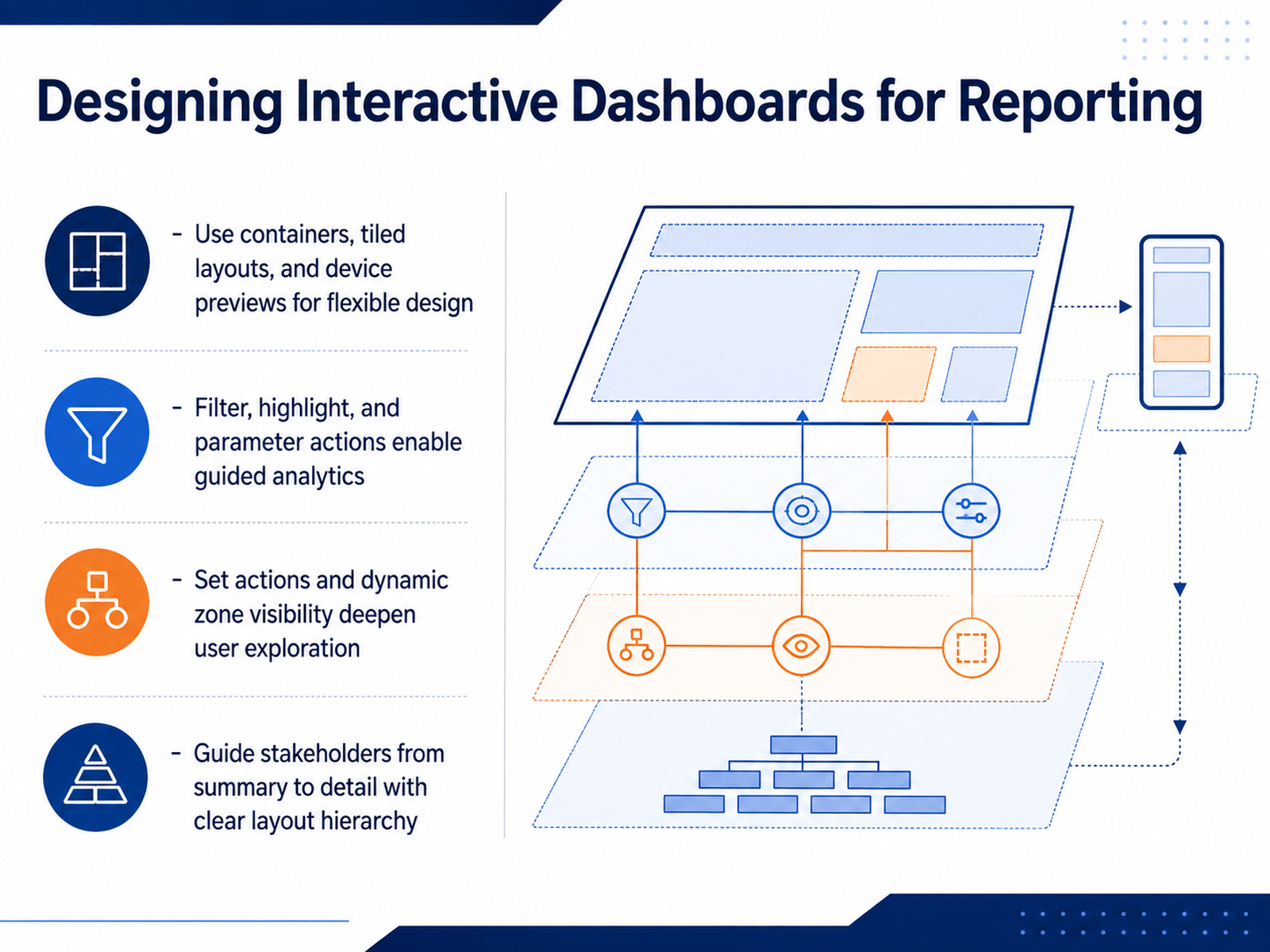
 - 10Designing Interactive Dashboards for ReportingNow let’s talk about designing interactive dashboards that actually serve your reporting workflow. Start with flexible layouts. Use containers and tiled structures so your dashboard adapts cleanly across devices, and always check the device preview before publishing. Next, think about guided analytics. Filter actions, highlight actions, and parameter actions let stakeholders follow a line of reasoning without losing context. For example, clicking a region on a map can drive a filter across all the supporting charts. Set actions and dynamic zone visibility take this further. They let users click into specific marks to update what appears on screen, which deepens exploration without cluttering the initial view. The core principle is hierarchy. Guide your audience from a high-level KPI summary down to operational detail through clear layout and interaction. Place your most important view at the top left and keep the total number of views on the page limited so the big picture stays intact. A moment ago, we touched on how design choices affect speed. Up next, we look at performance-conscious dashboard design in more detail.
 help.tableau.comtableau.comhelp.tableau.com+22 min
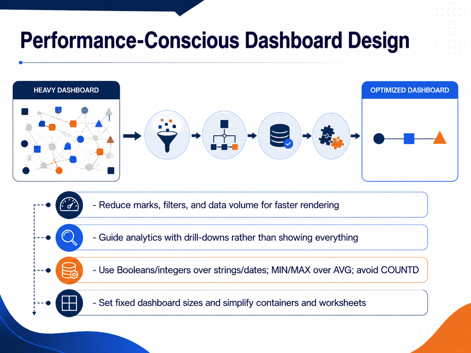
 - 11Performance-Conscious Dashboard DesignNow let's talk about keeping your dashboards fast and responsive. Performance is a design consideration from the start, not an afterthought. First, reduce the load: fewer marks on your views, fewer active filters, and less data coming into the workbook. If you don't need real-time data, use extracts and data source filters to keep the volume manageable. Second, guide your users with drill-downs and filter actions instead of showing everything at once. The majority of slow dashboards come from too many charts or too much data on a single screen. Third, choose your fields and calculations wisely. Booleans and integers are faster than strings and dates. Prefer MIN and MAX over AVG, and avoid COUNT DISTINCT whenever possible. These small choices add up. Finally, set your dashboard to a fixed size. That way it renders once and can be cached, instead of recalculating for every user's screen. Simplify your containers and worksheets, and remove anything that isn't essential. As you build, keep in mind that if it's slow in the data source, it will be slow on the server. Test and iterate. Next, we'll cover publishing, sharing, and governance.
 1 min
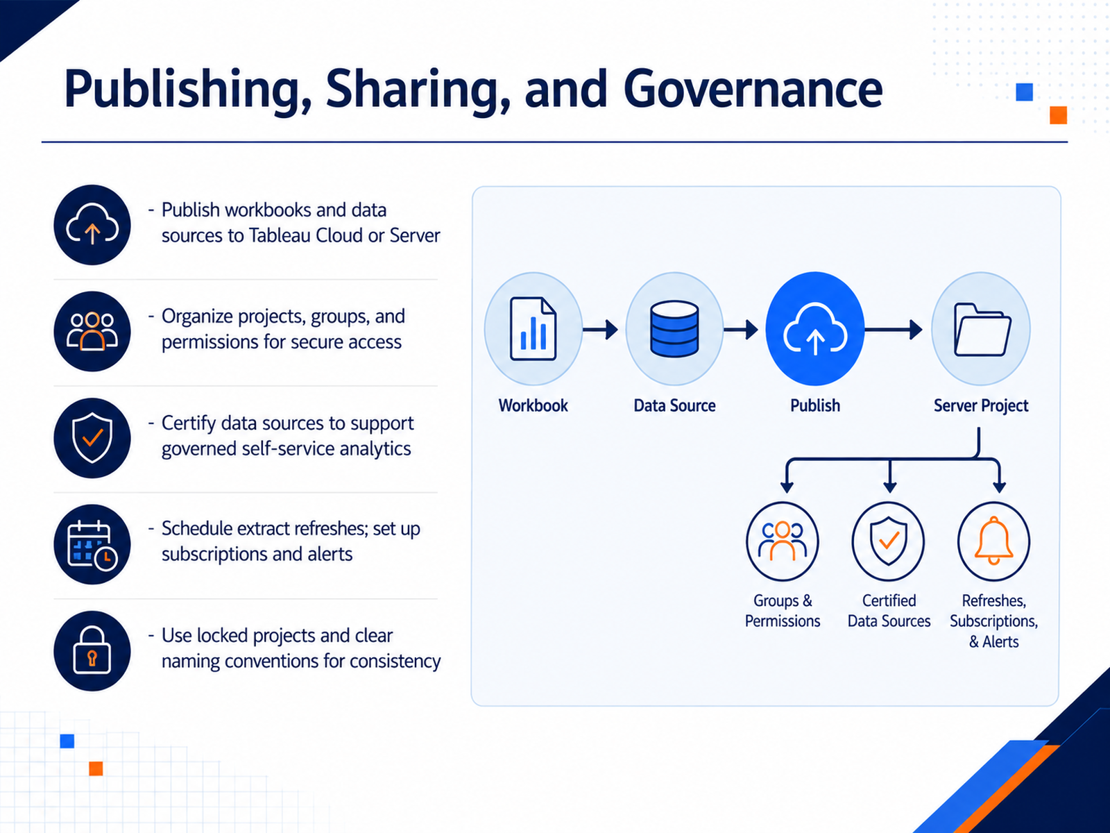
1 min - 12Publishing, Sharing, and GovernanceOnce you have dashboards ready, publishing and governance keep the whole system trustworthy. When you publish to Tableau Cloud or Server, decide early whether a data source should be standalone or embedded. Standalone sources support governed self-service, because many workbooks share one certified version of the truth. Embedded sources are fine for one-off analysis, but be aware they can lead to duplicate logic and metric drift across teams. Structure your site with projects and groups, and lock permissions at the project level, not on each workbook. Assign permissions by group, not individual users; this keeps access predictable and secure. Certification is your signal for trust. When data stewards certify a source, users know it meets standards and can build on it with confidence. For extracts, schedule refreshes so the data stays current without manual intervention. A good pattern is a daily incremental refresh with a weekly full refresh to catch updated records. Finally, set up subscriptions and alerts so stakeholders get the information they need without chasing dashboards. Keep naming conventions clear and consistent across projects, and your users can find and rely on the right content. Now, let’s move on to troubleshooting some common problems.
 help.tableau.comhelp.tableau.comhelp.tableau.com+22 min
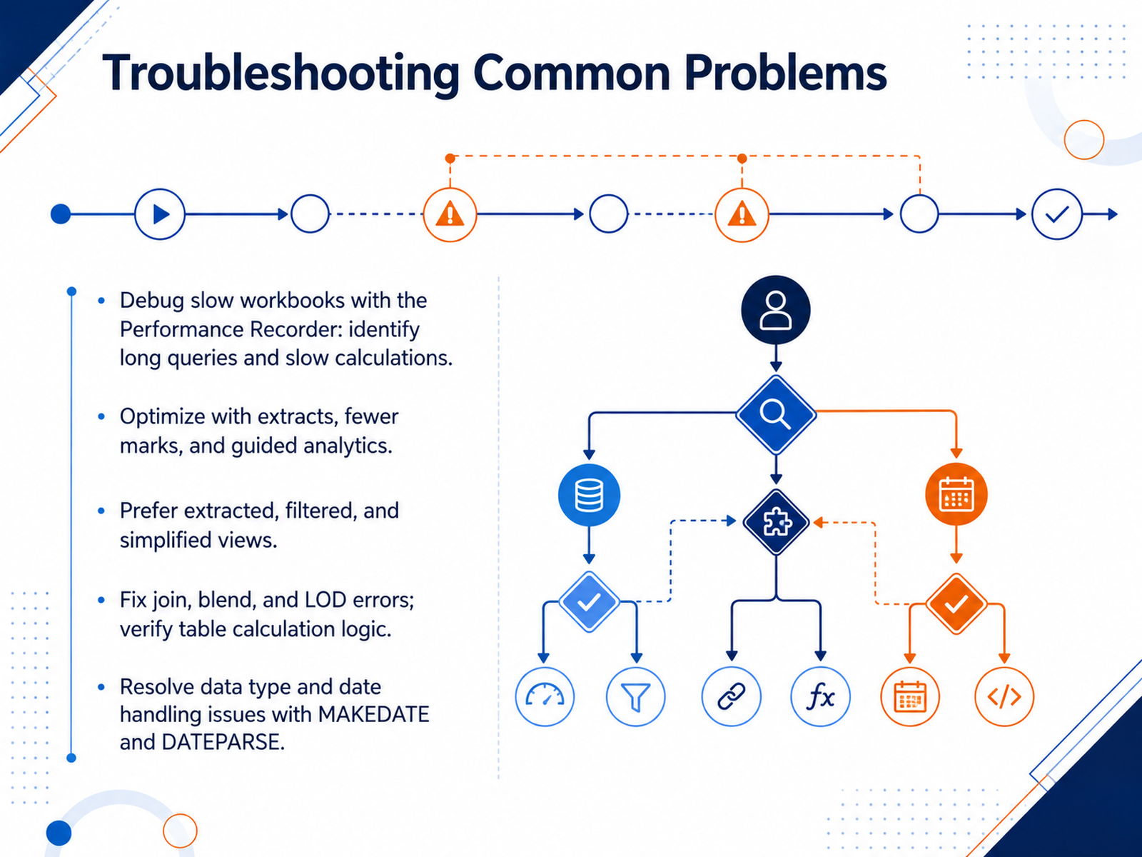
 - 13Troubleshooting Common ProblemsLet’s look at how to troubleshoot common problems. When a workbook feels sluggish, don’t guess—measure. Run the Performance Recorder, and let it show you where the time actually goes. Long-running queries, complex calculations, and rendering delays each need a different fix. If queries are slow, consider moving to extracts, filtering at the source, and cutting the number of marks in the view. For calculations, question complexity: can a Level of Detail expression replace a slow table calculation? Could a simpler MIN or MAX do the job? When joins, blends, or LODs throw errors, check your dimensions and granularity first. Table calculations are especially sensitive to addressing and sort order, so verify which fields are partitioning and which are moving across. If dates arrive as strings, use MAKEDATE or DATEPARSE rather than heavy text parsing, and keep fields compact. Remember, strings and dates are slow; numbers and Booleans are fast. Focus your effort using evidence, not instinct. Tune the workbook in Desktop first—publishing to Server won’t fix performance. That data-driven discipline carries into our final topic: building a repeatable analyst workflow.
 varsitytutors.comhelp.tableau.comvarsitytutors.com+22 min
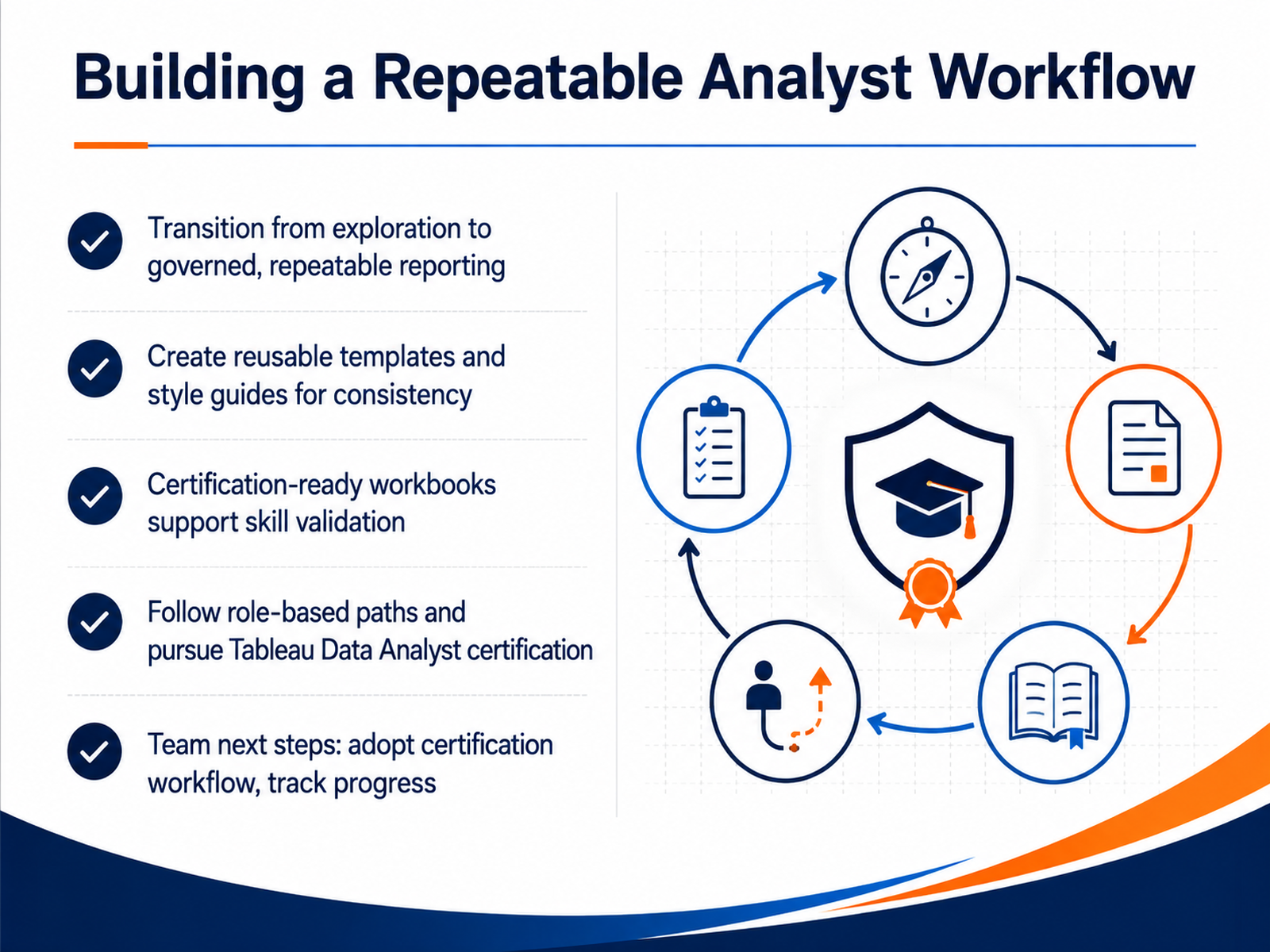
 - 14Building a Repeatable Analyst WorkflowAs we wrap up, let's talk about turning this into a repeatable workflow rather than a series of one-off dashboards. The goal is to move from ad hoc exploration into governed, consistent reporting. Start by building reusable templates and a style guide. This locks in your visual best practices and cuts down on rework. Next, consider certification. If you are already working with Tableau Desktop and Prep daily, the Tableau Data Analyst certification is a practical target. It is an advanced credential that requires real hands-on skill, so treat it as professional development, not a formality. For your team, the path forward is simple. Adopt a certification workflow, track progress, and make sure everyone knows where certified content lives. When you standardize the process, you free up time for the analysis that actually moves the business. Thank you for your time, and good luck building dashboards that people trust.
 help.tableau.com1 min
Take the deck with you
Download this course as a file — free, no sign-up needed.
- PDF handoutEvery slide page, ready to print or share.15 pages · 3.3 MBDownload
- Narrated PowerPointThe deck that presents itself — every slide carries the digital human's narration video.15 pages · 28.5 MBDownload
- PowerPoint slidesThe full deck as a .pptx — open it in PowerPoint, Keynote, or Google Slides.15 pages · 3.2 MBDownload
Free to use in your own training — please keep the PersonWise credit page at the end.
Have your own deck? Turn it into a course
Sources consulted
Web sources consulted while building this course.
- Business Intelligence Software Market Share & Growth | Ramp — ramp.com
- Tableau Ramp Rate: A Data-Backed Look — ramp.com
- Data Visualization Software: 2026 Global Intelligence Report — blog.9cv9.com
- Data Viz Titans: Power BI, Tableau and the AI Surge Reshaping Analytics in 2026 — webpronews.com
- 2026 Gartner Magic Quadrant Analysis: ABI Market Trends and Tableau's Leadership — vizney.com
- Test Your Data and Use Extracts — help.tableau.com
- Best Practices for Published Data Sources - Tableau — help.tableau.com
- Extract Your Data — help.tableau.com
- Tableau Cloud tips: Extracts, live connections, & cloud data — tableau.com
- TDE or Live? When to Use Tableau Data Extracts (or not) | Drawing with Numbers — drawingwithnumbers.artisart.org
- Choose the Right Chart Type for Your Data — help.tableau.com
- Which chart or graph is best? A guide to data visualisation — tableau.com
- Visual Best Practices - Tableau — help.tableau.com
- Data Visualization Tips and Best Practices — tableau.com
- Choosing the Best Chart Types for Your Tableau Visualizations — go.christiansteven.com
- Troubleshooting Table Calcs — Troubleshoot table calc... — varsitytutors.com
- Transform Values with Table Calculations - Tableau — help.tableau.com
- Table Calc Compute Using — Set compute using / addressing... — varsitytutors.com
- Common Table Calculations — Use LOOKUP, WINDOW_SUM, and... — varsitytutors.com
- Table Calculations – When, Where and How — jimdehner.com