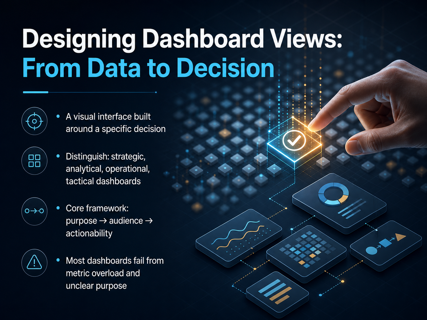
Dashboard Views Design
Begin
14 pages · ~28 min
Dashboard Views Design
Course on designing effective dashboard views, teaching principles for clear data visualization and layout.
What you’ll learn
- 01Designing Dashboard Views: From Data to DecisionWelcome to Designing Dashboard Views: From Data to Decision. I'm glad you're here. Over the next few minutes, we'll transform how you think about dashboards. A real dashboard is not a collection of charts. It's a visual interface built around a specific decision. We'll distinguish four types: strategic, operational, analytical, and tactical. Each serves a different rhythm and a different audience. Our core framework is simple: purpose first, then audience, then actionability. Most dashboards fail because of metric overload and unclear purpose. We're going to fix that together. Let's start with the foundation in Part 1: Purpose, Audience, and Decision-Spine.1 min
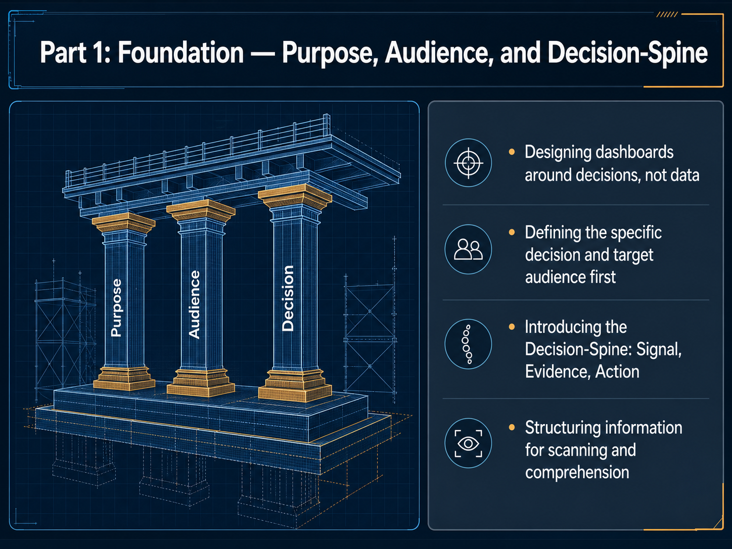
- 02Part 1: Foundation — Purpose, Audience, and Decision-SpineA great dashboard feels obvious, but getting there starts in a place most people skip: the decision. Think of a dashboard as a decision-support tool, not a data display. Before you pick a single chart, you must name the one specific decision this view will power. Who is making it, and what do they need to see to act with confidence? That clarity shapes everything. To build that clarity, we use something I call the Decision-Spine. It has three parts. First, Signal: the one or two numbers that immediately tell you if things are on track. Second, Evidence: the supporting context that explains the signal. Third, Action: the clear next step that the viewer should take. Structure your layout to guide the eye through that spine in seconds. Put the signal at the top left, evidence nearby, and the action where it can’t be missed. This scanning pattern turns a dashboard into a decision engine. Next, we’ll go deeper into defining purpose and audience before you touch a single layout.
 2 min
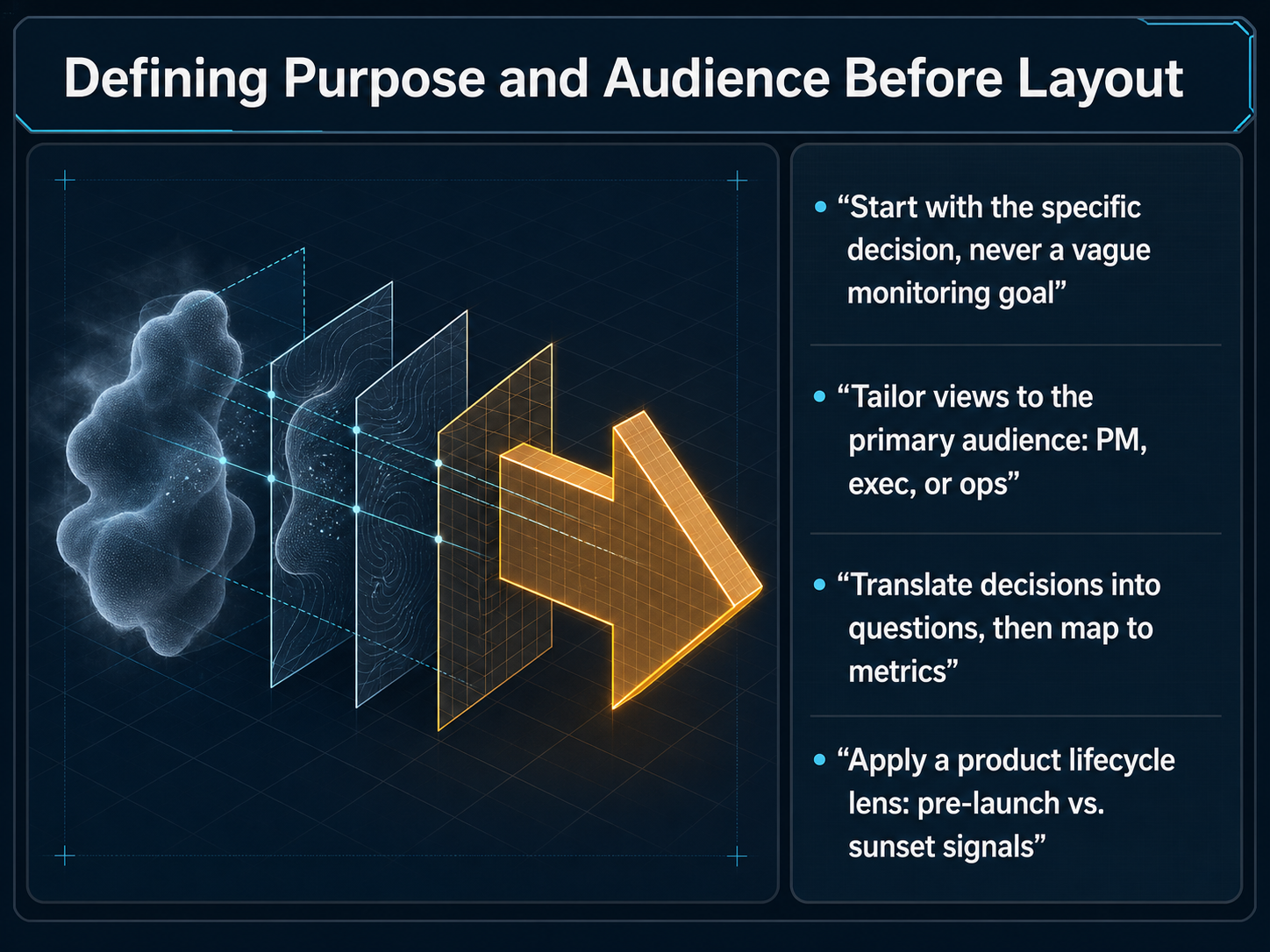
2 min - 03Defining Purpose and Audience Before LayoutLet's pause before we push a single pixel. The most effective dashboards start with a clear decision, not a vague goal to 'monitor things.' Who is your primary viewer? A product manager checking feature adoption, an executive tracking quarterly goals, or an operations lead ensuring system health? Start by turning their core decision into a direct question. For example, 'Should we increase the marketing budget for feature X?' Once you have that question, map the exact metrics that answer it. Also, apply a product lifecycle lens. The signals you need during a pre-launch beta are completely different from the ones you track for a product heading toward sunset. This focus decides what data makes the cut. Next, let's structure that focus into a framework I call 'The Decision Spine: Signal, Evidence, Action.'
 1 min
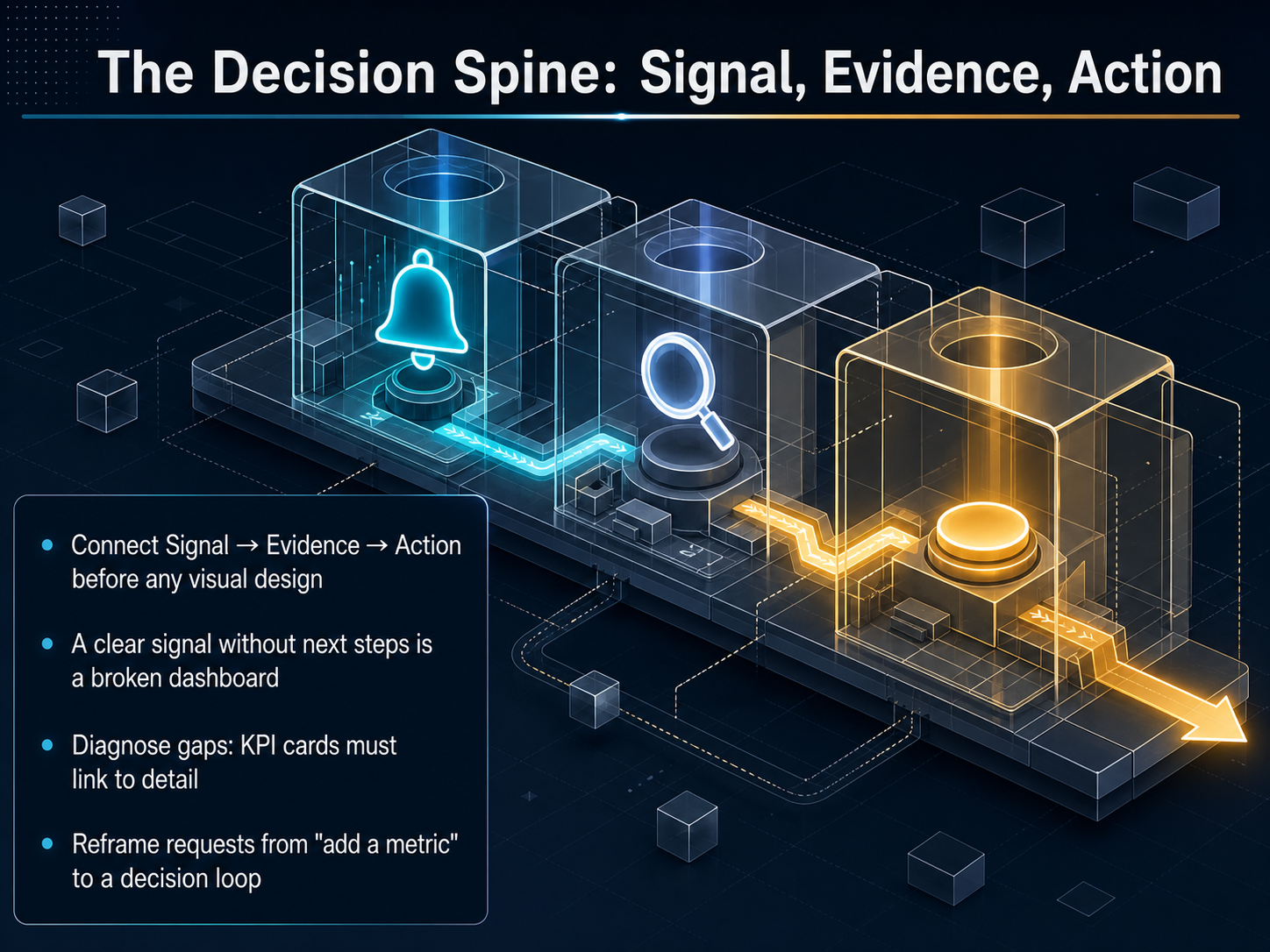
1 min - 04The Decision Spine: Signal, Evidence, ActionNow, let's anchor your dashboard with what I call the decision spine: Signal, Evidence, and Action. Before you touch any visual design, every view must connect these three dots. Start with a clear signal. What is the metric telling you in plain language? A number that just sits there without a clear next step is a broken dashboard. Next, attach the evidence. If a KPI card shows a conversion drop, you need a one-click path to the detail that explains why. That way, the user can diagnose the gap instantly. Finally, confirm the action. What decision should the user make right now? When someone asks you to just add a metric, reframe that request. Ask what decision loop it serves. Completing the spine turns a static report into a real-time decision tool. Next, we will build the visual structure that supports this spine with Information Architecture: Hierarchy and Scanning Patterns.
 1 min
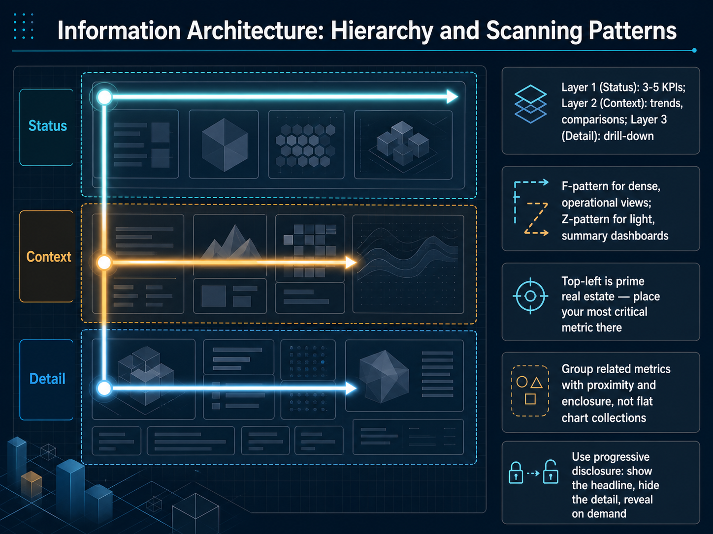
1 min - 05Information Architecture: Hierarchy and Scanning PatternsInformation architecture is what turns a collection of charts into a decision tool. This slide gives you the structure for that. Think of your dashboard in three layers. Layer one is Status. Place three to five KPIs at the top. These answer the question, 'Are we on track?' Layer two is Context. Right below your KPIs, add trends, comparisons, and sparklines. This answers, 'What direction are we moving?' Layer three is Detail. This is the bottom layer for drill-down tables and exports. It answers, 'What is behind the number?' Only reveal this layer on demand. Now, place these layers using the scanning pattern your audience will actually use. For dense, operational views with many widgets, design for an F-pattern. The eye scans across the top, then down the left side. For light, summary dashboards with a few KPIs, design for a Z-pattern. The eye moves top-left to top-right, diagonally to bottom-left, then across to bottom-right. In both patterns, top-left is prime real estate. Place your single most critical metric there. Do not bury it in the middle. Group related metrics using proximity and enclosure. A shared card or a tight cluster signals to the eye that these numbers belong together. Avoid flat chart collections that force the user to hunt for meaning. Finally, use progressive disclosure. Show the headline number, hide the detail, and reveal it only when clicked. This keeps your dashboard fast to scan but deep enough to explore. Next, we will move into Part 2: Design, where we cover Visual Encoding, Metrics, and Layout.
 cs.tufts.eduaesopanalytics.comintelligentgraphicandcode.com+22 min
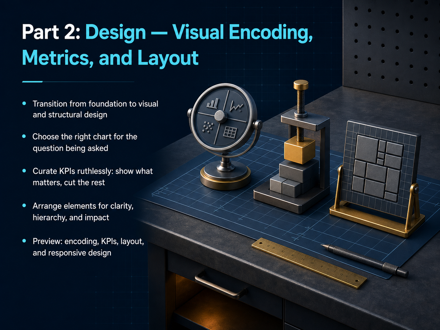
 - 06Part 2: Design — Visual Encoding, Metrics, and LayoutNow we shift from the foundation of your dashboard to its visual and structural design. This is where your data starts to tell a clear, actionable story. First, choose the right chart for the question being asked. If you need to compare values across categories, a bar chart works. For trends over time, use a line chart. The visual form must match the decision. Second, curate your KPIs ruthlessly. Show only what matters. Every metric on the screen should earn its place. If it does not drive a decision or a check-in, cut it. Finally, arrange the remaining elements for clarity, hierarchy, and impact. Put the most critical number top-left, group related metrics together, and use consistent sizing. We will now dig into the details in this order: visual encoding, selecting KPIs, layout structure, and responsive design. Let’s start with choosing the right visual encoding for your data.
 1 min
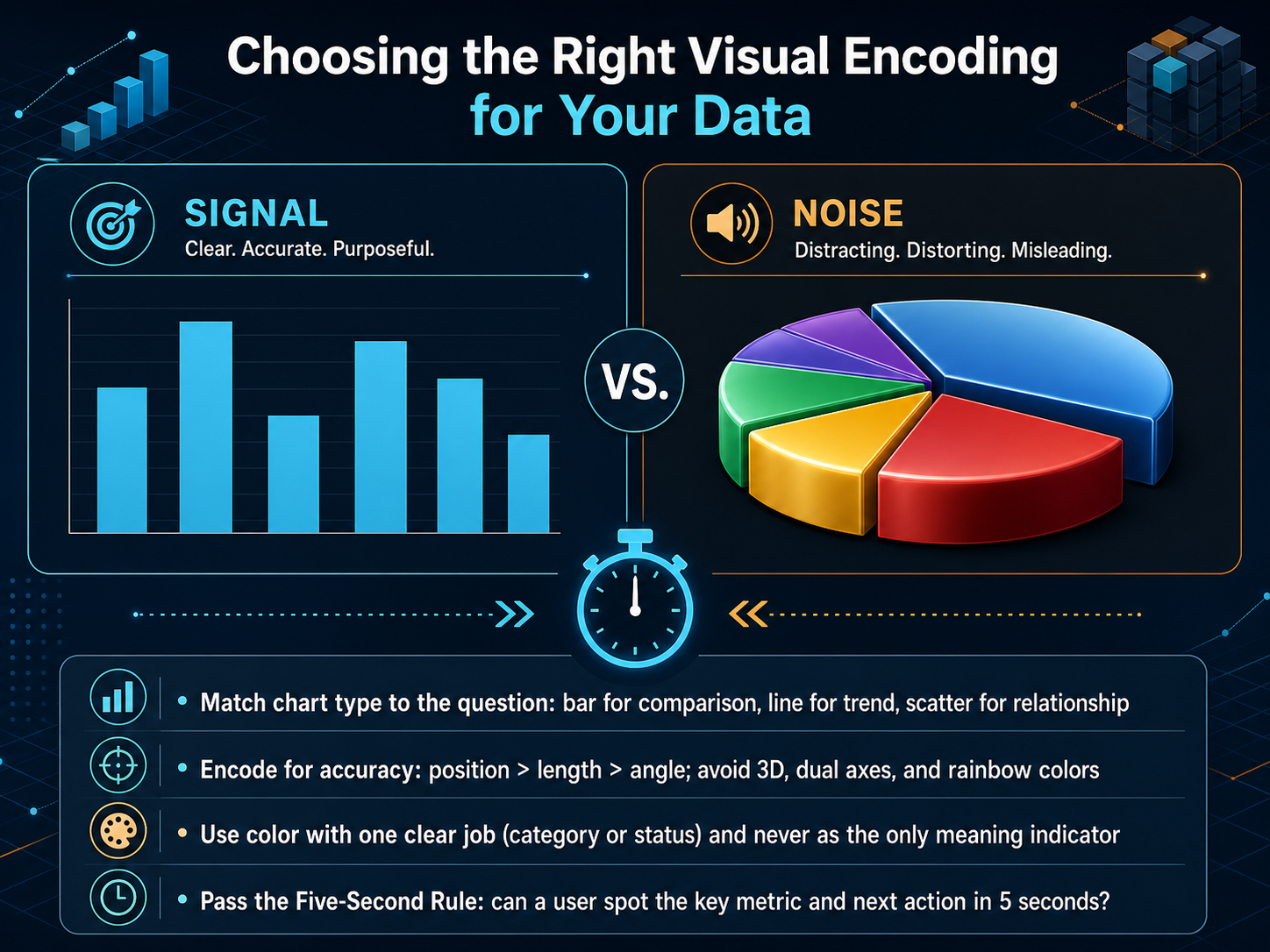
1 min - 07Choosing the Right Visual Encoding for Your DataAlright, let's make this concrete. We have the framework. Now we need to pick the right visual building blocks. Choosing the right visual encoding is about matching the chart to the question, and the question to the user's split-second decision. First, simple rules: a bar chart is for comparison. A line chart is for a trend over time. A scatter plot is for finding a relationship between two things. Second, encode for accuracy. Our eyes are better at judging position and length than they are at judging angle or area. So avoid 3D charts, dual axes, and rainbow colors. They distort the data and slow down the decision. Third, give color one clear job. Use it to signal a category, or to highlight a status. Never make color the only way to understand the meaning. Finally, and this is the real test, pass the five-second rule. Can a user spot the key metric and the next action in five seconds flat? If not, we simplify. In the next slide, we will apply this discipline to the numbers themselves. Let's talk about Key Metrics and KPIs: Show What Matters, Cut the Rest.
 datafield.devchartgen.aistoryrules.com+22 min
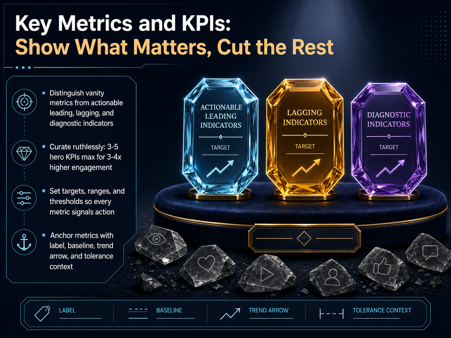
 - 08Key Metrics and KPIs: Show What Matters, Cut the RestLet's talk about the metrics that earn a place on your dashboard. Not every number is created equal. You need to tell the difference between vanity metrics, which might look good but don't drive decisions, and actionable indicators. Think in terms of leading metrics that predict the future, lagging metrics that measure results, and diagnostic metrics that help you understand why something happened. Once you know the difference, your next job is to be ruthless. Curate your dashboard down to just three to five hero KPIs. This focus can actually triple or quadruple engagement because your team sees exactly what matters at a glance. For each metric you keep, set a clear target, an acceptable range, and a threshold that screams for action. Never show a number alone. Anchor it with a descriptive label, a baseline for comparison, a trend arrow showing direction, and just enough context so everyone knows what that number means right now. A great dashboard doesn't just display data. It tells every viewer exactly what to do next. Now, having the right metrics is half the battle. Next, we'll look at how to arrange them on the screen for maximum impact with layout, white space, and visual weight.
 2 min
2 min - 09Layout, White Space, and Visual WeightLet's talk about layout, white space, and visual weight. A clean dashboard starts with a 12-column grid. Think of it as your invisible backbone for consistent alignment and predictable scanning. Next, you direct the user's eye by controlling visual weight. Size, contrast, and isolation are your tools. The biggest, highest-contrast element wins attention first. For spacing, use 16 to 24 pixels of card padding, and 8 to 12 pixels of internal padding. Consistent spacing makes your dashboard feel reliable. Now, organize your zones logically. Place your KPI cards at the top for an instant status check. Put your primary chart in the middle to show the trend. Tuck detail tables at the bottom for anyone who needs to drill down. And here's a pro tip: use the squint test. Blur your eyes and look at the page. What stands out? That's your true visual hierarchy. If the most important metric doesn't pop, you need to adjust the weight. Up next, we'll apply these layout principles to designing for different viewports and devices.
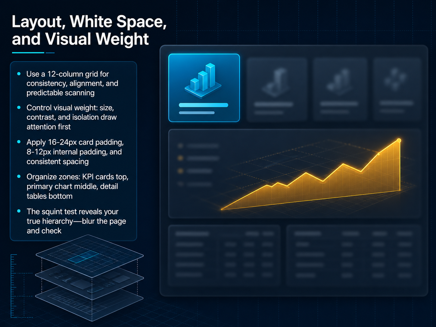 sumboard.ioilirivezaj.comsetproduct.com+21 min
 - 10Designing for Different Viewports and DevicesMoving to the devices your users will actually use. A mobile phone is not a shrunken desktop. It requires a completely different approach. Lead with three to four KPIs stacked vertically. Place the primary chart next, then tables at the bottom. Push filters into a drawer to keep the screen clean. For complex data tables, you have three options. Show only the critical columns and let the user expand the rest. Transform rows into cards for easy thumb scrolling. Or, for financial data, use an intentional horizontal scroll with a clear indicator. And remember, performance is a core part of the user experience. Aim for a sub-three-second load time. Use progressive loading to show KPIs instantly, and use skeleton screens to build trust while the rest of the data loads. Treating mobile as a distinct design context, not an afterthought, makes your dashboard valuable everywhere. Next, let's move into Part 3: Execution. We'll cover Interactivity, Case Studies, and the overall Process.
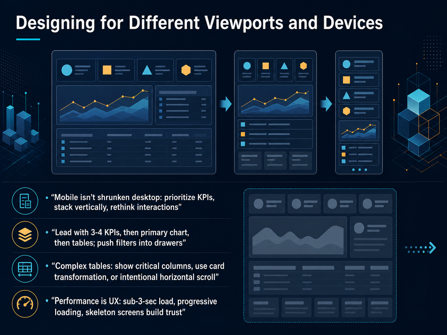 sumboard.ioilirivezaj.comsetproduct.com+22 min
 - 11Part 3: Execution — Interactivity, Case Studies, and ProcessLet's move into execution. This is where your dashboard shifts from a static layout into a living product that your team can trust for real decisions. Interactivity is the key. Every filter, every clickable element should answer the next question a user will logically ask. If a number looks off, can they click to see why? That builds trust. Next, you need to embed dashboard design directly into your team's workflow. It shouldn't be a one-time artifact you build and forget. Treat it like a product that ships, gets feedback, and iterates. We'll preview the specific techniques to make this happen. First, we'll explore drill-down patterns and the anatomy of a high-impact dashboard. Then, a practical checklist and clear next steps for iteration. All of this helps you turn a static report into a decision-making tool that evolves. Now, let's get tactical and look at how to add interaction and drill-down without losing the story.
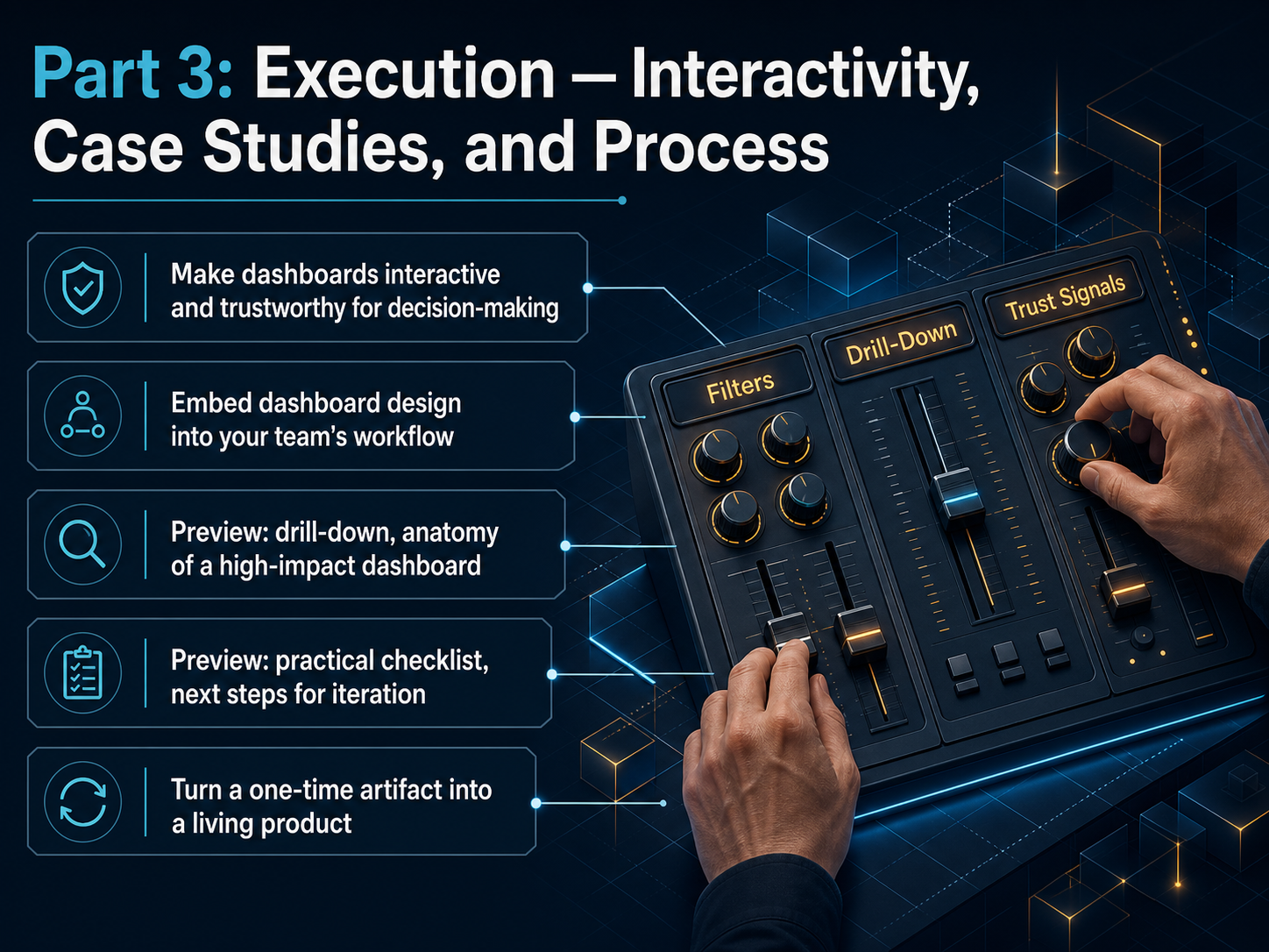 1 min
1 min - 12Interaction and Drill-Down Without Losing the StoryNow, let's talk about keeping your dashboard interactive without breaking the narrative flow. Every click should feel like a step forward in the decision story, not a detour. Start by keeping global filters visible. Think of them as a steering wheel, always within reach, so exploration is easy but never distracting. For drill-down, use a consistent path. Move from an overview to detail with clear breadcrumbs and a simple back button. Your users should always know where they are and how to get back. Avoid hidden states, filter overload, and dead ends. Nothing fractures trust faster than a full-page reload that loses context. Instead, build confidence with timestamps, completeness indicators, and clear error states. These small signals tell users the data is fresh and reliable. Remember, treat every interaction as a step in the decision story, not a detour. Next, let's pull all these concepts together by deconstructing a real-world, high-impact dashboard view.
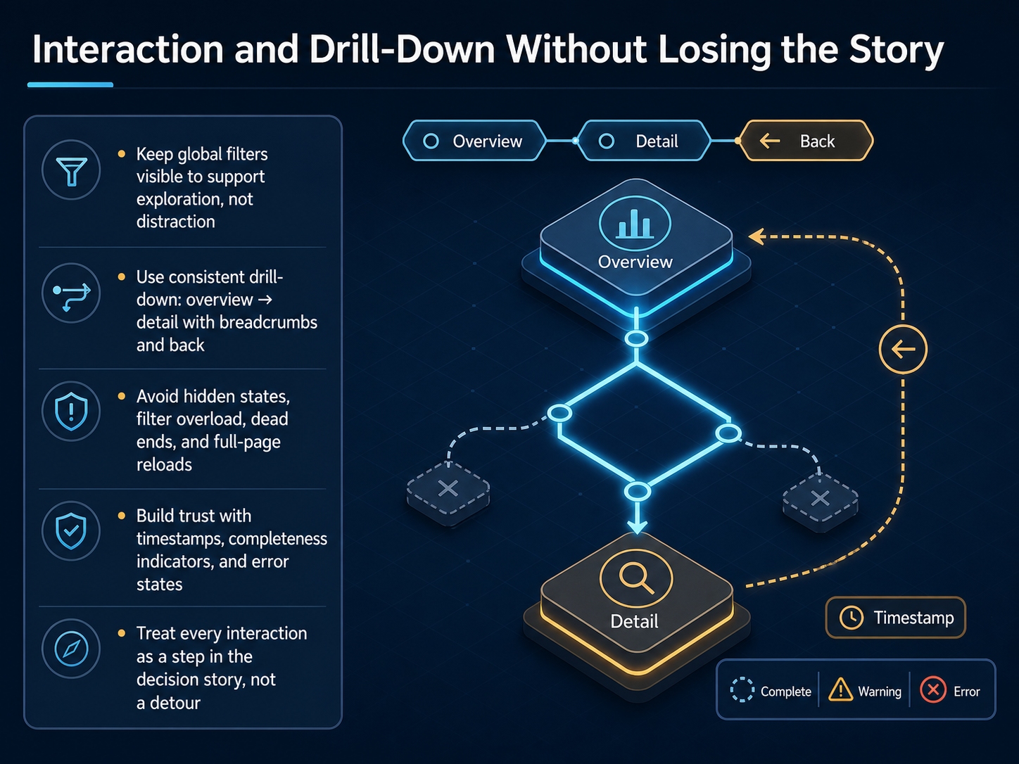 1 min
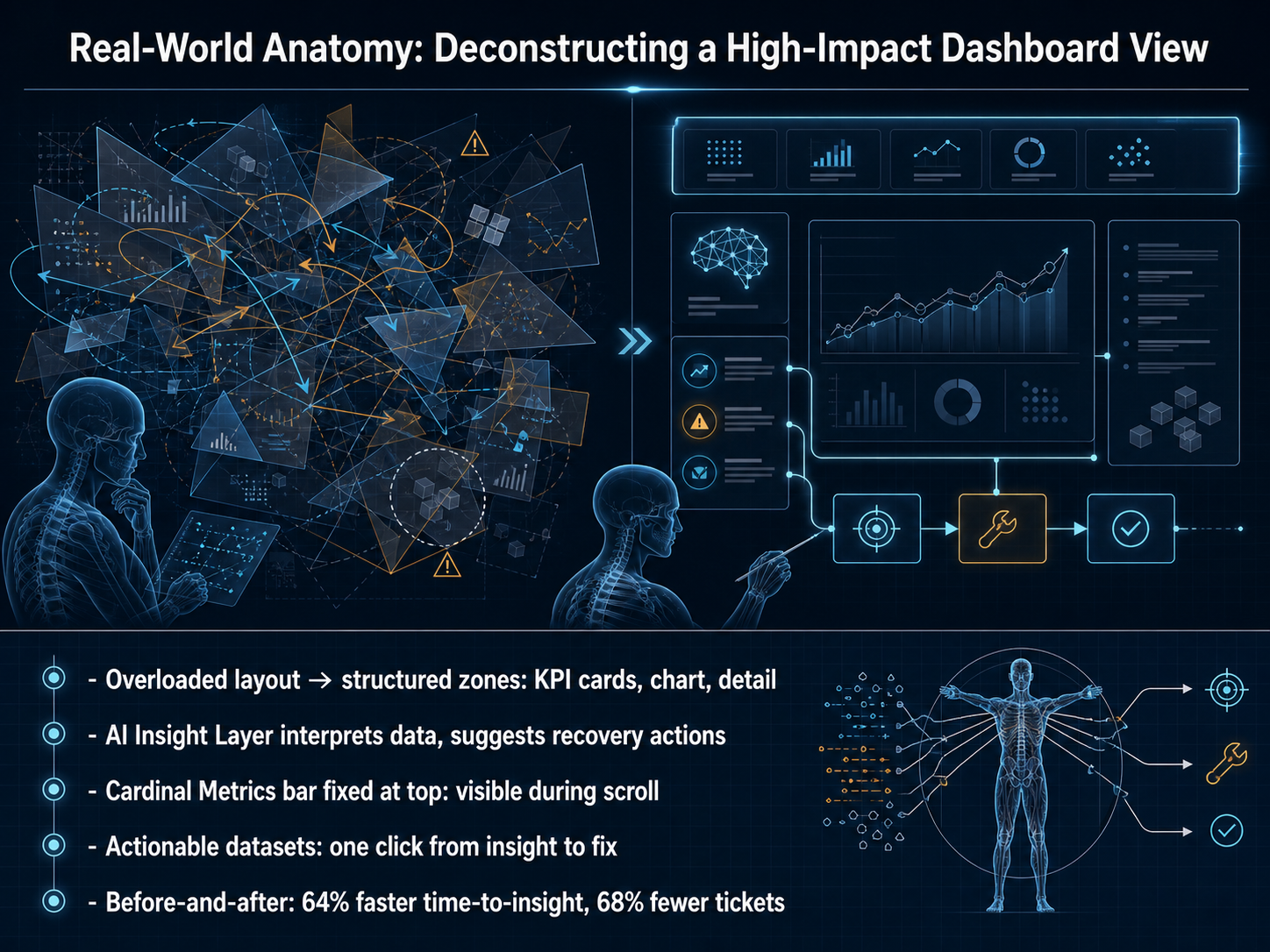
1 min - 13Real-World Anatomy: Deconstructing a High-Impact Dashboard ViewNow let’s walk through a real dashboard makeover, because the principles we just covered really come to life when you see a before-and-after. Picture an overloaded layout where everything shouted at once. The redesign structured the view into clear zones: KPI cards for top-level health, a main chart for trends, and a detail table for deeper questions. Right below the charts, an AI insight layer actively interprets the data and suggests recovery actions, so the team moves from noticing a problem to knowing what to do next. A cardinal metrics bar is fixed at the top and stays visible while you scroll, keeping the numbers that matter most always in view. Every dataset is actionable: one click takes you from an insight straight to the fix. The result? A sixty-four percent faster time-to-insight, and a sixty-eight percent drop in support tickets. Look for those same patterns when you judge your own view. Next, let’s turn these ideas into a practical checklist and next steps for your own dashboards.
 medium.comkarolinakolodziej.commedium.com+22 min
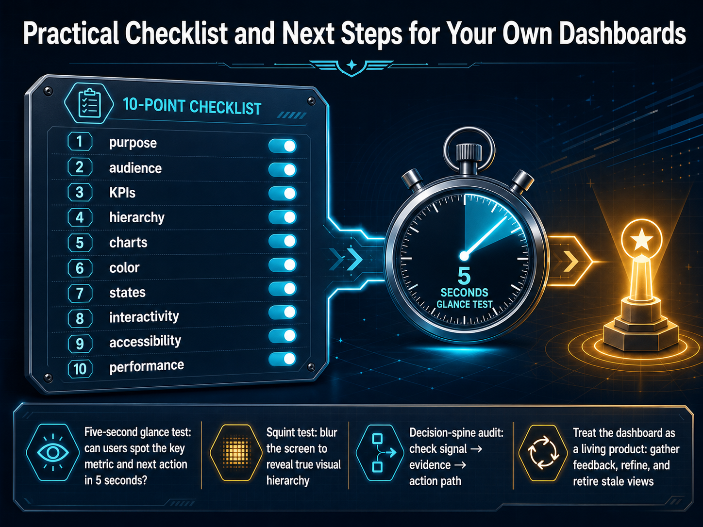
 - 14Practical Checklist and Next Steps for Your Own DashboardsLet's turn everything we have covered into a practical, repeatable checklist. Before you ship a dashboard, run through these ten checkpoints: purpose, audience, KPIs, hierarchy, charts, color, states, interactivity, accessibility, and performance. This list keeps you honest and stops scope creep from burying the signal. Now, let's talk about three quick tests you can run right now. First, the five-second glance test. Can someone spot the key metric and the next action in five seconds flat? If not, the hierarchy needs work. Second, the squint test. Blur the screen until the details disappear. The shapes that remain are your true visual hierarchy. If the sidebar or a dense table wins, rebalance the weight. Third, the decision-spine audit. Follow the path from signal to evidence to action. Does the dashboard make the right thing visible, connect it to the evidence behind it, and give the user a clear path forward? Finally, treat your dashboard as a living product. Gather feedback, refine often, and retire stale views. A dashboard that sits still loses trust. Thank you for investing this time in your craft. Now go build the dashboard your users will open every morning.
 setproduct.com2 min
Take the deck with you
Download this course as a file — free, no sign-up needed.
- PDF handoutEvery slide page, ready to print or share.15 pages · 4.0 MBDownload
- Narrated PowerPointThe deck that presents itself — every slide carries the digital human's narration video.15 pages · 13.0 MBDownload
- PowerPoint slidesThe full deck as a .pptx — open it in PowerPoint, Keynote, or Google Slides.15 pages · 3.9 MBDownload
Free to use in your own training — please keep the PersonWise credit page at the end.
Have your own deck? Turn it into a course
Sources consulted
Web sources consulted while building this course.
- Dashboard Vision: Using Eye-Tracking to Understand and Predict Dashboard Viewing Behaviors — cs.tufts.edu
- Gestalt Principles in Dashboard Design | Aesop Analytics — aesopanalytics.com
- Dashboard Layout: Visual Hierarchy People Actually Use | IGC — intelligentgraphicandcode.com
- Visual Hierarchy: Organizing content to follow natural eye movement ... — ixdf.org
- https://pdfs.semanticscholar.org/2f7b/f995fb0b37035685c33223df76d4d77d96b2.pdf — pdfs.semanticscholar.org
- Appendix C: Chart Selection Cheatsheet | Data Viz with Python | DataField.Dev — datafield.dev
- What Chart Should I Use? Chart Selection Guide 2025 | ChartGen — chartgen.ai
- Slides and Visuals for Book v1 — storyrules.com
- A friendly guide to choosing a chart type | Datawrapper Blog — datawrapper.de
- Chart Chooser Guide: 24 Chart Types | sheets.works — sheets.works
- Responsive Dashboard Design: Beyond Browser Resizing — sumboard.io
- Ilir Ivezaj on Dashboard Design Patterns | Design — ilirivezaj.com
- Dashboard UI design: From KPIs to layouts that convert | Setproduct Blog — setproduct.com
- Dashboard Design Patterns for Modern Web Apps 2026 — artofstyleframe.com
- kindatechnical() - Dashboard Layout Best Practices and Design Patterns — kindatechnical.com
- From Overloaded Analytics to an Insight-Driven Experience: Redesigning a Product Dashboard and Introducing AI Exploration | by Maria Portieri | Medium — medium.com
- Indigo.ai Case Study — Karolina Kolodziej — karolinakolodziej.com
- From Data Overload to Clear Decision - an Ai Powered Product Analytics Dashboard | by Richa Posarekar | Medium — medium.com
- https://dardesign.io/projects/clearflow-product — dardesign.io
- https://dardesign.io/projects/quanta-product — dardesign.io