Breadcrumb Design & Wayfinding
Begin
13 pages · ~26 min
Breadcrumb Design & Wayfinding
Learn to design intuitive breadcrumb navigation and wayfinding systems to improve user orientation and site usability.
What you’ll learn
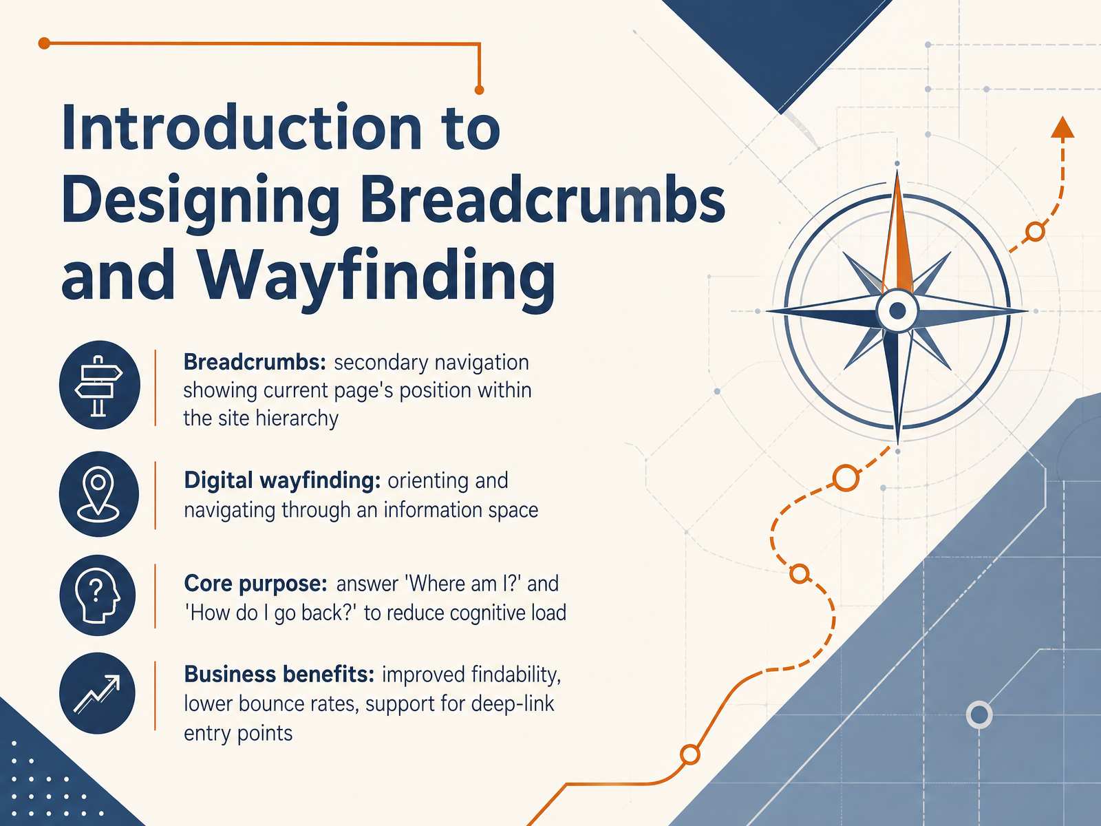
- 01Introduction to Designing Breadcrumbs and WayfindingWelcome. In this session, we're going to explore how to design breadcrumbs and digital wayfinding. Think of these as the quiet structural cues that tell a user, 'You are here, and here's how you can step back.' Breadcrumbs are that familiar secondary navigation pattern that shows the current page's position within the site hierarchy. Digital wayfinding is the broader practice of helping people orient and navigate through an information space. The core purpose of both is to answer two fundamental questions that reduce cognitive load: 'Where am I?' and 'How do I go back?' When you get this right, the business payoff is tangible—you improve findability, you lower bounce rates, and you give solid support to users who enter your site from a deep link, far from the homepage. So, let's dive in and start by understanding exactly who we're designing for.1 min
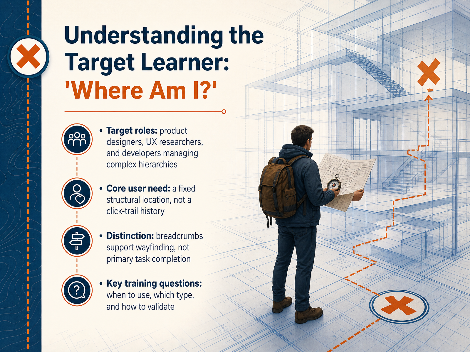
- 02Understanding the Target Learner: 'Where Am I?'Now let's focus on the learner we're designing this for. Think of a product designer, a UX researcher, or a developer who is managing a complex information hierarchy. Their core need is not a trail of digital breadcrumbs showing every click they made. What they really need to know is their fixed structural location. They're asking, 'Where am I?' Breadcrumbs support wayfinding—they help users maintain orientation inside a system—but they are not the primary tool for completing a task. As we move forward, the key training questions we'll tackle are: when should you actually use breadcrumbs, which type fits the site structure, and how do you validate that your choice really works for the user. Next, we'll look deeper into the psychology of spatial orientation in digital spaces and why that sense of place matters so much.
 1 min
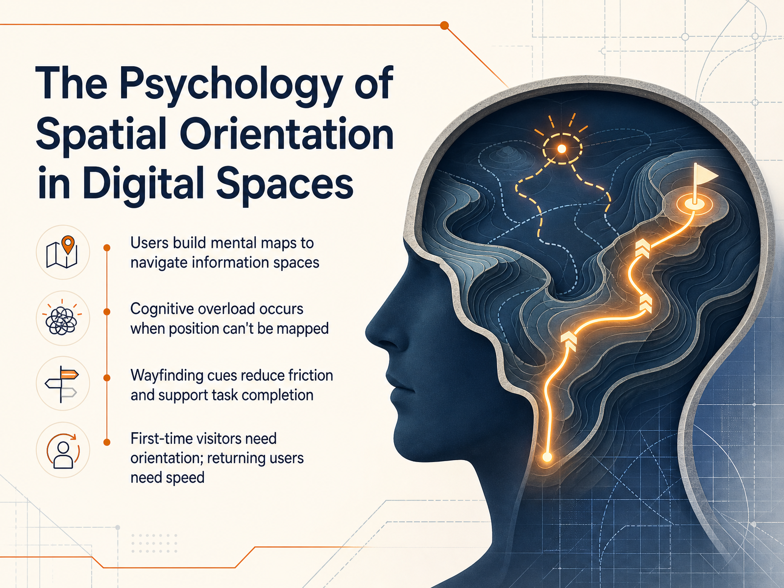
1 min - 03The Psychology of Spatial Orientation in Digital SpacesLet's look at what happens in the user's mind as they move through a digital space. People naturally build mental maps of the information around them, just like they would in a physical building. When someone can't figure out where they are in that map, cognitive overload sets in fast. Their working memory gets consumed by the navigation problem instead of the actual task they came to complete. That's why thoughtful wayfinding cues are so important. They reduce friction and keep the user focused on their goal. It's helpful to remember that different visitors need different things. A first-time visitor needs clear orientation signals to understand the shape of the space. A returning user already has that mental map and just needs speed to jump straight to what they remember. Both paths deserve equal design attention. In the next slide, we'll build on this with a foundation-first look at why information architecture dictates navigation.
 1 min
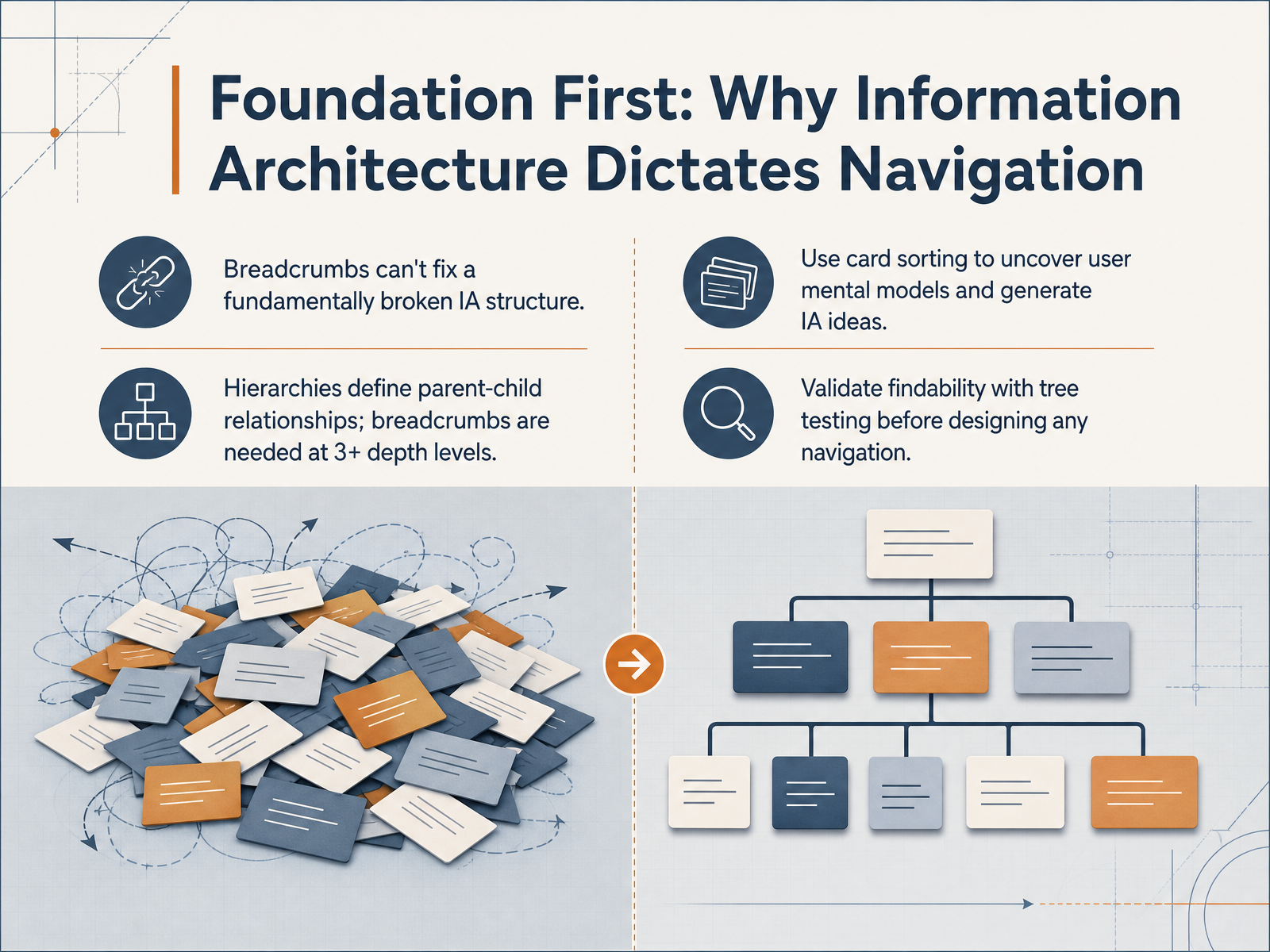
1 min - 04Foundation First: Why Information Architecture Dictates NavigationLet's talk about why information architecture needs to come first, before we even think about navigation components. Here's the truth: breadcrumbs cannot fix a fundamentally broken information architecture. If your site structure doesn't make sense to users, no navigation pattern will rescue the experience. Navigation simply exposes the structure you've already built. When your IA uses clear parent-child hierarchies, breadcrumbs become useful once users are three or more levels deep. At one or two levels, the path is still obvious. But beyond that, people need a visible trail to stay oriented. So how do you build that solid foundation? Two research methods will help you get there. First, card sorting lets you see how users naturally group and label content, revealing mental models you can turn into IA ideas. Second, once you have a draft structure, run a tree test to validate findability before you design a single navigation element. Tree testing tells you whether people can locate information using only your categories and labels, with no visual design to help or hinder them. Bottom line: invest in IA validation first, and the navigation patterns you choose will actually support user orientation. Next, we'll explore the taxonomy of breadcrumbs: location, path, and attribute types.
 2 min
2 min - 05Taxonomy of Breadcrumbs: Location, Path, and Attribute TypesNow let’s look at the three main breadcrumb types and when to use each. The first is location-based breadcrumbs. These show the static hierarchy of your site, like Home greater than Products greater than Laptops. They directly reflect your information architecture and are the safest, most predictable choice for most sites. Users always know exactly where they stand. Next, path-based breadcrumbs display the user’s unique click trail, such as Home greater than Search Results greater than a specific product. While this sounds helpful, it actually breaks the user’s mental model because the recorded path rewinds in unexpected ways, so it’s rarely recommended. The third type, attribute-based breadcrumbs, visualizes active filter states, like Home greater than Dresses plus color red, size medium. This works well in e‑commerce where users refine results, but it can create SEO crawl bloat if every combination becomes a separate URL. A simple decision rule you can follow: use location-based for stable hierarchies, attribute-based for faceted filter flows, and avoid path-based breadcrumbs entirely. Up next, we’ll explore conventional visual design and placement.
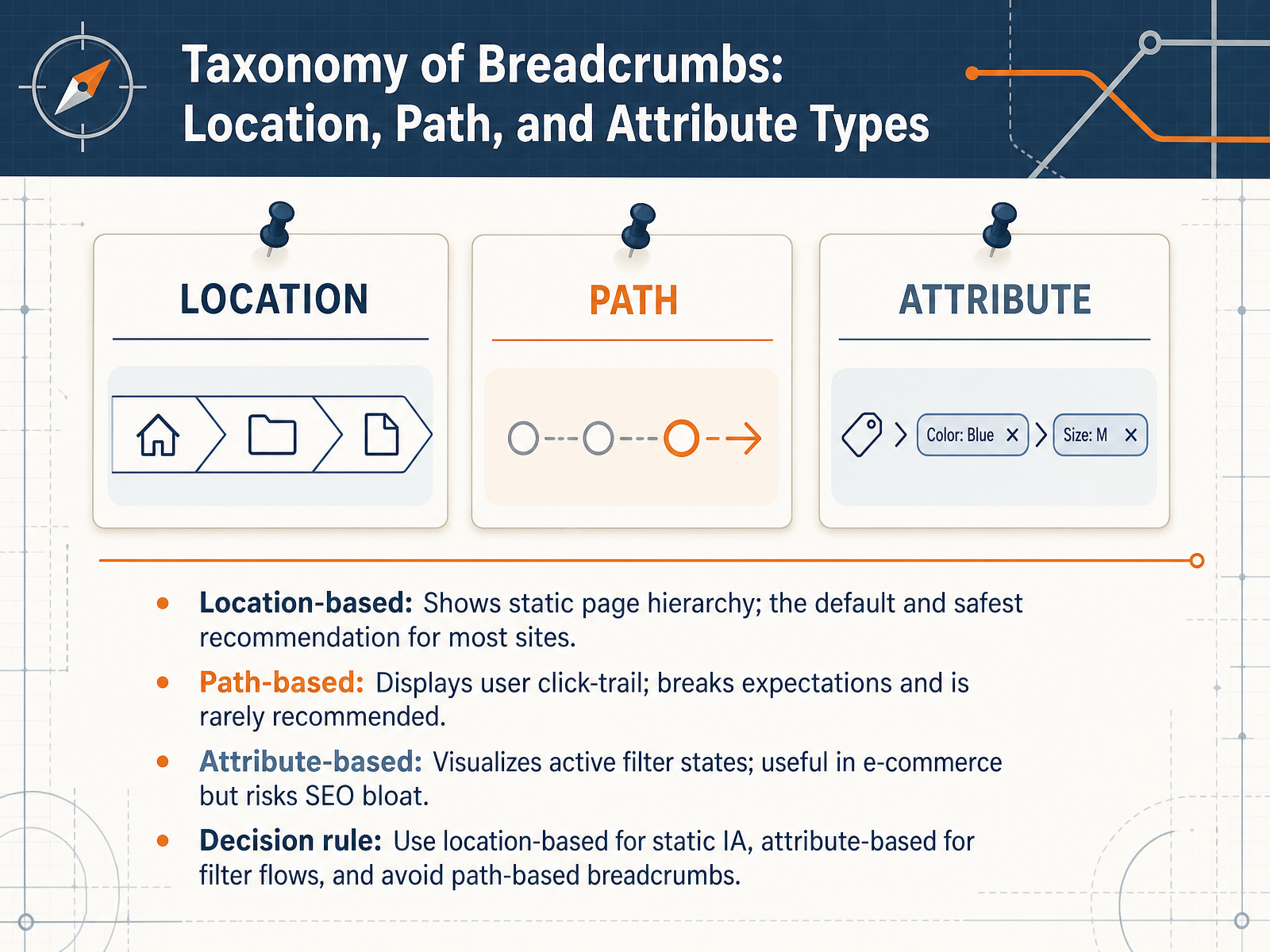 2 min
2 min - 06Conventional Visual Design and PlacementNow let's talk about the conventional visual design and placement of breadcrumbs. This is where your users will actually see and interact with them. To make breadcrumbs immediately visible, place them directly above the H-one heading or just below the global navigation bar. This positions them as a consistent orientation aid without competing with the main content. For the separators between levels, use a greater-than symbol or a forward slash. Keep these characters purely decorative, and make sure they are hidden from screen readers so they don't clutter the experience for assistive technology users. Style the breadcrumb trail with a muted text color and a standard font size. It should feel like a subtle utility, not a primary call-to-action. Avoid button shapes or bold, high-contrast colors. For accessibility and semantics, wrap the entire breadcrumb in a nav element with an aria-label, like "Breadcrumb". Use an ordered list for the links, and apply aria-current equals "page" to the last item. This clearly tells assistive technology which item represents the current page. In practice, this structure tells every user, 'here is exactly where you are.' Next, we'll carry these principles forward as we look at navigating the small screen with responsive and mobile patterns.
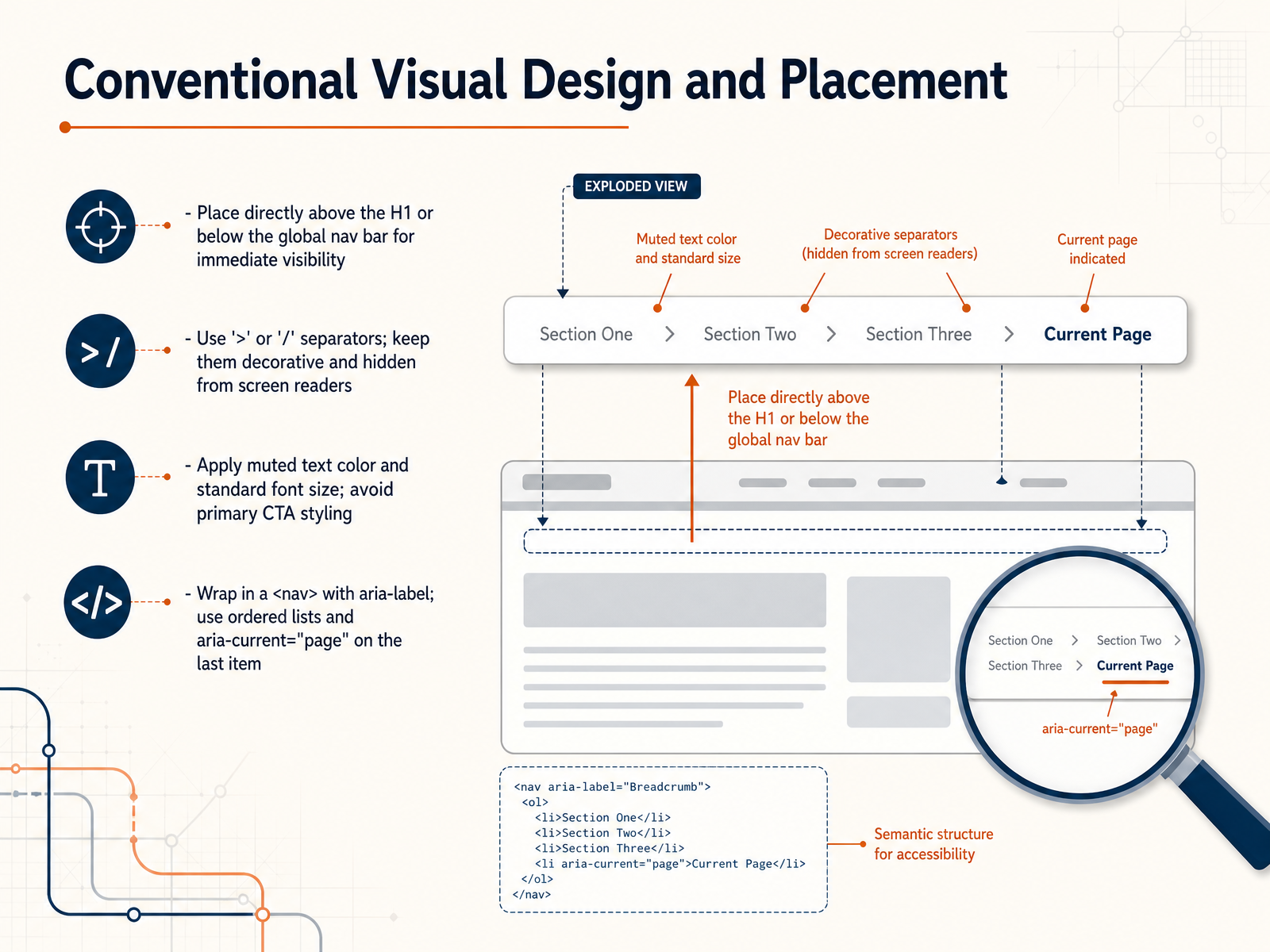 2 min
2 min - 07Navigating the Small Screen: Responsive and Mobile PatternsNow let's look at how breadcrumbs need to adapt when space is tight on mobile screens. The first principle is to avoid multi-line wrapping. When a breadcrumb trail breaks onto two lines, it stops being a scannable single line of context and starts eating up valuable viewport space. Keep it on one row, even if you have to simplify the trail. For shallow sites with only two or three levels, showing the full path can work well. But once your information architecture goes deeper, you need a tighter budget on mobile. A common pattern is to collapse mid-level items into an overflow menu, usually marked by an ellipsis. Tapping that ellipsis reveals the intermediate levels without cluttering the narrow header. For the tightest layouts, you can reduce the trail to a parent-only back link. This gives users an immediate way to return to the previous level while minimizing the horizontal footprint. Whatever pattern you choose, always protect touch accuracy. Make every breadcrumb link at least forty-four by forty-four pixels, with generous spacing between targets. This prevents mis-taps and reduces frustration during navigation. Up next, we'll explore how to manage breadcrumb length through truncation and overflow strategies.
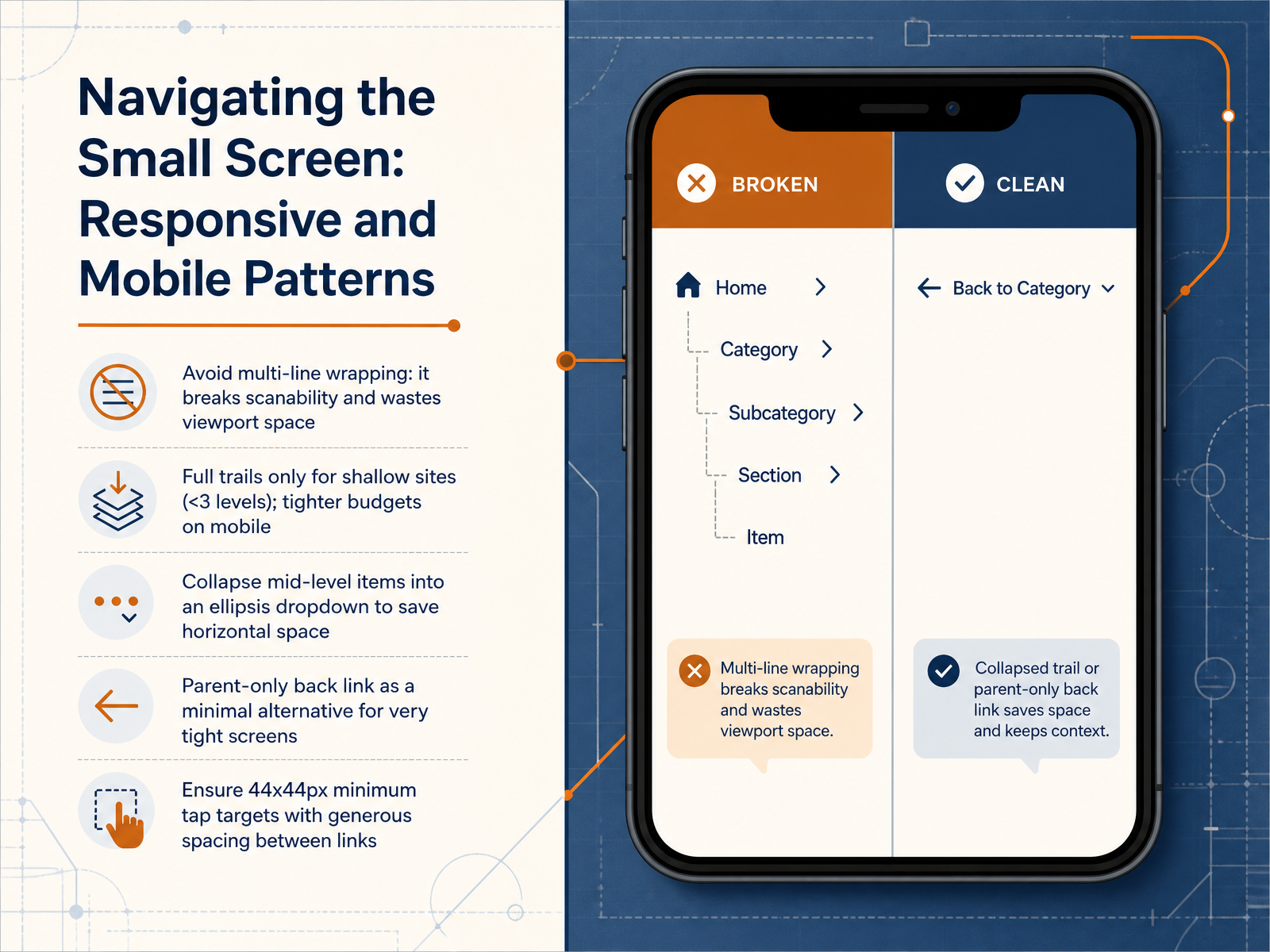 1 min
1 min - 08Managing Length: Truncation and Overflow StrategiesNow let's look at what happens when breadcrumb trails get too long. Long trails can break your layout and make scanning difficult, especially on mobile. The default strategy is middle truncation. This keeps the Home link, shows the last one or two ancestors, and uses an ellipsis in between. You should reserve start or tail truncation for very specific contexts only, and always make sure the remaining text stays distinguishable. One critical detail: the ellipsis must be interactive. When users click it, they should see a dropdown with the hidden items. An ellipsis that is just decoration creates a dead end. Next, we'll bring this together by looking at integration with primary navigation and how to prevent redundancy.
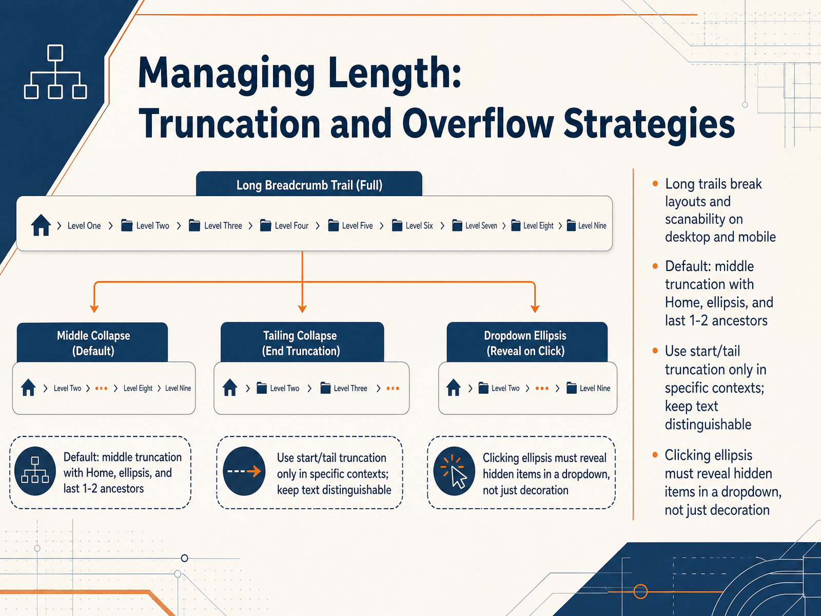 1 min
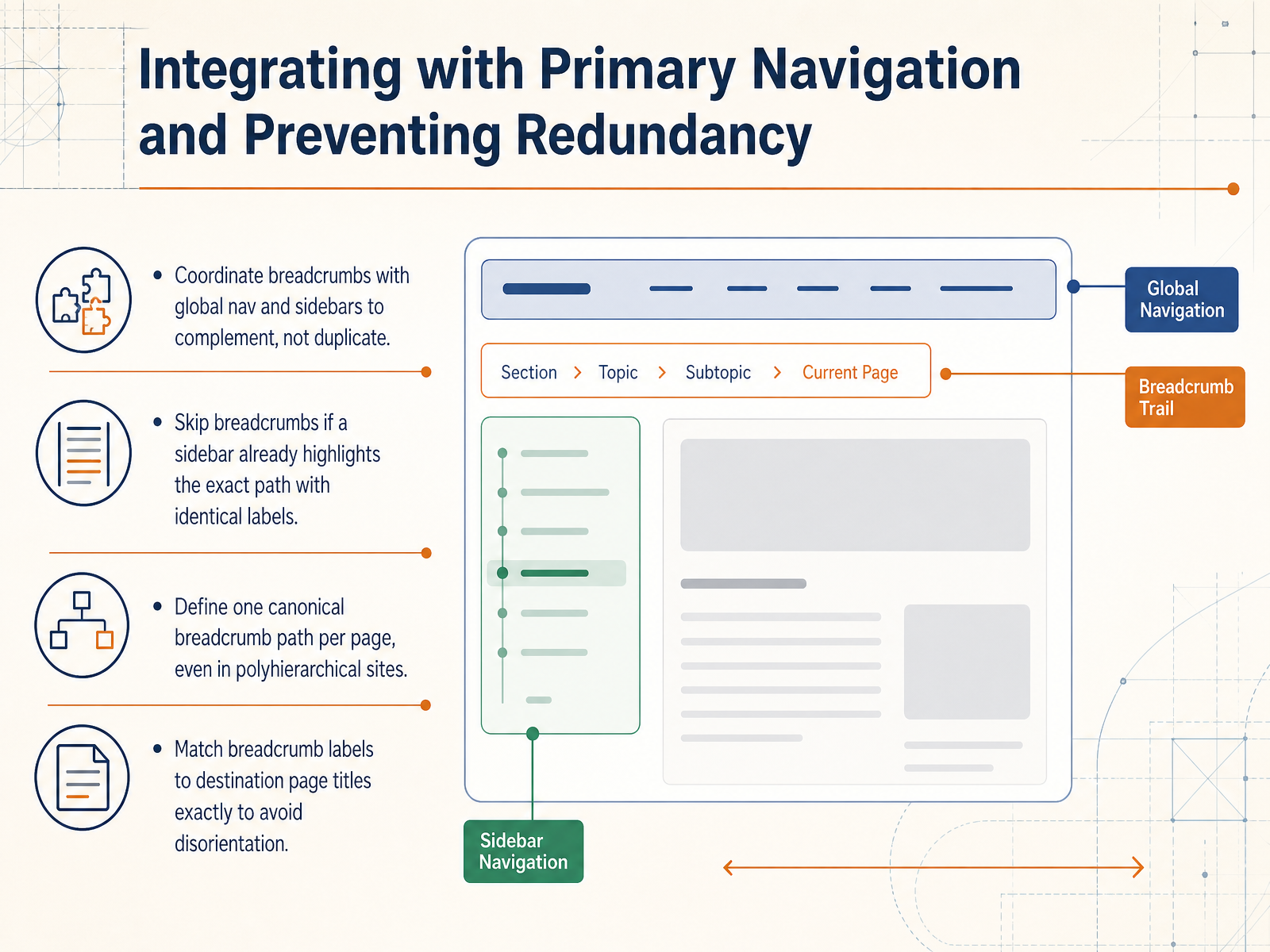
1 min - 09Integrating with Primary Navigation and Preventing RedundancyNow, let's talk about how breadcrumbs fit into the bigger picture. You want them to work with your primary navigation, not compete against it. If your global nav or a sidebar already shows the user's exact path with the same labels, adding breadcrumbs becomes noise. In that case, skip them. For sites where a page can belong in multiple places, things get trickier. You need to define one canonical breadcrumb path per page. This gives users a single, reliable trail, preventing the confusion of multiple conflicting histories. To make that trail solid, always match the breadcrumb label to the destination page title exactly. If the breadcrumb says 'Support' but the page is titled 'Help Center,' you've just broken the user's mental model. Precision here is what builds trust. Up next, we'll explore complementary wayfinding cues in 'Beyond the Trail.'
 1 min
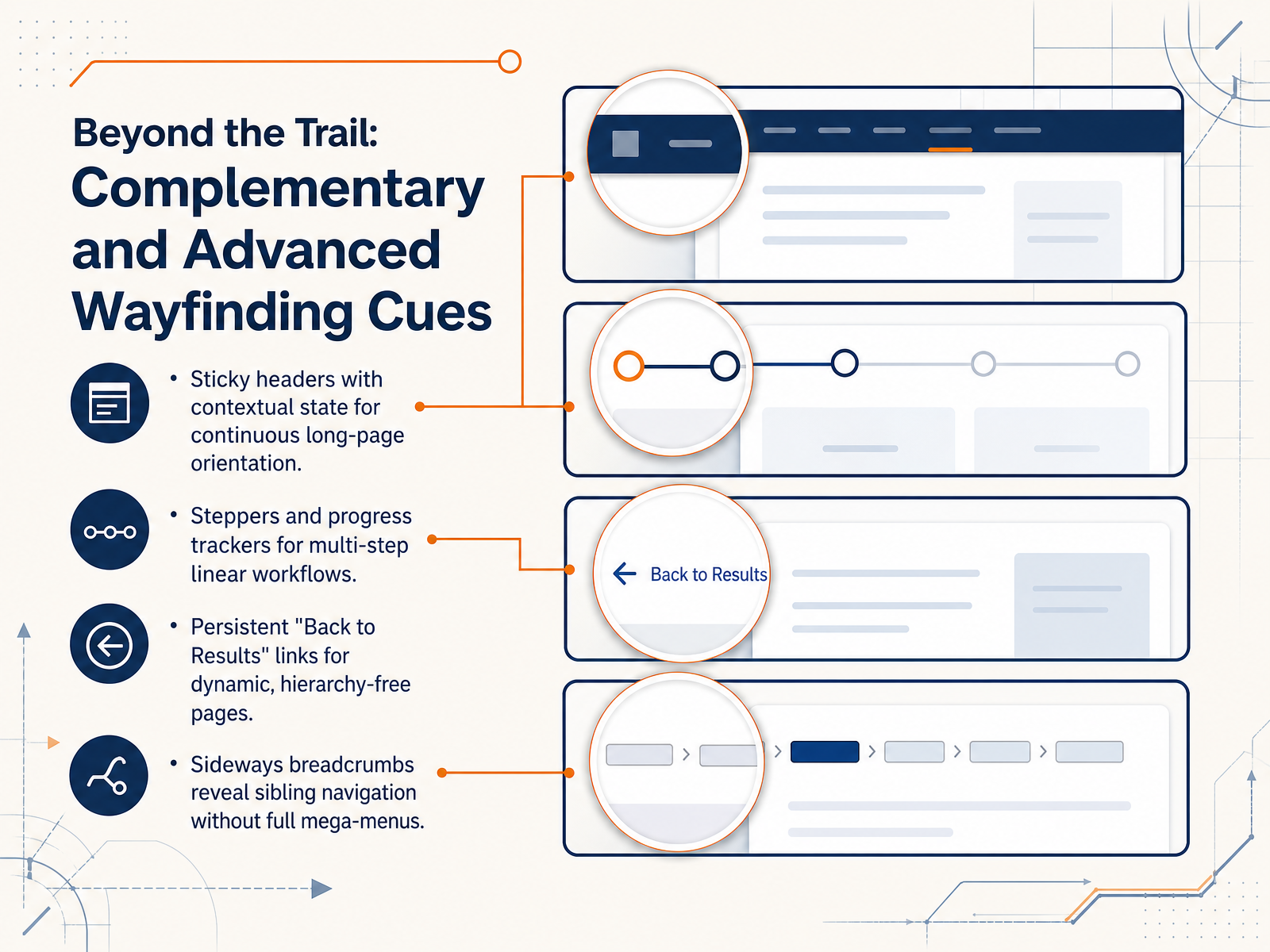
1 min - 10Beyond the Trail: Complementary and Advanced Wayfinding CuesBreadcrumbs are powerful, but they are just one tool. Let's look at a few complementary wayfinding cues you can use in more complex layouts. For long pages, try a sticky header that reflects the user's current section: it keeps the context anchored as they scroll. When you are designing a multi-step workflow, like a checkout or a setup wizard, use a stepper or progress tracker. This answers 'How many steps are left?' and 'Can I go back?' For dynamic, hierarchy-free result sets, a persistent 'Back to Results' link often works better than a breadcrumb. It mimics the user's mental model of returning to a stable list. And if you need to surface sibling pages without a full mega-menu, consider sideways breadcrumbs. They let users jump laterally within the same level, seeing related options without leaving their current context. Each of these patterns serves the same core need: telling the user where they are and how to move forward or back. Next, we'll step back and look at how to measure if these patterns are actually working with 'Measuring What Works: Usability Testing and Analytics.'
 2 min
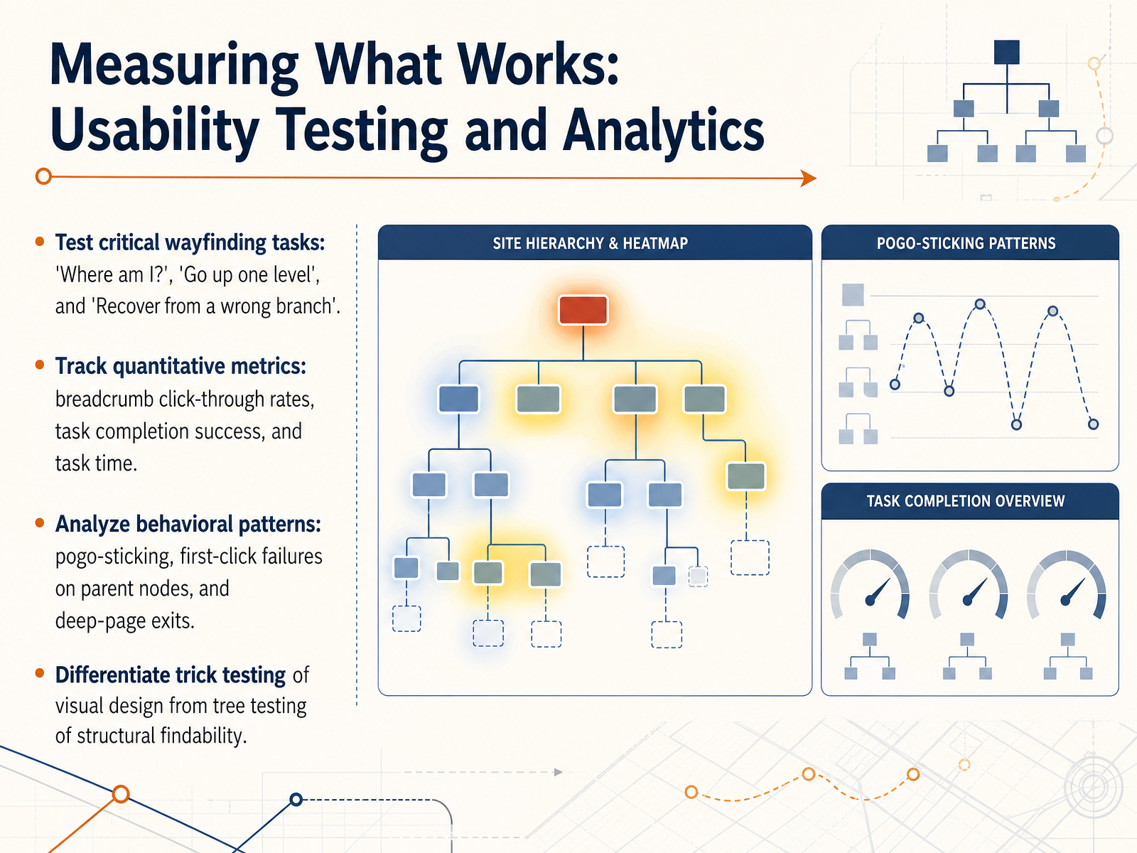
2 min - 11Measuring What Works: Usability Testing and AnalyticsLet's look at how to measure whether your breadcrumb and wayfinding design actually works for users. You'll want to test three critical tasks: can users answer 'Where am I?', can they go up one level, and can they recover from a wrong branch. These tasks expose whether your information architecture feels transparent. On the quantitative side, track breadcrumb click-through rates, task completion success, and time on task to gauge efficiency. Then, look for behavioral patterns like pogo-sticking, first-click failures on parent nodes, and exits from deep pages. These signals often reveal structural confusion that raw numbers might miss. One important distinction: trick testing evaluates visual clarity, while tree testing isolates structural findability. Use both methods separately so you know whether confusion comes from layout or from the architecture itself. Next, we'll turn to avoiding common implementation pitfalls.
 1 min
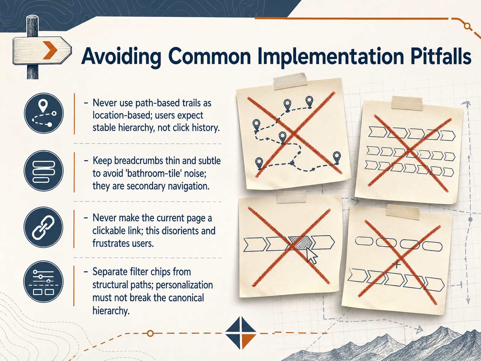
1 min - 12Avoiding Common Implementation PitfallsNow let's look at some common pitfalls that can quietly undermine your breadcrumb design. First, never treat path-based breadcrumbs as if they're location-based. Users expect a stable, logical hierarchy. If you show a click-history trail instead, like Home, then Search, then a product page the user reached through search, it looks like the product lives under the Search category. That breaks the user's mental model of the site structure. Second, keep the breadcrumb row thin and visually subtle. If you use large buttons or heavy styling, users get hit with what I call the 'bathroom tile' effect—too many chunky links competing for attention. Breadcrumbs are secondary navigation, not the main event. Third, never make the current page a clickable link. It's disorienting and frustrating when a user clicks what they think is a navigation element and nothing happens, or worse, the page just reloads. The current page should always be plain text. Finally, keep filter chips strictly separate from your structural paths. When a user selects a color filter on a product listing, that personalization shouldn't alter the canonical breadcrumb. The breadcrumb must stay fixed on the stable hierarchy; otherwise, the user loses their sense of place. Armed with these guardrails, let's move on to translating your design into development-ready specifications in 'From Design to Code: Handoff Checklist and Structured Data.'
 2 min
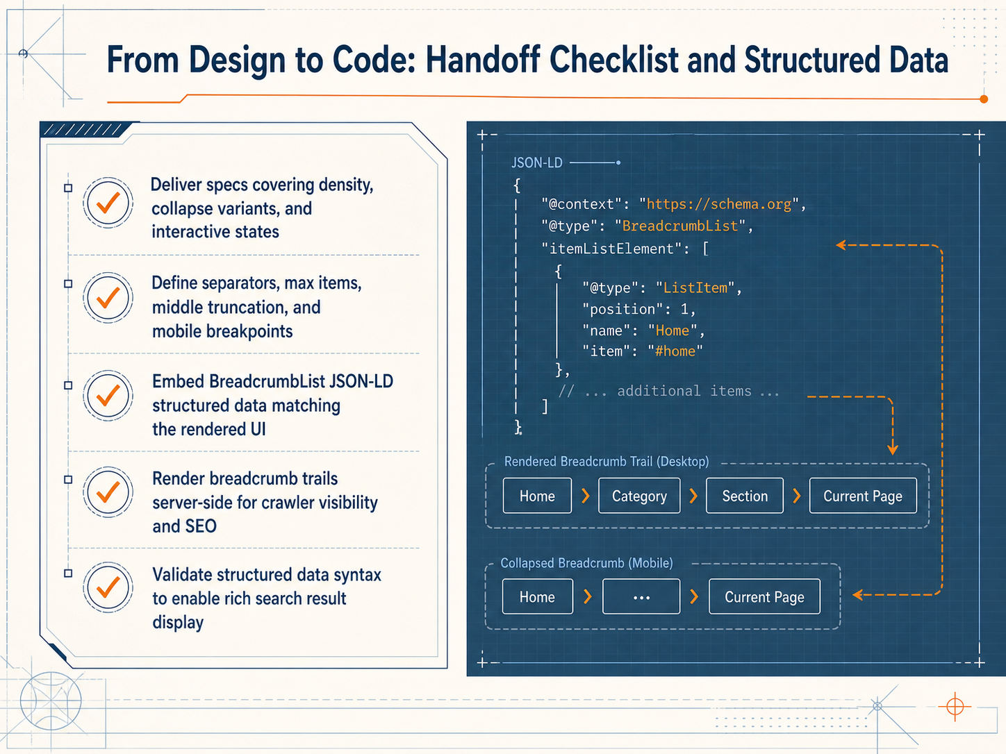
2 min - 13From Design to Code: Handoff Checklist and Structured DataNow let's make sure your breadcrumb design translates cleanly into code. A solid handoff checklist prevents teams from guessing on spacing, interaction, or accessibility details. First, deliver specs that go beyond static screens. Include density options, collapse variants, and states for hover, focus, active, and current-page. Define your separators, maximum visible items, middle truncation rules, and mobile breakpoints explicitly. Next, embed BreadcrumbList JSON-LD structured data that directly matches the rendered UI. Render the breadcrumb trail server-side so crawlers can see and index it, which strengthens your SEO. Finally, validate your structured data syntax to unlock rich search result displays. That wraps up our module on breadcrumbs and wayfinding. Thank you for your attention, and I hope these techniques bring more clarity and confidence to the navigation experiences you design.
 1 min
1 min
Take the deck with you
Download this course as a file — free, no sign-up needed.
- PDF handoutEvery slide page, ready to print or share.14 pages · 3.7 MBDownload
- Narrated PowerPointThe deck that presents itself — every slide carries the digital human's narration video.14 pages · 12.3 MBDownload
- PowerPoint slidesThe full deck as a .pptx — open it in PowerPoint, Keynote, or Google Slides.14 pages · 3.6 MBDownload
Free to use in your own training — please keep the PersonWise credit page at the end.
Have your own deck? Turn it into a course