Permission and Access State Design
Begin
14 pages · ~28 min
Permission and Access State Design
This training teaches learners how to design and implement effective permission and access states in systems, covering best practices for role definitions, access control, and security configuration.
What you’ll learn
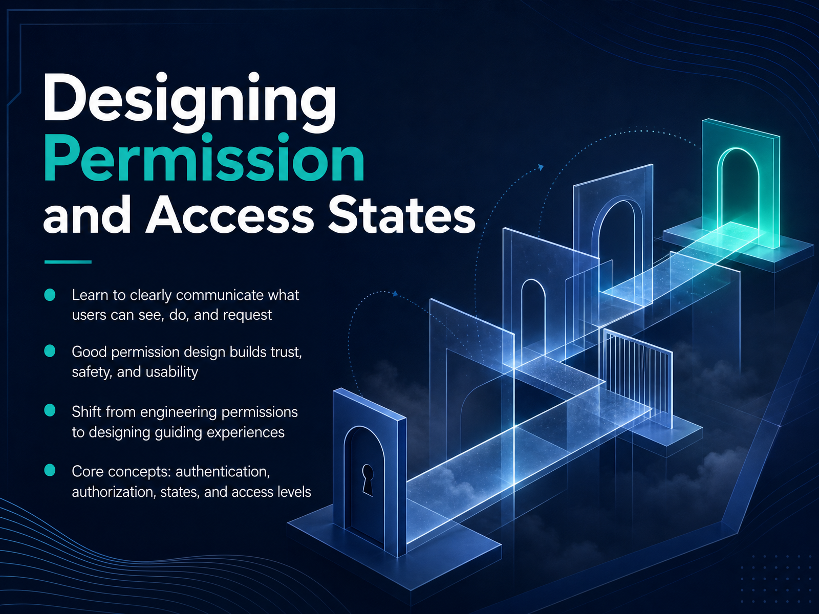
- 01Designing Permission and Access StatesWelcome. In this course, we'll learn how to design permission and access states that clearly communicate what users can see, do, and request. Good permission design is a trust-building practice—it directly shapes safety and usability. Instead of thinking about permissions as pure engineering logic, we'll shift our focus to designing guiding experiences. To get there, we'll work through four core concepts: authentication, authorization, the specific states users encounter daily, and the access levels that define their boundaries. By the end, you'll be able to move from a system that just enforces rules to one that actually explains them. Let's start by looking at why bad permissions break trust.setting.pagenorthbase.designdelbuenostudio.com+21 min
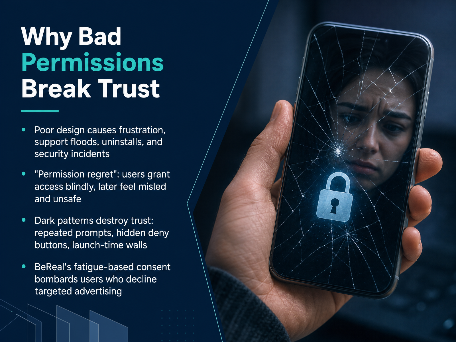
- 02Why Bad Permissions Break TrustNow, let's talk about why getting permissions wrong breaks trust with your users. Poor design isn't just a small annoyance; it creates real, measurable pain. Think about it: confusing prompts lead to user frustration, which floods your support team with tickets, drives up uninstalls, and can even cause security incidents if people just tap 'Allow' out of confusion. We have a name for that gut feeling users get later—it's called 'permission regret.' A user grants access blindly, often during onboarding, and later feels misled, even unsafe, wondering why a simple flashlight app needs their contacts. This feeling is often manufactured by dark patterns. These are manipulative design tricks, like making you hunt for a hidden 'Deny' button, or putting up a wall of permission prompts the very first time you launch an app, forcing a decision before you've seen any value. A powerful example is BeReal. If a user declined targeted advertising, the app allegedly showed a consent banner every single day, right when they tried to post. This is a fatigue-based tactic—essentially annoying people until they give in. Consent isn't freely given if it's obtained through exhaustion. A single permission screen can become a trust-breaking moment. Design it carefully. Next, we'll anchor ourselves in the language of access with 'Core Vocabulary: The Verbs and Nouns of Access.'
 uicase.comhelpnetsecurity.comusercentrics.com+22 min
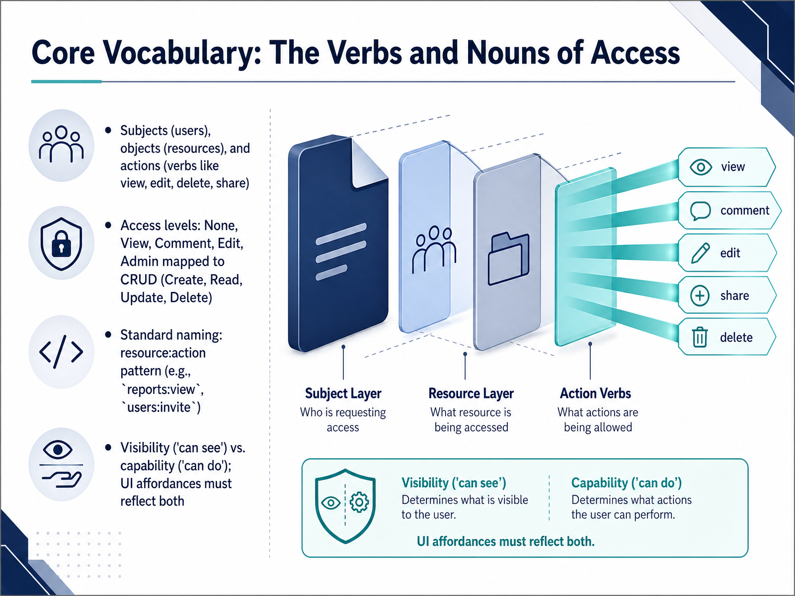
 - 03Core Vocabulary: The Verbs and Nouns of AccessNow let's translate those high-level states into the vocabulary we use every day to configure and enforce access. We'll start with the nouns and verbs. In any access system, we talk about subjects, which are your users. Objects, which are the resources like reports, dashboards, or invoices. And actions, the verbs like view, edit, delete, or share. These map directly to standard access levels. None means zero access. View maps to Read. Comment and Edit map to Update. Admin often maps to Create and Delete, plus special privileges. From these basics, we adopt a standard naming pattern: resource colon action. For example, reports colon view, or users colon invite. This convention makes permissions immediately scannable across your code and your admin dashboard. It also helps us separate a crucial pair of concepts: visibility versus capability. Visibility is what a user can see on the screen. Capability is what they can actually do. If a user lacks edit permission, the edit button should either be hidden or clearly disabled. The interface must always align with the permission truth. Let's apply this vocabulary to a real interface next, as we walk through the user's journey from access denied to fully empowered.
 dev.toveldsystems.comworkos.com+22 min
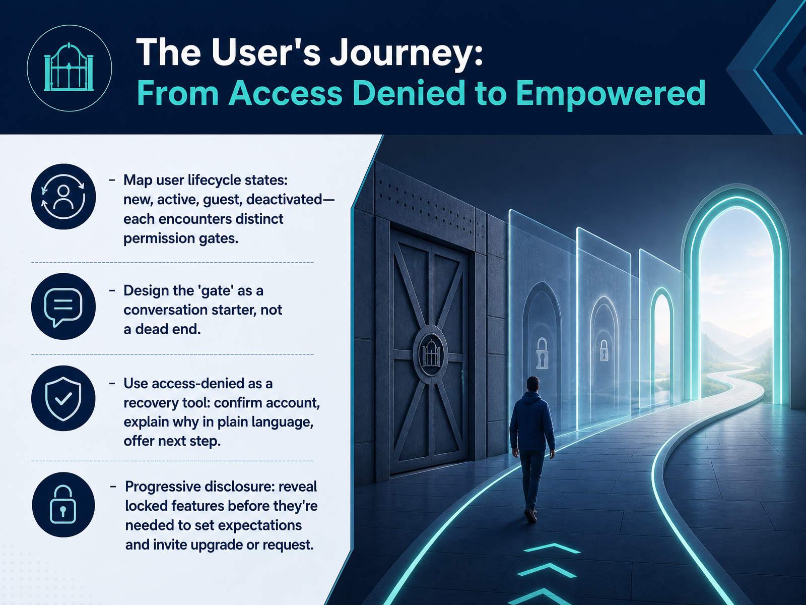
 - 04The User's Journey: From Access Denied to EmpoweredNow let's map out the user's journey through different access states. Think of this as the full lifecycle of permissions, from the moment someone is brand new, to when they're an active user, a guest, or even when their account gets deactivated. Each of these stages hits different permission gates. And here's the key mindset shift: design those gates as conversation starters, not dead ends. When a person sees 'Access Denied,' that moment should become a recovery tool. First, confirm their account status. Then explain what's happening in plain language, without blame. And always offer a clear next step. Another powerful pattern is progressive disclosure. Instead of hiding gated features completely, you can show them as locked. This sets expectations early. It also invites the right people to request an upgrade or ask for access, turning a restriction into an opportunity. To put this into practice, start auditing your current blocked states. Replace technical error codes with human headlines and action-first buttons like 'Request Access' or 'Switch Account.' A well-designed gate keeps people moving forward. Coming up next, we'll look at how to communicate the 'Can Do' with clear visual and text patterns.
 appmaster.iouicontent.coblog.logrocket.com+22 min
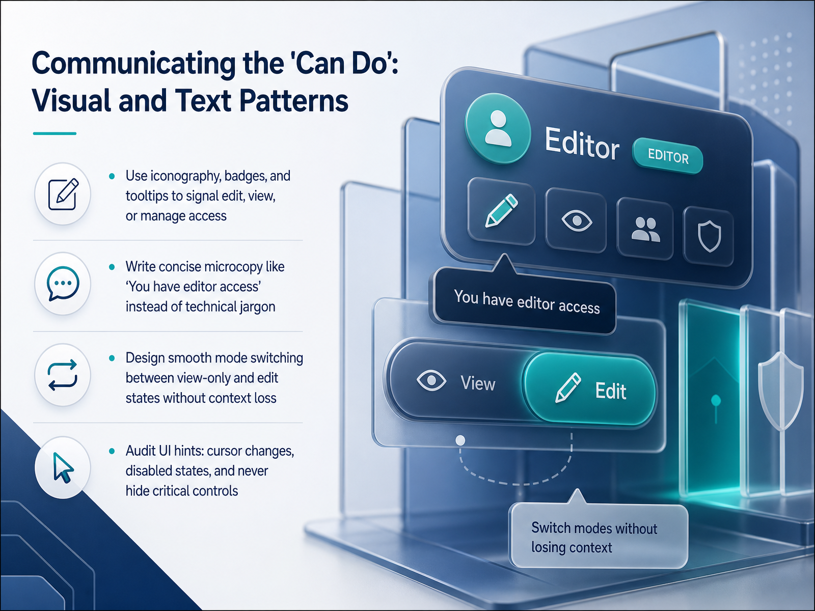
 - 05Communicating the 'Can Do': Visual and Text PatternsNow, let's talk about how to communicate the 'can do'—the actions a user is actually allowed to take. We do this through clear visual and text patterns. First, rely on recognizable signs: iconography, badges, and tooltips. A small pencil icon can signal edit access, an eye can mean view-only, and a badge reading 'Editor' leaves no room for doubt. Second, use concise, human-readable microcopy. Never show technical jargon like 'resource colon update permission granted.' Instead, simply say, 'You have editor access.' It’s direct and trustworthy. Third, design smooth mode switching. When a user moves from a view-only state into an edit state, they should stay in the same context. Don’t reload the page or lose their place; just activate the editable fields inline. Finally, audit your UI hints. Check that your cursor changes to a text selector over editable fields, that disabled buttons look clearly unavailable, but never hide critical controls entirely. If a button is disabled, show it—and consider a tooltip explaining why. These patterns turn abstract permissions into a calm, predictable experience. Next, we’ll apply the same care to communicating the 'cannot do' with graceful restrictions.
 dev.toveldsystems.comworkos.com+22 min
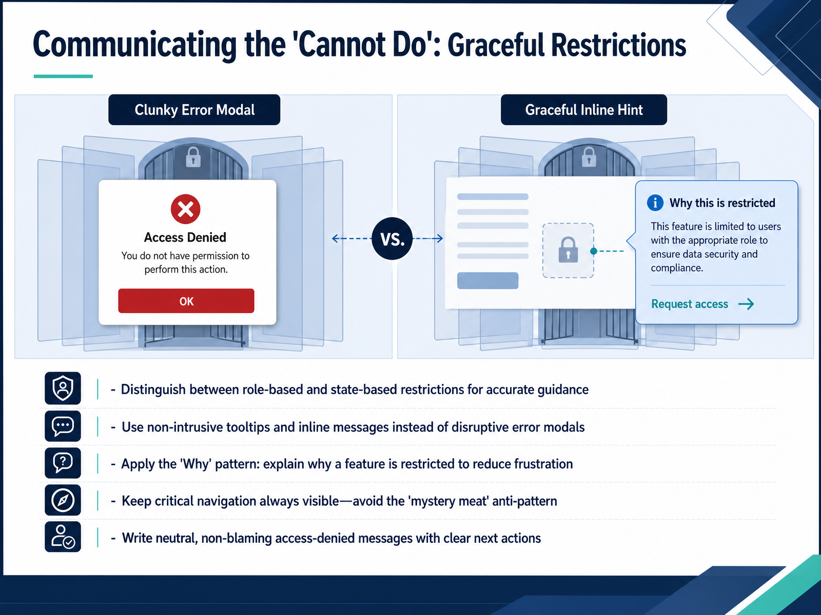
 - 06Communicating the 'Cannot Do': Graceful RestrictionsNow let's talk about how to communicate when someone cannot do something—what we call graceful restrictions. The goal here is to set a clear boundary without making the user feel blamed or stuck. First, learn to distinguish between role-based restrictions and state-based restrictions. A role-based restriction means the user’s job function simply doesn't include that permission. A state-based restriction is different—maybe a record is locked because it is pending approval. Knowing which type you're dealing with helps you guide the user more accurately. When you communicate these limits, avoid disruptive pop-ups. Use non-intrusive tooltips or inline messages right next to the affected element. And always apply the 'Why' pattern: explain briefly why a feature is restricted. This small explanation can dramatically reduce frustration. Also, never hide critical navigation. If you remove menu items a user cannot click, you create what's called a 'mystery meat' problem—they won't know those options exist or how to get them. Keep the navigation visible but show a clear, neutral message when needed. For the message itself, use non-blaming language. Instead of 'You are not authorized,' say 'You don't have access to this report.' Then immediately provide a clear next action, like a button to request access. In the next slide, we'll design that 'Request Access' flow from start to finish.
 appmaster.iouicontent.coblog.logrocket.com+21 min
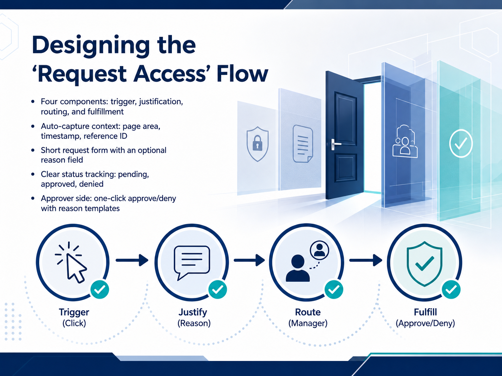
 - 07Designing the 'Request Access' FlowNow let's design the actual request flow. Think of it as four connected steps: a trigger, a justification, routing, and fulfillment. The trigger is the blocked page itself. Don't just show an error. Show a clear message and a primary button labeled 'Request access.' Next, justification. The user shouldn't have to write a novel. Auto-capture the context for them: the page area, a timestamp, and a reference ID. Then present a short form. The only field might be an optional reason. Keep it light. Once they submit, routing pushes the request to the right approver automatically. Fulfillment is about status tracking. The user sees their request move from 'pending' to 'approved' or 'denied.' No guesswork, no support tickets. On the approver's side, make it fast. A one-click approve or deny with pre-built reason templates, like 'Not in your team's scope,' keeps the process moving. Let's look at how these states work together in group and hierarchy structures on the next slide.
 appmaster.io2 min
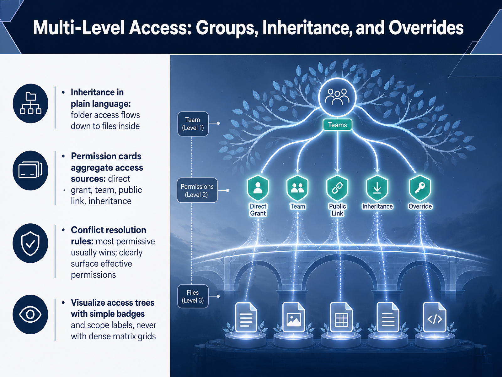
 - 08Multi-Level Access: Groups, Inheritance, and OverridesNow let's talk about how access flows through your workspace: groups, inheritance, and overrides. Inheritance is a simple idea. Think of a folder. When you share a folder with your team, the files inside automatically follow the same rule. The permission flows down from the folder to everything it contains. You don't need to set access on every single file. Your permission cards pull from multiple sources at once: a direct grant on a document, a team membership, maybe a public link, plus the inheritance we just described. The system aggregates all these sources and shows you the effective permission. When conflicts happen, the most permissive rule usually wins. For example, if a public link allows viewing and a direct grant allows editing, the user gets to edit. The interface must surface this winning permission clearly so you never have to guess. To visualize all this, we use simple badges and scope labels on an access tree. Think colored tags like 'Can Edit' or a label showing 'Team Scope.' We avoid dense matrix grids because they hide the story instead of telling it. Up next, we'll turn these concepts into a practical model: Roles, Permissions, and Scope.
 dev.toveldsystems.comworkos.com+22 min
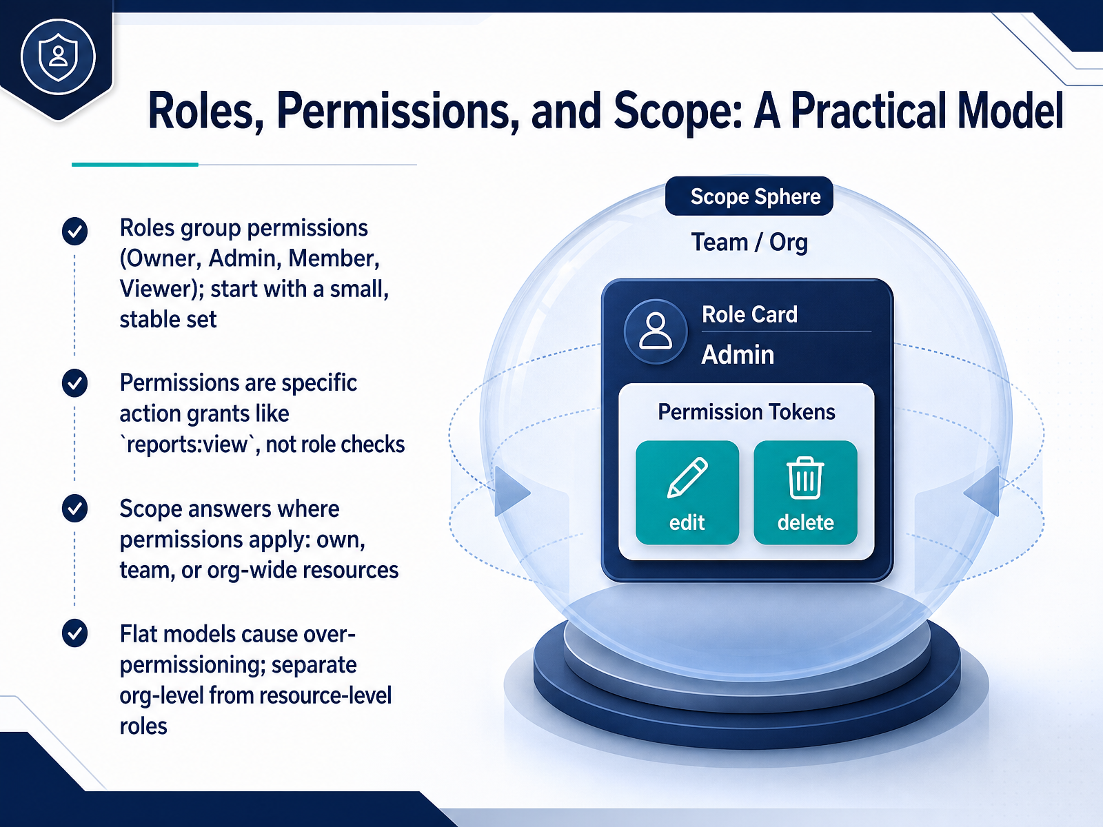
 - 09Roles, Permissions, and Scope: A Practical ModelNow let's turn the model we just discussed into a practical framework you can use in your own product. Think of it as three building blocks: roles, permissions, and scope. Roles are just containers that group permissions together. We recommend starting with a small, stable set like Owner, Admin, Member, and Viewer. Permissions are the actual action grants, written in a clear resource-colon-action format. For example, reports colon view, not a vague role check. This way your code never asks "is this user an admin?" It always asks "does this user have the reports colon view permission?" Then scope answers the where question. Does this permission apply to resources the user owns, to their team, or across the entire organization? Separating org-level roles from resource-level roles prevents over-permissioning. A flat model where one Admin role can do everything everywhere is a security risk. Instead, someone might be an org-wide Member but a workspace-level Admin for their own projects. Up next, we'll look at the security signals and trust indicators that reinforce this model.
 dev.toveldsystems.comworkos.com+22 min
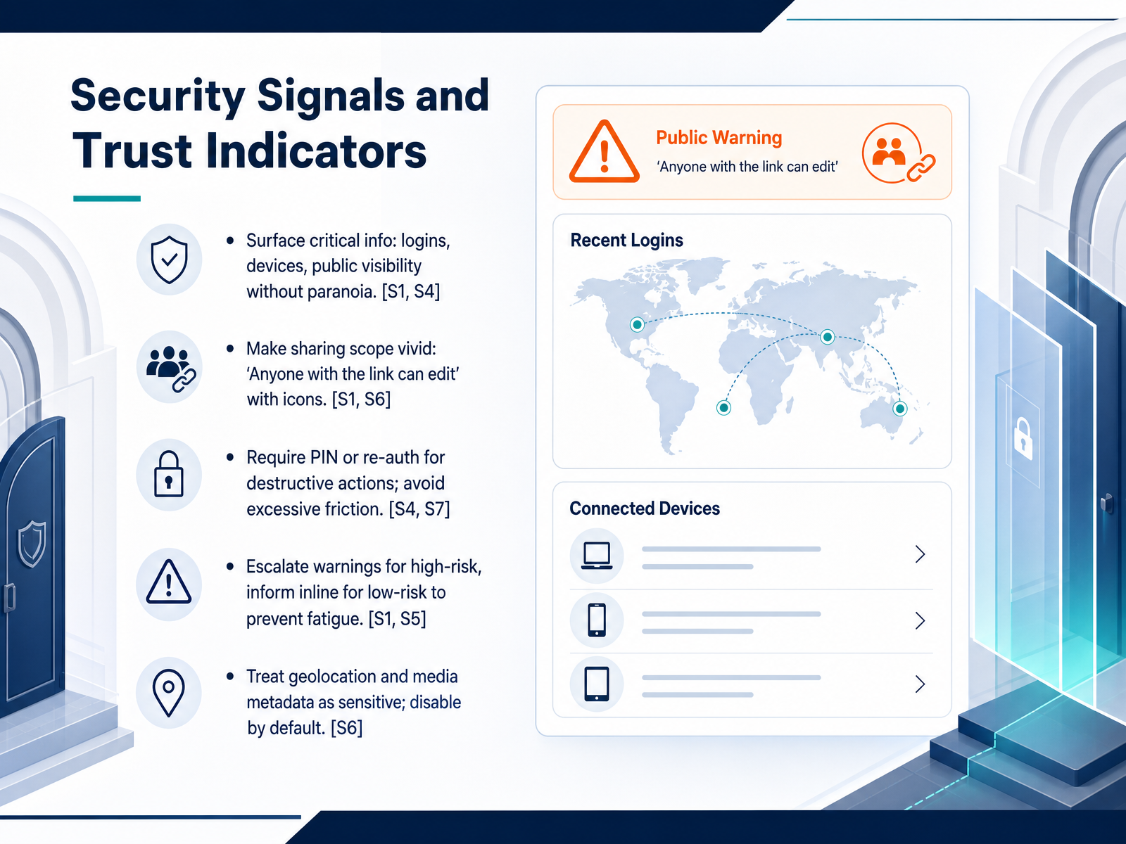
 - 10Security Signals and Trust IndicatorsNow let’s talk about security signals and trust indicators that help users feel safe without feeling overwhelmed. First, surface critical security information such as recent logins, connected devices, and current public visibility. Show these in an accessible dashboard, but avoid language that triggers paranoia. Next, make sharing scope vivid. Instead of just a label, use plain statements like “Anyone with the link can edit,” paired with a recognizable globe or people icon so the audience is immediately clear. For destructive actions, require a PIN or re-authentication step. This confirms intent without adding excessive friction to everyday tasks. When it comes to warnings, escalate the signal for high-risk changes but use subtle inline messages for low-risk updates to prevent alert fatigue. Finally, treat geolocation and media metadata as sensitive by default. Keep precise location sharing off and strip EXIF data from uploads until the user actively opts in. These trust signals turn abstract risk into clear, manageable choices. Up next, we shift to the admin-side view in “Admin-Side Design: Making Permissions Manageable.”
 1 min
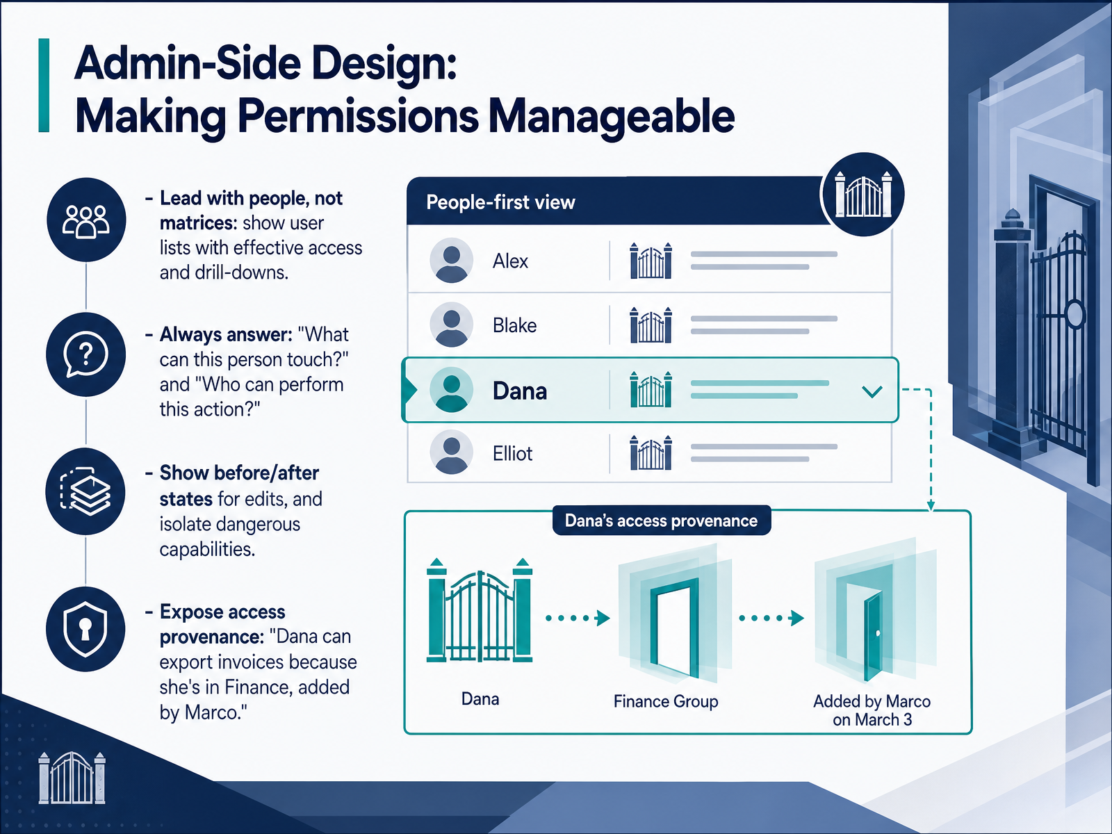
1 min - 11Admin-Side Design: Making Permissions ManageableLet's shift focus to the admin side and make permissions manageable for the people doing the configuration. The most important principle is to lead with people, not matrices. Instead of presenting a massive grid of checkboxes, start with a user list that shows each person's current effective access. From there, admins can drill down to see exactly what someone can touch and why. Always answer two questions clearly: what can this person do, and who else can perform this action. When someone edits a permission, show a clear before and after state so the change is intentional. And take extra care to isolate truly dangerous capabilities, so they stand out and can't be assigned by accident. Finally, expose access provenance. Don't just say Dana can export invoices. Show the reasoning: Dana can export invoices because she belongs to the Finance role, added by Marco. That one sentence answers the question before it is asked. When we turn to the next slide, we will apply that same clarity to the words users see, by writing clear permission microcopy.
 dev.toveldsystems.comworkos.com+22 min
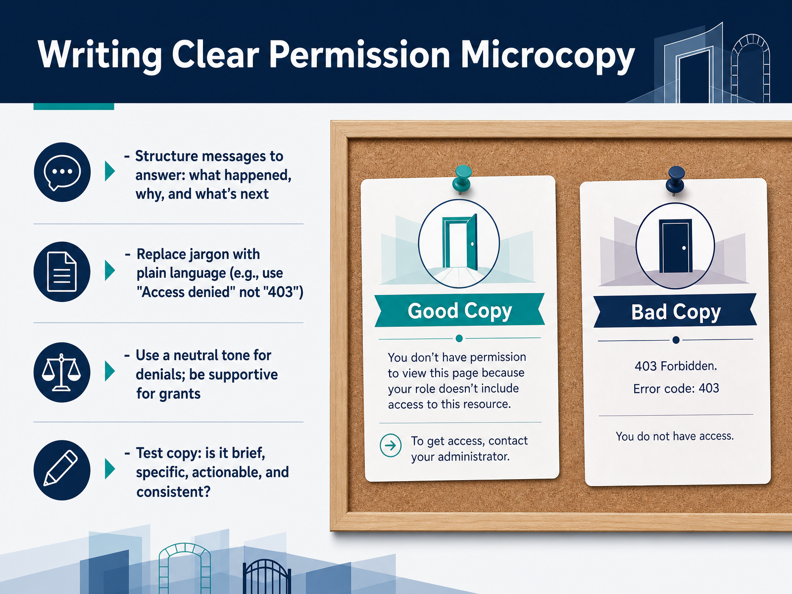
 - 12Writing Clear Permission MicrocopyLet's move into writing the actual words your users will see. Good permission microcopy answers three questions fast: what happened, why, and what's next. You structure every message to solve for those three points. For example, start with a plain-language headline like "You don't have access to this report" instead of a technical code like "403 Forbidden." Then add a short helper line, such as "Request access from your workspace admin, or go back to continue your work."
When you replace jargon with plain language, the user understands the situation without freezing up. Keep a neutral tone for denials, so it never feels like blame. For grants, a supportive "You now have editor access" reinforces the right action. Always test your copy against a quick checklist: is it brief, specific to the page or action, truly actionable, and consistent with every other permission screen in your product? If the answer is yes, you have microcopy that reduces support tickets and keeps people moving.
Next, we will step back and look at a practical strategy for designing all these states together.
 appmaster.iouicontent.coblog.logrocket.com+22 min
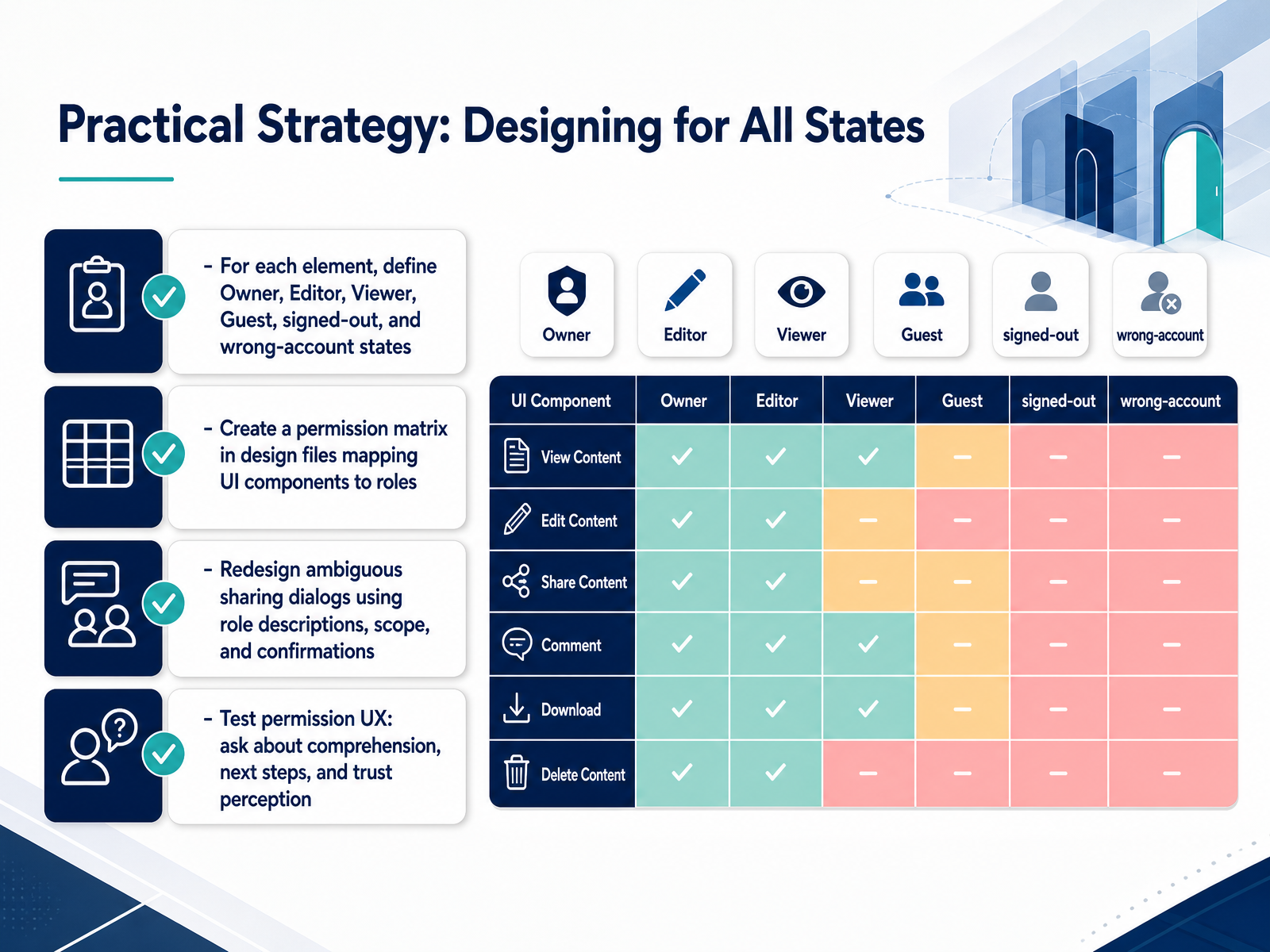
 - 13Practical Strategy: Designing for All StatesNow we turn strategy into action. To design for all access states, the first practical step is a permission matrix. For every element on the screen, define what the Owner sees, what an Editor can do, what a Viewer can see, and what a Guest or signed-out user encounters. Also plan for the wrong-account state, because people switch contexts all the time. This matrix lives right in your design file, mapping each UI component to a role. Next, look at your sharing dialogs. Many of them are ambiguous. Redesign them using clear role descriptions, a visible scope, and a confirmation step so the user knows exactly what they are granting. Finally, test your permission experience like any other flow. Ask users what they can do on the page, what their next step should be, and whether they trust the system. Their answers will tell you if your design actually communicates safety and clarity. That is the real measure of success. Up next, we will wrap up with key takeaways and a simple action plan you can put into practice right away.
 appmaster.io2 min
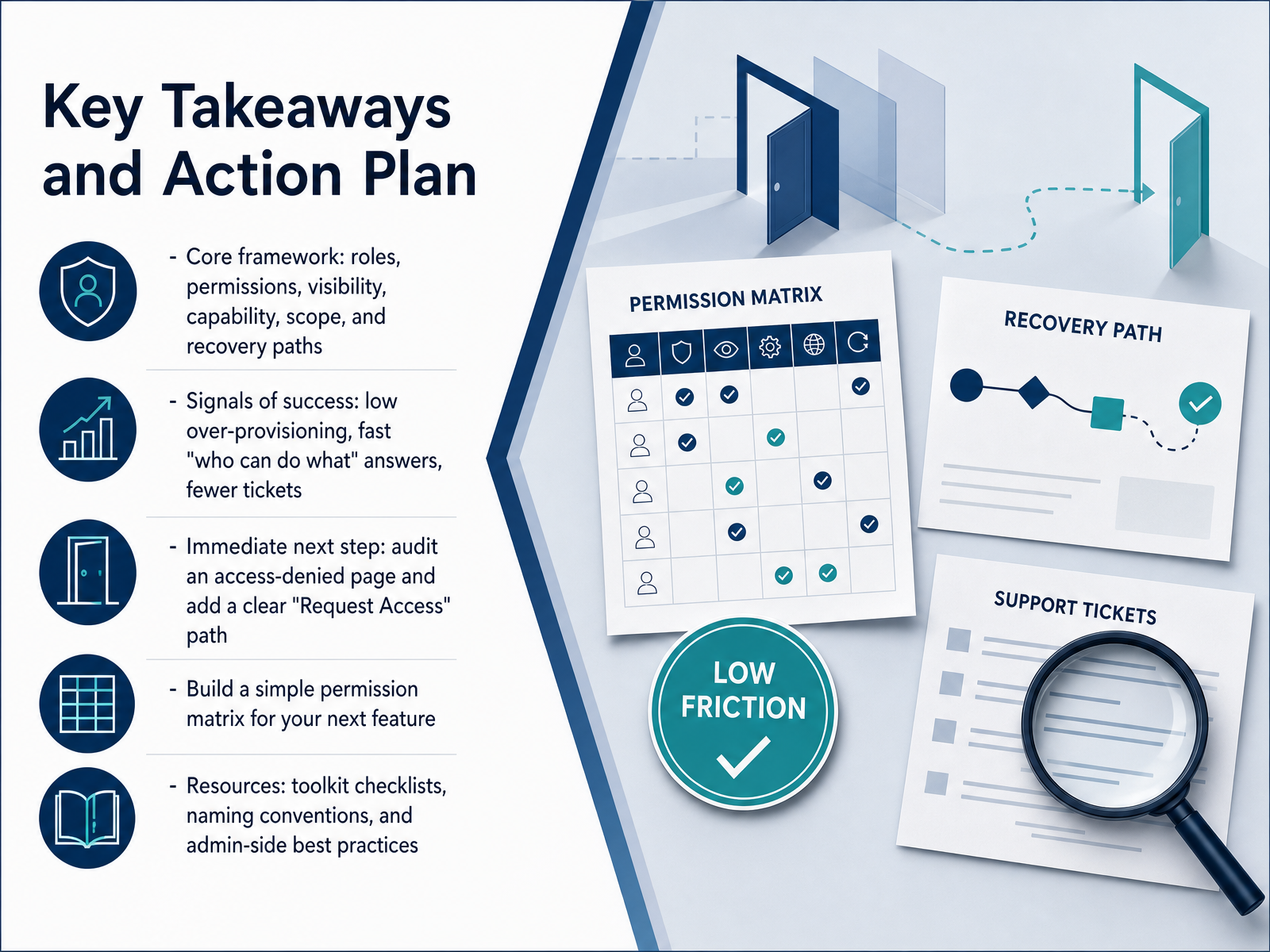
 - 14Key Takeaways and Action PlanLet's pull all of this together and talk about your action plan. First, remember our core framework: roles, permissions, visibility, capability, scope, and recovery paths. That framework is your mental checklist every time you design an access state. A clear signal of success is when you see low over-provisioning, your team members can quickly answer 'who can do what,' and support tickets go down. Your immediate next step is to audit one access-denied page in your product. Find a place where people hit a dead end and add a clear 'Request Access' path. Just one button can make a huge difference. Then, for your next feature, build a simple permission matrix. Map out who needs to view, create, edit, or delete each resource. That matrix will guide your copy and your logic. Finally, use the toolkit resources in your takeaway packet: the naming convention guide, the request-form checklist, and the admin-side best practices. Start small. Pick one blocked state, ship the right message, and measure the drop in support tickets. That one win proves the value of this entire approach. Thank you for joining this session. You now have the tools to turn every access moment into a clear, helpful experience. Go make it happen.
 appmaster.iouicontent.coblog.logrocket.com+22 min
Take the deck with you
Download this course as a file — free, no sign-up needed.
- PDF handoutEvery slide page, ready to print or share.15 pages · 3.7 MBDownload
- Narrated PowerPointThe deck that presents itself — every slide carries the digital human's narration video.15 pages · 14.8 MBDownload
- PowerPoint slidesThe full deck as a .pptx — open it in PowerPoint, Keynote, or Google Slides.15 pages · 3.6 MBDownload
Free to use in your own training — please keep the PersonWise credit page at the end.
Have your own deck? Turn it into a course
Sources consulted
Web sources consulted while building this course.
- User Permissions Settings UX for Roles and Access — setting.page
- Permission & Access Control Patterns from 10 Enterprise Systems | Northbase — northbase.design
- RBAC UX: Designing Permissions People Understand — delbuenostudio.com
- Designing Intuitive Permission and Role Management UI Patterns — tunde.me
- skills/frontend-design/reference/permissions-and-roles-ux.md — github.com
- 10 App Interface Breakdowns of Smart Permission Requests - uicase.com — uicase.com
- Google Play Store’s privacy practices still confuse Android users - Help Net Security — helpnetsecurity.com
- BeReal Case: NOYB Complaint Over Dark Patterns — usercentrics.com
- Why App Permissions Matter in 2026: A Privacy-First Design Playbook (Featuring GoodFirms Research) — forasoft.com
- ‘Watch for the Consequences’: Visualizing Permission Risks to Improve Privacy Decisions in Android | USENIX — usenix.org
- Best Practices for Naming Permissions in a System - DEV Community — dev.to
- Designing User Roles and Permissions for SaaS Products | Veld Systems — veldsystems.com
- How to build flexible authorization for multi-tenant B2B SaaS — WorkOS — workos.com
- Permissions and Role System Specification Template — ideaplan.io
- Multi-tenant SaaS permissions: orgs, teams, roles made clear | Koder.ai — koder.ai
- Access denied UX patterns that reduce support tickets | AppMaster — appmaster.io
- Writing Error Messages That Users Understand - UI Content — uicontent.co
- Error message examples: How to craft clear, effective UX messaging — blog.logrocket.com
- Error-Message Guidelines — nngroup.com
- Access messages - VA.gov Design System — dev-design.va.gov