Begin
14 pages · ~28 min
Data Visualization with Excel
This training teaches participants to create effective charts and dashboards in Excel. Ideal for analysts and professionals who need to present data clearly.
A digital instructor presents all 14 pages. Hold “Ask” at any point and ask out loud — the answer comes from this course. No sign-up needed.
What you’ll learn
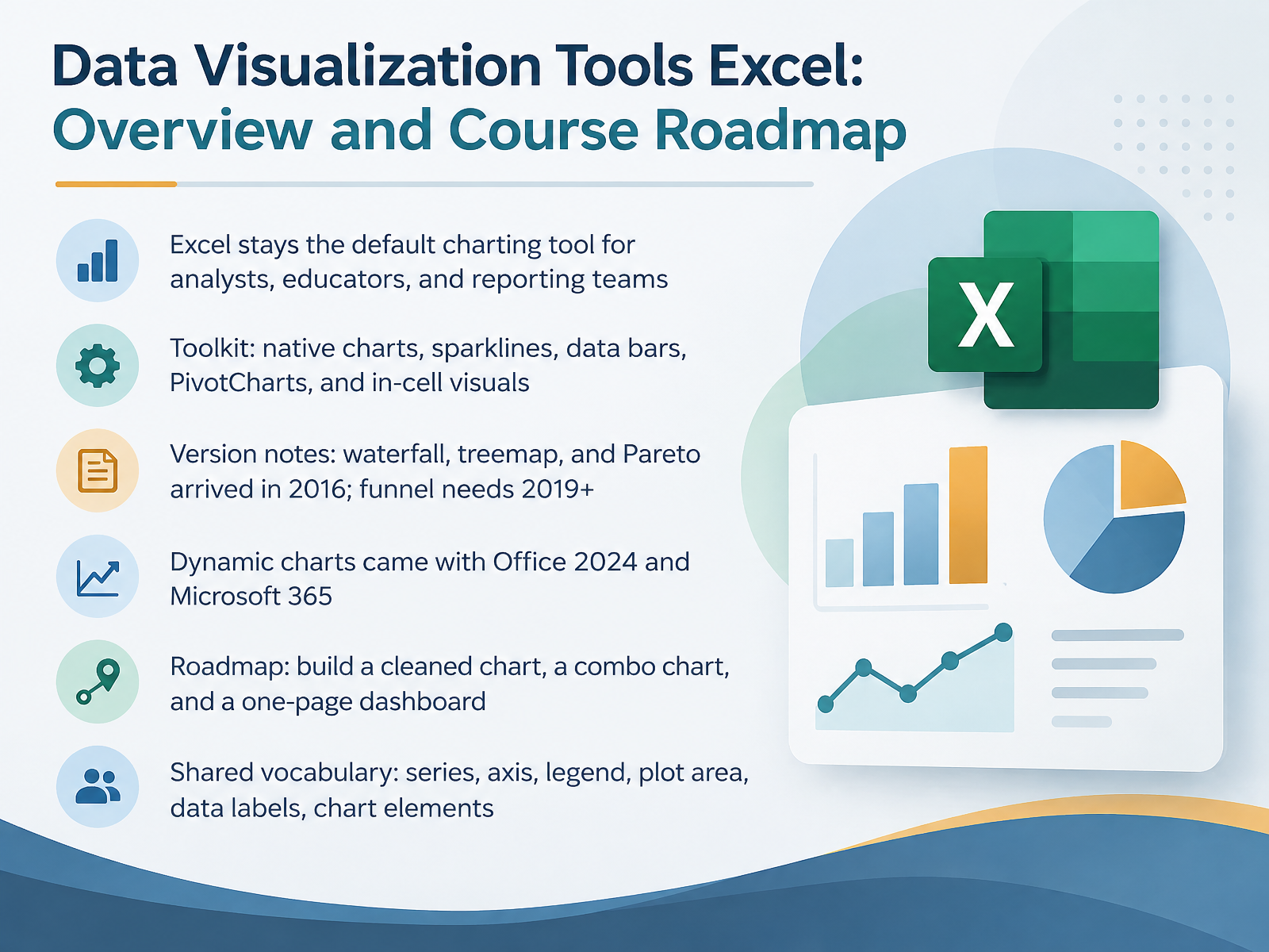
- 01Data Visualization Tools Excel: Overview and Course RoadmapWelcome. This course is about making Excel charts that people actually read and trust. Excel remains the default charting tool for analysts, educators, and reporting teams. So let us treat it like a real toolkit. That toolkit includes native charts, sparklines, data bars, PivotCharts, and in-cell visuals. One version note matters. Waterfall, treemap, and Pareto charts arrived in 2016. Funnel charts need Excel 2019 or Microsoft 365. Dynamic charts came with Office 2024 and Microsoft 365, so your charts update as data changes. Here is our roadmap. You will build a cleaned chart, a combo chart, and a one-page dashboard. Along the way, we will share vocabulary: series, axis, legend, plot area, data labels, and chart elements. Those words will keep our instructions precise. Let us start by choosing the right chart for your data.support.microsoft.comsupport.microsoft.comsupport.microsoft.com+21 min
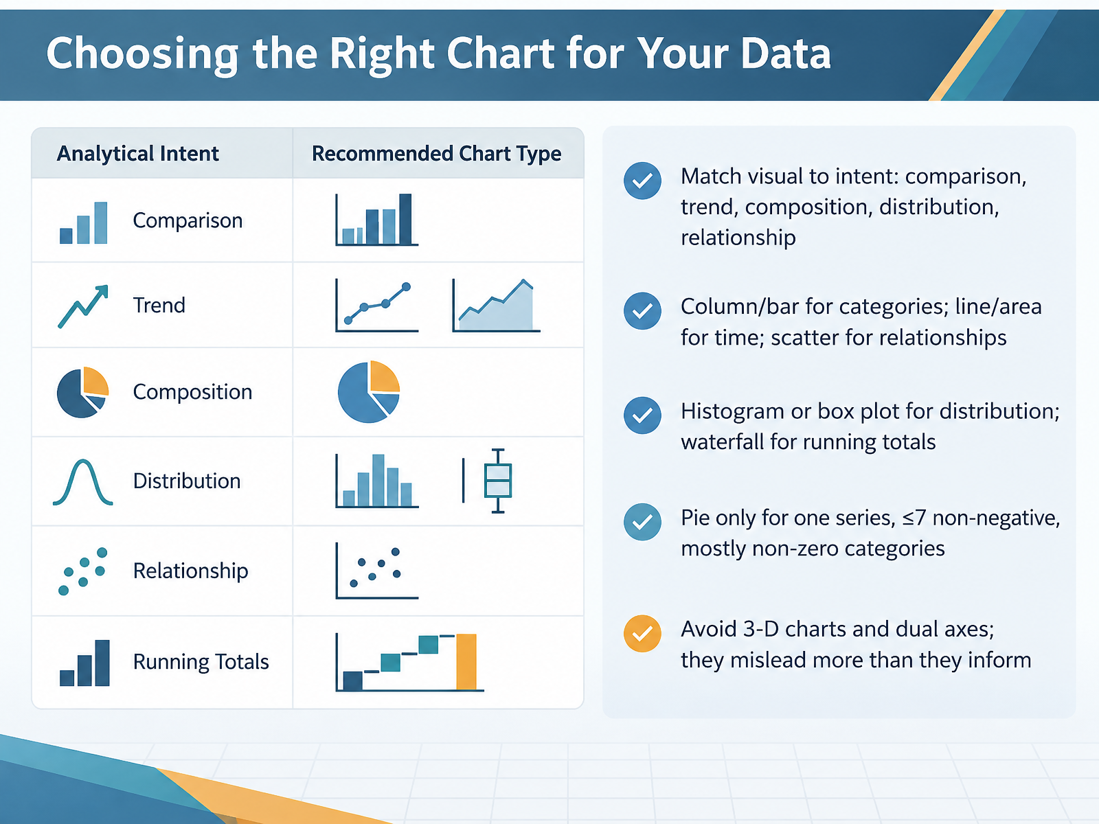
- 02Choosing the Right Chart for Your DataNow let's talk about picking the right chart. Before you touch the Insert tab, ask one question. What is my data actually saying? Your answer falls into five intents. Comparison, trend, composition, distribution, or relationship. Get that right, and the chart type almost picks itself. Comparing categories? Use a column or bar chart. Show change over time with a line or area chart. Testing whether two variables move together? That's a scatter chart. Looking at how values spread out? Use a histogram or a box and whisker plot. Tracking a running total with gains and losses? A waterfall chart handles that cleanly. Pie charts are the ones people misuse most. Only use one when you have a single data series, seven or fewer categories, no negative values, and almost no zeros. And skip the 3D charts and dual axes. They look impressive, but they mislead more than they inform. Pick the chart that answers your question, nothing fancier. Next, we'll build your first chart step by step, starting with your data range and the Insert menu.
 support.microsoft.comsupport.microsoft.comsupport.microsoft.com+22 min
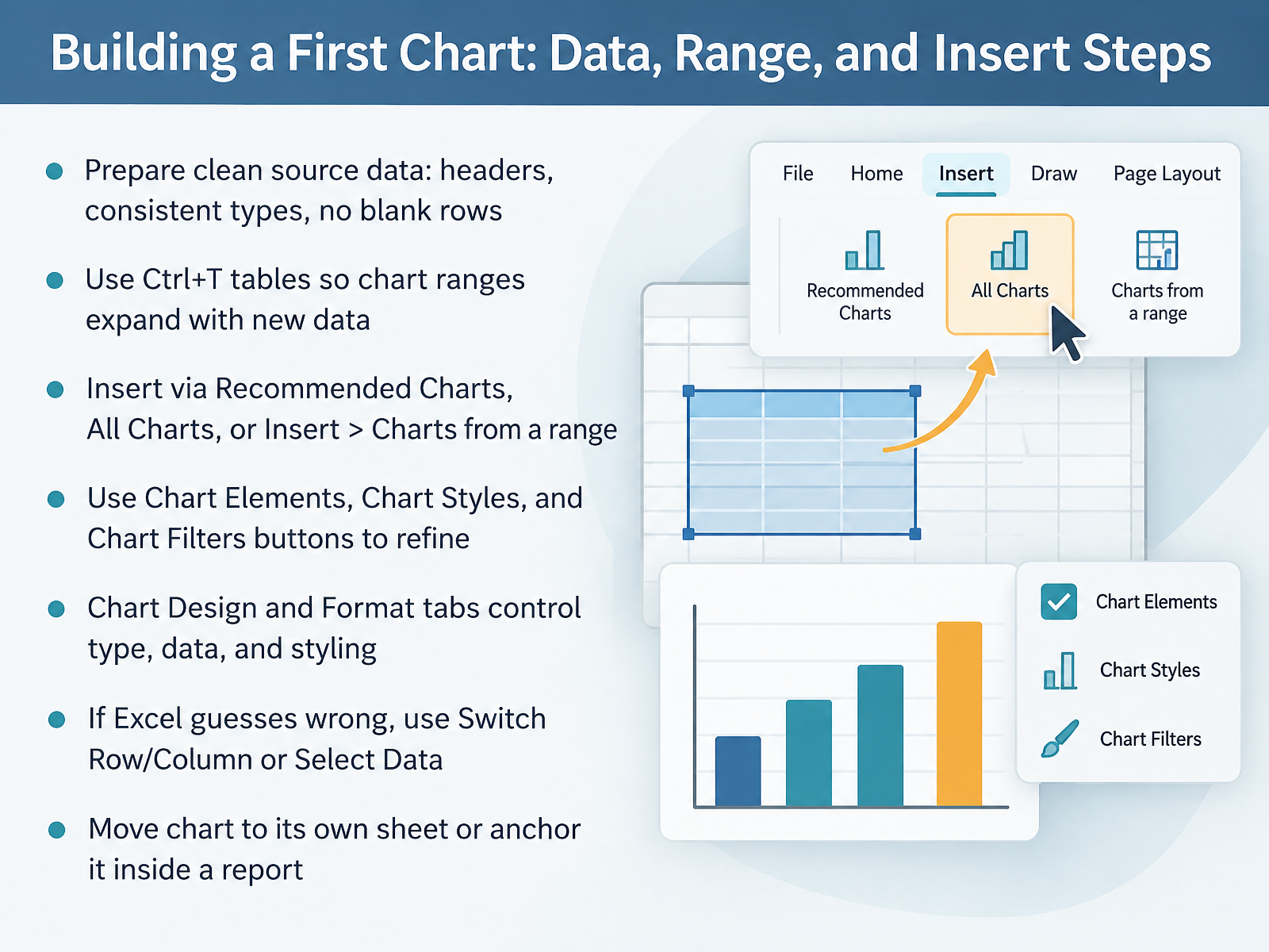
 - 03Building a First Chart: Data, Range, and Insert StepsNow let's build your first chart, starting with the data itself. Before you insert anything, make sure your source range is clean. Put a clear header in the first row. Keep each column one consistent type, like all dates or all numbers. Remove any blank rows inside the range. Next, select your data and press Control plus T to create an Excel table. Tables matter because the chart range expands automatically as you add new rows. Now insert the chart. Go to the Insert tab, then Recommended Charts for Excel's suggestions, or click All Charts to browse every type yourself. If you already know what you want, use Insert, then the Charts group. Once the chart appears, use the three buttons at its upper right corner. Chart Elements adds titles and labels. Chart Styles changes the look. Chart Filters controls what data shows. For deeper control, work on the Chart Design and Format tabs. They handle chart type, source data, and styling. If Excel guesses the layout wrong, click Switch Row over Column, or open Select Data to fix the series directly. Finally, decide where the chart lives. You can move it to its own sheet, or anchor it inside a report. Clean data, a table range, and the right insert path get you a chart that is ready for decisions. Next, we will make that chart clearer with formatting for clarity, covering titles, axes, labels, and color.
 support.microsoft.comsupport.microsoft.comsupport.microsoft.com+22 min
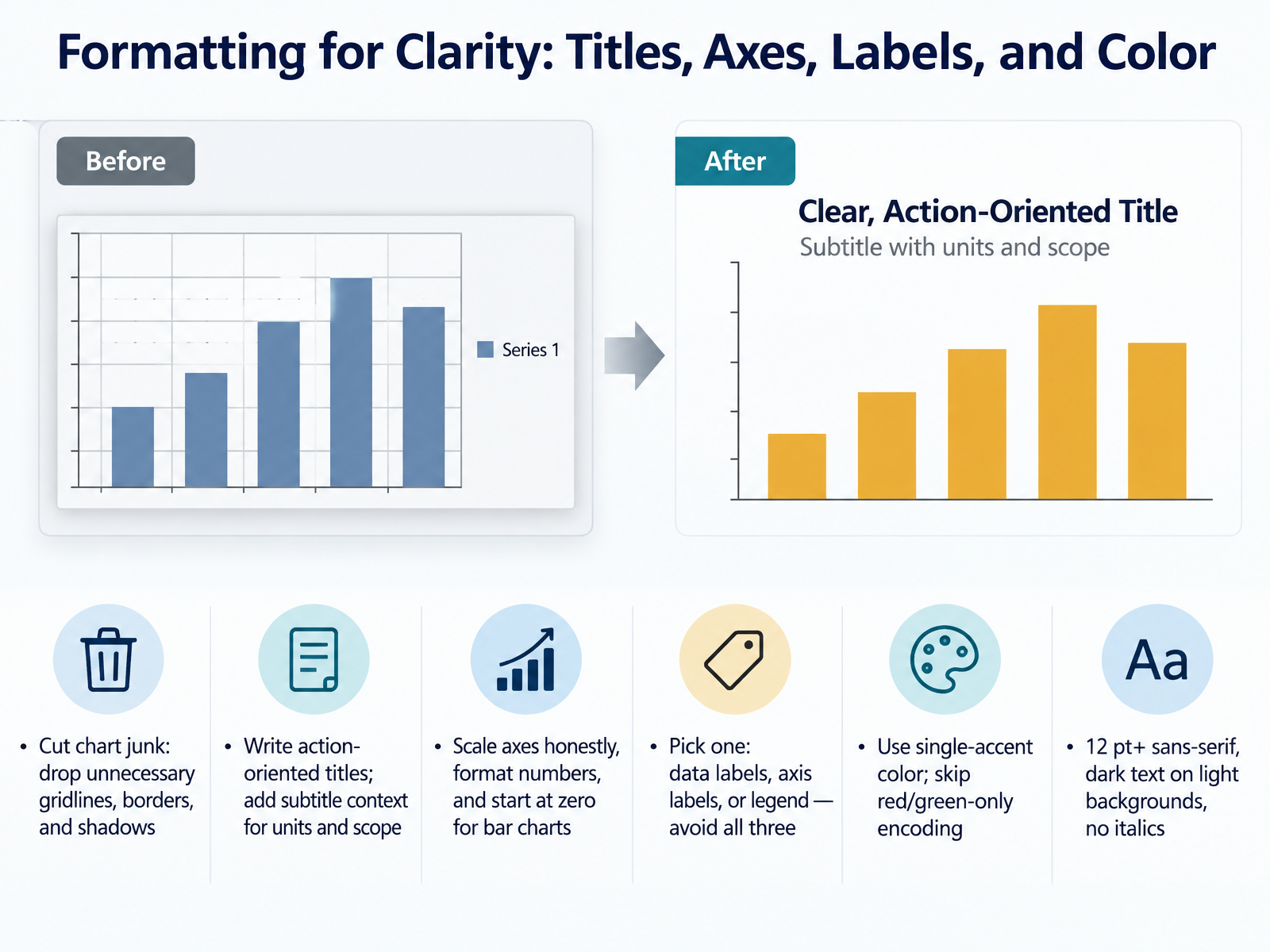
 - 04Formatting for Clarity: Titles, Axes, Labels, and ColorNow let's clean up the formatting so your chart reads clearly in seconds. Start by cutting chart junk. Delete gridlines you don't need, plus borders and shadows. Next, write an action-oriented title. Instead of quarterly sales, say Sales grew twelve percent in the second quarter. Add a subtitle for units and scope, like revenue in thousands, North America only. Now scale your axes honestly. Start bar charts at zero, and format numbers so they're easy to read. Then pick one label style: data labels, axis labels, or a legend. Avoid using all three at once. For color, use a single accent color against neutral gray, and skip red and green together, since colorblind viewers can't separate them. Finally, use a sans-serif font at twelve points or larger. Keep dark text on light backgrounds, and avoid italics. That's it for clarity basics. Next up: Colorblind-Safe and Accessible Chart Formatting.
 support.microsoft.comsupport.microsoft.comsupport.microsoft.com+22 min
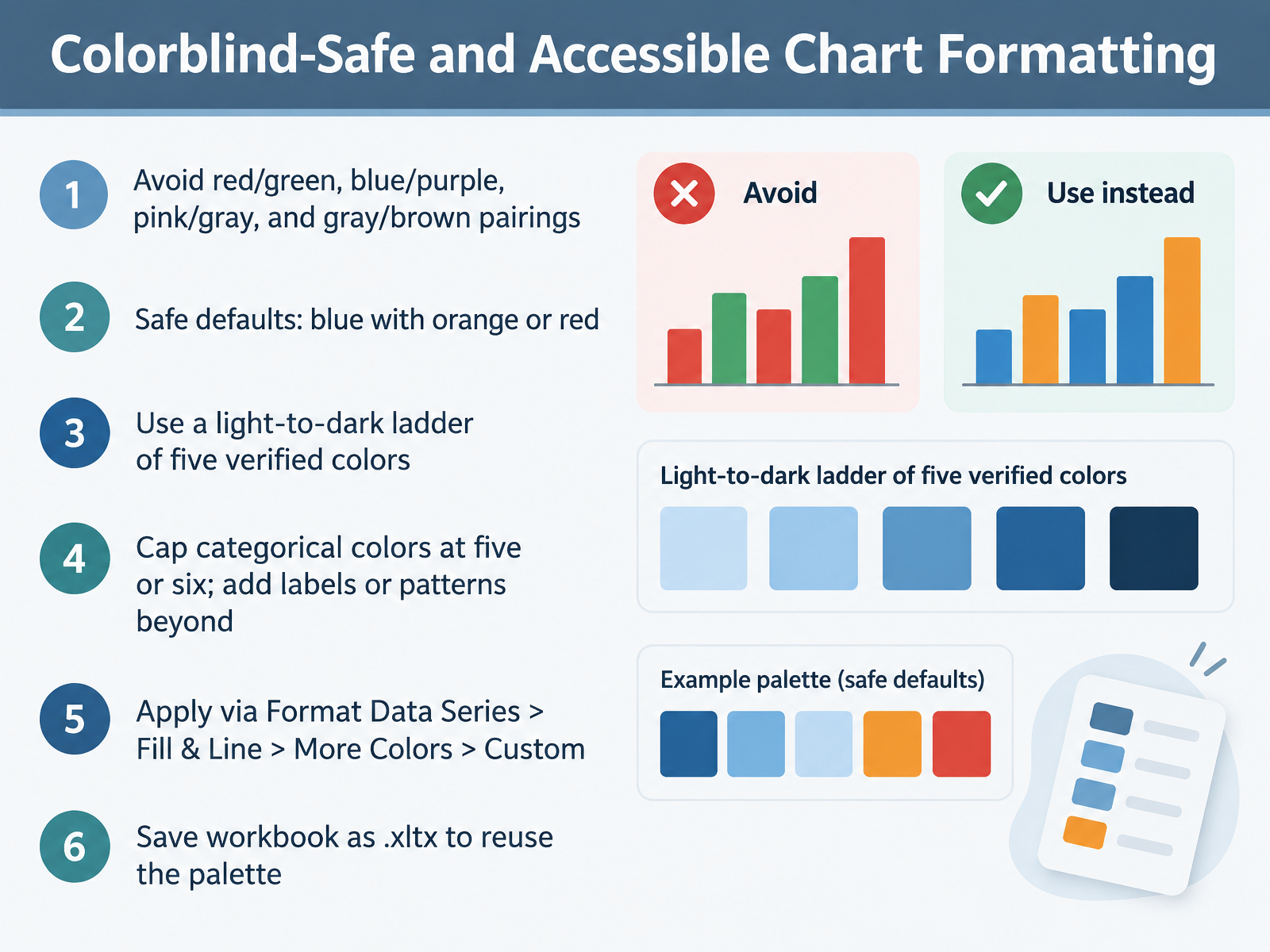
 - 05Colorblind-Safe and Accessible Chart FormattingNow that your chart types are set, let's make the colors readable for everyone. Start by avoiding the problem pairs: red with green, blue with purple, pink with gray, and gray with brown. They look distinct to you, but they collapse for many readers. Safe defaults are simple: blue with orange, or blue with red. For up to five categories, use a light-to-dark ladder of verified colors, because color vision deficiency preserves lightness, not hue. Cap categorical colors at five or six. If you need more series, add direct labels or patterns instead of hunting for another color. To apply a color, click a data series, then go to Format Data Series, Fill and Line, More Colors, then Custom. Type the hex value or the RGB numbers. Repeat for each series. When the palette is right, save the workbook as an Excel template, the x l t x format, so every new chart inherits it. Next, we will look at combo charts, secondary axes, and comparative views.
 ucl.ac.ukdata.europa.eucolorblind.org+22 min
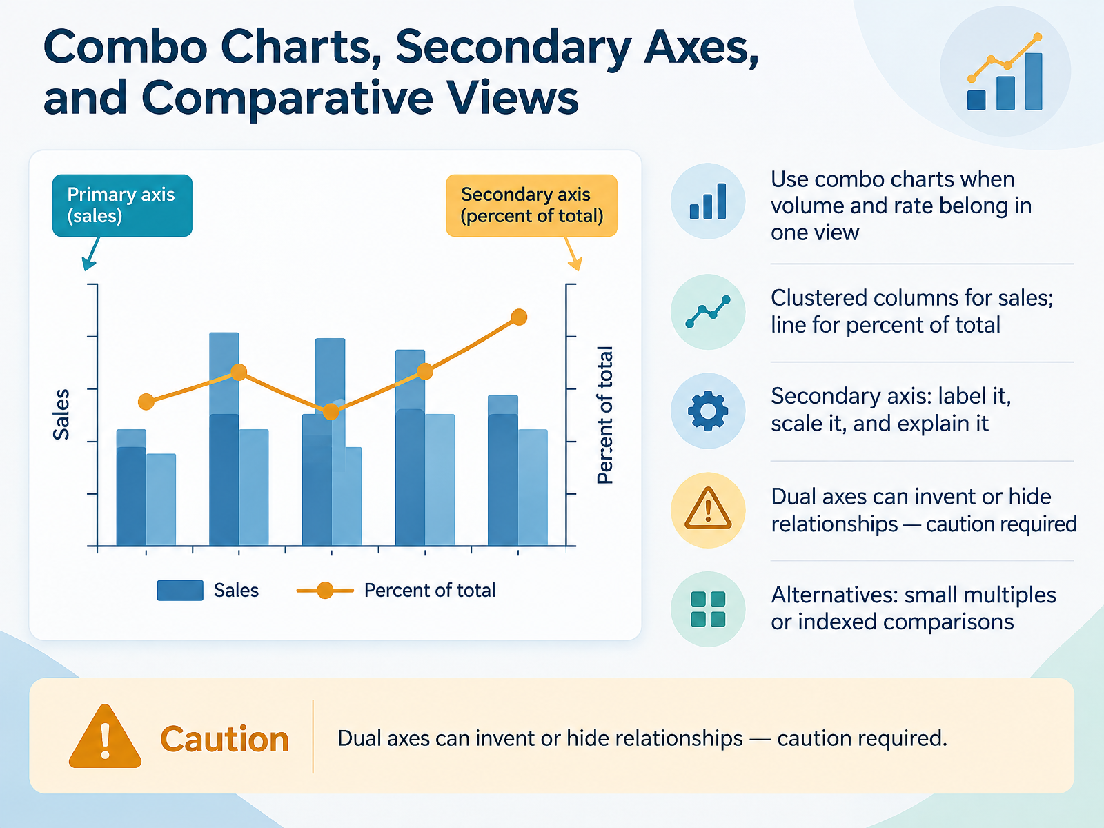
 - 06Combo Charts, Secondary Axes, and Comparative ViewsLet's move on to combo charts, secondary axes, and comparative views. Use a combo chart when volume and rate belong in one view. A practical example is clustered columns for sales, paired with a line for percent of total. In Excel, create the PivotChart, choose Combo, set sales to Clustered Column, and set percent of total to Line with the Secondary Axis box checked. Then label that secondary axis, scale it deliberately, and explain it in the chart title or a text note. One caution: dual axes can invent or hide relationships, so only use them when the two measures truly need different scales. If the comparison feels forced, choose an alternative, such as small multiples or an indexed comparison where every series starts at one hundred. That keeps the story honest and easy to read.
 spreadsheetplanet.comsupport.microsoft.comexceldemy.com+21 min
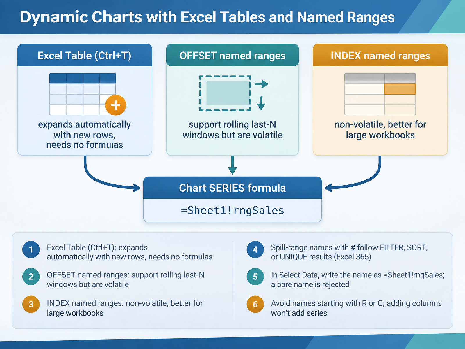
 - 07Dynamic Charts with Excel Tables and Named RangesNow let's make those charts update themselves. Start with the simplest option: the Excel Table. Press Control plus T, confirm the range, and any row you type directly beneath it joins the Table. Your chart plots the new point immediately, with no formulas. Next, named ranges. OFFSET names give you a rolling last-N window, say the last twelve months, but OFFSET is volatile, so it recalculates on every workbook change. In large models, build the same range with INDEX instead. INDEX is non-volatile and easier on performance. In Excel 365, you can also name a spill range with the hash symbol. Define a name that points to the result of FILTER, SORT, or UNIQUE, and the chart follows that spill as it grows and shrinks. One critical detail: in the Select Data dialog, type the name qualified with the sheet, like equals Sheet1 exclamation rngSales. A bare name gets rejected. Also avoid names starting with R or C, and remember that adding columns will not add series to a chart built on names. Next up, charts driven by dynamic arrays and FILTER.
 2 min
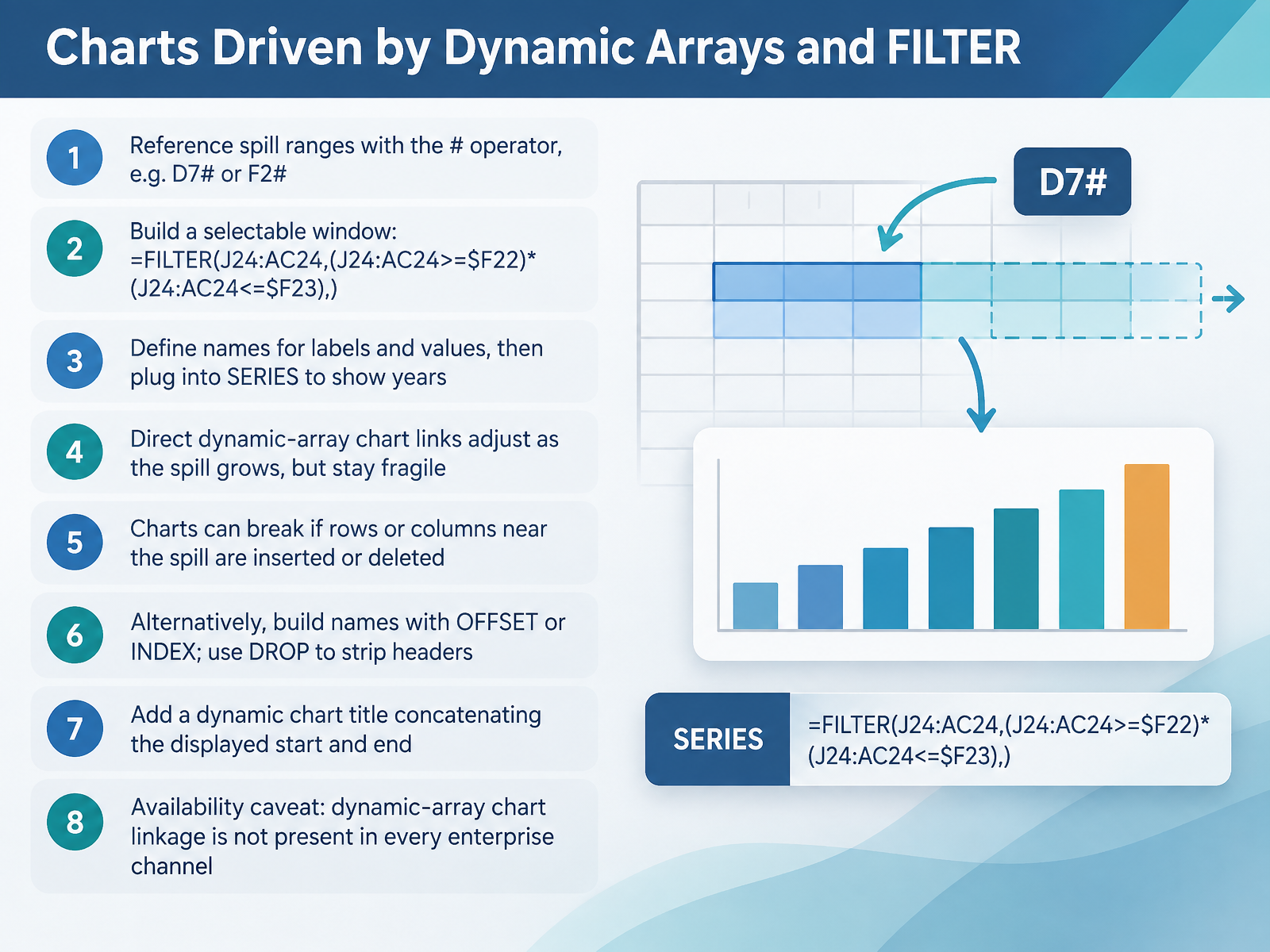
2 min - 08Charts Driven by Dynamic Arrays and FILTERNow let's connect dynamic arrays to your charts. In Excel 365, you can point a chart at a spill range using the hash operator, like D7 hash or F2 hash. That reference expands and contracts with the spill. To build a selectable window, use FILTER on your year row with two conditions, greater than or equal to your start year, and less than or equal to your end year. That gives you a moving timeline. For full control, define names for your labels and values, using the hash reference in Name Manager, then plug those names into the SERIES formula so the years display correctly. Here is the catch. Direct dynamic array links adjust as the spill grows, but they are fragile. Insert or delete rows or columns near the spill, and the chart can break. As an alternative, build names with OFFSET or INDEX, and use DROP to strip headers. Finally, add a dynamic chart title that concatenates your displayed start and end years. One caveat, dynamic array chart linkage is not present in every enterprise channel, so test before you rely on it. Next, we move on to PivotCharts, Slicers, and Timelines.
 2 min
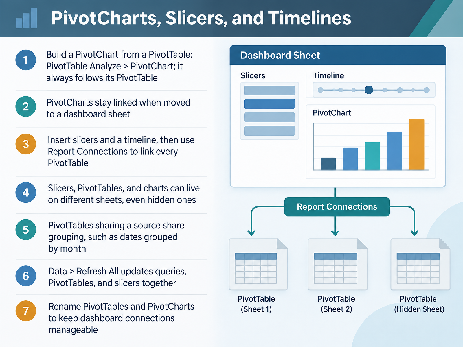
2 min - 09PivotCharts, Slicers, and TimelinesNow let's turn those PivotTables into an interactive dashboard with PivotCharts, slicers, and timelines. Start with a cell inside your PivotTable. Go to PivotTable Analyze, then click PivotChart and choose your chart type. A PivotChart is always tied to its PivotTable. Move it to your dashboard sheet and it stays linked. Next, insert a slicer from the same PivotTable Analyze tab. By default, it filters only the PivotTable it came from. Right-click the slicer and choose Report Connections. Check every PivotTable you want it to control. Do the same for a timeline if you have dates. A single slicer can drive multiple charts at once. PivotTables that share a source also share grouping, so if you group dates by month in one, the others follow. Keep in mind, slicers, PivotTables, and charts can live on different sheets. And when your source data changes, use Data, then Refresh All to update queries, PivotTables, and slicers together. One pro tip, rename each PivotTable and PivotChart. That makes your Report Connections list much easier to manage. Next, we'll look at Sparklines, Conditional Formatting, and In-Cell Visuals.
 spreadsheetplanet.comsupport.microsoft.comexceldemy.com+22 min
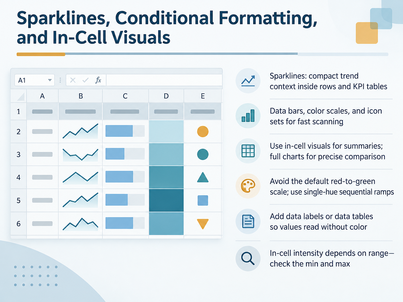
 - 10Sparklines, Conditional Formatting, and In-Cell VisualsLet's move on to sparklines, conditional formatting, and in-cell visuals. Sparklines give you compact trend context inside rows and KPI tables. Data bars, color scales, and icon sets help people scan numbers fast. One rule keeps these features honest. Use in-cell visuals for summaries, and full charts for precise comparison. Here's the part most people get wrong. Avoid the default red-to-green scale, because red and green collapse for many readers. Instead, use a single-hue sequential ramp, so lightness carries the meaning. Also, add data labels or a data table so values still read without color. Finally, remember that in-cell intensity depends on the range. Check the minimum and maximum values first, because Excel scales color to those bounds. Fix the range when you need fair comparison across rows. If your color needs meaning beyond a trend, keep a small caption that explains it aloud in words. Get these right, and your KPI tables become readable at a glance for everyone. Next, we'll pull it together in designing a one-page dashboard in Excel.
 ucl.ac.ukdata.europa.eucolorblind.org+22 min
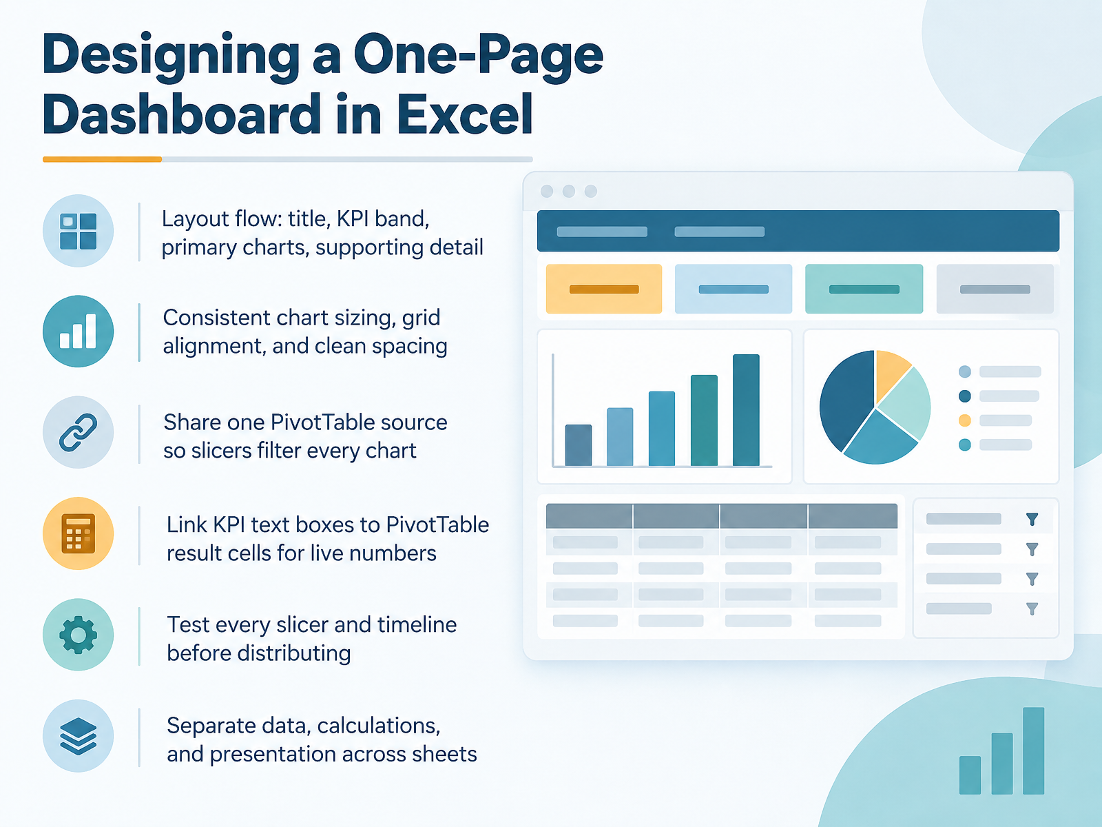
 - 11Designing a One-Page Dashboard in ExcelNow let's design the one-page dashboard itself. Start with layout flow: a title at the top, then a KPI band, primary charts in the middle, and supporting detail below. Keep consistent chart sizing, align everything to a grid, and use clean spacing. Next, build all your PivotTables from one shared source. Then right-click a slicer, choose Report Connections, and check every PivotTable so one slicer filters every chart. Link KPI text boxes to PivotTable result cells so the numbers update live. Before you distribute, test every slicer and timeline. Watch for PivotTables that overlap or throw errors. And separate your data, calculations, and presentation across sheets. That structure keeps the dashboard stable when the data changes. Up next, we'll look at Common Pitfalls and Misleading Chart Patterns.
 spreadsheetplanet.comsupport.microsoft.comexceldemy.com+22 min
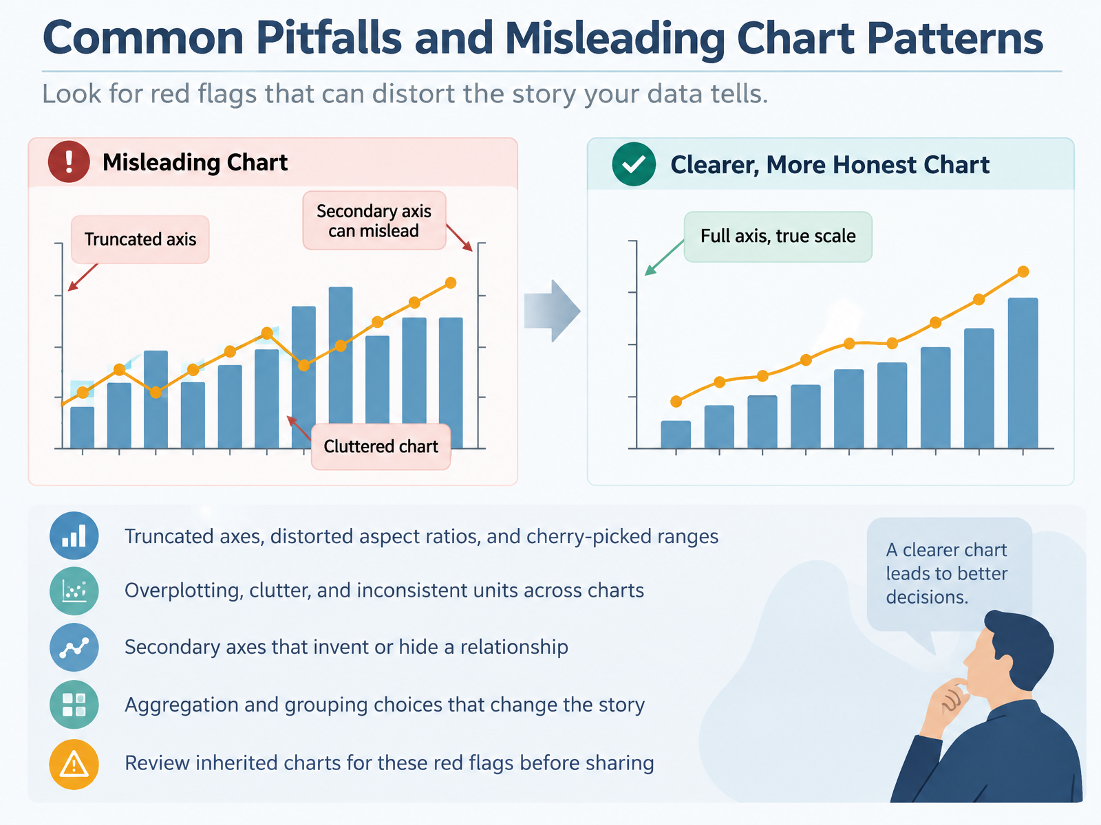
 - 12Common Pitfalls and Misleading Chart PatternsEven a clean-looking chart can quietly mislead, so let's talk about the pitfalls that cause it. First, watch your axis. A truncated axis that starts at ninety instead of zero makes small changes look dramatic. Distorted aspect ratios and cherry-picked date ranges do the same thing. Squeeze the timeline or stretch the height, and the trend changes. Second, reduce clutter. Overplotting too many series hides the pattern, and inconsistent units across charts, one in thousands and another in millions, breaks the comparison. Third, question every secondary axis. Pairing two different scales can invent a relationship that is not really there, or hide one that is. Fourth, check your aggregation. Grouping categories together, or changing the sort order, can flip the entire story. Before you share, open any inherited chart and hunt for these red flags. Ask what the axis really shows, what got grouped, and which units are in play. Fixing one bad axis often does more for clarity than any color scheme. Next, let's look at accessibility and data storytelling in Excel.
 support.microsoft.comsupport.microsoft.comsupport.microsoft.com+22 min
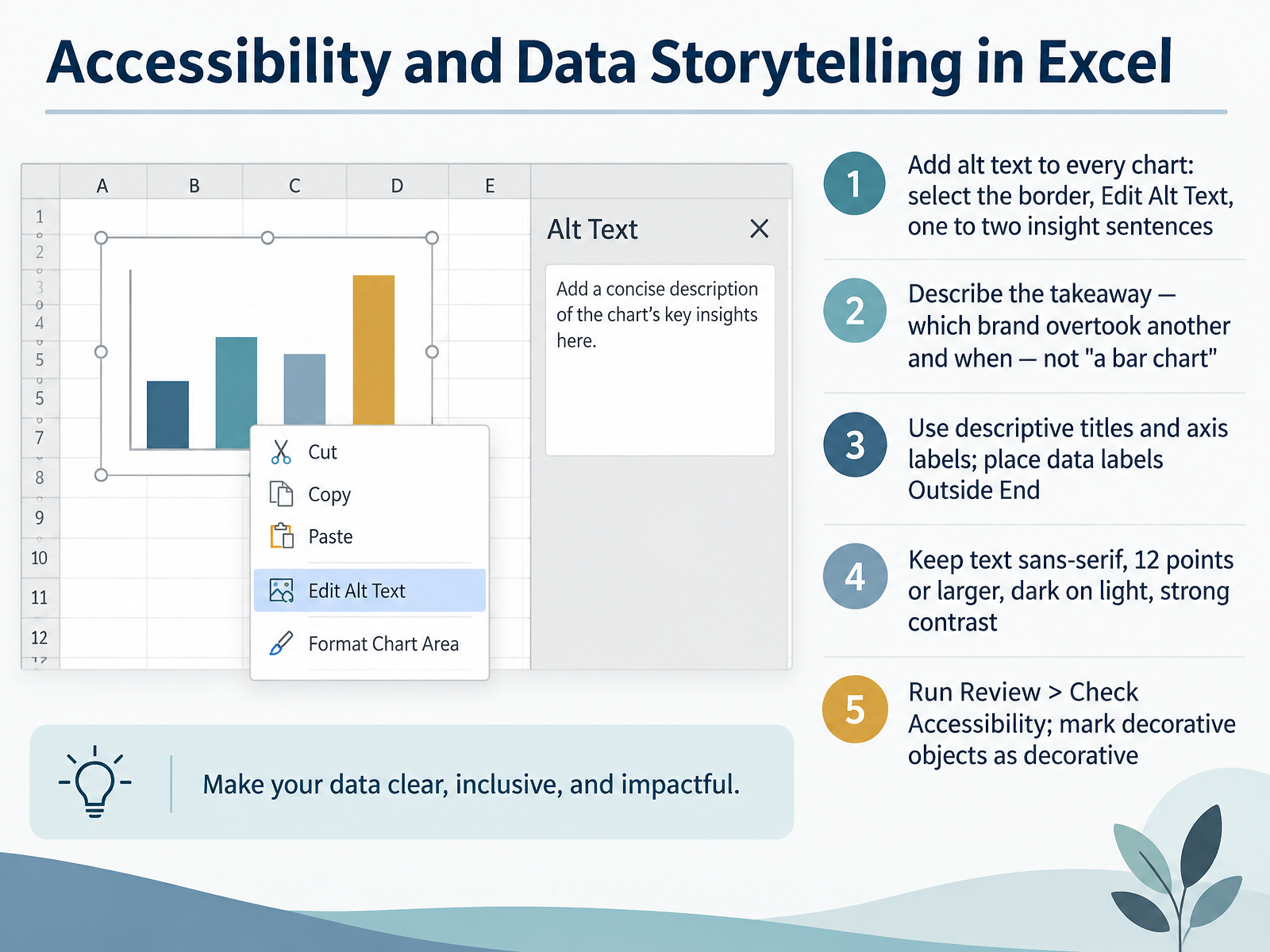
 - 13Accessibility and Data Storytelling in ExcelNow let's make your charts work for everyone. Start with alt text on every chart. Select the chart border, right-click, and choose Edit Alt Text. Write one or two insight sentences. Describe the takeaway, not the object. Say that Brand A overtook Brand B in July, not that this is a bar chart. Next, use descriptive titles and axis labels. Then add data labels. Go to Design, Add Chart Element, Data Labels, and pick Outside End. Keep your text readable. Use a sans-serif font at twelve points or larger. Use dark text on a light background for strong contrast. Finally, run Check Accessibility from the Review tab. It flags missing alt text and low contrast. If an object is purely decorative, mark it as decorative. That keeps screen reader output clean. Accessible charts are clearer charts, and your insights land with every audience. Next, we put these skills into practice. Hands-On Practice and Reporting Workflow Wrap-Up.
 support.microsoft.comsupport.microsoft.comsupport.microsoft.com+22 min
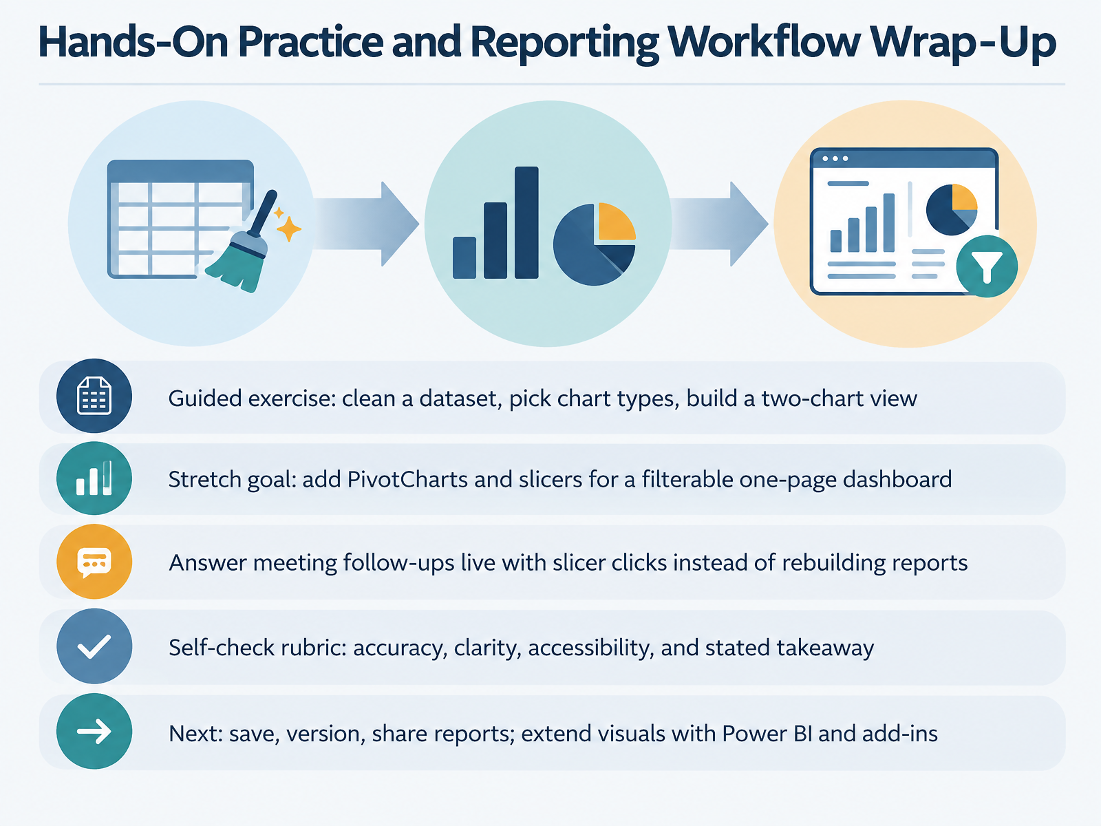
 - 14Hands-On Practice and Reporting Workflow Wrap-UpLet's finish with one complete reporting workflow you can run on your own data. First, clean your dataset, then choose chart types that match your questions, and build a two-chart view. For your stretch goal, add PivotCharts and slicers to create a filterable one-page dashboard. This pays off in meetings. When someone asks a follow-up, click a slicer instead of rebuilding the report. So test before you ship. Run your self-check rubric: accuracy, clarity, accessibility, and a stated takeaway. One example: in the Alt Text pane, describe the insight, not the shape. For accessibility, give each chart a clear title, labeled axes, and legible data labels, then confirm the contrast holds from the back of the room. Next, save and version your file, share it, then extend your visuals with Power BI or add-ins. You now have a repeatable Excel reporting workflow. Thank you for working through this course. Keep practicing, and build charts that make decisions easier.
 support.microsoft.comsupport.microsoft.comsupport.microsoft.com+22 min
Take the deck with you
Download this course as a file — free, no sign-up needed.
- PDF handoutEvery slide page, ready to print or share.15 pages · 3.2 MBDownload
- Narrated PowerPointThe deck that presents itself — every slide carries the digital human's narration video.15 pages · 25.3 MBDownload
- PowerPoint slidesThe full deck as a .pptx — open it in PowerPoint, Keynote, or Google Slides.15 pages · 3.0 MBDownload
Free to use in your own training — please keep the PersonWise credit page at the end.
Have your own deck? Turn it into a course
Sources consulted
Web sources consulted while building this course.
- Available chart types in Office - Microsoft Support — support.microsoft.com
- Create a chart with recommended charts | Microsoft Support — support.microsoft.com
- Create a chart from start to finish - Microsoft Support — support.microsoft.com
- Charts: Create and customize Excel charts with Office Scripts - Office Scripts | Microsoft Learn — learn.microsoft.com
- XlChartType enumeration (Excel) — learn.microsoft.com
- Video: Create more accessible charts in Excel | Microsoft Support — support.microsoft.com
- Add alternative text to a shape, picture, chart, SmartArt graphic, or other object | Microsoft Support — support.microsoft.com
- Accessibility best practices with Excel spreadsheets | Microsoft Support — support.microsoft.com
- Everything you need to know to write effective alt text | Microsoft Support — support.microsoft.com
- CMS Section 508 Guide for Microsoft Excel 2013 — cms.gov
- Guidelines for Colour-Blind Friendly Data — ucl.ac.uk
- Accessible colour palettes - The European Data Portal — data.europa.eu
- 5 tips on designing colorblind-friendly visualizations - Colorblind Association — colorblind.org
- Color Blind Friendly Palette for Excel, Google Sheets & Tableau — rgblind.com
- 5 Tips on Designing Colorblind-Friendly Visualizations - Tableau — tableau.com
- Connect Slicer to Multiple Pivot Tables (Step-by-Step) — spreadsheetplanet.com
- Create and share a Dashboard with Excel and Microsoft Groups | Microsoft Support — support.microsoft.com
- Dynamic Dashboards with PivotTables & Slicers in Excel - ExcelDemy — exceldemy.com
- Create Interactive Dashboard in Excel (Free Download) — spreadsheetplanet.com
- SLICERS & DASHBOARDS | SPREADSHEET SOLUTIONS — excelacademy.nl