Begin
14 pages · ~28 min
UI Design Fundamentals
This training introduces core UI design principles, including layout, typography, color, and usability, for aspiring designers seeking to create effective digital interfaces.
A digital instructor presents all 14 pages. Hold “Ask” at any point and ask out loud — the answer comes from this course. No sign-up needed.
What you’ll learn
- 01UI Design FundamentalsWelcome to UI Design Fundamentals. I'm glad you're here. Over the next few minutes, we'll build a shared vocabulary and a practical toolkit for creating interfaces that feel clear, trustworthy, and easy to use. Let's start with a simple distinction. UI, or user interface, is the visual and interactive layer you see and touch. Buttons, colors, spacing, navigation. UX, or user experience, is the entire journey, from first click to completed task. A product can look polished and still confuse people if the flow is broken. And a logically sound flow can feel untrustworthy if the interface seems dated or unclear. As a UI designer, you deliver the concrete pieces: components, screens, interaction states, and responsive specifications. These decisions directly affect user trust, task completion, and business outcomes. By the end of this course, you'll be able to apply core principles, build accessible components, and evaluate interfaces with confidence, even under tight deadlines. Next, we'll look at the core principles of effective interface design.coursera.orgstan.visionscallar.in+22 min
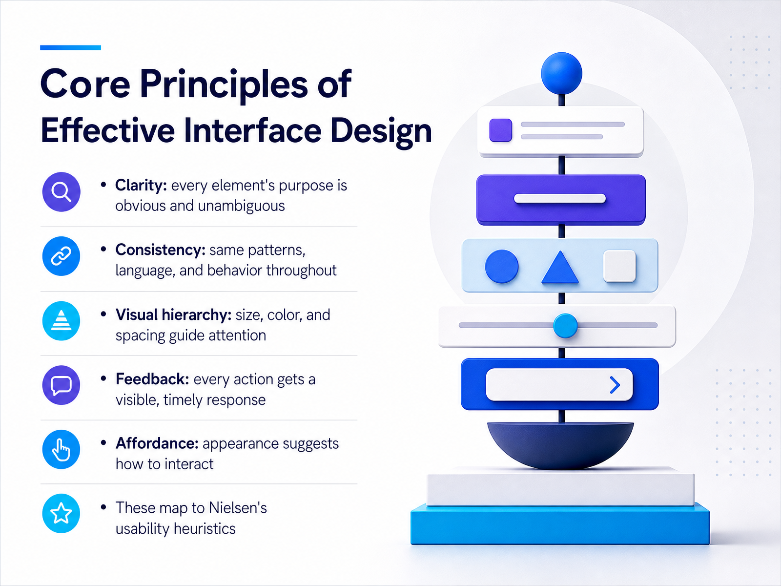
- 02Core Principles of Effective Interface DesignLet's ground ourselves in five core principles that shape effective interfaces. Think of these as the lenses you'll use to evaluate every screen you design or review. First is clarity. Every element, from a button label to an icon, should communicate its purpose without ambiguity. Choose 'Save draft' over 'Submit' because it describes the exact action. Next is consistency. Use the same patterns, language, and behavior throughout the product. If clicking a card expands it in one view, it should expand everywhere. This predictability lets users focus on their tasks, not on relearning your interface. Third is visual hierarchy. Guide attention through size, color, and spacing. Make the primary action visually dominant and let secondary actions sit quieter. Your content hierarchy should reflect what the user cares about most. Fourth is feedback. Every action needs a visible, timely response. A button press should show a state change, a form submission needs a success or error message, and long operations need progress indicators. Silent failures erode trust. Fifth is affordance. An element's appearance should suggest how to interact with it. Buttons should look clickable, links distinct from regular text, and drag handles grabbable. These principles map directly to Nielsen's usability heuristics, the industry standard for evaluating interface usability. If you master these five, you'll be able to diagnose most usability issues you encounter. Next, we'll explore how affordances, signifiers, and feedback work together to make interactions feel intuitive.
 uxpin.comuiuxatlas.comfigma.com+22 min
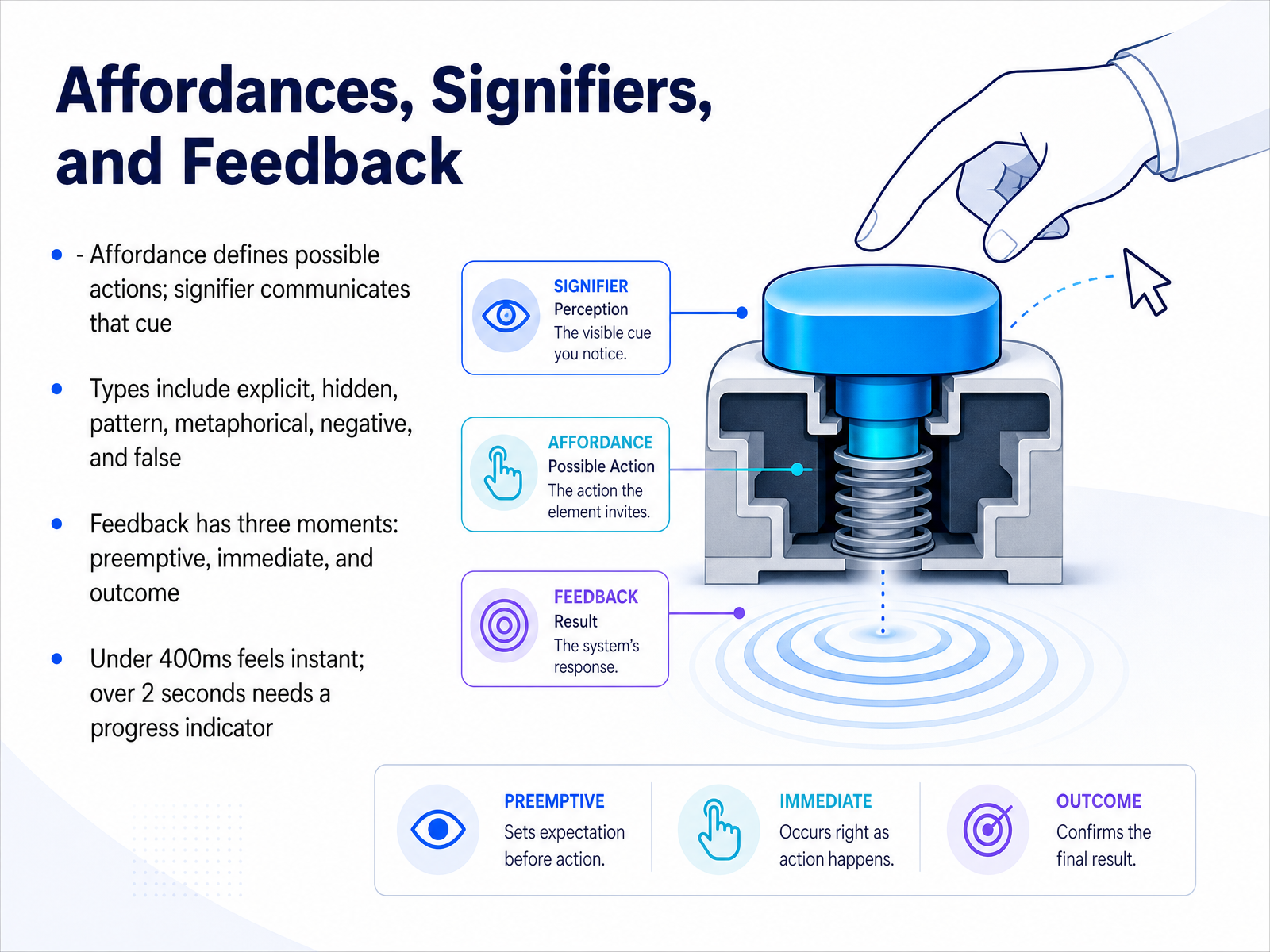
 - 03Affordances, Signifiers, and FeedbackNow let's get practical about how users understand what they can do on a screen. There are three ideas working together here. An affordance is the possible action itself. A signifier is the clue that communicates that action. And feedback is what happens after the user takes it. Think of a door. The flat metal plate affords pushing. A label saying Push is the signifier. The door swinging open is the feedback. In an interface, a raised button affords clicking, its shadow and label signify that, and the color change when you press it confirms the action. You will also encounter six common types of affordances. Explicit ones are obvious, like a clearly labeled button. Hidden ones are revealed only by interaction, like a dropdown menu. Pattern affordances follow conventions, like underlined links. Metaphorical ones use real world objects, like a trash can icon for delete. Negative affordances show that an action is unavailable, like a grayed out button. And false affordances are design failures, things that look clickable but do nothing. Feedback also has three moments. Preemptive feedback sets expectations before an action, like a warning that says this will delete forty seven items. Immediate feedback confirms the system received the click, like a button depress. Outcome feedback delivers the result, like a success message. One useful timing rule. Anything under four hundred milliseconds feels instant. Over two seconds needs a progress indicator. Keep these three layers in mind as we move into visual hierarchy and layout.
 uxpin.comuiuxatlas.comfigma.com+22 min
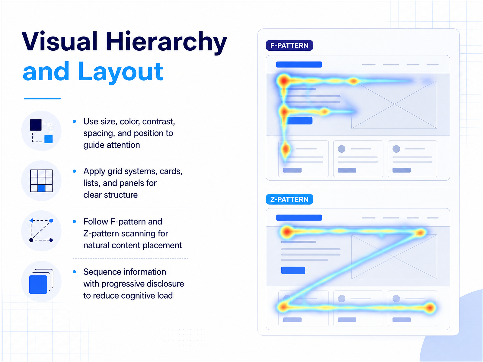
 - 04Visual Hierarchy and LayoutLet's talk about visual hierarchy and layout. Hierarchy is how you tell users what to look at first, second, and third, using size, color, contrast, spacing, and position. Think of a primary button. It should be larger and more colorful than a secondary action. The most important content carries the most visual weight, so the eye flows naturally through the page. To create clear structure, apply grid systems, cards, lists, and panels. These tools group related items together and create alignment, making the interface feel organized and predictable, even under a tight deadline. When placing content, remember the F-pattern and Z-pattern. Users often scan in an F shape for text-heavy pages and a Z shape for more visual layouts. Position key information along those scanning paths. Also use progressive disclosure to reduce cognitive load. Instead of showing a long form all at once, reveal advanced options only when needed. Keep the initial screen simple and let users choose to see more. That way, you respect attention and guide decisions. Up next, we'll focus on color and contrast for accessible interfaces.
 uxpin.comuiuxatlas.comfigma.com+21 min
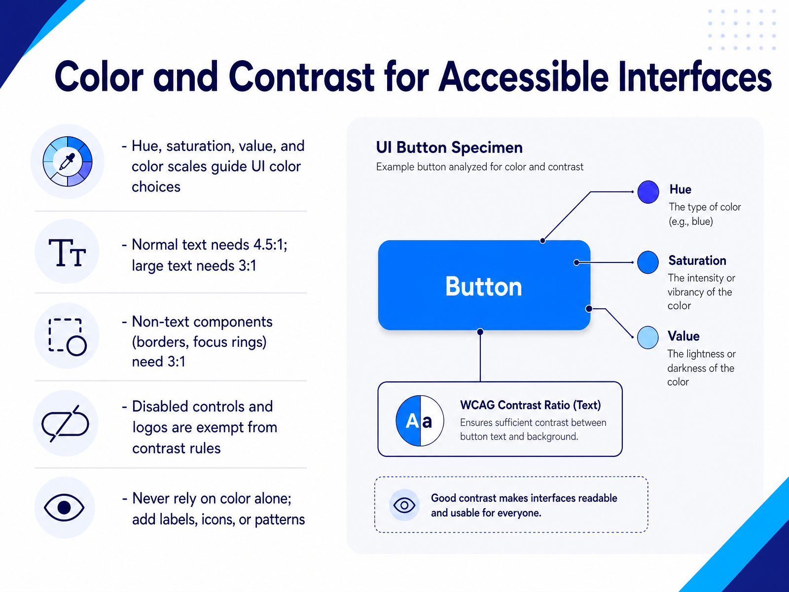
 - 05Color and Contrast for Accessible InterfacesNow let's talk about color and contrast, because accessibility is where good design either holds up or falls apart. First, understand the basics: hue, saturation, value, and your color scale. These are the building blocks that help you choose colors intentionally. When it comes to text, normal text needs a contrast ratio of at least four point five to one against its background. Large text, meaning eighteen point regular or fourteen point bold, can go down to three to one. And it is not just text. Borders, focus rings, icons that carry meaning, and chart lines all need three to one contrast. But remember the exemptions: disabled controls and logos do not have to meet these numbers. Practically, this often means choosing a slightly darker text gray instead of a pale one, or adding a visible border to an input field. A very common mistake is relying on color alone to show state, like a red border for an error. Always add a label, an icon, or a pattern. A user with color vision deficiency may not see the red, but they can read the word Error. With that mindset in place, let's move on to typography and readability.
 w3.orgwebaim.orga11yflow.dev+22 min
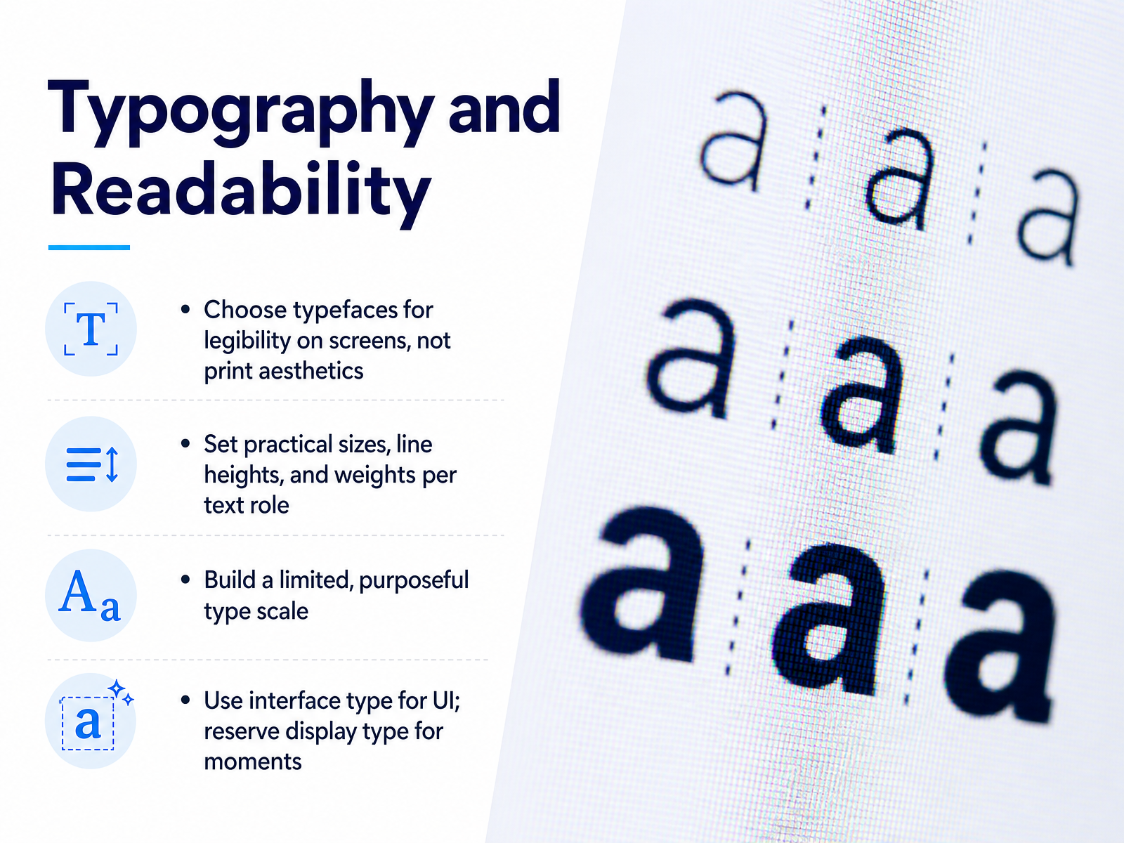
 - 06Typography and ReadabilityLet’s get practical about typography and readability. On screens, choose typefaces for legibility first, not print aesthetics. Look for open letterforms, generous spacing, and clear distinctions between similar characters. Set practical sizes, line heights, and weights based on each text role. Body text works well around fifteen to seventeen pixels on desktop, with a line height near one point five. Labels can be smaller, but keep them above twelve pixels on mobile. Build a limited, purposeful type scale. Instead of using twenty different sizes, define roughly four to six steps, then reuse them consistently. This not only improves visual hierarchy, it also speeds up handoff to developers. Reserve display type for key moments like empty states, onboarding, or major headings. For most interface elements, a neutral and highly legible UI typeface is the safer choice. A good rule of thumb is this: use display type to create personality, and interface type to keep tasks clear and efficient. Next, we’ll look at components, patterns, and interaction states, where these choices start working together.
 2 min
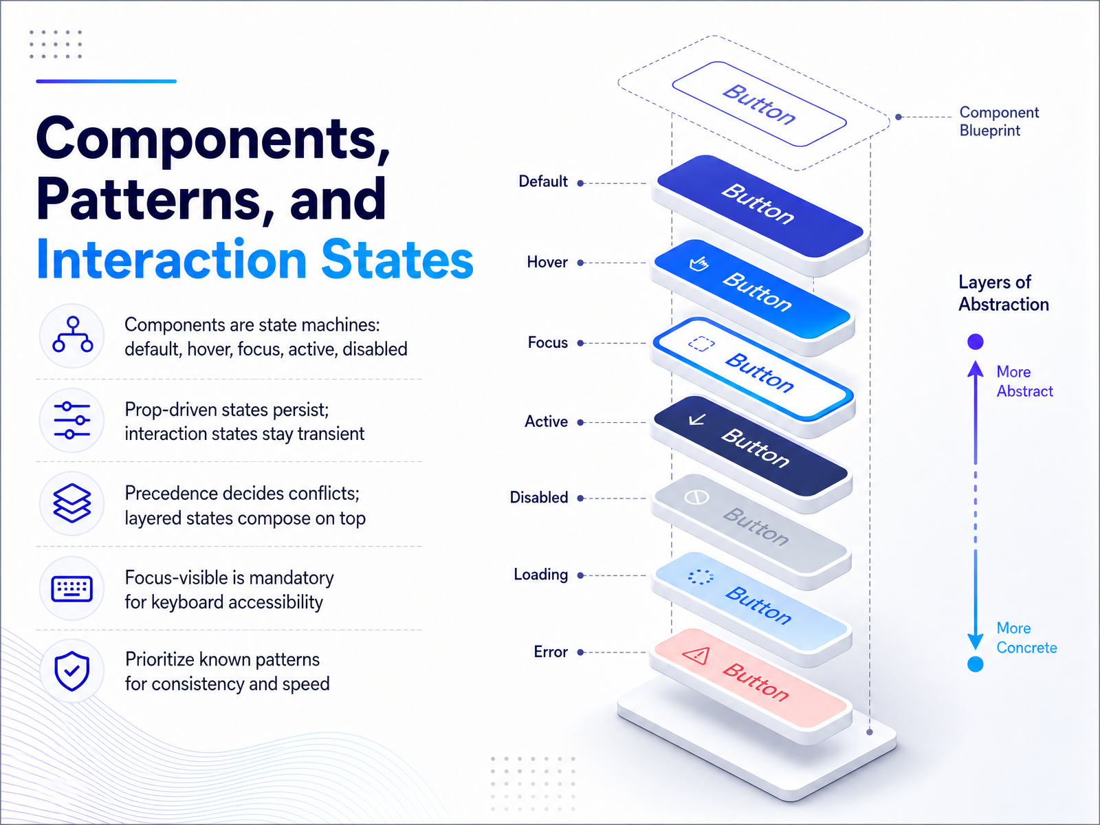
2 min - 07Components, Patterns, and Interaction StatesLet's move from inventory to behavior. A component is not a single picture. It is a small state machine. At minimum, you have the default, hover, focus, active, and disabled conditions. Each one needs a visual answer. But not all states behave the same way. Some are persistent, driven by properties like isSelected or isDisabled. They stay until the property changes. Others are transient, driven by interaction. Hover appears when the pointer enters, and disappears when it leaves. Active exists only while the button is held down. When states conflict, you need a rule. Precedence decides which non-layered state wins. Layered states, like focus, compose on top. That is how a selected item can still show a hover change without losing its selected color. One detail you cannot skip is focus visible. It is mandatory for keyboard accessibility. If someone tabs to a button, they must see where they are. Finally, rely on known patterns when you can. Standard state behavior builds consistency, and it speeds up your work. Next, we will design for the unhappy paths.
 opensource.adobe.compolaris-react.shopify.comtyrs.studio+22 min
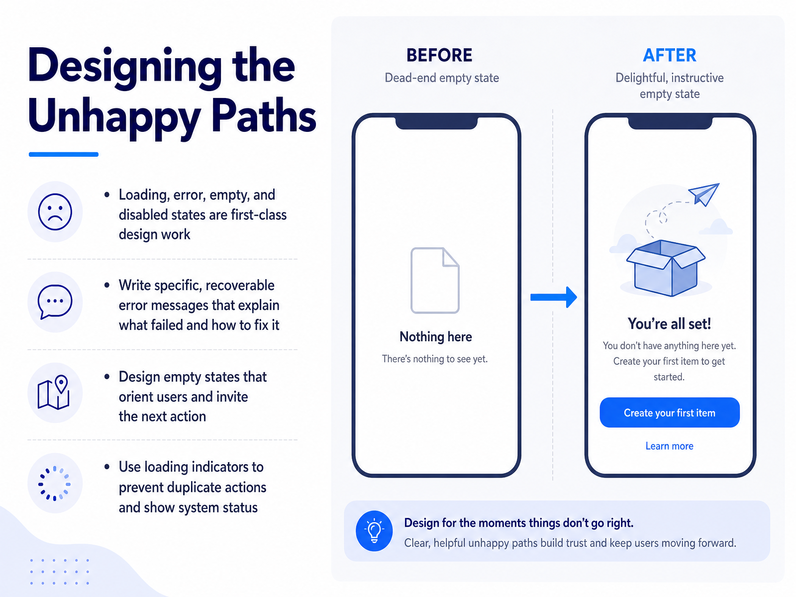
 - 08Designing the Unhappy PathsNow let's talk about a part of interface design that's easy to overlook until a user gets stuck. We often focus on the happy path, the flow where everything works. But the unhappy paths, the loading, error, empty, and disabled states, are where real users live. These moments deserve first-class design work, not afterthoughts. Start with error messages. A generic message like something went wrong leaves users with nothing to act on. Instead, write specific, recoverable copy. Tell them what failed and exactly how to fix it. For empty states, don't leave a blank screen. Orient the user and invite the next action, like a dashboard that says no projects yet followed by a create project button. And when a process takes time, show a loading indicator. This prevents duplicate clicks and confirms the system heard them. These states are not polish. They are the difference between a frustrating product and a dependable one. Up next, we'll see how design systems help you deliver these states consistently.
 opensource.adobe.compolaris-react.shopify.comtyrs.studio+21 min
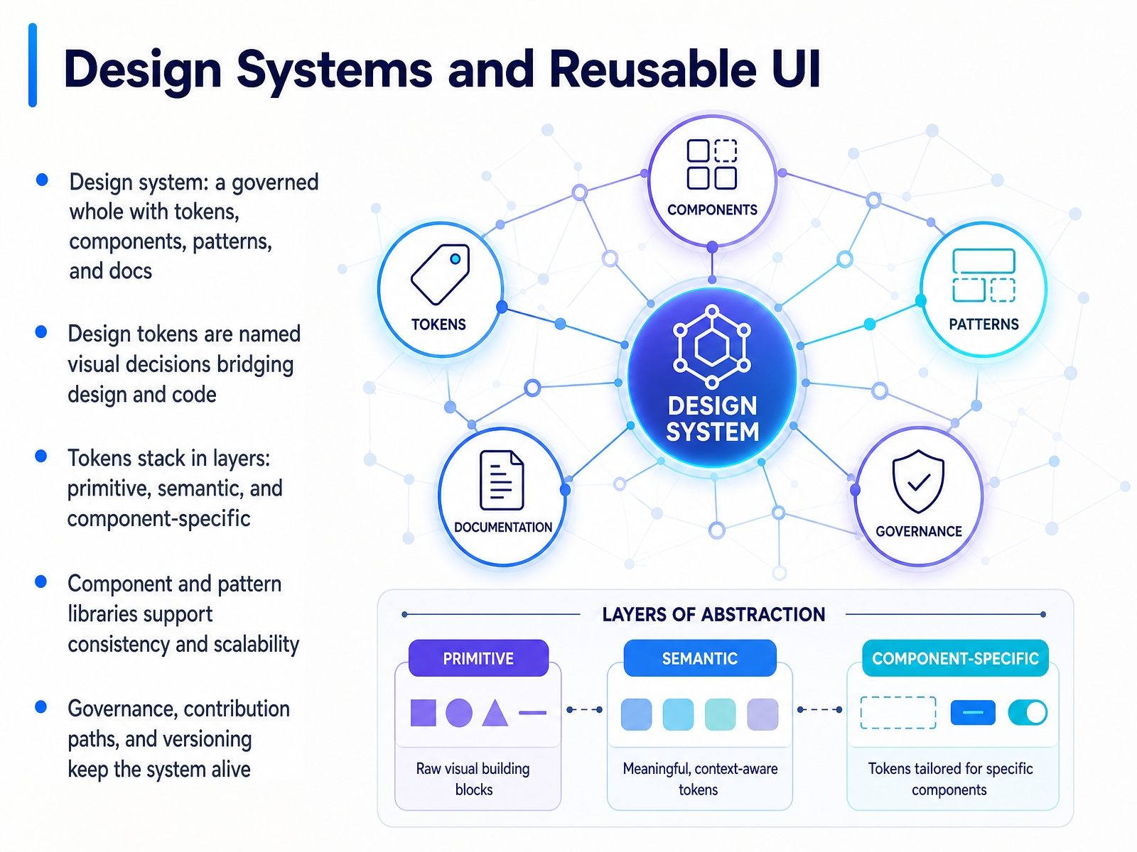
 - 09Design Systems and Reusable UINow let's talk about what holds all of these decisions together: a design system. Think of it as a governed whole that includes tokens, components, patterns, and documentation. It is not just a Figma file or a component folder. It is the living agreement that keeps everyone building the same way. At the core are design tokens. These are named visual decisions, like a brand blue stored once as color primary instead of being pasted as a raw hex value in five hundred places. Change the token, and every button and header updates at once. Tokens stack in layers. Primitive tokens define raw options, like the full color palette. Semantic tokens give those options meaning, like primary action or muted text. Component specific tokens then map those decisions to a single part, like a button's background. This layering is what lets a system scale without becoming fragile. Beyond tokens, component and pattern libraries provide ready made building blocks. But those libraries only stay healthy with governance. That means clear ownership, a contribution path that is faster than forking, and versioned releases. Without that, a system drifts and eventually dies. So choose to document the why, not just the what. Next up, we will look at responsive and mobile first UI design.
 2 min
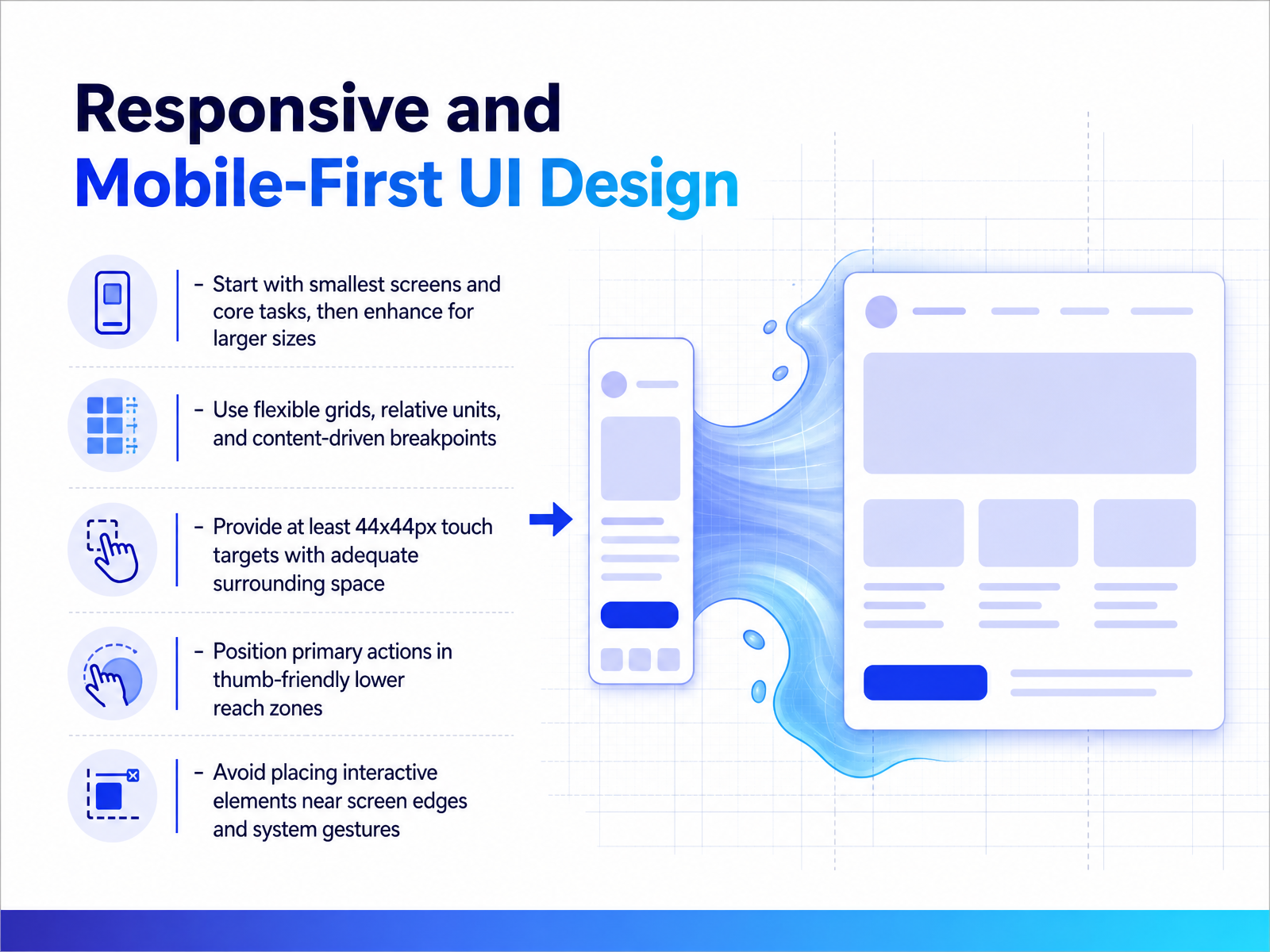
2 min - 10Responsive and Mobile-First UI DesignNow let's talk about responsive and mobile-first design. This is where good UI decisions meet real-world constraints. Start with the smallest screen and the core task. If a checkout flow works on a narrow phone, it will usually work on a desktop. Build up from there, not the other way around. Use flexible grids and relative units like percentages and rems. Let content decide when a breakpoint happens, not a device name. Touch targets need real space. Aim for about forty-four by forty-four pixels, with at least eight pixels of clear space around them. A finger is not a mouse cursor. Put primary actions in the lower reach zone, where a thumb naturally rests. Secondary or destructive actions can sit higher up, where accidental taps are less likely. Keep interactive elements away from screen edges. Those areas belong to system gestures, and your button will lose that fight. So the pattern is simple. Prioritize the smallest experience, respect the thumb, and move controls into safe, reachable zones. Up next, we'll look at prototyping at the right fidelity.
 1 min
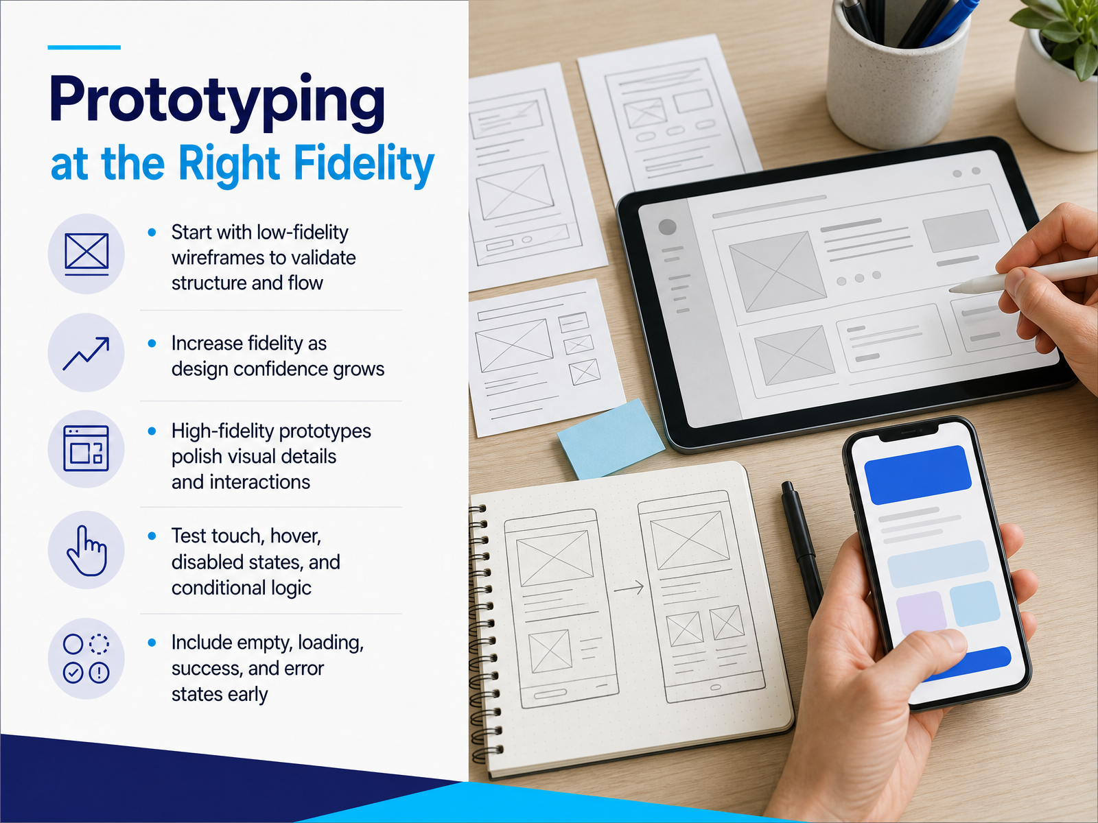
1 min - 11Prototyping at the Right FidelityLet's talk about fidelity in prototyping. The key is to match the detail of your prototype to the confidence of your design. Start with low-fidelity wireframes. These are quick sketches that validate your structure and flow before you invest in polish. As your confidence grows, increase the fidelity. High-fidelity prototypes are for polishing visual details and refining crucial interactions. This is where you test those subtle behaviors. Think about touch targets, hover states, disabled buttons, and conditional logic. Do not wait until the end to think about the edge cases. Include those empty, loading, success, and error states early in your design. This prevents surprises for your users and unnecessary questions for your developers later. Next, let's look at how to prepare everything for an effective developer handoff.
 1 min
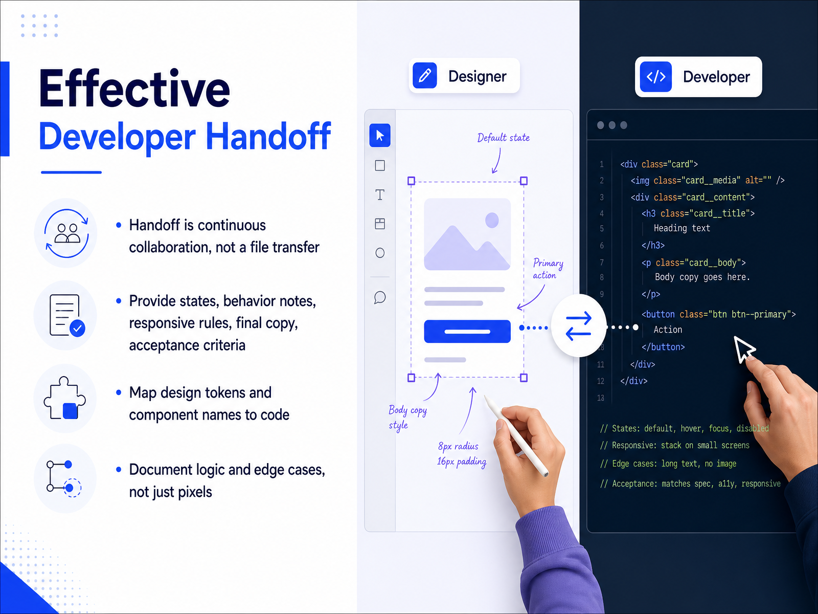
1 min - 12Effective Developer HandoffLet's shift from the visual details to how your work actually reaches the code. Developer handoff is not a single file transfer. It is continuous collaboration. The best handoffs treat developers as partners from early on. When you hand off, go beyond static pixels. Provide every state. That means hover, focus, disabled, empty, and error states. Add behavior notes. Explain what happens when a user clicks, submits, or loses connection. Include responsive rules for different screen sizes. Always provide final copy, not placeholders. And define acceptance criteria, so everyone agrees on what done means. Also, map your design tokens and component names to code. If your button is called primary in Figma, it should match the code name. This prevents confusion and speeds up the build. Document the logic and edge cases too. A developer should not have to guess what happens when a form fails. Write it down. Answer the what if questions before they are asked. This builds trust and reduces rework. Next, let's look at evaluating interface quality.
 2 min
2 min - 13Evaluating Interface QualityNow let's talk about how we actually evaluate the quality of an interface. A heuristic evaluation is when usability experts inspect your UI against Nielsen's ten heuristics, which are broad rules of thumb for good design. And here is a practical tip: use three to five independent evaluators. Having multiple people independently review the design catches far more issues than relying on a single expert, because different people notice different problems. Usability tests are the other side of the coin. Instead of experts making predictions, real users try to complete tasks, and you see exactly where they get stuck. These are the barriers that actually block people. Design critiques are a third tool. Your team gathers feedback specifically on clarity, visual hierarchy, and accessibility. The most actionable results come when you combine expert review with user testing. Experts can spot general interface problems, while users reveal the real-world obstacles to completing tasks. Neither method alone catches everything, but together they give you a much clearer picture. Up next, we'll look at how to measure and improve UI design.
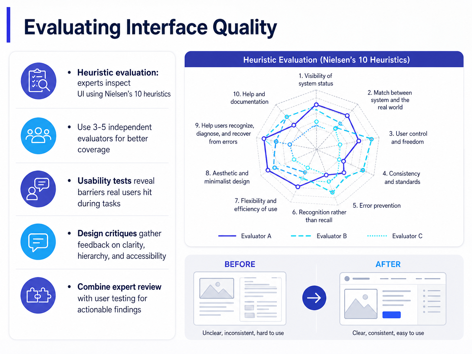 1 min
1 min - 14Measuring and Improving UI DesignLet's bring all of this together into a steady improvement loop. First, watch the right signals. Track task completion, error counts, and so-called rage taps, which are rapid repeated taps on the same spot. Those patterns point directly to broken or confusing elements. Second, audit the basics regularly. Check text contrast, visible focus states, touch target size, and full keyboard navigation. If a button is hard to reach on a phone, or a focus ring disappears, that is a concrete fix waiting for you. Third, work in short cycles. Evaluate, prioritize the issues that block real tasks, redesign, and retest. Do not wait for a perfect system. Finally, make quality continuous. Use analytics and user feedback to catch regressions, and care for your design system the way you would care for the core product. Design never really ends. It improves through small, deliberate decisions. Thank you for joining this course. Keep observing, keep testing, and keep refining your UI.
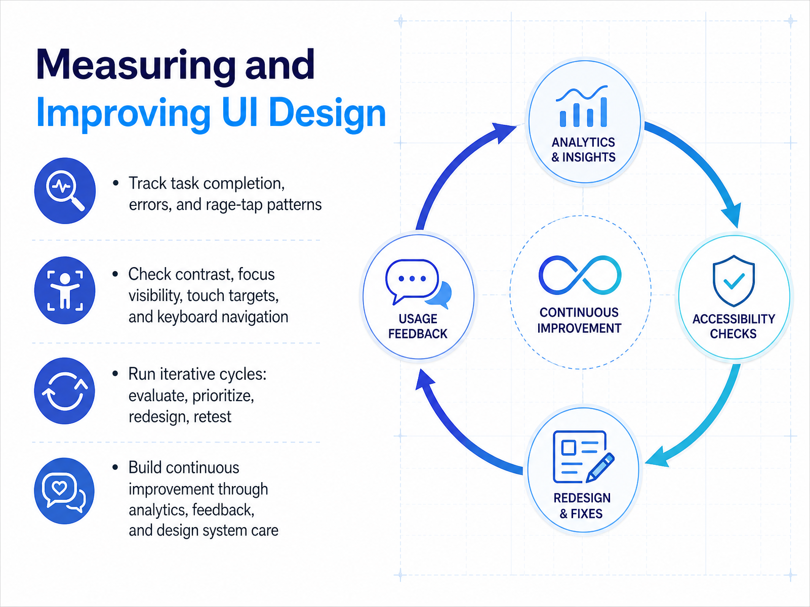 w3.orgwebaim.orga11yflow.dev+22 min
Take the deck with you
Download this course as a file — free, no sign-up needed.
- PDF handoutEvery slide page, ready to print or share.15 pages · 3.3 MBDownload
- Narrated PowerPointThe deck that presents itself — every slide carries the digital human's narration video.15 pages · 16.1 MBDownload
- PowerPoint slidesThe full deck as a .pptx — open it in PowerPoint, Keynote, or Google Slides.15 pages · 3.2 MBDownload
Free to use in your own training — please keep the PersonWise credit page at the end.
Have your own deck? Turn it into a course
Sources consulted
Web sources consulted while building this course.
- UI vs. UX Design: What's the Difference? — coursera.org
- UI vs UX: key differences, examples, and why both matter — stan.vision
- UI Design vs UX Design: Differences, Process, and What | Scallar IT Solution — scallar.in
- What Is User Interface and User Experience Design and Why It Matters in 2026 — bixeldesign.com.au
- What Is UX Design? A Complete Guide (2026) — myuxacademy.com
- 14 Essential UI Design Principles Every Designer Should Follow (2026) | UXPin — uxpin.com
- Affordances, Signifiers & Feedback (Norman's Model) · UI/UX Atlas — uiuxatlas.com
- 7 Key UI Design Principles + How To Use Them — figma.com
- Affordances in UX Design: 6 Types, Real-World Examples & Best Practices (2026) | UXPin — uxpin.com
- UI Design Principles — lyssna.com
- Understanding Success Criterion 1.4.3: Contrast (Minimum) | WAI | W3C — w3.org
- WebAIM: Contrast and Color Accessibility - Understanding WCAG 2 Contrast and Color Requirements — webaim.org
- Color Contrast WCAG 2.2: A Developer's Fix Guide (CSS) | A11yFlow — a11yflow.dev
- WCAG Color Contrast Requirements Explained (with Examples) | Accessalyze — accessalyze.com
- Understanding Success Criterion 1.4.3: Contrast (Minimum) — w3.org
- State model | Spectrum Design Data — opensource.adobe.com
- Interaction states — Shopify Polaris React — polaris-react.shopify.com
- Interaction States Model — UX Wiki — tyrs.studio
- States – Material Design 3 — m3.material.io
- Component states: hover, focus, active, disabled | Honcho — honcho.agency