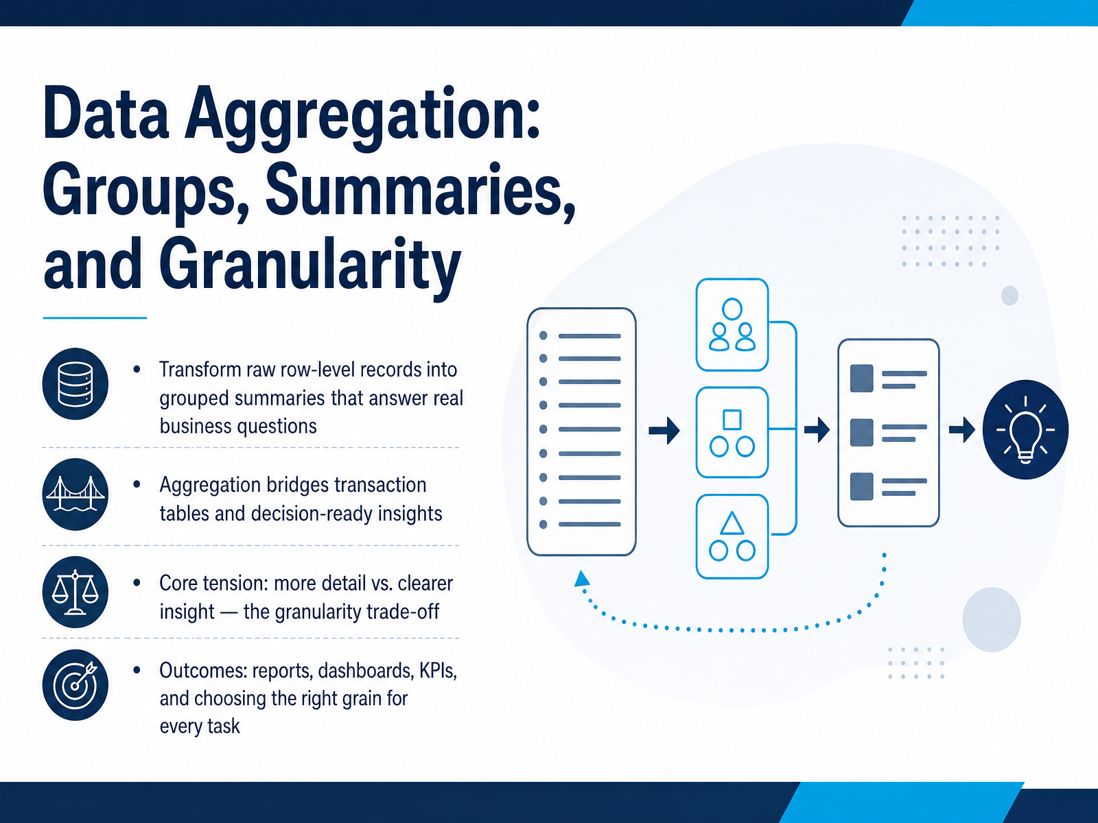
Data Aggregation: Groups, Summaries, Granularity
Begin
15 pages · ~30 min
Data Aggregation: Groups, Summaries, Granularity
Learn to group and summarize data effectively by understanding aggregation, granularity, and summary techniques.
What you’ll learn
- 01Data Aggregation: Groups, Summaries, and GranularityWelcome. Today we are going to talk about data aggregation: groups, summaries, and granularity. The goal is simple. We start with raw, row-by-row records, like a long list of individual sales transactions. And we transform that list into grouped summaries that can answer real business questions. Here is the central idea. Aggregation is the bridge between a detailed transaction table and a decision-ready insight. But there is a core tension you need to understand. More detail gives you more precision. Clearer insight usually requires less detail. This is the granularity trade-off. By the end, you will know how to build reports, dashboards, and key performance indicators by choosing the right grain for every task. Now, to use aggregation correctly, you first have to know exactly what a single row represents. That is where we are going next. Let's explore what one row truly represents.1 min
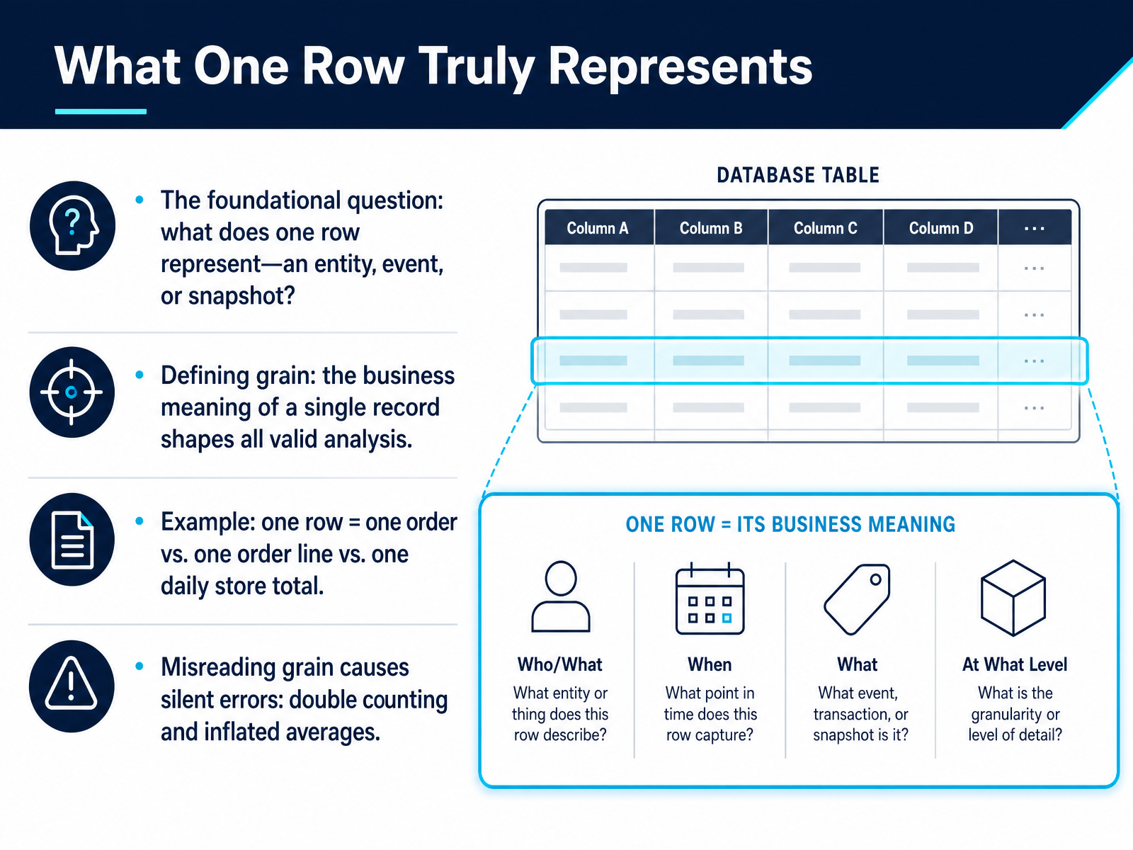
- 02What One Row Truly RepresentsLet's get straight to the most fundamental question you can ask of any dataset: what does a single row actually represent? This is all about defining the 'grain.' The grain is the business meaning of one record, and it shapes every valid analysis you will ever perform. For example, one row could be a single order, a single line item within that order, or a daily total for an entire store. Each one tells a completely different story. If you misread the grain, you create silent errors. You might double-count the same sale if you sum order-level rows while thinking you're adding up individual products. Or you might calculate an average that is inflated because you're averaging daily totals instead of individual transactions. The data will always give you an answer, but the grain determines whether that answer is correct or completely misleading. Up next, we'll explore the full spectrum, moving from atomic rows to aggregated summaries, in 'Atomic vs. Aggregated: The Grain Spectrum.'
 1 min
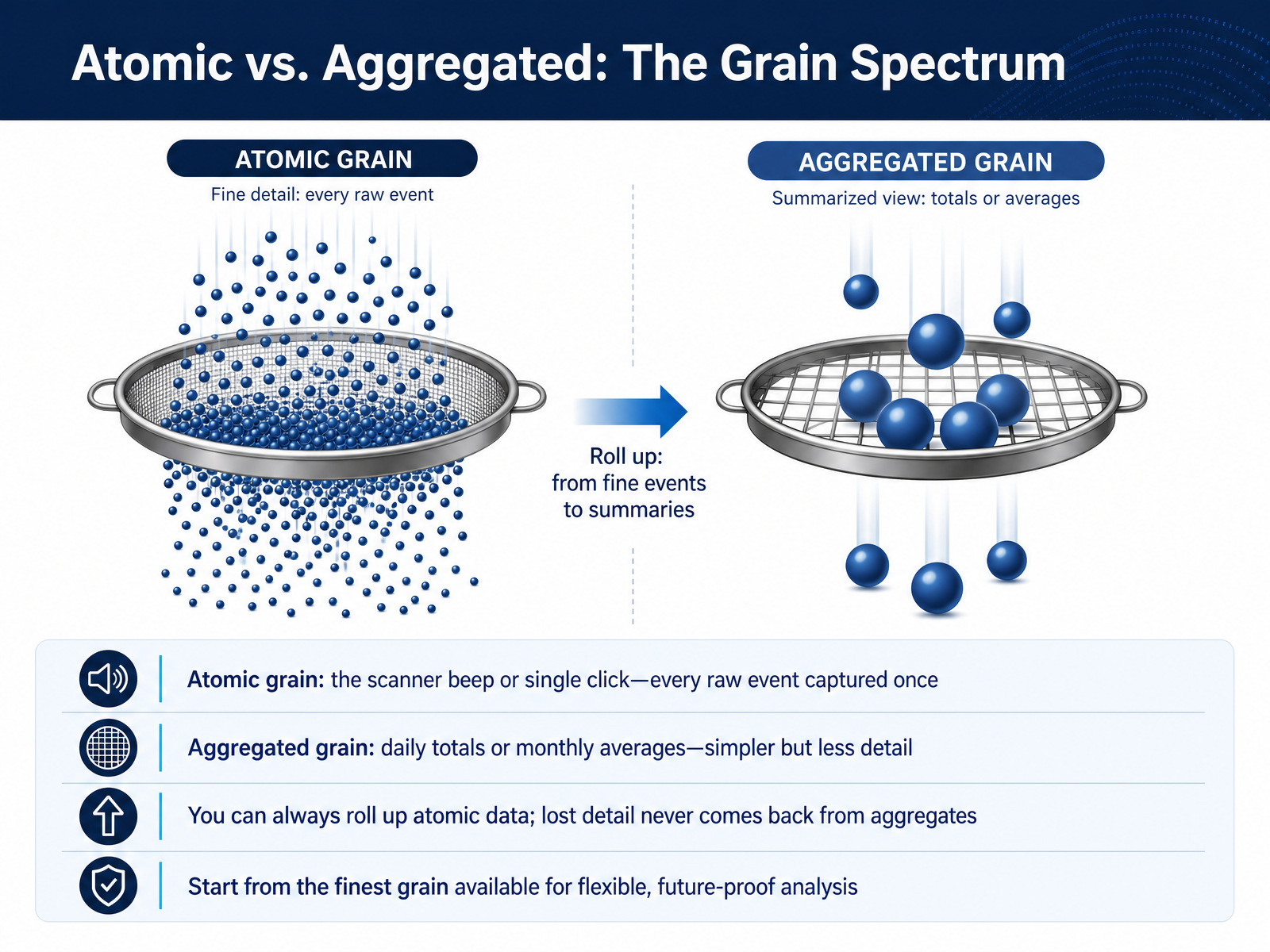
1 min - 03Atomic vs. Aggregated: The Grain SpectrumNow let's talk about where data lives on what we call the grain spectrum. Think of it as a slider from fine detail to broad summary. On one end, we have the atomic grain. This is the raw, unfiltered event—the scanner beep as an item is sold, or a single click on a webpage. Each action is recorded once, exactly as it happened. On the other end, we have the aggregated grain. This is where those individual events are bundled up. Daily sales totals or monthly average website visits are good examples here. The numbers are simpler and easier to read quickly, but you’ve lost the story of each individual transaction. The golden rule is this: you can always roll up atomic data into a summary, but lost detail never comes back from an aggregate. A monthly total can’t tell you which Tuesday had the most sales, but a list of every sale can build that total. So, always start your analysis from the finest grain available. This keeps your data flexible and ready for questions you haven’t even thought of yet. Next, we’ll put this into practice by spotting and avoiding mismatched grain.
 1 min
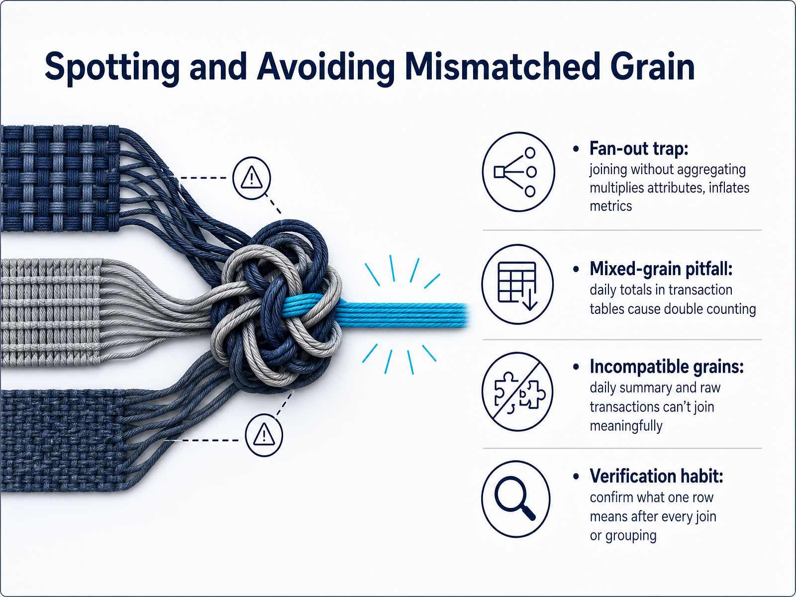
1 min - 04Spotting and Avoiding Mismatched GrainNow let's talk about a few traps that can appear when you mix different levels of detail. First is the fan-out trap. Imagine you have an orders table and a line-items table. If you join them without summarizing first, each order gets repeated for every line item, and any metric like shipping cost gets multiplied. Your total suddenly looks much larger than it really is. Another common pitfall is the mixed-grain mistake. Suppose you store daily totals right inside a table of individual transactions. When you sum that daily total column, you are adding the same day's figure over and over again, and your result gets heavily inflated. There is also the problem of incompatible grains. A table of daily summaries and a table of raw transactions simply do not match at the row level. Joining them directly produces nonsense because one row means an entire day and the other means one event. To protect yourself, build one simple verification habit. After every join or grouping, pause and ask: what exactly does one row represent now? Confirm that meaning before you trust any summary. Up next, we will dig into how to identify the real question hiding behind the data and let it guide your grain choices.
 2 min
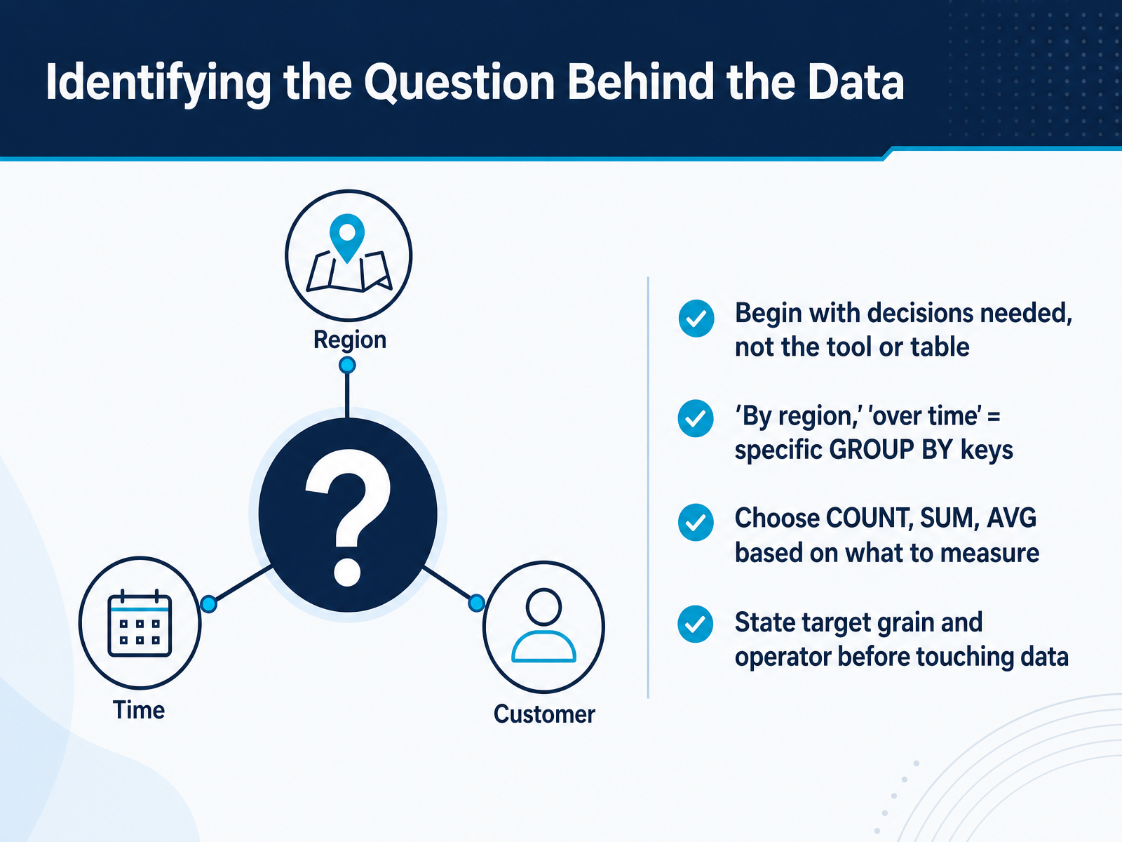
2 min - 05Identifying the Question Behind the DataNow let's talk about identifying the question the data should answer. Before you open a tool or even look at a table, start with the decision someone needs to make. If the request says "by region" or "over time," those phrases point directly to your grouping keys. Region and date column become your GROUP BY fields. Next, decide what you're measuring. Are you counting rows, summing sales amounts, or averaging a score? That choice determines whether you use COUNT, SUM, or AVG. Think of it as stating your target grain and your operator before you touch the data. A clear sentence like "total sales per region per month" locks in both the groups and the measure, so your summary answers exactly one question. Next, we'll see how groups reshape granularity and change what each row represents.
 1 min
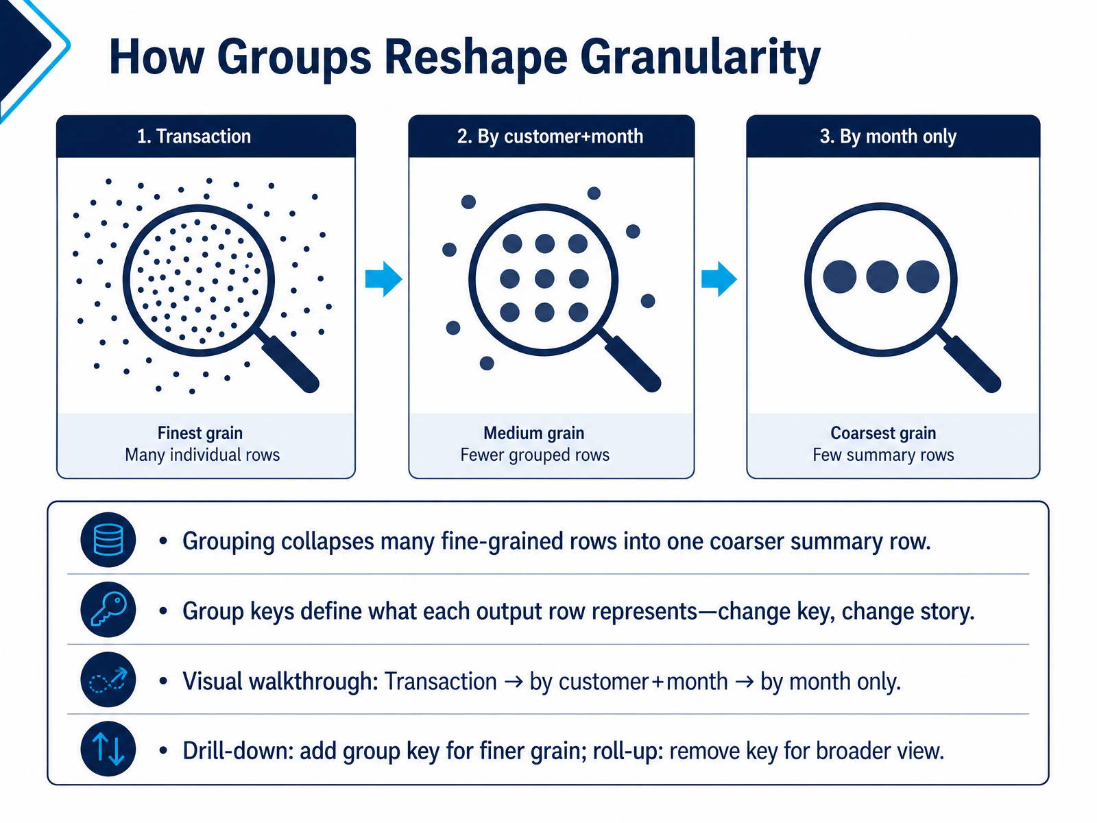
1 min - 06How Groups Reshape GranularityLet's see how groups actually change the grain of our data. Grouping collapses many detailed rows into a single, coarser summary row. The columns you choose as your group keys define what each output row now represents. Change the key, and you change the entire story the summary tells. Imagine we start with a transaction table where each row is one sale. First, we group by customer and month. Every row in the result now represents one customer's total activity in one specific month. If we remove the customer key and group by month only, each row now represents total sales for the entire month, rolling up all customers into a single number. Adding a key — say, putting customer back in — drills down to finer detail. Removing a key rolls up to a broader view. The takeaway is straightforward: granularity dictates the story. Next, we'll explore summaries that answer questions, and those that can mislead.
 1 min
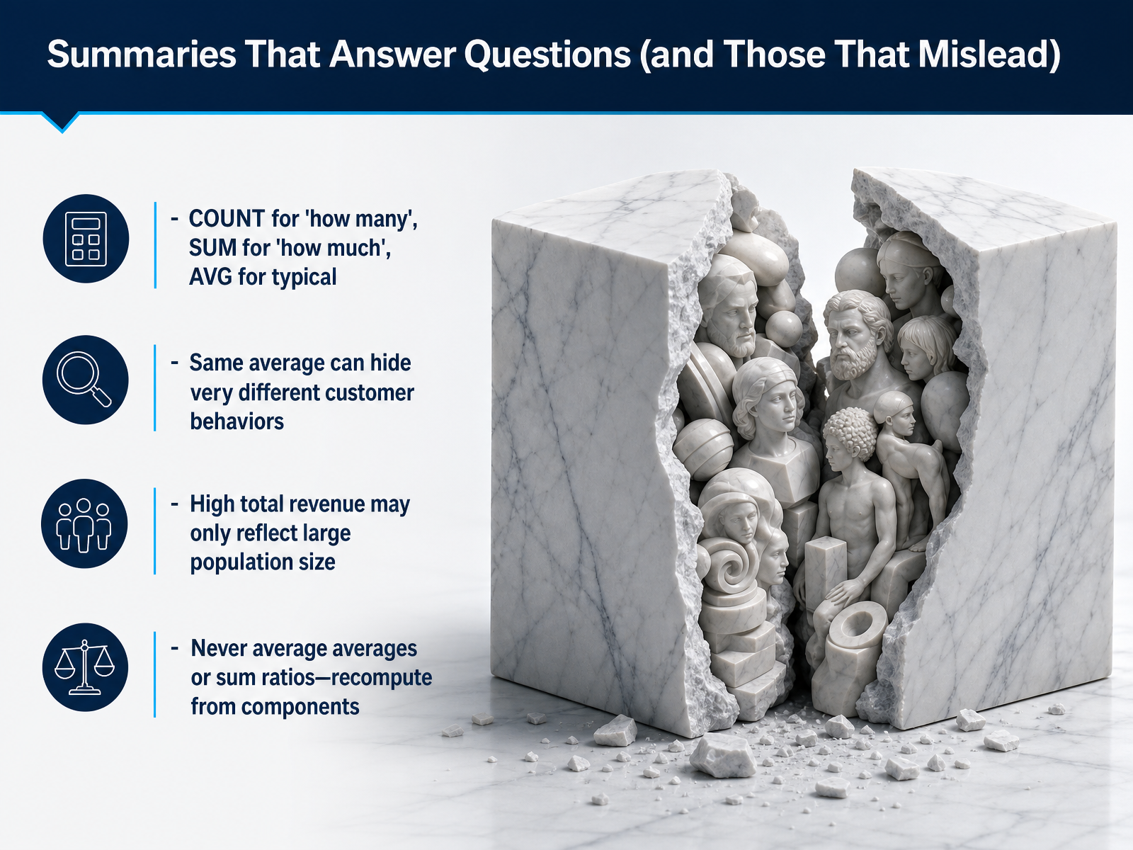
1 min - 07Summaries That Answer Questions (and Those That Mislead)Now, let’s make sure the summaries you choose actually answer your question. COUNT tells you how many. Use it when you need the number of orders, or the number of customers. SUM tells you how much in total, like total revenue. Average, or AVG, tells you a typical value, like an average order size. But be careful. The same average can hide very different behaviors. Imagine two customers each have an average order of fifty dollars. One places many small, steady orders. The other places one large order and then disappears. The average alone doesn’t show that. Also, a high total revenue might just mean you have a very large population, not that each customer spends more. One last rule: never average averages, and never sum ratios. Always go back to the original components and recompute. Otherwise, the number you get is meaningless. Next, we’ll put this into practice and talk about picking the right summary for the job.
 1 min
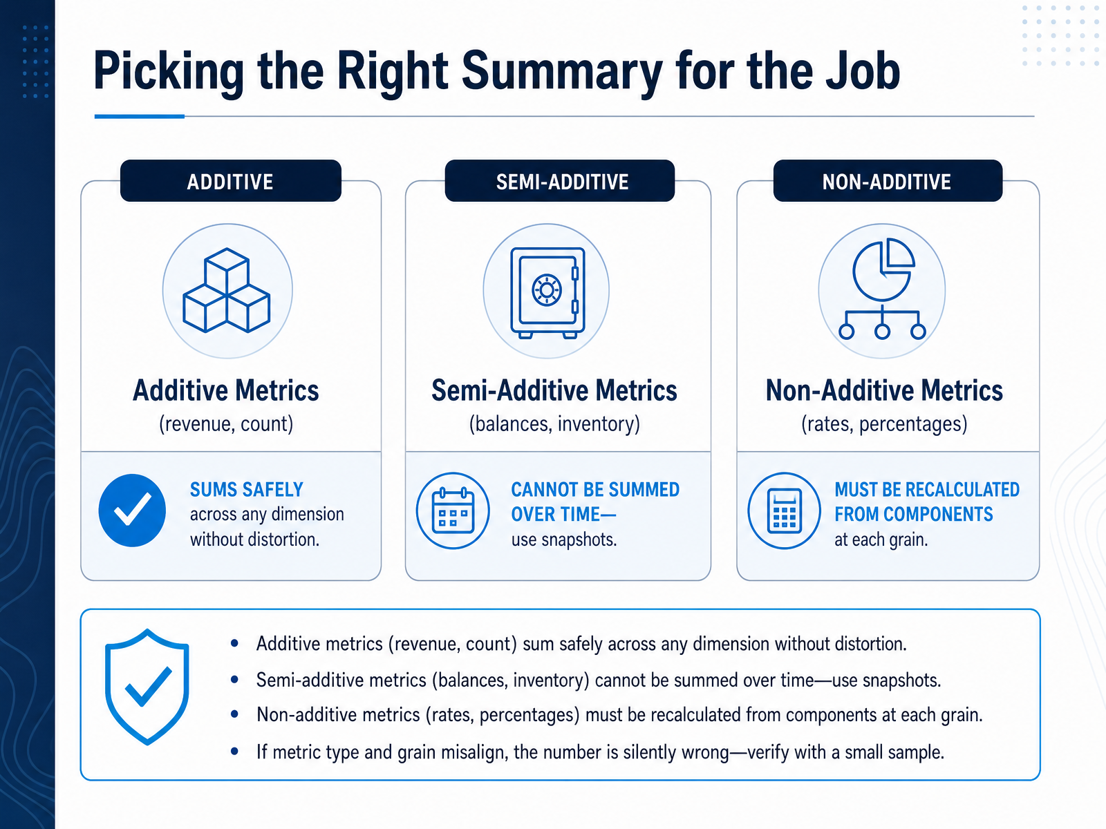
1 min - 08Picking the Right Summary for the JobChoosing the right summary metric is just as important as choosing the right grain. Metrics fall into three categories, and mixing them up silently breaks your answer. First, additive metrics, like revenue or a count of orders. You can sum these safely across any dimension. Add up daily sales to get monthly sales and the number is still correct. Second, semi-additive metrics, like a bank balance or warehouse inventory. These make sense to sum across products or regions, but you cannot sum them over time. Adding my account balance from Monday through Friday does not give my total wealth; it gives a meaningless inflated number. For balances, take a point-in-time snapshot, like the end of the month. Third, non-additive metrics, like rates and percentages. A conversion rate must be recalculated from its numerator and denominator at whatever grain you report. You cannot average daily rates to get a monthly rate. If the metric type and the grain are misaligned, the number looks reasonable but tells a false story. Always check with a small sample, pick a few rows and do the math yourself. Up next, we will look at composite summaries that go beyond single aggregates.
 2 min
2 min - 09Composite Summaries: Beyond Single AggregatesNow, let’s take the next step. Single aggregates like total sales or average revenue are useful, but real business questions often need two aggregates working together. Think about conversion rate, per capita sales, or average order value. Each of these is a ratio, made by dividing one summary by another. The safe and reliable pattern is to always calculate the numerator and the denominator at exactly the same grain. If you sum revenue per customer and then count your customers, you can divide those two numbers safely because they both represent the same level of detail: the customer. A very common trap is when the grain is mismatched. If you take total company revenue and divide it by a count of individual transactions, you create a number that looks like a ratio but carries no consistent meaning. Let’s make this concrete with customer lifetime value. First, you group your order rows by customer ID and sum the revenue for each. This creates one row per customer with a total revenue number. Only after that do you take the average of those totals. You summarize at the customer grain, then summarize again. Notice how the granularity at each step dictates the story your final number can tell. We’ll explore that strategic decision next: choosing the right granularity and how it shapes every answer you get.
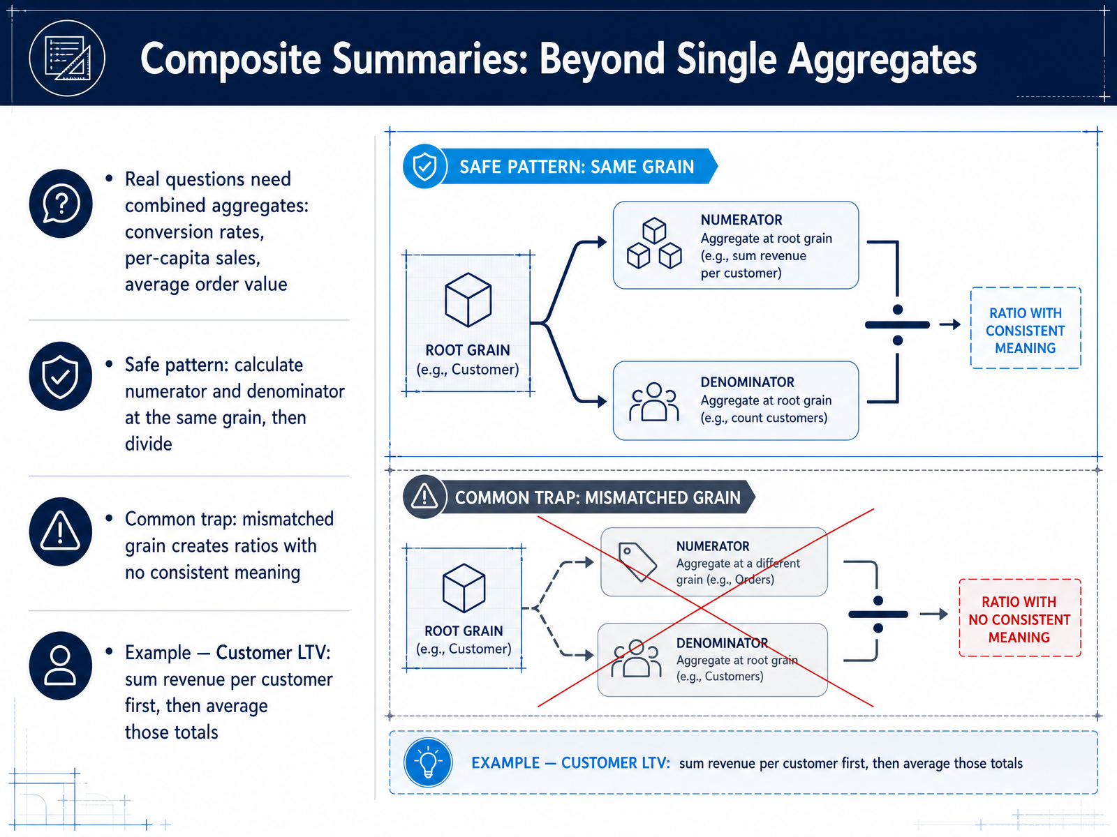 2 min
2 min - 10Choosing the Right Granularity: A Strategic DecisionNow let's turn granularity into a strategic decision, not just a button you click. Think of finer grain as having more flexibility. If you store individual sales transactions, you can later group by day, by region, by product. But you also have many more rows to manage. Coarser grain, like pre-summarized daily totals, is faster to query. The trade-off is that you lose the ability to drill down into individual orders. A good practical rule is to stop grouping when the resulting segments need different business responses. Ask yourself: will we treat this segment differently? If a regional manager needs separate data to allocate staff, keep that region separate. But if you cannot act on the difference between two customer types, merging them is likely safe. In the end, granularity is a business decision, not a technical setting. It is driven by the actions you need to take. That clarity helps you avoid two common traps, which we will cover next: over-aggregation and under-aggregation.
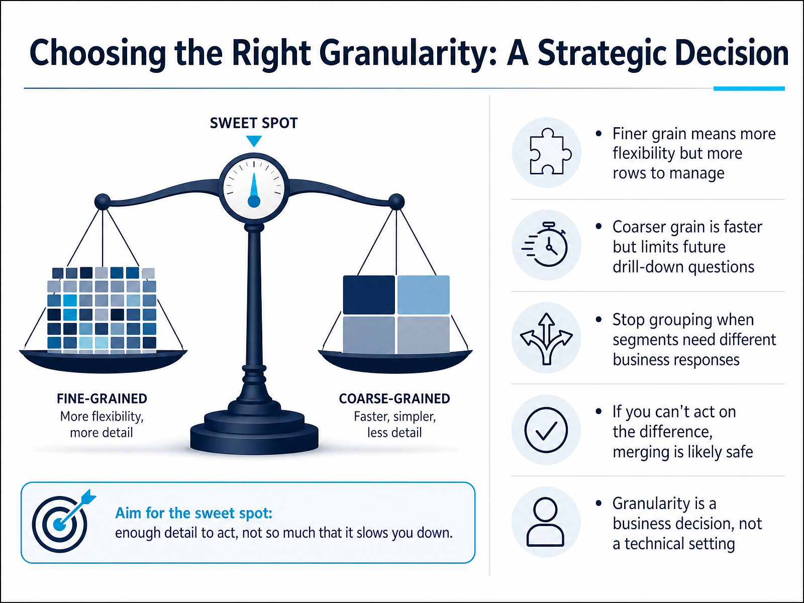 2 min
2 min - 11Over-Aggregation and Under-Aggregation: Two Sides of One ProblemNow, let's look at two sides of the same problem: over-aggregation and under-aggregation. Over-aggregation happens when we lose detail that matters. Imagine a retail dataset. If you average purchase amounts across all customers, you get one number. That number hides the fact that high-value loyalty members behave very differently from occasional discount shoppers. The detail you lost tells the real story. Under-aggregation is the opposite. You leave so much detail—every single transaction row, every timestamp—that the patterns drown in noise. A stakeholder staring at ten thousand rows cannot see the monthly trend they actually need. Neither extreme is universally right. The correct grain depends entirely on the question you must answer. Your litmus test is simple: look at the output and ask, can a stakeholder answer their question directly from this summary? If the answer is yes, your aggregation level is right. If not, adjust the grain. Up next, we will cover how to handle dirty data and edge cases before grouping.
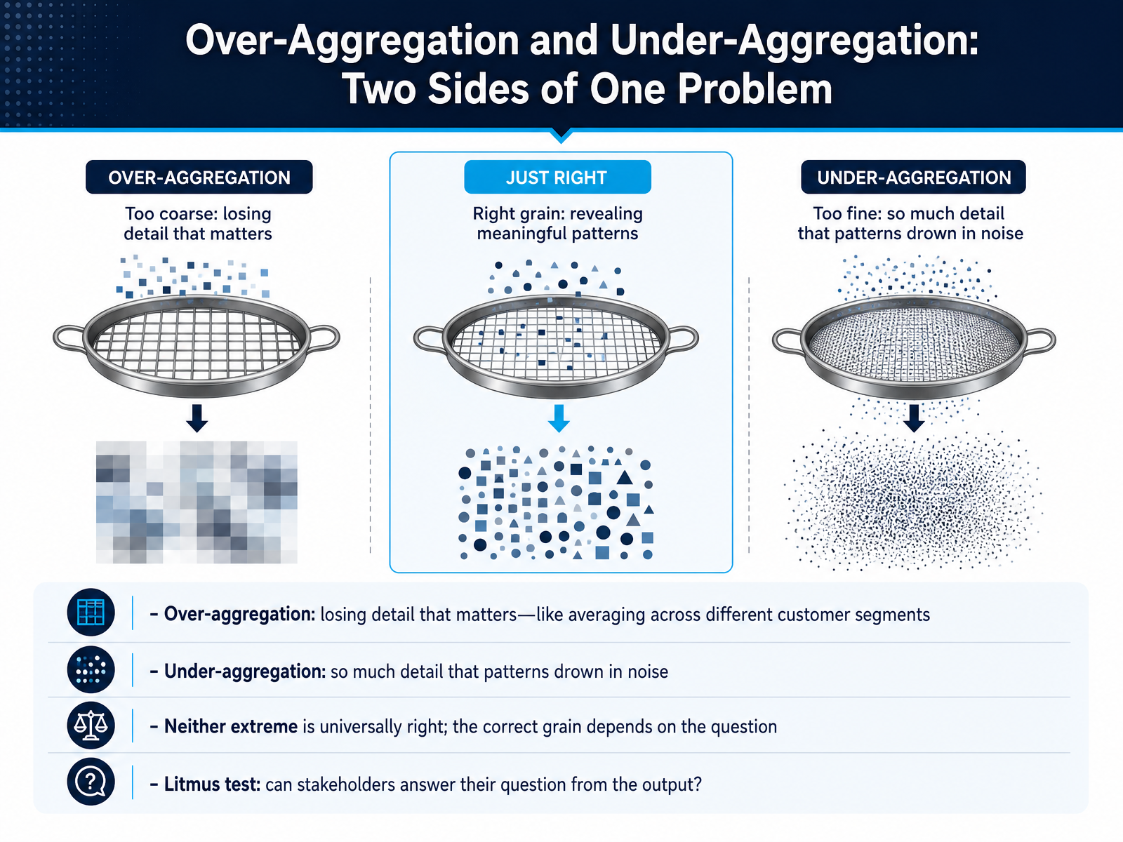 2 min
2 min - 12Handling Dirty Data and Edge Cases Before GroupingBefore we run a GROUP BY, we need to inspect the data carefully. Dirty data can silently mislead us. First, look for NULL values in the column you plan to group by. NULL groups hide patterns because they lump unknown information together. You must decide whether to filter them out or show them as an 'Unknown' category. Second, duplicate rows are dangerous. They inflate counts and totals without any visible warning. If a sum seems too high, trace back to the source row. You might find the same order was recorded three times. Third, verify the granularity, the meaning of a single row. If one row represents a line item and not an entire order, grouping by order date will double-count orders that have multiple items. Always verify duplicates, NULLs, and the grain of your data before you add GROUP BY to your query. Next, we will apply this careful thinking to answering questions with group-by-group logic.
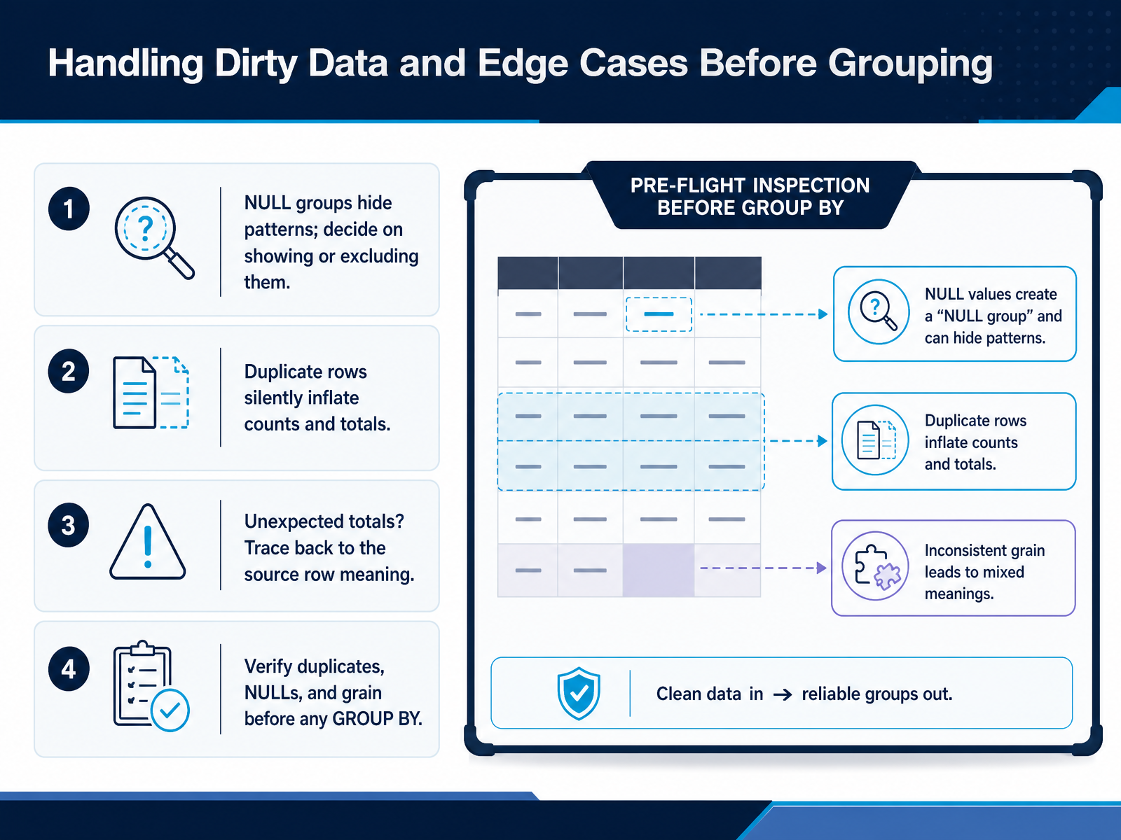 2 min
2 min - 13Answering Questions with Group-by-Group LogicLet's move from the concept of grain to a practical workflow you can use on any dataset. When you face a business question, the first step is to state that question clearly. Then, look at your data and identify what a single row represents at its most detailed level. This is the source grain. Next, choose your group keys. These are the columns you will group by to reshape the data. For instance, if the question is about monthly revenue per product category, your group keys would be month and category. Then, select the summary metrics that are safe to add up at this new grain. For our revenue example, summing the sales amount column is perfectly valid. The final, critical step is to verify every output row. Each row must trace back to a distinct, meaningful business entity—like one specific month and one specific category. So, let's see this in action. You have a table of individual sales transactions. Each row is a single sale. You group it by month and product category, and you sum the revenue. The result tells a clear story: the total revenue generated by each category, month by month. The granularity of the transaction data has been responsiblely lifted to answer the business question. Now, let's talk about how to communicate these results clearly.
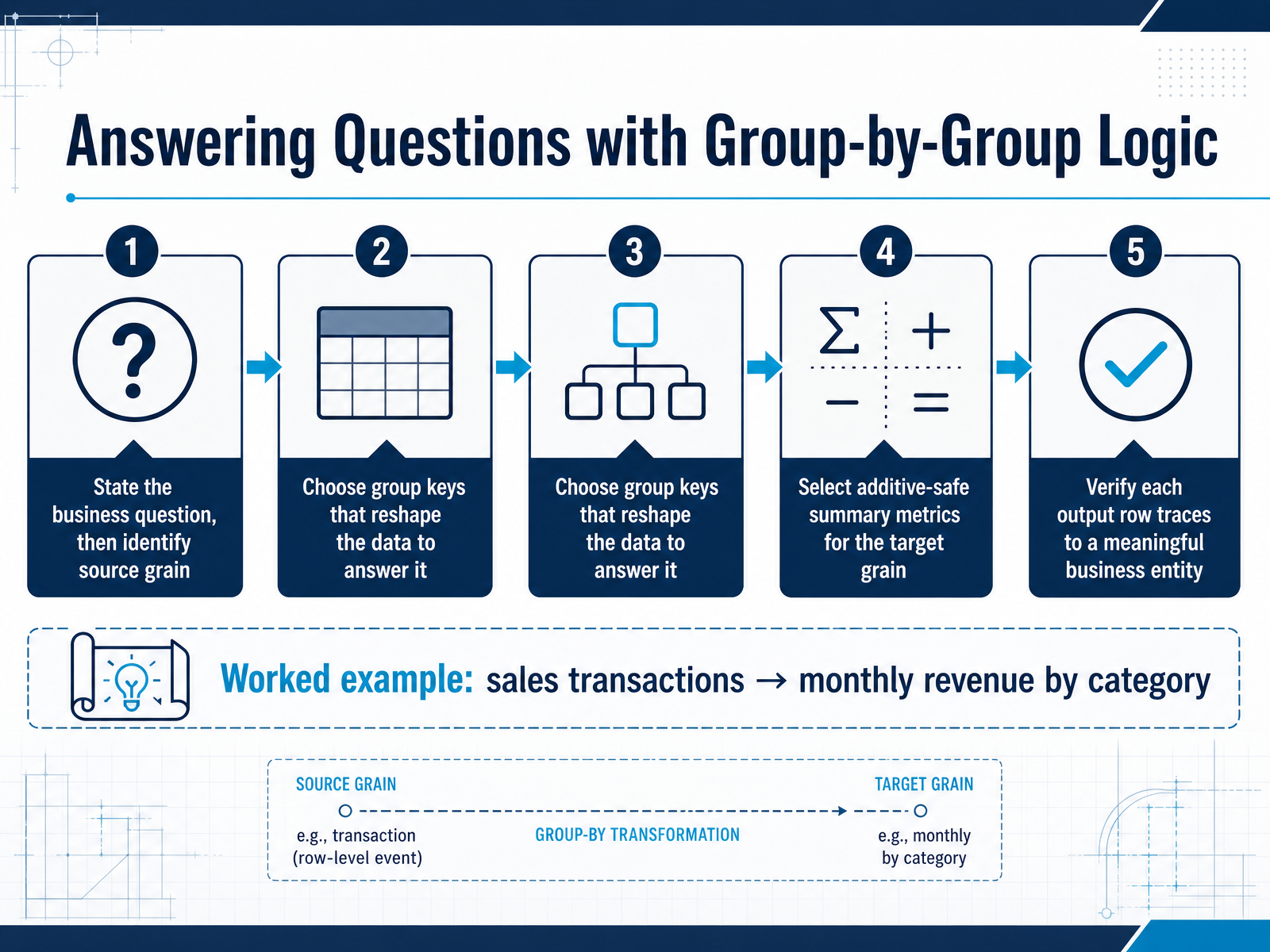 2 min
2 min - 14Communicating Aggregated Results Without ConfusionNow that you can build aggregated results, let's make sure you communicate them without confusion. Start by labeling every output clearly. State the grain explicitly — for example, 'One row equals one customer's monthly spend.' That simple label tells your audience exactly what each line represents. Next, pick the right display. Use line or bar charts to show trends over time; use tables when someone needs exact numbers for side-by-side comparisons. And here is a rule that prevents most reporting mistakes: never mix aggregation levels in a single total. Keep subtotals clearly labeled so no one accidentally adds monthly figures into an annual sum. Finally, for each key insight, lead with just one aggregated number to make your point the clearest. A single, well-labeled value tells a far stronger story than a crowded table. Up next, we will turn these techniques into habit in 'From Manual Thinking to Habit: Your Aggregation Reflex.'
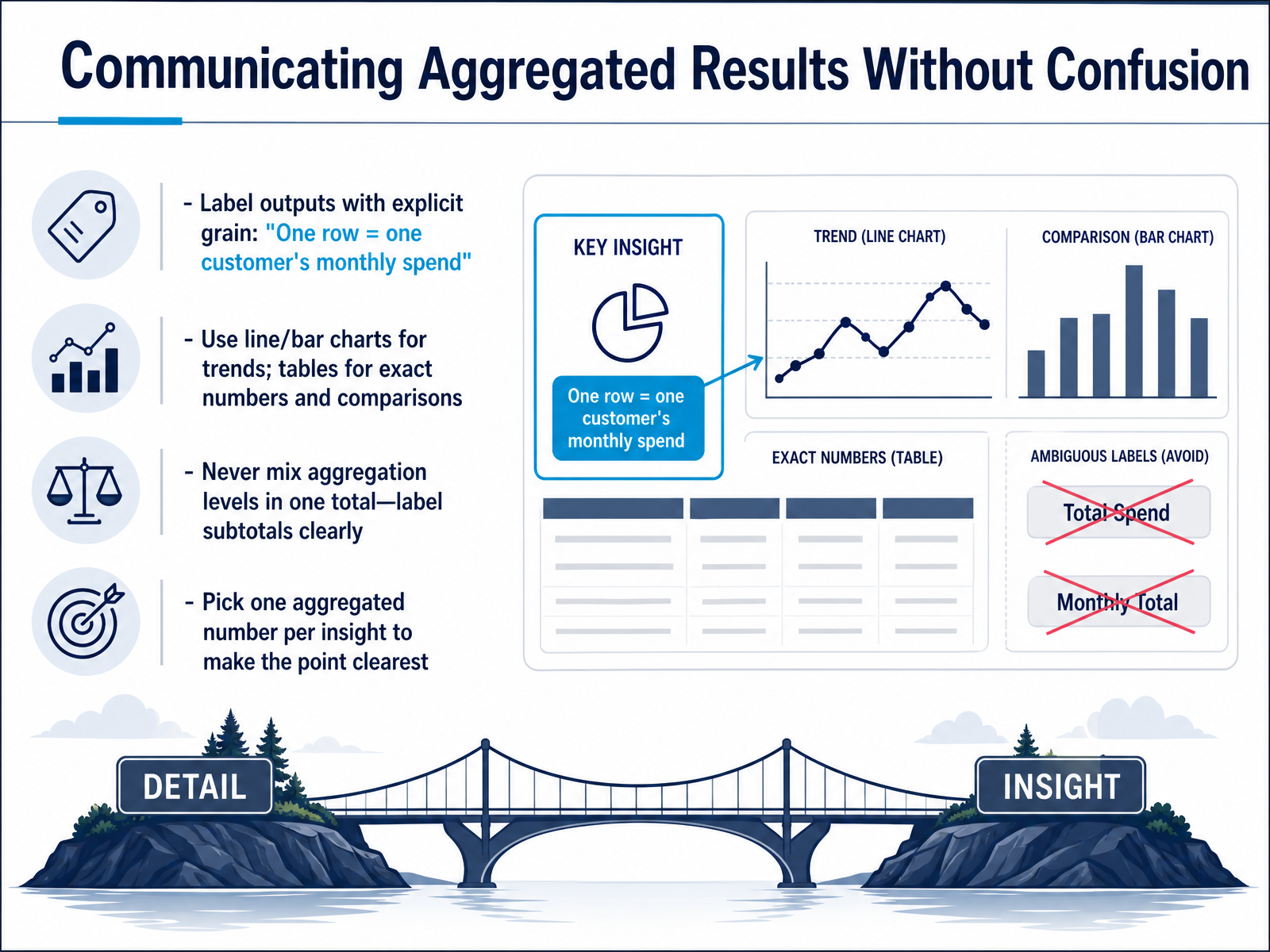 2 min
2 min - 15From Manual Thinking to Habit: Your Aggregation ReflexLet's bring it all together now into a single habit. Your first reflex when you face any dataset should be: what does one row represent? That one question sets everything else in motion. From there, follow the checklist. Check the grain. Verify that your grouping logic matches the question. Map how rows combine into categories. Choose a summary function that makes sense, and then reconcile the output. Does the final number actually describe the world you think it does? This same mental check runs across every tool you'll touch. Whether you write a GROUP BY in SQL, drag a field into an Excel pivot table, build a visual in a business intelligence tool, or write pandas code in Python, the logic is identical. Groups serve decisions. The right grain makes action obvious. When you shape the data at the correct level, the next step is never hidden in fog. Thank you for working through this with me. Trust the checklist, make the reflex your own, and let the grain tell the story every single time.
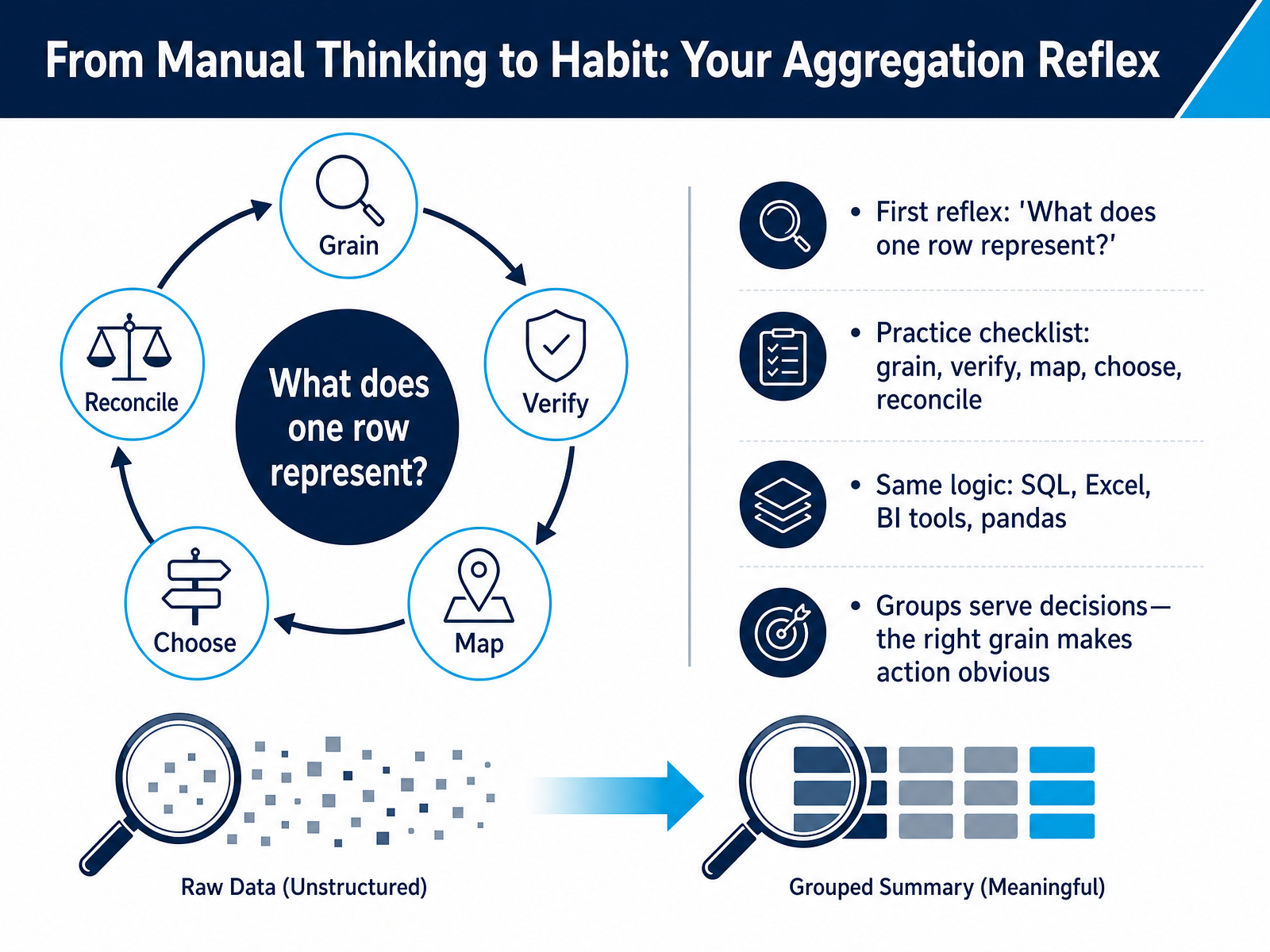 2 min
2 min
Take the deck with you
Download this course as a file — free, no sign-up needed.
- PDF handoutEvery slide page, ready to print or share.16 pages · 4.0 MBDownload
- Narrated PowerPointThe deck that presents itself — every slide carries the digital human's narration video.16 pages · 14.5 MBDownload
- PowerPoint slidesThe full deck as a .pptx — open it in PowerPoint, Keynote, or Google Slides.16 pages · 3.8 MBDownload
Free to use in your own training — please keep the PersonWise credit page at the end.
Have your own deck? Turn it into a course