Touch-Friendly Interface Design
Begin
12 pages · ~24 min
Touch-Friendly Interface Design
A training on designing interfaces optimized for touch interaction, teaching users to create intuitive, accessible, and responsive layouts for mobile and tablet devices.
What you’ll learn
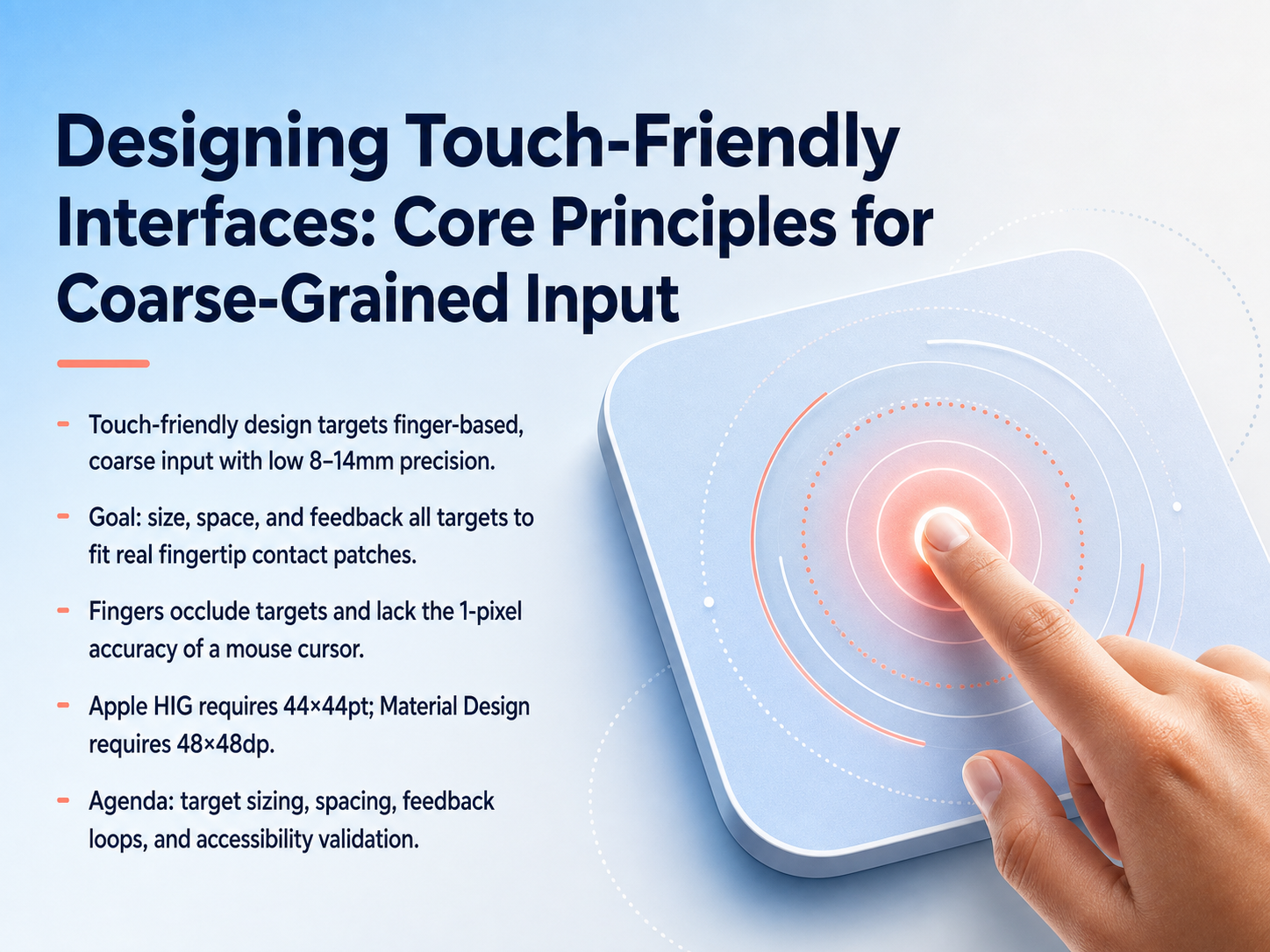
- 01Designing Touch-Friendly Interfaces: Core Principles for Coarse-Grained InputWelcome. Today we are building touch-friendly interfaces—designs made for fingers, not mouse cursors. Let’s start with the core problem. A mouse is a one-pixel pointer. A finger is a blunt patch of skin, roughly eight to fourteen millimeters wide. Screens read that contact area with far less precision, which means small targets get missed, and your own fingertip blocks what you are trying to tap. To solve this, we focus on three essentials: sizing every actionable target to fit the real contact patch, adding open space between targets, and providing clear, instant tap feedback. Across the industry, the two guiding numbers you will use are Apple’s minimum of forty-four by forty-four points, and Material Design’s minimum of forty-eight by forty-eight density-independent pixels. Both aim for the same physical comfort, roughly nine to ten millimeters on most devices. In this session, we will work through a practical agenda: target sizing, spacing rules, feedback loops, and accessibility validation. By the end, you will have a repeatable system for designing coarse-grained input that feels safe and effortless. Up next, we look at why fingers are not cursors—and how occlusion and contact geometry change every layout decision.developer-rno.apple.comdeveloper.apple.comdeveloper.apple.com+22 min
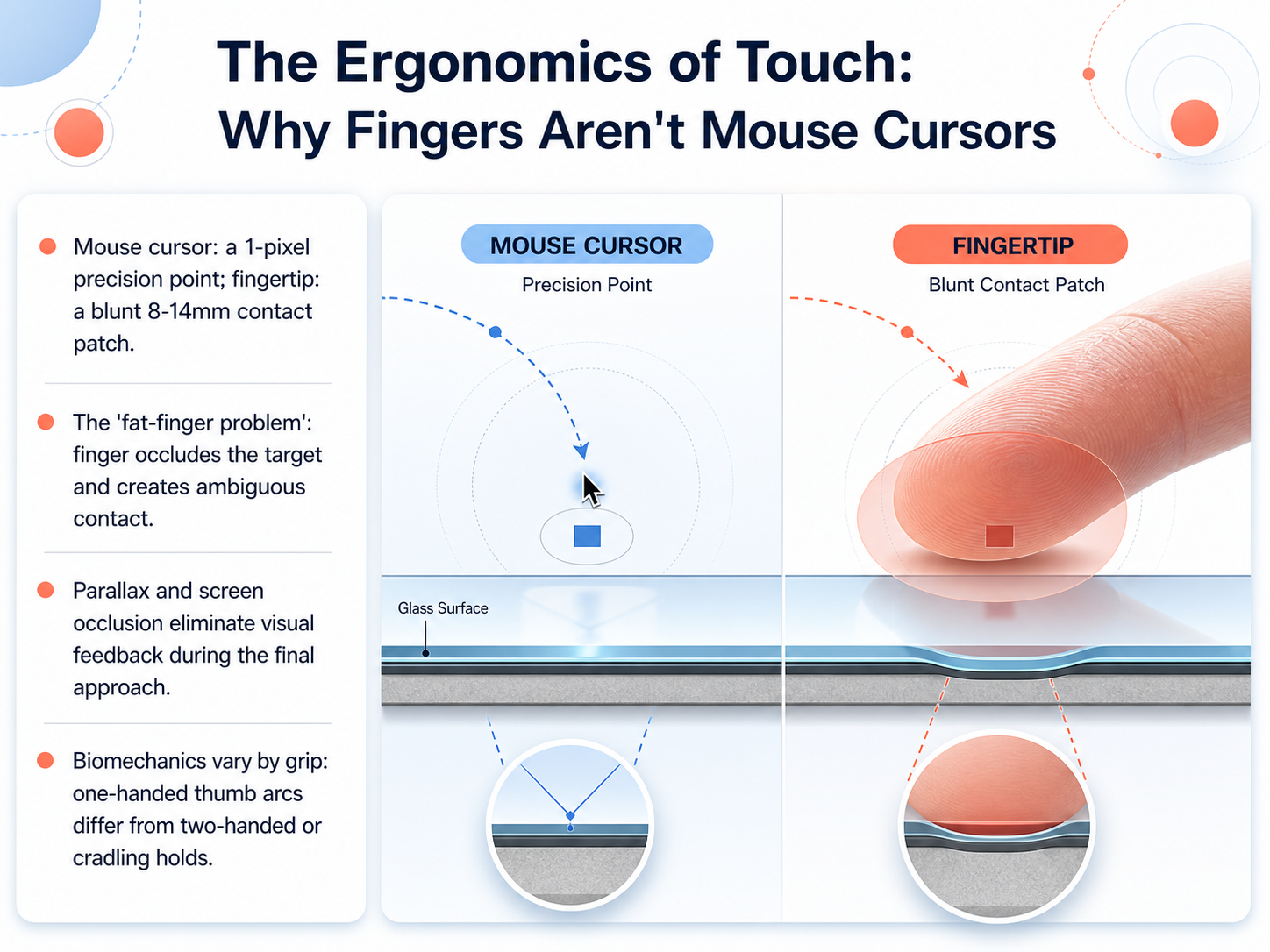
- 02The Ergonomics of Touch: Why Fingers Aren't Mouse CursorsNow let's look at why fingers are not mouse cursors, and what that means for design. A mouse cursor controls a single, pixel-precise point. Your fingertip, by contrast, creates a blunt contact patch roughly 8 to 14 millimeters wide. That difference creates what we call the fat-finger problem. Your finger physically covers the target during the tap, and the system has to interpret an area of contact rather than a clear point. On top of that, parallax and screen occlusion remove your visual feedback just when you need it most, right in that final approach. Biomechanics also change with grip. A one-handed thumb moves in a different arc than two-handed typing or a cradled hold. So the same screen feels very different depending on how the device is held. The core takeaway is this: touch design starts by accepting that input is inherently coarser and partially blind. In the next slide, we will translate this into concrete sizing and spacing rules for actionable targets.
 w3.orgevelance.iouxguides.com+21 min
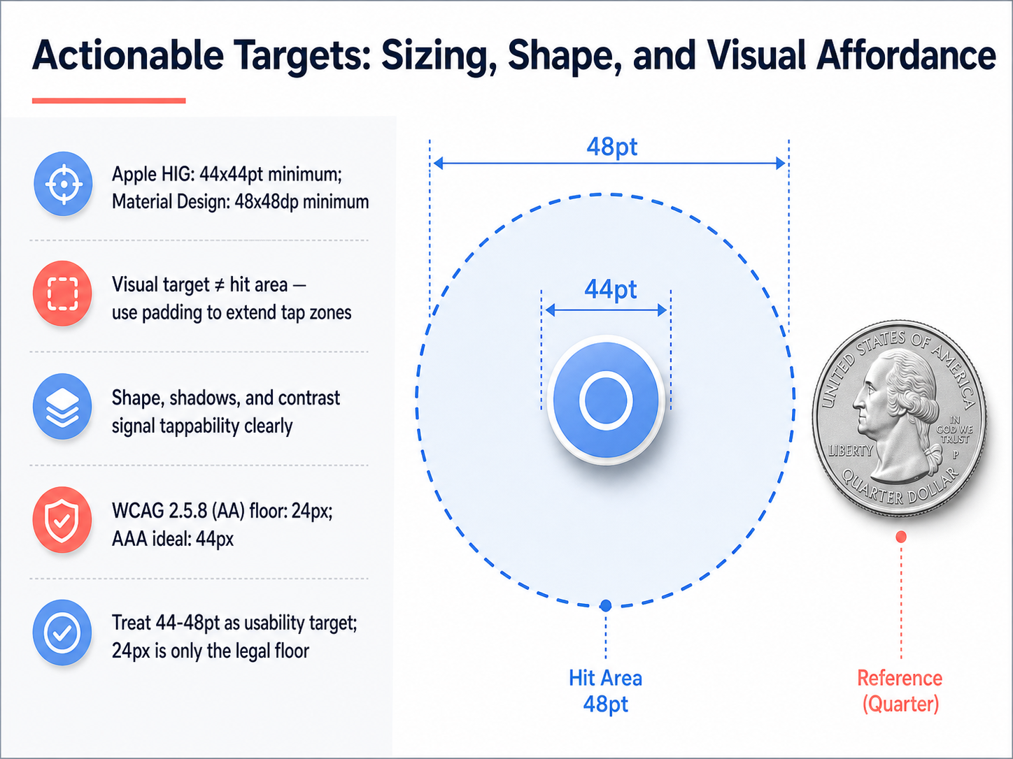
 - 03Actionable Targets: Sizing, Shape, and Visual AffordanceLet's get directly into how big a touch target actually needs to be. You'll often see two numbers right away: Apple's Human Interface Guidelines call for a minimum of 44 by 44 points, while Google's Material Design uses 48 by 48 density-independent pixels. Think of this window as your usability sweet spot, not just a set of competing rules. A critical concept to master is that the visual target—what the user's eye sees as a button or an icon—is not the same thing as the actual hit area. Use padding to invisibly extend the tap zone beyond the visible graphic, which is a lifesaver for small icon-only buttons. Shape, subtle shadows, and strong contrast against the background are the visual cues that signal tappability to the user. Now, you must also know the legal context. The Web Content Accessibility Guidelines, version two point five point eight, sets a minimum floor of 24 pixels at the Double-A level. However, treat this 24-pixel number only as a compliance safety net to avoid failing an audit. For a comfortable and inclusive experience, design toward the 44 to 48 point standard. It reduces errors significantly, especially for users with motor challenges. Next, we'll put these sizes into context by looking at strategic spacing and layout to prevent errors.
 developer-rno.apple.comdeveloper.apple.comdeveloper.apple.com+22 min
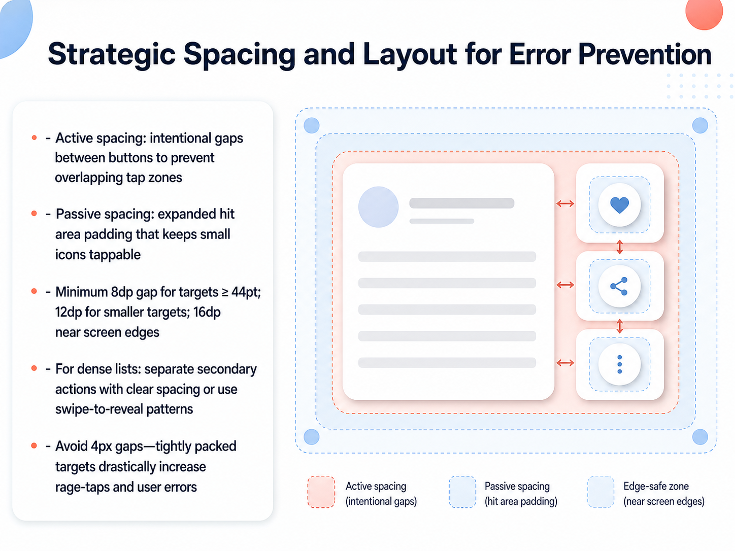
 - 04Strategic Spacing and Layout for Error PreventionNow let's talk about strategic spacing and layout to prevent errors. When we arrange interactive elements, we need to think about two kinds of spacing. The first is active spacing. This is the intentional gap between buttons that keeps their tap zones from overlapping. Think of it as giving each target its own clear footprint so a thumb doesn't accidentally land on two controls at once. The second is passive spacing. This means expanding the hit area with padding so that a small icon remains easy to tap, even though the visual element itself looks compact. For concrete numbers, aim for a minimum gap of eight density-independent pixels between targets that are at least forty-four points wide. If the targets are smaller, increase the gap to twelve density-independent pixels. And near the edges of the screen, where thumbs approach at an angle, bump that up to sixteen density-independent pixels. In dense lists, keep secondary actions clearly separated. If real estate is tight, consider using a swipe-to-reveal pattern instead of packing buttons together. Most importantly, avoid gaps of just four pixels. Tightly packed controls lead to rage-taps and user errors because the finger cannot reliably distinguish between two adjacent hit zones. Remember, generous spacing gives an unsteady finger somewhere safe to land. In the next slide, we'll connect these spacing rules to formal compliance standards, including WCAG, Apple's HIG, and Material Design.
 docs.dequelabs.comw3.orgsupport.google.com+22 min
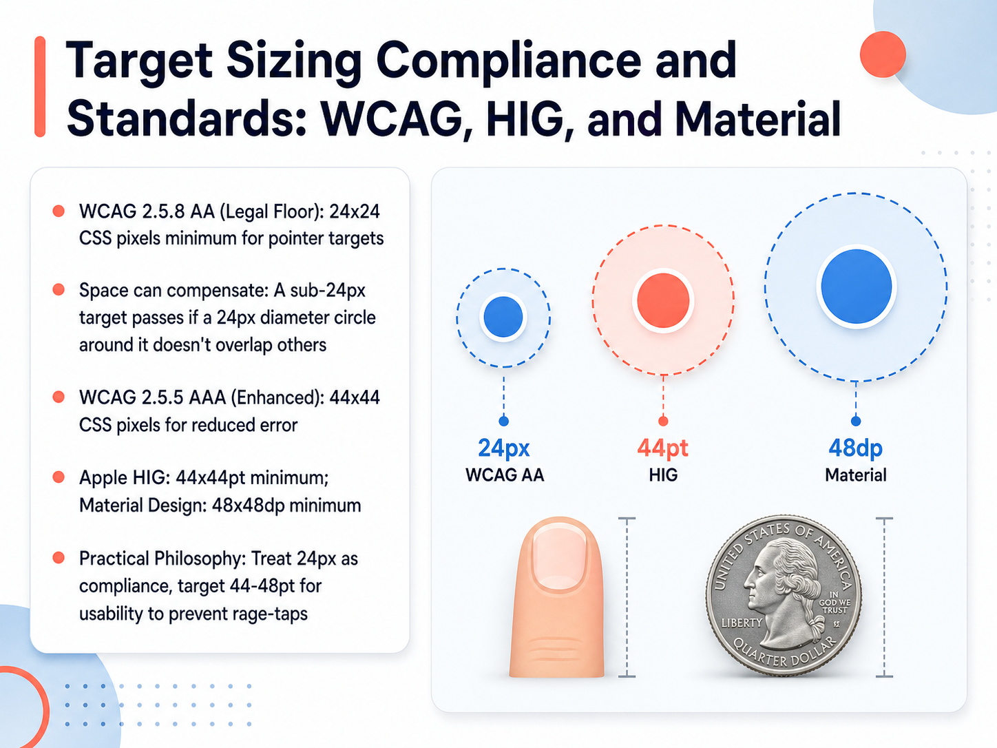
 - 05Target Sizing Compliance and Standards: WCAG, HIG, and MaterialNow let's look at the specific standards and guidelines that govern touch target sizing. You'll encounter three main sources: WCAG, Apple's Human Interface Guidelines, and Google's Material Design. They don't all agree, so understanding the differences is essential. WCAG 2.5.8 at Level AA sets the legal floor: a minimum size of 24 by 24 CSS pixels for pointer targets. However, spacing can compensate. If a target is smaller than 24 pixels, it can still pass if a 24-pixel diameter circle centered on it does not overlap adjacent targets. For enhanced accessibility, WCAG 2.5.5 at Level AAA recommends a larger target of 44 by 44 CSS pixels to reduce errors. Platform guidelines are more generous. Apple's HIG specifies a minimum of 44 by 44 points, while Material Design requires 48 by 48 density-independent pixels. Here's a practical philosophy to guide your work: treat 24 pixels as the compliance floor you must meet. Then, aim for 44 to 48 points as your usability target. This higher threshold directly addresses the frustration of missed taps and accidental activations, preventing what we often call rage-taps. Now that we've covered the sizing standards, let's move on to where we place those targets. The next topic is designing for thumb zones and comfortable reach.
 w3.orgw3.orgw3.org+22 min
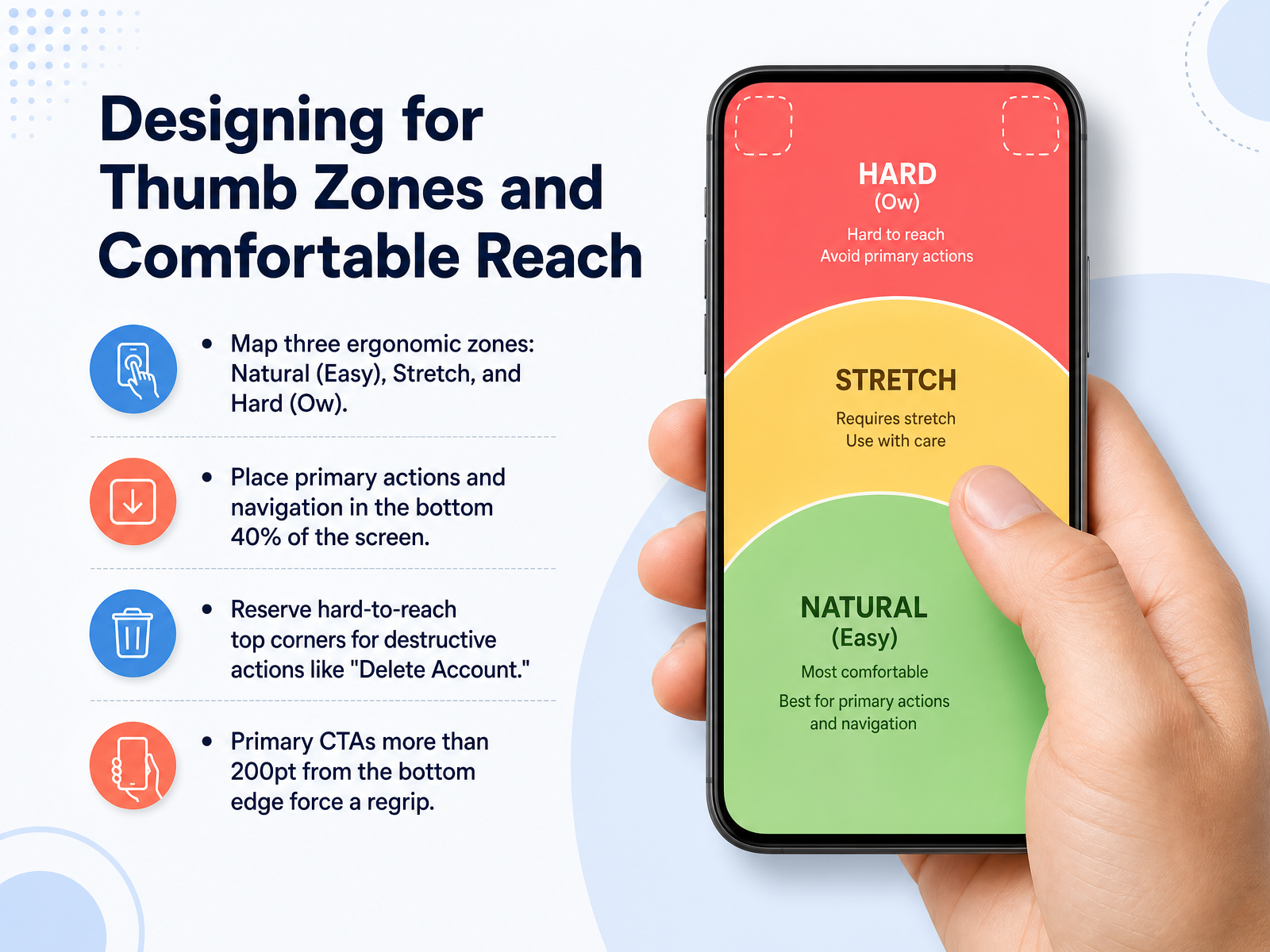
 - 06Designing for Thumb Zones and Comfortable ReachLet's get practical and map the screen real estate your thumb can actually reach. We divide the interface into three ergonomic zones: the Natural zone, which is the easy, comfortable arc along the bottom of the screen; the Stretch zone in the middle, which requires a bit of effort; and the Hard zone — sometimes called the 'Ow' zone — in the top corners, which forces a grip shift or a second hand. Following this map means placing your primary actions and main navigation in the bottom forty percent of the screen. The top corners, meanwhile, are perfect for destructive actions like 'Delete Account' precisely because they are hard to reach, which acts as a physical safety brake against accidental taps. Remember, if a primary call-to-action button sits more than two hundred points from the bottom edge on a standard phone, you are forcing a regrip and adding measurable friction to the task. Coming up next, we'll explore modern navigation patterns specifically designed for one-handed use.
 timgraf.com72technologies.comw3.org+21 min
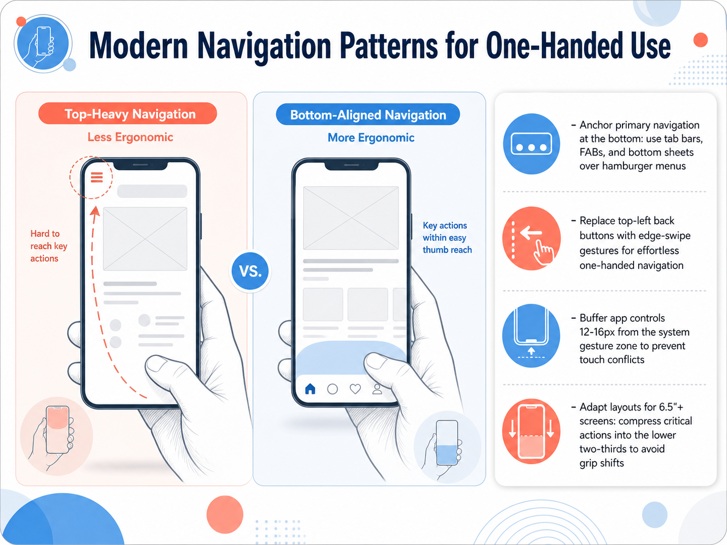
 - 07Modern Navigation Patterns for One-Handed UseNow let's talk about modern navigation patterns specifically for one-handed use. On today's large phones, the old rule of putting everything at the top is simply broken. Instead, anchor your primary navigation at the bottom. Use tab bars, floating action buttons, and bottom sheets instead of hiding destinations behind a top-left hamburger menu. Replace that hard-to-reach back button in the top corner with an edge-swipe gesture. It feels immediate and keeps the thumb in its natural comfort zone. Next, a practical spacing rule. Buffer your app controls twelve to sixteen pixels from the system gesture zone at the bottom edge. This prevents touch conflicts where the user tries to tap your button but triggers the device's home indicator instead. And for screens over six and a half inches, compress the most critical actions into the lower two-thirds of the display. This keeps everything reachable without forcing a grip shift. Next, we'll explore how to make every interaction feel solid with instant, continuous haptic-visual feedback loops.
 timgraf.com72technologies.com2 min
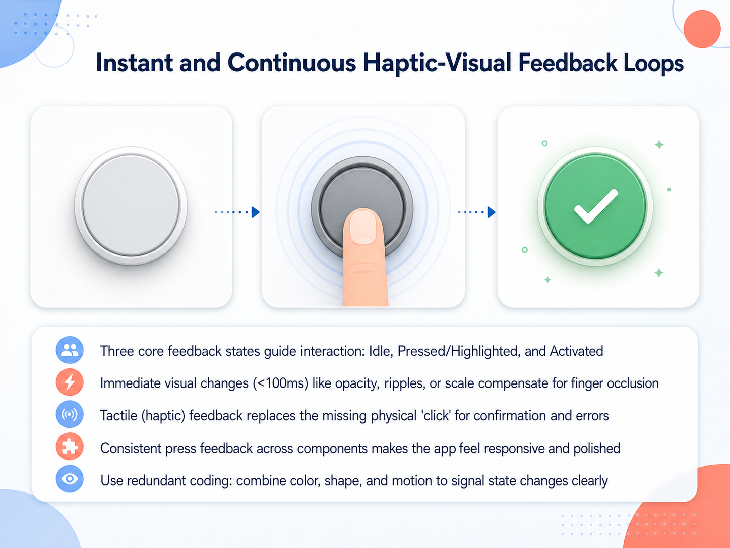
 - 08Instant and Continuous Haptic-Visual Feedback LoopsNow, let's look at how instant and continuous feedback loops make touch interfaces feel truly responsive. We design around three core states: Idle, Pressed, and Activated. The moment a finger touches a target, we need an immediate visual reaction, faster than one hundred milliseconds, because the finger itself is blocking the view. Techniques like a quick opacity shift, a scale reduction, or a ripple effect confirm the hit instantly. For confirmation and error states, haptic feedback fills a critical gap; a light vibration replaces the physical 'click' we miss on flat glass. The key to a polished app is consistency. Using the same press dynamics across all your buttons and interactive components builds user confidence. And to make this truly accessible, always use redundant coding. Do not rely on color alone; combine a shape transformation with a motion pulse or an overlay. Together, these visual and tactile signals clearly communicate exactly what state the interface is in. Next, we'll explore how to translate these critical feedback principles into your larger design system.
 developer-rno.apple.comdeveloper.apple.comdeveloper.apple.com+21 min
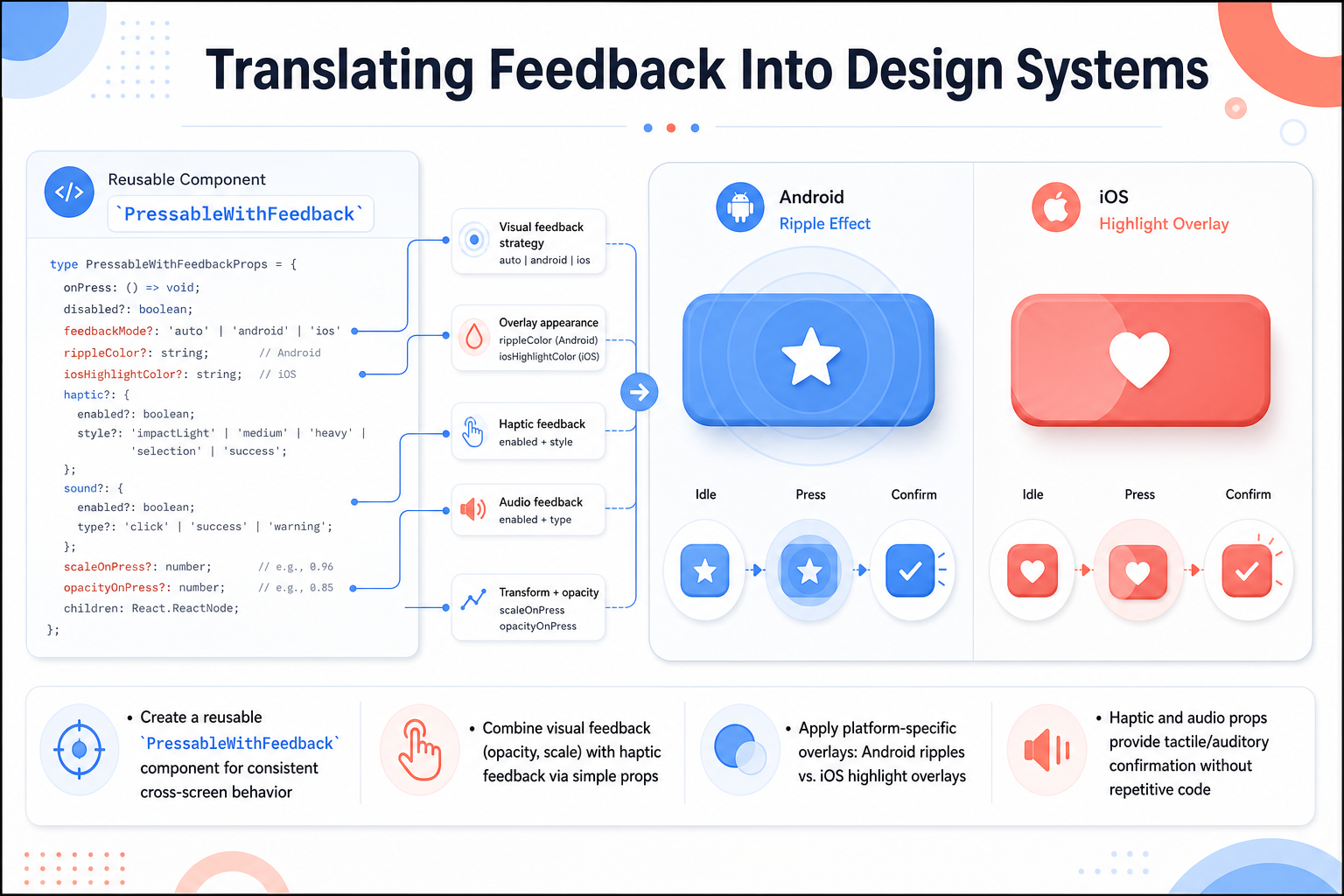
 - 09Translating Feedback Into Design SystemsLet's translate these feedback principles into a reusable design system. Instead of coding press effects on every single button, we create a single component called PressableWithFeedback. This wrapper handles consistent cross-screen behavior so every tap feels familiar. Through simple props, you can combine visual feedback like opacity and scale changes with haptic vibrations for tactile confirmation. The component also applies platform-specific overlays automatically. On Android, users see the familiar ripple effect, while on iOS they get a highlight overlay that matches platform conventions. Haptic and audio props give you tactile and auditory confirmation without writing repetitive logic across your screens. One component becomes your single source of truth for touch feedback, keeping your code clean and your user experience polished. In the next slide, we will explore Inclusive Touch, focusing on accessibility and motor impairments.
 1 min
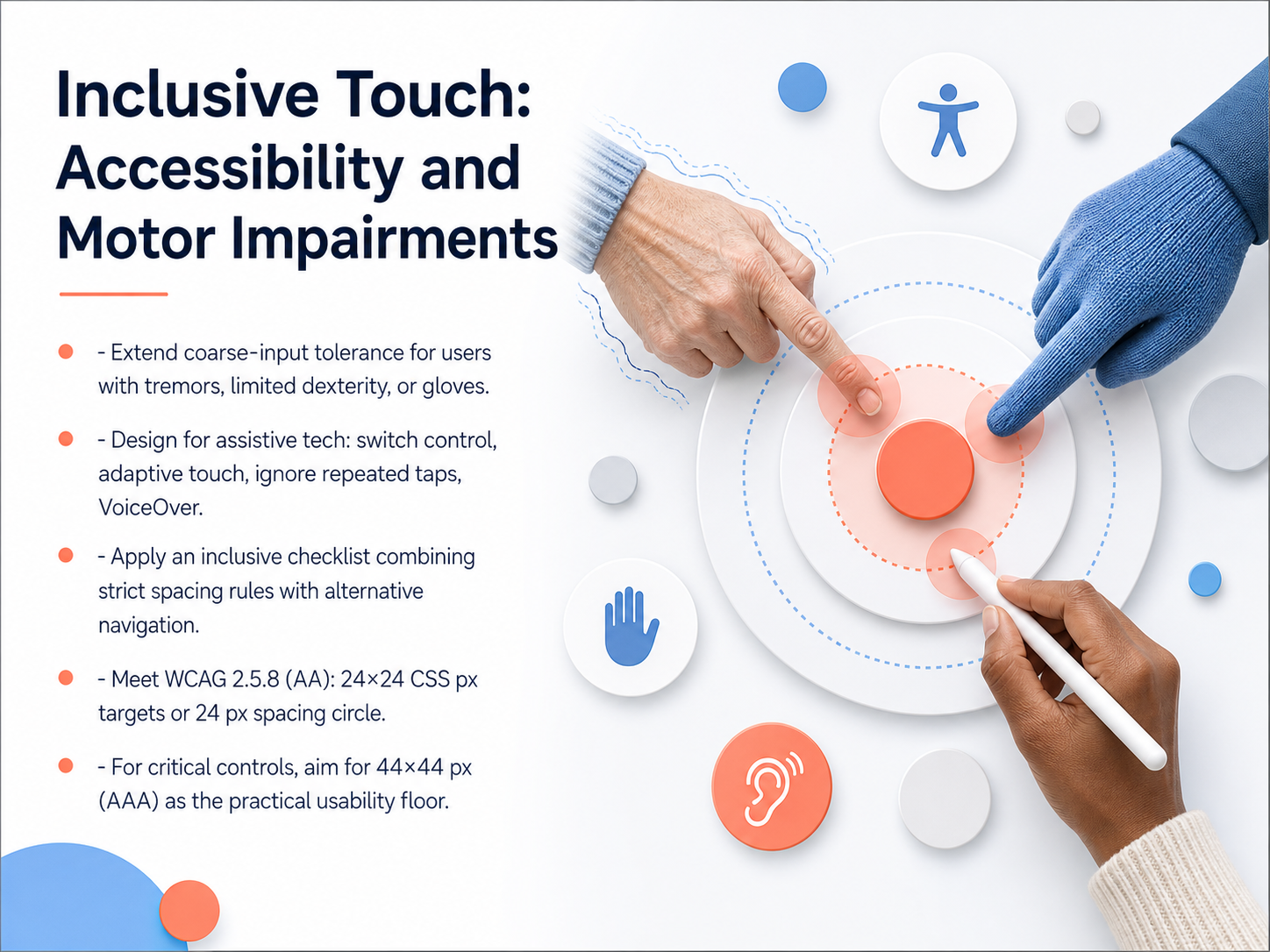
1 min - 10Inclusive Touch: Accessibility and Motor ImpairmentsNow let's focus specifically on designing for motor impairments and inclusive touch. When we talk about inclusive touch, we're not just extending the previous guidelines; we're designing for users with tremors, limited dexterity, or those wearing gloves. This means our touch targets need a wider tolerance for coarse input. We also need to design with assistive technology in mind, ensuring compatibility with switch controls, adaptive touch, and screen readers like VoiceOver. Crucially, we must handle repeated taps correctly, ignoring accidental double-taps that can frustrate users. To meet the legal minimum for accessibility, we apply WCAG criterion two point five point eight at Level AA. This states your touch targets must be at least twenty-four by twenty-four CSS pixels, or have a twenty-four pixel clear space around them. Think of this as the absolute floor you cannot drop below. However, for any critical control—like a Buy Now or Submit button—I want you to set your practical floor at the enhanced AAA standard: forty-four by forty-four pixels. This larger size aligns with the average finger pad and dramatically reduces activation errors. Create an inclusive checklist for your projects that combines strict spacing rules with alternative navigation paths, because a design that works for motor impairments often makes the experience better for everyone. Next, let's move into practical testing and validation techniques to see how we verify these targets work in the real world.
 w3.orgw3.orgw3.org+22 min
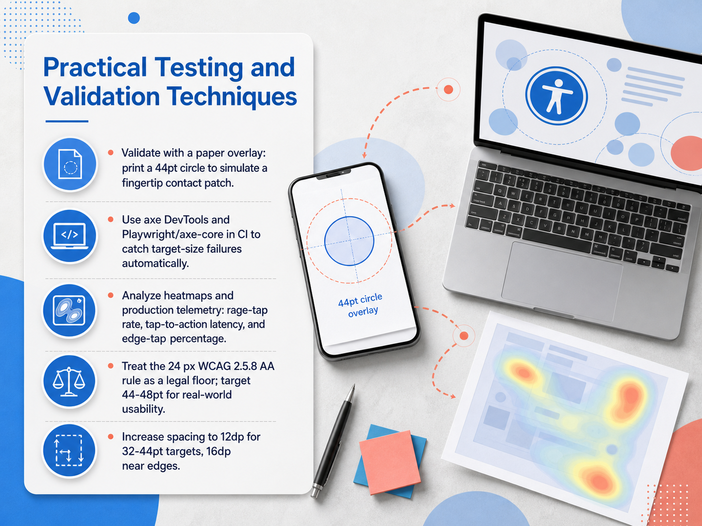
 - 11Practical Testing and Validation TechniquesLet's move from theory to practice and talk about how to actually validate your touch targets. First, try the paper overlay test. Print a 44-point circle on a transparency to simulate a fingertip contact patch. Place it over your screen and check if your interactive elements are large enough. For automated enforcement, use tools like axe DevTools or Playwright with axe-core in your CI pipeline to catch target-size failures before they ship. But don't stop with syntax checks. Analyze your production telemetry. Look at rage-tap rates, where users tap multiple times quickly in the same spot. Measure tap-to-action latency, and track the percentage of taps that land near screen edges. These metrics tell the real story. And remember, the WCAG 2.5.8 AA minimum of 24 pixels is a legal floor, not a design goal. For real-world usability, target 44 to 48 points. Finally, increase spacing to at least 12 density-independent pixels for 32-to-44-point targets, and 16 density-independent pixels near screen edges where thumbs approach at an angle. In our final slide, we'll wrap everything into a practical checklist and key takeaways for touch-friendly design.
 w3.orgevelance.iouxguides.com+22 min
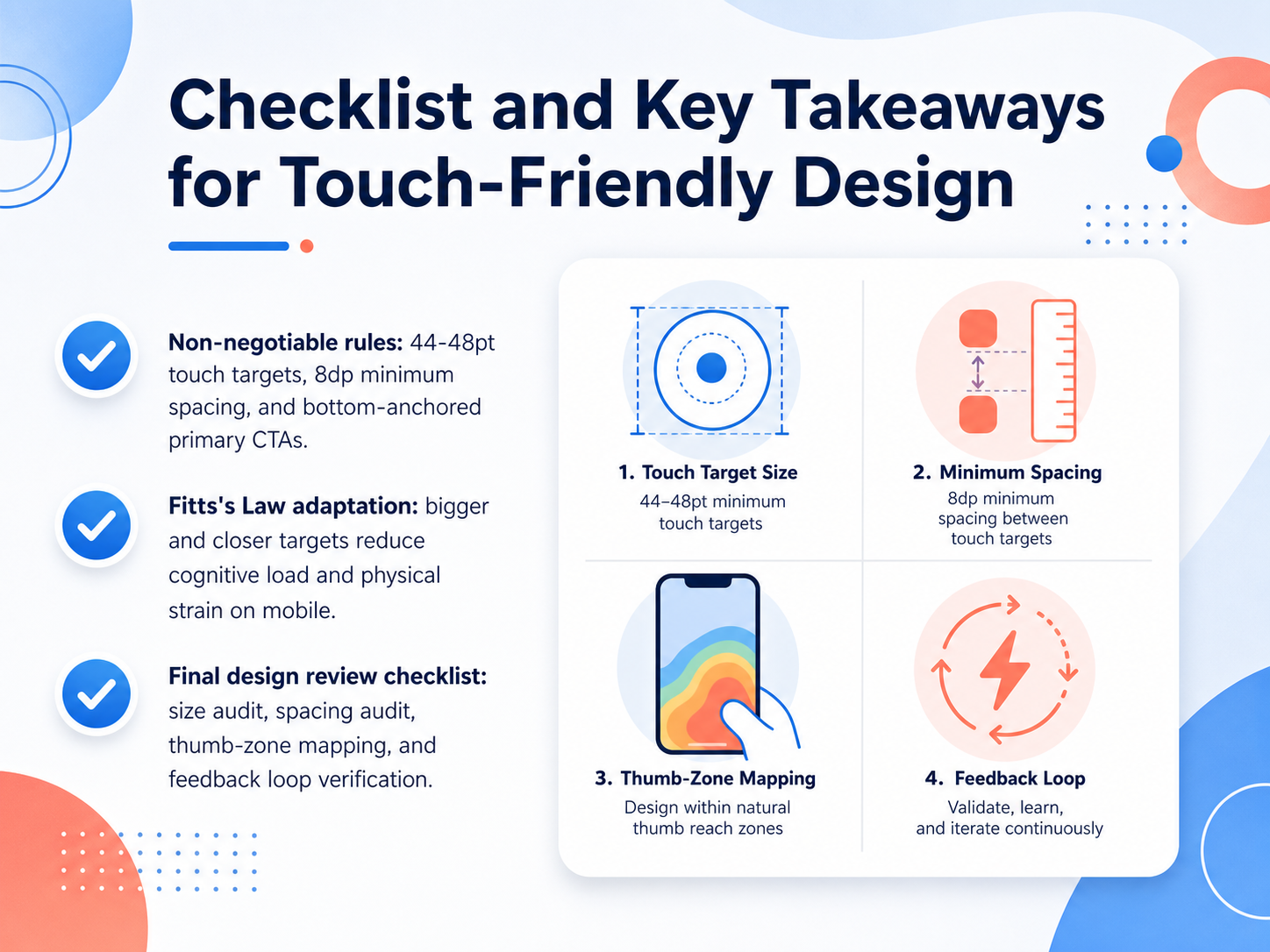
 - 12Checklist and Key Takeaways for Touch-Friendly DesignLet's close with a clear checklist that you can take back to your own design reviews. Think of it as a final quality gate before any mobile screen ships. First, the non-negotiable rules. Your touch targets must be at least 44 to 48 points in size. Maintain a minimum gap of 8 density-independent pixels between interactive elements. And anchor your primary call-to-action buttons in the bottom portion of the screen. This directly reduces physical strain by keeping actions inside the comfortable reach of the thumb. Next, apply what we learned from Fitts's Law. Bigger targets that are placed closer to the natural resting spot of the hand cut both cognitive load and physical effort. It is not just about size; position matters just as much. Finally, before you sign off, run this four-part audit. Conduct a size audit to check every tappable area. Do a spacing audit to ensure no buttons are crowded together. Map your layout against the thumb zones to move primary actions away from those hard-to-reach top corners. And verify your feedback loop to make sure every tap triggers a clear, immediate response. That covers the essentials of designing for touch. Thank you for your time, and go design interfaces that truly fit the hand.
 w3.orgevelance.iouxguides.com+22 min
Take the deck with you
Download this course as a file — free, no sign-up needed.
- PDF handoutEvery slide page, ready to print or share.13 pages · 2.8 MBDownload
- Narrated PowerPointThe deck that presents itself — every slide carries the digital human's narration video.13 pages · 13.7 MBDownload
- PowerPoint slidesThe full deck as a .pptx — open it in PowerPoint, Keynote, or Google Slides.13 pages · 2.8 MBDownload
Free to use in your own training — please keep the PersonWise credit page at the end.
Have your own deck? Turn it into a course
Sources consulted
Web sources consulted while building this course.
- Buttons - Menus and actions - Components - Human Interface Guidelines - Design - Apple Developer — developer-rno.apple.com
- UI Design Dos and Don’ts - Apple Developer — developer.apple.com
- Human Interface Guidelines | Apple Developer Documentation — developer.apple.com
- Touch Target Size | 2025.7.2 | Axe DevTools® for Mobile | Deque Docs — docs.deque.com
- Mobile validations, Tappable Area — knowledge.evinced.com
- Understanding Success Criterion 2.5.5: Target Size | WAI — w3.org
- Fitts’s Law and Touch Target Sizing That Holds Up on Mobile | Evelance — evelance.io
- How to Design for Touch | UIGuides — uxguides.com
- Tap Targets and Thumb Zones: Beyond the 44px Rule · 72Technologies — 72technologies.com
- Fitts's Law and Tap Target Sizing · The Frontend Casebook — anmshpndy.com
- Touch Target Spacing | 2025.7.2 | Axe DevTools® for Mobile | Deque Docs — docs.dequelabs.com
- Understanding Success Criterion 2.5.8: Target Size (Minimum) | WAI — w3.org
- Touch target size — support.google.com
- Touch Targets & Spacing | Human Standards — humanstandards.org
- All touch targets must be 24px large, or leave sufficient space | Axe Rules — dequeuniversity.com
- Understanding Success Criterion 2.5.8: Target Size (Minimum) | WAI | W3C — w3.org
- Web Content Accessibility Guidelines (WCAG) 2.2 — w3.org
- Understanding Success Criterion 2.5.8: Target Size (Minimum) | WAI | W3C — w3c.github.io
- Axe Rules | Deque University | Deque Systems — dequeuniversity.com
- Designing for the Thumb Zone: A Modern Guide to Mobile UX That Respects Human Anatomy - Timothy Graf | UX/UI Design Theory & 2026 Strategies — timgraf.com