Begin
14 pages · ~28 min
UX Design Case Studies: Patterns and Tradeoffs
This course analyzes real UX design case studies to help designers recognize recurring patterns and make informed tradeoffs in their own projects.
A digital instructor presents all 14 pages. Hold “Ask” at any point and ask out loud — the answer comes from this course. No sign-up needed.
What you’ll learn
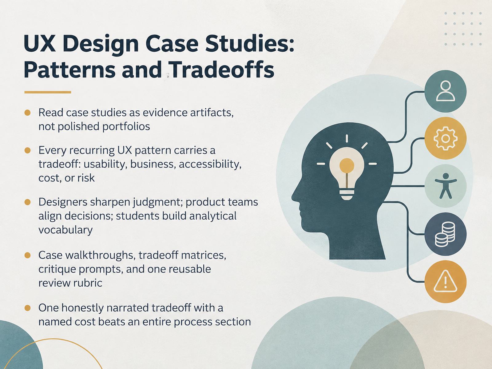
- 01UX Design Case Studies: Patterns and TradeoffsWelcome. This course is about reading UX case studies as evidence artifacts, not polished portfolios. Our goal is to help you weigh decisions and their tradeoffs with clear eyes.
Here's the framing. Every recurring UX pattern carries a tradeoff, whether in usability, business impact, accessibility, cost, or risk. Naming that cost out loud is most of the work.
Who is this for? Designers sharpen their judgment. Product teams align on decisions. Students build analytical vocabulary. Teachers and reviewers, you're equal listeners here, and I'll make the criteria explicit enough for you to push back on.
Over the next slides, we'll work through case walkthroughs, tradeoff matrices, critique prompts, and one reusable review rubric. Here's the habit I'd offer. One honestly narrated tradeoff with a named cost tends to beat an entire process section. Consider that as we go.
Let's begin with how to read a case study critically.thecrit.couaskos.orgrusaka.com+22 min
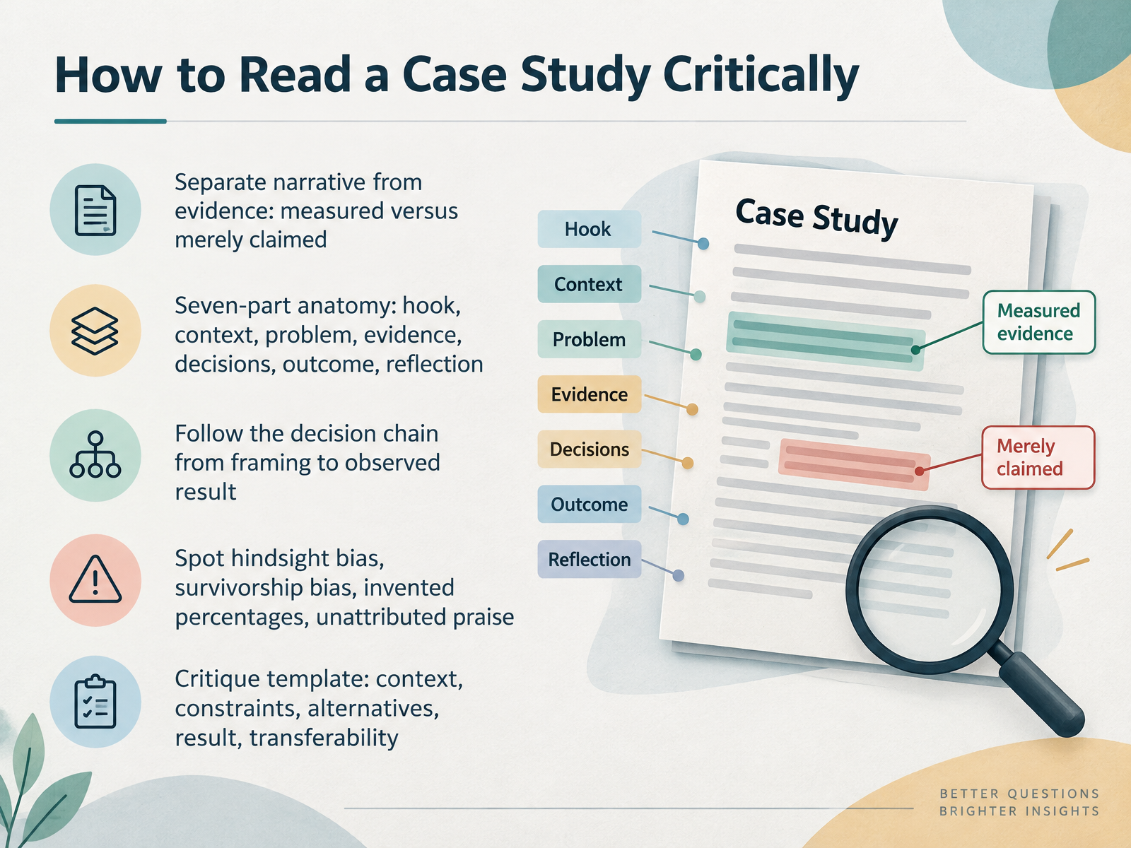
- 02How to Read a Case Study CriticallyLet's talk about how to read a case study critically. Start by separating narrative from evidence. Measured results and merely claimed results deserve different weight. Then use the seven-part anatomy: hook, context, problem, evidence, decisions, outcome, reflection. Follow the decision chain from how the problem was framed to the result actually observed. Watch for hindsight bias, survivorship bias, invented percentages, and praise with no attribution. For your own reviews, a simple template tends to work: context, constraints, alternatives, result, transferability. Pause on that last one, because transferability is often the weakest link. Consider whether the same decision would hold under different constraints. Next, we'll look at Pattern Library: Recurring UX Solutions.
 thecrit.couaskos.orgrusaka.com+21 min
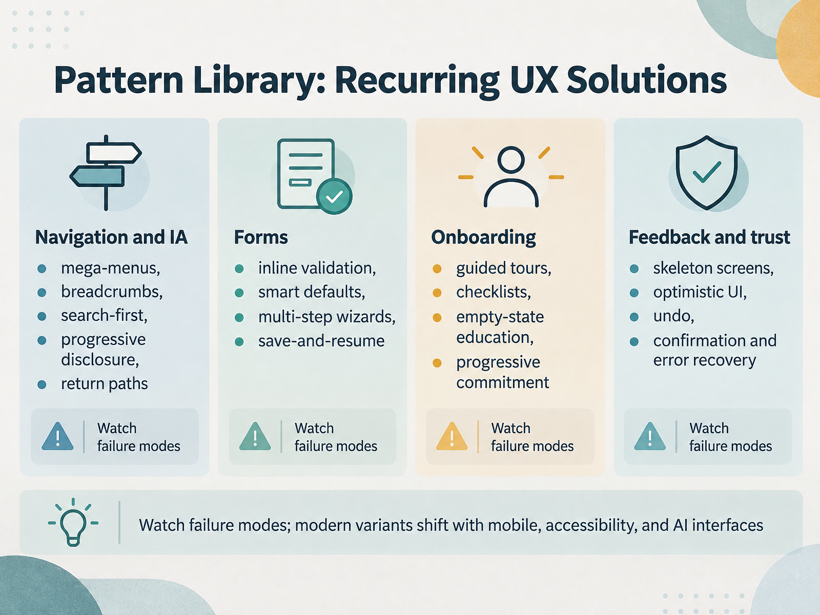
- 03Pattern Library: Recurring UX SolutionsNext, let's look at the pattern library, the recurring solutions we keep reaching for. Take navigation and information architecture. Mega-menus, breadcrumbs, search-first layouts, progressive disclosure, and clear return paths all answer the same question: where am I, and where can I go? The tradeoff is real. Mega-menus add scan cost and mobile complexity, while search-first hides the structure from newcomers. Pause there and weigh it. Forms follow the same logic. Inline validation, smart defaults, multi-step wizards, and save-and-resume each reduce effort in the moment, but inline validation can feel nagging if it fires too early, and wizards push longer flows. Onboarding patterns like guided tours, checklists, empty-state education, and progressive commitment shorten the path to first success, at the cost of screen space and effort to maintain. Feedback and trust patterns such as skeleton screens, optimistic UI, undo, and confirmation prompts manage uncertainty, but each adds timing risk or friction. Watch the failure modes, and consider how the variants shift with mobile, accessibility, and AI interfaces. That leads us into the next slide: Tradeoff Analysis: Turning Patterns into Decisions.
 ui-patterns.comtheuxshop.comuxpatternsguide.com+22 min
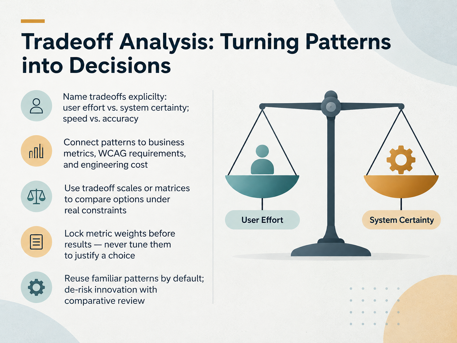
- 04Tradeoff Analysis: Turning Patterns into DecisionsLet's move from patterns to decisions. A tradeoff analysis makes the costs visible, so choices can be reviewed rather than argued. Name the tradeoff first. User effort versus system certainty, and speed versus accuracy. Then connect each option to business metrics, WCAG requirements, and engineering cost. Tradeoff scales or matrices help compare options under real constraints. One discipline matters here. Lock metric weights before you see results. Never tune them afterward to justify a choice. By default, reuse familiar patterns; they lower learning cost and review risk. For innovation, de-risk it with comparative review against the familiar baseline. This tends to work when the decision is named up front. Consider whether your weights would survive a skeptical reviewer. Next, we look at a first case. Case Study 1: Checkout and Conversion Patterns.
 washi.cs.waseda.ac.jpnngroup.comnngroup.com+22 min
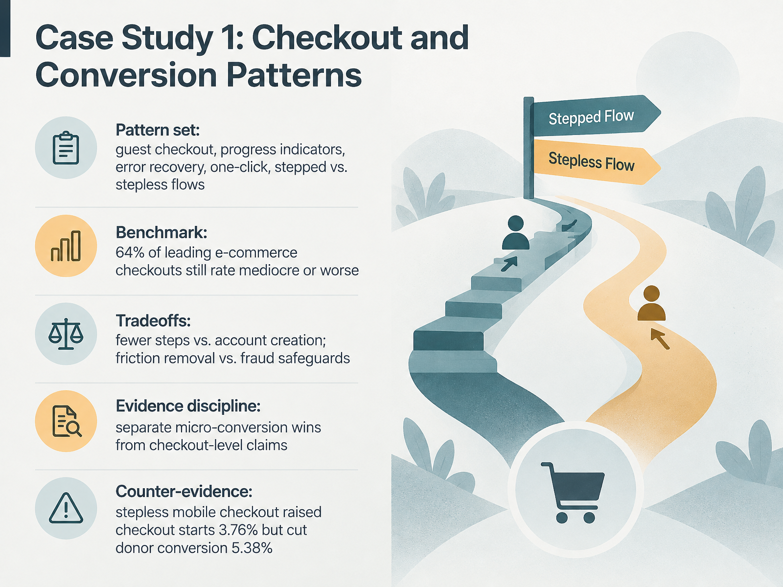
- 05Case Study 1: Checkout and Conversion PatternsNext, let's work through our first case study, on checkout and conversion patterns. The product context here is e-commerce, and the constraint is a familiar one: the checkout sits at the bottom of the funnel, where small frictions cost real revenue. The pattern set includes guest checkout, progress indicators, error recovery, one-click, and stepped versus stepless flows. Baymard's benchmark is a useful reference: about sixty-four percent of leading e-commerce checkouts still rate mediocre or worse. Notice the tradeoffs in the same breath. Fewer steps can reduce friction, but may reduce account creation. Removing friction can conflict with fraud safeguards. One-click helps returning users, but raises risk and authorization complexity. And keep evidence discipline: separate micro-conversion wins, like form completion, from checkout-level claims. The counter-evidence makes this concrete. A stepless mobile checkout raised checkout starts by three point seven six percent, but cut donor conversion by five point three eight percent. So consider whether a stepped flow better matches the decision cost of your checkout. That leads us to Case Study 2: Onboarding, Retention, and Engagement Tradeoffs.
 productphilosophy.combaymard.comsimplr.design+22 min
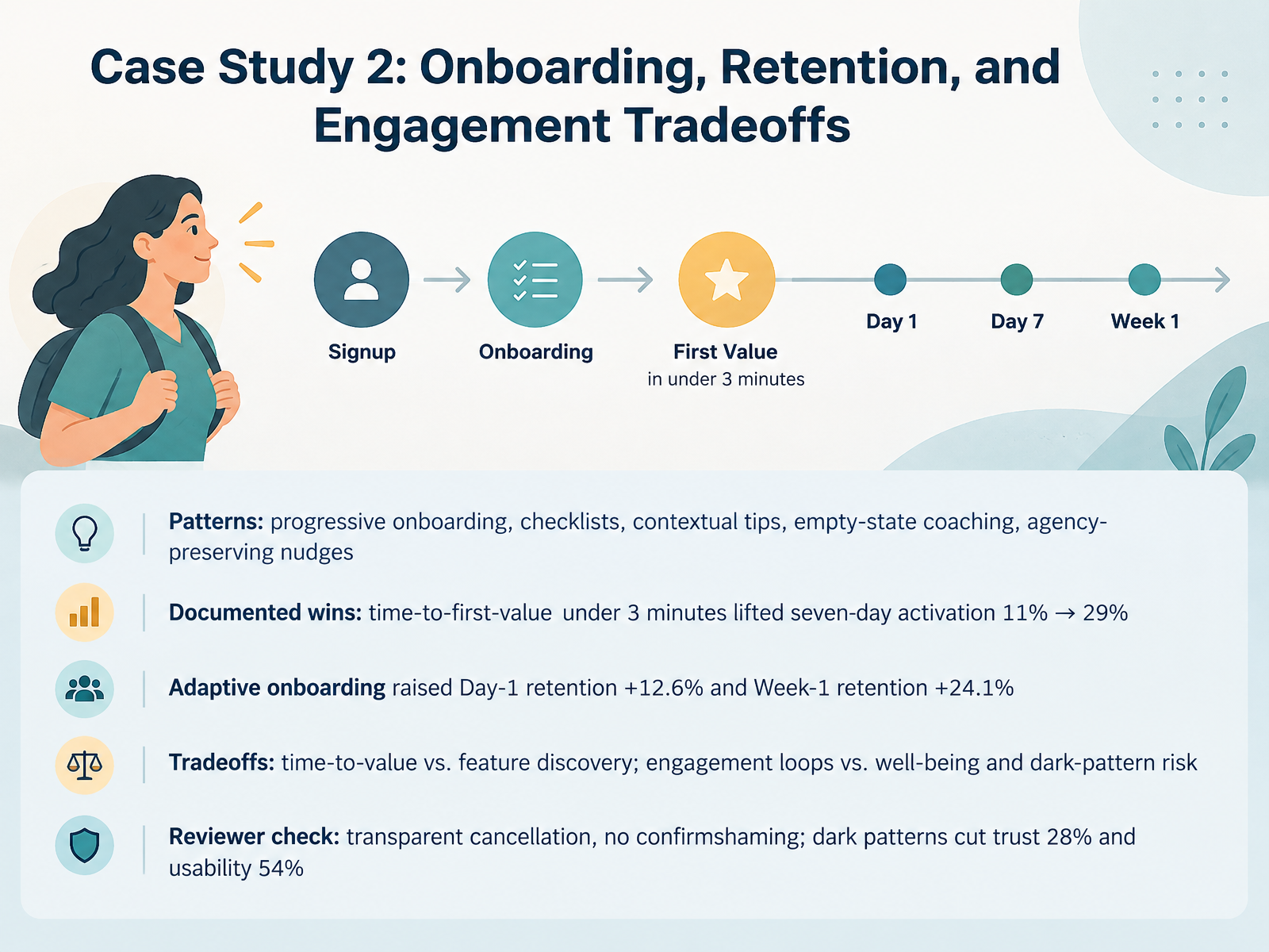
- 06Case Study 2: Onboarding, Retention, and Engagement TradeoffsLet's move to our second case study, on onboarding, retention, and engagement tradeoffs. The patterns here include progressive onboarding, checklists, contextual tips, empty-state coaching, and nudges that preserve a user's sense of agency. In one project-management tool with fourteen-day trials, only eleven percent of signups created a first project within seven days. After a redesign targeting time-to-first-value under three minutes, seven-day activation rose to twenty-nine percent. In an education platform, adaptive onboarding raised Day-1 retention by twelve point six percent and Week-1 retention by twenty-four point one percent. Now the tradeoffs. Time-to-value can compete with feature discovery. Engagement loops can compete with well-being, and risk slipping into dark patterns. So the reviewer check is explicit: transparent cancellation, and no confirmshaming. Research on dark-pattern-heavy cancellation flows found trust fell twenty-eight percent and usability dropped fifty-four percent. Consider whether your onboarding removes friction the user values. When the core task is complex, an alternative like a guided hands-on tutorial may beat speed. Next, we look at Case Study 3: Accessibility and Inclusive Design Decisions.
 2 min
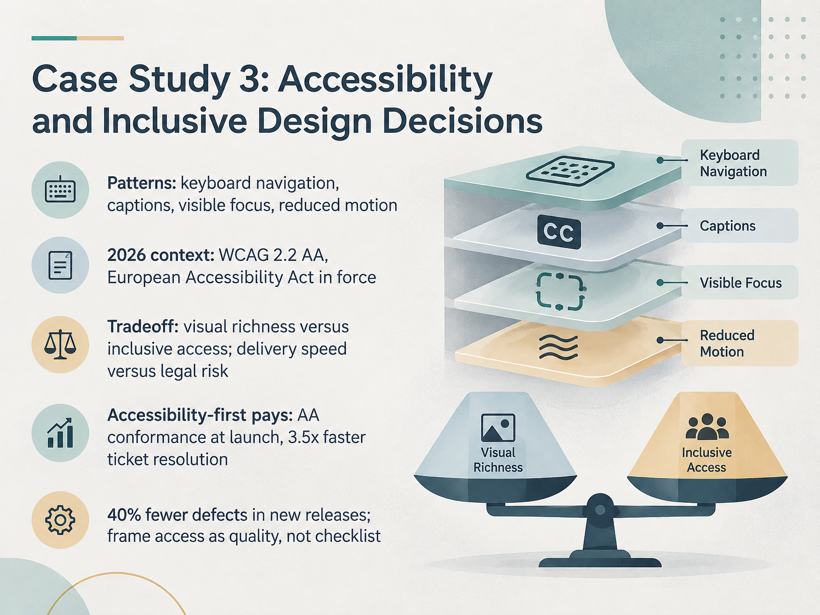
- 07Case Study 3: Accessibility and Inclusive Design DecisionsNow let's look at accessibility as a design decision, not a checklist item. The patterns are familiar: keyboard navigation, captions, visible focus, and honoring reduced motion. The 2026 context matters here. WCAG 2.2 AA is the baseline, and the European Accessibility Act is in force, so conformance at launch tends to be cheaper than retrofitting. The tradeoff is real: visual richness versus inclusive access, and delivery speed versus legal risk. Pause there and weigh it. Teams that build accessibility-first often see returns. One retailer reported WCAG 2.2 AA conformance at launch and roughly three and a half times faster resolution of accessibility tickets. Another reported up to forty percent fewer defects in new releases after standardizing components and testing. Consider whether framing access as quality, not a checklist, fits your team. It tends to work when reviews include keyboard and screen reader testing early. Next, Case Study 4: AI-Assisted Interfaces and Uncertainty.
 2 min
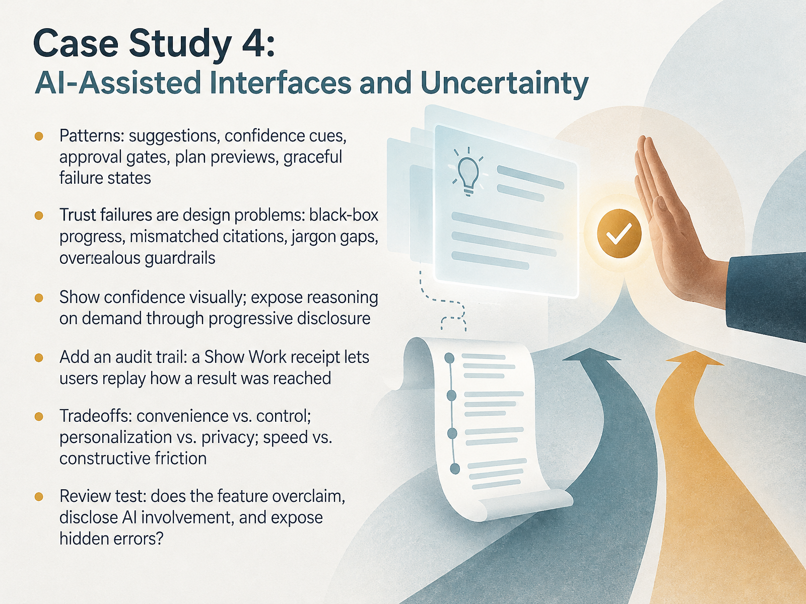
- 08Case Study 4: AI-Assisted Interfaces and UncertaintyNow let's turn to AI-assisted interfaces, where uncertainty is the central design material. Common patterns include suggestions, confidence cues, approval gates, plan previews, and graceful failure states. The useful framing here is that most trust failures are design problems, not model problems. Black-box progress, mismatched citations, jargon gaps, overzealous guardrails. In one documented case, a policy assistant had roughly eighty percent internal accuracy, but perceived accuracy sat near thirty percent, because users couldn't verify the receipts. So show confidence visually, and expose reasoning on demand through progressive disclosure. Pause here. That keeps the main surface clean, but it assumes users know the disclosure exists. Consider adding a Show Work receipt, an audit trail that lets people replay how a result was reached. The tradeoffs run in pairs: convenience versus control, personalization versus privacy, speed versus constructive friction. Pause. None of these resolve universally; this tends to work when the cost of a wrong output is high. As a review test, ask whether the feature overclaims, discloses AI involvement, and exposes hidden errors. Next, Case Study 5: Design Systems and Consistency Costs.
 2 min
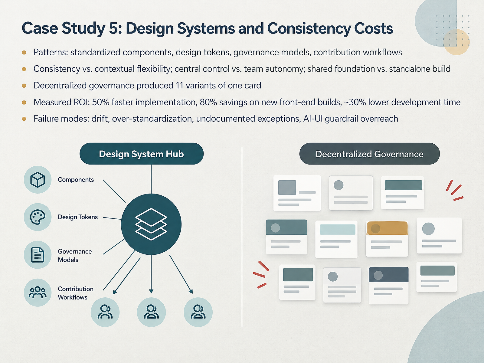
- 09Case Study 5: Design Systems and Consistency CostsLet's move on to design systems and the real cost of consistency. Picture a product organization with many teams. The constraint is speed, and everyone is building components their own way. Patterns here include standardized components, design tokens, governance models, and contribution workflows. The core tension is consistency versus contextual flexibility, and central control versus team autonomy. One documented case is instructive. Decentralized governance produced eleven variants of a single card. The team moved to centralized ownership. That fixed drift, but it raised the support and communication burden. Measured returns tend to follow adoption, roughly fifty percent faster implementation, about eighty percent savings on new front-end builds, and around thirty percent lower development time. Pause on those numbers, because they depend on scale. Then weigh the failure modes: drift, over-standardization, undocumented exceptions, and AI-interface guardrails that overreach. Consider whether a shared foundation or a standalone build fits your constraints. A standalone system may be the better choice when your roadmap can't depend on another team. Next, we look at evaluation design: metrics, comparison, and attribution.
 2 min
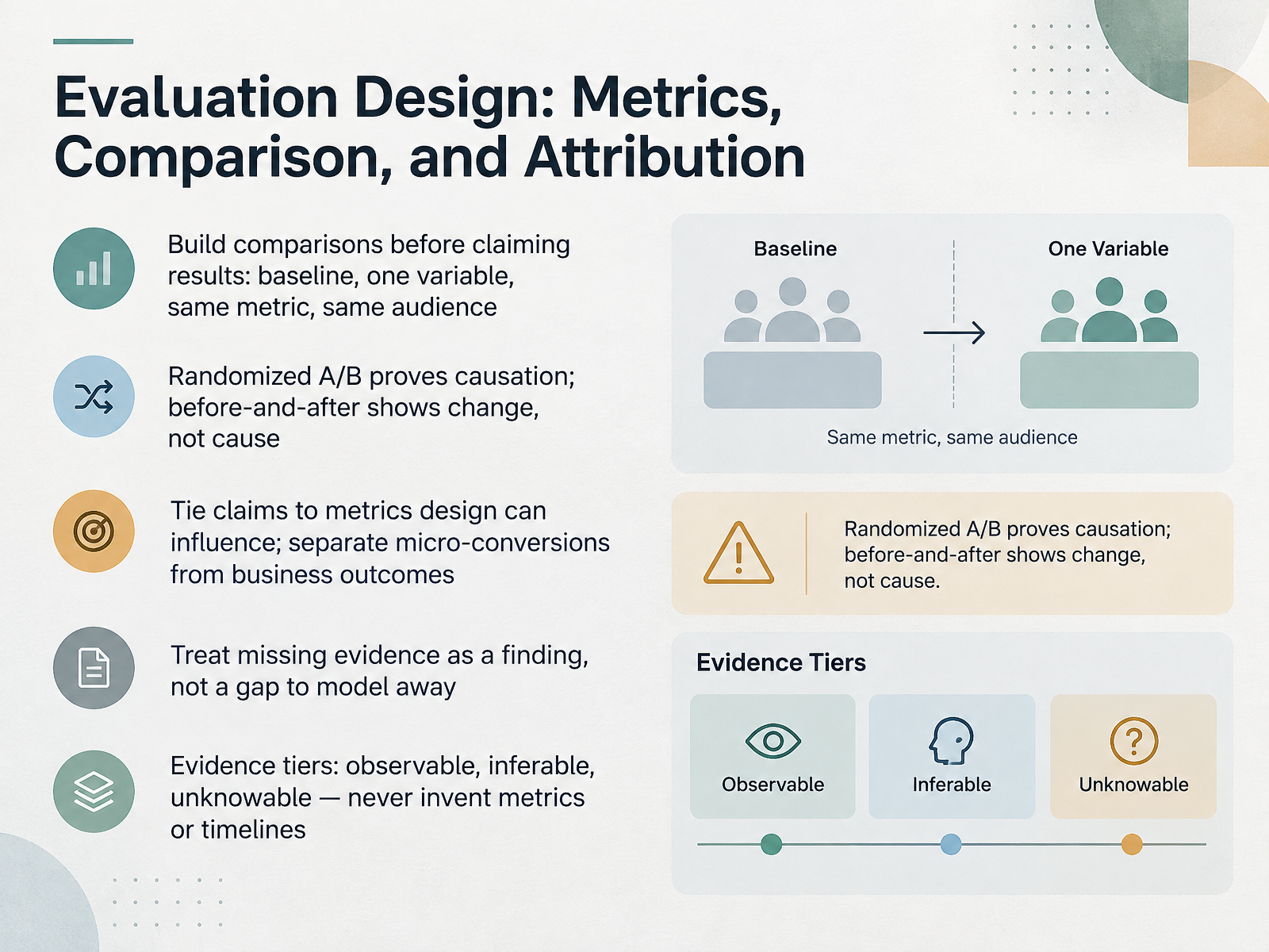
- 10Evaluation Design: Metrics, Comparison, and AttributionLet's turn to evaluation design, because how we measure shapes what we can honestly claim. Build the comparison before you claim a result: a baseline, one variable, the same metric, and the same kind of audience. A randomized A divided by B test can support a causal claim. A simple before-and-after shows that something changed, not why. So when you compare, pause and ask what this design can and cannot prove. Tie claims to metrics design can actually influence, and keep micro-conversions separate from business outcomes. Treat missing evidence as a finding, not a gap to model away. Tier your evidence: observable, inferable, unknowable. Consider whether your metric is stated precisely enough for a reviewer to challenge it. From pattern to decision memo.
 washi.cs.waseda.ac.jpnngroup.comnngroup.com+21 min
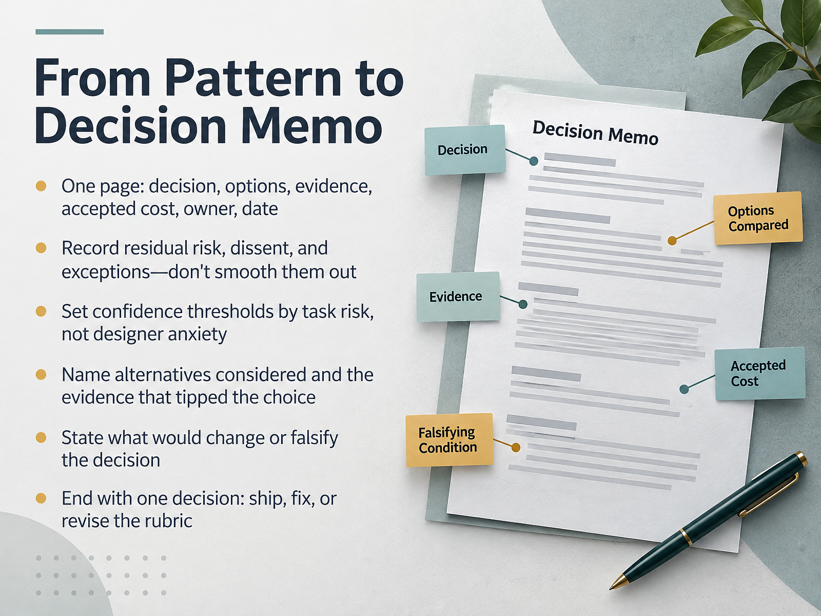
- 11From Pattern to Decision MemoLet's turn patterns into a decision memo. Keep it to one page: the decision, the options, the evidence, the cost you're accepting, an owner, and a date. Record residual risk, dissent, and exceptions. Don't smooth them out. Reviewers need to see where the agreement actually stops. Set confidence thresholds by task risk, not designer anxiety. A high-stakes checkout flow probably needs more evidence than a low-risk settings label. Name the alternatives you considered and the evidence that tipped the choice. Then state what would change or falsify the decision. This tends to work when people can point to the specific signal that would reopen it. End with exactly one decision: ship, fix, or revise the rubric. If you leave with no decision, it was a critique wearing a rubric's clothes. Consider whether your memo makes that final call easy to critique. Next, we'll look at Building Your Review Practice.
 uaskos.orgwashi.cs.waseda.ac.jpnngroup.com+22 min
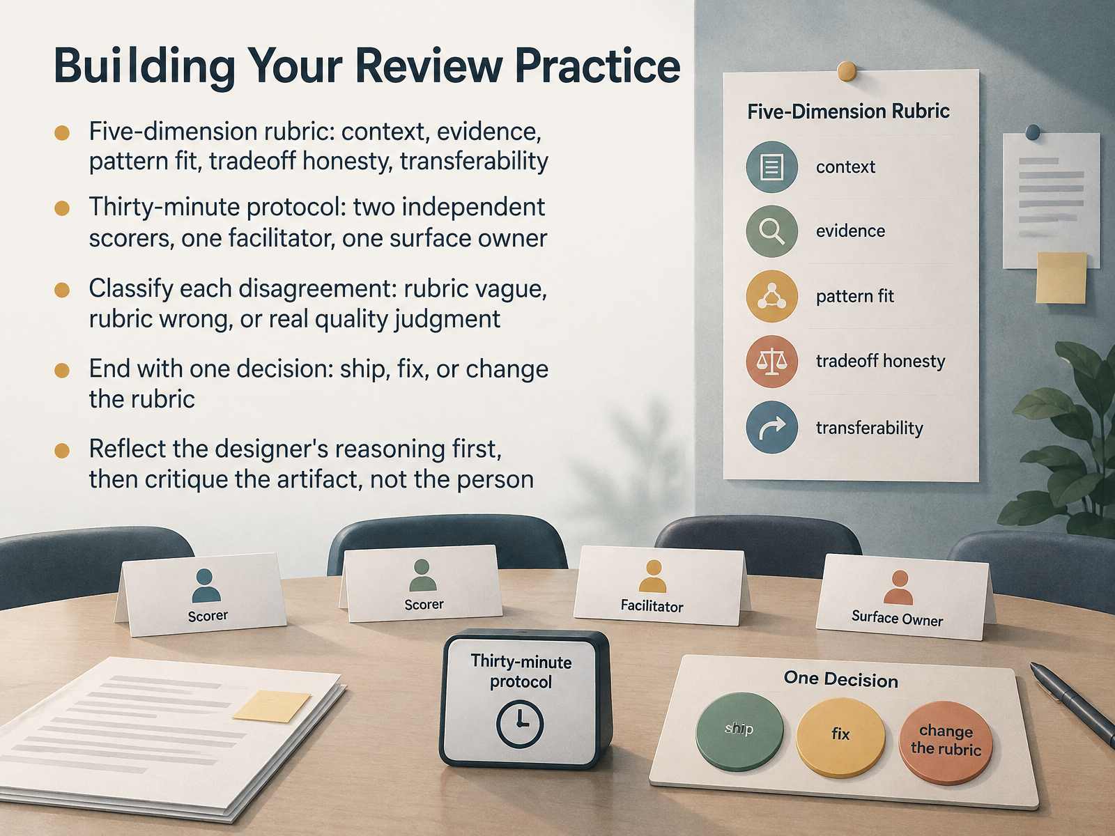
- 12Building Your Review PracticeLet's turn these patterns into a repeatable practice. Start with a five-dimension rubric: context, evidence, pattern fit, tradeoff honesty, and transferability. Then run a thirty-minute protocol with two independent scorers, one facilitator, and one surface owner. When scorers disagree, classify it: the rubric was vague, the rubric was wrong, or it's a real quality judgment. End with one decision: ship, fix, or change the rubric. And reflect the designer's reasoning first, then critique the artifact, not the person. Consider whether your team's current review does this. This tends to work when the roles stay separate. If your context is smaller, a lighter version may fit better. Next, we'll look at teaching the method in classrooms and workshops.
 uaskos.org2 min
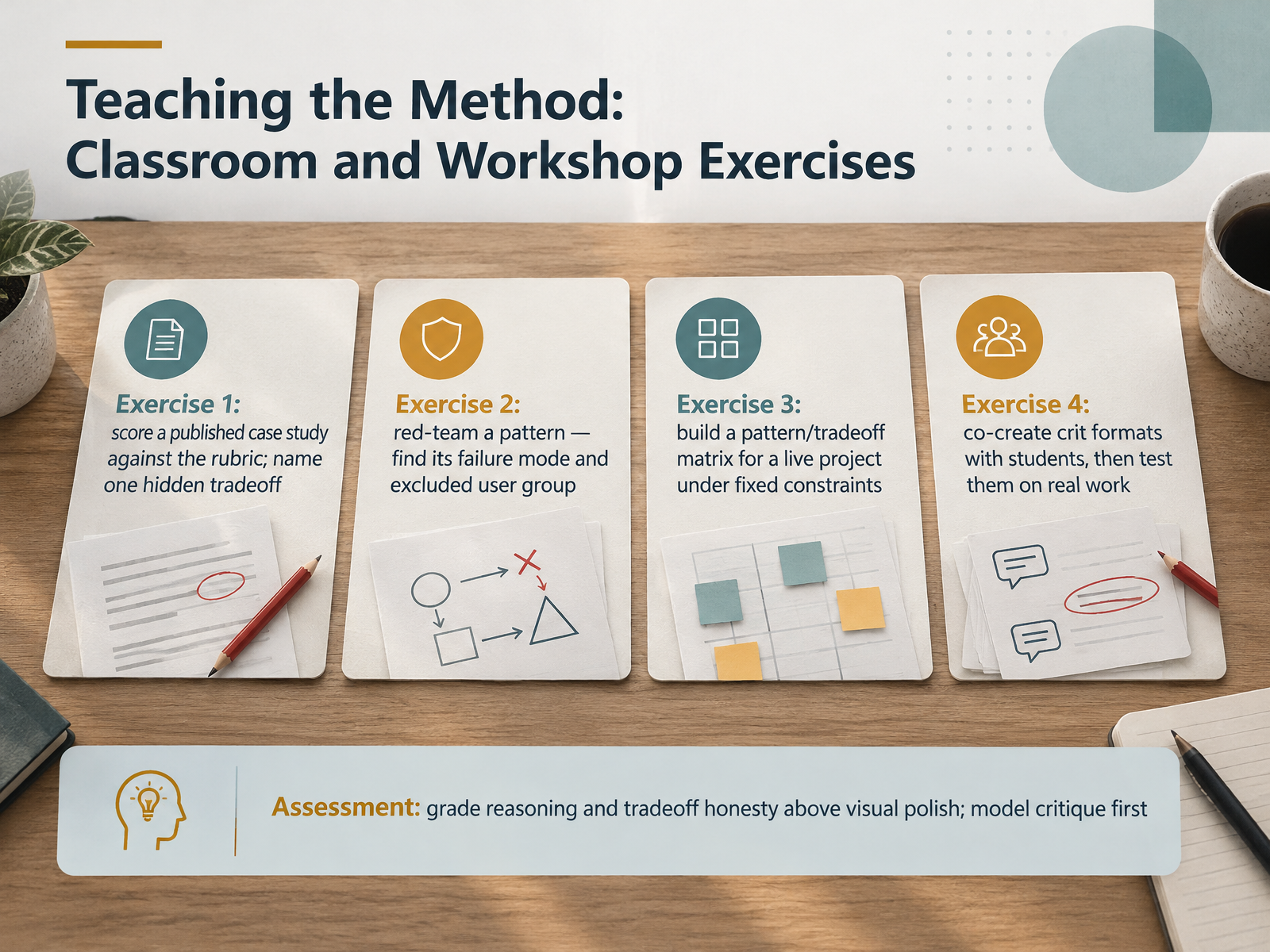
- 13Teaching the Method: Classroom and Workshop ExercisesLet's turn these practices into teaching. Here are four exercises you can run in a classroom or workshop. First, have students score a published case study against a rubric, then name one hidden tradeoff the write-up skipped. Pause there; let them see how often tradeoffs go unstated. Second, red-team a pattern. Ask students to find its failure mode and the user group it excludes. Expect discomfort; that is the point. Third, build a pattern and tradeoff matrix for a live project under fixed constraints, so the cost and risk stays visible. Fourth, co-create crit formats with students, then test them on real work, as a 2025 study on reimagining crits describes. For assessment, grade reasoning and tradeoff honesty above visual polish. And model a critique yourself first, so criteria are explicit enough to critique. Consider whether a scored rubric or a discussion fits your room. Next, we'll look at building your own personal library of patterns and tradeoffs.
 uaskos.orgwashi.cs.waseda.ac.jpnngroup.com+22 min
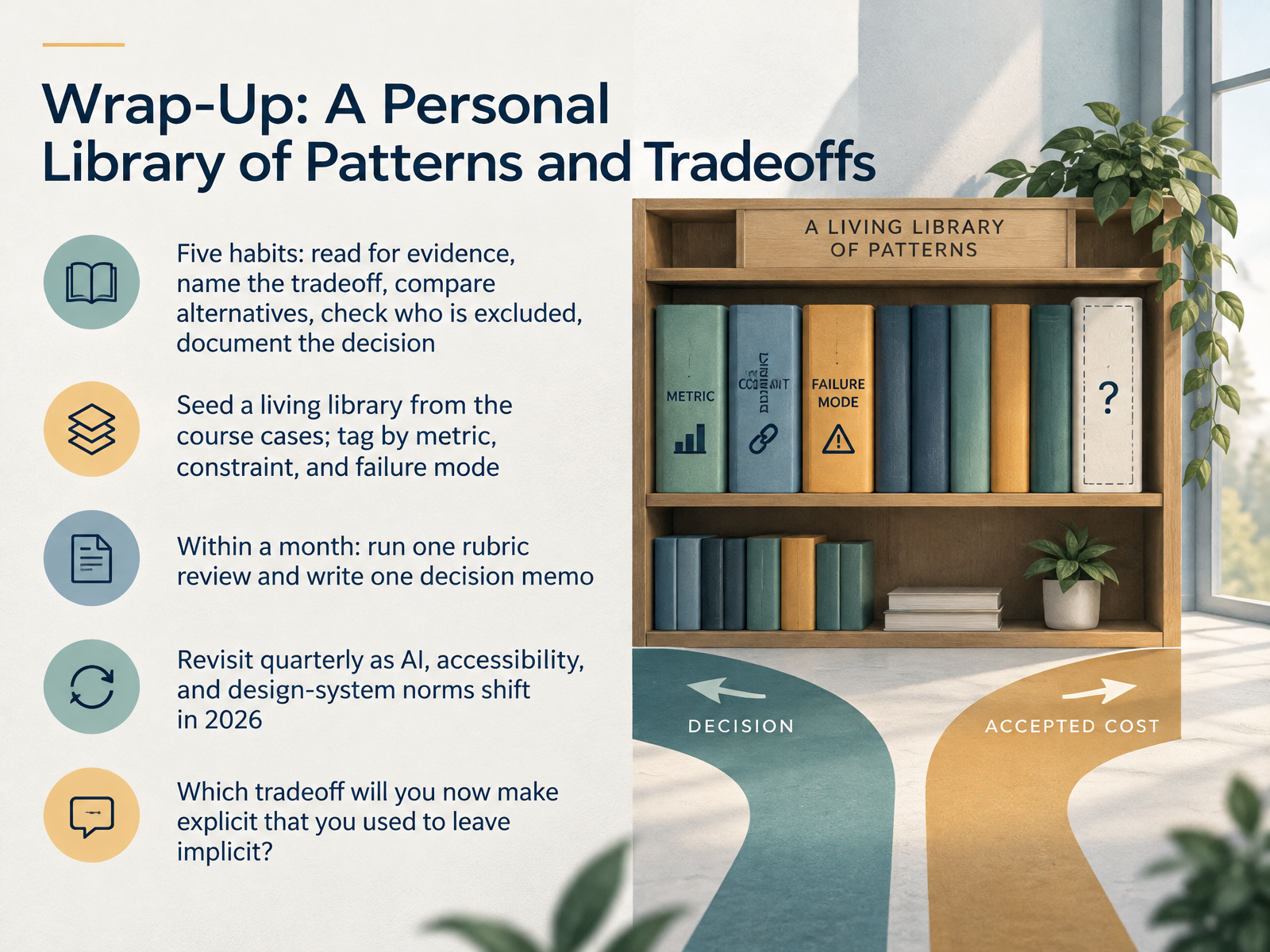
- 14Wrap-Up: A Personal Library of Patterns and TradeoffsLet's close by turning the course into a habit. Five habits carry the work: read for evidence, name the tradeoff, compare alternatives, check who is excluded, and document the decision. Seed a living library from the cases we covered, and tag each entry by metric, constraint, and failure mode, so you can find the pattern when a similar problem appears. Within a month, run one rubric review and write one decision memo. Neither has to be perfect. Then revisit quarterly, since AI, accessibility, and design system norms are shifting through 2026. A pattern that was sound last year may not hold now. So one question to carry out the door: which tradeoff will you now make explicit that you used to leave implicit? Thank you for working through these cases with me. Keep naming the tradeoff, and your decisions will speak for themselves.
 thecrit.couaskos.orgrusaka.com+22 min
Take the deck with you
Download this course as a file — free, no sign-up needed.
- PDF handoutEvery slide page, ready to print or share.15 pages · 4.0 MBDownload
- Narrated PowerPointThe deck that presents itself — every slide carries the digital human's narration video.15 pages · 14.0 MBDownload
- PowerPoint slidesThe full deck as a .pptx — open it in PowerPoint, Keynote, or Google Slides.15 pages · 3.9 MBDownload
Free to use in your own training — please keep the PersonWise credit page at the end.
Have your own deck? Turn it into a course
Sources consulted
Web sources consulted while building this course.
- UX Case Study Structure: A Practical 7-Part Guide (2026) — thecrit.co
- Design review and critique — HIF — uaskos.org
- Design Critique Framework | Rusaka — rusaka.com
- Practice UX judgment | UX Patterns Guide — uxpatternsguide.com
- Medium — uxdesign.cc
- UI Design Patterns Library: 170 UX & Persuasive Patterns — ui-patterns.com
- Patterns | The UX Shop — theuxshop.com
- UX Patterns Guide — uxpatternsguide.com
- UI-Patterns.com — ui-patterns.com
- Patterns · UX Encyclopedia — ux.detroit3d.com
- GO-MUC: A Strategy Design Method — washi.cs.waseda.ac.jp
- UX Metrics & ROI | Nielsen Norman Group Report - NN/G — nngroup.com
- Using Trade-Off Scales for Prioritization in UX Design Projects — nngroup.com
- Comparing — glare.zurb.com
- Measuring UXR impact (1200 x 1200 px) — uxinsight.org
- Checkout Flow Micro-Optimization vs. Macro-Redesign | Product Philosophy — productphilosophy.com
- Checkout UX Best Practices 2025 – Baymard Institute — baymard.com
- Estee Lauder UX Checkout improvement case study — simplr.design
- Checkout Flow A/B Testing - Vacasa — Brian Shreckengast — brianshreckengast.com
- Recovering up to 500k in annual revenue from checkout fixes - scandiweb — scandiweb.com