Keyboard-Friendly Interface Design
Begin
12 pages · ~24 min
Keyboard-Friendly Interface Design
Learn to design accessible, keyboard-navigable interfaces for users with motor disabilities or keyboard preferences.
What you’ll learn
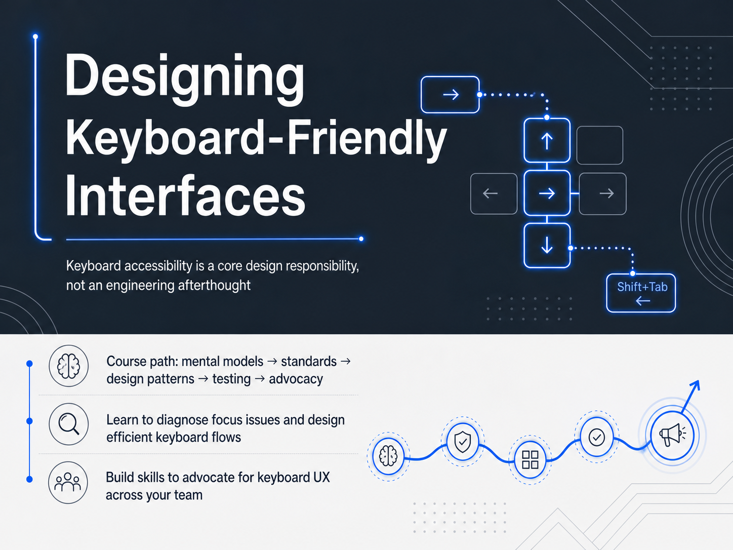
- 01Designing Keyboard-Friendly InterfacesWelcome, everyone. In this course, we are going to explore what it really means to design keyboard-friendly interfaces. Keyboard accessibility is not just an engineering concern or a compliance checkbox. It is a core design responsibility that shapes how users navigate, interact, and stay productive. Over the next few modules, we will follow a clear path. We will start by understanding user mental models, then move into web standards, practical design patterns, and testing techniques. Finally, we will look at how to advocate for strong keyboard UX across your team. By the end, you will be able to diagnose focus issues confidently and design efficient keyboard flows that put users in control. Let's get started by stepping into the user's perspective with our next topic: User Lenses and Mental Models.1 min
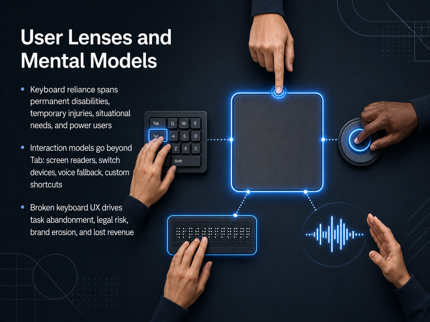
- 02User Lenses and Mental ModelsBefore we dive into specific techniques, let's align on why keyboard accessibility matters and who it serves. We often think of keyboard reliance as a permanent need, such as for users with motor disabilities or visual impairments who pair Tab with a screen reader. But it's much broader. Consider a developer with a wrist fracture in a cast, a parent holding a child who can only reach one key, or a power user navigating your data dashboard strictly with shortcuts for speed. This is our audience. Their interaction models go far beyond pressing Tab repeatedly. They may use switch devices that mirror a step-by-step scan, voice dictation as a fallback when hands are tired, or custom keystrokes mapped to frequent actions. Screen readers present a completely different focus model, where the user jumps between headings, landmarks, and controls, not just tab stops. When these interfaces break, the cost is steep. It is not just frustration; it is task abandonment. Users leave a checkout flow, a data entry form, or a critical tool because the keyboard path is blocked. Beyond that, repeated failures increase legal exposure under standards like the E N 301 549 and the Americans with Disabilities Act. And the ripple effect is brand erosion and direct revenue loss. So keyboard design is not a compliance checklist; it is a user-scope decision that impacts retention, legal standing, and your product's reputation. Next, we will get into the mechanics that shape these experiences. Let's move into focus, tab order, and the D O M.
 2 min
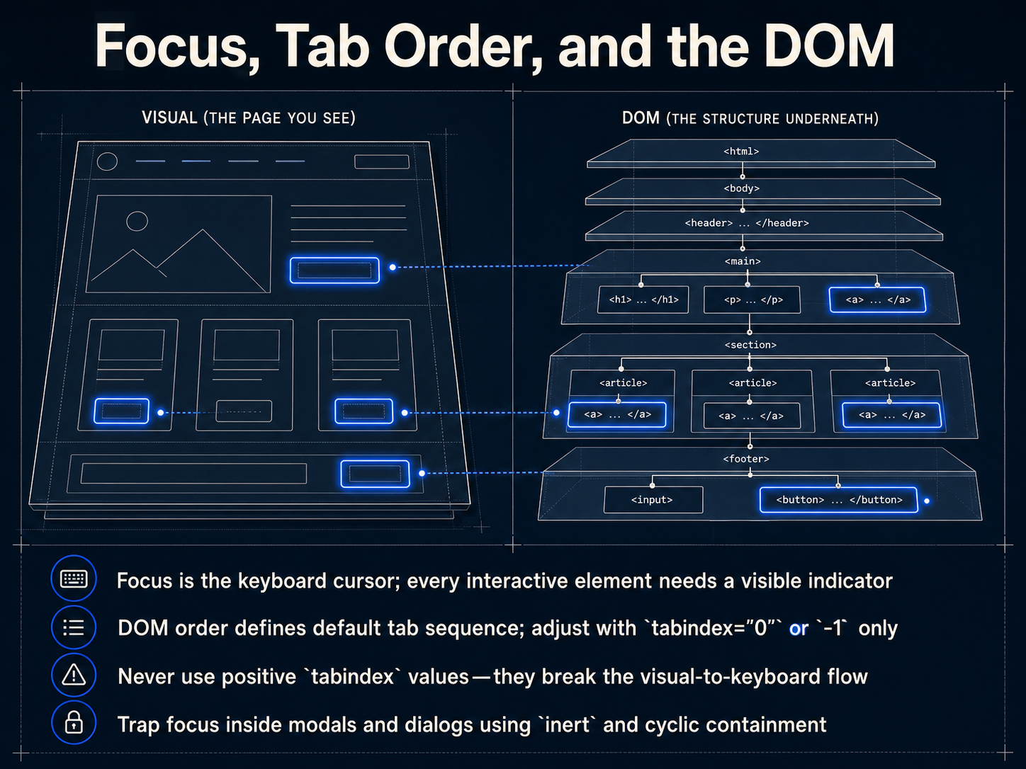
2 min - 03Focus, Tab Order, and the DOMLet's pull back the curtain on how the keyboard really navigates your interface. At the heart of it lies 'focus' — think of it as the keyboard cursor. Every button, input, and link needs a clear, visible focus indicator so the user always knows exactly where they are. This flow isn't random. The default tab sequence follows the Document Object Model, or DOM order. As a designer, you must align the visual layout with this underlying source order. To pull interactive elements like custom controls into the natural flow, you can use `tabindex` of zero. To programmatically set focus or remove something from the tab order, use `tabindex` of negative one. As a rule, never use positive `tabindex` values. They forcibly jump the cursor ahead, creating a disjointed visual-to-keyboard flow that disorients users. Finally, when a modal dialog opens, you need to trap the user's focus inside that box. Use the `inert` attribute on the background content and manage a cyclic tab loop to keep the user from accidentally wandering behind the overlay. Up next, we'll look at how these focus indicators must visually appear to meet the latest WCAG 2.2 requirements.
 2 min
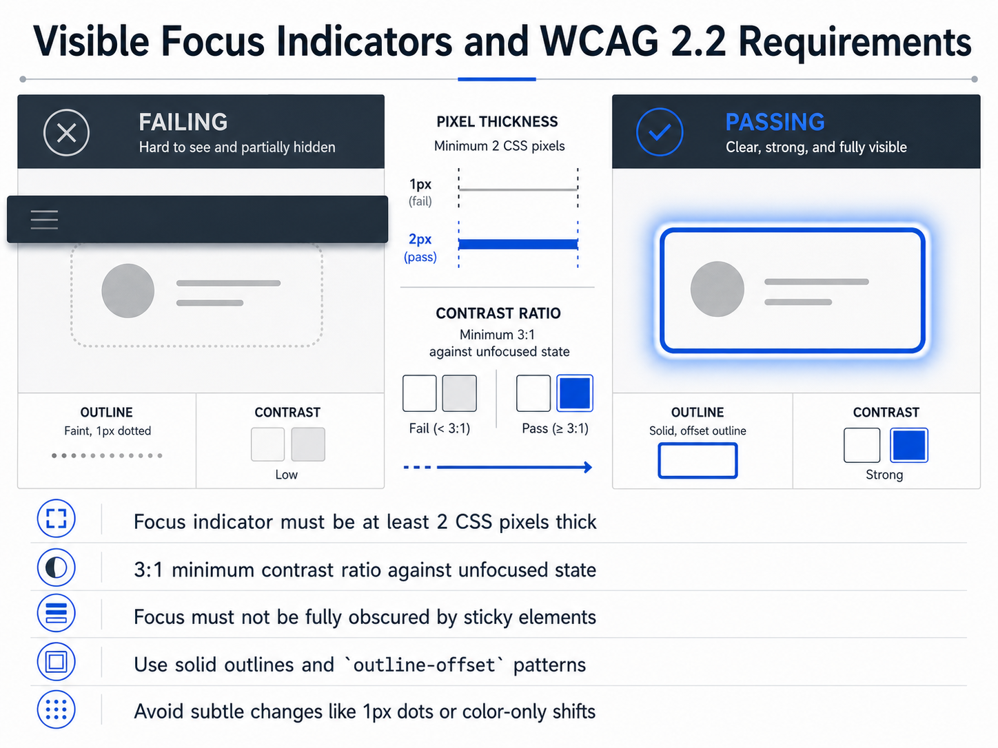
2 min - 04Visible Focus Indicators and WCAG 2.2 RequirementsMoving from general focus order to the visible feedback itself, let's talk about WCAG two point two requirements for focus indicators. These aren't just suggestions; they're measurable criteria that directly affect how users track their position. First, the indicator must be at least two CSS pixels thick. A one-pixel dotted line simply fails this requirement—it's too easy to lose visually. Second, the indicator needs a minimum three-to-one contrast ratio against its unfocused state. That means a subtle darkening of a border isn't enough; the change must be clearly perceptible. Third, watch out for sticky headers or footers. The focused element cannot be fully obscured by other content. Finally, for reliable implementation, use solid outlines combined with the outline-offset property. This creates a clean gap between the element and the indicator, avoiding visual clutter. Avoid subtle approaches like one-pixel dots or color-only shifts, as they exclude users with low vision. These techniques make the active element unmistakable. Next, we'll apply similar structural clarity to the page itself with Skip Links and Landmark Regions.
 2 min
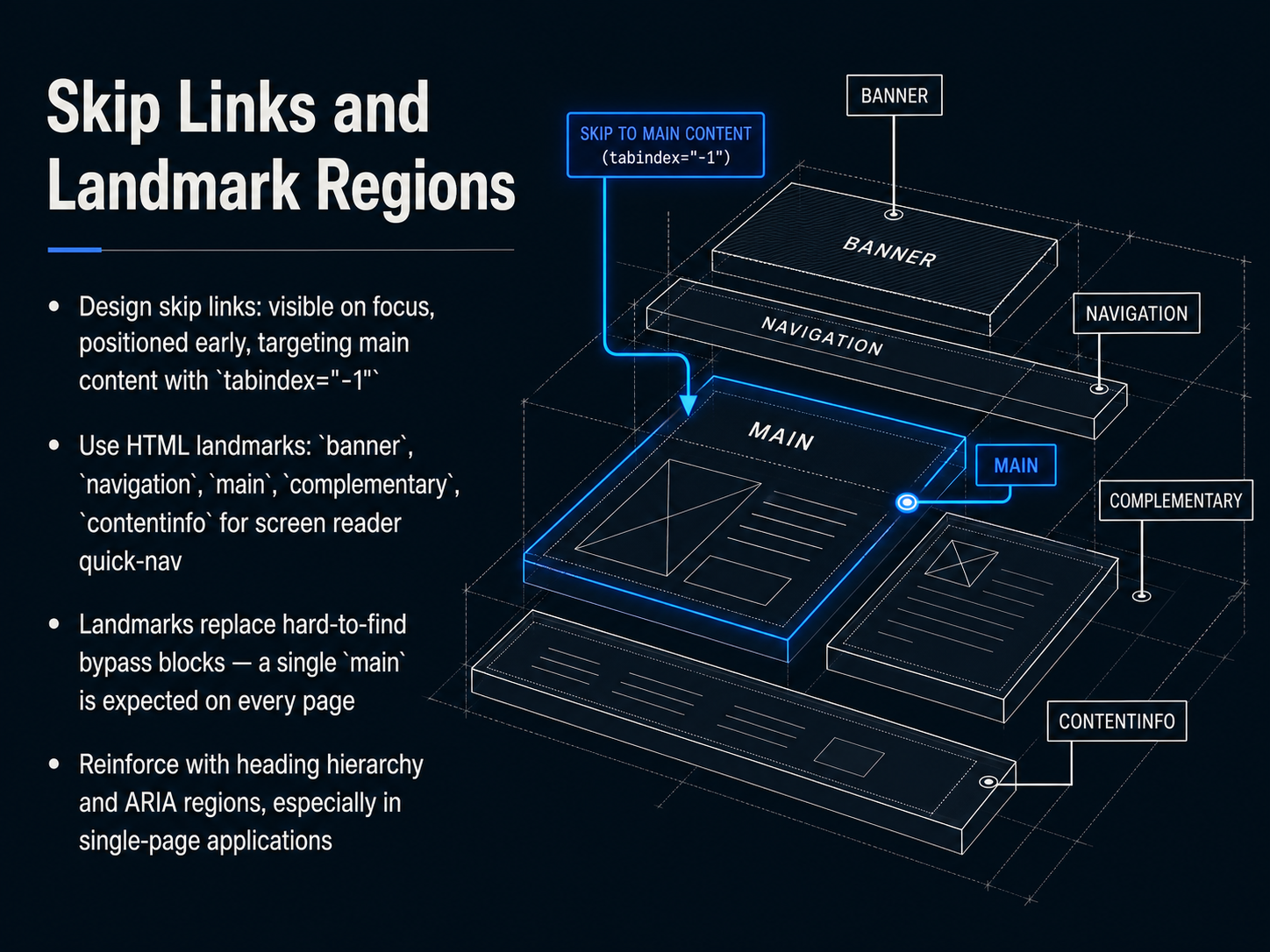
2 min - 05Skip Links and Landmark RegionsNow let's turn to a more structural approach: skip links and landmark regions. These patterns give keyboard and screen reader users direct, efficient access to the content they need. First, skip links. Design these so they become visible on keyboard focus, and position them early in the focus order. They should target the main content area, often with a programmatic shift using tabindex of negative one on the target container. This lets the link move focus without adding the container to the natural tab order. Next, use HTML landmark elements. Think of banner, navigation, main, complementary, and contentinfo. These work like built-in summary blocks that screen readers can jump between. Landmarks effectively replace hard-to-find bypass blocks. A single main landmark is expected on every page to mark the primary content boundary. In single-page applications, reinforce this structure with heading hierarchy and ARIA regions, especially when view changes simulate page navigation. The goal is consistent, predictable navigation that lets users jump to what they need without hunting. Next, we'll apply these concepts to interactive components as we move into designing keyboard interaction for composite widgets.
 2 min
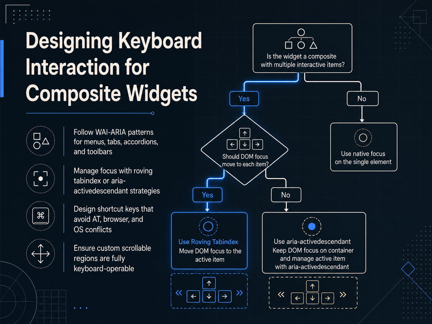
2 min - 06Designing Keyboard Interaction for Composite WidgetsNow let's move into composite widgets—the more complex components like menus, tabs, accordions, and toolbars. For these, following established WAI-ARIA design patterns is your most reliable starting point. They define the expected roles, states, and keyboard behaviors that assistive technologies and power users rely on. Next, you need a clear strategy for managing focus. Two common approaches are the roving tabindex method, where only one element in the group is in the tab order at a time, and the aria-activedescendant technique, where focus stays on the container while a separate attribute tracks the active child. Your choice depends on the widget's structure and how you want screen readers to interact with it. When you add custom shortcut keys, test them carefully to avoid conflicts with assistive technology commands, browser shortcuts, and operating system actions. A single overlapping keystroke can break a user's entire workflow. Finally, any custom scrollable region you create must be fully operable from the keyboard. Users should be able to scroll vertically and horizontally using arrow keys, and all content needs to remain reachable without a mouse. Next, we'll look at applying these principles to three specific, high-impact patterns: accessible custom select, combobox, and autocomplete.
 2 min
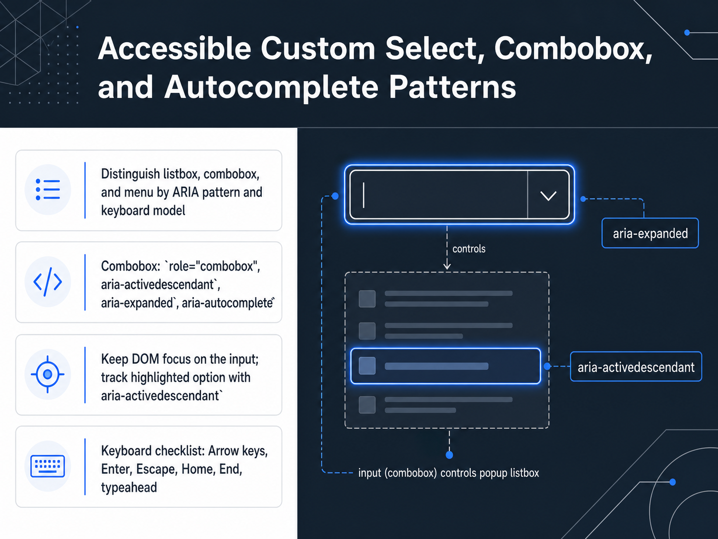
2 min - 07Accessible Custom Select, Combobox, and Autocomplete PatternsMoving into custom interactive controls, let's distinguish listbox, combobox, and menu patterns by their ARIA roles and keyboard models. A combobox combines a text input with a popup listbox. Assign role equals combobox on the input element. Use aria-autocomplete to signal whether the list shows suggestions or completes the typed text. When the user types or arrows through options, keep DOM focus on the input. Track the visually highlighted option using aria-activedescendant instead of physically moving focus into the list. This single focus model prevents keyboard traps and confusion. Add aria-expanded on the input to announce the popup state. Your keyboard checklist for combobox includes Arrow keys to move the highlighted option, Enter to select, Escape to close the list, Home and End for quick navigation, and typeahead so a user can type letters to jump to matching options. This pattern gives users precision and speed in one component. Next, we'll apply a similar rigor to forms, validation, and error recovery.
 1 min
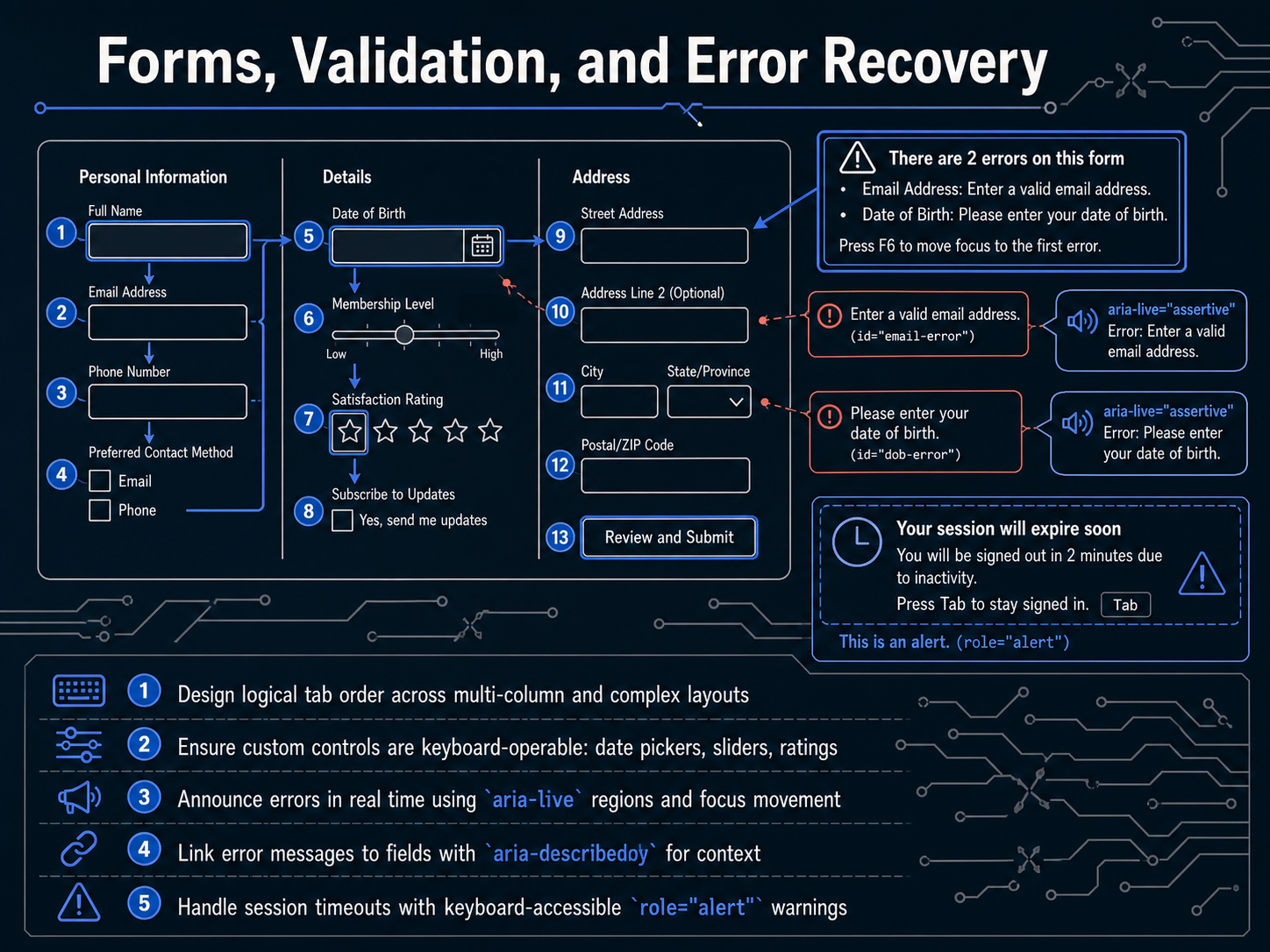
1 min - 08Forms, Validation, and Error RecoveryNow let's turn to forms, validation, and error recovery. These interactions often make or break the keyboard experience. Start with tab order. In multi-column layouts, the focus path must follow the visual reading order. Use the tabindex attribute sparingly, and only with values of zero or negative one, to avoid disrupting the natural DOM sequence. Custom controls like date pickers, sliders, and star ratings also need full keyboard support. Users should be able to open, navigate, select, and close them using predictable keys like Arrow, Enter, and Escape. When validation runs, announce errors in real time. Place a polite aria-live region near the form to speak error counts or summaries without shifting focus unexpectedly. Then, move focus to the first invalid field so the user can correct it immediately. Link each error message to its field with aria-describedby. This ensures the error is spoken when the field receives focus, giving the user clear context. For session timeouts, use a role of alert on the warning dialog. An alert region interrupts the user respectfully, letting them know time is running out, and must offer keyboard-accessible buttons like 'Extend session' or 'Sign out'. These techniques give users control and clarity during critical tasks. Next, we'll apply similar focus discipline to single-page application routing, client-side focus management, and dynamic content.
 2 min
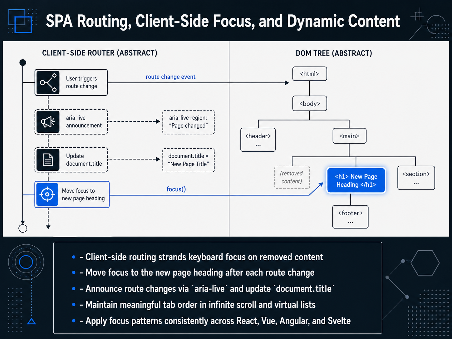
2 min - 09SPA Routing, Client-Side Focus, and Dynamic ContentNow let's look at how modern SPA frameworks complicate keyboard focus. With client-side routing, the browser does not reload the page. This means keyboard focus often stays on the link or button that triggered the route, while the old content – and its active element – is removed from the DOM. The user’s focus is stranded, forcing them to tab blindly from the top of the document. To fix this, programmatically move focus to the new page heading after each route change. Heading-level focus gives screen reader and keyboard users an explicit starting point. Pair this with a live region announcement so assistive technology confirms the route change, and update the document title to match. Dynamic content patterns, like infinite scroll and virtual lists, add another layer. As items load in, you must preserve a meaningful tab order. Avoid letting focus jump to newly rendered items unpredictably. Instead, insert new content after the current focus position, or provide an explicit 'load more' control that retains focus. Finally, apply these focus patterns consistently. Whether you work in React, Vue, Angular, or Svelte, the principles are the same. When a component mounts or updates, decide where focus belongs and manage it explicitly. Up next, we will explore motion, animation, and keyboard-driven experiences.
 2 min
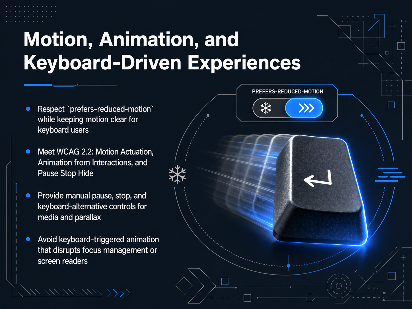
2 min - 10Motion, Animation, and Keyboard-Driven ExperiencesMotion and animation can make keyboard-driven interfaces feel responsive, but they can also create barriers if not thoughtfully designed. Let’s walk through how to balance clarity with accessibility. First, always respect the user’s system preference for reduced motion. When that setting is active, swap large transforms and parallax effects for subtle opacity fades or static states. This keeps the interface safe for people with vestibular disorders while still providing clear feedback during keyboard navigation. Next, we need to meet WCAG 2.2 success criteria around motion. Motion Actuation requires that any function triggered by moving a device can also be operated with a keyboard or other static input. Animation from Interactions means users must be able to disable motion triggered by their own actions, like a hover or a tab press. And the Pause, Stop, Hide rule applies to any automatically moving content, like carousels or looping background videos. A keyboard user must be able to pause, stop, or hide it using standard keys. For example, ensure the Enter key or Spacebar can freeze a rotating testimonial slider. Finally, be careful with animations that activate on focus. A massive scaling effect on a focused form field might look polished, but it can disorient screen reader users or cause loss of context in the focus order. Stick to outlines or color changes for focus indicators, and test with a screen reader to confirm the viewport doesn't jump unexpectedly. In short, keep motion purposeful, provide manual controls, and test for stability in the keyboard flow. Next, we’ll translate these behaviors into actionable guide rails with Design Annotations and Developer Handoff.
 2 min
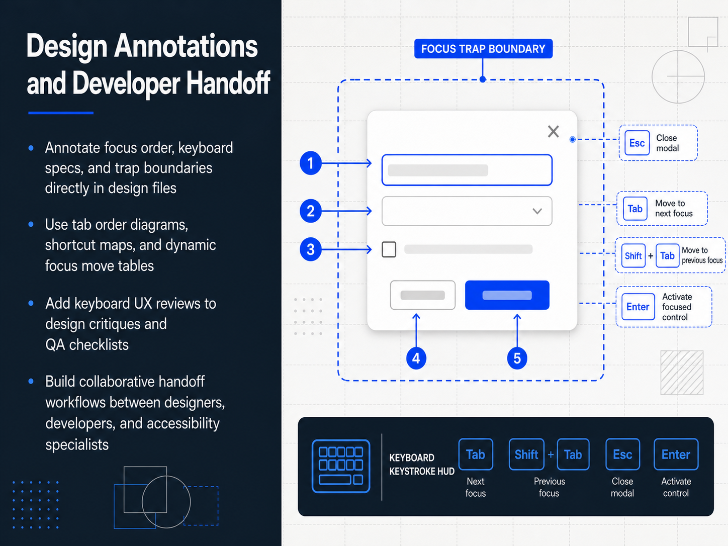
2 min - 11Design Annotations and Developer HandoffSo, how do we translate keyboard requirements into the final product? This is where your design annotations make all the difference. Start by annotating focus order, specific keyboard interactions, and trap boundaries directly in your design files. Next to each interactive element, a simple note like 'receives focus at tab stop three' can replace hours of developer guesswork. Complement these inline notes with a dedicated tab-order diagram for each view, a shortcut map for frequent commands, and a dynamic focus-move table that shows what happens on Tab, Shift-Tab, and arrow-key presses. Then, make keyboard UX a formal part of your reviews. Add a dedicated section to your design critique template and your QA checklist. Questions like 'Is the focus order logical?' or 'Can a keyboard-only user complete the task?' become standard checkpoints. Finally, build a collaborative handoff workflow. It’s not just a file export. It’s a working session involving designers, developers, and accessibility specialists to walk through the keyboard experience together. This closes the loop between design intent and implementation. Next, we'll look at the broader picture: how to test these interactions and advocate for a keyboard-first culture in your team.
 2 min
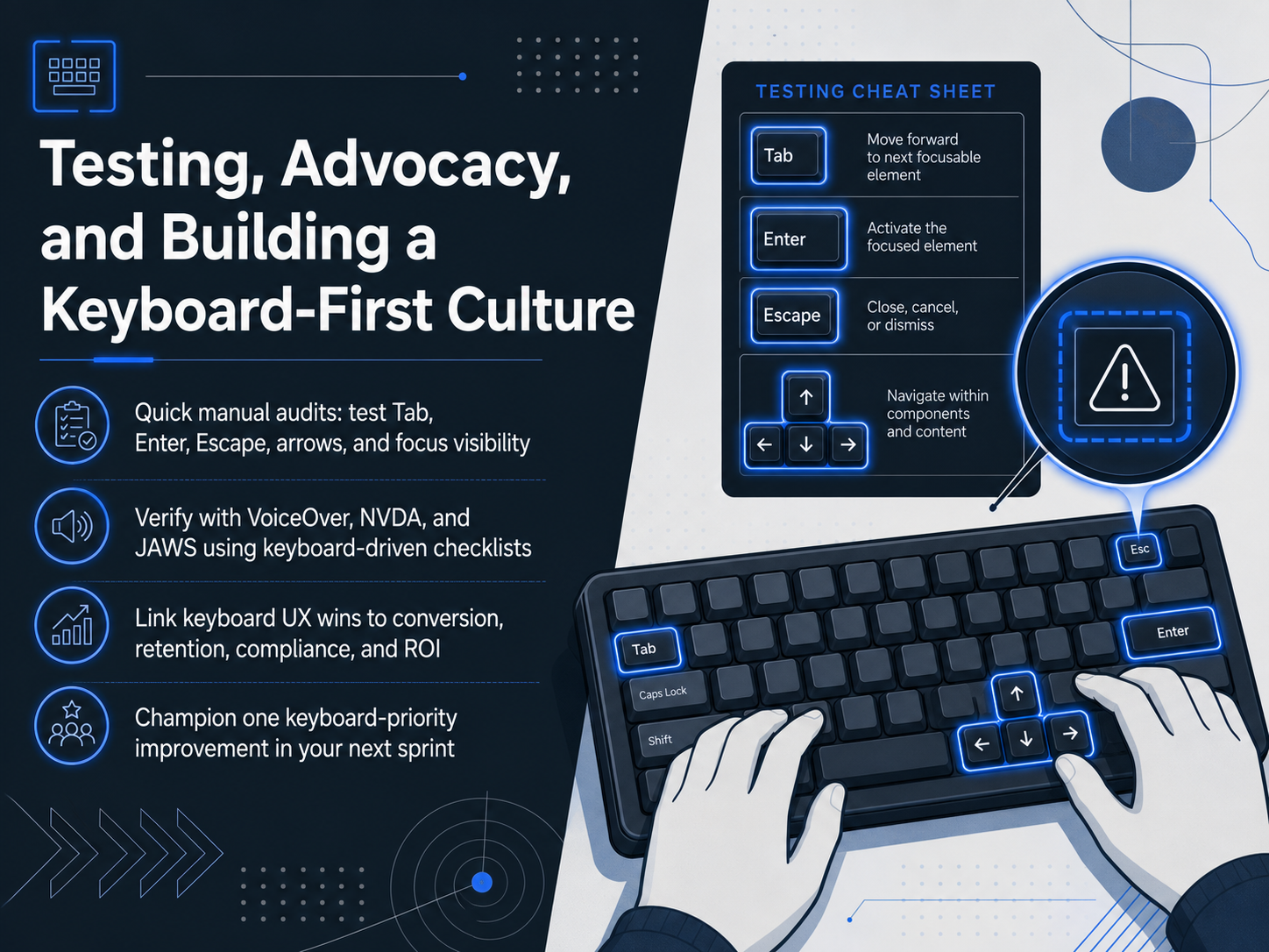
2 min - 12Testing, Advocacy, and Building a Keyboard-First CultureLet's bring everything together with a practical approach to testing, advocacy, and building a keyboard-first culture. First, make quick manual audits part of your design routine. Open any prototype or live page and drive it entirely with the keyboard. Test the Tab key, Enter, Escape, and arrow keys. Watch the focus indicator carefully. If you lose track of it even once, that is a finding worth logging. Next, move beyond visual checks. Verify your work with screen readers like VoiceOver, NVDA, or JAWS. Use a keyboard-driven checklist and navigate without touching the mouse. This exposes gaps that visual inspection alone will miss. When you advocate for these fixes, link keyboard UX wins directly to business metrics like conversion, retention, legal compliance, and return on investment. Stakeholders respond to clear cause and effect. Finally, champion one keyboard-priority improvement in your next sprint. Even a single, well-executed fix builds momentum and visibly raises the quality bar. Thank you for joining this session. By embedding these practices, you give every user a faster, more reliable path through your product. Go make that next interaction fully keyboard accessible.
 2 min
2 min
Take the deck with you
Download this course as a file — free, no sign-up needed.
- PDF handoutEvery slide page, ready to print or share.13 pages · 3.0 MBDownload
- Narrated PowerPointThe deck that presents itself — every slide carries the digital human's narration video.13 pages · 14.0 MBDownload
- PowerPoint slidesThe full deck as a .pptx — open it in PowerPoint, Keynote, or Google Slides.13 pages · 3.0 MBDownload
Free to use in your own training — please keep the PersonWise credit page at the end.
Have your own deck? Turn it into a course