Begin
14 pages · ~28 min
Design Systems vs Style Guides: Key Differences
Explore the differences between design systems and style guides, including tradeoffs and use cases, to help teams choose the right approach for scalable, consistent product design.
A digital instructor presents all 14 pages. Hold “Ask” at any point and ask out loud — the answer comes from this course. No sign-up needed.
What you’ll learn
- 01Design Systems Vs Style Guide: Differences, Tradeoffs, and Use CasesWelcome. Most product teams eventually hit the same question: do we need a style guide, or do we need a full design system. The terms get used interchangeably, but they solve different problems, and the distinction matters directly for how designers and front-end collaborators work together. In this course, we will break down the differences, the tradeoffs between flexibility and consistency, and the governance and speed decisions you will face. We will use real team scenarios around documentation upkeep, design to code alignment, and scaling across products. The goal is a practical framework you can apply this week. And a key point before we start: a style guide is not an incomplete design system. It is a focused piece of documentation. A design system is the broader infrastructure that includes components, tokens, patterns, and governance. One tells you how things should look. The other connects those rules to production code and keeps them alive. By the end, you will know when a style guide is enough and when you need to invest in the full system. Up next, we will look at why this terminology confusion costs teams real time.nngroup.comhoncho.agencyuxpin.com+21 min
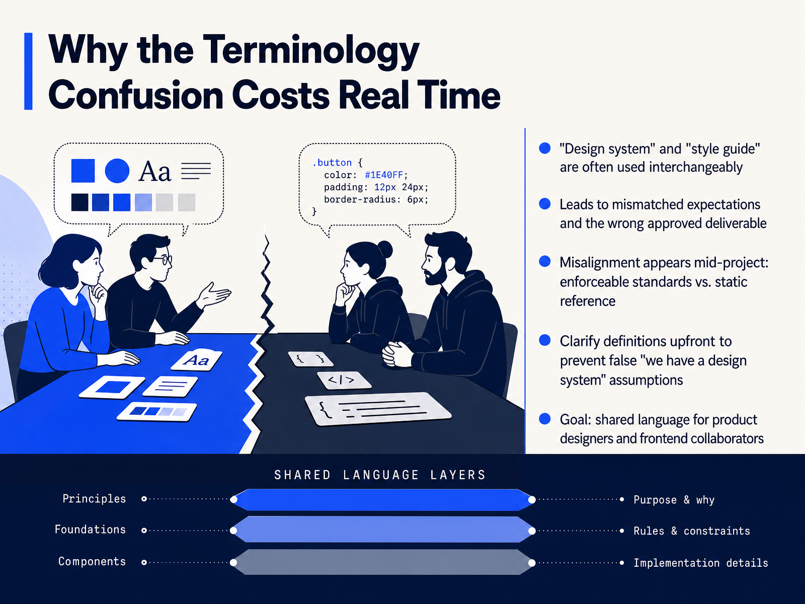
- 02Why the Terminology Confusion Costs Real TimeSo why does getting the terminology right actually matter? Because teams lose real time when design system and style guide are used as if they mean the same thing. A designer hears design system and expects a governed component library tied to code. A stakeholder reads style guide and expects a static PDF that covers color and type. When those expectations diverge, you end up with the wrong approved deliverable. And that misalignment often surfaces mid-project, right when you discover the difference between an enforceable standard and a static reference. The fix is simple. Clarify definitions upfront, so a style guide doesn't get mistaken for a full system. That prevents the false we have a design system assumption and gives designers and frontend collaborators a shared language. Next, let's break down the core concepts and definitions.
 nngroup.comhoncho.agencyuxpin.com+21 min
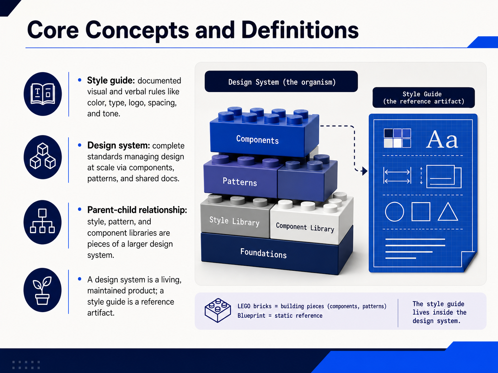
 - 03Core Concepts and DefinitionsLet's get the definitions straight, because these terms get used interchangeably in ways that cause real confusion during handoff. A style guide is documented visual and verbal rules. Think colors, typography, logo usage, spacing, and tone of voice. It tells you how things should look and sound. A design system is broader. It's a complete set of standards for managing design at scale, including reusable components, patterns, documentation, and often design tokens. The relationship is parent-child. Style guides, pattern libraries, and component libraries are all pieces inside a larger design system. The style guide is one component of that system. The most practical distinction for product teams is this. A design system is a living product that you maintain and version. A style guide is a reference artifact. It documents decisions. It does not enforce them in code. So when you hear someone say a design system and mean a color palette, that's the gap. Next, we'll look at what a style guide actually covers.
 nngroup.comhoncho.agencyuxpin.com+22 min
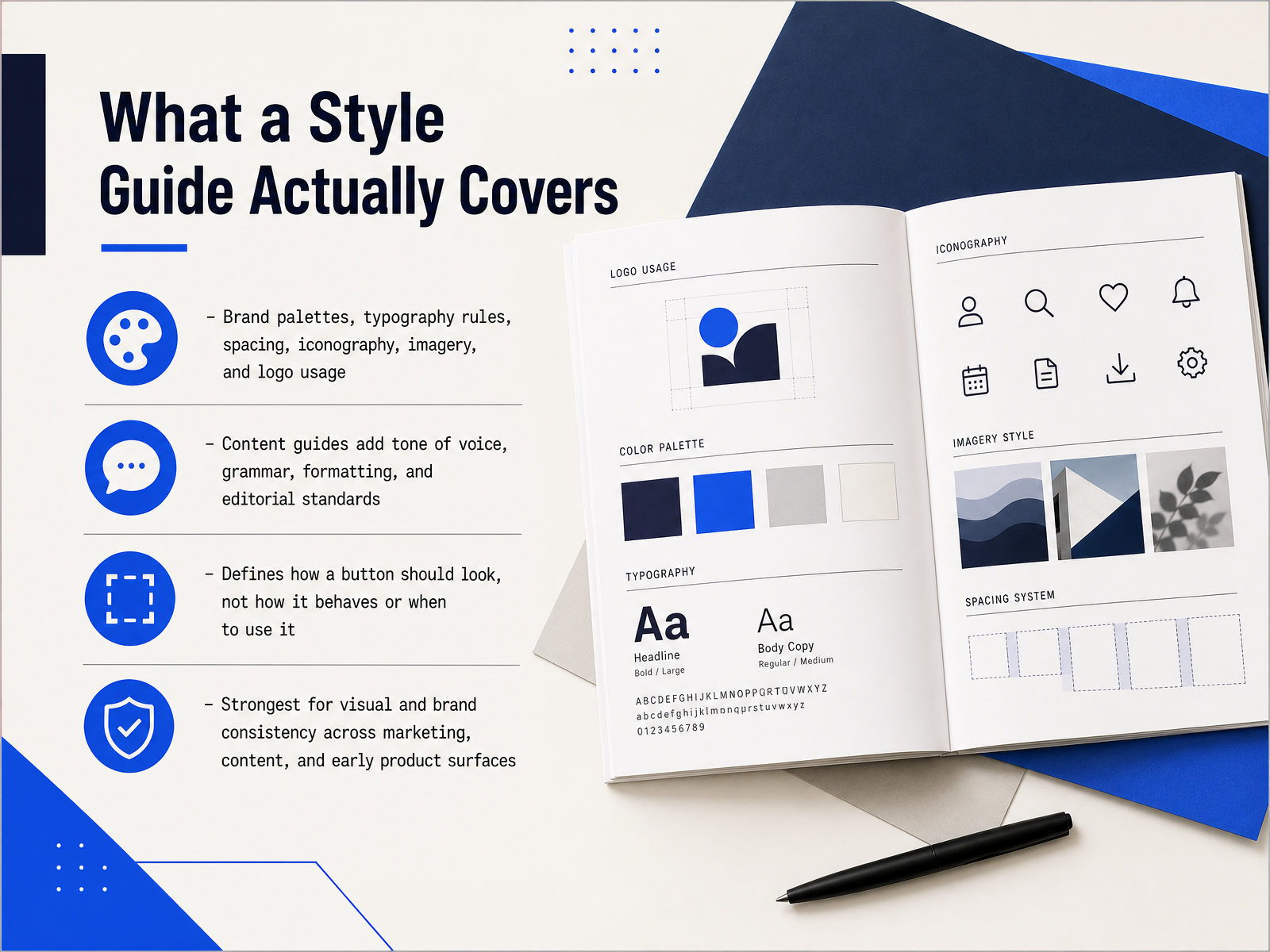
 - 04What a Style Guide Actually CoversSo that's the high level distinction. Let's get concrete about what a style guide actually covers. Think of it as the visual and editorial rulebook. It defines your brand palettes, typography rules, spacing scale, icon style, imagery, and logo usage. It can also include content standards like tone of voice, grammar, and formatting. The key thing to remember is that a style guide answers how something should look, not how it behaves. It tells you a button is blue, rounded, and uses specific type. It does not tell you what happens on hover, when a loading state appears, or when to use a primary versus a secondary action. Because of that focus, style guides are strongest for visual and brand consistency across marketing sites, content surfaces, and early product work. They get everyone speaking the same visual language before you need the heavier machinery of a full system. That limitation around behavior is where a design system starts to earn its keep. And that's exactly what we'll look at next.
 nngroup.comhoncho.agencyuxpin.com+22 min
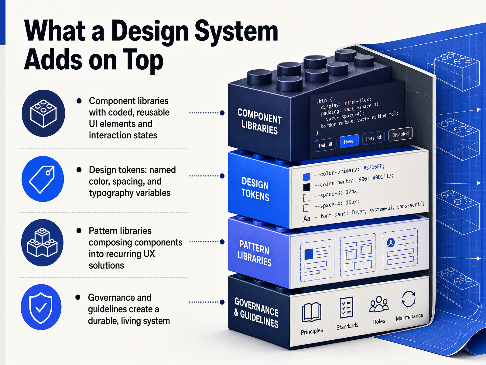
 - 05What a Design System Adds on TopSo if a style guide is the reference, a design system is the toolkit that actually gets reused in production. The first thing it adds is a component library. These are coded, reusable UI elements that include interaction states, not just visual specs. Think of a button where hover, focus, and disabled states are built into the code itself. Next, we have design tokens. These are named variables for colors, spacing, and typography. Instead of saying 'this button is a specific shade of blue,' we say 'this button uses brand primary.' That way, changing a token updates every component that references it. On top of components, a pattern library shows how those parts combine into recurring UX solutions, like a search header or a checkout flow. Finally, governance and guidelines keep this all alive. They define how changes get proposed, reviewed, and shipped, so the system doesn't drift from the actual product. That structure is what separates a design system from a simple visual reference. Next, let's look at the key differences at a glance.
 nngroup.comblog.logrocket.comwebdesign.tutsplus.com+21 min
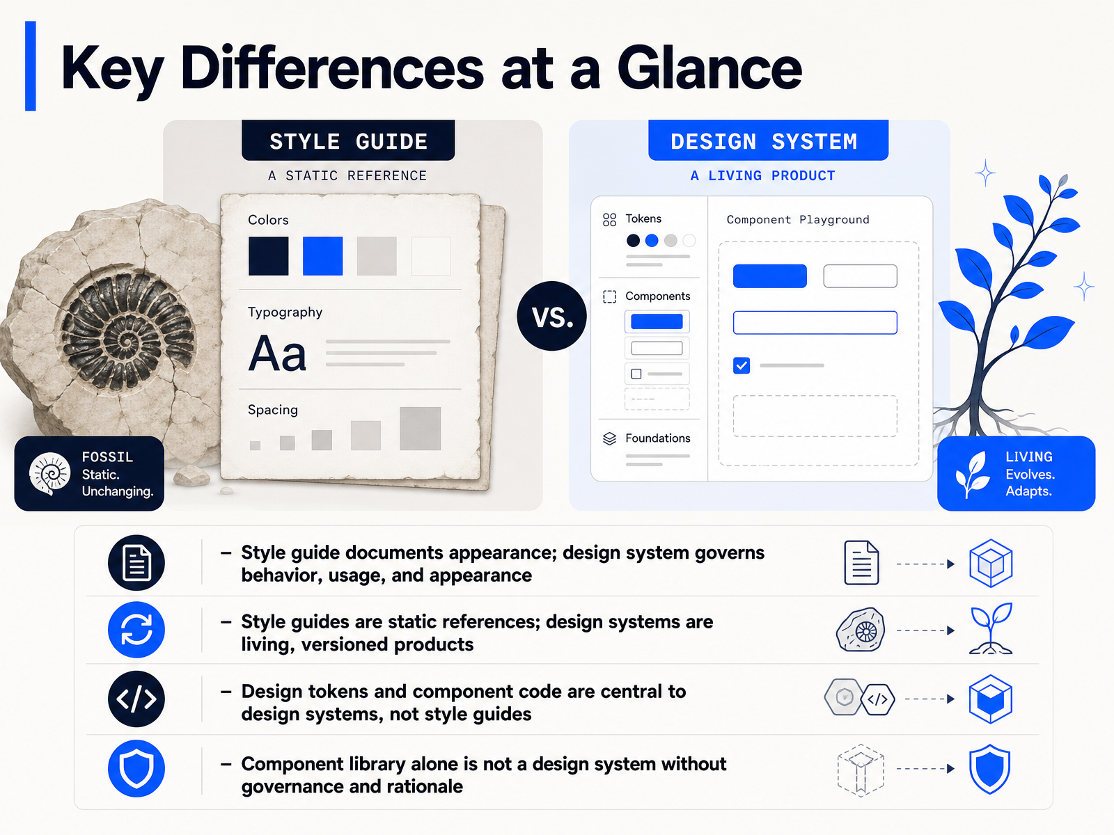
 - 06Key Differences at a GlanceLet's get the core differences on the table, because this is where a lot of cross-functional confusion starts. A style guide documents appearance. It tells you which colors to use, what the type scale is, and how the logo should sit. A design system governs more than that. It also governs behavior and usage. It answers questions like what happens when a button is disabled, or when a form returns an error. Second, style guides are usually static references. They sit in a PDF or a wiki and change occasionally. Design systems are living, versioned products. They ship updates, they have release notes, and they evolve with the codebase. Third, design tokens and component code are central to design systems, not style guides. A token turns a color or a spacing value into a reusable variable that both design and engineering can reference. And finally, a component library alone is not a design system. If you have a library of coded buttons but no usage rules, no accessibility guidance, and no one responsible for changes, you have building blocks, not a system. That distinction matters when you think about governance, which is exactly what we'll look at next.
 nngroup.comblog.logrocket.comwebdesign.tutsplus.com+21 min
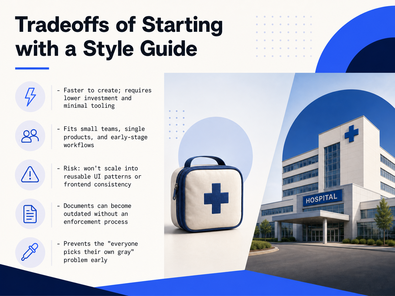
 - 07Tradeoffs of Starting with a Style GuideLet’s talk about the tradeoffs of starting with a style guide. On the plus side, it’s fast. You can stand one up with very little investment or tooling, which makes it a natural fit for small teams, single products, and early-stage work. It also solves a real problem right away: it prevents the “everyone picks their own gray” situation by giving the team a single reference for colors, type, and spacing. But there are limits. A style guide is a document, not a product. It won’t scale into reusable UI components or protect frontend consistency as the codebase grows. And because there’s no enforcement mechanism built in, the guide can drift out of date the moment someone ships a fix without updating the reference. That doesn’t mean it’s the wrong choice, it means you should treat it as a starting point, not the end state. Next, we’ll look at the flip side: the tradeoffs of investing in a design system.
 focalmedia.ingetwiththebrand.conexusbond.com+21 min
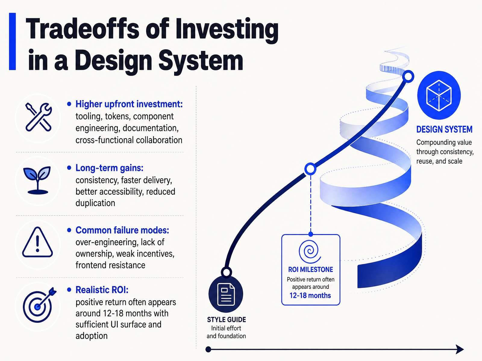
 - 08Tradeoffs of Investing in a Design SystemLet's talk about what a design system actually costs your team. The upfront investment is real. We're talking about tooling, token architecture, component engineering, documentation, and the cross-functional time needed to align everyone. With that bigger investment comes meaningful long-term gains: visual consistency, faster delivery, better accessibility out of the box, and less duplicated work. But there are failure modes to watch for. Over-engineering components that solve problems you don't have. Unclear ownership of the system. Weak incentives for product teams to adopt it. And frontend resistance when the system makes their job harder instead of easier. The realistic return on investment usually appears around twelve to eighteen months. That assumes you have enough UI surface area and strong adoption. If your system is only maintained by one or two people and product teams ignore it, that timeline stretches out fast. So the question isn't whether a design system can pay off. It's whether your team is structured to let it. That brings us to the use case framework for choosing the right approach.
 figr.designpathtoproject.comfigma.com+21 min
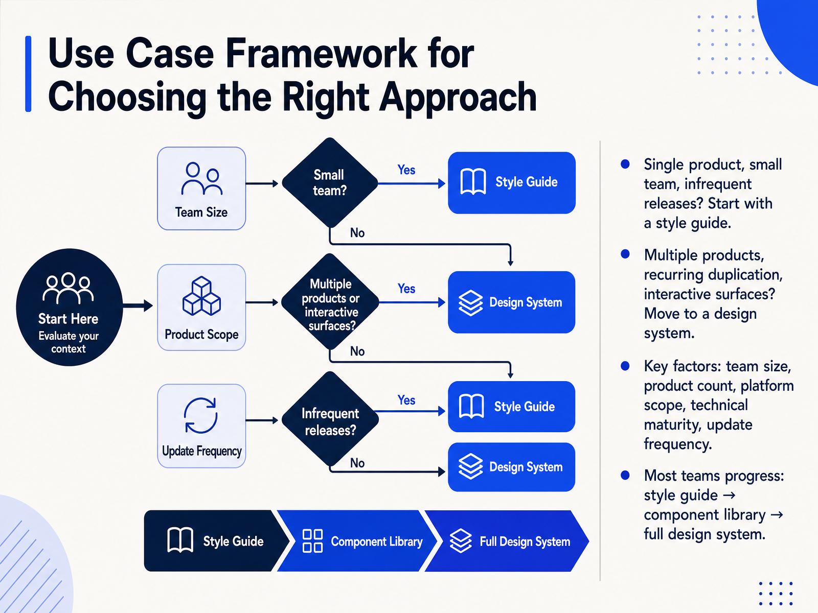
 - 09Use Case Framework for Choosing the Right ApproachSo how do you actually decide between a style guide and a design system? Start with the shape of your work. If you have a single product, a small team, and infrequent releases, a style guide is usually the right level of investment. It keeps you consistent without slowing you down. But if you are managing multiple products, noticing the same component getting rebuilt over and over, or dealing with highly interactive surfaces, that is the signal to move toward a design system. The key factors to weigh are team size, product count, platform scope, technical maturity, and how often you ship updates. Most teams do not jump straight to a full system. The typical progression is: style guide first, then a component library, and finally a full design system with governance. That natural path helps you avoid building infrastructure you cannot maintain yet. Next, let's look at how these choices shape design-to-frontend collaboration models.
 focalmedia.ingetwiththebrand.conexusbond.com+21 min
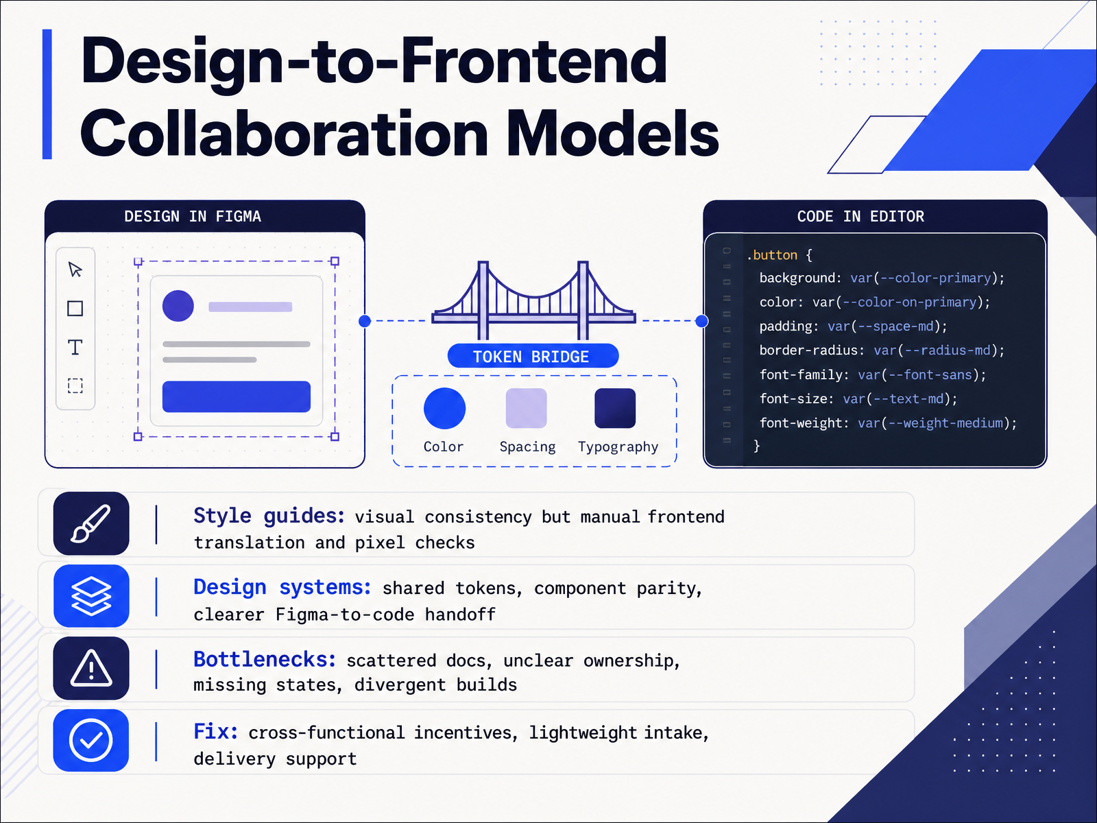
 - 10Design-to-Frontend Collaboration ModelsSo how do these choices actually show up in the day-to-day handoff between design and frontend? With a style guide, you get visual consistency on paper. But the translation to code is manual. Someone has to inspect the spacing, check the hex values, and do pixel-level reviews. It works, but it does not scale. With a design system, you move to shared tokens and true component parity. The button in Figma matches the button in code, because they reference the same named values. That makes the handoff much clearer. The real bottlenecks we see are rarely about the tools themselves. They come from scattered docs, unclear ownership of components, missing states like empty or error views, and builds that gradually diverge over time. The fix is not just better documentation. It is about creating cross-functional incentives, a lightweight intake process for new components, and direct delivery support so developers are not left guessing. That keeps the gap between design and code small. Next, let us look at common misconceptions and pitfalls.
 focalmedia.ingetwiththebrand.conexusbond.com+21 min
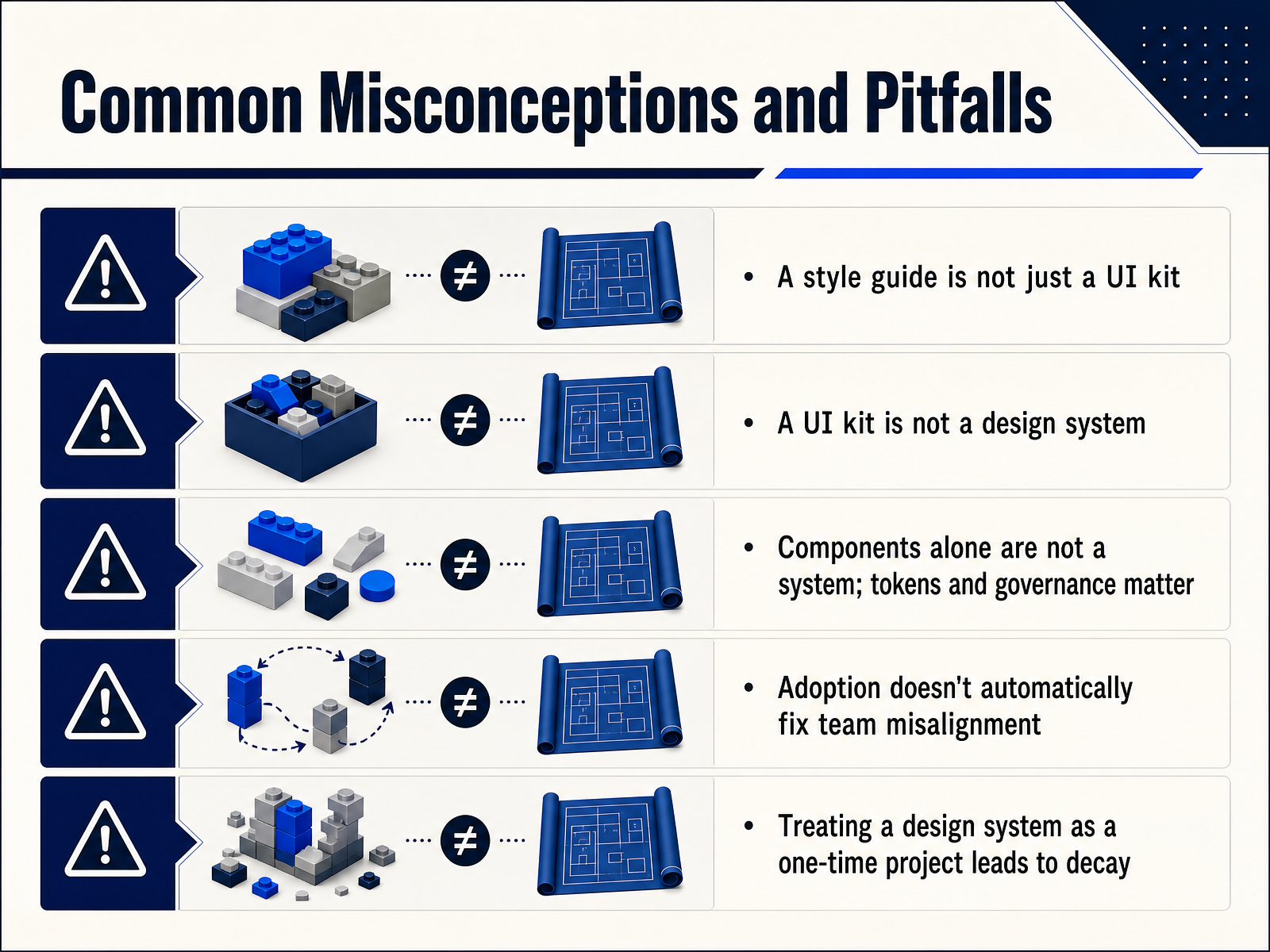
 - 11Common Misconceptions and PitfallsLet's clear up a few common misconceptions here, because they can quietly derail a system before it even gets traction. First, a style guide is not a UI kit. The kit is the component library in Figma. The style guide is the broader set of visual rules and usage guidance behind it. Next, a UI kit is not a design system. Components alone are not a system. Tokens and governance are what make those components behave consistently and stay aligned with engineering over time. Adoption also does not automatically fix team misalignment. If product teams are still incentivized to ship local solutions fast, a shared library just becomes optional infrastructure. And finally, treating a design system as a one-time project leads to decay. Maintenance, contribution paths, and versioning are ongoing costs that protect the initial investment. With those pitfalls in mind, let's move into the practical signals for knowing when to shift from a style guide to a full design system.
 figr.designpathtoproject.comfigma.com+21 min
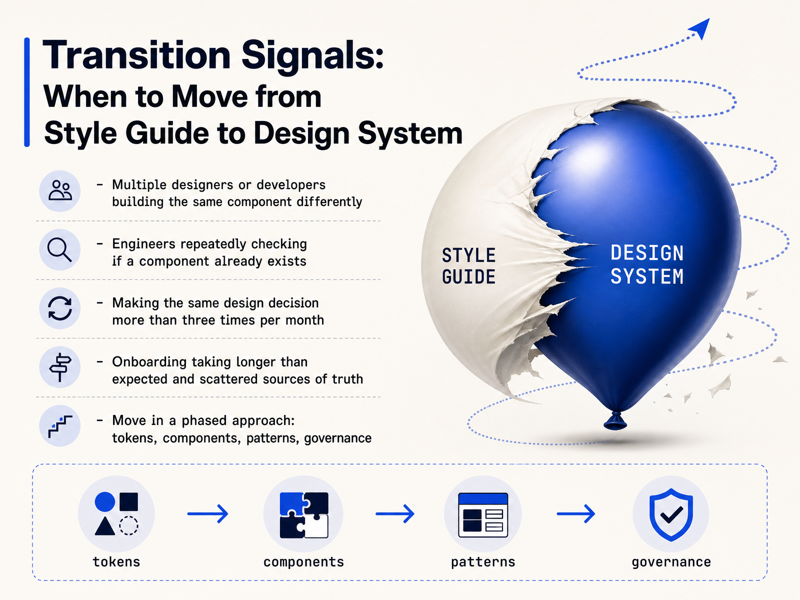
 - 12Transition Signals: When to Move from Style Guide to Design SystemSo when exactly is the right time to make this move? There are a few clear signals. If multiple designers or developers are building the same component differently, that is a governance problem, not a talent problem. If engineers are repeatedly asking whether a button or a modal already exists, you are paying for duplicated effort. A useful rule of thumb from the field is that if you are making the same design decision more than three times a month, your style guide is no longer enough. You have outgrown your documentation. Other triggers include onboarding taking longer than expected because new hires cannot find a single source of truth. When you see these patterns, do not try to boil the ocean. Move in phases. Start by standardizing design tokens. Then consolidate core components. Next, document common patterns. Only after that layer in formal governance. This sequencing keeps the transition practical and avoids a six month freeze on feature work. In the next slide, we will look at how you measure whether this investment is actually paying off.
 focalmedia.ingetwiththebrand.conexusbond.com+21 min
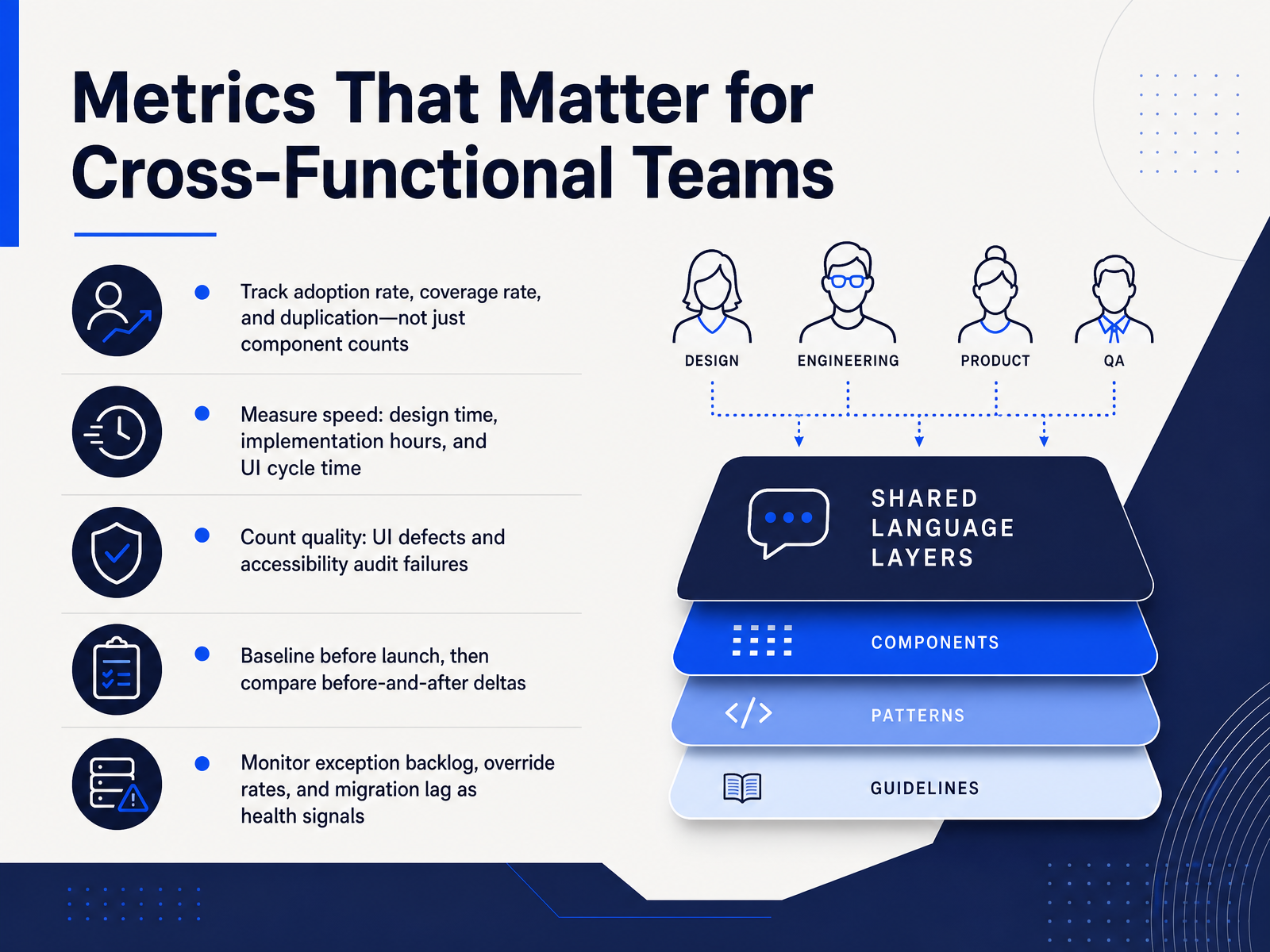
 - 13Metrics That Matter for Cross-Functional TeamsLet's move from structure to measurement. If the goal is a system that works across design and engineering, we have to track metrics that matter to the whole team, not just component counts. Start with adoption rate, coverage rate, and duplication. Adoption tells you whether product teams are actually using the system. Coverage shows how much of their common work the system supports. Duplication reveals where teams are still building custom components instead. Then measure speed. Look at design time per screen, implementation hours, and total UI cycle time. The way to know if the system is paying off is by comparing those numbers over time. For quality, count UI defects and accessibility audit failures. These are the operational costs that show up in rework and release risk. The most important practice here is to baseline before launch. Capture your current speed and quality numbers first, then compare before-and-after deltas. Without that baseline, you cannot prove improvement. Finally, watch the health signals. Exception backlog, override rates, and migration lag will tell you where governance is breaking down, often before adoption numbers drop. High usage with high override rates usually means the system does not fit real product needs. Tracking these metrics keeps the system economically useful instead of becoming another layer of overhead. Next, we will look at practical application and next steps.
 figr.designpathtoproject.comfigma.com+22 min
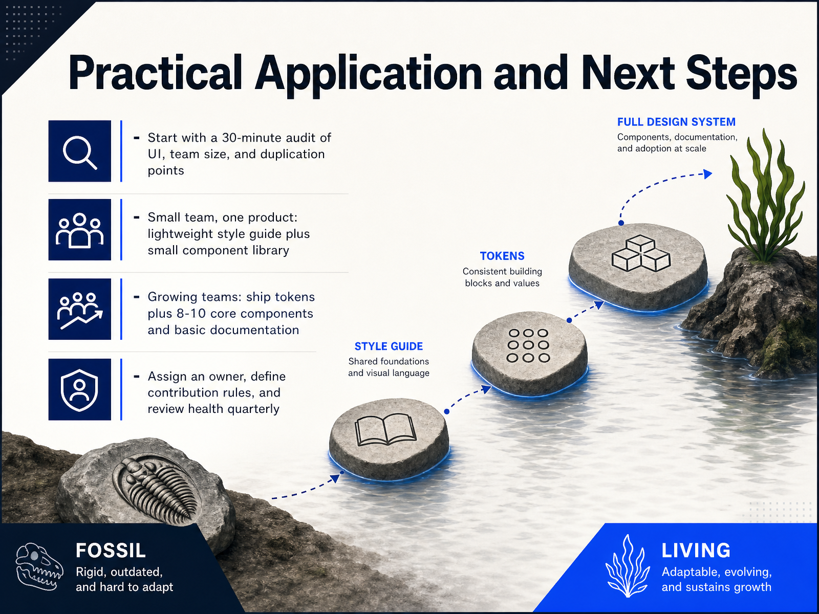
 - 14Practical Application and Next StepsSo where do you actually start? First, run a thirty minute audit. Look at your UI, your team size, and where you see the same work being duplicated. If you are a small team on a single product, do not build a massive system. A lightweight style guide plus a small component library is usually enough. If your team is growing and you are shipping across multiple surfaces, start with design tokens, then add eight to ten core components and just enough documentation to make them usable. Most importantly, assign an owner. One person who is responsible. Define clear contribution rules so the system does not turn into a bottleneck. Then review its health every quarter. Look at adoption, overrides, and where teams still build custom UI. The goal here is not a perfect system. It is a useful one that keeps pace with your product work. Thanks for joining. Start small, measure what matters, and build only what your team will actually use.
 figr.designpathtoproject.comfigma.com+21 min
Take the deck with you
Download this course as a file — free, no sign-up needed.
- PDF handoutEvery slide page, ready to print or share.15 pages · 3.7 MBDownload
- Narrated PowerPointThe deck that presents itself — every slide carries the digital human's narration video.15 pages · 15.0 MBDownload
- PowerPoint slidesThe full deck as a .pptx — open it in PowerPoint, Keynote, or Google Slides.15 pages · 3.6 MBDownload
Free to use in your own training — please keep the PersonWise credit page at the end.
Have your own deck? Turn it into a course
Sources consulted
Web sources consulted while building this course.
- Design Systems vs. Style Guides — nngroup.com
- Style guide vs Design System: what's the difference? | Honcho — honcho.agency
- Design Systems vs Pattern Libraries vs Style Guides — uxpin.com
- From Style Guide to Design Systems: Scaling Team Consistency — usertesting.com
- What Is a Design System? Tokens and Components in 2026 | ProductOS — productos.dev
- Style guide vs. design system: Why the difference matters - LogRocket Blog — blog.logrocket.com
- Design System vs. Style Guide: What’s the Difference? | Envato Tuts+ — webdesign.tutsplus.com
- Design system vs style guide: what's the difference? — wix.com
- Design Systems vs Style Guides: Key Differences — uxpin.com
- The Design System vs. Style Guide Debate: What You Actually Need at Each Stage of Growth - Focal Media — focalmedia.in
- What kind of design system does your organization need? - Get With The Brand — getwiththebrand.co
- Design Systems vs Style Guides And Why The Difference Matters | NexusBond — nexusbond.com
- 16pixel — Global UX Design Agency — 16pixel.design
- How to Measure Design System ROI in 2026 — figr.design
- Design System Adoption Fails Without Product Team Incentives — pathtoproject.com
- The New Business Case For Design Systems | Figma Blog — figma.com
- The Design System ROI: Evidence from Real Teams | Fordel Studios — fordelstudios.com
- Design Systems Report 2026 - brought to you by zeroheight — report.zeroheight.com